Henry Codax at Shoot the Lobster at Gavin Brown

codax_lobster_gavin_brown.jpg
Gavin Brown’s enterprise has a show of Henry Codax paintings organized by Shoot the Lobster.
The press release quotes an interview Codax did with Peter Scott, which ran in Grey Magazine in March. Scott runs Carriage Trade, where Codax’s paintings were shown for the first time in Summer 2011.
codax_ct_blue_green_yellow.jpg
Henry Codax, installation view, 2011, Carriage Trade
Shoot the Lobster is the projects program/backroom of Jose Martos’ gallery on 29th Street.
codax_martos_nada_2012.jpg
Henry Codax, NADA NYC 2012 installation view, Martos Gallery
Martos showed Codax’s paintings twice in 2012: first at NADA NYC in May, then in the gallery from June through August.
codax_martos_2012.jpg
Henry Codax, “Long Suffering,” installation view, Summer 2012, Martos Gallery
Martos Gallery’s current summer show is No Place Like You, works by Peter Scott. Shoot the Lobster’s current summer show is No Place Like You (continued), a related group show with works by Dan Graham, Servane Mary, Heidi Schlatter and Jaques Tati.
Last year, I wrote of Codax’s practice:

What little we know of Codax comes from fiction, but his paintings are real, physical facts. As the ambiguities about the artist persist, even multiply, the paintings remain unchanged. When I first saw Codax’s work last summer, it intrigued me. I liked it, but worried that it might be a stunt, a one-liner in the form of a show. But Codax keeps making and showing work. And selling it, sometimes to people who try to flip it. And getting reviewed and written about. At some point, it’s possible that the persistence of Codax’s paintings may overcome the uncertainties of their origins. We’ll just accept them–and buy and sell and show them–for what they are: Henry Codax paintings.

Which seems both truer and wronger today. Codax’s paintings certainly persist. After three Summer shows in New York, it may be time to consider Henry Codax paintings a fixture, a tradition. A Codax show holds the gallery walls while the nonfictional art world is out of town. They’re the painting equivalent of a lamp timer, set up to convince the passerby that someone’s home.
They’re a housesitter that doesn’t water your plants And won’t cover your bills. Because is it just me, or are these some of the same actual paintings? Why doesn’t anyone want the yellow one? Are Codax paintings like Hirst Spots, no two colors alike, or are people still just not getting it?
From the Grey interview:

Scott:…Though the idea of a pseudonym may not be new, if this was a recent example, it entered it into a system of valuation and exchange, which is dependent upon a traceable identification between the maker and the object. This identification was never made publicly, nor offered contractually, which created problems when the work came up for auction. The speculation around the authorship dovetailed with the market speculation around the work until they were indistinguishable to some.
Codax: Until the auction.
Scott: The irony is that the market speculation was hindered by “Henry’s” rumored origins being asserted as fact. As long as you remained an artist that “might have been” created by actual, living artists, there was no “true” identity to be lost. The moment that any living person either claimed or disclaimed you, you were subject to verification to establish your “actual” worth.
Codax: So you’re now saying I no longer exist.
Scott: I’m saying you exist through all the paintings out there attributed to the artist Henry Codax.

Lights are on. I believe.
Henry Codax Shoot the Lobster at Gavin Brown’s enterprise, through 10 Aug 2013 [gavinbrown.biz]
An interview with Henry Codax [grey-magazine]
Previous Codaxplanations on greg.org:
Henry Codax at Auction; Speculation, on the Codax auction aftermath

Standard Operating Procedure Is Here

Thumbnail image for sop_red_gregorg.jpg
OK, It’s hard to complain about your day-to-day when you’re doing a project on people being held in indefinite detention for a decade, even after being cleared for release, and then being force fed with nasal tubes when you go on a hunger strike in a last ditch effort to get attention for your existence.
So anyway, Standard Operating Procedure is out, and it is rather amazing.

2. When the Nurse is satisfied that the detainee is secured and a safe environment exists, they shall insert the EF tube ias SOP NO:JTF-JMT #001 and secure it as dsecribed in (A).
3. The guard may then release their hold on the detainee’s head
E. If a particular detainee displays repeated attempts to bite the tube, a weighted 10f tube shall be used for all subsequent EF.
F. If the detainee is able to gain the tube between his teeth, the nurse will:
1. Simultaneously turn off feed and, immediately stabilize the distal end of the tube and pull the tube from the detainee’s nose.
2. Maintain traction on the proximal portion of the tube until the detainee releases the tube from between his teeth. This may take considerable time. [p. 281]

These documents–these words, in this order–are extraordinary. They have been written this way.
Buy Standard Operating Procedure in unsigned, unnumbered edition, 6x9x1.5, $15.99 plus shipping [createspace]
Previously: Standard Operating Procedure

Niépce’s View From The Window, The Making Of

View from the window at Le Gras, 1826, Joseph Nicephore Niepce
The world’s first photograph, a persistent image made by exposing chemicals to light, was taken in 1826 by Joseph-Nicéphore Niépce. [NEES-uh-fore NYEHps]
It’s the view from a window of his house in Le Gras. It was made by projecting the view through a camera obscura onto a small pewter plate coated with bitumen and developed with lavender oil. The exposure took several days [The sun can be seen hitting opposite sides of the buildings.] Niépce called it a heliograph.
Niépce eventually partnered with Louis Daguerre who was also working to fix images chemically, but Niépce died, his less inventive son stepped into the partnership, and thanks to some branding jiujitsu, Daguerre basically crossed the history finish line alone in 1839 as the inventor of photography. [Niépce son did write a pamphlet in 1841 titled, Historique de la Découverte Improprement Nomée Daguerreotype, procédé d’une notice sur son véritable inventeur feu, M. Joseph Nicéphore Niépce (History of the discovery improperly misnamed daguerreotype, preceded by a note from its real inventor Joseph Nicéphore Niépce.) So there’s that.]
niecpe_view_flipped.jpg
An enhanced view of Niepce’s View, flipped to match the actual view
View from the window at Le Gras, known as Point de vue de Gras in French, was lost until 1952, when the historian/collector Helmut Gernsheim tracked it down. It’s now in the collection of the Ransom Center at UT Austin.
Niépce’s house, in a village called Saint-Loup-de-Varennes, is now a museum, open for visitors in July and August [and other times of the year for a flat EUR150 get out of bed fee.]
The property was divided in the mid-19th century, but the house is largely intact. Yet it was unclear exactly from which window the image had been made. Gernsheim thought it was from the attic. This French site discusses all sorts of details about maps, lenses, exposure times, focal lengths, angles, and suggests it was on the 1st floor.
Or maybe that window’s not even there anymore. A restoration project at the house in 1999 found evidence of a remodeling that moved the window on the 1st floor sideways by 70cm. Here’s a short video about the investigation, trapped inside a tiny Flash window.
Alas, you can’t try to recreate Niépce’s photo yourself, because photos are not allowed in the photography museum. The operators have sold exclusive rights to some agency. Here’s the sign on StreetView.
niepce_street_view.jpg
View from the Window at le Gras [wikipedia]
Niepce house museum [niepce.org]

film.factory and Satantango: The Making Of

Jonathan Rosenbaum taught a seminar on American independent film at Bela Tarr’s film.factory, the 3-year graduate film/filmmaking program he’s begun in Sarajevo. How’s that going?

I soon discovered that one of the main reasons why film.factory wasn’t a school was that it was much closer to a film shoot, something Béla knew and understood a lot better. This meant that everything, my screenings and lectures included, was subject to last-minute revisions due to weather, equipment, health, sudden inspirations and other variables. And bearing in mind Orson Welles’ definition of a film director as someone who presides over accidents – along with the dawning realisation that the same vicissitudes might even apply to film historians, and therefore to what we all know as film history – an important part of my own education over my 18 days in Sarajevo was learning how to roll with all the punches.

One good thing about being Bela Tarr is you’re never at a loss for ways to fill a sudden gap in the schedule:

a screening of Béla’s 450-minute Sátántangó one Saturday (the first time [f.f program mgr] Sunčica and nearly all the others saw it), introduced by me. This was followed the next day by Béla lecturing for four-and-a-half hours about how he made it, shot by shot and take by take, using a sort of post-it storyboard as his narrative thread. (As with the film itself, there were two intermissions.)

The workshop before Rosenbaum’s was led by Carlos Reygadas. The one after was by Tilda Swinton, a Socratic dialogue about performers, and it sounds fascinating. Seriously.
a personal report on an adventure called film.factory [bfi via keyframe daily]

Standard Operating Procedure

In Japan, I woke up a couple of nights angry from dreams about having dinner at the White House, and sitting across from Pres. Obama, and arguing with him about hunger striking prisoners at Guantanamo.
We talked–I talked at him, because, I guess my mind was incapable of imagining a viable retort, really, what could he say?–about Yasiin Bey’s video demonstrating the standard procedure the military uses to force feed hunger strikers through their noses. And I asked if the Constitution was now as quaint as the Geneva Conventions, a reference to Bush era torture theorist John Yoo’s position on following the rule of law and international treaties the US had nominally upheld for decades.
It was the kind of dream where I felt that surge of adrenaline, that this moment, this conversation, was going to be what opened the President’s eyes to the awful urgency of this situation our country is in. These people are in.
I had seen the reports by investigative journalist Jason Leopold which revealed JTF-GTMO’s recent, extraordinary revisions to the prison hospital’s forced feeding procedures. But it wasn’t until a couple of days ago that, with Jason’s assistance, I found the actual military manuals and memos themselves. They are in an archive of documents produced in response to Freedom of Information Act requests maintained byThe Department of Defense’s FOIA Service Center.
sop_red_gregorg.jpg
I can’t not do something, so I have published the three sets of detainee treatment regulations, known as Standard Operating Procedures, as a book. Which, believe me, I know. I feel a bit like an outraged @Powhida jamming @BarackObama into all his tweets, until the non-effect wore him out.
It’s weird feeling compelled to do something that you recognize is irrational and irrelevant. But again, I can’t not do something, and this is one thing I do. And with all due respect to Richard Prince, this text, as it is, and as it drives the world, is the kind of thing I feel must be propagated and put examined and contextualized if appropriation, or art, or attention, really, is going to mean anything at all.
Standard Operating Procedure includes the SOP Manual for Camp Delta, the prison side of GTMO, which was implemented in 2003. It’s 240-some pages, not including the various classified appendices for detainee transport and adjudication, which have not, apparently, been released. It also contains the 2003 version of SOP for the detention hospital for “Voluntary and Non-Voluntary Total Fasting and Re-Feeding,” which has several p.ages completely redacted. And then there’s the May 2013 revision to those procedures, which are contained in an SOP for the Joint Medical Group for the “Medical Management of Detainees on Hunger Strike.” That’s the regime the detainees are currently under.
Of course, as Leopold and others continue to report, the situation of detainees is even worse than what these SOP prescribe. There are indications that regulations are extensively, if not routinely ignored by guards and prison commanders. These primary documents embody the best case scenario for people who have been cleared for release for years, but who remain in harsh, indefinite, imprisonment.
So whether you buy the book [which should be is finally available to order this weekend, I think; I’ve been experiencing some friction from the printer/publisher, which is kind of annoying, and it’s been going on all week.] or read the regulations in electronic format, read them, and know that they exist.
Buy Standard Operating Procedure, 284pp, unsigned edition, $15.99 +s/h [createspace]
UPDATE: Proof copy – Standard Operating Procedure is here

Gursky Goods

gurusuki-ten.png
An exhibition of Andreas Gursky photos opened at the National Art Center on July 3rd, the day after I arrived in Tokyo. My first instinct was to not go, because of the whole Ghetto Gursky thing, but I decided that, precisely because I’m making some of my own now, I really should see the Gursky Gurskys again up close. It was highly enlightening.
I would not call the show a retrospective. There were three curators involved from two Japanese institutions, but the 65 photos were “specially selected by Gursky himself.” In fact, except for a lone Pyongyang photo which is in the collection of the other venue for the show, the National Art Museum, Osaka, all the works come from the artist’s own collection. [The selection looks very similar to to the Museum Kunstapalast show last year.] Another similarity: instead of a chronological approach, the show organizers explain, Gursky designed the exhibition to “uniquely aim to show the entire body of work as a single unified entity with both old and new and small and large formats displayed side by side.”
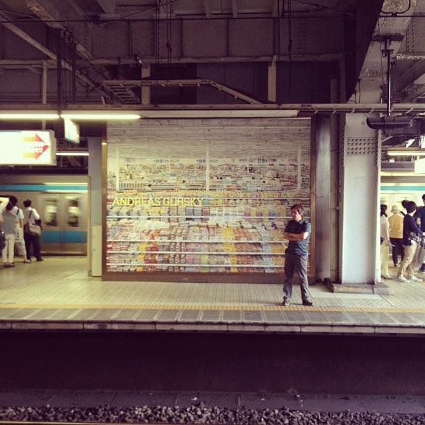
Which, wait, what? Small format Gursky? Is that some kind of Zen koan? Above all else, a Gursky is known for its “panoramic scale”; a “huge scale that envelops our body”; a “huge picture” with “a powerful presence…as an object,” which requires an “active viewing experience,” moving out and in, similar to that commonly used for large paintings. These descriptions all come from the current show’s catalogue essays, but they’re identical to nearly everything that’s been written about Gursky’s photographs since the 1990s. They’re bleeding edge big, and they’ve only been getting bigger.
gursky_nact_inst_gadabout.jpg
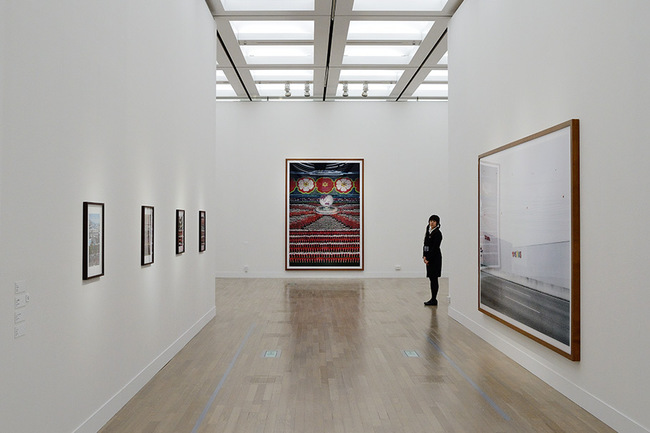
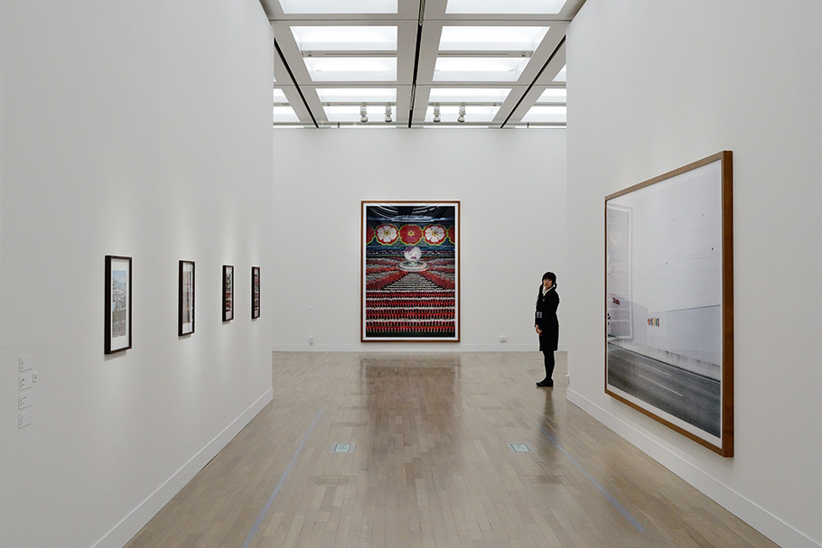
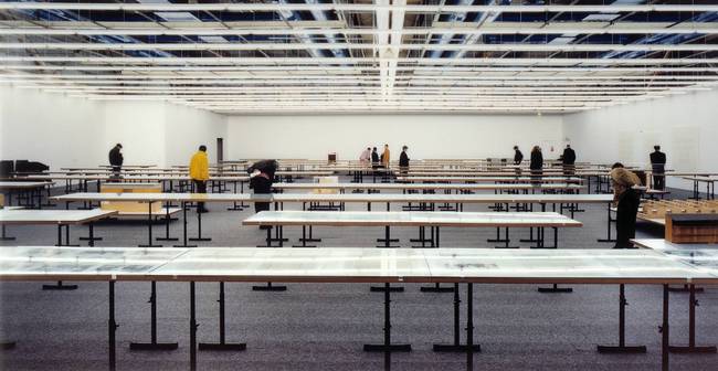
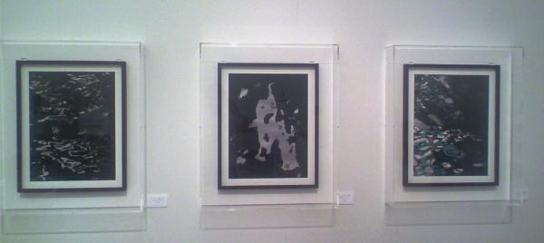
Gursky NACT installation shot showing small prints, taken by gadabout.jp, which also has a great photo of the artist
And yet fully a quarter of the prints in this exhibition, including some of his most well-known images, are small, around 40×50, 60, or 70cm. That includes Rhine II [whose$4.3 million auction result is mentioned in the show’s introduction]. It’s a dry-mounted inkjet print measuring just 43x71cm. That’s even smaller than the exhibition poster.
gursky_nact_poster.jpg
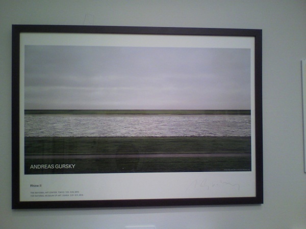
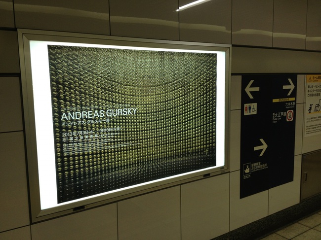
Exhibition poster for NACT’s “Gursky” depicting Rhine II, size A1, signed ed. of 200, 58,000 yen.
How often were such editions made or shown? Only your dealer knows for sure. I admit, it wasn’t until Rhine II sold in 2011 that I realized Gursky made an image in sizes other than “absolutely biggest possible.” From the part of Christie’s catalogue notes not cribbed from Tate: “Unusually for the artist, this series contains photographs produced on multiple scales, the present work being the largest of the entire edition.” But that meant 2×3.5m [like at Tate and Christie’s], and 1.5x3m, [like at MoMA and the Pinakothek Moderne, Munich]. Now there’s a 40x70cm pocket size, too? And what to do about that poster, which is available as a signed edition of 200, for 58,000 yen, in the exhibition site’s Gursky “Goods” section? Yes. アンドレアス・グッズキー。
gursky_pompidou_tate.jpg
Centre George Pompidou, 1995, image: tate
It’s not like there’s never been any. There’s everyone’s My First Gursky, of course, the Pompidou image (54x70cm) he released as a Parkett edition of 60+?? in 1995. [Ironically, the image above is of one of two large-scale artist proofs of the image, which was a gift to Tate Modern from architects Herzog & deMeuron, whose exhibition is depicted.]
gursky_white_cube_99cent_inst.jpg
And in a show at White Cube in 2003, Gursky did include an adorable little diptych of 99 Cent. Actually, those wide borders kind of kill it for me.
gursky_99cent_xs_whitecube.jpg
OK, jump back. Here’s the Gursky page at the local Cologne auction house Van Ham, which has more than a dozen small images, published in editions of 12-30, including even a couple of offset prints.
gursky_nact_ed_bangkok.jpg
So the three Bangkok series prints, in editions of 50 each, being sold by lottery at the gift shop for 500,000 yen, have context after all.
Since seeing the show until I sat down to research and write this out, I had assumed that with these little prints, I’d been beaten to the Ghetto Gursky punch by the artist himself. But these are not Ghetto Gurskys; they’re Entry Level Gurskys. Totally different. And those early German ones? Emerging Artist Gurskys. Also totally different.
Anyway, back to the show. These small prints did not really work for me. They primarily serve, along with the non-chronological hanging, to obscure the evolutionary relationship between Gursky and his technology, namely large-format photo printing and Photoshop.
There are definitely transition points and leaps to be seen between prints of different eras, in terms of size, medium, and resolution. And though two of the three curators emphasize the objecthood of Gursky’s photos, these actual characteristics, the print equivalent of a painting’s facture, go completely unmentioned.
One thing that jumped out at me: 1996-7 seems like it was a rough period for C-prints. Up close, a couple of those Prada shelf images looked like Seurats. But by 1999 they got better. The massive Ocean prints (2010), which were worked up from satellite imagery to look like animated airline inflight video maps, are giant C-prints of quality. But the Bangkok series (2011) of manipulated, river reflections, are crispy inkjets, perhaps another process shift.
All the small photos are inkjets, too, even the Parkett edition that was originally a C-print. A very early photo, Ruhr Valley (1989), is seen as a C-print 2.2x3m C-print, a scale I don’t believe was possible when the image was made. Indeed, it used to be dated 1993, which is presumably when the 57×66-inch version was produced. Which means Gursky’s objects are actually photographs after all. He goes back and prints them again. Size matters, but not as an indication of age. Emulsion grain and chemistry matter, but not as an indication of patina. I’ve heard Gursky will offer collectors reprints when images have destabilized or faded. Which is probably good customer service. But which seems rough on the object/painting positioning. In any case, no one in Japan, at least, cares when anything was printed.
gursky_kamiokande_650.jpg
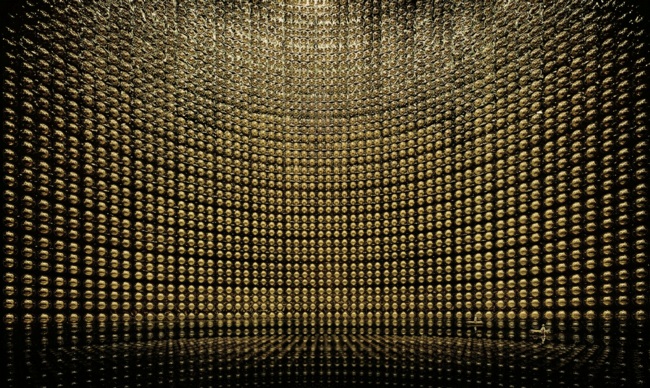
Gursky’s Kamiokande, 2007, image via: whitecube
Something else that really complicated my view of Gursky’s works was evident from the signature image for the show: Kamiokande (2007). It’s a photo of the Super Kamiokande neutrino detector which, coincidentally, I’d tried to visit on this trip. [We spent time nearby, in the mountains of Gifu prefecture.] It’s also something I have written about here before. And so it’s extremely obvious to me that Gursky’s image, in aspects large and small, is nearly identical to earlier published images of the giant underground tank.
super_kamiokande_boat2.jpg
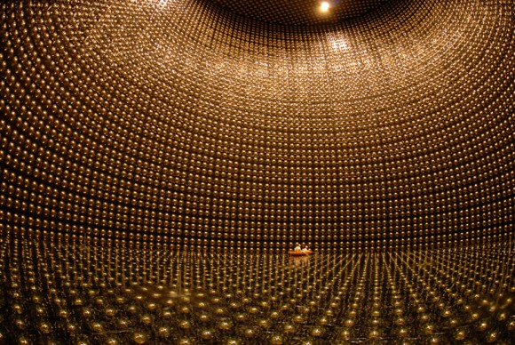
Image from 2001 or whenever, from Super-K themselves
Indeed, in the catalogue’s obligatory, “But what does Gursky think about Japan?” essay, curator Yuka Uematsu writes:

After seeing pictures of the facility in a magazine, Gursky chose the site as a motif for his work. At the time he shot the picture, the water had been drained to repair a damaged photoelectric tube, so he used a digital editing technique to add the water’s surface, which reflects the image and the workers riding in two boats.

Gursky’s well known to use digital manipulations and alterations to transform his images from depictions of reality to embodiments of his own Gursky Vision. “A restructured image” seen, as curator Mitsue Nagaya puts it, “through the filter of Gursky’s eye.” It’s just that sometimes, that eye looks at someone else’s photograph.
Gursky’s work, writes Nagaya, “presents a new vision of the relationship between people and the world.” He reveals and revels in the awesome scale of globalized capital. In 2001, when he had his MoMA show, people wrote of Gursky’s “zeitgeist images.” The artist himself called them “icons of our time.” Peter Galassi’s essay for that show was titled, “Gursky’s World.” But Gursky is not (or not just) looking at the world; he’s looking at images of the world. Images in the world. And that seems like a significant, and under-recognized difference.
gursky_tokyo_stock_exchange.jpg
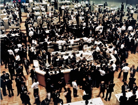
It began in 1990, we’re told, when he saw a photo of the Tokyo Stock Exchange in a newspaper and decided to shoot one like it himself during a visit for a group show. Gursky started scouring the media with his GurskyVision. When he found an awesome image, a spectacle that captured man’s dehumanity to man, his puniness in the face of the vast systems he’s built, he’d set out to have his own Gursky Moment, by photographing it. By rephotographing it. And when the reality he photographed didn’t approach the image in his eye, or in his head, or in his scrapbook, he’d invoke artistic license to alter it. The result is not an idealized, aestheticized version of the world, but of the mediated representation of it.
gursky_99ct_eki.jpg
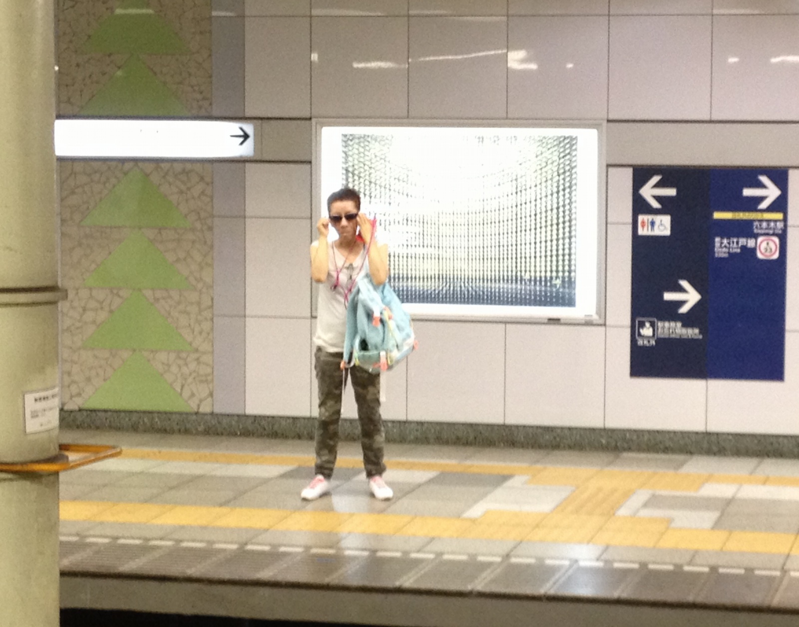
Gursky NACT exhibit ad on Tokyo Metro platform, photographed by ysmn1120
Which may be why my favorite images from Gursky’s Tokyo show are not in the gallery at all. User ysmn1120 shot this Instagram of an ad featuring 99 Cent on a Tokyo subway platform. [Tonotype snapped it too.] It’s spectacular. Exactly where it belongs and for what it is. It is the Ghettoest Gursky of all, and I am bummed I didn’t think of it, that couldn’t find it, and that I don’t have one.
gursky_roppongi_1.jpg
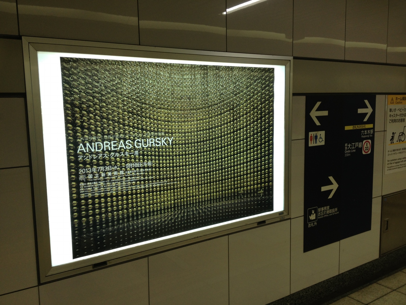
I did find a sweet, domestic-sized lightbox version of Kamiokande at Roppongi, though. It’s a nice nod to Jeff Wall, who exerted an early, formative influence on Gursky’s push into large-format.
gursky_roppongi_2.jpg
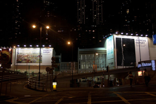
OK, this is sweet. Gursky’s show last year at Gagosian Hong Kong had even bigger billboards, which are included in the gallery’s installation shots. [There were also several little editions. They really are the perfect synthesis of collectibility and pointlessness.]
gursky_billboard_hk_gagosian.jpg
Meanwhile, the Ghetto Gursky project turns out to be much closer to Gursky’s own practice than I initially realized. The only difference being that the imageworld I’m picking from has Gurskys in it, too.

Tokyo Midtown And Out-Of-Town

tokyo_midtown_porcelain.jpg
This was the first untouched old house in the middle of Tokyo I came across on this trip, so it got photographed. I love stumbling across these things; they’re the barn finds of architecture.
This one is especially good because you can go in it. It’s a little vintage porcelain shop. It’s really awesome, mostly untouched inside, too. I’d move in tomorrow. Even though it’s in a kind of disgusting corner of Roppongi, sandwiched between the elevated freeway and Tokyo Midtown.
tokyo_midtown_stanchions.jpg
Speaking of Tokyo Midtown, I love that these little portable stanchions don’t realize the chain’s down and they’re free to wander. [What, you think Japan doesn’t have robot stanchions for responsive crowd control in development somewhere?]
fujimoto_sou_na_curtains.jpg
And speaking of slightly out of town, and tiny, kawaii places I’d move into tomorrow, we went to check out Sou Fujimoto’s NA House. The house’s location is unpublished, but it took all of five minutes to figure it out online. So don’t ask me to tell you.
What’s the point, one might ask, of going to visit a building that has been so widely published, and why take a picture when it’s been so skillfully documented by Iwan Baan?
fujimoto_sou_na_wires.jpg
Because you get to see how someone actually lives in that thing [answer: with lots of curtains], and you get to see it in context. Which, especially in Japan, means surrounded by 1) random architectural noise, and 2) electric power lines, transformers, and poles. I’d go so far as to say that this dense infrastructural web is one of urban Japan’s defining spatial conditions. I wonder if rather than cursing or ignoring it, an architect has ever addressed it in some way? What if you considered it a feature, not a bug?
IRL, NA House’s white steel grid and varied floor planes feel like a barely solidified extension of the criss-crossing mesh thicket in which it’s embedded.

Kusakabe House, Takayama

Just got back from a 2-week trip to Japan. Though we spent a lot of time in familiar places in Tokyo and Kyoto, we also took a 2-day trip to Takayama, a small city in the mountains of Gifu-ken, an extraordinary 2.5-hr train ride north of Nagoya.
Takayama retains many Edo-era buildings and streetscapes, which were really great to visit. The Kusakabe Mingei-kan is a large minka, in this case a merchant house in town, originally built in the early 19th century, and then reconstructed after a fire in 1896, is one of the best in town.
While visiting Takayama and neighboring Hida and Shirakawa during a summer break from college, the late great architecture photographer Yukio Futagawa was inspired by the anonymous, vernacular architecture of minka. In the mid-50s, he set off on a multi-year, cross-country trip to study and document these Japanese homes which were rapidly disappearing in the postwar reconstruction boom.
kusakabe_entry.jpg
Kusakabe House was turned into a house museum in 1966. The large public area of the house [above] was for conducting business and receiving guests. Those beams are sick.
kusakabe_irori.jpg
The kitchen is in the rear of this public-facing area. A fire was constantly maintained in the sunken hearth, or irori; the heat and smoke helped preserve the wood from insects and moisture damage. That crazy, gnarled hook is called a jizaikagi.
kusakabe_table.jpg
Pivoting 180 degreess from the top photo are the more private rooms of the house, including this amazing block table and chair set.
kusakabe_table2.jpg
Do want. Or do want to make.
kusakabe_fusuma.jpg
There are a couple of small gardens and these corridors. I took this looking back toward the streetside of the house.
kusakabe_cutouts.jpg
Above the fusuma sliding doors, where I’d call it a transom, are these thick hinoki boards with flower and leaf motifs sawed out. They had to have been done by hand. Aha, they’re called ranma, which means the space between columns. These turn out to be pretty simple designs, as far as ranma carvings go.
kusakabe_yanagi.jpg
The second floor and the 2-story storehouse in back have collections of mingei: lacquerware, basketry, tansu–and Sori Yanagi’s Butterfly Stool.
kusakabe_plan.jpg
On the way out I noticed this panel, which I thought was blank, but which turns out to be the builder’s blueprint for the house. It’s also visible in the background of the irori picture, under the horse.

Called It: Facebook For Google Maps, By Frank Gehry

lockheed_burbank_camo_det.jpg
From 2009, The Roof as nth Facade, about Google Maps-optimized architecture:

Maybe the next Bilbao Effect, sure to appeal to striving cities in these difficult budgetary times, will be to commission grand architectural designs purely for the benefit of the Google Maps audience. Like the rural streetscape camouflage which was applied to the roof of the Lockheed airplane factory in Burbank to thwart Japanese bombers during WWII, cheap, easy, flexible Potemkin roof structures could really put a town on the map, so to speak.

It seems so long ago, but in architecture terms, I guess four years is pretty quick. I just didn’t think it’d be Mr Bilbao Effect himself, Frank Gehry doing the camouflaging. And of course, it’s not the city, but a giant corporation, Facebook, the Lockheed of identity, that’s doing the hiding.
gehry_facebook_hq_roofgarden.jpg
Here is a detail of a model of the Menlo Park building Facebook asked Gehry to design. From Dezeen in April:

Early proposals for the campus, which was given the go-ahead by Menlo Park City Council last week, envisioned a bold, curving facade reminiscent of well-known Gehry buildings such as the Guggenheim Museum in Bilbao.
“They felt some of those things were too flashy and not in keeping with the kind of the culture of Facebook, so they asked us to make it more anonymous,” said Craig Webb, a partner at Gehry’s practice.
“Frank was quite willing to tone down some of the expression of architecture in the building,” he told the Mercury News, explaining that they plan to disguise the white stucco building with a rooftop garden: “Our intent is that it almost becomes like a hillside, with the landscape really taking the forefront.”

Or at least the appearance of landscape, on the roof of your 400,000-sq ft. relationship processing facility.
nbbj_google_greenroof.jpg
It’s worth noting that this green-roof-as-park approach is being used by NBBJ for their new office complex–for Google. Google is hiding from Google Maps, too. As Sam Jacob writes at Dezeen, “Though its appearance is closer to an average business park, it too has its roofs littered with green stuff.”
There are obviously many environmental and energy-use-related benefits to a green roof. But they also serve to mitigate the appearance gap between the “average business park” and the powerful technology companies inhabiting them. Invisibility through greenery, melting into the landscape, these are time-tested tools for managing an architectural first impression, as in bucolic renderings designed to mollify local land use and governmental constituents, or the landscaped, sculpture-filled approaches to the corporate HQs of the 1960s. Now every visitor’s first encounter with the buildings is when they look them up on Google Maps. And now they’ve got those covered.
lockheed_burbank_camo2.jpg
And though I didn’t grasp it at the time, it’s no surprise that these particular companies are the clients trying to become “more anonymous through these hillside camo roofs:

On the one hand, it seems obvious that this vast, global audience [on Google Maps] should be factored into the creation of architecture. But on the other, it seems absolutely insane to design a structure, a space, for people who won’t be anywhere near it, but sitting in front of some screen on the other side of the world.

Because the target of their disappearing act is their own users. Just as malls hide acres of parking lots behind roadside shrubbery, Google and Facebook are hoping their park-like roof facades will keep us from noticing the extent of their corporate footprint, and their relentless sprawl across our online landscape.
Previously: Heads Up: Roof as nth Facade [greg.org]
images via Sam Jacob’s Dezeen op-ed, ‘Cities are being redrawn according to Google’s world view,’ which, right? you’d think, but ends up going in a completely different direction. [dezeen]

If You Haven’t Seen It, It’s New To You

Mishka Henner, 2011:
mishka_henner_dutch_lndscp.jpg
image via ICP Triennial 2013, curated by Kristen Lubben, Christopher Phillips, Carol Squiers, and Joanna Lehan.
greg.org, 2009:
noordwijk_gmap_camo.jpg
“Dutch Landscape Paintings”
The population of Noordwijk, its visitors, and users of Dutch Google Maps since 2006:
gmap_noordwijk_2007.jpg
image via gridskipper.
Peter Halley, 1980:
Halley_Feuer_Abelow.jpg
Jacob Wrestling With The Angel, 1980, as seen in Jew York, at Zach Feuer Gallery, image via Joshua Abelow’s Art Blog Art Blog. Which I had never seen.

On James Bridle At The Corcoran

bridle_nasm_drone_corcoran.jpg
James Bridle of the New Aesthetic and Dronestagram Bridles opened a show at the Corcoran this evening, and I attended. It was the first time James and I have met in person, after several years of blogging at each other.
The show itself is small and drone-centric, containing a grid of Dronestagram images and Google Map dronespottings, but also video, a 10-volume printed excerpt of a UAV-related webcrawling database project in development, and Bridle’s classic drone identification kit [below].
bridle_dronekit_corcoran.jpg
The most stunning and disturbing image in the show is a realization Bridle made of the “Light of God,” a nightvision goggle-eye view of a targetting laser descending from the heavens. It’s based on a drone pilot’s commentary in an Omer Fast video, and it’s gorgeous, eerie, and chilling as hell.
During his talk in the adjacent auditorium, Bridle began by mentioning how he is compelled to make physical the things he studies. His most powerful piece, the life-sized outline of a drone drawn on the ground, is an excellent example of this.
In answer to one of the last questions, about materialist formalist dialectic, Bridle noted how he often found himself making an object of something from the network, in order to photograph it and reinsert it into the network. The Corcoran show feels like this: a physical instantiation of digital content.
The idea for the show, or particularly, for Bridle to be the go-to guy for such a show, more than just The New Aesthetic Guy, but certainly that, came from the Corcoran’s IT department, said the curator who introduced the evening. I will choose to take this as evidence of the Corcoran’s cross-disciplinary innovation and flat organization, not as a sign of a vacuum at the top of the institution. Anyway, the whole affair seems closely linked to the school side of the Corcoran, i.e., the still-functional side. The crowd was crowded, and felt student-heavy.
Anyway, James Bridle. Bridle noted that we in Washington are lucky to have a real Predator drone in our midst, right there at Air & Space Museum. It is exceedingly rare, he said, and he would know, to be able to be in the presence of an actual drone. They’re either largely invisible, or they’re bearing down on your village. And there’s one hanging on the Mall.
bridle_drone_dc_corcoran.jpg
And now there is the shadow of one, the outline of one, really on the sculpture pad of the Corcoran. That’s how it’s described, as being sited on the sculpture pad. Obviously, it doesn’t begin to fit on the sculpture pad. It’s painted on the pad, the rocks, the curb and sidewalk, with white paint of some no doubt temporary kind.
It is much bigger than you might imagine, which is exactly the point. That, and imagining it being overhead and casting a shadow on the ground, the thing a Pakistani wedding party might see right before the missile hits.
Bridle noted as to how not many people will get to see this privileged view from above. I would note that White House staff in the Eisenhower Old Executive Office Building will get to see it every day, and that right there is quite something.
But he’s right, and it underscores his point, that the drone outline reads quite differently from the ground. It’s not Nazca Lines different, but that’s the sense of it.
I asked James later how he’d decided which way to point the drone. There was really only one good way to fit it, he said, and also, he knew he didn’t want to aim it at the White House. Which is understandable. When he installed his first drone drawing in Istanbul, Bridle similarly made sure not to aim the drone at Mecca. In consciously not aiming at the White House, Bridle’s drone ends up feeling like it’s coming directly from the White House. Which probably intensifies its critical position a bit. It worked for me, at least.
In between these moments was a cogent, timely, and depressing talk about technology as a tool of control and a reflection of the political and social systems that foster and use it. If it was recorded or streamed, I will try to find a link.
Meanwhile, as I walked around the drone on my way home, I did think of one piece missing. Not to tell James how to do his job or anything. But it occurs to me that the sound of drones is distinctive and terrifying. Perhaps a sound element to recreate the perpetual presence of drones in the vicinity of the Corcoran, would provide a visceral experience. Who knows, it might even wake the neighbors.
Indeed: Corcoran College of Art & Design: Quiet Disposition by James Bridle, through July 7, 2013 [corcoran.edu]

Mari X IKEA: autoprogettazione by greg.org (2010)

Three years ago, I was thinking about what to do with the posts I’d written about the project I’d begun six years ago. Which I guess means it’s time to release the results.
mari_x_ikea_gregorg_cov.jpg
So here’s Mari X IKEA, a PDF compilation I made in 2010 aboutfmy 2007-09 project to construct an Enzo Mari autoprogettazione table out of Ikea furniture components.
I was not entirely pleased with the way it read all together, and so I didn’t publish it back in the day. But I realize now that my inner archivist and inner editor will never agree on things, and I/we are becoming OK with it. So the tabloid-style publication contains all the original blog posts and images documenting the project, and that includes a fair amount of recapping and repetition. Meanwhile, my inner publicist wants to emphasize that this is not a bug, but a feature, like the catchy chorus of a song.
I’m still quite stoked about the project–and the table, for that matter, which I am using at this very moment–and it continues to influence and inform my thinking about stuff: art, design, originality, authorship, authority, appropriation, systems, craft, utility. So I’m very happy to get information on the project out there in a more easily consumable format.
I should also give a shoutout to The Newspaper Club, the amazing publishing company, then just starting out, where I had originally contemplated printing Mari X IKEA in 2010. This PDF was made using their easy publishing/layout tool. And though I ended up not pulling the trigger on this particular project, they regularly make me want to turn this blog, and many other things, into a newspaper.
Mari X IKEA: autoprogettazione by greg.org, 2010 [PDF, 2.8mb]

Hot Favela Messe: Basel Riot Police Raid Protest Party In Tadashi Kawamata Cafe

kawamata_police_basel_tw.jpg
How is Tadashi Kawamata’s Art Basel Favela like a real favela? It’s built on public land, gets inhabited by people who don’t have legal permission to be there, who are tolerated or ignored for a while, and who then get attacked and dispersed by riot police when someone with power decides it’s time for them to go.
The details are still not clear to me, but Tages Woche reports that on Friday night, Basel police raided an outlaw party that had occupied Kawamata’s Favela cafe, firing tear gas and rubber bullets into the small crowd.
kawamata_police_raid_tw.jpg
It appears that an event organizer had erected a favela DJ booth of their own, and were presumably protesting Kawamata’s use of favelas to serve luxury falafel [at “reassuringly exclusive prices”] to visitors at Art Basel last week.
The event, or happening, or protest, seems to have been low-key. According to Tages Woche, Kawamata’s collaborating architect Christophe Scheidegger met with the protestors, and they were allowed to stay for a while. Police and Art Basel officials decided to clear them out at 10pm, declaring the noise levels illegal, and that continued occupation of the favela–in the public platz, which had been rented by Art Basel–would be considered trespassing.
kawamata_police_messe_tw.jpg
And that’s when, holy shit, it looks like they sent an assault force straight to the DJ favela to end the music and scatter the crowds with pepper spray and rubber bullets. Police established a perimeter, ended the party, kicked a few people on the ground, and then retreated back into the new Herzog & deMeuron Messe [above].

Tages Woche has a video of the attack shot from the parking garage [The embed above is from LiveLeak, but it’s on Vimeo, which won’t embed, and on YouTube, which, honestly, someone put an age-related content warning on? Is this an anti-viral video tactic?], though it’s edited in a way that does not make it so clear what exactly preceded, and may have precipitated, the use of violent crowd control tactics. [The editors and reporters wrote a followup post addressing the circumstances of shooting the video.]

But this unedited YouTube video posted by Gab Kae tracks around the entire platz, and captures the police raid from within Kawamata’s own favela. [It comes at around 2:20.] If there’s anything at all that justifies such an attack, I can’t see it. For these people hanging out in front of Art Basel, abuse of power came as a baffling surprise.
UPDATE greg.org reader Arthur points to another Tages Woche video, uploaded yesterday, which was taken on the ground, right next to the police, and which shows preparations for their assault on the party/protest.
In addition to the donkey, which had been part of the initial protest, the video features this nice, white-haired lady drinking a tallboy who, upon consultation with the officers, decides it best to move her chair out of the way.

After literally receiving their marching orders the Basel police head straight for their target. Which, this video makes clear, is the thumping sound system. Just watch that amp skittering out across the platz at 1:40. Obviously, the music demanded a forceful response, and any human casualties, injuries, or abuses, must be considered collateral damage and entirely unintentional. You know how it can be when techno dirtbags crash your party and won’t leave.
Video: Gewaltsame Polizeiräumung am Messeplatz [tageswoche.ch]
Basel Favela Occupation [artreview]

The Xerox Book, Infinite Loop

I have restaged one of Seth Siegelaub’s most influential shows, the 1968 The Xerox Book, as a series of animated GIFs [my 1st through 6th animated gifs, btw]. If only Seth could’ve been on infinite loop, too.
Siegelaub_Xerox_front.jpg
Frontispiece of The Xerox Book, 1968, organized by Seth Siegelaub and John Wendler
Primary Information has made an incredible collection of publications from Seth Siegelaub’s archive available online. That’s where The Xerox Book images came from. [pdf]

Continue reading “The Xerox Book, Infinite Loop”