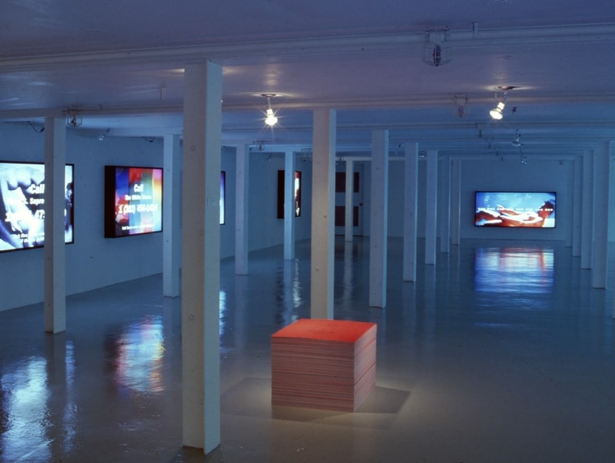
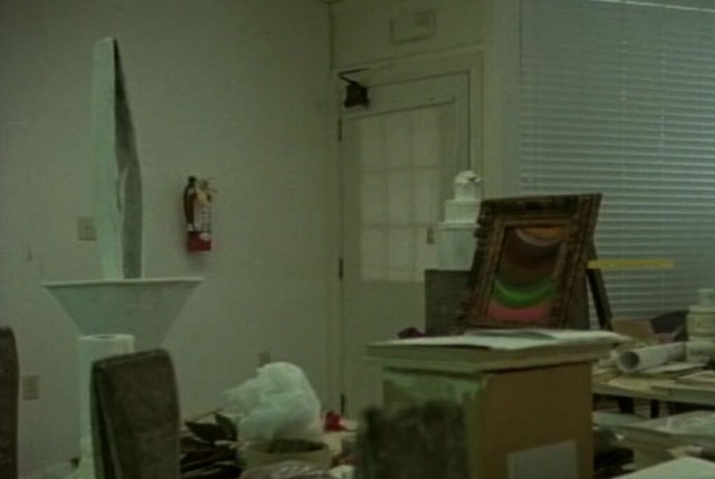
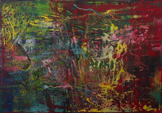
installation view of Strange Ways: Here we come, Felix Gonzalez-Torres and Donald Moffett, at the University of British Columbia, Vancouver, Fine Art Gallery in November 1990, image via FG-T Fndn
Maybe it’s the passage of time, the advancement of discourse, the writing and thinking about it for so long, the engagement with the work and history of an artist who wrote so emphatically, that he’d always believed artists were allowed “to do whatever they please with their work.” Or maybe it’s the moment, when something I’ve seen and written about before looks different. And when something I’ve read a dozen times before finally sinks in, maybe because now I’ve had that same experience.
“I’m not afraid of making mistakes, I’m afraid of keeping them,” Felix Gonzalez Torres told Tim Rollins in 1993.
Andrea Rosen put that quote in context in her CR essay [pdf], and how Felix’s decision to not have a studio meant the first time he’d see a work realized was when he installed it in a gallery: “Putting the work in public immediately allowed him the opportunity to sense if he felt confident about his decisions. From time to time Felix would decide that he did not feel strongly enough about a piece to have it remain a work, even if it had already been exhibited.”
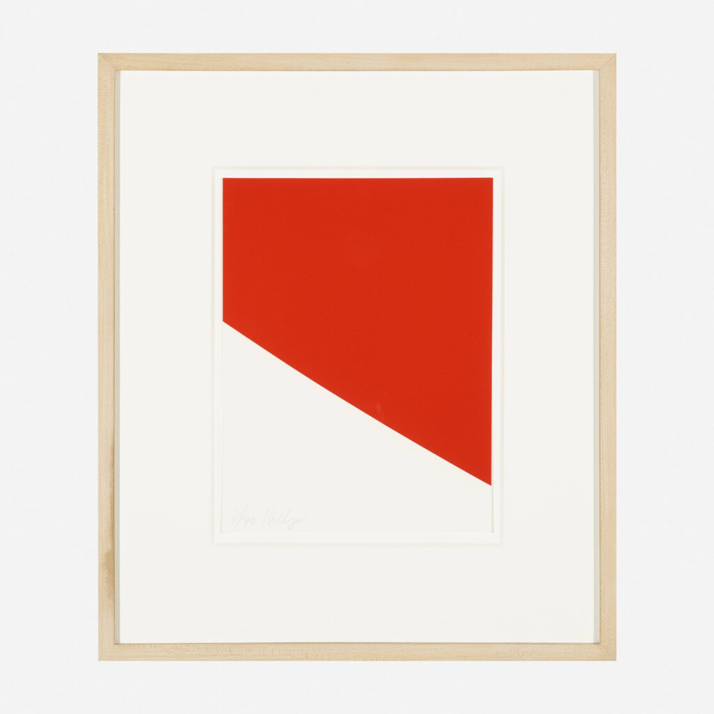
In the show it felt impossible to do more than sense the differences between the two installations. It seemed that, in the absence of a subject named in parentheses, this was a portrait of the artist himself, but the variety of posthumous additions made it non-obvious. So we left with questions: How was this portrait adapted for this dual/triple version? Besides the title, how [else] was it different from the others? If it was indeed a self-portrait, how did this portrait practice come to be?
Helpfully, the Felix Gonzalez-Torres Foundation collects documentation of each version as it is installed. As the first portrait [sic] that was, indeed, a self-portrait, which was in Andrea Rosen’s collection [The AIC got it in 2002], “Untitled” (1989) may be one of the most frequently exhibited; the documentation for [at least] 42 versions runs to 17 pages [pdf].
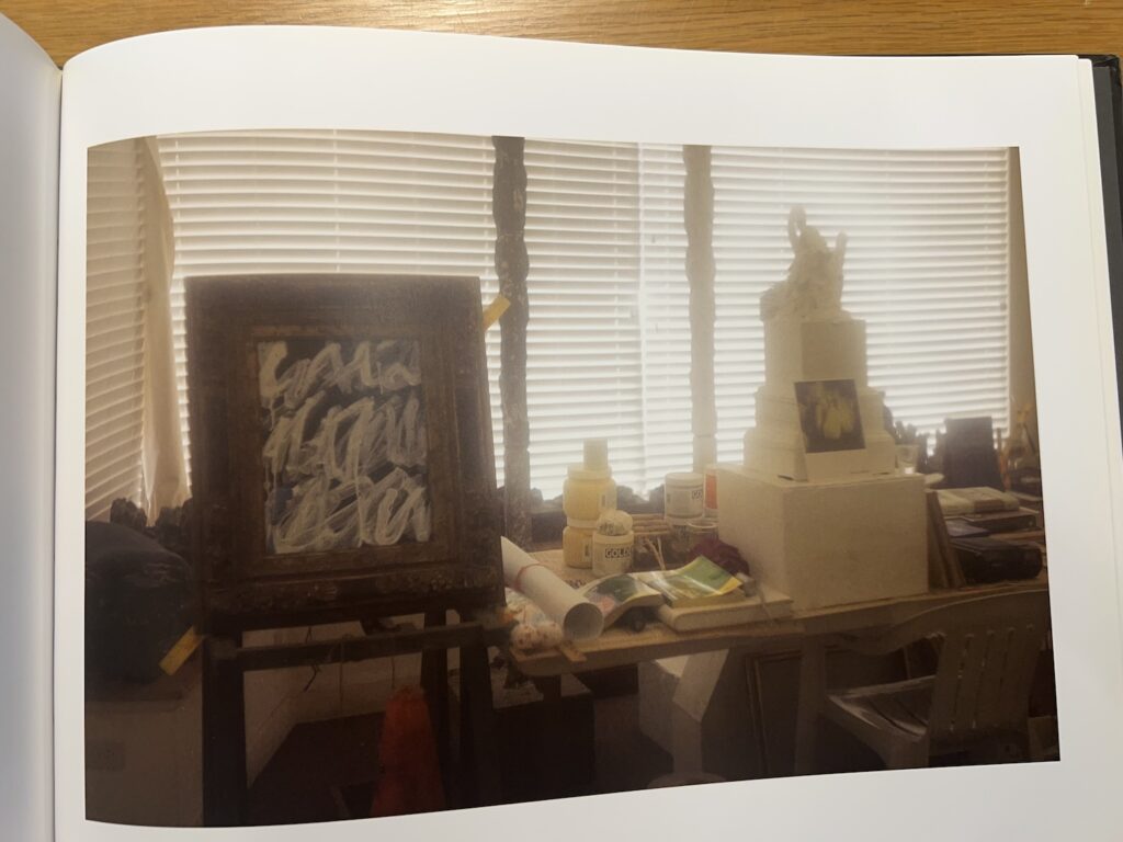
Sally Mann photo of Cy Twombly’s Lexington Studio from Remembered Light
Looked through Remembered Light: Cy Twombly in Lexington, Sally Mann’s 2016 book of photos of Twombly’s places, for the first time the other day, and saw this. A perfect little painting in a fat, baroque giltwood frame in his cluttered storefront studio.
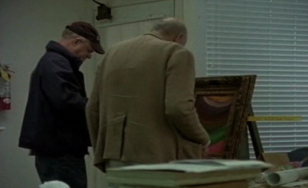
But this is not just any perfect painting. [I don’t actually know what painting it is, tbh.] I just know it was a major plot [sic] in Tacita Dean’s 2011 film, Edwin Parker.
Maybe plot is a little strong. In her quiet, attentive film Dean doesn’t follow Twombly around so much as just be where he is, and observe. And for most of the film, he’s in this little studio. The first action or narrative drama, such as it is, involves a painting that has fallen out of this picture frame, and Twombly tries to fix it. The two men with him—first, Butch, his local assistant, and then Nicola Del Roscio—alternately hover and jump in to help with tape and a tape measure.
detail of a screenshot from Tacita Dean’s Edwin Parker, 2011
When I had a review copy of Edwin Parker like ten years ago, I got kind of fixated on this painting, wondering what it was, where it was, and taking grainy screencaps so that I could track it down.
When the Hirshhorn was wrapped in his giant curtained scrim, the swag and slightly lurid colors made me worry Twombly’s painting was by Nicholas Party. When I was making Facsimile Objects about inaccessible Dürers in German museums, I wondered if it was the freely painted verso of something more mundane.
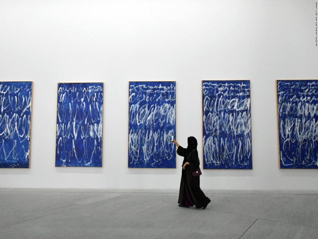
Later in the film, Del Roscio is holding the blue & white painting up top, flipping it around, as Twombly says it’ll fit in the frame. It looks like it’s related to the series of paintings Twombly made for the Louvre in 2008, as part of his ceiling deal.
installation view of Cy Twombly’s Untitled I–IX, 2008, at the Louvre Abu Dhabi, screenshot via CNN
So the plot, such as it is, involves the swapping out of one painting for another. Technically, this climax does not happen in Edwin Parker; Del Roscio is only shown setting the little painting carefully against the wall.
Whether that makes Mann’s photo a spoiler, a sequel, or just a post-credits teaser, I cannot say. All I know is now I have two little paintings to track down.
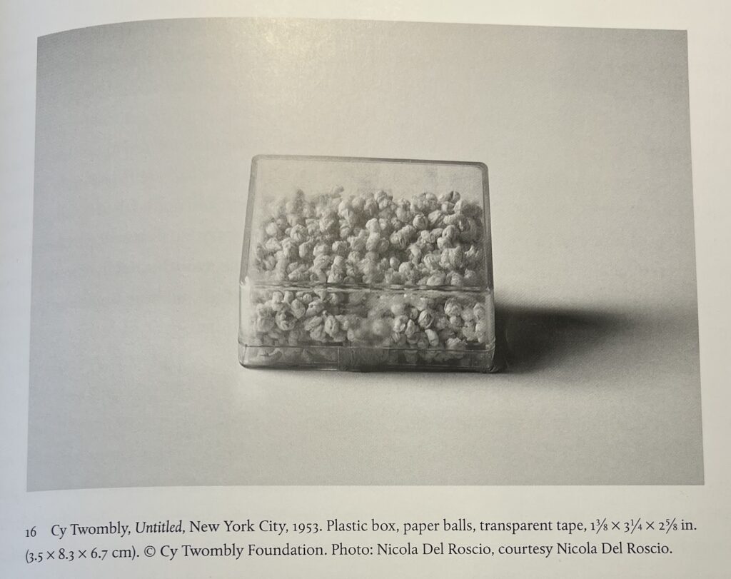
Twombly, Get me some tissue: Cy Twombly, Untitled, 1953, paper balls in plastic box, tape, 1 7/8 x 3 1/4 x 2 5/8 in., as published in Katie Nesin’s Cy Twombly’s Things (2014, Yale Univ. Press), photo: Nicola Del Roscio himself [!]
A lot of Twombly tabs open, as is the custom. After watching Art Institute curator Katie Nesin’s lecture about it, I checked out her 2014 book, Cy Twombly’s Things, an art historical close read of the artist’s sculptures.
Nesin examines at great length Twombly’s practice of painting his sculptures. It’s something Twombly referenced in one of his few artist statements, and which curators addressed, too. I know what they all mean, I really do, and so do you, but it is really hard to read statements coming straight outta Lexington like, “The reality of whiteness may exist in the duality of sensation (as the multiple anxiety of desire and fear). Whiteness can be the classic sttae of the intellect, or a neo-romantic idea of remembrance—or as the symbolic whiteness of Mallarmé. The exact implication may never be analyzed, but in that it persists as the landscape of my actions, it must imply more than mere selection.” And Kirk Varnedoe talking about “the increasing self-consciousness of his commitment to white,” and Nesin concluding “it is white’s susceptibility to contamination that remains the point,” in 2025 and think it all stays neatly contained in the art box.
Anywho, that’s a dissertation for another day. I mention it because Nesin traces the development of Twombly’s practice of painting his sculptures white with a picture of one of the few, early sculptures he didn’t paint white. Untitled (1953) is white on the inside. It’s a tiny plastic box filled with little rolled up balls of paper. Nesin argues that it’s also “derivative” because its size and nature refer to the scatole personali, the little fetish boxes, objects, and constructions Robert Rauschenberg showed in their two-person show in Florence in mid-March. [In a sharp detour from whiteness, Twombly showed geometric tapestries he constructed from textiles he bought in Tangier.] Which, yes, I see the connection.
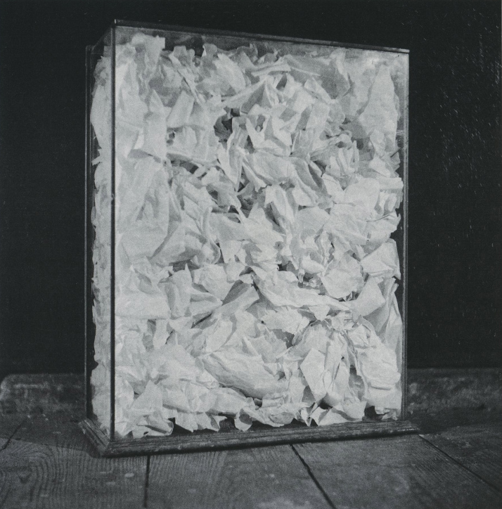
Robert Rauschenberg, Untitled (paper painting), 1953, 18x14x4 in., shoe box tissue paper, glass, wood base. lost or destroyed, or maybe rolled up into little balls in Twombly’s pocket
But there is a closer reference in 1953. In the then-couple’s Fulton Street studio, Robert Rauschenberg filled a glass case with tissue paper from shoe boxes and called it a paper painting. Did Twombly take some of Rauschenberg’s tissues and make them into balls he could keep in his pants? Did they make their his & his tissue boxes together? Whose personal fetish are we talking about, actually? While it’s impossible to say for sure who came first, it does seem likely these two came together.
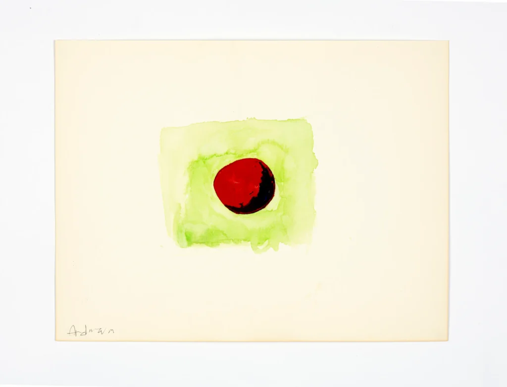
I’ve been listening to Kaelen Wilson-Goldie’s interview about Adnan on Bulaq, the podcast of Ursula Lindsey and M Lynx Qualey (ArabLit editor), and right around 24:00 Wilson-Goldie turns the question back to her book-centric hosts, to ask what they think the complicatedly multilingual Adnan meant by her statement that she “painted in Arabic.”
I would love to know more of the context in which she first said that. Wilson-Goldie, Lindsey, and Qualey talk about Adnan’s shifts from writing in French to English as her perspective and contact with French and US colonialism changed. But also how her return to Lebanon in the 1970s included a mutual embrace with the new Arabic poetry communities of the day.
I can absolutely see the appeal of a painting language that did not carry with it the political baggage, while also making an affirmative assertion of solidarity. Or maybe that characterizing painting as a language separate from the ones she used for writing helped justify it, or at least made it make sense within/alongside her multi-faceted, text-based practice. Or maybe it just gave her the psychological and linguistic space she needed for a personal expression. I’m trying to think of many novelist/poets who were also recognized for their painting, but ngl, my head is not primed for unfettered rumination on poetry today [noon]. Wonder why.
In any case, I feel like I have to rethink my understanding of Adnan’s work a bit precisely because I’d always read it—or seen it presented— as being an Arabic-inflected modernism being subsumed into the larger modernist project. And I have to consider that that could be just how it looks from my perspective in the distended belly of that empire.
[listened to the end of the podcast update: OK, so Adnan had various complex takes on what it meant, and why she did not, in fact, learn Arabic. And I wonder what it means that this was the language she analogized to her painting.]
The startlingly beautiful hues of a tropical Florida Sunset are depicted here in all their splendor and completeness that Cy Twombly didn’t need to add anything, not even his signature, via Maison d’Art
It’s the little differences. Where Marcel Duchamp’s letters to his collector friend Katherine Dreier are all, “shipping is $34, please send me $34,” Cy Twombly’s letters to his collector friend Reiner Speck are like, “we await you in the summer castle.” I have read the Twombly correspondence with noted urologist and Proust expert Herr Dr. Reiner Speck in the catalogue for Maison d’Art’s current exhibition, and here’s the expanded tl;dr:
Have you seen me? Ellsworth Kelly, Tiger, 1953, oil on five canvases, collection, NGA
I was listening to a recording of Ellsworth Kelly’s 1999 Elson Lecture at the National Gallery of Art, and I have some questions. Some could probably be answered by a video of the lecture—more of a conversation, with curator Marla Prather—or with a review of Kelly literature I don’t have.
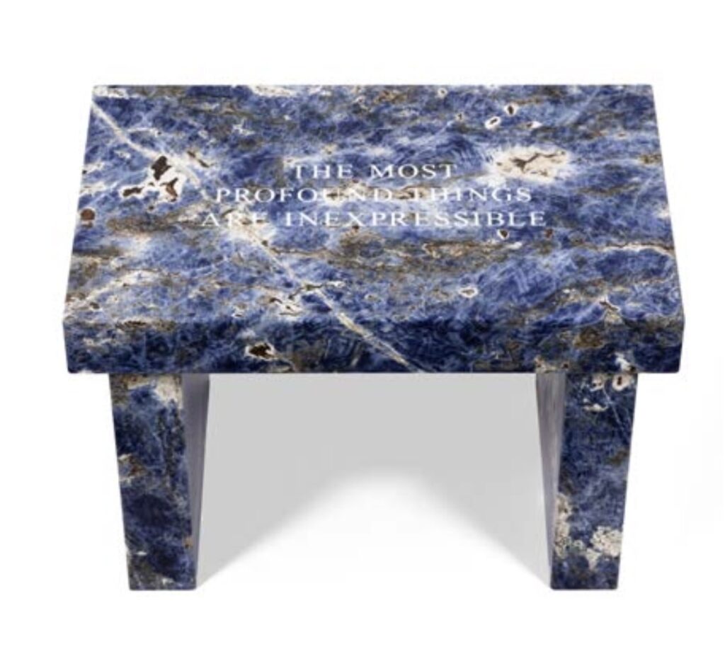
I was not prepared to be taken out a Jenny Holzer exhibition, especially since her most recent show at the Guggenheim seemed so lost. But that was then and there, and this is here—in DC, at Glenstone—and now—in the midst of a fascist crime spree by and against the government.
from the Glenstone extended exhibition guide
It was not the merch in the tiny book nook. It was not the entire gallery of redaction paintings—enlarged, oil-on-linen facsimiles of damning documents of the torture and atrocities of Bush’s Iraq war—though I really do wish this country would not give Holzer quite so much content to work with. Turns out abuse of power comes as no surprise because it happens over and over and over.
from the Glenstone exhibition guide
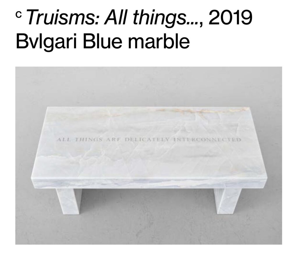
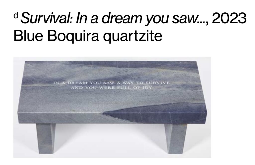
It was the next gallery of the private museum sanctuary, with the large window onto an artfully crafted vista, where Holzer crashed a tsunami of opulence over my unsuspecting head. It was all benches and paintings, not an LED ticker or a bumper sticker in sight. The benches in Blue sodalite. Bulgari Blue marble. Blue Boquira quartzite. Persian travertine and Silver Wave marble. Paintings large and small, single and in rows, cinnabar and lacquer finishes covered in copper and gold leaf, glowing in the morning sun. The extravagance of Holzer’s materials was so relentless, it was wretched. The polish, the weight, the preciousness, the hand, the logistics, the overpowering beauty impossible to ignore.
Wait, Ursula made a screenshot of the installation image from the 2002 Artforum critics’ picks of David Hammons’ Concerto in Black and Blue instead of right-click-saving it? Now I feel like I’m betraying history by renaming the file.
How has there not been more Concerto in Black and Blue content floating around? Do people not go to Hauser & Wirth LA anymore? Is the glow of people recording themselves on their phones ruining it? David Hammons has restaged his epic 2002-3 work in LA. It’s on til June MAY 25. So grab a little flashlight and become the artwork.
oh wait, the original Artforum img is actually beautiful. 2012/12/picksimg_large-6.jpg, 400×301 px. I must make this a work.
Meanwhile, Ursula has a great essay by legendary filmmaker, gallerist and Hammons whisperer Linda Goode Bryant, who filmed the opening night of Concerto in Black and Blue at the vast NYC outpost of Ace Gallery:
He allowed me to be inside for the opening, to make a short film of what happened inside. And what people didn’t know is that David was actually in there himself that night. I only knew where he was because I had a microphone on him. But he was otherwise totally invisible, moving around among everyone else, watching what they did and what they made, present and at the same time absent.
LGB talks incisively about walking and seeing with the artist, and getting hints of how he sees and works. It confirms my theory/suspicion/last-ditch hope that we are in fact living in David Hammons’ world, and often just don’t realize it.
[MAY 2025 UPDATE?? IT REALLY TAKES UNTIL MAY?]Nereya Otieno’s review of Concerto in Black and Blue explains the online silence and invisibility of Hammons’ extraordinary show: You have to bag your phone to enter. She did manage to get installation shots, though. And in some places Hauser still says it runs through June 1, and others say May 25, so don’t get stuck missing it.
Hammons Sotheby’s Bag Lamp coreyvscorey-screencap
Meanwhile, the book finally documenting Hammons’ sprawling 2019 show at H&W LA is out now, not in May, which means the lamp with the Flavin X Sotheby’s shopping bag lampshade I had to scavenge screenshots in the backgrounds of peoples’ youtube videos like a dog to see is now beautifully photographed on its own.
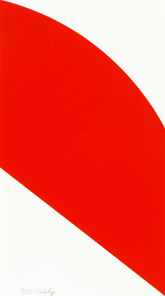
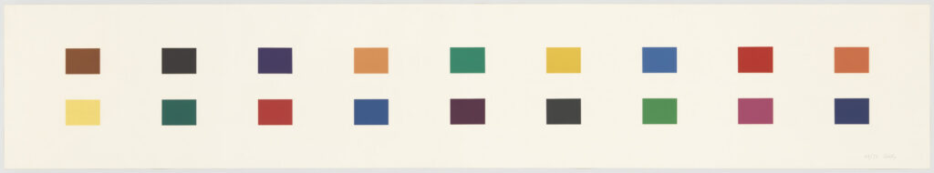
Ellsworth Kelly, Red Curve, 2006, lithograph, 12 x 6 3/4 in., ed. 100, plus 20 ap and 18 sp, this one via Bonham’s
While poking around the Gemini G.E.L. CR, I was surprised to find that River II (2005), one of Ellsworth Kelly’s superlong prints, was also his second to last print made with Gemini.
I’ll have to check the Kelly prints catalogue raisonné for details—the second edition was published in 2012, but Kelly sure seemed booked and busy right up to the end in 2015.
It’s also a surprise because the last print he made with Gemini was maybe his smallest ever. Red Curve (2006) is a single color lithograph, cropped so the shape goes right to the edges and the corners of the 12 x 6 3/4 inch sheet.
Red Curve was published for Kelly’s show at the Serpentine Gallery, a cheap, unframed edition of 100. I feel like it was easily under GBP1000, and at the time, it didn’t even seem real somehow. Now it is fascinating and formally intriguing, especially after the other full-bleed prints he’d just made, that resonate between print and object. Also it’s utterly adorable.
later this afternoon update: I went through the CR, published in 2012, but it does end in 2008. I feel like if there were more prints coming, they could have fit them in. So what seems like the last last print for Kelly was a large (48 x 130 in.) version of Blue Gray Green Red. He went big, then he went home.
Ellsworth Kelly, Red Curve (for Parkett 56), 1999, 10 x 7 1/2 in., lithograph, ed. 70, this one sold by Rago in 2021
The only smaller edition, though, might be Red Curve (1999), which he made for Parkett, which is 10 x 7 1/2 in. And for the 1973 Works By Artists in The New York Collection for Stockholm portfolio, Kelly made an untitled black on white screenprint that is 12 x 9 in. And while there are a couple of similarly sized Concorde etchings in the early 1980s, they’re on traditional, larger sheets.]
Ellsworth Kelly, Blue Curve (Axsom 281), 1999, 8 x 6 in., litho on rives, via nga/gemini
[July 2025 update] Actually, after my systematic search through the Gemini and prints CR, I missed posting Blue Curve (1999), the next one (Axsom No. 281), which was even smaller—8 x 6 inches—and which was published in an edition of 220 to benefit the Archives of American Art.
Rather than delve into why Kelly stopped, or what the very last prints mean, Richard Axsom, the prints CR editor, looked at what was there: a complete, ambitious, and exceptional project, and said, “River is a great summa to Kelly’s prints.”
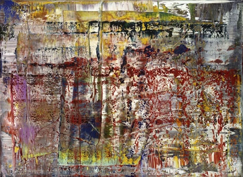
Gerhard Richter, Abstraktes Bild (CR 724-4), 1990, 92 x 126 cm, image via gerhard-richter.com
Once every 36 years, a new Gerhard Richter squeegee painting comes along that changes everything. For a long time it was (CR 724-4) (1990), which went on to become at least eleven editions, two artist books, four tapestries, a Facsimile Object, all the Strip paintings, and a movie. (CR 724-4) has been in fourteen museum exhibitions, including all the venues for Richter’s biggest retrospectives at MoMA and Tate Modern, and his COVID-shortened show at the Met.
Gerhard Richter, Abstraktes Bild (CR 946-3), 2016, 175 x 250 cm, image via everywhere and gerhard-richter.com
Now there is (CR 946-3), a 2016 painting that’s already been exhibited six times, including Richter’s last show at Marian Goodman in 2020, and his Foundation’s extended loan to the Neue Nationalgalerie in Berlin, where it’s on view through at least 2026.
The Spring 1984 newsletter for Crown Point Press [pdf] was notable not just because it was the first in two years. Or because they reflected on their 20th years of enabling contemporary artists to engage with intaglio. Or because they announced their principled expansion into woodblock prints through a collab with master artisans in Japan. Or because they launched their artist-designed silk lingerie collection, which, well. Or because they got a computer, and a new sales director. Actually, let’s stop there and have CPP director Kathan Brown expand on that:
One thing (totally unexpected) the computer has done for us is uncover fraudulent activity perpetrated by our former Sales Representative, Thomas Way. We have a warrant out for his arrest in connection with the theft of many prints. It appears now that he even took home some rejected prints during projects before the printers had a chance to destroy them. These were Diebenkorn’s and the RD signature was easy to forge-one print that we have recovered was even hand-colored (not by Diebenkorn)! Way apparently had a side business going the whole time he worked for us. If you bought anything from him personally, or have any other information, please call.
So wow, while it seems slightly wild to put the guy on blast like that, I guess that’s how print market justice worked in the 80s? Brown’s letter to the editors of Print Collector’s Newsletter ran in the May-June 1984 issue, and contained more details of the caper and the hot, forged prints:
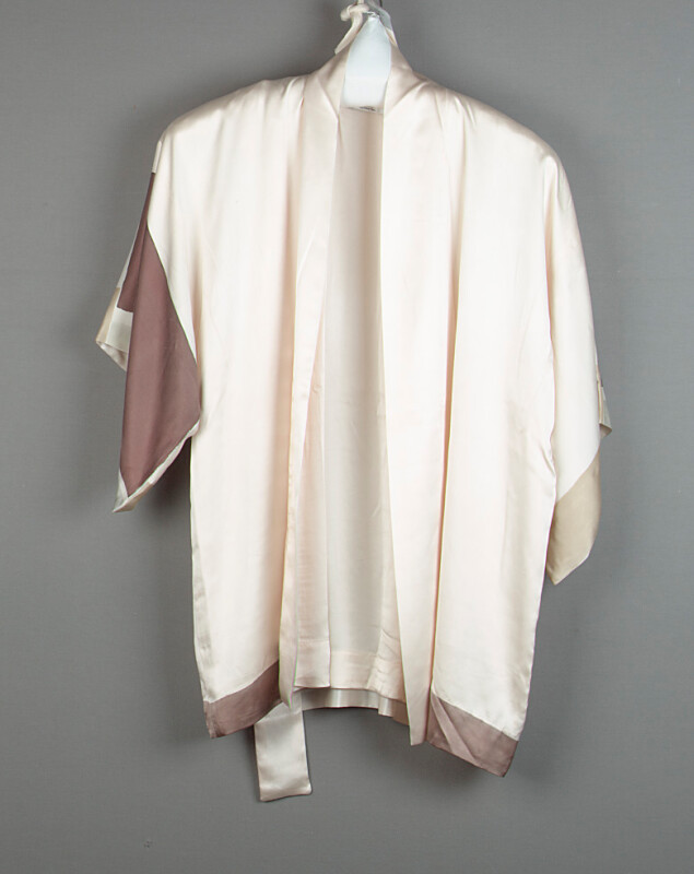
John Cage Kimono and Sash, 1982, hand-painted silk, published [sic] by Crown Point Press, via FAMSF
Is it really chance operations if a seemingly tangential Google search leads me to The John Cage Kimono?? From the Crown Point Press Archive, a gift to the de Young and/or Legion of Honor Fine Arts Museum of San Francisco?
And then an immediate follow-on search turns up the Crown Point Press Spring 1984 newsletter [pdf] which, the contemporary editions drama! I’ll get to the computers and fraud later, but first the “lingerie business”:
Robert Rauschenberg, Untitled (from Features from Currents), a 26-print portfolio, 1970, 40 x 40 in. sheet, being sold in April 2025 at Wright20
Though Our Most Important Art Historians disparage the practice, I could not resist zooming in to read the specific newspaper clippings that Robert Rauschenberg included in just one his 26 Currents prints. Honestly, I did not expect them to hit so hard, one after the other:
The threat of robots taking union jobs The threat of executives taking union pensions Gas tanker overturned on a freeway causing mayhem WORLD’S LARGEST RATS Birth control Woman’s outfit-shaming A problematic Kennedy A criminal president’s supreme court nominee being exposed as a mediocre southerner whose only firm conviction is white supremacy, getting defended by an unperturbedly anti-semitic republican senator saying, “Even if he were mediocre, there are a lot of mediocre judges and people and lawyers. They are entitled to a little representation, aren’t they, and a little chance? We can’t have all Brandeises, Frankfurters and Cardozos.”
Even the auction itself, a couple of loosies being stripped and sold off piecemeal, feels topical: people don’t buy 26-print portfolios these days anymore than they read newspapers. And yet the politics and the challenges remain the same.

![a google streetview screenshot of the back of a durer painting in the state museum in karlsruhe, germany, which is mounted on a white pedestal in a black and gold edged frame. the back of the painted panel is swirling red green pink blue, pale yellow, interpreted as a slice of agate, and I forget what's on the front. some devotional image of jesus [love him, don't get me wrong, but not the point rn] the gallery floor dominates the image; it is strip wood. the walls are pale grey with a dark grey stone baseboard. google streetview cruft and ui elements abound obv](https://greg.org/wp-content/uploads/2021/03/durer-ecce-homo-verso-google-streetview-1024x717.jpg)

![a robert rauschenberg screenprint of a collage made of clippings from newspapers in 1969, includes [clockwise from top left] a photo of cars stranded in the snow; a white woman in a miniskirt with a longer skirt drawn over her; a comet; ted kennedy, some racist judge nixon tried to put on the supreme court who eventually got voted down because twelve republicans still had enough conscience left to be shamed over unalloyed white supremacy, can you even imagine? anyway, several articles and photos of gm assembly lines and the threat of robots and depleted pensions; a chevron tanker truck overturned on a freeway; a hand holding a case of birth control pills; a sideshow entrance with the world's largest rats; a coal mining ship and a truck being craned onto a ship; more assembly line; and a ship docking on the hudson pier. from the 26-print portfolio known as Features from Currents, being sold at Wright 20 in apr 2025](https://greg.org/wp-content/uploads/2025/03/rauschenberg_currents_portfolio-wright20-202504-283-1001x1024.jpg)