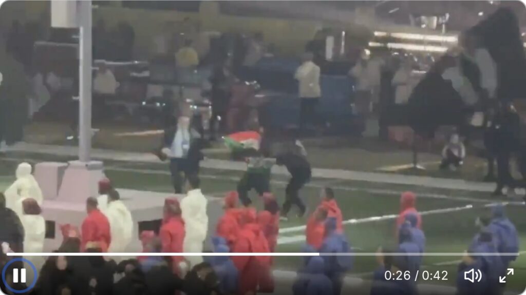
The first video I saw of the dancer in the Super Bowl halftime show breaking the choreography and unfurling a Palestinine/Sudan flag is still the most jarring. He runs around unimpeded with his flag, joining the crowd of flag wavers during Kendrick Lamar’s performance, and you can imagine him hatching plan in rehearsal. Seeing the A Minor flags, and Lamar’s mic drop ending where he stands amid a field of Black men in red, white, and blue gear, forming a giant American flag around him, and asking, “What flags are missing? Which flags aren’t being raised at this moment that should be?”
The chill comes from the end, though, where suited security agents tackle him while a grid of focused dancers continue their stepping in the foreground.
The next morning, the AP’s report of the incident, which did not make it onto the main broadcast, said the individual had been detained by New Orleans police while “law enforcement is working to determine applicable charges in this incident.”
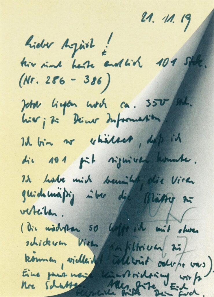
And here I thought that Gerhard Richter’s critique of the art market by making an offset print in an open edition was surpassed only by his using the prints as note paper. Claudio Santambrogio is much better than I at deciphering Richter’s handwriting, and he figured out the entire note Richter wrote to his dealer August Haseke in November 1969 when he finally delivered the first half of his 1967 open edition, Blattecke. And it is a whole new art direction casting its shadow:
Lieber August, Hier sind heute endlich 101 Stück (Nr 286-386). Jetzt liegen noch ca. 350 Stück hier; zu Deiner Information. Ich bin so erkältet, dass ich die 101 Stück gut signieren konnte. Ich habe mich bemüht, die Viren gleichmäßig über die Blätter zu verteilen. (Die nächsten 50 hoffe ich mit etwas schickeren Viren infiltrieren zu können, vielleicht Tollwut oder so was). Eine ganz neue Kunstrichtung wirft ihre Schatten. Alle gute Euch herzliche Grüße Dein Gerhard
Dear August, Here are finally 101 pieces today (nos. 286-386). Now there are still about 350 pieces here; for your information. I have such a cold, I could sign 101 pieces. I have tried to distribute the viruses evenly over the sheets. (I hope to infiltrate the next 50 with some fancier viruses, maybe rabies or something). A whole new art direction is casting its shadow. All the best to you best regards Your Gerhard
This is not what I envisioned when I mentioned a Felix-like stack, and yet the shadow is cast.
[week later update: these notes and additional related material are now in the Richter Archive in Dresden. Apparently it took Richter three years to work his way through signing the first 739 Blattecke.]
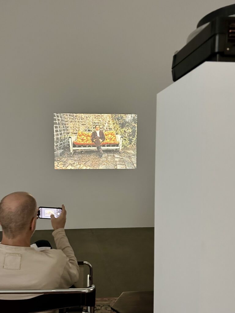
Wayne Bremser has a fascinating tumblr post about William Eggleston’s use of slideshows to exhibit his color photography before he figured out a successful way to print it. Eggleston has been generally credited, along with Stephen Shore, of bringing color photography into the fine art world. But Bremser also gives an important shoutout to Helen Levitt, who was showing her color photos of NYC two years earlier at MoMA—as a slideshow.
The impetus was a show at David Zwirner LA of Eggleston’s “Last Dyes,” the vintage prints using a long-discontinued dye transfer process. Dye Transfer is a whole journey in itself; for me the culminating color achievement of the dwindling print technology was early Liz Deschenes’ monochrome photos. I have not seen a Liz Deschenes slideshow.
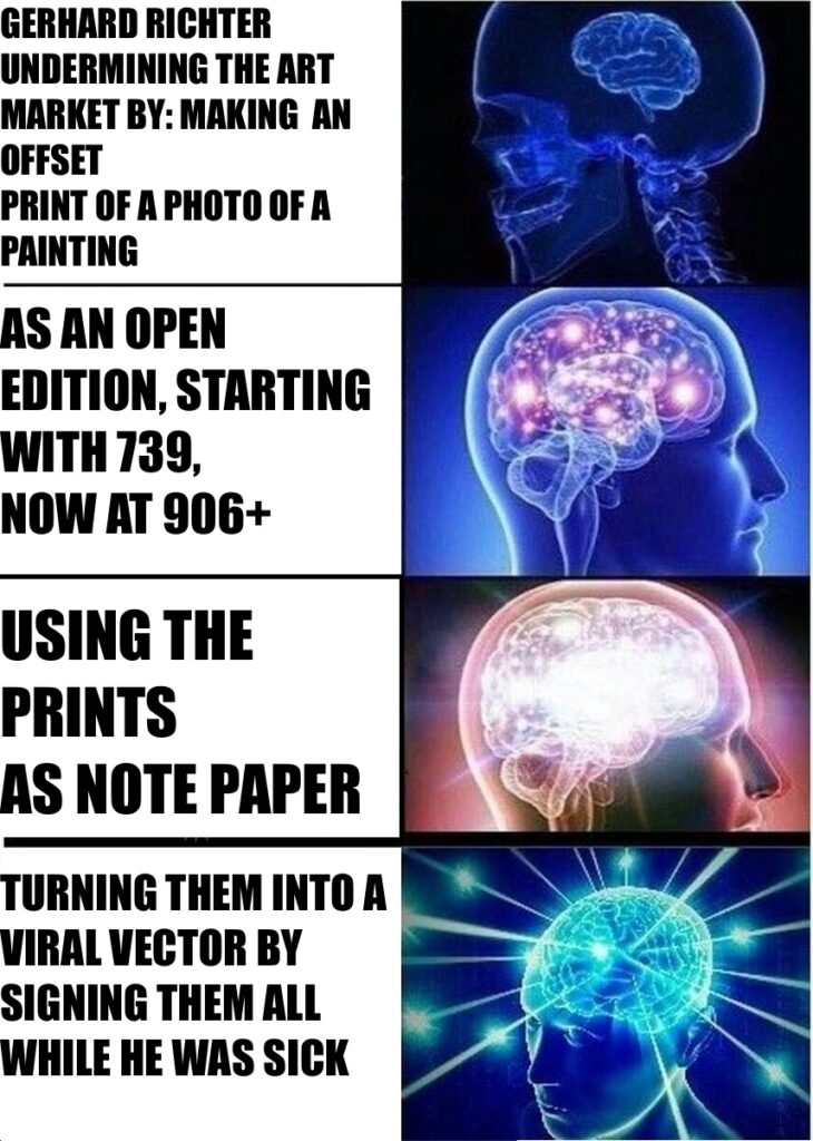
no. 555/739+ of Gerhard Richter’s Blattecke, 1967, sold by a consumer in 2024 at Christie’s
Happy belated Blattecke Tag to all who celebrate. 6.2.67, Februrary 6th, 1967, the date Gerhard Richter signed on most of the 739 examples of Blattecke (Sheet Corner) [Ed. CR 11], the 1967 offset print edition based on a full-scale photo of a little 1965 painting, Umgeschlagenes Blatt (Turned Sheet) [CR 70-2], which was 24 x 18 cm.
739 seems like a pretty big edition already, but Richter conceived of the edition as open and unlimited. How open and how unlimited is not clear. Richter’s website only mentions two additional examples, one dated 15.5.97, bringing the total to 741.
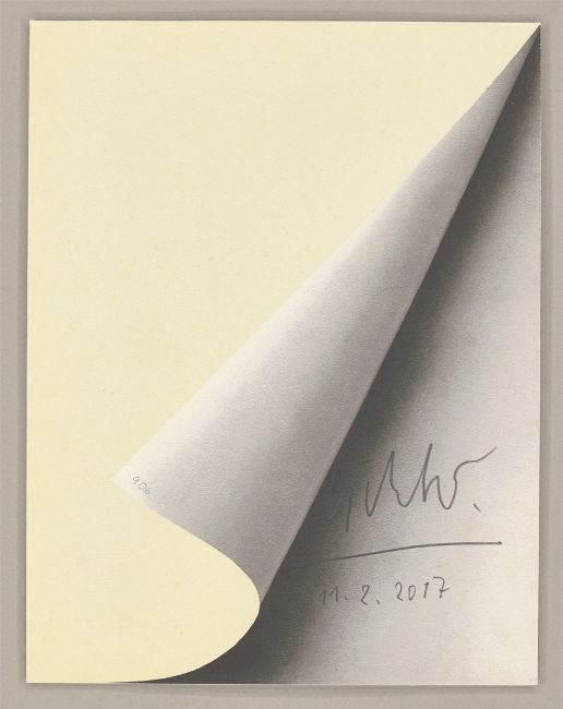
Gerhard Richter, Blattecke, 1967/2017, 232 x 174mm, offset print on cardboard, selling at Grisebach
Well, another post-’67 Blattecke just turned up for sale at Grisebach with a date of 11.2.2017. But in addition to the date, Richter puts the edition number on the corner of the turned up page. So by February 2017, the count was at 906.
A Stanley Brouwn show does not happen every day, and even when it did, odds are you weren’t supposed to tell anyone about it.
But next week, Portal 5 in Tribeca will open a stanley brouwn: in a certain direction, organized by Timothy Y. Hill, of Jonathan A. Hill rare booksellers.
373 Broadway, Suite 511, the Tribeca Spaces Bldg below White and above Ricky’s. You want me to draw you a map? email timothy.y.hill@gmail.com for an appointment.
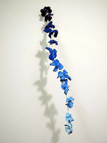
Erik Hanson, Disco Songs I Liked When I was a Punk Rock DJ, 2003, sculpey, epoxy, steel, oil paint 36 x 10 x 16 inches, image via Derek Eller
Speaking of photographs of perfume, in the early 2000s artist Erik Hanson was making sculptures of music. The first one I saw was at White Columns; it was blue stalagmites. Hanson dripped plaster into a stalagmite for the duration of each track on a David Bowie album. The two album sides were made on separate boards, which were then joined, facing each other, into a little box-like cave.
After the study I saw at White Columns—I think it was Ziggy Stardust—Hanson did a show of Bowie’s discography as little caves at Derek Eller. They were elegant, esoteric sculptures whose process was evident, but whose system was embedded in the titles. I’m left writing about sculpture because I can’t find any images online. Hanson made spiral drawings and other sculptural forms with the same durational strategy; the resulting work indexes the artist’s subjective experience of listening—or of making while listening—to a song. The body of work, then, becomes a catalogue of formative musical experience: playlist as autobiography as form, like the 2003 cascade of sculpey flowers above, Disco Songs I Liked When I Was A Punk DJ.
Steve Roden, Nothing But What Is Therein Contained…, 2009, installation view at Girard College, Phila.
This, along with Chris Rusak and Amelia Konow’s Lumen Prototypes, make me think back on the systemic works of Steve Roden. He would devise a scheme, seemingly but never arbitrary, more or less mathematical, subjective or convoluted, and set it in motion to produce one thing from another: text into sculpture, city into sound. One thing I’d forgotten him saying about his 2009 project in Philadelphia, Nothing But What Is Therein Contained, is the importance of intuition within the parameters of the system, as the point, even. And I’d forgotten it in 2009, too.
Chris Rusak and Amelia Konow, Lumen Prototype, 2024, 10 x 8 in, unique gelatin silver print, via
Both perfume and photography involve chemical processes. And I think in their Lumen Prototypes, fragrance and photo conceptualists, respectively, Chris Rusak and Amelia Konow are exploring what a photograph of a fragrance could be.
At least that’s the sense I got from the little unique silver gelatin print, and the zine containing evocative essays from the artists, and Rusak’s newly released conceptual fragrances, which I just got as part of his yearlong Analog/Context project. [They’re also sold separately, and at larger scale, above.]
They chose lumen prints, an intricate chemical photographic technique that, like cyanotypes, are made in daylight without a camera. What I think is happening is that Rusak and Konow are capturing the visual expression of fragrances—either composed or in constituent parts, I am not sure, and they’re not saying. They’re both abstract and not: they clearly show traces of their making, or of their subject/materials: liquidity, flow, absorption, dilution, evaporation, color, density.
But that visual record still doesn’t reveal what anything smells like, what the experience is of the fragrance(s), the unfolding over time. That gap resonates with the herculean poetic struggle to explain a perfume—or a picture—in a way that approaches the sensory encounter with it. And even though I don’t know what fragrance I’m looking at, they’ve nevertheless made a picture of it.
The Brooklyn Rail’s The New Social Environment is a daily artist conversation series, which is an incredibly ambitious amount of programming, but also the most natural-seeming thing in the world.
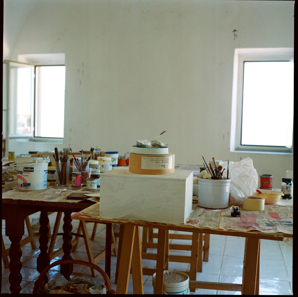
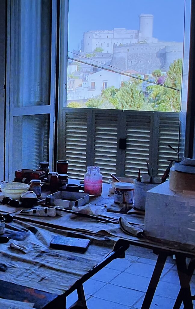
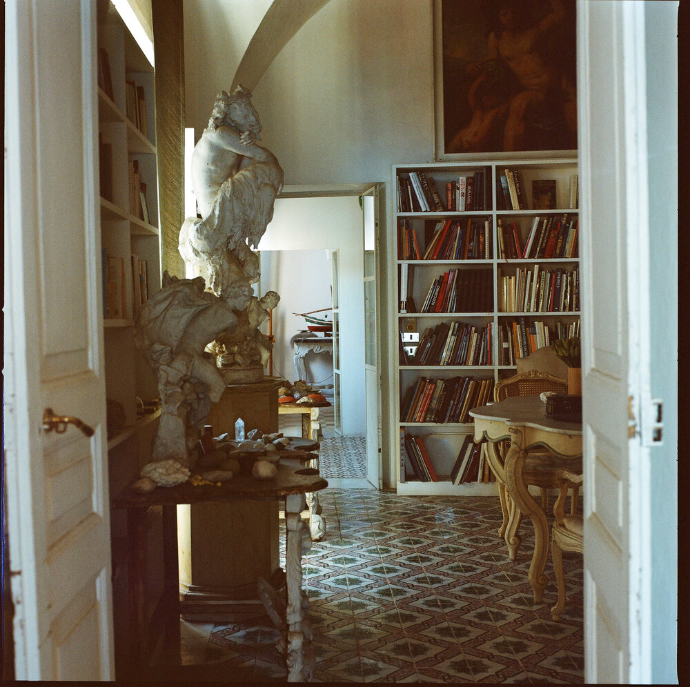
Manfredi Gioacchini’s photo of Twombly’s studio in Gaeta, a corner room with views of the bay and the city scape, but those are washed out, so look at this sculpture-like stack on the rickety table.
What’s popping out to me as I keep looking at Manfredi Gioacchini’s photos of Twombly’s Gaeta house & studio is the sculptures everywhere, and things that look like sculptures. It’s the sculpture-like objects here, the things that look like they could become Twombly sculptures, that seem to show him thinking and living with objects in a certain way, not just sitting down and making them.
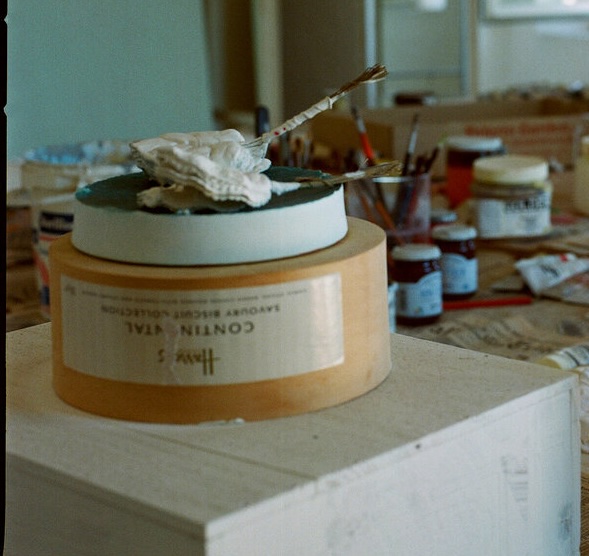
a detail of the Harrod’s tin, the little things on top, img;
What got me thinking about all this was the little tower of white-painted wood box and upside-down Harrod’s biscuit box in Twombly’s corner studio. When Gioacchini photographed it, it had what I thought were paint brushes in cloths, but which turned out to be little fetish-like pouch & stick combos.
me forced to take a photo of Cy Dear on my television like a savage to show that this unfinished sculpture-like object is still there in Twombly’s studio in 2017 onward
They’re also there in Cy Dear, which was released in 2019, but shot beginning, I think, in 2017. So perhaps a sculpture left unfinished in a studio that seems left largely as it was at Twombly’s death. I had somehow figured Gioacchini’s photos were from 2009, but it makes little sense that the studio would be untouched for two years before Twombly’s death. Now it looks like a deleted tweet announcing the photos came in November 2020, so three years after the documentary, not a decade before. The unfinished sculpture was still there, still unfinished.
screenshot from Mary Jacobus’s presentation on her Twombly book, via
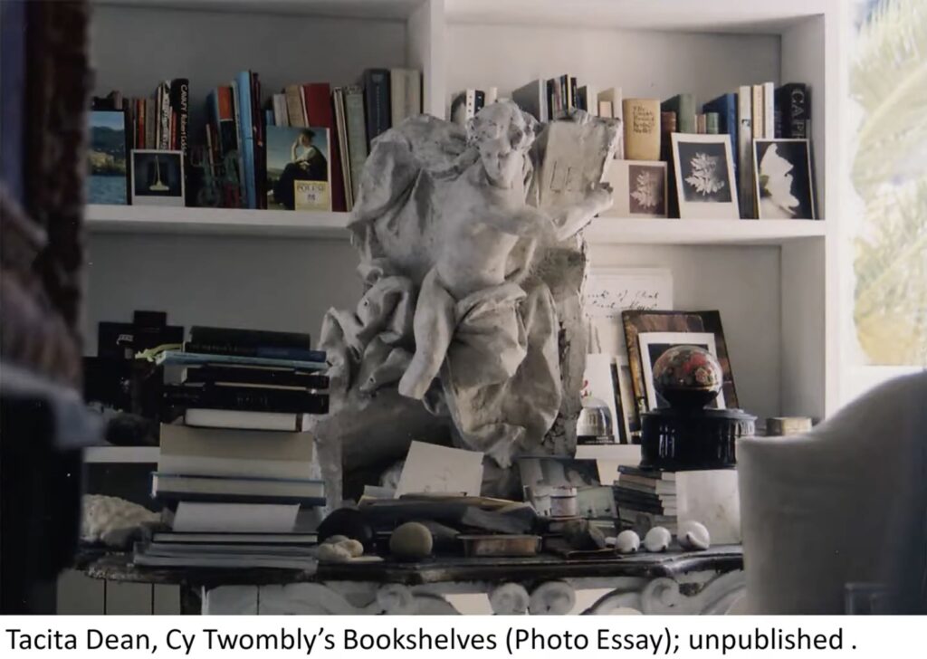
What jumps out at me? Well, there are additional views of the (plaster? painted terra cotta?) statue Tacita Dean photographed in Twombly’s library, which I’d wondered about in December 2023. [It’s feeling harder and harder to claim this isn’t a fanblog…]
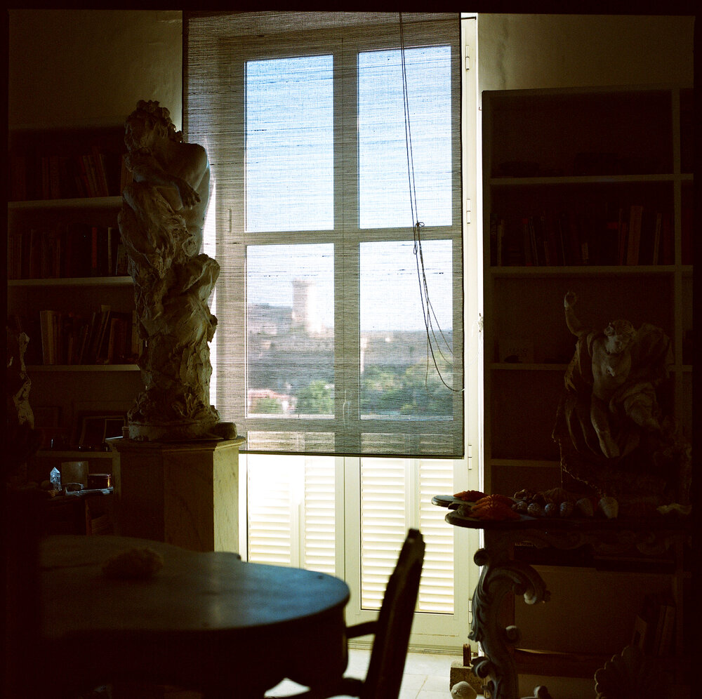
mood lighting in Manfredi Gioacchini’s 2009 photo of Cy Twombly’s library/bedroom, via
Anyway, point is, the statue is one of three. Actually, there are more throughout Gioacchini’s photos of the house, but there are three in this library grouping. At the center, in front of the window, is a larger, dramatically unfinished twisting satyr or something. Maybe it’s leaning on an unfinished stump.
Whether they’re actually a pair, another similarly scaled male figure, with its arm raised, sits on a matching table. The contortion and billowing cloak/drapery make me think they’re connected. From the top photo, the 2023 sculpture in profile shows how deep the drapery goes, too. It would be unusual for this to be on a frieze or in a niche; these may be meant to stand free and be seen in the round. Though here Twombly has arranged them in a triptych, with his view of the bay behind.
[April 2025 update: While world’s going to hell, I went to the National Gallery library, where a quick turn through the photos of Twombly, Tacita Dean, and Sally Mann confirm that the large center statue in the Gaeta trio was the Pan statue Twombly often photographed in Bassano in Teverina. Here is a 1998 photo exhibited at Gagosian Roma in 2021, for example, that shows it in profile through a doorway.]
Cy Twombly, Interior, 1998, Bassano in Teverina, drypoint, ed. 6, shown by the esteemed copyrightholder of the entire oeuvre, Fondazione Nicola Del Roscio, at Gagosian Roma in 2021
Now that Gagosian is closing their 980 Madison Avenue space with a Twombly show, the line has gone around that it makes sense, because Gagosian always opened a new space with a Twombly show. But 980 Madison did not open with a Twombly show. It opened with a Jasper Johns show.
Jasper Johns: The Maps was Gagosian’s first show at 980 Madison Avenue. It opened 36 years ago today: February 3rd, 1989. Before that, Gagosian, sometimes called “a Los Angeles dealer” in reviews, had a space in Chelsea, at 521 West 23rd St. The first Cy Twombly exhibition at 980, Bolsena Paintings, opened in December 1989. Twombly’s exhibition history includes a show at Gagosian NY in 1986, which is not in Gagosian’s exhibition archive [indeed, none of the W 23rd St shows are.] In the three-year interim, Twombly showed new and old work with five other New York galleries.
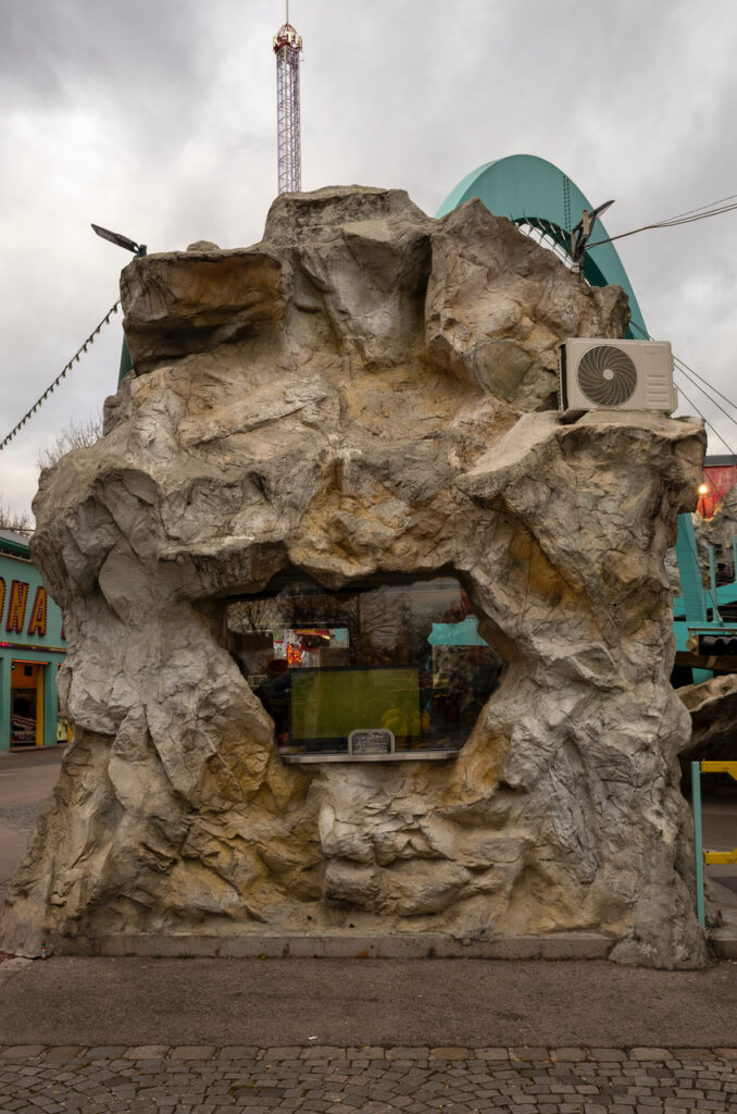
Don’t tell me it’s not a Rachel Harrison? Wurstelprater via Christian Oldham
It eventually wore off, but for a long while after seeing my first Gabriel Orozco show, it changed me, and I saw his art in every condensation ring on every counter, and every tin can balanced on a watermelon.
Rachel Harrison’s work is the opposite, in that I’ve been looking at it for years now, and this is the first time an object in the real world has seized me with her vision. And if you want me to believe that this fake stone ticket booth at the buck wild Wurstelprater amusement park in Vienna, with the air conditioner perched on its little ledge is not the world’s largest Rachel Harrison sculpture, well, the burden is on you.
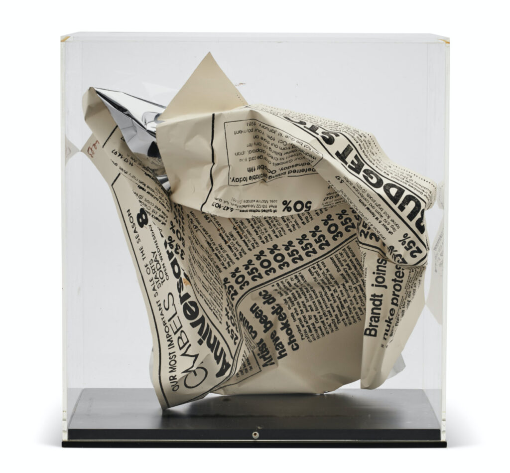
Andy Warhol, Daily News – October 19, 1983, 1983, silkscreen on metal, via @voorwerk
On the tumblr this morning, @voorwerk reblogged this odd Andy Warhol sculpture, which looks like a crumpled up tabloid page from the New York Daily News. A friend once had a Warhol sombrero made of crumpled dollar bills, so maybe there was a phase when not everything got swept into the time capsule?
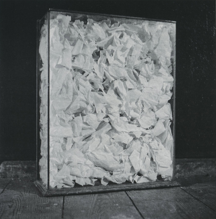
Robert Rauschenberg, Untitled (paper painting), 1953, 18x14x4 in., shoe box tissue paper, glass, wood base. lost or destroyed.
The vitrine especially made me think of the lost 1950s Rauschenberg “paper painting” made of tissue liners of shoe boxes, perhaps gleaned from his window dressing era. In any case, it all seemed possible that such a thing could be a “Warhol.” But this thing is different.
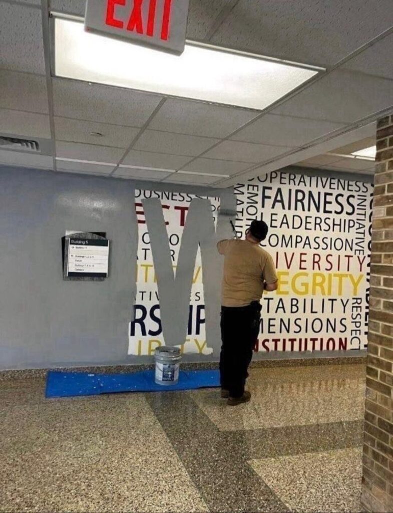
The FBI’s stated Core Values are RESPECT ACCOUNTABILITY LEADERSHIP DIVERSITY COMPASSION FAIRNESS RIGOROUS OBEDIENCE TO THE CONSTITUTION, and INTEGRITY
or at least they were.
A photograph submitted to the New York Times of a Core Values word cloud at the FBI Academy in Quantico, Virginia being repainted on January 29, 2025. Of the 595 color and finish specifications in the US Government procurement standard AMS-STD-595, 110 are commonly named gray. Until I hear otherwise, I’m going to say this is AMS-STD-595/26270, Interior Haze Gray (Semi-Gloss). image via NYT/Adam Goldman
Now I honestly can’t decide if this guy is making a subtle shoutout to fellow government worker-turned-painter George Bush, or if the new FBI Core Values is WHITE.
Either way, it’s unfortunately an early candidate for painting of the year.