Sehgal, Herzog, Patel, Oldenburg: Some Links I Like

A great post on language & progress, Claude Levi-Strauss & TIno Sehgal. Some of the most interesting commentary I’ve read on discerning the actual structure and contours of Sehgal’s This Progress, too. [futureofthebook.org via @briansholis]
Which makes me wonder: do the works come with NDAs? Are they secrets? Trade secrets? Can the instructions be shouted from the rooftops? Could the unwritten transmitted/purchased instructions be performed or recited publicly as entertainment, as part of a critical discussion, or in an effort of collective preservation? Are they really just a couple of lines [“Roll around kissing constantly. Every few minutes, strike a pose from a famous work of art.”] or are they more elaborate? Obviously the parties concur that there is some intellectual property right being transferred, but what is the implication for the artist–or his dealer or a collector or museum–either disseminating the instructions or refusing to do so?
Ramin Bahrani’s short film Plastic Bag tells the story of a lone plastic bag’s Odysseus-slash-V’Ger-like journey to find home and its creator. Werner Herzog stars as the plastic bag. Seriously. [via mrdanzak, thanks andrew]

Speaking of epics, Grain Edit has a wonderful interview with Sanjay Patel, the Pixar animator/illustrator/Charles Harper fan who went from self-publishing the awesomely kawaii Little Book Of Hindu Deities to creating a modernist graphic version of the Ramayana. [grainedit]
I’m liking what I can see of Eamon O’Kane’s paintings about Le Corbusier’s somewhat dickish relationship with and interventions in Eileen Gray’s architectural masterpiece, the E-1027 Villa at Roquebrunne. They’re at See Line Gallery, but the big pictures are at the LATimes. [Related: at a 2007 MoMA conference, Beatriz Colomina called Corbu’s alterations of E-1027 an architectural “rape”.]
I’ve been doing some research on early Happenings staged in Washington DC by Claes Oldenburg. More on that as it develops, of course, but there’s no need to wait on sharing this very self-amused Time Magazine account of “The Pop Art Festival” organized by the Washington Gallery of Modern Art in April 1963:

Blue Wrench.
Happenings are old stuff in the artiest alcoves of Manhattan, but of course that means nothing in Washington square. This one was prepared by Artist Claes Oldenburg, who makes those huge sailcloth hamburgers. Washington society prepared by getting itself puffed, powdered and sloshed. Little dinners were eaten intimately in Georgetown. The jolly crowd then collected at the gallery to see what was going to happen. Nearly everyone sat on campstools–White House Art Adviser Bill Walton, FAA Administrator Najeeb Halaby, Mrs. Arthur Schlesinger Jr. Those. [sic]
A member of the gallery staff announced that she had successfully achieved blue ice cream. She had mixed blue dye and vanilla ice cream with a monkey wrench. The New Frontier moved an inch forward on its stools.
This was obviously going to be some happening.

Does anyone know how Time and others [Old Media types, mostly] insert the unique tracking url into my copy&pasted quote of their article? I assume it’s to prevent/track automated scraping and republishing, but from their page code, I can’t figure out how they do it.
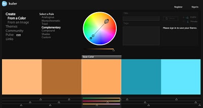
And lastly, I went to hear John Gerrard talk about his time/duration-intensive work at the Hirshhorn last week. He’s got a very different project going on, what with the environment, and the orbit of the sun and energy and industrialization and video game engines and what not, but it was nice to see that he’s nearly/slightly as engrossed with using Google Earth as a creative tool as I am. He pulls colors from the satellite images to create site-specific palettes for his digital landscape re-creations.
Which, whoops, come to think of it, may be problematic. Just yesterday, Stefan at Ogle Earth laid out a not-insigificant case for why it matters that–whoops–all satellite imagery, including Google’s–is color-enhanced. “It is the case that colors in satellite imagery are always false, albeit made to look realistic (just as with those pretty pictures of galaxies and planets).” [ogle earth via @felixsalmon]

Oh, Red, Green & Purple Where Art Thou?

Kuler_orange_teal.jpg
On his blog Into The Abyss, editor/filmmaker Todd Miro has an awesome, screencap-filled rant about the orange-and-tealification of Hollywood. In color theory, teal is the high-contrast opposite of flesh tone [as the palette Miro generated at kuler demonstrates] and so directors looking for an image to “pop” are jacking up the color contrast and narrowing their films’ palettes. In post.
While color adjusting has always been with us, Miro traces the problem to the Digital Intermediary, which has become the visual equivalent of AutoTune:

The Cohen brothers ushered in the new era of digital color grading with their excellent 2000 film, “Oh Brother, Where Art Thou.” This was the first feature film to be entirely scanned into a computer, a process known as “Digital Intermediary”, or DI. Once inside the computer, the colorist now had unheard of control over every element of the image. Imagine tweaking an entire movie with the tools and precision that one has with their still images using Photoshop, and you get some idea of what power was unleashed.
But was that power used for good… Nooooooooooooooo, or course it wasn’t!

As in so many other ways, so it goes with orange & teal overkill: Transformers 2 turns out to be the worst of the worst.
todd_miro_teal_orange.jpg
Teal and Orange – Hollywood, Please Stop The Madness [theabyssgazes via afc]

Wanted: Smithson’s Movie Treatment For Spiral Jetty Poster

smithson_jetty_poster.jpg
I’ve been working on a shot-for-shot remake of the Spiral Jetty film for a while, and so I’m quite familiar with the storyboard-like drawings Smithson did for it. Familiar with them as drawings, that is. He called them Movie Treatments.
It’s a little embarrassing to admit I didn’t realize Smithson had used a treatment/storyboard for the flyer/poster of the 1970 Dwan Gallery exhibition of Spiral Jetty until I read it in Kathleen Merrill Campagnolo’s essay on the Jetty and its camera imagery in the Smithsonian’s Archives of American Art Journal. But there it is:

DWAN 29 WEST 57 STREET NEW YORK OPENING OCTOBER 31 TO NOVEMBER 25
A 16 MM, 35 MINUTE COLOR AND SOUND FILM ON THE SPIRAL JETTY WILL
BE SHOWN DAILY AT 2:00 IN THE GALLERY FOR THE DURATION OF EXHIBITION.

The Dwan exhibition consisted primarily of Gianfranco Gorgoni’s large-format photos of the Jetty, eight of which were included in Kynaston McShine’s historic “Information” show at the Museum of Modern Art that summer.
Given the iconic aspects of the photos and the powerful influence of the film–not to mention the experience of visiting the Jetty itself–it’s somehow odd to think of encountering the Jetty first in terms of Smithson’s site/non-site paradigm, as a situation represented in a gallery.
It’s also interesting to note that the film only played once a day, not on a continuous loop as is often the case now. It was an event more than an installation.
Anyway, I would like you to send me one of these posters, please. If you have one you don’t need, or perhaps some extras. It need not be signed. Thank you.

On The Soviets On The Moon

moon_luna9.jpg
It doesn’t feel like a tangent to go from satelloons and museums on the moon to other aesthetic aspects of space and the space race. Plus there’s the fascination at discovering, as a grown man, how much I hadn’t been taught as a kid. As an American kid.
No one tried to ignore Sputnik or Yuri Gagarin, of couse, but it never registered with me that the Soviet Union reached the moon first. And landed the first spacecraft on it. And took the first pictures of the dark side of the moon. And from the surface.
The Soviets’ Luna Program began way back in 1959, when Luna 2 hit the moon [after shedding a bunch of small Soviet emblems, apparently.] This, beefore America even got a balloon into orbit around the earth.
Also in 1959: Luna 3 returned photos of the far side of the moon.
And in 1966, Luna 9 made the first soft-landing on the moon and transmitted back the first five photos from the surface.
To avoid embarrassment in the case of failure, Russian missions were typically only announced after they succeeded. This meant that each achievement was met worldwide with a sense of surprise and skepticism/resentment.
The first image sent back from Luna 9, however, was intercepted by the University of Manchester’s Jodrell Bank Centre for Astrophysics, which scooped the Russians’ own announcement.
As an image, there’s something familiar about it, at least in retrospect; it looks like what we [now] know the surface of the moon to look like. But in 1966, it had to have packed a punch. Add to that the level of political intrigue, the rivalry of the Space Race, and the ever-present military/nuclear threat of the Cold War, and this image becomes an incredibly powerful, important artifact.
One which I’d never heard of, or seen before last week. It’s as if Apollo and 1969 wiped away the contentious, anxious experience and history of the earlier years. And along with it, the memory, recognition, and appreciation of the achievements that came first.

Ken Price & Josef Albers At Brooke Alexander

josef-albers-ken-price-1.jpg
Roberta Smith loves loves loves the Ken Price/Josef Albers show at Brooke Alexander. I all but stumbled across it a couple of weeks ago after finding Brooke’s interview with Price (PDF), and I have to agree. It is incredibly fresh.

Its overarching theme is that abstraction is reality-based, distilled from lived experience, and actualized through highly personal approaches to process and materials. It’s a lesson in life as much as art.

Albers’ paintings and especially the prints, are additive, while Price’s method is subtractive: he builds up layers of paint, then sands it down.

‘Marina Abramovic Is A Total Stone Cold Diva.’

Ivan Lozano’s post about Marina Abramovic, Joan Jonas, Tino Seghal, and the conservation of performance art is absolutely fantastic. [It’s built off the Performance Workshop Klaus Biesenbach held a couple of weeks ago, which was written up by Carol Kino in the NY Times.]
The idea of a single orthodox means of retroactively preserving or documenting or re-performing or whatever early performance art strikes me as unreasonable; I like the idea that artists can decide if and how they want their work to live on, whether if it’s as a score, video documentation, ephemera, or in Seghal’s case, unwritten verbal transmission.
Lozano hits the nail on the head with his awesome characterization of Abramovic [above]. And kudos to her for making a strong play for preserving her own work and for influencing the present and future of the medium. But one thing about her stone cold divadom that he doesn’t mention that came immediately to mind was her establishment of the Marina Abramovic Institute, which is charged with the preservation of performance art.
It reminds me of the Eric Carle Musem of Children’s Book Illustration, another ostensibly comprehensive history-writing institution which was founded by a practitioner–who wasn’t waiting for history to decide his place in the history books.

Found, Sort Of: Vern Blosum

You remember how, a couple of months ago, I could find next to nothing online about Vern Blosum, the mysterious artist whose crisp, deadpan paintings of parking meters were featured in one of the very first museum exhibitions of Pop Art, “The Popular Image,” organized by Alice Denney in the Spring of 1964 1963 at the Washington Gallery of Modern Art?
Well, we’re making a little progress. I’ve been in touch with people who know or knew Blosum and his work. As I piece his story together, I’ll present it here. For an artist to show alongside Warhol, Rosenquist, and Oldenburg, and to be collected by MoMA and Larry Aldrich [1], and then to practically disappear, well, it’s fascinating.
What I really wanted to do, of course, was to find and see Blosum’s work, to see how it might relate to those earliest Pop contemporaries, and maybe see how it holds up. But all my searches came up empty. Until tonight. Somehow, Blosum’s entry in an art history teaching image database at California State University [WorldImages at SJSU, to be specific] showed up on Google.
There’s a very clean image of Blosum’s 1962 painting, Time Expired, which is listed as being in MoMA’s collection [a mystery again because MoMA’s online catalogue comes up a blank]. I’m looking into that, but first, just look at this.
It’s not a flat, billboard style like Rosenquist, or a flattened silkscreen image like Warhol or a deliberately graphic/comic style like, say Lichtenstein. And it’s not photorealistic, and certainly not Photorealist, despite how Cal State apparently teaches it, Instead, it’s quite illustrative, the city street version of Wayne Thiebaud’s diner desserts. I think it’s really quite nice.
blosum_sjsu.jpg
[1] Actually, I misread that. One of the only web results for Blosum was in Larry Aldrich’s 1972 interview with Paul Cummings in the Smithsonian’s Oral History collection at the Archives of American Art. That led me to a couple of lengthy discussions with folks at the Aldrich Museum about whether they have the Blosum painting Larry clearly said he’d bought. They don’t.
Now I see why. Aldrich is talking about the MoMA painting above, Time Expired. He created a multi-year fund for Alfred Barr and Dorothy Miller to purchase new work from emerging artists, and he was telling Cummings what works the Museum got from the fund each year. This 1962 Blosum came into the collection in 1963, just as, or just before, Denney was assembling her show in DC.
It’s funny, because the dynamics and challenges for museums to collect new work don’t seem to change that much. It can still be tough, or at least problematic, for curators to ask their donors to buy unproven and/or less expensive work, partly because of ask fatigue, and partly because big donors like to donate for big things.
Also, Aldrich’s unabashed discussion of using his fund to get the Museum’s curators to do his “shopping” for him is simultaneously awesome, refreshing, and cringe-inducing.

One to help young American artists, and quite frankly, the second one was a personal selfish one in thinking that in essence they could help my efforts and sort of do my shopping for me, because, as I said, I could only get out once every two weeks and sometimes I wasn’t even able to successfully do that. And I was under an impression, which I since learned was a mistaken impression, that they had people combing New York galleries all the time. Which I discovered was not the case.

He then recounts all these collecting war stories where he “loses” work to the Museum, or where he complains that prices have gone up because he’d let MoMA buy an artist’s work before he got it himself. He sounds a bit tacky, but passionate, with a good eye, and in his telling, at least, if there were any potential conflicts, the Modern always prevailed.
Previously: Anyone tell me about Vern Blosum?

Catching Up With Vito Acconci

acconci_attention_studies_eai.jpg
While rummaging around in Vito Acconci’s early exhibition history for traces of Kathryn Bigelow’s work [more on that in a second], I came across a set of three early, short Super 8mm films I’d never heard of: Three Attention Studies, 1969.
They’re all 3min. each, the length of a Super 8 cartridge, and made in conjunction with Peter Lupario, but it’s the last one that’s most interesting:

In Catching Up, the performer and cameraman walk side by side across a field. Sometimes the performer falls as the camera continues its pace; the performer must make an effort to catch up and return into the frame.

If that’s Lupario in the still above–and it doesn’t look like 1969 Acconci to me–these three films are notable for featuring the artist behind the camera, as the viewer, instead of in front, as the performer/subject.
These studies preceded by several months the 1970 body-related performance pieces for which Acconci became known. In a 1983 retrospective of the 8mm works at the Whitney, curator John Hanhardt said Acconci is “one of the first artists to successfully develop a significant oeuvre in the Super-8 film format.” [PDF via vasulka.org]
So this Catching Up, I’d like to see. If anyone knows where it exists digitally, I’d love to hear about it.
Now back to Bigelow. I’m beginning to think that the Acconci project that most closely matches the dates, descriptions, and details of Bigelow’s recollections is his 1973-4 Super 8 “feature,” My Word. [Of course, I haven’t seen it, even though it showed at X-Initiative last September.]
At two hours [or 90-something minutes, which may be an earlier, pre-1983 version], it required a lot of shooting. Hanhardt describes it as

composed of written statements alternating with shots of the artist in his studio and around his building. Acconci is the central protagonist whose gestures, actions, and written statements are all addressed to women–women are the other, unseen, presences in this work. The point of view of the camera can be interpreted as that of the women, silently confronting Acconci, or that of Acconci himself, mirroring his every move.

I don’t like to, but I can imagine that’s Acconci riding some kind of bondage apparatus with a large film projection behind him in the My Word frames below:
acconci_my_word_whit.jpg
My Word was a turning point, the last time Acconci included himself on-camera in his work. If this is the one, Bigelow actually shot some, part, or all of one of Acconci’s most significant works. Too bad the Academy doesn’t have some kind of lifetime achievement in dues-paying hardship award.
Previously: Tracking down Kathryn Bigelow’s early conceptual oeuvre

The Lady In Blue Meets The Lady In Red

abramovic_bkgrnd_cmonster.jpg
“The lady clad in bright red silk was having her picture taken from every angle around Abramovic’s performance. It was spectacular.”
C-Monster has an awesome photoset and a firsthand account of experiencing Marina Abramovic’s MoMA performance, The Artist Is Present. She touches on the intensity of the line, and the realization that the artist is making you sit and wait, possibly for hours, too, and how the entire atrium is transformed around the silent artist. When all is said and done, thousands of people will have projected their own experiences and “performances” onto Abramovic; it’s an aspect of the piece I hadn’t considered before.
This is my favorite of C-Mo’s shots, though, because it so perfectly captures the idea of an individual with her own strategy using the media to insert herself into Abramovic’s piece.
This is interesting me right now for other reasons, which may be why it caught my eye.
Photo Diary: Marina Abramovic at MoMA. [c-monster.net]

Quick, Do Not Think Of Rielle Hunter

From a 1983 New York Times profile of up-and-coming artist/photographer Cindy Sherman:

One day several years ago, in the studio of David Salle, who borrows extensively from the media, Miss Sherman saw a soft-porn magazine photograph of ”a housewife looking sexy” and decided she’d try to look like that. Thus were born the ”Film Stills” with their sex objects and immaculately-packaged good girls. Miss Sherman says she was not consciously making a feminist statement when she began these pictures. ”I never thought of it as political work,” she says, ”I don’t think of myself as a very political person”…
…Maintaining full control over her ironies remains something of a problem.

Portrait Of The Photographer As A Young Artist [nyt via @briansholis]

And Who Was Writing Those Ian Wilson Invoices?

I’m slightly fascinated with the talk-based artwork of Ian Wilson. The last couple of weeks, I’d been working on a Conceptualism-related proposal, and so I had out my catalogue for Ann Goldstein and Anne Rorimer’s awesome, formative [for me, anyway] 1995 MoCA show, Reconsidering the Object of Art: 1965-1975.
Fifteen years, and I think I’d never read the entry on Ian Wilson. Maybe it’s info fatigue by the time I’d get to the W’s, or maybe the blank page where the images usually go just registered as a section divider?
Anyway, Rorimer discusses Wilson’s “search for an art in which no evidence of physicality would intrude.” His work evolved from the instigation of casual conversations about “time” to a less subject-centered, “Oral Communication.”

Whereas his Time work stemmed from his understanding that a word might represent a concept, Oral Communication grew out of his realization that the Time project principally concerned the process of communication. The designation Oral Communication, he decided, more pertinent served to characterize an endeavor whose ultimate subject and object, he once stated, “is speech itself,” or “art spoken.”

Maybe it’s the institutional vs commercial context, but while Rorimer mentions Wilson’s dutiful contributions to checklists and catalogues for shows he was invited to participate in–even the invitation card for a newly configured work for a group, a 1972 Discussion at John Weber Gallery–there is no acknowledgment of the other, seemingly crucial evidence/remnant/ instantiation of Wilson’s work: his invoices and receipts.
And Andrew Russeth just emailed me this awesome anecdote he reported from a Performa 09 panel discussion last fall:

No matter how difficult or intangible the work, of course, most agreed that artists or their dealers will eventually find a way to sell it, leaving the museum to work out some of the details later. [Soon-to-be-announced incoming MoCA director Jeffrey] Deitch recounted that, as a gallery assistant at John Weber Gallery in the mid-1970s, he once typed the words “There was a discussion” on a piece of paper as a record that collector Count Giuseppe Panza had talked to artist Ian Wilson, who abandoned sculpture to make art only by talking. He then made out an invoice for $1,000.

Maybe if MoCA ever reissues the Reconsidering The Object catalogue, they will add a correction.
Deitch Defends Dakis Joannou Show at the New Museum [artinfo]

What Is Progress, And The Paper [Of] Record

Can I just suggest that, when you buy an article from the New York Times Archive, you go ahead and buy a 10-pack? In addition to supporting your local paper in their time of financial distress and dire need [ahem], you can use the other nine articles for exploring whatever random people, thing, or history crosses your mind?
Which is how I found Roy Bongartz’ Sunday arts feature from August 11, 1974: “Question: How Do You Buy A Work of Art Like This?/ Answer: With A Check”
The piece could’ve been read straight in one of Powhida and Dalton’s #class sessions. Burden, Beuys, LeWitt, Acconci, de Maria, Bochner, Ray Johnson, Ian Wilson:

…these artists, all of them young “conceptualists,” had decided to lift their work clear out of the category of investment property. By shifting the emphasis of their work to the pure thought and by refusing to offer any saleable object, they were mounting a deliberate attack on the traditional business of art. The artists’ intention was to leave the dealer with nothing to sell, the collector with nothing to buy, and the museum with nothing to squirrel away.
[turn page, see continuing headline, “Buying Conceptual Art – Photos, Sets of Directions, Receipts”]
…The secret is that there is always something to sell.

Artists need to eat. Collectors want to buy. Ronald Feldman “authenticates” Burden’s gunshot wound with a check. And voila! These rebels’ most cunning attempts to escape or destroy the art market have been thwarted before brunch. We can now move on to the crossword.
But beyond the apparent news-worthy novelty of certificates, documentation, and instruction-based work, and the vastly divergent view now of some of the namechecked artists–Ryman and Sandback have a conceptualist collectible object problem?–you know what the funniest thing about the past is? It’s the little differences:
That as long as the instructions [which sell “for as much as $8,000”] are followed, “it doesn’t matter at all whether it’s you, Sol LeWitt or your Uncle Elmer who does the marking.”
That dealer/wife Mrs. John (Susan) Gibson is aghast at an invitation “from a Washington DC gallery” to show Robert Cumming’s text & photo-based work–wait for it!

–in the photography section! Mrs. Gibson insisted Cumming’s work go into the fine arts section because he was not showing photographs, but conceptual art. The reply was, well, we hope this is what photography will become. “Too late,” said Mrs. Gibson. “This is what fine art has become.” It was a standoff–no show for Cumming.

And then there’s the eerie familiarity of Ian Wilson, “a kind of extremist even in SoHo, [who] simply comes in and talks. This is all that he does, and he’s made a career of it.”
The quote is from Sonnabend director Ealan Wingate:

“Here the art becomes so abstracted there is no object whatever. Yet in a way there is always an object because an idea can be a subject. [hey, wait– -ed.] There is, also, always the piece of paper, the bill of sale, which says you bought it.”

And then comes Bongartz’ explanation of the paper gauntlet Wilson threw down across the ages to Tino Seghal:

You can commission Wilson to do a piece; for example, he may come to your house and talk with you about Plato for a while. The two of you might discuss, say, the subject of unreality, and that would be it–and you’d get your receipt.

For all the fun of digging through the Times’ archive on my own coin, it’s not all eye-opening, perspective-correcting or knee-slapping blog fodder. Even at $1.50, you sometimes click through to a dud, but overall, it still feels like money well spent. And not just because seeing vintage discussion of an under-remembered predecessor should at least cast a critical shadow on the current hype over Seghal’s artistic innovations.
There’s an extra, bonus level of irony, though, in paying to read a 36-year-old Times article about artists successfully selling nothing–and then in worrying that I’m quoting and recapping it too much, thereby damaging the damaged Times’ economic position, or at least earning me the wrath of the copytheft maximalists.
But, oh, look, here’s the whole article for free online. Apparently, the Times repackaged a bunch of arts coverage in 1978 as a topic-based anthology. Which was scanned into Google Books. Of course, it’s formatted differently, probably from a different edition of the paper. So it doesn’t have the $1.50 PDF version’s awesome illustration of Wilson’s work:
ian_wilson_nyt74.jpg
The secret is that there is always something to sell.

Selections From The NASA Library: How-To Build A 100-Foot Satelloon

EL-2000-00292.jpg
Part of re-creating the Project Echo satelloons as art objects is tracking down the documentation and history of it all, identifying archives and primary source materials, and finding out how, exactly NASA built these early, early satellites.
Because it’s more than technically possible to replicate their efforts. America’s first forays into space were literally ad hoc: the prototype Echo satelloon was twelve feet in diameter because that’s how big the ceiling was in the workshop. They figured out how to fold the balloon after one engineer saw his wife’s rain bonnet. They pressure-tested the Mylar skin on an armature made of 1-by lumber, pulleys and weights. [image above: nasaimages.org]
I thought I’d have to track down a NASA archive facility in some Maryland backwoods, and make an appointment, and I may still. But it turns out NASA has converted a lot of the technical and fabrication documents for Project ECHO–ECHO I and ECHO II–to PDF format. The compilation of links at Astronautix.com is pretty high in the Google results.
Here’s what I especially like:

In An Art Film That Time Forgot. Kathryn Bigelow IS. That Girl On Lawrence Weiner’s Sofa.

Like everyone else reading it on OSCAR NIGHT®, Andrew Hultkrans’ 1995 Artforum interview with Kathryn Bigelow gave me hope for the films-by-artists genre, if not quite from the direction people might expect. To hear a double OSCAR® winner say of film noir, “That’s how I moved from art to film, so to speak: I went through Fassbinder on my way to noir.”

ANDREW HULTKRANS: It’s quite a leap from Conceptual art to the culture industry. KATHRYN BIGELOW: It does seem like a departure. I was studying painting at the San Francisco Art Institute and one of my teachers put me up for the Whitney Program, so I went. This was ’73 or ’74, when Conceptual art really came to the fore. I did a couple of videos with Lawrence Weiner, and I worked with Art & Language, an artists, group who were critiquing the commodification of culture. So I was very influenced by them, and my concerns moved from the plastic arts to Conceptual art and a more politicized framework. And I became dissatisfied with the art world – the fact that it requires a certain amount of knowledge to appreciate abstract material.
Film, of course, does not demand this kind of knowledge. Film was this incredible social tool that required nothing of you besides twenty minutes to two hours of your time.

Wait, Lawrence Weiner videos? No, not that one.
weiner_bigelow_done_to.jpg
Bigelow appeared with Sharon Haskell in Weiner’s Done To, 1974, which Alice Weiner describes as:

…simple camera frames which are silent and/or unconnected to a complex soundtrack running parellel [sic] to the images. There are brief instances where image and sound meet; however, the majority of the images are overtaken by at times symphonic, at times cacophonous soundtracks which displace the normal filmic viewing experience. The standard film format for going from frame to frame — and then and then and then — is what the film is concerned with.

E.A.I. has a fuller synopsis, and VDB has a tiny clip viewable online.
weiner_bigelow_green_eai.jpg
She also appeared briefly in Green as Well as Blue as Well as Red, 1976, [above, vdb clip here] where her off-camera conversation with Weiner is mixed over the shot of two women reading from a red book at a rainbow-painted table.
Bigelow is credited as an editor and production/script consultant on Weiner’s first narrative-based work,Altered To Suit, 1979 [vdb clip]. From Alice Weiner’s synopsis at EAI:

“The mise-en-scene, the whole story, takes place in one location, the artist’s studio. A delicate psychological allegory on ‘a day in the life of’ anchors the displacement of (filmic) reality and the alienation of the (players) self. Devices such as incongruity between the image and the soundtrack, odd camera angles, and plays on objective focus are integral and explicit components of the narrative.

Altered To Suit overlaps with the beginning of Bigelow’s own film work; she made her first short, The Set-Up, which she completed in 1978 while at Columbia.
Bigelow mentioned two other very early, art film-related gigs in an interview with Gavin Smith published in Jessmyn & Redmond’s 2003 anthology, The Cinema of Kathryn Bigelow: Hollywood Transgressor [seriously]: She appeared “for about five seconds” in a Richard Serra video, and she shot some B-roll for a Vito Acconci installation.

[He] needed these slogans and phrases on film loops that would play on the wall behind him during a performance piece he did at Sonnabend in a rubber bondage room he created. The job was to film these slogans. I’d never worked with a camera. I was starving to death. If I hadn’t been at the brink of economic disaster, I think I never would have had all these detours.

I haven’t been able to figure out which Acconci performance/installation Bigelow’s referring to. Acconci showed at Sonnabend in 1972, ’73, and ’75. But 1972 was Seedbed, where the artist hid under a ramp masturbating for several weeks. The 1973 performance, Recording Studio From Air Time consisted of a video feed of Acconci in an isolation chamber/ confessional for two weeks, analyzing a romantic relationship in a mirror. I haven’t found a description of the 1975 show, but MoCA curator Anne Rorimer has written that after 1974, Acconci “dismissed himself as a live presence” and began using video and audio of himself in his performances. If her description and timeline is accurate, I’m guessing this is what Bigelow filmed, and what Acconci showed in 1975.
While Googling around to identify the Richard Serra video with Bigelow’s cameo, I found Bettina Korek’s fresh post at Huffington, about Bigelow’s art career. She links to “Breaking Point: Kathryn Bigelow’s Life In Art,” an exhibition at castillo/corrales in Paris which has been on since mid-January and continues through next weekend.
The most likely possibility for the Serra video is his 1974 game show/game theory critique of TV, Prisoner’s Dilemma, in which Spaulding Gray and Leo Castelli are supposedly at risk of getting stuffed in a SoHo basement for 50 years [The video was shot at 112 Greene Street, the first home of White Columns. 16miles.com has an installation shot from White Columns’ 40th anniversary show of stills from Prisoner’s Dilemma.]
Sure enough, sometimes it still makes sense to get up and walk across the room, because Serra discusses it two interviews, with Liza Bear and Annette Michelson, in Richard Serra: Writings/Interviews.
With Michelson, he explains how the angry art world-y studio audience tore down the screen to save Castelli. And in the notes for Bear’s earlier interview, the video’s credits include: “D.A.’s Secretary: Kathy Bigelow.” So there you go.
UPDATE: BUT WAIT, THERE’S MORE! Francois from castillo/coralles emailed with some more information: “Vito Acconci, when visiting the show, mentioned [Bigelow] had collaborated on his installation ‘Pornography in the classroom’, originally conceived in 1975.”
Which should put the issue to rest, except that “PITC” doesn’t seem to fit with Bigelow’s account, either of the work she did [filming slogans and phrases], the installation/performance [bondage equipment, with video projected behind Acconci], or the venue [Sonnabend]:
“Pornography in the classroom” as it’s known today is a slideshow of images from 1970s porn magazines, projected over a single channel video monitor [originally Super8mm film] of an ascending and descending penis, which is accompanied by the artist’s voiceover [“Thar she blows!”] It was shown at Gladstone in 1998, and the Kramlichs [of the San Francisco video art-collecting Kramlichs] bought it. It’s an edition of one, though Acconci apparently retains the master slides and film. The Kramlichs donated “PITC,” along with many other of their video works, to the New Art Trust, a consortium of museums and archives.
In a fascinating-to-video-collectors article in the 2001 Journal of the American Institute of Conservation, Timothy Vitale all but says flatout that the current incarnation of “PITC” is not just artist-remastered, it is completely new media. Neither the slides nor the video show any traces of aging or reformatting. If Bigelow did, in fact, shoot footage for “PITC,” her camerawork has almost certainly been replaced.
Of course, I’d think that, given her lucid discussions of her and others’ conceptual and performance work, I don’t think Bigelow would confuse “phrases and slogans” with “bobbing penises.” My guess is she didn’t work on “PITC”. And if she did, she may not want to talk about it.