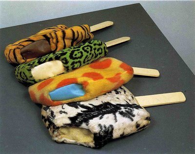
Claes Oldenburg, Soft Fur Good Humors, 1963, fake fur, filling, enamel paint on wood, posted by @toytheatre via @octavio-world
When I saw these 1963 Claes Oldenburg Soft Fur Good Humors on @toytheatre via @octavio-world‘s tumblr the other day, I thought they were perfect. But then I found out, from Barbara Rose’s 1969 MoMA catalogue, that they’re too small, just 19 x 9 1/2 x 2 inches each, barely the size of a placemat.
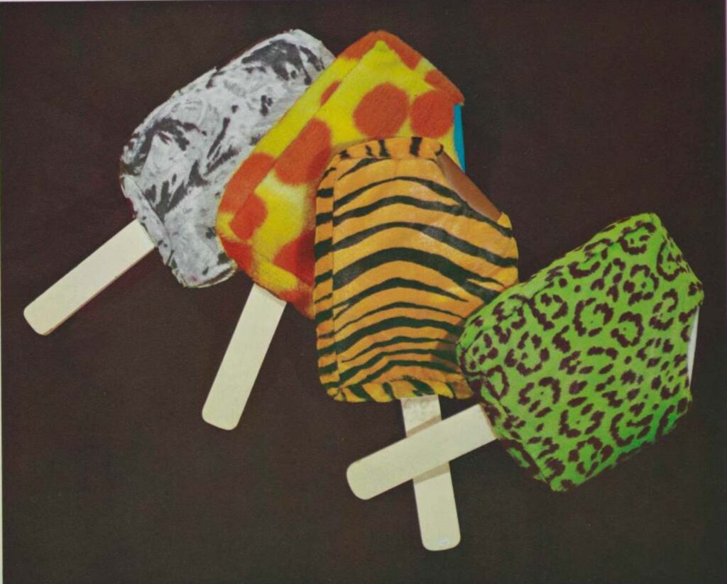
Claes Oldenburg’s too small Soft Fur Good Humors, 1963, as illustrated in the catalogue for Oldenburg’s 1969 exhibition at MoMA, curated by Barbara Rose
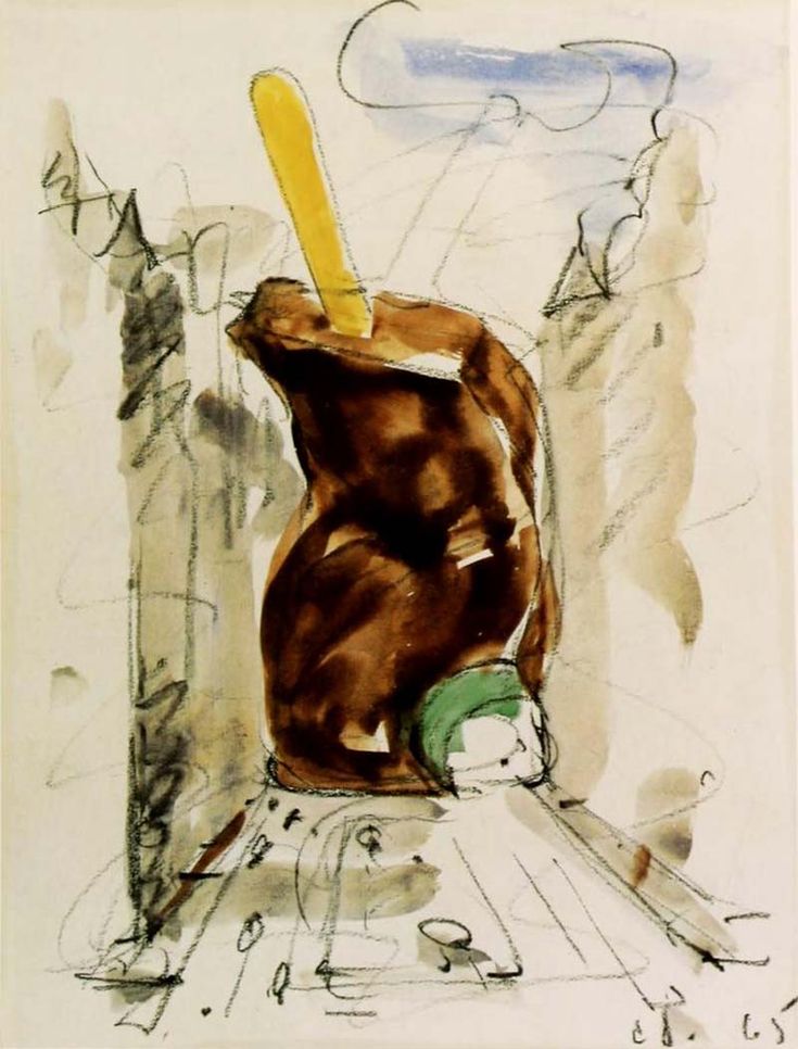
Oldenburg said that the inspiration came from seeing the fake fur at a fabric store, so maybe this is all he could get. Within a couple of years, though, he recognized that a Good Humor Bar sculpture should be bigger. He proposed one for the middle of Park Avenue, where the Pan-Am Building eventually went. Too big, tbqh.
Claes Oldenburg, Colossal Monument for Park Avenue, Good Humor Bar, 1965, liberated from p*nterest
In 1972, Oldenburg’s friend Michael Crichton commissioned Oldenburg to make a 3.6m tall version of his 1970 Soft Alphabet Good Humor Bar print, which, frankly, seems like a mistake, both in scale and subject. It looks like when you pop leftover mac & cheese out of the Tupperware. I hope he was handsomely paid, as was whoever sold it to Crystal Bridges.
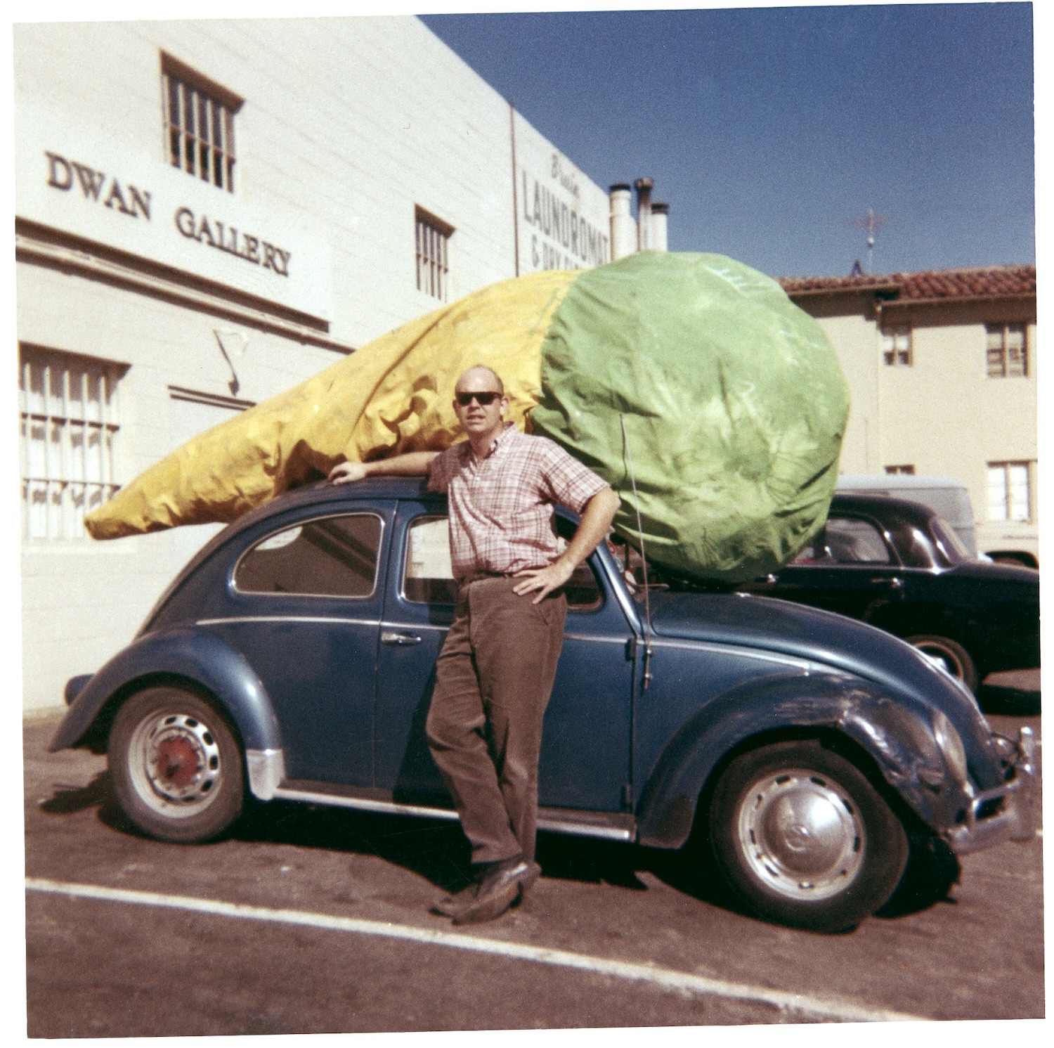
Claes Oldenburg with Floor Cone, 1962, on top of his car at Dwan Gallery in LA in 1963, image via the artists’ studio via MoMA, Floor Cone is now at MoMA, obv
No, I think these Oldenburg Soft Fur Good Humors should be at least as big as a sleeping bag, but not too big to fit on the roof of your VW. Floor Cone is 3.5m, almost the same size as the Crystal Bridges one, but good. And on the floor.
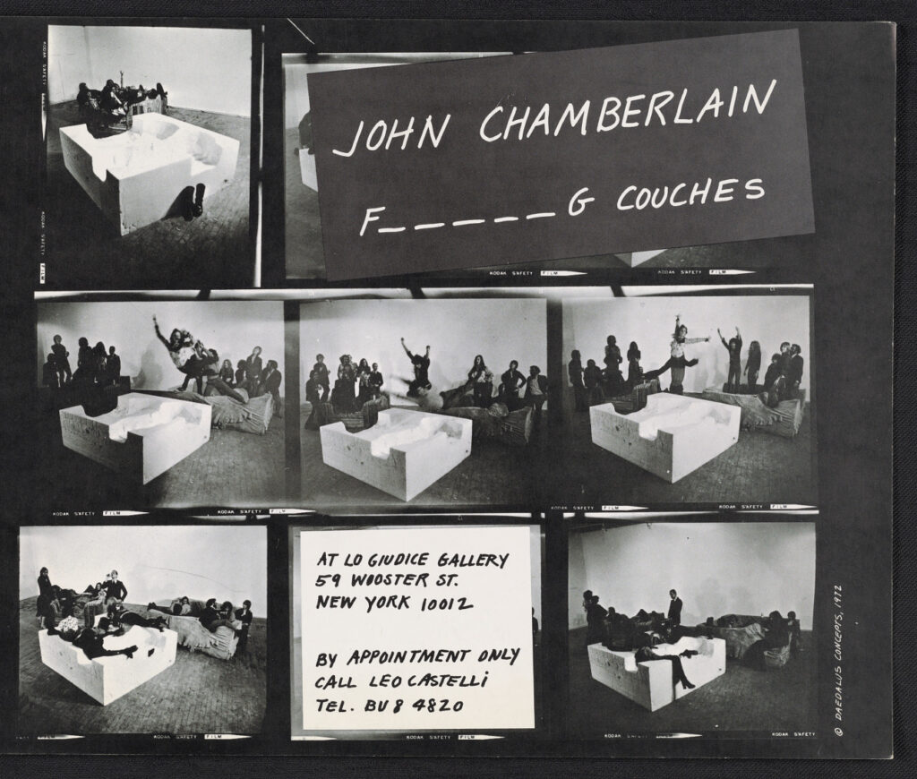
If each Oldenburg Soft Fur Good Humor was roughly the size of the raft in Titanic. So depending on where you come down in that debate, four on the floor could fit between four and eight people. They would have roughly the same presence in a room as a Chamberlain F*****g Couch. Or two.
This feels like a needed corrective in the material record and a worthwhile work to realize.
Being Pontus Hultén must have been absolutely amazing, the king of all he surveyed. He was the founding director of at least three modern art museums and one of the most influential figures in 20th century art. A groundbreaking curator, a friend to major artists, and a stone cold crook.
Hultén made the first re-creation of Tatlin’s lost Memorial to the Third International for an exhibition at the Moderna Museet, which, great.
With permission from Duchamp, Hultén made exhibition copies of Duchamp sculptures, including the first copy of the Large Glass, for the Moderna Museet in 1961, which Duchamp signed as recognized copies on his visit to Sweden. No problem, but watch this space.
But then in 1990, after Warhol’s death, Hultén had 105 more Brillo boxes made in Malmö, which he said were made in Stockholm in 1968. He donated or sold these boxes all over the place until his death in 2006, based entirely on his association with Warhol, and his own assertions of authority. He sold 40 to Duchamp dealer Ronny van de Velde with certificates of authenticity saying they were from 1968. But Warhol never authorized these, and he definitely didn’t do it after he was dead. It turns out many people in the Swedish modern art world knew Hultén’s Brillo racket. Not OK.
An entire investigation and report on the various fabrications of Brillo boxes was conducted by the Warhol Foundation in 2010, which declared all the Hultén boxes to be Hulténs, not Warhols. (This, after Hultén got the Warhol Authentication Board to approve and add 94 1968-I-mean-1990 Stockholm/Malmö boxes to the catalogue raisonné in 2004.) Shady, a bummer for a few collectors, but kind of hilarious.
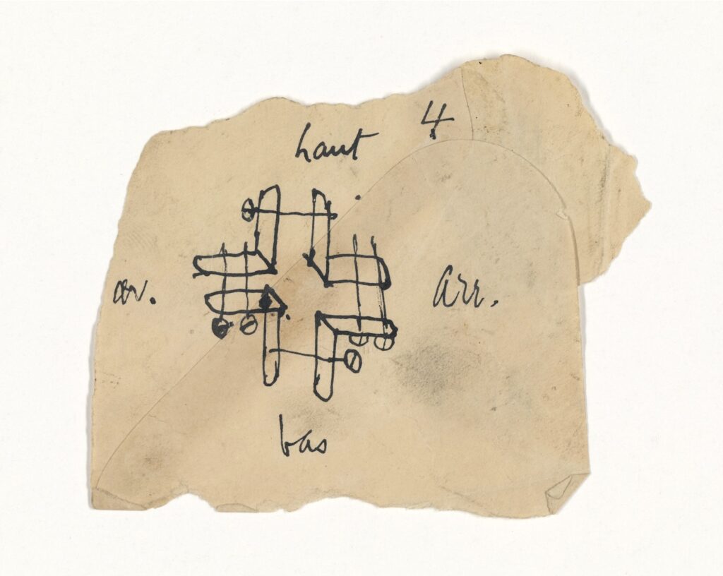
up, down, front, back: Duchamp’s 1920 sketch for Rotary Glass Plates, jacked by Pontus Hultén in 1960 from Yale University Art Gallery.
But in 1960 Pontus Hultén also straight-up stole at least four Duchamp drawings from Yale University Art Gallery. Katherine Dreier had donated Duchamp’s 1920 sculpture Rotary Glass Plates to Yale in 1941 as part of the Société Anonyme. Hultén visited the sculpture for what Yale’s extraordinary provenance note for this sketch on an envelope of the Rotary Glass Platessays was to consider it “for inclusion in an exhibition.”
What he was doing was studying how to refabricate it. The 1961 exhibition, Movement in Art, for which Hultén and Ulf Linde fabricated all the Moderna Museet’s Duchamps, including a Rotary Glass Plates. [Actually, Linde made the Large Glass; Hultén made Rotary Glass Plates with Per Olof Ultvedt and Magnus Wibom.]
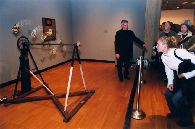
After some engineering professors restored it in 1999, Yale turned on Rotary Glass Plates for a two-day Duchamp/Johns symposium in 2000. image: Yale Bulletin
Yale writes that “Hultén reportedly removed the sketch, along with three others, from the artwork’s storage box.” I think it illustrates how to clamp the painted glass plates to the central axle on which they rotate. Hultén apparently gave the sketch to Linde as a birthday present, and his widow, along with Duchamp scholar Paul B. Franklin, returned it to Yale in 2018. No word what or where the three others are, but Yale clearly has some idea.
Marcel Duchamp? Rotative Plaques Verre, 1920/1979, a purchase by the Centre Pompidou
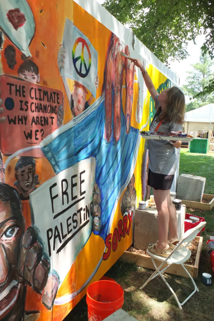
The kid of MOCAT painting Free Palestine on her mural at the Smithsonian Folklife Festival, image: Bruce Guthrie via NPR
The Museum of the Contemporary American Teenager (MOCAT) is an art and culture program initiated by a teacher in Montgomery County, MD, which operates at American University, the Kennedy Center, and the Smithsonian.
For this year’s Smithsonian Folklife Festival on the National Mall, MOCAT artists painted a mural of teen life and teen issues. It included protest signs that mentioned the climate crisis, the immigrant crisis, the gun crisis, and Free Palestine. One of these was anti-Semitic hate speech, a Smithsonian official told the teen artist, who is Jewish, and who disagreed.
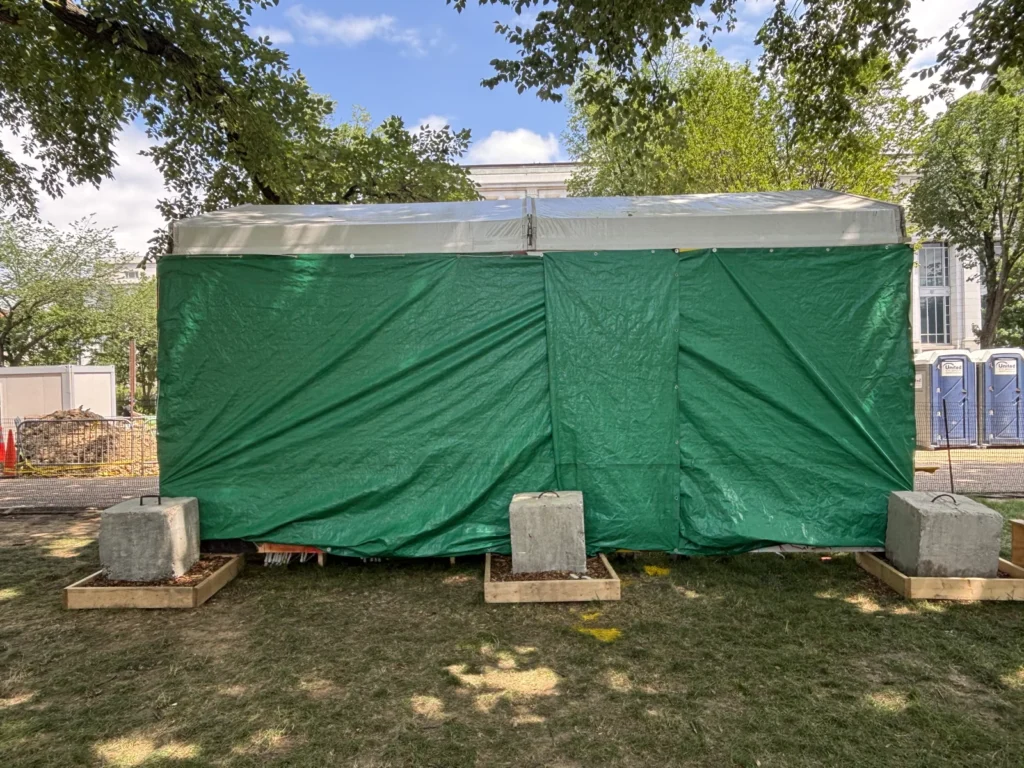
MOCAT Mural with Smithsonian Tarp, Folklife Festival 2025, image: Léda Pelton via NPR
The next day, the MOCAT crew arrived on the Mall and found their entire mural covered with tarps by the Smithsonian. The Smithsonian said they were doing it to protect the kids from angry mobs, which the kids said, “maybe we are not the problem in that situation.” The Smithsonian said the mural violated the no politics policy MOCAT had agreed to, though the document they cited was only distributed two days after the festival began. The MOCAT folks want the mural for educational purposes, but the Smithsonian claims ownership of it, so I guess it was a work-for-hire situation. Or work-for-exposure.
This all happened at the beginning of July, but only hit NPR the other day. So I feel like we should have a lot more clarity over what happened and why. What we do know is that in the three weeks since, Israel has continued starving and killing Palestinians in Gaza while governments in the West throw a tarp over it and walk away.
Love is the Message, the Message is Death is considered one of Arthur Jafa’s key works. Dating from 2016, it represents for the artist the affirmation of an African American identity, one of solidarity and confidence, while also showing and denouncing the violence that it has often faced.
It includes a piece of music titled Ultralight Beam from Kanye West’s album The Life of Pablo, which was released that same year. This composition, which combines gospel and R&B sounds, is an ode to spirituality, reconciliation, and the search for light, and it was praised as such by critics and a very wide audience upon its release. Arthur Jafa specifically chose this song for the values of hope and peace that it promotes.
Pinault Collection condemns Kanye West’s recent statements and actions in the strongest possible terms.
Are there others I have just not noticed? I confess, I had not looked. In any case, additional disclaimers will be documented here as they turn up.
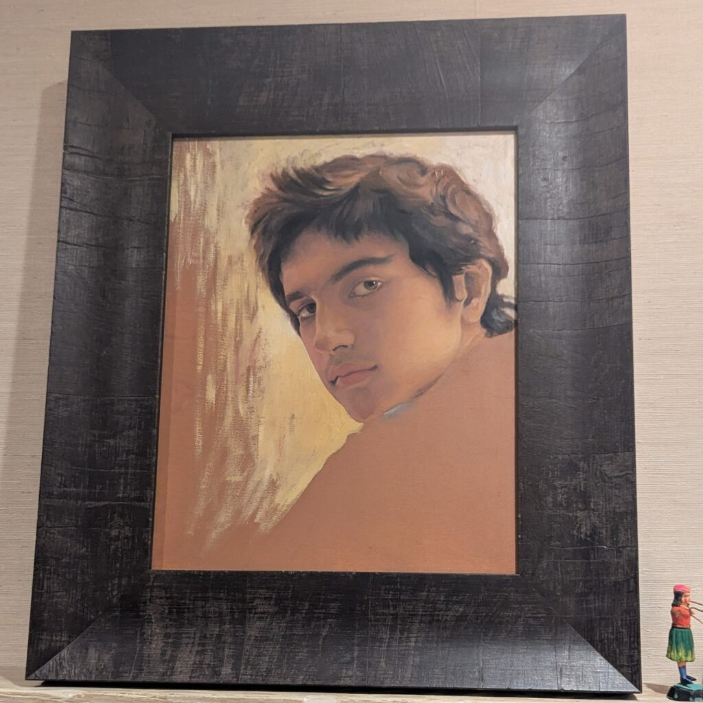
Salman Toor, Portrait of Zohran Mamdani, 2007, collection: his parents, image: IG/Amitav Ghosh
In 2007 Salman Toor was a 24-yo student at Pratt when he made this portrait of Zohran Mamdani, who was then 14. Amitav Ghosh posted the pic on instagram after Mamdani’s victory in the Democratic mayoral primary in NYC, which he celebrate with Mamdani’s parents, Mahmood Mamdani and filmmaker Mira Nair.
From Artsy’s report, it sounds like the study was created in preparation of a larger family portrait. Toor is asked to do the corny thing of seeing the future in this portrait. Inshallah he wins, of course, but I do not go for this portraiture sorcery.
On the other hand, if you were to ask me if this looks like the portrait of a kid who told his mother to reject the offer to direct a Harry Potter movie and instead keep working on adapting a Jhumpa Lahiri novel about grieving over the loss of a far away family member, I would say “Absolutely, nailed it, 1000%.”
Barnett Newman’s Uriel, 1955, 8 x 18 ft, installed at the Art Institute of Chicago in 2021 by the grace of its new owner, and photographed there by blogger Tocho T8
“There is one more story that properly belongs to the period of Newman’s hardest struggles. In 1968, during the social and political events and dialogue, the publisher of Horizon Books asked Newman if he could publish a volume of his essays, notes, and statements. Newman replied that he would prefer it if Horizon would republish Peter Kropotkin’s Memoirs of a Revolutionist, and that he would write an introduction, in the hope of making a contribution to the dialogue going on within the Left. Horizon agreed, and in Newman’s introduction he allowed himself only one small personal digression:
In the ’40s, when artists got together of an evening, there was always someone who insisted on playing surrealist games. I recall one evening when everyone in the room had to say what destroyed him. I remember what I said. I said that I felt destroyed by established institutions. I was surprised to hear one of the artists present say that what destroyed him were people. He was perhaps wiser than I, for I had to go through that Darwinian lesson. Looking back, I think we were both right, because only those people practice destruction and betrayal who hunger to accept completely the values of the establishment in which they seek a place. It’s the establishment that makes people predatory.
Uriel was purchased in 2021 by Ken Griffin, in a deal organized by James Meyer and Iwan Wirth, for an undisclosed nine-figure price.
In the late 1940s, anthropologists came into the sights of the anticommunist crusades known as McCarthyism. The AAA formed a committee to protect the individuals targeted by the McCarthyist witch hunts, but it was quickly undermined by the ultraconservative anthropologist George Peter Murdock, who got himself appointed as chair.2 Murdock denounced his own colleagues in a letter he wrote to FBI director J. Edgar Hoover. Thanks to David Price’s (2004) historical research, we now know the identities of ten of the twelve anthropologists Murdock betrayed: Irving Goldman, Jules Henry, Melville Jacobs, Alexander Lesser, Oscar Lewis, Richard Morgan, John Murra, Morris Siegel, Morris Swadesh, and Gene Weltfish. All but one was Jewish, and all were involved in antiracist activism, either by public writing, speaking, and broadcasting or by political advocacy and direct service (e.g., Gene Weltfish wrote an antiracist pamphlet with Ruth Benedict that was mass distributed and adapted in a union-produced short film; Richard Morgan, an archaeologist, was an NAACP member and active campaigner against race-restrictive real estate covenants in Columbus, Ohio).
The McCarthyists and FBI also persecuted Black scholars, including W. E. B. Du Bois and St. Clair Drake, along with many other white anthropologists, such as Robert Armstrong, Cora Du Bois, Kathleen Gough, Jack Harris, Ruth Landes, Ashley Montagu, Philleo Nash, Marvin Opler, Paul Radin, Jerome Rauch, Earle Reynolds, Vera Rubin, Bernhard Stern, and George Stocking. Many lost their jobs and left anthropology. Many suffered distress, humiliation, and often financial ruin. Armstrong and Swadesh emigrated from the United States. Their examples spread fear, leading other anthropologists to censor themselves and steer clear of activism. This is undoubtedly part of why antiracist causes were largely “silenced” in US anthropology for years to come (Price 2004, 64, 71–75, 79, 110ff., 344–45; 2019, 15; see also Maxwell 2015; Stocking 2006, 129–31, 158–82).3
Remembering this can help us grasp the importance of preparing now to protect our fellow anthropologists, this time skillfully, from the neo-McCarthyist attacks being launched today against antiracist initiatives and teachers in US schools, universities, and companies. [paragraphing added to lure people to read it]
Look, I understand how reporting works, and why it’s being covered the way it is, because that is how the story got out, and that is who has gone on the record.
But as shocking and admirable as it seems that Amy Sherald canceled her retrospective’s appearance at the National Portrait Gallery, that is not the really important part.
The important and frankly dire thing is that the NPG, and the Smithsonian’s chancellor Lonnie Bunch, attempted to join Trump’s extremist movement to erase trans representation. They sought to censor one of Sherald’s paintings, of a trans woman posing as the Statue of Liberty, remove it from the exhibition American Sublime—organized by SFMOMA and moving in a couple of weeks from the Whitney to, well, not the NPG now, so who knows?—and replace it, somehow, with a video of people debating or reacting to the painting? The painting they would refuse to show? And letting people decide for themselves whether trans people should exist?
The quote being attributed to Bunch, via Sherald, is that they didn’t want to “provoke” Trump by showing a work. So instead they join him by censoring it. This comes just weeks after Bunch and the board of regents also acceded to Trump’s calls to review Smithsonian exhibitions for unapproved ideologies. Like, I guess, the applicability of “with liberty and justice for all” to trans people.
Project 2025 calls for a takeover of the Smithsonian and the removal of Bunch, saying he’s not the right man for the job. Maybe he’s trying to prove to them that he is their guy after all. This immediately calls the resignation of NPG director Kim Sajet into question, too. When did all this censorship conversation go down? Why was Lonnie Bunch even weighing in on single artwork decisionmaking?
Sherald did the right thing when she needed to, exercising the power she has in the context where she has it. Every one of us should do the same. But what matters on a larger scale is that faced with the same situation, the people at the Smithsonian Institution betrayed their mission, their principles, trans people, and all of us.
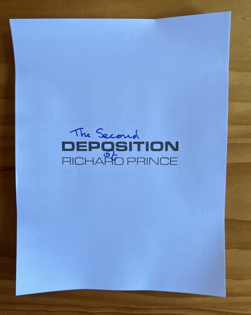
The Second Deposition of Richard Prince, course pack edition, 2025, 11 x 8.5 in.
A full one third of it is an auto-generated, unedited index, but at least it’s getting out there. People who don’t call it Kinko’s have no idea that it didn’t used to cost $30 to print a document.
The Second Deposition of Richard Prince, softcover edition, 2025, 9 x 6 in., 120pp
…aaand the third Second Deposition of Richard Prince just arrived.
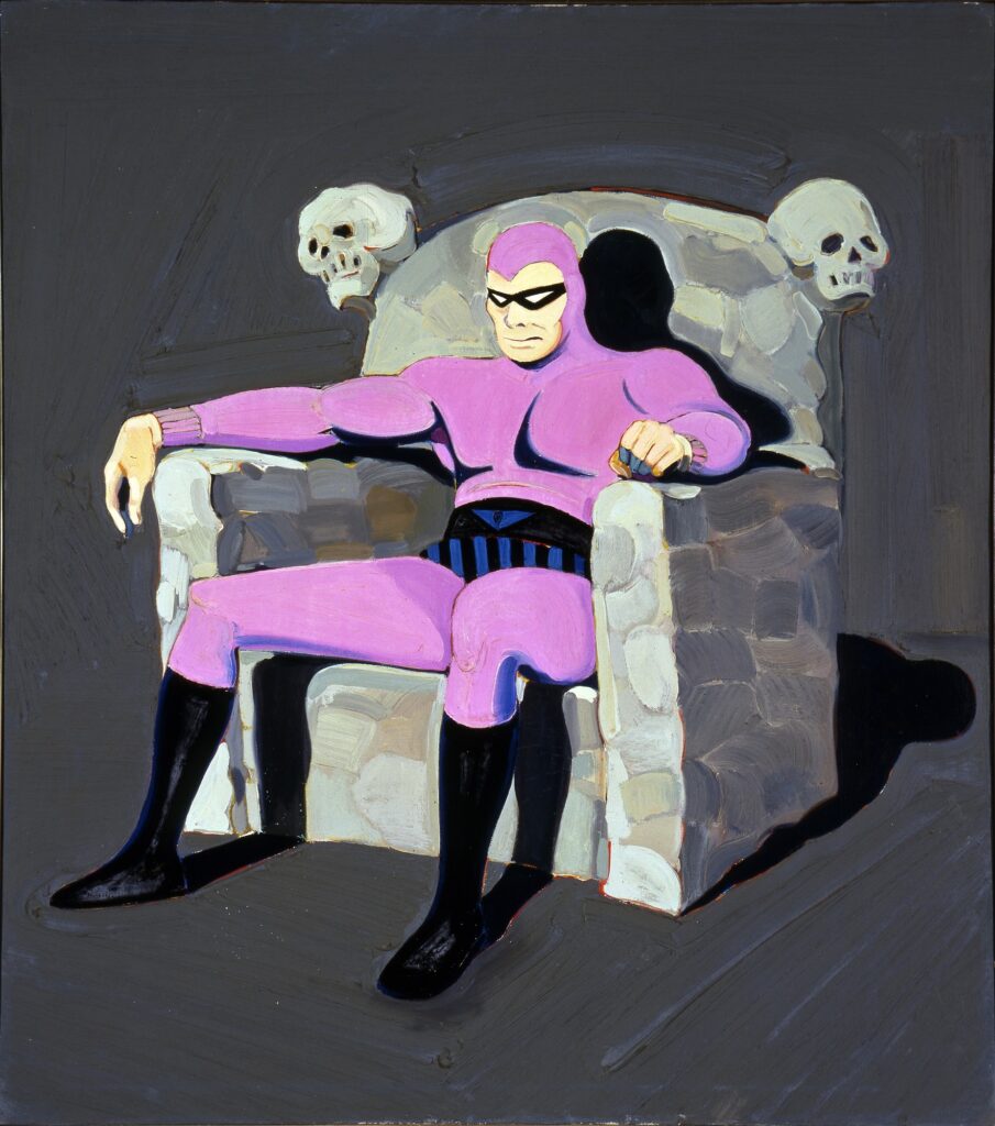
Mel Ramos, The Phantom, 1962, oil on canvas, 49 x 43 in., in SAAM’s collection
I don’t think about Mel Ramos too much, tbh, but when I do, it’s not his superheros that come to mind. Which is too bad, because, like, this painting of The Phantom from 1962 [1962!] is kind of fantastic. It feels like Ramos could have gone in a variety of directions from it, but opted for cleavage.
It looks like it really sucked to be The Phantom, slumped dejectedly in your flagstone armchair with your skulls, in your darkest room, being blasted by the light of what must have been the biggest TV you could get into your lair in 1962.
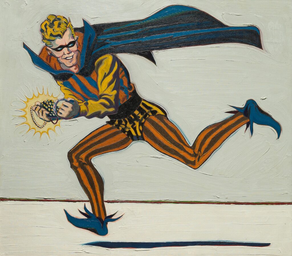
Mel Ramos, The Trickster, 1962, 44 x 50 in., oil on canvas, did not sell at Bonham’s in 2013
The Trickster, also from 1962, and on an identically sized canvas, turned sideways, feels like he just knocked off the jewelry store next to Wayne Thiebaud’s bakery. [Not only did The Trickster not sell when it came up at Bonhams in 2013, the lot right before it, a Warholian silver disaster-style diptych of Iwo Jima by Bruce High Quality Foundation, sold for $122,000, so the expectation, the illogic, and and the letdown must have been intense.]
1962 really was just cooking, painting-wise. 15 years after I first read it, I still marvel at Ivan Karp’s stories of how unsettling it was in 1962 to discover Lichtenstein, Warhol, and Rosenquist all making similar kinds of cold, numb, paintings from comics and commercial imagery.
But Ramos wasn’t hanging out in the backroom at Castelli in 1962; when he made these he was 27 and teaching art in a high school in Sacramento. Today would have been his 90th birthday. What a world. [thanks to Peter Huestis for the birthday heads up]
Here I am fiddling around with printers to make a paperback version, and he just ‘grams it out.
Of course, it IS his deposition.
For a couple of months now, Richard Prince has been showing Deposition (2025), the single channel video version of his second court-ordered deposition in a copyright infringement lawsuit, at Gavin Brown’s Sant’Andrea de Scaphis space in Rome. The show runs through this Friday, July 25, to andiamo!
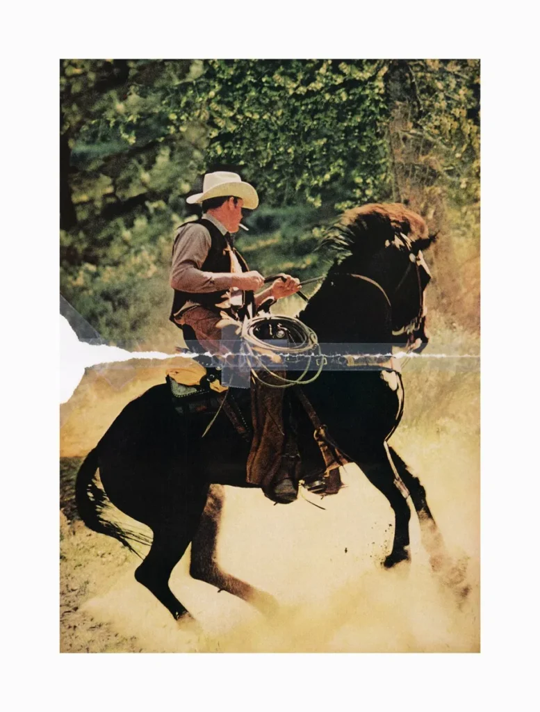
Richard Prince, Untitled (cowboy), 2016, C-print in two parts, Richard Prince Studio via Sant’Andrea de Scaphis
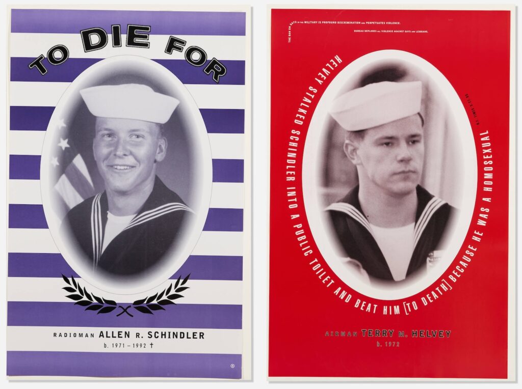
I realize though I’d seen the posters, and the basics of the situation, I’d never known the brutal details of Schindler’s killing. Or of the violent harassment Schindler experienced and tried to report, repeatedly, from the moment in late 1991 when he’d transferred to to the USS Belleau Wood until his murder October 27, 1992, days before Bill Clinton defeated George Bush in the US presidential election.
Clinton had campaigned to end the military’s ban on gay soldiers. Bush and his Defense Secretary, the draft dodger and parent of a gay child Dick Cheney, and many other Republican politicians, supported the ban, and fostered the atmosphere of homophobic violence and discrimination under the guise of military unity. Actually, gays were the real threat to this culture, they argued, what with the blackmail, and the AIDS.
I also did not realize the vast extent to which the US Navy abandoned and gaslit Schindler’s mother and family, and to which they covered up the culture of abusive bigotry encouraged by the officers on Schindler’s ship, and to which they obstructed investigations and attempts to seek accountability, much less reform. This all unfolded after the posters had gone up and worn down, after Clinton agreed to a compromise with the powerful and bigoted senator from Georgia, Sam Nunn, the policy known as Don’t Ask, Don’t Tell.
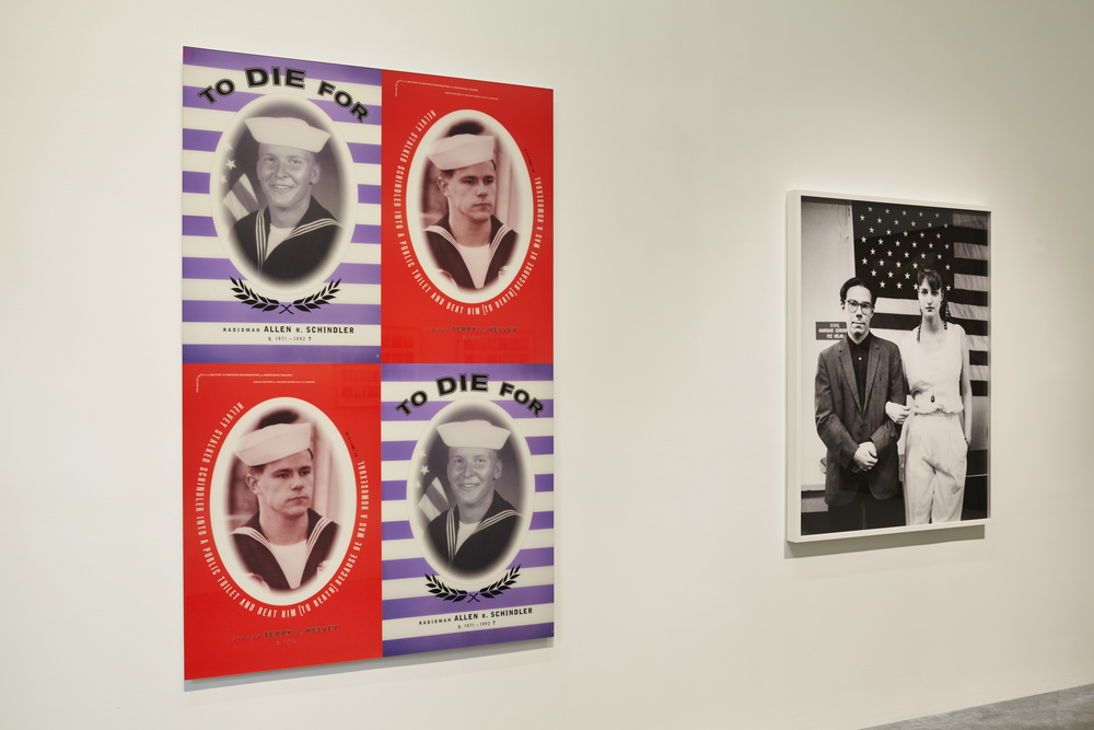
2013 installation view of Bureau’s posters and Alix Lambert & Bob Nickas’ portrait at the New Museum’s 1993 show, via Big Red & Shiny
Bureau was the design studio of artists Marlene McCarty and Donald Moffett, a continuation of sorts of Moffett’s involvement with the activist collective Gran Fury. At some point, or eventually, it all just became too much, too intense, too traumatic, and Moffett sought refuge in the studio, and in art, making abstract paintings. He seemed to address it in his 2019 Brooklyn Rail conversation with Dan Cameron, but rereading it now, it’s actually Cameron who does the talking, both questions and answers.
The way I’d remembered the posters installed was the way I’d remembered all Bureau’s posters, in an alternating grid, which was also how they were shown in 2013 at the New Museum’s NYC 1993 time capsule survey. I mention them now because a pair of posters just turned up in LA Modern’s post-Pride queer swag auction. But also because we live with one of Moffett’s earliest abstract paintings at the center of our home; we pass it hundreds of times each day. And its beauty now reminds me of the psychic cost Moffett paid to get to the place where he made it. Also, we’re entering an era where government-led bigotry and violence against its own people are expanding, and we need to remember how it went down before, and how to counter it.
Isa Genzken, Spiegelbild, 2001, mirror mosaic on board, 50 x 40 cm, ed. 100, published by the Kunstverein Dǔsseldorf
See, that’s how you shoot a photo of a mirror artwork. The Kunstverein für die Rhineland und Westfalen, Düsseldorf showed us the way, way back in 2001, when they published Spiegelbild, Isa Genzken’s contribution to their bougie annual artist editions series for their members.
Isa Genzken, Spiegelbild sold at Van-Ham in 2015 via a photo that emphasizes the 1 cm gridness of it all
It’s been downhill ever since. Shooting mirrored artworks from behind a blank white scrim to eliminate any reflection or trace of presence is a sales tactic, like staging a house. This kind of market lubrication and context erasure betray the experience of any artwork; mirrors just make it obvious. But the impact remains, and spreads, and eventually we’re swamped by the art equivalent of white modern farmhouses with grey laminate floors, everything around us optimized for resale.
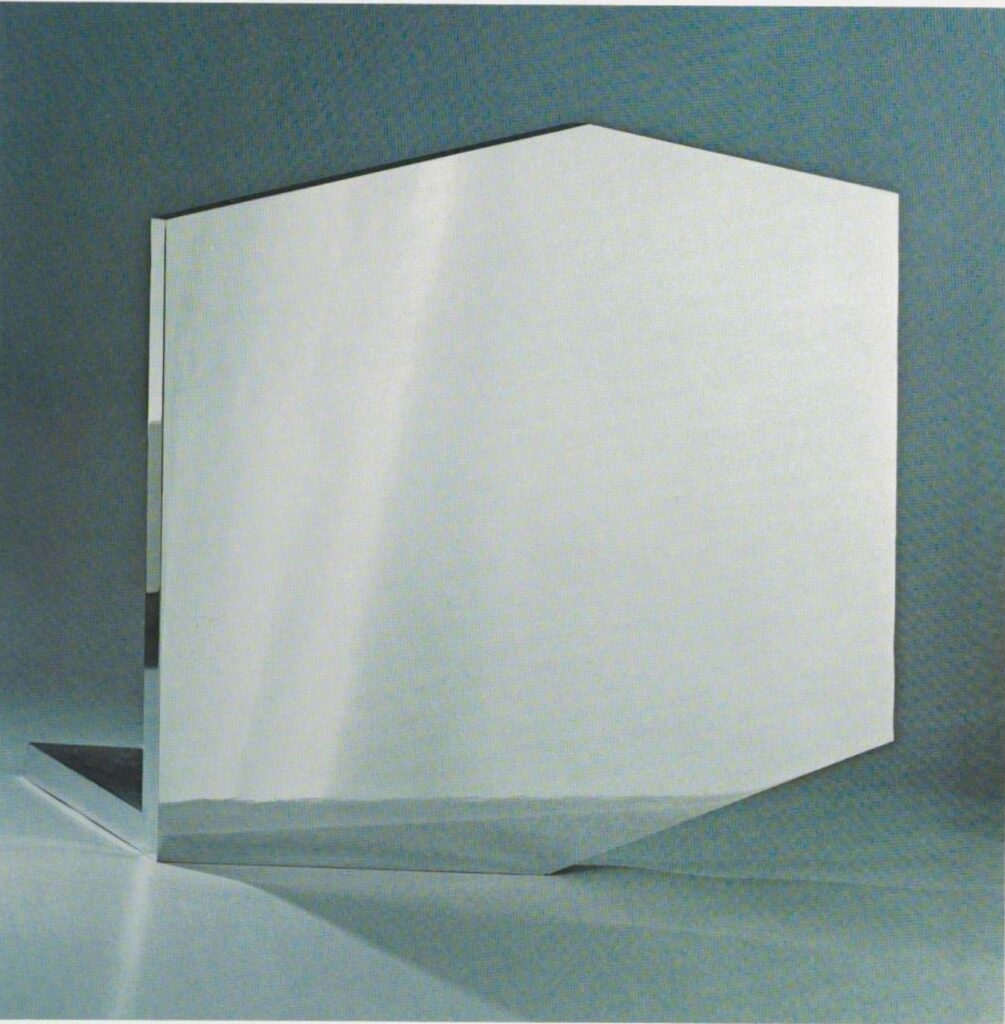
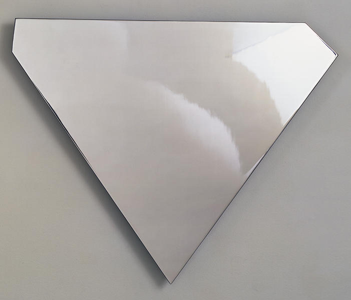
Ellsworth Kelly, Mirrored Concorde, as published in 1971, in the catalogue for Riva Castleman’s show Technics and creativity II Gemini G.E.L. at MoMA
Looking up something else in the catalogue for Technics and Creativity II, MoMA’s 1971 exhibition about Gemini G.E.L.’s process, I was stopped in my scrolling tracks by this excellent full page photo of Ellsworth Kelly’s Mirrored Concorde.
It absolutely looked like the future. And in a sense, it was: Mirrored Concorde was an edition in progress, just entering production with an undetermined edition size. Which, hold that thought. But the image itself, with its dramatic lighting, refractions, and straightforward mirrored materiality really hit.
That’s not quite how the work has turned out, alas, though it’s still a beautiful thing. It seems like there were only 16 made by 1972, when the work was officially published: an edition of 12, plus two copies each for Kelly and Gemini.
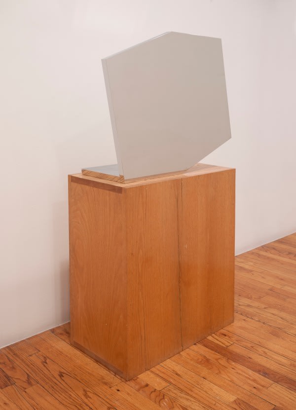
Unlike the free sculpture above, the examples out in the world have variousbases and pedestals that make me wonder if it’s a little top-heavy. Christie’s incorporated the base into the 50 7/8 in. height, but while they broke out the metal pieces, neither Brooke Alexander nor Matthew Marks included the base in the depth.
The truncated rectangular shape is one Kelly used as early as the 1950s; this one feels like it could be the hexagonal outline of a 3-D cube diagram. The mirror finish is very unusual in his work. After cutting, the 1-inch steel plate elements were ground, lapped, and polished on the sides and edges, then nickel- and chrome-plated. Which, I guess that’s ok, but could they not have just kept polishing? [Asked the guy who didn’t make one of these things, much less sixteen.]
Ellsworth Kelly, Untitled, 1985-86, polished steel, 30 x 24 3/4 x 3/8 in., ed. 9+7, image: Gemini GEL
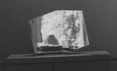
Mirrored Concorde proof installed at MoMA’s Technics & Creativity II: Gemini G.E.L. in 1971, on a wonky pedestal and roped off, but reflecting the Sculpture Garden, photo: James Mathews for MoMA
So maybe I like the top pic so much because it actually feels like a mirror-finished object. Every other image of Mirrored Concorde makes it look like Featureless Matte Finish Concorde. Seeing James Mathews’ installation photo of the MoMA show, I can confirm.
detail: Ice Bag in Mirrored Concorde
Even on its wonky pedestal, behind its stanchion, and against its painted accent wall, Mirrored Concorde manages to look like a portal to another dimension. Because what it actually reflects is the world in front of it: the museum’s sculpture garden through the Philip Johnson addition’s windows, with one of Claes Oldenburg’s Ice Bag sculptures peeking its motorized head up. Let this be one more argument in support of photographing mirrors to look like mirrors.
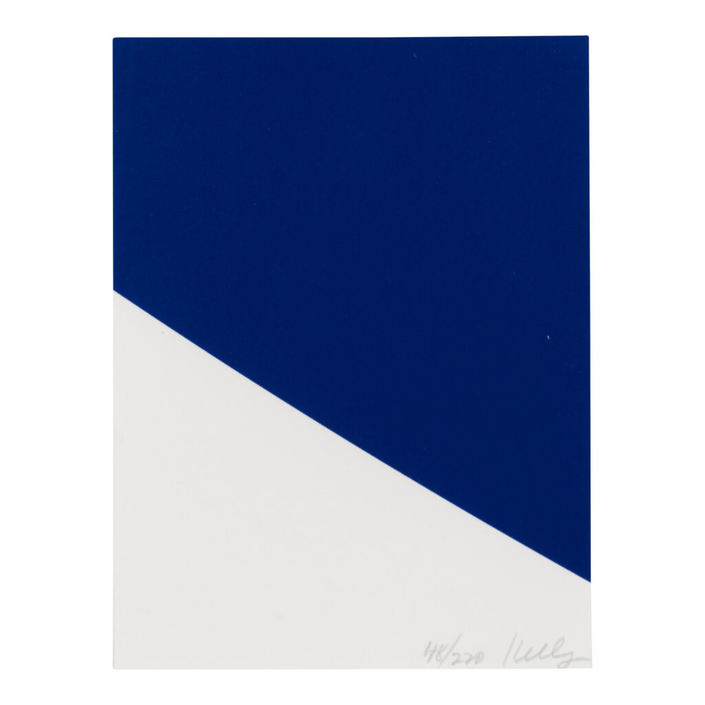
I am slow, but the Ellsworth Kelly print that’s the first lot in Roy and Dorothy Lichtenstein’s estate sale is even smaller than the smallest Kelly prints.Blue Curve, 1999, is just 8 x 6 inches. It was made as a benefit print for the Archives of American Art in a big edition, 220+38AP, so aggregated surface area-wise, it’s probably right in the middle.
Kelly was honored with a medal the AAA’s benefit gala in October 1999, which coincided with an exhibit of items from the artist’s archives in the Archives Gallery. The AAA had a gallery in the lobby of 1285 6th Avenue, the UBS Building with the Scott Burton street furniture.