February 2010 Archives

Hey Snow People,

I'll be participating in a "non-hierarchical panel discussion" about collecting art tomorrow, Saturday, 2/27 at #class, that's hashtagclass, Bill Powhida and Jen Dalton's show/performance/talk-in at Edward Winkleman Gallery.

The gig is organized by Barry Hoggard and James Wagner, there's an interesting-looking roster, and it kicks off at 6pm. I'd love to see a bunch of greg.org readers in the crowd, though if you can't make it, you can always watch the proceedings on the hashtagclass blog's livestream.

Collecting with your Eye, not your Ear [hashtagclass.blogspot.com]

UPDATE/REPORT Well, that was fun. "non-hierarchical" turned out to mean any/all of the following: sitting around a table in the center of the gallery, surrounded by the audience, which, incidentally, is also how a discussion/interview I did a few years ago at Witte de With was set up; all the images on Barry & James's collection website are the same size and most everything cost under $1000; or no artists in the discussion have sold much work for more than mid-six figures, if at all. Non-hierarchical, but not by choice.

But it was all good. The one instant I was worried--which John Powers noted, too--was when the one artist pointed in my direction and said, "I would never sell a work to him!" At which point, I looked around--are you talking to me?--and realized he was actually pointing to the screen behind me, which contained a juicily obnoxious quote from Tobias Meyer about bidding and sex, or something. So I dodged that bullet.

mauritshuis_portrait1.jpg

I've been thinking about this image from Google Street View, the one of the Mauritshuis which contains two distorted images of the guy's head. As that elongated lower head shows, Google's image knitting algorithm apparently combined two photos of the guy, two photos separated by a couple of seconds and/or feet.

It's like an automated cubism, or futurism, I thought, the photography of multiple simultaneous perspectives, or of motion. Which led me to the work of Etienne-Jules Marey, the pioneering 19th century French physiologist and chronophotographer.

Marey used photography and early cinematography to study motion, and he developed a chronophotography gun which printed multiple exposures on a single surface. Like this pelican landing:

marey_pelican.jpg

I found a couple of eerily relevant Marey quotes from the excellent compilation by GregP [no relation] on Interfacial Effects, a research-lookin' blog about art and temporality:

"Marey made it possible for the avant-garde to become receptive to new values: instead of escape into the past, the unreal or the dream, there was the double cult of machines and their propulsion [...]" (148) inspiring Giacomo Balla & Luigi Russolo, Marinetti, and ultimately Duchamp (1912 Nude Decending a Staircase)
- Etienne-Jules Marey : a passion for the trace, François Dagognet

"artists who wished to give form to the new experience of time Bergson so articulately voiced were drawn to Marey's pictures. They were an irresistible and particularly fecund visual source. For artists the attraction of the photographs lay in one important particular: they were the first images to effectively rupture the perspectival code that had dominated painting since the Renaissance. Marey's pictures depicted chronological succession within a single frame. Chronophotography provided a language for representing simultaneity - what was popularly understood to be Bergson's idea of time."
- Picturing time: the work of Etienne-Jules Marey, Marta Braun [google books]

Many of Marey's studies have been digitized by the BIUM at the University of Paris and are available online.

For all my talk lately about satelloons, Olafur's stayed very politely quiet about his own giant, swinging aluminum balls. Maybe because he only has one? Seriously, though, I hope it's an edition.

imploded_view_olafur_kemper.jpg

Your Imploded View is a 51-inch diameter, 660-lb polished aluminum sphere that swings like a pendulum. It dates from way back to 2001 [!], though it's not clear when it was first realized. At that weight and dimension, it has to be solid, which is rather spectacular. Such precision-manufactured geometry reminds me of the fantastically produced objets de science like Le Grand K, the International Kilogram Prototype stored outside Paris.

Anyway, the Kemper Art Museum at Washington University in St Louis purchased Your Imploded View in 2005, and it's on permanent view in the atrium there. Kemper curator Meredith Malone's YouTube video is nice and informative, but HD would be better for capturing the sculpture's experience. Don't miss they guy using the special, custom-made Your Carpet-Wrapped Pushing Trident to get the ball swinging.

Your Imploded View (2001) by Olafur Eliasson on permanent view at the Kemper Museum, St Louis [kemperartmuseum.wustl.edu]

giacometti_moma.jpg

These are mostly for me, just kind of gathered here without order or comment for the moment. I've been thinking about Alberto Giacometti lately, and his sculptural, spatial pursuit of that moment when a figure comes into view.

Arthur C Danto in The Nation 2001 about Sartre in 1948 on Giacometti:

Sartre says something even more striking about Giacometti's figures. "The moment I see them, they appear in my field of vision the way an idea appears in my mind." This is a way of explaining the somewhat ghostly feeling of his figures, as if they were persons whose bodies had been all but erased. Giacometti was legendary for destroying his work--his studio floor would be found littered with broken plaster in the morning, after undoing a night's work. I think this was the result of an impossible effort to eliminate whatever gave them the solidity that belonged to their material condition as sculpture.

Rosalind Krauss in Artforum 2001 quoting Sartre in 1948 on Giacometti:

"Giacometti," Sartre wrote, "has restored an imaginary and indivisible space to statues. He was the first to take it into his head to sculpt man as he appears, that is to say, from a distance." And because this is man as he is perceived, it is fitting that these sculptures should all be vertical, since Sartre equates perception with walking, traversing space, doing things, just as he links imagining with the body's repose. If one dreams lying down--as in the sculptor's earlier, Surrealist, s leeping women--one perceives standing up.

Michael Kimmelman in NYT 2001 on Giacometti's MoMA retrospective:
In the 1940's and 50's, when he made extremely thin heads, flattened on both sides like pancakes, Giacometti talked about the effect of looking at somebody straight on, then from the side. He was rejecting the Cubist idea that it was possible to keep different views of the same person in sight at the same time. ''If I look at you from the front, I forget the profile,'' he said. ''If I look at you in profile, I forget the front view.'' Which is precisely what happens: if we move 30 degrees left or right off-center of these heads, the face becomes a profile. Back six inches, the profile disappears. If we move: the work is about our distance from the figures, our position vis-a-vis the heads or striding men or standing women.

Kimmelman in the NYT 1996 reviewing David Sylvester's incredible book, Looking at Giacometti:
The issue for Giacometti became the pursuit of what he called likeness. Roughly, it had to do with trying to represent the real experience of seeing, apart from artistic conventions: on the simplest level, conveying the actual swimmy sense of distance and engulfing space when viewing figures across, say, a broad street, or conversely, the vertiginous foreshortening you get when standing face to face with someone. Likeness also had to do with something less tangible but still real: the intense sensation of the shared gaze between living artist and living model. Mr. Sylvester contrasts Giacometti with Matisse in this respect. "The Matisse sculptures present a figure seen whole and entire now, in an instant of time, in any instant of time, meaning outside time," he writes. "The Giacometti sculptures seem to present figures as they are perceived while time passes."
I've GOT to get Sylvester's book out of storage this weekend. That, and Herbert Matter's photobook of Giacometti's sculptures. I have my Bonnefoy, of course, which is beautiful to look at, but nearly impossible to read. Just, wow, what is going on there?

image: City Square, 1948, via moma.org

mauritshuis_gmap.jpg

Because I now appear to be constitutionally incapable of doing otherwise, after mentioning the Mauritshuis, the Vermeer-loaded Royal Picture Gallery in The Hague, I checked to see if was camo-obscured on Google Maps.

[I kind of knew it wasn't, because it's situated smack in between two prime Dutch Camo Landscapes: the Noordeindepaleis and the Ministry of Defense HQ, but I looked anyway.]

And while we knew that Google Street View has come to Den Haag, I didn't realize it was just a couple of months ago. And with the Google Trike, no less.

Here's where the museum--a 17th century mansion, is supposed to be, but whoa.

mauritshuise_streetview1.jpg

It's apparently camouflaged as a generic glass & steel office building. Took me three passes to find it. By which point, I became kind of fascinated with the way Street View knits together its panoptic images, particularly when they include people. I love Google's Cubist-meets-Robert Lazzarini-meets-Julia Scher-meets Hans Holbein the Younger portrait style.

mauritshuis_portrait1.jpg

vermeer_view_of_delft.jpg

The inconvenient intrusion of war and political upheaval [i.e., the collapse of the Dutch government and the looming withdrawal of Dutch troops from their frontline deployment in Afghanistan] into my Dutch Landscapes project has sent me trying to re-find some discussion of Vermeer that's stuck with me for years.

Like so many hundreds of thousands of others, I made a trip to the National Gallery in Washington in the winter of 1995 to see the first Vermeer exhibition in almost 300 years. It was a DC that may be hard for folks today to even conceive of: the show was abruptly opening and closing, thanks to massive snowfall and two government shutdowns orchestrated by an obstructionist Republican agenda led by Newt Gingrich. [I know, right? He seems so nice.]

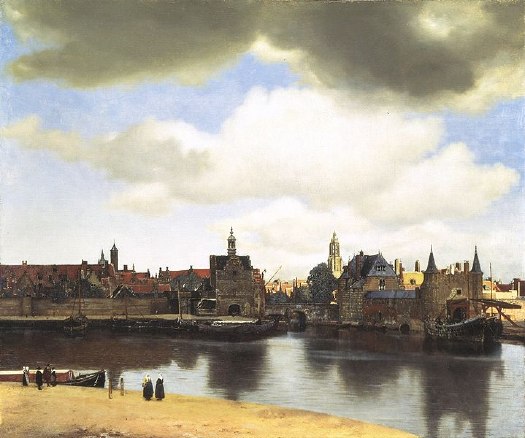
Anyway, 21 of the world's 35 Vermeers were there, including View of Delft, loaned by the exhibitions only other venue, the Royal Gallery at the Mauritshuis in The Hague.

The Essential Vermeer puts the date depicted in the painting as early May, 1660 [the evidence: leaves on the trees, the boat activity, and the empty tower on the Nieuwe Kerk, because the bells were in the shop]. It seems so banal, so placid, so idyllic.

But I remember reading a discussion of how deceptive, or at least complicated, this peace was, in light of Delft's own history. The argument centered on the high-contrast beam of sunlight Vermeer punched through his rainclouds to illuminate the Nieuwe Kerk, in the center background of the painting.

William of Orange had used Delft as a base for launching in 1568 what became the Eighty Years War, against Spain, the Hapsburgs, and the Holy Roman Empire, which turned on issues of religious intolerance, taxation without representation, and centralized power. William was assassinated in 1584, and because his family's traditional seat, Breda, was still in Spanish hands, he was interred in the Nieuwe Kerk. So are his successors in the House of Orange-Nassau, who continued the fight, and who have ruled the Dutch Republic since it won its independence with the Treaty of Westphalia, which was signed on May 15, 1648.

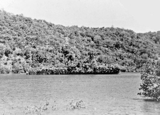
But wait, there's more! In 1660 the city was also still recovering and rebuilding after the Delft Thunderclap of 1654, a massive gunpowder explosion at a waterfront munitions warehouse that killed over 100 people--including one of Delft's most well-known painters, Fabritius Carels--injured thousands more, and leveled a huge section of the city.

If Vermeer were alive in 2013, then, the equivalent painting might be the rainy skyline of lower New Amsterdam from the Hudson, where a ray of sunlight picks out the details of an unobstructed St Paul's church--if George Washington and all the subsequent presidents were buried there. If there's a Dutch equivalent of a bald eagle with a tear in its eye, Vermeer showed remarkable restraint by not including it.

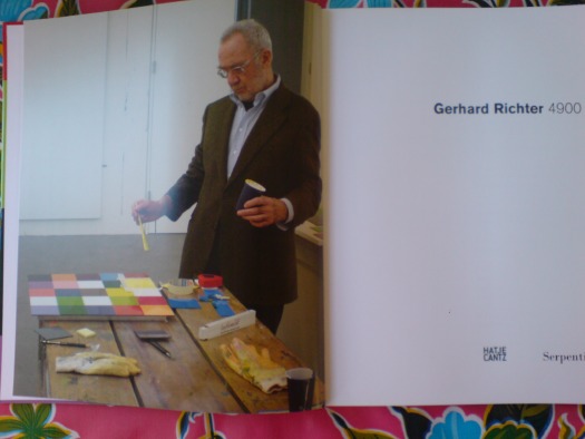
UPDATE I'll get out my DVD set in the morning to confirm, but I think Tyler Green's right, it's the first essay in Lawrence Weschler's 2004 book, Vermeer in Bosnia, which was originally published as "Inventing Peace," in The New Yorker, Nov. 20, 1995.

Yep, here we go, Weschler's setup for the remarkable story of how the head of the International War Crimes Tribunal in The Hague kept himself sane by looking at the Vermeers at the Mauritshuis:

For, of course, when Vermeer was painting those images, which for us have become the very emblem of peacefulness and serenity, all Europe was Bosnia (or had only just been): awash in incredibly vicious wars of religious persecution and proto-nationalist formation.
Wow, maybe I should re-read the whole thing rather than post updates every page, but. Weschler quotes Harry Berger's idea about Vermeer's deployment of "'conspicuous exclusion,' of themes that are saturatingly present but only as a felt absence."

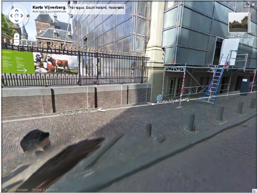
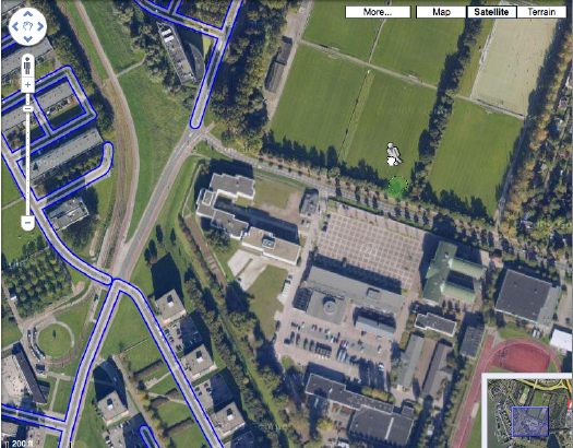
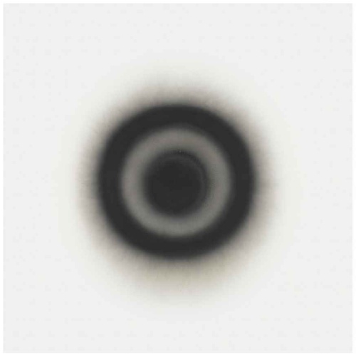
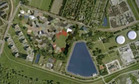
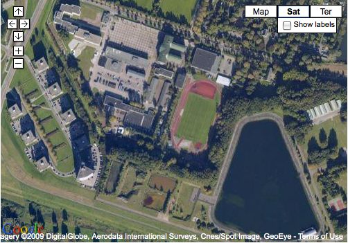
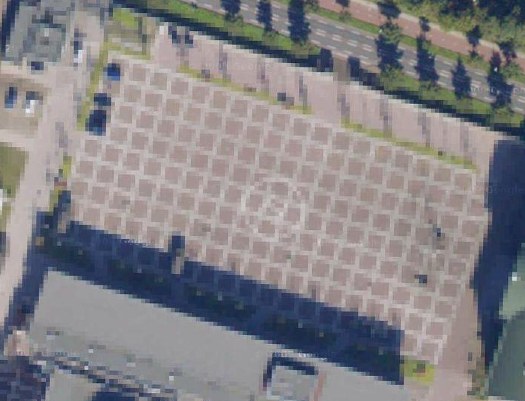
What a fantastic phrase, which immediately reminds me of a comment left by Jerome Bertrand on Ogle Earth's original 2006 coverage of the Dutch Google Map censorship issue:

All the same, someone at Royalty level (AIVD?) would choose to typically blur out certain private residences - so it ends up you can find them quicker than others by just scanning for blurred spots in the area. This is helpfull [sp] when you need to know what's hot.

February 20, 2010

Echo Echo

echos_sandia_life64.jpg

The giant, reflective aluminized mylar satelloons of Project Echo were designed to be seen by the naked eye from anywhere on earth. As I trace down depictions and accounts of seeing them, I wonder how watched they actually were outside the scientific community.

Echo II was launched January 25, 1964. Shortly afterward, scientists at Sandia Corporation calculated the crossing of the two satelloons and snapped this photo, a 6-minute exposure. Echo I [100-ft diameter, 870-mi. orbit] is traveling from the upper left. Echo II [135-ft dia., 670-mi. orbit] is traveling from the lower left. The photo was a double page spread in LIFE Magazine on Feb. 28.

Sandia was a division of Western Electric, a subsidiary of AT&T, which ran the Sandia National Labs in New Mexico. It was a different division from Bell Labs, the division of AT&T which ran the Echo communications system on the ground. Sandia is now owned by Lockheed Martin, which manages it for the Department of Energy.

I think I'd now like to track down some vintage prints of this photograph, and not just the copies of LIFE, which I already hoovered up from eBay.

"Heavy Traffic In Outer Space," Feb. 28, 1964 [LIFE via Google Books]

Related, but the exact opposite: Trevor Paglen's The Other Night Sky

no_google_streetview_rott.jpg

You may recall how Google Maps recently changed the polygonal camouflage on one of the Dutch landscapes I was using for my painting project.

I was back there, getting a clean shot of the nicely distorted grid plaza--the site belongs to the Koniklijke Marine, the Royal Navy, and is apparently the home address for the Royal Marine Band--when I saw that the Streetview icon was activated. Looks like Google's camera cars reached the football field-filled outskirts of Rotterdam.

But not all of them. The available imagery shows that Google is excluding all street-level imagery from around the camo'd compound. The previous official explanation for camo-obscuring intelligence-sensitive sites was that the Dutch government claimed jurisdiction to censor aerial photography, but not satellite imagery. I guess there's another law that forbids street-level photography from public roads, too? Yes and no.

A quick stop at the ur-Dutch Camo Landscape, the Noordeinde Paleis in The Hague, shows that Streetview is unavailable for its entire perimeter. But the other camo'd complex, a Royal Garage or something, to the northwest through the park, shows up just fine. The south perimeter of that giant, cut-n-past camo blob is just fine, which makes me think that the building being camo'd--I think it's the HQ of the Defense Ministry itself--is on the next street up, which is, indeed, blocked. Unfortunately, Noordwijk ann Zee, the beachfront town that is the site of my favorite inexplicable, airdropped camo blob, has not yet been added to Streetview.

Update: In actual governmental/military news, the Dutch coalition government just collapsed in the face of growing opposition to extending the deployment of 2,000 Dutch troops in NATO's operations in southern Afghanistan.

February 19, 2010

On Reading Auras

As you can guess from the mentions of Sherrie Levine, I've been studying the issues around copying and reproducing and originality and authorship. And whenever you do that, Walter Benjamin comes up, specifically his concept of aura.

Basically, it's what an original work of art has that a reproduction doesn't. Except when it does. It's what declines or disappears in the process of mechanical reproduction--especially in the cinematic process, which interested Benjamin greatly--but then it comes back sometimes. Somehow.

Just in case quoting or arguing Benjamin at length is tedious or pretentious to the Twitterized reader, I'm putting a few quotes and sources after the jump, for my own reference later. They are:

Sherrie Levine
John Perrault
Samuel Weber
Grant Wythoff
Miriam Brantu Hansen

February 19, 2010

Uncle Rudi, Is That You?

ft_uncle_rudi.jpg

Who are the freaks and nerds who call out picayune corrections in newspaper articles? Me, for one.

On a New York Times piece I did once, I changed an entire line during the copyediting process. The piece was much, much better for it, I think, but I got chewed out afterward because, apparently, it required several people staying late to re-layout a whole page, which delayed the closing of the section.

As penance, I've been pretty fastidious ever since about quickly slipping the Times' web editors little corrections--usually of peoples' names, ex the kind of things that might cause unnecessary embarrassment--for Arts stories. [Oy, in one pseudo-liveblog post from Miami Art Basel, the correspondent misspelled basically every name she dropped. And no, it was not Linda Yablonsky; she is an exquisite name dropper.]

Anyway, last weekend, the Financial Times mentioned the new Gerhard Richter biography in Jackie Wullschlager's survey of books on German painting. Their whole point was about how loaded Richter's blurred portraits of his family were, such as Uncle Rudi.

The FT transposed the captions with the Richter and a portrait by Otto Dix. When I tried to do my typical one-click correction, I was surprised to find that the FT doesn't appear to even publish an address for corrections. Or for reaching the editors.

Setting aside the whole implication that the very idea of being corrected didn't cross their minds, the whole FT website contact interface turns out to be oriented to subscribers/users and the support of the paid consumption experience.

As such, it has taken a week for me to receive an automated reply, and now my comment had been forwarded to the appropriate department. As the fresh screenshots show, the error remains.

gareth_long_seymour.jpg

Gareth Long's giant lenticular prints based on the iconic-yet-anachronous 1991 cover designs for JD Salinger's books are freaking me out right now.

They're like Noland or Morris Louis canvases, reanimated through some immediately dated, retrofuturistic technology. Something an aesthete in an early Star Trek movie might have had hanging on his wall. Jeremy Blakes that still work in a blackout.

Which is why they freak me out so much. A Color Field painting hangs unobtrusively, even decoratively, on the wall. A Blake requires turning it on and watching it. You can't work with those things on in the background, any more than you could sleep with the Flavin on.

Long's lenticulars thwart all that passive/active viewing negotiation by always being on. If they're in the room with you, you can't not look at them.

Go ahead, try it. They're on view through next weekend at Kate Werble Gallery on Vandam St.

Above: Untitled (Seymour) is the most Salinger cover-esque, while Untitled (Zooey) is the most unabashedly psychedelic. Both images are from Long's site, where he also offers video clips of the pieces.

Colby Chamberlain ties this "restless" aspect to Salinger in his Artforum review [artforum]
Untitled (Stories) [garethlong.net]

For their "Art of Two Germanys" show in 2008, LACMA recreated part of a 1966 gallery installation by Gerhard Richter called Volker Bradke, which was designed to mimic or reference the postwar German bourgeoisie's penchant for ticky tacky floral wallpaper.

But instead of real wallpaper, the museum used an artifact from the original installation, loaned by the piece's owner via the gallery: a rubber stamp roll with a design carved into it. LACMA's curator and gallery manager talk here about printing up the walls, but for some reason, I just can't get enough of this video of them actually doing it.

This reminds me a bit of Christopher Wool, and it's a fantastic-looking method of generating an image. Or a design, or a surface, whatever you end up calling it. The fact that it's a painted simulacrum and not actual wallpaper, though, seems pretty relevant, as does the curator's instruction that "the printing is not supposed to look perfect." It sounds like an early example of Richter reminding the viewer that he's looking at an image, not the thing itself.

Anyway, this is all coming down today because Bradke is the subject of Richter's only film, a 14-min black & white short which was part of the installation. It's just been released on DVD, along with a book, »Volker Bradke« und das Prinzip der Unschärfe ["Volker Bradke and the Uncertainty Principle] by art historian Hubertus Butin. From what I can tell, the whole project was designed to turn Richter's friend and studio assistant into a celebrity, using paintings, posters, banners, and a fawning profile film. We'll see how the film turns out when it arrives; but so far, Richter doesn't seem too compelled to revisit the medium. [via @gerhardrichter]

Wallpaper in Art of Two Germanys, part II [lacma blog]

February 17, 2010

More Levine, More Meltdown

Here's Sherrie Levine talking in 1993 about the making of her Meltdown woodblock print series with BAM's Constance Lewallen in the Journal of Contemporary Art. Levine did just what Susan Tallman, who reviewed Meltdown kind of negatively in 1990, feared: she used the computer algorithm to color-average the entire images of Mondrian, Monet, etc., and then she used the "Mardenesque" greys to paint monochrome canvases. It wasn't a bug, it's a feature.

The JCA transcript has a funny find&replace quirk, where all the SL's were replaced with Levine [e.g., slide >> Levineide]:

Lewallen: You did some woodblock prints recently, I noticed, that had to do with the "Meltdown" paintings. Where did you do them?

Levine: I worked with a wonderful printer, Maurice Sanchez. I had wanted to do prints based on a geometric grid with computer averages of colors of modern master paintings.

Lewallen: Which paintings did you use as a starting point?

Levine: For example, we used a Monet "Cathedral." We put a Levineide of the picture into a computer with graphic capabilities and the computer created a grid in which each section corresponded to an average of the color in that section of the painting. The "Meltdown" paintings are based on the same principle but rather than being gridded off, they represent one uniform average for the whole surface. In fact, it's funny, I had been wanting to make work after Marden's early work, because some of his monochromes are some of my favorite paintings. For me they are the ultimate late-Modern paintings. I am also a big fan of Olivier Mosset's monochrome paintings, and Yves Klein is another favorite of mine. For years I have been trying to think of a way to make monochromes that were interesting but not the same as those I admired, but I never came up with a solution. Then, when I was working on the print project, almost as a mistake, the computer also gave me the color average of the entire . . .

Lewallen: So, the print project preceded the paintings?

Levine: Yes, the average of the entire painting, all the colors in the painting, like when you mix your whole palette together you get these beautiful, Mardenesque greys and greens and mauves. And I realized I had finally found a method.

Lewallen: What were the colors like in the prints, working with color mixes from grid to grid?

Levine: They were much less greyed down than the paintings.

Lewallen: Depending on the section.

Levine: I originally thought they should be lithographs or silkscreens, and Maurice came up with the wonderful idea of woodcuts on Japanese rice paper. He used a high-tech method; he made a grid of the twelve tongue-and-groove blocks using a laser saw that he inked up separately and printed all at once. I liked the combination of high-tech and low-tech techniques.

Levine's Meltdown (After Yves Klein), 1991, was in Daniel Birnbaum's Italian Pavilion at Venice last year. AFC got the photo, if not the concept.

Reductivist abstraction and pixelated photo-appropriation? If only it could involve a short film, an Ikea table, or a White House stage set, I could wrap this whole blog up with a bow and go home.

From Peter Blum Editions' text accompanying Sherrie Levine's 1989 print series, Meltdown:

The twelve-color woodblock prints in the portfolio Meltdown have been created by Sherrie Levine by entering images, after Duchamp, Monet, Kirchner, and Mondrian into a computer scanner that spatially quantizes and transforms these images into the minimum number of pixels, thus determining each of the colors in the four prints.
after Duchamp et al, means these are pixelated prints based on Levine's own photographic reproductions of photoreproductions of [clockwise from upper left], a Monet's Rouen Cathedral, Kirchner's Potsdamer Platz, Berlin, Mondrian's Composition No. II, and Duchamp's L.H.O.O.Q..

levine_meltdown_2.jpg

I'd started tracking down links to the "original" works, Levine's source paintings, before realizing that kind of missed the point. In fact, as with her earlier rephotographic series, Levine's source images are reproductions in books. In 1987 she showed 40 photos, all 1982, of reproductions of works by Monet, Kirchner, and Mondrian at the Wadsworth Athenaeum. [pdf of the exhibition brochure].

For one contemporary reviewer, Levine's use of a computer, her deployment of algorithmic color averaging, and the whole "pixel" concept gave Meltdown the whiff of suspicious techno-novelty. I obviously think it's a fresh and worthy approach, which now makes me wonder a bit. I'm also kind of fascinated by her use of woodblock, which was either a 4- or 12-color process. Either way, it seems an important, digital-to-analog color translation step is being largely ignored.

What's also remarkable is that Phillips ran the After Mondrian image on the cover of the catalogue for it editions auction last fall, even though the suite for sale was an unsigned, undeclared set outside the edition [35 + 10AP], which was marked simply "WKSHP 1/2." It still sold for $12,500.

Levine made at least one other pixelated print series. Equivalents: After Stieglitz 1- 18 are greyscale inkjet prints from 2006, and were shown at the last Whitney Biennial.

skyway_for_sale_cds.jpg

In this difficult real estate environment, close followers of the used modernist Skyway market will note have reason to be optimistic. Even as asking prices have dropped nearly 40% in the last year,--from $79,500,to around $49,500--they are still way above 2002 and 2006 results of $1 and "a very small amount" that's probably closer to $1 than $49,500, respectively.

city_desk_skyway_in_situ.jpg

SKYWAY FOR SALE - AGAIN!!! [minneapolis.craigslist.org, thanks sheree from aol]
City Desk Studio architects for all your used Skyway needs [citydeskstudio.com]

February 10, 2010

ZERO Adds A Zero

otto_piene_sothebys.jpg

Wow, Sotheby's auction of iconic Zero works from the Anne and Gerhard Lenz collection today in London went through the roof.

Whether it was the recent renewed critical interest in key Zero artists beyond the big names--from Klein, Fontana and Manzoni to Otto Piene, Gunther Uecker, Jan Schoonhoven--or just shrewdly low estimates on fantastic works, the sale was pretty impressive.

gunther_uecker_sothebys.jpg

There'll be no more haggling over stray assemblages in the empty aisles of Art Rotterdam after this, I tell ya.

top: Lot 2: Rauchbild, 1961, Otto Piene, est 35-40,000 GBP, sold 223,250 GBP.
above: Lot 3: HAAR DER NYMPHEN, 1964, Gunther Uecker, est. 100-150,000 GBP, sold 825,250 GBP
ZERO art from the Sammlung Lenz Schoenberg, Feb 10, 2010 [sothebys]

Previously: Otto Piene on The Mall - Centerbeam and Icarus

February 10, 2010

100 Colours Down, 4800 To Go


Fuse Beads, After Gerhard Richter, originally uploaded by gregorg.

We may go blind and crazy, but we'll have something to show for this snopocalypse, dammit.

Previous Gerhard Richter's 4900 Colours-related excesses here, here, and here.

duda_miranda_coll.jpg

So from what I can gather, Duda Miranda is a fictional collector persona, created by an artist, who collects by fabricating replicas of conceptual artworks. He first exhibited his collection in his [or someone's] house in Campinas, Brazil, in 2003. But apparently, he kept on making/collecting, and in 2007, the Museu Mineiro in Belo Horizonte, exhibited the collection and published a catalog, which was distributed to "schools and art institutions."

Included in the collection are replicas of works by Felix Gonzalez-Torres, Cildo Mireiles, Helio Oiticica, Joseph Beuys, Rivane Neuenschwander, Sophie Calle, and Sol Lewitt. From the thumbnails above, it looks like there are early Dan Flavins and Olafur Eliassons as well. A condensed auto-translation of Duda's 2003 statement:

My collection is simple: do not buy artwork, redo them. For me art is mental and in some way, every time I encounter a job and I am affected by it, I have it or am possessed. So I am led to believe that art is both the artist and mine, she is in the world. And it learned from the art itself, it is learning, learning is built.

My collection is composed primarily of learning. Nothing to do with books. Forget this is perhaps the first step (Beuys: Noiseless Eraser). Collection Duda Miranda is like a series of propositions, each working a proposition. My choice is guided by the method invented to collect, certain jobs require living, give me. Do not build up, a repeat experiment.

The collection that bears my name will be considered false by many - most experts. I learned the power of art is to affect and be affected, the rest is shadow of alien powers.

I first learned of Miranda's collection project in Irene Small's Artforum article about the fire that damaged and destroyed many pieces of work by the late Brazilian artist Helio Oiticica. According to Small, Miranda's "deterritorialization" was a "paradoxical reminder that the afterlives of works of art inhere not in singular possession, but in collective use."

Also, in exploring the ramifications of the fire for Oiticica's work and influence, just at a time when his global prominence as a pioneer in so many fields of postwar art practice has been rising, she cites unnamed Brazilian "commentators" who

argued that Oiticica's works had become fetishized, some going so far as to say that the fire had "liberated" the artist's ideas from their material cage. Oiticica's works, according to this reading, are primarily prompts for experience and better conveyed by propositions and writings than by physical remains. Of course, this idealist position also has its market version, as propositions and projects are easily editioned and sold when remade.
It's remarkable that it's remarkable that this antipathy toward the "fetishized" or commodified art object has such currency in the Brazilian context, whether in the debate over Oiticica's fate or official sponsorship and promulgation of Miranda's self-concious counterfeiting.

For all the griping and, the US/Europe art world still feels like it exists within the market paradigm. And it's a paradigm which subsumes even the essentialist ideas behind much of the art of the last fifty years. So it's kind of fascinating to see art in an alternative reality where the concept takes precedence over the certificate.

All that said, I can't find the supposed online catalogue anywhere, nor can I find anyplace to see or buy the print version. Portuguese readers, help an irmão out?

update: According to this PDF text from her site Marilá Dardot cooked up the Duda thing with fellow artist Matheus Rocha. Thanks to Joao for the info.

torben_giehler_2001.jpg

As soon as I started thinking that Dutch Polygonal Camo on Google Maps would make great abstract landscape paintings, I thought of a some giant, abstract, polygonal landscape paintings I'd seen way back in 2000-2. But for the life of me, I couldn't remember the artist's name. From Julie Mehretu to Edvard Haberkost, to Benjamin Edwards to Kevin Appel to Carla Klein to Jules de Balincourt to Thomas Scheibitz, large-scale, geometrical/architectural/spatial/digital/landscape abstraction has not been in short supply. And of course, it was none of the above.

I'd seen one at "Collector's Choice," the exhibition I co-curated at Exit Art in the winter of 2000-1. It was on Norman Dubrow's crazy, salon-style wall. Then the one that really haunted me was in a 2001 show at Caren Golden Gallery, curated, I think, by David Hunt. And then there was another show somewhere later, a solo show.

Well, thanks to, of all people, Mark Kostabi, I just realized it was NY/Berlin painter Torben Giehler. And the gallery was Leo Koenig, in 2002.

In her 2002 review of Giehler's Koenig show, Roberta Smith described the artist as one of several interested in "formalist abstraction, digital cartography and photography." She also guessed that making the paintings "must require hours of applying masking tape." And sure enough, the many studio photos on Giehler's website show piles of balled up blue tape, and also small printouts taped next to the canvas. It looks like he begins his work on a computer, and then enlarges and transposes the compositions by hand. [This 2004 Art in America review is excellent for describing the painting's production, while adding absolutely nothing to their context or understanding.]

Some of Giehler's landscapes are gridded; the earliest painting on his site is an explicit Mondrian flyover, a psychdelic reworking called Boogie Woogie. But his polygonal landscapes seem to form structures of their own. Like the mountain series he showed at Koenig. K2 is a favorite. [And a favorite of Giehler's, too, apparently; he made a series of prints of it with Fawbush.] And Matterhorn has a very Dutch color scheme.

Glad to clear all that up.

above: Tomorrow World, 2001, by Torben Giehler, exhibited in "Superimposition," Caren Golden Gallery [torbengiehler.com]
Torben Giehler's website [torbengiehler.com]

February 8, 2010

Dutch Camo Mashup Goodness

camo_crijnssen.jpg

I guess that's the whole point of camo, you just never really know what you're gonna see.

In February 1942, the Dutch minesweeper the HNLMS Abraham Crijnssen survived the Battle of the Java Sea, in which the Japanese Navy crushed Allied forces [AU, UK, NL, US] and invaded the Dutch East Indies [aka Indonesia].

To evade detection from the air and retreat to Australia, the Crijnssen's captain ordered the 186' ship disguised as an island by covering it with branches.

Unlike the official, formal Razzle Dazzle camouflage technique used in WWI to confuse submarines, the Crijnssen's improvised approach worked. The ship survived and eventually ended up in the Dutch Navy Museum at Den Helder, the city at the tip of the North Holland peninsula which has long been a strategic nexus of Dutch naval and shipping operations.

crijnssen_gmap.jpg

In fact, when you look up the Crijnssen on Google Maps, there turns out to be a huge complex of Dutch Polygonal Camo just to the east, the main base for the Royal Dutch Navy.

dutch_camo_ship_helder.jpg

And the camo extends out into the water in order to cover a ship caught by Google's Aerodata photographers just as it passed by the world's most undeniably phallic breakwater. Wonder what the sailors' nickname for that is.

Here a Google Map with both generations of Dutch naval camo, side by side:


View Larger Map

HNLMS Abraham Crijnssen at the Historical Naval Ships Assn [hnsa.org via boingboing]

February 5, 2010

Called It

olafur_color_experiment.jpg

Been waiting to finally see one of these. Looks like this week is my chance:

In the main gallery upstairs, Eliasson exhibits a series of watercolor drawings on paper. Configured in sequences, they use ellipses and circles as narrative exercises on the perception of space and movement. While shades and hues play an important part in these watercolors, the oil painting Colour experiment no. 3 (2009) is part of ongoing research into color conducted at Studio Olafur Eliasson. The studio has been developing a set of handmade oil paints that range through the full spectrum of visible light, experimenting with their physical properties and interactions. Circular in form, the painting expands on the traditional model of a color wheel, wherein each of 360 degrees is painted in one color and corresponds to its complementary afterimage located directly across from itself.
That image above is Colour experiment no. 7, 2009, which was shown in Seoul, but I'm just sayin'


Olafur: The Magazine, originally uploaded by gregorg.

Olafur Eliasson, Multiple shadow house, February 11 - March 20, 2010 at Tanya Bonakdar Gallery [tanyabonakdargallery.com]

Gather ye screengrabs while ye may, I guess.

The camo-obscuring of sensitive sites on Google Maps by the Dutch Intelligence Service (MVID) is a dynamic process. One of my favorite sites I found last November is a complex along the Maas in Rotterdam. The polygonal camo zone is surrounded by an equally artificial-looking geometric landscape:

rotterdam_camo_before.jpg

But when I pulled up that old post, the embedded Google Map showed a new, unobscured image:

rotterdam_camo_after.jpg

Thereby revealing the existence of a previously classified football field.

But wait, the image isn't unobscured after all; it's just obscured at a higher resolution. Oh no! It's Dutch Camo 2.0!

rotterdam_camo_v20.jpg

My project just got overlaid with a thick, historicizing blanket of obsolescence. Which, for a bunch of Dutch landscape paintings, is probably just as well.

And I must say, I DO like what they've done to that helipad-equipped grid.

rotterdam_camo_v20_grid.jpg

I swear, I didn't plan to go all Errol Morris and do three posts about one photo in one catalogue about one artwork. So look at this other photograph!

4900_colours_dropshadow.jpg

The second thing you notice--first if you just crack it open, second if you start from the front--in the Serpentine Gallery's Gerhard Richter | 4900 Colours is what I bought it for: page after page of reproductions of the panels in all eleven possible configurations. The Serpentine's own Version II comes first, with large, 2x2 assemblies shown, one per page.

With drop shadows. Seriously. Drop shadows. Are these photographs? Part of me wants to think that photos in a Richter book would all be taken under such perfectly identical lighting that it creates exactly identical shadows. But I am doubtful.

4900_colours_noshadow.jpg

There is one squeegee painting reproduced, but it has no shadow, or frame, or any indication of three dimensionality. And it's pretty obvious that all the other Versions of 4900 Colours are illustrated, not by photos, but computer graphics--diagrams. Does this matter? And if it doesn't, what does it mean to simulate three dimensionality with dropshadows?

Buchloh, whatchagot?

The Diagram
A diagram is not a painting. It's as simple as that...I can make a painting from a diagram, but can you? - Frank Stella [ed note: this is from an apparently cantankerous 1964 radio interview with Judd, included in Gregory Battcock's "Minimal Art: A Critical Anthology."]

...the diagram contributed a dissenting voice to the heroic chorus of abstraction, recognizing the degree to which the painter and the spectator as perceptual and desiring subjects are always already contained in systems of spatio-temporal quantification, control, and statistical registration.

Mhmm. I like this idea of diagrammatic abstraction and how it is an overlooked underdog. But could that just be my own subjective anti-subjectivity talking? Maybe I agree because I happen to have found my own "schemata of statistical data collection" to use as my "necessary and primary matrices determining a pictorial/compositional order"?

Also, I don't see how Richter's "low-tech colour production [could] subvert the new digital spectacularisation of colour [8]" while he simultaneously publishes more-perfect-than-real digital simulacra of his work, augmented with Adobe Illustrator's systems of simulated tempo-spatiality.

4900_colours_cg.jpg

I take issue with this. I also realize that I'm putting Buchloh on the hook directly and Richter, too, by implication, for tiny, seemingly peripheral-to-picayune issues I have with the catalogue that fall well within the scope of book design. But they transform the book from a documentation to a blueprint, a schematic. Which is fine. But drop shadows?

And anyway, why should any spectator's seemingly arbitrary perceptual minutiae take a back seat to Buchloh's, or anyone else's?

Do my questions really and truly seem less germane than this spectacular footnote to the digital spectacularisation of colour--I mean, wow. Just wow--and tell me what is going on here?

[8] It is certainly not accidental at all that at the time of the writing of this essay, a new electronic device operates on the site of an advertisement for eBay Europe. Under the imperative appellation 'CHOOSE YOUR COLOUR' a field of randomly ordered colour chips appears, very much in the manner of one of Richter's earlier colour chip paintings. The site's digitally vibrating colour squares appeal to spectators to find precisely 'their colour', i.e., to comply with an order to suture their desire (performed on the computer's touch pad) and to yet another commodity to be acquired.
A banner ad on eBay Europe! What does Benjamin Buchloh buy--or sell?!--on eBay Europe? It is certainly not accidental at all!

Meanwhile, the commodity that is 4900 Colours, 2007, was acquired by La Collection de La Fondation Louis Vuitton pour la creation. I don't think I've enjoyed reading an exhibition catalogue this much in fifteen years.

Gerhard Richter: 4900 Colours

February 3, 2010

4900 Colours: The Making Of

richter_1_of_4900_colours.jpg

OK, now it's been bugging me a bit, this catalogue photo of Gerhard Richter with a paint brush, ostensibly going to town on the work that is the lone subject of the book, 4900 Colours, which is comprised of randomly generated color grids on 196 enamel-on-aluminum panels.

First off, I think the explanation is correct that the painting in the photo is actually a study, a prototype, a concept, a related-but-distinct work. But as the first thing a reader sees upon opening the catalogue, the photo powerfully argues--or implies--that Richter painted the work we are about to see.

Which I am relieved to know he didn't, remember? Mine is not one of those gripes about an artist painting his own paintings, a la Koons--who proudly doesn't--or Hirst--who shamelessly doesn't, except when he embarrassingly does. If any painter actually is a painter, it's Gerhard Richter, amiright?

But Richter's whole project seems based on the premise of not romanticizing the painter's gesture or the artist's subjectivity. It's why he uses photographs as subject matter. And color charts. Mechanical. In the case of 4900 Colours, it's why he outsourced the colors and placement to a randomizing computer program. [Not that he was remotely the first artist to deploy randomness or computer instructions in his work, of course.]

But wait, that's not all! Here's Benjamin Buchloh's rather torturous description of the making of 4900 Colours:

Analogously to expanding the technological order of painting's composition, Richter has also decided to dislodge the very process of manufacturing the painting from the hand to the mechanical devices of the spraygun handled by a technical collaborator. (The colour chips making up the paintings are individually spray-painted lacquer squares. Once solidified, they are inserted like elements of a mosaic into the prefixed structural arrangement. Each element consists of 25 coloured squares glued or taped onto the supporting Aludibond panel.) These decisions form the base for the permutability of the 4,900 colour chips and panels, since they were conceived from the start as a structure of permutation that could vary its own quantitative arrangements in 11 different presentational constellations.
[I know, I could have stopped before that last sentence, but that'd be like leaving a birthday party just as they're bringing out the cake. Someone needs to endow an editorship at Harvard.]

Buchloch goes on to say Richter is not, like some artists [Moholy-Nagy, *cough* Judd], triumphantly declaiming "the superceding of painting's artisanal past," with his mechanicism; his is "a rather detached, not to say resigned, acceptance of the inevitable regimes of technological production."

Sigh. Then if the facture-free production of 4,900 Colours is so intrinsic to both its "monotonous polychromy" and its--I love this--"almost Beckettian complacency in the exhaustion and hopelessness that technological progress without social transformation has inflicted on the subject," why is the artist posing on with a brush as he gets ready to lay down the last stroke?

I think the explanation lies in the contradictory expectations that persist around Richter and his work. The Buchlohs among us want their Beckettian techno-anomie. The Joe Hage collector-fanboys among us want the intimacy of hanging around the studio and being present for The Moment of Creation. The gallerygoers among us want permission to just soak, guilt-free, in the beauty of a work. While the bookreaders and bloggers among us apparently just want to overanalyze a single photo in a single book on a single work.

February 2, 2010

One Of 4900 Colours

richter_1_of_4900_colours.jpg

So my copy of the Serpentine Gallery's catalogue for "Gerhard Richter: 4900 Colours" finally came. This is the frontispiece, a photo by Joe Hage [who is turning up everywhere in Richterland now? He's the collector who's helping the artist with his evermore-info-intensive website. The staff of whom are also running the @gerhard-richter Twitter feed. He bought a half-interest in September, RIchter's little painting of the World Trade Center, which he and the artist donated to MoMA. And now he's hanging out with the artist as he puts the finishing touches on the 4900th colour? (It's tough when you start out on a parenthetical, only to end up with it as your main thought. Makes me want to just leave off the last bracket.)]

Anyway, my points--besides, "notice how sharply Mr. Richter is dressed for work"--are two, and somewhat inter-related:

He is painting with a brush and taping his edges. Enamel on aludibond, a European brand of aluminum composite panel. Not being any kind of painter, I've been slightly obsessed with what Benjamin Buchloh regularly calls facture, the technique for application of the paint. And frankly, I've been wary/nervous/feelin' like a cheater for thinking about taping my polygonal edges on my Dutch Landscape Paintings, for whatever reason.

richter_4900_tape.jpg

So when I posted his 2001 quote to Michael Kimmelman this morning, before the book arrived, "Idiots can do what I do," I didn't think it would feel like such a personal invitation. "Thanks, I will!"

But now to the issue of Richter using tape and a brush. 4900 Colours is comprised of 196 48.5 sq. cm panels, each with 25 squares. That's [hold on, doing the math] 4900 squares--ah, right--in 25 colors. The colors were arranged on each panel following a randomizing computer program.

4900 Colours has 11 "Versions," which I believe refers to their possible configurations on the wall. Version I was all 196 in a single 49x49 square. The Serpentine showed Version II, 49 2x2 squares. And so on. The position and orientation of each panel is similarly determined in aleatory fashion. But as far as I understand it, there is only one set of 196 panels, not eleven. But even if there are not 1,960 additional panels that Richter had to paint with masking tape, a brush, a Dixie cup, and a fine tweed jacket, that's still a helluva lot of squares to paint.

Why that surprises me? I guess I just saw the vast, pixilated scale of this work, and the industrial luster of the panels themselves, and I assumed he had it fabricated. That the paint was mechanically applied. That he just hit ENTER on his random colorgrid generator app and exported the data file to a shop. That they glued the acrylic paint chips to the Aludibond, so mechanical and repetitive, an idiot could do it. And then a couple of weeks later, a truck backs up to his studio with all those gorgeous crates. It appears this was not the case at all, and that is really pretty stunning.

[But surely, this is not standard operating procedure? Is that how massive, repetitive/mechanical images like the electron microscopic photo mural made for the atrium of the De Young, made, too? Entirely by Richter's hand? Doesn't he have people for that? He's closing in on 80, I want him to have some people for that. See, here I am again with the parenthetical wrapup.

update: eh, bad example. The De Young's Strontium is made of C-prints.

update update: with encouragment from @manbartlett, I checked all 196 panels, and I can't find one with that color configuration. Which would mean it's a one-off or a study or a prototype. Whew.

Buy Gerhard Richter: 4900 Colours for around $43 at amazon [amazon]
Previously: What I looked at today - Gerhard Richter

February 2, 2010

Richter On Idiots

A 2001 visit to Gerhard Richter's studio, from when Michael Kimmelman used to write about art:

He puts a canvas on an easel at the end of the room and slides the photograph into a projector. The photo appears, projected onto the canvas, and Richter begins to trace it with a piece of charcoal and a ruler. Tracing each minute detail of a photograph, as he does, usually takes Richter a couple of hours. Then he is ready to paint.

''Idiots can do what I do,'' he says, although of course he doesn't really think so. ''When I first started to do this in the 60's, people laughed. I clearly showed that I painted from photographs. It seemed so juvenile. The provocation was purely formal -- that I was making paintings like photographs. Nobody asked about what was in the pictures. Nobody asked who my Aunt Marianne was. That didn't seem to be the point.''

The point, among other things, was to distance himself from the clichés of artistic expression -- all the spontaneous, fiery, warm and fuzzy modes of painting -- so as to make people really look and not reflexively swoon. By using deliberately banal photographs, impersonally mimicked, he was doing the exact opposite of what painting was expected to do, not grabbing a viewer by the lapels but methodically copying an everyday image. In time, some of the pictures have come to look expressively painted, perceptions having changed, but making methodical copies was Richter's intent.

An Artist Beyond Isms [nyt via john bailey]

sputnik_echo.jpg

I've been searching for historical and primary source material for Project Echo, one of NASA's earliest missions, which kicked into high gear in 1958. The giant, inflatable satelloons were functional--passive reflection communication satellites. That they were shaped just like Sputnik, only a hundred thousand times bigger, and were visible to the entire world with the naked eye, were, I'm sure, just a happy Space Race coincidence.

Echo I [above, right] was 100 feet in diameter and launched in 1960. Echo II was 135 feet, and launched in 1964. By then engineers at NASA's Langley Research Center figured out that over-stressing the aluminized Mylar would help the giant sphere keep its shape, even if it deflated a little bit. [Echo I was found to have partially caved in a few months after launch.]

Film and TV cameras were included in the Echo II rocket--the film canisters were recovered in the ocean, but I haven't found images from the footage. Video of the Echo II Inflation, however, is right here. Retired Goddard engineer Ron Muller screened it as part of a history of The Echo Project at a 2004 NASA conference on solar sails. It's pretty awesome, right down to the end. [The avi is available for download at the conference page.]

I put a little film strip together after the jump, too:

Since 2001 here at greg.org, I've been blogging about the creative process—my own and those of people who interest me. That mostly involves filmmaking, art, writing, research, and the making thereof.

Many thanks to the Creative Capital | Warhol Foundation Arts Writers Program for supporting greg.org that time.

comments? questions? tips? pitches? email
greg [at] greg [dot ] org

find me on twitter: @gregorg

about this archive

Posts from February 2010, in reverse chronological order

Older: January 2010

Newer March 2010

recent projects, &c.


our_guernica_cycle_ivanka_320px_thumb.jpg
Our Guernica Cycle, 2017 –
about/kickstarter | exhibit, 2017


pm_social_medium_recent_proj_160x124.jpg
Social Medium:
artists writing, 2000-2015
Paper Monument, Oct. 2016
ed. by Jennifer Liese
buy, $28

madf_twitter_avatar.jpg
Madoff Provenance Project in
'Tell Me What I Mean' at
To__Bridges__, The Bronx
11 Sept - Oct 23 2016
show | beginnings

chop_shop_at_springbreak
Chop Shop
at SPRING/BREAK Art Show
curated by Magda Sawon
1-7 March 2016

do_not_bid_or_buy_iris_sidebar.jpg
eBay Test Listings
Armory – ABMB 2015
about | proposte monocrome, rose

shanzhai_gursky_mb_thumb.jpg
It Narratives, incl.
Shanzhai Gursky & Destroyed Richter
Franklin Street Works, Stamford
Sept 5 - Nov 9, 2014
about | link

therealhennessy_tweet_sidebar.jpg
TheRealHennessy Tweets Paintings, 2014 -
about

sop_red_gregorg.jpg
Standard Operating Procedure
about | buy now, 284pp, $15.99

CZRPYR2: The Illustrated Appendix
Canal Zone Richard Prince
YES RASTA 2:The Appeals Court
Decision, plus the Court's
Complete Illustrated Appendix (2013)
about | buy now, 142pp, $12.99

weeksville_echo_sidebar.jpg
"Exhibition Space" @ apexart, NYC
Mar 20 - May 8, 2013
about, brochure | installation shots


HELP/LESS Curated by Chris Habib
Printed Matter, NYC
Summer 2012
panel &c.


drp_04_gregorg_sidebar.jpg
Destroyed Richter Paintings, 2012-
background | making of
"Richteriana," Postmasters Gallery, NYC

czrpyr_blogads.jpg
Canal Zone Richard
Prince YES RASTA:
Selected Court Documents
from Cariou v. Prince (2011)
about | buy now, 376pp, $17.99

archives