May 2011 Archives

erased_dekooning_sfmoma.jpg
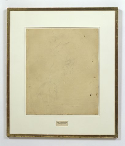
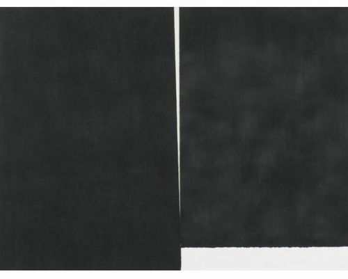
Robert Rauschenberg, Erased de Kooning Drawing, 1953, "drawing | traces of ink and crayon on paper, mat, label, and gilded frame." via SFMOMA

So the basic question, "What do we really know about Erased de Kooning Drawing and how do we know it?" Is really driven by some recent discoveries that my understanding of the work and its story--its history--turns out to be wrong. Incomplete. Based on some assumptions that should, it turns out, be questioned.

For example, Erased de Kooning Drawing is regularly referred to know as one of Rauschenberg's most important works, which prefigured or influenced entire movements in contemporary art. But so far, I haven't found actual evidence that the work was even exhibited before 1973. It's barely even discussed in the 1960s literature on Rauschenberg, never mind the 50s [It supposedly began shocking the art world soon after its creation in 1953.]

I'm always kind of torn between trying to figure this stuff out by piling on the research and citations and sifting through it, and then posting about it, and just documenting my inquiry, incomplete as it may be, as I go along.

I guess the key here may be laying out what freaked me out, and saying that it kind of blows my mind precisely because I've been spending so much time looking back at the relationship and collaboration between Rauschenberg and Johns, and at the stigmatized silence that continues to distort our view and our understanding of their crucial, early work.

A week or so ago, I saw a digitally remastered version of Emile de Antonio's 1972 documentary, Painters Painting [Here's the vanilla Ubu version.] De Antonio was a longtime friend of both Johns and Rauschenberg; he helped them get their earliest job together as window dressers for Bonwit Teller. I saw a 1976 note in the Smithsonian archives where Walter Hopps says that Bob called de Antonio "a hustler." He became a complex and controversial filmmaker with a 10,000 page FBI file. For Painters Painting, he conducted extended interviews with both artists and a critically disparate range of others on the scene [the film was mostly shot in 1970]. According to my MFA brother-in-law, the film is a hilarious staple in art schools, which I think I object to; I may take on the film's content and form head-on at some point, but not now.

rr_ladder_deantonio.jpg

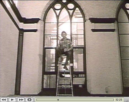
Rauschenberg recounted the story of making Erased de Kooning while sitting atop a ladder in front of the church-like windows of his Lafayette St studio. His delivery is deadpan, deliberately ridiculous, and not a little drunk. De Antonio's editing is kind of disruptive, but the issue isn't whether erasing the drawing took "nearly three weeks" or a month, or 15 erasers or 40. The issue is Erased de Kooning Drawing itself:

erased_unframed_deantonio.jpg

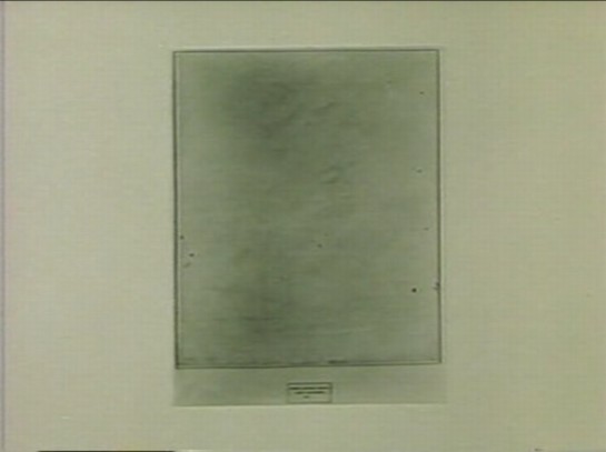
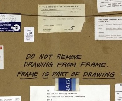
There's no frame. And no mat. No nothing, just the drawing. Which feels substantively different. De Kooning's original sheet appears to be mounted onto the piece of paper onto which the label was drawn. Where the mat now seems to separate the label and the drawing, without it, it seems like one thing. A collage, perhaps, but a joined, unified, self-contained whole.

Which makes the label not just a label, but a text, a set of marks, as much a drawing as the erased marks--or the erasure marks. Rauschenberg's explanation to de Antonio is different from other, later tellings, and from the neo-dada, Freudian interpretations of others. He seems entirely clear about what he wanted to do:

One of the things I wanted to try was an all-eraser drawing. And, uh, I did drawings myself, and erased them. But that seemed like fifty, fifty. And so I knew I need to pull back farther, and like, if it's gonna be an all-eraser drawing, it had to be art in the beginning.
He was trying to make a mark with an eraser. It's the difference between erasing a drawing, and drawing with an eraser. And when he was done, the result was both an erased de Kooning and a drawing. And the hand-drawn label declared as much. It's almost a perfectly symmetrical prefiguring of Joseph Kosuth's One and Three Chairs, made a dozen years later.

kosuth_one_three_chairs.jpg

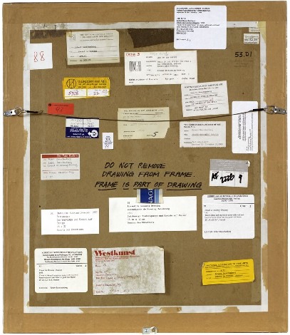
But did Kosuth know and react to Erased de Kooning Drawing in creating his piece? Did de Antonio just happen to shoot the drawing while it was out of its frame, or did it look different--was it constituted differently--in 1970? And before? When did it change to the conceptual object, where the label is demoted, no longer an integral element, diametrically opposite but co-equal with the "drawing," the concept, but now a separated, ancillary presentation device equivalent to mat and frame? Rauschenberg wrote on the back of the work, "FRAME IS PART OF DRAWING," but I'm not sure that was always the case.

It seems to me that Erased de Kooning Drawing became one thing in the early 1970s, but before then, it was something else.

Previously: 'FRAME IS PART OF DRAWING'
Next up: looking back at what was said and written and known and shown about Erased de Kooning Drawing before 1973.

burden_oh_dracula_ut74.jpg

So I try to take a break from this [now rather long] exploration of the history of Robert Rauschenberg's Erased de Kooning Drawing by reading my Avalanche magazines.

And there I find an announcement for Oh Dracula, a 1974 Chris Burden performance/installation which took place at the Utah Museum of Art at the University of Utah in Salt Lake City. Really? Yes.

October 6 - October 9, 1974, in fact, which makes it one of Burden's earliest museum shows.

But it seems that the piece was not just organized by the museum, but as part of the Joint Conference of the Western Association of Art Museums and the Western Regional Conference of the American Association of Museums, which was held in Salt Lake that year. I've added it to the research list.

Avalanche said cellophane, but in a 2000 essay in Frieze Ralph Rugoff said canvas. Either way, Burden climbed into a "chrysalis"-like sac and had himself installed in between some of the museum's exceedingly random 18th century paintings, with candles placed at his head and feet. And there he hid all day.

Rugoff's piece is about invisibility; he talks about Burden's hiding pieces, and John Cage's silence, but not Erased de Kooning Drawing, even though his ending paragraph reminded me of it:

But perhaps the most salutary effect of invisible art lies in the chameleon-like array of meanings which have cloaked it over the past half century. Rather than simply serving as a static limit defining the no-go zone of artistic practice, it has alternately appeared under the guise of the Sublime, of social idealism, avant-garde aggression, personal humility and ironic commentary. No single artist has been able to possess invisibility as a signature medium, and its wayward history gently yet pointedly mocks our waning belief in the cult of originality. It suggests instead that art doesn't begin and end in a physical frame or a singular context, but lives on in the potentially endless process by which we make use of it.
Oh Dracula isn't mentioned in Burden's current bio, and though I talked about Burden while I was lecturing at the University of Utah, no one there mentioned it to me, either. So it's a different kind of erasure.

Touched by your presence [frieze]

How do we know what we know, and when?

erased_dekooning_sfmoma.jpg

For instance, we know that Erased de Kooning Drawing (1953) is one of Robert Rauschenberg's most important, influential works. It's the kind of commonly accepted history that lands a piece in the Final Four of Tyler Green's Art Madness poll to determine America's Greatest Post-War Artwork.

And we know the story of it, how Bob took a bottle of liquor with him to Bill's studio to ask for a drawing to erase. And how Bill, at first reluctant, twice-validated the sacrifice by giving away "a drawing he'd miss" and which would be "hard" for Bob to erase. And then Bob signed it and framed it and sparked an art world scandal with it which hasn't really abated. We know this because Bob and then his curator and critic advocates repeat the story so frequently. [Vincent Katz has a nice telling of it in Tate Magazine in Autumn 2006.]

But this weekend, I suddenly had cause to wonder just how all this went down, and when, really, did this revolution start? Because it's not as clear or as obvious as I had always assumed.

That's Erased de Kooning Drawing up there, precisely matted and framed. That's how I saw it for the first time in Walter Hopps' "Rauschenberg In The Early 1950s" show at the Menil 20 years ago, and then again in John Cage's "Rolywholyover" a couple of years after that. [Or am I conflating the two Guggenheim SoHo versions of those shows?]

At the time, it was still in the artist's own collection. In 1998, SFMOMA acquired it along with a group of other Rauschenberg works. [Calvin Tomkins wrote in the New Yorker in 2005 that MoMA was offered the works first and turned them down.] Its official description: "drawing | traces of ink and crayon on paper, mat, label, and gilded frame." It's not just a drawing, not just an erased drawing, it's an object assembled.

SFMOMA has a nice little, c.2000 interactive that includes the back of the piece:

rr_dekooning_back_sfmoma.jpg

"DO NOT REMOVE
DRAWING FROM FRAME
FRAME IS PART OF DRAWING"

frame_drawing_sfmoma.jpg

LOVE THAT. I could geek out staring at the backs of artworks all day. Did Bob himself write that? It looks like it.

The early line on Erased de Kooning was either "neo-dada," which was a standard critical reaction to Rauschenberg in the 50s, or AbEx patricide. But it has since evolved far beyond these bad boy, enfant terrible readings, to be considered a precursor of huge swaths of contemporary art.

In his 2009 book, Random Order: Robert Rauschenberg and the Neo-Avant-Garde, Branden Joseph discussed Erased de Kooning Drawing as one of the touchstones of conceptual art and appropriation art, alongside Marcel Duchamp's mustache-on-the-Mona-Lisa, L.H.O.O.Q:

Whether by defacement or effacement, the two works' devaluation of the appropriated representation (an essential factor in the process of allegorization) is equally effective. Rauschenberg's subsequent mounting of the erased sheet of paper within a gold frame, together with the addition of a carefully hand-lettered label with a new authorial attribution, title, and date ("Erased de Kooning drawing / Robert Rauschenberg / 1953"), simultaneously doubles the visual text with a new signification and calls attention away from the (now depleted) visual aspect of the work and toward the conventional and institutional devices of the work's "framing."...For Rauschenberg's Erased de Kooning Drawing essentially reenacted the reception of his White Paintings: the initial evacuation of expressive or representational meaning in favor of transitional, temporal forces subsequently gave way to a process in which meaning was reattributed to the work from the outside.
Indeed it was. As the White Paintings were to the reflections and shadows in the room, so Erased de Kooning Drawing was to passing theories of art.

In 1976 Bernice Rose put "the famous Erased de Kooning drawing" along side Jasper Johns' Diver at the foundation of The Modern's major survey, "Drawing Now." Reviewing the show for the New Yorker, Harold Rosenberg dismissively labeled Pop, Minimalism and Conceptualism, the work that followed Rauschenberg's and Johns's "parodies of Action painting," as the new "Academy of the Erased de Kooning."

Later that year, the drawing was in Walter Hopps' Rauschenberg Retrospective at the Smithsonian, which traveled back, in 1977, to MoMA. Where it prompted Grace Glueck to open her NY Times story with a rhetorical question--"Wasn't it only a couple of years ago that Robert Rauschenberg erased a drawing by Willem de Kooning?"

Yes, only a couple, give or take twenty four. Maybe it just took that long to get it. We had to wait for Conceptualism to be invented before anyone could recognize Erased de Kooning was its foundation.

In the September 1982 issue of Artforum, none other than Benjamin Buchloh discussed Erased de Kooning Drawing's historical importance in a sprawling 14-page essay titled, "Allegorical Procedures: Appropriation and Montage in Contemporary Art":

At the climax of the Abstract Expressionist idiom and its reign in the art world this may have been perceived as a sublimated patricidal assault by the new generations most advanced artists, but it now appears to have been one of the first examples of allegorization in post-New York School art. It can be recognized as such in its procedures of appropriation, the depletion of the confiscated image, the superimposition or doubling of a visual text by a second text, and the shift of attention and reading to the framing device. Rauschenberg's appropriation confronts two paradigms of drawing: that of de Kooning's denotative lines, and that of the indexical functions of the erasure. Production procedures (gesture), expression, and sign (representation) seem to have become materially and semantically congruent. Where perceptual data are withheld or removed from the traditional surface of display, the gesture of erasure shifts the focus of attention to the appropriated historical constrict on the one hand, and to the devices of framing and presentation, on the other.
Whew. But.

Back up. Because here is Buchloh's account of the gesture, and of the "device of framing and presentation":

After the careful execution of the erasure, which left vestiges of pencil and the imprint of the drawn lines visible as clues of visual recognizability, the drawing was framed in a gold frame. An engraved metal label attached to the frame identified the drawing as a work by Robert Rauschenberg entitled and dated 1953.
[Emphasis added because, WTF engraved metal label?] When did it have a metal label?

There wasn't one in 1991 when I saw it. And there wasn't one in 1976, when Walter Hopps wrote this catalogue entry: "He [Rauschenberg] then hand-lettered the title, date of the work, and his name on a label and placed the drawing in a gold-leaf frame bought specifically for it." [Oddly, the only source Hopps cites is an Interview Magazine Q&A, dated May 1976, just as the catalogue was being produced.]

There is no way that the hand-drawn label in the middle of the mat of Erased de Kooning Drawing could be mistaken for a metal label on a frame. At least if you had seen the work in person. Or had discussed it with anyone who had. So the implication, then, is that in 1982, Benjamin Buchloh had not actually seen Erased de Kooning Drawing, or that he'd misremembered it or misread a photo of it, and neither he nor anyone at the magazine of record noticed the error. Which does make some sense if Erased de Kooning is a conceptual work in the mode of Joseph Kosuth, not an art object, per se but an "idea of an art work [whose] formal components weren't important." [Of course, Kosuth said that in 1965, more than a decade after Rauschenberg apparently already demonstrated it.]

rr_edkd_3d-to-2d.jpg

But there are some problems here. Judging by all the registrars' labels and notes on the back, it seems impossible that someone like Benjamin Buchloh would not have seen Erased de Kooning Drawing in the 30 years since its creation. But looking more closely, I can't find any exhibitions dating before 1973. That's when Susan Ginsburg's show, "3D Into 2D: Drawing For Sculpture," opened at the New York Cultural Center. [Ginsburg was, among many other things, a board member of Change, Inc., an artist emergency assistance foundation Rauschenberg started in 1970.]

Was Erased de Kooning Drawing shown in the 60s? Or the 50s, for that matter? Where? How? What was the reaction? Because the triumphant Conceptualist historicization of the work seems to have obscured--if not actually erased--its early history.

May 30, 2011

Grate Art

Oh, yeah. With this awesome cheese grater screen, Mona Hatoum has just won a 10-year pass in my book; she can do whatever she wants.

mona_hatoum_grater_divide.jpg

Oh, really? It's called Grater Divide? And it was made in 2002? Well, her 10-year-pass is just about up.

May 30, 2011

Wall Works

almond_schellmann_wall.jpg

I've always admired the series of site-specific Wall Works produced over the years by Edition Schellmann, even though I've never mustered the courage to buy one. Fear of commitment, I guess. Too nomadic.

Well, no, that's not quite right. Because their finitude is part of their appeal. The way they thwart commodification and exchange by being limited, by nature and design, to a finite number of installations.

judd_schellmann_wall.jpg

You could cheat, I suppose, and reinstall your Judd elements once you know the ratio. Or re-paint your Darren Almond sunlight once you know the angle or time. But then what have you got? If you're going to ignore the artist's intention, you might as well save the dough and fabricate the whole thing anyway.

lewitt_schellmann_wall.jpg

Anyway, none has ever made me sad, until now:

Wall Drawing, Sol Lewitt, 1992

description:
"wall drawing" to be written on a wall in the hand of the owner, medium and size to be chosen by the owner. Limited to 10 installations. Certificate: an 8 x 10" black and white photograph of the installation, sent by the owner to the artist, who will sign, number and return it.

I guess finitude is the right word:
Finitude. To be carefully distinguished from "mortality." Finitude refers not to the fact that man dies but to the fact that as a free choice of his own project of being, he makes himself finite by excluding other possibilities each time that he chooses the one which he prefers. Man would thus because of his facticity be finite even if immortal.

May 28, 2011

Esso De Cherbourg

esso_de_cherbourg.jpg

It may not be the absolute origin of my desire to live in a converted, modernist gas station, but AO Scott's recent reminiscence reminds me that the Esso station at the end of Jacques Demy's incomparable Les Parapluies de Cherbourg is one of my formative cinematic and architectural experiences.

I got completely blindsided by the film in the early 1990s when I basically wandered into the Time Warner screening room at MoMA and watched a preview of the restoration of the film spearheaded by Demy's widow, Agnes Varda, who was on hand to discuss it. Truly not worthy, but there you go.

Uh-oh, something looks screwy with these prices; is there an issue with US availability of the DVD? [amazon]

May 26, 2011

Colorama

ansel_adams_colorama.jpg

I really need a photomurals tag at this point. The Kodak Colorama billboard was installed in the Great Hall of Grand Central Station from 1950 until around 1990, when the station began a long-overdue restoration.

Anyway, 18x60 foot backlit, color transparencies, "the biggest photographs in the world," one a month for forty freakin' years. It's like if Norman Rockwell had a son named Jeff Wall who went into advertising.

According to the Kodak Colorama mini-site, company executives Adolph Stuber and Waldo Potter originally thought to recreate "Kodak's success with projecting color slides to a staggering size for the 1939 World's Fair," but the Great Hall's sunlight forced them to go the backlit route.

earthrise_colorama_67.jpg

Just as regular photomurals were first printed in wallpaper-like strips, the Colorama transparencies were made of 18-inch [and later 36-in] rolls pieced together witn tape.

Colorama was designed to promote "a critical cause -- photography for photography's sake." Which means something different to a company that sells cameras and film. The majority of the Colorama pictures were by Kodak staff photographers, who inserted amateur photographers in glorious landscapes.

But not all. There are several Coloramas over the years by Ansel Adams, including the August 1954 panorama of Bryce Canyon, Utah up top. The 1967 Earthrise image above is the only black & white Colorama photo. Apparently, it had been covered a lot immediately after NASA received the transmission from the Lunar Orbiter, and the Colorama appearance kind of leveraged that familiarity.

apllo-11_colorama.jpg

Contrast that, though, with the 1969 Apollo 11 images, where Kodak engineers rushed to print NASA's just-released negatives from the moon landing, and ended up scooping Time, Newsweek and Life, to the benefit of the "awed crowds."

The Kodak Colorama [kodak.com]
Last summer, Kodak donated the Colorama Archive to Eastman House [eastmanhouse.org]

May 24, 2011

Aarhus Madness

olafur_rainbow_pano_aarhus.jpg

O wow.

Olafur Eliasson's Your Rainbow Panorama opens Thursday on the roof of ARoS Aarhus Kunstmuseum in Denmark. It's a 360-degree glass promenade which paints the cityscape with every color of the spectrum.

Too bad the promenade roof's not rainbow-tinted glass, too. That'd make one helluva signature on Google Maps.

Image and statement via olafureliasson.net [olafureliasson.net]
More images at designboom [designboom.com]

Previously: Olafur: The Magazine?
Color Experiment paintings

Thumbnail image for serra_amer_flag_worship.jpg

On October 4th, 1994, at an artist panel discussion for MoMA's Cy Twombly retrospective, Richard Serra made an offhand comment about how "The last century of art has been based on a misreading of Cezanne."

To a young, impressionable student/fanboi still putting his contemporary art world view together, this was a shock. Because it was Serra, and because I still assumed there was some right art historical "answer" to be gotten to, and because Serra didn't bother to say how everybody got it wrong, it lodged in my brain for years.

And so it was that at some point a couple of years later, when I met him at a party, I asked him what he'd meant. Of course, he didn't remember what he'd said, or the context, so he gamely tried to float a couple of possible theories, but nothing that matched the seeming conviction with which I'd remembered him saying it. So I tried to forget about it.

And I thought I had, at least until just now, when I was reading Serra's discussion with Gary Garrels in the Richard Serra: Drawing catalogue. They were talking about the "jump" in Serra's work after 1989 in terms of Cezanne:

GG: Those double-panel drawings, rather than dealing with a wall or with a room or a space, deal with internal relationships.

RS: They are masses in relation to one another. They're not about composition or figure-ground; they emphasize the comparison of different weights in juxtaposition.

GG: So this, to me, is again another jump.

cezanne_cupid_courtauld.jpg

RS: For me they have more to do with Cezanne than with Malevich. I wasn't looking at Cezanne when I conceived them, but in retrospect, I see a clear connection in the way they deal with weight and mass in relation to shape. They're the opposite of the floating shapes of Constructivism and Malevich, referred to in drawings like Heir

The comparison of the diptychs with Cezanne may be a stretch, but no one else comes to mind who deals so physically with mass and weight. No one talks about the weight of Cezanne, but there's a manifestation of weight there that's not in Picasso, not in Matisse, barely in anyone who follows. Cezanne is obviously interested in gravity and in the relation of weight to plane. Take Still Life with Plaster Cupid [ca. 1894], in the Courtauld, where he punches a hole in the space, and you think the apples and onions are going to roll off the table. The only thing holding them in place is their weight. They have the weight of cannonballs.

So the answer, then, is C) gravity.

But then, literally, as I'm typing this in from the book, it's 41:00 into the recording of the panel, right where Serra says it:

I think Twombly has a big range-- a big range of evocation. I think that's what he does. He doesn't present an image; he evokes a sensuality, and it's unlike anything in post--I think. I'd have to go back to someone like Baziotes, maybe--there's nothing in the American brain like that. Americans are much--maybe Brice. Americans are much more heavy-handed, much more flat-footed, much more aggressive.

This is the opposite of Cezanne. And the whole inheritance of the New York School kind of goes Cezanne; Cubism; into Abstract Expressionism; Pop Art pretty much hangs things back on a grid; the grid comes back up again in Minimalism. That seems to me all an extension of a certain kind of classicisim and aggression and a standardization coming out of Cezanne, a misreading of Cezanne, albeit. And Twombly takes the opposite attack. It's very lyrical. And very open. And very...delicate.

Brice Marden: Yeah, I think it's really great that he left town. [crowd laughs]

OK, then. I seem to have misunderstood the question. The correct answer is actually D) Serra likes to think in terms of major historical frameworks. I'm glad that's all cleared up.

johns_memory_feelings_1961.jpg
In Memory of My Feelings - Frank O'Hara, 1961, Art Institute of Chicago

I've had a jpg of Jasper Johns' 1961 painting, In Memory of My Feelings - Frank O'Hara on my desktop for months now. It was one of the most important works in the National Portrait Gallery's "Hide/Seek" exhibition, and I took the chance to study it up close several times throughout the run of the show.

I have also been a little wary to write much about it, and its seemingly powerful resonance with Johns' Short Circuit flag, partly because I was unsure of how much to read in, and how relevant or not the associations I was seeing really were.

In Memory of My Feelings definitely relates to the other, larger Flag--at 40x60 vs 42x60, it's nearly identical in size. But unlike the 1955 Flag, or any other flags, it's made of two canvases hinged together. Hinges, functional and not, are just one unexamined element that appears in both Johns' and Rauschenberg's early work. [Light bulbs are another. Maps, just barely.]

When In Memory is discussed, the somber, grey tones come first. Then there's Johns' stenciled inclusion of the words "dead man" next to his own name on the bottom. And the overpainted skull that you can barely make out in the upper right quadrant somewhere. And that's it, and then the Frank O'Hara reference takes over, and the irony that Frank O'Hara would die five years after this was made--as if this had anything to do with the painting, or Johns' painting of it.

johns_memory_feelings_det.jpg

And so I wondered why I couldn't find anyone talking about what IS clearly visible through the overpainting in the lower right section [detail above], which is a series of vertical red and white stripes. A flag. Or maybe two. Photos weren't allowed in NPG exhibition, and I can't remember now. But there is at least one flag painting under there.

One person who does talk about In Memory of My Feelings, though, is "Hide/Seek" co-curator Jonathan Katz. In a gallery talk video, Katz talks about putting Johns' and Rauschenberg's works side by side to show it for the first time in the context of their relationship, and particularly their breakup.

Katz talks matter-of-factly about these artists' relationship and collaboration in a way that no curator ever has. And keeping the bitterness of the breakup in mind certainly brings a lot of content to the fore in Johns' painting. It feels especially necessary for understanding why Johns might have chosen to reference this poet and this poem. [Spoiler: it's about dealing with the despair of a breakup.]

But Katz, whose delivery is slick and precise, not a word out of place, drops what I think is a bombshell? And just keeps on going:

When [Johns] and Rauschenberg met, one of the first works that they made after becoming a couple, was the famous--even iconic--Jasper Johns American Flag painting. This is a picture of that flag, in grey, reversed. The obverse of the picture that they made when they got together.
In one sense, it's obvious, and in another, it's ridiculous. Or at least unheard-of. Yes, definitely unheard-of. Katz is proposing, in passing, fundamental changes to the understanding of bodies of work, practices, and histories of two of the most important artists of the last 100 years.

This is the compelling thing for me about Short Circuit, an early 1955 Rauschenberg combine with a Jasper Johns flag behind a hinged door. A work which was originally/also titled Construct with J.J. Flag, and which was exhibited by Alan Solomon under both their names in 1958. It makes the otherwise incredible, even shocking assertion that Johns and Rauschenberg collaborated and made some of their most important work together seem perfectly obvious.

elmdrag_home_left.jpg

All this Rapture hype reminds me of this old school Elmgreen & Dragset piece from their Powerless Structures series. Even though I'm sure the Rapture people are sure the two guys not wearing these outfits are goin' straight to hell.

Image via art21, where this piece appears to be titled, "Home Is The Place You Left," which is actually the name of their 2008 exhibition in Trondheim.

For that matter, everyone from Perrotin to Konsthall Malmo lists the jeans as Levi's, but they are Diesel. Just sayin'.

bauhaus_ball_pdp130-sm.jpg

Andy helpfully pointed out this mirrored glass ball, which I'd missed in the catalogue for Phillips' upcoming design auction.

Everyone knows the Bauhaus was a huge party school. And during the Winter 1929 semester, Oskar Schlemmer had put an extra emphasis on partying, "to preserve the character of the Bauhaus community." And so what had started as a metal shop farewell get-together for Marianne Brandt on 9 February 1929 with the tasteful theme, "Church Bells, Doorbells, and Other Bells" [Hmm, one of the few cases where it sounds better in German: "Glocken Schellen, Klingel Fest."] became a raging, balls-out "Metallisches Fest," which took over the entire, iconic Dessau building. As MoMA's 2009 catalogue tells it:

The pure qualities of metal lend themselves to costumes with decorations that magically transform the Bauhaus through shimmering, reflective surfaces. According to Schlemmer, "The Bauhaus was also attractive from the outside, radiant in the winter night: the windows with metal paper stuck inside them, the light bulbs--white and colored according to the room--the views through the great glass block--for a whole night these transformed the building of the 'Hoschschule fur Gestaltung."
Party on, Oskar! I'm glad the Bauhaus Arkiv is so careful with all their materials, they don't let anything more than a postage-stamp-sized image slip through to the web.

I can't remember where I found this copy of the Bauhaus wallpaper sales brochure which came out soon after the Fest, but it wasn't the Bauhaus Arkiv:

bauhaus_wallpaper_cov-sm.jpg

And Marianne Brandt Geselleschaft only had a tiny version of this Brandt self-portrait taken a mirrored glass ball.

marianne_brandt_kugelportrait.jpg

Though to their credit, the firm did throw another Metallische Fest in 2005, even if the guest of honor had long since departed for good.

Lot 130 Bauhaus Mirror Ball, est $5-7,000 [phillipsdepury.com]

Previously [as in previously on greg.org, but after the Bauhaus, obv]: Shiny Space Balls? Yes Please!
Oh wait, Muybridge was before the Bauhaus

Well this certainly wasn't in his MoMA retrospective.

rs_cage_1-det.jpg

There are rubber and neon pieces dated from 1966-7, of course, and because they look prescient now, Benjamin Buchloh's catalogue essay discusses early Richard Serra sculptures like Doors and Trough Pieces as "the official beginning of his oeuvre." But Buchloh dismisses Richard Serra's first solo show in May 1966 in Italy, where the young artist was traveling on a Fulbright, as nothing but "his rather literal responses to Rauschenberg's combines." Fortunately, the show got written up--with a picture, even--in Time Magazine:

popova.jpg
Von Heyl-bait: Spatial Force Construction, 1921, Lyubov Popova

A couple of weeks ago Charline von Heyl made a refreshingly badass presentation on painting at the Hammer Museum. [It was organized by UCLA's art department.] The tenor was quite different, it quickly became one of my favorite artist talks since Thomas Houseago's Public Art Fund lecture at the New School last year.

Von Heyl talks a lot about her sources and tactics, including design, folk and indigenous art, and overlooked and bad [Bad?] painting. Rather than narrating a trajectory for her work, or elaborating on her technique, she focuses on how she looks, and on how central that is to what she does eventually turn out.

So obviously, this from the q&a:

I find the idea of time in painting super-interesting in every respect, you know, the speed of the brush, the way the backwards/forwards thing goes, the time of the paradox, which is probably my idea of irony, the material thing that switches things around.

And so all those things really feed into each other, and the time of looking is constantly feeding into it, constantly. And it's really--one of the first things I do when I go to the studio is to get different books and check different things out.

And for me, the whole blog thing is a godsend. If I put in one of my favorite paintings, some weird Popova painting or something like that, and go to images and blog, there's a kindred soul, you know, somebody who has the same taste. And from there, you find other blogs because he's going to go somewhere, And I think books have been so important for me, but now, blogs, painters' blogs are, I mean, there are a lot of people who are super smart when it comes to looking, and it's really fun to look at it. I use that a lot, too.

A follow-up question asked what blogs she looks at, and she balked; she can't name her favorite books, either, she said, because she doesn't know the titles. It's a result of being immersed in "this community of images." So it makes sense that the one blog she did manage to namecheck is Bibliodyssey. [She also said she does read Notes on Looking, too.]

UCLA Department of Art Lectures: Charline von Heyl [hammer.ucla.edu, thx permanent link |

May 17, 2011

ArtCash

eat_artcash_nymag71.jpg
ArtCash by Rauschenberg (top) and Tom Gormley, via nymag

Whatever else it was, Billy Kluver, Bob Rauschenberg and Robert Whitman's Experiments in Art & Technology was wildly successful at never selling out; the collaborative was constantly broke and getting bailed out by whomever they could find. E.A.T. was booted from the Pepsi Pavilion at Expo70 as soon as it opened over wild cost overruns. I saw a thick folder of invoices, IOUs, and pleas for petty cash in the Castelli Archives. I hear there's an identical stack, probably even thicker, in the Foundation for Contemporary Arts. And then the other night, I find this 1971 article about art and money in [where else?] New York Magazine:

In the sixties several American artists, most notably Larry Rivers and Andy Warhol, used money as the subject of their paintings. Calling on their example, a broke E.A.T. organized a gambling event last week to finance further activities. Currency was designed by Warhol, Robert Whitman, Robert Rauschenberg, Red Grooms and Marisol [and Tom Gormley], on an escalating scale. But Swedish artist Oyvind Fahlstrom's design was turned down for political reasons--it depicted Nixon inflating and deflating himself...Their gambling night was an amusing comment on the current situation as well as, hopefully, a way to outflank the museum-bank gallery-cartel syndrome.
The gambling night was held at Ted Kheel's Automation House on the Upper East Side, which connected to the head end of one of Manhattan's first cable TV companies. Proceeds were actually flagged for E.A.T.'s Community Television Center and Artists & Television program, which had solicited proposals for artist-produced TV shows.

Warhol_large.jpg

$25 got you $25 ArtCash bucks, which you could use to win "TV sets and original graphics." At least a few people just took the ArtCash. According to the lot description of an unbroken $500 bundle of Warhol Ones at the 2009 Dumbo Arts Center benefit auction, the ArtCash bills were printed [but not engraved] by the actual American Banknote Company.

E.A.T. published three signed ArtCash posters showing either the fronts or backs of the various denominations. Here's a composite showing two of the three [l via pdp; r via artnet]

artcash_left.jpg

The denominations were $1 [Warhol], $3 [Whitman], $12 [Rauschenberg], $24 [Gormley], $51 [Grooms], and $88 [Marisol]. Which means each print had a face value of $468. Considering that Phillips sold the copy on the left for just $1,875 in 2008, these may be the worst-performing Warhols on the market.

Whoa, in tallying that out, I took a closer look at each bill; Gormley's look to include the World Trade Center, which might mean that that underground moving walkway is in Albany, which might make that figure there then-governor Nelson Rockefeller.

gormley_artcash_cu.jpg

The E.A.T. Archives at the Getty includes several more stacks of ArtCash, including some by Jeff Davis, who, who?

Jan 2013 UPDATE: Good things come to those who blog. greg.org reader and/or ArtCash Googler Sarah Hollenberg of the University of Utah Art & Art History department writes that the Jeff Davis mentioned above is none other than the country's greatest example of printing your own money, Jefferson Davis, President of the Confederate States of America. Hollenberg:

The bill that the Getty credits to him is by Red Grooms. They mistook the reference to Davis as a signature because they keep the bills wrapped up with a strip of paper, which covers up Grooms' signature.
And now we know. Thanks!

May 16, 2011

Police Action Painting

uganda_pink_cfr.jpg
Police spraying protesters in Kampala, Uganda, May 10, 2011 [image james akena/reuters via cfr.org]

I haven't been able to get these images out of my head since Brian Sholis pointed to them; they're stunning and disturbing at once.

As Time Lightbox's Ishaan Tharoor put it,

We're used to protest movements that come in colors--the yellow of people power in the Philippines, Ukraine's orange, the green of Iran's brutalized democrats. We're less accustomed to seeing protests quashed with color. But in Uganda, security forces sprayed opposition leaders and activists with a vivid pink dye--a mark intended both to humiliate dissidents and make it easier for police to nab them.
The first publicized use of dye cannons was in Cape Town, South Africa in 1989, in a fiasco that became known as the Purple Rain Protest [image below via wikipedia] An anti-apartheid demonstrator seized the cannon and turned it on the white-painted buildings in the square, including the National Party headquarters. "The purple shall govern" became a rallying cry for the democracy movement.

purple_rain_za.jpg

In 2008, after Indian police painted protestors purple in Srinagar, Slate's Explainer put together a concise history of the dye cannon. Which is, well, ironic, considering how aesthetically similar the police painting images are to the Indian Holi Festival, where crowds bombard each other with powdered pigment as part of an equalizing, anarchic celebration of religious joy.

Clearly this is not art; but it is painting. And the sobering political implications and power dynamics depicted in these incredible--even, I hate to say it, beautiful--images makes me question the glib, benign assumptions I hold for that word, that action.

For a long time, I've been fascinated by the military definition of 'painting," the use of laser sighting and guidance systems to target weapons ranging from guns to missiles. It made me wonder what other seemingly paradoxical contexts "painting" has found its cultured, refined way into. I guess I can add one more to the list.


Color in the midst of protest [time lightbox]

So I'm kind of dying because there's a screening next week, and I'm trying to figure out how to go.

Three houses were used for the principal location; the production moved from one to another depending on the direction of the sun. "Terry's not really a stickler for continuity," Mr. Fisk said.
Terrence Malick's Tree of Life premiers at Cannes [nyt]

gingrich_brooks_somodevilla_getty.jpeg

Holy smokes, this has to be the greatest photo of David Brooks and Newt Gingrich anyone has taken or ever will take. Will the uncredited Getty Images photographer who was in the Russell Building stairwell last week please step forward to claim your prize? [via andrewsullivan]

UPDATE: Congratulations, Chris Somodevilla!

twitter_taxi_abbas.jpg

Sometimes it's like they're just having a conversation in my tweetstream without me. The only possible improvement is if the Kiarostami movie had been Ten, but that's quibbling.

serra_amer_flag_worship.jpg
Richard Serra, The American Flag is not an object of worship, 1989, 288 x 376 cm

One of the artworks ImClone CEO Sam Waksal bought from Gagosian but didn't pay sales tax on in 2000 was a huge, $350,000 Richard Serra drawing titled, The American Flag is not an object of worship.

Interestingly, when the drawing sold at Sotheby's in 2004 [for $232,000 against an estimate of just $80-120,000. There really ought to be a word for a deal where you weasel out an 8.25% "discount" after dumbly overpaying by 50-300%. Maybe a Waksale.], the provenance only mentioned collector/Dia board member/Kim Heirston dater Dr. Pentti Kouri [who passed away in 2009] and the Leo Castelli Gallery, where the work was originally shown.

And what a show it was.

"8 Drawings: Weights and Measures" opened in September 1989, in the wake of the Tilted Arc controversy, and six months after the 1981 sculpture was removed [and according to the artist, "destroyed"] from Federal Plaza in lower Manhattan. And from the titles Serra gave the massive paintstick on paper works, I don't think he'd quite gotten over the loss.

serra_castelli_poster_wtmeas.jpg
Poster/flyer for "Richard Serra 8 Drawings: Weights and Measures"

There's a room in the Met's Serra drawings retrospective with several works from the Castelli "Weights and Measures" show, including The United States Courts are partial to the Government [105x185 in.], No mandatory patriotism [93x201 in.], and the massive The United States Government destroys art [113x215 in.], which is owned by the Broads.

I can't find out online, and I don't have my Serra drawings catalogue raisonné with me to check, but it would be interesting, if maybe a little too neatly literal, if the cumulative dimensions of the eight "Weights and Measures" drawings added up to 120 feet, the length of Titled Arc. It'd turn the drawings into fragmented shadows of the lost sculpture, ghost slabs floating in a gallery before being dispersed to haunt collections around the world. Serra's not averse to coding such biographical or historical references in a work's dimensions; I seem to remember hearing that the dimensions of the six forged steel blocks in his 1996 sculpture 58 x 64 x 70 were derived from his and his wife Clara's eye heights. [I can't find any mention of that now, though; I'll have to check.] Anyway, TBD all over the place.

[UPDATE: thanks to the Communications office at the Met for sending along the checklist, which also includes the dimensions of the other two W&M drawings in the show. The four drawings mentioned here do, in fact, add up to 62 linear feet. So a 120 ft total is in the realm of the possible.]

2015 UPDATE: yes, but maybe not? I can't believe I never published the result of this research, but I did gather the dimensions of all the W&M drawings, and they ran about 117 linear feet. If they each have 4.5-in larger framed dimensions, they'll add up to 120 feet, but I doubt Serra's numerological interests would incorporate frames. I'd love to be wrong about that and right about the dispersed, destroyed ghost of Tilted Arc, but I think it's the other way around. Oh well.

serra_castelli_poster_wtmeas_dim.jpg
Weights & Measures, annotated, dimensions in inches

tarkovsky_mirror_balloon1.jpg

I just watched Tarkovsky's 1975 film The Mirror for the first time as an adult, basically; when I saw it in college, I had no clue and was bored out of my gourd by it. In fact, for a long time, I'd conflated it, burning houses and whatnot, with The Sacrifice.

tarkovsky_mirror_balloon2.jpg

Anyway, the largely plotless, highly autobiographical film is a memory-like collage of documentary footage and vignettes set in disparate time periods. When I say, plotless, though, I mean it's a movie about a guy who spent ten years trying to make a movie about his childhood purely as an excuse to show the awesome scenes of a Soviet military balloon from the Spanish Civil War. At least that's how it looks to me now.

tarkovsky_mirror_balloon3.jpg

tarkovsky_mirror_balloon4.jpg

tarkovsky_mirror_balloon5.jpg

Previously: an image of a guy on a balloon inspecting Echo II at Lakehurst, NJ

You never know what you'll find digging around in archives, even your own. While looking back at greg.org posts about Alexander Payne and Dany Wolf, I bumped into this gem from 2003, the reconstructed list of artworks Sam Waksal bought from Gagosian Gallery without paying NY state sales tax, and how much he paid.

At the time, I'd written that not only had Waksal, the CEO of ImClone whose case broke around the same time his friend Martha Stewart was getting charged with insider trading, the newbie collector hadn't negotiated a discount from the gallery beyond the sales tax. And that the ploy of having empty boxes--or in some of Waksal's purchases, just the invoices--sent out of state, had "been tripping up art world naifs since the 80's, at least."

Well, this statement was incorrect on several fronts. The investigation of Waksal had followed on the fraud investigation of certified art world naif Tyco CEO Dennis Koslowski, remember, which had been triggered by an art sales tax evasion inquiry involving the fictitious shipment of 3rd-rate Monets to a factory in New Hampshire. But in a subsequent 2004 wrap-up on the caper, the NY Times' Timothy O'Brien reported that as many as 90 art world figures were implicaited in DA Robert Morgenthau's investigation, including many non-naifs.

And as for the 80's, well.

On a recent visit to the Leo Castelli Gallery collection at the Archives of American Art, I came across a letter from the gallery to Mr. Frederick Weisman, one of the biggest collectors around, who had apparently been confused by the arrival of an empty box at his Sunset Blvd office. The letter was dated Jun 22, 1965:

The package you received was intentionally empty. It represents a Lichtenstein banner that Richard purchased. The package was sent to your California address to side-step New York City tax. I hope this hasn't caused you any unnecessary concern.
It's not specified, but I'll assume the banner was Pistol, 1964, the best of the three Lichtenstein made with the Betsy Ross Flag & Banner Co., Richard, of course, is the Richard Weisman of Find The Warhols! fame, who does in fact live in California. And so, it would seem, does the banner.

lichtenstein_gun_banner.jpg

The history for a Pistol banner sold at Sotheby's in 2008 mentions its inclusion in a 1967 exhibition at the Pasadena Museum, which Weisman's uncle Norton Simon would soon take over.

It appears the only nair around here is 2003 me.

gordon_bootleg_empire_pdp.jpg

In 1997 Douglas Gordon surreptitiously videotaped two hours of Andy Warhol's Empire during an installation in Berlin. He called it Bootleg (Empire):

'I did a version of 'Empire', which was called 'Bootleg Empire', it is almost like the amateur version of the auteur masterpiece -- it's very shakily done. I lived in Berlin for a while and I went to see Warhol's 'Empire' and I thought 'I may never get to see this again', so I filmed it for an hour went to the pub and then came back and filmed it for the last hour. So mine only lasts for two hours -- so it's like 'the best of' or something. But quite often my version is seen with his films in exhibitions, which is kind of funny as mine is slightly more dramatic as it is shaky and there are shadows of people walking in front of the camera.' (Jean Wainwright 'Mirror Images' (Interview with Douglas Gordon) Art Monthly, Dec-Jan 2002/03, No. 262) [via a new path]
In 1998, he released Bootleg (Empire) as a video edition of eleven. For whatever reason, maybe because he has the word "bootleg" in the title, it's often referred to as an homage. How many intellectual property battles could be dodged if everyone made sure to use that word, I wonder.

Anyway, one of the Bootleg (Empire) editions didn't sell Friday at Philips de Pury. The estimate was $30-40,000.

And the details seem confusing. The lot description says "installation dimensions variable," as you'd expect from a Gordon. But when another of the edition sold in 2000 at Christie's [for $9,400], the description said it was "for view on monitor only." The Christie's edition also contained two tapes, a VHS and a Beta, but the duration is given as only 62 minutes, not two hours. Philips doesn't bother to provide the duration information in their catalogue, but the piece was two hours long at the Guggenheim's "Haunted" exhibition last fall.

So far, I can find mentions of at least three other Bootleg works, all of which predate Empire. Bootleg (Big Mouth, Cramped and Stoned), use slowed down, slient concert performance footage from the Smiths, the Cramps, and the Rolling Stones, respectively.

Wow. It's amazing how awkward and wrong this original ending to Alexander Payne's 1999 feature Election seems. According to Peter Sciretta at Slashfilm, this six-minute segment comes from a VHS transfer of an original work print found at a flea market. The ending tested so badly, Payne went back to shoot additional footage for the more satisfyingly harsh ending he released.

Sciretta notes that there's never been any discussion of another ending to the film, but hey-ho, It's right there in Payne's and Jim Taylor's original script.

Watch The Never Before Seen Original Ending of Alexander Payne's 'Election' [slashfilm via matthew clayfield]
Previously: I co-hosted a MoMA Film Dept. party for Alexander Payne in 2003. more recapping here.

May 13, 2011

Shh, Don't Speak.

From Dennis Lim's brief Q&A with Gus Van Sant at Cannes, where Restless is [finally?] debuting:

We did silent takes of almost every scene so we could maybe use them in the editing. Terry Malick apparently shoots silent takes so he can mold what he wants out of the scenes. But with our takes we actually created a silent version because we had enough material and we realized we could -- maybe it'll be on the DVD. Everything is there except the dialogue -- all the sounds and music, and you hear all the footsteps, but there's nobody talking and no lips moving. They're the same scenes, but it has the distance of not being dialogue-driven. It's the exact same love story but it plays like a different movie.
It's funny, because Gerry and Elephant only have like 10 pages of dialogue between them anyway.

Previously: Gus Van Sant's go-to guy, the greg.org 2003 interview with producer Dany Wolf

140hberlin_standingflag.jpg

Not quite sure what to make of this, but this image showed up this morning on the golden livestreaming page for Man Bartlett's piece, #140hBerlin.

And though maybe he wasn't even born when it came out, it immediately made me think of... Sandra Bernhard's 1990 performance film, Without You I'm Nothing

bernhard_flag_without_you.jpg

So yow, I just watched that clip on rutube.ru? Which, while it might offer Man some programming, if not costuming, ideas, also ties into Berlin's own history.

And wow, I just listened to Bernhard's cabaret cover of "Little Red Corvette" for the first time in maybe a decade, and damned if it isn't one of the most American things about America this American has ever heard.

#140hBerlin runs for 140 hours through May 17. [manbartlett.com]

echo_satelloon_color1.JPG

Believe me, I know how this looks.

kapoor_sphere_portrait.jpg

But also this. Balloons and the Grand Palais go way back:

gimpel_grand_palais_airshow09.jpg

And anyway also this, Leviathan has a groin vault:

leviathan_groin_vault.jpg

and is the venue for a concert performance by minimalist composer and maximalist stuffed animal shaman Charlemagne Palestine:

kapoor_leviathan_palestine.jpg

[image of Anish Kapoor posing in front of Leviathan via mymodernmet, as baited by starwarsmodern. Images of Charlemagne Palestine performance inside Leviathan via Monumenta 2011]

"One idea could be using mirrors so photographers could do their jobs out of the president's sight line, the White House's Earnest said."

My mind is blown and I am still picking up the pieces after contemplating the possibility that White House photographers might be instructed to shoot using mirrors so as not to disrupt the president's line of sight.

I mean, the compositional challenges pale in comparison to the artistic compositional goldmine that such an environment would provide. I mean, just imagine. Here's one AP shot I didn't post the other day about Sforzian backdrops at Fort Campbell. Check out how the floating reflection of the camo netting draped over the crowd barrier, which is picked up in the teleprompter:

obama_campbell_camo_ap.jpg

With mirrors, photos of the president would be like rainbows, visible only from the single specific angle that aligns the lens, the mirror, and the face.

Street photographers would suddenly have an edge. Lee Friedlander, traveling with the President:

friedlander_rushmore.jpg

I've slowly been making my way through Kierran Horner's analysis of Andrei Tarkovsky's The Mirror in relation to Gilles Deleuze's concept of the 'time-image.' I had just gotten to this part when I found the AP White House photo policy story:

Left alone, Alexei locates and sits in front of a large mirror hung on the wall. The next shot begins stationary behind Alexei, facing his reflection in the mirror, and the camera slowly pans in over his shoulder, focusing ever more tightly on his reflection, until, gradually, the reflection becomes the sole image of the frame, staring back toward the actual Alexei.


tarkovsky_mirror_0.jpg

There is then a sharp cut to reveal a medium close-up of Alexei sat contemplating his reflection from the opposite angle. This shot/reverse shot dynamic and the 'eye-line match' are common to most conventional cinema, establishing an object, or person, as perceived by a character from their point of view.

tarkovsky_mirror_1.jpg

As David Bordwell and Kristin Thompson describe it 'shot A presents someone looking at something off-screen shot B shows us what is being looked at' (2004: 303). However, as in this case, the 'eye-line match' refers conversely to an interaction between two characters, here, the actual Alexei and his virtual counterpart. It is as if he is reacting to/with his reflection. This dialectic can be read as representing the Deleuzian 'crystal-image':

tarkovsky_mirror_2.jpg

'In Bergsonian terms, the real object is reflected in a mirror-image as in the virtual object which, from its side and simultaneously, envelops or reflects the real: there is a 'coalescence' between the two. There is a formation of an image with two sides, actual and virtual. It is as if an image in a mirror, a photo or a postcard came to life, assumed independence and passed into the actual, even if this meant that the actual image returned into the mirror and resumed its place in the postcard or photo, following a double movement of liberation and capture.' (Deleuze 2005b: 66-67)

I see Barack Obama as Alexei. And a virtual presidency. Can you begin to imagine what kinds of images this would produce? Forget the stunning conceptual aspects for a minute; has anyone at the White House thought through the political implications--should we call them the optics?--of not permitting the cameras' eyes to gaze upon the President directly?

Maybe not mirrors, then, but what about one-way mirrors? Is that what they're thinking? Put the photgraphers on the darkened side of a one-way mirror. Fortunately, there's only 225 hours of Law & Order-related programming on basic cable each week to communicate the absolute trustworthiness of anyone speaking on the mirrored side of the glass.

wh_pool_spray_nyt.jpg

Before getting too fixated on the complications of presidential imagemaking, though, it's worth remembering that the White House is already a supremely weird place for photographers to work. Go back to 2009, just days after President Obama's inauguration, when the NY Times' Stephen Crowley pulled back the curtain on the surreal and utterly staged 12-second tradition known as the "pool spray." These are the images whose authenticity is suddenly, apparently, of such great concern.

Previously: WH beat photogs upset at staged photographs they don't take

So long, Sforzian Replays. After Reuters photographer Jason Reed went all meta about it on his blog last week, the White House has decided to do away with the longstanding practice of re-enacting speeches for reporters from different media.

"We have concluded that this arrangement is a bad idea," Obama spokesman Josh Earnest said late Wednesday. He said the administration is open to working out some new arrangement with photographers.

...

There are conflicting accounts on whether technology exists to take photographs without distracting the president. One idea could be using mirrors so photographers could do their jobs out of the president's sight line, the White House's Earnest said.

Yes, by all means, mirrors. Pick mirrors, ohpleaseohpleaseohplease.

White House Announces End To Re-Enactments For News Photographers [ap/huffpo]

May 12, 2011

Point Break

roe_point_break.jpg
Untitled (Point Break), 2010, Roe Ethridge, via andrewkreps

This is in Le Luxe, Roe Ethridge's awesome show at Kreps, through July 3rd.

Related: Crafting Genre: Kathryn Bigelow, a retrospective of the director's film titles, combined with her early videos, paintings and conceptual artworks, opens at MoMA at the end of May. Point Break will be screening twice in early June, and once in August. [see the complete schedule.]

May 11, 2011

Nice

greg_calligrane11.jpg

There sure has been a lot of calling card hoopla these days. It seems like it peaked just as I was moving an old file cabinet, and I found this packet of cards I had made in 1999 in Paris. They were still wrapped in the Hotel Costes stationery I'd used to break the order down and transport it more easily in my luggage.

I'd gotten them made at Calligrane, a small paper store in the Marais that still doesn't have much of a web presence. I remember it as a little giftier than I like, with elaborate desk sets or something, but still the only place I could find who could do the typewriter-like letterpress cards I was seeking.

greg_calligrane21.jpg

Because I did not want engraved cards, and I didn't want fine paper. I already had business cards like that, and so did all kinds of people. What I needed, I told them, was a replica of the earlier calling cards I had made in 1995.

That's when I had a business card with three addresses and six phone numbers in two countries on it, it was ugly and ridiculous. All I needed, I figured, was email [gallen@echonyc.com], and since it's the internet, I really thought the cards should be typed.

I got really lucky, it turns out, because in Vieux Nice, just up the hill from the cathedral, was a little printing and paper studio run by a Scandinavian guy named Peter. He'd salvaged the type from old typewriters to do letterpress with. Wow, those were clean.

I still have one small box of those somewhere. It has Peter's full name in a stamp on the bottom. I think when I looked him up to order replacements, he was still in Nice, but had switched from printing to sculpture. Gotta track that guy down again.

roustan_cans_artcurial.jpg

If my intermittent obsession with photomurals, and especially with the actual prints themselves, overlooked objects with a presence and character that feels now like a visual and experiential precursor to the monumental painting and photography of the contemporary era, has jumpstarted any interest in the market for these things, they haven't heard about it in France.

On Monday, Artcurial included this 1964 "monumentale photographie" by Jean-Régis ROUSTAN, a 1.3 x 2.3 meter silver gelatin print of an abstracted wall of dented cans, in its books & manuscripts sale. But it failed to reach even its low low estimate.

LOT 483 Jean-Régis ROUSTAN Monumentale photographie, 1964 1,30 x 2,30 m, tirage argentique sur papier. Encadrement baquette aluminium. Nature morte de boites de conserves cabossées.
Estimation : 700 - 1000 €
Invendu

Tirage unique, offert à l'époque par l'artiste à l'actuel propriétaire. L'agrandissement monumental des boites entraine une abstraction. Légères taches.

Maybe it's because Roustan was more photojournalist than artist? And though the lot before it went unsold, a set of six vintage prints of 1964 artist portraits by Roustan did sell for EUR829 last December. Duchamp, Calder, Ernst, Dali, Chagall...

But this is still a giant, beautiful, vintage object. I remain confused and convinced, if as-yet unmoved to schlep an 8-foot framed photo by a guy I confess, I hadn't heard of until last week, over from Paris.

Hm, OK.

I think we're in the clear here, satelloon-wise. It is true that Anish Kapoor's Leviathan is inflated, and 35 meters tall.

kapoor_leviathan_int_guardian.jpg

But when you enter the Grand Palais to see Leviathan, you enter Leviathan itself. It's a space, a bulbous, three-chambered cathedral of a space, "like going into the belly of a whale," says the Guardian. Though of course, it's really going into the belly of a cinematic whale. So it's a belly of imagination.

But it's a space, not an object. At least, not at first. When you exit, though, it's a thing. And well, hm. At first, things look pretty grim, which is to say, satelloonish.

kapoor_monumenta_headon.jpg

But ultimately, it's a different thing, very different. One thing that's emphasized in Kapoor's talk to the Guardian is the light and space of the Grand Palais, and its vast expanses of glass:

"This is a terror of a space, probably much more difficult than the Turbine Hall," Kapoor said. "It's three times the size, huge horizontally and vertically and above all the light is a killer. It's almost brighter than it is outside."
There are any number of spaces--dirigible hangars, stadiums, train stations--that could hold a 100-ft mirror-skinned aluminum sphere; but in this time, there are no art spaces except, now, the Grand Palais. And that's part of the point.

richter_sphere_iii_12769.jpg

Not only can satelloons not escape the problems Gerhard Richter diagnosed for spheres--they're too beautiful and perfect--they blow these problems up [sic] to gargantuan scale. Which is kind of interesting.

Monumenta 2011 has a Facebook wall [facebook.com]

May 9, 2011

MoMA WTF FTW

Alright, so I'm back from a day mostly spent at MoMA:

Wow, the Film Department is firing on all cylinders.

I remember one year when Chaka Khan yelled at the crowd for not paying enough attention to her, and now this year, Kanye West is performing to mad hype. Crazy.

Hmm, the fourth floor where I'd hoped to spend a great deal of time studing Jasper Johns' Flag was "closed for reinstallation," which means they're part of the Missing Flag Coverup! Trust No One!

There are some Bridget Riley paintings in the hallway next to the cafe [I know] that look like they came from Bill Seitz's 1965 Op Art blockbuster, The Responsive Eye. Don't tell Larry Aldrich, though, or he'll turn them into fabrics.

Really, a very crowded place.

Oh, I bought this anthology, Curating and the Educational Turn, and I think it's going to be sweet. Unfortunately, with 27 different authors the chances of anyone topping this sentence, chosen at random from the introduction, are slim-to-none:

For several of the authors gathered here, these primarily function as points of departure for performative or polemical texts which themselves refuse a masterful discourse of explication in an attempt to honour the ethos of counter-institutional and counter-hegemonic practices of dissent and emergence.
Maybe curators have added pedagogical toolsets to their praxis because they're fed up with people always asking them to explain what the hell they're saying.

murakami_vesrailles_ball.jpg

I almost bought what is undoubtedly the greatest book of its kind, Murakami Versailles, but it was too heavy to contemplate carrying it around. Also, I expect it will be entered into evidence in Murakami's trail before the People's Post-Revolutionary Court, so I can just grab a scaned version soon enough.

The death of the Sforzian Backdrop has been greatly exaggerated.

obama_campbell_ap6.jpg

They may not show it off every day, but it turns out that the Obama White House's advance team speaks fluent Sforza. As these AP photos from the President's congratulatory address to the soldiers at Fort Campbell, KY clearly demonstrate.

For starters, there's that Patton-esque flag up top, plus the small bleacherful of racially diverse soldiers for the wallpaper effect,

obama_campbell_ap1.jpg

a motif that was so popular in the Bush era [and so hilariously screwed up in the brief McCain phase.] Check out all the cell phone cameras in the photo above. Don't recall that ever happening in the wallpaper before.

bush_milit_wallpaper.jpg

Looks like they used camo netting instead of regular bunting or blue curtain to cover the barricade there.

obama_campbell_ap5.jpg

And check out that fresh new banner, hung on the side, so that:

obama_campbell_ap3.jpg

Here's a nice wide angle shot to see how the staging comes together:

obama_campbell_ap2.jpg

But if there's a difference, besides the frequency, I guess, between staged military events in the Bush and Obama eras, it's this: you just never know, so save yourself a peck of trouble down the line

miss_accomp_ap_nyt.jpg

and don't stand under the banner.

obama_campbell_ap4.jpg

[all Ft. Campbell images via ap]

May 7, 2011

Open House Teardown

In 1997 or so, the Junior Associates at MoMA organized a day of studio visits in Williamsburg. Worried about where to eat, we packed our own food, sandwiches from a fellow board member's startup, Cosi. We ate lunch on Meg Webster's roof. Most people took the bus to Momenta, but a brave group of us decided to walk, unprotected, up Berry Street. The very idea that we might be from Manhattan being beyond their imagination, some people sitting on the stoop of a vinyl-clad house stopped us and asked if we were Dutch.

This Long Island daytrip comes to mind when I read about Open House, a reconceptualization of Levittown which is the latest project from Droog Lab and Diller Scofidio + Renfro.

I hope if my heroes ever organize a self-indulgent, vanity symposium and an utterly disconnected, irrelevant publicity stunt exhibition about the suburbs that misses like five real points and replaces them with trite photo-op interventions designed solely for the benefit of the critics they bus out from the city for the afternoon, my review of their debacle will be as tactful and constructive a devastating takedown of the shitshow as Alison Arieff's is.

Conceptual Suburbia: A Design Project Descends on Levittown [nyt]

lang_morris_copyright1.jpg

Oh boy, here' we go again. As @BDPNT, @joygarnett, @robertpearre, @shelawterry, and @Copycense tweeted, "Welcome to Cariou's world."

A leading origami artist, Dr. Robert Lang, has filed suit along with several other designers, charging Sarah Morris with copyright infringement for making paintings and prints which use particular crease pattern diagrams without permission or credit.

At issue, just as in Patrick Cariou's complaint against Richard Prince, is the legal status of Morris's works, and whether they are derivative, which is infringing, or transformative, which is protected under fair use exemption.

Lang has filed his suit in California, and for some reason a lawyer may be able to explain to me, a great deal of his complaint focuses on the applicability of California as a venue for hearing the case. [The filings, including a sheaf of exhibits, are available for download at Lang's attorneys' website. They're very well-produced, but right now it's too early to say whether I'd turn them into a book.]

Since I have been exactly 100% [0 for 1] wrong in my predictions for the outcome of such transformative use trials, I'm wary to go too deeply into the facts of this case yet. I will say, though, that basically every difference I see between Morris's appropriation and practice and Prince's only intensifies my belief that Morris is and should be in the clear, and that these kinds of lawsuits are a nuisance and a threat. Morris is not an outlier. As an artist she's operating at the center of the art world, not its margins; her practice and method are widely known, critiqued, supported, and emulated. Within the art world.

She's also a couple of orders of magnitude less commercially successful, price-wise, than Prince or Koons. As such, she's more vulnerable than they are, I think, to exactly the kinds of debilitating or chilling effects an expensive, protracted legal fight would entail, especially one fought at an extreme distance. [Morris is based in NYC and London.] Because the stakes for her are non-trivial, they are also more relevant to more artists whose practice includes--I can't even say appropriation, because I don't even see Morris's work within that context. But it'll be what it'll be, I guess.

[UPDATE: oh-ho, I may be wrong about this; a couple of people have emailed to point out that Morris is an alumna of Koons's studio, so this may be exactly the context in which to consider her work. It makes sense, considering the number of people I've met who turn out to have worked for Morris at some point. Time to make the donuts.]

Two things, no, three, that stand out, though:

1) These side-by-side exhibits that lawyers for both Patrick Cariou and Lang produced are seductive and deceptive, and they tend to obscure or minimize otherwise potentially important aspects of transformative use.

Lang uses these exhibits to argue that Morris has done nothing but "colorize" [his term] his copyrighted crease pattern. In fact, she has made several substantive changes to its appearance, content, scale, and materials, as well as to its meaning, utility, and context. A crease pattern is not just the geometric form; each type of line--dotted, dashed, or solid--indicates the direction of a fold, and it a crucial, even fundamental element--for making origami. Morris removes all this functional information, a non-trivial transformation.

Another misleading element of these side-by-side comparisons is size. Even if we assume Lang uses the biggest piece of paper mentioned on his site, 20-inch squares, his pattern is still 95% smaller than Morris's huge painted canvases. A more accurate side-by-side image might look like this:

lang_morris_copyright2.jpg

2) Lang's filing makes the bold but utterly ridiculous claim that "Morris's actions have created competition for Plaintiffs by occupying the market for painted versions of their copyrighted artworks." No such market exists, and I'd argue that Morris's paintings have created one. If people pay $100,000 or more for Morris's paintings, it's not because they look like Robert Lang diagrams; it's because they look like Sarah Morris paintings. Her realized gain attributable to the origami IP itself is incremental at best.

3) Unlike Prince, who did not profess any particular critical interest in Cariou's Rasta photos, Morris has publicly discussed and presented her origami paintings as commentary both on origami and its history and its specific meanings and contexts, but also on its contemporary connection to science and systems. Lang the origami expert is famous in a way that Cariou the photographer precisely is not. As such Lang's work could present a larger, more natural target for someone wishing to make critical new work about origami.

The kicker for all this, is that I'm kind of an origami nerd myself. That my greatest origami accomplsihment was winning 2nd prize and $10 at the Utah County Fair one summer when we were visitng my grandparents' house as a kid pretty much says it all. [I made my origami peacock out of printed wrapping paper.] But I still do it pretty regularly, and I'd say I have an above-average sympathy for these origami masters who feel they've been treated unfairly. I still think they're wrong as hell, though, and that this case is a dangerously unproductive nuisance.

UPDATE: And speaking of my fellow nerds, look who else has spent Friday night picking apart the latest artist copyright infringement case? Joy Garnett has some solid analysis and some biting commentary. I'll only add that between their blog headline and their PR-chasing email to Newsgrist, the origami folks' lawyers are really angling aggressively to publicize their claim against Morris.

Lang Origami [langorigami]
Oy: These Origami Artists Won't Fold [bayoaklaw.com]

witness_cool_book.jpg

"THE WITNESS: This could be a cool book."
- Richard Prince Deposition Transcript, p. 328

Dude, Richard Prince just blurbed my book.

Between the lawyers on both sides of Cariou vs. Prince et al, about 275 pages of the transcript of Richard Prince's 7-hour deposition had been made public as footnotes to various briefs and memos, but there were 101 pages left out.

In the weeks since I compiled the excerpts and exhibits into a book, I've been trying to track down the complete transcript. Now I have it, and you can too. After trying multiple sources for obtaining it, a sympathetic party close to the case pointed me to an apparently inadvertent, unmarked exhibit appended to a late court filing, which included the entire 378-page transcript instead of the customary snippets.

czrpyr_cover_thumb.jpg
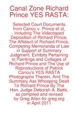
And so I have revised Canal Zone Richard Prince YES RASTA to includ the entire interview, in order, with a handy timestamped topical index, even, and with some additional rounds of legal memos, that give a fuller sense of the give and take that led up to Judge Batts' royal smackdown of Prince's transformative use claims.

In addition, to accommodate wholesale requests, I've switched printers, so the new, revised edition has slightly smaller page facsimiles, but it is also printed on higher-grade paper. It looks pretty slick.

Because of the additional quality and page count bumps, the cost went up a bit, to $17.99, but it's still a pretty sweet deal, I think. You can buy Canal Zone Richard Prince YES RASTA directly from Createspace.com, an Amazon print-on-demand subsidiary, of if you like, you can also order it from Amazon. If you're dying to see it in person first, both Printed Matter and Specific Object have greg.org-stamped copies available.

For folks who have already purchased the book, either in print or electronic format, don't worry, I've got you covered. I made an Appendix which contains all the missing transcript pages, and I've been mailing out printed and PDF copies to people who've contacted me. Whenever the printed copies run out, I'll be happy to keep the appendix available via PDF.

Because it really does have some interesting stuff in it, like the quote at the top of the page, which was Prince's reaction to the exhibit showing the side-by-side comparisons of the Patrick Cariou's YES RASTA images and the Prince Canal Zone paintings they ended up in. [Obviously, that exhibit is included in the book.]

Now that the whole deposition story can be told, I think I'll go through and pull out some highlights to share here: some great exchanges, useful insights, or straight-up WTF moments. If you have any favorites, definitely pass them along. And enjoy! The damages hearing is scheduled for May 6, tomorrow!


Buy Canal Zone Richard Prince YES RASTA: Selected Court Documents from Cariou v. Prince et al from Createspace or Amazon.
The book is also available at Printed Matter and Specific Object, both in New York and online.

I've been thinking a lot lately of governments' relationships to modernism and, by extension, contemporary art, and the controversies that erupt around it.

So I was kind of stoked to see the headline in The Art Newspaper, "Revealed: secrets of the Tate bricks
Newly released documents uncover a heated argument and the search for spares."
The paper apparently filed a Freedom of Information Act request for the documents pertaining to the 1976 outcry over Tate Britain's acquisition of Carl Andre's 1966 sculpture, Equivalent VIII, which consists of 120 bricks stacked two high.

Sweet.

But here's the big get: Tate couldn't find any extra bricks left to stockpile. Also, "Among the papers is a memo on 'The Burlington & the Bricks'."

Seriously, that's it. Do they publish this long-lost memo or add anything to the Tate curators' argument in print with Burlington Magazine? No. I guess TAN figures if people really want to know, they can FOIA it for themselves.

Tom McCormack's lengthy look at the contentious, suspicious history of US government support for the arts is worth reading for itself. But it also got me off my butt to write something that's been bugging me since attending the Smithsonian's Flashpoints and Faultlines symposium last week.

I had no plans to go to the symposium, primarily because it seemed like such a transparent attempt to ride out the Smithsonian's "Hide/Seek" censorship mess by throwing up a cloud of bureaucratic, academic dust. While I could be persuaded that Wayne Clough's resignation over his egregious mistake might have served to embolden entrenched critics and weaken the institution in advance of a difficult budget battle, I didn't think a pointless symposium designed to corral the most outraged arts administrators into an auditorium and bore the concern out of them doesn't help either.

But I had a meeting set up with an attendee which got pushed back, so last Wednesday I ended up attending part of the first, museum directors panel, and most of the second, "Exhibitions in National Museums & Public Institutions," or the political operatives & appointees panel.

From these panels, various references to earlier sessions, and the subsequent, sparse reporting, it seems clear to me that the art world really needs to rethink the paradigm for its relationship with the federal government, or more specifically, with politics.

Frank Hodsoll was President Reagan's NEA chairman. He was a foreign service officer and lawyer, later an OMB appointee, and now consults. Not an art guy, but a diplomacy-turned-art/culture policy guy. He talked very openly about his charge to vet NEA grant proposals to weed out potentially troublesome, controversial, or poltiical content. He took credit for personally rejecting or spiking a dozen, maybe 20 [I'm paraphrasing, but the video for the panel is archived now. It starts at around 1:40.] proposals that had otherwise passed the NEA's established panel review process. One example: a Washington Project for the Arts proposal to project images or text or something onto the Capitol Building, which he was sure would anger some Congressmen.

Hodsoll was the Chairman when the exhibition including Andre Serrano's Piss Christ and Robert Mapplethorpe's retrospective were both approved for partial or tangential NEA funding. He was very forthright that these projects hadn't been monitored closely enough, and had he been able to scrutinize them, he would have deemed them "inappropriate" and denied them funding.

I guess I was not so amazed that the chairman of the NEA was advocating actively screening and denying grants based on the ideological or political appropriateness of the artwork, but that the NEA was screening out work that might engender controversy or displeasure from congressional representatives. It was a position and policy that rejects not only the possibility that art might have political content or engagement; but also art's essence as an expression of speech.

Putting it in terms of whether this or that project is deserving of taxpayer support misses the point, at least when such support exists. Hodsoll pointed out that artistic expressions get rejected all the time, "it's called selection," by which he meant the NEA's grant evaluation processes, but also, I think, curation.

And so the tautological calculus that art may receive public funding if it wholly disassociates itself from politics and/or controversial issues, and if it pleases--or at least doesn't piss off--someone in the government. And if these terms aren't acceptable, art, artists, and art institutions can deal with the reality that the government has no responsibility or compelling need to support art anyway.

If this argument wasn't disheartening enough, Hodsoll was followed by Bill Ivey, who was Bill Clinton's NEA chairman, the guy left holding the mop--or left holding the bag--after the fiercest Helms-led attacks on the NEA. Ivey spent almost half his time laying out the findings of various polls that showed no matter how you slice it, 30-50% of the population does not support the right to free speech.

Never mind that the right being opposed is always someone else's, and the speech is something they disagree with. With such tenuous support, an inconsistent and unfriendly legal landscape, and the existence of politicians and/or activists who will exploit this rift, Ivey argued, the last, most important thing is to protect the institutions of art, and their funding. [In a perfect segue, the next panelist was Ford Bell who, as president of the American Association of Museum, is basically the art institutions' lobbyist.

From the far side of long careers as political operatives and appointees--only Bell seems to have ever run for elected office--these men uniformly decried the politics, and the politicizing of art and museums--by others. Just as propaganda is the other guy's marketing, playing politics is someone else's common sense policy. The only winning move, we're told, is not to play. A strange game indeed.

And Ellen McCulloch-Lovell, the moderator, opened the panel with a lament that I hear so often, it's like the Washington art world's Pledge of Allegiance: "I wish there members of Congress could hear to this." But they never are.

No wonder the official art world wants to see itself apart from politics; to do otherwise only proves how poorly they do, or how superfluous they are. At least in the nakedest political terms of power and money.

As infuriating or disheartening as these political hands' assessments may be to an art lover's ears, they are still important to hear. They're experienced views from the real, political world of Washington, the world in which money and constituents and lobbying and controversies and demagoguery and negotiation and propagandizing exist. Symbolism is there, too, and dissent, and relationships and persuasion.

If art & museum people thing politics seems intimidating, confusing, or potentially embarrassing, maybe it's worth recognizing that many non museum people, politicians included, feel the same way about art.

The "Hide/Seek" Wojnarowicz crisis was precipitated by a conservative religious and political activist who had no interest in art, but in changing the political micro-climate during the congressional vote to end Don't Ask/Don't Tell. Clough reacted to soundbites solicited from political staffers who saw neither the show nor any political downside to criticizing it and the Smithsonian which sponsored it. By so doing, they only raised the political price their opposition would have to pay for their funding levels and priorities.

Throughout the Flashpoints Symposium, speakers referred to Hide/Seek co-curator Jonathan Katz's rallying cry that Americans would rise up to defend their/our Smithsonian from the threat of budget cuts [or worse.] But that seems as practicable as wishing there were more senators attending your 2-day symposium.

Through the efforts of some combination of, in order of mobilization, directors, boards, curators, artists, educators, marketers, associations, audience and constituents, lobbyists and legislative affairs professionals [that's everyone, right?] I think the art world needs to make a more compelling political case for itself, and to make it more persistently and productively. I have some sense for how that might happen, but at the moment, it still feels like a major endeavor to accurately understand the problem.

Thumbnail image for echo_satelloon_color1.JPG

So all this time, I've assumed it's common knowledge that I am planning to recreate a satelloon and exhibit it in the nave of the Grand Palais in Paris. And if the curators of Monumenta, the annual contemporary art installation there, hadn't called about it yet, it was just because they were busy clearing the older guys [Kiefer, Serra, Boltanski] off the list first. Which is fine, of course. No rush.

Sketch for echo satelloon in Grand Palais

But then I get this tweet about Anish Kapoor's project, which opens next week, and well:

monumenta_tweet.jpg

You can understand my concern. So I "c'est quoi ça?" retweeted, and then I started poking around the Monumenta 2011 site more carefully.

And before I figure out if Kapoor's workin' my side of the street, I have to say, I'm now slightly fascinated by the mechanism of the teaser, the reveal, and the spectacle.

Monumenta has assembled a range of concepts and images highlighting aspects of Kapoor's practice which, I assume, they see as relevant to or illuminating of their own commission.

kapoor_monumenta_teasers.jpg 
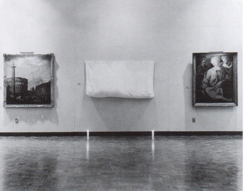
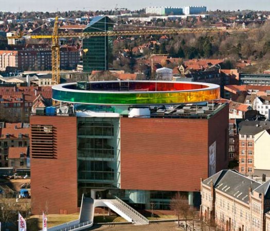
Artwork become landscape
To see is to imagine
Entropy
Self-generation
The écorché
Fiction and ritual
Concaveness
Light become ghost
Void become shape
The artwork skin
Non-object
Colour
Inhabiting space
Leviathan

I can't help but imagine them as a narrative, a presentation, an argument that culminates in the essential, inevitable work. Leviathan: c'est logique!

The work is called Leviathan, and with references to sea serpents and gargantuan invaders and gaping maws, the write-up taps every ominous, apocalyptic Leviathan reference available, from Job to Hobbes.

Which, now that you mention it, does sound a lot like several of the works Kapoor has done before. And there's this sense of simultaneously wanting something new, that no one's ever seen before--oh, boy, will they be surprised!--and of wanting more of what works, what you know, what has been before. And then what is the nature of anticipation and experience when the pitch for the project is, "it's like Marsyas at the Tate, but bigger and spookier"?

So I'm basically thinking it's the Doomsday Machine from Star Trek: The Original Series, but in red? Or mirrored? Or mirrored on one side, and red on the other:

st_doomsday_machine.jpg

And then today, there's a teaser photo, a detail, on Facebook, which doesn't quite match up to my image:

kapoor_leviathan_fb_det.jpg

Unless maybe it's the Doomsday Machine's nuts. Either way, it's all good, and totally different. Still, it's an important lesson learned, and I've decided to preserve a bit of the mystery surrounding my Monumenta project. Which is not to say anticipation.

satelloon_grandpalais_pixel.jpg

Monumenta 2011 au Grand Palais, 11 Mai - 23 Juin [monumenta.com via @Monumenta2011]

May 3, 2011

Sforzian Replay

obama_jreed_reuters.jpg

Photographers take pictures of U.S. President Barack Obama after he announced the death of Osama bin Laden live on television from the East Room of the White House on May 1, 2011.

So I was looking at Reuters White House photographer Jason Reed's side view of a scrum of other photographers getting all up in the President's grille while he was giving his Osama Bin Laden speech, and thinking, "But I saw him walk away. How the hell did that happen?"

And holy smokes, now we know. The Sforzian Backdrop has been retired in favor of the Obamian Re-enactment:

As President Obama continued his nine-minute address in front of just one main network camera, the photographers were held outside the room by staff and asked to remain completely silent. Once Obama was off the air, we were escorted in front of that teleprompter and the President then re-enacted the walk-out and first 30 seconds of the statement for us.
On the one hand, that's no more staged a photo than any photo these guys take in the White House; think of those handshake photosprays with visiting leaders. They're definitely not the kind of photo staging that WH photojournalists complain about, just the opposite, in fact, it's standard operating procedure.

But if Reed hadn't pulled back the curtain, I don't think many people would have understood that from Reuter's technically-accurate-but-now-somewhat-dodgy caption.

Ready To Record History [blogs.reuters.com via @markdubya, no relation, I assume]

May 3, 2011

Could Be?

via Eyeteeth | "File under: This could be art"

Can't tell you how awesome this is. I would pay cash money to see the biennial that shows it.

I'm getting pretty comfortable with my love affair/obsession with the US Pavilion at the Expo 67 in Montreal. I mean, it's got Buckminster Fuller; Alan Solomon curating gigantic paintings; photomurals; and satelloons, what's not to love, right?

So seeing Design for a Fair, the 1968 promo short film by Peter Chermayeff is awesome just as it is. The vintage footage and photos are some of the crispest I've seen, and it really is pretty crazy on a whole bunch of levels that this thing existed at all.

But maybe the greatest thing--even better than the giant graphic designed flags that look like a lost Ellsworth Kelly, as if there wasn't enough giant, escalator-optimized, actual art already--and even better than the sheer soft power/propaganda play that was so drop-dead awesome it won the future for the day--is the voiceover.

Because the whole thing really sounds like Chermayeff's idea. Every last bit of it, dome to nuts. It's fantastic. Chermayeff, of course, is an architect and exhibition designer, and his former firm, Cambridge Seven Associates, or C7A, was contracted by the US Information Agency to produce the US Expo entry.

And so, as Chermayeff tells it, they knew they wanted a 3/4 geodesic dome, so they ordered one. And they wanted some giant art, so they ordered that. And the moon stuff, and the Hollywood and all the happy parts of American culture.

Now I don't doubt a thing; I'm sure that's exactly how it all went down. It's just that that's not how it's typically remembered. Architects only remember Fuller; the art world only recognizes Solomon and the artists, not the venue or the show or the implications of it; and everything else is artifact and prop. [And the poor lunar photomural, I've hardly found anyone remembering that at all.]

The historical focus is either on the general awesomeness of the spectacle and mood, the political context and propaganda, or on the parts in isolation. What Design for a Fair reminds me of, though, is the visitor's experience, the carefully orchestrated messaging, and the reality that it was orchestrated by a contractor working to a brief provided by the USIA. It was a government-funded gesamtkunstwerk, a massive piece of installation art before the fact, and probably one of the most cost-effective public diplomacy efforts of the Cold War era. It literally seems unimaginable today.

P050111PS-0210

These people are not wearing their videoconference faces.

According to the EXIF data, White House photographer Pete Souza took this photo at 4:05 PM, or 1:05 AM Abbottabad Time, five minutes in. They're watching it as it happened. Which people already know, since it has garnered 455,000 views been blogged and retweeted and facebooked 455,000 times in a matter of hours.

Souza also asks us to "Please note: a classified document seen in this photo has been obscured." Indeed, there it is. Funny how unobscured it looks at this size.

wh_situation_camo_det.jpg

Let's take a closer look:

wh_obl_briefing_camo_up.jpg

Didn't I just post something about collecting all the seals and emblems of government agencies?

nga_seal.jpg

Because that's the seal for the National Geospatial Intelligence Agency sticking out from underneath there. As you'd expect.

wh_obl_briefing_camo.jpg

And that corner of landscape does look like the image of left sideyard of OBL's compound. [image via ogleearth]

cia-oblique-640x302.jpg

And now that you mention it, the pixelated image does look like the front gate area of the compound, just at an as-yet-unacknowledged high resolution. Of course, from here, it also kind of looks like a painting. I'll get right on that.

Previously: Google Maps & the everchanging Dutch Camo Landscape

May 2, 2011

Partly In Jest

NPR interviewed former National Intelligence Director John Negroponte this morning. Steve Inskeep asked a too-long question about the multi-year intelligence work that resulted in yesterday's attack on Osama bin Laden's compound in Pakistan:

Did some of this happen while you were National Intelligence Director? Would this be the kind of level of detail that would get to the desk of some of the highest people in the intelligence hierarchy, of someone in the White House, if you just had a bit of information like, we think we might have a courier, would that be the kind of thing that--

Well, let's put it this way: the President, President Obama said, and certainly President Bush before him, said that this was the, uh, highest, uh, priority. Very often when representatives or leaders of the intelligence or law enforcement community would come in to brief President Bush, one of the first questions he'd always ask, partly in jest, but also deadly serious, "Have you found him yet?"

I mean, this has been a major preoccupation of our leadership ever since 9/11 occurred.

Reminds me of GWB pretending to look for WMDs under the table at the White House Correspondents Dinner.

Also reminds me just how little we actually know of the hunt for OBL between Tora Bora and Abbottabad. The media likes to call itself the first version of history, so we should expect that large chunks of it will be fact-checked, corrected, or thrown out entirely.

May 2, 2011

Tuymanmatic

obluctuymans.jpg

Apparently the first footage released from inside Osama bin Laden's Abbottabad compound was shot on an iPhone with Hipstamatic's new Luc Tuymans filter.

May 1, 2011

Mission Accomplished

I've written before about the "clean and presumptively powerful" design of various government letterheads I've come across in my recent archive diving.

31-2389a

And I must not be doing it right, because my searches for the expansive survey of the history of such official design, and for the comprehensive sourcebook containing the thousands of seals and emblems of various government agencies and offices keep coming up empty.

250px-IAO-logo.png

I mean, Total Information Awareness, right? Somebody must be keeping a list. Anybody? Bueller?

So I'm reduced at the moment to random click trains through Wikipedia, or to search diving in the digitized collections at the National Archives. Not very productive.

Though it has yielded some nice finds. Nothing spectacular, but then, that's kind of the point of these designs. Up top, the United States Information Agency, once part of the State Department. That's the director's office letterhead there, with the smaller seal.

08-2958a

What I really like, in addition to the undesigned design, is how all the rest of the information is handled. Though a zip code does pop up occasionally, there's almost never a street/mailing address. Or maybe there is; "Department of State comma Washington" would probably get you or your letter there in 2011 as easily as 1898.

31-2249a

But it's the way information accretes, the way the document functions, that's kind of cool, too. The tiny instruction for answering and the reference number on the upper left of this 1922 Dept. of Labor letter, for example. And all the stamps! Check out that received stamp: not just the date, but the time, too.

Anyway, I made a little flickr photoset of a few examples I've found. I'm looking forward to having my scattered, amateur enthusiasm swamped by the exhaustive review of government logo and letterhead design that some expert has already compiled. And then we can start talking about what I'm looking at this stuff for.

Previously: The Great Letterpress of The United States

Since 2001 here at greg.org, I've been blogging about the creative process—my own and those of people who interest me. That mostly involves filmmaking, art, writing, research, and the making thereof.

Many thanks to the Creative Capital | Warhol Foundation Arts Writers Program for supporting greg.org that time.

comments? questions? tips? pitches? email
greg [at] greg [dot ] org

find me on twitter: @gregorg

about this archive

Posts from May 2011, in reverse chronological order

Older: April 2011

Newer June 2011

recent projects, &c.


our_guernica_cycle_ivanka_320px_thumb.jpg
Our Guernica Cycle, 2017 –
about/kickstarter | exhibit, 2017


pm_social_medium_recent_proj_160x124.jpg
Social Medium:
artists writing, 2000-2015
Paper Monument, Oct. 2016
ed. by Jennifer Liese
buy, $28

madf_twitter_avatar.jpg
Madoff Provenance Project in
'Tell Me What I Mean' at
To__Bridges__, The Bronx
11 Sept - Oct 23 2016
show | beginnings

chop_shop_at_springbreak
Chop Shop
at SPRING/BREAK Art Show
curated by Magda Sawon
1-7 March 2016

do_not_bid_or_buy_iris_sidebar.jpg
eBay Test Listings
Armory – ABMB 2015
about | proposte monocrome, rose

shanzhai_gursky_mb_thumb.jpg
It Narratives, incl.
Shanzhai Gursky & Destroyed Richter
Franklin Street Works, Stamford
Sept 5 - Nov 9, 2014
about | link

therealhennessy_tweet_sidebar.jpg
TheRealHennessy Tweets Paintings, 2014 -
about

sop_red_gregorg.jpg
Standard Operating Procedure
about | buy now, 284pp, $15.99

CZRPYR2: The Illustrated Appendix
Canal Zone Richard Prince
YES RASTA 2:The Appeals Court
Decision, plus the Court's
Complete Illustrated Appendix (2013)
about | buy now, 142pp, $12.99

weeksville_echo_sidebar.jpg
"Exhibition Space" @ apexart, NYC
Mar 20 - May 8, 2013
about, brochure | installation shots


HELP/LESS Curated by Chris Habib
Printed Matter, NYC
Summer 2012
panel &c.


drp_04_gregorg_sidebar.jpg
Destroyed Richter Paintings, 2012-
background | making of
"Richteriana," Postmasters Gallery, NYC

czrpyr_blogads.jpg
Canal Zone Richard
Prince YES RASTA:
Selected Court Documents
from Cariou v. Prince (2011)
about | buy now, 376pp, $17.99

archives