Ellsworth Kelly created his first floor piece, Yellow Curve-Portikus, in 1990 in Frankfurt. When the Raleses sought to recreate it, Kelly made a new work, Yellow Curve (EK808), in 2015. He supervised a test installation at Glenstone before he passed away. The video above is about the realization of Yellow Curve this year, for the EK 100 exhibition marking the centenary of the artist’s birth.
I love that at Portikus, the architecture was the fixed constraint, providing the parameters Kelly used to create the shape of the work. And at Glenstone, the work Kelly made provides the parameters for the space, which is built to fit. A perfect inverse which results in, seemingly, the same visual and physical experience. It’s the little differences.
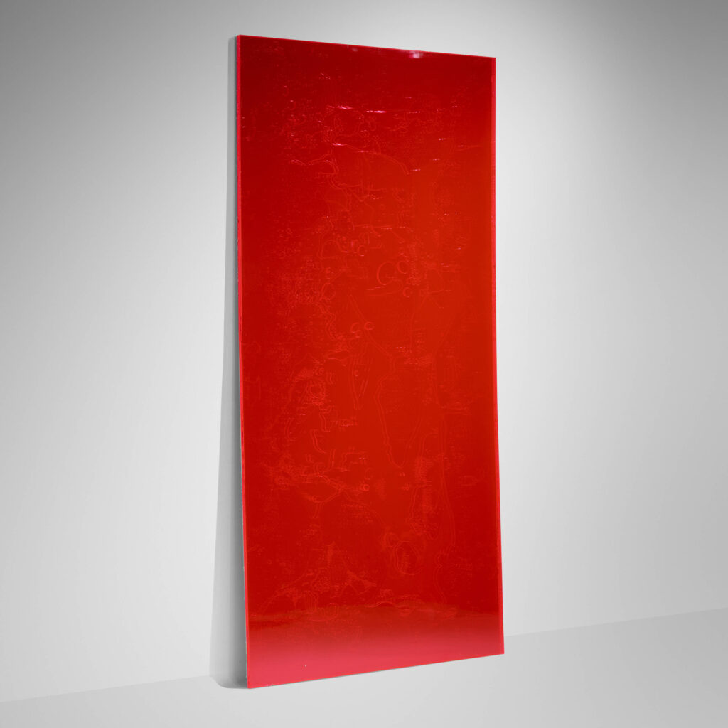
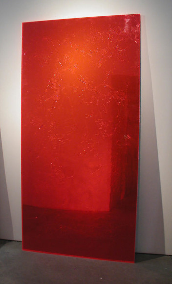
Previously, related, it sounds like this one is a refabrication of the 1992 floor piece, though. How does that work?: Ellsworth Kelly, Red Floor Panel (1992)
While looking for something else, I stumbled across this set of porcelain dishes by Gerhard Richter. They were apparently produced in 1992—there’s a big RICHTER 92 signature baked onto the bottom of everything—by the Thuringian porcelainmaker Kahla as part of an Edition Obelisco series of artist-designed dishware.
So now I’ve got to resist being one more empty result in the little swirling eddy on Google linking Richter and Obelisco and nothing else. Other listings say Edition Obelisco was commissioned for the 1992 edition of Art Cologne, but the Hamburg auction house Stahl that sold these six 7-piece place settings (six chargers, plates, soup dishes, cake plates, cups & saucers, and mugs) in 2016 said it just debuted at what was once the most important art fair around.
It’s hard to tell from the picture, but the blue brushstroke design of Richter’s dishes is apparently raised up from the white surface. The Gerhard Richter Archiv in Dresden, which has two place settings, reports that the planned edition of 500 sets was not realized because of production challenges. [From the various online images, maybe they had some trouble getting the blue right.]
Other artists in the Edition Obelisco series included a bunch of dudes—Michael Buthe, Alain Clement, Alan Jones, Emil Schumacher, Walter Stöhrer, Claude Viallat, and Wolf Vostell—and Isa Genzken, then still married to Richter. Out of all that, only one awful plate turns up online. Unless Vostell’s dishes are all encased in blocks of concrete, the only other one I want to see is Genzken’s. This whole project feels like a reunification euphoria fantasy that didn’t work out.
It’s been two days and the #CadyNoland hashtag’s been kind of quiet. Maybe folks are still thinking about what a newly seen 1986 work might imply about the possible existence of a Cady Noland Warehouse. [wtf send moar pics]
“Hopefully, instead of providing solace, a new source or cause for anxiety is opened up in relation to the coupling and uncoupling of elements in a way that has no predictable relation as to whether things are old or new, or in what manner they are alike, like a random killer being on the loose,” Cady Noland wrote in the artist statement for her first solo show, at American Fine Arts, in 1989, the date for most other Untitled (Walker) works, as published in The Clip-On Method.
Also: “I made three pieces with walkers and police equipment. These are more about the _equilibrium_ of the iconographic police officer who manages at once to enjoy the righteous action ‘out there’, a place of danger and thrills, but also to fulfill the comforting but suffocating tedious obligations to the family, civilian life, etc. The hero cop is a family man, not a ‘swingle’ (the occasional deviant ‘kook’ like Serpico or the fictive Dirty Harry notwithstanding).” Hmm.
Later today update: Three things to note from revisiting Noland’s 2-volume publication, The Clip-On Method, which was released with her 2021 show at Galerie Buchholz. This 1986 Untitled (Walker) is not represented, but a similar work, Saw Action/Duty, is.
She wrote about how adding or taking away elements of her sculptures doesn’t change their meaning—until it does. It’s an idea that prompts closer study of what each work comprises, and where they differ. [It also prompts me to imagine a Cady Noland Kit of Parts, where she can stick accessories together like an Officer Potatohead, give it a name, take a picture, then dismantle it, and repeat as often as she likes. ACAD (All Cadys Are Documentation).
Or are they? Of the 162+ images of works in The Clip-On Method, 59 of them are not from exhibitions. It’s an admittedly crude metric for tabulating her total output. But it does feel significant that just two years ago, the universe of known Nolands grew by more than 50% in one pop. And now, two days later, a new show with another previously unseen sculpture confirms that the Cadyverse is still expanding, and at an accelerating rate.
Blum & Poe are not splitting quietly. They just opened “Pictures Girls Make,” a show of portraiture curated by Alison Gingeras that looks fantastic.
The title comes from Willem de Kooning, a derogatory quip about his wife Elaine’s portrait practice. So of course there’s an excellent, faceless portrait of Frank O’Hara to start the refutation. A rocky Gertrude Abercrombie self-portrait, Beauford Delaney’s glowing yellow painting of an unidentified man, and a spare, muted picture of John Ashbery by Fairfield Porter are just some of the unexpected vintage treats. It’s an unusually literary show.
Literally cracking up in response, Nate goes, “It’s a perfect Sam McKinniss painting, because it’s a painting of a subject, and it’s a painting of so much more than that”
“And it’s a tough picture, but it’s so well done, it is really, absolutely fantastic.”
I have had a no-engagement policy with JCO for my entire tenure on Twitter, but as that world falls apart, I will make an exception offsite, for Sam. Because it does rock rather intensely.
The circumstances of the shape are well-known, and generative: Ellsworth Kelly saw an aerial photo of the World Trade Center site illustrating a 2003 New York Times article about the controversies over what to build. Kelly collaged his proposal, which he sent to the Times, which Herbert Muschamp donated to the Whitney. Interestingly, Kelly’s collage vividly captures the color of his proposal to fill the entire site with a large, grass-covered mound, used only for resting and gathering, while the flat, isometric image elides the actual form. Neither, as it happens, is it captured in the abstracted aluminum object he made in 2011, which somehow feels even flatter.
The circumstances of making this object are unclear, at least to me. There is the possible timing of an anniversary, of course. The collage was included in Peter Eleey’s show, September 11 at MoMA PS1, but a green panel was not.
The size of the panel is very small, even domestic: 22 1/4 x 49 1/2 in. (56.5 X 125.8 cm). This feels like an object to live with. It was produced in painted aluminum by Carlson Baker, fabricators who were very familiar to Kelly. It was made in an edition of three. Kelly gave ed. 1/3 to the Whitney. The example sold as a fundraiser for something at Sotheby’s in 2013 was listed as AC II, so Kelly had at least two for himself. The title then was Green Panel (Ground Zero), but the fabricators listed it as Green Panel, with the CR number, EK1022. The example hanging in the final gallery of the EK100 show at Glenstone is from the collection of Jack Shear. I recall it as thicker than expected, an aluminum slab rather than an aluminum sheet. Maybe that is the first one. Did they have it up in their house?
Thinking of Steve Roden took me back to a work he helped inspire: Untitled (George Washington’s Coffin). Steve had been “obsessed” by an auction photograph of two pieces of nondescript wood bound together, which turned out to be fragments of George Washington’s coffin. Turns out Washington was reinterred several times at Mount Vernon, and his heirs made a practice of giving away small pieces of his old coffin(s) to visitors. After wondering what this might have been like, living within this tradition of democratic relicism, I proposed to reassemble the coffin, reuniting all its pieces scattered to the world. This was in October 2016, if you can imagine.
And then I found this: a 1 by 1 3/4 inch fragment of lace that once belonged to George Washington, and which was given by Martha Washington to Gilbert Stuart to aid in painting Washington’s portrait. The catalogue note says it was a gift in 1865 of Jane Stuart, the painter’s daughter, who was also a painter, and who had beef about lace with rival Washington portraitist Rembrandt Peale:
…Peale claimed he had never seen Washington wearing elitist lace “ruffles,” notably represented in Stuart’s portrait hanging in the White House. To counter Peale’s accusation and defend her father’s character, Anne Stuart replied, “We [have] in our possession some lace which my father cut from Washington’s linen. The circumstances were these: My father asked Mrs. Washington if she could let him have a piece of lace, such as the General wore, to paint from. She said, ‘Certainly,’ and did it make any difference if it were old. He replied, ‘Certainly not, I only wish to give the general effect.’ She then brought the linen with the lace on it, and said, ‘Keep it, it may be of use for other pictures.’ I have given away this lace an inch at a time, until it has all disappeared; the largest piece I gave to the late Mrs. Harrison Gray Otis, who had it framed.
And so again we have the propagation of relics of George Washington by those with the most intimate physical connections to him, and disputes over their political implications. In addition to contemporary correspondence about the president’s lace, Mount Vernon holds two similar fragments, and a third, or rather a fourth, is reported in the collection of the Dorothy Quincy Homestead in Quincy, Massachusetts.
While I wonder about these objects and the social and historical processes that produce and preserve them, I am not really in a reassemble George Washington’s old lace shirt as a conceptual project mood these days. So you may bid unimpeded (by me, at least. There are already five bids, though the reserve is not yet met.
The other lot in the two-lot sale is, amazingly, The Metallic Pegasus Judicial Collar from the collection of the late Ruth Bader Ginsburg. Maybe the buyer will part it out one silver bead or feather at a time to mark Ginsburg’s judicial legacy, until it has all disappeared.
[update: the lace sold for $3,250. The collar did not sell for $195,000.]
I was reading something else the other day and it said something about when Yoko Ono and Yayoi Kusama lived together, and I was like, wait, what? And had to chase that down. [tl;dr They knew each other in New York. Their interactions are undocumented, but maybe worth asking about. I don’t think they lived together.]
I’m bereft to learn that artist Steve Roden passed away, surrounded by loved ones.
I never met Roden in person, though we got close a few times, but we had a correspondence. We mostly interacted with each other through blogging. We had some mutual/overlapping interests, including John Cage, but we also enjoyed watching each other do our own things. And I was always in awe of the things Roden did, how he thought and worked, and the artworks, music, performances and words that resulted.
When Tyler Green launched his podcast, Modern Art Notes in 2011, the only suggestion I had for him was to get some sound, and there was a guy. Turns out he was already on it. A few episodes later, Steve Roden’s droning intros and outros, made from a 1970s Italian recording of Cage’s 4’33”, became a steady ringtone for me, even more than Roden’s longer recordings. [I collect but rarely listen to music, tbh, but it’s going on rotation now.]
Roden’s blog, airform archives, got quiet in 2018, a not unusual occurrence. But it was only a year or so ago that I learned Steve was experiencing very early, and increasingly severe, Alzheimer’s. My heart first sank, selfishly, for the loss of all the work and correspodence that wouldn’t come, but then it ached for the challenges of those closest to Steve, and the burdens they faced, in care and sadness. I hope they found comfort in the community they formed, and that they find peace now, and that knowing of Steve’s influence and impact in so many ways, big and small, near and far, slight and profound, helps to lift their spirits.
For some artists, or for artists in the past, their legacies were primarily objects—paintings, sculptures, drawings, sketchbooks, books, manuscripts, artifacts—that were preserved in institutions like museums, libraries, archives, unless they weren’t. Steve Roden’s practice encompassed objects like this, and they were shown, documented, and collected in art institutions. But Roden produced so much more, and those digital traces and recordings are proxies for the interactions, connections, experiences, and memories he shared with so many people all over the world.
I’m glad to have his words, voice, music, and work to reflect on as I remember him. I hope you’ll find it meaningful to do the same.
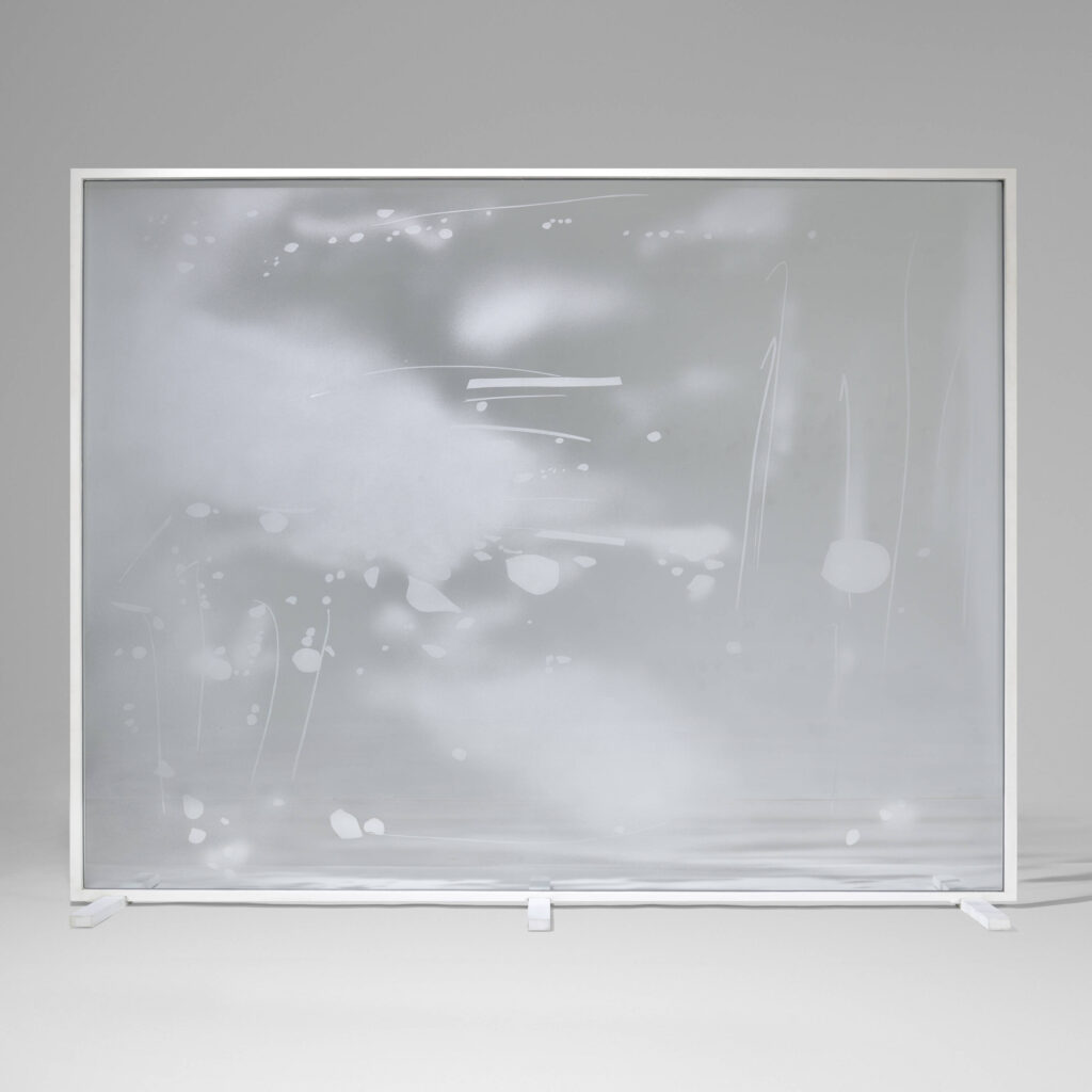
This 2012 map work was posted to Olafur Eliasson’s social media this morning. It’s one of at least threevintagemaps Olafur framed behind handmade, gradient glass. They feel like a confluence of subjects and materials he’d become very familiar with.
I’m committed to the bit and will blog about every André Leon Talley Bean Bag that comes to auction. Including these six [!] which look like they were the ones he actually used. I may have to buy them and then flip five because honestly [update: honestly, i am not bidding on these]
A minute ago I saw a photo burritobreath had posted to tumblr of The Wrong Number Cocktail Lounge, which was reblogged by wilwheaton, and then reblogged by someone I follow into my own feed? How did it get there? The algorithm? [update: my timeline was set to show me things liked by people I follow.]
But that’s not important now. Because, I mean, just look at it, isn’t it obvious? Don’t those fake, painted over flagstones look like the flagstones Jasper Johns saw out of his taxi window on the way to the airport in 1967, but which neither he nor David Whitney could find when they got back, and so Johns had to paint them from memory? The flagstones which became a frequent and fruitful motif for Johns for years to follow? In the raking light of burritobreath’s image, they even have some cross-hatching.
The Wrong Number closed in 2009. It was a mobbed up dive bar on the corner of West 7th St & Avenue T in Gravesend, the far side of Bensonhurst, Brooklyn. And I guess it’s on the way to the airport if you’re coming from Coney Island to LaGuardia, or Staten Island to Idlewild. Was the airport story a cover? Did he see the flagstones on his way to or from Coney Island? Was Johns actually in cahoots with the mafia in the 1960s? Just, as they say, asking questions!
Then there’s the question of timing. Johns’s story is from 1967, and his paintings soon followed. The Wrong Number was reportedly in business “for over 35 years” when it closed, which only gets us back to 1974. Were the faux flagstones there before that?
So except for the location being on the far side of the city, two boroughs away, and the whole different decade situation, I think it couldn’t be clearer that these are the fake flagstones that inspired Jasper Johns.
This is what it’s like when an artist changes the way you see the world. Every time I see a fake flagstone wall in New York, I will wonder if it’s this, is this the one Johns saw that time, have I found it? It’s like a curse.
Meanwhile, the most salient discussion of The Wrong Number is in the extraordinary comments thread of a 2005 post of pictures from Bensonhurst on David F. Gallagher’s legendary photoblog, LightningField. It’s a kind of internet that is as lost to us as the flagstones were to Johns, and all we can do is remember, and try to piece things together.
And that world starts, as new worlds have, on September 12th. The forms include crushed cans and weapons encased in acrylic and wire baskets of detritus. The hashtag for Facebook and Twitter [sic] is #CadyNoland. So yes, some things still do feel like the old world.
I’m personally fascinated with the way I focused on the little moving pads under the corners of the sculpture’s meeting points with the floor, which I read probably undue significance into, even after they ended up not being listed on the ingredients list. But everyone involved is a highly trained professional, and Noland sculptures have been made or broken over less, so I don’t feel like I’m being unreasonable
The cover of tomorrow’s print edition [pdf] of The Daily Tar Heel, the student newspaper for the University of North Carolina, Chapel Hill, compiles text messages from yesterday’s campus shooting. It is a work of extraordinary grief, power, and anger, and it should be printed in endless stacks placed everywhere the politicians who let this violence continue go.
The plinth is such a fascinating object in the way that it, in a really naive sense, tries to be neutral or an extension of a gallery space: it’s not here, but it’s here. That act of fabricating something that is meant to not be seen, or meant to not be focused on, I find it so fascinating to think about the material and physical presence of those objects. You know, “Look at me, don’t look at me.”
And really, I might go as far to say there’s a kind of relationship to trans-ness, in that idea of playing with—maybe juggling—the idea of passing, assimilating, the way that a form is visible and not visible in space. I could talk about this endlessly, but specifically, to speak to the plinth, I for a long time felt really resistant to using the language of the gallery, the language of the museum in the sort of “furniture” sense. I was really inspired—I am really inspired by the way Arlene Shechet talks about “the furniture”, or “the architecture” is the language that she uses, the architecture of the object.
And for a solo exhibition I did in San Francisco in 2019 at Et al, Etc. Gallery, we built out the gallery furniture using a stash of 2x4s that the gallery had in their back room, and there was something so exciting to me about the provisional quality of the furniture. I think of it a lot as the diasporic quality of the furniture, the way that the anchor, the way that the architecture, the way that the objects are sort of situated in space can sort of change, and evolve with the work or the exhibition itself.
For 2023 the Swiss Post Office launched a concrete wall stamp printed with cement pigments in an ultra-matt finish for tactile effect. The only thing more Swiss is the stamp’s entire product description, which details how this stamp aligns with the three pillars of Swiss Post’s art support policy [revised in 2020], and how that policy aligns in turn with Swiss Post’s ongoing policies for supporting the arts.
In 2021, to announce this newly updated art policy, and to draw attention to Swiss Post’s art collection and architecture, Swiss Post introduced a blank canvas stamp. It is sold out, but when augmented by a CHF0.10 stamp, is still valid for use. The making-of video is as sublimely boring as one could hope; it must have been a great source of comfort in the midst of pandemic uncertainty.