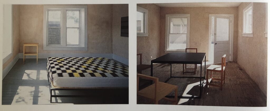
El Taller Chihuahuense, Donald Judd’s metal fabrication shop in Marfa, as published in Donald Judd Raume/Spaces, 1994, from the Museum Wiesbaden, all photos: Todd Eberle
After several years of executing works in Cor-Ten steel, Donald Judd opened a welding and fabrication shop in 1988 in the disused Ice Plant building on the northeast side of downtown Marfa. He called it El Taller Chihuahuense (The Chihuahuan Workshop), and he hired local welders, including Raul Hernandez and Lee Donaldson to make his works.
Cobb Gatehouse with Judd steel bed and table by, as published in Donald Judd Raume/Spaces
The workers of El Taller also fabricated beds and slate-topped tables of square tubular steel, which Judd designed in 1991 and 1992.
David Hammons, Icestallation invitation card (recto), 1986, paint on paper, JAM via MoMA Library
A few months ago artist David Horvitz was looking into a story of one of his artist neighbors who knew David Hammons back in the LA day. While poking around for some corroboration, I realized this invitation to a 1986 Hammons show at JAM was only and ever published in Elena Filipovic’s 2019 Afterall One Work: Bliz-aard Ball Sale.
Filipovic’s researcher, Alhena Katshof pulled the invitation out of MoMA Library’s legendary Ephemera File, where it was scanned for the first time, I learned, by legendary librarian David Senior.
Anyway, the invitation is a silvery painted postcard with a hand-stamped ball, and a date, 3/13/83. One of the very few other examples of the invitation known to exist, along with the show’s terse press release, mention 2/13/83, so perhaps this one is an error. The show, Icestallation, consisted of a dingy 3-year-old snowball in a used and altered freezer, set amidst the detritus of JAM’s gallery renovation. As printed on the verso, the show was in April/May, so the date, presumably, was the snowball’s birthday? And so the date of Hammons’ Bliz-aard Ball Sale action?
Without contemporary recollections of the invitation’s production, Filipovic speculated, based on the size, that Hammons might have used a silver-painted tennis ball to imprint them. I think the seams on a tennis ball disqualify it, though. I’ve spent time trying to identify a similarly sized, seamless, and fuzzy-enough ball Hammons could have used. A round sponge seems like the easiest, but is it the most Hammons-ian? I’ve done the same exercise with Hammons’ favored printmaking medium—his own body—to imagine what might reliably produce a few hundred unperturbed, round imprints. Because it’s not a ball. So a knee? A calf? A cutout and a buttcheek? Is it even actually printed, not stenciled?
A 2-liter bottle with sticks and metal zipper sliders in it from David Hammons, a 1996 sculpture titled, Flies in a Bottle, is being sold this month in New York.
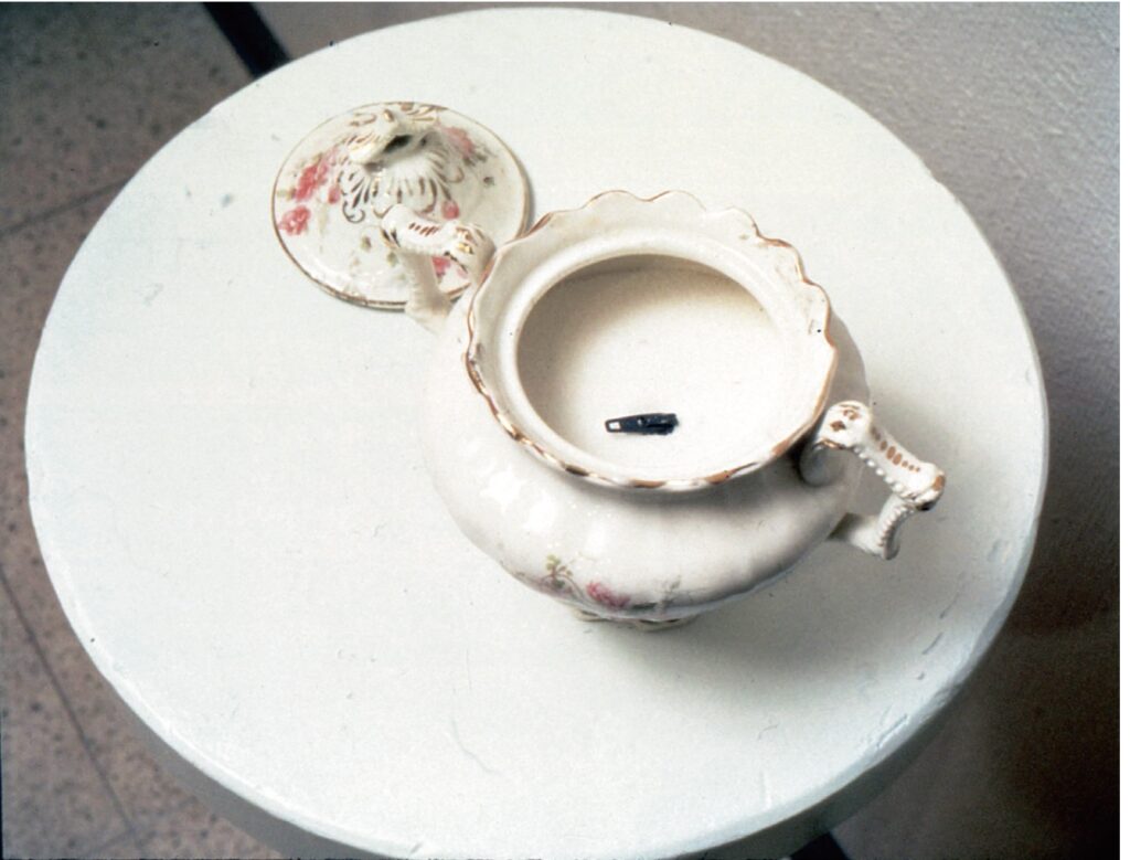
In 1993 David Hammons made a sculpture, Fly In The Sugar Bowl, by placing a metal zipper slider in a bowl of sugar. The first and only place I’ve seen it was in Elena Filipovic’s 2019 contribution to Afterall’s One Work series about Hammons’ Bliz-aard Ball Sale.
Haim Steinbach, pop art I-2, 1990, plastic laminated shelf, latex Bart Simpson mask on mount, four ceramic breast mugs, 45 inches high, being sold [again] at Phillips on March 8
The first thing is obviously that Haim Steinbach really has this one thing nailed. The second is the visceral resonance of the yellow of the shelf and the yellow of the Bart Simpson mask. The third thing is this seller at Phillips bought this at Phillips in 2007, so in addition to imagining the 17 years of fascinated engagement this object must have yielded, there’s also a comfort in the circularity of life. The fourth thing is that in the not so far off future, a latex conservator will be getting a call, and will be forced to reflect on how her years of dedication to the work of Eva Hesse has really brought her to this point. Have your condition report ready.
Lot 148, Hector Guimard, house numerals, 1900-08, painted cast iron, at Christie’s 12 March
I don’t think I’ve ever been in an emotionally wrung out state where I get choked up by the beauty of house numbers, but here we f’ing are.
Hector Guimard had these absolutely exquisite numbers cast, like everything else, at the Fondries Saint Dizier. These are painted, which is fine. The set the de Menils bought in 1971 are just naked iron, which is better. The 25yo surmoulage bronze replicas being sold on 1st Dibs look like they’re wearing a gold lamé sweatsuit. It’d be less embarrassing to tape a hundred dollar bill to your door.
[A few excited minutes later update: as recently as a 2016 blog post, le Cercle Guimard reviewed the history of these numerals, which were available as products basically up until WWII. In 1971, some of the earliest connoisseurs rediscovering Guimard obtained the original counter-models from Saint-Dizier, which Dominique de Menil acquired, some for her own collection, and others she donated to the Musée d’Orsay. Their counter-models long gone, Saint-Didier began producing the surmoulage casts in the 1980s.]
Josef Koudelka, Mourning Jan Palach who burned himself to death to protest the invasion, 1969, Magnum via newyorker.com
I’m haunted by this image by Josef Koudelka, who photographed the Soviet invasion of Czechoslovakia in August 1968 and its aftermath. Jan Palach was a 21-year-old student who died in January 1969, after setting himself on fire in Wenceslas Square and running through the streets of Prague.
Koudelka made his photos secretly, under extraordinary and dangerous circumstances, but they always had a feeling of distant historicity. Then a couple of days ago Aaron Bushnell, a 25-year-old soldier in the US Air Force, set himself on fire in front of the Israeli embassy near my house. He was protesting US involvement and support of genocide being committed against Palestinians in Gaza.
Koudelka’s image illustrates Masha Gessen’s New Yorker essay about the implications for the US and its political system for an American soldier to self-immolate in terrible protest against something even worse.
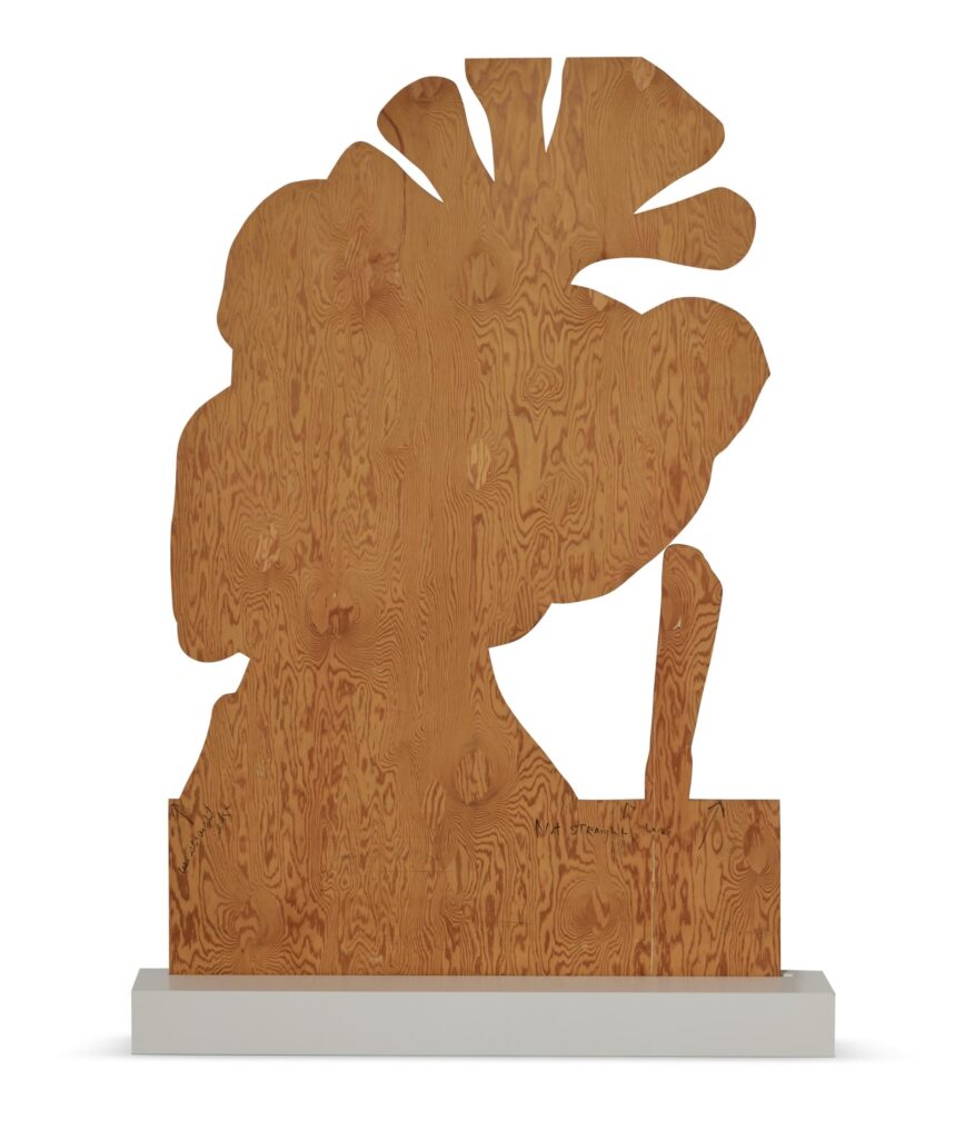
Cady Noland, Patty Hearst Wooden Template, 1989-90, 72 x 47 in., selling Feb. 29 at Sotheby’s
Of all the work remaining to be sold from Chara Shreyer’s fascinating collection, there’s a lot to like. But nothing lands quite like this Cady Noland sculpture. It’s labeled as Patty Hearst Wooden Template, though the aluminum version at MoMA is titled, Tanya as Bandit.
Cady Noland, Tanya as Bandit, 1989, screenprint ink on aluminum, 72 x 48 x 3/8 in., collection MoMA
Also this one is dated 1989-90, while MoMA’s—which one would think was created using this template and the instructions written on it in marker—is dated 1989. Maybe it took a little longer for Noland to decide this, too, was a work. But I don’t know, and as the artist’s statement to Sotheby’s makes clear, she was not consulted:
Statement from the Artist:
In an atmosphere of rapidly trading artwork, it is not possible for Cady Noland to agree or dispute the various claims behind works attributed to her. Her silence about published assertions regarding the provenance of any work or the publication of a photograph of a work does not signify agreement about claims that are being made. Ms. Noland has not been asked for nor has she given the rights to any photographs of her works or verified their accuracy or authenticity.
Me, I’d also ask her about that base, when there’s a wire on the back for hanging it.
Dan Budnik, Robert Rauschenberg in his Pearl St Studio, 1958, image via RRF
When I saw a print of this 1958 photo of Rauschenberg in his studio in a group of eleven artist portraits by Dan Budnik coming up for sale in LA, I took a closer look at the boring side of the image, which turns out not to be boring at all.
A rancid and myopic review of a new exhibition at Tate Britain of fashion and John Singer Sargent was making the rounds this week. The dismissal of fashion as an unworthy nuisance to the proper appreciation of Sargent’s great painting was so caustic, you didn’t have to see the show to know he was wrong.
And as if to prove the point, Jessica Lynne dropped a two sentence intro to the latest episode of her podcast, Harlem Is Everywhere, produced as a companion to the Met’s new exhibition, The Harlem Renaissance and Transatlantic Modernism, that also perfectly accounts for the Sargent show: “Portraiture has to do with how an artist sees a person. Fashion has to do with how we want others to see us.”
The people in portraits in early 20th century Harlem used fashion to communicate sophistication, respectability, and social credibility to a larger world that regularly ignored, doubted, rejected, or oppressed them. And making portraits was itself a highly symbolic social act, on the part of the artist as well as the subject.
Though they were deeper in the WASP-y heart of the white supremacist class structure, the subjects of Sargent’s paintings, often some combination of American, Jewish, or nouveau riche, could be seen making the same assertions in the face of the same forces.
Listening backward, the first episode of Harlem Is Everywhere sets the Harlem Renaissance in the context of the work of W.E.B. Du Bois [HBD, btw] and Alain Locke, and The New Negro anthology, and the movement’s relationship to nascent Modernism.
[update: OK, the Once Again trailer from the Barnes Collection page is itself pretty spectacular]
Honestly I have no idea how it got lodged in my head, but for at least fifteen years, and probably twenty, I was certain that James Turrell made two pieces at PS1.
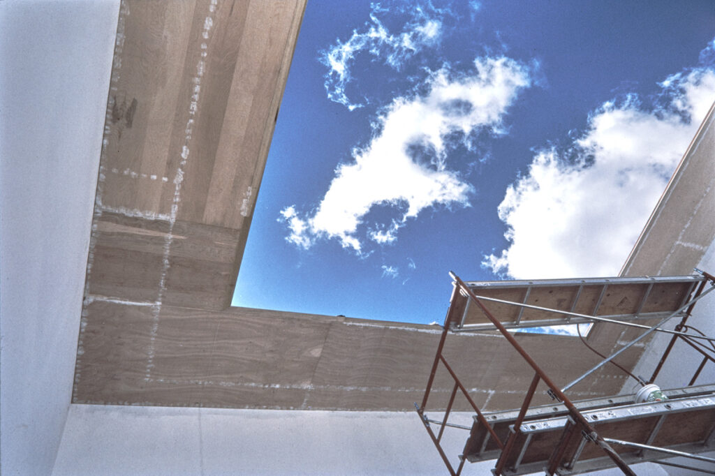
One is the famous, iconic, even historic skyspace known as Meeting, which has gone through several iterations—perhaps upgrades, perhaps not—since Turrell first created it in 1980 and opened it in 1986.
Turrell’s skyspace, Meeting, under construction in 1986, via MoMA’s interactive timeline that kind of glosses over the dramatic changes of adding an LED lightshow to the work in 2016, just before it was formally accessioned into the collection.
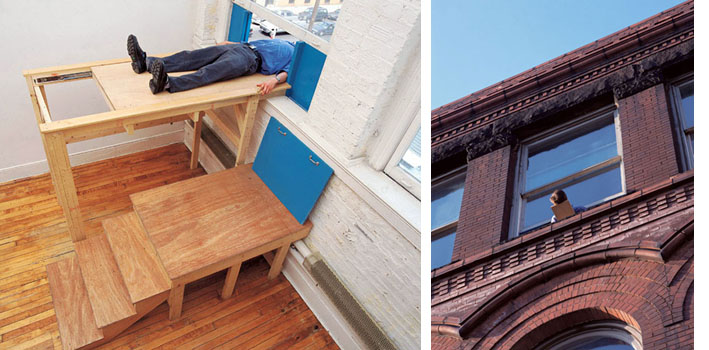
The other was a far rougher, more primitive, but also more visceral, individual experience, just down the hall. A single viewer climbs onto a wooden platform, lays down, and then the platform is slid through an open window just enough for their head to stick out. For a moment, the viewer has a disorienting and somewhat disembodied view of the sky from an extremely unfamiliar vantage point.
This permanent installation began in a gallery, but the space was then taken over for* was in PS1’s administrative offices, which were open to visitors who would take turns having their heads pushed out the window.
Then this piece was gone, and no one spoke of it again, it was the lost Turrell, that I began to wonder if I’d hallucinated it, a Klaus-era fever dream, or janky Turrell erasure? No, I was just wrong.
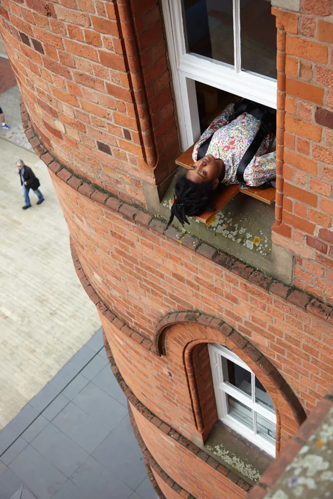
Observation Deck (Queens) was a 1996 work by Patrick Killoran, first installed in his studio in Williamsburg, and then installed at PS1’s reopening in 1997. It stayed in place until 2006 2010, mostly missing the Phonecam-brian Explosion. One of the few images of it online (above) is at Rhizome’s archive of VVORK. So thank you for that.
Patrick Killoran, Observation Deck (Birmingham), 2016, installation at IKON Gallery, photo: Stuart Whipps via IKON
A version of it, Observation Deck (Birmingham), has been installed at IKON since 2016, and has far more photo documentation. They appear to have added a safety harness, which makes sense. Birmingham’s just-announced 100% culture funding cuts, while devastating and myopic, are a small enough source of IKON’s budget that access should not be too affected.
As for how and why I conflated Killoran’s and Turrell’s work, maybe it was some resonance of the sky, the sliding mechanisms, the proximity, and the timing? I can only say it was a compliment for which I am truly sorry, and for which I’m glad to finally be corrected.
* MARCH 2024 UPDATE: And corrected again. Killoran reached out to clarify the work was always in PS1’s office; I concluded wrongly from the VVORK documentation photo that it was in a gallery space at some point.
He also explained the work’s dates related to its studio vs. public installations. Versions would later be installed in Sydney, Nantes, and London.
As for my retconning Observation Deck as a Turrell, Killoran suggested that may have arisen from a 2004 Village Voice article [long since corrected] that called it a Turrell. I’d already experienced Observation Deck several times since then, but memory is a wild thing. Anyway, now we know a little more.
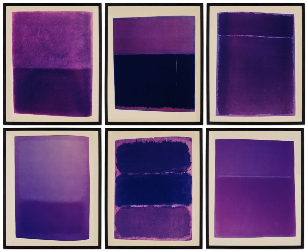
Mike Kelley, More Tragic! More Plangent!…More Purple!, 1985 (Printed 1996), Ektacolor on museum board, each 30×24 in., illustrated is ed.1/5, sold at Sotheby’s in 2022
OK, since no one else had done it, I decided to figure out the Mark Rothko catalogue Mike Kelley photographed for his 1985 edition, More Tragic! More Plangent!…More Purple! which he printed in 1996 and published with Patrick Painter Editions.
If he’d actually taken all the photos in 1985, his options for catalogues with a decent number of full-page, full-color reproductions of Rothko’s paintings were very limited.
The first and biggest candidate was Mark Rothko, 1903-1970: A Retrospective, Diane Waldman’s catalogue for the 1978 show at the Guggenheim, which has been republished several times. No. Only one of the six Kelley works—a 1953 painting on canvas— was included. There was another possibility, thinner but timely: a catalogue for a 1983 show at Pace titled, Mark Rothko Paintings 1948-1969. I couldn’t find a copy nearby.
Fortunately, the only Rothko book the curators of the current Rothko Paintings on Paper show left in the National Gallery’s library was a spare copy of the catalogue from the National Gallery’s first show of Rothko Works on Paper, in 1984. That catalogue, assembled by then-Rothko Foundation curator Bonnie Clearwater, with an essay by Dore Ashton, was republished in 2008.
I found all six Rothkos Mike Kelley used in More Tragic! &c., and identified and collaged them with no purple below, to match the Sotheby’s hang above:
Richard Prince, untitled (Milton Berle), 2021. Inkjet on canvas, 100 × 46 1/4 inches. image: Richard Prince via georgiamuseum.org
The Georgia Museum of Art at the University of Georgia in Athens just opened, Richard Prince: Tell Me Everything, an exhibition of joke-related works that seems to focus on new work related to the original joke files of the 20th century comedian Milton Berle. [If you’re within six hours of Athens today, Feb. 21, the exhibition’s curator Shawnya Harris is giving a gallery talk at 2:00. So get going.]
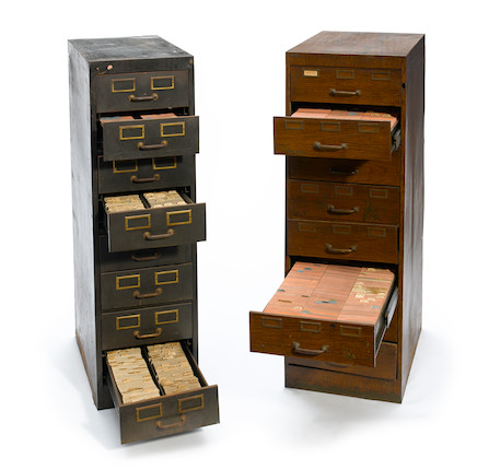
Two 4-ft tall four cabinets of Milton Berle’s jokes, sold at Bonham’s in 2013. There were also two short cabinets and six banker’s boxes of “loose joke file material”
Over his eight decades in show business, Berle had collected, organized, and annotated thousands of jokes on 3×5 inch index cards. Prince acquired four file cabinets of Berle’s jokes from an auction in 2013.
In his second deposition, made in 2018 for the [recently settled] lawsuits over Instagram portraits, Prince talked at length about his use of jokes, and transforming something heard into something seen.
Richard Prince, untitled (Milton Berle), 2021. Inkjet on canvas, 118 3/4 × 55 1/4 inches image: Richard Prince via georgiamuseum.org
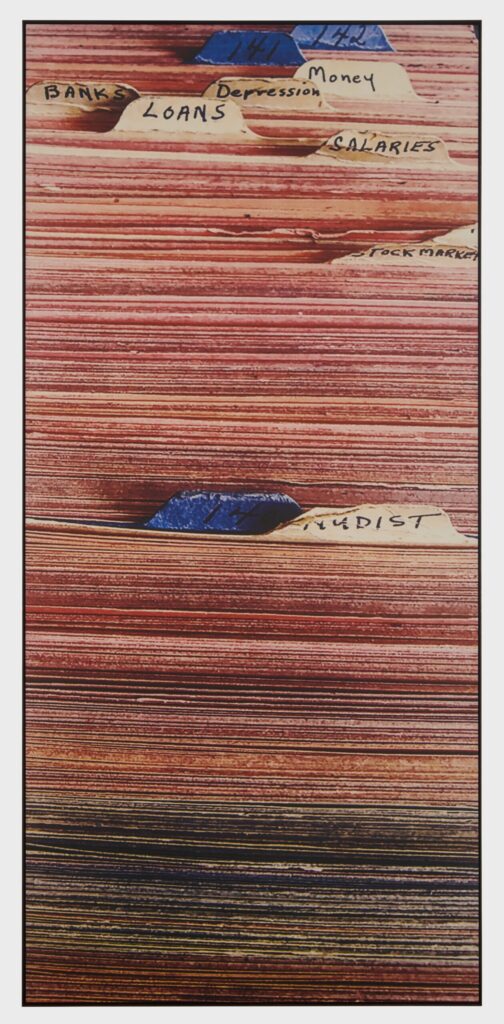
When I first saw these images, I figured that their elongated, portrait-style dimensions reflected a decade of Prince using an iPhone as a studio. But they also simultaneously read as landscapes, with joke mesas extending to a cropped out horizon, a western desert begging for a cowboy. Then I saw the file cabinets, and realized these images also map to their subject, and the experience of living with these physical objects made over decades from words, ideas and language.
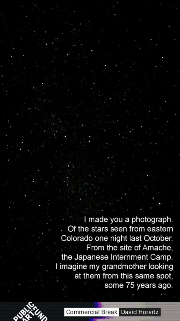
screenshot of David Horvitz’ For Kiyoko (From, Amache), 2017, digital image via PAF
Yesterday, February 19th was the anniversary of FDR’s Executive Order 9066, which ordered the displacement and imprisonment of 120,000 Japanese and Japanese-American citizens in remote detention sites around the western US. Artist David Horvitz marked the date on Instagram with a post about his grandparents, who met while incarcerated in Amache, Colorado.
Horvitz showed his photograph of the night sky as seen from Amache in a 2017 Public Art Fund exhibition on LinkNYC pylons. For Kiyoko (From Amache) depicted the same stars his grandmother might have seen, the same stars under which new groups of people in America were being threatened by the new government with kidnapping, detention, and deportation.
Horvitz’ website includes audio of a brief text about the making of this piece. The Public Art Fund’s page has an installation photo of the image in Herald Square, and the way it blends right in to the landscape is kind of unsettling rn.