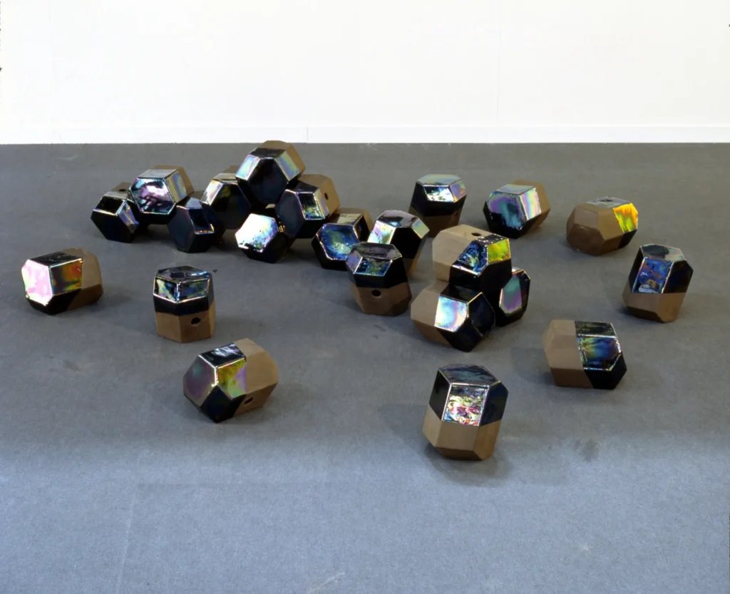
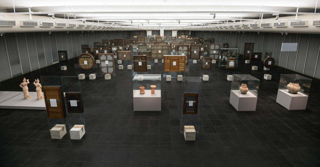
Scrolling in the Olafur Eliasson results on liveauctioneers for farflung oddities I’d missed, I came across this unexpected familiar item right in front of me that I’d also missed.
Continue reading “The Everything I Bought In 2022 Museum”the making of, by greg allen

Scrolling in the Olafur Eliasson results on liveauctioneers for farflung oddities I’d missed, I came across this unexpected familiar item right in front of me that I’d also missed.
Continue reading “The Everything I Bought In 2022 Museum”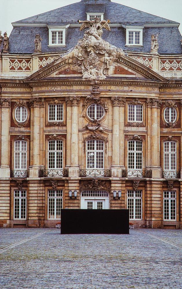
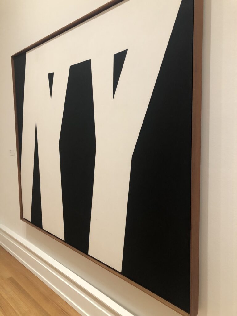
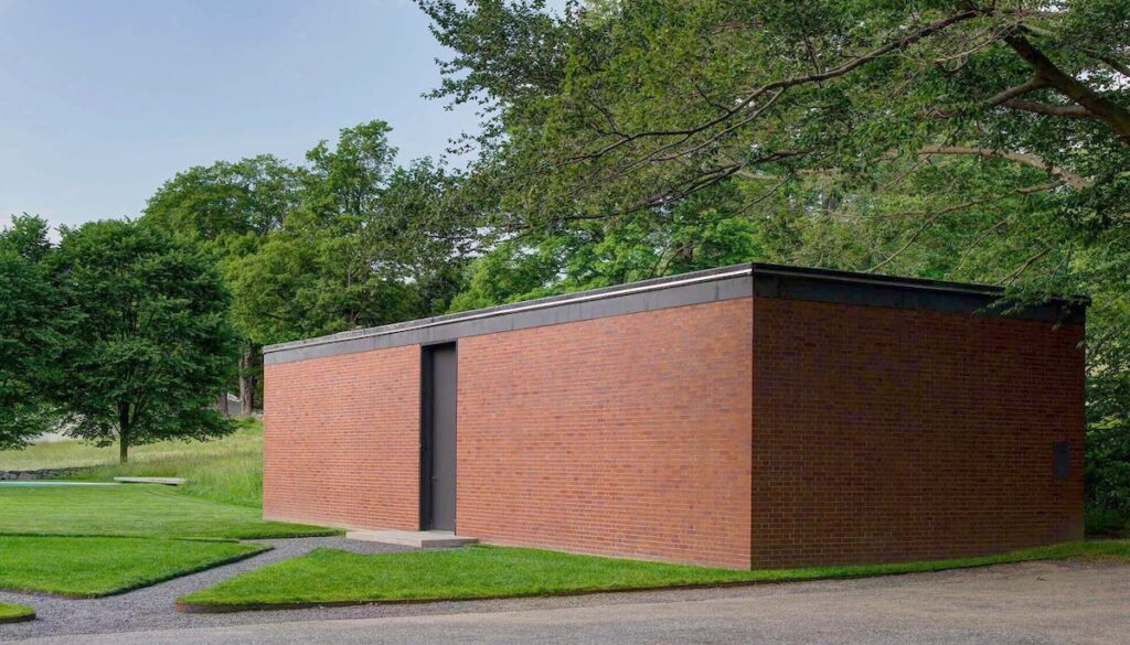
Thanks to baileybobbailey’s reblog of archiveofaffinities I became aware of what Sol Lewitt described as his only political work: Black Form — Dedicated to the Missing Jews, which was one of two works he installed at Skulptur Projekte Münster in 1987.
The sculpture, an elongated block of painted concrete bricks, was at the entrance to the University of Münster, in the Schloss Münster. Lewitt felt compelled to give a politically charged title referencing not the Jews who were murdered in the Holocaust, but the generations of descendants of those Jews, who would never be born, leaving a permanent void in German society.
Lewitt was ready to donate the work to the city, or the university, but it was perhaps ahead of its time; in a divided country where Holocaust memorials were not yet a thing, Lewitt’s Black Form generated tremendous controversy and critique. It was actually destroyed after the Sculpture Project ended—in 2023 Stefan Goebel wrote a fascinating blog post about Black Form‘s fate—and in 1989, Lewitt ended up donating another version of it to the city of Hamburg, which still stands.
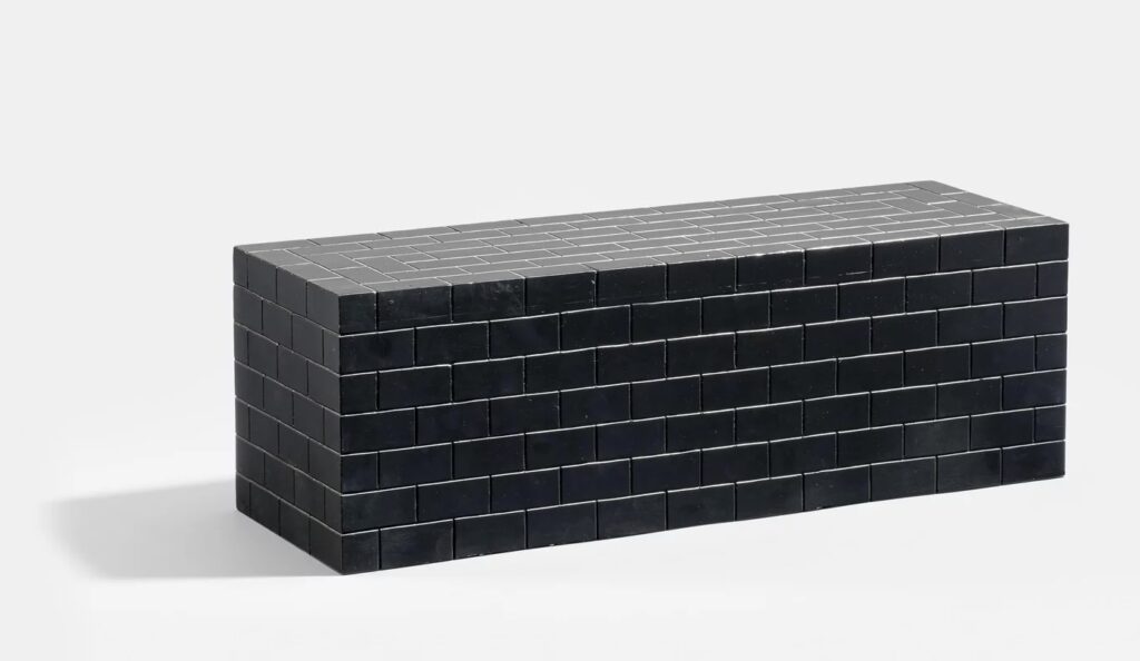
Oddly/amazingly, a carved and painted wood replica of Black Form, dated 1985, so perhaps a maquette, turned up for sale in Hamburg. What has not turned up yet is discussion of the relationship between this early Holocaust memorial to the Missing Jews and Peter Eisenman’s (and, once, Richard Serra’s) Monument to the Murdered Jews of Europe that was eventually built in Berlin.
Skulptur Projekte Archive, 1987, Sol Lewitt [skulptur-projekte-archiv.de]
Black Form (Dedicated to the Missing Jews): The Destruction of a Holocaust Memorial [munitions of the mind, kent.ac.uk]

The Walters Museum of Art translates Apkallu as a “winged genius”; other museums which have wall panels from the palace of King Ashurnasirpal II describe Apkallu as a “sage,” or a “genie.” These ripped, winged humanoid figures stood at the entrance of doorways in the palace, offering blessings or protection to passersby with a pine cone dipped into a small bucket of anointing liquid.
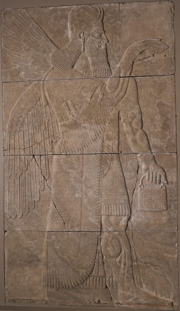
There is obviously much that can be said about Apkulla style: the feathered or fishskin cloaks; the fringed kilts; the beards, the workout, the armbands; the daggers; the horned diadems; the earrings; the rosette-covered wristbands. For starters, let’s just look at the bucket, or as Reddit is fond of calling it, the Handbag of the Gods.
Continue reading “Apkullacore”
Right now I would just like to get lost in transparent mazes of color, tracking the new colors produced by overlapping vistas, and reminisce on the Penetrable installations of Helio Oiticica. Who was driven from Brazil into exile by the military dictatorship.
Turns out discovering this 2011 Olafur Eliasson installation in São Paulo, and later in Stockholm, is not helping me flee the foreboding present, who knew?
Seu corpo da obra (Your body of work), 2011 [olafureliasson.net]
Seu corpo da obra (Your body of work) installation video [soe.tv]
Previously, related: Art & Autocracy [brooklynrail]
What I Saw: Manhattan Speedrun (and Liz Deschenes Gorilla Glass works)
It’s been almost ten years since Adriano Pedrosa brought Lina Bo Bardi’s glass & concrete easels back to MASP in São Paulo, and I guess I thought the world would have long since filled up with photos from the back. It is literally the first thing I think about every time I see one.
Continue reading “Taken From Behind: Lina Bo Bardi’s Back, Baby”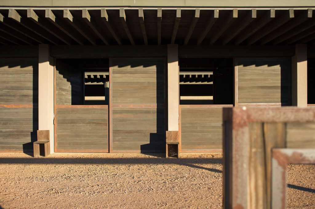
I am not going to engage in the Tadao Ando weirdness going on all over California, of which Ian Parker’s New Yorker article focuses only on the most ridiculous and collapsing epicenter. But it all did make me look again at Ando’s work for Tom Ford’s ranch outside Santa Fe.
Which, it turns out after Ford sold the 20,000-acre ranch with the Ando house, horse barn, and indoor & outdoor riding arenas in 2021, the buyer put it back on the market in 2022. It’s still for sale. [update: I don’t think this arc is correct. Many reports that the ranch, put up for sale in 2016, pricechopped in 2019, and sold in 2021, but the Tom Ford ranch Fred Haas put up for sale in 2022 is another one, a house built on 1,000 acres that once belonged to Ford. And yet Bobolsky still has the Ando ranch looking like it’s available.]
But none of that is as important as the Juddy little stools outside each of the horse stalls. If plywood KimK’s Jurd chairs were too plywood and janky, these seem too thick and pristine. Plus, I think the dimensions are off. The filename on the realtor’s site is still “TF-Ranch,” but what are they, and who made them?
Cerro Pelon Ranch [kevinbobolskygroup.com]
Previously, related: These Darren Jurd Tables
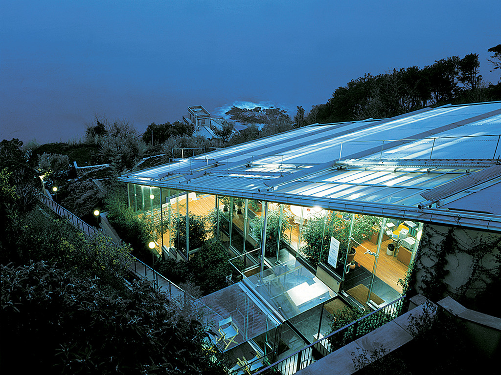
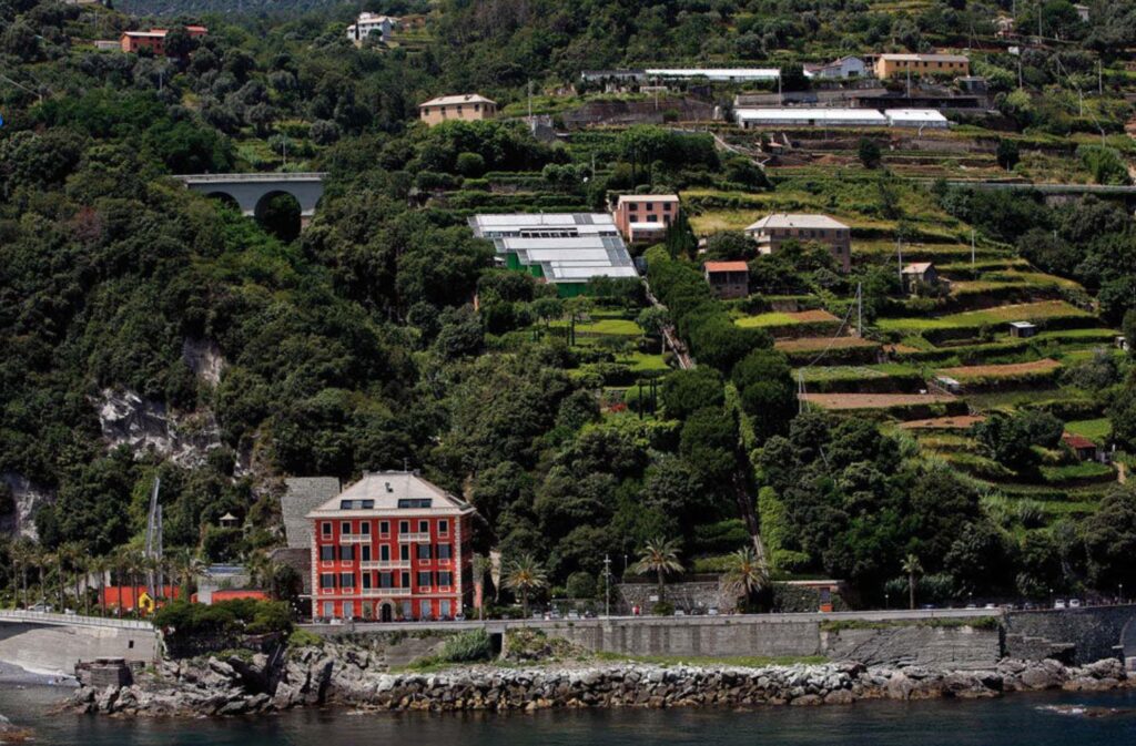

I mean, I was greenhousepilled long before Lacaton & Vassal. When I first moved to New York there was a derelict greenhouse on the roof of a building underneath the Roosevelt Island tram that I convinced myself I could rent and fix up for practically nothing, I’m sure that’s how real estate works. I had stacks of Global Architecture, the most expensive magazine in the world (after FMR, obv). I lived on a greenhouse-studded, terraced hill overlooking the Mediterranean.
So I knew about Renzo Piano’s Genoa studio (1989-1991) almost as soon as I left the Menil (1987).
Yet I somehow never saw the funicular conference room until this morning. Absolutely off the charts.
By now, with the Fondazione in Villa Nave, the red building between the funicular and the beach, the whole of Punta Nave is a Renzo Piano compound, from the autostrada to the sea. And Google Street View, from the gated pullout around the bend and the tunnel, is completely invisible. Just incredible.
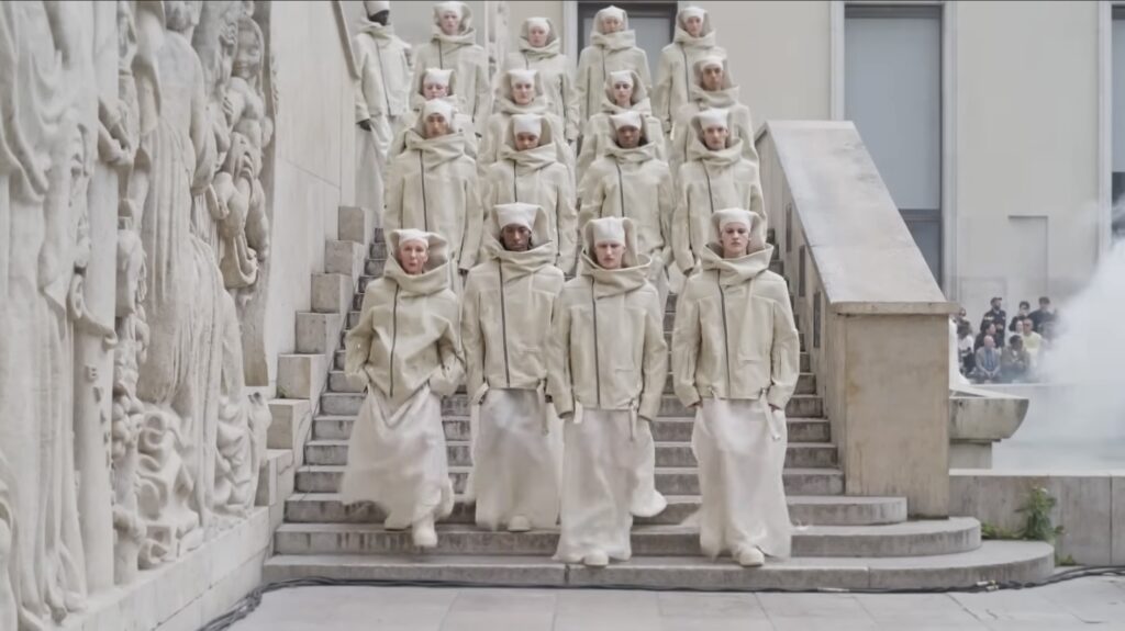
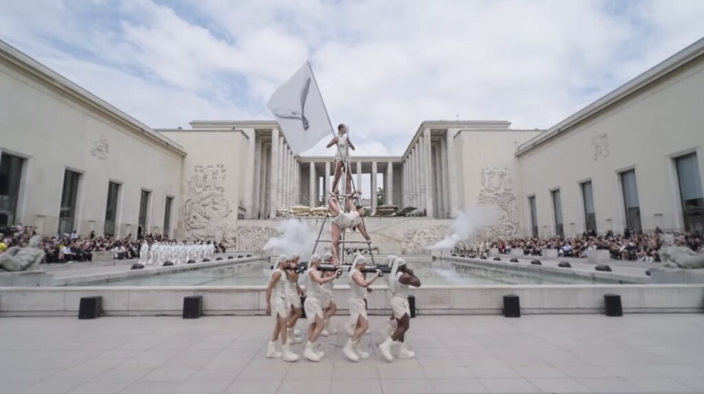
The streets were scouted. The fashion schools were emptied. The gazar was unfurled. The skaters were evicted. And Rick Owens’ Spring/Summer ’25 men’s collection processed momentously around the courtyard of the 1937 Palais de Tokyo— twice—to a very extended remix of the second movement of Beethoven’s 7th.
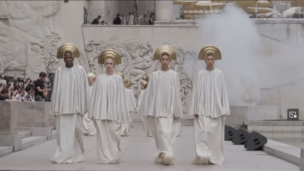
In the description on his YouTube channel, Owens cites as inspiration his own youthful flight to Hollywood Boulevard, Jack Smith & Kenneth Anger, and “THE LOST HOLLYWOOD OF PRE-CODE BLACK AND WHITE BIBLICAL EPICS, MIXING ART DECO, LURID SIN AND REDEEMING MORALITY.”
Which sounds and looks like Cecil B. DeMille’s original 1923 version of The Ten Commandments, with better costumes.
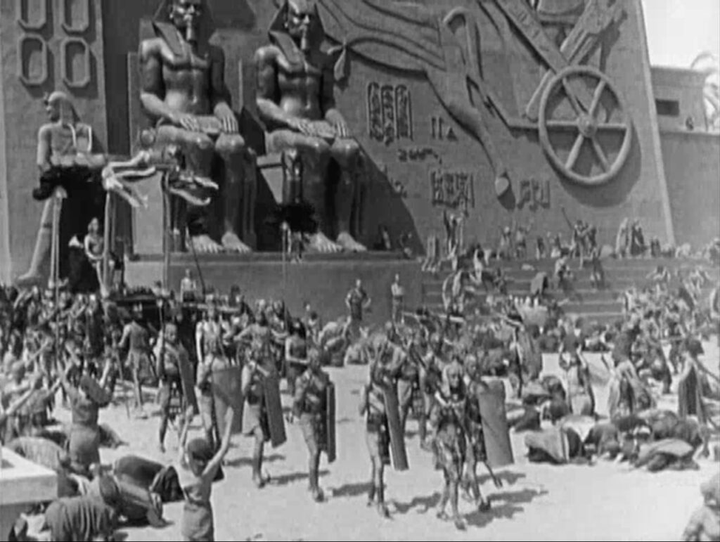
And, ngl, it also sounds and looks a lot like Intolerance (1916), D.W. Griffith’s unwieldy and obsequious sequel to his breakout klanfic hit, The Birth of A Nation (1915), with much better costumes.
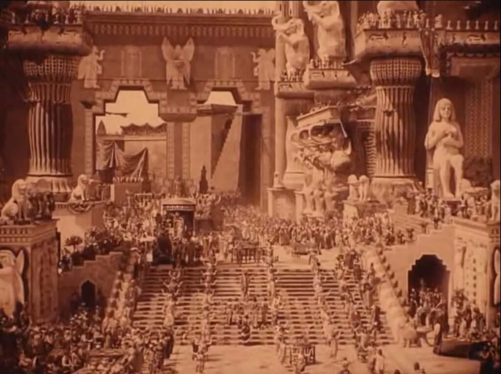
The creation of Griffith’s spectacle, from the cast of thousands to the mammoth set built on Hollywood & Sunset, was a centerpiece of Anger’s book, Hollywood Babylon.
“EXPRESSING OUR INDIVIDUALITY IS GREAT BUT SOMETIMES EXPRESSING OUR UNITY AND RELIANCE ON EACH OTHER IS A GOOD THING TO REMEMBER TOO… ESPECIALLY IN THE FACE OF THE PEAK INTOLERANCE WE ARE EXPERIENCING IN THE WORLD RIGHT NOW…” also wrote Owens.
I am not really sure how the master’s spectacularly propagandistic tools are going to dismantle his ideological house. But maybe it’s the show’s second lap, where each model walks again solo. I do want one of those jackets, though.
Seeing these Frank Lloyd Wright clerestory window screens from the New York Exhibition House, and being like, New York Exhibition House?? And I guess I somehow never clocked that the Usonian project kicked off with a fully furnished, 1,700-sq ft house built on the site of the Guggenheim Museum in 1953. The Usonian Exhibition House was supposed to be sold off and rebuilt somewhere, which didn’t work out [see above], and the plans were executed twice—for the Feimans in Ohio, and the Triers in Iowa—but that’s not important now.
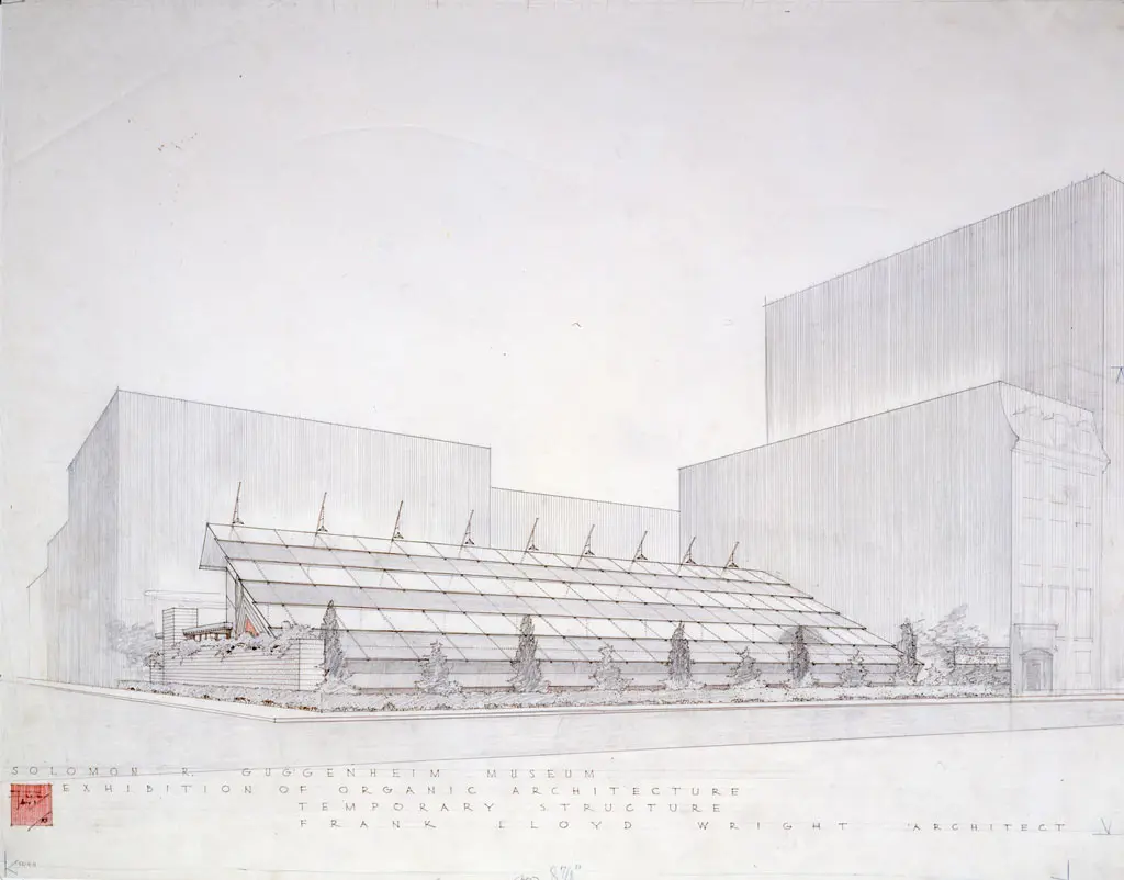
Because also—or rather, first—FLW built a pop-up, 10,000-sq ft exhibition pavilion, on Fifth Avenue.
Continue reading “Frank Lloyd Wright Temporary Pavilion(s)”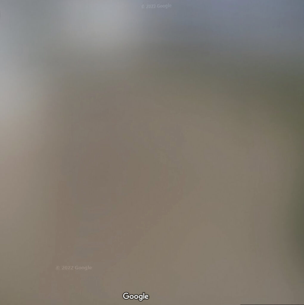
Looking to see what they’re tearing down to build their new offices and whatever, I was surprised to see the Rothko Chapel is blurred out on Google Streetview.
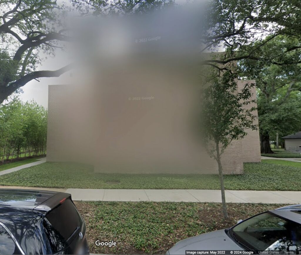
Just a bit, and just one pano, but still, it was unexpected and unexplained.
Previously, related: Blurmany and the Pixelated Sublime
OK, I guess it’s clear I was not paying close enough attention when I posted about Ellsworth Kelly’s Red Floor Panel (1992) in 2022. I recognized that Kelly made five floor works. They began in 1990, Matthew Marks wrote, with Yellow Curve, for Portikus and were followed by “two in black, one in blue, and this one in red.” I’d assumed that Glenstone purchased Yellow Curve (1990), but of course, it was later made clear that Kelly did not recreate Portikus’ Yellow Curve, but made it anew as an autonomous work, Yellow Curve (EK 808), 2015, for an identically dimensioned—and purpose-built—space. Which means technically, Kelly made six.
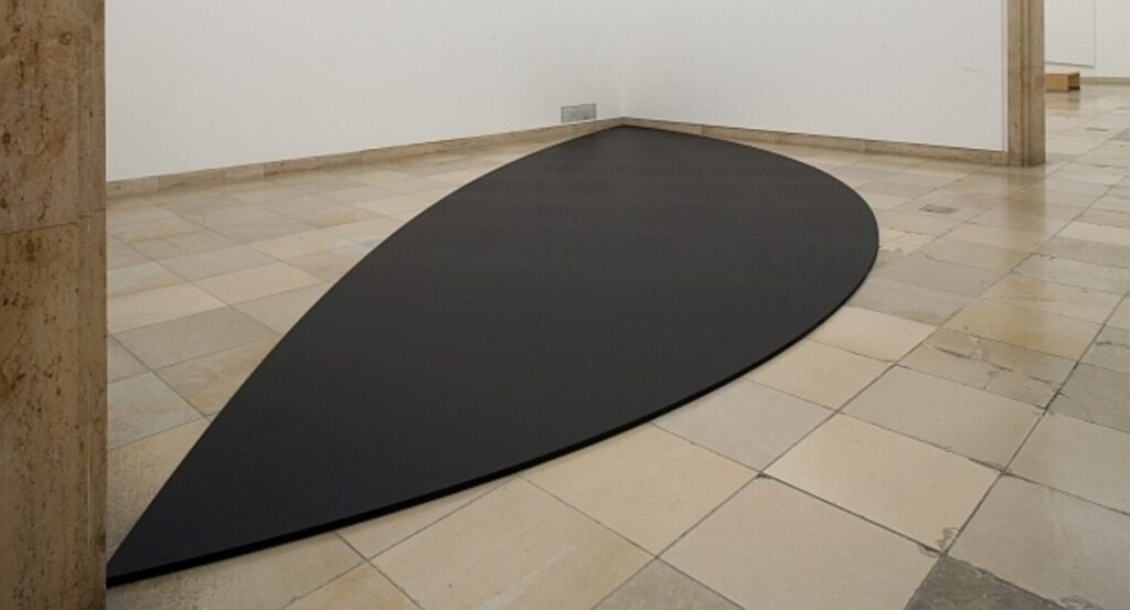
Red Floor Panel was reconstitutable and not site-specific, and Yellow Curve was not. Which are two potential conditions a floor piece can have. And now while researching Kelly’s 1955 painting Bar, I surfed across the 2011 exhibition, Ellsworth Kelly: Black & White at Haus der Kunst in Münich. For this venue Kelly was commissioned to create a floor panel the Haus called Black Curves [though Artforum called it Two Curves For Floor]. This panel extended 11 meters across a bay of the museum, and was destroyed when the show moved to Wiesbaden.
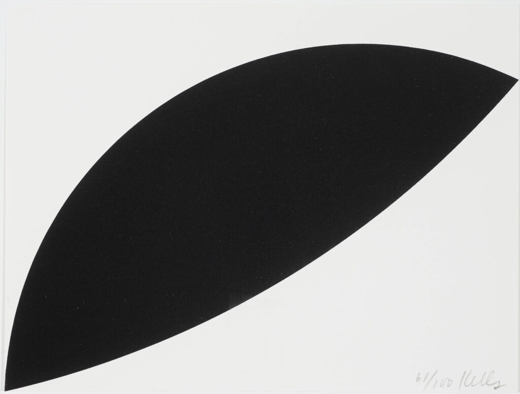
It lives now only in proportion, memorialized in the diminutive fundraising edition created for the exhibition. Though with the dimensions and the plan, it feels ripe for recreating; all you need is a space with an 11m hypotenuse.
Previously, related:
Ellsworth Kelly Red Floor Panel (1992)
EK 808: The Making Of
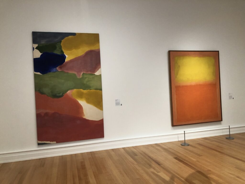
Maybe it’s living on the border, or the multiple additions, but my strongest sense of visiting the Buffalo AKG, the museum formerly known as the Albright-Knox, is of marveling at the things they put next to each other.
By entering through the parking lot and the new Gundlach Greenhouse, I ended up walking backwards, chronologically, through the museum, beginning with a gallery of large paintings made in 2013. Then there was the 90s room, then on back, to the room with this pairing of a Rothko and a Frankenthaler that just felt wild for some reason. But at least I got a picture. The mid-70s pairing of a Susan Rothenberg horse next to a blurry pre-squeegee abstract painting by Gerhard Richter was so unexpected, I forgot to photograph it.
The Coenties Slip room, though, was pleasantly sublime, with Ellsworth Kelly’s 1950s NY NY living across from Agnes Martin’s Tree just like old times. That’s a detail below, obviously; just imagine that extending in infinity.
There were some other nice moments in the permanent collection—the Stanley Whitney retrospective was spectacular, btw. Those little paintings he makes at the end of the day with his leftover paint!
Olafur’s pavilion tree situation was nice, and better than the courtyard it replaced, for sure. Is it worth having to have the Gundlach wing, too? I will defer to the Buffalovians, who did seem pleased with the place.
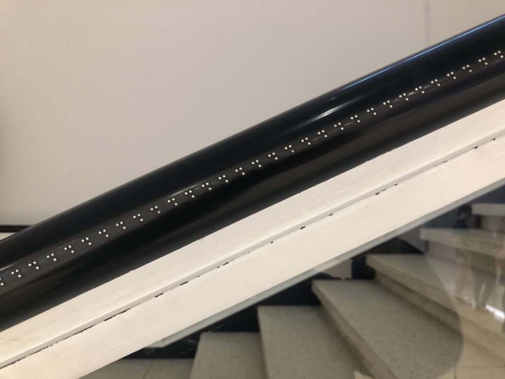
But the surprise and delight was the Jacob Kassay installation, developed in collaboration with the visually impaired education folks, where he lined the outer edge of the handrail with the letter H in Braille, creating a tactile onomatopoetic evocation of breathing, or sighing, as visitors drag their hand along. It was the perfect opposite of spectacle.
Some people wanted to make art in the gap between life and art.
Some people, meanwhile, are interested in the gap between if you move it you destroy it and actually we didn’t cut it up because it has little tongues and grooves and just slots together.
As an architecture fan and a survivor of a visit with him to the Glass House, I feel like I can say it is really too bad Philip Johnson was such a Nazi. Because the ancillary content would have been amazing.
It is still so worth checking out Spencer Bailey’s report in Town & Country on the restoration of the Brick House. Though it is right in front of the Glass House, and connected to it underground—it contains all the plumbing and mechanicals that make the Glass House possible—the Brick House has never been open to the public.
Which is not the same as not open to visitors. The Brick House was originally conceived in 1949 as a three-bedroom guest house, but it was quickly remodeled. And as everyone from Frank Lloyd Wright to Andy Warhol to Paul Goldberger readily acknowledge, it was Johnson’s sex shack. And it seems like it was hopping.
The butch boudoir interior has been restored to its 50s Fortuny-draped glory; the library has its uncomfortable number of fascism-related titles; and the halls are filled with regular rotations from Johnson’s collection of modern art. And now it is finally open for visitors, both those who head back to the city before nightfall—Johnson’s favorite kind—and the special ones who stay over. Like the Glass House, the Brick House is available for fundraising sleepovers. The mind reels.
Inside the Brick House, Philip Johnson’s Private Playground [townandcountrymag]
Previously at the Glass House, related; Au Bout de La Nuit
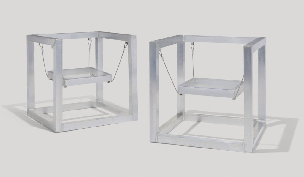
NGL, I chose this among the many great RO/LU lots in Patrick Parrish’s upcoming sale at Wright20 for the headline. Even though I got stuck on the ending.
Matt Olsen calls these Rauschenberg Chairs, because they were realized by one of Robert Rauschenberg’s original fabricators. He was one of the first artist/designers to do a residency at Captiva, too, in 2013. So maybe there was some carefree hammock or sling inspo there on the deck, too; I have not asked.
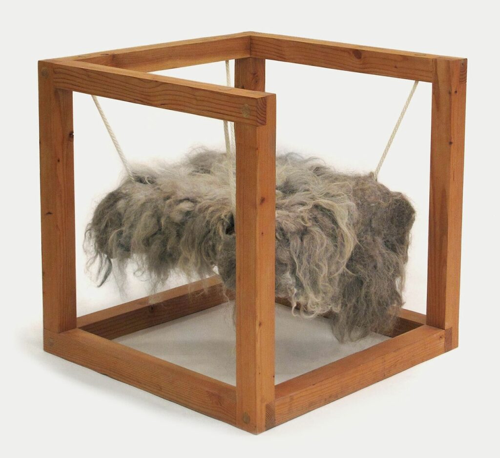
But I think he took the form with him to Florida. RO/LU showed fir and fur-based sling chairs in late 2011, with ropes holding up a wild felt seat element by Ashley Helvey. Their full title was Primarily / Primary (after Carol Bove, Scott Burton and Sol Le Witt), namechecking three artists that had been on/in their minds while making them.
It is unsurprising now, but a refreshing (re)discovery at the time that in exploring the gap between art and furniture, RO/LU would find Scott Burton.
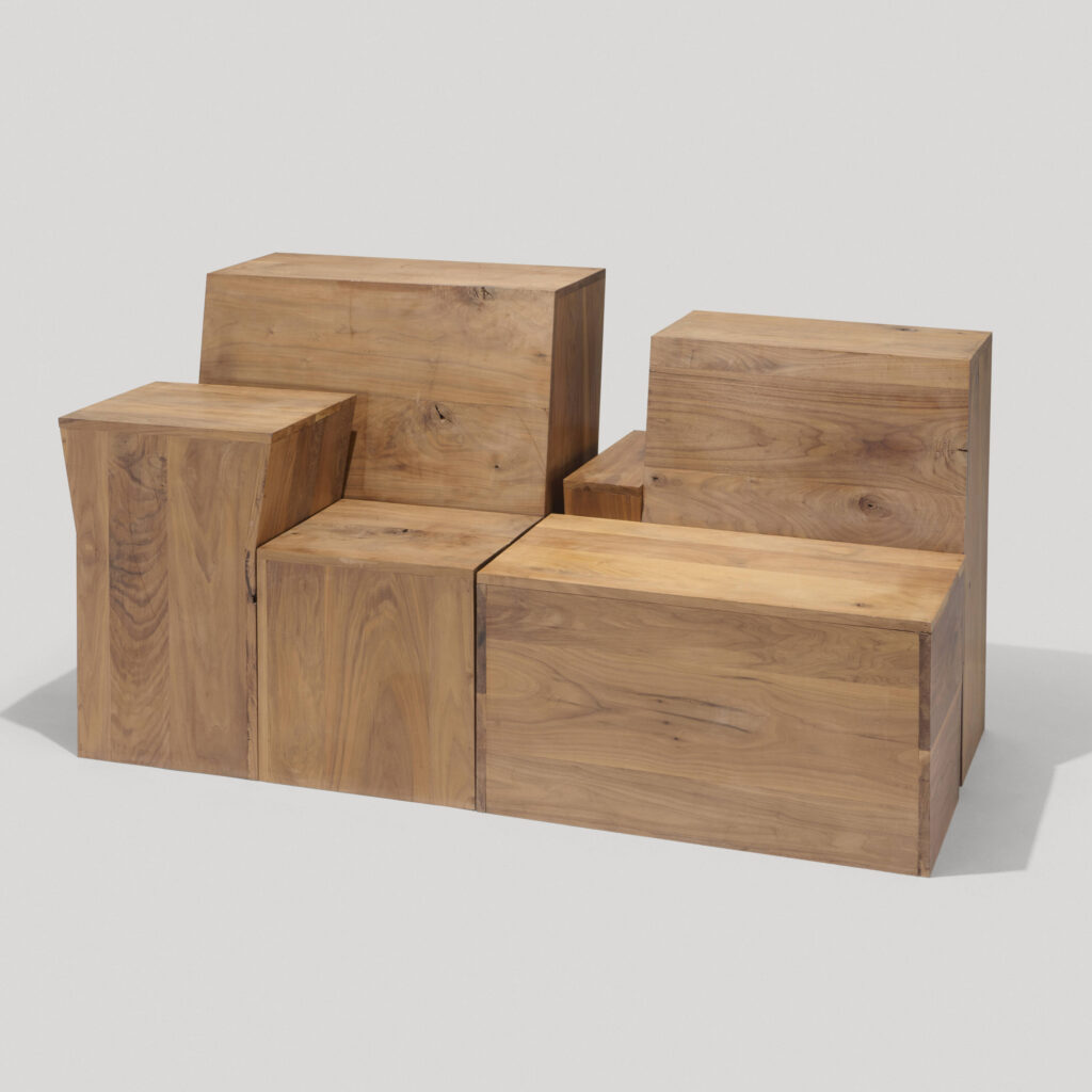
Which, now that I bring it up, I can’t not post the greatest Burton-referenced piece in the sale, this group of walnut forms called Settee X Three After BURTON Photo (Private, Public + Secret). I’ve been staring at the 360-degree photos, and the pull-aparts of the the four pieces for ages, and still cannot quite process or piece them together.
I first got to know RO/LU as a blog before I got to know them as people, and one of the most amazing things they did was experiment with moving from digital/visual contemplation to real world experience when so much of the culture was trying to do the opposite.
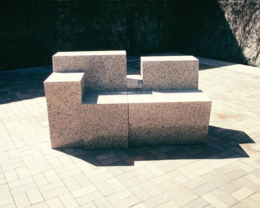
So an object (Private) that was produced by eyeballing an old photo of a Scott Burton granite settee at the Dallas Museum, that is temporarily cast in concrete on a Williamsburg sidewalk (Public), and replicated somewhere else (Secret), that you can only understand in person, feels very on the mark.
11 Apr 2024 Lot 179: RO/LU, Aluminum Rauschenberg Chairs, 2011 [wright20]
Lot 169: RO/LU, Settee X Three (After BURTON Photo, In Private, Public & Secret), 2012 [wright20]
2012: RO/LU’s Settee X Three at Sit and Read Gallery [sightunseen]
RO/LU | “Primarily / Primary (After Carol Bove, Scott Burton + Sol Le Witt) Chairs”, 2011 [patrick-parrish]
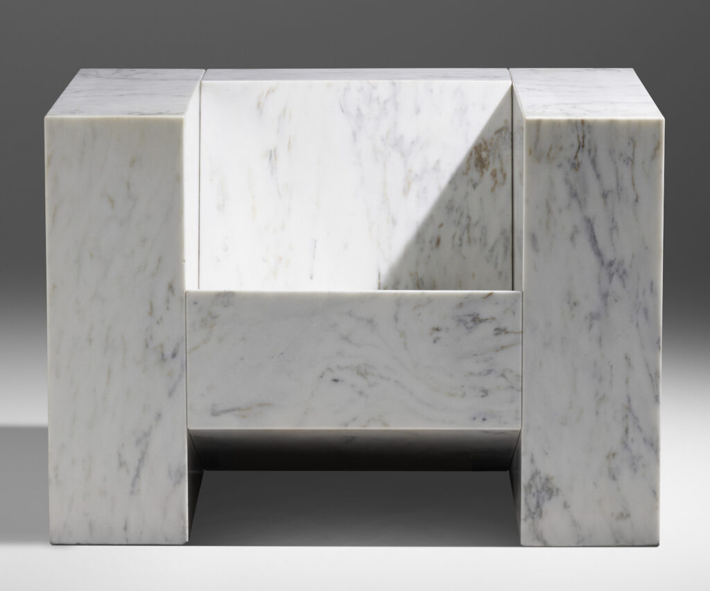
Previously, related: Scott Burton Marble Armchair