Thanks to Find The Warhols! and the Pebble Beach Pollock, 2009 was the Year Of Sketchy Art Thefts here on greg.org. Definitely didn’t see that coming. But after a couple of intense months, both cases have grown dishearteningly cold of late.
Fortunately, Benjamin Amadio, the collector/dealer/consultant/puppy mill operator/boy toy/possible insurance scammer decided to end the year with a flourish. According to the Contra Costa Times, Amadio filed a “rambling complaint” with the Monterey County district attorney using his lawyer/boss/law school professor’s letterhead, demanding an investigation of the local sheriff for botching the theft investigation–and for persecuting a friend of his with check kiting charges or something.
The lawyer has publicly disavowed the complaint, whose “subjects swing from accusations of sex slavery to a detective’s allergy to cats.” Also, the reported insurance policy on the supposed $20-60-80 million hoard turns out to have been off-the-shelf, $500,000 renter’s insurance.
UPDATE local CBS affiliate KION has published the full text of the complaint. It’s like an un-spellchecked script for a telenovela.
But rambling incoherence and teenage psychodrama aside, Amadio’s memo does put what he calls the “Pebble Beach Art Heist” into the context of several months of wrangling with/persecution by the Monterey County Sheriff’s Office. And we get some new characters/suspects: the art driver Todd Griffiths [to whom Dr Kennaugh had given some kind of educational grant, which he canceled?], some other live-in waitresses and hangers-on, and a possible lockbox-stealing guesthouse squatter [their house was a repossessed rental.]
None of this changes the fact, though, that Amadio consistently calls prints “paintings,” or that their still-unseen Pollock is still almost certainly a fiction, fake or fraud. [thanks greg.org reader chris for the heads up.]
Rambling complaint is latest twist in Pebble Beach art heist [contracostatimes.com]
Category: art
The AMNH’s Digital Universe Atlas

The American Museum of Natural History maintains a Digital Universe Atlas, which maps all the objects in the universe using the most current data available.
They just released The Known Universe, an animated version of the data, in conjunction with the Rubin Museum of Art [which presumably paid to have the Powers of Ten-style roundtrip through all time and space begin and end in Tibet.]
While it’s encouraging to see so much empty-looking orbital space for me to put my satelloon, this is my favorite shot: “the empty areas we have yet to map.”
Watch The Known Universe by AMNH in HD [youtube via kottke]
Download or visit the Digital Universe Atlas [haydenplanetarium.org/universe]
Previous posts on the charming concept of trying to depict everything in the universe: On The Sky Atlas And The NGS-Palomar Observatory Sky Survey
Delirious DC
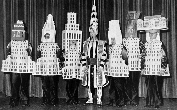
At the 1931 Beaux Arts Ball, more than a dozen New York architects came dressed as their buildings: [l to r] A. Stewart Walker [Fuller Building], Leonard Schultze [Waldorf-Astoria], Ely Jaques Kahn [Squibb Building], William Van Alen [Chrysler Building, who clearly booked his own stylist], Ralph Walker [Irving Trust Company], and Joseph Freedlander [Museum of the City of New York].
Rem Koolhaas included the Ball in his 1978 history/”retroactive manifesto,” Delirious New York.
Which was hook enough for Lali Chetwynd, whose 2006 performance piece, “Delirious!” reimagined the Beaux Arts Ball as a skyscraper cocktail party. It was ably documented by Showstudio:
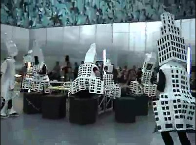
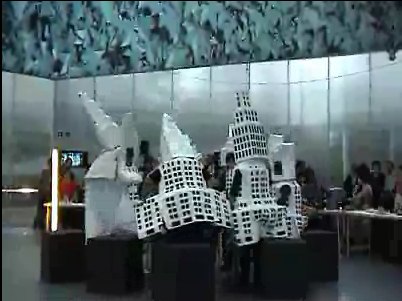
“Delirious!” was staged in the Serpentine Gallery Pavilion designed by Koolhaas and Cecil Balmond, which comprised a giant, inflatable ovoid canopy atop a cylindrical amphitheater/event space.
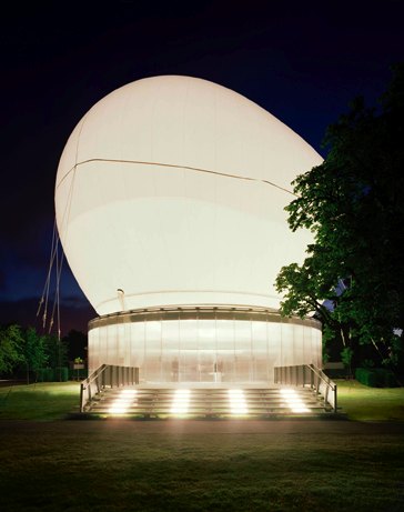
Which, of course, bears a striking resemblance to the much-discussed, little-funded inflatable balloon space Diller Scofidio + Renfro have designed for the Hirshhorn Museum in Washington DC.

So now we have some idea what will go down in the Hirshhorn Balloon if and when it is realized: Liz Diller will appear at a $5,000-a-table benefit, dressed as her creation, and probably looking not a little like this:
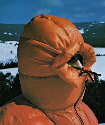
but in light blue.
Or perhaps.
Soon after “Delirious!,” Chetwynd changed her first name to Spartacus. Tom Morton discussed the implications of this move in Frieze:
Chetwynd’s adopted moniker seems designed to make us stage a mock-heroic mini-drama in our minds, in which she persuades a band of artists to stop pitting themselves against each other and instead revolt against their masters. Push this fantasy a little further (and Chetwynd’s art is nothing if not about pushing idle thoughts as far they’ll go), and we might imagine the defeated rebels refusing, pace Stanley Kubrick’s 1960 film Spartacus, to identify their chief, instead claiming one after the other ‘I’m Spartacus’, only to be symbolically crucified by a poor auction result or a less than complimentary review.
If this flight of fancy resembles the absurd, unexpectedly telling narratives and motifs that characterize Chetwynd’s work, then this is no mistake. In her practice the epic and the everyday speak through each other in accents of giggled hope.
Giggled hope seems to be an apt operating principle for the Hirshhorn’s Balloon of Cultural Democracy. Is it not now time for us balloon lovers, each of us, to put on our puffy down coats, cinch our hoods around our noses, and raise the defiant cry to all who dare challenge or pooh-pooh us, “I’m Liz Diller!” “I’m Liz Diller!” To the Mall!
[hoodie image via old chum’s flickr, thanks to the purely coincidentally titled blog, an ambitious project collapsing]
Merz-y Christmas!
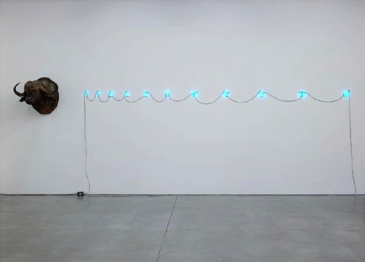
Paddy recognized a good match for MOCA’s Felix Gonzalez-Torres [Christmas] light string card. If the folks at Luhring Augustine would hop to, we can still get this printed and sent in time for Kwanzaa, at least.
Alternate headlines:
Deck the halls with Fibonacci
Have yourself a Mario little Christmas
Here we come a-Water Buffalo-ing
Untitled, 1998, Mario Merz, taxidermy and Fibonacci numbers, on view through Dec. 19 [luhringaugustine.com]
Time To Make The Doughnut

Sweet. The Hirshhorn Museum is floating the idea to turn its central plaza into a 4-story event space by filling it with a giant temporary balloon pavilion by Diller Scofidio + Renfro. The $5 million pavilion would be put up to house “performing arts, film series and conferences to foster a wide-ranging public debate on cultural values.”
It’s a grand and awesome-looking architectural gesture that would dance around the bureaucratic hurdles any permanent structures on the Mall would face. The key to its success, obviously, is the programming.
The popularity of the Hirshhorn’s Afterhours DJ parties is proof of concept for courtyard events. But that sounds like barely the tip of the programming iceberg. Think of the Hans Ulrich Obrist-era Serpentine, which fills the temporary pavilion with concerts and and 24-hr lecture marathons–bring your sleeping bag! And of course, you can throw one helluva benefit dinner in that thing.
A lot of work to be done, but it’s nice to see the folks at the Hirshhorn are well-versed in the grand tradition of implausible balloon interventions on the National Mall. And with the even grander tradition of talking to the New York Times, not the local Washington Post, when you want to make cultural attention.
UPDATE: aha. Score another one for the bloggers. Here’s then-new Hirshhorn director Richard Koshalek talking to Tyler Green in April [!] about his plans:
We really want to engage the arts in big themes not just in the galleries, but outside the museum, say in a tent-type structure on the National Mall. One of these events would be in the fall and one would be in the spring, in a kind of inflatable building. The structure would house 500-1000 people and we’d have programming that includes everyone, from trustees to directors to curators to artists. [Koshalek showed me drawings of what the tent might look like.] It’s about where the cultural institution needs to go in the future to be relevant.
In Washington, a Different Kind of Bubble [nyt via tropolism chad]
Felix Navidad
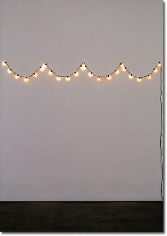
Not sure how I feel about this, I’ll tell you when my order arrives. Pretty damn pleased with the headline, though.
Felix Gonzalez-Torres Holiday Cards: Last Light, $14.95 for a box of 10 [mocastore.org]
Bubbly Museums 2.0
Robin Pogrebin reports on all the museums waking up with a financial and strategic hangover after a decade of Bilbao Effect-ed building.
It’s good, obvious-and-not-just-in-hindsight stuff. I seem to recall during the midst of the boom, the American Cinematheque in Paris blew its wad on a Frank Gehry building it couldn’t handle. Now the Cinematheque’s run off of some guy’s dining table or whatever, and the Gehry building’s, uh, something else.
When MoMA picked Yoshio Taniguchi for their expansion, I translated a very similar article on Japan’s 1980s museum bubble from Yukio Futagawa’s GA Document 33: Japan’ 92.
I don’t have it in front of me, but the gist is roughly the same: Japanese cities felt a competitive urge to build trophy museums, which almost immediately began faltering on their collecting, programming, or operations because of incredible strategic, political, and financial short-sightedness. City fathers wrote one check, and they were done.
Taniguchi is just one architect whose reputation was formed in large part on his beautiful contributions to this bubbly museum era. I’ll try and track that article down.
I C U & U & U
The first time I did the Miami collection visit circuit was in 1998, with MoMA’s Junior Associates. A few things stuck out in my mind: Ernesto Neto camped out on Rosa de la Cruz’s floor with a sewing machine; Zhang Huan and his wife hanging out with us at the Rubell’s hotel, making work; Marty Margulies’ dressing room positively overflowing with the entire photographic canon; the Olafur grid installed in his gigantic bathroom; so much rubble shedding from the Bramans’ Kiefers, they had to sweep it up every day; and the oddly standoffish, yet competitive vibe I got from various collectors regarding each other’s collecting. It felt like they didn’t really talk to each other that much, they each did their own intense thing. Except when they didn’t.
By the end of the trip, I’d seen no less than four versions of Claes Oldenburg’s Typewriter Eraser. It was as if Claes had an eraser-themed trunk show at the Fontainebleau, and everybody came.
I was reminded of that during last week’s installment of Art Basel Miami Beach because of Wade Guyton. I’m not talking about the kind of Art World Tour 09 disorientation you get from seeing Guyton/Walker’s sprawling installation from Venice turn up just a couple of weeks later at the de la Cruz’s new space. “It’s great to be here in [insert biennale/art fair city name]!”
I’m just saying, I know he’s shown at least a dozen at once, but did everyone in Miami think they were the only one buying a Guyton Untitled U sculpture?
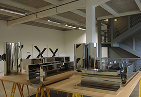
The Scholls threw theirs onto the pile of U’s Scott Rothkopf curated into the Lyon Biennale in 2007.
The Rubells had theirs out for their show, “Beg Borrow & Steal,” which was inspired, they said, by conversations with Wade and Kelley in 2005.
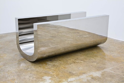
And the de la Cruz’s is on view at the Miami Art Museum:
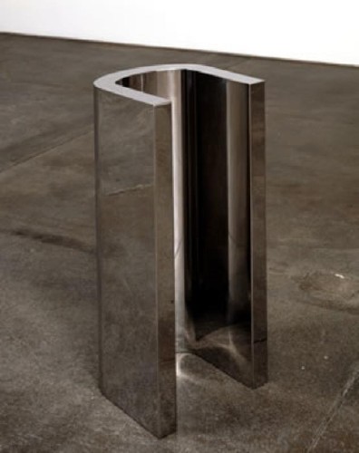
I’m sure there are a few more lurking around Miami I just haven’t seen yet. You?
Slight Of Hand
Considering how important and incredible the work is, it’s funny how ambivalent the Times’ Gabriel Orozco feature sounds.
Ann Temkin did a great show of Orozco’s work in Philadelphia, and yet she comes across as a bit flustered discussing the artist’s mid-career show at MoMA.
The whole Mexico/Mexican Artist thing is odd, too. Mexico is obviously an important site for Orozco’s work, but it’s just one of many. And he’s been resolute–and successful, I’d say–at not being The Mexican the art world might want him to be. [Wow, has it really been seven years since I criticized Peter Schjeldahl’s Mexican stereotyping of Orozco clay pieces at Documenta 11? ]
And the thing about painting? So many of Orozco’s classic works–and I’m thinking of things like the currency, the boarding passes and tickets, the sports photos–involve drawing and painting, this idea that painting’s somehow anathema to him and his project is baffling.
From the beginning, I’ve seen Gabriel’s work–already I realize I have to turn that thought around. The impact comes not so much from seeing Gabriel’s work, as from seeing the rest of the world differently after seeing Gabriel’s work.
The slightness of his gestures and perceptions seem like Duchampian hypotheticals, brought into the real, gritty world: how little can an artist do to make something into art? Can this coaster, this yogurt lid, any circle at all, successfully be art? And if the answer is yes, then nearly every other object or situation we encounter every day has that same potential as well.
It’s why my favorite work of his in MoMA’s collection is a 1992 drawing, or really, work on paper, where he pinched and rubbed a little raised arc at the center.
I’ll figure out some grand ending for this piece a bit later. Right now I don’t have one, which may suit me fine.
Gabriel Orozco’s Whale of a Return to MoMA [nyt]
Mercury’s Tethered Balloon Experiment
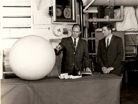
A periodic check on eBay for Project Echo-related material turned up this photo from April 29, 1963: “NASA-MERCURY, HANGAR 5, CCMTA – Left to Right – William Carmines and William Armstrong of NASA describe the balloon experiment for the MA-9 mission.”
MA-9 was Mercury-Atlas 9, the last of the first series of manned US space flights. L. Gordon Cooper was the first American to spend more than a day in space. “The balloon experiment” was designed to measure atmospheric drag at various altitudes by inflating a 30-inch balloon behind the orbiter, which would trail at the end of a 100-ft nylon cable. Cooper was also supposed to take photos of the tethered balloon to test visibility in space.

The balloon experiment was a carryover from MA-7, 1962, in which astronaut M. Scott Carpenter became the second American [after John Glenn] to orbit the earth. As the MA-7 flight plan describes it, the balloon experiment was a color test:
Objective: The objective of the visual portion of the experiment is to evaluate the relative merit of various colors for optimum visibility in space at short and long ranges.
…
The test device consists of a 30-inch diameter balloon constructed of 30 gores of 1/2 mil Mylar – 1/2 mil aluminum foil material. It will be divided into five equal size lunes composed of uncolored aluminum foil, yellow and orange Day-Glo, flat white paint, and phosphorescent paint (figure 1, below).
…
The balloon, [inflating] bottle, and shock absorber will be packaged between two balsa half cylinder shells in a metal cylinder which si three inches in diameter and seven and one-half inches long. It will be mounted in the Mercury spacecraft antenna fairing. [The assembly would be ejected out of a spring-loaded door by the firing of an electric squib.]
…
A small quantity of 0.250-inch diameter Mylar disks will be placed in the folds of the balloon. The Mylar is backed by aluminum foil on one side and is coated with Claray (diffuse-reflecting) compound on the other. These will disperse as the balloon inflates.
So, small explosion, burst of mylar confetti, and deployment of beach ball-like balloon on the end of a 100-ft cord. Then photos of the whole thing. Sounds awesome.
Unfortunately, the MA-7 balloon tore on inflation, and only the aluminum and orange Day-Glo lunes were visible. The orange was so much brighter, that the MA-9 balloon, above, was painted entirely in orange. Unfortunately again, the MA-9 balloon failed to deploy at all.
Those balloons would look nicer in color.
Making Eames Shell Chairs, c. 1970
So fantastic. This promo film was made by Eames Office for Herman Miller in 1970, and it shows the making of fiberglass shell chairs, from the analog beginnings of design to the box.
The idea of design has been so thoroughly associated with computers in my mind, I’d forgotten the essential sculptural processes it used to involve: carving, modelmaking, molding, pouring… How design and art ever stayed separate in those days, I cannot imagine.
Also mind-blowing, but not in a good way: the nonchalance with which the gloveless, maskless employees casually lay down fiberglass matting and resin, and the one-scoop-at-a-time casting of the chairs’ aluminum bases. It’s all OSHA-mazing.
Wow, the 6-Volume DVD box set, The Films of Charles & Ray Eames, is on sale for just $30, down from $80. Fiberglass Chairs (1970) is on Vol. 4. [amazon]
The Eames Solar Do-Nothing Machine – The Remaking Of

I’m fallen in love all over again with the Solar Toy Ray and Charles Eames created around 1956-7 for Alcoa.
Writing about it in 1958, Charles Eames also called it the “Do Nothing Machine.” As Steve Roden discussed a couple of years ago, Eames’s view of the functionless machine/toy was rather Zen: “It is not supposed to do. It is supposed to be. Its whole function is in its being.” Or, I would add, rather sculptural.
The Solar Toy was never meant for production, just promotion. As far as I know, a single unit was commissioned by Alcoa’s Oscar Shefler for the innovative-sounding “Forecast Collection.”
I’ve been stewing on it for more than three years now, and I think I must track down what happened to it, and what archives and records remain of its creation. And then I must either find it and exhibit it, or remake it and exhibit it. But either way, it should really be seen today.
Beyond the Toy’s sheer, self-evident beauty, it could shine a light, so to speak on some of the intellectual, cultural, technological, and environmental complexities of the intervening 50 years.
What has happened, how have we done since the archetypal prophet of American, can-do, corporate modernity dazzled us with his shiny, functionless object powered by the limitless energy of the sun?
Or as the article in Radio & TV News puts it in their cover story, “Will our future electricity all come from the sun?”
Intrigued by the possibilities of a future where man would use an energy source 93-million miles distant, Eames fashioned a design so that people may “see a living demonstration of the fantastic potential of the work that solar energy can perform for mankind.”
Fantastic! Let’s see how that turned out.
Continue reading “The Eames Solar Do-Nothing Machine – The Remaking Of”
Anne Truitt, Cool Warrior
I’ve always smiled when I read this exchange from James Meyer’s 2001 interview with Anne Truitt:
JM: People often try to connect the artist’s life and work In obvious ways: They refract the art through the lens of biography. I can already see a reading that goes like this: “Truitt, living in Washington at the height of the Cold War”–
AT: I’m just agog with interest at what you’re going to say–
JM: –“devised an abstraction that sought to escape, and yet expressed, US Imperialist power.” I’m thinking of the old reading of Abstract Expressionism’s manipulation by the US Information Agency to represent an American ideology of “freedom.”
AT: That’s true.
Also true: Truitt’s best friend was JFK’s mistress, who was murdered; her kids attended preschool at the White House; and her friends–and possibly/probably her Washington Post/Newsweek executive husband–were in the CIA.
Grand Allusion: James Meyer talks with Anne Truitt [artforum 2002]
The Parmalat Picasso: Calisto Tanzi’s Secret Art Stash
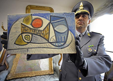
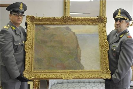
Whoops, looks like the number of spectacular corporate fraudster’s secret art stashes about be pawned off to unnamed Russian collectors has dropped by one. The Guardia di Finanza del Nucleo Polizia Tributaria in Bologna raided several Parma homes of friends and family of Calisto Tanzi, and seized 19 artworks that he long claimed did not exist. Tanzi was convicted in 2003 of embezzling more than 800 million euros from Parmalat, the milk-in-a-box giant he founded and drove into Europe’s biggest bankruptcy. He was sentenced to 10 years in prison. [clarification/correction: the bankruptcy was in 2003. The looting and fraud-related conviction was in 2008. Tanzi is currently free on appeal.]
Last week, Rai 3 reported that Tanzi’s son-in-law was secretly trying to sell the art to a Russian billionaire. I’m looking for images and details of the loot. Meanwhile, here’s a translation of the Libero News report, which has the most complete list of the works I can find. Typical mogul stuff, it gets pretty boring pretty quickly:
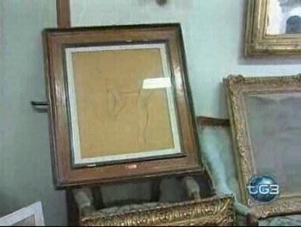
- Portrait of a dancer, pencil on paper, Edgar Degas
- Self-portait, canvas, Antonio Ligabue
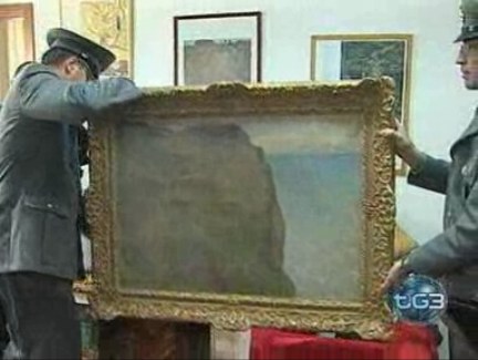
- Cliff at Pourville, oil on canvas, Claude Monet, [the EUR10 million sale of which prompted the raid. above, perched precariously on sofa, one of three works published by the AP]
- Still Life, Paul Gauguin
- Willow Trunk, Vincent Van Gogh [which, if it’s Pollard Willow, just sold in 2007 at Christie’s. Bibliodyssey posted several willow sketches from the Theo letters a couple of months ago.]
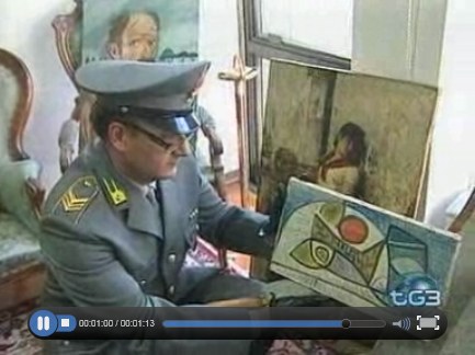
- Still Life, oil on canvas dated 12.1.44, Pablo Picasso
- Portrait of a lady, oil on canvas, Giuseppe De Nittis
- Portrait of a girl, oil on canvas, Giacomo Favretto
- Tree, oil on canvas, Edouard Manet
- Still Life, oil on canvas, Vincent Van Gogh
- le hetre, watercolor/pencil on paper, Paul Cezanne [I think hetre is beech], Two ladies, pastel, Condés Pizarro
- le couple, gouache on paper mounted on canvas, Maurice Utrillo [sold at Christie’s in 1996 for $9,200]
- Bergerie, drawing on paper, Amedeo Modigliani, [sold at Christie’s in 1990 for $25,000]
- Landscape, collage and tempera, 1953, Nicolas De Stael
- Landscape, Marino Martini
- Landscape, Gino Severini
- Illustration for Esquire, pencil on paper, 1937, George Grosz [not the right title; Grosz commonly inscribed that on the back of his Esquire drawings]
- Untitled drawing, Rafael Barradas.
[pictured above, with the Monet on the sofa in the background]
[pictured in the BBC report]
So a lot of small works on paper, and a couple of seemingly un-smugglably large paintings of not-so-much importance or value. The best-sounding piece by far is the Monet [below, from the BBC’s slideshow]. But there’s little to warrant the term “masterpiece” at all, and it’s hard to see how to get to the EUR100 million value the police claim the stash is worth. But it makes for a neater headline.
Holy smokes, this Rai 3 news report is enough to give art handlers a heart attack:
The Van Gogh is just a drawing:
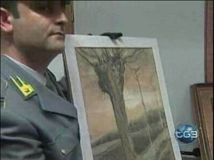
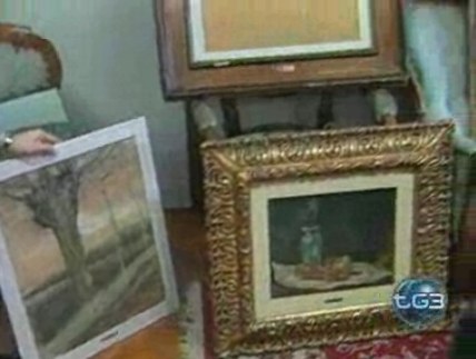
Here’s the Van Gogh propped up next to the Cezanne, with the Degas propped on the chair arm above:
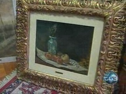
A closeup of the Cezanne, looks kind of early to me:
The Degas is a wisp of a sketch:
The Picasso, with the Ligabue [L] and the Favretto [R] leaning behind them:
You have to watch the video for the full effect of the policeman shuffling the Ligabue to the ground while one-handing the Monet. The guy on the right is different, so I guess all the police took turns posing for the cameras with their booty:
Domes In Dutch Landscapes: Awesome Worlds Collide
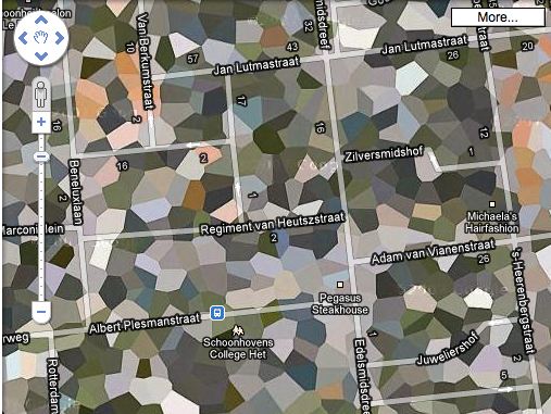
I love it when several plans come together. Apparently, not all the Dutch Google Maps landscapes camo’d out by the Military Intelligence Department are actually sensitive sites. And some sites will toggle in and out of camouflage without warning or explanation.
One such site is the southern town of Schoonhoven, which has been poly’d off the map for most of the last four years, for no security reason at all.

It’s no secret that NATO operated a SATCOM weather station on the north edge of town. The giant, geodesic dome that hid the doppler equipment is a prominent roadside landmark. But the base was decommissioned in 2005, just before Google’s contractor, AeroData, began its hi-res geoimaging flights over the Benelux region.
It was too late to get off the Defense Department’s polygon list, though, and so the entire town is obscured, even the Pegasus Steakhouse [above].
By 2008, with plans for the residential redevelopment of the abandoned base well under way, it was reported that townsfolk were finally being promised year-round, un-camouflaged Google Earth access to their homes. Maybe today was just a bad day.
06-2008: No More Blind Spot [ad.nl, image via ad.nl]
Urbex – NATO Schoonhoven photoset by Marc Duiker [flickr]

