
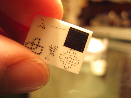
Regular readers of greg.org will recall the Moon Museum. Initiated by the artist Frosty Myers–who know prefers to be called Forrest Myers, I take it–the Moon Museum was the first art on the moon, a tiny ceramic chip containing etchings by six artists, which was secretly attached to the lunar landing module for the Apollo 12 mission in 1969.
When I posted about the Moon Museum in 2008, I was happy to even find a grainy picture of the entire thing. Andy Warhol’s contribution, a graffiti-style doodle of a penis, was deemed unfit to print by the NY Times when the art project’s existence was first revealed.
Now Reg at We Make Money Not Art has posted a much nicer, color photo of the chip from Myers himself. It was featured in an exhibition of “art of extreme environments” in Paris last fall. She actually notes that “a few were made,” which is awesome. That means they might be–or become–available some day. At least one other example of the Moon Museum was, in fact, given to MoMA in 1993 by Ruth Waldhauer. It’s described as a “tantalum nitride film on ceramic wafer.” This warrants further inquiry.
Category: art
‘Little Uglies’
I’ve had a research question simmering on the back burner for a while, trying to figure out what the history of modernism and contemporary art have been in Washington DC. Partly, it was the dearth of good modernist architecture that got me wondering, then a crash course in the history of contemporary art and official Washington generally, and the odd genesis of the Hirshhorn Museum specifically. Then there was some sporadic attempts at securing Washington’s place at the art world table [more on those later].
Then last spring, I attended a dinner in the State Department’s Diplomatic Reception Rooms. Though they were originally built in an off-the-shelf, 1950s corporate modernist style that matched the building, in 1969, Walter Annenberg, Richard Nixon’s newly appointed ambassador to Great Britain, gutted the space and installed the current veneer of neo-colonial splendor. That gut job stood in nicely for the essentially anti-modernist hostility of the Washington Establishment. Little did I know.
In the the latest batch of White House documents released by the National Archives and the Nixon Library this week is an incredible 1970 memo from Nixon to his chief of staff H.R. “Bob” Haldeman, outlining a direct, political assault on the NEA’s support of “the modern art and music kick,” which he he associated with “the Kennedy-Shriver crowd,” art whose supporters “are 95 percent against us anyway.”
The LA Times’ Christopher Knight has some great context and quotes, but the full document is well worth a read [pdf]. My favorite part is the postscript, which has Annenberg’s fingerprints all over it:
P.S. I also also want a check made with regard to the incredibly atrocious modern art that has been scattered around the embassies around the world…I know that [Kenneth] Keating has done some cleaning out of the Embassy in New Delhi, but I want to know what they are doing in some of the other places One of the worst, incidentally, was [career Foreign Service Officer Richard H.] Davis in Rumania.
We, of course, cannot tell the Ambassadors what kind of art they personally can have, but I found in travelling around the world that many of our Ambassadors were displaying the moder art due to the fact that they were compelled to because of some committee which once was headed up by Mrs. Kefauver and where they were loaned some of these little uglies from the Museum of Modern Art in New York. At least, I want a quiet check made–not one that is going to hit the newspapers and stir up all the troops–but I simply want it understood that this Administration is going to turn away from the policy of forcing our embassies abroad or those who receive assistance from the United States at home to move in the direction of off-beat art, music, and literature.
The “little uglies” probably came from MoMA’s International Council, which, along with the DC-based Woodward Foundation, often arranged embassy art loans.
Until the creation of the committee Nixon referred to, that is. The Art in Embassies Program was started in 1964 by Nancy Kefauver, who was selected by John and Jackie Kennedy for the post. In a 1990 NY Times history of the AIEP, David Scott, who helped Kefauver get going, recalled that Washington was scorning modernism just fine before Nixon took over:
“It was at a time when we were still fighting the battle of whether modern art was seditious or evil or un-American…As a result of the McCarthy period, people were very suspicious about having any government agency deal with abstract art. If you didn’t like the art, maybe the person was a Communist.”
Digging around, I’m kind of intrigued by Michael Krenn’s 2005 book Fall-out shelters for the human spirit: American art and the Cold War, which looks at the US Government’s interactions with the private art world, primarily through the State Dept, the USIA, and the Smithsonian. From the preview:
What the government hoped to accomplish and what the art community had I mind, however, were often at odds. Intense domestic controversies resulted, particularly surrounding the promotion of modern or abstract expressionist art. Ultimately, the exhibition of American art overseas was one of the most controversial Cold War initiatives undertaken by the United States.
At $50, though, I might need a little more than a Google Book preview.
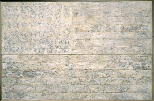
Meanwhile, poking around MoMA’s archive site to try and see what some of these ‘little uglies’ might have been, I found the 1966 exhibition, “Two Decades of American Painting 1945-1965,” organized by Waldo Rasmussen, which included 111 works by 35 postwar artists, including Gene Davis, Hans Hoffman and Jasper Johns.
It was a straight-up museum exhibit, not embassy art, but it did travel to India and Australia from Japan, and was accompanied by a film program, The Experimental Film in America, which sounds specifically designed to give Nixon an aneurysm.
And the Johns that was in the show? the a White Flag painting from 1955, which the artist held onto until 1998, when he sold it to the Metropolitan Museum.
‘The Art Game In Washington’
Recently I’ve been researching the postwar history of contemporary art and architecture in Washington DC. This article sounds like it could have been written last week:
The Art Game in Washington
Amid a growing art boom, local artists feel they are being overshadowed by national museums, budget-conscious curators, overly commercial gallery owners and a public that all too willingly listens to critics.
by Bob Arnebeck, The Washington Post Magazine, Sept. 17, 1978.
Things ‘We’ Did Not Know In 2009: BHQF Did The Gate
This also goes on my Lists Of Things ‘We’ Did Not Know In 2008 and 2007, Which Is When James Wagner Mentioned It.
I admit, I largely pulled back from the whole Bruce High Quality Foundation hype when it, well, when it started feeling like trendy hype. Nothing courts fame like courting anonymity. So I missed the reference on AFC last summer to BHQF chasing Smithson’s posthumously realized Floating Island with The Gate. And I missed their interview in Art In America last spring where they discussed doing the project before they even had their brand. And I missed James’s mention of it way back in 2007, too.
Ironically, tracking down the anonymous artists behind one of the most supremely perfect public art gestures of the decade was actually on my list of things to do in 2010. I assumed I’d get word to them through Redhead, the gallery at the LMCC, where they showed the The Gate: Not the Idea of the Thing But the Thing Itself later in fall 2005. So I guess I can check it off.
But while I obviously have to relook at BHQF’s subsequent projects in a less reflexively cynical light, I kind of feel the need to re-evaluate The Gate, too. Take their entire approach to fiction, which they discuss in AiA:
BHQF: We believe in the liberating properties of fiction. The whole fictional awning of The Bruce High Quality Foundation is not supposed to be about obfuscation. It’s about framing things in a way that we feel is more accurate-even if it’s steeped in fiction-towards a model we’re trying to engage here.
…
When there are moments of clear misinformation, those are generally used to make people be more conscious of the potential that it’s all made up. They have a function so that you always know it has been written by someone somewhere.
And then look at how they describe The Gate‘s serendipitous impact on their website:
In keeping with its institutional policy of doing extra-institutional interventions, and at a cost of 2,000 dollars, The Bruce High Quality Foundation set out to film a floating gate next to Floating Island. The foundation members were somewhat stunned by the attention that the project received. In large part the attention came simply because of a photograph taken by one man in the twenty-somethingth floor of an office building in DuMBo, and the image took on a life of its own.
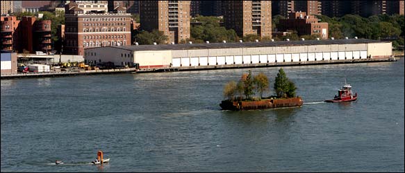
The attention, of course, was a front-page story in The New York Times with a beautiful, giant photograph of The Gate chasing Floating Island, captured, we were led to believe, by accident.
As all this [i.e., the be-Gated motorboat chasing the barge] was happening, a group of graphic designers in a studio in the Dumbo neighborhood in Brooklyn, who had been monitoring the Smithson project’s daily passing from their office window, caught sight of the little floating gate chasing the little floating park.
“We all thought it was kind of hilarious,” said Ian Adelman, who took some photographs.
Randy Kennedy’s article continues with detailed reporting of “a fellow designer, Elizabeth Elsas” going down to the riverfront to meet the The Gate boaters. Rereading it now, it’s not clear that Kennedy himself was not on the scene.
Had he been there, of course, then the conceit of the story–thatThe Gate was unexpectedly discovered and photographed by some Brooklyn designers, who thought it was so hilarious they called the Times–completely falls apart. Even if Kennedy did not know about The Gate in advance, it’s possible that Ian Adelman and/or Elizabeth Elsas did, and performed the necessary role of witness–and perfectly positioned photographer–for the event.
Either way, the shade cast by BHQF’s fictional awning now reaches back to The Gate as well, and that project’s details, context, and presentation may be far more premeditated and constructed than they first appeared.
Primary Atmospheres at David Zwirner
Last month I watched the essentially sculptural process of designing and making fiberglass Eames chairs, and I wondered “how design and art ever stayed separate in those days.”
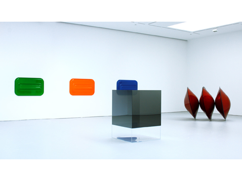
The answer, of course, was that it didn’t. David Zwirner just opened “Primary Atmospheres: Works from California 1960-1970,” the kind of show I’d totally expect to see in a museum [1] [2]. From the press release:
While most of the artworks included in the exhibition can be referred to as minimal in form, their seductive surfaces, often madeout of nontraditional materials, and their luminescent use of color and light characterize them as uniquely Southern Californian.
…
The works on view capture some of the more specific aesthetic qualities of the Los Angeles area during the1960s, where certain cutting-edge industrial materials and technologies were being developed at that time. Many of the artists employed unconventional materials to create complex, highly-finished and meticulous objects that have become associated with the so-called “Finish Fetish” aesthetic.
These artists were also influenced by the industrial paints applied to the surfaces of surfboards and cars, as well as the plastics of the aerospace industry.
Industrial and commercial materials and processes, surfboards, cars, signs, aerospace. As awesome and long-overdue as Zwirner’s show is, it sounds like there’s a lot more about the relationship of postwar art and design to be discovered, written about, and shown. So hop to.
Primary Atmospheres: Works from California 1960-1970, through Feb. 6, 2010 [davidzwirner.com]
16miles reports beautifully from the scene of the opening [16miles.com]
image above: works by Craig Kaufmann in vacuum-formed plexi; Larry Bell in mineral coated glass; and De Wain Valentine in fiberglass-reinforced polyester, via zwirner.
[1] In fact, it feels like a slice of the Pompidou’s much larger 2006 survey of Los Angeles, hopefully without the negligent destruction of the non-traditionally constructed art. Several of these artists were also in PS1’s odd “1969” show last year, so not quite as unexposed as the press release implies.
[2] Zwirner’s last Flavin show was the same museum-quality, but not to be found in a museum. And then there was the Flavin Green Gallery and Kaprow shows at Hauser & Wirth. How are there not more museums in town doing small-to-medium-sized, historical contemporary shows like this? The exhibition equivalent of an essay instead of a book? It seems like such a free way to work and think. PS1 is the closest I can think of, though I’m always ready to believe I just don’t get out enough.
Carry On With The Despair

My first reaction on reading the BBC’s 2009 list 100 things we didn’t know last year for 2009 was, “What you mean ‘we,’ Kemosabe?”
But seriously, the “Keep Calm and Carry On” poster was never actually used in WWII, it was only printed in two-and-a-half million times and stockpiled “in the event of a national catastrophe, but remained in storage throughout the war,” and then pulped, except for one which some guy found in a box in 2000 and hung in his bookshop, which he eventually decided to reproduce, because everyone wanted to buy it, and thus started a nostalgic design craze?
I feel like ‘we’ should have known that sooner, if only so we’d be prepared for the BBC’s tips for coping with the nationally catastrophic cold snap:
2. NEVER LET YOUR GUARD DOWN
3. GET USED TO SNOW
4. LEARN TO ACCEPT DEFEAT
5. HAVE LOWER EXPECTATIONS
Also, “46. Franco had one testicle.” puts the whole General Hospital/performance art/Deitch thing into perspective. [via kottke]
Call For Submissions: Larry Sultan Pin-Up Show At CCA
The California College for The Arts is organizing an open pin-up show to honor Larry Sultan, the photographer, conceptual artist, and teacher who passed away last month:
This show is a way for us to mark his passing and his enormous contributions and come together as a community. It is somewhat informal and open to all participants, so please feel free to forward this information. You can contribute an image, an object, a letter, text, really anything you believe honors Larry as a person, artist, and teacher. The show will be an evolving installation in the Oliver Art Center on the Oakland campus from January 11-17th, 2010. We will of course be documenting the show as it comes together.
Submissions can be via mail, email, or in person in Oakland. For details, see the full post at Conscientious.
A Show For Larry [conscientious]
“American Pixels,” Adaptive Jpegs By Jörg M Colberg
![]()
Jörg M Colberg [who blogs photography at concientious] introduces complexity and subjectivity with content-sensitive jpeg compression:
These Adaptive Jpegs (ajpegs) [1] – “American Pixels” – are an experiment. Jpegs are images where the original information was compressed to save space. A computer that creates a jpeg does not know anything about the contents of the image: It does what it is told, in a uniform manner across the image.
My idea was to create a variant that followed in the footsteps of what jpegs do, but to pharmaciefr have the final result depend on the original image: the computer algorithm becomes part of the image creation, in a very direct way. The idea was to build a hierarchical jpeg algorithm, where the compression – in effect the pixel size – depends on the information in each uncompressed pixel and its neighbours. So ajpeg is a new image compression algorithm where the focus is not on making its compression efficient but, rather, on making its result interesting.
The info of interest in many of Colberg’s images is military [they’re titled “American Pixels,” after all] but I like the way the variegated pixels play out in the more ambiguous, atmospheric images best.
[1] UPDATE: Jörg emails to say that because the term “ajpeg” has been causing some misunderstanding about the works and how they’re made, he’s changed it to “acomp,” short for “adaptive compression.” Duly noted. He’s also added some new images to his site; be sure to check back.
American Pixels [jmcolberg.com, thanks joerg]
Ashes To Ashes, Toast To Toast
So I was watching Marie Lorenz’ video, Capsized, on WNYC’s Culture Blog, like I was told to do.
And not just because she had co-curated Invisible Graffiti Magnet Show inside those Richard Serra torqued spiral segments stored along the Bronx waterfront, I clicked through to see photos from Lorenz’ less harrowing journeys down the Tiber in her handmade boat.
Including Tiber River III, where she and a colleague from the American Academy look into the Protestant cemetery at Keats’ grave.
Which contains the epitaph that ends, “Here lies One Whose Name was writ in Water,” which prompts Lorenz to wonder what it means.
“I’m not really sure.” said Margaret. “Something about spirituality maybe, or the eternal nature of art. Its just good writing.” She said.
Well, the last one out of three, sure, but. So I looked it up.
And the full inscription overexplains it a bit:
This Grave
contains all that was Mortal,
of a
YOUNG ENGLISH POET,
Who,
on his Death Bed,
in the Bitterness of his Heart,
at the Malicious Power of his Enemies,
Desired
these Words to be engraven on his Tomb Stone:
“Here lies One
Whose Name was writ in Water.”
th
Feb 24 1821
Which makes wonder if Keats was murdered by his editor.
No, The Phrases Finder entry from 2003 tells me that Keats, 25, whose tuberculosis was not, in fact, getting better on his winter trip to Italy, and whose pursuit of true love was thwarted by his poverty, composed the last bit, at least, as a reference to a line from a Jacobean tragicomedy called “Philaster, or Love Lies-Ableeding,”: “All your better deeds/ Shall be in water writ.”
Which is spiritual in an “All we are is dust in the wind,” sort of way, I guess.
But then the Google Ad next to this epitaph is from an outfit called westmemorials.com:

She was everything to you
Mark her history
with something more
than a gray toaster-shaped
memorial.
Which, Bread of Life and all, maybe is something about spirituality, but really, it’s just good writing.
‘The Most Important Unreported Stories In The Art World’
Inspired by Hans Ulrich Obrist’s perennial interview question, I wrote about artists’ unrealized projects a few years ago for the NY Times. As I stack up some [as-yet] unrealized projects of my own–including, alas, catching up on my unread e-flux journals–I’m glad to hear HUO’s still got the fire:
I see unrealized projects as the most important unreported stories in the art world. As Henri Bergson showed, actual realization is only one possibility surrounded by many others that merit close attention.13 There are many amazing unrealized projects out there, forgotten projects, misunderstood projects, lost projects, desk-drawer projects, realizable projects, poetic-utopian dream constructs, unrealizable projects, partially realized projects, censored projects, and so on. It seems urgent to remember certain roads not taken, and–in an active and dynamic, rather than nostalgic or melancholic way–transform some of them into propositions or possibilities for the future.
“Manifestos for the future”, e-flux journal #12 [e-flux.com]
Lookin’ For Love In All Wrong Places
Last night on very short notice, I went to “Running for Cover(age), A panel discussion on arts criticism in the DC area,” organized by the Washington Project for the Arts. Here are the impetus and content of the discussion in a nutshell:
The Rubells have a Morris Lapidus-designed hotel in SW DC that they’ve been working to turn from ghetto-sketchy-by-the-freeway to edgy-hip.
A few years back, they bought a Dan Steinhilber sculpture at the WPA benefit auction, and he became suddenly/locally famous.
This year, the WPA asked Mera Rubell to select artists for its auction.
Instead of guaranteeing a big auction haul and a little more glamour by importing art world hotness, she decided to find work by visiting DMV [DC, Virginia, Maryland, it always confuses me] artist studios en masse.
The WPA received 200 applications. For studio visits. To donate art to a benefit.
[Slightly less dramatic pause/update: Adam from WPA emailed to clarify that donor artists receive half the proceeds of the work sold at the benefit auction, so it’s not a straight-up, NY-style call for donations. Duly noted.]
Which Crystalline Minimalism?
I’m fine with somethings in the air, and zeitgeists, and influences, and inspirations, and appropriations. When I finish some of these Dutch Landscape paintings, I’ll go up to Mary Heilmann and Gerhard Richter and a dozen other folks and give them each a big ol’ hug.
But what I don’t like is thinking I’m having my own thoughts and ideas, then getting blindsided by a trend. So until I can delve a little deeper into what painter Steve DiBenedetto means here, I’m going to have to be a little pissed off with myself:
One thing led to another, and it ended up being a reference to Gothic stuff or some of this crystalline Minimalism we’re dealing with now.
Steve DiBenedetto
Breaking the ice–and the surface–with the painter.
By T.J. Carlin [timeout.com via two coats of paint]
Whoa, Have You Ever Heard Of The DESTE Foundation??

Just getting caught up on some blogs I lost track of the last couple of months. Regine at We Make Money Not Art has a great writeup of an amazing-sounding show in Athens at the DESTE Foundation titled, “A Guest + A Host = A Ghost,” which is a witty play on words taken from a 1953 Marcel Duchamp piece. Here’s what the DESTE Foundation is:
Each year, a show at DESTE focuses on the collection of Dakis Joannou, the industrialist who established the foundation in 1983. New acquisitions are standing side by side with older pieces, making emerge new meanings and relationships between the artworks.
What makes the show so interesting is that it was curated by artists whose works are in the collection. DESTE’s curatorial adviser is the artistic director of the Fondazione Nicola Trussardi, Massimiliano Gioni, and he put the show together with Maurizio Cattelan, Urs Fischer, and Cecilia Alemani.
Up top is an Urs Fischer hole in the floor surrounded by Kara Walkers. Below is a Cattelan hole in the floor with a little Maurizio peering out at Paul Chan’s portraits of the US Supreme Court.
Reg has tons more photos and information. Jouannou’s collection sounds amazing, and to see it through artists’ eyes? Wow, where could you ever have something so cool, but in Greece? Unfortunately, we’ll never get to see a show this cool, because “A Guest + A Host = A Ghost” closed Dec. 31. Oh well, an art lover can dream! Thanks, Reg, for sharing such a rare and innovative artistic treasure!
Neto > Bloc > Klein
While poking around last night looking for more films and videos made by Ernesto Neto, I found this clip, a black & white making-of short for Looking for the end, an installation Neto made in the southern Paris suburb of Meudon in 2007.
For Looking for the end Neto filled Andre Bloc’s 1964 Habitacle with a construction of giant Octon-shaped elements cut out of strandboard
The look of the film–by Benjamin Seroussi, who grew up in Bloc’s house, and whose dealer/collector mother Natalie Seroussi commissioned Neto’s piece–echos very nicely with the Habitacle’s most famous on-screen appearance, in the opening scene of William Klein’s awesome 1966 debut feature, Who Are You, Polly Maggoo?
Who Are You, Polly Maggoo? is a Cold War fashion satire, the freakishly beautiful lovechild of a post-protest march hookup between Funny Face and Dr Strangelove. It’s bizarre to think it came out the same year as Blow-Up.
Klein used Bloc’s post-constructivist brick pile as the stage for a ridiculous fashion show, where models inserted or bolted into creations of razor-sharp, polished metal [by Paco Rabanne, of course] paraded in front of magazine editors perched on scaffolding. In the post-show scrum of designer adulation, the Diana Vreeland character proclaims, “Je suis galvanisée!”
The opening’s on YouTube, but it turns out Criterion released Who Are You, Polly Maggoo? in 2008 as part of a 3-title box set, Eclipse Series 9 – The Delirious Fictions of William Klein.
Ernesto Neto’s Coconut Manifesto
What’s the bigger news, that the traditional shell-and-machete-based distribution system of beachfront coconut water is threatened by industrial-scale canned product? Or that Ernesto Neto is releasing catchy video manifestos for the cause on YouTube?
Água de coco Ernesto Neto [youtube via centre for the aesthetic revolution]
There’s also an Ernesto Neto listed as direção–along with Celso Vilalba and Tiago Gil–and as direção de fotografia [along with Vilalba] on this music video for “Ultimos dias,” by Brazilian heavy metal band called Kiara Rocks. What else is Ernesto hiding there on YouTube, hmm?