
The greg.org Unannounced Holiday Break [UHB? Oh wait, that’s already taken] is over.
 A month from now, on Jan. 31, I’ll be part of a panel discussing Mormon art and artists at the Sunstone Symposium in Washington, DC. It’s sponsored by Sunstone, a journal of Mormon religious, historical, and cultural thought. [Details and registration info are here.] The panel also includes Lisa Fraser [singer/songwriter], Erin Thomas [writer], and Jonathan Linton [artist/illustrator], and the moderator is Menachem Wecker, a DC-based journalist specializing in religious art.
Since all my fellow panelists are professional artists, I think the organizers wanted me to talk about my film stuff, or the 19th century Mormonism-related screenplay adaptation I’ve been working on, but I didn’t feel I could do that well in a panel. So I suggested–and instead will be talking about–Mormon artists and Mormonism in the contemporary art world. I’m thinking it might be a pretty short talk.
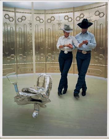
The most prominent references to Mormonism in contemporary art are obviously in Matthew Barney’s Cremaster Cycle, particularly in Cremaster 2, where cowboys two-step around the temple in Nauvoo, Illinois, and Gary Gilmore’s parents visit the spiritualist whose table is supported by Golden Plates. As one of the [presumably] few Mormons to actually see Barney’s work, I figure his interest is in symbology and self-contained systems, and that Mormonism is just another source, like football and Freemasonry, from which he constructs his own hermetic world. If I see Matthew before I speak, I guess I’ll finally ask him if he was actually raised in the church, or if being from Boise is enough to make anyone an honorary Latter Day Saint.
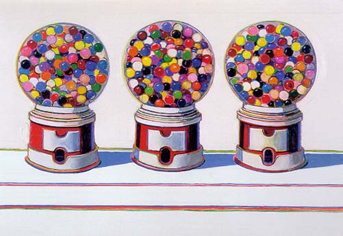
But my main focus is on the three major artists whose Mormon connection is uncontested–and for the most part, unconsidered: Wayne Thiebaud, Paul McCarthy, and La Monte Young.
[above: a trailer (?!) for a 2007-8 McCarthy exhibition in Ghent, maybe nsfw]
Typing those three names next to each other, I can’t think of a more dissimilar-seeming bunch. It seems the only thing they have in common is that they grew up Mormon in the West–Thiebaud in Los Angeles and Southern Utah, McCarthy in Salt Lake City, and Young in rural Idaho–and they all left the Church.
Also, they’re all old. Thiebaud and Young were both born in the Depression [I guess I should get used to saying “the last Depression”], and McCarthy was born in 1945. I tried and couldn’t come up with another prominent artist in the contemporary art world with Mormon connections or roots born since WWII. Though there are a few artists showing in New York these days with LDS connections–Lane Twitchell, my brother-in-law Benjamin Cottam–it does seem that there’s at least one missing generation.
I’ll be researching and posting a bit about this [dis]connection between Mormons & contemporary art over the next few weeks. If anyone has any thoughts, particularly if you want to out your favorite Baby Boomer artist as a Mormon, I hope you’ll drop me a line.
Category: art
Astute And Observant Viewers Get Fischli & Weiss
It just keeps going and going! From Steven Kaplan emailed with a reply from MoMA curator Christian Rattemeyer about the consciousness of edits in Fischli & Weiss’s Der Lauf der Dinge: “It is his contention that many astute and observant viewers (himself included) have ‘always thought of it as an edited work, never as a continuous chain reaction.'”
D’oh! If you need me, I’ll be over here in the unastute and unobservant section, reading People. But to Kaplan’s–and by extension, Rattemeyer’s, and the entire observant art world’s–point, I didn’t mean to imply that Fischli & Weiss have duped anyone, or that they or any institutions are mis-presenting the piece.
Editing is basic to the language of film, so basic, in fact, that it often disappears from our consciousness. That’s just the way things go. Just as Fischli & Weiss’s meticulously fabricated re-creations of a custodian’s closet, Der Lauf der Dinge‘s impact derives from its seemingly artless [sic] matter-of-fact-ness. It looks and feels like a documentary, just a guy with a camera capturing the way things go. But it turns out to be a film that–like any other film–is the careful culmination of a whole host of aesthetic decisions, both on the set and on the editing table. Maybe the editing point is so obvious, it doesn’t need to be made, but I guess I’m simpleminded like that.
[update after thinking about it: Though F&W’s edits are not cuts, the kind of jumps of time, place, or vantage point we’ve come to read unconsciously as film; they’re almost all illusionistic, dissolves and fades, that attempt to approximate continuity.]
Rattemeyer also brought a show at Susan Inglett Gallery to Kaplan’s attention, titled “The Way Things Go,” in obvious homage. It closes tomorrow, so I’ll have to content myself with the press release and images.
The Way Things Go, through Dec. 20 [inglettgallery.com via thing.net]
Miguel Barcelo, 100 Tons Of Paint And $25 Million Walk Into The UN…
 Spanish artist I’ve never heard of #48 Miguel Barcelo got the commission to paint the domed ceiling of the UN Palace of Nations’ Human Rights and Alliance of Civilizations chamber in Geneva.
Eyeteeth has some photos; Designboom has some background on the making of, which involved pigments from around the world and paint ball guns.
Apparently, the minority right in Spain has raised a stink about the government’s share of the $25 million cost. In retrospect, they probably could’ve saved a bundle if they’d let Sony shoot a Bravia ad during production. A 4,600 sf paintball target of peace presents an attractive marketing hook.
Room XX by Miguel Barcelo [designboom]
The UN’s Stalactite Ceiling [eyeteeth]
Vik Muniz Gets Fischli & Weiss
I’ve been searching for more critical acknowledgment of Fischli & Weiss’s Der Lauf der Dinge as an edited construct instead of the miraculous documentation it’s normally perceived/presented to be.
Though he’s talking about another Fischli & Weiss piece [above], artist Vik Muniz, who just curated Der Lauf der Dinge into “Creating a Rebus,” his show at MoMA, nails some very relevant aspects of the duo’s work:
It’s about this connection between mind and matter — how something is conceptual and formal at the same time. Fischli and Weiss are artists that I admire for this: They manage to put an enormous amount of craft into their illusions. I remember when I first saw this piece at Sonnabend Gallery, people didn’t think these objects were constructed, but they are all cast pieces. It takes a lot of labor to make something look accidental.”
Vik Muniz on Creating a Rebus [artinfo.com, image: matthew marks gallery]
update: In a short podcast with Mexican artist Pablo Helguera, Hirshhorn curator/researcher Ryan Hill mentions F&W’s dissolves a couple of times, and how exhibiting the film on a loop can trap visitors who keep watching the procession go round and round. I don’t know why there’s no way to search, sort of link directly to the many, many podcasts on Hirshhorn’s site, but here’s the mp3 file [hirshhorn.si.edu]
Just Do It?

A spectacular image by Reuters photographer Yiorgos Karahalis of a rioter in Athens.
Until Joy Garnett gets around to it, the full-size version at the Big Picture is the best way to see it.
Ceci N’est Pas Un Warhol?
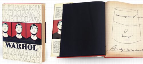
Careful, this might not be a Warhol. After all, it’s only a signed drawing of a Campbell’s Soup can. But it’s in a Warhol book that has the Warhol self-portrait on the cover which Warhol presented to a collaborator–and which the Warhol Authentication Board declared inauthentic two years ago. So yeah, you never really know.
Really?? Jan. 12, 2009, Christie’s NYC, Lot 218: Andy Warhol (1928-1987) | Andy Warhol; and Untitled (Campbell’s Soup) , est. $6,000-8,000 [christies.com]
D’oh, Don’t Tell Chris Burden

Toothpick Engineering is Dentist’s Hobby [popular science, feb 1940, via boingboing]
Der Kauf Der Dinge
Artforum reports that Fischli & Weiss’s 1987 film, Der Lauf der Dinge, (The Way Things Go), [1] was recently sold at Christie’s in Zurich for 1.02 million Swiss francs. Which is awesome [2], I first thought, since I have that work, and I only paid $20 for it. [d’oh, it’s only $15 on amazon!]
Of course, the Dinge that sold was not the DVD, which is available all over, or even the exhibition copy, which is always a crowdpleaser at museums. [It’s pleasing crowds right now in one of the Hirshhorn Museum’s hallways interstitial spaces, in fact. update: and Vik Muniz put it in the hallway of his show at MoMA, too. Thanks Steven, Tyler, Maggie and Melanie for the tip.] Instead it was, in Artforum’s words, “the original film reel along with a series of relics from the film set.” They said as they cranked up the music and danced on Walter Benjamin’s grave.
Before seeing the making of video for “Cog,” Weiden + Kennedy’s insane, single-shot 2003 Honda Accord commercial which knocked off Fischli & Weisswith spectacular effort and precision [3], I hadn’t given much thought to the making of Der Lauf der Linge or how it existed as a work of art; I just thought it was what it obviously was.
But now it wasn’t so obvious. It had taken W+K 606 takes to get their 2-minute sequence perfect, and even that turned out to have been edited. [It’s really two one-minute sequences edited together where the muffler rolls across the floor. Watch the floorboards.]
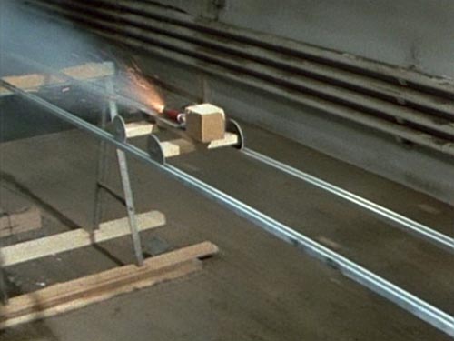
Sure enough, there are edits all through Der Lauf der Dinge, mostly dissolves executed by taking the camera in close to something abstract–a spinning garbage bag [2:00] or a pool of foam [2:55, 3:43] smoke from dry ice [7:22], more foam [9:31]–or something abrupt and distracting–the flare of a lightbulb [11:09], the firework exploding on the side of a tire [12:04], a flare of a fuse [13:21] or a candle [13:47] [4]. If F&W had had script girl on set, she might have noticed that a fuse appears out of nowhere at the edge of the flaming pool [14:11], or that the lighting is significantly darker in the second shot.
Actually, that 14-min. cut marks something of a second act. The sequences that follow are all darkly lit, which accentuates their flames and fireworks. There are two more hard-to-spot cuts [15:51, burning hay], [17:26 bucket glare] before a bold, smoky dissolve [18:33] and an even more conspicuous–well, it’s really a montage, what else can you call it?–set of a weighted doll-like device tottering off a plank [19:17]. A dissolve in the blackness at the center of a wheel brings the lights back on [20:18]. More pools of flame on the floor [21:28]. Explosion under a teapot [21:51]. The close-up foam dissolve is now an official motif [22:22, 23:33]. As is the flame-on-floor [24:57]. And the dry ice [25:25].
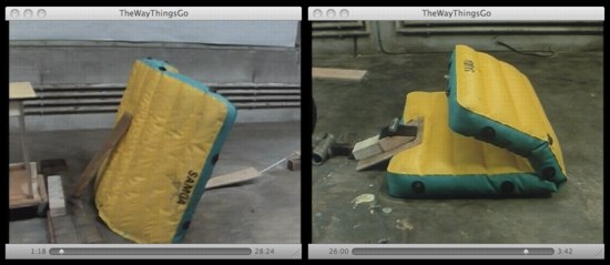
They’re reusing props, too. The orange board that was so obviously being manipulated off-camera [8:00] is now a simple ramp [20:40]. And there’s that air mattress [1:15], now turned and folded [26:00]. Foam [27:00]. Smoke [28:54] whoa, fade to black. [29:02] the end. An edit to nothing, effectively.
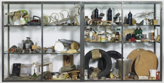
23 edits in a 29 minute film, including one seemingly unnecessary one at the very end. Re-used and staged props. If you studied the walls carefully, you’d see the devices are not wrapped around a giant factory, but are staged in the same general strip of space. It turns out The Way Things Go is not the way things are purported to go. Which made me wonder who’s doing the purporting, and who’s doing the assuming?
The artists and their production companies and distributors seem happy to perpetuate the idea that Der Lauf is one, giant, continuous Lauf. Here’s the copy on my DVD case:
Inside a warehouse, artists Peter Fischli and David Weiss build an enormous, precarious structure 100 feet long made out of common household items…Then, with fire, water, gravity, and chemistry, they create a spectacular chain reaction…
Guess they forgot to mention the editing. I haven’t found reactions to the film’s debut in the summer of 1987 at Documenta 8, but when it was first shown in the US, at PS1 in 1988, the NY Times critic marvels at the duo’s “masterpiece to date,” where “the artists manage to sustain a chain reaction of ever-more-absurd materials and events for 30 minutes.”
The edits are clear, even obvious in places, and yet casual observers and critics alike appear to miss or ignore them, preferring the enjoyable spectacle of a 30-minute, non-stop trick. I’ve never heard of this dichotomy discussed in terms of Fischli & Weiss’s work, certainly not in regard to this piece. A cynic could have a lot of fun with the idea that people choosing to believe something enteraining but self-evidently false is, in fact, The Way Things Go.
I should have mentioned much earlier that all my Der Lauf der Linge questions might already have been answered. This whole post might be another in an embarrassing series of RTFM-themed posts, where I could just get the damn book and find out what’s going on. Jeremy Millar wrote a book-length paean to The Way Things Go, the publication of which coincided with a 2006 Fischli & Weiss retrospective at the Tate, which went to Hamburg and Zurich.
And then there’s Making Things Go, a making-of documentary by ex-critic/curator Patrick Frey, who had filmed his friends Fischli & Weiss in 1985 experimenting [rehearsing?] with their various entropic stunts and devices. Though, reading Frey’s account in Tate Magazine, the answers may not be there at all:
The first version was a relatively short loop, which Fischli/Weiss call Sketch for The Way Things Go: a three-minute Super-8 film, in which key sequences of the later 30-minute 16mm film are outlined and tested.
The present film documentation was created during the three-day preparations for this ur-version of The Way Things Go.
Christie’s engaged Frey to lecture on Der Lauf der Dinge as part of the pre-auction excitement, but I haven’t found an account of the event online.
But back to the other anomaly, the “originality” of the million-franc version of Der Lauf der Linge. The piece Christie’s sold was from the collection of Alfred Richterich, and though the auction house’s press release [pdf] includes lofty quotes about Richterich’s foundation using the proceeds to support new generations of Swiss artists, there is no mention at all about his own apparently seminal relationship to the film–even though it seems intrinsic to the existence and nature of the work itself.
Richterich is an heir to the Ricola cough drop empire, such as it is, and he pursued his family’s tradition of collecting art and supporting various creative endeavors. According to the monograph of Herzog & deMeuron, who received early commissions from Richterich, he was “instrumental in facilitating” the production of Der Lauf der Linge. Sure enough, Richterich’s film production company is credited on my DVD case, right alongside T & C Film, the production company who provided the crew–and who had produced Fischli & Weiss’s with their earlier film projects.
I had always assumed that Matthew Barney pioneered the art of financing films by packaging props into more easily monetizable vitrines, but Fischli & Weiss had him beat by a full Documenta.
Did Richterich receive a somehow definitive version of Der Lauf der Dinge along with his two vitrines full of ephemera in exchange for funding the production? Was his film reel more “original” than the prints that museums and collectors used before the advent of decent video transfers? Is it the artists’ actual negative or master print? Or is the market’s throwback preference for “objects” as opposed to “art”–even when it comes to the sale of this “icon of Swiss art”–just the way things go?
[1] the artist’s chosen English title is The Way Things Go, which lacks the flowing, riverlike connotation of the direct translation, The Course of Things or The Current of Things.
[2] Of course, it’s slightly less awesome for Christie’s and Richterich, because the pre-sale estimate was CHF1-1.5 million. With premium and VAT, I calculate the hammer price at CHF 790,000, which is an odd increment and well below the low estimate. Looks like even the “icon of Swiss art” market is down these days.
[3] Whatever its knockoff-ish crimes, “Cog” is rightly praised as one of the greatest commercials ever made. It took dozens of people months to design, engineer, and produce. It involved taking apart one of just six pre-production Accords in existence, cars that had been hand-built by Honda. In fact, I’m going to watch it again right now, I’m so jazzed by writing about it.
[4] this one is almost a jump cut; the camera ends up on the other side of a metal sawhorse when the candle ignites its target.
A Tree Grows In Poundbury
I liked Stephen Bayley’s takedown of New Urbanist prig Duane Urbany in the Guardian last weekend, partly for its awful description of Poundbury, a traditionalist-veneered village [sic] in Dorset that’s beloved of Prince Charles:
To visit Poundbury is to be delivered to the furniture floor of a provincial department store in 1954, translated into architecture. It is fake, heartless, authoritarian and grimly cute.
Sounds like early Levittown, but without the charm.
But I love Paul Russell’s bleak photoset of Poundbury, including this unexpectedly awesome photo of a tree. If I were feeling poignant, I’d say it’s doing a deft impression of a Rebecca Horn sculpture. But given the setting, we can be sure it’s actually trying to knock down the wall and flee. [via things]
Fuller x Noguchi Colabo: Dymaxion Car Model

In what has apparently become an annual feature here on greg.org, I present Rare And/Or Unique Buckminster Fuller Objets. This time last year, it was the Perspex prism chandelier Fuller [had] made as a wedding gift for Princess Margaret. The 2nd item:
A rare, early model of the Dymaxion vehicle, circa 1932, carved by Isamu Noguchi and painted by Fuller. Fuller and Noguchi had met in New York, and began working together on the Dymaxion House. The Vehicle, which was to be a car/plane/whatever eventually followed.
The model had been published many times over the years, but until very recently, it was believed to be lost. Neither the 2006 Noguchi Museum exhibition, “Best of Friends” nor the Whitney’s recent Fuller retrospective are mentioned in the model’s Sotheby’s exhibition history, so I suspect their publicity helped flush it out of hiding. Which makes it a recent discovery indeed.
Important 20th Century Design, Dec. 18, 2008, Sotheby’s New York
LOT 145: R. BUCKMINSTER FULLER AND ISAMU NOGUCHI
AN IMPORTANT AND RARE “DYMAXION” CAR MODEL, est. 40,000–60,000 USD [sothebys]
update: it sold for $92,500.
Warning: Don’t Invite Julian Schnabel To Anything
Or if you do, don’t have ellipsis in the name, because Schnabel will inevitably fill in the blanks with his name.
From the WSJ’s article on Spectacle: Elvis Costello with…, the Sundance Channel’s excellent-sounding new TV talk show about music:
But the first few shows are marred by an almost amateurish laxity. Julian Schnabel, the artist and director (and Lou Reed’s neighbor in downtown Manhattan), steps out of the audience to join Mr. Costello and Mr. Reed onstage and hijacks the conversation.
I still remember vividly the artist panel discussion at MoMA for the Cy Twombly retrospective, where Rob Storr talked to Serra, Marden, and Francesco Clemente. The first question was by an unidentified idiot in the front row, only it wasn’t a question, but a rambling speech. Storr finally kind of interrupted to identify the speaker as Julian Schnabel.
[update: shoulda listened to me, Morley.]
A Long Time Ago, In A White Cube Far, Far Away
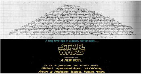
Wait, The Empire was the US and the Rebellion was the North Vietnamese, but Lucas only put them in space after Hollywood suits wouldn’t let him make Apocalypse Now? And the grunge was a simultaneous obeisance and refutation of the antiseptic future of Stanley Kubrick’s 2001, which like half Lucas’s crew had worked on? What next, John Powers, that Leia was actually his sister?
Duh. Also, the Deathstar is Judd, the Millennium Falcon is Smithson–and Bob Morris is Obiwan Freakin’ Kenobi, Jedi Freaking Master.
I’ve watched and discussed and swooned for months as Powers shaped his analysis, and I’m still floored and fascinated by it. I can’t think of any other example of scholarship that approaches this formative film with such seriousness and wit. I can’t wait for it to be turned into an a capella ditty and/or toaster.
Star Wars: A New Heap, by John Powers [triple canopy]
Art, Love, Or Money: Choose Any Two
In September, a group of artists organized as W.A.G.E [Working Artists and the General Economy] appeared at a Creative Time-organized event to talk about the economic inequities of artists’ interactions with museums and other institutions. They certainly earned their speaking fee.
The video’s here; it gets kind of angry. There’s a cooler headed Q&A at ArtCal, but the gist of it is: because the US lacks the standards or legislation of other countries, the practices of arts institutions in the US are often economically exploitative of artists they work with. It’s often unclear, but artists in the US are routinely expected to work on exhibitions and programs for free, for exposure, or for some/all reimbursement of expenses.
Frankly, I’m not surprised. A couple of years ago, I was working on a story for the NYT about the dynamics of the artist-collector relationship; reporting it out got complicated, and I eventually killed the piece in its crib. But one thing I found was an almost pathological aversion of art world participants to discussing money issues generally–and the vast economic disparities between most collectors and most artists, specifically–directly. That avoidance mechanism apparently extends into the cultures of many museums as well.
While W.A.G.E.’s point about the trade of work for exposure is valid to a point, I think there are larger dynamics afoot. Rightly or not, the art world contends that arts institutions are places apart, which operate as non-commercial havens, bastions of altruism, in contradistinction to the art market.
To a large extent, the sense of art as a luxury, something to be pursued for love, not money, is determined by collectors with the means to travel and purchase at will. But artists, dealers, curators, advisors, much of the rest of the art world readily ascribes to this notion; even if they are living hand to mouth, they feel obliged to act as if they, too, are in it solely for love. This notion can exist within museums, where modestly paid staffers and patron/volunteers work side by side, and where the default that everyone, including artists, should chip in, in places an undue burden on people for whom money is as finite as their time.
W.A.G.E.’s notion of wealthy art institutions is a bit naive, though, a point which we will no doubt see proved out when museums are hit with layoffs or even closures. Still, it would be interesting to see the impact a few major institutions could have if they stepped up and offered artists fair compensation for their time and expenses as a matter of course, not just as an extraordinary request.
Democracy In America: Democracy Convergence Videos [creativetime.org]
Working Artists and the Greater Economy at the Park Avenue Armory [artcal via modern art notes]
W.A.G.E. is having a rally/info mtg on Dec. 11th [wageforwork.com]
On Land Art Growing Up/Old
As much as I love it, Brian Sholis’s new blog reminds me how little I actually read and think these days. Here’s a quote from an excellent essay he points to by Lucy Lippard on the changing context for the Land Art that was built in the 1960’s and early 1970’s:
I’ve lived in the New West–urban and rural–for twenty-one years now, and my sense of the earthworks I knew and touted in the 1960s has changed quite drastically. In 1995, I gave a talk in Marfa, Texas, called “Land Art in the Rearview Mirror,” in which I discussed having “gone on down the road” to preferring an art that was “place specific” rather than “site specific.” Arguing for a microview of land and art, and for grassroots connections, I realized that monumental land art takes much of its power from distance–distance from people, from places, and from issues–while my own interests had come to focus almost entirely on the nearby, on “specific places as they reflect the interactions between people and what we call ‘nature,’ which includes people.” My views of land art have changed not because I have less respect for the older work, but because the better I know the New West, the more my attention is claimed by the sideshows, or the side-of-the-road shows.
In the 1960s, when land art was new, the expansion of consciousness offered was visual and aesthetic, perhaps even social, since it brought provincial New Yorkers out of their cocoons and into the West. It would have seemed crass to demand more of an art that prided itself on isolation. Artists were thinking on a grand (sometimes grandiose) scale. There were even religious undertones along the lines of the nineteenth-century “sublime.” (James Turrell spoke eloquently at the 1995 Marfa symposium about “directing vision toward a larger sort of space” and “making spaces that see.”) Forty years later, climate change, shrinking resources, and an administration bent on destroying the environment for corporate gain have changed the rules of the game. There is a point at which artists too have to take some responsibility for the things they love, a point at which the overview of magnificent scenery gives way to a more painfully focused vision of a fragile landscape and its bewildered inhabitants.
Funny, or not, that as recently as 2002, Nico Israel was still writing in Artforum as the provincial New Yorker braving the truck stop and strip mall savages of the New West as he made his Land Art pilgrimages.
Peripheral Vision by Lucy Lippard, in the 10/29/08 issue of NYFA Current [nyfa.org, reg req]
Lucy Lippard’s changing views of Land art [The Search Was the Thing]
White Cube Of Surrender?
Am I the only one who’s heard rumours of bankruptcies in diamond-encrusted skull-showing places?
update: apparently so. Last major financial transactions reported for Jay Jopling include buying £7.2 million worth of his own artist’s work at Sotheby’s in September. This, after leaking news before the auction that the gallery still had £100 million or so worth of Hirsts in inventory, no waiting. And that, before it was reported that in fact, Damien Hirst sold his £50 million [asking] diamond skull to himself, his manager Frank Dunphy, and his dealer, Jay Jopling.
So it would be interesting to speculate, perhaps, that one of White Cube’s biggest creditors could be Hirst. It would be ironic to say the least if the artist ended up owning the gallery.
previously: the making of Hirst’s diamond skull; the costing out of Hirst’s diamond skull