Untitled (Shenanigans), 2016, Installation View

cady_noland_trump_shenanigans_jackbgoode1.jpg
Untitled (Shenanigans), 2016, chainlink fencing, US flags, ratchet tie-down straps, LED strips, Ford F-250 Crew Cab. Installation view: Palm Beach

It seemed so much funnier when Cady Noland did it.
Maybe not funny, but at least it didn’t freak you out. Noland’s artworks drew from the raw aesthetic landscape of late 20th century built America to shed light on uncomfortable truths about patriotism, violence, commercialism, waste, the American psyche.

But it did it in an art context. Whatever it was, or however dark or unsettling, it was still [just] art. You could walk away from it.

Or wake up from it, like a bad dream.

Now there’s a white nationalist bigot in Florida trolling Muslims, and protesting Hillary Clinton and her treasonous supporter citizens by building a lock-em-up protest cage in the back of his pickup truck. No voter shenanigans, he says on Twitter: Trump landslide or in the cage ya go.

My instant impulse, or maybe it was a coping mechanism, was to make a Noland reference. Then as I got ready to post this thing here, and declare it a work [as one does around here], I got cold feet. The reality of this person and his anger and hatred and poisonous rhetoric and not-idle threats piled up, and I reconsidered. This is literally not-helping, I feared, it is making-worse.

cady_noland_trump_shenanigans_jackbgoode1-5.jpg

But after a couple of days of looking, and thinking, and seeing this guy’s gesture/threat circulate, I came to see this as important. Or at least real. Relevant. This bigot’s sculptural move was atypical, even perhaps unique, but it is a datapoint in a network, a churning system of political hate. These images are of a physical object manifesting the digital flow of right-wing ideas and imagery across Twitter and Facebook. It’s a post-Internet avatar of Trumpist America.

Looking at it, now I wonder: is this how Noland saw, how she read, how she felt, when she made her works? Did she dream of making toxic, dystopian, American flag-draped cages, only to wake up and find the dream was still there? And wasn’t even a dream?

Untitled (Gerda Taro Leipzig Monochromes), 2016

gerda_taro_leipzig_fstop_Koenig-Wenzel.jpg
Untitled (Gerda Taro Leipzig Monochromes), 2016, Gerda Taro photos, painted wood supports, tar. image: Anne König and Jan Wenzel

On the night of August 3rd, an outdoor installation of 18 photos by Gerda Taro in Leipzig, Germany, was vandalized, painted over with tar? Or aniline black dye? The photos were part of f/stop Leipzig, an annual photography festival, held in early July. Some of the public space components of the festival apparently continued beyond that date.

f/stop curators Anne König and Jan Wenzel included Taro, a pioneering war photographer, because of the confluence of her life, her work, and the city itself. She lived in Leipzig until 1933, when she fled as a Jewish refugee. She met up with another refugee, Robert Capa, in Paris, and they documented the Spanish Civil War together until Taro was killed in 1937. Leipzig is hosting many refugees from the Syrian war right now.

The curators note that effacing the images of refugees by a Jewish photographer with tar is inherently a political act, and they are calling on the city to discuss the implications. The Taro estate, in the form of the International Center for Photography, wants her images back on view in Leipzig.

I agree with all of that, but also wish to recognize the damning bluntness of the blacked out panels. Sometimes redactions and monochromes cannot be let off the hook. Declaring them an artwork of my own is no way of assuring anything, but It feels important that they will be preserved.

The 21 panels include three texts and at least five layouts from LIFE magazine. The bottom eleven were completely blacked out, while the tops of the five tallest appear to have been beyond the easy reach of the unknown redacter. In the event this work does get destroyed, I will try to identify the Taro images under the tar.

update: I’m still thinking this one through a bit.

Pioneering war photographer Gerda Taro’s images vandalised in Leipzig [theartnewspaper]
09. August 2016 Auch Gewalt gegen Fotografien ist Gewalt [f-stop-leipzig.de]

Keith Haring Painted His Land Rover

keith-haring-land-rover_forest.jpg
In 1983 Keith Haring painted his [?] Land Rover. He was the first artist-in-residence for the Montreux Jazz Festival, for which he designed a well-known poster.
haring_montreux_jazz_poster_galartis.jpg
One of those Keith Haring Montreux posters, image: galartis.ch
The snaky figures from the poster, along with the words MONTREUX JAZZ, appear on the rear of the military-lookin’ 1971 Land Rover Series IIa 109.
haring_land_rover_petersens_pr.jpg
the Haring Land Rover on display at a press event of some kind at Petersen’s Auto Museum, with the CH sticker, but minus the Swiss license plate.
keith-haring-land-rover-1983_swiss_plate.jpg
The Swiss license plate above is visible in the photo of Haring mid-way through the painting process.
haring_painting_land_rover_bw.jpg
The curator at the Petersen does not appear able to process this seemingly basic information. The owner of the car, so far unidentified in the press, offered to show it at the museum through the end of the year. That Kenny Scharf showed up to talk about Haring’s car is, I hope, a coincidence.
[UPDATE A COUPLE OF DAYS LATER: I have my guess, based on Haring’s account of his later travels to Switzerland. And now I expect the Land Rover was never his to begin with, but a friend/collaborator’s.]
Anyway, this is now officially the second coolest art Land Rover in the world, after Donald Judd’s. [Thanks Steve for the heads up]
One of a Kind Keith Haring Land Rover Revealed [roverparts.com]
See the 1971 Land Rover painted by Keith Haring at the Petersen Automotive Museum now [scpr.org]

This Louise Bourgeois Shackle Necklace By Chus Burés Has No Title.

bourgeois_lang_choker_tajan.jpg
This is a necklace by Louise Bourgeois. Based on a 1948 design, it was realized in collaboration with Madrid jeweler Chus Burés in 1998, and was produced in silver in an edition of 39. It weighs 374 grams, more than 13 ounces, which is pretty heavy.
It caught my eye this morning when artist Linda Hubbard tweeted about it, partly because it’s going around tumblr as a project Bourgeois did for Helmut Lang. And I thought I knew my late 90s Helmut Lang. The necklace itself’s only stamped LB, though, and none of the auction listings over the years credit Lang, even in the provenance. A 2008 sale at Tajan in Paris said the necklace is “due to” Lang, and links it to Lang’s, Bourgeois’ and Jenny Holzer’s three-person show in Vienna in 1998. It also compared it to a slave collar.
bourgeois_necklace_toledo_museum.jpg
acquired in 2010. image: toledo museum
When the Toledo Museum wrote about it this spring, they gave it a title, Shackle Necklace, and slightly earlier dates (1947-48):

Louise Bourgeois designed this necklace in the 1940s as a personal statement against the violence she had witnessed against prisoners during the Spanish Civil War (1936-39), who were asphyxiated by shackles of this shape. It was also designed as a comment about the female state, a metaphor for the social, political, and legal constraints of women before the feminist movement.

Which, wow, there is a lot going on there.
Did Bourgeois go to Spain during the war? I don’t think so. She was studying at the Beaux Arts and selling Picasso prints to Robert Goldwater, the NYU art historian she’d marry and move to New York with. The war in Spain was obviously hot news, even more so if Bourgeois was working with Picasso. And there was the World’s Fair in Paris, of course.
grilletes_military_milanuncios.jpg
Here are some antique Spanish shackles from a classified ad site. I see a resemblance. Except these are for feet. This set says it’s for horses. Which would technically make these hobbles, right?
grilletes_caballos_milanuncios.jpg
And they’re asphyxiating no one. In the absence of more concrete examples or info, the asphyxiation reference makes me think of the garrota or garrote. Is that what Bourgeois’s referring to? A prisoner is chained to the seat, and the executioner stands behind him, tightening a flat metal band around his neck-and/or releasing a spring-loaded spike into the base of his skull-until he’s dead. The garrote was pretty much the standard method of execution in Spain, around since the Inquisition, and official for 150 years until the Second Republic, when it was abolished. Then Franco reinstated it in 1940. Is this what Mrs Goldwater was protesting? 8-10 years later? By making a necklace which, frankly, doesn’t look anything like a garrote?
spain_garrota.jpg
Spanish garrote, image from this Italian medieval torture site
In 1947-48, Bourgeois did not have an art career. She’d had one solo show, but she was, as her obit put it, “known to the New York glitterati merely as the charming French lady who appeared at private views on the arm of her American husband” the art historian. If she even got out of the house then. In 1939, thinking she could not get pregnant, the Goldwaters returned to France briefly to adopt a French orphan. Back in the States, they promptly had two more sons in two years. So maybe a necklace patterned after a prisoner’s collar or a garotte is just the kind of sculpture a mom trying to work with three boys under foot would make.
louise_bourgeois_necklace_father_1948.jpg
Louise Bourgeois rocking the original necklace in New York in 1948, at lunch with her father Louis. image: LB Studio
So I called the man who made them, Chus Burés. He said the necklace turned up during the preparations for Memoria y Arquitectura, Bourgeois’ 1999 exhibition at the Reina Sofia in Madrid, curated by Danielle Tilkin and Jerry Gorovoy. She’d made it for herself, and she wore it.
The curators brought the original to Burés; it was a darkened metal, he said, round and matte. He created the squared shape, in silver, with a satin finish, which Bourgeois liked very much. There was an idea to do a gold version, but it was too expensive.
The five small holes drilled in the piece were for attaching strings (originally) or crystals; Burés designed a set of 14 various crystals that could be swapped out and arranged on the necklace. Despite being Spanish, a Catalan, and having intensive conversations about Spanish culture and literature with Bourgeois, Burés never heard the artist reference the war, or shackles. A couple of years later, Burés made a spider brooch for Bourgeois, in both silver and gold.
As for Helmut Lang, Burés explained that Bourgeois had given a necklace to Lang, and that at some point, several years later, the designer wanted to include it in a runway show. Lang’s people asked permission, Burés agreed, there was a press release with proper credits, it was all wonderful. Later a friend spotted the necklace for sale in Lang’s boutique in Paris.
There is no way Bourgeois’ necklace does not evoke a shackle. But unless something turns up from the artist, any more specific interpretation is just weighing it down.
via @DukeToddIsAlive & @LindaHubbardArt
Nov 2012, Lot 70 Louise Bourgeois, Choker (1999-2003), sold $20,000 [bonhams]

Regarding Camille Henrot’s Elephant Child, A Book

It is not clear how the Oracle at Delphi worked. One day a month, except in winter, the priestess, known as Pythia, entered a sacred chamber, perched on a gilded tripod, peered into a bowl of water from an enchanted spring and, imbued by mystical vapors with the *enthusiasmos*, or divine spirit, of Apollo, she answered the urgent questions of the faithful. The Oracle was the most powerful public figure in the Ancient Greek world. No military or public policy decision was made without consulting her, and she was always right; any unwanted outcomes were attributed to mortals’ failure to properly interpret or follow the Oracle’s predictions. Centuries of Pythian pronouncements are recorded. For a long time they were in iambic pentameter. Then they switched to prose. Some accounts had a lucid, forceful Pythia dropping these pure rhymes herself. In others, the possessed priestess’ utterings seemed incomprehensible to all but her handlers, a coterie of priests known as the *hosioi* who, one would say, translated the prophecies.

elephant_child_cover_invpress.jpg

*Elephant Child* is a book about Camille Henrot’s 2014-15 exhibition “The Pale Fox”. Very much like *Grosse Fatigue*, Henrot’s extraordinary video from the 2013 Venice Biennale, it explores humans’ attempts to understand the universe, and it marvels at the structures this inevitably impossible effort yields. It here can refer to either the book, or the exhibition. Henrot suggested thinking of *Grosse Fatigue* as a history and “The Pale Fox” as a geography, which I guess makes *Elephant Child* a map. They are three incarnations of Henrot’s universal narrative, all in one, one in all, a trinity.

henrot_elephant_child_spread_4.jpg
Literally. Many screenshots from *Grosse Fatigue* are woven throughout the book, as is the video’s lyrical poem, performed by Akwetey Orraca-Tetteh and created in collaboration with Jacob Bromberg. Ideas and references from *Grosse Fatigue* also abound, particularly Henrot’s foundational experience as an artist fellow at the Smithsonian, where she captured traces of the museum’s conflicted histories through taxonomy, evolution, colonialism, anthropology, and religion.

henrot_elephant_child_spread_3.jpg
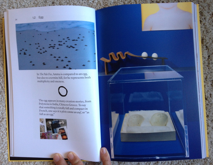
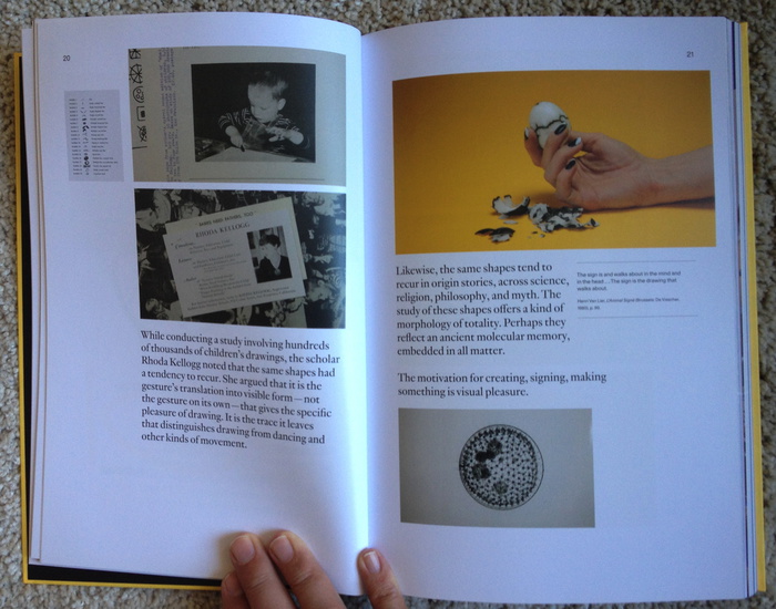
*Elephant Child* begins by holding up a compelling example of what we should be more cautious of calling an origin myth. The Dogon people of Western Africa tell of Amma, who created the universe, his twin, by drawing. The chaotic eighth of their four pairs of twin offspring rebelled, bringing disorder to the universe, but also creativity. He was Ogo, The Pale Fox. Henrot eagerly mined this cosmology for motifs that recur across origin myths-eggs, twins, recursion, primordial drawings-even as she acknowledges its credulous source: a blind Dogon hunter named Ogotemmeli, who reportedly wound out the tale during a long conversation with two white French anthropologists, Marcel Griaule and Germaine Dieterlen, who published it as a book in 1965. The book was called *The Pale Fox*.

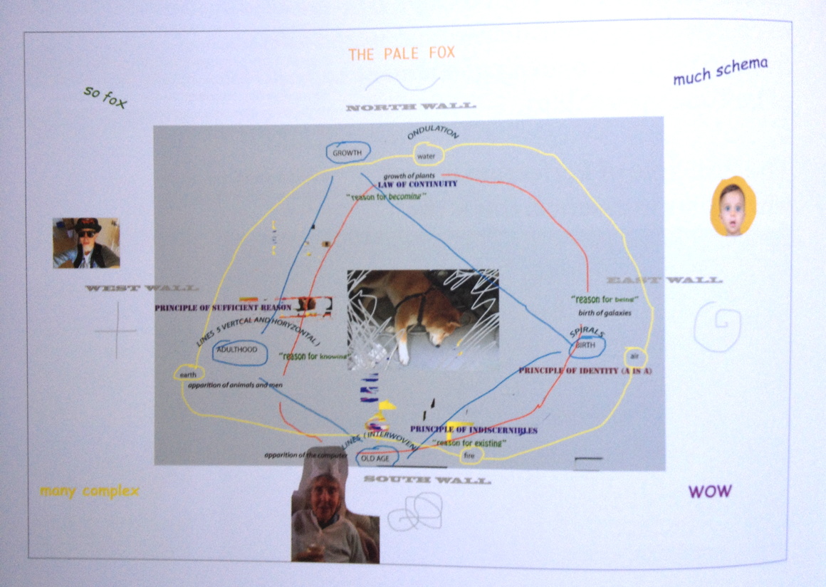
In its function as an exhibition map, *Elephant Child* traces Henrot’s process of identifying structures, and then translating them into schema. The intersection, or collision, of various schema produce the conditions under which the exhibition takes shape. As Henrot said in an interview, that is mentioned in, but does not appear in, *Elephant Child*,

I found it interesting to liken the elements related to the different phylogenies of living beings to the organizational systems of James Joyce’s *Ulysses*. When Joyce wrote *Ulysses*, he had organized systems in which a literary style corresponded to a color corresponded to a theme corresponded to a bodily organ. This over-systematization creates freedom, as categories can be understood together as a group or structure that permits arbitrariness. I wanted my exhibition to have this same freedom.
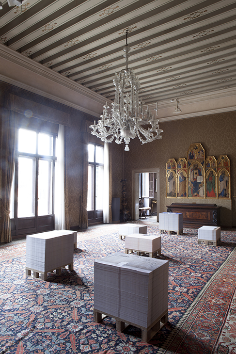
henrot_pale_fox_doge.jpgDogon meets Doge

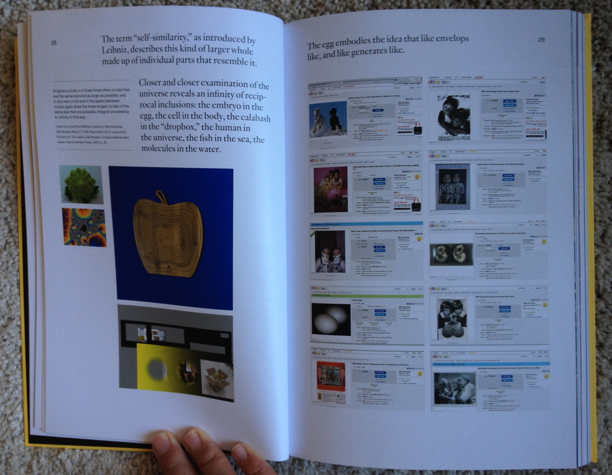
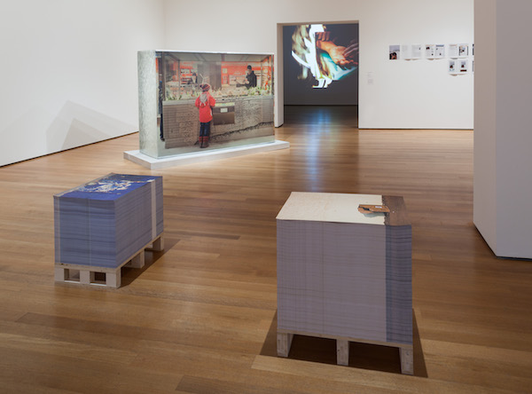
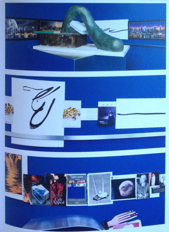
And so Henrot lays four chronological stages intuited from Leibniz onto the cardinal points of a compass in a rectangular gallery-a shape representing man, for God is a circle. The walls and floor are painted chromakey blue and encircled by an undulating, sculptural shelf, suggesting a timeline, of polished aluminum, which is piled with metaphorically resonant objects and images:
henrot_elephant_child_spread_1.jpg

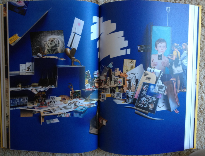
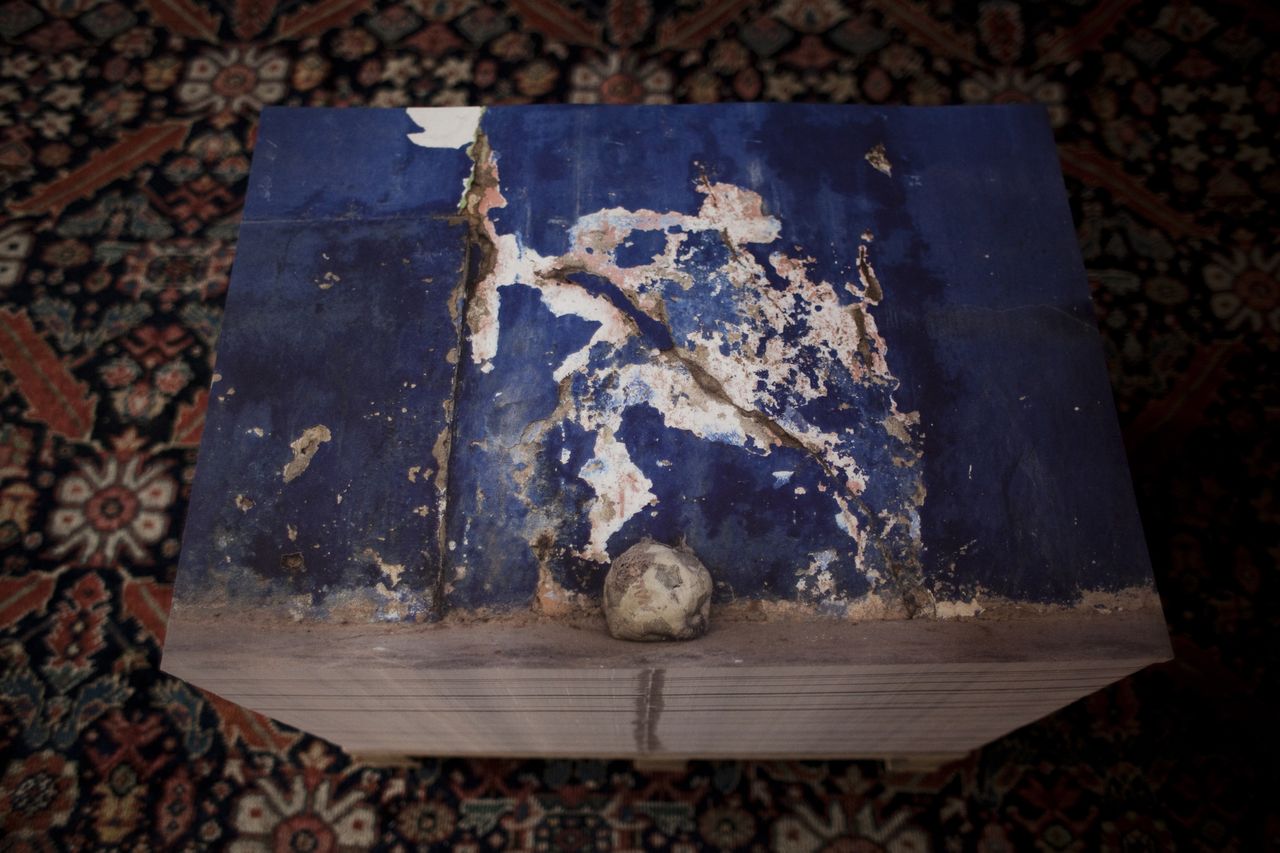
There are photos of my family and photos I bought on ebay…and there are different kinds of magazines, advertisements, leaflets, things I picked up in the street, things I bought. The images and the objects have very different statuses…I chose lots of embarrassing objects, because I wanted to focus on clutter-all the objects that you don’t know what to do with, but you don’t dare throw out.

What did not occur to me until I got to the very end of the book, and only then because I’d just seen one appear at auction, is that among these hundreds of objects are Henrot’s own works of art. This category is mentioned once in Scepanski’s intro, and nowhere else, until you get to a checklist of works, which turn out to be the only objects mapped onto the show’s schema. Rather than a *gesamtkunstwerk*, then, Henrot’s show, and its elaborate conceptual confabulations, are a context, a framing, for the production and presentation of her own art. Which here includes dozens of Zen-ish ink drawings that approximate Amma’s generative marks, and bronzes that echo either exoticized artifacts or postwar desktop abstraction. None of which is ever discussed.

henrot_elephant_child_install.jpg

Or maybe it is.

Maybe this book not only maps the arbitrary folly of inevitably subjective systematization that gave the show its premise; it instantiates it. It’s its own recursive cautionary tale, a *Gödel, Escher, Bach* of Henrotian Systems Theory, and turtles all the way down as practice. And the art is the result.

Henrot is trying to be the fun, free, arbitrary elegance she wants to see in the chaotic world she consciously over-systematized to the point of collapse.

The only place I’ve seen Henrot discussing her art per se is an interview with Rachael Vance last winter during the fifth and final installation of “The Pale Fox”.

[CH] I spend a lot of time looking at the objects on my desk. Also, when I go to the doctor I am fascinated by what they have in their waiting rooms, on their desks, and the way these things are placed. The objects are supposed to represent power but they are also ridiculous. More often than not, the doctor will have one of those huge tape dispensers, which just look so silly. Every time I see them, I always think:
“Why would you have a tape holder that takes up all this room? Wouldn’t it be more elegant to have a small tape in your drawer? And wouldn’t it be even more elegant to just do everything on your iPad?” One day perhaps things like that won’t exist anymore, who knows. Most of the bronzes in “The Pale Fox” were conceived out of this process in which we try to introduce rationality to something that is fundamentally irrational.

[RV] Compared to the rest of your material in “The Pale Fox”, your sculptures stand alone as very substantial yet quiet pieces. Do they represent some sort of therapy for you?
[CH] It’s true that they have a very different energy from the rest of my work. When I think about the exhibition, I think that energy came from a sense of anxiety. However, the sculptures came from a more playful and distant part of myself. When I start making a sculpture and stop having fun, I stop making the sculpture and move onto another one. In a way, there is this part of my work that is very disciplined and almost masochistic. The whole process of buying five hundred items on eBay and doing these charts and maps and studying them is a little mad. Just making the list for the exhibition was a headache. It was the same with *Grosse Fatigue*, writing the voice-over was such a long process. Editing the images was a nightmare and my assistant and I became really sick. There was a super-long list of different footage lines because there were more than 25 images running simultaneously. It was really crazy, but I guess I’m driven by this idea of going mad by trying to produce the impossible project.

henrot_elephant_child_spread_2.jpg
The actual genesis of “The Pale Fox” is not clear, but it appears to follow (from) *Grosse Fatigue* and its success. The screenshots in the book show most of the ebay photos shipping in November 2013. Most of the sculptures date from 2014. So this kind of object making seems relatively new for Henrot, who previously favored film and had been skeptical of the artist label.

It is probably speciously late of me to note Michael Connor’s explanation from the preface that the main text of *Elephant Child* was “initially narrated by Camille to curator Clara Meister over a period of several days.” It is an “intellectual framework,” a “set of ideas as carefully crafted as any of her works,” that also comprised, on Connors’ part, “a certain amount of panic” and “scissors and tape.” In her introduction Westphälischer Kunstverein curator Kristina Scepanski credits Meister and Connor as co-authors of Henrot’s text. All three, along with Bromberg, are also the book’s co-editors.

I did not see any installations of “The Pale Fox” in person, but like so many others, I was utterly transfixed by *Grosse Fatigue* and remain so. It remains a remarkable, ambitious, challenging, and beautiful work, and I continue to marvel at its making. *Elephant Child* communicates that essence-and much of the content-in book form. But it also captures the multitude of overlapping systems and the many talented people assembling in the wake of Henrot’s triumphant Venice debut. It documents at least a part of the structure that grows around an artist to sustain a career, or a practice, that might, one hopes, survive the chaos that yields such works again. And if a crowd of *hosioi* decrypting Henrot’s pronouncements and wan ink drawings and elegant bronze pleasure objects are what it takes, then so be it.

Buy *Elephant Child* from Inventory Press, or on Amazon [inventorypress.com]
Order from Chaos: Interview with Camille Henrot [sleek-mag]

Untitled (The Four Seasons), 2016

four_seasons_pool_room_palms_pgoldberger.jpg
Untitled (The Four Seasons), 2016, four bronze Philip Johnson planters and 16 trees, in seasonal rotation. image: Paul Goldberger
Paul Goldberger tweeted this photo of an emptied out Four Seasons, and now I want those potted palm trees more than anything in the 14-hour auction I sat through the other day&night [online, obv, but I stayed until the checks arrived].
Four-Seasons-Spring-Pool-Room_wright_t2burn.jpg
The Pool Room in spring, via wright20
Those planters canNOT be landmarked, can they? The trees certainly can’t be; they change(d) with the seasons. OTOH, given the merch they unloaded, the only way they wouldn’t have sold the planters is if they were landmarked. So Selldorf, Rosen & those food guys will keep them. Will they rotate their trees too, keeping a signature of the restaurant they booted planted squarely in the center of their new joint? We shall see.

Tantas Sombras

la_sombra_margolles_1_cmiranda_lat.jpg
Teresa Margolles’ La Sombra, installed at Echo Park Lake, photo: Carolina Miranda/LAT
Teresa Margolles has contributed a memorial to Current: LA Water, the “public art biennial,” which started last week. La Sombra (The Shade) is near Echo Park Lake and looks to be the most significant and prominent work in the program, which runs, incredibly, for less than a month.
La Sombra is a six meter-high…pavilion? Awning? Structure? In her onsite report for the LA Times, Carolina Miranda calls it an installation, a memorial, and a monument. It looks like it’s made of concrete, but if it’s going to disappear in a couple of weeks, I suspect it’s gunnite or stucco sprayed on a plywood box.
Which hurts. Margolles created La Sombra as a memorial to 100 Los Angelenos murdered with guns in the last 18 months. The sites of these killings were visited, washed, and the water re-collected for use in mixing the concrete. This circulatory element echoes Margolles’ previous works which incorporate the water used to wash corpses in the morgue in her home city of Juarez.
La Sombra is a stark, powerful form that draws people to it, especially on a hot, sunny day. In this way, perhaps, the deaths of these hundred people might yield some comfort to the living. Maybe family and friends can come sit under it. Maybe people will be motivated to act against gun-related violence.
“I wanted [La Sombra] to be on the scale of what has happened,” says Margolles in the Times. “I wanted it to have presence.”
judd_chinati_concrete_wiki.jpg
Donald Judd, One of 15 Untitled Works in Concrete, 1980-84, 2.5m x 2.5m x 5m, Chinati Foundation, image via wiki
The scale and presence of La Sombra are indeed notable. It seems quite large. It looks like it could be concrete-Judd-in-Marfa-fields-size, but it is actually 4x that. It has an architectural presence and is not slight. It feels like about the right scale for 100 people. Maybe it is even the size of 100 people standing within it, I don’t know.
Memorials use scale to convey their meaning. Some memorials, like for the people killed in the Oklahoma City bombing and the AA77 crash at the Pentagon, use a cemetery-like field of individual-scale objects-chairs and benches, respectively-to represent the dead. The Vietnam Veterans Memorial and the World Trade Center Memorial, meanwhile, incorporate individual names into a larger, holistic experience of loss. nodding to a larger, shared sense of mourning, of a community, a nation. It really depends on the scale of death, whether it is thousands (58,195 or 2,977), hundreds (168 or 184), or one.
By remembering 100 otherwise unrelated deaths with one La Sombra, Margolles appears to have found a new scale for memorialization: a memorial unit that modulates between societal tragedy and individual loss. [I just remembered that the Pentagon Memorial actually called the benches “memorial units”.]
There were not just 100 people killed in LA with guns in the 18 months Margolles bracketed; there were 975. Even if it was just because of the prohibitive the logistics of washing down all those murder sites, the artist knew her temporary memorial alone could not account for that “scale of what has happened.” She’d need nine more La Sombras, just in LA. With an average of 55 people being killed each month, that’s another La Sombras every two months.
judd_chinati_concrete_4.jpg
Imagine these 3-meter tall Judd concrete sculptures at Chinati are actually 6-meter tall Margolles La Sombras, each commemorating 100 people killed with guns. image: chinati.org
And now scale them up. There are 30,000 gun deaths in the US-half a Vietnam War or ten September 11ths-each year. Margolles’ La Sombra could be the optimal form and size for memorializing the people killed by gun violence across the country. But some details would need to be worked out. How far back in time do we go? We could need thousands of La Sombras right from the start. Seems impractical, at least at first.
Where should they be placed? Do we combine them all into one sprawling site, like an AIDS Quilt of concrete, an ever-growing Holocaust Memorial for a slaughter we refuse to stop? I think a La Sombra site could take into account the hundred people it memorializes within a city or perhaps a state, without getting too granular with your data; you wouldn’t want them to pile up and stigmatize a neighborhood, though having a few together could totally work.
Spread them out at least a bit. Though maybe a city or state could decide to stack them up in a public space, magnify their presence, so the absence of the dead can’t be ignored. Of course, you’d also want to avoid gamifying them, having them treated as kills to be racked up by violent forces in society, or even just a run-of-the-mill gun-toting psychokiller. They need to stay present in the landscape, but also just ominous and uncomfortable enough to prick the consciences of we who remain.
An artist’s imposing new monument at Echo Park Lake honors Angelenos killed in violent crimes [latimes]
Current: LA Water, LA’s Public Art Biennial, runs through August 14. [currentla.org]

When Form Becomes Content, Or Luanda, Encyclopedic City

luanda_encyclopedic_city_beyond_entropy_install.jpg
Luanda, Encyclopedic City, installation view, 2013, via beyond entropy
In 2013, Luanda, Encyclopedia City, an exhibition by Edson Chagas at the Angola Pavilion, won the Golden Lion for National Pavilion at the Venice Biennale. It was the first time Angola had participated in the Biennale, and the first time an African country had won. It was Chagas’s first solo exhibition in Europe.
The exhibition comprised images from Chagas’ ongoing series, Found, Not Taken (2009 – ), in which he photographed an object from various cities’ streets in front of a carefully selected background. The curators of the pavilion, Paula Nascimento and Stefano Rabolli Pansera of the firm Beyond Entropy Ltd, selected 23 images of Luanda.
luanda-encyclopedic-city-venice_install_tankboys.jpg
Luanda, Encyclopedic City, installation view via tankboys.biz
The commissioned title, Luanda, Encyclopedic City, is an unabashedly direct callout to the main Biennale exhibition, Encyclopedic Palace, curated by Masimiliano Gioni. The pavilion was the Palazzo Cini, a private museum of Venetian painting just off the Grand Canal.
from_found_not_taken_venice_edson_chagas.jpg
From Found Not Taken, installation of inkjet prints on pallets, title via moma.org, image via beyond entropy
Chagas’s images are appealing, but not groundbreaking. They feel like painterly Gabriel Orozco photos where journalism replaces self-conscious lyricism. What was most striking about the exhibition was its sculptural and spatial qualities. Offset prints of the images were placed in large stacks on pallet-like plinths, providing a stark contrast of both content and form with the palazzo’s ornate galleries and collection.
While I’ve found no mention of Orozco’s work in discussions of the show, the references to Felix Gonzalez-Torres were clear, broad, and abundant. Indeed, it felt like Chagas’s works were the most powerful and effective use of the replenishable stack since Felix put the form on the contemporary map 25 years ago. Beside the bases, one innovation was a large, printed folder, which turned visitors’ sheafs of free prints into a tidy, transport-friendly exhibition publication.
edson_found_not_taken_ocean_of_images_install_moma.jpg
Ocean of Images installation shot with Edson Chagas’s Found, Not Taken, Luanda, 2013, image: moma via aperture
When MoMA included five images from Chagas’ Found, Not Taken series in last year’s Ocean of Images show, they showed the stacks, minus the folder, with the pallets. Or again, pallet-shaped plinths, since the stacks involved actual, non-sculptural pallets, too. The works were now credited as coming from the Founding Collection of the Zeitz Museum of Contemporary Art Africa. [You know what collectors say: biennials before Basel.]
The stacks’ appeal, as Felix knew, is their distributive power. As MoMA’s Kristen Gaylord put it, “they require the interaction of our thousands of visitors, who take them away to hang on a wall, toss in the garbage, or give away, distributing Chagas’s work throughout the world.”
So it’s kind of amazing to find out that the stacks weren’t Chagas’s idea; they came from the graphic designers’ for the Angolan Pavilion, a two-person firm in Venice called Tankboys. In the official press release, the curators were described as collaborating withsomeone called Thankboys on “design and art direction,” but almost no other mention of a Thankboys can be found online. Tankboys, however, Lorenzo Mason & Marco Campardo, lists the pavilion on their un-Googled website:

Our role as designers was to find an adequate setting for the contemporary artworks while also creating a dialectic relationship with the permanent collection present on the site. While observing the space, we have decided to create a physical and imaginary landscape, adding another layer to the location by creating 23 towers with posters of the 23 photographs selected by the curators. The physical structure of the exhibition has allowed us to obtain two goals: we have been able to give shape and structure to the photographs while also creating a physical encyclopedia (as the title suggests) of the artworks displayed. Twenty-three posters scattered around the room, 70 x 100 cm large, can be collected from the piles and bound together using a red cover especially designed (the chosen typeface was our interpretation of Aldo Novarese’s Forma) to hold the prints together.

This is how your Venetian sausage is made. Other of the firm’s projects include finely crafted wood tables, so I assume they created the plinths, too.
chagas_mahama_install_palazzo.jpg
Ibrahim Mahama and Edson Chagas installation view at Palazzo Gallery, 2015
Chagas’ other exhibitions of Found, Not Taken included c-prints of images from the cities where he lived-London and Newport as well as Luanda-framed, editioned, and hung on the wall. For example, in a victory lap after Venice, he had a two-person show with Ibrahim Mahama at Palazzo Gallery where things are framed. The stacks appear to be a direct product of the exhibition conditions in the Palazzo Cini. Which were then bought by the Zeitz and repeated at MoMA. With no mention of Tankboys’ formative contributions at all.
I don’t mean to denigrate Chagas’ images, or to assert he has any less than total claim to authorship of his works. I’m sure Chagas had ample opportunity to consider the options and proposals for presenting his work. But I can’t shake the feeling that I misunderstood the works in Luanda, Encyclopedic Pavilion, and my misperceptions were reinforced at MoMA.
Megan Eardley wrote about Luanda, Encyclopedic City for Africa Is A Country:

Enter Africa, the expert in European fantasies. At the Angolan pavilion, Edson Chagas has crafted an elegant response to the encyclopedic project, which begins with the title of his photographic series. “Found Not Taken,” thumbs its nose at the Europeans who cannot stop carting off the world’s knowledge to its curio shops, laboratories, and museums.

And yet I can’t help but feel it’s the opposite now, that the western art system has safely processed and subsumed another African artist for consumption. Independent curators took a particular, localized tranche of a little-known African artist’s work, and poured it into an instantly recognizable form, one long associated with a canonical contemporary artist, whose work deals with identity and power, and optimized it for propagation at the art world’s greatest curatorial circus, where it wins top prize and spawns hours-long lines. It’s like Venice gave the Golden Lion to itself.
But what about the stack? Can we have stacks now that nod to Felix without being necessarily and only an appropriation? Can they work outside of the high-traffic, souvenir-hunting environment of a biennial or a museum? Maybe when Tankboys grafted Felix’s concepts of print-as-sculpture and the endlessly free, devalued original onto Chagas’s work, they helped create a place for the stack apart from Felix’s legacy. For Chagas’s otherwise unrelated images, the stack functioned as an exhibition device and a publishing & distribution strategy. Maybe the stack can now begin to function as a platform, not just an object, like how Seth Siegelaub’s Xerox Book was at once a book and a show. Maybe. We’ll have to see. [h/t to Paul Soulellis for the impetus to revisit the stack]

Sforzian Boardwalk

hrc_trump_plaza_philly_tom_gralsh.JPG
Hillary Clinton speaking at the closed Trump Plaza in Atlantic City July 6, 2016, image: philly.com/Tom Gralsh
I missed this while I was out of town, but Hillary Clinton hit a Sforzian jackpot when she gave a campaign speech on the boardwalk in Atlantic City, in front of the closed and failed Trump Plaza Casino.
Carl Icahn owns the building now, and the vestiges of Trump’s failure are literally written on the wall, providing a readymade Sforzian backdrop.
Or two. According to Amy Rosenberg’s report at philly.com, the Clinton campaign had originally wanted to stage their event a block inland, with the casino’s de-Trumped tower in the background, but it would have blocked traffic to Caesar’s. So they wedged in to a less optimal but still effective corner of the boardwalk, the ghosts of T-R-U-M-P lingered on the classy, glassy marquee.
hrc_trump_atlcity_app_tcostello_.jpg
same, this time via Asbury Park Press/USAT/Tom Costello
If you don’t count his kneejerk tweets blaming anyone else for his business’s failures while crowing about skating out of bankruptcy with a wad of investors’ dough, Trump’s reaction came Thursday. The Press of Atlantic City reports that the traces of Trump’s name were removed “for good” from the boardwalk facade. “Black paint has been applied to cover up any mention to Donald Trump.”
trump_plaza_monochrome_pofac_blk.jpg
Untitled (Trump Plaza Black) Nos. 1-3, 2016, paint on panel, collection: Trump Entertainment Resorts/Carl Icahn, installation photo via Press of Atlantic City
Actually, from Jack Tomczuk’s (or Michael Ein’s, I can’t tell) photos, the traces of Trump’s name were not painted over, but were covered by painted panels. Five black monochromes were affixed to Hillary’s Sforzian corner, and to the fenced off boardwalk entrance, where the ghost of Trump’s made up crest remains visible but illegible.
The exhibition will remain on view at least through November. I would be stoked if you visit it and post photos.
trump_plaza_monochrome_pofac_blk-3.jpg
Untitled (Trump Plaza Black) Nos. 4 & 5, 2016, paint on panel, each in two parts, collection: Trump Entertainment Resorts/Carl Icahn, installation photo via Press of Atlantic City
Hillary Clinton takes on Trump in A.C. [philly.com]
Faded ‘Trump Plaza’ removed after Clinton appearance [pressofatlanticcity.com]

Yes, NO

johns_no_litho_gemini_26-22_christies.jpg
Jasper Johns, No, 1969, litho and lead on Arjomari paper, 56 x 35 inches [BIG], published by Gemini G.E.L.
This really seems like a lot of Jasper Johns for the money.
No is a four-color lithograph from Gemini G.E.L. made in 1969, and based on the 1964 painting of the same name. I hear four colors and think CYMK, but apparently the colors are three shades of dark gray and silver.
On the painting, the NO is made of lead, and attached to a long wire, hovering precariously over the unpainted spot it popped up from. In the print, the wire is printed, but there is a lead NO glued to the embossed surface.
Christie’s has this example, no. 20/80, for sale online for a couple of weeks, but who knows whether the link will keep working.
AAA_leocast_2413736_johns_no_gorgoni-1.jpg
UPDATE: While poking around in the digitized photos of the AAA’s Leo Castelli Archive, I found this portrait of Gianfranco Gorgoni, where Johns is flourishing copies of No.
First Open online only: Lot 468, Jasper Johns, No ULAE 71, Gemini 128, est. $4-6,000, sale ends July 28, 2016 [christies]
Gemini CR Catalogue No. 26.22, No, 1969 [nga]

Au Bout De La Nuit

Isa_Genzken_Glass_House_2015.jpg
Isa Genzken’s World Receiver in “Night” at The Glass House, image: Amanda Kirkpatrick

I was talking to a friend who recently got his first work by Isa Genzken, a World Receiver, (which really is the best first Genzken to get, and the third, and the seventh-they look great alone or in groups!) and it reminded me of one of the best installations ever of the radio-shaped cast concrete sculptures. Last fall a World Receiver was the last work in a fascinating 3-year exhibition called “Night”, which took place on the coffee table in Philip Johnson’s Glass House.

The Glass House is kept pretty much as Johnson left it, and that means almost no art. The Poussin on its stand is the famous exception. But for the first fifteen or so years, there was another work, a small plaster sculpture which sat on the Mies coffee table, and it appears in early photos of the Glass House, such as the 1949 Ezra Stoller image below. It was called La Nuit, and, obviously, it was by Alberto Giacometti. Johnson bought it in 1948 from the artist’s first postwar US show at Pierre Matisse Gallery.

giacometti_night_glass_house_stoller1949.jpg
By the mid-1960s, the plaster figure had begun to deteriorate, and Johnson sent the sculpture back to Giacometti’s studio in Paris for repair. The artist’s brother Diego worked on the figure, but Alberto was apparently dissatisfied and stripped it to its metal wire armature in order to remake it. Then he died. That was 1966.

And that might have been the end of it, if independent curator artist Jordan Stein hadn’t gone archive diving in preparation for “Night”. The Times’ Randy Kennedy tells this story of “Night” and La Nuit in a 2012 article which I am trying mightily not to retype from start to finish.

Stein, who worked on “Night” with the Glass House’s curator Irene Shum Allen, found a 1974 letter from James Lord in Matisse’s archive at the Morgan Library, that discussed the restoration of La Nuit. Lord’s idea was to have Diego remake the plaster figure, and then to have it cast in bronze as a posthumous edition that somehow noted both brothers’ involvement. “What would you think of having Diego remake the figure?” Lord suggested. “He-and he alone-could do it so that it would be virtually-but of course not absolutely-as if it had been done by Alberto. Indeed, there are more than a few pieces, if the truth were known, in which Diego had as much of a hand as that…I have spoken of this to Diego, and he would be prepared to do the restoration…Would Annette have to be consulted?”

Which, well, yes, Annette would have to be consulted, though in 1974 she was in no position to decide. I just re-read Marc Spiegler’s 2004 ARTnews article [pdf] on the decades-long conflict among the Giacomettis’ assistants, family, collectors, Associations, Fondations, and Stiftungs that had only then begun to settle down. This seemed like a stretch in 1974, and any possible restoration was mooted by Diego’s death in 1985, and no resolution over its ownership was likely during the posthumous shitstorm over Giacometti’s work. It was basically gone.

giacometti_la_nuit_studio_1946_marc_vaux-m.jpg
1946 photo of La Nuit, early state, in Giacometti’s studio, by Marc Vaux

Until 2007, when it turned up at the Pompidou in « L’Atelier d’Alberto Giacometti » a show organized with the new Fondation Alberto et Annette Giacometti. The catalogue had 1946 photos by Marc Vaux (above) and Cartier-Bresson of La Nuit in the studio. It was originally a maquette for an unidentified monument and, most amazingly, the walking figure was a woman. Or as Alberto originally put it, “a lanky girl groping in the darkness.” I can’t think of another walking female Giacometti of this postwar style; his attenuated women were always rooted in their spots.

giacometti_night_matisse_catalogue_1948.jpg
By the time La Nuit was shipped to Matisse’s New York Gallery in 1948, though, it lost its outspread fingers and its “opulente poitrine”; the Pompidou catalogue said it had been “asexualized,” but defeminized or regendered seems more apt, especially in retrospect. Giacometti also made a second maquette La Nuit, with a similar footed platform, but no box base. Both were included in their stripped/deteriorated states at the Pompidou.

giacometti_deux_nuits_fragments_pompidou_m.jpg
La Nuit original and second version, in current state, from the Pompidou’s 2007 exhibition catalogue

With the bare metal armature protruding from a solid base, Johnson’s La Nuit looked like nothing so much as a World Receiver.

Charles Green Shaw’s Wrigley’s

charles_green_shaw_wrigleys_1937_artic.jpg
Wrigley’s, 1937, Charles Green Shaw, Art Institute of Chicago, image: poulwebb
The banner on J.S. Marcus’s WSJ story about American painting in the 1930s is Charles Green Shaw’s Wrigley’s, which is in the Art Institute of Chicago collection. Also, it is awesome.
With its unafraid abstraction mixed with proto-Pop, it reminds me of Gerald Murphy’s paintings from the 1920s. Shaw and Murphy both enjoyed privileged, Manhattan-based, continental lifestyles that involved painting, and according to Adam Weinberg’s 1997 exhibition brochure, they were friends in Europe.
But his AAA history doesn’t mention Murphy at all. Shaw didn’t get into abstraction until he came back to New York, well after Murphy stopped painting. And Shaw doesn’t seem to have been very involved in the artist community of New York in the 30s, despite having a couple of gallery shows, and being on some committees at The Modern. He was more a writer.
Which makes it tricky to gauge the quality/influence/familiarity of his work. It’s nice, some of it, like Wrigley’s, even looks great, but it doesn’t seem to have been important or impactful. The historical upside is limited, is how it feels. This, even though he was apparently friends with Ad Reinhardt. I guess it’s complicated?
AAA_shaw_charles_wrigley_photomontage_sm.jpg
Still, it’s good to see this photo of a pack of gum sitting on a postcard, which looks like source material for the painting. It’s among the digitized collection of Shaw’s papers at the Archives of American Art. As the larger version of the image so ably informs us:
AAA_shaw_charles_wrigley_photomontage.jpg
Maybe it’s hard to put an emphasis on Shaw’s painting because he had so much else going on. He wrote for the New Yorker, did slim books of verse, cranked out some children’s books, took photographs.
AAA_shaw_charles_storefront_harness.jpg
Charles Green Shaw, photo of NYC harness store, c.1940s?, collection aaa.si.edu
We might call Shaw an artist fluent in multiple mediums today, but his is the kind of peripatetic practice that we’re conditioned to look askance at when we see it in the past. Or maybe it feels like he did not take much of anything seriously, except for mixing drinks. Maybe it’s because he was rich and a “bachelor” in a time and art world where that didn’t help?
I don’t really know, but I like the work.
Oh here we go. In 2007 Roberta Smith also called him peripatetic and wondered, more clearly than I, about his legacy. His group of well-heeled colleagues, the American Abstract Artists, who were abstract when abstraction was un-American, “were often called — and not always benignly — the Park Avenue Cubists.”
When he died in 1974, Shaw left his art to a surprised friend, the collector Charles H. Carpenter, who became its posthumous shepherd. A bunch of paintings went to the Whitney, and the Art Institute bought Wrigley’s. And apparently, he’s been an overlooked American minor master ever since.
Charles Green Shaw papers [aaa.si.edu]
Charles G. Shaw’s artist page at Michael Rosenfeld Gallery [michaelrosenfeldart]
[nyt]

Dada’s Great, If It Weren’t For The Dadaists

Breton_Picabia_uncropped.jpg
I love dada, I support it entirely. But dadaists themselves seem kind of tiresome to be around. Dead founding dadaists, on the other hand, we could hang out all day.
If I understand the history correctly, Francis Picabia painted this signboard which André Breton wore at the Festival Dada held on 27 March, 1920 at the Theatre de l’oeuvre. The quote comes from Picabia’s Manifeste Cannibale, which Breton read that night in the dark: “For you to love something, you must have seen and heard it for a long time, you idiots.”
breton_icabia_ernest_t.jpg
Ernest T. Bande d’Idiots, apres Picabia, 1985, acrylic on cardboard, collection FRAC Limousin
agnès b. says that Picabia took the photo, though the succession André Breton is not so sure. b. has reissued a 2004 t-shirt with the photo printed on it. b. also owns one of three replicas of the sign painted in 1985 by Ernest T., a 73-yo pseudonymous French artist whose dada appropriationist practice inspired the title of this post. Another is in the collection of the FRAC Limousin, which gave Ernest T. a retrospective in 2001. [pdf checklist].
That leaves one unaccounted for, but maybe I’ll just make it myself. Ernest doesn’t seem to have tried to guess the colors Picabia used anyway. That creme & greige palette does not strike me as very Festival Dada.

Monochrome House

monochrome_house_dc_dr1.jpg
Study for Monochrome House Red, 2016
I’m consistently amazed at the photos in real estate listings, which turn someone’s private space and life inside out and propagate it across the web, where it just stacks up. It makes the case for real estate staging and swapping out all your belongings that much stronger; the photos may be intrusive, but at least they’re not intruding on you.
There’s another way, though.
While flipping quickly through the listing of a nearby house, I was stopped by an extraordinary artwork on the dining room wall: a bright red monochrome. Which, what?
monochrome_house_dc_lr2.jpg
Study for Monochrome House Beige, 2016
Scroll back, and there is a beige monochrome in the living room. The master suite has two monochromes in different shades of blue. Except for a couple of posters in the rec room, in fact, all the art in the house is monochromes. It looks fantastic.
monochrome_house_dc_mbr2.jpg
Study for Monochrome House Blue #1, 2016
Way better than the “Art Panels” offered by that NY stager last year, which I think are basically giant sheets of gatorboard, the merest ghosts of actual objects.
informedspace_plastic_furniture_2.jpg
Nothing. Meh. Keep scrolling.
No, these monochromes can really hold their walls.
monochrome_house_dc_br1.jpg
Study for Monochrome House Green, 2016, this one has a serious Prina vibe
Kudos to the photoshop artist who devised this solution for the seller, who did not care to have his actual-and, for DC, surprisingly not insubstantial-art collection blasted out to the world in such an exhibitionistic/voyeuristic way. And if the seller, or the eventual buyer of the house wishes, I’m glad to realize the whole houseful of monochromes in time to close the deal.

[2021 update: this house sold in 2017, without either party assenting to the realization of this work. Now it is back on the market, and it is full of large, greige, monochrome hotel concourse art, so I guess the joke’s on me.]