
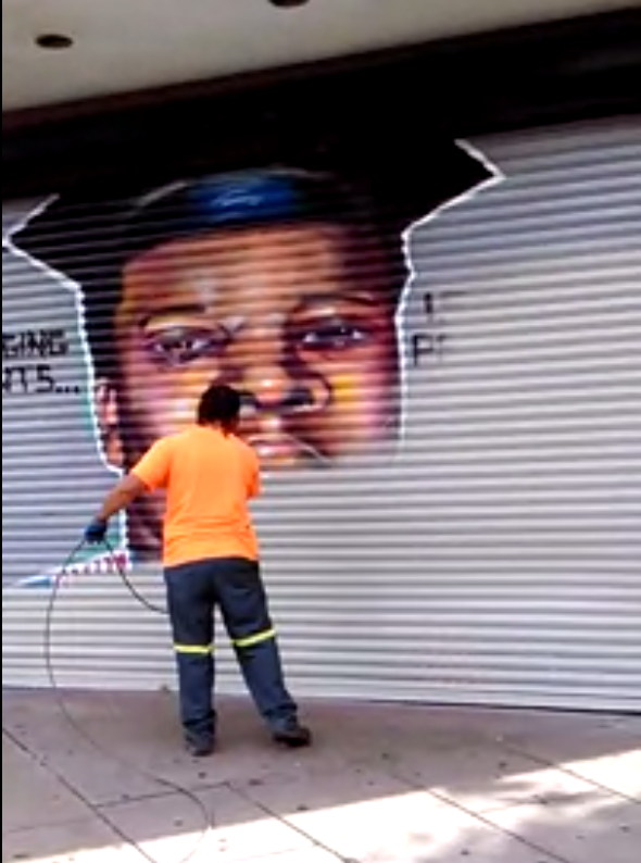
About two weeks ago, artists from the Sage Coalition in Trenton, New Jersey, sought and obtained permission from the Trenton Downtown Association to paint a mural on the metal shutters of a vacant storefront. They decided to paint a large portrait of Michael Brown and the text, “Sagging pants…is not probable cause.” The artists saw it as relevant to both the memory of Brown and his killing in Ferguson, Missouri, and to their own experience with racial profiling at the hands of the police in Trenton.
Yesterday, according to NJ.com, “The Trenton Downtown Association elected to remove the image after hearing concern from police officers that the mural sends a negative message about the relationship between police and the community.” TDA director Christian Martin “said police said the painting did not promote peace in the community.”
The image was buffed by a municipal graffiti blasting crew yesterday. Sage collaborator Byron Marshall shot and narrated the scene.
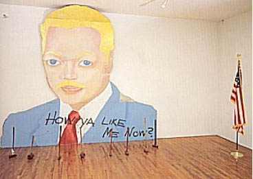
David Hammons, How Ya Like Me Now?, reinstalled inside at WPA, 1988
The situation feels like an inversion of the destruction of How Ya Like Me Now?, a 1988 billboard-sized painting by David Hammons of a blonde, blue-eyed Jesse Jackson, which was momentarily installed across the street from the National Portrait Gallery in DC. It was almost immediately set upon by sledgehammer-wielding locals who did not care for its negative message.
‘Sagging Pants is Not Probable Cause’ Mural Removed After Concerns From Trenton Police [nj.com]
Previously: How Ya Like How Ya Like Me Now?
Category: dc
From The Audio Files Of Mr. Felix G-Torres
The Smithsonian has added the Hirshhorn Museum’s audio archive to their digital library collection, and it’s great. Too often in the art world, what happens in Washington not only stays in Washington, it’s forgotten in Washington. So it’s unsurprising that the Nation’s Attic has interesting, even important stuff in it that really should be dusted off.
One of the first recordings I headed to this weekend was a lecture by Felix Gonzalez-Torres, in association with his Summer 1994 retrospective. I hadn’t heard Felix’s voice in almost 20 years, and I’d never heard him talk at length about his work. I was not prepared, either, to hear him say he was getting tired about an hour into the recording. After that, I couldn’t not hear his exertion to complete what was clearly a difficult, but imperative task.
It turns out I was also not prepared for how unfamiliar his work sounded in his own words. And how different his practice was from the received, sort of calcified, canonical understanding of it. The things he emphasized vs the things we saw or now see as being elemental.
Felix read part of his 1993 interview with Tim Rollins, which we know. But he also talked along to a selection of slides, which I tried to follow along in my books. Easily half the works he discussed were not included in ostensibly definitive catalogues and anthologies. Many had different titles. Some weren’t illustrated.
All of this is of a piece with Felix’s work, though. He would change the titles of pieces. Works he showed and sold were, near the end of his life, recategorized as “additional materials” and “non-works.” But some things, installations and site-specific projects in particular, seem to have been sorted out of his canon completely and/or ignored by critics.
We work with what we have, but we too often don’t see what else there is. And when we find out we’ve been using incomplete or inaccurate info, we’re slow to adapt.
So here’s a single example. It’s a piece Felix started his Hirshhorn talk with, and which he said “is a key to a lot of my work, and also the way I am.” And it’s piece I’d never heard of or seen, whose bare, incomplete, and contradictory references in the record so far I have completely overlooked. The artist called it “Untitled” (Quatrenium).
Here’s what he had to say:
Continue reading “From The Audio Files Of Mr. Felix G-Torres”
Danh Vo On ‘We The People (Detail)’
Here is an interview [in Danish, subtitled] with Danh Vo, on the making and exhibition of We The People (Detail), his full-scale copy of the Statue of Liberty. Many of the 400+ pieces of We The People were rotated and stored at the Statens Museum for Kunst in Denmark in 2012-13.
I am enthralled with this work; it strikes me as one of the smartest, most elegant, and provocative sculpture projects in years, and yet it didn’t occur to me until Vo mentioned it that Gustave Eiffel, who designed a steel armature to support Bartholdi’s copper repousse skin, did not see the Statue of Liberty installed in the US.
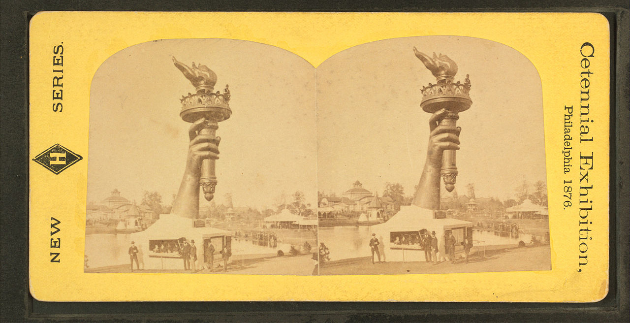
But reading up on the Statue’s history, it turns out the entire statue was assembled in Eiffel’s factory in France, and then disassembled for shipping. Also–and I did know this and should have remembered it–the statue began as parts, exhibited. Bartholdi made the statue’s arm and torch, which traveled to the US for the 1876 US Centennial, and which remained installed in Madison Square Park for several years afterward. And the head was exhibited at the Paris World’s Fair in 1878, all as part of a fundraising, promotional effort for the project.
SMK TV: Danh Vo – We the People [smk.dk youtube via @aservais1]
On Warhol And The World’s Fairs
If I ever get a PhD it will be in the US Pavilion at Expo67 as a gesamtkunstwerk. So much going on there, and in my years of fascination and study of it, it just keeps on giving.
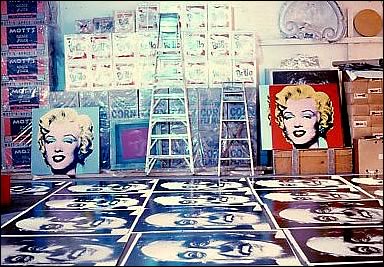
And I am stoked for the Queens Museum’s show, opening to day, on Thirteen Most Wanted Men, Andy Warhol’s short-lived commission for the New York State Pavilion at the 1964 World’s Fair. It sounds amazing, with an impressive amount of archival research and new understanding.
I haven’t seen it yet, but I have been bothered by a line that’s cropped up in several reviews of the show, which makes me think it’s not accidental, calling the 13 Most Wanted Men panels “Warhol’s only public artwork.”
This characterization only holds up if you define public art so narrowly as to make it irrelevant [which is something that happens to public art a lot, actually, but that’s not the point here.] Warhol exhibited work in at least three World’s Fairs in a row–1964 in New York, 1967 in Montreal, and 1970 in Osaka. And the first two were commissions. In fact, I’d suggest that the New York and Montreal projects are so similar, that they really should be considered together. Warhol’s Expo 67 works suddenly feel like a direct response to the controversy in 1964. When faced with the prospect of wading into another political conflict over his subjects, Warhol chose to depict himself.
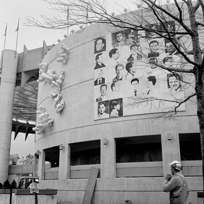
In 1964, Warhol painted 25 panels–22 with mug shots, 3 blank/monochromes–on 4-foot square masonite panels. The images came from an internal NYPD pamphlet that gave the piece its title: 13 Most Wanted Men. These were painted over in aluminum house paint within two days.
Thirteen Most Wanted Men overpainted and covered by tarp, 1964. Photo: Peter Warner, via Richard Meyer’s Outlaw Representation
Later they were covered with a large tarp. They have since been lost or destroyed. In his incisive 2002 history, Outlaw Representation: Censorship and Homosexuality in Twentieth-Century American Art, Richard Meyer quotes John Giorno’s story about the origins of Thirteen Most Wanted Men, and that the mug shots came from the gay cop boyfriend of another painter, Wynn Chamberlain. 1 [No one’s mentioned it, but I assume this is all in the Queens Museum show. Right? And the show will surely explain why Philip Johnson told Warhol in 1963 not to talk about the sources of the paintings? Johnson, who surely knew as much about power, rough trade, and a man in uniform?]
Warhol painted 25 panels with Robert Moses’ headshot, taken from Life magazine, as replacements. Philip Johnson rejected them, and they are also now considered lost or destroyed. [This photo is by Mark Lancaster, who helped Warhol make the Moses panels and much else. There’s a great interview with Lancaster at warholstars.org.]
During the Summer of 1964 Warhol reused the screens to create paintings on canvas of the 13 Most Wanted Men, which Lancaster cropped and stretched. Nine of these are currently in the Queens Museum show.
In 1964 he began making the Screen Tests, which were inspired both by the Thirteen Most Wanted mug shots and the photobooth pictures Warhol began using in 1963. He created Most Wanted series of women and boys as well.
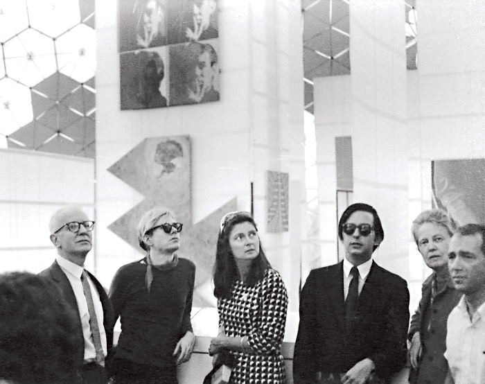
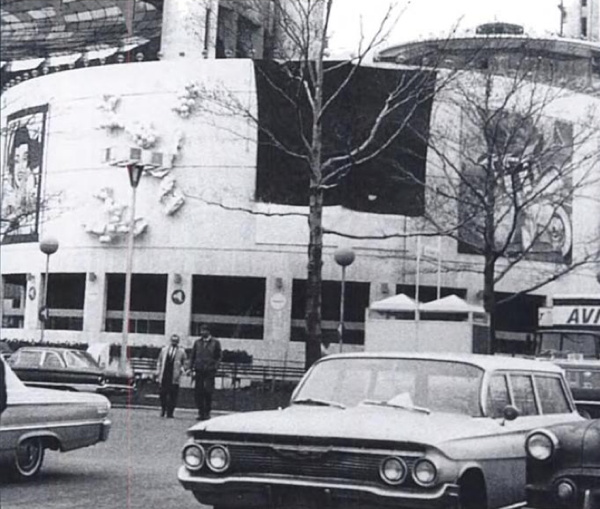
Warhol visiting Expo 67 with the de Menils, that’s John de Menil at left, not Buckminster Fuller, as some online sources would have it. image via menil.org
In 1967 curator Alan Solomon commissioned Warhol to make large paintings for the US Pavilion at Expo 67. Warhol created eight giant Self-Portraits. They are 6-feet across and based on a photo by Rudy Burckhardt. Six of them were installed in Buckminster Fuller’s geodesic dome, above Jasper Johns’ Dymaxion Map. Four of them are visible above, in a photo taken during Warhol’s visit to the Expo with John & Dominique de Menil. The one on the lower right is now in the Tate Modern.
If the Thirteen Most Wanted Men censorship was really as concerned with vice, power, and the homosexual gaze as Meyer argues, then Warhol’s uncensorable Self-Portraits read like an act of defiance. For his 2nd World’s Fair, Warhol didn’t shrink from political conflict; he met it straight on and came out on top.
1 Update: I just came across a story by Lucy Sante about Thirteen Most Wanted, which he published in 2009. It is, I assume, a fictional encounter with a retired NYC policeman who had the idea for a Ten Most Wanted list stolen from him by a fellow cop, who became lovers with a young Warhol, and then years later, while guarding the World’s Fair, saw his Most Wanted Men idea stolen again by his ex. Hmm. I think someone had better talk to John Giorno.
From Evening To Dawn With Augustus Vincent Tack
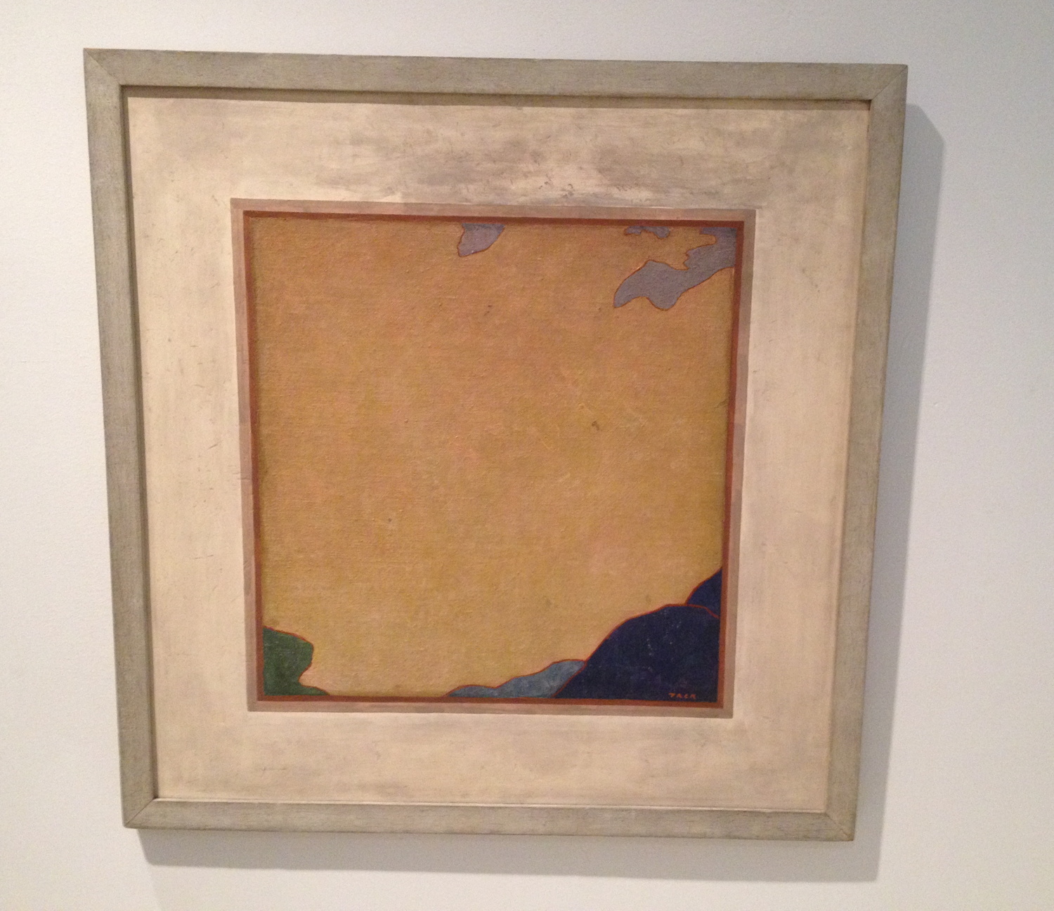
I went to the Phillips yesterday to see the “Made in USA” show and to get out of the rain. After seeing the nice John Frederick Peto trompe l’oeil, I was distracted and annoyed by the grain of the canvas in some John Henry Twachtman painting or another. No sooner had i sworn eternal allegiance to gesso than I turned the corner, went up 1/3 a flight of stairs, and was stopped cold by Augustus Vincent Tack’s painting, Evening. And I had to take it back.
What an amazing little painting. The Phillips is Tack Central. They have 79 of them. I’ve never seen this one, though, nor its similar-looking partner Dawn, which faces it in the stairwell.
Almost every Tack in any other museum was foisted on them by Duncan Phillips. [Tyler did a nice post on the Tack paintings in the Phillips in 2011.] Born in 1870, Tack painted classical moderne murals, more traditionalist portraits, and extraordinary landscape photography-based abstraction.
Obviously [sic] it’s the abstractions that amaze here. He really only did them for Phillips, between 1922 and 1934, who apparently became disappointed when they didn’t change the course of abstraction and modernism. [Curator Leslie Furth writes about Phillips’ unrealized hopes for Tack’s critical uptake, and how the artist seemed to drop the abstract ball decades too soon.] Tack, Phillips wrote in 1933, was destined to have “a limited reputation as an…eclectic painter…rather than as one of America’s most original painters.” This, from his biggest fan.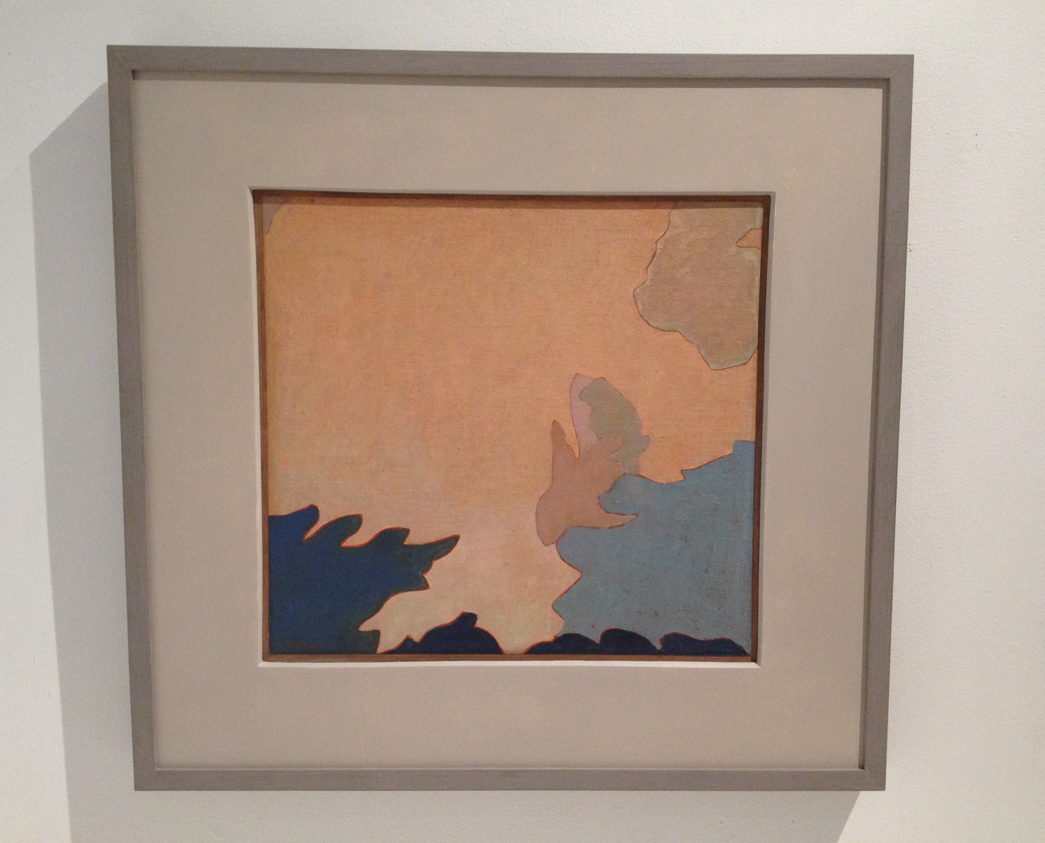
Evening and Dawn were painted after this letdown. “Between 1934 and 1936,” is how the Phillips dates these abstractions, which were variously willed to the museum by the artist or bought from his wife’s estate in the 1950s. Tack would blow up details from photos of Death Valley and transfer the forms of clouds, rocks, mountains, sky, whatever was there. [Stieglitz was taking similar-sounding photos, abstractions of clouds known as Equivalents, at the same time. Several are in the show.]
Let’s be real here, though. He’s sort of like family for the Phillips, the wistfully visionary uncle, but the reason anyone cares about Tack at all is because his paintings look like Clyfford Stills. Bafflingly so. Frustratingly so. Amazingly so. Still was the titan Cronus to the AbEx Olympians. But what would that make Tack? Uranus? Except the lineage is not clear, or even suggested. Still was sure Newman stole zips from him [which makes him, what, Prometheus?], but though Still was in Virginia in the 20s and 30s, and may have visited the Phillips, no one really considers that Still got the core of his abstraction strategy from Augustus Vincent Tack. It’s more likely [to me] that their paintings are similar because their inspirations were similar: the powerful forms, colors, light, and space of the western landscape.
But that’s not important now. What really blew me away about Evening was that Tack had painted a painting of a painting. That’s entirely flat, as flat as a Peto, and just as tricky. The abstract center, where Tack signed it, has the tooth of the canvas still visible, but the mat/wall part, the smudged space around it, is smooth. And it’s possible that it’s a mat, not a wall. Maybe it’s even likely. Dawn has a hardboard mat/border around it. See the shadow along the top edge? And Evening has no shadow. This is not an academic trompe l’loeil. But the little white along the top edge of the painting, which separates it from the schmutz, could read as a highlight.
Forget Still. Was Tack anticipating Johns? And Richter, for that matter? Was Tack an eclecticist painter too many decades ahead of his time? I doubt it. And that’s the problem with a word like “anticipate.” It seems to me that Tack was in and of his time and place, and as a capable, open-minded painter, was aware of a whole range of possibilities. And he tried them. And they worked. But he also stood apart from the social structures and networks in which art history was self-consciously created.
Tack’s practice and his trajectory should make us more aware of the social, interpersonal forces at work in art history, and of the bias we have for a heroic narrative of breakthrough, discovery or innovation. Many of the painting possibilities we credit to later painters were also known to a random guy like Augustus Tack. But he didn’t influence anyone, except Duncan Phillips. Which, on the flipside, Phillips’ championing of Tack’s polyvalent work to the institutional powers of the day also didn’t stick. But maybe our more eclectic time can find something to learn from someone like Augustus Vincent Tack. Off to the library.
On Schwendener On Richard Serra & Public Art
I’m pleased to see some actual critical response to Richard Serra’s sculptures, and Martha Schwendener is more right than wrong in her review of Serra’s latest shows at Gagosian. But this retelling of the Tilted Arc controversy is based on several faulty premises that are amply documented and refuted in the written record of the case.
It’s hard to approach Mr. Serra’s sculptures without some kind of baggage. There is, of course, the unfortunate 1989 “Tilted Arc” episode, in which that commissioned sculpture by Mr. Serra was removed from Federal Plaza in Lower Manhattan after complaints from neighbors and workers that it impinged on their use of Foley Square. In the aftermath of that fiasco, rather than fighting for the rights of artists creating public sculpture, Mr. Serra’s response was to make abstract drawings with puerile titles like “The United States Government Destroys Art” and “No Mandatory Patriotism,” both from 1989.
When exhibited at the Metropolitan Museum of Art in 2011, these drawings seemed only to iterate Mr. Serra’s myopic misunderstanding of art in the public realm. As the art historian Leo Steinberg put it, the space of Federal Plaza was Serra’s “raw material, but there are a thousand people working there, so this is not raw material but the space of their existence.”
The campaign against Tilted Arc was started by a judge in the building, and it became an ascendant conservative rally that pulled in the likes of Rudy Giuliani. Public opinion, even the opinion of the workers in the Federal Building was not opposed to the sculpture. The commission assembled to judge the work’s fate was stacked, and its recommendations went against the evidence it assembled.
What I bristle against most, I suppose, is Schwendener’s idea that Serra did not “fight for the rights of artists creating public sculpture.” That is exactly what he did when he sued the GSA to stop the removal of the work, and to declare it destroyed when it was removed. In the legal context of the time, this was, unfortunately, the most that could be done.
Of all artists, Serra has pushed the hardest for the primacy and autonomy of the artist’s vision. His take-it-or-leave-it stand is certainly annoying and abrasive to some people, but it is principled, and it is at the core of his practice, and apparently, his personality. He’s not a collaborative guy. He’s not a compromiser. He compared Robert Venturi’s plan for Pennsylvania Avenue to the Nazis. He walked out on Helmut Kohl and removed his name from the Berlin Holocaust Memorial rather than take the chancellor’s suggestions. [Schwendener mentions the memorial in her review, but ignores Serra’s involvement.] He apparently walked out on Steve Ratner when asked to pitch for a Hudson Yards public art project.
It may very well be the case that Serra is unsuited for public art and the political rigamarole that it requires. But he wasn’t poisoning the well so much as pissing on a reactionary fire that had already been lit during the Reagan Era. If such non-accommodationism is damaging to artists’ prospects for making public art, then maybe we should consider the processes by which public art comes to be. Maybe the gargantuan spatial spectacles Serra produces now really are optimized for private consumption, the single decisionmaker, the big checkwriter. But whatever Serra’s faults, the public art ecosystem in the US has rarely produced works that command such a spirited defense as Tilted Arc received back in the day.
Previously:
On those “Revenge Drawings”: Richard Serra was not pleased with the US Government
Serra interview from 1982: And I AM. An American Sculptor.
You really should have The Destruction of Tilted Arc: Documents, the 1990 compendium of material from the case [amazon]
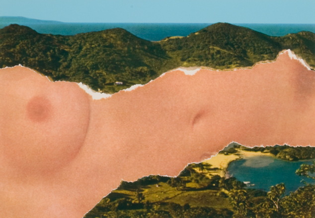
Ellsworth Kelly Postcards: Wish You Were Here!
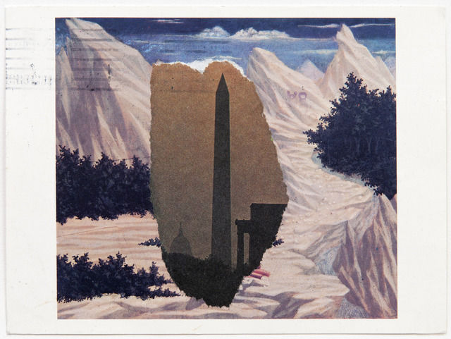
Domenico Veneziano / Washington Monument, 1984, image: peter freeman/artsy
So I didn’t spot this Ellsworth Kelly postcard collage at Peter Freeman’s booth at Frieze Masters, and I love it. It makes me want to see more. And to wonder why we haven’t?
Kelly’s used collage and found shapes and forms to develop his paintings and sculptures since the very beginning. He’s made postcard collages to explore scale and shape and site, too. They’re little glimpses into the way he sees. He makes them for himself, and he sends them to friends.
This example, made using photo torn from the newspaper and a postcard from the National Gallery of Veneziano’s St. John in the Desert has some postal markings on it, so I expect it’s the latter.
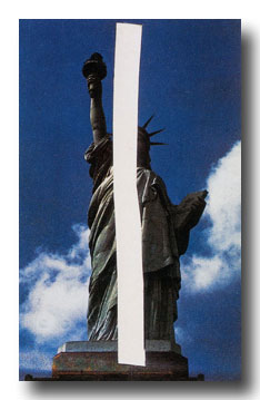
Statue of Liberty, 1957
Can we have a show of these, please? Or at least a book? I guess the closest so far is that amazing Drawing Center show in 2002, Ellsworth Kelly Tablet: 1949-73, curated by Yve-Alain Bois, which had collaged up pages from the artist’s sketchbooks.
Upper Manhattan, 1957
But these postcard collages are not just, or not all, preparatory works; they’re social, too. Their intimate scale, non-preciousness, and exchange function remind me of Felix Gonzalez-Torres’s Polaroids and Gerhard Richter’s overpainted photographs. The absolute least gesture and material required to convey the artist’s observation.
Study for a Blue and White Sculpture of Les Tuileries, 1964, like many of the smaller images, from a slideshow at nyss.org
They inevitably also function as postcards, seeming to mark a visit to a place, and the artist’s reaction or memory there. In the Guggenheim’s 1996 retrospective catalogue, Roberta Bernstein called them “souvenirs of experience.” The light on the Seine, the bridge near the Taconic, the sliced coffee lid at Agnes Martin’s place. Kelly talks of seeing things others don’t, thus the unsuitability of an off-the-rack postcard.
St. Maarten, 1974
In at least one case, the private, unique postcard became a published edition.
St Martin Horizontal Nude, 1974
If I’d realized that it started with a postcard, I’d have been less baffled by the big lithographs that pop up occasionally at auction.
Saint Martin Landscape, 1979, 16×22-in
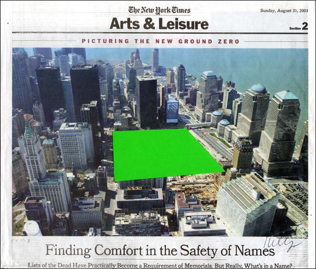
Postcards are obviously useful for sculpture, space, and scale. They’re ambitious and offhand at the same time, a powerful proposition that can be discounted, but not unseen.
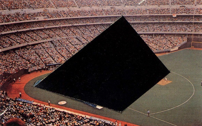
This 1980 postcard collage of Riverfront Stadium reminds me of Ground Zero, the newspaper collage Kelly sent to Herbert Muschamp in 2003:
There’s one other instance I can think of where Kelly’s postcard collages and his monumental sculptural situation are linked, the imposition of sculptural form on photogenic tourist vista: his 1998 sculptural installation on the roof garden of the Metropolitan Museum.
I’ve found this over and over: 1998 is invisible online. There was a lag between the internet and digital photography, and archival digitization projects privilege the dusty. Ellsworth Kelly Metropolitan is a predictably beautiful search on flickr, but it doesn’t yield any images from the pre-flickr era. Which is really too bad, because as I recall, they were picture perfect.
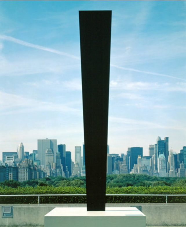
UPDATE:: Whaddyaknow, here’s a picture of Totem on the roof of the Met, which I just randomly found in a 2010 NPR story about the closure of Carlson & Co.
Anyway, point is, we need a show. So please send all the Ellsworth Kelly postcard collages to me, and I will exhibit them.
Previously, suddenly related, souvenirs of virtual experience: Ellsworth Kelly on Google Art Project
The Confederacy Is Present

Carhartt product placement? image: @catblackfrazier
Talking Points Memo calls it “Rage & Performance Art,” which is complicated only if you let it.
Senators Ted Cruz and Mike Lee and former half-term governor and Fox News personality Sarah Palin headlined a protest at the WWII Memorial today. They were decrying the memorial’s closure as a result of the government shutdown. The shutdown they orchestrated and perpetuate. Personally.
The protestors, Tea Party Republicans and truckers, siezed the barricades and marched them up 17th Street to the White House, where they waved a Confederate flag and demanded President Obama come out with his hands up.

image: @davidfrum
On a process note, it’s interesting that where Sforzian moments were once centrally conceived for and executed by professional photojournalists, nowadays photo-op political stunt events are disseminated through amateur snapshots.
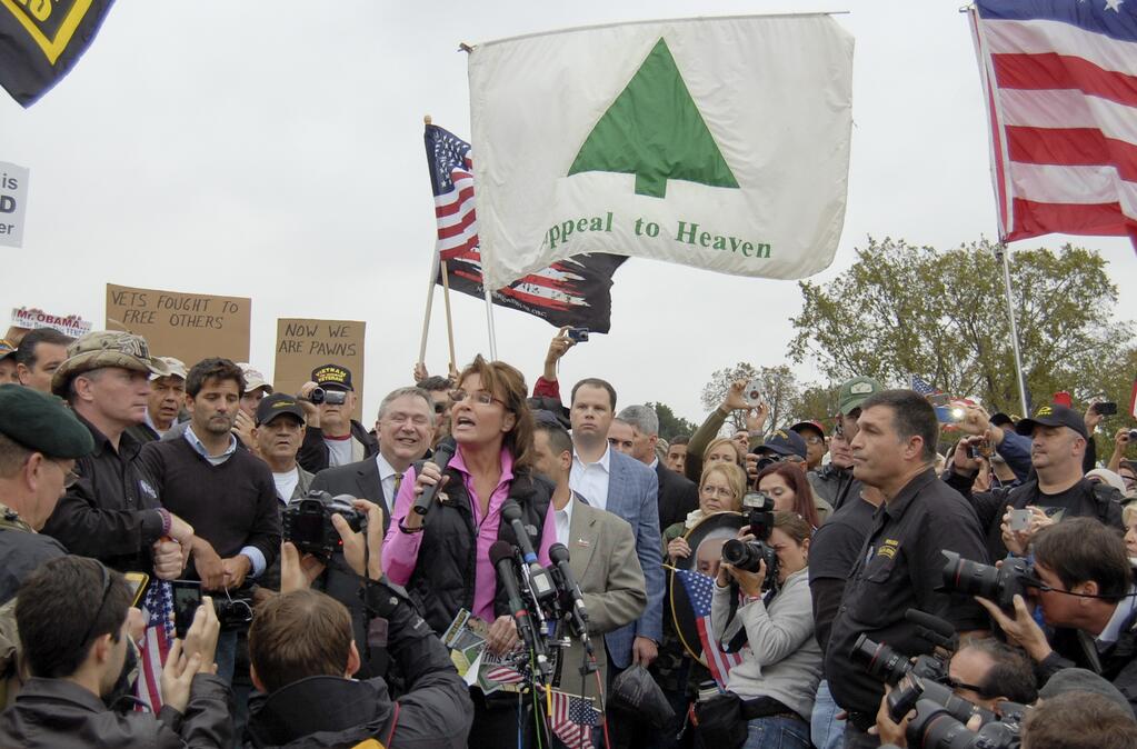
One thing that hasn’t changed, though, is Karl Rove’s Sforzian dictum that you should be able to get the message even if you have the TV sound turned off. And I think that comes across loud and clear.
As in this photo from [decidedly non-amateur, non-bystander] Texas Republican congressman Steve Stockman, which includes a flag behind Palin that cites John Locke’s “appeal to heaven” to call for revolution against the government. [via andrewsullivan.com]
Emerge-ing
The third edition of the (e)merge art fair was held this weekend at the Rubells’ hotel in Washington DC. After not being sure whether I’d be in town, I was, and I went on Saturday afternoon. I’d say it was well-attended, but not crowded.
The fair was smaller than the first/only time I’d been in 2011, with one 32-room floor of exhibitors instead of 2.5. And some of this year’s exhibitors took double/adjoining rooms. And in addition to a couple of DC galleries, there were local non-profits and agencies like Transformer Gallery, WPA, and DC’s Arts & Humanities agency.
Despite trying to keep up with art making things, I knew almost none of the galleries or artists I saw. (E)merge’s emphasis on emerging galleries showing emerging artists felt like a self-fulfilling and self-limiting parameter that makes for a tricky situation in which to buy–and sell–art. It’s a set-up that appeals almost exclusively to collectors’ impulse purchase reflex, not their investment aspirations, and definitely not their craving for glamor, luxury, status, or social theater.
On the other hand, there seemed to be significantly more artists in the fair’s Artists Platform, self-representing artists, collaboratives, and artist-run galleries who were spread out around the hotel’s ground floor, deck, and parking garage. They were mostly solid, engaging, and interesting. Baltimore and MICA were heavily represented, the Corcoran, much less so. I left wanting to merge (e)merge with Artomatic.
But enough of that armchair quarterbacking. Here’s some of what I saw that stuck with me, in roughly chronological order. It’s like a timeshifted liveblogging highlight reel of my (e)merge visit.
American Decay

From grupa o.k. comes this 1972 diagram [drawing?] by Carl Andre, Line of March, which describes a smallish floor piece. And it connects to the second inauguration, on January 20, 1972 [sic?], of Richard Nixon.
Courtney Fiske blogged about finding a 1973 ARTNews article about Line of March titled “The politics of cheese.” Andre had found the index card-size sheet metal pieces for the sculpture on his way to Washington, where he’d planned to protest Nixon’s inauguration by installing a work, titled American Decay at Max Protetch’s gallery on M Street:
The piece consisted of 500 pounds of cottage cheese anointed with 10 gallons of ketchup, resting atop tar paper, covering an area about 12 by 18 feet, with the cheese itself about 10 inches deep. Although the piece was not for sale, one collector did take home ten small cans of the Sealtest large-curd cottage cheese.
There were those who felt, on seeing the piece, that Andre had taken an obscurantist stance, but they should remember that during the campaign Nixon’s lunches consisted of cottage cheese coated with ketchup. It has not yet been determined if the cottage cheese Nixon ate was Sealtest large-curd. At any rate, American Decay, which opened at the Protetch Gallery on Jan. 19, closed on Jan. 20 because of the putrid smell which permeated the premises.
I can’t find photos of American Decay, but I will definitely look. It sounds gross, but fantastic.
The student of politics will also note that Nixon’s inauguration actually took place on January 20, 1973, a full year after the date in the drawing above. Gilbert & Lila Sullivan had another Line of March drawing in their collection that does have the “right” date.
So now I really have no idea what this piece of paper is.
To The Sforzian Barricades!

For a brief moment yesterday, the first morning of the GOP-instigated shutdown of the federal government, anxious confusion reigned. And as folks began realizing that in addition to the hundreds of thousands of furloughed and unpaid workers, and the halt to vital government programs across the country, Washington’s museums and memorials were also closed to the public, there was a ray of hope.
A tour group of World War II veterans, The Greatest Generation, were not going to stand for this assault on our great constitutional democratic institutions. So they had someone push them in their wheelchairs into the World War II Memorial as Park Police watched from the sidelines.
Yeah, then it turns out the pushers were some of the same Tea Party extremists in the House who had voted for, nay, clamored for, the government to be shut down in the first place. Last night the likes of Michele Bachmann and Steve King were promising to personally help any veterans group fight their way back into the Memorial any day if they had to. And they just dared Pres. Obama to arrest them all. Ideally, on live cable TV.
Today, with conservative media attention riveted on this Mussolinian plaza which slices the National Mall in two like a hernia operation, Park Police decided to stand aside as congressional tour guides boldly shouted, “Tear down this fence!” and “Stand our ground!” and whatever.
And GOP chairman Reince Priebus himself stood in the glare of cameras and the afternoon sun, brandishing a GOP check and offering to pay to keep the memorial open (for vets) or, in Gawker’s words, “to rent the WWII Memorial for shutdown theater,” and –hey, how’d those people in the background get past Obama’s Black Fence of Tyranny? It’s almost like that little fence was put there, in front of the sign, and strewn with police tape, just so, just to be photographed. Can we get a wide shot on this one?
[image tweeted by HuffPostPol reporter @RyanJReilly: “‘Go do your job, idiot!’ — protestor to @Reince at WWII Memorial”]
On The Real [sic] Economic And Cultural Power Of The Art World
In this set-up for After Art, his slim tome of theory on networked images, Yale’s David Joselit argues that art’s status as a luxury commodity is not a bug, but a feature, and the art world should get with the program:
Indeed, all over the world, from Bilbao to Abu Dhabi to Beijing, new contemporary museums are being established in order to consolidate local elites, and broadcast a global image of cultural progressiveness. Commenting on the Qatar Museum Authority’s staggering budget of some $1 billion per year for art acquisitions, the New York Times recently declared, “it seems clear that, just as Qatar has used its oil riches to boost its influence in the Middle East with ventures like arming Syrian rebels, its wealth is also being deployed to help the country become a force in the world of culture.” It is rather breathtaking — and enormously revealing — that arming Syrian rebels and building a sophisticated cultural infrastructure can be so seamlessly joined in the same sentence.
Paradoxically, artists, critics and historians too often disavow the art world’s capacity as an economic engine and its political power as a marker of national development. The reasons for this are obvious: if one admits the real economic and cultural power of the art world, one must also give up on the enduring myth that works of art remain apart from that world, existing in a realm of detached criticality or extra-economic authenticity. In actuality, the art world has grown enormously in the post-World War II period and in its combination of knowledge production, public presentation, and patronage of powerful elites, it has begun to resemble institutions of higher learning on the one hand, and the entertainment industry on the other. It seems to me that art’s worldly power, which tends to be veiled (or literally obscene), can be harnessed better and to more progressive ends by artists.
I guess I’ll have to read the book, but a term like “art world” can obfuscate a whole lot of power-related detail, of who’s doing the wielding and to what end. But I suspect neither art’s power nor the enduring myth are quite as real IRL as they are in Joselit’s thought experiment. And I don’t know about revealing, but that whole Syrian thing just gets more breathtakingly timely by the week, doesn’t it?
UPDATE: Joselit’s piece ends by holding up Ai Weiwei as an example of an artist who wields this kind of art world/real world power. Which, interestingly, Jason Farago mentions Ai, too, in his BBC article on the timid Metropolitan Opera getting dragged into the controversy over Russia’s shameful discrimination of LGBT people. Farago compares the Met’s inaction to the institutional outcries and support given to Ai Weiwei during his imprisonment. [via @karenarchey]
Which might render Joselit’s notion of art world power all the more quaint, and his call for action all the more damningly empty. His book came out in 2012, but the oppression and discrimination against lesbians and gays in Russia is surely the first test of Joselit’s paradigm: a fundamental “progressive end” toward which the “art world”–not just artists and institutions, but presumably, the administrators, executives, trustees, collectors, dealers, fair organizers, magazines, philanthropists, and critics–should be harnessing “art’s worldly power.”
How’s that going? Sure, there’s tepid talk of boycotting the Moscow Biennial. But has anyone checked in with the Russian oligarchs and collectors [and the Ukranian one(s), for that matter, since Ukraine has already enacted similar discriminatory measures] who collect, show and sponsor? Who chair galas and sit on museum boards and invest in art-related Internet startups? It would make for an exciting Frieze VIP preview. But I’m not waiting up.
The Politics of Information | David Joselit [berfrois.com]
Art & Technology & Serra & Steel Mills
Visitor posted this comment from Richard Serra’s 1974 interview with Liza Bear, quoting his own statement from the catalogue for Maurice Tuchman’s 1970 show at LACMA, Art and Technology, about technology being “a form of toolmaking, body extension.” Also, “Technology is what we do to the Black Panthers and the Vietnamese.”
technology is david hammons pissing on your sculpture. pic.twitter.com/QPm5w2zysT
— visitor design (@visitordesign) August 30, 2013
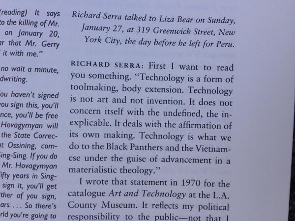
He goes on to say that “It reflects my political responsibility to the public–not that I have any idealistic notions of swaying the masses through television. I think commercial TV is basically show business, and that means show business is used to reflect corporate America’s interests.”
Of course, one of the criticisms leveled at Art & Technology was that it was using art to reflect those same corporate interests. Tuchman arranged for 64 men of the art and industry to pair up to produce artworks, which would be exhibited at the Museum, and also the US Pavilion at the Osaka 70 World’s Fair. The results were mixed at best.
Roy Lichtenstein worked with Paramount to make 35mm painting/film installations. Warhol made some wacky lenticular rain machine. Rauschenberg made a bubbling pool of lubricating mud. Tony Smith tried to make a cave from thousands of cardboard tetrahedrons. And all of it went down when opposition to the Vietnam war and Nixon and the Establishment were hitting new nadirs every day. If the show was meant to heal, bridge, transcend, or even paper over the cultural chasms between art and the American corporate machine, it has to be considered a failure.
And yet, somehow I hadn’t noticed this, and I can’t remember ever hearing it discussed, the work Richard Serra made for Art and Technology seems like some of the most crucial of his career. I’ll look again, but in terms of the artists’ own practice, I think Serra made what turns out to have been the most important art in the show.
Serra was, remarkably, the seventh artist Tuchman tried to match with Kaiser Steel Corp’s Fontana mill. [Among the first six attempted matches: Smithson and di Suvero, which, sure, but also Jules Olitski and Len Lye, which, what?] He proposed work that would “be related to both the physical properties of the site and the characteristics of the materials and processes concomitant to it.”
The three “categories” he envisioned were, casting, overlaying/stacking, and constructions.
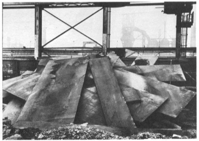
And that’s just what he did. Serra worked nights with the crew assigned to him to get a feel for steel in its different forms, for the site, and for the processes available to manipulate the material. After several weeks working in the skullcracker yard, where scrap steel was moved around with a giant magnetic crane for reprocessing, he used the machinery to execute 12 different constructions [or 20, depending] within two intense, final weeks. “The procedure would be to erect a piece, and, if he considered it successful, to have it recorded photographically when possible. The structure was then dismantled.”
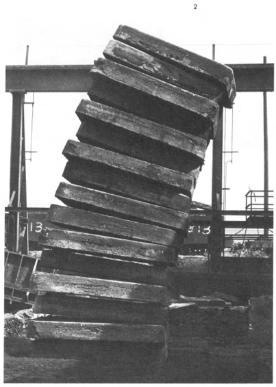
Stacked Steels Slabs (Skullcracker Series), 1969, constructed at Kaiser Steel, Fontana, CA
The first of these pieces is probably the best-known, a leaning stack of sixteen 6-ton slabs of cast steel known as stools, the photo of which has circulated under the name, Stacked Steels Slabs (Skullcracker Series). These Skullcracker Series works became more structurally complex; Serra created loose piles of steel scrap, then propped large slabs against or on top of them.
He made counter-balanced structures with plates jutting out in various directions. They remind me a bit of the block towers architect Eliot Noyes made to demonstrate balance in a 1955 educational film. I’m sure, of course, they were completely different.
After a second, less successful stay in 1970, Serra agreed to return in the Spring of 1971 for the actual LACMA show. He would erect a Skullcracker Series at the museum, and also install “a piece related to his more recent thinking; the idea derived directly from what he had learned about steel at Kaiser.”
His idea was to measure a site and install a steel plate, which would be cut along the edge of the ground, thereby taking the contour of the topography into which it had been installed.
Though the cutting is, I think, unique, a form of drawing, this creation of sculpture that marks the contours of a site is immediately, obviously recognizable as central to Serra’s work at the time. He was doing it at that exact moment in St. Louis with Pulitzer Piece, and in Ontario with Shift. And he says that it all came “directly from what he had learned about steel at Kaiser.” [Those links are both to Tyler Green’s Modern Art Notes, who’s written one of the very few art-aware accounts of actually visiting Shift.]
Serra’s steel mill-based practice is something else that, in the intervening decades, has become central to Serra’s work. In interviews, it’s usually explained by biography, by early factory jobs in college. But those jobs didn’t get a mention in Tuchman’s Art & Technology catalogue, and Tuchman’s complicated show rarely gets credited for arranging the corporate collaboration at Kaiser Steel that gave Serra his first studio in a steel mill.
Previously, related: Stop & Piss: David Hammons’ Pissed Off
Gretchen Bender On ‘Art As Signs And Not As Valuable Objects’
Gretchen Bender, Sensurround, 1983, silkscreen and c-print on tin
From Andrew Russeth comes Cindy Sherman’s 1987 interview with Gretchen Bender, published in BOMB Magazine:
CS There’s an article in an L.A. paper describing you as a TV terrorist, saying that you can attain a critical edge through overload.
GB Yeah. There are artists who talk of using silence as a weapon, an alternative and an act of resistance. That’s one end of it. I’ve gone in the opposite direction but with the same desire. I think it’s more important to mimic and provoke at this point.
CS Your theatrical pieces are counterpointed by the tin pieces, which ironically, make objects out of paradigms.
GB Either way, it’s only temporarily effective. Hans Haacke uses part of the dominant high culture to criticize the function of the whole system through his object/displays. The question is–how broadly effective do you want to be? That is a difficult question with artists. Artists can be confused about their situation as a powerless elite. We operate from the protective base of the art world, a situation in which we can develop ideas but a place from which it is complicated to launch media-related art work without it getting co-opted by the very structures it criticizes. Although I use those structures. I’m resisting one channel television because I haven’t figured out how to effectively communicate except in a theatrical setting.
Again, I started wanting to quote the silence and art’s engagement/fear of politics, and I didn’t want to stop reading. Plus, it’s all talking about the tin pieces:
CS You’ve been criticized for being high tech, which is another way of infiltrating popular culture–using the technology that they use.
GB It’s something visual artists tend to resist although that resistance is steadily breaking down. More artists are figuring out how to use computer technology . . . there’s so much that’s happening visually. It’s strange that the art world resists using the visual tools of our time. What’s that about? It is scary when you have this heritage that you invoke–art history.
CS It’s supposed to be more pure if you use materials like paint or make it all yourself or use another person to make it for you.
GB The art world is trying to protect this antiquated territory and what is most disturbing about switching over to the newer technologies is that there is no authority to invoke. There aren’t any guidelines to tell you that you’re making ‘good’ art. No one knows enough or understands enough. There’s so much experimentation to do, so many blind visual forays to risk, so many conceptual implications of the newer technologies to try to comprehend. Many artists aren’t willing to take those risks. You don’t know if you are going to be effective or not, if you are going to make silly or profound works. I think that’s what terrifies most artists and I think that’s why the art world is so slow to accept the culture of today.
CS You have used imagery from other people’s art work in some of your own pieces. I interpreted that as reducing expensive works of art by male artists–paintings–to this disposable imagery level.
GB I wanted to use the art as signs and not as valuable objects. I decided to combine those found art reproductions as one combines words in a language or even just parts of an alphabet. I saw them as a moving language. I have been working with the equivalent flow of television. Before that, I was actually dealing with the equivalent flow of art objects. What’s really being said? At the same time, I realized that because we had gotten so much of our art out of magazines and reproductions, we weren’t contemplating art anymore. So I made those tin pieces to be a scan. You couldn’t fall into the pieces and contemplate. I go into galleries to see shows, to be aware of what is going on and it takes three minutes to see a show. Where are we? And what are we doing? It’s our nervous system–the time we live in–it’s not about reverie.
…
GB Artists using media have taken on a more complicated position in the culture than painters. Painters like tradition. And I think it’s a hundred, or a thousand times more difficult for a painter to make politically engaged work. They know that if it smells like art and looks like art and tastes like art–it’s painting. There’s not much risk in the art world.
CS Especially now, it seems really dull right now.
GB At the same time, I constantly examine my . . . I’m still operating within the art world. There is that base. Maybe it’s a base to reaffirm your goals or your sanity in trying to develop ideas. You do have people who want to see you succeed in producing important work.
Silkscreen on sheet metal must have caught Cady Noland’s attention. BOMB Magazine: Gretchen Bender by Cindy Sherman [bombsite]
First You Get The Art. Then You Get The Power.
When I started transcribing this section of Mike Kelley’s 2004 Q&A with Gerry Fialka , I was only in it for the Duchamp and Cage. But I’m glad I stayed for the art, entertainment, and politics:
[49:31] Gerry Fialka: Duchamp said, “How do you make a piece of art that’s not a piece of art?” Well Cage did it with music, maybe 4’33”, [Kelley shaking head]
Mike Kelley: No,
GF: Well–
MK: Duchamp did never not make a piece of art, and Cage did never not make a piece of art. That’s a game they played, that’s a game they played to pretend they were doing something that wasn’t art. Of course it was art. What else was it?
GF: Well put, let me finish. And then Joyce wrote uh–
MK: Pshhh
GF: Finnegan’s Wake and invented the Internet, and disguised it as a book. And George Manupelli–
[Audience noise]
George Manupelli is someone we both encountered in Ann Arbor, Michigan, who started the oldest experimental film festival in the world, the Ann Arbor F–
MK: The Ann Arbor Film Festival, which is, I tell you, I got my whole film education from that festival.
GF: It was a great place for me, too. to view experimental films
MK: They don’t do things like that anymore.
GF: And he had a piece called Film for Hooded Projector, so why is it important to shake up constructed belief systems, and do we need’em?
MK: Of course. Why else would you want art?
The only social function of art is to f things up. It has no other social function. Absolutely none. That’s why, if you merge it with the entertainment industry, make it about the desires of the masses, it doesn’t have any social function.
Also, what that idea about art–what separates it from politics, politics has a purpose. It’s about power relationships. Art doesn’t have anything about power relationships. It’s simply about fucking this up for the pure pleasure of fucking them up.
So it’s about formal–it’s about analysis, and formal, uh, uh, scrambling, and it both escapes the practicality of politics and the–what was the other side? I forget.
Audience: Entertainment.
MK: Eh?
Audience: Entertainment.
MK: Yeah, entertainment which is, drugging the masses. So art should be something in between that’s not practical in terms of power relationships, because it’s fantasy, but it allows for power. Because art allows for power shifts over a slow time because people’s minds change. Entertainment never changes people’s minds. It just drugs them to reality, and I completely agree with Marx in this, in this way.
So I’m, I’m against the idea of art being subsumed either into the political sphere, or into the entertainment sphere. I think it has to be a separate social entity, especially in America.
I think in Europe, social and class differences are different than they are here. But in America, since it’s such an anti-intellectual culture, it has to be a separate milieu, that’s purposely–um. What would I say? Purposely purposeless.
It has to be. Otherwise it has no social function.