Alright, I know it all looked like a black hole of boring embarrassment last week, but Amazon Art just broke through to the other side.
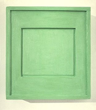
Artisoo Surrogate Painting [No. 783] – Oil painting reproduction 30” x 26” – Allan McCollum, $193
Kriston Capps and Joy Garnett were tweeting this link to what seems to be an Allan McCollum Surrogate Painting (No. 783), a 30×26-in original oil painting, offered on Amazon by a gallery called Artisoo–for $193. Kriston pointed out that Amazon’s gallery system has a forgery problem, or at least an authenticity problem. Which could very well be the case! But this is not why.
Because Allan McCollum’s Surrogate Paintings are not oil on canvas, but acrylic on plaster. Or as in the case of [No. 783], which was made in 1978, acrylic on wood. They’re painting-shaped sculptures, really. And what Artisoo is selling here is actually an original oil painting of the jpg reproduction of the McCollum. Artisoo is making an artwork that’s the picture of an artwork that the original artist hoped would help a gallery “become like a picture.”
Artisoo guarantees that your Surrogate Painting [No. 783] will be “100% hand-painted by our experienced artists. We stand by our top quality.” And you can order with confidence knowing that “The original motifs presented by Artisoo are created by artists from the most prestigious art schools and academies of fine arts. [emphasis added, because, ‘motifs’! -ed.]”
Chinese Paint Mill has appropriated Google Images and put it up for sale on Amazon. There are at least 18 other McCollum jpgs available as oil paintings. They all appear in the first page of the artist’s Google Image results. Artisoo currently offers 8,124 other paintings on Amazon, and unnumbered thousands more on their own website. In your choice of seven sizes.

It’s the fine art equivalent of LifeSphere, the Spamerican Apparel botcompany Babak Radboy wrote about that systematically turns every public domain image into every possible Zazzle product.
At least it’s trying to be. After a quick surf, I’d say that this Artisoo McCollum Surrogate Painting counts as a rare conceptual gem; easily 98% of the company’s merch is Chinese Paint Mill fluff. I’d call it pure over-the-sofa art, but that’d only account for one of the eight options in their Shop By Room function.
But there’s something sublime about the way a painting of a photograph of a minimalistic, monochromatic painted object encapsulates the entirety of orthodox post-war art history, collapses it, and drops it into the world’s biggest online vending machine. It’s painting pared down to its barest essence as a privileged cultural signifier: a decorative picture of whatever, made by hand. Painting sells its soul for Dino Sponges. But wait, there’s more!
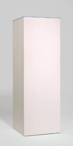
Like any serious collector, I like to shop for my art alphabetically, which means the first post-war artist to emerge in Artisoo’s stable is Anne Truitt. Artisoo offers 62 paintings with an Anne Truitt “motif,” including installation shots of her trademark acrylic on poplar columns; monochromatic works on paper; sumi ink drawings; and even the barely visible washes of the Arundel paintings. Can’t wait to see how those come out.
Artisoo’s daring paintings, uh, interrogate the conventions of scale as deftly as the notion of medium, date, authorship, context, and form. At 30×10 inches, this painting of a Parva sculpture is easily three times the size of Truitt’s original.
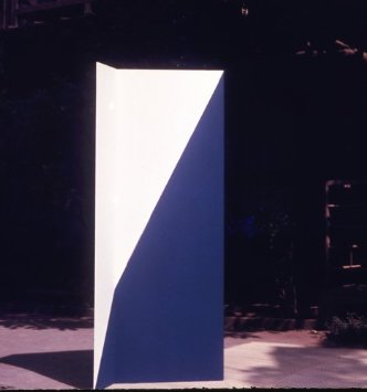
Artisoo Signal – Oil painting reproduction 30” x 28” – Anne Truitt
In a move that feels appropriated from my own playbook, Artisoo even offers paintings of early works that Truitt destroyed, the aluminum sculptures she created in 1964 while living in Japan. Unlike Destroyed Richter Paintings, however, Artisoo’s Artisoo Signal – Oil painting reproduction 30” x 28” – Anne Truitt ($204) does not attempt to recreate the experience of being in the original’s presence; it promises only its own, bold self: a painting of a vintage Kodachrome of a nautically colored sculpture bathed in the light of Tokyo courtyard.
I’m on slow wireless at the moment, so I gave up hope of surfing through all 340 pages of Artisoo’s products, and instead started plugging in names of artists I liked, or rather, artists I’d like to see appropriated by Amazon Chinese Paint Mill. It didn’t really pan out. No Kosuth, no Andre, no Beuys, Lewitt, Gober, Sherman, Levine, Hesse, Newman or Prince, and no Richter. The company’s web-indexical curation strategy is clearly still a work in progress. There are several dozen Johnses on Artisoo.com, though. I wonder if I could order a copy of Flag in the exact dimensions of the Short Circuit original? Yes, there’s no Sturtevant.
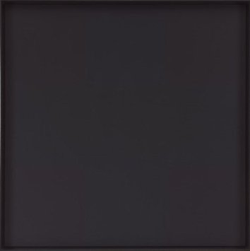
Artisoo Abstract Painting – Oil painting reproduction 30” x 30” – Ad Reinhardt, $221
There are Alma Thomases, though. And 63 Calders. Would you like a painting of a stabile? Oh, nice, there are 50 Ad Reinhardts. Those ought to be interesting. Likewise the 23 Agnes Martins.

Artisoo Happy Valley – Oil painting reproduction 30” x 30” – Agnes Martin, $239
Here’s a standout, though, which reveals a lot about Artisoo’s practice. It’s a painting called, Http En Wikipedia Org Wiki File Hamilton Appealing2 Jpg 1956, and it comes 4x-36x larger than Richard Hamilton’s 10-inch paper collage.
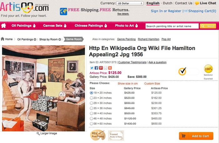
Http En Wikipedia Org Wiki File Hamilton Appealing2 Jpg 1956 ($125-650)
Everything about Artisoo is so immediately and obviously fantastic, I almost don’t want to spoil it by seeing actual paintings. Almost.
Category: dc
On Peter Coffin At The Hirshhorn
I’m surprised to not be hearing or reading more about “Here and There,” Peter Coffin’s show at the Hirshhorn, curated by Kelly Gordon.
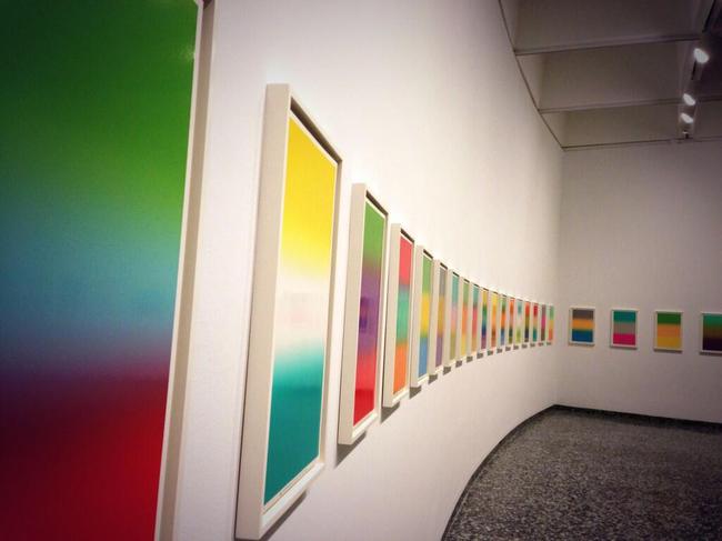
Hirshhorn installation view via @bluelikechagall
Maybe it’s the show’s unusual format; with seven works, it’s bigger than a project, but smaller than a mid-career retrospective, and Coffin’s works are dispersed throughout the museum (and one online). Jane Holzer’s copy of the eyecatching Untitled (Spiral Staircase) is in the courtyard. And my absolute favorite of Peter’s work, Untitled (Designs for Colby Poster Company), is on view, all 80 posters, in the elevator landing. [The Hirshhorn apparently bought Colby Poster in 2008, which was definitely the right time to get it, but the checklist and walltext says these particular examples are Collection of the Artist. I hope there’s a trivial explanation for this, especially now that Colby Poster Company is gone. (RIP). Also, has it ever been shown in the museum before? I don’t think so. I would’ve put that thing up at the end of Warhol’s Shadows instead of that Estate Edition Flavin wall. Just sayin’.]
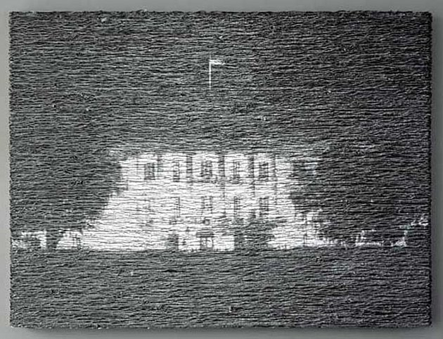
Donald Moffett, Aluminum/White House Unmoored, 2004, image via marianneboeskygallery
Anyway, the big news is the center of the show, a [commissioned?] project, Untitled (Smithsonian Hirshhorn Museum), 2013, a 12-minute animated projection/installation on a dozen or so works from the collection. It’s not so much site-specific as institution-specific and work-specific; each projection is timed and tailored for a particular painting or drawing.
When Donald Moffett first showed projected still video landscapes on paintings in 2003 (above), his silver and gold monochrome canvases served as uneasy, even dubious screens. Coffin, though, has selected a wide mix of figurative and abstract work onto which he projects Jeremy Blake-like animations that overlay their own representational/abstract painterly arguments.
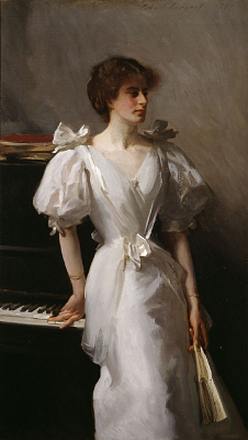
For Jasper Johns’ pastel 0-9 (1962), for example, Coffin articulates each collapsed digit in turn, rendering the illegible temporarily legible. For Sargent’s portrait of random London shipping heiress Catherine Vlasto (1897) [left], Coffin highlights different elements of the picture, including the piano keys, her décolletage, and the gilt frame, referencing the viewer’s own reading process, the very museum experience that has been digitally usurped.
I’ve watched the program through several times, and I got to where I can identify and anticipate favorite passages, moments where the original artwork and Coffin’s projected images work well together (or against each other.) The last 5 seconds or so of the video clip above, for example, where Coffin makes de Kooning’s painting seem to blur in and out of focus, is a standout that deftly addresses the painting’s abstraction.
Overall, though, Coffin’s various animations don’t seem designed for contemplation. Instead they fall under the rubric Gordon calls, “serious fun,” a new, different, and “subversive” way of looking at traditional artworks. I imagine that for many viewers, especially those who wander in from Air & Space, Coffin’s 12 minute loop will be several times longer than they’ll spend strolling through galleries where they can actually see the paintings. In that sense, they’re the apotheosis of a certain kind of entertainment-centric museum-going experience, just what the curator ordered.
Peter Coffin: Here & There runs through Oct. 6, 2013 [hirshhorn.si.edu]
Mao Hope
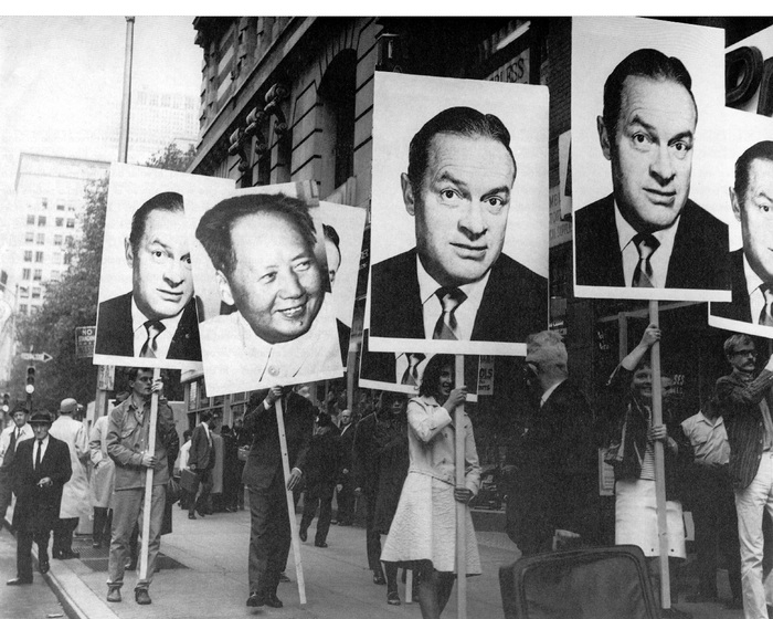
I shouldn’t have to explain, but it’s just really important that this photo get out there even a little bit more. That it should be here. Because seriously, it’s a 1966 march through New York City by people carrying giant head shots of Bob Hope, and one of Mao Zedong.
I’ve been kind of fascinated by different aspects of Öyvind Fahlström’s work lately, so seeing this photo, a still or documentation from Mao-Hope March, on grupa ok reminds me of how few dots I’ve connected yet.
Fahlström was a contributor to 9 Evenings: Theatre and Engineering, the ambitious-but-mixed-but-historic series of happenings, performances, music, and events organized by Experiments in Art and Technology. Folks like Rauschenberg, Whitman, and Billy Klüver kind of soak up much of the E.A.T. limelight, and John Cage and Bob loom especially large, in the remembering of 9 Evenings.
Which is all a way to say that I’ve never really paid attention to Fahlström’s contributions to the program. The Langlois Foundation has a fairly detailed account of the 100-minute performance, titled, Kisses Sweeter Than Wine, which strikes me as one of the most politically charged elements in 9 Evenings.
Performers in Kisses carried Mao and Hope placards live, but Fahlström also showed a short film of a Mao-Hope March shot on Fifth Avenue. No explanation for the demonstration was given to passersby, and none was made in Kisses. But New Yorkers were interviewed by a popular WBAI radio announcer on the scene about whether they were happy. That’s it. [Fahlstrom.com has a complete transcript.]
Mao, of course, was the Communist hegemon looming over Vietnam, while USO veteran Bob Hope was the aw shucks face of the US military. Both, then, stood in for but were at least one degree removed from the actual war. But the associations and allegiances were clear enough that, even if the demonstration’s agenda was not clear, people could easily, reflexively take sides. Me, I am mostly just in awe of the bold and gripping and ambiguous content of those placards.
Some years later Fahlström showed Mao-Hope March as an independent work. MoMA acquired the film in 2009.
Mao-Hope March,1966 [fahlstrom.com]
Öyvind Fahlström | Kisses Sweeter than Wine (performance) [fondation-langlois.org]
A 20-second clip of Mao-Hope March playing at the Pompidou [youtube]
All The World’s A Stage Set By Piet Mondrian
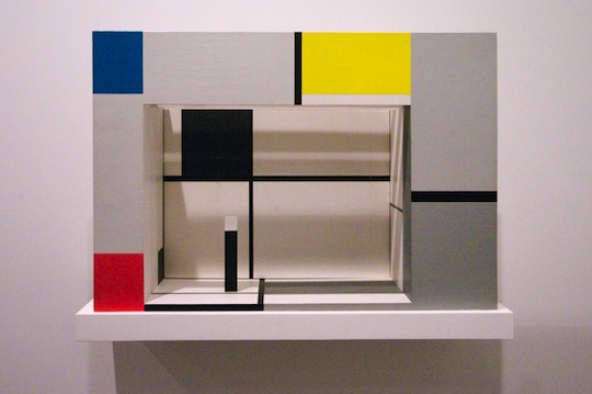
Model for set design, “L’Ephemere est eternel,” 1926, recreated in 1964, photographed in 2008 at Vanabbemuseum by Jeff Werner
After reading Michel Seuphor’s Dada play “L’Ephemere est eternel” in 1926, Piet Mondrian surprised his friend by designing sets for each of the three acts. The little models were photographed amidst Mondrian’s paintings in his studio, a nice parallel to the play’s denouement, in which a model of a theater is destroyed by an executioner. It also resonates with a play Mondrian himself wrote in 1919, which ends in his studio. For someone trying to change all the world, the stage was a nice place for a dry run.
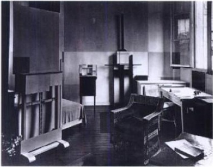
Susanne Deicher noted that Mondrian refused to be photographed painting in his studio.
Mondrian often said that “new life” could be found in the free space opened up by reason and thought. The empty plane at the centre of the small painting on the easel reflects the absence of the artist.
During this period Mondrian frequently spoke of the end of the subject in the new age to come. He designed his studio as an imaginary setting for a theory without an author, where the “new” appears to evolve in the non-space of the empty center of his abstract paintings.
This absence to Mondrian’s ideas for the staging of “L’Ephemere” as well. He really wanted sets that concealed the actors as they delivered their lines. To what extent Seuphor was on board with Mondrian’s creative involvement, I don’t know.
I also don’t know in what form it circulated at the time, or how widely it was read or known, but Seuphor’s play was not actually ever performed until 1968. By then Mondrian’s original models had been lost; someone–perhaps Seuphor himself–had refabricated one in 1964. It’s in the collection of the Vanabbemuseum in Eindhoven. [That’s where Vancouver designer/blogger Jeff Werner photographed it in 2008.. I first saw it a few months ago in “Inventing Abstraction” at MoMA.]
Remarkably, the US premiere of “L’Ephemere est eternel” took place in 1982, at the Hirshhorn Museum. It was one of several ambitious elements of Judith Zilczer’s exhibition, “de Stijl: Visions of Utopia: 1917-1931.” The show also included a large-scale recreation of Theo van Doesburg’s lost interior of the cinema/cafe in the Aubette in Strasbourg. The opening was attended by Queen Beatrix, who, on a state visit, discussed nuclear proliferation and anti-NATO protests with Ronald Reagan.
Georgetown University theater professor Donn B. Murphy directed his and Zilczer’s 60-minute adaptation of Seuphor’s absurdist, plotless, and wordplay-filled script, which ran for at least seven public performances during the weekend of June 25-27. The show was in the museum’s auditorium, which barely has a stage, more of a podium, but which was apparently able to accommodate a full-scale version of Mondrian’s spare, shallow set.
The Washington Post hated it. In his review David Richards summed up the play’s Dadaist, traumatized historical context as “the intellectual’s version of ‘Hellzapoppin,’ music-hall for the nihilists born of World War I.” Which, well, I guess it could be worse. Whatever could Dada tell the world of Washington during the throes of the Culture and Cold Wars and at the onset of the AIDS pandemic? [On the same page, the Post hated on John Carpenter’s remake of The Thing, starring Kurt Russell, even more.]
In the Dada spirit of non sequitur, and to add one more datapoint to calibrate the Post’s critical settings, I can’t not quote from the their review of a local stand-up performance by one Jay Leno:
Leno’s nasal delivery, which resembled Andy Rooney’s, expanded to a colorful palette of characters as he worked through subject matter including the Phil Donahue show, photo stores (“How come they can transmit pictures 80,000 miles through space, and you walk across the street to Fotomat and they can’t find yours?”), male strip shows, Steven Spielberg movies, video games, and even local deejay Howard Stern.
Anyway, the Hirshhorn has a [VHS!] videotape of the performance in their archive. I will be making my appointment pronto.
Standard Operating Procedure
In Japan, I woke up a couple of nights angry from dreams about having dinner at the White House, and sitting across from Pres. Obama, and arguing with him about hunger striking prisoners at Guantanamo.
We talked–I talked at him, because, I guess my mind was incapable of imagining a viable retort, really, what could he say?–about Yasiin Bey’s video demonstrating the standard procedure the military uses to force feed hunger strikers through their noses. And I asked if the Constitution was now as quaint as the Geneva Conventions, a reference to Bush era torture theorist John Yoo’s position on following the rule of law and international treaties the US had nominally upheld for decades.
It was the kind of dream where I felt that surge of adrenaline, that this moment, this conversation, was going to be what opened the President’s eyes to the awful urgency of this situation our country is in. These people are in.
I had seen the reports by investigative journalist Jason Leopold which revealed JTF-GTMO’s recent, extraordinary revisions to the prison hospital’s forced feeding procedures. But it wasn’t until a couple of days ago that, with Jason’s assistance, I found the actual military manuals and memos themselves. They are in an archive of documents produced in response to Freedom of Information Act requests maintained byThe Department of Defense’s FOIA Service Center.
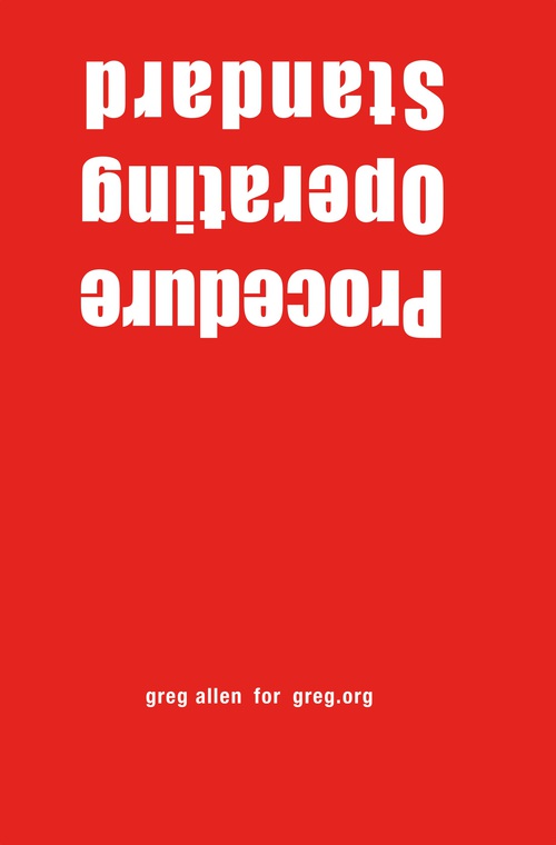
I can’t not do something, so I have published the three sets of detainee treatment regulations, known as Standard Operating Procedures, as a book. Which, believe me, I know. I feel a bit like an outraged @Powhida jamming @BarackObama into all his tweets, until the non-effect wore him out.
It’s weird feeling compelled to do something that you recognize is irrational and irrelevant. But again, I can’t not do something, and this is one thing I do. And with all due respect to Richard Prince, this text, as it is, and as it drives the world, is the kind of thing I feel must be propagated and put examined and contextualized if appropriation, or art, or attention, really, is going to mean anything at all.
Standard Operating Procedure includes the SOP Manual for Camp Delta, the prison side of GTMO, which was implemented in 2003. It’s 240-some pages, not including the various classified appendices for detainee transport and adjudication, which have not, apparently, been released. It also contains the 2003 version of SOP for the detention hospital for “Voluntary and Non-Voluntary Total Fasting and Re-Feeding,” which has several p.ages completely redacted. And then there’s the May 2013 revision to those procedures, which are contained in an SOP for the Joint Medical Group for the “Medical Management of Detainees on Hunger Strike.” That’s the regime the detainees are currently under.
Of course, as Leopold and others continue to report, the situation of detainees is even worse than what these SOP prescribe. There are indications that regulations are extensively, if not routinely ignored by guards and prison commanders. These primary documents embody the best case scenario for people who have been cleared for release for years, but who remain in harsh, indefinite, imprisonment.
So whether you buy the book [which should be is finally available to order this weekend, I think; I’ve been experiencing some friction from the printer/publisher, which is kind of annoying, and it’s been going on all week.] or read the regulations in electronic format, read them, and know that they exist.
Buy Standard Operating Procedure, 284pp, unsigned edition, $15.99 +s/h [createspace]
UPDATE: Proof copy – Standard Operating Procedure is here
On James Bridle At The Corcoran
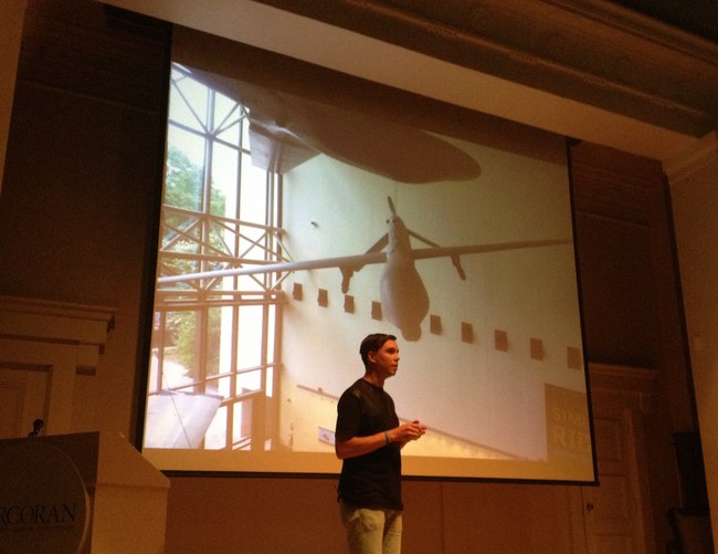
James Bridle of the New Aesthetic and Dronestagram Bridles opened a show at the Corcoran this evening, and I attended. It was the first time James and I have met in person, after several years of blogging at each other.
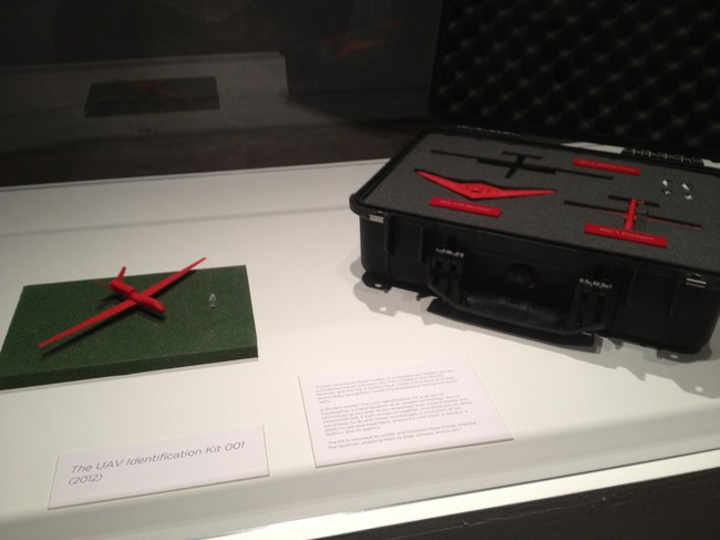
The show itself is small and drone-centric, containing a grid of Dronestagram images and Google Map dronespottings, but also video, a 10-volume printed excerpt of a UAV-related webcrawling database project in development, and Bridle’s classic drone identification kit [below].
The most stunning and disturbing image in the show is a realization Bridle made of the “Light of God,” a nightvision goggle-eye view of a targetting laser descending from the heavens. It’s based on a drone pilot’s commentary in an Omer Fast video, and it’s gorgeous, eerie, and chilling as hell.
During his talk in the adjacent auditorium, Bridle began by mentioning how he is compelled to make physical the things he studies. His most powerful piece, the life-sized outline of a drone drawn on the ground, is an excellent example of this.
In answer to one of the last questions, about materialist formalist dialectic, Bridle noted how he often found himself making an object of something from the network, in order to photograph it and reinsert it into the network. The Corcoran show feels like this: a physical instantiation of digital content.
The idea for the show, or particularly, for Bridle to be the go-to guy for such a show, more than just The New Aesthetic Guy, but certainly that, came from the Corcoran’s IT department, said the curator who introduced the evening. I will choose to take this as evidence of the Corcoran’s cross-disciplinary innovation and flat organization, not as a sign of a vacuum at the top of the institution. Anyway, the whole affair seems closely linked to the school side of the Corcoran, i.e., the still-functional side. The crowd was crowded, and felt student-heavy.
Anyway, James Bridle. Bridle noted that we in Washington are lucky to have a real Predator drone in our midst, right there at Air & Space Museum. It is exceedingly rare, he said, and he would know, to be able to be in the presence of an actual drone. They’re either largely invisible, or they’re bearing down on your village. And there’s one hanging on the Mall.
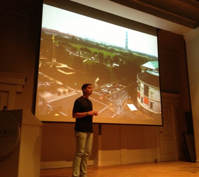
And now there is the shadow of one, the outline of one, really on the sculpture pad of the Corcoran. That’s how it’s described, as being sited on the sculpture pad. Obviously, it doesn’t begin to fit on the sculpture pad. It’s painted on the pad, the rocks, the curb and sidewalk, with white paint of some no doubt temporary kind.
It is much bigger than you might imagine, which is exactly the point. That, and imagining it being overhead and casting a shadow on the ground, the thing a Pakistani wedding party might see right before the missile hits.
Bridle noted as to how not many people will get to see this privileged view from above. I would note that White House staff in the Eisenhower Old Executive Office Building will get to see it every day, and that right there is quite something.
But he’s right, and it underscores his point, that the drone outline reads quite differently from the ground. It’s not Nazca Lines different, but that’s the sense of it.
I asked James later how he’d decided which way to point the drone. There was really only one good way to fit it, he said, and also, he knew he didn’t want to aim it at the White House. Which is understandable. When he installed his first drone drawing in Istanbul, Bridle similarly made sure not to aim the drone at Mecca. In consciously not aiming at the White House, Bridle’s drone ends up feeling like it’s coming directly from the White House. Which probably intensifies its critical position a bit. It worked for me, at least.
In between these moments was a cogent, timely, and depressing talk about technology as a tool of control and a reflection of the political and social systems that foster and use it. If it was recorded or streamed, I will try to find a link.
Meanwhile, as I walked around the drone on my way home, I did think of one piece missing. Not to tell James how to do his job or anything. But it occurs to me that the sound of drones is distinctive and terrifying. Perhaps a sound element to recreate the perpetual presence of drones in the vicinity of the Corcoran, would provide a visceral experience. Who knows, it might even wake the neighbors.
Indeed: Corcoran College of Art & Design: Quiet Disposition by James Bridle, through July 7, 2013 [corcoran.edu]
This Scaffolding Has No Title Yet

Here’s a shot I took today of the scaffolding around the Washington Monument for its post-earthquake restoration.
Every time I go by I think how awesome it would be, and until I hear or see otherwise, I’ll just keep hoping and assuming it’s the case that, instead of Michael Graves’ tired, pomo cartoon scrim, the National Park Service is actually encasing it Budweiser cans, installing a massive adaptation of the 1989 work, This Piece Has No Title Yet, by DC’s own Cady Noland.
What? I’m sure Don and Mera could totally make it happen!
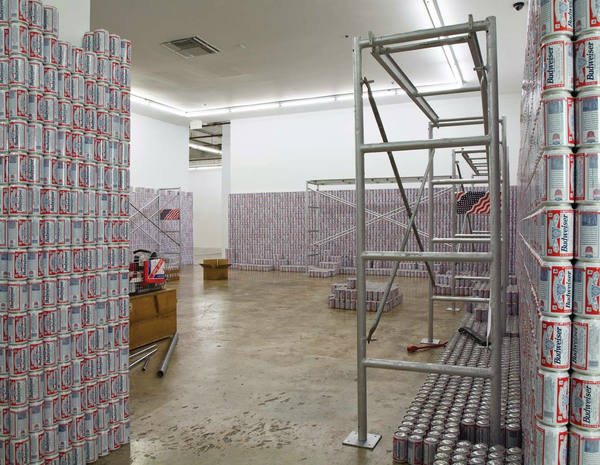
This Piece Has No Title Yet, 1989, Dimensions variable, you guys! [rfc.museum]
The Hirshhorn Is A Special Venue In Search Of Events
DAY AFTER UPDATE: Whoa, well, then. The Hirshhorn board split and Koshalek announced his resignation by year-end. What a way to go.
While designer Liz Diller made her politico-architectural case for The Hirshhorn Bubble in her 2012 TED talk, the Museum’s own justification for the project has been unclear and uncompelling.
Explanations center on making the Hirshhorn “an agent for cultural diplomacy.” In February director Richard Koshalek told Kriston Capps, “This institution should be the leader in terms of setting arts and cultural dialogue. Cultural policy is set in Washington, D.C.” This is debatable enough, as both mission and content.
The programming that’s always discussed, though, a “Center for Creative Dialogue,” involves conferences and discussions created by the Council on Foreign Relations and outside staff, not the Hirshhorn itself, or even the Smithsonian. Critics of the Bubble vision like Tyler Green note this disconnect, and that the Museum doesn’t need a bubble to host such policy-flavored forums and events; they could do it right now, in the existing auditorium. And in fact, they did just that last Fall, where a capacity crowd watched TV journalist Judy Woodruff moderate a panel on “Art and Social Change” during to the Ai Weiwei exhibition.
No, The Bubble is a thing apart, apparently, from the programming that would inhabit it. Its absurdist form on this symbolic site, and the transgressive gesture towards Gordon Bunshaft’s concrete donut, are meant to be self-justifying. Capps calls it “a public art stunt,” and the Washington Post suggests it could “break DC from stagnation.” It’s starchitecture as spectacle and a catalyst for attention and, eventually, one hopes, the holy grail of Washington existence: relevance.
Meanwhile, it’s amazing that until Capps’ reconsideration of the project last winter in the City Paper, there was no mention of what would be, for lack of a better term, the business model: The Bubble would be a for-hire event space.
Koshalek swears the Inflatable will engage the Hirshhorn’s curators, too. When the Bubble is inflated, part of its programming will correspond with whatever’s lining the gallery walls of the museum. The rest of the timeshare will go to whichever universities, think tanks, and corporations rent it out–a money-making proposition for the Hirshhorn which could lead to exclusive uses not quite in keeping with Diller’s civic scheme. (And certainly not with the museum’s artistic mission.)
Continue reading “The Hirshhorn Is A Special Venue In Search Of Events”
Big Swingin’ D[iller]
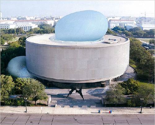
The Hirshhorn’s board is scheduled to vote on whether to proceed with The Bubble, the most prominent initiative of director Richard Koshalek since he arrived at the museum in 2009.
Even though The Bubble was the subject of one of my all-time favorite posts, I have not written much about it since. I have reservations about it, but I have only wished the museum’s success, and so have been willing to give the current regime the benefit of the doubt as they pursue their vision.
But that has been a vague slog, and far from a sure thing. It’s remarkable that the board which hired Koshalek is apparently reluctant to support his efforts to do what they presumably hired him for: raising the profile of the Hirshhorn, and raising money for the Hirshhorn and its exhibitions, acquisitions, and educational programs.
Maybe that is because there are persistent and unaddressed issues with The Bubble and its ostensible purpose. It is true that Koshalek’s stated vision for The Bubble–to host some kind of cross-disciplinary cultural forum, with content generated not by the Museum, or even the Smithsonian, but by the Council on Foreign Relations–still comes across as squishy and alarmingly unconcerned with actual art and artists. That disconnect is even more inexplicable for being unnecessary.
About The Bubble itself, though: I didn’t care much either way before, but after watching Liz Diller’s TED talk from March 2012, I am really starting to sour on Diller Scofidio + Renfro’s design and their entire approach. Titled “A Giant Bubble for Debate,” Diller’s speech is the rare, unmediated, extended discussion of The Bubble by a principal. As such, it’s worth a closer read.
For Diller and her client, who wants to take advantage of the Museum’s unique and symbolic site “at the seat of power in America,” the National Mall, “the question is, ‘Is it possible, ultimately, for art to insert itself into the dialogue of national and world affairs?’ and ‘Could the Museum be an agent of cultural diplomacy?'” Technically that’s two questions, which not only are not answered, but which beg more questions–insert itself to what end, and agent for whom?

“I blush whenever I show this,” says Diller of the slide above, to laughter. “It is yours to interpret.” Wait, what? So I guess she interprets this insertion into the Hirshhorn’s hole as a phallus? Or given the material, I guess it could be a sex toy, or a condom? Or at least some flavor of kink, given the “study of some bondage techniques” that went into the tension cable design on the next slide?
Diller continues: “We were asked by the bureaucracy at the Mall, ‘How long would it take to install?’ And we said, ‘The first erection will take one week.'” And if it lasts longer than that, I guess, call your architect.
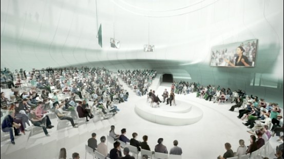
Diller shows the interior space of The Bubble in use, with renderings of a panel discussion in the round; a spotlit performer; a movie screening; and a Barbara Kruger-style text projection. In every instance, the activity is the same: an audience sits and watches something happen. This “breath of democracy” turns out to be just more entertainment and spectacle. And this purportedly transgressive, iconoclastic structure does absolutely nothing to change or challenge the programs of the Mall’s museums Diller just criticized, or by extension, the structures of power she pretends to subvert.
Diller’s claim that her structure, built to house extravagantly ticketed events like TED, the WEF, and CFR fora, will somehow embody “the ideals of participatory democracy” is obviously nothing but hot air.
Which is still just part of the problem, seeing as how the ideals The Bubble is embodying are those of pay-to-play capitalism. More on that in the next post.
Barnett Newman Sculpture In Specific Sites
Listening to David Diao’s amazing talk on Barnett Newman at Dia a few weeks ago, and then seeing his painted references to Newman, and especially to the 1966 Guggenheim catalogue for Lema Sabachthani, the debut exhibition of Stations of the Cross reminds me that Newman’s work has been experienced and considered quite differently than it is today. [The Internet Archive has digitized Barnett Newman’s The Stations of the Cross catalogue, btw.]

Which reminded me of these old photos of Newman sculptures. The top one’s from 1967, the first installation of Broken Obelisk at the Corcoran, the museum which commissioned it. It was included in the same large-scale sculpture exhibition as Tony Smith’s Smoke and whatshisname’s giant X.
This, first edition was removed from the Corcoran in 1969 [according to Washington Post courtier/reporter Paul Richard, there was turmoil after the departure of the museum director. Go figure.] and was eventually installed at the Rothko Chapel in Houston, dedicated after the fact to the memory of Martin Luther King. But there are a couple more. Has a Broken Obelisk ever been exhibited in DC since? And I keep looking for a photo of it from the other angle, with the actual Washington Monument. I mean, that shot was possible, wasn’t it? [Yes, from the FDIC building, apparently.]
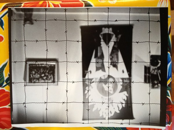
And this one, which blows my mind, is Lace Curtain for Mayor Daley, a grid of barbed wire across a cor-ten window frame. Newman made it for a series of protest exhibitions hastily organized by Richard Feigen and Claes Oldenburg, after Chicago police attacked anti-war protestors at the Democratic National Convention. [Oldenburg was one of those beaten.] Annalee gave Lace Curtain to the Art Institute of Chicago in 1989, which has exhibited it only rarely.
Like I said, the perception of Newman’s work has been quite different than it is today.
On Jack Smith, And Also Agnes Martin
While huh, wtf? investigating the backstory of this tweet this morning, I was reminded of the time Strom Thurmond screened Jack Smith’s Flaming Creatures at the US Senate in 1968:
Some mailboxes that were confiscated by police when Jack Smith mailed his Beautiful Book. Collection, Fulton Ryder. [pic missing]
— Richard Prince (@RichardPrince4) February 2, 2013
Which, wow, has it really been two years since “Hide/Seek”? I found videos of the symposium presentations I was stunned by in 2011:
Jonathan D. Katz on Agnes Martin, abstraction & sexuality, and Zen [“and though she was not a practicing Buddhist, she did her best to both look and sound like one,” strikes me now as a heckuva hook, but keep watching.]
Dominic Johnson on disgust and Jack Smith’s Flaming Creatures, and the context for the Senate hearings and screening, which had been “confirmed” by the courts as obscene.
I assume Johnson’s book Glorious Catastrophe: Jack Smith, performance and visual culture, includes more information on the Thurmond screening. No reviews or discussion of the book yet? Really?
UPDATE With this recollection of that paragon of traditional virtue that was the late segregationist senator from South Carolina, we note the passing of Ms. Essie May Washington, 87, Strom Thurmond’s secret daughter, who was born to his family’s 16-year-old African American maid when Thurmond was 22.
Brought A Trailer

I hate malls in general, Tyson’s in particular, and Tyson’s at Christmas most of all. So I was beyond annoyed that it was the nearest/soonest Genius Bar appointment when the foot came off my laptop.
All was forgiven, though, when I saw this slightly amazing portable building. An office module on a trailer.

I do not know what it was for–I didn’t notice that now-obvious sign by the steps. And I don’t know whether to put it in the tiny home, prefab, shipping container, or cabin porn category.
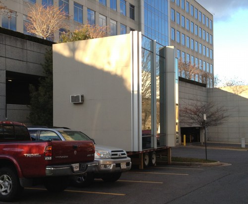
It’s really one space on the inside. With a window unit A/C, a little bit of a hack. It looked a little shabby, i.e., used, broken in, so it presumably wasn’t [just?] a materials/color mockup for reskinning a nearby office building.
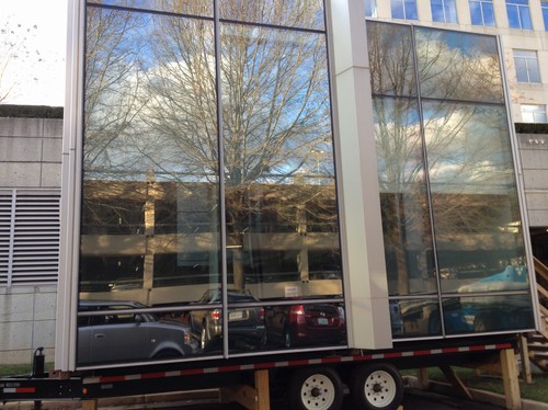
If it’s a temporary building, though, such as one might find on a giant construction site like the one enveloping the entire Tyson’s Corner area, we should definitely give credit where it’s due; this thing is far sweeter than the standard issue site office.
The sad part is, now that I’ve insulted their mall, I feel bad about calling and asking what it’s for. Maybe someone else can be the citizen journalist here and cold call the mall with a, “What’s this awesome thing I saw on the internet?? You guys are so awesome!”
Supreme Sforza
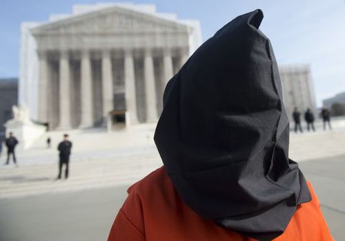
image: protestor in front of the US Supreme Court on Jan. 8, 2013, the 11th anniversary of the opening of the Guantanamo prison. by Saul Loeb for AFP/Getty
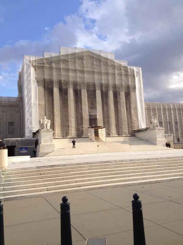
I’ve been meaning for a couple of weeks now to post a photo of the extraordinary construction scrim on the front of the US Supreme Court, which has a full-scale photo reproduction of the actual building. Here we go, since this tweet:
This is art RT @wayneandwax: whoa RT @matthewstoller: The Supreme Court is covered with a Supreme Court themed tarp.
— John Pyper (@johnpyper) December 19, 2012
I had no idea. So I looked it up. And was troubled by the fact that I had no idea it had been in place since last May. During the 21-month west facade stone restoration project, “The scaffolding and ongoing conservation work will be concealed by a scrim that will mimic the Court’s architecture.”
The Supreme Court building was designed by Cass Gilbert with John Rockart, and completed only in 1935. From its overall classical Greek temple design to the sculptures on the facades to the smallest ornamentations of the bronze flagpoles and handrails, is highly symbolic. As Chief Justice Charles Evans Hughes said at the laying of the cornerstone in 1932, its very creation and existence are symbolic:
The Republic endures and this is the symbol of its faith…the national ideal of justice in the highest sphere of activity.
So it is entirely appropriate, then, to take a symbolic view of the scrim as well, and its illusionistic simulation of Equal Justice Under Law. As symbolic curtains go, it’s the most inadvertently damning drapery since Colin Powell covered up the UN Security Council’s Guernica tapestry in 2003.
The anniversary of Guantanamo coincided with the unreleased ruling in the hearing on Pvt. Bradley Manning’s illegal and abusive detention without charge. The cancer of vengeance and torture that the US government first directed only toward foreign others has spread to its treatment of our country’s citizens.
And so the thing that gets me about Saul Loeb’s photo above is not the hooded Abu Ghraib/GTMO/Fort Meade protestor, or the Court’s photogenic tarp, but the police officers spread long the steps between them.
Interesting, related, and surprisingly full of scare quotes for a 2009 show: Ben Street’s review of Goshka Macuga’s Whitechapel installation about Guernica, which included the UN tapestry.
Study For A Fence And A Wall (2006)
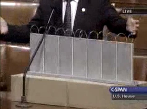
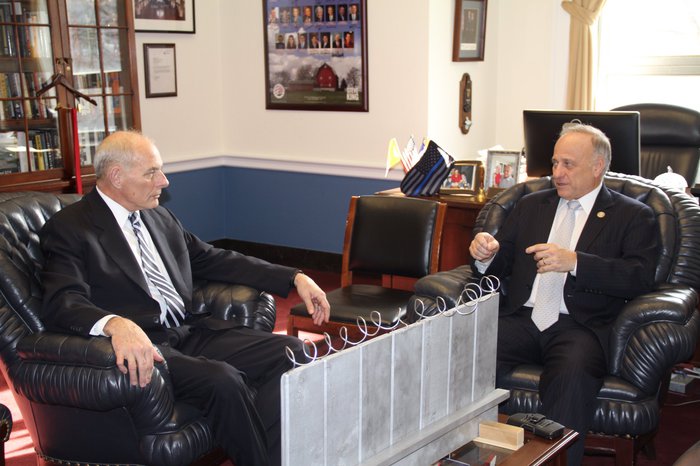
On July 11, 2006, on the floor of the US House of Representatives, Congressman Steve King, Republican from Iowa, presented a model of “a fence and a wall” he had designed. It was a site-specific proposal, to be located on the US-Mexico border.
The fence/wall could be built, Mr. King explained, using a slipform machine to lay a concrete foundation in a 5-foot deep trench cut into the desert floor, a gesture that immediately brings to mind the Earth Art interventions of Michael Heizer. Pre-cast concrete panels, Post-minimalist readymades 10 feet wide and 13 feet high, could be dropped in with a crane.
“Our little construction company,” Mr. King said, referring to the King Construction Company, which he founded, and which was then being run by his son, “could build a mile a day of this, once you got the system going.”
Mr. King demonstrated the construction of the wall using his tabletop model, made of cardboard boxes, silver-painted wood slats, and a couple of feet of coiled wire [representing the wall’s crown of concertina wire, which would be electrified “with the kind of current that would not kill somebody…we do that with livestock all the time.”]
It’s true that the remarkable simplicity of the design and the economy of the materials resonate the work of Richard Tuttle. But in the scale and especially the form, King seems to be making a conscious reference to the early work of Anne Truitt.
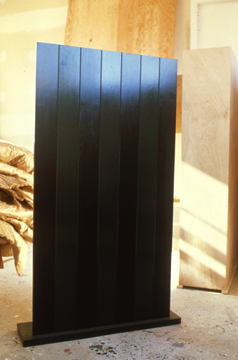
Seven, 1962, image: annetruitt.org
Obviously, at some point after his arrival in Washington in 2003, King studied the iconic Truitts in local collections: the highly fence-like First (1961) [at the Baltimore Museum] and slab-on-plinth structures like Insurrection (1962) [at the Corcoran]. But even I was surprised to see King make such an explicit homage to Truitt’s Seven (1962) [above, collection of the artist’s estate].
Much like Christo and Jeanne-Claude, King conceived of his site-specific fence/wall to be temporary, at least conceptually:
You could take it back down. If somehow they got their economy working and got their laws working in Mexico we could pull this back out just as easy as we could put it in. We could open it up again or we could open it up and let livestock run through there, whatever we choose.
Whatever we choose. Thus the fence/wall becomes a symbol of American freedom.
According to the Congressional Record, Mr. King, appearing as an expert witness, exhibited his Study For A Fence And A Wall again a week later, in a joint hearing of the House Committees of Homeland Security and Government Reform.
The current whereabouts of King’s model is not immediately clear, but I guess I could call about it. Meanwhile, I would love to see this work realized at full scale, if only temporarily, where it was conceived: right here in Washington DC. Perhaps in the National Gallery’s sculpture garden, or along one of the sketchier sections of Pennsylvania Avenue, where dangerous elements threaten Our Freedoms.
January 2017 inevitable update: Oh how we did not need to worry that this work might not have survived. On Jan. 13 Congressman King tweeted out a photo with it, and the new appointee for DHS. Study was installed on his coffee table in his office. It will be noted that it has a new base, set in unpainted wood feet, presumably a pair. The articulation of the wall at the ground and the underground footing are now fully visible. The box representing the desert floor, and the notch, where “you put a trench in the desert floor.” are not seen. What was once site-specific is now available for installation anywhere, I guess. Though it’s really tough to say at the moment.
Thinking About Art, Politics, And Milton Glaser’s Mural
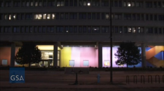
I’ve been wanting to write about Color Fuses, Milton Glaser’s 1974-5, 27×672-foot gradient mural in Indianapolis, all week, ever since Richard McCoy’s great Art21 post about the GSA’s restoration of the work’s 34 monochrome sections, and the realization, finally, of Glaser’s original lighting effects.
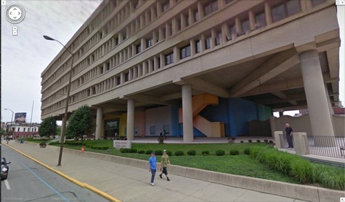
image: google maps
Besides my well-documented fascination with monochromes and gradients, I found myself intrigued by Glaser’s stated purpose for the mural, which wraps around the stark, ground-level loggia of the Minton-Capehart Federal Building, designed by local modernist eminence and Philip Johnson alumnus Evan Woollen. Glaser wanted to create “a mural that would express a spirit of openness and thus a new sense of government.”
The architect, for his part, hoped the mural would help make the building feel “cheerful, disarming, fresh, welcoming, and inviting.” Which is, let’s face it, a helluva thing to hope for your Brutalist, concrete, ziggurat superblock.
[Walking around the building on Google Maps gives a nice sense of the mural in daylight, including the backside, which is across the parking lot, and the bluish south end, which is largely blocked by privacy wall around the building’s daycare center. Even ignoring the unfortunately undulating wall–an out-of-place motif picked up by the single, sad wave of shrubs on the building’s strip of security plinth grass–the Minton-Capehart can only be my second favorite example of brutalism and daycare, way behind the playground on the plaza of the J. Edgar Hoover FBI Building.]
So I’m inclined to believe that the project went down a little differently at the time, a time when the GSA had revitalized and professionalized its Percent For Art program under the 2nd Nixon administration. [A distracting sop to the elites, he figured.] It’s not clear, for example, whether Glaser came to the project under the new system, as a world-class, committee-reviewed pick, or the old way, in which case he would have been suggested by, and thus, subsidiary to, the architect.
Which would be interesting to know, because another benefit of not blogging about immediately, is reading Alexandra Lange’s post about how modernist architects [occasionally] recognized that their severe forms might [just sometimes!] have needed a bit of humanizing.
But then watching the GSA’s video of the original/new lighting scheme, which adds slow ripples [undulations!] of light/dark around the building, I immediately thought of art. Specifically, Paul Sharits, who had been making painting-like, flickering, multi-projector, monochrome film installations for several years already when Glaser created his mural. [Writing about Sharits’ 1972 piece, Soundstrip/Filmstrip, Rosalind Krauss said it “muralizes the field of projection.”]
Paul Sharits’ Shutter Interface, first shown at ArtPark in NY in 1975, here at Greene Naftali in 2009.
And I wondered about the different ways art functions, and is treated, both at the time and through the lens of history and criticism. Partly because I’d never heard of Glaser’s mammoth mural before. Or of any other art he’s made. It seems to fall into this population of things people commissioned, made and showed, that are/aren’t/look like/function as art, which are [happen to be?] made by designers. And which are excluded from consideration within the context of art and art history. And politics is at the center of this boundarymaking.
The clearest example of this is the US Pavilion at Expo 67 in Montreal, the geodesic sphere designed by Peter Chermayeff and his exhibition firm Cambridge Seven Associates. Which had both spacecraft and satelloons and flag-like, Ellsworth Kelly-like supergraphics, and giant, commissioned paintings from the likes of Barnett Newman, Warhol, and Johns.
I don’t know yet how to make sense of Glaser’s mural, but I bridle at what I instinctively feel, that despite its awesomeness and Glaser’s immense influence, Color Fuses is somehow a less significant work because it’s art by a designer. Or art for the government. Or art the architect will put up with. Especially when I read Glaser’s intentions for the piece, which, by 1974, transparency and a new form of government were certainly on a lot of peoples’ minds.
And finally, last night, I found Hillman Curtis’s video profile of Glaser on Brainpickings, where the designer talks about art’s role in culture. It’s “benign” and “pacifying,” he says, and succeeds best when it creates “commonalities” by which “the likelihood of us killing each other is diminished.”
Again, I don’t think that perspective has been very prominent in the art world discourses of the day. It could be dismissed as hyperbolic, an at once idealistic and yet embarrassingly low bar. And yet, lately, the polarization in our cultural and political spheres make me wonder if not throttling each other is actually something we’d do well to focus on. Even if pacification by painting undulating rainbows on government buildings is not the best role demanded by the times for art.
Restored & Renewed: Milton Glaser’s 1975 Artwork, “Color Fuses” [art21.org]
Color Fuses’ Mural Restored at Minton-Capehart Federal Building [gsa.gov]
Art Matters To Architecture [designobserver]

