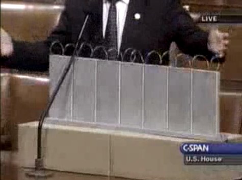
On July 11, 2006, on the floor of the US House of Representatives, Congressman Steve King, Republican from Iowa, presented a model of “a fence and a wall” he had designed. It was a site-specific proposal, to be located on the US-Mexico border.
The fence/wall could be built, Mr. King explained, using a slipform machine to lay a concrete foundation in a 5-foot deep trench cut into the desert floor, a gesture that immediately brings to mind the Earth Art interventions of Michael Heizer. Pre-cast concrete panels, Post-minimalist readymades 10 feet wide and 13 feet high, could be dropped in with a crane.
“Our little construction company,” Mr. King said, referring to the King Construction Company, which he founded, and which was then being run by his son, “could build a mile a day of this, once you got the system going.”
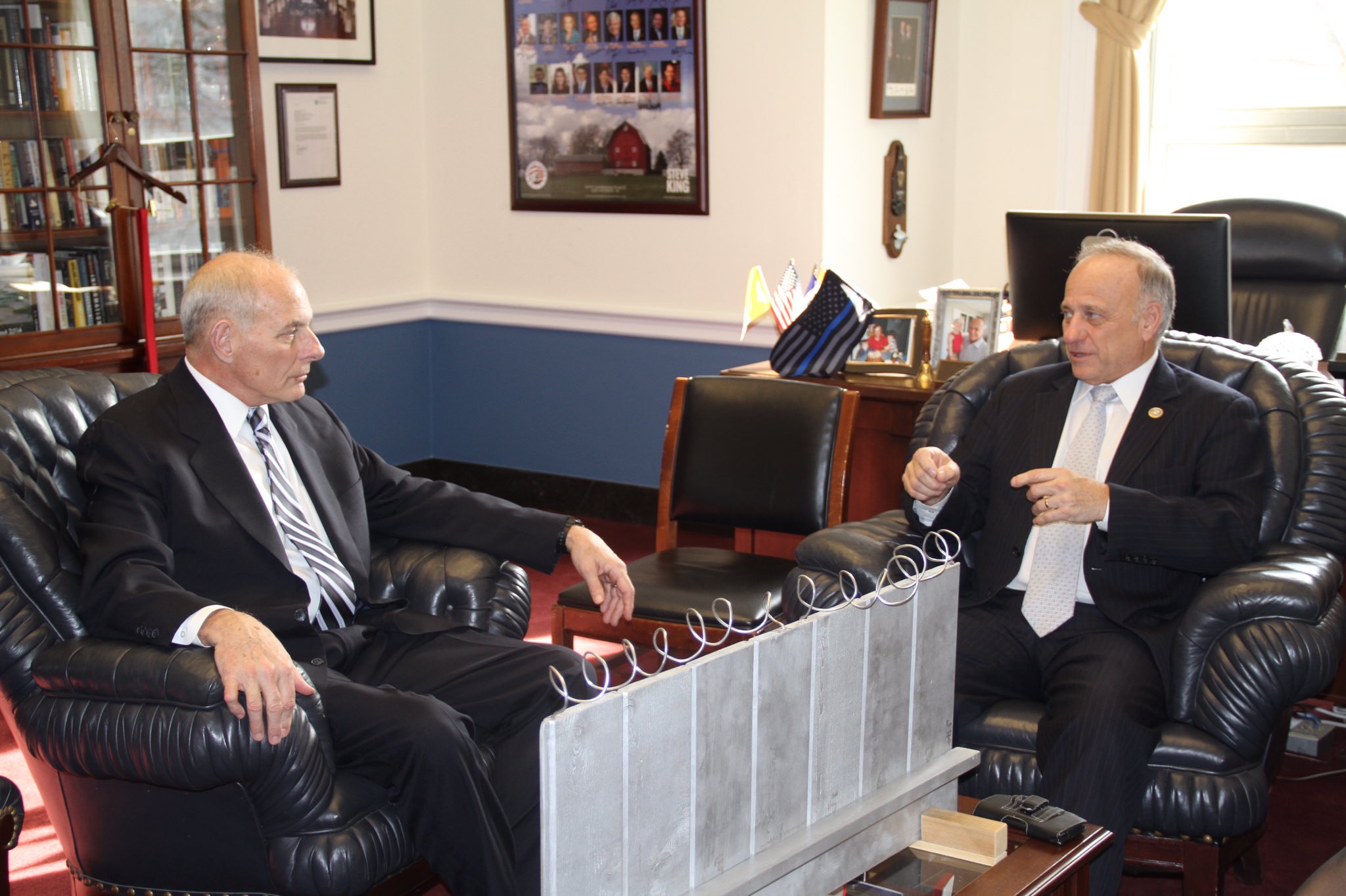
Mr. King demonstrated the construction of the wall using his tabletop model, made of cardboard boxes, silver-painted wood slats, and a couple of feet of coiled wire [representing the wall’s crown of concertina wire, which would be electrified “with the kind of current that would not kill somebody…we do that with livestock all the time.”]
It’s true that the remarkable simplicity of the design and the economy of the materials resonate the work of Richard Tuttle. But in the scale and especially the form, King seems to be making a conscious reference to the early work of Anne Truitt.
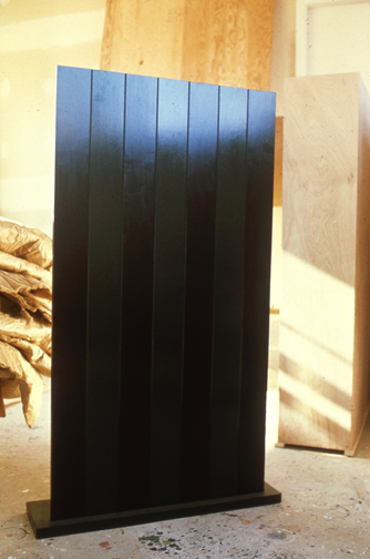
Seven, 1962, image: annetruitt.org
Obviously, at some point after his arrival in Washington in 2003, King studied the iconic Truitts in local collections: the highly fence-like First (1961) [at the Baltimore Museum] and slab-on-plinth structures like Insurrection (1962) [at the Corcoran]. But even I was surprised to see King make such an explicit homage to Truitt’s Seven (1962) [above, collection of the artist’s estate].
Much like Christo and Jeanne-Claude, King conceived of his site-specific fence/wall to be temporary, at least conceptually:
You could take it back down. If somehow they got their economy working and got their laws working in Mexico we could pull this back out just as easy as we could put it in. We could open it up again or we could open it up and let livestock run through there, whatever we choose.
Whatever we choose. Thus the fence/wall becomes a symbol of American freedom.
According to the Congressional Record, Mr. King, appearing as an expert witness, exhibited his Study For A Fence And A Wall again a week later, in a joint hearing of the House Committees of Homeland Security and Government Reform.
The current whereabouts of King’s model is not immediately clear, but I guess I could call about it. Meanwhile, I would love to see this work realized at full scale, if only temporarily, where it was conceived: right here in Washington DC. Perhaps in the National Gallery’s sculpture garden, or along one of the sketchier sections of Pennsylvania Avenue, where dangerous elements threaten Our Freedoms.
January 2017 inevitable update: Oh how we did not need to worry that this work might not have survived. On Jan. 13 Congressman King tweeted out a photo with it, and the new appointee for DHS. Study was installed on his coffee table in his office. It will be noted that it has a new base, set in unpainted wood feet, presumably a pair. The articulation of the wall at the ground and the underground footing are now fully visible. The box representing the desert floor, and the notch, where “you put a trench in the desert floor.” are not seen. What was once site-specific is now available for installation anywhere, I guess. Though it’s really tough to say at the moment.