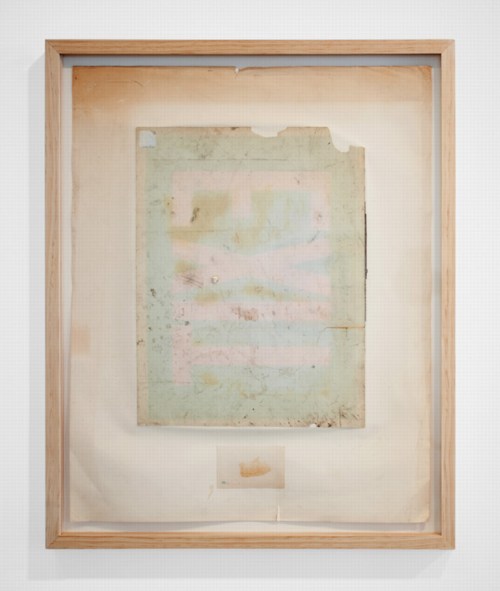
The Electronic Privacy Information Center filed a Freedom of Information Act request with the Department of Homeland Security on the government’s deployment of body scanner technology on streets and in roving vans.
These are the three pages of the FOIA report that did not come from a scanner manufacturer’s publicly available brochures and website, and that were not the publicly available agenda for a scanner industry conference.
Related: DODDOACID, one of a suite of six Redaction Paintings made in 2007 by Jenny Holzer from FOIA documents, and acquired by the National Gallery of Art in 2010 [nga.gov]
FOIA Note #20 (August 15, 2011) Government Transparency [epic.org via @wagnerblog]
Category: dc
None Of Your ‘Unfinished Business’
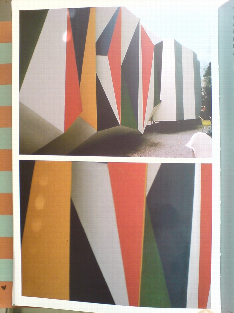
In the early Cold War of the mid-1950s, the Soviet Union countered American condemnation of its repressive actions in East Germany and Hungary with criticism of the US’s internal policies of segregation and racial discrimination. Planners of the US Pavilion at the 1958 World Expo in Brussels, the first since before WWII, warned that “the desegregation issue would be ‘underlined rather than evaded by omission.'” As longtime USIA design director Jack Masey put it in his 2008 book, Cold War Confrontations, “The Unfinished Business” Pavilion was created by Fortune magazine and/for the State Department “as a way to save face–openly and directly–[by anticipating] negative Soviet propaganda about domestic problems in the US.”
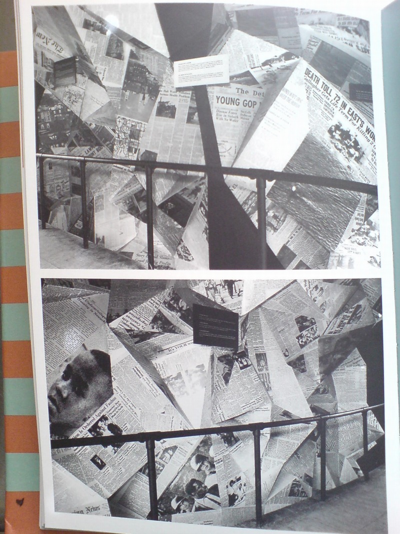
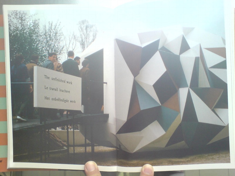
Fortune art director Leo Lionni designed both the pavilions and the exhibit as three distinct sections: past, present and future. The form of each pavilion mirrored the content of its exhibit, though none were so programmatically matched as the first pavilion, where the darkly colored “chaotic crystal” of the exterior [below]
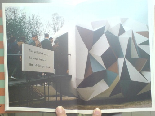
was wallpapered inside with a jumbled, kaleidoscopic collage of US newspapers. Headlines related to desegregation battles were interspersed among other front page stories, presumably to dilute the racism issue by expanding the context, and to underscore the country’s uncensored media as a site of free debate and progress.
The second, present pavilion had some quotes from President Eisenhower and other leaders, whatever, but it was the bright future pavilion that turned out to be the most incendiary. For its expansive, smooth walls featured large photomurals of amber waves of grain, and a group of happy, young children–“white, colored, and yellow”–playing in a flower-filled meadow.
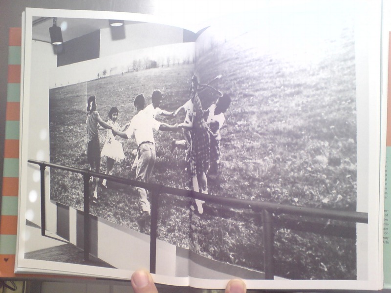
Which basically made segregationist politicians from the South’s heads explode when they found out about it. Masey gives an overview of the controversy in his book, including some declassified letters from outraged Dixiecrats to Eisenhower’s acting Secretary of State. But Michael Krenns devotes an entire chapter to the political shitstorm surrounding the “Unfinished Business” pavilion in his 1999 history anthology, The Impact of Race on US Foreign Policy: A Reader. Great stuff.
Throughout the Spring and Summer of 1958, angry congressmen criticized the exhibit for “foul[ing] the nation’s nest.” The pavilion was temporarily shut down–the official explanation was “poor craftmanship” on the part of the “Belgian carpenters” who somehow failed to properly execute Lionni’s original concept. By including too many news clippings about Little Rock and Gov. Faubus. Leonni hustled to Brussels to make ordered changes to bring “balance” to the desegregation issue.
They even posted a disclaimer that children of various races playing together “did not represent US policy, but was representative of the freedom of choice available in the US.” And still Georgia’s segregationist senator Herman Talmadge protested, demanding an end to exhibition’s “unwarranted invasion of the rights and prerogatives of the states of the South.”
Faced with calls for a congressional investigation that could turn “The Unfinished Business” into The Neverending Business, the Eisenhower administration caved, and by mid-summer, the State Department shut down what the European press had called “the most effective propaganda in the American Pavilion” and replaced it with an exhibit about the unfinished business of public health.
The Unfinished Business Pavilion, By Leo Lionni

What’s the opposite of writer’s block, the thing where you have so much damn good stuff to write about, you’re paralyzed into inaction? Because that’s what I’ve got, and August vacation voids or not, I just can’t help it; I’m gonna blog it all and let Google sort it out.
 For example, for all the dome- and Expo-loving going on around here, you’d think by now I would have gotten my hands on a copy of Jack Masey and Conway Lloyd Morgan’s 2008 book, Cold War Confrontations: US Exhibitions and Their Role in the Cultural Cold War, but no.
As the longtime design director for the US Information Agency, Jack Masey was basically the client, or the producer, of the expo-related architecture, art, media, domes, pavilions, exhibitions, and propaganda that folks like Buckminster Fuller, Shoji Sadao, the Eameses, and George Nelson became famous for.
Cold War Confrontations is a fantastically surfable book, a thick, highly visual memoir of the USIA’s greatest hits. It’s based on the premise that the structured, official propaganda pageants of world expos, culture exchanges and trade shows, played pivotal roles in the course of post-war world history:
At Expos, however, the teams are not playing games; rather, they competed by presenting to the world examples of a nation’s best architecture, technology, arts, crafts, manufacturing, and performing arts. And in so doing, they sometimes, somehow, change the world. [p. 110]
There were many people who believe[d] that to be true. I sort of want it to be true, at least in the same sense that I’d rather see street gangs settle their differences by breakdancing instead of drive-by shootings. Maybe it’s better to see these expos as reflections of the cultures that produced them, or of their aspirations. Because the views expressed therein do not, it turns out, necessarily represent the opinions of the United States of America as a whole, or of their elected representatives and/or government officials.
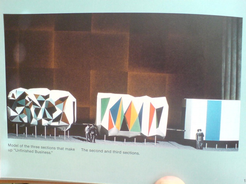
Case in point: The “Unfinished Business” pavilion, designed by Leo Lionni [!] for the 1958 Brussels World Expo. Holy Smokes, people.
Masey tells a longer version of the story in the book, but here’s a condensed version: in 1956, a team that included Boston ICA director James Plaut consulted with MIT economist Walt Rostow on the contents of the official US pavilion, which was being designed by Edward Durrell Stone. The idea was to emphasize the US’s people and cultural accomplishments. Rostow’s team also called on the US to be frank and self-critical in recognizing its “unfinished business,” by which they meant “soil erosion, urban decay, and race relations.”
Somehow, though the giant, donut-shaped pavilion had room for a Vogue fashion show on water; a proto-Pop, pseudo-combine street sign streetscape; and a giant, aerial photomural of Manhattan installed in a half-pipe [WTF!? I don’t know! We’ll come back to it!]; there wasn’t room to “address ‘the Negro Problem.'” And so somehow [?] Henry Luce’s Fortune magazine became the State Department’s partner/sponsor of a smaller garden pavilion devoted to “Unfinished Business,” and the magazine’s creative director Leo Lionni designed it.
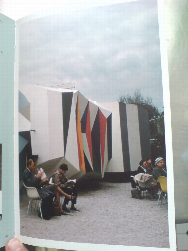
That’s the model above, and it looks pretty damn close to the real thing. Lionni conceived of three linked, raised pavilions, each about six meters long, as a frankly allegorical timeline, in which America’s problems get literally smoothed out. Or as Masey put it, “the content of the interior was also to be conveyed through the exterior.” Which means that the somber, “chaotic crystal” of the past had already given way to the much brighter, Family of Man-colored present. A little more ironing and the square, orderly, utopian future was just steps away. That was the concept, anyway, but that’s not exactly how it turned out.
[to be continued in the morning]
Buy Cold War Confrontations: US Exhibitions and Their Role in the Cultural Cold War on Amazon [amazon]
Out Of ‘Out Of Practice’
Away | Out, 2010, Seth Adeslberger via
Seth Adelsberger’s evocation of Erased de Kooning Drawing in this work on found paper manages to be both calculated and offhand. It was one of my favorites in “Out of Practice,” Baltimore gallery Nudashank’s sweet show about studio and process in Joshua Abelow’s temporary Art Blog Art Blog space. It closes today, so hop to.
Out of Practice, through June 18 [artblogartblog.com]
Nudashank is an awesome Baltimore gallery [nudashank.com]
Seth Adelsberger portfolio site [sethadelsberger.com]
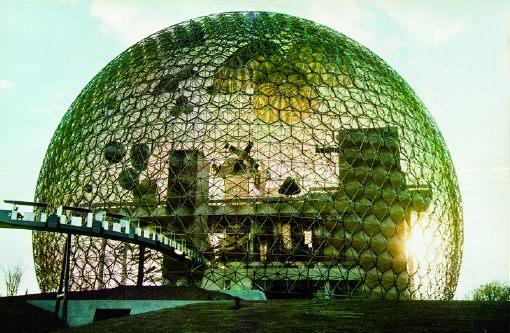
In Afghanistan Did Buckminster Fuller A Statecrafty Geodesic Dome Erect
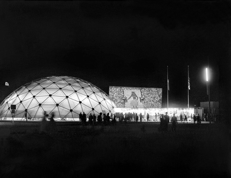
US Pavilion at Jeshyn Fair, 1956, photo by James Cudney
In the Spring of 1956, as the Jeshyn Fair celebrating Afghan independence approached, and the Soviets were well along in constructing a massive pavilion, US diplomats in Kabul thought the US better have one, too.
A USIA officer named Jack Masey commissioned Buckminster Fuller to create a 100-foot diameter geodesic dome in two months. His Raleigh, NC-based firm, Synergetics, Inc., apparently completed it in one.
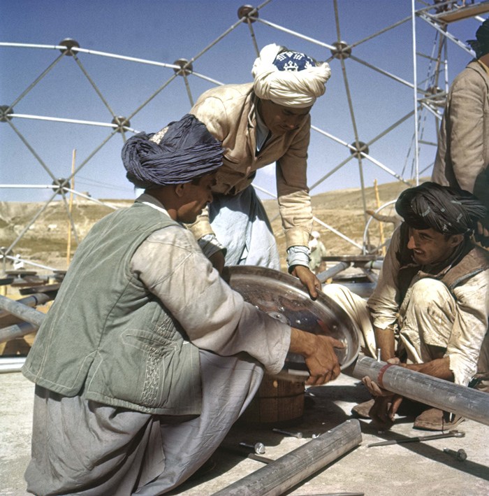
Pashto laborers assembling Buckminster Fuller dome, 1956, photo by Jack Masey
It was airlifted to Kabul, where a crew of local Pashto erected it in two days. The aluminum & plastic-coated nylon dome tent pavilion was a hit, “perhaps the most significant cultural event” of the “golden age” of US-Afghan relations, according to the creators of “In Small Things Remembered,” an exhibit looking at the history of the two countries’ relationship.
The show, which closed yesterday at the Meridian International Center in Washington, DC, was organized by Dr. Curtis Sandberg, VP of the Arts at Meridian, and sponsored by the State Department. It comprised photos discovered in various archives and foreign service officers’ private collections, such as Masey, above, and James Cudney, top, who spent eleven years in Afghanistan taking pictures, and developing various photography- and media-based culture, education, and diplomacy programs. Cudney passed away in 2009, but some more of his Afghan photos can be seen in the previews of two 2010 calendars he or his family created on lulu.com. They look pretty amazing.
Anyway, the US Information Agency and Dept. of Commerce continued to use the Kabul dome for trade fairs across Asia. As USIA’s director of design, Masey would go on to select Fuller to build the US Pavilion at the Montreal 67 expo, too.
In Small Things Remembered, at Meridian through June 5 [meridian.org]
Richard Serra Was Not Pleased With The US Government.
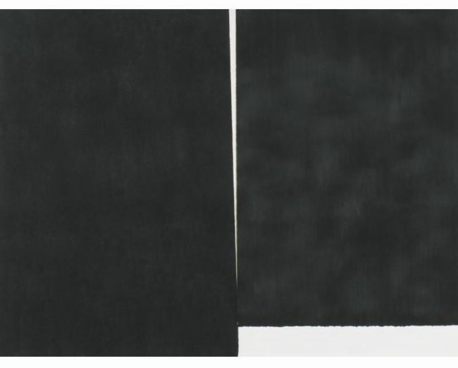
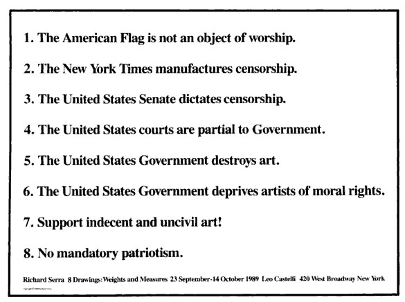
Richard Serra, The American Flag is not an object of worship, 1989, 288 x 376 cm
One of the artworks ImClone CEO Sam Waksal bought from Gagosian but didn’t pay sales tax on in 2000 was a huge, $350,000 Richard Serra drawing titled, The American Flag is not an object of worship.
Interestingly, when the drawing sold at Sotheby’s in 2004 [for $232,000 against an estimate of just $80-120,000. There really ought to be a word for a deal where you weasel out an 8.25% “discount” after dumbly overpaying by 50-300%. Maybe a Waksale.], the provenance only mentioned collector/Dia board member/Kim Heirston dater Dr. Pentti Kouri [who passed away in 2009] and the Leo Castelli Gallery, where the work was originally shown.
And what a show it was.
“8 Drawings: Weights and Measures” opened in September 1989, in the wake of the Tilted Arc controversy, and six months after the 1981 sculpture was removed [and according to the artist, “destroyed”] from Federal Plaza in lower Manhattan. And from the titles Serra gave the massive paintstick on paper works, I don’t think he’d quite gotten over the loss.
Poster/flyer for “Richard Serra 8 Drawings: Weights and Measures”
There’s a room in the Met’s Serra drawings retrospective with several works from the Castelli “Weights and Measures” show, including The United States Courts are partial to the Government [105×185 in.], No mandatory patriotism [93×201 in.], and the massive The United States Government destroys art [113×215 in.], which is owned by the Broads.
I can’t find out online, and I don’t have my Serra drawings catalogue raisonné with me to check, but it would be interesting, if maybe a little too neatly literal, if the cumulative dimensions of the eight “Weights and Measures” drawings added up to 120 feet, the length of Titled Arc. It’d turn the drawings into fragmented shadows of the lost sculpture, ghost slabs floating in a gallery before being dispersed to haunt collections around the world. Serra’s not averse to coding such biographical or historical references in a work’s dimensions; I seem to remember hearing that the dimensions of the six forged steel blocks in his 1996 sculpture 58 x 64 x 70 were derived from his and his wife Clara’s eye heights. [I can’t find any mention of that now, though; I’ll have to check.] Anyway, TBD all over the place.
[UPDATE: thanks to the Communications office at the Met for sending along the checklist, which also includes the dimensions of the other two W&M drawings in the show. The four drawings mentioned here do, in fact, add up to 62 linear feet. So a 120 ft total is in the realm of the possible.]
2015 UPDATE: yes, but maybe not? I can’t believe I never published the result of this research, but I did gather the dimensions of all the W&M drawings, and they ran about 117 linear feet. If they each have 4.5-in larger framed dimensions, they’ll add up to 120 feet, but I doubt Serra’s numerological interests would incorporate frames. I’d love to be wrong about that and right about the dispersed, destroyed ghost of Tilted Arc, but I think it’s the other way around. Oh well.
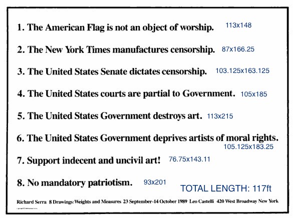
Weights & Measures, annotated, dimensions in inches
Curators Gonna Curate, Politicos Gonna Politick
Tom McCormack’s lengthy look at the contentious, suspicious history of US government support for the arts is worth reading for itself. But it also got me off my butt to write something that’s been bugging me since attending the Smithsonian’s Flashpoints and Faultlines symposium last week.
I had no plans to go to the symposium, primarily because it seemed like such a transparent attempt to ride out the Smithsonian’s “Hide/Seek” censorship mess by throwing up a cloud of bureaucratic, academic dust. While I could be persuaded that Wayne Clough’s resignation over his egregious mistake might have served to embolden entrenched critics and weaken the institution in advance of a difficult budget battle, I didn’t think a pointless symposium designed to corral the most outraged arts administrators into an auditorium and bore the concern out of them doesn’t help either.
But I had a meeting set up with an attendee which got pushed back, so last Wednesday I ended up attending part of the first, museum directors panel, and most of the second, “Exhibitions in National Museums & Public Institutions,” or the political operatives & appointees panel.
From these panels, various references to earlier sessions, and the subsequent, sparse reporting, it seems clear to me that the art world really needs to rethink the paradigm for its relationship with the federal government, or more specifically, with politics.
Frank Hodsoll was President Reagan’s NEA chairman. He was a foreign service officer and lawyer, later an OMB appointee, and now consults. Not an art guy, but a diplomacy-turned-art/culture policy guy. He talked very openly about his charge to vet NEA grant proposals to weed out potentially troublesome, controversial, or poltiical content. He took credit for personally rejecting or spiking a dozen, maybe 20 [I’m paraphrasing, but the video for the panel is archived now. It starts at around 1:40.] proposals that had otherwise passed the NEA’s established panel review process. One example: a Washington Project for the Arts proposal to project images or text or something onto the Capitol Building, which he was sure would anger some Congressmen.
Hodsoll was the Chairman when the exhibition including Andre Serrano’s Piss Christ and Robert Mapplethorpe’s retrospective were both approved for partial or tangential NEA funding. He was very forthright that these projects hadn’t been monitored closely enough, and had he been able to scrutinize them, he would have deemed them “inappropriate” and denied them funding.
I guess I was not so amazed that the chairman of the NEA was advocating actively screening and denying grants based on the ideological or political appropriateness of the artwork, but that the NEA was screening out work that might engender controversy or displeasure from congressional representatives. It was a position and policy that rejects not only the possibility that art might have political content or engagement; but also art’s essence as an expression of speech.
Putting it in terms of whether this or that project is deserving of taxpayer support misses the point, at least when such support exists. Hodsoll pointed out that artistic expressions get rejected all the time, “it’s called selection,” by which he meant the NEA’s grant evaluation processes, but also, I think, curation.
And so the tautological calculus that art may receive public funding if it wholly disassociates itself from politics and/or controversial issues, and if it pleases–or at least doesn’t piss off–someone in the government. And if these terms aren’t acceptable, art, artists, and art institutions can deal with the reality that the government has no responsibility or compelling need to support art anyway.
If this argument wasn’t disheartening enough, Hodsoll was followed by Bill Ivey, who was Bill Clinton’s NEA chairman, the guy left holding the mop–or left holding the bag–after the fiercest Helms-led attacks on the NEA. Ivey spent almost half his time laying out the findings of various polls that showed no matter how you slice it, 30-50% of the population does not support the right to free speech.
Never mind that the right being opposed is always someone else’s, and the speech is something they disagree with. With such tenuous support, an inconsistent and unfriendly legal landscape, and the existence of politicians and/or activists who will exploit this rift, Ivey argued, the last, most important thing is to protect the institutions of art, and their funding. [In a perfect segue, the next panelist was Ford Bell who, as president of the American Association of Museum, is basically the art institutions’ lobbyist.
From the far side of long careers as political operatives and appointees–only Bell seems to have ever run for elected office–these men uniformly decried the politics, and the politicizing of art and museums–by others. Just as propaganda is the other guy’s marketing, playing politics is someone else’s common sense policy. The only winning move, we’re told, is not to play. A strange game indeed.
And Ellen McCulloch-Lovell, the moderator, opened the panel with a lament that I hear so often, it’s like the Washington art world’s Pledge of Allegiance: “I wish there members of Congress could hear to this.” But they never are.
No wonder the official art world wants to see itself apart from politics; to do otherwise only proves how poorly they do, or how superfluous they are. At least in the nakedest political terms of power and money.
As infuriating or disheartening as these political hands’ assessments may be to an art lover’s ears, they are still important to hear. They’re experienced views from the real, political world of Washington, the world in which money and constituents and lobbying and controversies and demagoguery and negotiation and propagandizing exist. Symbolism is there, too, and dissent, and relationships and persuasion.
If art & museum people thing politics seems intimidating, confusing, or potentially embarrassing, maybe it’s worth recognizing that many non museum people, politicians included, feel the same way about art.
The “Hide/Seek” Wojnarowicz crisis was precipitated by a conservative religious and political activist who had no interest in art, but in changing the political micro-climate during the congressional vote to end Don’t Ask/Don’t Tell. Clough reacted to soundbites solicited from political staffers who saw neither the show nor any political downside to criticizing it and the Smithsonian which sponsored it. By so doing, they only raised the political price their opposition would have to pay for their funding levels and priorities.
Throughout the Flashpoints Symposium, speakers referred to Hide/Seek co-curator Jonathan Katz’s rallying cry that Americans would rise up to defend their/our Smithsonian from the threat of budget cuts [or worse.] But that seems as practicable as wishing there were more senators attending your 2-day symposium.
Through the efforts of some combination of, in order of mobilization, directors, boards, curators, artists, educators, marketers, associations, audience and constituents, lobbyists and legislative affairs professionals [that’s everyone, right?] I think the art world needs to make a more compelling political case for itself, and to make it more persistently and productively. I have some sense for how that might happen, but at the moment, it still feels like a major endeavor to accurately understand the problem.
The US Expo 67 Pavilion Has Seven Fathers
I’m getting pretty comfortable with my love affair/obsession with the US Pavilion at the Expo 67 in Montreal. I mean, it’s got Buckminster Fuller; Alan Solomon curating gigantic paintings; photomurals; and satelloons, what’s not to love, right?
So seeing Design for a Fair, the 1968 promo short film by Peter Chermayeff is awesome just as it is. The vintage footage and photos are some of the crispest I’ve seen, and it really is pretty crazy on a whole bunch of levels that this thing existed at all.
But maybe the greatest thing–even better than the giant graphic designed flags that look like a lost Ellsworth Kelly, as if there wasn’t enough giant, escalator-optimized, actual art already–and even better than the sheer soft power/propaganda play that was so drop-dead awesome it won the future for the day–is the voiceover.
Because the whole thing really sounds like Chermayeff’s idea. Every last bit of it, dome to nuts. It’s fantastic. Chermayeff, of course, is an architect and exhibition designer, and his former firm, Cambridge Seven Associates, or C7A, was contracted by the US Information Agency to produce the US Expo entry.
And so, as Chermayeff tells it, they knew they wanted a 3/4 geodesic dome, so they ordered one. And they wanted some giant art, so they ordered that. And the moon stuff, and the Hollywood and all the happy parts of American culture.
Now I don’t doubt a thing; I’m sure that’s exactly how it all went down. It’s just that that’s not how it’s typically remembered. Architects only remember Fuller; the art world only recognizes Solomon and the artists, not the venue or the show or the implications of it; and everything else is artifact and prop. [And the poor lunar photomural, I’ve hardly found anyone remembering that at all.]
The historical focus is either on the general awesomeness of the spectacle and mood, the political context and propaganda, or on the parts in isolation. What Design for a Fair reminds me of, though, is the visitor’s experience, the carefully orchestrated messaging, and the reality that it was orchestrated by a contractor working to a brief provided by the USIA. It was a government-funded gesamtkunstwerk, a massive piece of installation art before the fact, and probably one of the most cost-effective public diplomacy efforts of the Cold War era. It literally seems unimaginable today.
The Great Letterhead Of The United States
I’ve written before about the “clean and presumptively powerful” design of various government letterheads I’ve come across in my recent archive diving.
And I must not be doing it right, because my searches for the expansive survey of the history of such official design, and for the comprehensive sourcebook containing the thousands of seals and emblems of various government agencies and offices keep coming up empty.
![]()
I mean, Total Information Awareness, right? Somebody must be keeping a list. Anybody? Bueller?
So I’m reduced at the moment to random click trains through Wikipedia, or to search diving in the digitized collections at the National Archives. Not very productive.
Though it has yielded some nice finds. Nothing spectacular, but then, that’s kind of the point of these designs. Up top, the United States Information Agency, once part of the State Department. That’s the director’s office letterhead there, with the smaller seal.
What I really like, in addition to the undesigned design, is how all the rest of the information is handled. Though a zip code does pop up occasionally, there’s almost never a street/mailing address. Or maybe there is; “Department of State comma Washington” would probably get you or your letter there in 2011 as easily as 1898.
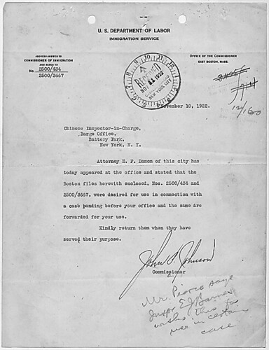
But it’s the way information accretes, the way the document functions, that’s kind of cool, too. The tiny instruction for answering and the reference number on the upper left of this 1922 Dept. of Labor letter, for example. And all the stamps! Check out that received stamp: not just the date, but the time, too.
Anyway, I made a little flickr photoset of a few examples I’ve found. I’m looking forward to having my scattered, amateur enthusiasm swamped by the exhaustive review of government logo and letterhead design that some expert has already compiled. And then we can start talking about what I’m looking at this stuff for.
Previously: The Great Letterpress of The United States
9 Artists/ 9 Spaces: OG Minnesota Awesome
Oh, RO/LU, you are so awesome for posting this.
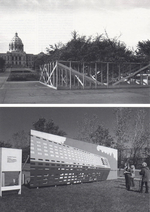
9 Artists/ 9 Spaces was a public art exhibit organized in 1970 for the Minnesota States Art Council, while the Walker Art Center’s new building was under construction. The concept of creating temporary, site-specific works was almost unheard-of, but it’s since become an international norm of public art practice. The show was organized by none other than Richard Koshalek, who was assistant curator at the Walker at the time, but who is now the director of the Hirshhorn Museum.
From a purely practical standpoint, I’m afraid Peter Eeley is right, 9 Artists/ 9 Spaces “proved in many ways a disaster.” If anything, Eeley’s list of problems–“works were vandalized; damaged by accident; and shut down by the police for reasons of safety, fear, and improper permitting”–completely undersells the near-total mayhem surrounding the show.
Fortunately, Peggy Weil published what is apparently the first extended history of 9 Artists/ 9 Spaces as part of a larger exploration of public art. It is truly incredible.
Just one incident: William Wegman wanted a large vertical image to be rendered in horizontal format, so he proposed a large billboard painting of Minneapolis’s Foshay Tower on its side. The work, unfortunately titled What Goes Up Must Come Down, was installed on the U of M campus. Only no one notified the campus police of the project, and they freaked and called the FBI, who “showed up at Koshelek’s office the next morning to inform him that they’d read it as a bomb threat and dismantled it.”
Wegman himself posted about the 40-year-old show on his blog a couple of weeks ago, after being contacted by the Walker; the billboard is apparently featured in a new tapestry created for the museum by Goshka Macuga. In fact, digging around a bit, almost the only info online about 9 Artists/ 9 Spaces seems to come from Weil and this Macuga project.
Whatever happened on the ground at the time now seems frankly awesome and entertaining; the very idea that public art could instantly provoke a wide range of heated responses seems almost quaint. But of course, such bemused hindsight requires an idealized, incomplete grasp of the political and cultural context of the show; the idea of bombings and long-term occupations of parks in St. Paul sounds positively surreal, but it happened.
The failure, really, is ours, for not remembering, knowing, studying, and learning from this rather spectacular-sounding show. Someone get me Koshalek on the horn!
Peggy Weil’s history of 9 Artists/ 9 Spaces, 1970-71, organized by Martin Friedman and Richard Koshalek [linkall.com, via RO/LU, who has other links and pictures]
What Goes Up Must Come Down [wegmansworld (!!)]
Andrea Bowers On The Political Landscape
Thomas Lawson’s 2010 interview with Andrea Bowers is like five kinds of great. It concerns the works in her show at Susan Vielmetter in Los Angeles, “The Political Landscape.” Bowers’ story of making a video piece about activist and Bush-era public land auction-saboteur Tim deChristoph has some nice critiques of the Earth Art Boys. And it’s surprising how surprising so many of the reactions were to her immigration- and border-related drawings.
But I can’t not post a bit of the discussion of the centerpiece of the show. Titled No Olvidado – Not Forgotten, the 10-foot-high, 23-panel mural/drawing contains the names of several thousand people known to have died crossing the Mexican-US border:
AB: Yes, it’s a hundred-foot drawing.
TL: And it is set up as a memorial, it’s a very grand piece. Let’s talk about it. Since it is monumental, it presumably required a different way of working?
AB: Right. I worked with a graphic designer and several assistants. It resulted from a conversation with an activist, Enrique Morones. He founded an organization called Border Angels. They started off in I think ’86, providing water and blankets to people crossing the border.
TL: And many die in the attempt–are they killed out there in the desert, or do they die from exposure and thirst?
AB: It’s both, but in many cases nobody knows. A lot of people die from dehydration or temperature, but there are also people who are killed. So Enrique collects names of anyone who dies migrating from Mexico to America. He actually has about ten thousand names. He finally admitted that the group of names he provided to me, a list of four or five thousand, is only up to the year 2000.
I’ve always been making memorials in one way or another, but memorials that I thought would never be made, or memorials that were kind of impossible to make. I’m fascinated by the Vietnam Memorial in DC, and how listing names functions in general. An important part of what I do concerns this documentary-type collection of information.
A Story about Civil Disobedience and Landscape: Interview with Andrea Bowers [eastofborneo.org]
Verne Blosum Found! Or Rather, Found By Verne Blossum
You stumble upon something that Google doesn’t know anything about, and you post about it, and then a while later, the other handful of people wondering about the same thing eventually email you, and you try to figure this stuff out together.
Thus it is that the Verne Blosum Fan Club is proud to welcome the Greensboro Chapter to the table.
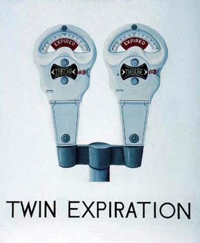
The other day, a curator from the Weatherspoon Art Museum contacted me after seeing my 2010 posts about the pioneering Pop Art painter Vern Blosum. Because it turns out the museum which is affiliated with UNC-Greensboro, has a Verne Blossum painting, Twin Expiration, above, from 1962.
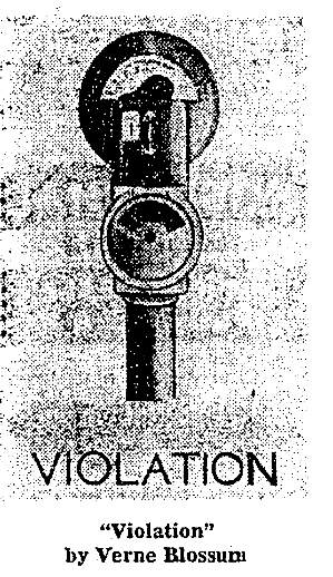
I first found out about Blossum when his parking meter painting, Violation was illustrated alongside Andy Warhol in a 1963 Washington Post article about Alice Denney’s foundational Pop Art show at the Washington Gallery of Modern Art.
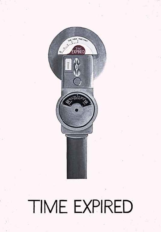
Then it turned out MoMA has a Blosum parking meter as well, Time Expired, purchased for them in 1964 by Larry Aldrich. [No, I’m not typing it wrong, his name shows up in contemporary sources with both one s and two, with an e and without.]
The Weatherspoon discovery [for whatever reason, their collection database has not been indexed by Google] comes on the heels of another out-of-the-blue email from some folks in California. Seems they’d come across Vern Blosum in the catalogue for Pop Art USA, a 1963 exhibition curated by the Pasadena Art Museum’s own John Coplans. That Blosum, titled 25 Minutes.
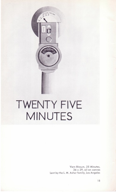
Clearly, there’s a theme, and I’m not just talking about parking meters. 25 Minutes was apparently lent by the L.M. Asher family. Betty Asher was one of the major collectors and supporters and curators at LACMA for many years. Just phenomenal. And her son is Michael Asher.
The Weatherspoon’s Blossum turns out to have been donated in 1981 by Robert Scull, probably the most famous [or infamous, depending] Pop Art collector of them all, in honor of Virginia Dwan, who has had a long, generous relationship to the museum.
For an artist who seems to have mysteriously disappeared from the art world, Vern[e] Blos[s]um sure left behind, not just an intriguing body of work, but also an incredible body of collectors.
The work continues.
An Artistic Discovery: The Congressional Art Competition
I know what it is, and what it’s for, and where it is, and what what. But still.
In a year when politicians’ considerations of art have had considerable impact on art, artists, and the art world, it is fascinating to consider the official guidelines [pdf] for the Congressional Art Competition.
Founded in 1982, the Congressional Art Competition offers high school-age artists in each congressional district the chance to have their work exhibited on Capitol Hill, or in their representative’s offices, for an entire year.
Each entry must be original in concept, design, and execution and may not violate any U.S. copyright laws. Any entry that has been copied from an existing photo (other than the student’s own), painting, graphic, advertisement, or any other work produced by another person is a violation of the competition rules and will not be accepted. Work entered must be in the original medium (that is, not a scanned reproduction of a painting or drawing).
…
Artwork must adhere to the policy of the House Office Building Commission. In accordance with this policy, exhibits depicting subjects of contemporary political controversy or a sensationalistic or gruesome nature are not allowed. It is necessary that all artwork be reviewed by the panel chaired by the Architect of the Capitol and any portion not in consonance with the Commission’s policy will be omitted from the exhibit. The panel will make the final decision regarding the suitability of all artwork for the Congressional Art Competition exhibition in the Capitol.
a href=”http://www.house.gov/house/ArtGuidelines.shtml”>An Artistic Discovery: The Congressional Art Competition [house.gov via patch.com, thx @artisphere]
From The Mixed Up Files Of Basically Everyone
What’s that, dear? Oh, nothing, just some legendary but unknown drafts for the first film adaptation of Ian Fleming’s Casino Royale, by veteran Hollywood screenwriter Benjamin Hecht.
After reading various references to the early 60s script, Jeremy Duns decided to go looking for it, and whaddyaknow, there it was, sitting in Hecht’s archive, which is at the Newberry Library in Chicago. Apparently, in the intervening decades, no one had ever bothered to actually look for it:
[T]hese drafts are a master-class in thriller-writing, from the man who arguably perfected the form with Notorious. Hecht made vice central to the plot, with Le Chiffre actively controlling a network of brothels and beautiful women who he is using to blackmail powerful people around the world. Just as the theme of Fleming’s Goldfinger is avarice and power, the theme of Hecht’s Casino Royale is sex and sin. It’s an idea that seems obvious in hindsight, and Hecht used it both to raise the stakes of Fleming’s plot and to deepen the story’s emotional resonance.
It’s exactly the kind of mind-boggling, serendipitous archive find that keeps me going on this Johns Flag hunt, even when the more skeptical part of me is saying, “Seriously, how could Jasper Johns’ first flag painting have been stolen, and missing, and then resurface in his own dealer’s office, and then disappear again, and no one knows where it is or even what actually happened to it?” But the more I dig and ask around, the more I find that, though plenty of people gossiped or speculated, almost no one has ever actually searched for it.
UPDATE/CLARIFICATION/APOLOGY/&C. Ha, ha, I guess if I think about it, yeah, my meant-to-be-exciting-thrill-of-discovery-in-uncharted-archives anecdote below could make actual archive professionals cringe. And I guess I didn’t think of that. OR mean it as any kind of criticism of the way the AAA works, just the opposite, in fact.
Fortunately, Barbara Aikens, the Chief of Collections Processing at the Smithsonian’s Archives of American Art took the time to correct some inaccuracies and clarify some of the wrong implications in my account. Which, I didn’t really– I mean, it was really meant to be kind of an amusing offhand story, not a transcript, which– Anyway. My bad.
A few trips ago, while researching at the Archives of American Art, I opened a white cardboard box, indistinguishable from all the others on the outside. But instead of the neatly labeled, acid-free folders, I faced a mishmash of giant envelopes, ragged edges, and old, manila folders. And a rubber banded brick of old AmEx bills. And some matchbooks. What a mess. It was more time capsule than archive.
In the middle of a sheaf of clippings and tear sheets, interviews and reviews and feature articles about Robert Rauschenberg, I came across an odd little card. No, it’s a transparency showing an Apollo alnding capsule. No, there’s three. Blue, magenta, cyan, waitaminnit, this is taped together by hand. It’s an object, maybe even a work, made of layered transparent sheets, similar to Rauschenberg’s editions made from multiple sheets of plexiglass. Shades (1964) is one; I have a similar set of plexi discs somewhere from 1970-1, in a boxed set of multiples titled, Artists and Photographs. Here you go: Revolver.
The other day, i recognized that space capsule image as the one in the Hirshhorn’s big Rauschenberg screen/painting, Whale, which is also from 1964. Maybe Bob sent that little objet home after a studio visit or something. But should it really be in here, in the archives, hanging out with greasy-fingered riff-raff like me? Maybe I should say something.
A couple of folders later, I carefully extract a large, tattered, manila envelope with something about a group show or benefit scribbled on the outside. The first thing I pull out is a signed Jim Dine drawing. Then another. The next one is an Oldenburg. I pull out a piece of black paper, which turns out to be a chalk drawing. A little dust gets on my hands. At which point–I mean, fingerprints, right? I’m totally busted–I call the attendant over with a hearty, “Uh, did you know there’s a bunch of original art in here?”
No, she did not, but yes, that happens, because, in fact, budget, priorities, low demand, &c., &c, some of this collection’s boxes had not been processed yet. I was probably the first person to even look through this box since it had come in over 25 years earlier. She gave me a stack of acid-free paper to slip in between the various drawings, and I decided that, though it looked like a blast, the stuff in the packet was obviously not related to my research–at the very least, if Johns’ Flag had been stuffed inside, I would’ve seen it–so I put it all carefully away.
I guess I’m just saying, there’s stuff out there. And no one’s been looking for it, so get cracking.
UPDATE I thought I was being helpful by not identifying the collection I was using here, but of course, Barbara knew right away what it was: the Alan Solomon Archives. The Solomon material had come into the AAA in waves, and the unprocessed box had actually entered the Archive in 2007, not, as I misunderstood, 25+years ago.
The presence of art, drawings, sketches, etc., while not a collecting goal of the Archive, is also not unheard of, and such material typically remains in accessible within the collection, where it is to be handled with care.
Barbara points out that while I made it sound like there I worked through a stack of acid-free paper, in fact, I only inserted three sheets between a couple of drawings. This is true. I was given a stack, but after replacing the works I’d taken out, I figured I’d leave the rest of the handling to the professionals, and so I closed up the box.
On the point of processing, I can’t do better than Barbara’s statement:
On average, we process and preserve about 500-700 linear feet per year; this includes writing full and detailed electronic finding aids that are available on our website. In addition, we are the only archival repository in this country that has a successful ongoing digitization initiative to digitize entire archival collections, rather than just selected highlights from collections. To date, we have digitized well over 100 collections, totaling nearly 1.000 linear feet and resulting in 1.5 million digital files. Archival repositories from across the country regularly consult with us on our large scale digitization methodologies, work flows, and infrastructure.
I would hate to think that users will think less of our major efforts here at AAA to increase access to our rich resources, or, worse, think that we do not care about the stewardship of collections. It is one of our ongoing mission goals and we devote considerable staff resources to our processing work. However, the work is never done to be sure.
And thank you for it. And for the clarifications. Carry on.
Casino Royale: discovering the lost script [telegraph.co.uk via daringfireball]
Gnome
Is there a tumblr for awkward Twitterstream juxtapositions? Because there oughta be.