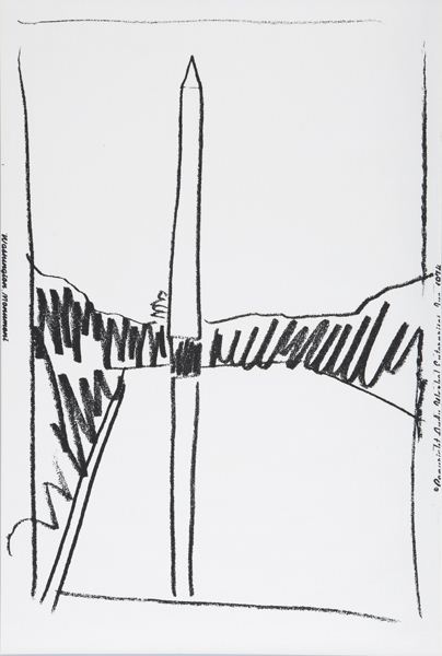
An interesting curatorial pairing where you’d least expect it: deep in the middle a random, Sunday afternoon print sale at Phillips de Pury.
Lot 327: Washington Monument, is an unnumbered edition sliced up from a wallpaper Andy Warhol made in 1974 for an unknown commission, but apparently never installed. Dia had 322 rolls of the stuff, which it gave to found the Warhol Museum.
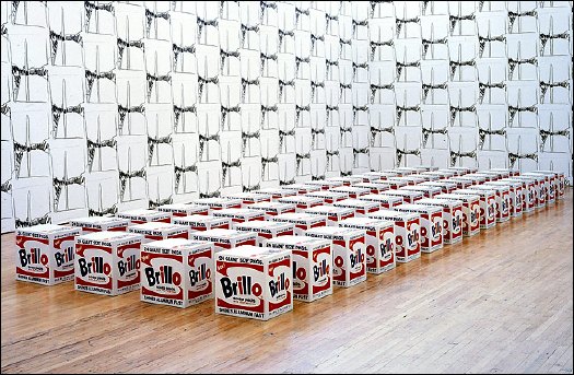
With a few takebacks, I guess, because the Warhol let Dia Beacon install a whole roomful of the stuff in 2005. It looks kind of nice and abstract, a nice background for those Pasadena Brillo Boxes. [image via nyt]
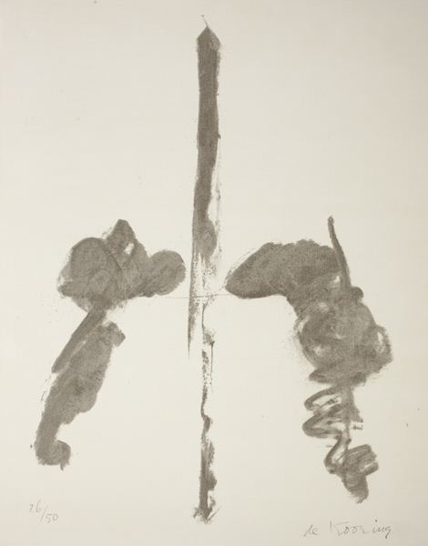
Meanwhile, Lot 328 [above], was Washington Monument, a properly signed and numbered lithograph by Willem de Kooning, published in 1970. The composition’s almost identical to Warhol’s, as if both artists used the same photo or postcard for a source. Or as if Warhol used de Kooning’s print, which would be pretty unusual. Several of these have come up at random auctions this year: #13/50 at Bloomsbury; #14/50 at Swann.
An abstract representation of an abstract original, de Kooning’s Washington Monument is uncontroversial enough to be displayed in a wide range of otherwise complicated settings.
The Phillips version is #26/50, and it was sold by the defunct law firm Dreier, LLP, which was implicated in a massive securities trading fraud sideshow to the Bernard Madoff scandal.
And two related, slightly larger charcoal drawings, dated 1969-70, are on loan from the Estate to the US Ambassador’s residence in London [pdf].
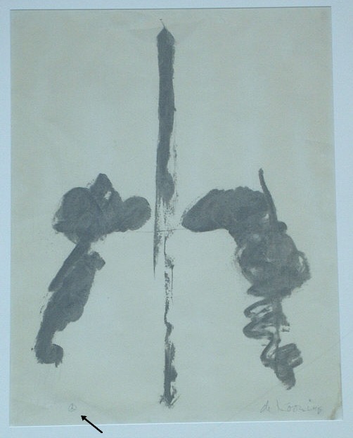
The drawings are untitled, but every numbered lithograph I’ve found is titled simply, Washington Monument. But a Connecticut antique dealer once had a signed, proof, which apparently came from a close friend of the artist. The title of the work, the friend said, is actually Washington Monument Peace Sign, and in the bottom corner, in place of an edition number, de Kooning put a little peace sign.
Category: dc
The Wound Dresser, Set In Stone
I’m feeling more serious about turning Richard Neutra’s Cyclorama building at Gettysburg into an educational monument to the wounded and a wheelchair-accessible battlefield observation platform.
War becomes history, reduced to its most basic contours, a date, a bodycount, and a winner:
Future years will never know the seething hell and the black infernal background of countless minor scenes and interiors, (not the few great battles) of the Secession War; and it is best they should not. In the mushy influences of current times the fervid atmosphere and typical events of those years are in danger of being totally forgotten.
…
The present Memoranda may furnish a few stray glimpses into that life, and into those lurid interiors of the period, never to be fully convey’d to the future. For that purpose, and for what goes along with it, the Hospital part of the drama from ’61 to ’65, deserves indeed to be recorded–(I but suggest it.) Of that many-threaded drama, with its sudden and strange surprises, its confounding of prophecies, its moments of despair, the dread of foreign interference, the interminable campaigns, the bloody battles, the mighty and cumbrous and green armies, the drafts and bounties–the immense money expenditure, like a heavy pouring constant rain–with, over the whole land, the last three years of the struggle, an unending, universal mourning-wail of women, parents, orphans–the marrow of the tragedy concentrated in those Hospitals–(it seem’d sometimes as if the whole interest of the land, North and South, was one vast central Hospital, and all the rest of the affair but flanges)–those forming the Untold and Unwritten History of the War–infinitely greater (like Life’s) than the few scraps and distortions that are ever told or written. Think how much, and of importance, will be–how much, civic and military, has already been–buried in the grave, in eternal darkness !……. But to my Memoranda.
That’s Walt Whitman’s foreword to his Memoranda During the War, a compilation of his diary entries, which he published in 1875.
In a country at war, so seemingly polarized by political disagreements, it’s odd how easy it is to forget that not only was there a civil war, there was an aftermath, where millions of Americans had to put their lives, their families, their cities, and their country back together again. Is forget the right word for something you presumably knew, or should have known, but really never gave a thought to?
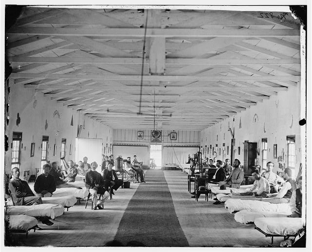
Armory Square Hospital, 1865, via loc.gov
Because I didn’t forget so much as never realized, never put it all together, that the wartime hospitals, where I knew Walt Whitman attended to wounded and dying soldiers, were not in Brooklyn, where the Whitman in my mind lives. They were in Washington, DC, where he’d come looking for his brother George, who’d been wounded in the battle of Fredericksburg. He stayed on, and tended over 80,000 men who belonged to what he called, “The Great Army of the Sick”:
June 25, (Thursday, Sundown).–As I sit writing this paragraph I see a train of about thirty huge four-horse wagons, used as ambulances, fill’d with wounded, passing up Fourteenth street, on their way, probably, to Columbian, Carver, and Mount Pleasant Hospitals. This is the way the men come in now, seldom in small numbers, but almost always in these long, sad processions.
Whitman also visited the hospitals at the Patent Office [now the Smithsonian Museum of American Art] and at Armory Square [above, now the site of the National Air & Space Museum]. His compiled letters to his mother, published in 1897 under the title of an 1863 poem, The Wound Dresser, contain additional details of his experience.
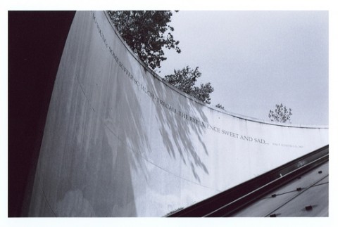
awesome torqued circle image by marc nielsen via flickr
Originally published as “The Dresser,” the poem is the centerpiece of Drum Taps, Whitman’s collection of war-related poems first published in 1865, and included in subsequent editions of Leaves of Grass, beginning in 1867.
A stanza of “The Wound Dresser,” or at least part of one, wraps around the cylindrical granite wall of the entrance to the DuPont Circle metro station:
Thus in silence in dreams’ projections,
Returning, resuming, I thread my way through the hospitals;
The hurt and wounded I pacify with soothing hand,
I sit by the restless all dark night – some are so young;
Some suffer so much – I recall the experience sweet and sad…
– Walt Whitman, 1867
New York carpetbagger and infrequent DuPont metro traveler that I am, I’d always assumed it was installed in the early 90s, an oblique sop of acknowledgment of the AIDS crisis. Ahh, yes and no.
The idea for the poems did originate with a community request to “honor those who cared for people with HIV/AIDS,” [2025 update: internet archive link] but this had been expanded to include caregivers for all kinds of illnesses. And so the D.C. Commission on the Arts and Humanities sponsored a competition for poems as part of the Metro’s Art in Transit program. In 2007.
One would think that a 150-year-old poem by America’s greatest poet could survive a seemingly routine governmental agency arts collaboration unscathed. But I guess the public art doctors felt they must amputate to save the patient. With the last two stanzas cut off the inscription serves as an inadvertent memorial to what must still be sacrificed to make a permanent mark on the official landscape of 21st century Washington:
(Many a soldier’s loving arms about this neck have crossed and rested,
Many a soldier’s kiss dwells on these bearded lips.)
For much, much original Whitman material and even more Whitman scholarship, visit The Whitman Archive [whitmanarchive.org]
Next, related: Toward a Cyclorama-shaped Gettysburg Memorial to The Wounded
‘No Monuments To Jesus’
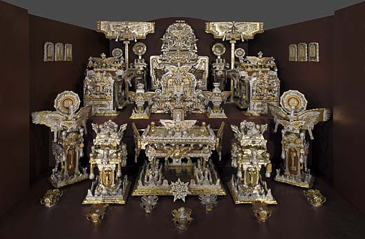
One of the most incredible works of visionary art in Washington DC is James Hampton’s The Throne of the Third Heaven of the Nation’s Millennium General Assembly. Hampton, an African American WWII veteran and janitor at the General Services Administration, built the 180+piece assemblage out of discarded furniture, cardboard, cellophane, blotter paper, and foil, in a rented DC garage. He spent at least 14 years working every night, in secret, and it was only discovered by his landlord after his death in 1964. After several uncertain years, it was donated to the Smithsonian’s Museum of American Art in 1970.
Hampton told almost no one about his work, but notes attached to the various objects seem to indicate that he was receiving visitations by angels, who directed him to construct the Throne in preparation for the Second Coming of Jesus Christ. Most of the notes, though, and his voluminous writings, as well as the contents of a looseleaf notebook titled, The Atlas of The State of Eternity, are written in Hampton’s own code, which is comprised of mixed and altered Hebrew, Greek, and Roman characters. As far as I can tell, these works have not been deciphered, nor have facsimiles been published.
update>I am happy to be corrected, especially during National Archive Month or whatever. The Archives of American Art has Hampton’s writing available on microfilm. An independent researcher of enciphered documents, Dennis Stallings, has an extensive site about decoding what he calls “Hamptonese.” And in 2004, San Jose State computer scientists Mark Stamp and Ethan Le published a statistical analysis of Hamptonese. Because it doesn’t correspond to a typical substitution code, they defer to the previous hypothesis that Hamptonese is “the written equivalent of ‘speaking in tongues.'” In other words, not their department, either.
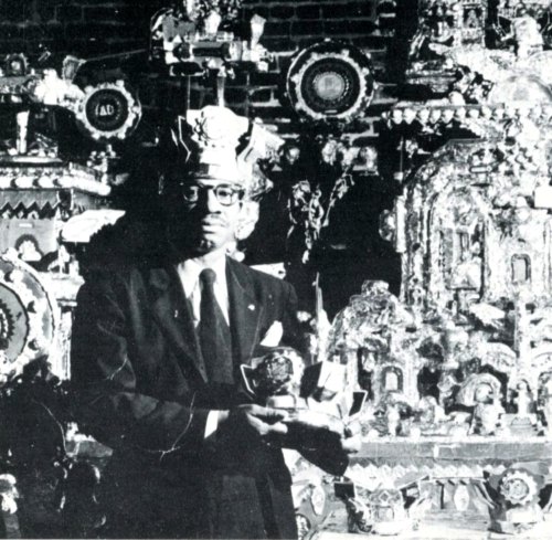
image from Naives [sic] and Visionaries, Walker Art Center, Minneapolis, 1974, via stopping off place
Hampton obviously showed someone his work, because there is a photo of him standing in front of it [above], which Michael from stopping off place posted this summer. Interestingly, those crowns were separated from The Throne in some way, and were only donated to the AAM in 2001. Perhaps there is more work–and more story–still out there somewhere.
After it was conserved, in 1976, The Throne… went on a several cities tour. Curator Lynda Roscoe Hartigan wrote an essay laying out as much of the work’s and its creator’s history as could be known at the time. Hampton, who called himself Saint James in his writing, also mentioned a Baptist minister named A.J. Tyler:
Despite Hampton’s Baptist background, he was not a member of a congregation in Washington. Believing that there is only one God, Hampton considered different religions unnecessary. An important encounter with the Reverend A. J. Taylor, a popular black minister who died in 1936, may have occurred in one of the neighborhood churches he occasionally visited. The Mount Airy Baptist Church, where Taylor served, was not far from Hampton’s boarding house, and it is possible that the Reverend inspired Hampton during a revival meeting or Sunday sermon.
Tyler was noted for having said that in Washington, the city of monuments, there were no monuments to Jesus. During his ministry, he installed an electric sign, “Monument to Jesus,” over the door of the Mount Airy Baptist Church.
Hampton may have been intrigued by the minister’s idea for a monument to Jesus; the word “monument” is entered in one of his notebooks, and numerous references to A. J. Tyler appear in the assemblage. Many pieces bear labels reading “Tyler Baptist Church,” although Tyler never preached in a church of that name. Hampton also indicated in his notebooks that Saint James was the pastor of “The Tyler Baptist Church.” Tyler may thus have been a model and an inspiration for Hampton, whose commemoration of the Reverend seems to have mingled freely with his belief in the Second Coming.
Emphasis added because, hello, “the city of monuments.”
As spectacular as Hampton’s creation is, it’s not at all clear that he himself considered it to be art. In fact, the texts he left behind almost certainly refute that categorization. These are devotional objects, grounded in his complex religious experience. With American Indian tribes, the Smithsonian has gone to great lengths to recognize and preserve the cultural and spiritual aspects of relics and artifacts; I wonder if there has ever been discussion of dealing with Hampton’s work in the same context.
James Hampton, The Throne of the Third Heaven of the Nations’ Millennium General Assembly, 1950-64 [americanart.si.edu]
Stephen Shore’s Photomurals, I Mean, ‘Architectural Paintings’
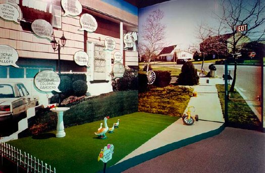
that sidewalk, that exit sign, that door. installation image of Stephen Shore’s images, 1976
So yes, I’ve got a million other things to do, but thanks to this Mies thing being auctioned, and Michael Lobel’s article on photography and scale–and by implication, photography and painting, pace Chevrier’s forme tableau–I’m become slightly obsessed with the history of photomurals.
From what I can tell so far, I have the field largely [sic] to myself, but there is definitely some interesting work out there–and some interesting writing about it. And who should turn up as one of the innovators of these scale-blasting photomurals, but the master of the snapshot himself, Stephen Shore?
Just this past May, Swiss art historian Olivier Lugon published an article in Études photographiques titled, “Before the Tableau Form: Large Photographic Formats in the Exhibition Signs of Life, 1976.”
Signs of Life: Symbols In the American City was a groundbreaking and somewhat controversial show held at the Smithsonian’s Renwick Gallery as part of the US Bicentennial celebrations. Conceived in 1974 on the heels of the publication of Learning From Las Vegas by Robert Venturi, Denise Scott Brown and Steven Izenour, it was, depending on who you asked, an exultation, an examination, or an elitist excoriation of commercial and populist vernacular architecture and design. They filled the gallery with iconic roadside signs, and they created dioramas of archetypal American living rooms to give all Our Stuff the museological treatment.
And to photograph it all–and to create giant, deadpan photomurals of the American residential streetscape–Izenour selected a young photographer whose seemingly unstudied roadtrip snapshots had just been shown at the Met, Stephen Shore.
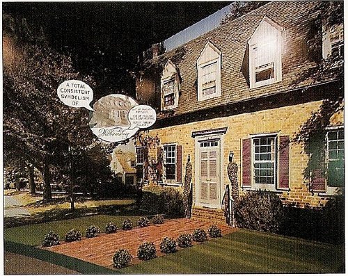
Lugon quotes Venturi & Scott Brown’s explanation of the show [I’m translating back here from French, so it’s probably off a bit]:
“The idea was to cross the model of the billboard, this image made for distant, fugitive, distracted perception of the driver, with that of the newspaper, which is a density swarming with information.” The art museum is thus invaded by two different but interdependent media regimes: the advertising billboard’s principle of rapid distraction, and the extreme informational concentration of the newspaper, two opposing models for aesthetic contemplation, where the distance of the viewer from the image is either too far or too close.
Despite working at like 100x his previous [and, for the most part, subsequent] scale, Shore’s illusionistic photo backdrops manage to capture the banality he loves. Banality in a good way, of course. I think this street is my favorite:
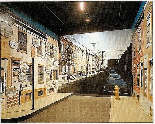
Maybe because he wasn’t a fetishy print guy–Shore rather famously sent all his film to Kodak to be developed, just like civilians–he readily embraced the print quality of the photomurals. Which–I love this–turned out to be paintings.
Lugon explains that the Signs Of Life photomurals were made with an expensive, state-of-the-1976-art, 4-color airbrush-like printing system from the Nippon Enlarging Color Company, which had been licensed for the US by 3M. Who marketed it to trade fairs and restaurants as Architectural Painting. With the public and art world attention from Signs of Life, 3M brought Izenour on to promote the new medium for use by artists and museums.
In 1977, Popular Science ran an article explaining how Architectural Painting technology worked. A specially prepared color negative was scanned and split into CMYK, and the quick-drying paint was applied in overlapping strips, inkjet-style, by a computer controlled, scanning sprayer. 3M technicians then touched up the finished print by hand. All in, it cost $10-25/sf.
Expensive enough to be the second largest line item on Signs of Life‘s budget, and sexy enough that Venturi et al. used it again almost immediately. For their controversial [i.e., steaming hot mess, according to Robert Hughes, who I’ll happily believe just this once] exhibition design for the Whitney’s Bicentennial blockbuster, 200 Years of American Sculpture, the architects installed a 27-foot-tall cutout photo by Shore of Hiram Powers’ iconic marble, Greek Slave, on the canopy of the museum. Ezra Stoller says it was “inspired by Caesar’s Palace,” which I’m sure was a compliment:
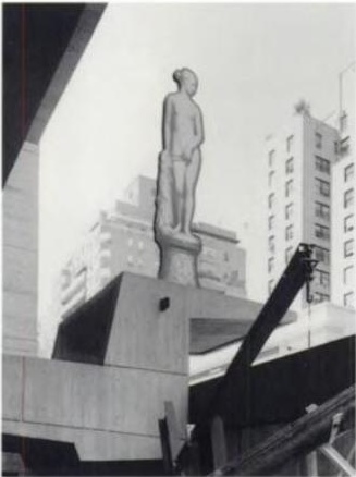
Once again, I start programming a bonus DVD for “The Original Copy,” Roxana Marcoci’s current show at MoMA on photography and sculpture. But I think the real story here is painting and photography.
Jean Francois Chevrier gets credit for the term forme tableau, which he used to describe the large-format photographs which began to assert a place on the wall and in the discourse that had previously been reserved for painting in the 1980s [and since]. Then Lugon mentions how Sherman, Prince, Kruger, etc. had appropriated the photography of commercialism–advertising and movies [Untitled Film Stills began in 1977]. And now here’s Shore, right there in the thick of things, making giant photos with his new-fangled, trade show backdrop printing techniques–which turn out in the end to actually be paintings. [And sculpture. And architecture.]
The kicker, though, is one of the complicating factors for why I’m finding photomurals so interesting right now. And I write this as a guy who has two of Felix Gonzalez-Torres’ Parkett billboard/photomurals because, once you install one, it’s up, it’s done, it’s gone: they managed to thwart the market. Here’s Lugon:
The photomural reveals itself to be extremely vulnerable. Its own installation, its dependence on conditions of fixation and lamination make it enormously fragil: with rare exceptions, it does not survive its exposition. It’s one of the fundamental points that distinguishes it from painting: its incapacity to become an object of collection.
When it was developed in the 19th century, photography constituted precisely a pure image for collecting: one acquired it to conserve, because it was capable of bringing all objects in the world together into a system of thesaurisation and generalized comparison, but it’s difficult to show. Small and grey, taking poorly to the wall, and with a surface that deteriorates in the light the more one views it. The grand format photos of the interwar years reversed this logic: photography became the image of exposition, but it renders it improper for collecting.
Only the forme tableau would succeed in crossing these two qualities, to make of photography an image at once for exhibiting and collecting–two criteria indispensable for accessing fine art’s economic system.
I guess I’ve gotta call Stephen Shore now and see if that’s really true, about his photomurals, I mean.
What I Didn’t See
The other weekend, I pigeonholed former Washington Post art critic Paul Richard after his talk, titled “What I Saw,” at the National Gallery of Art. I said that I’d been interested to hear his take on public art over his 40-year career, and he answered back, “What public art?” “I guess that was my real question,” I said.
Richard then made a quick and familiar explanation that public art is outdoor art, outdoor art is sculpture, museums in town focus on painting, and so sculpture generally and outdoor sculpture specifically is marginal[ized].
I had this exchange in my mind when I watched the Post’s current art critic Blake Gopnik effuse over his “favorite new discovery,” a massive Alexander Calder sculpture that has been sitting on one of downtown Washington’s busiest intersections for almost 30 years.
Gopnik said that in a series of Post web videos called, “The Wonders Around Us.” He opens another, featuring the chair-shaped granite sculptures of the late Scott Burton, thus: “I’m at the Sculpture Garden of the National Gallery, looking at works I don’t often look at–the ones they keep outside.”
In another video, discussing Richard Lippold’s 100-foot-tall steel starburst sculpture Ad Astra, in front of the National Air and Space Museum, he ends on what he imagines is a poignant and/or ironic note:
Amazing how you look at this thing, and you realize that almost no one but you is looking at it. Not a single head turned up to look at poor Richard Lippold’s magnum opus.
[Let’s ignore the fact that if Lippold has a magnum opus, it’s probably Orpheus and Apollo, which glitters across the atrium lobby of Avery Fisher Hall. Gopnik was going for pathos, and couldn’t very well call Ad Astra a “masterpiece” so soon after calling it a TV antenna.]
Days later, Gopnik was writing about Hirshhorn director Richard Koshalek’s proposal to renovate the museum’s sculpture garden on the Mall and add indoor exhibition space to/under it, since the current sculpture setup is “dormant,” rather than “lively,” and [anecdotally, at least] is always empty.
Which may be true, but that’s not [quite] the point. And [for once or twice] I don’t want to pick on Gopnik; in this case, I think his forthright ignoring of outdoor sculpture is probably in sync with the general population of DC. The city is stratified and carved up into ghettos for tourists and locals alike. Commuters, whether in cars or trains, on bike or on foot, rarely venture off their routes.
Outdoors, art, or sculpture in a drive-by situation quickly becomes invisible, receding into the landscape passing outside the window. But is that actually just a DC thing? I don’t think so. Is it even just a city thing? Is it even just an art thing? How quickly does something become invisible, and why? What happens to art in such a context? Has someone written about this with intelligence or insight?
Is it even just outside? We like to think that art rewards close or considered looking. But how long do most people look at most artworks in most museums? [answer: for less time than it takes to read the label next to it.] Do professional art lookers sit through every blackbox video installation they enter, or do they only watch long enough to “get it”?
When I started, I thought I was writing this about DC, its critics, its particular context, sculpture, outdoor art. See how the circle keeps expanding to include everything? Now I’m a little bummed out.
After 26 Years, The Smithsonian Will Put Alexander Calder’s Gwenfritz Back Where It Belongs.
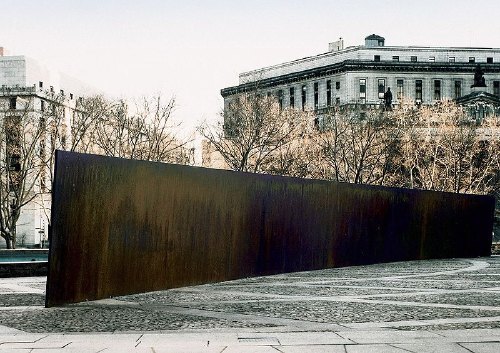
What if they decided to put Tilted Arc back? What if the General Services Administration, and the Jacob Javits Federal Building folks called up Richard Serra and said, “You know what this Federal Plaza needs after all is a nice, long, angled slab of Cor-Ten steel”?
Would that be a shock? Would that be a story? A new day of some kind dawning? Because that’s what’s happening. Only it’s not New York, it’s Washington, DC. And it’s not Richard Serra, it’s Alexander Calder. And it’s not Tilted Arc, it’s Gwenfritz.
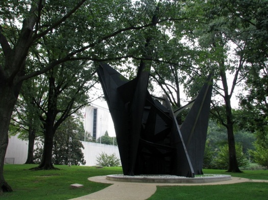
Gwenfritz displaced, image via si.edu’s Mitch Toda
In 1965, Mrs. Gwendolyn Cafritz convinced the Smithsonian’s S. Dillon Ripley that the first modern building going up on the National Mall–the Museum of History and Technology, now known as the National Museum of American History–needed some modern art to go with it. She offered her family’s support for a large, abstract fountain by Alexander Calder. After site visits and negotiations, the artist settled on a fountain jets-inspired sculpture in a reflecting pond. The Cafritz Foundation donated the $400,000 needed for a 40-foot high, black steel stabile [and its landscaping] on the west end of the museum.
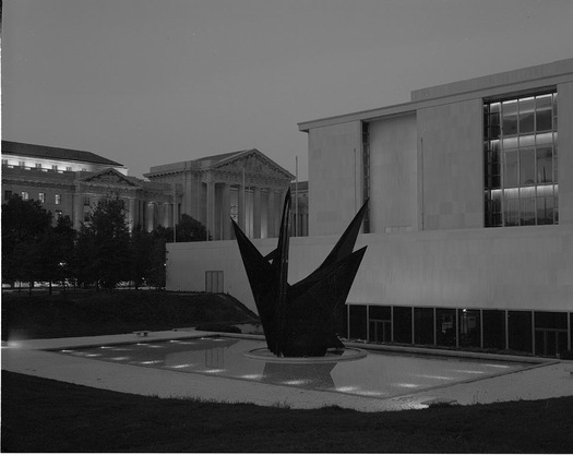
Gwenfritz, c.1969, in the site Calder designed it for, via si.edu
At the dedication ceremony in June of 1969 [below], the Washington Post reported that Calder unexpectedly announced the name of the sculpture would be, The Caftolin. When her turn came to speak, Mrs Cafritz said no way, they were sticking with the first choice, The Gwenfritz, and that’s that. Obviously, no one objected.
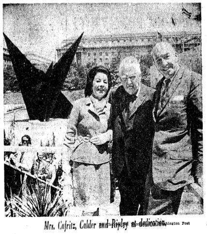
via Washington Post, June 4, 1969
The Gwenfritz [not sure when the The disappeared] was Calder’s first major commission in Washington, one of his most important stabiles, and Washington’s first major modern and first major abstract public sculpture.
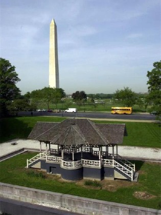 None of which seemed to slow down the Smithsonian which decided in 1983 to move the site-specific sculpture and replace it with a Victorian-era bandstand from the grounds of a Jacksonville, Illinois mental hospital. Or the Washington Fine Arts Commission which approved the move over the objections of–well, of almost no one, since Calder himself had died in 1976. The Washington Post did run an angry column by Robert Hilton Simmons, though, criticizing the trouncing of the artist’s intentions and the Museum’s claim that the sculpture’s new site, in a grove of trees on the corner of Constitution Ave & 14th Street, would “allow it to serve more fully as a focal point.”
The frictionless violation of Calder’s intentions was cited by public art experts as a direct precursor to the government’s accelerated actions in the Tilted Arc controversy beginning in 1984-5. And yet, in the absence of an outspoken artist, Gwenfritz has sat in its altered, degraded, and supposedly more “focal” site for 26 years and counting.
All of which makes Washington Post art critic Blake Gopnik’s new video visit to Gwenfritz even more jawdropping than normal:
This is actually one of my favorite new discoveries in Washington. It’s by Alexander Calder. He made it in 1968, and it’s called Gwenfritz. Terrible name for a really amazing, magical work of art.
Rather than ask what it means that the Post’s art critic calls a 40-foot-tall Calder located at one of DC’s busiest intersections–across the street from both the White House and the Washington Monument– a “new discovery,” why don’t we just say it proves the paper’s 1984 argument about the invisibility of Gwenfritz‘s displaced site. [Or maybe Gopnik, like many, many Washingtonians, is essentially inured to monuments and outdoor sculpture. A fascinating theory, perhaps, for another post.]
And rather than mock, I’ll just note Gopnik’s proudly uninformed self-reflexivity, and his free-associative interpretations based on the sculpture’s maintenance issues. [“This seems so much a part of the period in which it was made, the tail end of American industry. You could call this a ‘Rust Belt Sculpture.'” Actually, it was born when Modernism was still the official symbol of America’s free and glorious future, and that its ex-pat creator had it made in France.] And his praise for the idyllic site and its relationship to the surrounding trees.
And his complete ignorance of the work’s context, history, or implications when he mentions in passing, “I think the Museum’s going to move this to a better site soon. That’s what I’ve heard.”
Oh?
Yes.
I called the press office today and confirmed that it is the Museum’s as-yet unannounced intention to return Gwenfritz to its original site. In August, the bandstand was dismantled in preparation for its triumphant return to Jacksonville. The date for Gwenfritz‘s return has not been set, but it will mostly likely take place after the Museum’s renovation of the west wing, or sometime between 2012 and 2014.
Or just in time for the 30th anniversary of its uprooting. You heard it here fir–let’s just say that’s what I heard.
Industrial Remnants [washingtonpost.com]
What I Heard: Paul Richard
I just got back from hearing longtime Washington Post art critic Paul Richard speak at the National Gallery of Art. Richard is an excellent speaker and an alluring storyteller. His lecture, titled “What I Saw,” began with his move from scrappy beat reporter to dread-filled art critic in 1967.
Richard did an admirable job of illustrating his talk largely with artworks either from DC, or which had been shown in DC. A central, and astute, premise, which Richard used to pivot from his own inexperience to the non-academic, non-specialist enthusiasts who were his readers, to the four-decades-long wave of new museums and blockbuster exhibitions in DC was basically, “If you haven’t seen it, it’s new to you.”
And he’s right. Museums–like the one he was speaking in, of course, the alternative title of his lecture could have been, “What Museums Showed Me”–brought revelatory shows to Washington: Chinese Treasures and British Treasure House treasures, DaVinci treasures, tons and tons of treasures.
And Richard paid homage to Washington’s most cutting edge curator ever, Walter Hopps.
And yet. He wove his argument for universal “rhymes” and echoes in art across cultures and millennia, from IM Pei’s triangles to the Washington Monument’s capstone to prehistoric ochre carvings. He spoke reverently and fondly about Hopps, and the artists he met through Hopps, like Duchamp, Warhol, Kienholz, and Tony Smith. Which got us to about 1968.
But Richard showed exactly two works–Rachel Whiteread’s Ghost (1990) and Beverly Semmes’ Kimberly (1994), that were made after he became an art critic.
Which I guess is as accurate an account of the history of DC’s fraught, distant, marginalized relationship with contemporary art as anything else. Or at least of its newspaper and its museums.
How To Make Lantern Slides Of Spiral Nebulae
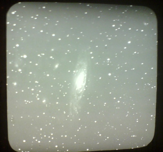
While wandering through the National Air and Space Museum [family’s in town], I stumbled across James Keeler’s lantern slides of spiral nebulae, taken at the Lick Observatory outside San Jose beginning in 1888.
Keeler was a pioneering astronomer at what was the largest reflector telescope at the first permanent mountaintop observatory in the world. He wasn’t the first astrophotographer [moon photos don’t count; everyone from Daguerre forward shot the moon], but he was a great one, and his deep sky photo survey is one of the earliest and most ambitious I’ve found. Keeler photographed hundreds of spiral nebulae and boldly estimated that at the rate he was finding them, there were at least 100,000 of them out there.
Three of his slides are on display at the museum. In the midst of what it called the “photographic fad” of 1890, The New York Times covered a lantern slide presentation Keeler made in December of that year at the New York Camera Club on Fifth Avenue. [Alfred Stieglitz joined the Camera Club soon after in 1891.]
Keeler’s slides, which he acknowledged were executed by a staff member at the observatory, were nevertheless described as “excellent in their make” and “some of the best specimens of star photography.” He went into great depth on the technical challenges of making telescopic photographs of the stars:
The usual method of keeping the star on the plate in photographing was by moving the telescope, but owing to the size of the instrument at the Lick Observatory this was impossible, as the telescope weighed seven tons. The plan adopted, therefore was to make the plate movable by means of turning screws.
…
…it happens that a different focus is obtained in the big telescope. The dry plate is therefore placed in the tube nine feet from the eye piece, a hole having been cut in it for that purpose…When the plate is developed the operator has to go it in a blind sort of fashion, as the smaller star images will not appear till the developing work is done.
…
Photographing stars, especially the small ones, is tedious work, as in some cases teh exposure must last for several hours. During all that time the plate or telescope must be moved so that the image of the star will continue in one place.
Keeler was the director at Lisk when he died suddenly in 1900, and his colleagues undertook to publish his sky survey and photos.
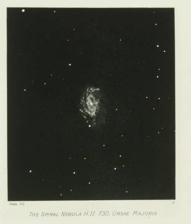
Photographs of NEBULAE AND CLUSTERS. Made with the Crossley Reflector was published in 1908 by the University of California. It contains 70 full page, hand-printed heliogravures [which is French for photogravures, which is actually French for any kind of photo-based printing technique, not just the copper plate-based intaglio-style prints associated with photogravure in English].
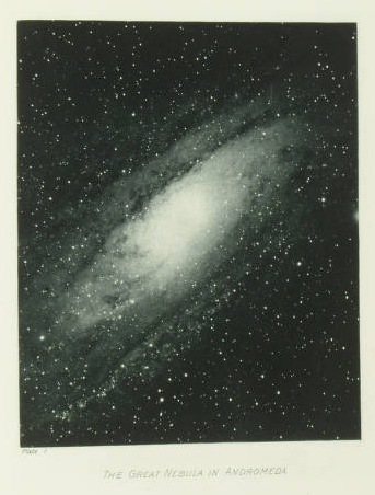
The Clark Art Institute has helpfully digitized all 70 of Keeler’s posthumously published plates. So far, I have not found information on the extent or state of his negatives, slides, or other prints. I imagine I’ll be digging into the Lisk and UC archives soon.
أنا ♥ نيويورك

John Emerson saw an “I [HEART] NY” flyer in Arabic posted in the East Village a few days after September 11, 2001. He posted a large, printable graphic version on his blog a year later.
A few months after that, I noted that Maurizio Cattelan had created a

t-shirt in an edition of 100, which was sold via Printed Matter. The Printed Matter folks now have no idea what the story was, and I’m waiting to hear back from Maurizio, but I think it’s way past time for another edition.
Washington Color School Dropout
I was talking shop with Tyler Green this weekend, and he told me that the Washington Post’s art critic Blake Gopnik actually did devote more than a paragraph in a review of two unrelated shows at a different museum to the National Gallery’s extraordinary exhibition of Mark Rothko’s black paintings. They’re incredible works, and the installation the East Wing’s skylit Tower Gallery is both beautiful and bold, and not just because they break with art world convention by continuously playing Morton Feldman’s related, minimalist composition, Rothko Chapel in the gallery.
But yeah, no, I still couldn’t find anything more than a cursory mention in a slight, “big picture” piece about monochrome painting in DC. For once, though, it’s not Gopnik that got under my skin.
It’s the arts editors [sic] at the Washington Post who, in 2010, not only published a sloppily argued, clichée-ridden letter about shows at Washington’s top three museums–the National Gallery or Art, the Hirshhorn Museum, and the Phillips Collection–which the obviously hadn’t seen. They managed to write a headline that matched the letter for proudly ignorant bluster:
My kids could match these color-crazed artists
Saturday, June 12, 2010; A13
I read with much interest Blake Gopnik’s review of new exhibits at the Phillips Collection [Arts & Style, June 6].
I can’t help but compare the artists’ work with that produced by some artists very close to me. While Mark Rothko’s blacks at the National Gallery invite “deep immersion and profound explanation” and Yves Klein’s blues at the Hirshhorn are about an “astonishing gesture of reduction,” my sons’ graphite on blue-lined white backgrounds invite profound explanation about the astonishing number of orcs a person can depict being killed in one scene.
It’s almost enough to make me feel sympathy for Gopnik, who actually has to work with these philistines. Or at least it helps explain some of his Corky St. Clair-isms.
Art Fleet: Domes & Trucks & Art Things That Go
 While researching the National Gallery of Art’s Barkley L. Hendricks paintings, which were purchased by J. Carter Brown with money from Michael Whitney Straight, I came across one of the crazier space-meets-art moments in the history of exhibition design: Art Fleet.
In an amusingly transparent move to manage his own complicated story, Straight wrote a biography of Nancy Hanks, the founding chairwoman of the National Endowment for the Arts, who had been appointed by Richard Nixon. [Straight himself had been approached to found the NEA by the Kennedy administration, at which point, he disclosed his history as a KGB spy. He became the deputy chairman, instead, a post which did not require Senate confirmation.]
Anyway, Art Fleet. We begin in San Clemente, 1970:
In the same spirit of loyalty to the president who had appointed her, Nancy committed the Endowment to supporting a project entitled Art Fleet. She had asked the president, when she met with him in San Clemente, what he would like the Arts Endowment to do. He had replied that “it was extremely important to get the arts out into the country.” Nancy had agreed. She was reminded of the technical problems involved in moving art masterpieces around the nation. She dismissed them. As Bill Lacy, our program for Architecture and Environmental Arts, recalls, “Nancy contended that if we could put a man on the moon, we could surely send the Mona Lisa around the country.” [p.149]
Surely, why not, but seriously, why?
And what do you want to do with the Mona Lisa again?
Continue reading “Art Fleet: Domes & Trucks & Art Things That Go”
‘Real Art D.C.’!
Oh, I take it all back. The Washington Post does support a vibrant local art scene.

If they didn’t, would they be “looking to discover the Washington Region’s newest talents” with their “Real Art D.C.” Art Contest? I didn’t think so.
You can look, too! And if everyone clicks all the way through the paper’s 1,265-pageview [and counting!] slideshow, they’ll be able to hire another freelance gallery reviewer! Art Works!
Wow, the Terms and Conditions of the Real Art D.C. Promotion are awesome:
…Materials do not violate or infringe the rights of privacy, publicity, or any other rights, including but not limited to copyrights or trademarks, of any third party,…Sponsor reserves the right, in its sole discretion to disqualify any…which Sponsor believes may be…offensive, harassing, inappropriate…to modify any material submitted…There are no prizes…16. By participating in this promotion, each entrant gives Sponsor permission to use his/her Entry Materials and other information provided to Sponsor in any manner or media in its sole discretion…20. Notwithstanding the above, The Washington Post is not licensed to publish, reproduce, use, transfer, and otherwise display your Entry Materials in book format.
Yes, let artists keep the book goldmine for themselves.
update: Meanwhile, the Post’s Washington Area High School Photo Contest is offering the winner a $100 gift card.
In Xanadu Did Rauschenberg A Stately Parachute Deploy
It’s hard to say where the momentous awesomeness of the Washington Gallery of Modern Art’s 1963 Pop Art Festival first overwhelmed me.
When I learned that noted Pop Artist John Cage performed on opening night?
When I found out that Claes Oldenburg held an early Happening in the dry cleaners on P Street?
Or when I saw this picture from the gigantic dance extravaganza at the America on Wheels roller rink in Adams Morgan, organized by Billy Kluver, with Merce, Yvonne, and the Judson Dance Theatre?
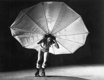
That is Robert Rauschenberg, on roller skates, with a parachute on his back, premiering his dance, Pelican, a tribute/homage to his heroes, the Wright Brothers.
Rauschenberg had been doing costumes and set design for Cunningham’s company for many years, but when the program for the Pop Art Festival performance listed him as a choreographer, he decided to roll with it, so to speak.
Well, it turns out Cage’s performance was a lecture; Oldenburg’s Happening was moved to the gallery; and this photo of Pelican is from 1965, by which point, Rauschenberg had more than a couple of days’ skating practice. But still, the magic lives on every time I go to that roller rink, which is now a Harris Teeter.
Update: Holy smokes, SFMOMA has a film clip. That’s Rauschenberg, Per Olof Ultvedt, and Merce Cunningham dancer Carolyn Brown. The SI’s Eye Level blog has comments by Alice Denney on Rauschenberg’s DC forays.
image: Peter Moore, published in Mary Lynn Kotz’s 2004 Rauschenberg Art/Life, via warholstars.org
What’s Happening? Claes Oldenburg’s Stars Via Time And Alice Denney
I’ve already mentioned the May 3, 1963 Time Magazine article about the Washington Gallery of Modern Art’s Pop Art Festival; it’s really not much, but it contains the most extensive contemporary account of Claes Oldenburg’s 1963 Happening, Stars. Here’s how they reported the grand finale:
Red Gee String.
As the evening wore on, slides of naked women were projected, suggesting that pornography has its place among the neo-Palladian splendors of the alabaster city. Waiters spilled bits of plastic from trays onto the audience. A woman came on wearing a shredded American flag on her head; her spine was as stiff as a flagpole. It had to be, since it was part of the monument to the victory at Iwo Jima, and three soldiers held her at the appropriate tilt. A 14-year-old boy in a Lincolnesque beard entered the room, was shown to his seat, and sat there waiting to be shot. Zow.
For the closing number, Miss Washington, stacked like the melon gallery, appeared in a mass of red taffeta. She pulled her rip cord, and there she stood–after all, it is the nation’s capital–not quite nude. An aw-gee string. A suggestion of red taffeta there-there and there.
She turned and bolted like a moose, followed by official Washington, gurgling hip-hip for happenings.
All these activities map very closely to Oldenburg’s script, which was transcribed and published with his Raw Notes in 1971. But these incomplete accounts generate as many questions as they answer about how Stars took shape, what actually happened, and what happened afterward as a result.
I finally decided to go to the source. Last week I spoke with Alice Denney, who organized the Pop Art Festival and curated the Popular Image show it accompanied. She was generous and awesome, and not a little bemused at my questions–or that I was asking them at all.
How many Happenings were there? When and why did the site move from the cleaners to the Gallery, and how did that affect it?
AD: We thought we could do it in the rug cleaning place on P Street, but a few days before, a couple of the trustees came in and said, “You couldn’t do it there, there’s no egress.” So we moved it.
…
[The content] didn’t change, even though the space was much tighter. We used the stairway so that Olga Kluver could come down.
Ah, so Olga Kluver was the one in the red taffeta dress. In 1963, though she was living with Billy Kluver, she still went by Olga Adorno. Kluver, of course, had helped organize another major event for the Festival, a multi-stage dance performance by the Judson folks at a roller skating rink in Adams Morgan. Meanwhile, in 1964, Andy Warhol threw a party to celebrate Adorno and Kluver’s marriage.
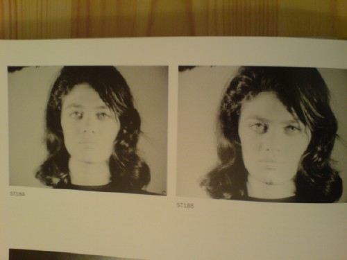
Adorno appeared in at two of Warhol’s Screen Tests, ST184 and ST185, both in 1964. She also performed in Happenings by Allan Kaprow, Red Grooms, and Robert Whitman. Apparently, Adorno’s still going strong, creating enigmatic performance works from her base in Nice, France. But back to Mrs Denney, who was the gallery staffer mentioned in Time as making blue ice cream and serving it on picnic plates, and whose son was the stand-in for Lincoln:
…It was all about Washington: the monuments, the dinner parties…
Everybody wanted to go, and all the fancy folks wanted to be in it.
But it was pretty much my gang of crazies, [Claes] didn’t want society ladies.
And it turned out to be quite popular. The reservations filled right up for all three Happenings [one on Wed., Apr 24, and two on the 25th]. Mrs Denney mentioned that in addition to performing in Stars, Claes’s first wife, Patty [Pat Muschinski], worked on many of Oldenburg’s soft sculptures and costumes, and wrote a memoir of the Happening for Art in America. And so the chain continues.
What’s Happening? Nina Burleigh Takes On Claes Oldenburg
In her 1998 biography of Mary Pinchot Meyer, Nina Burleigh used Stars, Claes Oldenburg’s Happening at the Washington Gallery of Modern Art’s 1963 Pop Art Festival, as a bellwether for sophisticated Georgetown/Washington’s temperament towards contemporary art. Here’s how Burleigh described the event [from p. 202]:
Stars: A Farce for Objects Designed by Claes Oldenburg and involving twenty-one players, the happening lampooned official Washington and satirized the capital’s iconography. One pieces was a huge sewn miniature of the Washington Monument moving around by means of seven people huddled inside. One scene involved a very well-endowed naked woman coming down some steps, and included such absurdities as a roller skater, a waiter carrying a tray and spilling colored foam rubber bits, a girl brushing her teeth, two men spraying room deodorant, a woman undulating inside two mattresses, a girl ironing, and a child dishing out blue frosting. It was accompanied by drumbeats and a rendition of “Sweet Leilani.” Each action was repeated twenty-four times. It was received with annoyance by the art critic for the Washington Evening Star, who found the whole evening tedious. The show, he wrote, “will be repeated and repeated and repeated tonight.”
