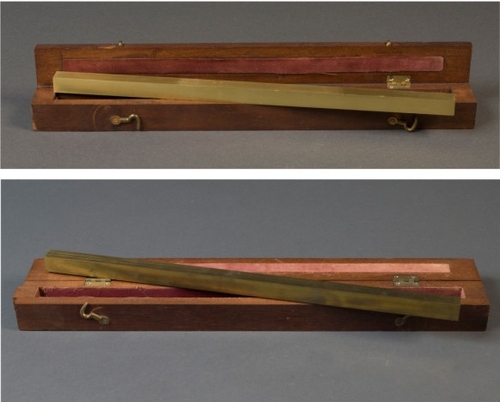
The curators of NIST’s collection of historical and scientific artifacts have thrown open the racks in hopes of crowdsourcing the origins of some unknown pieces.
On top of the list: this brass one foot scale, in a handy, fitted, velvet-lined travel case, which is obviously the inspiration for Walter de Maria’s High Energy Unit [also here]. Love that thing.
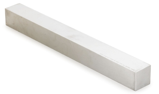
Anyway, case closed. What else ya got, NIST?
One Foot Scales: NIST Digital Collections crowdsourcing initiative [nistdigitalarchives]
Category: etc.
Allied To The Human Form

Can I just tell you how awesome the Contra Mundum I – VII lecture compilation is? How did I not buy this before? How did I not fly out to LA in 2009 for these talks, each one of which is greater than the next, and the first was pretty damn near perfect?
Rupert Deese kicked off the lecture series at the Mandrake with his incredible tales of building and documenting and investigating furniture for and by the likes of Donald Judd, Josef Albers, and Gerald Summers.
Oh, how I totally remember seeing those incredible 1929 Gerald Summers single-sheet molded ply chairs at Bergdorf’s in 1990 [above] and having my furniture mind blown. Only I didn’t realize those were the first and only good knock-offs, and I didn’t snap them up for a song when they were changing the display.

But enough about me. The story I have to put here is not mine, or even Deese’s:
When I was at the information desk at the Met, Norma, one of the people there, told me a funny story about Charles and Ray Eames. They were doing a show at the Met and they showed up; it was about two years before Charles died. Ray died ten years later to the day. So the information desk, most of you know, is round, in the middle of the main hall there, and when people come to visit they come up and they say, “The Eameses are here.” So you call up to the department and you say, “The Eameses are here,” and then you politely ask, “While you are waiting for the curator to come down can you please step away from the desk?” So, as the Eameses stepped away from the desk Ray dropped something. So, she did not bend her knees, she just reached down and picked the thing up. And Norma saw her rear end and said, “Oh, my god, that is the plywood seat!” And so she told me that. And, well, the Eames furniture is allied to the human form, I’d say–quickly I would say that–but Judd’s furniture is allied to this. [gesturing to the room] It’s all about the structure around it.
Contra Mundum I – VII, published in Nov. 2010 by Oslo Editions [osloeditions.com via ro/lu]
Alex Klein and Mark Owens explain Contra Mundum in 500 words [artforum.com]
Buy Contra Mundum I-VII online via textfield, $18 [textfield.org]
This Week In Awkward Twitter Juxtapositions
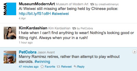
I think Jason’s tuning that one a bit, but still.
I’ve had this one sitting on my desktop for a little while, actually.

Looks Like I Picked The Wrong Week To Give Up Everything
Holy crap, I go away for a long weekend, and what happens?
The death toll in Japan doubles,
The number of meltdowns triples [or something],
We are at war in Libya,
The Death Star has the T-Mobile rebellion caught in a tractor beam,
and Richard Prince somehow lost his open & shut copyright infringement case.
I totally did not see that one coming.
UPDATE: OK, I’ve read through a bunch of the motions, affidavits, and depositions, and the decision [pdf here via aphotoeditor.com], which is basically a flabbergasting shitshow. I’ll probably write a bit more specifically later today, but if it stands, it would have major, sweeping, and stifling effects.
Not only would the current operating assumptions of fair use and transformative use be ratcheted way back, but the contemporary art world would be turned upside down. It would restrict both how artists appropriate, or even refer to, copyrighted work. And it would turn galleries into copyright police, with an affirmative responsibility to clear images, sources, and references for the work they show and sell.
If visual artists and the art market have been operating in some kind of an appropriation bubble, this decision would pop it. Artists would have to adopt the sampling, licensing, and rights clearing practices and infrastructures of the music industry, or the entertainment industry.
But the decision has some glaring omissions and relies rather heavily on almost-20-year-old textbooks and articles from law journals, while ignoring several highly relevant, recent decisions. The most notable ignored precedent is Blanch vs. Koons (2006), which happens to involve another Gagosian artist, and which seemed to set out a workable test of transformative use.
From reading the case materials, including Prince’s detailed descriptions of the making of each of the 29 Canal Zone paintings, it seems obvious to me that Prince and Gagosian were operating under the transformative work/fair use assumptions of Blanch, where changes in scale, medium, context, and color, along with process, editing, collaging, or other process-related elements, are used to identify a transformative work. Judge Batts doesn’t even address process, or any relevance of Blanch to the transformativeness; instead, she makes a blanket assumption that all 29 Prince paintings are infringing because they include Cariou’s Rasta images in some way. It’s really an eye-popping and untenable conclusion.
At the least, the fact that Gagosian the man and Gagosian the gallery were found equally liable for infringing, I am almost certain that this decision won’t go unchallenged. In a series of truly amazing statements, the most shocking is Batt’s cursory finding that Prince, Gagosian, and the gallery all acted in bad faith by not proactively pursuing permission from Cariou to use his images. In other words, operating under the assumption that an artist enjoys a fair use exemption to use or reference a copyrighted element, or that an artist is using copyrighted material in a transformative way, is, on its face, bad faith.
With upwards of $20 million in artwork and unspecified but certain punitive damages pertaining to bad faith actions on the line, there is NO way that Gagosian will let this decision stand.
On the other hand, the photographer crowd is jumping up and down with schadenfreudian glee. [Zaretsky’s rounding up more reactions at The Art Law Blog]
Animal, Vegetable or Minimalism?

Have we considered Damien Hirst’s vitrine sculptures from the Wunderkammer perspective? Because the giant grab-bag auction at Pierre Berge & Associes in Brussels is stuffed [heh] with disturbing taxidermy, eerie medical/scientific specimens, and elaborate butterfly displays. Yes, that is a butterfly skull under glass. If you’re playing any Hirstian drinking games, you are now passed out on the floor.
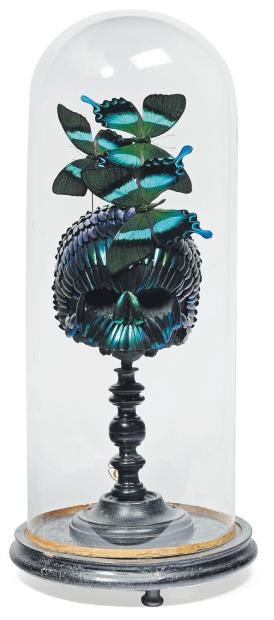
Or have we considered Olafur Eliasson’s art to be inhabiting a similar historical aesthetic trajectory?

Because seriously, put something in a bell jar, or on a tiny little display stand, and it gets immediately objectified and pretty damn near artified.

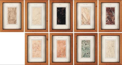
If not, then hop to it, Art History. Because right now, I’m too busy planning my show of found conceptualism and ur-Post-Minimalism:
Lot 451: a suite of 9 framed marble samples [est. EUR1300-1500]
Lot 562: a cube-shaped Oryx-skin pouf [est. EUR 300-450]
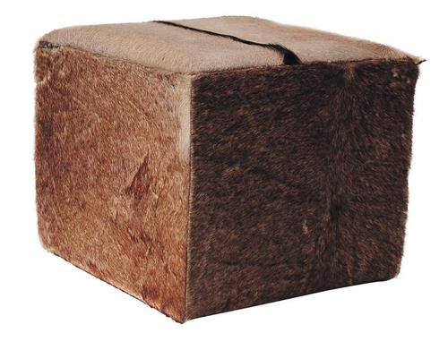
I guess it’s really a pair: Lot 563: a cube-shaped boar-hide pouf [est. 300-450]
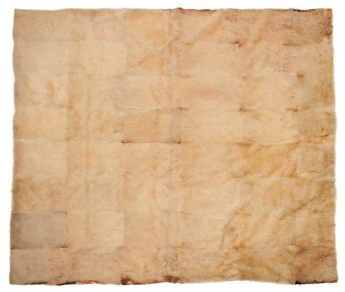
Lot 561: a large monochrome grid made of white wolf skin [est. EUR3000-5000]
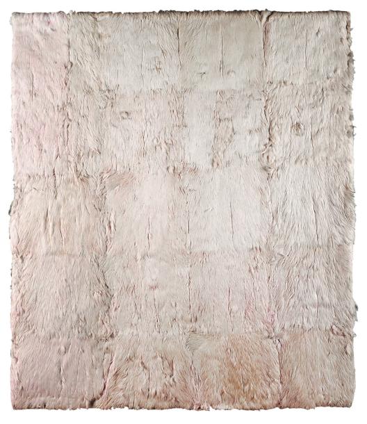
I guess it’s really a diptych: Lot 823: a large monochrome grid made of pink flamingo feathers [est. EUR 1500-2000]
And a couple for the back room:
This could be bigger: Lot 504: a sphere [23cm dia.] of polished thuya root burl [est. EUR 150-200]

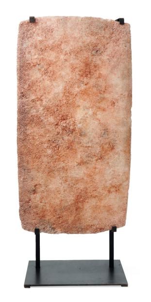
And this could be a bit less Madison Avenue, but still: Lot 576: a plaque of caravan salt from Mali [est. EUR 1200-1500] [ref. flickr]
I Am An American

I’ve written and been inspired by Ansel Adams’ WWII Japanese-American internment camp photos for years, but inexplicably, I haven’t looked closely at Dorothea Lange’s. Paul has some intriguing examples at Eyeteeth. He also notes that Lange was actually covering the internment process for the War Relocation Authority, which quickly became as complicated as you might imagine. According to the Library of Congress, the US government immediately censored many of Lange’s photos, which tended to highlight the patriotism of the Americans being imprisoned without cause or charge. They weren’t widely seen or known until 1972, when the Whitney organized an exhibition about the internment titled Executive Order 9066.
The caption on this photo, taken in San Francisco in March 1942, when the store was being confiscated and its owner jailed, says the UC graduate nisei had installed the banner outside on Dec. 8, 1941. So on the bright side, in those four heated, panicked months, no one tore it down.
Day of Remembrance – Dorothea Lange’s Japanese Internment Photos [eyeteeth]
Dorothea Lange: Women Come To The Front [loc.gov]
FunnyorDie
Looks like I picked the wrong week to not start that awkward Twitstream juxtaposition tumblr.

Gnome
Is there a tumblr for awkward Twitterstream juxtapositions? Because there oughta be.

Recognition Models
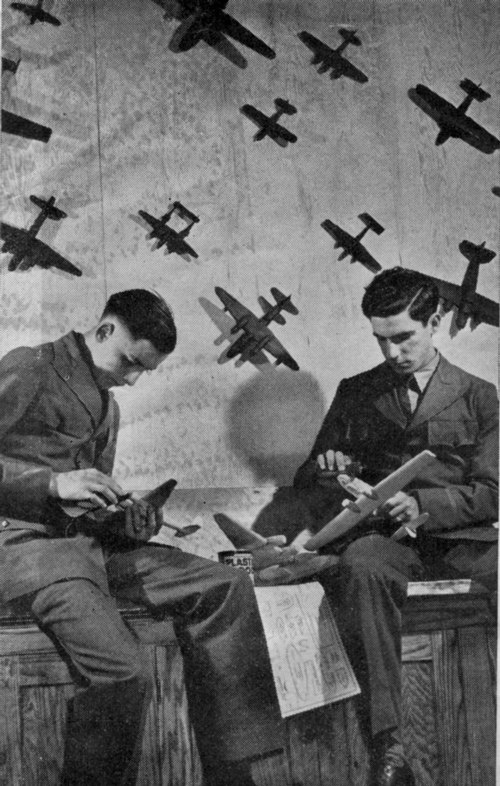
Air Training Corps cadets building recognition models, via CollectAir
Looking for the “Plaster of Paris Aircraft Corp.” and coming up empty [stay tuned], I did find plenty of aircraft made from Plaster of Paris: WWII-era recognition models used to train military personnel and civilian planespotters to distinguish between friendly and enemy aircraft. Though recognition models and plane silhouette posters and such were used as early as planes themselves, planespotting efforts surged during World War II.
Models were needed to train millions of soldiers, for whom distinguishing planes was a matter of survival and victory on the battlefield, and to train millions of volunteers in the Ground Observer Corps, who were manning towers and outposts all along America’s coasts. [British planespotters actually ended up having much more to do.]

Official StromBecKer model kit of the Boeing Flying Fortress, via CollectAir
To source all these models, manufacturers developed injection-molded cellulose plastic technologies to crank them out, and schoolchildren were enlisted to build them from kits of wood, or to carve them to spec from other non-strategic materials. Like Plaster of Paris.
Like the Civilian Camouflage Council mobilized by New York artists and art directors in 1942, and these insane canvas-and-stilts bomber trainers, these recognition models are an awesome melding of militarism and craft, cutting edge technology and ad hoc bricolage.

Walt Disney with reconition models, and the diagram for a Naval flight training film on the wall, from LIFE, via Collectair
They’re interesting and novel to me, but also esoteric and esthetic. For the folks who grew up during the war, they were life and death, vital, formative to their world.
And they’re apparently being forgotten. The images here [and the information, basically everything I know about recognition models that didn’t come from the opening of Empire of the Sun] come from Steve Remington’s CollectAir Friend or Foe? Museum, an extraordinary collection of recognition models and related training material located in Santa Barbara. There’s much, much more on the website, including the planespotting training kites, gorgeous shipspotting models, including one British Razzle Dazzle model, on and on.
Friend or Foe? Museum [collectair.com]
The Great Letterpress Of The United States
During some recent archive dives, I’ve come across a ton of different letterheads. Apparently, people used to write letters to each other all the time, can you imagine? Must’ve taken forEVER.
Anyway, one I particularly ilke is the United States Information Agency, which used to organize international tours for art exhibitions. [The USIA also took over sponsorship of the Venice Biennale from MoMA in 1964, the year Alan Solomon curated a group of Pop and abstract painters, including Rauschenberg.] Anyway, there are variations for USIA offices in embassies, but the basic format is the one seen below. This is actually from a 1965 American filmmaker-related memorandum, something to do with the secret plan to enlist Stanley Kubrick to fake the moon landing. Anyway:
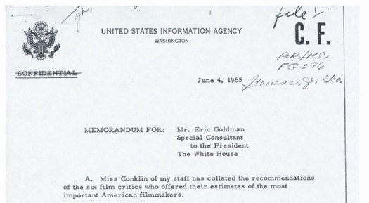
That’s it, just the agency name, and WASHINGTON, with a pared down version of the Great Seal of the United States there on the left. It’s a basic, agency-wide format used by many government agencies. So clean and presumptively powerful.
I had absolutely no idea, though, about the Great Seal, its history, and how it is still used today. Between Wikipedia and the State Department [pdf], though, there’s a fascinating tale. The current die is the fourth version of the original text description–or blazon, to use the heraldic term–approved by the Continental Congress in 1782. It was designed by James Horton Whitehouse of Tiffany & Co. in 1885, and replicated by Bailey Banks & Biddle in 1904. In 1986, the Bureau of Printing & Engraving made a master die from which the current and future operational dies will be created.
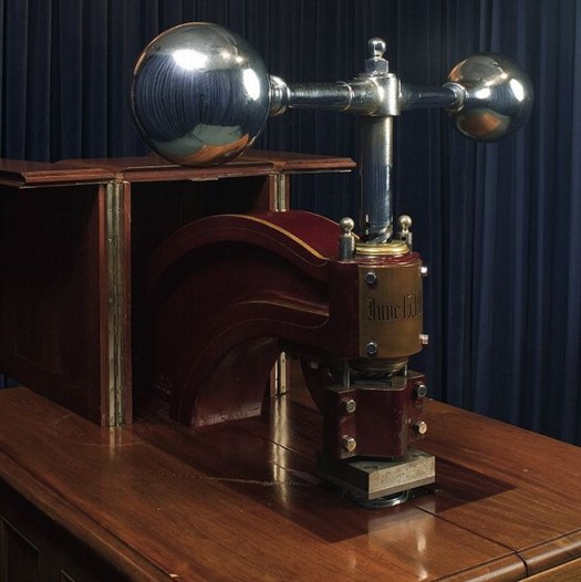
The die is for the front of the Great Seal, the eagle side; there has never been a die made for the back, the pyramid side. The setup since 1904 has the Great Seal affixed to a giant, counter-weighted, brass and mahogany press in the State Department. The Seal is used 2000-3000 times/year, for treaties, ambassadorial appointments, and a bunch of other official, ceremonial communications.
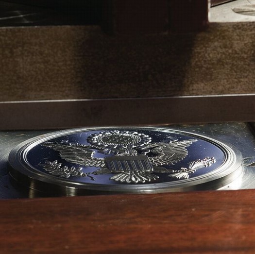
Here’s how it works:
Sealing of Documents
In the Department of State, the term “Great Seal” has come to include not just the die, but the counter-die, the press, and the cover, or cabinet in which it is housed, as well. These stand in the Exhibit Hall of the Department, inside a glass enclosure which is kept locked at all times, even during the sealing of a document. The mahogany cabinet’s doors also are kept locked, and the press is bolted and padlocked in position except when in use. The seal can be affixed only by an officer of the Department of State, under the authority of its custodian, the Secretary of State. When there are documents ready for sealing, one of the officers carries them to the enclosure where the Great Seal is kept and prepares them for impressing.
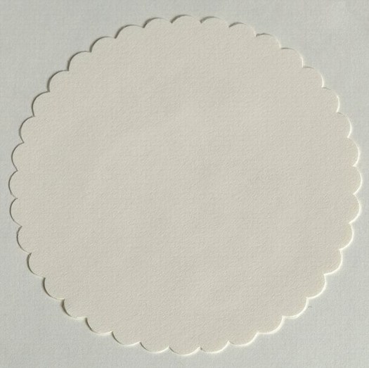
First, a 3 3/4-inch, scalloped, blank paper wafer of off-white linen stock is glued in the space provided for it to the left of the document’s dating clause. If ribbons are used in binding the document, they are run under the paper wafer and glued fast. Second, the document is inserted between the counter-die, with the wafer carefully lined up between them. Third, the document is held in place with the left hand and the weighted arm of the press is pulled sharply forward with the right hand, from right to left. This drives the die down onto the wafer, document, and counter-die, which impresses the seal in relief. The die is then raised, releasing the document and allowing for its removal. When an envelope containing letters of credence or recall is to be sealed, the wafer is impressed first, and then glued to the sealed envelope, leaving the envelope itself unmarked.
In other words, letterpress.
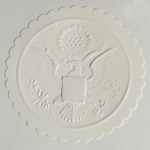
Great Seal of the United States [wikipedia]
The Great Seal of the United States [state.gov, pdf]
Related/who knew?: Historically, great seals are signs of sovereignty, while seals and the deliberate ritual of making them have had added legal significance.
Noguchi Akari Lamps: The Making Of
Isamu Noguchi’s Akari lamps have been manufactured at the Ozeki Lantern Company in Gifu, Japan since 1951. They are contructed from paper and bamboo using the traditional techniques for which Gifu’s lanternmakers are famous. In Japan. [via @freduarte via @langealexandra]
This is so awesome, watching this process makes me want to use it somehow.
Also, I lived in Gifu for a while, just after Noguchi exhibited his Akari lamps in the US Pavilion at the 1986 Venice Biennale. Not that I knew what a Biennale was at the time, of course. The Noguchi Museum re-created the Venice installation in 2009.
From the Ozeki site, it looks like there was a massive, room-filling Akari sphere at Venice? I can’t tell, but none of the other photos I can find seem to show such a thing. The largest size for sale these days is the 120A, which is around 4′ [or 120cm?] in diameter. Which looks smaller than the Akari in the stairwell of the Noguchi Museum, right?

And smaller than the one in Noguchi’s own apartment, which he set up across the street from the museum, an interesting-sounding private space that was mostly dismantled, but not irreparably destroyed, when Fred Bernstein called for its restoration in 2004. Waitaminnit, Jonathan Marvel of Rogers Marvel is Buckminster Fuller’s grandnephew?
Noguchi’s Unknown Home [interiordesign.net]
Frog Design X Louis Vuitton?
My German–including my German retyping into Google Translate–is not good enough for me to tell if they ever actually came to market, but it sure sounds like Frog Design created these Kevlar and leather luggage pieces for Louis Vuitton in 1983:
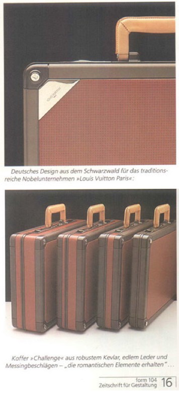
Frogdesign profile, in Form 104 [form.de]
Color Me Interested

Not sure what this psychedelic Juddy chair/sculpture colabo they’re doing with Eric Timothy Carlson is about, but anything RO/LU does has my undivided attention, even if they didn’t quote my favorite Joe Bradley review. [via rolu]
[2020 update: RO/LU alumnus Matt pointed out that Frieze has deleted Chris Sharp’s 2008 review of Joe Bradley’s CANADA show, so here it is, exhumed from the Internet Archive [CW: offensive ableist slur]
This will be a very un-politically correct piece of art criticism. The faint of heart are encouraged to stop reading now. That said, I was recently impressed to hear a New York artist criticize, with distinctly un-PC disdain, a fellow artist for producing work that was ‘not retarded enough’. ‘Retardation’ being the acme of advanced art and any un-self-conscious betrayals of earnest intelligence an act of philistinism, it is as if, over the course of the past five years, a kind of compulsory Dada has integrated itself into the fabric of a good deal of New York art-making. The higher the ‘durr’-factor, the better, apparently, the art. And with this exhibition at CANADA, entitled ‘Schmagoo Paintings’, Joe Bradley has thrown down the ‘durr’ gauntlet. Because it doesn’t get much more retarded than this.
Departing from the slightly less ‘durr’ primary-colour minimalist figures he showed at the Whitney Biennial this year, Bradley has produced an exhibition of seven mid-size ‘paintings’ on unprimed canvases (all works 2008). Six of the seven works bluntly feature stick figures, grease-pencil drawings which can be read as: a human figure, a fish in an open mouth, a cross, a Superman symbol, the number 23, and a line towards the bottom of a canvas (a deadpan mouth?) – while the seventh, titled Untitled (Schmutz Painting), bears nothing but the dirt from the floor upon which it was stretched. There is, incidentally, a lot of schmutz, for the same reason, on the other works as well.
One thing that can said about Bradley’s work is that it responds to the art-fair attention-span of our time. It can (and should) be consumed in no less than the time it takes to walk in, chortle, and walk out of the gallery. When Martin Barré (a very generous reference) did just as little with white canvases and black spray paint in the early 1960s, it was radical and even beautiful. But here and now with Bradley it is just plain dumb, though that is the point. Whether I, or anyone, likes it or dislikes it is actually beside the point. Which is also very much the point. This kind of work wields the uncanny ability to render all who enter its orbit complicit. It’s a kind of 2008 Lower East Side counterpart to Jeff Koons – though rendered much more poorly. Squarely operating within a paradigm of post-sincerity – it is neither sincere or insincere, having transcended such issues – its mere existence acts as a cerebral black hole, engendering critical paralysis. Any possible reaction you may have to it has been foreseen and theoretically integrated into the work, such that reacting is vain. Whether you like it or not, you’re a fool. And if you profess indifference to it you’re likewise a fool, because such painterly antics require a stand that no one can make. It’s like a work of high modernist fiction – Borges, or Cortazar perhaps – in which you realize that you are part of the plot, but by the time you do – standing in front of the painting or reading this review – it’s too late.
I’m Sure There’s A Product Here Somewhere

Yesterday I was looking around for something to take my iPad on the train, and I saw that it fits perfectly in the thick cardboard envelope my Cabinet magazine came in.
I love the idea of a found, cheap, repurposed iPad case that provides a decent amount of protection. But I also wonder if this could work even better in a slightly more advanced material. Maybe Kickstart a development plan, test out some small batches in various Kevlars and polycarbonates and whatnot.
Or maybe low-profile, recyclable cardboard is where it’s at. You could subscribe, and they’d send you a new iPad case when they start to wear out, maybe every quarter. And maybe entice you with a free magazine inside.
$31/100ct is a pretty good price for 9×11.5 inch kraft mailers. [esupplystore.com]
Amazon’s got 100ct for $49, which is alright. [amazon]
Zombie Mark Cross Now Stalks The Earth
Reading through the press release for the new upscale family travel site Poshbrood.com, I was surprised and promptly filled with dread by the chance to win a “faboo Mark Cross saddlebag.”
Because that means someone has brought the luxury brand back from the dead because, what, zombies are really on trend right now? Because if you have any concept of venerable or luxury or heritage or leather or gift or anything when you hear the name Mark Cross, it has literally nothing to do with anything actually happening or made this millennium. And that residual brand goodwill embedded in your brain is now the intellectual property of a roving band of scavenging garmentos and opportunistic luggage salesmen.
Which, God bless’em, credit where it’s due, but also blame, awful, tacky blame.
