
Category: etc.
Ro/Lu Lo/Go
Ro/Lu is en fuego these days, in case you didn’t know, and I’ve been lucky enough to get warmed by their fire.
First off, they’ve been doing this Simple Chair project, an exploration of how and where our stuff is made. It’s making its second appearance at Mass MOCA. I was planning to just write about it more when I saw the publication [to which I contributed a brief article of my Enzo Mari X Ikea table project], but Ro/Lu just keeps on doing stuff, so I can’t sit silently by.
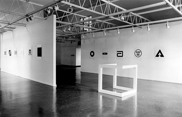
And then, as if reading my mind–or my blog drafts, or maybe communicating telepathically with me through the minimalist/modernist/design/art ether–they posted a link to an awesome-looking 1980 exhibition at The Renaissance Society in Chicago, “Objects and Logotypes: Relationships Between Minimal Art and Corporate Design”.
Whoa. It’s fascinating to see how Minimalism, modernism, and corporate branding were perceived and presented thirty years ago. They all feel digested and processed now, but I get the sense that what curator Buzz Spector is talking about in his essay is not quite the same thing we use those terms for today.
Which may be a way of saying I take issue with many of Spector’s definitions and points, but I’m not quite able to articulate why I think he’s wrong. I mean, I can say that I think Greenberg’s Minimalism-as-“mannerism” does not seem related at all to the principles of usage in corporate visual design. Or that the ubiquitous, homogenizing proliferation of a corporate logo seems like the diametric opposite of Robert Morris’s sculptural gestalt, not its twin.
But Spector’s show still seems like an interesting, important first step for the coming revisiting of Minimalism. And siting avant-garde art practices in parallel to mid-century corporate marketing is pretty compelling to think about. And I really like the idea Spector hangs his show on, that these designers and artists are alike in conflating form and value, i.e., that they “reflect a common faith in the efficacy of form as a means of restructuring society through public exposure to works executed within particular systems of use.”
As I sit here in the middle of a mild obsession with the Netherlands government’s new, painting-inspired rebranding and centralized visual identity system, this idea feels as relevant as ever.
So thanks, Ro/Lu!
Working In The Medium Of Vinyl Wrap Art Car
Last year about this time, after seeing Jeff Koons’s BMW Art Car, I tossed off the idea that artists could be cranking out vinyl wraps as artworks.
Which I will happily assume is why designboom and Porsche had this contest last winter to create vinyl wraps for the Cayman.
Which, hrm. Even as I randomly take full credit for the idea, I gotta say, it’s just as likely it’s entirely wrong.
ABC & POD at Printed Matter Thursday Night
So when I first published the Richard Prince Canal Zone YES RASTA book in March, I got some nice responses from people, including a couple of folks who suggested I look at joining ABC, the Artists’ Book Co-operative. ABC is an interesting-looking coalition of artists and photographers who come together to support and discuss print-on-demand publishing and to bring attention to their projects.
As it turns out, Printed Matter is hosting a reception and conversation tomorrow night with active members of ABC, which is in conjunction with an exhibition of ABC/POD titles that runs until June 30th.
It should be positively informative and delightful, and I look forward to going, to meeting some of the folks there, and to possibly seeing a greg.org reader or two as well. At this point, I think I will not endeavor to join ABC, but to continue to admire them from a distance.
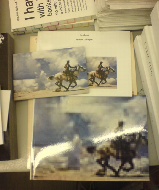
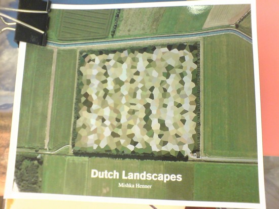
Seeing as how they already have at least one guy who copies jpegs of Richard Prince cowboy photos in volume, and another who just released a collection of Google Maps images showing of the peculiarly aesthetic polygonal camouflage technique used to obscure sensitive sites in the Dutch landscape, maybe a little more distance would be better for all concerned.
ABC Artists’ Book Co-operative conversation and reception, Thursday, June 16, 5-7 PM [printedmatter.org]
De Rijkshuisstijl & The 1 Logo Project
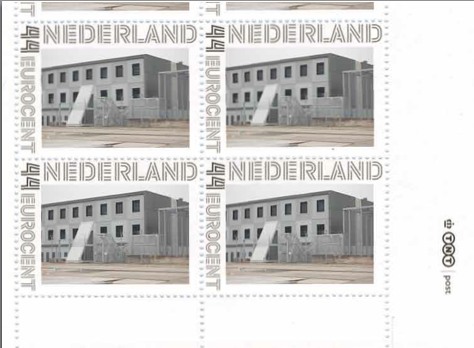
As part of their project Caché-Exposé, investigating the Netherlands’ largely invisible detention and deportation system, the Amsterdam art & design collaborative Foundland documented obscure, anonymous detention sites around the country. Then they used a highly official, public system to distribute their images: design-it-yourself postage stamps.
What with the domes, the minimalist/industrial architecture, these stamps, and–hello, this awesome flag they shot in 2008–I can’t help noticing how beautifully designed the Dutch immigrant prison system is. So thoughtful.
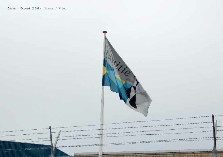
That is the Ministry of Security & Justice flag there, flying over the Zaandam waterfront dome prison. The biomorphic shape is a perspectival view of the scales of Justice, a fragment of the Ministry logo, which is an abstracted, blindfolded Justice.
![]()
Is, or was. Because on Google Streetview, the flag is different. Much simpler.
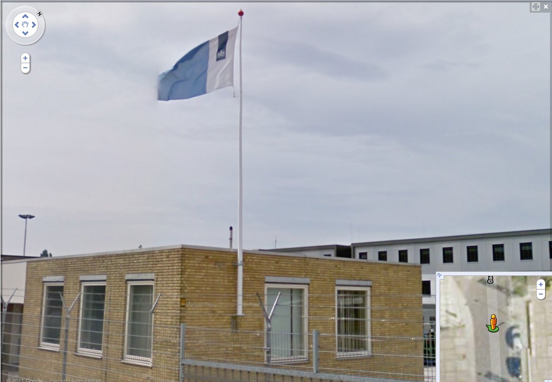
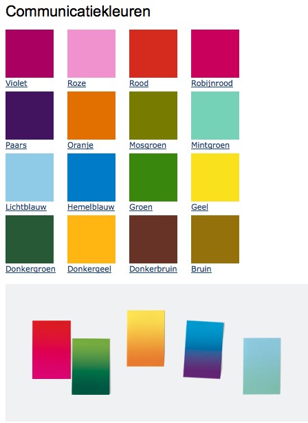
That is the new Rijkshuisstijl, which is officially called the Central Government Visual Identity, but which I gladly transliterate as the State House Style, a four-year effort begun in 2007 to centralize and redesign the Dutch government’s corporate identity. Part of that initiative was the 1 Logo Project, a replacement of 125+ separate ministry and agency logos with a single logo, the national coat of arms on a vertical blue bar.
Ah, I’m told it’s a ribbon. Here’s the English version of the style guide.
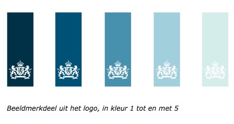
Oh, man, the color palette, 16 colors “inspired by the colorful Dutch landscape painting,” plus five gradients. Get me Colby Poster on the horn.
I am kind of geeking out over this. On the one hand, it’s a normal redesign gig, tastefully done, but typical to the point of banality. On the other, because it’s the state, I can’t help but read every platitude in the mission statement and objectives, every justification of every design decision and element, through a politicized filter. Without knowing really anything about the details or shifts in Dutch poltiics beyond recent surges of right-wing populism, I can’t help but interpret the identification of problems the Rijkshuisstijl was intended to fix as criticism of the parties and governments then in power.
Partly, it’s the Rijkshuisstijl’s incredibly bold assertions of design’s importance and function. And the grand assertions of meaning:
“The symbol exists of a blue ribbon with the coat of arms. Subtle and unpretentious, an authority without being authoritarian.”
The color of the logo is Rijksoverheid Blue. Inspired by the Dutch skies and Dutch light. Blue for calm and reliability. Blue for tradition and enduring values. Blue for harmony and balance.”
“The wide variety of logos previously used by various government organisations made them less recognisable, causing confusion among the public and business community. People were no longer able to see the wood for the trees. Central government organisations seemed to be competing rather than cooperating with each other. This approach compounded the widely held view that central government was fragmented.”
“The mission statement and the motto both underline what central government stands for. They give the central government logo (Rijkslogo) real meaning.”
And then there’s the irony of context, the subjective happenstance of discovering the Rijkshuisstijl while looking at an exposé criticizing the Netherlands’ unjust treatment of immigrants, a project which I’d discovered in turn while reading about the current populist government’s massive cuts to the country’s arts infrastructure. Is this what modernism and Good Design signed on for? Because it’s what they got.
Oh, and there was a symposium, and a book, De stijl van het Rijk/ Style and the State, produced last fall by the Stichting Design den Haag.
Foundland [foundland.org]
Rijkshuisstijl guide in English [rijkshuisstijl.nl]
UPDATE: So the work was actually done by Studio Dumbar in Rotterdam, announced on their site in 2007 [studiodumbar.com]
Pastoe Cabinet With Desk By Cees Braakman
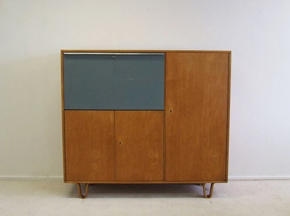
They may not be able to create an art ecosystem that can withstand the whims of populist demagogues, but I tell ya, back in the day, the Dutch sure could make the hell out of a birch writing cabinet.
Cees Braakman for Pastoe writing cabinet, birchwood cabinet with original colour-painted flap door (scratch), EUR1300 [vervlogenjaren.nl via anambitiousprojectcollapsing, also previously, reflib]
iIkea: Furniture In The Cloud
An aside from Dan Hill’s extended examination of physical retail:
a conversation earlier today, spiraling out of the fact that we have some Ikea furniture (a bed) in a shipping container somewhere, traveling from Australia to Finland, and the thought occurs that Ikea could replace that physical shipping by simply sending a copy of the bed from the Espoo store, and picking up the old one in Sydney. A form of fabrication possible with their already distributed network of components.
On Retail [cityofsound]
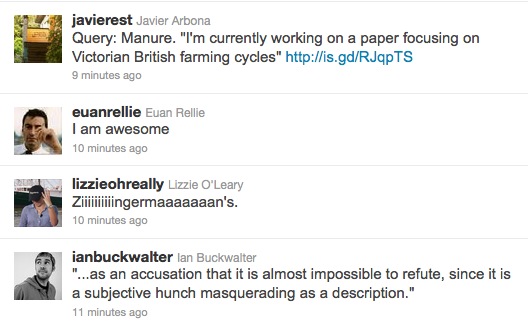
Awesome Twitter Juxtaposition Of The Day
These tweets actually do reflect the opinions of greg.org:
Colorama
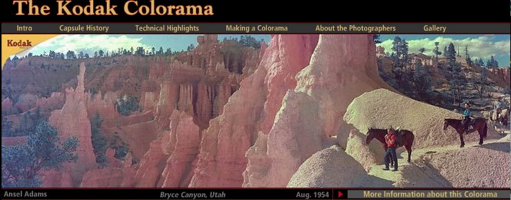
I really need a photomurals tag at this point. The Kodak Colorama billboard was installed in the Great Hall of Grand Central Station from 1950 until around 1990, when the station began a long-overdue restoration.
Anyway, 18×60 foot backlit, color transparencies, “the biggest photographs in the world,” one a month for forty freakin’ years. It’s like if Norman Rockwell had a son named Jeff Wall who went into advertising.
According to the Kodak Colorama mini-site, company executives Adolph Stuber and Waldo Potter originally thought to recreate “Kodak’s success with projecting color slides to a staggering size for the 1939 World’s Fair,” but the Great Hall’s sunlight forced them to go the backlit route.
Just as regular photomurals were first printed in wallpaper-like strips, the Colorama transparencies were made of 18-inch [and later 36-in] rolls pieced together witn tape.
Colorama was designed to promote “a critical cause — photography for photography’s sake.” Which means something different to a company that sells cameras and film. The majority of the Colorama pictures were by Kodak staff photographers, who inserted amateur photographers in glorious landscapes.
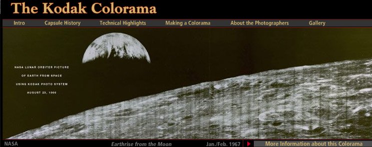
But not all. There are several Coloramas over the years by Ansel Adams, including the August 1954 panorama of Bryce Canyon, Utah up top. The 1967 Earthrise image above is the only black & white Colorama photo. Apparently, it had been covered a lot immediately after NASA received the transmission from the Lunar Orbiter, and the Colorama appearance kind of leveraged that familiarity.
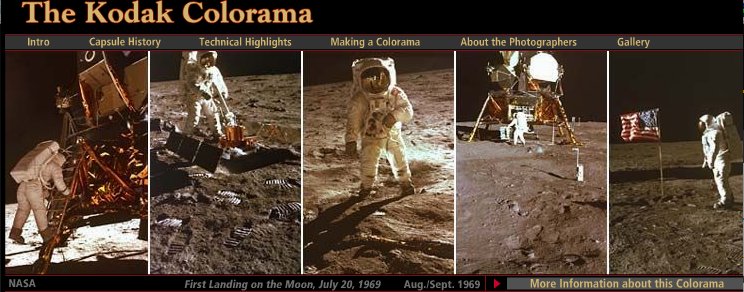
Contrast that, though, with the 1969 Apollo 11 images, where Kodak engineers rushed to print NASA’s just-released negatives from the moon landing, and ended up scooping Time, Newsweek and Life, to the benefit of the “awed crowds.”
The Kodak Colorama [kodak.com]
Last summer, Kodak donated the Colorama Archive to Eastman House [eastmanhouse.org]
Police Action Painting
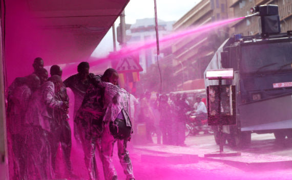
Police spraying protesters in Kampala, Uganda, May 10, 2011 [image james akena/reuters via cfr.org]
I haven’t been able to get these images out of my head since Brian Sholis pointed to them; they’re stunning and disturbing at once.
As Time Lightbox’s Ishaan Tharoor put it,
We’re used to protest movements that come in colors–the yellow of people power in the Philippines, Ukraine’s orange, the green of Iran’s brutalized democrats. We’re less accustomed to seeing protests quashed with color. But in Uganda, security forces sprayed opposition leaders and activists with a vivid pink dye–a mark intended both to humiliate dissidents and make it easier for police to nab them.
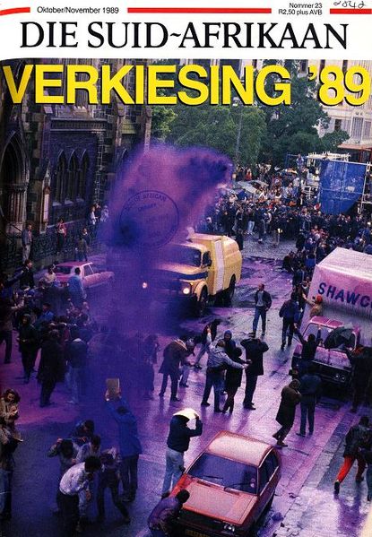
The first publicized use of dye cannons was in Cape Town, South Africa in 1989, in a fiasco that became known as the Purple Rain Protest [image below via wikipedia] An anti-apartheid demonstrator seized the cannon and turned it on the white-painted buildings in the square, including the National Party headquarters. “The purple shall govern” became a rallying cry for the democracy movement.
In 2008, after Indian police painted protestors purple in Srinagar, Slate’s Explainer put together a concise history of the dye cannon. Which is, well, ironic, considering how aesthetically similar the police painting images are to the Indian Holi Festival, where crowds bombard each other with powdered pigment as part of an equalizing, anarchic celebration of religious joy.
Clearly this is not art; but it is painting. And the sobering political implications and power dynamics depicted in these incredible–even, I hate to say it, beautiful–images makes me question the glib, benign assumptions I hold for that word, that action.
For a long time, I’ve been fascinated by the military definition of ‘painting,” the use of laser sighting and guidance systems to target weapons ranging from guns to missiles. It made me wonder what other seemingly paradoxical contexts “painting” has found its cultured, refined way into. I guess I can add one more to the list.
Color in the midst of protest [time lightbox]
Random Twitter Juxtaposition Of The Day
Sometimes it’s like they’re just having a conversation in my tweetstream without me. The only possible improvement is if the Kiarostami movie had been Ten, but that’s quibbling.
Nice
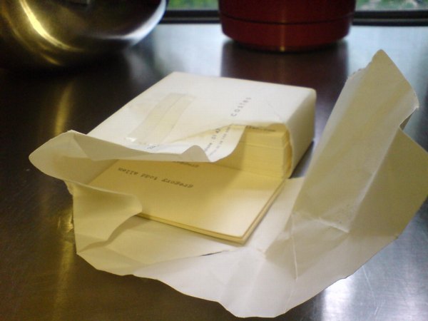
There sure has been a lot of calling card hoopla these days. It seems like it peaked just as I was moving an old file cabinet, and I found this packet of cards I had made in 1999 in Paris. They were still wrapped in the Hotel Costes stationery I’d used to break the order down and transport it more easily in my luggage.
I’d gotten them made at Calligrane, a small paper store in the Marais that still doesn’t have much of a web presence. I remember it as a little giftier than I like, with elaborate desk sets or something, but still the only place I could find who could do the typewriter-like letterpress cards I was seeking.
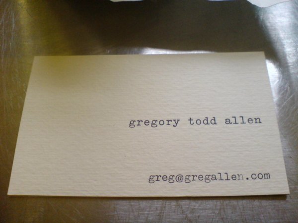
Because I did not want engraved cards, and I didn’t want fine paper. I already had business cards like that, and so did all kinds of people. What I needed, I told them, was a replica of the earlier calling cards I had made in 1995.
That’s when I had a business card with three addresses and six phone numbers in two countries on it, it was ugly and ridiculous. All I needed, I figured, was email [gallen@echonyc.com], and since it’s the internet, I really thought the cards should be typed.
I got really lucky, it turns out, because in Vieux Nice, just up the hill from the cathedral, was a little printing and paper studio run by a Scandinavian guy named Peter. He’d salvaged the type from old typewriters to do letterpress with. Wow, those were clean.
I still have one small box of those somewhere. It has Peter’s full name in a stamp on the bottom. I think when I looked him up to order replacements, he was still in Nice, but had switched from printing to sculpture. Gotta track that guy down again.
Pakistani Camo Landscape

These people are not wearing their videoconference faces.
According to the EXIF data, White House photographer Pete Souza took this photo at 4:05 PM, or 1:05 AM Abbottabad Time, five minutes in. They’re watching it as it happened. Which people already know, since it has garnered 455,000 views been blogged and retweeted and facebooked 455,000 times in a matter of hours.
Souza also asks us to “Please note: a classified document seen in this photo has been obscured.” Indeed, there it is. Funny how unobscured it looks at this size.
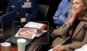
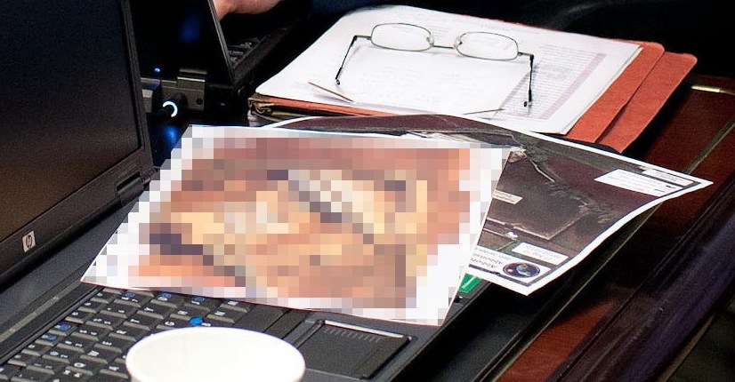
Let’s take a closer look:
Didn’t I just post something about collecting all the seals and emblems of government agencies?
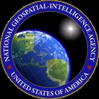
Because that’s the seal for the National Geospatial Intelligence Agency sticking out from underneath there. As you’d expect.
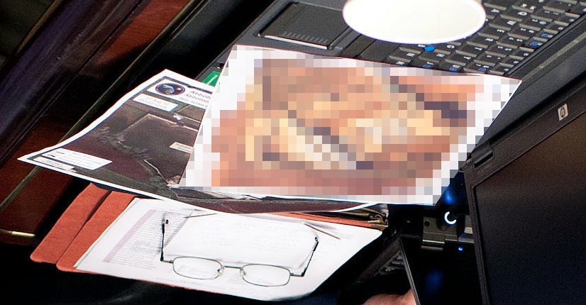
And that corner of landscape does look like the image of left sideyard of OBL’s compound. [image via ogleearth]
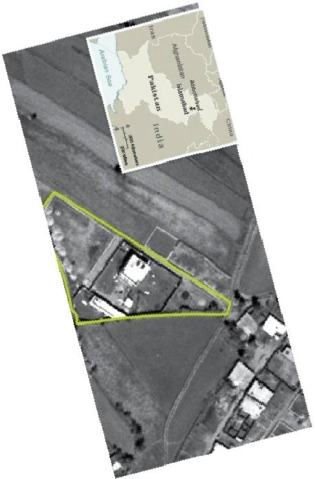
And now that you mention it, the pixelated image does look like the front gate area of the compound, just at an as-yet-unacknowledged high resolution. Of course, from here, it also kind of looks like a painting. I’ll get right on that.
Previously: Google Maps & the everchanging Dutch Camo Landscape
The Great Letterhead Of The United States
I’ve written before about the “clean and presumptively powerful” design of various government letterheads I’ve come across in my recent archive diving.
And I must not be doing it right, because my searches for the expansive survey of the history of such official design, and for the comprehensive sourcebook containing the thousands of seals and emblems of various government agencies and offices keep coming up empty.
![]()
I mean, Total Information Awareness, right? Somebody must be keeping a list. Anybody? Bueller?
So I’m reduced at the moment to random click trains through Wikipedia, or to search diving in the digitized collections at the National Archives. Not very productive.
Though it has yielded some nice finds. Nothing spectacular, but then, that’s kind of the point of these designs. Up top, the United States Information Agency, once part of the State Department. That’s the director’s office letterhead there, with the smaller seal.
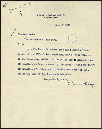
What I really like, in addition to the undesigned design, is how all the rest of the information is handled. Though a zip code does pop up occasionally, there’s almost never a street/mailing address. Or maybe there is; “Department of State comma Washington” would probably get you or your letter there in 2011 as easily as 1898.
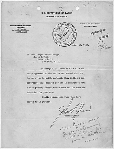
But it’s the way information accretes, the way the document functions, that’s kind of cool, too. The tiny instruction for answering and the reference number on the upper left of this 1922 Dept. of Labor letter, for example. And all the stamps! Check out that received stamp: not just the date, but the time, too.
Anyway, I made a little flickr photoset of a few examples I’ve found. I’m looking forward to having my scattered, amateur enthusiasm swamped by the exhaustive review of government logo and letterhead design that some expert has already compiled. And then we can start talking about what I’m looking at this stuff for.
Previously: The Great Letterpress of The United States
Dear pwn0 on Publicsurplus.com, I want to buy your Palomar Sky Survey Prints
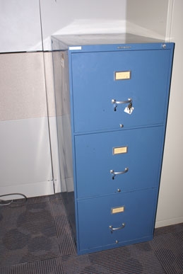 Dear pwn0,
How are you? I would like to discuss with you the Palomar Sky Survey prints you bought on publicsurplus.com in 2010.
I know it was a POSS-I set of prints, but from the size of the file cabinet, it looks like it was an early or partial version. And I hear from the folks at the planetarium who sold it that it might have been incomplete.
I have attempted to relay a message via publicsurplus.com itself, but the company does not respond to any non-automated communication attempts.
pwn0. Are those your initials? Perhaps someone knows you, and might relay this message to you? From the other, large, shop-related items you have purchased recently on publicsurplus.com, I am assuming you live in Utah. Which is awesome. My mom lives there, and we’ll be visiting in a few weeks.
Anyway, I’m interested in hearing about that old file cabinet full of obsolete astronomy photos–and then I’m interested in buying it from you. So please drop me an email at greg at greg dot org. Thanks!