
Not sure what’s cooler about JWZ’s post about visiting the repurposed Christian Science church that is now The Internet Archive’s San Franscisco Mothership:
their slick and simple book digitizing station setup, or the “terracotta army of avatars of their long-term employees” which are gradually filling the pews.
The Internet Archive [jwz.org]
Category: etc.
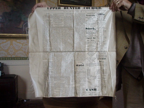
Queen Victoria Silk Newspaper
Well that’s kind of fantastic, like Victorian- era Rauschenberg.

Apparently, to commemorate Her Majesty the Queen’s to the Isle of Jersey, The Jersey Herald printed copies of the September 11, 1846 edition of the newspaper on silk panels, which were then stitched together with beaded pearls. Here’s a detail shot:

Did they only make the one copy? Is this the only printed silk newspaper facsimile out there? Can I find these in any boot sale of dead queen paraphernalia, or only Malcolm Forbes’s?
UPDATE AFTER TEN MINUTES OF GOOGLING So printing newspapers on silk is/was a commemorative thing. The first copy of the first issue of the Grand Rapids Times was printed on silk in 1837 and presented to its largest subscriber/investor, while additional souvenir copies were printed on cloth. A silk copy of an 1852 edition of the San Francisco Daily Whig came across book conservator Nicole Wolfersberger’s desk [and into her flickr stream] a couple of years ago. The Upper Hunter Courier made a silk presentation copy of their paper for Lord Belmore after he came to open a section of railway in Scone in 1871. It was not nearly as nice as Queen Victoria’s.
And in 2007, the Jiefang Daily Press Group gave the V&A a copy of the 2005 silk front page which was carried into orbit on China’s second manned space flight.
The Forbes Collection at Old Battersea House – Sale 338 – Lot 415
TWO PRINTED COMMEMORATIVE SILK FACSIMILE NEWSPAPER SHEETS
Est. £500-800 [lyonandturnbull.com]
Previously: Rauschenberg Currents Event
Camo USS Recruit
I’m not sure what’s cooler:
That during World War I, John Purroy Mitchel, “The Boy Mayor of New York,” built a giant plywood battleship called the USS Recruit in the center of Union Square to drum up volunteers for the Navy,

That it was repainted overnight by the Women’s Reserve Camouflage Corps in brightly colored dazzle camouflage to get more business,
Or that there’s a site–and a book!–called Camoupedia.
Camoupedia: A Compendium of Research on Art, Architecture and Camouflage, by Roy R. Behrens (Bobolink Books, 2009) [camoupedia]
Blowing Up Tanks: Ellsworth Kelly And The Camouflage Secret Army
ce ci n’est pas un Razzle Dazzle? Ellsworth Kelly, Study for Meschers, 1951, moma
When tiny scans of Gwyneth Paltrow’s Interview interview with Ellsworth Kelly first appeared on tumblr, the only thing you could read was his pullquote about his tour of duty in World War II:
I was in what they called the camouflage secret army. The people at Fort Meade got the idea to make rubber dummies of tanks, which we inflated on the spot and waited for Germans to see.
Which, nuts, right? I guess I’d heard of Kelly’s camouflage involvement before, and I remembered somewhere that Bill Blass had also been in a camouflage division, but I’d never put it all together that these guys were in the Ghost Army, whose operations remained largely classified and unknown until the mid-1990s.
Here is Kelly’s fuller quote, and his photo of himself standing next to a burlap jeep:
PALTROW: Did you design camouflage while in the army?
KELLY: I did posters. I was in what they called the camouflage secret army. This was in 1943. The people at Fort Meade got the idea to make rubber dummies of tanks, which we inflated on the spot and waited for Germans to see through their night photography or spies. We were in Normandy, for example, pretending to be a big, strong armored division which, in fact, was still in England. That way, even though the tanks were only inflated, the Germans would think there were a lot of them there, a lot of guns, a whole big infantry. We just blew them up and put them in a field. Then all of the German forces would move toward us, and we’d get the call to get out quick. So we had to whsssh [sound of deflating] package them up and get out of there in 20 minutes. Then our real forces, which were waiting, would attack from the rear.
PALTROW: So in a way, it was just like an art installation! That’s amazing.
KELLY: One time, we didn’t get the call and our troops went right by us and met the Germans head on. Then they retreated, and they saw our blow-up tanks and thought they were real and said, “Why didn’t you join us?” So, you see, we really did make-believe.
PALTROW: It’s the perfect job for an artist in combat.
KELLY: We even had the tank sounds magnified because tanks would go all night long.

It sounds like Kelly was actually in the 603rd Engineer Camouflage Battalion, one of four units in the 23rd HQ Special Troops, which entered France just after D-Day and ended up seeing quite a bit of action, all with balloons and loudspeakers instead of actual weapons.

As Edwards Park explains in a fairly detailed history, the 23rd’s main objective was to impersonate various active divisions in order to cover or obscure troop movements. The inflatable weaponry was designed to fool aerial reconnaissance, but the 23rd also acted out the operations of the units they were impersonating/replacing, visiting fake garbage dumps, and laying fake tank tracks at night under the cover of pre-recorded troop sounds and fake radio broadcasts. And they created fake badges and mingled with local civilian populations, passing along disinformation. As Park puts it, “It wasn’t long, in fact, before the 23rd had a voluminous file on visual identifications and the men suffered many a bloody finger sewing bogus shoulder patches on their uniforms before going into action.”
It’s one of many not-too-thinly veiled references to the 23rd’s apparently fruity reputation. I’m sure there’s at least one queer studies dissertation out there on masculinity, war, and the confluence of camouflage, artsiness, and passing for “real” soldiers.
As NPR reported in 2007, most camo/deception soldiers were apparently ordered never to discuss their wartime efforts. But Jack Masey was never told to keep quiet–waitaminnit, Jack Masey? The USIA design director and serial Expo geodesic dome commissioner? Holy smokes! It all makes filmmaker Rick Beyer’s documentary Ghost Army feel like a race against time. I hope he got some good stuff.

Meanwhile, I guess I’m on the hunt for some 23rd material myself. In 2004, Sasha Archibald wrote in Cabinet about the Ghost Army’s unauthorized insignia for itself, which featured the three-legged triskelion and the motto, DECEIVE TO DEFEAT. [Christoph Cox’s excellent history of sonic deception in the military leads me to believe that everything I knew about the 23rd I learned in Cabinet Magazine.]
And I guess it’s too optimistic to imagine any rubber tanks or vintage camo have survived all these years; I can’t imagine if the top secret thing preserved such artifacts or doomed them. But at the least I could start tracking down some of those Ellsworth Kelly posters.
OK, Meyers’ site points to this 1992 video by/about the WWII paintings of Harold Laynor, who describes himself as part of the “famous Ghost Army,” and says its activities were “unknown to the general public until well after 1980.” Hmm. Laynor also says there was an initial plan in 1942-3 for the 603rd to focus on domestic camouflage. But that the British successes with battlefield camo in North Africa inspired the US to deploy the deception unit in combat.
Related: British WWII bullshit camo stories
The Civilian Camouflage Council, included a lot of folks at Kelly’s school, Pratt
Sounds so-so, but full of facts/details: military historian Jonathan Gawne’s 2002 book, GHOSTS OF THE ETO: American Tactical Deception Units in the European Theater, 1944 – 1945
Defendant’s Request #2
While doing some family history research, I discovered that one of my grandmother’s cousins, Charles Burr, a farmer in Burrville, Utah, had been killed by W.A. “Boss” Lipsey, a neighbor, in March 1943.
The Burr family version of the story says that Lipsey had run-ins with many other farmers in the valley, and that, after a water rights argument, he lay in wait in the bushes until Burr ventured out to feed his animals, and then he shot him in the back with a 12-gauge shotgun.
A version of the story online mentions a years-long feud between the two, and specifically referred to a fight a couple of years earlier between Burr, Lipsey, and Lipsey’s sons.
I just received the court records for Lipsey’s murder trial, including some information the defense drafted for the judge to pass along to the jury during their deliberations. Here is one, with the judge’s handwritten notations in italics:
DEFENDANT’S REQUEST #2.
The Court instructs the jury that the evidence in the case shows, without dispute, that on August 7, 1941, Charles Burr, with his fingers and hands, dug out the left eye of the defendant.
Refused
July 1, 1943
John L. Sevy, Jr
Judge
The Burr account I have ends:
The family could not believe the verdict of second degree murder with a fifteen-year prison sentence with eligibility for parole after five years. Needless to say, the Burr family did not believe justice had been served.
The account does not mention what I found from newspaper accounts: that Boss Lipsey was denied parole once and appears to have died in the Utah State Prison. As of 1995, when this Burr family history was privately published, it doesn’t sound like there’s been much attempt to reconcile the Lipseys and the Burrs’ versions of their intertwined history. I don’t know if I’m up for trying, or if I’m too close or too far to do it.
05/12 UPDATE Thank you, Google. I have heard from one of Boss Lipsey’ great grandchildren that Boss was, in fact, released from prison shortly before he died. As one might imagine, their family stories emphasize details that the Burr versions omit, like that Lipsey was in his mid-70s when he and 40-yo Charley first fought over their turns for the Koosharem Reservoir’s irrigation water. I may end up putting the Burr family version of the incident online sometime; it was written by Charley’s son Ned, who was around 13 at the time his father was killed.
Autoprogettazione Items I Didn’t Win On eBay

Mondo Patrick tipped me off to this a little while back, and for a while there, it was kind of turning my table world upside-down.

It’s an autoprogettazione table by Enzo Mari, of course, model 1123 xE, one of the most picnic tabliest of them all, made from the original 1970s precut wood kids produced by Simon Gavina.
It was really tempting, but ultimately the condition issues–there were some split and badly repaired wood pieces on one side which would probably mean losing some of the original wood–and really, the shipping from somewhere outside Torino to, wherever really, where am I going to put a second table project on no notice? And maybe if I could wait for the euro to collapse it’d make financial sense, but–anyway, I passed on it.

That hammered, golden patina still shines in my dreams, though. Let’s watch the European auctions for a while and see if this bad boy reappears. Meanwhile, I still have this image of Rirkrit’s chrome ghost of 1123 xE to keep me company.
Cast Out First The Economic Terrorist Beam That Is In Thine Own Eye
From a NY Times article about a gay activist’s petition for Microsoft to stop participating in an online affiliate sales company CGBG, which earns revenue for anti-gay groups like Focus on the Family:
“This is economic terrorism,” said Mike Huckabee, the former pastor, governor and presidential contender, who is a paid CGBG consultant. “To try to destroy a business because you don’t like some of the customers is, to me, unbelievably un-American,” he said in an interview.
From SFGate, Dec. 6, 2005:
Christian group pulls Wells Fargo accounts / Focus on the Family objects to donation to gay rights group
“We don’t expect corporate America to do our bidding on the issues, but when they use the proceeds from our business and give them to others who clobber us over the head, we say enough is enough,” said Tom Minnery, who oversees public policy for the organization.
Focus on the Family’s move follows a recent spate of conservative boycotts and other actions against large companies that support gay and lesbian causes, including Walgreens drugstores and Kraft Foods Inc., both of which contributed to the Gay Games.
Conservative groups also have targeted Ford Motor Co. for advertising in gay media and Procter & Gamble for advertising during the television shows “Will & Grace” and “Queer Eye for the Straight Guy.” The best-known protest may have been the nine-year boycott led by the Southern Baptist Convention against Walt Disney Co. for hosting Gay Days, a week of gay-themed activities at Walt Disney World in Orlando. That boycott ended in June.
From a 2005 Orlando Sentinel article on the Kraft, Proctor & Gamble and Disney boycotts:
As more companies adopt gay-friendly business policies, they risk the wrath of conservative Christian groups prepared to take action with their collective buying power.
“People are willing to fight back with their pocketbooks,” says Tim Wildmon, president of the Tupelo, Miss.-based American Family Association, a conservative group that has boycotted such companies.
Eyeballed Autoprogettazione

Toronto-based designer Maté Szemeredy didn’t have the plans to make Enzo Mari’s Autoprogettazione Square Table, so he eyeballed it, based on online photos and published dimensions of finished tables. I’d say he got pretty damn close–those crosspieces may be inside-out and upside down, or maybe they just look cleaner that way–and he got a pretty sweet finish. And all in just two days, too. Nice.
Enzo Mari Autoprogettazione photoset by Datum-Datum [flickr]
Szemeredy’s blog, Things Take Time
We Made And Ate John Cage’s Cookies. They Were Delicious.

Someone recently tweeted about John Cage’s cookie recipe, which the Walker had posted on their blog a few weeks ago
Preheat oven to 350 degrees.
In a food processor, grind:
1 c. raw almonds
1 c. raw oats
Combine almonds and oats in a large bowl. Stir in:
1 c. whole wheat flour or brown rice flour (if you want a gluten free option, you may need to add slightly more than the 1 c. brown rice flour, so that you are later able to form balls with the dough)
Add ground cinnamon to the dry mixture.
To the dry mixture, add:
1/2 c. almond oil (other nut oils work as well)
1/2 c. real maple syrup (no Aunt Jemima!)
Stir mixture until you are able to form one-inch balls. Place on ungreased cookie sheet. Flatten slightly, and press a small dollop of your favorite jam or preserves (jelly is too thin) into the center of each cookie. Bake for 15-20 minutes, turning the pan once, halfway through the baking process. Cookies are done when light golden brown. They store well in the fridge.
Well, yesterday, we tried it, and the recipe works, and they are very good, as good as anything made primarily of almonds, cinnamon, maple syrup, and homemade raspberry jam could be, anyway. They’re very rich and dense.
A couple of tips about the recipe:
We have almond flour, or almond meal, which is fine-ground almonds, which I was tempted to use instead of foodprocessing actual, whole almonds. But I didn’t, and I’m glad. The more coarsely ground almonds give the cookies basically all of their texture.
We ended up adding about 2 tablespoons more whole wheat flour, because the recipe seemed a little oily [the only liquid is almond oil and maple syrup.]
The recipe says to cook them until they’re golden brown. Which has to be a trick, since they started out golden brown. They don’t really change color, so I ended up cooking them the full 20 minutes. You’ll poke them and think they’re not done, and that they won’t stay together, but they cooled down and firmed up.
Let Them Eat Cage Cookies [walkerart.org via someone, thanks!]
What Ikea Lack
Once again, I’m getting burned for procrastinating on a project. And once again, I’m forced to reckon with how susceptible we are to the illusion a company can create of cultural stability and reliability, even as it constantly effects changes that suit its own business purposes.

Which is a lot to pile onto a tiny, cheap-ass Ikea Lack side table. Even before I finished my Ikea X Enzo Mari autoprogettazione table in 2009, I had the idea of making another one.
For the first, I’d found the single Ikea product that felt closest to the original lumber Mari specified for his designs: the unfinished pine components of the Ivar shelving system.

I wanted to realize the second table, though, in the product that felt the most Ikea: the Lack table. The Lack collection is pure Ikea: high modern, highly engineered, and super-cheap. The Lack is a marvel of perfect crappiness: sawdust legs and honeycomb cardboard tops encased in a structural plastic shell. You can’t cut a Lack without destroying it, but the series’ tables and shelves all share proportional dimensions, so it’s possible to tile them together.

my favorite Lack reference: MVRDV’s 2007 proposal for the Boijmans von Beuningen Museum Depot in Rotterdam. Alas, unbuilt.
The other day when Man Bartlett posted on his tumblr about visiting Brent Birnbaum’s studio, this awesome image made my heart leap–off the Ikea ferry, and then to promptly sink into the East River.
On the wall of Birnbaum’s studio is a piece called Untitled (Ikea), which is assembled from a veritable rainbow of Lack tables and shelves the artist has collected around town. It’s like, “WHOA, DOUBLE RAINBOW!” And exactly the patchworked minimalist look I was hoping for.
And the killer thing is, when I came up with the idea 2+ years ago, there was a literal rainbow of Lack side tables stacked in a spiral on the catalogue cover and in every store. But when I finally decided to make it about eight months ago, I found that after introducing a bunch of pastel colors in 2010, Ikea had all but discontinued colored Lack, leaving just red, white and black, and just a couple of wood “effect” finishes. [Seriously “birch effect” is such a sad concept.]

I had some pieces that I’d stashed or stored: a navy blue shelf, dark grey and dark green side tables, and either dumped or gave away a while ago because seriously, it’s Ikea. Just go get another one. But it’s precisely this misplaced belief that it’ll always be there that tripped me up. Ikea IS always full, and it DOES always look and feel the same in its way, but the specific products, even the iconic ones, are constantly in flux.
There were hints, warning signs, which I chose to ignore. A Lack side table was always ridiculously, disposably cheap: $12 or something. But in 2010, Ikea began value engineering them, eliminating packaging, and tweaking the materials a bit, to get the price even lower. For a while, they were $5.99. Now I think they’re $7.99. Rationalizing inventory and SKUs was obviously part of this ongoing, profit-wringing process.
And that brings up the implications of Ikea’s product choice winnowing, which are thoroughly depressing, yet fascinating. I’ve been scanning craigslist for months, trying to find any colorful Lack pieces. I’ve missed a couple in New York because I couldn’t get them in time, and I found one pink table in Alexandria, Virginia. But otherwise, the craigslist selection is relentlessly constrained: it’s almost entirely these fake wood finishes. And I can’t tell what came first: Ikea’s eliminating all color from their lowest-end table offerings, or the [$5 table-offloading] public’s total embrace of printed plastic that simulates [and poorly] actual wood.
The greatest/saddest listing I saw was from an American University student, who described his Lack side table as, “exactly the same table that everyone else has.” And it’s becoming even more so every day.
So anyway, if you have a lead on some colorful Lack side tables or hanging shelves [medium or small], definitely drop a line. Because I’m definitely buying.
This Weekend In Awesome Twitter Juxtapositions
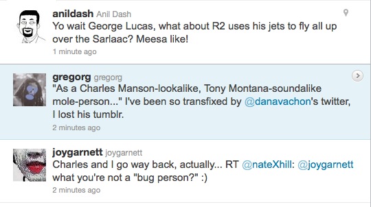
I admit, after I saw the pair of Chucks, I was just waiting, pretty sure I’d get a post out of it no matter what. So kudos to Anil, who tweets quality.
Speaking Of Awesome American Steel
We had a tree limb come down across our driveway last weekend–some freak weather thing, who knew?–and needed to rent a car for a couple of days.

The checkout guy at National Airport was working off of this beauty, the Foreman’s Shop Desk, by Relius Solutions.
At under $200, it looks like the cheapest decent foreman’s desk out there, no finish fetish or unit construction, or whatever brings the double-to-triple prices. But to my eye, it has a winning simplicity. Had I rented an SUV, I might have just slipped the guy a Hamilton and loaded it into the back. Oh well.
Brandstorming
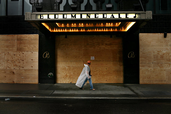
michael appleton for nyt
Such a great shot, such artful product placement. While it’s unfortunately still true that you cannot buy publicity like this, only the most foolish brand evangelist will find himself unprepared when disaster coverage strikes.

hiroko masuike for nyt
The truth is, news photographers want to include your store or brand in their hurricane coverage; it can add excitement and content to the shot. The trick is to help the journalist by making that sexy storefront/logo shot not just easy, but irresistible.
reuters via daylife
Be respectful, not demanding. Craft your message with current media standards in mind, if only to increase your chances of actually getting it on the air.
Most brand messaging during a disaster buildup often feels impulsive, improvised.
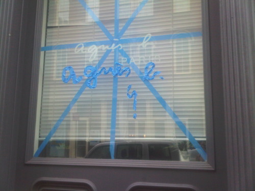
joygarnett.tumblr.com
Which works great for a nimble, inherently creative brand like agnes b.
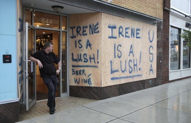
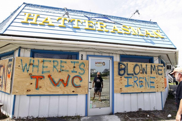
reuters via daylife
But let’s face it, executing on-brand on the fly is tough. Even if guy from Reuters takes a picture of your defiant but slightly odd scrawl, the benefits to your brand are limited if readers have to rely on the caption to learn that Lush is actually the name of your irreverent beer and winé shop.
But it shouldn’t always have to be so ad hoc. This scaffolding covering the glass cube at the Fifth Avenue Apple store looks absolutely fantastic. Those guys really are brand geniuses.
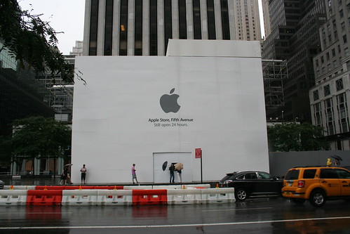
via johnrevill’s flickr
Except it’s actually for an ongoing renovation project. They got lucky. Here’s Getty coverage of a very high-quality boarding-up underway at the Georgetown Apple Store:
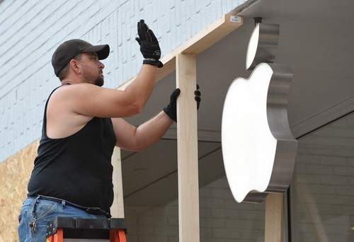
getty via daylife
A barrier which, however strong physically, utterly failed from a brand standpoint. The raw OSB–and not just OSB, but mismatched OSB!–is almost as detrimental as the hidden logo.

“Must Buy Apple Products,” image m.v. jantzen via flickr
In fact, a quick survey shows, with the exception of a few strikingly on-point, silver sandbags in the Meatpacking District, hurricane preparedness design is a glaring weakness in Apple’s heretofore vaunted retail strategy.

jeremy m. lang for nyt
Another tenet of disaster coverage messaging is to balance long and short term objectives. On the one hand, there’s marketing to do and money to be made. On the other, you don’t want to be seen as exploiting either the situation or your customers. So make sure the statement about fair plywood panel pricing is in the shot with the helpfully upselly hurricane shopping list.
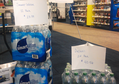
“WOWOW look at what Best Buy is doing! Selling cases of water for over 40 bucks!” via @AConDemand
And remember, a hurricane is no time for business-as-usual, and that goes for branding, too. So instead of squeezing out full, point-of-sale retail for every bottle in inventory, be creative. Offering a case of water free with purchase of every flatscreen could build goodwill toward the brand, which may pay off immediately by mitigating any effects of post-storm looting.
There will always be naysayers who think that putting even a little thought into your brand’s disaster coverage presentation is crass and exploitative. Or who are willing to just hand over complete control of the presentation of their brand to freelance photographers and shiftless twitterers.
To these people, I would say simply, “Follow the experts.”

Monocle’s artfully, pointlessly taped storefront, via eric etheridge’s awesome hurricane retail roundup
Not the branding experts who, in their obsessive preservation of brand essence, apparently miss the entire point of taping a window in the first place.
No, the other experts, the ones who live and breathe disaster coverage; the ones whose job it is to stand ready to help, to be prepared to move in wherever The Weather Channel’s satellite trucks may roll. When you’re wondering what your hurricane brand strategy should be, ask the important question first, “What would the Red Cross do?”
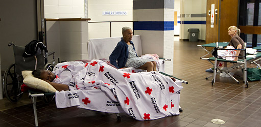
colin archer for nyt
Okehed
Since I was researching the family murder last night–an 11-year ranchers’ feud, irrigation wars, shovel fights, gouged-out eye, yearlong revenge plot, shotgun ambush, an old guy named “Boss”–this alternate spelling of OK’d, which I came across in a little story, tacked onto the bottom of a regional news roundup in The Richfield Reaper, c. about 1948 or ’49, is only the second most shocking thing from the past that no one had ever told me about.
On Being Karl Lagerfeld
Everyone was so hyped up about the extraordinary, long New Yorker feature detailing the hunting and killing of Osama Bin Laden, that well, obviously, I couldn’t post about it at the time. But I was so pissed at Helmut Lang for shredding his 6,000-piece clothing archive and turning it into mediocre sculpture, I knew I had to put things into context. See the bigger picture. Figure out what’s really important. I had to go back and re-read John Colapinto’s extraordinary, long New Yorker feature on Karl Lagerfeld from 2007. Specifically this scene:
The fitting model strutted forward in a new outfit and posed in front of Lagerfeld. He scrutinized her through his dark glasses and frowned. He said that he did not like the way the assistant had arranged the neckline of the sweater the model wore. Several assistants converged on her and began to tug uncertainly at the fabric.
“Non, non!” Lagerfeld said.
He uncapped a black marker and, rings clacking, made a quick sketch on a pad in front of him. Lagerfeld derisively describes many of his colleagues as “playing the designer,” because they drape fabric on a model or a dummy; he conceives his collections at a kind of platonic remove, in multicolored drawings on paper, and only rarely touches fabric. The picture he produced–a swift hash of lines suggesting a soignée woman–reflected his skill as an illustrator. (His work has been published in numerous books and magazines.) An assistant looked at the drawing and hustled to the model to make adjustments. Lagerfeld ripped the drawing from the pad, crushed it in his hands, and tossed it into a large wicker hamper, which, over the course of the evening, filled with similar small masterpieces. “I throw everything away!” he declared. “The most important piece of furniture in a house is the garbage can! I keep no archives of my own, no sketches, no photos, no clothes–nothing! I am supposed to do, I’m not supposed to remember!” He smoothed a gloved hand over the empty page in front of him and visibly relaxed.
The whole piece is just a mutant rollercoaster ride of journalism, down to the last “hmm?” Here’s another awesome scene:
Finally, Lagerfeld stopped talking and agreed to give a tour of the house. After warning, “You will think I’m a madman,” he led the way up a grand curving marble staircase. The second floor is composed of huge rooms with soaring ceilings, ornate plasterwork, wood panelling, and fifteen-foot-high mirrors. The furniture, a mixture of antique and modernist pieces, was almost impossible to see, hidden under hundreds of magazines, CDs, photographs, promotional brochures, and books, which lay in heaps spilling on every surface, including the floors. Scattered through the rooms were dozens of iPod nanos of every hue. Each one was loaded with songs that Lagerfeld listens to when designing his collections, which he does, he says, usually in the mornings, while dressed in a long white smock. Surveying the scene through his black glasses, Lagerfeld said serenely, “Normal people think I’m insane.”
He says that again later, after visiting his dressing area and the room with his five hundred suits, and then, “He shrugged. ‘I don’t know what ‘normal’ means, anyway.'”
In Colapinto’s telling, Lagerfeld’s voracious excesses of cultural consumption are designed to stave off boredom. The sustained investment in financial, human, and emotional capital required to keep Karl Lagerfeld entertained–and entertained enough to produce a new mountain of luxury goods year in and year out–is staggering.
And in a way, a good way, boredom was part of Lang’s stock in trade. His clothes felt like an antidote to relentless fashion stimulation. At least they did at the time. For a customer. For Lang, though, who can say? He may have had some issues with the whole thing. Here’s what I wrote about his first artwork, a giant disco ball which was exhibited in 2007 as “found,” but which actually came from Lang’s shuttered SoHo boutique:
Which completely changes the question of the disco ball from, “Where the hell’d he find it?” to “why the hell’d he keep it?” A glittering symbol unceremoniously yet sentimentally hauled out and dumped on an 18-acre beachfront estate in East Hampton and left to weather away in over-fabulous isolation. With a 4-foot disco ball in tow. [ba dum bum.]
Ultimately, Lang’s problem maybe is not boredom, or not even that he’s too normal, whatever that is, but that he’s not Karl Lagerfeld. And for that, I imagine Lang is thankful.