Did I mention that I got a copy of the 316-pg instruction manual for Lego Set 10179-1: The Ultimate Collector’s Millennium Falcon? It is worth every penny. It is a thing of beauty. And gigantic, the first coffee table LEGO instruction manual.

But not the only awesome LEGO instruction manual. There is another. Martin Hudepohl, a German composer and programmer who works under the moniker Xubor, just released Badass LEGO Guns, which includes detailed instructions for creating five working guns from stock LEGO Technic pieces.
It’s not clear, but Badass may overlap with Xubor’s 2009 manual classic, WEAPONS for LEGO LOVERS. Both feature variations on the THRILLER LEGO crossbow, for example. I assume the compleatist will acquire both on principle.
Badass LEGO Guns: Building Instructions for Five Working Guns
Category: etc.
Ahnighito
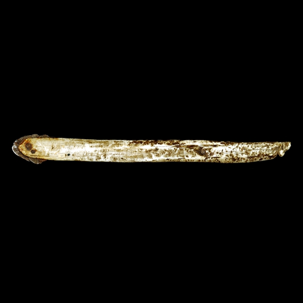
I don’t know why, exactly, but as I was looking online for Zakaeuses this morning, the description of this early 18th century Inuit knife from the British Museum caught me off guard:
This type of knife was made and used by the Inughuit (Polar Inuit or Eskimo (uhh, sic)) of north-west Greenland. Similar pieces of iron were used to make all-purpose knives for butchering animals, preparing meat, eating and making tools.
This example was collected in 1818 during the search for the Northwest Passage by the explorer Sir John Ross (1777-1856). The Inuit told the expedition, through the Greenlandic interpreter and expedition artist Hans Zakaeus, that they believed that they lived alone in the world and thought Europeans were gods. [emphasis added]
Greenland’s Inuit used ivory and bone instead of wood, and they got all their metal from meteorites. The Cape York Meteorites, to be precise, which crashed into the earth around 10,000 years ago.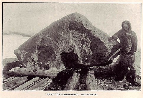
Explorer Robert Peary and his Inuit guide found three large fragments near Melville Bay: Ahnighito, or The Tent [above], weighs 31 metric tons, and was found on Disko Island. [Seriously.] Woman (3 tons) and Dog (400kg) were a few kilometers away on the mainland. Woman and Dog, especially, showed signs of being the primary source for Inuit iron for centuries. They were surrounded with more than 10,000 hammerstones, brought from hundreds of miles away, which were used to cut, chip, and drill off pieces of iron, which were then flattened into blades for knives, spears, and scrapers.
Peary had his wife with him during the expedition. When their daughter Marie Ahnighito Peary was born in Greenland in 1893, Inuit apparently traveled from all over to see the pink & blonde child, who they nicknamed The Snow Baby. In the midst of ongoing media buzz and snow baby merchandising craze, her mother Josephine Peary to publish a picture book, The Snow Baby in 1901.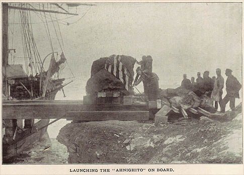
I haven’t seen any mention of his asking permission, but after several years of effort, Peary moved the three meteorites to New York, and eventually sold them to the American Museum of Natural History. The pylons supporting Ahnighito run through the foundation of the building into the bedrock of Manhattan. Which, given the Upper West Side’s geography, is probably right there, but still. It’s basically as heavy as a decent Richard Serra Torqued Ellipse.
Lance with a blade made from meteoric iron [britishmuseum.org]
Greenland’s Meteorites [amnh.org]
Cape York Meteorites [wikipedia]
Account Of The Discovery And Bringing Home Of The “Saviksue” or Great Cape York Meteorites [niger-meteorite-recon.de]
Keeping Up With The Laurens

Good grief, The Hilfigers? Is anyone else old enough to remember the ads launching Tommy Hilfiger in the 80s? Just full page text:
Ralph Lauren
Calvin Klein
Perry Ellis
Tommy Hilfiger
Glad to see he’s returning to his desperate, striving, unoriginal roots.
Take Ivy That

Ah, September 10th, an inadvertently trenchant date for unloading on the trendchasers’ seemingly complete lack of historical self-awareness.
And I’m not talking about that perfect, frivolous Marc Jacobs afterparty on that nearly perfect late summer evening which only acquired its poignancy the next morning when, well.
I just found this incredible wool twill authentic made in USA Ivy prep revival classic trad artisanal manly tweed outdoor ruling class WASP vintage Woolrich shirt jacket, which I’m rocking right now because it’s kind of chilly typing with the windows open.

See, I’d gone up to Connecticut Berkshires Brimfield North Adams Darien New Haven over the weekend. But since I had the car, I also stopped in Long Island City at our storage unit. And pulled a bunch of stuff out of a cedar-filled sweater suitcase I’d packed in 1995. I do believe it was vintage when I bought it in 1989.
It starts to feel like freakin’ Groundhog Day around here sometimes, but fortunately, I’m ready.
last year: authenticity vs. realness
It’s Reagan Men! Hallelujah!
This is where Nightcrawler ‘ports in and shouts, “Ausgezeichnet!”
Here is Joseph Beuys, pop singer, performing his greatest anti-US, anti-nuclear hit from 1982, “Sonne statt Reagan, [Sun not Reagan].” Reagan, remember, is a German homonym for rain [Regen], so it makes perfect sense.
As Ubu explains it, “Beuys tried his luck as a pop singer as part of his political commitment.” Sure.
To throw one more tidbit in there, here’s one section of the lyrics that jumped out at me:
Er sagt als Präsident von USA
Atomkrieg ? – Ja bitte dort und da
ob Polen, Mittler Osten, Nicaragua
er will den Endsieg, das ist doch klar.
He says as President of USA
Nuclear war? – Yes please here and there
whether Poland, Middle East, Nicaragua
he wants the final victory, that much is clear.
Endsieg: perhaps Reagan used a loaded term in German, one that turns out to be associated with Jews in Mein Kampf and inevitable civilian casualties in the Third Reich. But translation can be a bitch that way. Just ask the guy who came up with “enhanced interrogation” [“Verschärfte Vernehmung”].
Thanks greg.org reader frank for the felt hat tip.
Oh No, There’s A Deutschen Bundespost Type TelH78 Telephone Booth On eBay
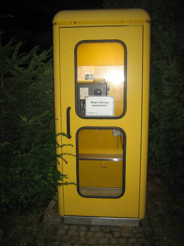 I’ve been trying for months to figure out the designer of what I think is one of the slickest phone booths around, the Deutschen Bundespost Typ TelH78 Telefonzelle.
You know it when you see it. It’s bright yellow, a fiberglass and safety glass box with beautiful rounded corners. It has just the stability, utilitarianism, officialism, and future-forward design you’d expect from a European, state-run telecommunications monopoly in 1980, which is when I think they started deploying them. [Near as I can tell, the type number refers to the year it was designed.] It’s the Helvetica of phone booths.
And it’s disappearing, if not completely gone. I haven’t roamed the German byways to see how far T-Mobile’s awful magenta & glass booths have taken over, but these days, phone booths themselves seem barely more than excuses for street advertisements. A few Telefonzellen, including TelH78s–oh, wow, look at that olive drab one–are being converted into tiny, neighborhood lending libraries.
And now one’s on eBay.de. In beautiful condition, a mere EUR71. For local pickup in Fritzlar, just outside of Kassel. Weighs around 100kg. So beautiful, so tempting.
Telefonzelle der Deutschen Bundespost, ends Aug. 19 [ebay.de]
Telefonzelle (Deutschland) [wikipedia]
The Hamamatsu Photonics R1449 And R3600 Photomultiplier Tubes
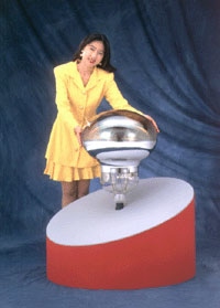 Photomultiplier Tubes, or PMT, are vacuum tubes used to detect electromagnetic energy. In 1979, Hamamatsu Photonics began development of the world’s largest PMT, 25 inches across, which would be used in the Kamiokande proton decay detector being constructed by the University of Tokyo in a mine in rural Japan.
Within a year, Hamamatsu had managed to design a 20-inch (50cm) PMT, and successfully manufactured it by 1981. It was dubbed the model R1449:
Because this was a 20-inch PMT, the biggest question was whether or not its cathode could be manufactured correctly. The days leading up to the completion of the first PMT were anxious. Moreover, in steps such as antimony evaporation, there was no other recourse but to rely on the eyes and judgment of those professionals performing the tube evacuation task. An ordinary PMT can be held in the worker’s hand throughout the production process, but the large 20-inch PMT first had to be secured in place. Then, the worker could perform his required tasks while walking around the outside of the PMT. The workers donned protective helmets equipped with explosion masks, mounted steps to the platform holding a large pumping bench, and began the final fabrication, which consisted of making the photocathode and sealing the PMT.
The color formed from oxygen discharge in the photocathode manufacturing process was visually attractive. When made to react with potassium after antimony evaporation, the tint immediately changed to an ideal color for a photocathode. Cheers arose from the staff gathered around the pumping bench, as it was a moment of high emotion for everyone.
Hamamatsu delivered 1,050 R1449 PMTs to Kamiokande, where they lined a giant tank of ultra-purified water 1,000 meters below the surface.

In 1987, the PMT array at Kamiokande detected for the first time neutrinos given off by a supernova. [It was a discovery for which Professor Masatoshi Koshiba [above], who spearheaded the Kamiokande research, was awarded the Nobel Prize in 2002. Those may be the two most awkwardly constructed sentences in this post.]
Meanwhile, an even larger detector was being planned for Kamiokande. Dubbed Super-K, the new tank, 39m high and 41m in diameter, would hold 50,000 tons of water and 11,200 PMTs. These new, improved PMTs, known as model R3600, were based on the R1449. They cover approximately 40% of the interior surface of the tank. Super-K began operations in 1996.
On November 12, 2001, as the tank was being refilled, a PMT imploded, sending a shock wave through the water, and causing a chain reaction which destroyed around 6,600 other PMTs.

The survivors were redistributed, protective acrylic shells were added, and research resumed. Beginning in 2005, newly manufactured R3600s were installed. The detector reopened in 2006 as Super-K-III.

According to reports at the time of the implosion, an R3600 cost around $3,000 new, an extremely reasonable price for such a magnificently crafted object. I would most definitely like one. Also a convenient display stand. Also, that tank is absolutely stunning. If I were a sculptor of shiny round objects of a hundred feet or more in diameter, I would find it hard to get out of bed in the morning knowing this exists.

20-Inch Photomultiplier Development Story [hamamatsu.com, the original Japanese version is a little more dramatic]
portrait of Prof. Koshiba hugging a Hamamatsu R3600 [u-tokyo.ac.jp]
hi-res images in the Super-Kamiokande photo album [ICCR at U-Tokyo]
Accident grounds neutrino lab [physicsworld]
Oh My Heck, Spiral Jetty India Pale Ale
That is so Epic.

From Epic Brewing Company, Salt Lake City, Utah.
Spiral Jetty IPA | Epic Brewing Company [epicbrewing.com via the freshly relocated tyler green]
Related? The Shoppes at Rozel Point, from Visiting Artist (sic), a lecture involving Smithson which I gave at the University of Utah:

‘No Artists Were Paid In The Making Of This Commercial’

The ad’s been running for a while now, but Jean just spotted this disclaimer at the end of AT&T’s “Blanket” commercial last night: “The artists Christo and Jeanne-Claude have no direct or indirect affiliation or involvement with AT&T.”
I will assume they tried to contact Christo by calling him on his iPhone, but they got cut off.
AT&T Rethink Possible – Blanket Commercial [search youtube if the link is broken]
Previously: The Gates Bill
If You See Something, Say Something
Do you find yourself wanting to talk about Group Zero, but the only names you can pronounce are Fontana and Klein [and Westwater]? Do you ever call galleries you’re about to walk into, just to hear them say the artist’s name? [I just asked at the desk, it’s von HILE.]
You may be suffering from Gigli Syndrome, a condition where you avoid saying an artist or designer’s name because you’re not sure of the pronunciation. Bennifer can’t cure all possible outbreaks of Gigli Syndrome, any more than Nomi Malone could inoculate us against the dangers of unknowing mispronunciation, Versace Syndrome.
After typing [well, cut-n-pasting] 0100101110101101.org yesterday morning, I realized a universal cure to either condition is impossible. Americans will never switch to Van Gohchhhh, and Thaddeus Ropatch may never give you more than 10% off, but that doesn’t mean we shouldn’t do all we can to treat and prevent.
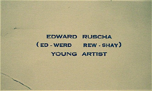
So inspired by my friend Sam, who once helped me avert disaster at Lever House [it’s A-B Rosen, not Abby], and as a tribute to the young artist who once printed up business cards reading, “Ed-werd Rew-shay”, here is a quick roundup of high-risk artworld names and their correct pronunciations by curators, interviewers, and even the artists themselves:
- 0100101110101101.org: zero-one-dot-org [thx their dealer @magdasawon, pronounced sah-vawn, btw]
- Eija-Liisa Ahtila: AY-ya-lisa AHH-tilah [youtube]
- Richard Anuszkiewicz: AN-ehs-KAY-vitch [mike wallace via youtube]
- Giuseppe Arcimboldo: Arch-im-BOLD-oh [washpost]
- Kutlug Ataman: KOOT-loo ATTA-mun [tate channel]
- Huma Bhabha: HOO-mah BAH-bah [public art fund via youtube]
- Alighiero e Boetti: Ali-GYAIR-oh BO-etty [he was just one guy, btw. Stuck the “e” in there himself. moma]
- Carol Bove: Bo-VAY [I called Maccarone to confirm, because I’ve heard people calling her Bove (rhymes with clove) to her face, and introducing her as Bove, for literally YEARS. She is too polite and well-known to deserve this any longer.]
- Eli Broad: rhymes with road [thx @manbartlett]
- Marcel Broodthaers: ooh, a Britdown between BROAT-haus and BROOT-ers, with a bit of long O thrown in. I vote for the latter. [mk-g.org]
- Vija Celmins: VEE-ya Sell-muns [youtube thx @lucretiab]
- Chinati: Chih-NAUGHT-y, not Shih-Naughty or Kih-Naughty. [member since 1994, plus I just called and listened to their answering machine.]
- Wayne Clough: rhymes with rough and censoring stuff. [nyt]
- Dan Colen: CO-lin [via nyt]
- Bice Curiger: short for Beatrice, [Just imagine Che Guevara taking an interpretive dance class: “Be a tree, Che.” and then leave out the “a tree,” cuz you guys are tight.] Koo-REE-gare, rhymes with Care Bear [via youtube]
- Dada: Da-DAH [Marcel Duchamp and Richard Huelsenbeck, both founders of Dada, pronounced it Da-DAH at The Modern in 1961. clocktower.org]
- Walter De Maria: de Ma-REE-uh [youtube w/English accent, thanks judy]
- De Stijl: de STALE, maybe Dutch it up a bit with a little h: ShTALE [youtube]
- Marlene Dumas: Mar-LANE du-MAH [moma]
- Rineke Dijkstra: RIN-uh-kuh DIKE-stra [moma]
- Ekow Eshun, ex-ICA, current (2014) Fourth Plinth guy: Echo Ession rhymes with session [lisson gallery youtube]
- Omer Fast: Homer without the H, not Omar [via @magdasawon]
- Os Gémeos: Ose like dose, ZHEH-meh-ose [coolhunting, alt. pron.: Barry McGee]
- Joseph Grigely: Grig-lee [via hans ulrich (han-ZOOL-rick) at moma]
- Cai Guo-Qiang: Cy, like Twombly, Gwoh, long O, Tsee-ahng, somewhere between a Ch and a Ts [moma]
- Francesca von Habsburg-Lothringen: Hops-burg Lote-ring-en, though I’ve never heard the Lothringen used/said. [youtube]
- Thomas Houseago: House-ago, like it was two words. [public art fund via youtube]
- Pierre Huyghe: I say Hweeg to his face, but I almost hear Peter Eleey say Whee. [thx @analogc]
- Dakis Joannou: DOCK-iss ZHO-new [numu youtu]
- Emilia and Ilya Kabakov: KA-buh-Koff, Ka like Kat [youtube, bonus: Andre Putman: PUT like in Putin, man, rhymes with yawn]
- On Kawara: Own, as in rent-to-. Kawara is his family name, so it’s Kawara On (河原温) in Japanese. [dude, I speak Japanese. 25 years.]
- Paul Klee: Clay [thx paddy]
- Guillermo Kuitca: GYAIR-mo hard G, KWEET-kuh in Minneapolis and Buffalo, anyway. In London, they say KWIT-kah [youtube; publicbroadcasting.net]
- Yayoi Kusama: Yah-yoy Koo-saw-mah. Again, Kusama is her family name, so Kusama Yayoi (草間彌生). [me]
- Wifredo Lam: THERE IS NO L, PEOPLE, NO L!! LOOK CLOSELY. Anyway, it’s pronounced like Wilfredo WITHOUT THE L. [Italian on vimeo, thanks @aljavieera]
- Laocoön: Lay-UH-kuh-wahn, rhymes with go on. [britishmuseum.org]
- Aristide Maillol: My-yole [moma]
- Iñigo Manglano-Ovalle: In-EE-go Mawn-glawn-o O-VA-yay [though the guy at SAIC also says peda-GO-gee, so…]
- Julie Mehretu: MARE-Eh-too [metmuseum]
- Modigliani: Mo-DEE-lee-Ah-nee [metmuseum via youtube]
- Laszlo Moholy-Nagy: LAZ-low rhymes with Hasbro, Moley as in holy, Nazh, like gnaws, with a zh on the end [german youtube, but you get the idea. update: But the artist and his family also accept the Americanized “nadgie” new idiom]
- Vik Muniz: Moo-NEES [5min]
- Edvard Munch: Moonk [thx paddy]
- Albert Oehlen: Uhrlen, classic umlaut O [moma]
- Maja Oeri, of the Schaulager: Ury, like Early without the “L”; Show- like shower and lager like beer. moma]
- Meret Oppenheim: Merit [moma]
- Francis Picabia: Pih-CAW-bee-uh [moma]
- Otto Piene: PEEN-uh [german youtube]
- Fondazione Sandretto Re Rebaudengo: Ray-Ray-bo-DANG-go, a little like Bojangles [italian youtube]
- Gerhard Richter: For Americans, it’s like the scale. For the Teutonically inclined, go ahead and let’er rip, GAIR-haht REESH-tah [gerhard-richter.com]
- Gerrit Rietveld: two R’s, one T, people. REET like street, feld, like fell down the stairs. [dutch youtube, thanks craig]
- Dieter Roth: Rote [german youtube]
- Edward Ruscha: “(Ed-werd Rew-shay)” [walkerart.org and colette.fr thx @valeriemargolis]
- Anri Sala: ON-ree SAHL-LAH [google video]
- Yinka Shonibare: YEEN-kuh SHOW-nih-Bar-eh [tate channel]
- Alec Soth: rhymes with both [youtube, thx @jenbee]
- Sperone: Spare-ownee [just call, you’ll see]
- Thomas Struth: [SHTRoot, he has never corrected me, but that’s how he says it at the Met]
- Alina Szapocznikow: Ah-LEE-nuh Shah-POTCH-nick-off [UPDATE: this moma audio has it as POTS, but thanks to Rachel Wetzler, we learn that the ‘cz’ combo in Polish is pronounced “CH”, like chalk. cf. a Polish curator’s youtube video. To practice hearing the difference, please listen to this 4-hour symposium at MoMA. Thanks Rachel and thanks Andrew for the suggestion]
- Thyssen-Bornemisza: Tissen BORN-uh-Meesa [youtube]
- Rirkrit Tiravanija: Hans Ulrich says Tier-uh-vah-NEE-juh, and Rikrit says TEER-uh-van-EET. So maybe there’s a reason people just say Rick-rit. hans ulrich at moma; studiobanana.tv]
- Günther Uecker: GOON-ter OO-ker, like a clipped booker [german youtube]
- Ulay: OO-Lie, as in, “Ooh, lie down naked with this skeleton on top of you for eight hours.” [that’s how Marina prounces it, anyway]
- Joep van Lieshout: Yoop fawn LEASE-howt, [dutch tv, whoops, I’ve said van lees-hote to his face, too]
- Danh Vo: Yahn, it’s a “Vietnamese soft ‘d’. [ex. Talking at Walker Art Ctr, via youtube]
- Apichatpong Weerasethakul: A like apple pih-CHAT like room pong WEIR like weird -uh-suh-THA like Thatcher cull like a herd [cannes 2010 press conf]
- Susan Weil: Vay, “like Simone Weil” [Rauschenberg Fndn oral history, page 1] UPDATE: When I met her and mentioned this, she was like, “No, it’s Vile, “like Simone Weil,” and I was like, “Sounds good to me!” So I think it is Vile like Susan Weil.
- Ai Weiwei (艾未未): Eye way way, family name is Ai [paleycenter.org]
- Rachel Whiteread: reed, not red [moma]
- Witte de With: VITT-uh de VIT [dutch youtube]
- David Wojnarowicz “(pronounced voy-nah-ROH-vitch)” [PPOW, his dealer since 1988]
- Lisa Yuskavage: Yuh-SKA-vedge, sounds like savage [youtube, thanks john]
Some build on each other; once you know Bas Jan Ader [Boss Yan Adder], you can do Jan Dibbetts, Jan Schoonhoven [Skoon-ho-ven], Christian Jankowski [Yan-KOFF-ski], and so on. If your favorites aren’t on the list, please feel free to send them along.
One Makakai, Acrylic Pressure Hull, Shipped, Please
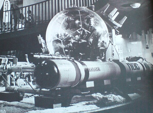
I saw a citation in a footnote somewhere, but in the three weeks it took for the Design Review: Industrial Design 23rd Annual, 1977, to arrive, I’d completely forgotten why I’d ordered it.
No matter, this insane image of a Makakai deepwater transparent hull submersible (THS) is worth the $2+shipping.
There’s a lot less info online that I’d expect for such an awesome-looking rig, but according to Globalsecurity.org, it was developed at the Naval Undersea Research And Development Center [NURAD?] in San Diego:
Two standard spherical hull designs were available; (a) 66 inch outside diameter and 2.5 inch thickness for 600 ft. operational depth and (b) 66 inch outside diameter and 4.0 inch thickness for 1000 ft. depth. The hulls were fabricated by adhesive bonding of 12 thermoformed spherical pentagons, two of which incorporate metallic hatches.
I’ve just added it to my military industrial geodesic sphere government surplus save search list on eBay. Competing bidders, be warned.
Deep Submersible Rescue Vehicle [globalsecurity.org]
‘Mock Fuselage On Stilts’

First up, let me just say these are fantastic; I would love to see this row of bombardier training simulators parked in any gallery in the world, right next to Chris Burden’s homemade B-Car.
But then you’d have to ask The Question: a full year after Pearl Harbor, and this is really as far as we’d gotten? If all you had to go by was the pages of Popular Mechanics, you’d have to conclude the US’s entire wartime response consisted of scale models, plywood mockups, and canvas bombers on rolling stilts.
Bombardiers Train in Mock Fuselage On Stilts, Popular Mechanics, December 1942 [popmech via google books]
Carrara: The Ferrari Of Marbles
When I still lived in the neighborhood, a real estate broker once mailed me a thick brochure for Bob Guccione’s East Side townhouse, which touted its grand entry made entirely of Carrera [sic] marble.
Now, by finding someone only very slightly less clueless at a bathroom fixture trade show, crackerjack Times investigative reporter Joyce Wadler confirms that after more than 2,200 years, Carrara has officially become the ultimate luxury marble of choice for people who have no idea what they’re talking about:
The company was also introducing a line of marble faucets, which ranged from $1,900 to $2,280.
“Statuary white marble, from the kind of marble used by Michelangelo, not like Carrara,” a product manager said.
Alcoa Forecast: Spheres Of Tomorrow
They’re both under-known, and so they probably deserve their own posts, but the uncanny similarity of these two Alcoa Forecast program designs requires me to put them together.
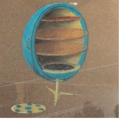
Greta Magnusson Grossman was a Los Angeles-based Swedish industrial designer. According to the notes at the 2008 Drawing Center exhibition of her never-before-seen technical drawings, she was highly influential on her fellow Southern California colleagues in the 1950s-60s, including the Eameses.
That show included a sketch [above] for the personal aluminum oven she designed for Forecast. A small photo of the wacky, ball-shaped oven appeared in a collaged Forecast ad in the Dec. 28, 1959 issue of LIFE Magazine.
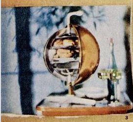
[update: whaddyaknow, the new blog The Modernlist reports that the Arkiteturmuseet in Stockholm has the first-ever Magnusson Grossman retrospective right now, through May 16. Definitely check out that crazy Grossman House.]
Graphic designer Lester Beall, meanwhile, is better known, at least by my criteria: I recognize his awesome, constructivist-style photocollage posters for the Rural Electrification Administration from MoMA’s design collection. His portfolio site says he designed the Music Sphere for Alcoa in 1956, which seems remarkably early.
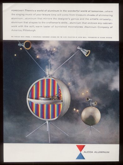
An unsourced tear sheet for a Forecast Collection ad on eBay says it’s from 1969, which is remarkably late. I’m going to guess it’s really 1959. But the real question is why the future doesn’t have even a tiny fraction of the giant, shiny aluminum ball-shaped appliances we were promised?
“Aluminum that mirrors the designer’s genius and the artist’s virtuosity”? “Aluminum that endows any cabinetwork with the soft, warm luster of burnished moonstones”?? I think we have found Project Echo’s official stereo!
If You Are Reading This On An iPad
the sidebar is now the footer.
Looks like my vintage html blog templates may not survive the game change.
