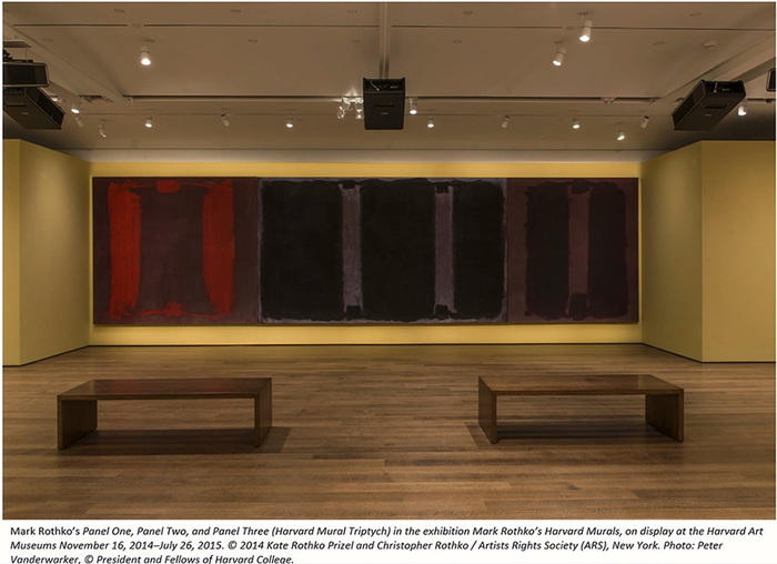
I’m slow to take a closer look at the conservation project to restore the coloration to Mark Rothko’s badly faded Harvard Murals (1963) using computer-calibrated light projections. The project has been going for several years, but the last winter the lit paintings went on view for the first time in decades, and remain up until July 24th. Which was the trigger for the roundtable discussion in Artforum that piqued my interest. It’s fascinating all around, but I really liked that it included artists Rebecca Quaytman, David Reed, and Ken Okiishi, who ended discussing the fate of paintings and the use of projection on painting as a creative medium in itself.
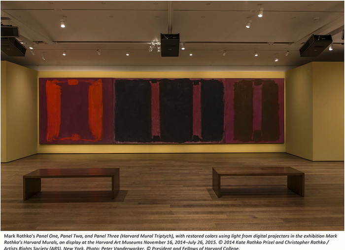
Even before the conservator Carol Mancusi-Ungaro explained that the projection was tuned pixel by pixel to approximate Rothko’s intended colors, I found myself jonesing to get my hands on the image, and turn it into a work of its own. Called a compensation image, it’s made by calculating the chromatic differences between the paintings’ current state and the target state. It’s a map of everything the painting has lost, an accounting of how far it’s fallen from its (hypothetical) historical potential.
It’s the color that might have been. In the case of Rothko’s Harvard Murals, Mancusi-Ungaro explained that they weren’t seeking to return the paintings’ appearance to a new, “original” state, but simply to erase the damage caused by Harvard leaving the works to bake in the sun for 15 years. The target state was determined using color-corrected Ektachrome slides from 1964 and a sixth painting, excluded from the set, which has been in dark storage in the Rothko estate.
The images above showing three of the paintings with and without the corrective projection come from a TEDx talk given by Harvard conservator Narayan Khandekar. The dramatic reveal, when the museum turns off the projection, happens every day at 4 o’clock, and is by all accounts dramatic.
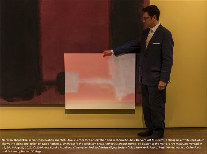
What is not shown is the compensation image itself. Here is a photo of part of it, when Khandekar holds some foamcore in front of the painting. I would like to see and use the entire thing. There may be a way.
In 2011 other Harvard conservator Jens Stenger published a report on the project at the International Committee of Museums triennial in Lisbon, which is circulating as an ICOM-CC newsletter pdf. In it, Stenger discloses that the team confected a small scale test of the light correction process by using identical materials (egg and pigment) to paint another Rothko and superfade and correct it.1, 2
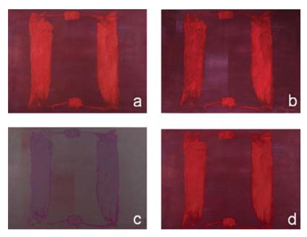
A is the Conservators’ Rothko. B is the painting after a few weeks under some tungsten lamps. C is the interpolated compensation image (A – B). D is the lit painting (A + C).
In an incisive essay last April, John Pyper likened the compensation image’s duplicative relationship to the painting as a similar to a print and a plate. Seeing it now makes me think of a color photo negative.
Which makes me think of Alma Thomas, who painted Watusi (Hard Edge) in 1963 [!] using the form from Matisse’s giant cutout, L’Escargot, but in the inverse colors. For Thomas the colors signaled a reversal of direction for cultural appropriation. What does the color of a compensation image represent? Here it is loss, a loss caused, let’s face it, by Harvard’s years of neglect, mishandling, and occasional abuse. [Actually, the projector project does not address the physical damage, dents, scratches and graffiti the paintings received in what was, after all, a campus dining room.] At least in this case, compensation feels too diplomatic; maybe we should call it a restitution image, or a reparations image.
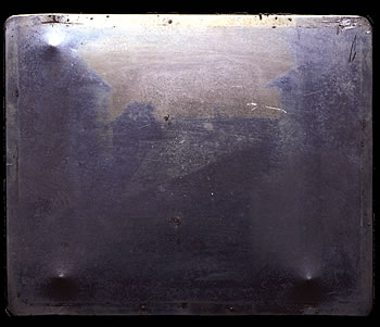
Now that I look at it a bit, the particular colors of the Rothko compensation image remind me of not just any photo negative, but the first photo/negative, made by Joseph-Nicéphore Niépce in 1826. And just because a projection is used to index and compensate for loss or aging now doesn’t mean that’s all it’s capable of. It turns out photography could do more than capture a view out a window.
1 I don’t think it’s a spoiler to say this outcome is literally the kicker from the Artforum discussion.
2 This is the second instance I’ve heard of conservators making post-war painting simulacra, and now I want some.
Stenger, J. et al., “Non-invasive Color Restoration of Faded Paintings Using Light from a Digital Projector” [icom-cc.org, pdf]
After Mark Rothko, American [printeresting.org]
Previously, and very much related: On Peter Coffin at the Hirshhorn, also Donald Moffett
other early Donald Moffett projections on paintings
Category: projects
Andiron Of The Library Of The Printed Web
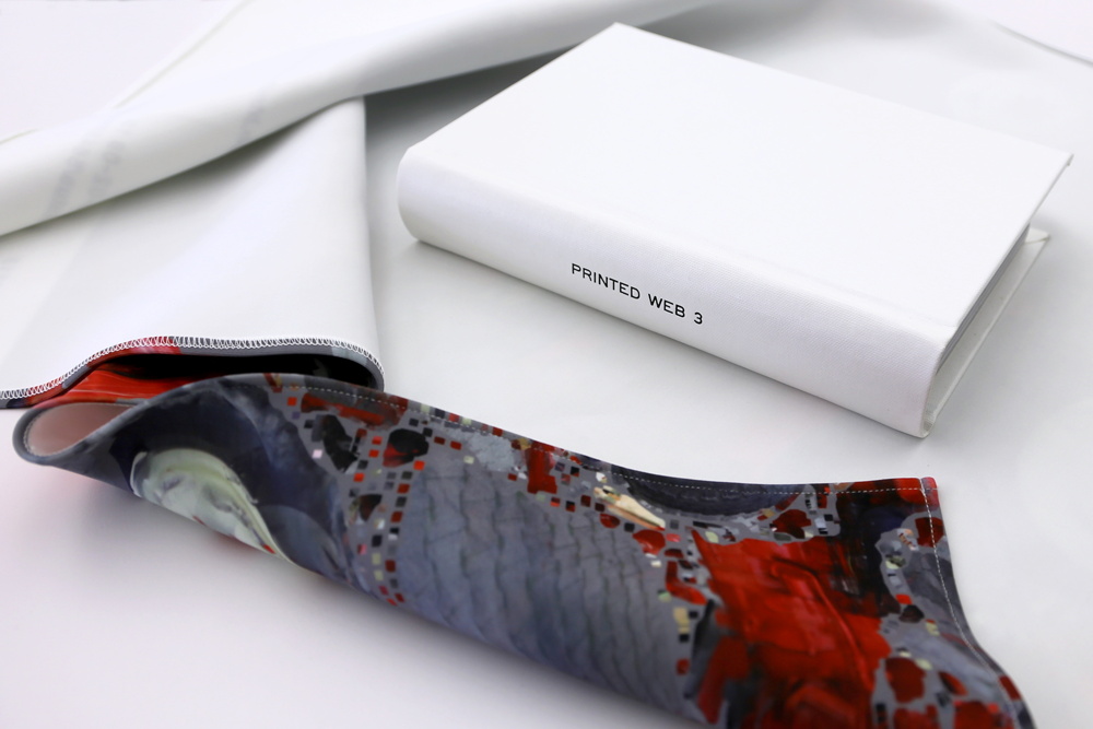
The third edition of Paul Soulellis’s Library of the Printed Web is out, and it looks fantastic in many forms. What started as a tabloid zine is now, with Printed Web 3, a sprawling, multi-platform, medium-jamming festival of publishing. 147 people responded to Paul’s invitation by submitting 329 files, which are now being released in a variety of print and digital formats, at prices ranging from free to entirely justified. Each one looks as interesting as the next.
I’ve already scraped rhizome.org, which is presenting all the files in one giant Apache directory, in the order they came in. And I’ve ordered the full set of sorted print-on-demand zines. And I’m thinking of pulling the trigger on the limited edition, full-color hardcover Chinatown Edition, a handbound/POD hybrid which comes wrapped in a digitally printed neoprene book blanket.
A what?
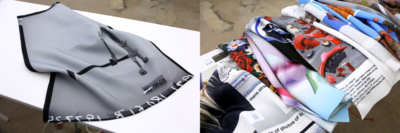
Yes, and in fact, there are digitally printed neoprene book blankets available separately, too, which feature a small selection of the images. I’m stoked to find that my submission, Untitled (Andiron Attributed To Paul Revere, Jr.) is one of the ten neoprene options. And the only reason I might not get that one is because doing so might deprive the lonely andiron of the company of a(nother) sympathetic steward. Won’t you help?
There’s even a 5.5mb, 147-frame GIF. Printed Web 3 is dropping IRL this weekend at Offprint London. Everything else is below. Congratulations and thanks!
Check out all the instances of Printed Web 3, by Paul Soulellis [newhive.com]
Previously, related: Untitled (Andiron Attributed To Paul Revere, Jr.), 2015
Moon Piece, 1985-6, Chris Burden
We’ll talk about this in the morning.
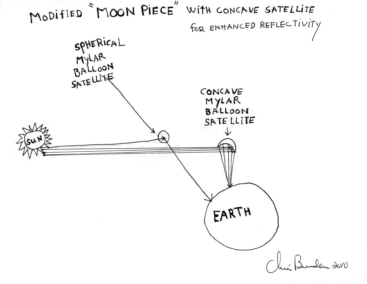
Chris Burden, Modified Moon Piece, 2010 image: manpodcast
MORNING UPDATE A WEEK LATER, BECAUSE APPARENTLY IT TAKES LONGER THAN ONE NIGHT TO PROCESS THIS
November 2011: This was sitting right there in the first episode of Modern Art Notes Podcast, waiting. And even though he wouldn’t tell me who the guest was, Tyler had been goading me before the launch, that I better listen, there is a surprise. Because he knew about the satelloons.
And I did not know about Chris Burden’s unrealized 1986 proposal for The Moon Piece, which is basically to launch the biggest possible spherical inflatable mylar balloon satellite into orbit.
Which was basically the same idea I’d had four years earlier. Or nineteen years later, depending on who’s counting.
Or was it? Maybe it’s fine? Maybe it’s different? Relationship status: it’s complicated. Green teed the question about Burden wanting to build something like the Eiffel Tower. And in discussing The Moon Piece Burden said it could be a giant spherical balloon or an even more “giant parabolic mirror you could control.” Which, if you made it about “the size of Lake Havasu,” [78 km2, btw. -ed.], you could use to “light [all of] New York from above.”
So maybe it’s not a satelloon at all, then. And he’s talking about something permanent, and big enough to light cities from space. This sounds like the Russian thing. Except it can’t be, at least not originally. Green cited a 1988 interview with Paul Schimmel as the source for this proposal. And solar mirrors didn’t really show up until the 90s. Russia ran a proof-of-concept solar mirror program called Znamya from 1992-99 which, it was hoped, would boost solar power production and bring light to darkest Siberia. But it only had one success: a 20-meter-diameter mirror launched in 1992 which produced a 5km-wide beam as bright as the full moon. Later, scientists at Livermore Lab proposed massive solar mirrors as one extreme technological approach to geo-engineering humanity’s way out of the climate change crisis. So this solar mirror aspect is different, maybe an adaptation, an addition, and it shows the artist was keeping tabs on things. But Burden’s original The Moon Piece idea is/was a satelloon.
It turns out Burden first pitched The Moon Piece in a letter to Edward Fry, who was co-curating Documenta 8 (1987) The letter was [first?] published in the appendix of the amazing 2005 monograph, Chris Burden. [Which I bought in 2008, but didn’t read all the way, even after getting more into his work in 2009.]:
[The satellite’s] “only function and purpose would be to reflect light back to earth. This special satellite would function much in the same manner that our present moon reflects sunlight. I foresee that this huge satellite could be manufactured out of fairly inexpensive, highly reflective Mylar film and be carried into outer space in a deflated state (like an uninflated balloon).
…
The Moon Piece will be highly visible to the naked eye and appear, in relation to the pin points of starlight, as a bright automobile headlamp moving rapidly across the night sky, one-fifth to one-tenth the size of the moon. The most sophisticated and the most primitive of cultures will be aware that something has changed in the heavens.
…
This is not simply a conceptual project. This project is technically feasible and to function as a work of art it must be actualized.
…
Obviously more research and information needs to be done on the specifics of the Mylar balloon such as size, thickness of Mylar, weight, etc., but I believe that The Moon Piece is physically and financially feasible given enough energy. If this idea, of putting into orbit a highly reflective satellite that would light up the heavens, could come to fruition I believe it would well be worth the effort.
On the one hand, it’s nice to feel like you’re on the same wavelength with someone whose work and career you admire. On the other hand, damn.
But some things stood out. Like Burden “foreseeing” the possibility of the satellite’s existence, and not knowing any of “the specifics.” Is it possible that Burden really did not know that these exact objects had already been created and deployed in the 1960s, when he was a teenager? I can’t believe it. Was it not important to his concept, or his pitch, to reference their historical sources, or their current non-art uses? Apparently.
And he adapted The Moon Piece, which began with the assumption that after 20 years, an inflatable satellite could be bigger, and after 30 years it could be bigger still. Or it could use future-state-of-the-art technology and be a mirror as big as a lake. Burden’s constants were big, reflective, and in space. But other than that, the 2010-11 version didn’t sound any further along than 1986’s.
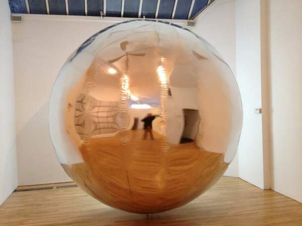
A few months later (in 2012) I was working on making and showing a satelloon at apexart in New York, and I uncovered aspects of satelloons and their history that mattered. The concept had originated with none other than Wernher von Braun, who proposed, not a new moon, but a new, “American Star” which would awe the lesser nations into supporting the US in the Korean War. Von Braun wrote that in a widely published Time | Life book on space travel. Burden’s language about “primitive cultures” knowing “something has changed in the heavens is straight from von Braun’s pitch. The NASA engineer who had claimed the most credit for Project Echo came up with the idea at von Braun’s V-2 rocket conference. It was OK’d after Sputnik because US military leaders wanted a visible satellite would normalize people to the presence of spy satellites and surveillance.
This is context I only pieced together after five years of researching. Burden missed or omitted not just this, but the very existence of Project Echo, when he proposed Moon Piece for Documenta1. Would it have turned up in Kassel? How would that’ve gone over? I can’t even imagine.
Except that I did, and I still do. My apexart experience has made me very wary of satelloons, which are seductive, but also politically problematic. Their beauty and surface make them impossible to ignore, which makes it worse. I’ve also found that where I once felt daunted and insecure about having the same idea as a major artist I admired, I am OK with it. Partly because I realized my project is better.
And that, plus a $25,000 Marquis Jet card, can get you to Basel. Burden nailed it the first time: this is not a conceptual project, destined merely for Hans Ulrich’s files. It must be actualized. And so it’s especially unfortunate that Burden, whose genius was superlative physicality, can’t see The Moon Piece in the sky himself.
After hearing about The Moon Piece, Green’s follow-up question was whether Burden would be OK with people “mining his files” to produce his unrealized projects “after you’re no longer with us.” It’s a conversation that obviously sounds very different now than it did in 2011, which is just one reason it’s taken me more than a week to write this blog post. “if somebody wanted to do that after I’m not around, that’d be fantastic,” Burden said. “I think that’s why people become artists, you know. To have a life beyond them. I mean, it’s a way to become immortal.”
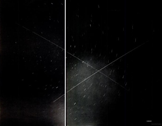
The Project Echo satellites stayed in orbit for five and eight years before gravity pulled them into the earth’s atmosphere. It’s not quite immortality, but it’s a start.
Related, devastatingly: Chris Burden dies at 69 [latimes]
2007: If I were a sculptor, but then again
2013: Exhibition Space [apexart.org]
Listen to the entire discussion between Chris Burden and Tyler Green on Episode 1 of MANPodcast [manpodcast]
Or listen to the 3:00 MANPodcast excerpt where Burden & Green talk about The Moon Piece [dropbox greg.org, 4.6Mb mp3]
[1] What did Burden end up showing in Documenta 8, anyway? I have found him listed in the participating artists on Documenta’s own site, as showing “audio”. Of Burden’s four pre-1987 audio works, only The Atomic Alphabet and Send Me Your Money, both 1979, seem likely. For his part, the artist’s official CV only mentions Documenta 6, in 1977. Fry was the American co-curator on both.
eBay Test Listings, Reviewed
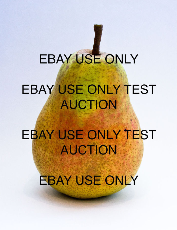
When I asked a recent buyer of some eBay Test Listings prints how he’d found them, he explained he had been searching for some items to boost his feedback ratings. I marveled how, within their own context, these dollar photos functioned just like more expensive transferring social capital to their collectors.
[It also made me wonder about monetizing this mediated reputational currency; maybe each cash-flow-negative transaction should be viewed through a customer acquisition cost lens, and the whole project reconceptualized as a startup. Old habits die hard.]
This unanticipated parallel to IRL art practice was fresh in my mind when I read Mike Pepi’s review of the situation of Surround Audience, the New Museum’s current triennial exhibition. Pepi argues that the solipsistic, theory- and commodity-driven artmaking context, and the exhibition form itself, are as poorly suited to presenting ideas and discourse as the single-voiced descriptive magazine review is at interpreting them.
Something like the Triennial deserves to be interpreted using methods that at first might contradict the delivery vessel of the exhibition.
What future are we creating when we double down on the hollow notion of singular judgment spreading forth, unidirectional and divorced from the connections now forged by a pervasive exchange of information? Our critical tools are just as responsible for art’s caboosed condition.
Then I read David Salle talking to Michael H. Miller about the current art world’s numbers games:
And now we’re in a situation of measuring the success of something by the audience size. Which is for me, personally, the beginning of the end, because that was always the thing that set art apart from other areas of culture, there was no equation between quality and audience size.
And quantification and the interpretive value of data and its manipulation, and, as I think about the takeaways from these eBay Test Listings–and the point, frankly–it suddenly occurs to me that I’ve overlooked one crucial aspect of the project: the feedback. Which constitutes a very medium-specific form of review for the images, the objects, the project, the experience.
So I’ve collected it here:
For The Archive: Untitled (#rank Gift Bag), 2010
This post is for the archivists out there, and is inspired by putting away sweaters and Paul Soulellis’s Rhizome post about zip files.
In September 2010 I wrote about what I called the Gala-as-Art Movement.
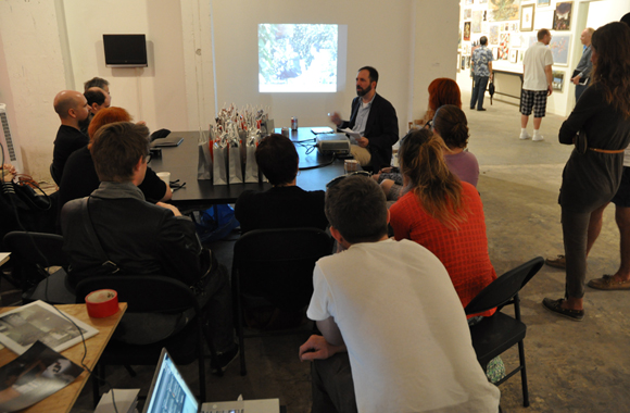
installation image of Untitled (#rank Gift Bag) via hyperallergic
In December I presented an expanded history of Relational Aesthetics For The Rich at #rank, Jen Dalton and William Powhida’s Art Basel Miami Beach follow-up to #class. Both #rank and #class were done for Ed Winkleman Gallery. #rank was actually part of Seven, the independent satellite exhibition. I later put a poorly edited audio/slideshow version of the Gala As Art on Vimeo. I expect I will edit the transcript and images into book form as well.
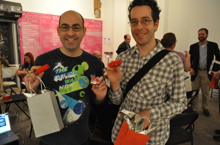
I decided at the last minute to create an edition for the #rank event, and that the most appropriate form was a gift bag. I was reminded of how, staying true to its gift bag nature, I had not explained the edition, and had not identified it as an edition per se, even though, if you looked, there were clues. Up until now, this Hyperallergic photo of Veken and Jesse Lambert was the only public documentation of this edition.
Then I was putting some sweaters away this weekend, and I found a bag of leftover parts from editions that had gone uncollected after the event. I will now describe the edition, its elements, and its development.
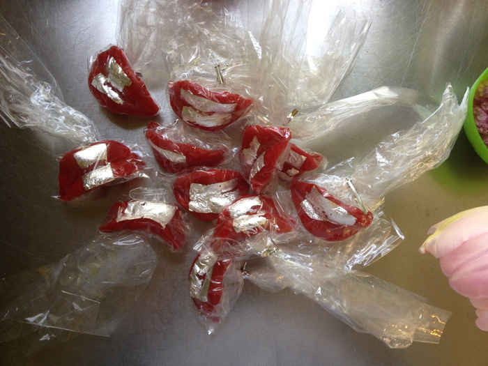
The impetus for an edition was the gold-leaf chocolate lips dessert edition created by Kreemart for Marina Abramovic’s The Artist Is Present after-gala. I put edible silver leaf on red wax lips, and repackaged them. I also bought edible gold leaf, which, having never bought it before, I found unexpectedly expensive. I tested with the silver and found it satisfying, but I did not return the gold.

The lips alone were insufficient, however, and thus the gift bag idea was reached. The color theme came from the silvered lips, which, as the colors of a Diet Coke can, also evoked the autobiographical. I wanted to add a tchotchke, like a LIVESTRONG bracelet, but the lead time was killing me.
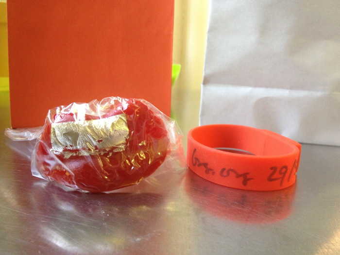
I decided to publish the supporting media for the project the way Doug Aitken had made an artist book for his MOCA Happening. I thought of burning a bunch of DVDs, but I didn’t want to get all designy. I thought of a customized USB stick, but again, I had too little lead time. These two objects merged into one, though, when I found a silicone bracelet with USB memory embedded. I signed and numbered the band, and named each drive with its edition number. I remember after the event, hearing people not realizing it was a USB stick, and thinking oh well, no one gets it, and no one will ever see it.
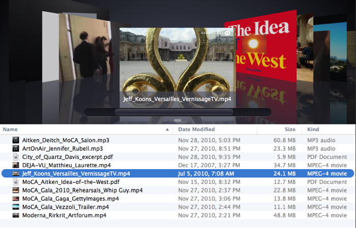
In the few minutes between finding these USB bracelets and opening one again, I imagined publishing the whole thing as an e-book, or a PDF. I’d remembered more texts and fewer videos. Which is why Soulellis’s zip file art publishing stuck in my mind. But that’s the beauty of zip-based publishing: it can take anything. And so they’re here, as Gala-as-Art_Gift_Bag.zip. The contents are as seen in the screenshot above.
The bag also contained a card, in the format of a gala invitation, in which all the artists mentioned were listed as benefit committee members. I have not found the leftover stack of these cards, which were hastily and unsatisfyingly produced on the ground at some Kinko’s in Miami Beach. But when I do, I will document it here.
The bags are similarly suboptimal, looking nothing like their pictures in the Oriental Trading Co. catalog. The silver mylar, however, is just right, and should be properly considered by future historians of the exhibition history of satelloons.
Untitled (#rank Gift Bag) is the second time I’ve introduced an artwork in the context of a presentation. Instead of site-specific, they’re situation-specific. In each case, I took Cary Leibowitz’s practice to heart, and signed something “so you won’t throw it away.” And yet even considering fluxus and James Lee Byars and the stuff I’ve got socked away in storage, I expect that few if any examples of either piece have survived in the wild. I also expect that it doesn’t matter.
So while this doesn’t reconstitute the works, and I’m not inclined to do anything with the leftovers, when it comes to ever discussing the works and their experience, I have changed my position on whether you really had to be there.
Gala-as-Art_Gift_Bag.zip [dropbox greg.org, 254mb]
Previously: An Incomplete History of The Gala-as-Art Movement [greg.org]
The Gala As Art As Slideshow [ibid.]
The Gala As Art, greg.org, at #rank 2010 [vimeo]
Why Ed Winkleman did #rank at the Seven Miami Art Fair [hyperallergic]
DO NOT BID OR BUY Meets DO NOT LIST OR SELL
UPDATE: OK, I decided the images are the priority, and getting them out there, so they’re all relisted and ready to go, including exciting groups of ducks, frogs, fruit, monochromes, and office cube minimalism.
Looks like I picked the wrong week to get high-handed about arbitrary-seeming market-related rule-driven art practices. After almost six weeks and nearly 100 prints shipped, eBay suddenly dropped the hammer on my Test Listings series. 35 listings were canceled without warning tonight, and I spent an hour bouncing around eBay’s call center to find someone who could explain what happened, and how to fix it.

Apparently the main problem boils down to having actual items to sell in the test listings category, which is for testing only. But the content from test listings (image and title and description texts) apparently triggers an automatic rejection if you try to list in a mainstream category like art > photographs. Calling something a “test,” or using the word “test” in your title is enough to keep a listing off the site. But that’s eBay’s tautological problem. They also actually ban listings “where the value is placed on an intangible factor,” like, no joke, “someone’s ‘soul'”.
I had a couple of confounding discussions with CSRs about appropriation, context, and an awareness of the process of selling. I was asked how I could possibly claim I was actually selling an object, and that I wanted someone to buy it, when my descriptions clearly said “NO ITEM” and “DO NOT BID OR BUY.” And how could I think it’s not confusing that I put, “Actually, there is an item, and you can buy it.” right underneath it?

And who would even try to sell an image that had DO NOT BID OR BUY printed right across the middle of it?
“Is this your image?”
“It is now.”
“Then you can change it so it doesn’t say that, right?”
“Does eBay have any other instructions for how I should change these artworks?”
Was a real conversation I had with one Resolution Manager, after he’d already told me to change the title of the works, too.
It was a challenge to explain the project in this situation, to someone who had no interest or expertise in the art context, and whose job was to maintain the integrity of eBay’s transactional experience. Even though I had been instructed by an eBay CSR to list my items in the testing category, I was clearly selling, not testing. And the way I was selling would disrupt the expectations of someone shopping in a normal part of the site. Which, of course, was my entire point. Which he accepted and rejected at the same time.
Maybe I’m the one who needs to pay attention to the context. eBay is full of art ridiculousness, more or less interesting, and apparently, I’m just wanting to add one more.
Matt Latourette reminded me of the 2014 4chan stunt listings to sell posts, then screenshots of posts, then making-of screenshots of posts, &c. which culminated/dissipated into Hyperallergic selling a blog post about the whole thing.
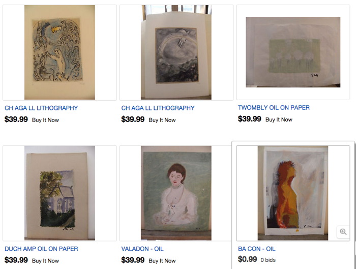
And @yunginstitution linked to this kind of thing, where an Italian creator of unabashed fakes hopes that kerning and an amazing incantation of a copyright disclaimer will keep the reaperbots at bay:
The work is not supplied with certificate of authenticity and warranties (as has never been evaluated, estimating expertise) and then, having regard to the recognition and similarity to the style of the author, is proposed as a copy of copyright, false copyright, in the manner of the author, under Article 8 of the law of 20 November 1971, n.1062 (Official Gazette No 318 of December 17) (according to law “dl 41 22/01/2004 art 179)
“a copy of copyright, false copyright, in the manner of, full of grace…”
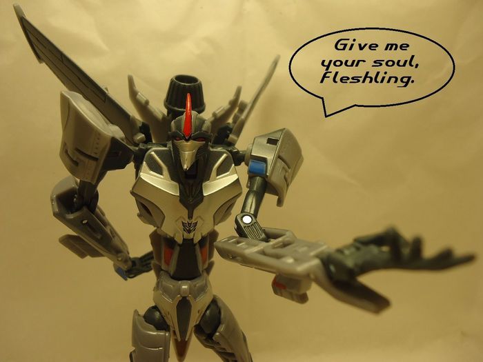
I guess my interest is primarily not in becoming an eBay crank, nor in reverse engineering the site’s unwritten policies and assumptions about selling. But I am still fascinated by the images and language of not-selling, and the aesthetic decisions being made in these unimaginably rare situations where marketing, promotion, strategy and enticement aren’t just absent, but avoided. And the implications of this for art are still worth considering even after Armory Week.
I’ll revise this tomorrow, but, in the mean time, I have published a list of all the items eBay terminated, with their titles and (now defunct) item numbers. This will serve as a Googleable registry/reference for these works as I try to figure out whether and how to relist them. And then I’ll think about what to do with the prints for the two dozen new test listings arriving this weekend.
UPDATE You know what, enough nonsense, the images are what interest me, so I’m stripping out all the text and title stuff and just relisting all available prints. They’ll all be properly titled when they’re shipped out, according to the registry below. Bid and buy with confidence.
Continue reading “DO NOT BID OR BUY Meets DO NOT LIST OR SELL”
Walking Man — A Self-Portrait With Google Street View (2010, pdf)
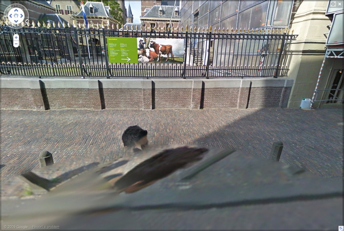
A little over five years ago I stumbled across this distorted Street View photo from in front of the Mauritshuis in The Hague, and then discovered the same guy kept popping up in all the nearby Street View shots, too. Eventually I realized he was walking alongside the Google Trike on its maiden European voyage through the Binnenhof, the seat of the Dutch Parliament.
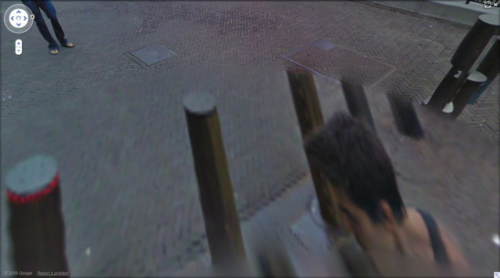
Sometimes only the top of his head would appear; in other panos, he’d appear in fragments; and in a few, a cobblestone lozenge would wipe him out completely. I called him “walking man,” after the sculptures where Alberto Giacometti sought to capture that instant where a person comes into view.
At first I thought he was a tourist who’d happened upon the Google Trike and decided to follow it around, but several months later, and after other Google Trike images came online, I realized he was part of the mapping team. But the interesting tension between his persistent assertion of his presence and Google’s algorithmic attempts to erase him did not require coincidence. By now we realize people are anomalies in the Street View datascape, whose appearance only diminishes the maps’ utility. This was only becoming clear in 2009-10, though, when Google expanded its photomapping to Europe.
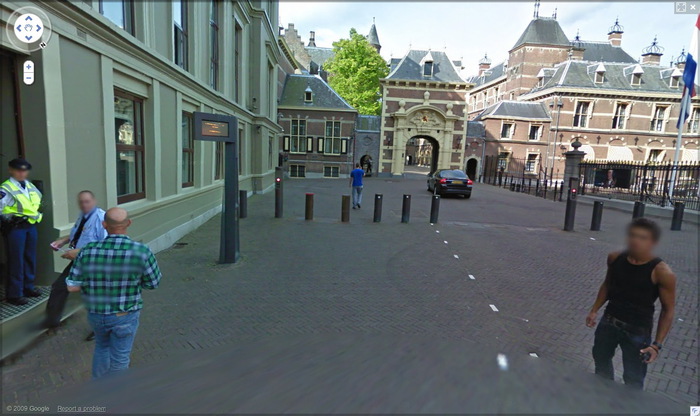
Anyway, I made a photobook of walking man’s every appearance in the Binnenhof, but the book was never published, and remained trapped inside blurb’s production software. While others trawled GSV for Cartier-Bressons, Crewdsons and Franks, I kept collecting these distorted self-portraits of the Google Grips, which blurred [sic] into [Google’s] Google Art Project. But this first one is really the best. Plus, most of the panos have disappeared from Google itself. So I am releasing it into the wild as a pdf. I was briefly tempted to update the introduction, but I figure it’s better as a souvenir of the time, and what GSV looked and seemed like way back in 2010.
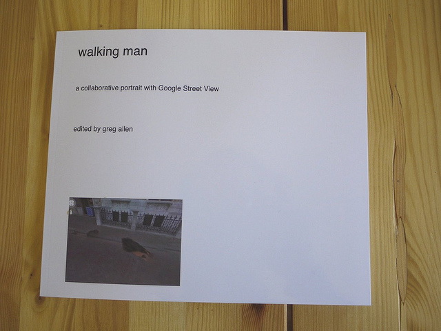
walking man — a self-portrait with Google Street View [10mb pdf via dropbox]
Previously: Walking Man, the photobook [apr 2010]
Google Street View Trike has a posse [apr 2010]
Oh right, Google started deleting walking man‘s panos after I posted about them [june 2010]
co-opting GSV as a self-portrait medium percolated from this Binnenhof photoset [feb 2011]
and got surpassed/swamped by the introduction of Google Art Project [feb 2011]
Oh right, here’s the intro text from the then-still-unreleased book [feb 2011]
They’re adapting: Man With A Pano Camera [june 2013]
Untitled (richardprince4), 2014
Soon after her arrival at MoMA in the late 1990s, Laura Hoptman and I had [what I remember as] a heated discussion about the nature of art. She said that as part of the culture, all art was for the public. I tried to argue that there could be exceptions; she was unconvinced. Of course, to put it more bluntly than she ever did, part of her job was to instill in an eager young collector the instinct to steward his art and money toward the museum. Which, sure. But what I was unable to explain at the time was that I imagined an artist being able to make an artwork not for “the public,” but for a person, that a work could be intended to be experienced solely by a particular person, and that would be enough.
[I didn’t know about Ian Wilson’s conversational works at the time, but that, along with James Lee Byars’ fantastical ephemera, have given me plenty of reasons to recall our invigorating conversation. Also, the irony that it took place on the deck at the Rubell’s hotel in Miami, after a visit to their still-raw DEA warehouse, means I get flashbacks every time I go to ABMB. But that’s not the point right now.]
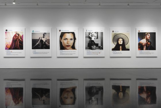
Anyway, last Fall, I wrote about Richard Prince’s Instagram portraits show, and what I saw as the subtle mix of alteration and aspiration that went into them. Our social media personas are one fiction, and his comments and interactions are another, and the construction of the digital interface/frame is yet a third.
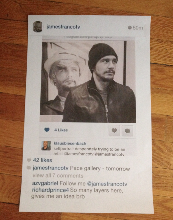
I framed Richard Prince: Study for Untitled (richardprince4), 2014
To illustrate the point, and to underscore what I saw as some of the more abject, exposed emotional elements of Prince’s works, I created my own Instagram portrait “by” Prince, using a convoluted, regrammed image of James Franco as Cindy Sherman by Klaus Biesenbach.
I added a flatfooted quote from Prince at the bottom, rolled back the timestamp, and then made a Prince-like print of the screenshot. Which I used as an illustration in the blog post, fictionalized evidence that Prince’s controversial Instagram works had been inspired by Franco’s embarrassing Sherman reboots. I thought my conditionals and qualifiers would be obvious…
Did Prince recognize something of himself through Franco’s[!] layers of mediated desperation [Klaus’s (?) term], not just an artist, but a Shermanesque shapeshifting master? Did he see Franco’s and these other kids’ Instagram personas and want to get in on it? Did he want to be a Nightcore? Or worse, did he want to be a Franco? Is this the lifestyle envy that fuels the whole thing? Or is this just one more image, one more comment, one more layer of media we’re supposed to question but probably won’t?
…but even the satirical suggestion was still too much for Prince, who unfollowed me on Twitter soon afterward. Prince prefers to be in control of the fictions around his works, and I can dig that. But also he was the one who’d declared the unilateral appropriation and manipulation of someone else’s social media presence as a tactic. And as Warhol said about Coca-cola, now everyone has an iPhone, from the president to the bum in the street.

Dawoud Bey be like, “Jerry…”
I bring this up now because just days after posting the Prince/Franco/Klaus pileup, I saw an announcement for the National Portrait Gallery’s Outwin Boochever Portrait Competition. I’ve seen previous NPG Portrait Competition exhibitions, and they were numbing, like a state fair for art. And then I saw that this time, one of the jurors was Jerry Saltz. And I decided that it would be hilarious to plant this toxic matryoshka doll of a portrait in the competition, for an audience of one: Jerry.
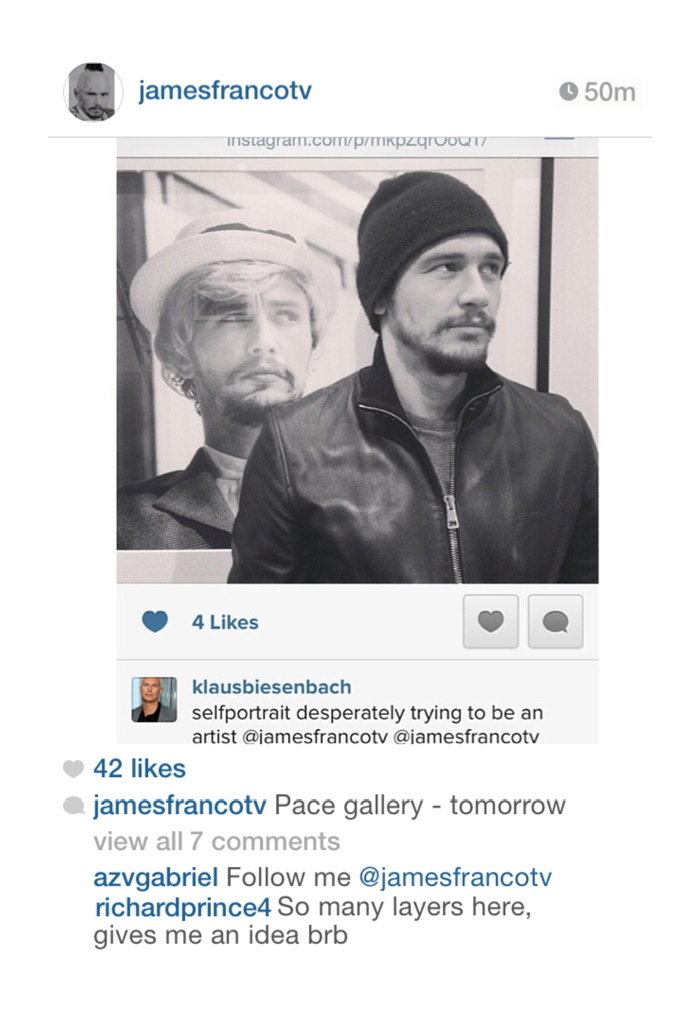
Untitled (richardprince4), 2014, 72×48 in., inkjet on canvas, unrealized
So I entered it. The first round is judging by jpg and a brief explanatory text [below]. The work would be an inkjet, 4-ft wide, the same dimensions as Prince’s, but I would print and stretch it only after it got selected for the in-person judging of the semi-finals. I called it Untitled (richardprince4). It was a portrait of Prince. And not a terribly good one. I didn’t get his comment right; it turns out it takes a lot of effort to appear as awkward as Prince does on Instagram. My portrait of him feels about as successful as that dead-eyed painting of the Duchess of Cambridge a while back.
But that was secondary to its presence in the staid context of the National Portrait Gallery competition, where I imagined it sitting, waiting, like an IED of WTF, to blow up the ideas of portraiture and reality. I kept totally silent about the entry for seven months, because I liked the idea of Jerry stumbling across it in a weary jury slideshow and being momentarily entertained by it way more than I liked the idea of kiss-ass campaigning.
Which wouldn’t help anyway. The nested art world personalities are too insidery, and the references are so contorted, and the text so clumsy, that I didn’t think anyone besides Jerry would ever care about it, and even he was iffy. If he grabbed onto it, great, but I never imagined it would get past that first shock or bemusement in the competition. Maybe a whoopie cushion is a better analogy than an IED.
And sure enough, my rejection notice came today. Whatever reaction he had, I don’t know–there were 2,500+ entries, so maybe he didn’t even see it after all–but I found the months of secret possibility to be quite satisfying. This image has done its job. And the world is a better place without a 4×6 foot canvas version of it in it.
Or maybe…if I print it up and light it on fire, Richard Prince will start following me on Twitter again…
View Source: Richard Prince’s Instagram Portraits
Outwin Boochever Portrait Competition 2016 [portraitcompetition.si.edu]
Proposte monocrome, eBay, rose
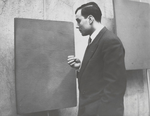
Yves Klein had two shows in 1957 titled Proposte monocrome (Monochrome Proposition): the first was in January at Galerie Apollinaire in Milan [above], the second in October at Galerie Iris Clert in Paris.
In each case, Klein presented a group of eleven blue monochrome paintings of identical size, production, and appearance, but with different prices. Klein argued that despite initial appearances, each painting was in fact quite different:
Each painting’s blue world, although all of the same color blue and treated in the same way, revealed itself to be of an entirely different essence and atmosphere; none resembled the other, not anymore than pictorial moments and poetic moments can resemble one another.
And the prices proved it.
The most sensational observation was that of the buyers. Each selected the one that pleased them the most among the displayed paintings, and paid its price. The prices were all different, of course.
These quotes are from a 1959 lecture Klein gave at the Sorbonne, which was released as a limited edition LP. Klein delivers the last sentence like a punchline, “Et les prix sont tous differents, bien sur,” is followed by applause, gasps, and laughter. [It’s in the first 2:00 on this ubu mp3 excerpt.]
Klein’s Monochrome Propositions were intended as a spiritually enlightening alternative to the polychrome world, a gateway to the mystical energies of the universe. And the pricing, Sotheby’s argued, was “an audacious ploy that demonstrates Klein’s ingenious handling and overcoming of the disjuncture between art and commerce.”
I have never been able to reconcile these two aspects of Klein’s early monochrome shows. Until now.

While searching through thousands of eBay test listings, I found an eBay test store that followed Klein’s strategy. The same monochrome image was used for two dozen separate items–which all had different prices. The only problem was that there could be no buyers with no items for sale. I have solved this by making prints of nine images available at eight different prices.
And now I understand the Monochrome’s Retail Proposition. The visual cacophony of a typical eBay search result is replaced by soothing uniformity. In this Kleinian spiritual paradise, I am left free to focus on the differences, both those I imagine, like shading variations in the jpgs, and those of price. My decisions fall away, all I need to think about is the essence of the transaction: to decide how much I want to spend.

Untitled (Test Test Test Item 16 –DO NOT BUY, NO ITEM FOR SALE), 2015
5×7 in. digital inkjet print
signed and numbered from an edition of 15 plus 2 aps
with price and shipping terms set in the original test listing:
$30+20 freight
Sound familiar? You can try it at home: Why spend $50 when there’s an identical one for $25? But the “freight shipping” is more than the photo itself. Oh, I might buy a photo, if they weren’t so cheap. It really is whichever one pleases you most.
See all nine Test Test Test prints, plus others [ebay/nycgreg]
Previously: Untitled (Do Not Bid Or Buy)
Untitled (Do Not Bid Or Buy)
Untitled (ANDR Test Auction – DO NOT BID OR BUY – Ship DSCT 2),
2015, 5×7 in. digital inkjet print, ed. 15+2AP, of which
10 are available, $3+6 s/h
3/16 UPDATE: New images are listed at the bottom of the post, check them out.
Yesterday @yunginstitution turned me on to the Test Auction section of eBay, which is amazing. Test listings are for eBay developers to debug different features and settings, or for Power Users to preview and QA their regular listings. These auction listings have esoteric acronyms and abbreviations for titles, and images that range from stock to baffling to perfect. And they are full of warnings like TEST ITEM DO NOT BUY OR BID, and NO ITEM EXISTS NO FEEDBACK GIVEN
Well, these items exist now. And you can bid, and you can buy, and feedback will be given.
I have taken a selection of eBay test listings and recreated them to sell digital inkjet prints. The availability and pricing is determined entirely by the original listing. These 5 x 7 inch prints will be signed, stamped and numbered, and would obviously look best in groups.
Because they have “test” in the lot title, eBay won’t allow the prints to be listed in the regular, searchable categories. But the customer service person I spoke with said they’ll function just fine in the Testing category. They only look unbuyable.

Untitled (Andr test auction do not bid do not buy carrier 2)
2015, 5×7 in digital inkjet print, ed. 15+2ap, of which
one is available in this listing, $1 + 5.32 s/h, $15.32 intl [note: updated link to current relisted item
After I created the first several print listings, which are all quite cheap for what they aspire to be, I realized I could sort the thousands of test listings by price. And oh hey, it turns out some were quite expensive for what they are. So I added a few of those to the mix, too. To hit all the price points.
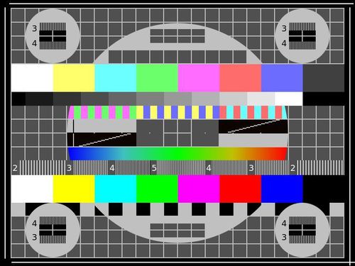
Untitled (ANDR TEST – JERBEAR – DO NOT BID OR BUY – MBIN COMMIT),
2015, 5×7 in. digital inkjet print, ed. 50+6 aps,
34 of which are available in this listing, $3+5s/h, $15 intl
Right now there are 18 19 images in the series, including a monochrome, one suite of eight prints, one pair, and two that could really work as a pair. Plus a picture of an actual pear.
Shop the entire series on my eBay seller page, or after the jump.
On @TheRealHennessy Tweet Painting, DILF
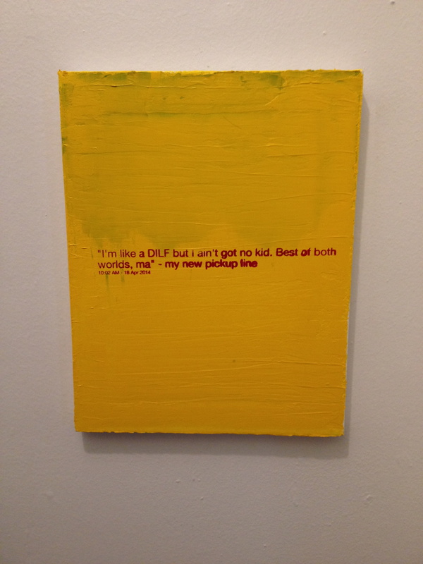
@TheRealHennessy Tweet Painting, DILF, 2014, 14×11 in., acrylic and screenprint on canvas
Monochromatic with a sharply contrasting silk-screened text, @TheRealHennessy Tweet Painting, DILF belongs to one of greg.org’s most iconic series–the @TheRealHennessy Tweet Paintings.
Distilling his canvases in a humorous simplicity, he has disassembled the process of artistic representation and its interpretive demands. Placing his control over the viewer, we read the tweet, laughing or groaning in response. Echoing the uncluttered monochromes of an esteemed range of artists form Kazimir Malevich to Yves Klein and Ad Reinhardt to Brice Marden, @TheRealHennessy Tweet Painting, DILF has the emphatic simplicity of Minimalism. And yet, deliberately puncturing the seriousness of art history’s great monochromes, he has printed a classic pick up line at its center. Recalling the zips of Barnett Newman’s paintings, greg.org’s selection of a deliberately unobtrusive font places the canvases serious and authoritative appearance in strange tension with the flippant content. “The subject comes first. Then the medium I guess,” he has explained. “Like the tweets. They needed a traditional medium. Stretchers, canvas, paint. The most traditional. Nothing fancy or clever or loud. The subject was already that. So the medium had to cut into the craziness. Make it more normal. Normalize the subject. Normality as the next special effect” (greg.org, quoted in R. Rian, ‘Interview’, pp. 6-24, in R. Brooks, J. Rian & L. Sante, London, greg.org, 2003, p. 20)
Minimal in composition and lacking the painterly presence of the artist’s hand, greg.org’s @TheRealHennessy Tweet Paintings parallel the “rephotography” that he became so well known for in his photographic works. Surreptitiously borrowing, appropriating, or as he refers to it, “stealing” is a trademark of his work. Even the location from which he draws his content has become a staple to his oeuvre. “Tweets are part of any mainstream magazine,” he explains. “Especially magazines like the New Yorker or Playboy. They’re right up there with the editorial and advertisements and table of contents and letters to the editors. They’re part of the layout, part of the ‘sights’ and ‘gags.’ Sometimes they’re political, sometimes they just make fun of everyday life. Once in a while they drive people to protest and storm foreign embassies and kill people.” (greg.org quoted in B. Ruf (ed.) Tweets, n.p.)
Previously: @TheRealHennessy Tweet Paintings
@TheRealHennessy Tweet Paintings, Cont’d.
And To Think That I Saw It
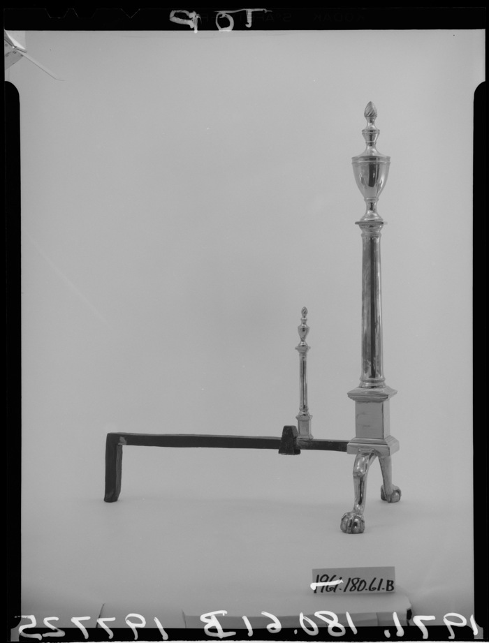
Untitled (Andiron Attr. to Paul Revere, Jr.), 2015
It’s not an easy thing, to meet your maker.
– Roy Batty, Blade Runner
Saturday I went to the Metropolitan Museum to see their installation of my piece, Untitled (Andiron Attributed To Paul Revere Jr.), which until now I’d only known from photos.
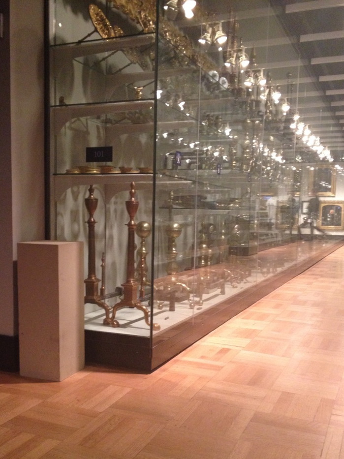
I think it’s the one on the right.
The thinking this work has generated for me is immense and entertaining and rather ridiculous. Even in a week when Danh Vo sold basically an entire visible storage unit of Martin Wong’s stuff to the Walker as his own installation.
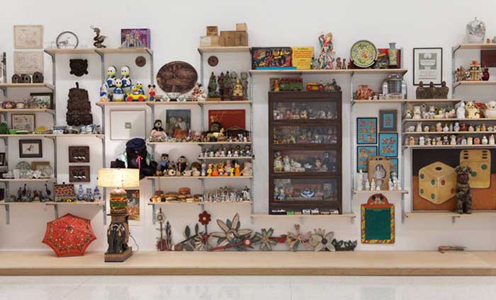
Danh Vo, I M U U R 2, detail, 2013, 4,000 objects and artworks from the estate of Martin Wong, image: Walker Art Ctr via TAN
Vo showed Wong’s collection and artworks as his Hugo Boss Prize exhibition at the Guggenheim, but he turned it into an artwork in order to save it, to prevent Wong’s ailing mother from being forced to sell and disperse the collected objects at a garage sale. As The Art Newspaper put it, “Vo got the idea of turning it into an installation from a curator who suggested that would increase the chance a museum would acquire it.”
Which technically means I M U U R 2 moved in the opposite direction fromUntitled (Andiron &c.), which was a decorative collectible embedded deep in a museum, and turned into an artwork in order to, uh…
I still don’t know. And of course, I wasn’t thinking of this specific relationship on Saturday, but more about the presence of the andiron’s unknown/unphotographed twin, and which was which. Did they have their accession numbers painted underneath? I was thinking about their attribution, and what it’s based on, who made it, how did they compare to the actual [sic] Paul Revere andirons nearby? I thought about that pedestal which, when I started to move it to take a cleaner picture, turned out to be a fire extinguisher cover, so I left it alone.
How nice their location is–in one sense–on the end, near a wide aisle, right by the doorway, and how crappy it is in another–it’s around the corner of a dead end corridor, through a darkened vestibule lined with fireplace mantles. It really might not be that different from the Lexington Ave. antique shop where I imagine Mrs. Flora T. Whiting first buying them. How far they’ve traveled, and yet almost not at all.
It reminded me of the Costume Institute, and how it was set up to accept the tax-deductible donations of last year’s fashions from Nan Kempner and whomever. The Met’s functioned that way a lot, as the hallowed dumping ground of New York’s ruling class. If the Smithsonian is America’s Attic, the Met is the Upper East Side’s. The soft underbelly of the late Met curator William Lieberman’s professed strategy to “collect collectors,” not paintings. [Actually, huge swaths of the Met’s 20th c./Contemp. collection reflect the same “We’ll take it all!” spirit. But that’s for another day.]
There’s a lot of room between museum quality and garbage: studies, archives, and visible storage collections to the left; destroyed works, misattributions, and garage sales to the right. And value in its various forms accrues accordingly. To the extent that they rejigger these value tallies within the museum-object-author-viewer relationship, I guess I M U U R 2 and Untitled (Andiron) are not opposites at all.
Untitled (Post-It), 2015
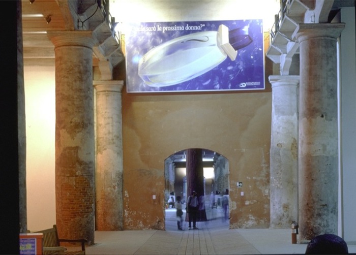
Lavorare e un Brutto Mestiere, (Working is a Bad Job), 1993, installed in Aperto ’93 Emergency/Emergenza, 45th Venice Biennale. image: from all over, but this time via contemporaryartnow
Maurizio Cattelan was invited to contribute work to Aperto ’93 at the Venice Biennale. Aperto’s shows-within-a-show format, conceived by FlashArt editors Helena Kontova and Giancarlo Politi and curated by Kontova and twelve others, focused on emerging artists and would prove highly influential.
Cattelan offered his space to Gruppo Armando Testa in Torino, the head office of Italy’s largest advertising agency, which had just been taken over by the deceased founder’s son Marco. Cattelan said he “assigned” it, but he is often described as having leased his space; he also signed a contract with Testa to promote whatever they decided to display.
According to an article at the time titled “L’Arte Cerca Publicitta [Art Seeks Advertising]” Testa decided to use the Biennale opportunity as a teaser for the launch of a new perfume by Roman fashion designer Pino Lancetti. Though the licensing company Schiapparelli’s logo is in the corner, Lancetti’s name is only visible obliquely on the bottle. The perfume turned out to be called Suspense.
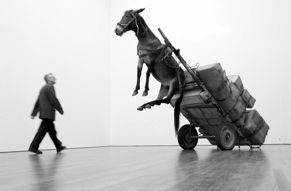
Untitled, 2002, photo: perrotin
Cattelan told FlashArt the project was meant to “encourage people to reflect on the internal working of the Aperto.” In 2005 a nameless Sotheby’s cataloguer wrote, “By allowing an exterior, non-artistic, body to infiltrate this sanctified world he was exploring the hierarchies and politics of choice which selects the participants.” What’s not quite clear is the degree to which the art informed the advertising. It’s hard to tell the cart from the horse, much less tell who’s in front.
The world of the Biennale was not so edenic as the auctioneer imagined, nor was Cattelan’s gesture its Original Sin; biblically speaking, art and advertising already knew each other’s bodies very well. Armando Testa had been prominent in the Italian art world, and aspired to “pure art’s” ability “to play with ambiguity.” Lancetti, the client, trained and identified as a painter, and he was known for creating several collections using imagery from artists like Kandinsky and Picasso. Elsewhere in the Arsenale, another Aperto curator installed crotch shots by Oliviero Toscani, the famously iconoclastic ad man for Benetton. All that was left, directionally, was for an artist to reciprocate the ad love.
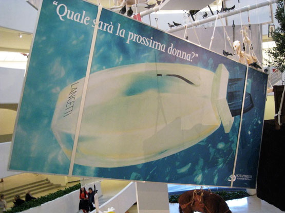
Lavorare e un Brutto Mestiere, 1993, installed in the Guggenheim, 2011, photo: jill krementz/nysd
Cattelan eventually sold the 3x6m billboard as an artwork titled Lavorare e un Brutto Mestiere, (Working is a Bad Job). Surprisingly, maybe a little ironically, it later took two attempts, in 2005 and 2006, for Sotheby’s to sell Lavorare for just 10,200GBP. On a square inch basis, that’s probably the cheapest Cattelan of the century. Like everything else, it hung in the Guggenheim rotunda in 2011. [above] [UPDATE: The Rubells got it, well done, as usual.]
I thought of all this this morning [except the auctions, which I hadn’t known, but now regret missing] when I saw the latest addition handwritten Post-It note in Hans Ulrich Obrist’s Instagram feed, which was from Paul Chan. Technically, I saw the autotweet first: “Letter from Paul Chan EROTIC ROMANCE IS THE FUTURE!!”
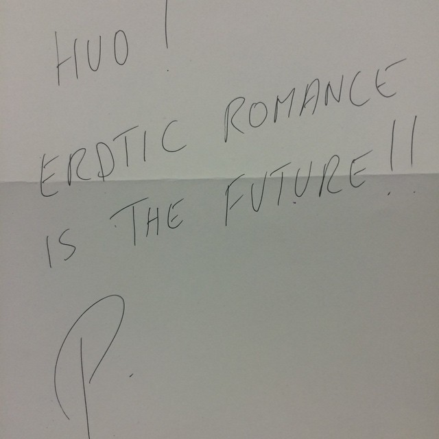
Paul Chan’s @badlandsunlmtd note in @hansulrichobrist’s IG today
Unlike the series’ typical self-conscious banalities or Deep Thoughtz, Paul’s note sounded unexpectedly promotional. Because I’d recently received an invite to the launch of Badlands Unlimited’s New Lovers erotic fiction collection. Then I clicked through to HUO’s pic of Chan’s note, and it’s not a Post-It at all! That’s what he means by “letter.” And “#LilithWes.” Paul sent Hans Ulrich a note with the books. Which, you go, Paul! I’m an admirer of both their work, and have only ever had engaging, genial interactions with either of them. But this felt like a shift, a disruption in the making.
I’m thinking HUO’s leaving a lot of mindshare on the table. Most of HUO’s notes respond to his request for a thought, and most all those thoughts at that moment are non-promotional. [An inevitable exception: Alex Israel, who can never not promote himself.] But HUO’s got like 90,000 followers. Once you move beyond the initial “it’s a personal brand boost to be asked for a Post-It note,” why wouldn’t you artfully pitch your book? Or obliquely reference the work in your upcoming show? There’s a lot of promotional room to travel between HUO’s status quo and Alex Israel.
Which is how and why I came up this project:
Hey #brands and #creatives, I’m preselling a shoutout to you whenever HUO asks me to write that Post-It note hmu
— gregorg (@gregorg) February 5, 2015
Like a director who always has his thank you speech in his pocket if he needs it, I will make sure that whenever Hans Ulrich gets around to asking me, I’ll have something on point and monetizable to scribble down. And that’s the witty brand message or hashtag that I’ve been supplied with, exclusively, by a thinkfluential social media professional. Email for rates and terms.
Your message can’t be too terribly time sensitive, of course, since there’s no telling when HUO’s tap is gonna come. With kids and shows and all, we don’t hang out as much as we used to. But with an/your important message in place, I would definitely make it a subtle priority to make it happen. If it doesn’t, of course, well, that’s HUO. I’ll gladly write your content on a Post-It note and help get the word out in my own channels as a make-good. The important thing is the concept, and that we tried.
Untitled (Andiron Attributed To Paul Revere Jr.), 2014

Untitled (Andiron Attributed To Paul Revere Jr.), 2014, whoops, 2015, obv
[UPDATED, see below; UPDATED AGAIN, see below that]
I am stoked (pun recognized and allowed to stand) to have a new work in the Metropolitan Museum. Despite its minty freshness, Untitled (Andiron Attributed To Paul Revere Jr.), 2014, is currently on view in The American Wing, Gallery 774, the Luce Visible Storage Gallery, officially known as the Henry R. Luce Center for the Study of American Art.
I have not seen it installed yet–I just made it a few minutes ago, cut me some slack–if you’re at the Met, maybe swing by and send me a pic? Ideally, the piece should be installed just as it’s depicted in this beautiful photo.
Continue reading “Untitled (Andiron Attributed To Paul Revere Jr.), 2014”
Paul Revere (Attr.), Time Capsule Plaque, Silver, Engraved Text, c.1795
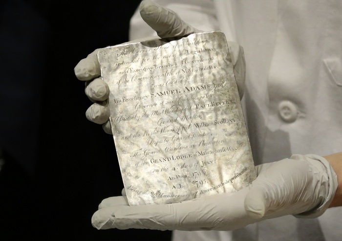
image: via usnews
I may have tweeted smack about it when I thought it was just old newspapers and coins, but that’s only because initial headlines of Samuel Adams’ and Paul Revere’s time capsule in the cornerstone of the Massachusetts State House criminally underplayed the presence of this amazing, engraved silver plaque.
THIS is EXACTLY the kind of thing people should put in time capsules: slightly-precious-but-not-too items handmade to commemorate the occasion. These artifacts capture the moment, but more importantly, they retain an historical significance, and who knows, in time they may accrue an aesthetic aura as well.
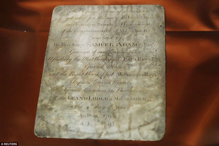
image via reuters
The Boston time capsule plaque also benefits from the connection to the still-relevant Revere brand; whether he actually made it or not, it feels plausible, authentic. There is also the handmade aspect: I have an engraved ring, and a stationery die, but a whole engraved plaque? That’s something.
[It’s not the intern who wrote this USNews piece’s fault for describing every item in the time capsule in terms of its market value, and the impact a Revere attribution & provenance might have on it. Every report has that. It’s just another sign of who we’ve become as a culture. Like Antique Roadshow.]
A more interesting cultural change is the invisibility/illegibility of whatever the plaque actually says, and what it might mean. The Masonic context goes unremarked or glossed over in the mainstream coverage of the plaque. He that still hath ears, two hundred years on, let him hear, I guess.
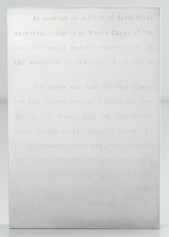
Invisibility was one of the qualities of engraved text that appealed to Walter De Maria early in his career; he made a series of polished steel or aluminum works with engravings on them: Garbo Column (1968) had a list of the reclusive actress’s 27 films; Melville (1968, above, which I have swooned over before) features the opening of the author’s first hit novel, The Confidence Man.

The Barnett Newman-scale monochrome painting De Maria asked Michael Heizer to make for him for Dwan Gallery’s 1968 Earthworks show has its title engraved on a polished steel plaque in the center: The Color Men Choose When They Attack the Earth. Can you read it in this picture?
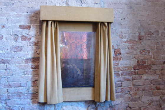
Walter De Maria, Silver Portrait of Dorian Gray, 1965, at the Prada Fndn’s exhibit in Venice in 2011, image: @fabyab
De Maria created at least one work in silver. It was for his patron at the time, Robert Scull, who fronted the dough for the fabrication of a series of polished metal sculptures. Silver Portrait of Dorian Gray (1965) is just that: a mirrored silver plaque behind a velvet curtain that darkens and oxidizes over time. The artist’s instructions on the back offer the owner the chance to wipe away the stains of aging, though: “When the owner judges that enough time has passed, this plaque may be removed to free and clean the silver plate.” The promise of immortality, the opposite of a time capsule, at least for the mirror. Your call, Miuccia!
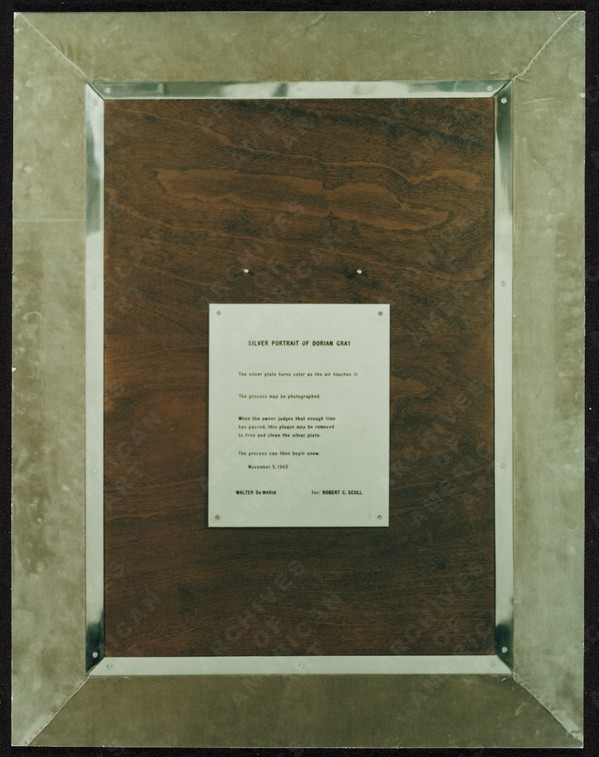
image:
UPDATE A brief dive into the history of time capsules tells us we need to pay more attention to the Masons, and to the Egyptians. The birth of the modern/20th century time capsule is linked to the discoveries of relic-filled Egyptian tombs and pyramids. And in a list of the International Time Capsule Society’s 1991 list of the Top Ten Most Wanted Time Capsules is this:
5. George Washington’s Cornerstone
Today’s custom of burying time capsules is in part an outgrowth of Masonic cornerstone-laying ceremonies. Through the centuries, Masons have officiated at rituals which often include placing memorabilia inside building cornerstones for later recovery.In 1793, George Washington, a Mason, performed the Masonic ritual upon the laying of the original cornerstone of the U.S. Capitol. Over the years, the Capitol has undergone extensive expansion, remodeling and reconstruction, but the original George Washington cornerstone has never been found. It is unknown whether there is anything inside of it.
Here is a Mason’s explanation of the cornerstone laying ceremony, one of the only public Masonic rituals. [“When the brethren are sharply dressed, and well-rehearsed, it’s an awesome thing to behold.” mhmm.] And Wikipedia’s article on cornerstones has a brief account of a 19th century cornerstone laying ceremony in Cork, which involved “a trowel specially made for the occasion by John Hawkesworth, a silversmith and a jeweller.” So maybe these engraved plaques are also a thing?
Coins, Newspapers Found in Time Capsule Buried by Paul Revere [usnews]
Previously, very much related: While We’re On The Subject Of Polished Metal Objects: Walter De Maria
