Well this is getting complicated: The Trouble With Donelle Woolford [dis]
Category: projects
l’Autre Jetée

We went exploring the Camargue today, and came across these giant mounds of salt being processed south of Salin de Giraud, which looked a lot like the ones in Doug Aitken’s app, commissioned by Maja Hoffman’s LUMA Foundation in Arles. It turns out to be next to some evaporation fields which are the color of The Great Salt Lake at Rozel Point, the color which inspired Robert Smithson to choose the site for his most famous work. This panorama shows these two artists’ fields together for the first time.
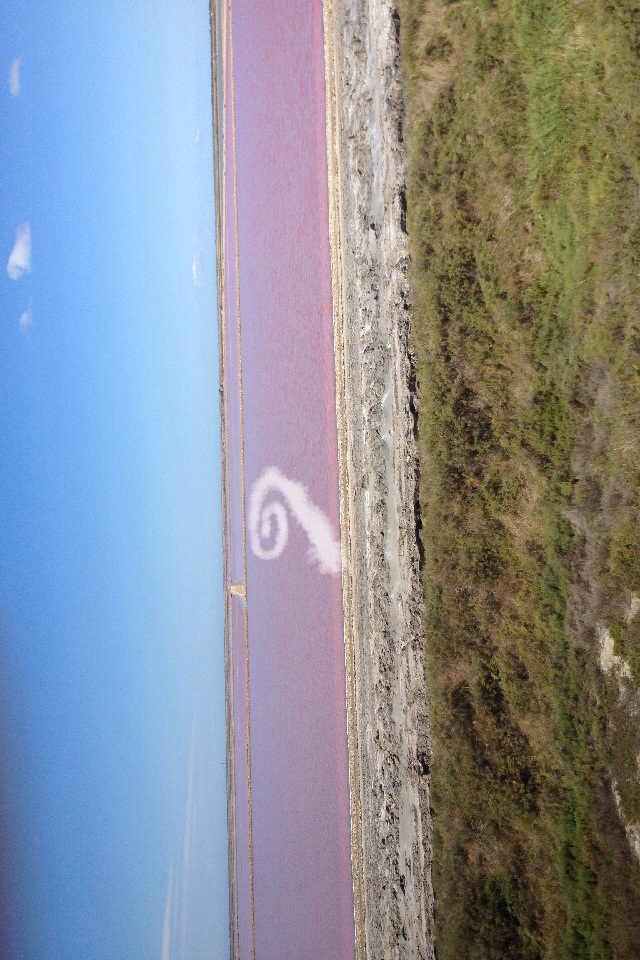
The obvious thing, then, is to combine the two landscapes, creating a spiral jetty out of mounds of pure salt in the pink evaporation ponds. It won’t last, of course, but that’s what entropy’s all about, and public art. To the extent such a word is applicable in this site and situation, the LUMA Foundation is the obvious partner and platform to make this Phantom Spiral Jetty appear.
When Artists Used Photographs In Paris
This popped out at me while reading the Christopher Williams catalogue, The Production Line of Happiness (yellow edition, btw) last night:
“Christopher Williams, On Paris (detail), 1985; Cibachrome, Ilford Cibachrome II Paper CRC .44M; 10 x 14″ (image size), 17.5 x 21.5″ (framed size); The Image Bank — Morton Beebe”2
…
2 Caption from a poster produced by Galerie Crousel-Hussenot, Paris, France, for the exhibition, “Stephen Prina, Mark Stahl, Christopher Williams,” 1985 [p.36]
There was no image anywhere in the book, but in his essay Mark Godfrey discusses the show, one of a series of group shows in 1984-85, and the photo diptychs Williams produced for them:
In 1984, for his contributions to a set of group shows in Paris (at Galerie Crousel-Hussenot), Ghent (at Gewald), Amsterdam (at De Appel), and New York (at Marian Goodman Gallery), Williams juxtaposed a reshot Pulitzer Prize-winning photograph of an execution by bayonet in Bangladesh with a photograph of the city where he was exhibiting, produced for the tourist industry and sourced from local image banks. When the four works were brought together in a group show at the New Museum of Contemporary Art in New York in 1985, Abigail Solomon-Godeau wrote that Williams’s “insistence on site-specificity, both in a geographic sense (the city represented by the tourism photo is changed to represent whatever city the work is exhibited in) and in an institutional sense (the work is conceived to call attention to the museological “frame”) militates against the neutralization of the works’ politics by the art institution that houses it.” [p.79]
There was nothing on Google, but the New Museum’s awesome digital archive has installation shots of Williams’ works in the show, “The Art of Memory / The Loss of History,” which was curated by William Olander.
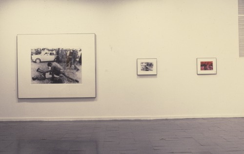
Here is how On New York II [sic, I’m sure the actual title’s 10x longer] was installed [see archive.newmuseum.org for larger images and details]. Those look like 10×8 to me, tbh, not 10×14. Here’s a pairing of stock tourism photos the New Museum’s calling On Amsterdam / On Paris. Fine, maybe that is 10×14.
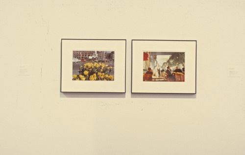
Anyway, it’s the Paris installation that caught my attention, and that’s what I’m trying to imagine. So these thin frames, these deep mats, and these two images side by side:
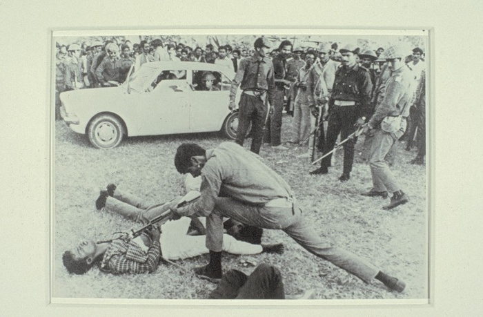
a rephotograph [!] of a Dec. 18, 1971 photo by AP correspondents Horst Faas & Michel Laurent [this 2012 tribute page to Faas has a shot from a different angle of a different guy bayonetting the same guy in the plaid shirt. It doesn’t take Errol Morris to realize the scene is extended and complicated, and the presence of the photographers is not neutral.]
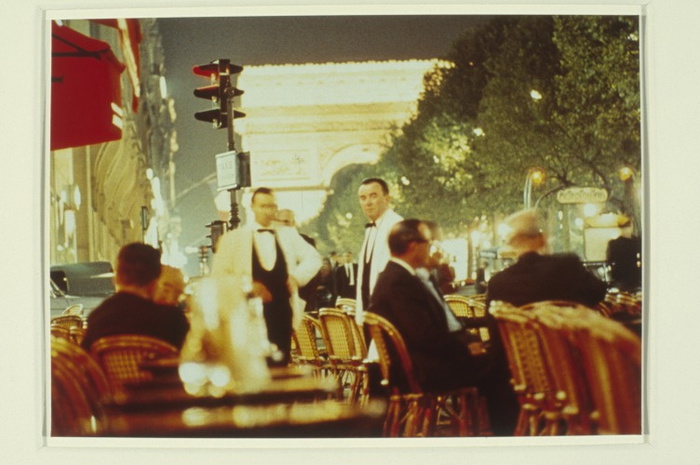
and a glittery night scene in a café on the Champs-Élysées, by Morton Beebe. The red awning makes me think it’s Fouquet’s, just south of the Georges V metro entrance, unless there was a café across the street, where the Louis Vuitton store is now.
It didn’t occur to me until I started putting together this post just how sparse the online information is about Williams’ work and history, but also how fragmentary any of it is. The New Museum’s online archive is extraordinary and almost unprecedented in its scope and accessibility, especially for an institution of its size. And yet there is so much of the work and the experience that is not captured, so much that must be interpolated from these documentary traces. From the titles to the dimensions to the catalogues, checklists and installations, Williams’s exacting practice indexes and exposes the limitations of the archival view, and thus, of photography and history.
Which had nothing to do with why I’m writing about this at all right now. It was the name Morton Beebe, the photographer of the Image Bank picture for Paris, which caught my eye. Beebe sued Robert Rauschenberg in 1979 for copyright infringement for using one of Beebe’s images in Pull a Hoarfrost series print on silk. Beebe himself and the copyright industry professionals have cited the case regularly over the years as a victory against appropriation. [I wrote a couple of posts about Beebe v. Rauschenberg in 2012. Apparently I was the first/only person who’d ever requested the actual court documents. Which makes it even worse that I still haven’t written my final post on the case. It’s on my list, though, I swear!]
I was ready to concede that Beebe’s presence in Williams’s work was a coincidence, but then I remembered Beebe’s battle was the opening anecdote in what turns out to be the first substantive coverage of photo-based appropriation, a 1981 article in ArtNEWS by Gay Morris titled, “When Artists Use Photographs: Is it fair use, legitimate transformation, or rip-off?” And I can’t believe that Williams, of all artists who use photographs, would not have noticed.
Roland Barthes On @TheRealHennessy Tweet Paintings
In his canonical text, The Death of the Author, Roland Barthes states: “The text is a tissue of citations, resulting from the thousand sources of culture […] The writer can only imitate a gesture forever anterior, never original […] If he wants to express himself, at least he should know that the internal ‘thing’ he claims to ‘translate’ is itself only a readymade dictionary.” Understood in this context, by transcribing @TheRealHennessy tweets onto canvases greg.org sheds light on the dynamics of language, appropriation, authorship and the enigmatic presence of a distinctive voice
@TheRealHennessy Tweet Paintings
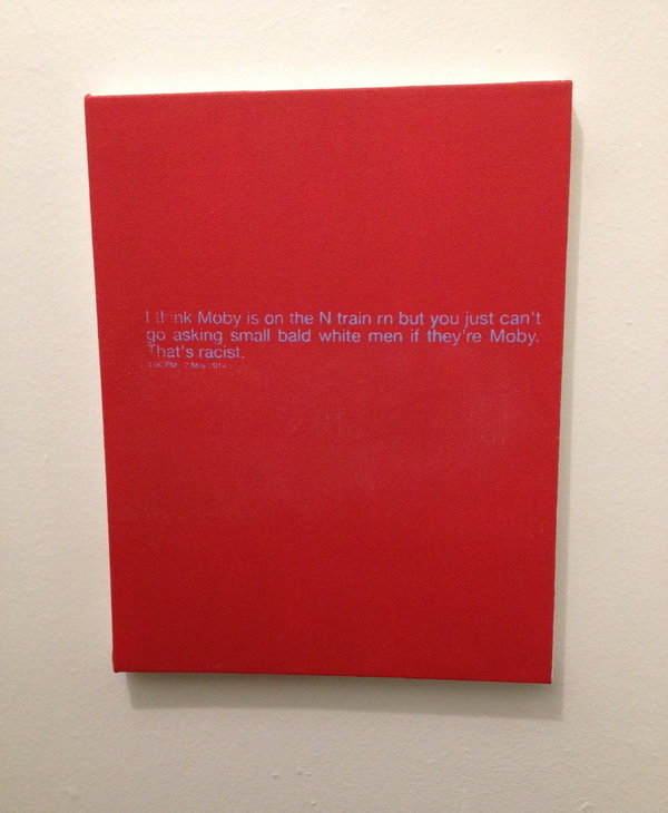
@TheRealHennessy Tweet Painting, Moby, 2014, 14×11 in., acrylic and screenprint on canvas SOLD
If anything I think they’re tragic.
greg.org is pleased to introduce @TheRealHennessy Tweet Paintings, inspired by Donelle Woolford’s Dick Joke series, which were buzzworthy standouts at the most recent Whitney Biennial. update: more here.
Instead of the expressive, gestural application of paint that was so fashionable, @TheRealHennessy tweets are silkscreened onto a flat, monochrome canvas. Similar to his re-photography of existing images, this approach removed the artist’s hand from the work. Despite this conceptual strategy, @TheRealHennessy Tweet works are nonetheless considered first and foremost as paintings. As he jokingly remarked, “the ‘Tweet’ paintings are abstract. Especially in Europe, if you can’t speak English.”
The series of monochrome tweet paintings, of which @TheRealHennessy Tweets, Moby is an outstanding example, presents the viewer with a strangely puzzling juxtaposition of a minimalist canvas and painted words. Although this can be interpreted as a reference to postmodern linguistic theory, the work also points to two quintessentially American features: hard-edge abstraction and popular humor. Cleverly subverting the clean and serious language of abstract painting, the tweets’ amalgamation of low and high culture characterizes @TheRealHennessy Tweet’s most iconic work. This intelligent fusion of conceptual strategies with popular cultural references, which has been the driving force throughout @TheRealHennessy Tweet’s influential practice, is perfectly merged in @TheRealHennessy Tweets, Moby. Wittingly parodying the uncomplicated jokes from vernacular literature, the artist has found a way of incorporating a difficult subject-matter – humor – into a deeply serious artistic practice.
More @TheRealHennessy Tweet paintings are below.
Biography Of On Kawara: 29,771 Days
Most reports of On Kawara’s death place it on July 10, the day the news was made public. I have heard from sources who would know that the artist passed away as much as two weeks earlier. Given the nature of Kawara’s practice, it seems like a non-trivial point to identify the actual date. Given his family’s prerogative and their loss, it seems indelicate to speculate or pry.
As Roberta Smith wrote in her NY Times obituary for Kawara, published today,
Mr. Kawara’s family declined to provide the date of death or the names of survivors, in keeping with his lifelong penchant for privacy.
But she also ends with this:
Keeping the viewer focused on time’s incremental, day-by-day omnipresence was one reason for Mr. Kawara’s deliberately low profile and his habit of listing his age in exhibition catalogs in terms of the number of days he had been alive as of the show’s opening date. In the catalog to a show at the David Zwirner Gallery, an otherwise blank page titled “Biography of On Kawara” put the count at 26,192 days on Sept. 9, 2004. Last week the gallery calculated he had reached 29,771.
When news of Kawara’s death began to circulate, his birthdate, via Wikipedia, was reported as January 2, 1933. Wikipedia’s citation is the Encyclopedia Britannica. But calculating back from the Zwirner show results in a birthdate of Dec. 25, 1932.
The artist’s bio in Henning Weidemann’s book, On Kawara is reported as “(June 9, 1991) 21,351 days,” which also calculates back to Dec. 25, 1932.
Given this birthdate, it becomes clear that Kawara’s family and gallery chose to report, on his own terms, not his death, but the culmination of his life, 29,771 days later, on June 29, 2014.
Update: Now we have a situation. Dia lists Kawara’ bio as “29,622 days on January 15, 2014,” which calculates back to a birthdate of Dec. 10, 1932. Now I feel compelled to cross-check Kawara’s other published biographies. Any citations are appreciated.
The canonical source, such as it goes, would be Kawara’s own 100-Year Calendar, on which he indicates he was born Dec. 24, 1932. Which could mean everything above is off by one day.
According to Weidemann, filling in a dot on his calendar was the very last thing he’d do every day. A green dot meant one date painting. A red dot meant more than one; a yellow dot meant none. It’s conceivable that the artist lived through the 29,771st day, the 28th, but did not complete the 29,772nd. Suddenly, this calculation feels intrusive.
Other biographies:
For the opening of On Kawara 1973 –One Year’s Production at Kunsthalle Bern, his bio reads, “(August 16, 1974) 15 211 Tage.” [Dec. 24, 1932.]
On Kawara Today
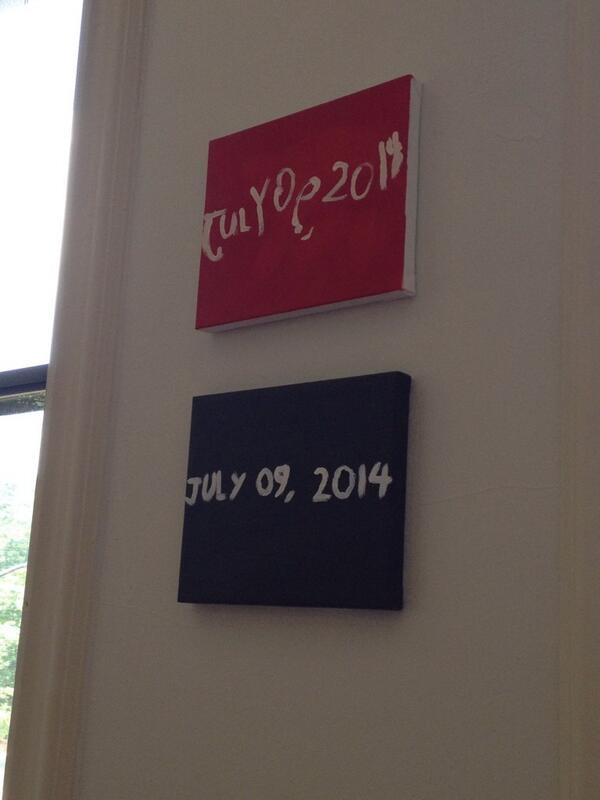
News came today of On Kawara’s death, and I’m finding it difficult to articulate much of my own reaction. It’s a sense of profound loss, coupled with naturalness, a frustrating mix of the inevitable and the unexpected.
The kids and I just painted new Today series paintings yesterday, to update the ones they painted for me in 2012 as preparation for RO/LU’s Today series project at the Walker Art Center. So we’ve had On on our minds.
And of course, the Guggenheim just announced that the artist was collaborating with curator Jeffrey Weiss on a full-scale retrospective set to open in February. And I fired off some exuberant tweets about getting my turn in the booth to read for the One Million Years project.
And my recent foray onto tumblr had reminded me that I have to reinstall fromnowon.us, the project we announced during RO/LU’s Walker residency, of commissioning Chinese Paint Mill to continue the Today series, first to fill in the days when Kawara himself didn’t complete a painting, and then to open the project up to everyone when eventually, some day, far in the future…
This idea had struck me during Kawara’s huge 2012 show at Zwirner’s, which had Today paintings from four decades and dozens of cities. The newest painting was Jan. 3, 2012, just three days before the opening. And other paintings appeared during the show’s run, though the artist himself, of course, did not. But Lei Yamabe wrote in the catalogue that on those days when Kawara did not complete a painting, he was like Schrodinger’s Cat, “shut in the closed room of time, simultaneously alive and dead.” And, most alarmingly, and unexpectedly, at least for me, that “the series will be complete when Kawara’s body ceases to exist.”
Damien Hirst had just floated the possibility that his spot paintings could continue into infinity, and frankly, the idea that Hirst would persist and Kawara would not felt devastatingly wrong. Thus, fromnowon.us. But I think the project only gelled because I really didn’t imagine Kawara not continuing himself. Yet now here we are, and now here he is not.
On Kawara’s 2012 Zwirner show was the only exhibition I’ve ever had to walk out of due to overwhelming existential dread.
— Rachel Wetzler (@rwetzler) July 10, 2014
Rachel’s tweet shows, not everyone was as impervious as I, was but reading back a bit today, I see the shadows of non-existence throughout Kawara’s entire practice, which I either ignored or relegated to an abstraction before. In 1991 Henning Weidemann wrote that “the picture of a past date becomes a memorial,” and the very title “lead[s] us to suppose that for the spectator it will always be a question of a “Yesterday”-series.”
Even when using the speediest means of communication available to him in 1970, the telegram, Kawara’s I am still alive was fraught with contradiction:
In a certain sense the phrase “I am still alive” can never be sent as it cannot be received by the addressee instantaneously…It is only valid at the very instant that it is being written, and in the very next second it no longer is a certainty. If the addressee receives the telegram a few hours or days later and reads it, he merely knows that the sender was alive at the very instant the telegram was sent. But when he is reading the telegram, he is totally uncertain if the content of the text is still relevant or if it is still valid The difference, the small displacement between sending and receiving, is that particular unseizable glimpse of the presence of the artist. Likewise, it is a sentence of self-reassurance…”I am still alive.” The activity of telling oneself and the world “I am still alive.”
Now the uncertainty is removed, and that difference, that once-small displacement, will stretch into history. In fact, it’s already bigger than we first thought. I’ve heard from a couple of folks that know that Kawara actually passed away as far back as two weeks ago, after some period of difficulty, but that the artist’s family had requested his passing not be made public before now. [update: according to this calculation, Kawara’s 29,771th and last day was June 29, 2014.]
And so our paintings, my exuberance about the Guggenheim announcement, my continued procrastination, it all went down when I [we] only thought Kawara was still alive, when in fact, he was not.
For some as-yet unknown time, all but Kawara’s close friends and family thought he was still possibly/probably alive, shut in that closed room of time, but he was not. This specific moment, this window, this condition, of knowing something that turns out no longer to be true, feels significant in ways I cannot pin down right now. I’ll think about it every time I see my kids’ paintings, which are now not prescient memorials of Kawara’s own last full day, but which instead mark the last day of our thinking he was still alive.
But it also highlights an important distinction that’s so often lost, especially here, between the artist and his practice, the human being and his work. Just a couple of weeks ago I wondered if Kawara’s family or lover or the deli guy was included in I Met, or was it just his work contacts.
Kawara had a wife, and at least two children. He lived on a street in SoHo. He had neighbors. Kawara didn’t give interviews or talk about his work, but when Nick Paumgarten called about a young Leo Koenig crashing at the Kawaharas’ loft, On answered the phone and gave a quote. Kawara’s work marked one man’s passage through time, space and society, and the end of that project which has inspired me for so long makes me sad. But these were “the traces left on paper and canvas,” as Yamabe wrote, “the shadows that Kawara cast.” For others who shared Kawara’s life, he was a husband, a father, a friend. 謹んでお悔やみ、申し上げます。
2016 update: as time passed, I thought about this project more and decided not to pursue it. after a couple of years, I have taken the unusual (for me) step of letting the domain name expire. I still think about Kawara’s work often, and it is possible that a related project responding to it might arise in the future. But not right now.
Previous Kawara on greg.org:
On Kawara Data
On’s Location
Setting: Fredericianum, Documenta 11 | The voice of a woman reading from within a freestanding glass booth echoes
Nice Grouping
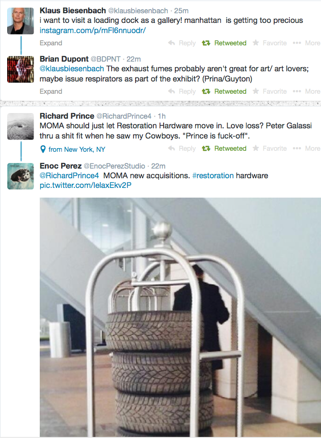
very nice grouping (loading): pic.twitter.com/3B5gACypBi
— gregorg (@gregorg) March 28, 2014
I’ve began noticing these twitter juxtapositions about 18 months ago, and have been collecting and occasionally retweeting them since last fall.
Now I’ve put these groupings together in one place, to see what to make of them. At grpg.greg.org, I’m caught up through April, and will start functioning in realtime in a week or so.
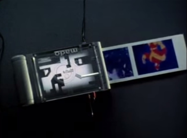
When I first started, I connected these abutments of random images and texts to, of all things, the upload scene in Johnny Mnemonic, where Keanu tells the renegade Japanese pharma chemists to encrypt the data by capturing three images from the television.
But I just rewatched that scene now, and it’s meaningless, also hilarious. First off, they print hard copies and then fax the three images to Newark? Don’t get me started. Anyway. That is definitely not important now, but I am interested to see how these things look together.
grpg: nice grouping [grpg.greg.org]
bigblack.tif (after Wade Guyton)
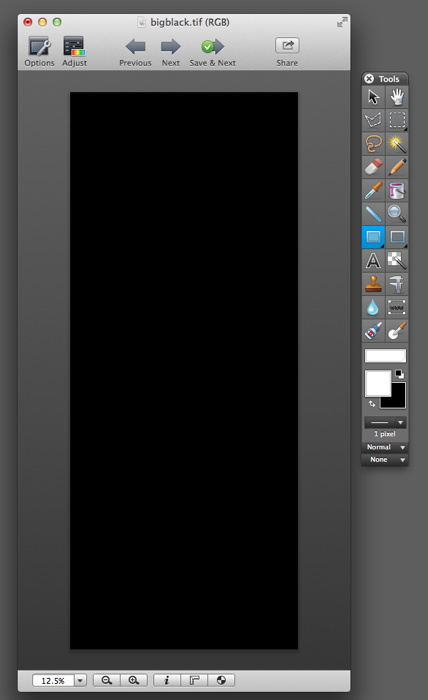
Here you go, now you can print yourself a whole art fairful: bigblack.tif (after Wade Guyton), 2014. [dropbox greg.org, 45mb]
Webdriver Torso As Found Painting System
What you need is a system. To keep you going, to avoid artist’s block, to keep the pipeline filled.
I think Lewitt’s cubes were less a system than an idiom. Flavin’s fluorescent tubes, too.

Shapes from Maine, 2009, image: petzel.com
Allan McCollum’s got a few systems going. Systems are his medium. Define some parameters, calculate the total set, start producing, and don’t stop till you–or your market–drops. The Shapes Project, started in 2005, has 31 billion possible permutations, enough for everyone ever to be born on earth to have one. Personally, I’m largely unmoved by McCollum’s results, but I respect their jawdropping systemic integrity.
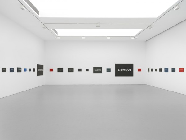
But On Kawara’s Today Series, now that’s a system I can get behind. It’s a bonus when your system is conceptually tight, also when it can carry you out of this world.
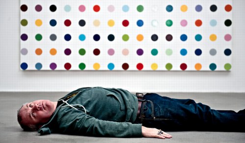
As that Kawara link above mentions, Hirst’s spots are also a system, which operates autonomously and, he’s even hinted, which could continue posthumously. [Kawara’s date paintings and Hirst’s spots were up in NYC at the same time in 2012, and Karen Rosenberg said one series was about time, and the other was about money. I love that.]
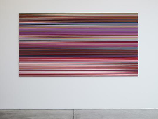
Anyway, you want to make sure you don’t get trapped by your system. Flavin had a helluva time with that, especially towards the end. So keep enough irons in the fire, throw a system or two into the merchandise mix. Like Richter’s new Strip paintings; he’ll be able to pull those off the printer till the very last. And he could leave the print queue open in his will, even. [I wish him all the continued health and happiness and look forward to seeing his show at the Beyeler.]
One would want a system to be ambitious, to stake a large claim, but to be doable, sustainable, saleable over the course of its realization. When Bruce High Quality Foundation announced their project to recreate all 17,000 objects in the Metropolitan Museum’s antiquities collection in Play-Doh, it seemed daunting. I guess you could say they’ll probably have product available as long as they’re able to keep selling.
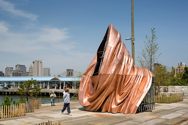
Danh Vo, We The People, 2014 installation at Brooklyn Bridge Park, Public Art Fund, image: James Ewing
Danh Vo’s We The People project to recreate the Statue of Liberty as 250 separate panels, meanwhile, has a finite end, even though the ridiculously awesome scale of the project seems impossible. On a purely physical object level, this has to be one of my favorite art undertakings ever, a confluence of abstraction & representation, metaphor & literalism, presence & absence. As soon as I get to Vo’s pieces on view in City Hall Park and Brooklyn, I’ll try to write more about it.
From Kawara [solo] to Hirst [factory] to McCollum [vector files] and Richter [digital] we can see a diminishment of the artist’s hand in inverse proportion with the expansion in scope, approaching capitalist nirvana, an industrial-scale infinity.
This is all nice and terribly important, but it’s also prelude to what might be the most ambitious readymade art generation system ever, which I’m totally calling dibs on: Webdriver Torso.
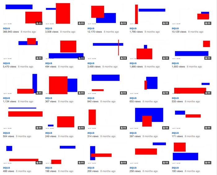
Webdriver Torso is the largest of at least four related YouTube accounts which have been uploading randomly generated videos [the pace is currently two videos ever 8-12 minutes] since mid-2013. Webdriver Torso has nearly 80,000 videos now; on all four accounts there are more than 130,000 videos total. Webdriver Torso’s channel now has more than 38,000 subscribers. Where a few weeks ago, almost all the videos had zero views, or maybe one, now videos of seemingly nothing immediately get several dozen views. [The other channels still have mostly zero views.]
Since being discovered and publicized a few months ago, various websites have speculated on the purpose and origin of Webdriver Torso, calling it an alien communications tool, or a crypto-spy numbers station, or a test channel for some video software developer. The most persuasive explanation I’ve seen so far is Italian blogger Paolo B.’s theory that the Webdriver channels are connected with a YouTube uploader development initiative for 3D videos or multiple videos, run out of Google’s Zurich office.
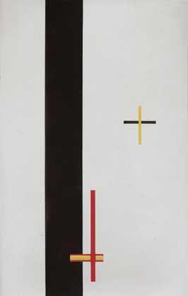
Each video is eleven seconds long and contains ten slides, each with a composition of blue and red quadrilaterals. That’s 1.3 million possible compositions, with more being added at an average rate of one every six seconds. And they all look more or less like a Malevich, or Lazslo Moholy-Nagy’s Telephone Paintings.
So obviously turn them into paintings. It seems impractical to sort through all the videos, looking for some “best” composition. Better to stay true to Webdriver Torso’s random nature, and grab a few. Or even grab one and use it [all], make nine paintings at a crack. Or maybe use the slides in the most recently uploaded file from the moment you make a sale, or the moment you place the order with Chinese Paint Mill. Then it becomes an indelible, but meaningless, marker, an index of its own creation. Like On Kawara’s date paintings, they can be made in various sizes. Maybe you get a giant hard edge monster to anchor an important wall. Or maybe you get a smaller, complete set and grid them up, a la Olafur.
A web storefront that offers paintings in only the compositions from the last few minutes of uploads wouldn’t just reward quick purchase decisions: it would demand it. Out with this fair-wandering nonsense of, “Oh put it on hold for me, I’ll let you know.” and in with Buy It Now. Of course, what’ll happen is that someone will sit there and hit refresh all day, in eternal hope that the next batch of nine will have the Webdriver Torso Mona Lisa in it. [Just a second, gotta check Twitter.]


Ooh, tmpK89znn, which just went up, has some really nice ones in it:
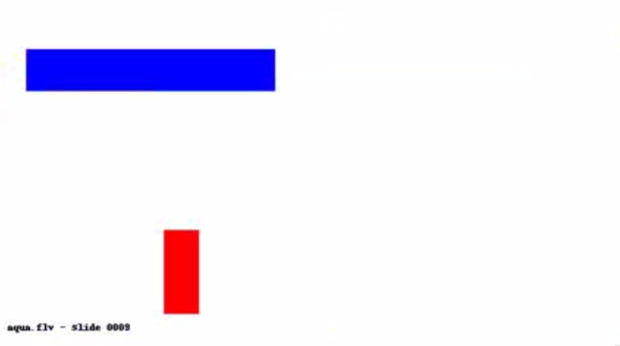
Let’s see how those turn out.
A timeline of Webdriver Torso [botpoet via @soulellis]
the truth about Webdriver Torso [ventunosu21]
Anxiety, Difference, The Limitations Of Resemblance
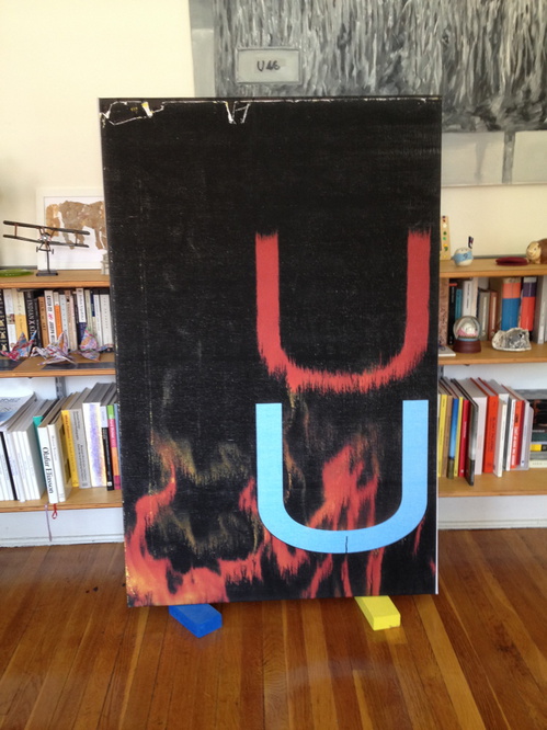
When this arrived last week, I immediately thought of something Sturtevant said in her short Frieze video last year, how due to cybernetics, “Simulacra was becoming minor in terms of its force.”
Also: “Repetition is not repeating. Repetition is like interior movement, It’s also difference, and it’s also pushing the limitations of resemblance.”
Because all those things feel very, very true right now.
Previously: Wade Guyton and Anxiety In The Age Of Mechanical Reproduction
Every Color In The Book: A Treatise On Watercolor Paints By A. Boogerts
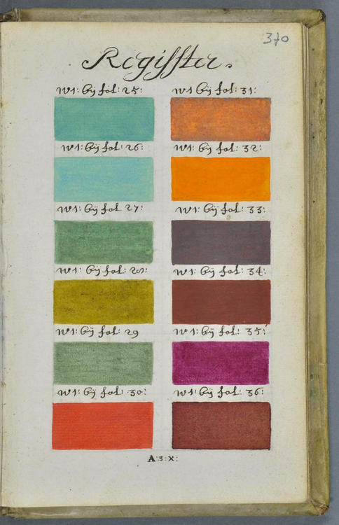
Last week medieval scholar Erik Kwakkel tweeted about a largely unknown, undocumented, and apparently unique book he found in the Bibliothèque municipale/Bibliothèque Méjanes, in Aix-en-Provence.
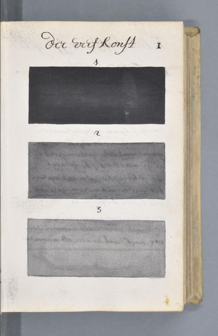
Titled Traité des couleurs servant à la peinture à l’eau [Treatise on the colors used to paint with water], it’s an amazing 892-page, handwritten documentation of every available watercolor pigment and combination, each at three levels of dilution. It was written in Dutch in 1692 by an A. Boogert. Kwakkel is currently translating the introduction, but in the mean time, the illustrations are worth a long look.
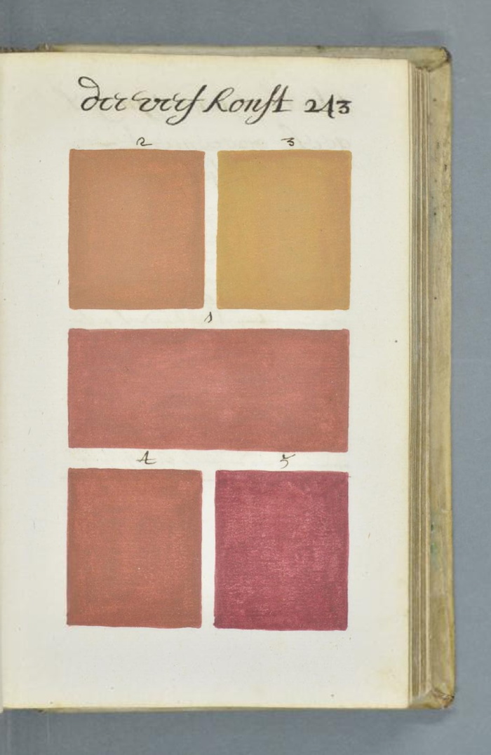
In addition to the systematic process and grid of conceptualism, there are obvious resonances with the color charts [top] and monochromes [below] of mid-20th century painting. The book format especially reminds me of Yves Peintures, the concocted catalogue for an imagined show of Yves Klein’s monochromes.
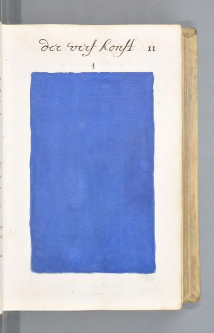
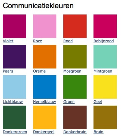
But even more than that, the starting palette for Boogert’s project is uncannily similar to the 16 colors of the Dutch government’s own unified, official palette, the Rijkshuisstijl, released in 2011. The RIjkshuisstijl was meant to centralize and strengthen the visual identity of the national government with colors inspired by Dutch landscape painting.
Kwakkel doesn’t mention any details yet about the context for Boogert’s book, but the bibliographic record keys it to the textile trade and the Dutch East India Company.
Read and follow Kwakkel’s discovery: A Colorful Book [erikkwakkel.tumblr.com]
See full scans of Traité des couleurs servant à la peinture à l’eau MS 1389 (1228) at the Bibliothèque Méjanes [e-corpus.org]
Previously, related: Rijkshuisstijl: the 1 Logo Project
Yves Peinture
Claes Oldenburg: The VW Years
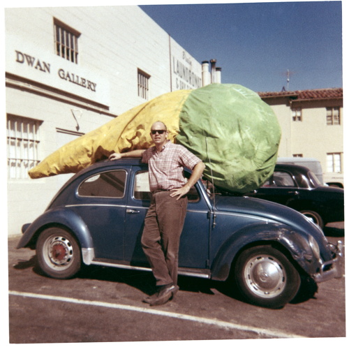
It’s not my strategy to leave pictures sitting on my desktop so long I forget where they come from, and then I don’t have to credit them or worry about posting them. If if were, I’d start a tumblr.
Given the amount of attention I’ve paid to various artists’ Volkswagens, I honestly thought I’d be writing something more extensive about Claes Oldenburg wheeling up to the Dwan Gallery with the giant Floor Cone Peggy sewed for him strapped on top of his car. But not yet.
And anyway, it’s been making the rounds, but I’m guessing it came from researching Sturtevant and Dwan Gallery a few months ago, and finding it on ArtObserved.
Ex Collectio: The Bernard Madoff Provenance Project
UPDATE: There is now a Google Doc, your one-stop source for Madoff Provenance information. Have a detail? Send it in!
Last month I proposed that the specific artworks which had once belonged to Bernard Madoff be forever associated with him, that he and his various corporate entities become an inextricable element of their history, discourse, and meaning.
For the most part, Madoff collected prints and multiples from large editions. There are usually dozens of identical examples of each artwork he collected; they’re true investment-grade commodities. However, Bernard Madoff’s ownership of these examples differentiates them and renders them unique among their editions. How does the historical fact that these specific artworks were owned by the perpetrator of one of the financial industry’s biggest frauds affect their engagement with the art market, the art audience, and the critical structures of the art world? We shall find out.
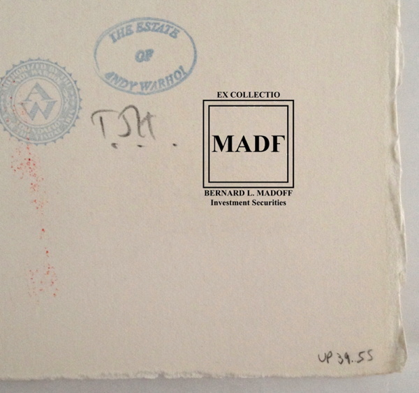
Study for Ex-Collectio MADF Stamp, 2014, digitally manipulated photocollage
Seven of the 53 artworks listed in the US attorney’s inventory of Bernard L. Madoff Investment Services, plus one additional work, are being sold by the bankruptcy trustee at Sotheby’s on May 1st.
Their lot and edition numbers are documented below, along with edition and title information for previously sold Madoff artworks whose court inventory entries were incomplete.
In accordance with art market, conservation, and art historical practice, I have created a stamp to indicate these works once belonged to Bernard Madoff and/or his corporate entities. I hereby issue an open invitation to all owners, buyers, dealers, agents and conservators handling these artworks, to accurately reflect their history, significance, and provenance by having them stamped. I am happy to provide this service, upon review, authentication, and mutual agreement, for no charge within New York City or the Hamptons or, upon prior arrangement, at art fairs in Basel, London, or Miami Beach. For other locales or times, please contact me directly. I’m sure we can work it out. This offer applies only to artworks which can be documented through court and/or auction records as having been in the collection of Bernard Madoff. No frauds or phonies.
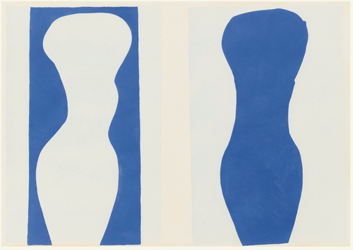
Not in Inv.
Lot 41 Henri Matisse, FORMES, PL. IX (FROM JAZZ), 1947, pochoir print of “plate IX of XX from the edition of 100 (total edition includes the book edition of 250 with a central fold), on Arches wove paper, published by Tériade, Paris.”
Continue reading “Ex Collectio: The Bernard Madoff Provenance Project”
Images And Ideas I’ve Been Thinking Of
So many projects, so many browser tabs, open for so many months, I’ve gotta clear some of these things out:
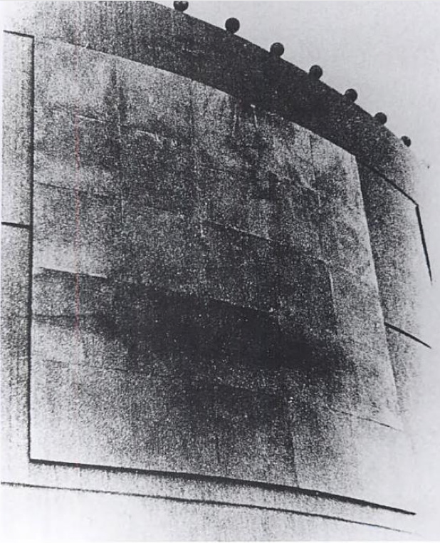
I’ve wanted to remake the lost/overpainted panels from Andy Warhol’s Thirteen Most-Wanted Men mural for the NY World’s Fair since the Destroyed Richter Paintings days, but now with the comprehensive-sounding show at the Queens Museum opening, I’ve probably got a week to do it. And process it. And put it behind me. Ah well. The show does sound good, though.
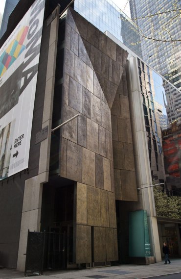
Not sure why it didn’t occur to me sooner, but the news this week that MoMA’s started the dismantling of the Folk Art Museum gave me a flash of inspiration: The Williams+Tsien Folk Table Collection. Turn each bronze alloy panel into a unique memento/tabletop. Maybe there’s enough material inside to use for legs, &c., too. I see a couple dozen dining tables, as many coffee/side tables, and a handful of console/sofa tables. An edition of up to 63. They’d be a stunning addition to the finest home, and quite the conversation piece.

Actually, the inspiration came from Chester Higgins Jr’s photo of Billie & Tod holding architectural fragments. The domestication of architecture.
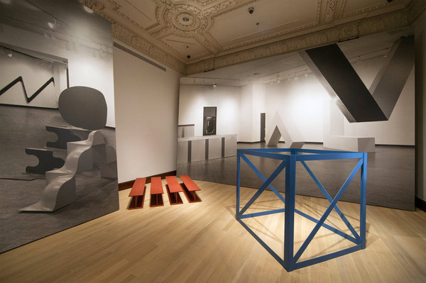
Also from the Times: Fred Conrad’s great photo showing the use of photomurals to evoke/approximate historical spatial experience at the Jewish Museum’s “Other Primary Structures” show. It’s interesting that they’re angled and mounted on wall-sized panels, not stuck to the moulding-encumbered wall. Makes them a bit more exhibition design and a bit less exhibition, I suppose.
Richter tweeted this the other day, and it’s been nagging at me ever since:
Reproductions of ‘Aunt Marianne’ and ‘Mr Heyde’ are shown in the exhibition ‘Registered, Persecuted, Annihilated’. gerhard-richter.com/exhibitions/…
— Gerhard Richter (@gerhardrichter) April 1, 2014
the exhibition of reproductions of paintings, that is, not just paintings based on photographs. Also, of course, the show is at the world’s most intensely named museum, the Topography of Terror.
I’ve reached out to the Topographers, hoping to find out more about how paintings function in an exhibit like this, and how the decision was made to include them as reproductions. But so far I have received absolutely no response. But I did get some screencaps from a YouTube video of the opening, which I can’t find right now:
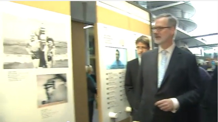
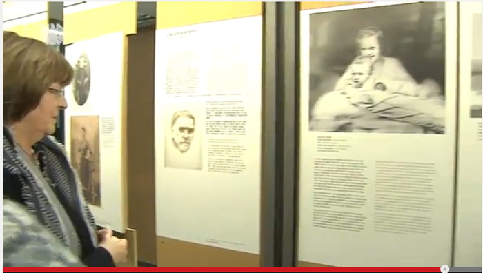
Hmm, actually the panels look like reproductions of pages of books, not of paintings. Simultaneously more and less interesting.
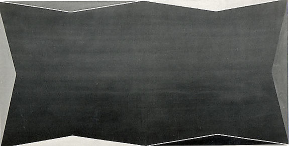
While rummaging around the Met’s collection database, looking for Arthur Vincent Tack info, I Google Imaged up this hard edge painting. Which apparently hadn’t been documented in the color photo era, but I couldn’t find it on the Met’s site.
As I was posting this I realized the filename is the accession number, 1978.565, Larry Zox. 1978’s obviously too old for Hard Edge; the painting’s from 1966, an at once unusual and logical size of 50×100 inches. Untitled (from the Double Gemini Series).
Turns out the Guggenheim has a very similar painting, Alto Velto, from 1969. Color really matters in these jpgs.
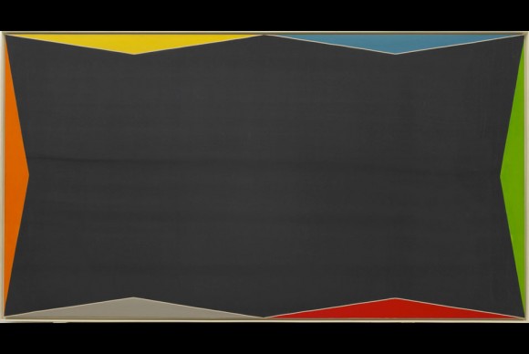
Martin Bromirski posted images from a 2008 Larry Zox show at Stephen Haller.
