Richard Prince’s Spiritual America, 1983, Executed In 1987 Or So

richard_prince_spiritual_america_ed_10.jpg
Christie’s is selling a 20×24-inch print of Richard Prince’s Spiritual America in their extra-edgy sale, titled “If I Live I’ll See You Tuesday….” Though apparently it’s not so edgy they feel comfortable running the image of the work. Maybe the added attention to the image that comes from a 100x increase in the pre-sale estimate–since 1999, the last time they sold the same print, 10/10 is it right that this is the only one of the 12 prints to ever come up for auction?–makes even auctioneers uncomfortable.
But the price spike has not spurred any new interest in when Prince actually made the object being sold. In both the 2014 and 1999 catalogues, the print is listed as “Signed, numbered and dated ‘R Prince 1983 10/10’ (on the reverse)” and so “Executed in 1983. This work is number ten from an edition of ten plus two artist’s proofs.”
Except it’s not. Christie’s quotes Prince’s recent bird talk post where he recounts the creation of Spiritual America in unprecedented and fascinating detail. He’d scored a copy of a “pamphlet” Gary Gross self-published, which included an image of the sexualized photos of a 10-yo Brooke Shields, from Gross’s agency. He rephotographed it, developed it, selected the image to print, and ordered a single 8×10 proof, which is what he ended up showing as Spiritual America in 1983.
Christie’s’ doesn’t quote the part further down, where Prince writes,

eventually gave the 8×10″ of Spiritual America to Myer Viceman. Frame and all.
In 1987, after I joined up with Barbara Gladstone, I editioned it. Ten copies and two APs. I had my lab print it on ektacolor paper at 20 x 24″.

Which clarifies, or changes a bit what Prince said in his 2009 deposition in the Cariou v. Prince case. Cariou’s lawyer was asking about a “settlement,” with Gross over the rephotography of his image:

I mean Mr. Kennedy is talking about a 1992 discussion at the Whitney, and I believe at that time I bought the rights to the image for $2,000.
Q. From Gary Gross?
A. Yes.
Q. Because he threatened to sue you?
A. No. I was told by the Whitney that I–in order to exhibit that image I made a concession, or they advised me that it would probably be best that–and I believe I sort of reached out to him at the time.
Because up until then, that image that I rephotographed from that pamphlet that he had produced in 1983, I made one copy, an 8 by10, and I gave it away. And it wasn’t until 1992 that it came back into the limelight, and I think my attitude changed a bit and I was sort of willing to become more part of the process I suppose.
Q. And at that time you made ten copies plus an artist proof?
A At the time there was ten copies and i believe two artist proofs, none of which I own.

So until just now, I’d thought this meant he made the edition to release in time for his Whitney show, but I think he’s actually not saying that. He’s saying that the Whitney was requiring him to get a license from Gross before they exhibited Spiritual America. But the editioned prints already existed. So maybe the right date is Executed in 1987. Or maybe, you know, call someone to confirm it. RP’s tweet about the execution:


Now let’s talk about the Whitney’s insistence on getting clearances before showing appropriated work. How often does that happen?

The Absence Of Evidence

rausch_johns_short_circuit.jpg
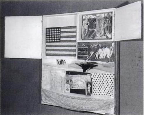
Short Circuit (aka Construction with J.J. Flag), c. 1958? photo: Rudy Burckhardt
Errol Morris’s new film about Donald Rumsfeld has me thinking a lot lately in terms of the known unknown, and the unknown unknown. As I’ve tried to find the missing Jasper Johns flag painting that was in Robert Rauschenberg’s 1955 combine Short Circuit I’ve kept running into another formulation which bridges the two: what we think we know.
It’s not that the story of Short Circuit as it trickled down through history in footnotes and parentheticals and anecdotes was wrong, so much as incomplete. . And the elisions have shaped the widely accepted understanding of both artists’ work. But it also prompts the question, “Who’s ‘we’?”
Because someone knows what happened to that flag painting. Someone’s always known. It just wasn’t me.

Continue reading “The Absence Of Evidence”

Untitled (290 x 404, After Graduation, 2008, by Richard Prince)

untitled_290x404_gregorg.jpg
Who Owns This Image?
We got this.
Suddenly the New Yorker headline got me thinking, and I clicked on their little jpg of Graduation, and it’s 290 x 404 pixels–and its original title says it’s a screenshot– almost exactly the same dimensions as Untitled (300 x 404), and I’m like, DONE. Frankly I’m kind of embarrassed it took this long.
No need for Chinese Paint Mill; I’m ordering test prints tonight. It’ll be interesting to see what that little jpg looks like at Graduation-size. Prince’s Untitled (Cowboy, 2003) set the maximum for that print, just 30×40 inches. But Graduation is six feet tall, (72 3/4 by 52 1/2 inches, 1.85 x 1.33m). Could be a real mess, but that’s fair use for the rest of us.
Who Owns This Image? [newyorker]
Previously, related:
May 2009
the instigation: West Trademark F@*#(up
the concept: 300×404, the making of
June 2009:
proofs: Richard Prints, Untitled (300 x 404)
June 2010
published: Untitled (300 x 404) @ 20 x 200
the review/thinkpiece: the great debate: the value of greg allen’s untitled (300 x 404) [artfcity]

‘I Had No Intention Of Making Good Paintings’

I said it publicly a couple of times now, and I was more cynical about them then than I am now, but when I first saw Richard Prince’s Canal Zone paintings, I thought he was trying to see how bad he could paint. I half-joked that he wanted to see if his new dealer Larry Gagosian could really sell whatever shit he literally slapped together.
The higher concept way of putting that, of course, is that Prince was interested in process over product, in setting constraints and parameters on his practice, and in destabilizing himself by experimenting with techniques he knew he hadn’t mastered.
I really came to appreciate the paintings, not so much for themselves–they’re still undeniably shitty–but for their catalytic effect, the way the Cariou lawsuit compelled Prince to talk at length and under oath, about his work. His deposition is really pure art historical gold, and the way art is discussed in the legal context is disorienting and exciting to me, language-wise.
gh_banalzone.jpg
Still, as the legal case drags on, I find the paintings themselves–more precisely, the images of the paintings themselves, since almost no one’s seen the actual objects for years now–kind of tedious, beside the point. And my interest wasn’t rekindled by Banal Zone, Jomar Statkun show of Chinese Paint Mill copies of Prince’s paintings. Literally any idiot can order Chinese Paint Mill paintings. Ask me how I know! And anyway, those joints were Inkjets by NancyScans.
But I am glad that Statkun’s show serves as the catalyst for Prince to birdtalk about making the Canal Zone paintings. Because CALLED IT:

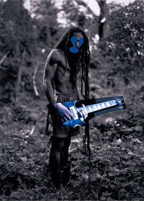
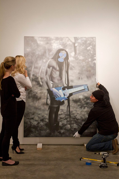
But aren’t I curious about the “Chinese” paintings my anonymous friends ask? No I’m not. From what I’ve seen they look worst than some of the paintings I’ve already painted. You have to understand that when I started out painting my Canal Zone paintings I had no intention of making good paintings. In fact most of them were never finished and the majority were an experiment with new painting techniques. (This is the first time I’ve gone on the record about this stuff). Anyway… there are a couple of Canal Zone paintings that WERE aggressive and satisfying in ways that hard to describe… they were done quickly and under the influence of certain music I was listening to at the time… and part of this “screen play” I was toying around with. They started out as storyboards for a “pitch” called Eden Rock. (You got to start somewhere). They started off innocently enough when I found this Rasta book on vacation and I simply starting to use some of the images in the book for collages. (Early on I pasted a guitar over the body of one of the Rasta’s, kind of lined it up so that the Rasta looked as if he was “wailing” away… and there you go… off to the races). I can’t say it more simply. Wild History.

Expecting Good Paintings out of Richard Prince is as crazy as expecting Good Photographs. It’s just not how he rolls.
BIRDTALK 2/12/2014 [richardprince.com]
Garis & Hahn Presents Jomar Statkun’s ‘Banal Zone’ [hyperallergic sponsor; direct to garisandhahn]

Para-Real Conversation Really Happening, Wed. Feb 5, 7PM At 601Artspace

2014_01_601Artspace_ParaReal_Richters.jpg
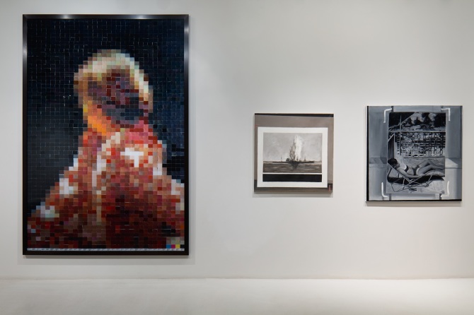
Vic Muniz After Gerhard Richter (from pictures of color) (2001) and Greg Allen Destroyed Richter Painting No.2 (2012, left) and Destroyed Richter Painting No.4 (2012)
I’m really stoked to have the Destroyed Richter Paintings project included in “Para-Real,” an exhibition at 601Artspace, that has been extended until this weekend [closes Feb. 8, cf. Ken Johnson’s review in the NYTimes].
Magda Sawon curated the show with works from the 601 collection and others, and she paired Vik Muniz’s big paint chip Portrait of Betty with one of the Destroyed Richters. I’ve been a big fan of Muniz’s work for years and was particularly taken by his Pictures of Color series when we first saw them in Venice in August 2001. We barely knew how great we had it back then.
But anyway, that’s just one of many interesting pairings of works that examine notions of the real. If you haven’t seen the show already, I hope you’ll put it on your itinerary.
Maybe you should put it on your calendar tomorrow, in fact, say, 7pm, when our rescheduled conversation takes place with Robert Blake, Director of Special Projects at 601 Artspace, Jennifer & Kevin McCoy, John Powers and I. I’ve been looking forward to it for weeks. Months, even.
A round table conversation on Para-Real moderated by Robert Blake and led by Magdalena Sawon with Greg Allen, Jennifer and Kevin McCoy and John Powers
Wednesday, February 5, 2014, 7-8:30p [601artspace.org]

The Maze Collection

tony_smith_maze_la_install_1.jpg
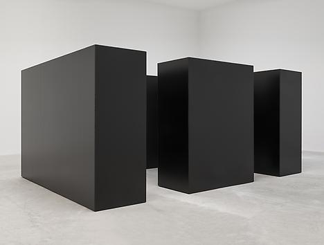
Tony Smith conceived of The Maze in 1967 for a very early show of installation art at Finch College’s townhouse gallery on the Upper East Side. The four units, two 10×7′ and two 5×7, were originally made from plywood, painted black. Grace Gleuck said the light was low, and that “a walk among these gloomy, primeval presences evokes the feeling of an endless forest.”
When I wrote about the little cardboard model of Maze in Aspen 5+6, in 2012, I did not know whether it had been shown since. That was because I just wasn’t looking hard enough. It turns out that another plywood incarnation of The Maze was shown at Paula Cooper Gallery in 1988. And last Fall, Matthew Marks installed a black steel version of Maze [no The] in his Los Angeles gallery. I’m bummed I didn’t get to visit it in person, but the photos look stunning [top].
smith_ubu_mazeGrid2.gif
The plan of the piece seems to show that the dimensions, including the inner and outer passages, and even the units themselves, were all 30 inches wide, and derived in some degree by the Finch space itself. Not sure about Paula’s incarnation, but that site-specific aspect didn’t make it into the 2013 version, which looks suitably monumental, but also clearly sculptural. And not a hint of primeval gloom.
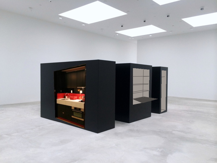
In his statement for Aspen, curated by Brian O’Doherty, Smith actually gave permission to anyone to “reproduce the work in its original dimensions (in metal or wood).” And so I will. As The Maze Collection of functional household built-ins. It just seems like a lot of space to lose to sculpture. It’s more Zittel than Zittel, and less Jade Jagger than Jade Jagger.
tony_smith_maze_kit_desk.jpg
I see The Maze Collection as having a really sick, velvety, matte black surface. No gloss, no lacquer. As long as you make that the panels close properly, and give you that clean, solid, not-at-all-hinged-or-doored look, I think it’ll work.

On Googling Richard Hamilton’s Maps of Palestine


I was looking around for something on Richard Hamilton this morning, when I Googled across a 2010 discussion between the artist and the human rights architect Eyal Weizman at Map Marathon, one of the Serpentine Gallery’s Marathon series. It was rather compelling for several reasons.
For one thing, their discussion of the political power of maps was frank and vivid in a way that I’m unaccustomed to in US media or art world forums. They talked specifically of Palestine & Israel, but I quickly took down two quotes that seemed very relevant to, of all things, Google:

the “double crime of colonialism is to colonize and to erase its own tracks” -Eyal Weizman paraphrasing Edward Said.
“All maps of a political kind have nothing to do with the people who occupy the territory being mapped.” -Richard Hamilton.
walking_man_pointing.jpg
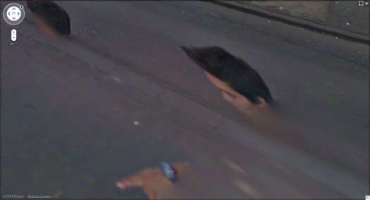
These both reminded me of Google Maps’ tendency I find so eerie, of Street View cameras and car/trikes to be erased from the panoramas. It turned out at the same time of Map Marathon, I had been working on this Walking Man project, where I followed the Google Trike through The Hague, its European debut, and collected the disembodied portrait fragments of the guy–who turned out to be a Google employee–walking alongside the entire trip.
It would have seemed a bit extreme at the time, but now it feels depressingly plausible, even urgent, to consider Google and its pervasive data collection as a political force and as a surveillance agent. Whatever the benefits of Google Maps–and they are real–we are still in the dark about just how transparent our information is, and how opaque the implications of Google’s deep information structure is. And we won’t know, and we won’t have open, informed debates and political discussion of it until our entire cultural landscape has been transformed by the company. And maybe not even then.
hamilton_palestine_2.jpg
Richard Hamilton,Maps of Palestine, 2010
So this is what’s going through my head as Hamilton and Weizman discuss the artist’s contribution to the show, Maps of Palestine (2010), above. It was a pair of maps from 1947, and 2010, showing the shifts in political control between Israel and Palestine. It basically shows the impact of Israeli military retaliation in 1967 and subsequent settlement activity in occupied territory, and it appears to challenge the practicality of a two-state solution. [Indeed Weizman, upon whose groundbreaking crowdsourced mapping and analysis the newer map is based, believes only a one-state solution is feasible now, and that everyone’s just going to have to figure out how to get along. That’s a dark optimism of a sort, I guess.]
And then I start wondering, what, exactly, are these maps like? I mean, what did Hamilton actually make and show? Unsurprisingly, almost no one seemed able to talk about the maps as images or as objects; some people called them/it paintings, but nearly all the discussion was around their content and its meaning. Adrian Searle wrote about the Maps in The Guardian in the context of Hamilton’s art historical career and extensive political engagement. When a 4-map variation of Maps of Palestine was included in 4th Moscow Biennale, not only was there no image, or dimensions, the title and the very subject have been omitted. In the opening’s press announcement, director Peter Weibel stated, rather amazingly,

There will be quite a few so-called political works at the exhibition. For example, Gerhard Richter’s painting is not just a painting, it also refers to 09/11, and the piece by Richard Hamilton does not just show us a map of Israel, but it asks us questions about war.

Credit lines are a continuation of occupation by other means.
hamilton_palestine_4maps_moscow_700.jpg
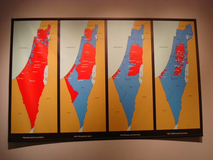
Maps of Palestine, 2011, 4th Moscow Biennale
see full-size img in Al-Madani’s flickr stream

The only image I can find online of the Moscow Maps is from flickr user Al-Madani, and it’s the first to show the work as a physical object. It curls up on the lower corners: an unmounted print of some kind.
It’s only after turning up Rachel Cooke’s interview with Hamilton in advance of his Serpentine show, “Modern Moral Matters,” which coincided with the Map Marathon, that I get my answer. Cooke’s entire anecdote is kind of golden, though:

Hamilton hands me a colour copy of a piece of new work that will hang at the Serpentine. It is a political piece, and consists of two maps: one of Israel/Palestine in 1947, one of Israel/Palestine in 2010, the point being that, in the second map, Palestine has shrunk to the size of a cornflake. I hold the image in my hands, and give it the attention befitting a new work by an artist of Hamilton’s reputation. In other words, I look at it very closely, and I notice something: on these maps Israel has been spelt ‘Isreal’. Slowly, my cogs turn. Hamilton loves wordplay. One of my favourite pieces of his is a certain iconic French ashtray subtly tweaked so that it says, not “Ricard”, but “Richard”. So presumably this, too, is a pun. But what does it mean? Is-real? Hmm. This must be a comment on the country’s controversial birth. Either that, or he wishes to suggest that the Israel-Palestine conflict is a nightmare – can it be real? – from which we will one day wake up. How clever.
“So what are you up to here?” I ask. “Why have you spelled Israel like this?”
Hamilton peers first at me then at the image. “How is it spelled?” he asks. I tell him how the word should be spelled and how he has spelled it.
There is a small silence. “Oh, dear,” says Hamilton. Rita Donagh gets up from her seat and comes round to look at the image over my shoulder. “Oh, dear,” she says. The misspelling is, it seems, just that: a mistake. It’s my turn now. “Oh, dear,” I say. “I’m so … sorry.” My cheeks are hot. Hamilton looks crestfallen. Donagh looks worried. “Can you change it?” I say, thinking that Hamilton works a lot with computers these days. “Not very easily,” he says. Oh, God. On the nerve-wracking eve of his new, big show, I have just told the 88-year old father of pop art that there is a mistake in one of his prints (this one is an inkjet solvent print). Why? Why did I do this? And how on earth will our conversation recover?
After a moment of perplexity, though, Hamilton starts to laugh. “Oh, well!” he says. “I’m sure there’s some way of sorting it out. Not to worry!”

So there we have it. Inkjet print. And from the image published above, it appears they reprinted it with the correct spelling. If only all the Israeli-Palestinian mapping problems could be resolved so quickly.
Also, I wonder if these maps will turn up in Hamilton’s Tate retrospective next month. UPDATE: YES IT WILL. [thanks to Tate Modern’s curators and communications folks for the update]
Map Marathon: Richard Hamilton & Eyal Weizman – Political Plastic [vimeo]
Map Marathon – 2010 [serpentinegalleries.org]
Modern Moral Matters | Richard Hamilton [serpentinegallery.org]
Richard Hamilton: A masterclass from the father of pop art [theguardian]
On Untitled (Beauty Love)

There is beauty in this painting. But the beauty is not what makes you love it.
It’s the emotion of what it says, in very simple means about life. And where we all go.
I don’t know why I get chills from Tobias Meyer’s little promo video for Silver Car Crash (Double Disaster), but here we are.
I matched the audio to Michelle V. Agin’s photo from the Times this morning.

And then after reading Ian Bogost’s McRib essay again, I realized it was the most persuasive explanation I’ve seen of Auction Week. So

untitled (where we all go)

Collection Daniel Loeb

collection_daniel_loeb_wide.jpg
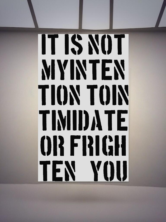
Collection Daniel Loeb, 2013
I’m inordinately pleased with this, especially the TION TOIN. So I’m now going to search around for some other stellar quotes from Christopher Wool collectors which can become paintings. Dan’s a genius for this kind of stuff, though, he’ll be hard to beat.
UPDATE: A few more after the jump. It feels like they’re just scratching the surface. It’s like how there are some people who totally should have a Warhol portrait, there are quotes that should really be a Wool painting. It really just should happen.
Previously, related:Now a painting? Who do I think I am?
base image via #ChristopherWool/@Alipechman

Continue reading “Collection Daniel Loeb”

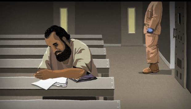
Guantanamo Bay: The Hunger Strikes, by Jonathan Hodgson

hodgson_gtmo_guardian_gloves.jpg
the blue gloves
The Guardian commissioned this animated short by director Jonathan Hodgson about the ongoing hunger strikes by prisoners in Guantanamo. The content and text are all based on testimony of five men who are still imprisoned six years after being cleared for release.
The disturbing treatment depicted in the film is largely dictated by the US military’s standard operating procedure regulation manuals for handling prisoners and administering force feedings.
Guantánamo Bay: The Hunger Strikes – video animation [guardian]
Previously, related: Standard Operating Procedure

What Makes Today’s Amazon Chinese Paint Mill So Different, So Appealing?

Alright, I know it all looked like a black hole of boring embarrassment last week, but Amazon Art just broke through to the other side.
artisoo_mccollum_surrogate.jpg
Artisoo Surrogate Painting [No. 783] – Oil painting reproduction 30” x 26” – Allan McCollum, $193
Kriston Capps and Joy Garnett were tweeting this link to what seems to be an Allan McCollum Surrogate Painting (No. 783), a 30×26-in original oil painting, offered on Amazon by a gallery called Artisoo–for $193. Kriston pointed out that Amazon’s gallery system has a forgery problem, or at least an authenticity problem. Which could very well be the case! But this is not why.
Because Allan McCollum’s Surrogate Paintings are not oil on canvas, but acrylic on plaster. Or as in the case of [No. 783], which was made in 1978, acrylic on wood. They’re painting-shaped sculptures, really. And what Artisoo is selling here is actually an original oil painting of the jpg reproduction of the McCollum. Artisoo is making an artwork that’s the picture of an artwork that the original artist hoped would help a gallery “become like a picture.”
Artisoo guarantees that your Surrogate Painting [No. 783] will be “100% hand-painted by our experienced artists. We stand by our top quality.” And you can order with confidence knowing that “The original motifs presented by Artisoo are created by artists from the most prestigious art schools and academies of fine arts. [emphasis added, because, ‘motifs’! -ed.]”
Chinese Paint Mill has appropriated Google Images and put it up for sale on Amazon. There are at least 18 other McCollum jpgs available as oil paintings. They all appear in the first page of the artist’s Google Image results. Artisoo currently offers 8,124 other paintings on Amazon, and unnumbered thousands more on their own website. In your choice of seven sizes.
lifesphere_zazzle_ties.jpg
It’s the fine art equivalent of LifeSphere, the Spamerican Apparel botcompany Babak Radboy wrote about that systematically turns every public domain image into every possible Zazzle product.
At least it’s trying to be. After a quick surf, I’d say that this Artisoo McCollum Surrogate Painting counts as a rare conceptual gem; easily 98% of the company’s merch is Chinese Paint Mill fluff. I’d call it pure over-the-sofa art, but that’d only account for one of the eight options in their Shop By Room function.
But there’s something sublime about the way a painting of a photograph of a minimalistic, monochromatic painted object encapsulates the entirety of orthodox post-war art history, collapses it, and drops it into the world’s biggest online vending machine. It’s painting pared down to its barest essence as a privileged cultural signifier: a decorative picture of whatever, made by hand. Painting sells its soul for Dino Sponges. But wait, there’s more!
artisoo_truitt_austr_spring.jpg
Like any serious collector, I like to shop for my art alphabetically, which means the first post-war artist to emerge in Artisoo’s stable is Anne Truitt. Artisoo offers 62 paintings with an Anne Truitt “motif,” including installation shots of her trademark acrylic on poplar columns; monochromatic works on paper; sumi ink drawings; and even the barely visible washes of the Arundel paintings. Can’t wait to see how those come out.
Artisoo’s daring paintings, uh, interrogate the conventions of scale as deftly as the notion of medium, date, authorship, context, and form. At 30×10 inches, this painting of a Parva sculpture is easily three times the size of Truitt’s original.
artisoo_truitt_signal.jpg
Artisoo Signal – Oil painting reproduction 30” x 28” – Anne Truitt
In a move that feels appropriated from my own playbook, Artisoo even offers paintings of early works that Truitt destroyed, the aluminum sculptures she created in 1964 while living in Japan. Unlike Destroyed Richter Paintings, however, Artisoo’s Artisoo Signal – Oil painting reproduction 30” x 28” – Anne Truitt ($204) does not attempt to recreate the experience of being in the original’s presence; it promises only its own, bold self: a painting of a vintage Kodachrome of a nautically colored sculpture bathed in the light of Tokyo courtyard.
I’m on slow wireless at the moment, so I gave up hope of surfing through all 340 pages of Artisoo’s products, and instead started plugging in names of artists I liked, or rather, artists I’d like to see appropriated by Amazon Chinese Paint Mill. It didn’t really pan out. No Kosuth, no Andre, no Beuys, Lewitt, Gober, Sherman, Levine, Hesse, Newman or Prince, and no Richter. The company’s web-indexical curation strategy is clearly still a work in progress. There are several dozen Johnses on Artisoo.com, though. I wonder if I could order a copy of Flag in the exact dimensions of the Short Circuit original? Yes, there’s no Sturtevant.
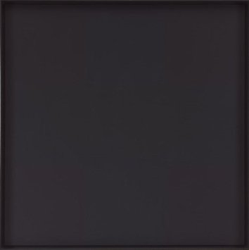
artisoo_reinhardt.jpg
Artisoo Abstract Painting – Oil painting reproduction 30” x 30” – Ad Reinhardt, $221
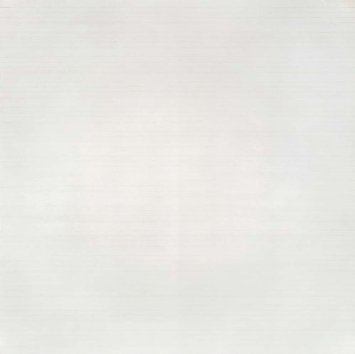
There are Alma Thomases, though. And 63 Calders. Would you like a painting of a stabile? Oh, nice, there are 50 Ad Reinhardts. Those ought to be interesting. Likewise the 23 Agnes Martins.
artisoo_agnes_martin.jpg
Artisoo Happy Valley – Oil painting reproduction 30” x 30” – Agnes Martin, $239
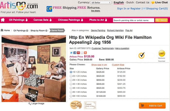
Here’s a standout, though, which reveals a lot about Artisoo’s practice. It’s a painting called, Http En Wikipedia Org Wiki File Hamilton Appealing2 Jpg 1956, and it comes 4x-36x larger than Richard Hamilton’s 10-inch paper collage.
artisoo_hamilton_screen.jpg
Http En Wikipedia Org Wiki File Hamilton Appealing2 Jpg 1956 ($125-650)
Everything about Artisoo is so immediately and obviously fantastic, I almost don’t want to spoil it by seeing actual paintings. Almost.

‘The Fine Art Of Banking’

nga_kelly_orange.jpg
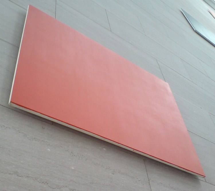
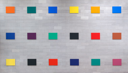
I’ve mentioned Ellsworth Kelly’s Color Panels for a Large Wall before; though they were hard to see up close, the 18-canvases were the only monochromes at the National Gallery that have that tasty, gestureless surface I was craving when I started plotting the Rijksoverheid paintings.
kelly_18_panels_nga.jpg
The panels, made in 1978, look so at home there on the giant wall of the East Wing atrium that even though I knew they were a fairly recent acquisition (2005), I somehow never considered they lived anywhere else. So just take a look at that provenance [on the NGA’s newly upgraded website? Congratulations]. They have really been around the block:

Commissioned 1978 by the Central Trust Company, Cincinnati, and installed 1979; gift 1992 to the Cincinnati Art Museum; de-accessioned 1996 and returned to the artist; purchased 30 September 2005 by NGA.

Central Trust Bank’s building in downtown Cincinnati had a 140-foot long wall, where Color Panels were originally installed in two rows of nine. There’s a long, skinny Gemini lithograph from 1979-82 titled 18 Colors (Cincinnati) that gives a flavor for the original configuration:
kelly_18_colors_cinc_gemini.jpg
Reports at the time praised Central Trust’s investment savvy and connoisseurship, joked about color coding the teller windows, and mocked the idea of loaning Kelly’s “paint chips” to an exhibition in Amsterdam. My favorite attempt to explain Kelly’s abstract canvases is this uncredited illustration from Cincinnati Magazine’s coverage of the work’s unveiling, which consisted of three one-dollar bills, each cut into six parts:
kelly_cinc_fineart_banking.jpg
So awesome. I’m getting some uncirculated bills first thing in the morning to start working on the edition.
But back to that provenance. Central Trust was bought by PNC Bank in like 1988, which then sold parts of it to Banc One in 1991, which probably explains the gift of Color Panels to the Cincinnati Art Museum in 1992. But what baffles me is the deaccession of such a major work by such a major artist just four years later. Was there just not a wall large enough, not even in the Great Hall, which had been freshly renovated in 1993? I guess not.
kelly_marks_sculpture_wall.jpg
image via matthew marks’ artnet page
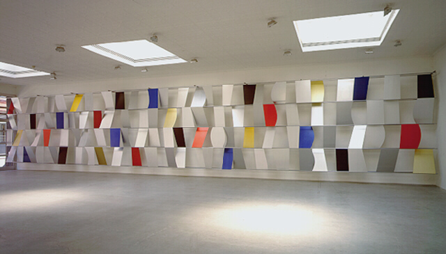
1996 was a big year for big Kellys. It was when the artist and his dealer Matthew Marks began working to save Kelly’s 1957 anodized aluminum Sculpture For A Large Wall from demolition when Philadelphia’s Penn Center was being remodeled. [Herbert Muschamp rhapsodized about the piece in 1998. Then the Lauders bought it for MoMA. Amusingly, it’s back in Philadelphia right now, for a show at The Barnes.]
It found its way to the East Wing’s 25th anniversary in 2001 as a 2-year loan, reconfigured into three rows of six. “Kelly believes that this incarnation of the piece is preferable to the original.”, the press release said, which probably assuaged Glenstone’s acqisition of it for the museum, which the press release did not say. Anyway, I like it very much and miss it, and wonder what the story is, and why they’re not quite the 4×6 feet they were originally said to be.
Previously: What I looked at today: NGA Monochromes

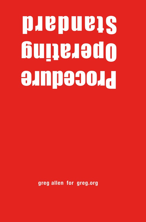
Standard Operating Procedure Is Here

Thumbnail image for sop_red_gregorg.jpg
OK, It’s hard to complain about your day-to-day when you’re doing a project on people being held in indefinite detention for a decade, even after being cleared for release, and then being force fed with nasal tubes when you go on a hunger strike in a last ditch effort to get attention for your existence.
So anyway, Standard Operating Procedure is out, and it is rather amazing.

2. When the Nurse is satisfied that the detainee is secured and a safe environment exists, they shall insert the EF tube ias SOP NO:JTF-JMT #001 and secure it as dsecribed in (A).
3. The guard may then release their hold on the detainee’s head
E. If a particular detainee displays repeated attempts to bite the tube, a weighted 10f tube shall be used for all subsequent EF.
F. If the detainee is able to gain the tube between his teeth, the nurse will:
1. Simultaneously turn off feed and, immediately stabilize the distal end of the tube and pull the tube from the detainee’s nose.
2. Maintain traction on the proximal portion of the tube until the detainee releases the tube from between his teeth. This may take considerable time. [p. 281]

These documents–these words, in this order–are extraordinary. They have been written this way.
Buy Standard Operating Procedure in unsigned, unnumbered edition, 6x9x1.5, $15.99 plus shipping [createspace]
Previously: Standard Operating Procedure

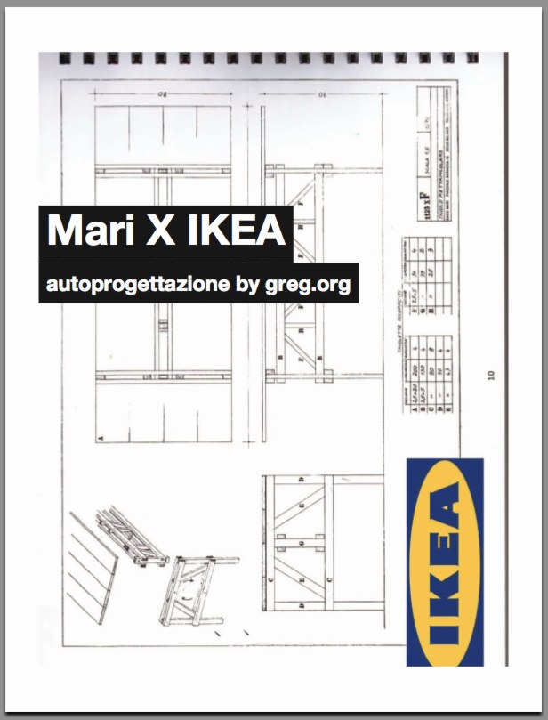
Mari X IKEA: autoprogettazione by greg.org (2010)

Three years ago, I was thinking about what to do with the posts I’d written about the project I’d begun six years ago. Which I guess means it’s time to release the results.
mari_x_ikea_gregorg_cov.jpg
So here’s Mari X IKEA, a PDF compilation I made in 2010 aboutfmy 2007-09 project to construct an Enzo Mari autoprogettazione table out of Ikea furniture components.
I was not entirely pleased with the way it read all together, and so I didn’t publish it back in the day. But I realize now that my inner archivist and inner editor will never agree on things, and I/we are becoming OK with it. So the tabloid-style publication contains all the original blog posts and images documenting the project, and that includes a fair amount of recapping and repetition. Meanwhile, my inner publicist wants to emphasize that this is not a bug, but a feature, like the catchy chorus of a song.
I’m still quite stoked about the project–and the table, for that matter, which I am using at this very moment–and it continues to influence and inform my thinking about stuff: art, design, originality, authorship, authority, appropriation, systems, craft, utility. So I’m very happy to get information on the project out there in a more easily consumable format.
I should also give a shoutout to The Newspaper Club, the amazing publishing company, then just starting out, where I had originally contemplated printing Mari X IKEA in 2010. This PDF was made using their easy publishing/layout tool. And though I ended up not pulling the trigger on this particular project, they regularly make me want to turn this blog, and many other things, into a newspaper.
Mari X IKEA: autoprogettazione by greg.org, 2010 [PDF, 2.8mb]