Ghetto Erased De Kooning Drawing

erased_dekooning_sfmoma.jpg

[See the note about Ghetto vs Shanzhai at the bottom of this post.]

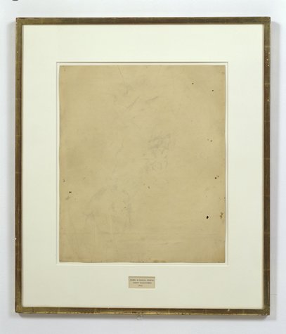
I’ve explored and written quite a bit about Erased de Kooning Drawing by Robert Rauschenberg & Jasper Johns. And I started to wonder if anyone else had ever erased one, too. If so, who and when, and if not, why?
Was it really a gesture that only needed to–or only could be–done once? Yes, there’s an audacity to Rauschenberg’s gesture, but the work is also, rather definitively, not a destructive act. Rauschenberg correctly saw erasing as an affirmative markmaking technique, one that de Kooning himself used quite skillfully.
So why not do it again?
I think the obvious explanation is that one more erased de Kooning drawing in the world would mean one less de Kooning drawing in the world, and that’s a seen as a problem. De Kooning’s pre-eminent stature as an artist, combined with his being dead, the finite number of works by his hand, the urge to preserve them, the conservation imperative of not making any irreversible alterations to an artwork–and of course, the economic folly of it, it just don’t add up.
On the other hand, it would offer an invaluable insight into Rauschenberg’s own experience and process in erasing de Kooning. Remember how he said it took him a month and a whole bag of erasers or whatever? Now we could find out.
Because Christie’s just posted an online-only auction of de Kooning works on paper collected over two decades by his longtime physician and friend Dr Henry Vogel. There are 33 works in the online Vogel sale, and some of them are nice, and even interesting. Let’s also say that there are several works available whose artistic character, historic importance, and sales estimates completely upend the calculations that have prevented a restaging of Rauschenberg’s act. They are highly erasable de Kooning drawings.
dekooning_scribbles_2.jpg
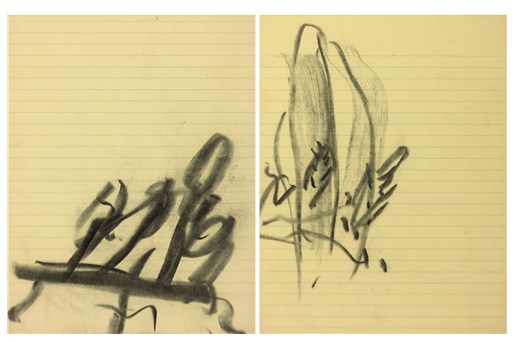
Lot 10, a diptych, is the first of nine drawings in what me might call de Kooning’s Notepad Series, which juxtapose his expressive markmaking with the rigorous geometry of lined paper:

He drew on everything from bags to grocery receipts, but it was paper–smooth, permanent and hard–that he favored most. Any kind of paper could suffice, even the torn out pages of a notebook, like with these two pieces.

The current bid is $2,600, with an estimate of $4-6,000. [update: sold for $3,250]
dekooning_scribble_1.jpg
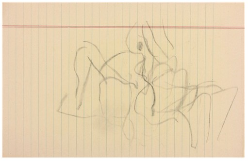
Christies’ specialist hints at the mysteries locked into Lot 11, above:

De Kooning often used the female figure as a starting point to explore abstraction, obsessively and tentatively probing the boundaries between the two forms. In drawings like this, only the faintist hint of the female form emerges–and even that is open to interpretation.

The starting bid will be $1,000 against an estimate of $2-3,000. [update: sold for $2,750]
dekooning_scribbles_3.jpg
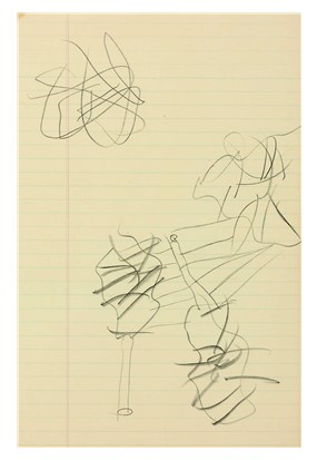
But the most promising candidate for erasure may be Lot 12 (starting bid, $1,500, est. $3-5,000, [update: sold for $1,875], which not only features images that de Kooning himself crossed out–a double negation!–but which has not only been seen, but commented upon by John Elderfield himself:

“There’s one of these yellow pad sheets where he seems to have drawn a lot of forms and crossed them out,” said John Elderfield, a [sic] former curator at MoMA, describing this piece. “And it’s hard to quite know what he’s up to. […] But with de Kooning, there always is something.”

Just like a palimpsest, there always is something.
Which highlights another major difference between Rauschenberg’s Erased de Kooning Drawing and this, for lack of a better term, Ghetto Erased de Kooning Drawing: you could buy it. Rauschenberg held onto his for decades, until he sold it with a group of foundational, early work, to SFMOMA. But if having an authentic, erased de Kooning drawing of your very own is something you’ve always drramed of, well, the auction ends June 19th. Drop me a line. We’ll make it happen.
Willem de Kooning Works on Paper from the Estate of Dr. Henry Vogel, online auction ends June 19 [christies.com]

[NOTE: Though the use was more common at the time, I grew uncomfortable with the racist origins and implications of the colloquial use of “ghetto” for these works. I changed it to “shanzhai,” a Cantonese term which originally described unabashed counterfeit consumer goods; this usage has since shifted toward a hackier, scrappy innovation, but for these works, the original meaning pertains. I have kept the original uses of ghetto rather than delete them to acknowledge the blinkered social context I was also complicit in.]

Unrolling: Ghetto Gursky Rhein

ghetto_rhein_unboxing.jpg

[See the note about Ghetto vs Shanzhai at the bottom of the post.]

When I undertook this Ghetto Gursky experiment last week, immediacy felt important: to use just the best image I could find online rather than scanning a catalogue, for example. And printing with the quickest, point&clickiest online service I could find. The constraints would then be the focus: the “accuracy” and veracity of the image that circulates freely [approximated here by resolution]; and the ability to instantly print large-format photos in the dimensions that were once so startling and rare, they were only available to, well, Gurskys.
Literally, though, no sooner did I place my order than I realized this generated complications. Printing at 5×6 feet, the rough dimensions of Gursky’s Rhein (1996), is actually beyond the capacity of most instant printers, at least those of the vanilla consumer variety. [It’s trivial to print a vinyl banner at that size, though, but this wasn’ what I wanted.]
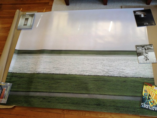
Which is all a long way of saying that the Ghetto Gursky test print just arrived today. It turns out that my immediate vendor choice meant it was printed in California and groundshipped. But it came rolled nicely in a large tube, and it made it perfectly intact. So that’s all good.
First impression: ghetto fabulous. Turns out high-production photography has an uncanny valley effect, too. It’s on thick photo paper, with a nice finish. The colors are true [to the JPG I used, anyway]. Standing in front of/over it, the similarity to a Gursky is surprising.
ghetto_rhein_det2.jpg
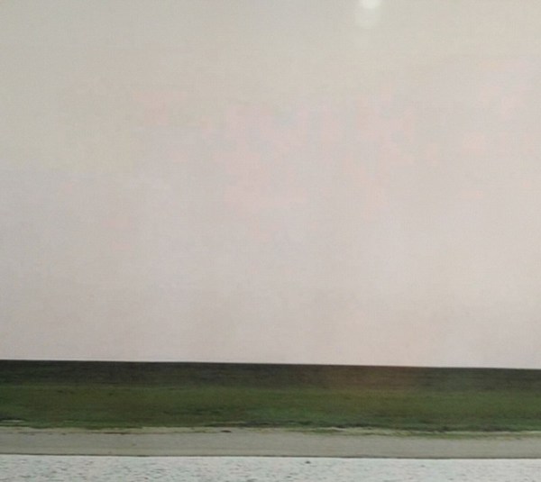
Looking closely, though, yields its expected rewards, just the way Hito Steyerl likes it: “resolutely compromised: blurred, amateurish, and full of artifacts.” Without algorithmic smoothing or some kind of image-massaging resolution upgrade, there are pink, pixellated passages in the sky [above].
ghetto_rhein_det1.jpg
And there are a couple of greyish digital artifacts floating in the grass as well. I was going to say that the Ghetto Rhein does not have any of the crisp focus of Gursky’s original, but I don’t actually know that to be true. I haven’t stood up close with Rhein lately, but I’m not so sure that mid-90s C-prints actually have the grainless clarity I see/imagine in my memory. As with Prince’s Untitled (Cowboy) and the life-sized Untitled (300×404) print, I’d really like to see them side by side.
But the other issue, which popped up immediately, by which point it was too late, is mounting. There was no obvious, immediate, self-serve online place for facemounting a print that size on plexi. So now it’s up to me to track someplace down, and get it done. At which point, I’ll be schlepping a 5×6 print around. And soon enough, it’ll be basically 6×7 framed. And then it gets a crate, and then it’ll need a Sprinter van, and then it’s practically a Gursky, alike in every way except its street value.

[NOTE: Though the use was more common at the time, I grew uncomfortable with the racist origins and implications of the colloquial use of “ghetto” for these works. I changed it to “shanzhai,” a Cantonese term which originally described unabashed counterfeit consumer goods; this usage has since shifted toward a hackier, scrappy innovation, but for these works, the original meaning pertains. I have kept the original uses of ghetto rather than delete them to acknowledge the blinkered social context I was also complicit in.]
Larry Rivers Lamp, Olafur Eliasson Extension Cord

foh_lamp_schifano.jpg
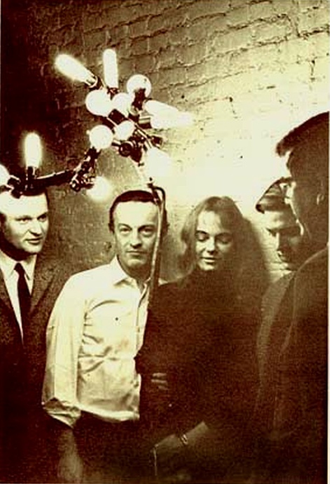
So I’ve decided to make me a lamp like this Larry Rivers lamp Frank O’Hara had in his loft in the mid-60s.
Which means I’ve been trying to map out the number and types of sockets and adapters up there. And I’ve begun poking around for parts. At first, I was going to rework a vintage, industrial-style floor lamp, but those aren’t turning up with anything like the frequency I need. And the current crop of adaptable floor lamps are actually pretty unappealing, too. Really, they just make no sense here.
So to stay closer to Rivers’ approach, I think I’ll just build up a lamp from galvanized steel pipe. [I saw Colin Powell puttering around the hardware store yesterday, btw, the hardware store that had no such plumbing parts at all, just PVC, which, no thanks.]
Rather than a fuse-blowing heater made with 14 incandescent bulbs, I figure I’ll make a little constellation of incandescents, CFCs, and LEDs, in a range of whites. And as for the wiring and cord, well. I am really jonesing over this:
olafur_10m_cable.jpg
It’s an extension cable, from Olafur Eliasson Studio, released in 2004 as a limited edition with the title, 10 Meter Cable For All Colours. Which, I know, is just nuts. But still. There have been more than a few works like this from Olafur, where very modest functional objects are produced for internal use, which are recouped or spun off as an edition. It is a model that works for him, and the demand is there, so.
Technically, though, for this project, it’s not what I need. And I wouldn’t cut up an Olafur cable to rework it into my thing anyway. I just mention it here because the world is an amazing place.
Previously: Frank O’Hara’s and Alfred Leslie’s Larry Rivers’ Lamp
Previously and amazing and related: Lindsey Adelman’s autoprogettazione-style, You Make It chandelier

WNYC FOIA NJT

wnyc_njt_foia_1.jpg
A months-long investigation by WNYC and New Jersey Public Radio into New Jersey Transit’s preparedness and response to Sandy last fall has produced at least one beautiful result.
wnyc_njt_foia_2.jpg
The “New Jersey Rail Operations Hurricane Plan” was provided by the state agency in response to two separate Freedom Of Information Requests from WNYC and The Record.
wnyc_njt_foia_3.jpg
The three-and-one-quarter-page plan was deemed exempt from FOIA and redacted completely. I don’t think it diminishes the content in any way, nor our understanding of what happened to NJ Transit and its facilities and operations during the storm. In fact, it feels to me like it explains quite a lot.
wnyc_njt_foia_4.jpg
I will add it to this series of monochromes. I feel a book coming on. Information wants to be free!
How NJ Transit Failed Sandy’s Test [wnyc.org]
Previously: EPIC FOIA DHS

CZRPYR2 Is A Thing

Wow, the first shipment of Canal Zone Richard Prince YES RASTA 2: The Appeals Decision & The Appendix arrived, and they actually look very nice.
czrpyr2_shipped_cover.jpg
Which is good.
czrpyr2_spread_01.jpg
Because people are writing about it. And buying it. And it would be kind of awkward if it sucked.
Your Thievin’ Art: At play in the field of fair use [artnews]
Not yet in stores: Buy Canal Zone Richard Prince YES RASTA 2: The Appeals Decision & The Appendix direct, $12.99 [createspace]

Introducing CZRPYR2: The Appeal + The Appendix

czrpyr2_cover_1.jpg
So I did this.
I am very pleased to announce the latest title from greg.org, Canal Zone Richard Prince YES RASTA 2: The Appeals Court Decision in Cariou v. Prince, et al., Also The Court’s Complete Illustrated Appendix. It is available now.
It would have been available sooner. It really should have been available sooner. I got it all together by the end of the day the Appeals Court decision came down, but there was seemingly endless futzing and back & forth with the digital publisher about proofing and formatting, etc. So sorry for the delay.
czrpyr_cover_thumb.jpg
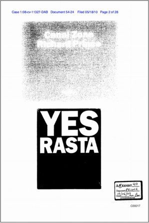
CZRPYR2 is a follow-on and indispensable primary source companion to Canal Zone Richard Prince YES RASTA, [above, available here], which contains the full transcript of Richard Prince’s incredible 7-hour deposition, as well as many key filings and exhibits from the first phase of Cariou v. Prince.
czrpyr2_spread_d.jpg
I wondered what you wondered: why not just add the Appeals Court decision to the original book? And if CZRPYR2 was only the decision itself, I might have done just that. Or not bothered with it at all. But then I found the beautiful Appendix the Court created for the decision, and I realized it deserved a permanent place in the history of the case, a book of its own.
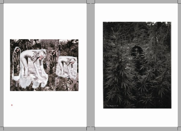
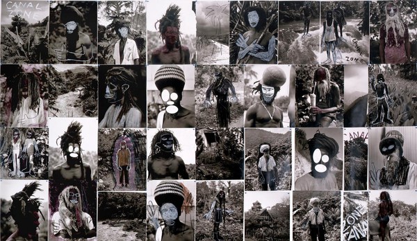
Following on Patrick Cariou & friend’s own slapdash effort, the Appeals court produced a high-quality, carefully cross-referenced catalogue of each use of Cariou’s YES RASTA images in Prince’s Canal Zone paintings. This indexing was the basis of the judges’ Solomonic decision to divide the Canal Zone series into 25 non-infringing works, and 5 infringing?-who-knows-let’s-look-again works. Where applicable, the Court added highlights to Cariou’s images, arguably creating yet another transformative work. And submitting it into the public record.
For this 142-page volume, I integrated the Court’s collections of Prince & Cariou images, to facilitate painting-by-painting review of Prince’s appropriations. And I annotated them for easier referencing. But otherwise the Court’s primary documents are preserved, with an eye to posterity, as they were prepared,
CZRPYR2 is in this way a salute to the Court’s own transformative, creative spirit.
Buy Canal Zone Richard Prince YES RASTA 2: The Appeals Court Decision in Cariou v. Prince, et al., Also The Court’s Complete Illustrated Appendix (142 pages, b&w, 6×9-in.) for $12.99 [createspace]
Buy Canal Zone Richard Prince YES RASTA: Selected Court Documents from Cariou v. Prince, et al for $17.99 [they can ship together, but I’ll probably only sell 2-vol. sets in person. Maybe on a blanket next to Central Park.]

Richard Prince’s Canal Zone Paintings: Now With 83% Less Infringiness!

Thumbnail image for czrpyr_exhib_40.jpg
Word is definitely out, but it’s nice to see that copyright insanity has taken a step back for now.
The US Appeals Court largely reversed the earlier court ruling against Richard Prince, finding that the US District Court erred in finding his Canal Zone series paintings infringed the copyrights of Patrick Cariou. Specifically, they said that Judge Deborah Batts used the wrong standard in determining infringement and rejecting fair use.
canal_zone_collage_rprince.jpg
The Appeals Court judges declared that at least 25 of Prince’s paintings made obvious transformative use of Cariou’s photos. And after laying out a fairly expansive criteria for fair use, it ordered the court to re-review the other five Canal Zone works for infringiness. [That list includes Graduation (inaccurately reproduced below), Meditation (with the dude on the donkey), Charlie Company, Canal Zone (2008), and Canal Zone (2007) (above, which is actually collage, paint on book pages fixed onto a board, which was not in the Gagosian show or the catalogue; it was only shown in St. Barth’s. So why is it even covered by US law? Was it even made in the US? Is it even in the US? Is it impounded with the rest of the Canal Zone works? If so, WHY?]
In addition to citing previously unmentioned quotes from Richard Prince’s own deposition, the judges said that Prince’s intentions, or the unstated lack thereof, were not necessarily required to decide if something is fair use. Fair use can be in the eye of the beholder, specifically the “reasonable observer.” This seems both obvious, and slightly amazing to me. It also jibes pretty well with the amicus brief filed in the appeal by the Warhol Foundation.
It also means that fair use is not dependent solely on an artist making an explicit case for it. If Prince’s refusal to articulate a Koons-scale structure of critique and commentary is not required to appropriate something into your artwork, that would fortify a fair use defense. Rather than discuss art on the law’s terms, Prince has pulled the law toward considering art on its own terms.
cariou_prince_artinfo_wtf.jpg
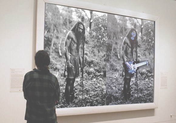
Another fascinating aspect of the decision–and by fascinating, I mean obvious and totally in agreement with me–is the court’s emphasis on the changes in size, format, and process between Cariou’s book pages and Prince’s giant inkjet/collage/paintings. [cf this discussion of scale recently] The court went so far as to create its own reference work, similar to the distorted exhibit Cariou entered, but clearer, documenting each painting and the Cariou images and fragments used in it. It’s really nice, and would be very handy for anyone wishing to make their own Canal Zone paintings. Ahem.
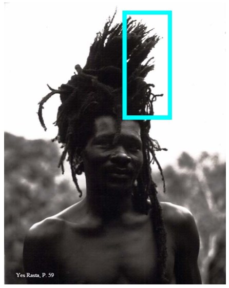
yes_rasta_hair_p59.jpg
Study for Untitled (After YES RASTA, p. 59), 2013
Anyway, there is more to come, including possibly a new round of evidence and testimony about Cariou’s photos and their appearance and alteration in Prince’s work. Or perhaps someone’ll try to settle. Cariou’s lawyer’s on contingency, I believe, and 40% of nothing is nothing. So who knows how this thing ends. After more than two years since the first cluster)($#%k of a decision, though, today’s gotta be something of a relief for Team Prince.
Here, btw, is a roundup of previous Cariou v. Prince posts, including readings, reviews, and info about the book I made, Canal Zone Richard Prince YES RASTA: Selected Court Documents from Cariou v. Prince, which contains the transcript from Prince’s amazing 7-hour deposition in the case:
Early days of THE BOOK:
the five most ridiculous things about the Richard Prince copyright decision
The Richard Prince decision? You’re soaking in it!
Richard Prince’s Spiritual America
Size Matters?
Actual found blurb: “THE WITNESS: This could be a cool book.”
Introducing: Canal Zone Richard Prince YES RASTA: The Book
More documents from the case, like:
The Movie Pitch that started Canal Zone: “The Movie is called ‘Eden Rock'”
The great Amicus brief filed by the Warhol Foundation
Some CZRPYR reviews and events:
Canal Zone YES RASTA &c. reviewed in The Brooklyn Rail
HOLY SMOKES REVIEW at the Poetry Foundation by Kenneth Goldsmith, which is really humbling and amazing
Apr 2012: CZRPYR included in “Canceled,” curated by Lauren van Haaften-Schick, at the Center for Book Arts
Sept 2012: Audio & coverage of a Printed Matter talk with Joy Garnett and Chris Habib where we actually discussed and looked at Prince’s paintings, which almost never happens.
Looking a bit at the amazing language of depositions, in relation to the live staging of the deposition we did for AFC.
A great discussion of a a WTF image: Virginia Rutledge and Penelope Umbrico talking copies
Buy Canal Zone Richard Prince YES RASTA: Selected Court Documents from Cariou v. Prince online, or in person at Printed Matter.

The Offices of Fend, Fitzgibbon, Holzer, Nadin, Prince & Winters

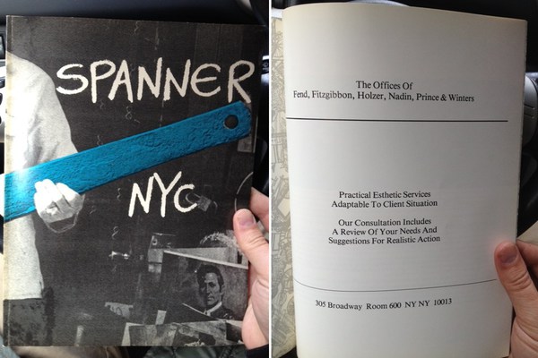
spanner_the_offices_ad.jpg
A couple of weeks ago at Printed Matter I found copies of Spanner NYC, an arts magazine published in 1979-80 by Colab folks including Dick Miller & Terese Slotkin. In the back of the third/blue issue was a full page ad from “The Offices of Fend, Fitzgibbon, Holzer, Nadin, Prince & Winters,” offering their “practical esthetic services adaptable to client situation.”
There’ve been a ton of shows related to Colab recently, and I’d known The Offices at least by name, or as a line in a few peoples’ CVs. As the recent creator of a corporate entity designed to operate in the art world, though, I guess I’ve been newly sensitized to such ventures. And I realized I had no idea what, if anything, The Offices actually did.
nadin_the_offices_of.jpg
So first, the basics. The Offices seems to have been a conceptually driven, services-based, artist collaborative run on the ad agency or consultancy model. Which might be considered alongside corporate experiments like N.E. Thing, Co in Canada; Art & Language in the UK, that other UK group that infiltrated companies all over, which I can’t remember the generic name; and even the art-as-professional service work of Michael Asher. Or maybe it’s a failed utopic version of a massive sellout operation like Takashi Murakami’s Kaikai Kiki, Ltd.
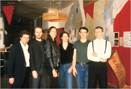
The Offices sounds like it was an outgrowth of Colab, or at least created by artists involved in Colab. Peter Fend called it a “spinoff.” Here’s a photo from, perhaps, a board meeting, with all the name partners: [l to r] Robin Winters, Richard Prince, Jenny Holzer, Coleen Fitzgibbon Peter Fend, and Peter Nadin.
Actually, it could be at Peter Nadin Gallery, the artist’s studio transformed into an accretive exhibition space with Chris d’Arcangelo and Neil Lawson, where artists created work in response to the space and what had been made & shown there before. That continued for eight months from 1978-9, ending with a memorial show to mark d’Arcangelo’s death.
Or maybe it is the show on ecologically optimizing North America’s political and economic systems by reorganizing boundaries around its saltwater marsh basins. That show included work, a poster, by Fend and Holzer. I would have pegged Fend for the instigator of The Offices, but in telling the story of the basins project, Political Economies After Oil, he writes that Holzer “asked Fend to join her in a six-person artist team intent on “functional” projects.”

Continue reading “The Offices of Fend, Fitzgibbon, Holzer, Nadin, Prince & Winters”

A Domestic Proposal:

At Home With Voice Of Fire

expo67_ masey.jpg
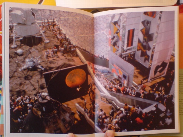
photomurals and satelloons to the left, painting to the right. image: USIA via Jack Masey’s book, Cold War Confrontations
With Barnett Newman in the air recently, I began looking back through the greg.org archives, and I found this 2009 post about the art and space objects at Expo 67, which is a great read, if only for the smackdown delivered by NY Times critic John Canaday.
I was already into satelloons and photomurals and World’s Fairs as odd, underconsidered contexts for art when it registered that Alan Solomon had curated a whole painting show for the US Pavilion in Montreal. He basically asked all the artists for work that could be hung vertically, would hold up visually in a giant geodesic terrarium, and would pretty much only be seen from an escalator. And that’s what he got.
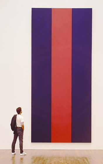
Barnett Newman’s Voice of Fire is there in the upper right corner, looking really small between the Lichtenstein and Johns’ Dymaxion Map. Which just goes to show you, because here it is in the National Gallery of Canada, which bought it in 1989.
newman_voice_of_fire.jpg
A work of confounding scale. And not without its charms. It’s not my favorite Newman, but I like Voice of Fire. It looked great in Ann Temkin’s Philadelphia retrospective. And last night, I wondered what it’d be like to live with. Because at 8′ x 18′ it is pretty unwieldy. In principle it’d be nice to have 20’+ high space at home to hang it freely. But that kind of room is really a gallery, even if your breakfast nook is just through the door.
newman_vof_sideways.jpg
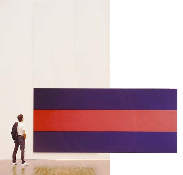
So barring that, you could turn it sideways, which is how Newman painted it. If 12×25 is too long a run of uninterrupted wall for you, though, you’re stuck. And so I wondered about cutting it down.
We sure don’t cut up paintings into saleable parts like they used to. Like they did with altarpieces [hello, Piero at the Frick] where everyone on his Grand Tour got to take home a panel or predella.
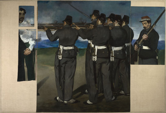
Even barely a hundred years ago, Manet’s heirs were chopping up the uncomfortably political Execution of Maximilian into more marketable groupings. And look, now most of it’s in the National Gallery [of England].
manet-execution-maximilian-NG3294.jpg
I’m not saying there’s no contemporary precedent: Gerhard Richter cut a squeegee painting into 64 little ones. And this BMW Rauschenberg campaign reminds us that Aaron Young painted dozens of panels at once at the Armory that one time, with the motorcycles.
I’m just saying maybe it’s not enough. We could do more. I understand Voice of Fire is very well known in Canada, and that the National Gallery’s purchase of it was controversial. So should Canadians ever face an arts crisis where, say a Taliban- or ayatollah-style regime takes over that is decidedly unsupportive of the kind of painting Newman practiced, I’d think cutting it down and dispersing the painting would be far better than burning it. Or bombing it, Buddhas-of-Bamiyan-style, out of existence.
Or maybe it’s just the populist thing to do. Voice of Fire would suddenly be much easier to display in a modest home. Or several, actually.
newman_vof_vert.jpg
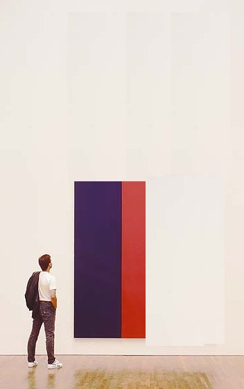
To start, you could cut it two ways: in quarters [above] or in slices [below] slices. Each approach yields four attractive, wall-filling pieces, each 4×8.5′, that preserve the original proportion while making a rich, full allusion to Newman’s overall composition. Reassembling such a group for an exhibition 500 years from now would be trivial.
newman_vof_horiz.jpg
You could also cut it into 8 pieces, roughly 4×4, almost easel-size. Voice of the Fireplace. But then it seems like you’d be losing a lot to the stretchers. So, what, you’d mount the pieces? Frame them? I imagine you’d get a mix of decor decisions from the various owners. Which, yes, no, I haven’t thought through the pricing and sales strategy yet. This is really just starting out.

Seeing Stars: These Two Interviews On Aperture Right Now

Oh, nothing, just my Q&A with Aperture editor Brian Sholis hanging there online next to THOMAS RUFF. Brian and I went back and forth, discussing the photographs in Exhibition Space and how they relate to art historical developments like conceptual photography and Minimalism.
Meanwhile, Michael Famighetti interviewed Ruff for Aperture’s upcoming Summer issue, and the photographer talked about the beginnings of his Sterne series, the giant photos made using imagery from the European Southern Observatory’s Southern Sky Survey. Ruff’s work was one of the triggers for my own interest in the Palomar Observatory Sky Survey, which was the ESO’s Northern predecessor. Anyway, I think this is the first he’s discussed the series’ origins in English:

MF: Could you talk about the role of research in your work? Where does a project begin?
TR: If I see an image that attracts, upsets, or astonishes me–one that stays in my mind for a long time–I begin working. This is the starting point of the research: 
I try to find out how the image was created and in what context–historical, political, or social–the image belongs. After clarifying these questions I begin to create “my own” image, the image I have in my mind, the image that was triggered by the image I saw. Sometimes it can be done in a straightforward way, with
 a camera, but sometimes you need to reflect on how you can manage to make this technically. For example, when I had the idea of photographing the night sky, I realized that with my small telescope, I had no chance of getting high-quality images of stars, so I looked for an observatory with a big telescope where 
I could take the photographs myself. 
But they wouldn’t let me in. So I had to give up the idea of being the author of the photograph, and worked with large-format negatives from the observatory’s archive.

Yes, authorship.
And speaking of authorship [and much more], in his talk with Jörg Colberg for Conscientious, Ruff mentioned authorship and his new show at David Zwirner:

JC: I was going to ask you about that, the idea of landscape photography. Scientific photographs, say the Mars rover images, in principle are landscape photographs along the lines of early survey landscape photography in the American West.
TR: That’s where it continues. On top of that, it’s also about automated photography, photographs made by robots. That’s all part of it, the surrender of authorship… Ma.r.s. contains a bit more authorship than Stars where all I did was to select the area and to do the cropping.

All I did? After all this time, do we find out is Ruff a traditionalist?
Thomas Ruff: Photograms for the new age [aperture.org]
Interview with Greg Allen [aperture.org]
Previously: Thomas Ruff’s Sterne

Organizer-Artist vs Artist-Organizer

Thumbnail image for exhib_space_install_05.jpg
The new Frieze begins its series of artists talking about curating and being curated [sub req] with Daniel Buren’s classic 1972/1992 statement in Harald Szeeman’s Documenta 5, “Exhibitions of an Exhibition.”
I never registered it before, but Buren uses the term “organizer” for curator. Which is ironic, because at apexart several years ago, at the thin wedge of the emerging trend/abuse, they moved away from using the term “curator”–in favor of “organizer.” And the sense I’ve gotten while working on Exhibition Space is that they were seeking to get away from exactly the curator-as-artist/exhibition-as-art pretensions or associations that Buren was kvetching about in 1972.
In any case, now that I’m an organizer, and apparently the worst of Buren’s fears realized, here are some excerpts from his 1992 English translation of “Exhibitions of an Exhibition”:

Exhibitions of an exhibition
More and more, the subject of an exhibition tends not be the display of artworks, but the exhibition of the exhibition as a work of art….
The works presented are carefully chosen touches of color in the tableau that composes each section (room) as a whole.
There is even an order to these colors, these being defined and arranged according to the drawn design of the section (selection) in which they are spread out/presented.
These sections (castrations), themselves carefully chosen “touches of color” in the tableau that makes up the exhibition as a whole and in its very principle, only appear by placing themselves under the wing of the organizer, who reunifies art by rendering it equivalent everywhere in the case/screen that he prepares for it.
The organizer assumes the contradictions; it is he who safeguards them.
It is true, then, that the exhibition establishes itself as its own subject, and its own subject as a work of art. The exhibition is the “valorizing receptacle” in which art is played out and founders, because even if the artwork was formerly revealed thanks to the museum, it now serves as nothing more than a decorative gimmick for the survival of the museum as tableau, a tableau whose author is none other than the exhibition organizer.

Which, in 2003, prefaced his response to the idea, proposed by e-flux and Jens Hoffman, that “The Next Documenta Should Be Curated By an Artist.”:

Could a large-scale exhibition like Documenta be entrusted to an artist? If the tendency remarked upon here continues to hold, my response would undoubtedly be “yes.” For the artist-organizer would erase the faults inherent in the organizer-artist. For example, it would be worth betting that the announcement of an artist-organizer, whoever he or she might be, would cause an immense outcry of lamentations from the choir of the majority of all the other panic-stricken and destabilized artists.
This will be a varied and serious song. Its reasons for being will be intelligent, stupid, and revealing at the same time. They will be founded on jealousy, on the one hand, and fear of the artist-organizer’s positions, on the other. Artists, exacerbated individualists if ever they existed, would show that their corporatist spirit is not as remote as it may seem. One would notice, then, that the critiques suddenly raised by the announcement of the name of an artist-organizer had never been raised by the announcement of any organizer-artist. This a priori predictable reaction already bears within itself the fruits of extremely positive debates, for they reveal a state of fact that has been occulted for over thirty years.

Glitches Of The Stations Of The Cross

So I’m reading the Guggenheim’s little exhibition catalogue for Barnett Newman’s Stations of the Cross, which, as I noted, has been digitized by the museum in conjunction with the Internet Archive, and is thus available for instant and free viewing or download.
12th_station_sidebyside.jpg
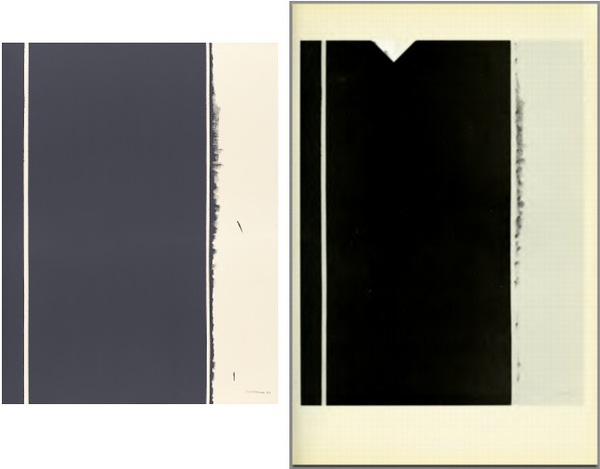
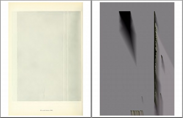
And then the little PDF constantly hangs up Preview, which is supposed to be like the most stable application in the entire OS, I thought, so what is up? And it’s always at page 31. Which, when I can see it, about half the time, has a full-page illustration of Twelfth Station [right], with a giant divot taken out of the top. Which, after a flash of doubt, I confirm [left] is not how the painting actually looks.
[Heads up: Stations of the Cross is not on view right now; it was in the NGA’s Tower Gallery, but the whole East Wing is being shut down for renovations, starting, apparently, with the gallery holding the greatest paintings.]
After repeatedly crashing, I thought, maybe I could print my way ouf of this problem, and so I printed the Internet Archive’s file to a new PDF. And watched my 1.4mb file balloon to 282mb, which obviously takes its own sweet time to open to page 1.
As well as Page 31, which is now a glitch masterpiece, that obviously, I must now paint.
glitch_newman_sotc.jpg
On the theory that monochromes somehow confound either scanners or compression algorithms, I checked the PDF for the Guggenheim’s 1975 Brice Marden exhibition, but it appeared disappointingly glitch-free.

Makin’ Copies

cariou_prince_artinfo_wtf.jpg
“Courtesy Flickr and the Artists; Illustration by BLOUIN ARTINFO”
The new issue of Aperture has a great discussion between Penelope Umbrico and Virginia Rutledge about one of my favorite WTF aspects of the Cariou v. Prince case: the fact that the primary visual evidence of copyright infringement used in court is not the paintings themselves, but photocopies. When the fair use/recontextualization/mediated imagery chips are down, the only thing being looked at is flattening, scale-destroying Xerox pairings made by a friend of Patrick Cariou.
Anyway, hot foot it over there right now, but before you go, just check out this amazingly dishonest image of a page from a book and a 6-ft painting. It’s “Courtesy Flickr and the Artists; Illustration by BLOUIN ARTINFO,” and accompanied a Julia Halperin story from last year wherein “BLOUIN ARTINFO analyzes how the Prince v. Cariou case has shaped views on the issue of appropriation.” Which, SRSLY, BLOUIN ARTNFO, analyze thyself.
It’s almost enough to make me start turning my pages from my copies of Cariou’s Yes Rasta book into tiny, exact collage replicas of Prince’s paintings. Stay tuned.
The Image World Is Flat: Penelope Umbrico in conversation with Virginia Rutledge [aperture.org]

‘Exhibition Space’ Installation Snaps

exhib_spc_pano_poss1.jpg
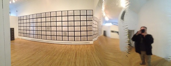
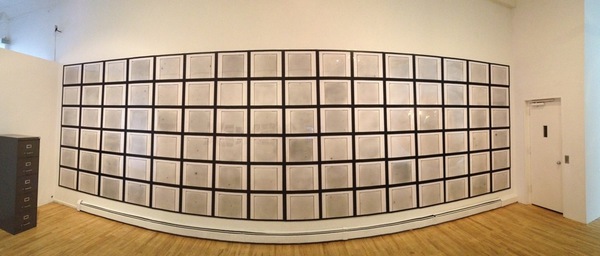
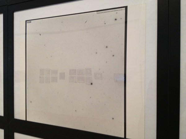
Installation view: panorama of 96 photographic plates from the National Geographic Socety-Palmar Observatory Sky Survey (1949-58); the other 1,700+ plates are in the cabinet.
First off, thanks to everyone at apexart for the really amazing work on the show. “Exhibition Space” looks great, and it’s installed beautifully. Thanks, too, to the folks who have stopped by to see it, whether at the opening or since, and those who have sent along kind comments. I know Massimiliano curates three shows 10x this size each day before breakfast, but it’s still a BFD for me, and after writing and thinking about the objects and photos in the show for so long online, it really is a completely different thing to see them in person.
exhbspc_poss_det.jpg
detail of a photographic plate from NGS-POSS
I’ll get some more systematic documentation shots of the show and the pieces in it soon, but in the mean time, here are some pictures I snapped last week. If you circulate them, I really hope you’ll check back and update them when I get some slicker versions.

Continue reading “‘Exhibition Space’ Installation Snaps”

‘Exhibition Space’ Opens Tomorrow

indiana_jones_echo.jpg
Dude. I can’t believe it’s really happening. But it is. “Exhibition Space” is opening tomorrow night at apexart in Tribeca. There’s a reception from 6-8pm, and the show will be open to the public from Thursday the 21st through May 8.
What started out as completely separate ideas, spawned, obviously, here on the blog, has turned out to have all these amazing and direct interconnections, both among the objects in the show, but also into the art of the time.
As the new banner image suggests–which I love, btw, just so awesome, like it was shot just for me–there will be some extended posting about the stuff in the show here on greg.org. So please visit often.
image above inspired by Whitney’s suggestion at AFC that I’m on some kind of Indiana Jones-like satelloon quest, which, well.
“Exhibition Space,” photographs, objects, and perception at the dawn of the Space Race, 21 Mar – 8 May 2013 at apexart [apexart.org]
Previously:
2007: The Sateloons of Project Echo, must. find. satelloons.
2008: On The Sky Atlas and the NGS-Palomar Observatory Sky Survey