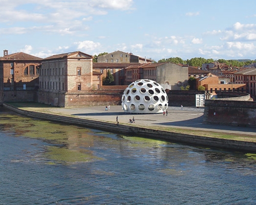
Well there we are, then. Bob Rubin got the prize, the 50-foot prototype of Buckminster Fuller’s Fly’s Eye Dome, which he’s now restored and will unveil to the world in May-June at the Festival International d’Art in Toulouse, which used to be Printemps de Septembre, but is now actually in the Spring, and Printemps de Printemps was obviously not going to work, so. Whatever they call it, and whenever it is, this is a junket I will accept.
Anyway, The Architect’s Newspaper has the story, which Phaidon’s hype-y account distorted beyond recognition.
Max Protetch had been working these domes since at least 2008, and the Buckminster Fuller Institute sold the 10-ft prototype to Norman Foster, and the 24-ft version to Miami developer Craig Robins, who Miami’d the hell out of that thing in 2011.
With architectural expertise and sympathy running as deep as his pockets, Rubin is probably the best guy to take this on. And though Fuller’s original engineering consultants Daniel Reiser and John Warren are involved, there’s no luxury yachtmaker mentioned. So maybe Rubin’s restoration will have some historical sensitivity.
Meanwhile, I will console myself with the knowledge that since the 50-foot dome is the only one you could conceivably live in, if I’d bought it, I would have been tempted to make unconscionable ahistorical modifications to it. Like windows. And a door. So I’m better off with a repro.
Robert Rubin restoring a monumental Buckminster Fuller dome. [archpaper via bfi via phaidon wtf via @wefindwildness]
Previously:
2011 Fuller’s Fly’s Eye Dome Gets Miami Makeover
2008 Welcome to the Fly’s Eye Dome
Category: projects
Erased de Kooning Drawing In The House
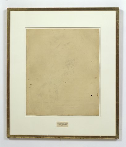
Last month, after putting together a list of all the times Johns and Rauschenberg mentioned working on each others’ work, and wondering, “SERIOUSLY, DOES NO ONE ASK FOLLOW-UP QUESTIONS?” I decided to start asking follow-up questions.
In particular, I’ve been asking around, trying to document the early history of Erased de Kooning Drawing (1953-5). Remember, the first public exhibition of it wasn’t until 1964; its measurements seem to have changed over the years; and the first known image of it didn’t come until 1970.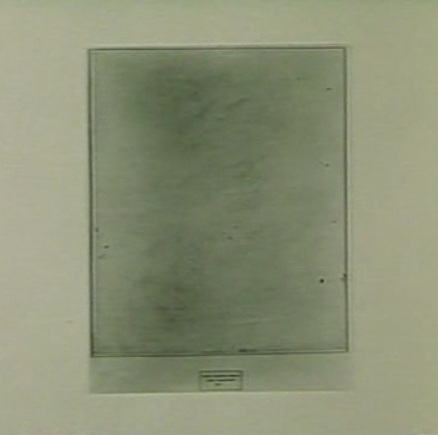
So I wondered how people knew or saw it in that first decade. And I really wanted to know whether folks knew that Johns had helped finish the work. Which, presumably, would only have happened while they were together, between 1954-59 or 1960 or so. Right?
And so far, my results are fascinating but mixed.
Johns told me that Erased de Kooning Drawing was actually included in a show in 1958, which was the impetus for his contribution. He helped conceive of the frame and label, and then drew the label while Bob got a store-bought frame.
The show was at Poindexter Gallery, a group drawing show in Dec 1958 – Jan 1959 Dec 1955-Jan 1956, turns out. Ellin Poindexter had been working with Charles Egan Gallery for a few months, but ended up opening her own space. This big group drawing show was one of her first.
Which is all HUGE, I figured. [Johns had a work in the show, too, apparently. A footnote in Fred Orton’s Figuring Jasper Johns mentions a Flag drawing with 64 stars, which seems like a lot of stars. It also seems not to exist anymore; so maybe Johns destroyed it. He didn’t say one way or the other.]
I went diving in the Poindexter Gallery papers at the Archives of American Art, but there’s nothing at all about the show. There is no documentation of it anywhere, that I can find. Well, that’s not quite true. Dore Ashton reviewed the show for the NY Times, but she didn’t mention Rauschenberg or Johns. I asked her if she remembered seeing Erased de Kooning Drawing in the show, and she didn’t. She didn’t recall the first time she saw the work, either, except that she did figure it was probably in Bob’s studio.
I asked around a bit more, looking for any documentation of this show–maybe one of the dozens of other artists has saved a checklist in a box somewhere? And it turns out I’m not the only person Johns has mentioned this exhibit to; it’s just that no one can find documentation to back it up.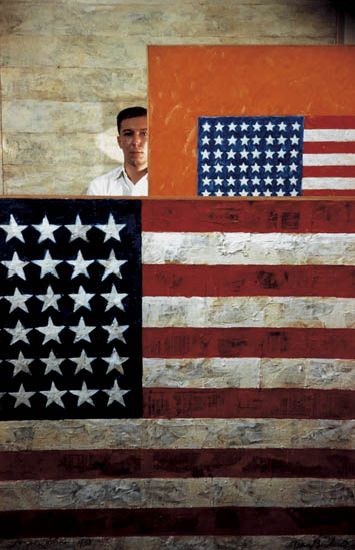
Which makes me realize that there is an entire layer of art historical information out there, stuff that people who know know, but can’t write about. I wonder how much of this information gets lost before it’s written or published or transmitted somehow.
Anyway, the other day, while surfing along through a Swann’s photo auction catalogue I came across the great Dan Budnick portrait of Johns from 1958. Budnick’s a Magnum photographer and still alive, and he was clearly on the scene at the right time. So I started poking around. And BAM.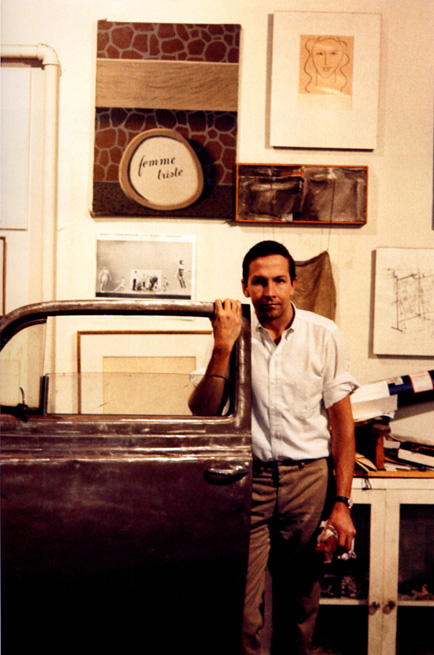
Budnick did take pictures of Rauschenberg, too. This Budnick photo of Bob in his studio, in fact, is listed as 1958. And what is that behind the car door? Does that not look like Erased de Kooning Drawing? In a mat and frame? Case closed. Also, check the frame profile; it IS different from the current one.
55-5
Except that that is not the Front Street studio; it’s Broadway. And so that is not 1958. It’s probably 1964-5. Because that’s when and where Alexander Lieberman took this very similar photo of Rauschenberg. [Which, amazingly, Matt from RO/LU had posted just a day or two before I found it. Eerie.]
Even though the photo of Merce dancing is tacked in the same place, Lieberman’s bigger shot doesn’t include Erased de Kooning Drawing. There’s an early 50’s painting from his Betty Parsons show in its place. [There’s also a little plastic American flag hanging to the left. A memento, perhaps?]
Which is all a way to say that if you–or more likely, your artist grandfather–was in this Poindexter Gallery show in 1958-9 1955-56, and has some checklists or installation photos, definitely drop a line.
[2023 checking back in update: In 2014 the Rauschenberg Foundation, following SFMOMA’s research, dated this Poindexter group drawing show to 1955-56. Though the Tworkov Estate chronology cited doesn’t actually reference the show, the earlier date aligns with the actual publication date of Ashton’s Times review. A good reminder to doublecheck info in old chronologies, and the conversational recollections of specific dates from decades before by living principals. Also, I spotted EdeKD in a 1954? photo at Fulton Street.]
‘One Mask Shy Of A Nurse Painting’
So, Gerhard Richter and Richard Prince. They’ve both had their way with photography, and painting, and even squeegeeing, but do we ever consider them together? I mean, I’ve tweaked on each of them for several years now, and even I have to admit, I haven’t thought of their work in relation to each other, until this instant:
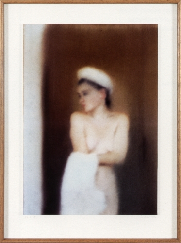
Gerhard Richter’s 1996 photo edition, Small Bather, is based on an identically titled painting from a couple of years earlier.
And yes it’s the blur, but it’s also maybe the towel on Mrs. Richter’s head, but when I saw it in the Christie’s catalogue for next month’s London sale, the first thing I thought was “Whoa, Nurse Painting.”
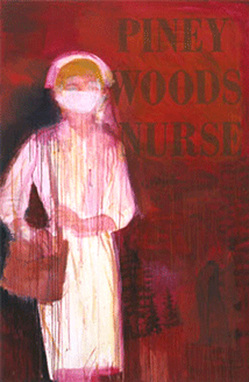
Richard Prince, Piney Woods Nurse, 2002, image: oh, it’s around
Seriously, how awesome would that be? I mean, the Chapmans worked over those Goya prints; and Kippenberger turned that Richter into a coffee table. I mean, sure you could paint over an inkjet of the thing, and flag your est. £40,000 – £60,000 for other things. But why?
On his site, Richter shows Small Bather, above, as it was published: “Cibachrome photograph, fixed on stiff, white cardboard, framed, behind glass.”
This example at Christie’s, though, is only shown cropped to the c-print, and is only listed as on the “artist’s mount,” which, that’s where it’s signed and numbered, so. So? So if some chucklehead compromised this particular piece by taking it out of the artist’s frame, why not use it as an ingredient in a new work? There are presumably still at least 53 others out there to carry on.
Contemporary Day Sale, Feb. 14, 2013 Lot 183: Gerhard Richter, Kl Badende, Small Bather, est. £40,000 – £60,000 [christies.com]
Kl. Badende | Small Bather, 1996 [gerhard-richter.com]
If He Did It: Johns Edition
Alright, let’s get all these together in one place:

After claiming for more than 40 years that he had drawn it himself, Robert Rauschenberg acknowledged in 1999 that, in fact, Jasper Johns, who “lived upstairs,” created the graphite text label collaged onto Erased de Kooning Drawing. Or as one person who knew the work when it was made told me last year, “Bob made it, but Jasper made it art.”
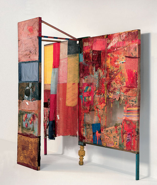
Minutiae
Jasper Johns in 1999, as published on the site of the artist’s Foundation for Contemporary Arts [and first quoted here in 2011, in discussing collaboration and Jacob Kassay, actually]:
In 1954 I had helped Bob Rauschenberg a bit with his Minutiae set, his first for Merce Cunningham, and I continued to assist him with most of his stage work through 1960.
Rauschenberg is credited with costumes and/or set design for at least 10 works for the Merce Cunningham Dance Company between 1954 and 1960, including the iconic painted backdrop/leotards of “Summerspace” (1958). Johns’s first actual credit doesn’t appear until 1968.
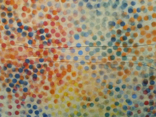
Oh, but look, on this walkeradmin tumblr [? ;)], a detail from the “Johns/Rauschenberg backdrop for “Summerspace.” I’m glad it’s not just me.
Of the 18 works Rauschenberg is credited with between 1954-58 for the Paul Taylor Dance Company, 17 were for costumes, and one, “The Tower,” (1957) was for set design. Jasper Johns is credited with making the costumes for “The Tower.”
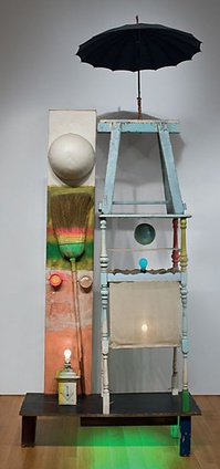
The Tower, by Rauschenberg & neighbor
The Tower, a 1957 Rauschenberg combine created for the dance set, which depicts a couple, was described by the Christie’s representative trying to sell it in 2011 as both “autobiographical” and “cryptic,” which, for these two, is redundant. For composer John Cooper’s part, the Feb 10, 1957 program said he had been considering the “pastoral themes of the Adonis-Persephone myth.” [Persephone and Aphrodite both fell in love with Adonis while babysitting him. So, yeah. Not sure what to do with that.]
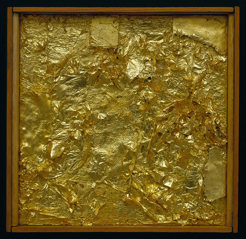
Untitled (Gold Painting), 1956, Menil Collection
I recently met someone who owned a Rauschenberg Gold Painting. The collector said that once Jasper saw it, and said, “Oh, yes, this is one I did.” 10 existing gold paintings predate 1954, the year of Johns’s and Rauschenberg’s meeting, but according to Walter Hopps’ 1991 catalogue, “two or three” were made afterward, at the “special request” of friends. Alison Gingeras included Untitled (Gold Painting), 1955, in “Unpainted Paintings,” her 2011 show at Luxembourg & Dayan. The Menil’s gold painting [above] dates from 1956.
In 1977, in the SoHo Weekly, art historian Roberta J.M. Olson had posed to Johns this kind of remarkable question:
During his early days in New York City Johns and Robert Rauschenberg shared a closely knit friendship of cross-fertilization…It has been said [it has?? -ed.] that during this period the two artists also painted works in each other’s styles.
I asked whether any so-called “Johns paintings by Rauschenberg existed in collections today?
JJ: No, but there is one “Rauschenberg” by Johns. Really, though, it is a Rauschenberg because after I finished it, Bob fooled around with it and I do believe that he eventually signed it. It was a small painting and I don’t know its whereabouts today…The only time I remember Bob actually working on a painting of mine was when he picked up the red paintbrush and went to work on one of the white stripes in a flag painting” […]
One? Just one? Does no one ever ask follow-up questions? No, no one ever does.
Johns told Calvin Tomkins in 2005 that in 1960 Rauschenberg, who had been using maps as an element in his combines as early as Small Rebus (1956), “simply gave” him mimeographed maps of the US, which he painted on directly, and later enlarged into paintings like Map (1960).
UPDATE: In fact, Rauschenberg painted on maps as early as 1950, when he created Mother of God, which was part of SFMOMA’s massive 1998 acquisition.
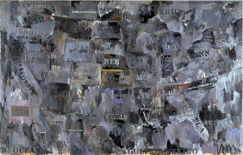
Map, 1962, image via moca.org
In 1988, Deborah Solomon told a version of Johns’s Flag dream story that somehow includes direct quotes from–and a co-starring role by–Rauschenberg:
One day in 1954, Johns casually mentioned to Rauschenberg that he’d had a crazy dream the previous night. ”How crazy was it?” Rauschenberg asked. ”Well,” Johns replied, ”in this dream I was painting the American flag.” The American flag? Rauschenberg didn’t think it was crazy at all. ”That’s a really great idea,” he said.
And this all is aside from the Short Circuit saga; and the fact that Flag looks like it’s constructed like a combine; and his paintings from the earliest canvas & fabric, drawer, canvas, fork, spoon, flashlight, plate, and letter set are essentially combines, too, only we don’t call them that–even though Johns says he came up with the term.
There is so much we don’t know about how these two artists worked and collaborated. So much that doesn’t get asked, or is known and doesn’t get written. So much about the similarities and cross-references and resonances in their work that has been overlooked, dismissed or deflected for so long.
From the earliest days, curators like Alan Solomon and critics were assiduous about keeping these two oeuvres separate and distinct. Whenever asked about influence, Johns would say he always tried to stay aware and move away from it. Rauschenberg would emphasize how diametrically opposite their personalities were, and that was that. Whatever the forces at work, whether the closet, the AbEx legacy of the lone genius artist, or the market’s willful self-delusion, the work they made and discussed side by side, alone with each other, for six foundational years, is almost only ever considered in isolation.
1954: more than a decade before BMPT, and two decades before Prince & Levine [And multiple generations before Codax, BHQF, and Dylan]. What would it mean for the concept of authorship to find out Johns and Rauschenberg were making each others’ work?
update: And while the PMA’s amazing collaboration-related show has absolutely gotten me off my duff to post about this subject, I swear, I had no idea that Alistair Macaulay would publish his email q&a with Johns about his work with Merce Cunningham this morning. Great minds.
Scoring John Cage’s Table
So this is John Cage’s table.
Nothing fuels one’s quixotic pursuit of Cage’s visual and aesthetic artifacts quite like being served a drink from what turns out to be John Cage’s table.
I cannot say where or when I saw it. I cannot say who has it. I can only say I was told that it was Cage’s table–really, John’s and Merce’s table–from their loft on 18th St, and that it came with instructions [conditions?] not to fetishize it. I believe that was the word used. Maybe it was valorize. Not to valorize it. At which point I joked that I did not fetishize it or whatever, I only coveted it. And I promised that, if asked, I would attest that it was not fetishized, and that if it was given to me, I would not fetishize it, either.
Upon reflection, it felt like a useful insight into Cage’s perception of objects, the things around him which he knew, if he wanted or allowed them to, could garner attention or importance by virtue of being his. It’s Buddhism 101, eschewing attachment to objects, but it’s also an artistic position. No branding. At the very least, art was not a practice for generating objects, either for sale or veneration. Oh, maybe that’s what it was not supposed be: venerated.
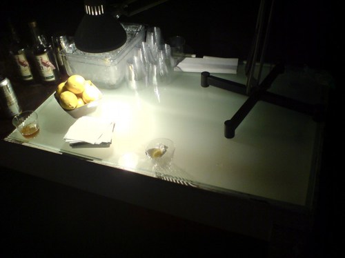
Yes, that’s it. Veneration. Like saints and gurus. I could see why Cage would be sensitive to that. No problem. Since it was being used as a sloppy drinks table, I was going to happily attest that it was not being venerated in the slightest. No venerating here, nosiree.
But let’s just take a look at it instead, hmm? Because it does have some aspects which we might consider Cageian. It’s rough, simple, not fancy, not precious, not worked, just made. It’s painted white, like the original Mazza loft. It’s utilitarian, or functional. Multi-functional. IT HAS A LIGHT BOX BUILT RIGHT INTO THE END, PEOPLE. So it was for working, meeting, and eating.
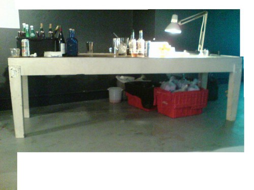
And it was made, not bought, found, or adapted. With some trace of intention. No chance operation produced the slight taper in those square wooden legs. And there’s the nice little setback edge between the upper and lower halves.
Since the table was not immediately offered to me, and given its principled/conceptual encumbrances, the obvious thing was to make one myself. Which is why these photos exist, as documentation for this project, my second table. Table-shaped object. By-product of my performance of a score for a table. I really just want the table, mkay? I’m imperfect and unenlightened, and the Dalai Lama has his watch, I just want the table.
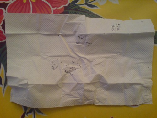
So as best I could, I took some measurements. I just found the napkin I used to scribble down some ad hoc data. What a dork I was right then and there. I hope I was at least amusing.
“Cage table”
those are the widths of the top and bottom of the legs, looks like about a 4/3, 1″ taper.
“55 [?] chip Bd?
lt Box 8 ft Total”
That can’t be right. Well, it’s close. If the napkin’s 10″, the light box looks to be around 3′, at least. [That was my unit of measure: napkinlengths.] I guess I figured I’d be able to feasibly extrapolate the other dimensions? Was that what I was thinking?
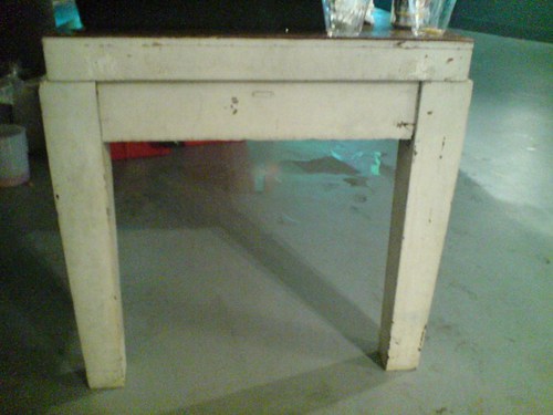
Hmm, maybe this was found, and hacked. Given a new top and a paint job. An old lab table or something. Because seriously, those legs are non-trivial. But then, those legs also look hammered. I won’t fetishize or historicize the construction. Any deskilling will be my own.
Meanwhile, seriously, current non-venerator[s] of this table, if it’s ever in the way, or under threat, or if you redecorate, or whatever, any reason, let me know, and I’ll gladly clear it out in the least venerating way possible.
Willem de Kooning Meant To Not Do That
In the 4th part of his video walkthrough of MoMA’s Willem de Kooning retrospective, James Kalm has an extended clip of curator John Elderfield talking with Glenn Lowry about how the artist’s late paintings relate to his earlier work.
Elderfield stays pretty broad, arguing that the works are valid and important, and that Gary Garrels’ and Rob Storr’s earlier MoMA show ably made their case. Which all sounds good to me. [While noting that “the topologies of the paintings are very reminiscent of earlier pictures,” Elderfield apparently felt that a press preview was not the right context for expanding on de Kooning’s practice of tracing details of earlier paintings which his assistants had projected onto primed canvases.]
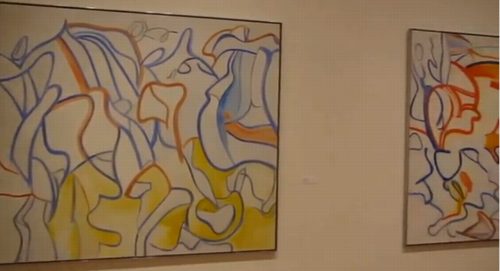
What struck me now, though, was his discussion of how the marks in de Kooning’s 80s paintings were the result of his elimination of subjectivity. Elderfield told how de Kooning “fell into a sort of trough” after seeing a hugely successful show in 1978 of his large, gestural abstractions made in 1975-7, which were in the preceding gallery. “There could have been three times that number in the exhibition,” Elderfield said,” with no drop in quality or achievement…de Kooning had said he ‘felt he could do no wrong,’ which for him, was the point at which he had to stop doing them.”
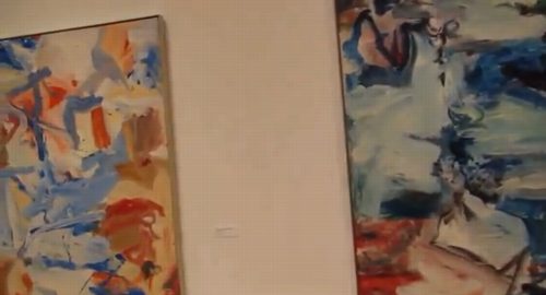
It’s an interesting idea, and it reminds me of how much I loved those 70s paintings, and losing myself in those big, sinuously virtuosic brushstrokes. It’s really too bad Kalm’s woozy, wandering camera eye is one of the few ways left to take in that gallery.
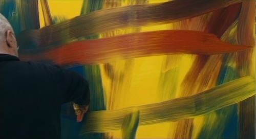
Still from Corinna Belz’ Gerhard Richter Painting
It also reminds me how much those de Koonings reminded me of the early states of Richter’s squeegee paintings. This concept of Richter painting and then overpainting as a transformative, not destructive, technique was what first got me looking at Richter’s destroyed paintings. [That, and Erased de Kooning Drawing, of course.]
Now it strikes me how the two painters share the urge to resist habit and ease. Richter picked up the squeegee in part to counter intentionality and the mastered brushstroke. If de Kooning was resisting the same thing when he changed up his approach after 1980, maybe there’s something to be discovered by seeing these two painters’ works together.
Crazy 20×200.com Sale Starts at 4AM EST

20×200.com is starting their WTF Cyber Monday sale early, at 4AM Eastern, with an eye-popping 40% off on prints and frames, as detailed above. The discount ticks down a bit throughout the day, until it reaches a still-totally-respectable 25% off by 4PM.
The discounts apply to orders over $100, so for example a framed 14×11 edition of Untitled (300 x 404), below, would be $111 instead of $185. And one of the five remaining 30×24″ prints, would be $720 vs $1,200.
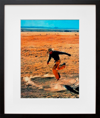
There are, of course, many other excellent prints available, too.
You can’t even get discounts like that at Basel Miami Beach, people. It is serious Crazy Eddie days over there.
Study For A Fence And A Wall (2006)
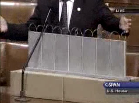
On July 11, 2006, on the floor of the US House of Representatives, Congressman Steve King, Republican from Iowa, presented a model of “a fence and a wall” he had designed. It was a site-specific proposal, to be located on the US-Mexico border.
The fence/wall could be built, Mr. King explained, using a slipform machine to lay a concrete foundation in a 5-foot deep trench cut into the desert floor, a gesture that immediately brings to mind the Earth Art interventions of Michael Heizer. Pre-cast concrete panels, Post-minimalist readymades 10 feet wide and 13 feet high, could be dropped in with a crane.
“Our little construction company,” Mr. King said, referring to the King Construction Company, which he founded, and which was then being run by his son, “could build a mile a day of this, once you got the system going.”
Mr. King demonstrated the construction of the wall using his tabletop model, made of cardboard boxes, silver-painted wood slats, and a couple of feet of coiled wire [representing the wall’s crown of concertina wire, which would be electrified “with the kind of current that would not kill somebody…we do that with livestock all the time.”]
It’s true that the remarkable simplicity of the design and the economy of the materials resonate the work of Richard Tuttle. But in the scale and especially the form, King seems to be making a conscious reference to the early work of Anne Truitt.
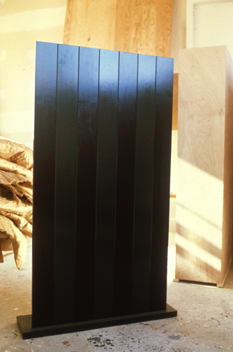
Seven, 1962, image: annetruitt.org
Obviously, at some point after his arrival in Washington in 2003, King studied the iconic Truitts in local collections: the highly fence-like First (1961) [at the Baltimore Museum] and slab-on-plinth structures like Insurrection (1962) [at the Corcoran]. But even I was surprised to see King make such an explicit homage to Truitt’s Seven (1962) [above, collection of the artist’s estate].
Much like Christo and Jeanne-Claude, King conceived of his site-specific fence/wall to be temporary, at least conceptually:
You could take it back down. If somehow they got their economy working and got their laws working in Mexico we could pull this back out just as easy as we could put it in. We could open it up again or we could open it up and let livestock run through there, whatever we choose.
Whatever we choose. Thus the fence/wall becomes a symbol of American freedom.
According to the Congressional Record, Mr. King, appearing as an expert witness, exhibited his Study For A Fence And A Wall again a week later, in a joint hearing of the House Committees of Homeland Security and Government Reform.
The current whereabouts of King’s model is not immediately clear, but I guess I could call about it. Meanwhile, I would love to see this work realized at full scale, if only temporarily, where it was conceived: right here in Washington DC. Perhaps in the National Gallery’s sculpture garden, or along one of the sketchier sections of Pennsylvania Avenue, where dangerous elements threaten Our Freedoms.
January 2017 inevitable update: Oh how we did not need to worry that this work might not have survived. On Jan. 13 Congressman King tweeted out a photo with it, and the new appointee for DHS. Study was installed on his coffee table in his office. It will be noted that it has a new base, set in unpainted wood feet, presumably a pair. The articulation of the wall at the ground and the underground footing are now fully visible. The box representing the desert floor, and the notch, where “you put a trench in the desert floor.” are not seen. What was once site-specific is now available for installation anywhere, I guess. Though it’s really tough to say at the moment.

I’ve Got Nothing To See And I’m Seeing It
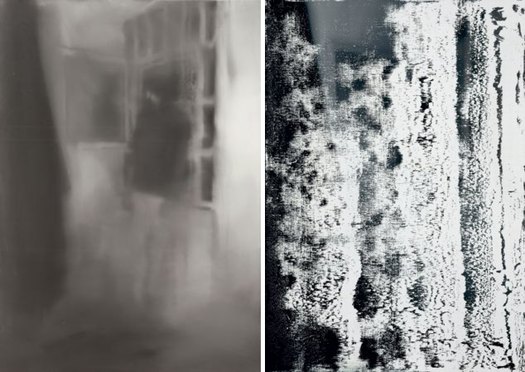
Wendy Lesser’s essay on the installation of Gerhard Richter’s Baader Meinhof series amidst the historical paintings at Berlin’s Alte Nationalgalerie is long, but very worthwhile.
She writes about how, along with MoMA’s 15 October 18 paintings, the exhibition included Blanket [above, right], a related painting that Richter squeegeed over and renamed sometime after finishing the series in the summer of 1988:
That is the end of October 18, 1977. But in this exhibit in the Schinkelsaal, there is a final sixteenth painting, a vertical canvas the size and shape of Cell or Hanged [above, left]. It is called Blanket, and it consists largely of white paint covering a darker (but still monochrome) undersurface. The white has been thickly pulled over the entire canvas–presumably from right to left, since the upper and lower corners on the lefthand side have escaped full coverage and still remain black. There are black patches and streaks amid the rest of the white too, but we have no way of knowing what is underneath; or rather, we would have no way of knowing, except that the wall caption tells us this was once a painting of Gudrun Ensslin hanging in her cell, a near twin of Hanged. What has merely been blurred in the other paintings has here been obliterated, as if even the oblique and indefinite sight of things proved too much.
As if. Because like blurring, squeegeeing ends up being a strategy for Richter to signal this kind of judgment without actually making it. We can know, or at least presume, what is under Blanket precisely because of its blurred doppelganger.
It’s worth noting, though, that even though Blanket has been exhibited extensively over the years, including in Rob Storr’s “40 Years of Painting” retrospective in 2003, this appears to be the first time it has actually been placed directly in the context of the 18. Oktober 1977 paintings.
Richter’s Masterpiece [threepennyreview]
Previously, and very much related: Overpainted Gerhard Richter Painting
Gig: The Contemporary Artists’ Books Conference, Friday 9/28, 2PM
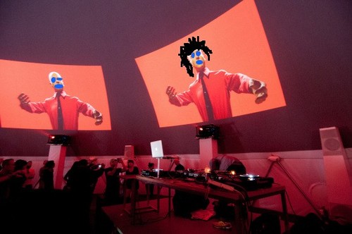
I am stoked and a bit daunted to be participating in a session on appropriation at this year’s Contemporary Artists’ Books Conference. It will be this coming Friday at PS1, as part of the NY Art Book Fair, and will take place in the Performance Dome:
2:00-3:30 pm
Appropriation and Intellectual Property
Debates on the the legal complexity of appropriated imagery have resurfaced in light of a recent lawsuit between artist Richard Prince and photographer Patrick Cariou. Artists Greg Allen and Eric Doeringer and lawyer Sergio Muñoz Sarmiento will discuss notions of “fair use” and “transformation” with our digital culture, as well as the question of how copyright law should adapt to rapidly evolving artistic practices and whether copyright law might constitute a medium in and of itself. Organized and moderated by Stephen Bury.
I hope you can come to the Fair, of course, because it is amazing. And while you’re there, I hope you’ll come by the session. It’s a big dome, and it’ll feel even bigger if it’s empty.
CABC Conference Sessions [nyartbookfair]
image: from DJ Francois and Juan Atkins’ performance during the MoMA PS1 Kraftwerk Festival, via timeout
Domestic Objects
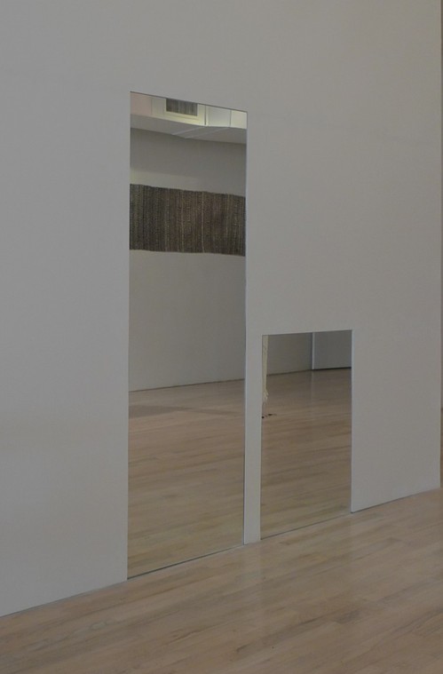
“Untitled” (Orpheus, Twice), 2012, Bridge Gallery installation
From the gallery website for “Domestic Objects,”:
For “Untitled” (Orpheus, Twice), 2012, Greg Allen alters Felix Gonzalez-Torres’ elegiac 1991 work, cutting one of the pair of identical, adult-sized mirrors down to a toddler’s height. In Gonzalez-Torres’ original conception, the work’s evocation of the musician of Greek myth who travels to Hades in hope of bringing his beloved Eurydice back from the dead, has been understood as a reference to the artist’s own partner Ross Laycock, who had just died from AIDS-related illnesses.
Former MoMA curator Rob Storr has also noted a formal resonance between Felix’s piece and Jean Cocteau’s 1950 film version of Orpheus, set in postwar France, in which a bedroom mirror becomes the mourning hero’s gateway to the underworld.
By transmuting the twinned mirrors’ allusions from lovers to parent and child, Allen’s simple gesture renews and expands the senses of personal loss and political outrage of Gonzalez-Torres’ original. By faithfully preserving the rest of the work, including the title, “Untitled” (Orpheus, Twice) marks the ground traversed in the intervening decades; from a fight for survival against homophobia and the AIDS epidemic to marriage equality and gay dads. Changes Felix might have taken measure of himself, if only he were still here.
Domestic Objects is on view at Bridge Gallery, 98 Orchard Street below Delancey, through Oct. 18 [bridgegalleryny]
Untitled (NYPD)
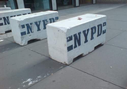
It’s UN Season in New York, and the streets are filled with people enjoying the sun, and squeezing through these flat-out gorgeous NYPD barriers. Seriously, I mean, Tony Smith, Donald Judd, Richard Serra, Beverly Pepper, Anselm Kiefer, Janine Antoni, Scott Burton, Robert Gober–you see where I’m going with this? I mean, Rachel Harrison–I’d love to make a Rachel Harrison-style version of these. That would be awesome. and so much more manageable, too.
Oh, look, I was right:
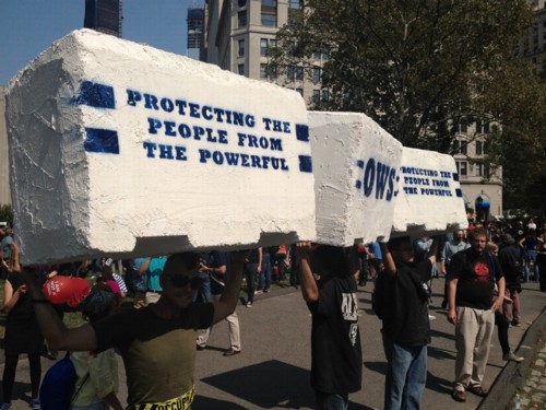
Occupy protestors on Sept. 17th in Battery Park, as covered by Bucky Turco at Animal New York
So the next thing would be a Cow Parade-style celebration across the whole city. These barriers could become a vibrant platform for artists the world over, and highly collectible, too. Munny dolls-meets-street security furniture.
I. Am. On it.
The Secret Ingredient Turned Out To Be Infringiness
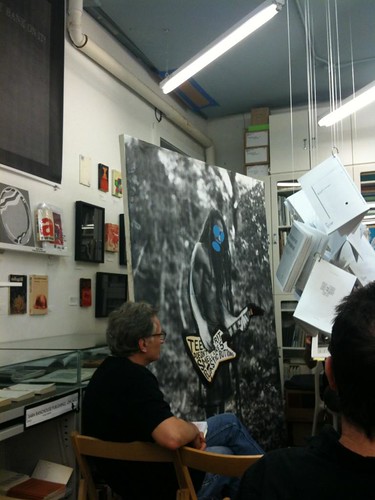
Well that cat’s out of the bag.
Joy Garnett posted audio from the Richard Prince Canal Zone discussion she, Chris Habib and I had Saturday night at Printed Matter. It’s available for streaming or download at the Internet Archive. OR for remixing, autotuning, and stop-action animating, whatever you want, since artpanelsjustwanttobefree it’s public domain.
It clocks in at almost an hour and a half, and who knows what you’ll find in there. I was too high on life and drunk on power–I was running the projector, too– to really remember what was said. Though I do remember something about megayachts, Perry Mason vs Law & Order; and wishing you were Rasta and/or punk. So really, something for everyone.
Many thanks to Chris and Joy, to Keith and Max and the PM Crew, and especially to the awesome and engaged audience. We’ll do it again for either the damages hearing or the Supreme Court phase.
Cariou v. Prince Meets Iron Chef, Discussion & Crit at Printed Matter, NYC [archive.org]
Joy Garnett’s flickr photoset clearly reveals I have no veto power over her photos of me [flickr]
Two Gigs: Saturday 9/22 @Printed Matter, Friday 9/28 @NYABF
I’m really stoked to be participating in two events in New York in the next few days. Please come if you’re in town, and pass the word.
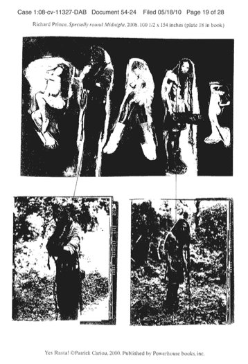
crappy photocopy court exhibit of Specially Round Midnight and the Patrick Cariou photos that went into it
The first is at Printed Matter this coming Saturday evening, Sept. 22, from 6-7:30PM. It should be a hoot:
The ongoing Cariou v. Prince trial have presented a high-stakes platform for debating copyright, appropriation, fair-use and artists’ rights. One thing that’s been oddly missing from the discussion, though, is the art itself.
Printed Matter will host a raucous crit of Richard Prince’s little-seen but much-contested Canal Zone paintings, culminating in an open-forum, Iron Chef-style evaluation of each artwork in terms of content, aesthetics, and infringiness.
The Ocean Club, 2007
Using bootleg copies of Prince’s banned exhibition catalogue and excerpts from the artist’s own sworn deposition testimony which were never entered into evidence in court, panelists Joy Garnett, Greg Allen, and Chris Habib will take a closer, critical look at Prince’s paintings and practice in an art historical context.
Joy Garnett is an artist and writer in Brooklyn, NY. She is also the founder of the blog NEWsgrist (where spin is art).
Greg Allen has been writing about the creative process at greg.org: the making of, since 2001. He published Canal Zone Richard Prince YES RASTA: Selected Court Documents from Cariou v. Prince et al. in 2011.
Chris Habib is an artist and the curator of HELP/LESS, which runs through Sept. 29th at Printed Matter.
And then next Friday, Sept 28 at 2-3:30, I’ll be speaking at the Contemporary Artist Book Conference as part of the NY Art Book Fair at PS1. The session, led by Stephen Bury, will be on the limits, excesses, and future of appropriation and copyright law. Artist Eric Doeringer and artist/lawyer Sergio Muñoz Sarmiento will also speak. It should be awesome. If you’re at the Fair, definitely come join us in the Dome.
Art Voices, Infinity, And Apocalyptic Tattoo
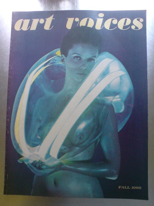
Well look what I unearthed while reorganizing my books in storage. The Fall 1966 issue of Art Voices, a short-lived magazine that, I swear, I bought for the articles.
Seriously. It’s the issue where Robert Smithson & Mel Bochner published “The Domain Of The Great Bear,” their photo-essay/article-as-art expedition through the Hayden Planetarium. I mean, sure, you could read it in Robert Smithson: The Collected Writings, but don’t you want to see it printed slightly bigger?
Anyway, in the short features section up front, right before Lawrence Alloway’s essay on early space age films, is this awesome story by pioneering downtown journalist Walter Bowart about a secret, artist-run tattoo parlor called Apocalyptic Tattoo. It’s not turning up online anywhere, so I’m putting the whole, short, thing after the jump:
Continue reading “Art Voices, Infinity, And Apocalyptic Tattoo”

