The Photographic Archive

In response to Olia Lialina’s post last week about screwy reproductions of her c.1996 lo-res digital imagery, Cass Fino-Radin writes about how Rhizome deals with archiving and documenting digital art in its native formats, platforms and resolutions: by photographing it.
This very issue of how low-resolution digital images gum up the hi-res assumptions our visual systems are built on is was one of the unexpectedly central discoveries of making Untitled (300 x 404) project. Though initially, at least, the losses and distortions of moving a thumbnail-sized jpg through the media channels were for me evidence or symbolic of the information that’s lost through ridiculous copyright restrictions, and not so concerned with archiving or perpetuation.
But that’s not important right now. Because just a few days before reading about Fino-Radin’s archival challenges, I stumbled across another data-driven use of old-school photography, on Project Echo.
I just received a rare print copy of the 1961 Bell Systems Technical Journal devoted to Project Echo, which has a dozen papers reporting Bell Labs’ findings and processes of tracking and operating an inflatable, reflective communications satellite. What’s extraordinary about the papers is what’s always fascinated me about the Echo satelloons in the first place: they were analog experiments done largely by hand, and before computers were practical tools for real-time tasks.
echo_data_recording_bstj.jpg
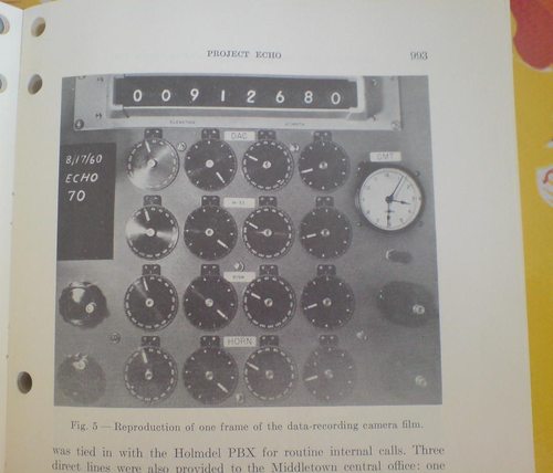
And so, for example, in order to record all the satellite tracking data and readouts at the Holmdel, NJ receiving and transmission station, they took pictures of the control panel. Here’s the description from Bell Labs project engineer Dr. William C. Jakes’ paper [available from dtic.mil as a pdf]:

In order to have a record of the positions of the various moving elements of the system during a satellite pass, each element was provided with synchro read-outs which were periodically photographed. Pictures were taken at one-second intervals of a panel carrying the two-speed azimuth and elevation position dials for the DAC, M-33 (optics), 60-foot dish, and horn antenna. A Greenwich Mean Time clock also appeared in the photographs. Position angles could be read to +/- 0.01 degrees, and time to 0.5 second. An enlargement of one frame of such a record is shown. [above]

But wait, there was more:

The 60-foot dish and horn antennas were each equipped with a bore-sight camera [!] that could be started at will whenever the satellite was visible. Pictures were taken at four frames per second, and included a reticle for indicating angular offsets to an accuracy of +/-0.01 deg. and a time-coded counter.

I have contacted archivists for Bell Labs, and unfortunately, no such operational film records have survived. In the company’s possession, anyway. But I am still looking.

So Appropriate! Find The Warhols! Poster At House Of Switzerland London

ftw_poster.jpg
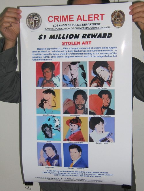
Almost three years ago now, a suite of ten Athlete paintings [plus one] by Andy Warhol was stolen from the Bel Air dining room of collector Richard Weisman. In an effort to help find them, I created a grass-roots campaign via the then-new service Kickstarter, to print giant versions of the LAPD Art Crimes Division’s utterly awesome wanted poster, and to post them all over the world, wherever Warhols were traded or shown.
Unfortunately, that Kickstarter campaign failed. And the Warhols remain missing, though Weisman has stopped cooperating with police, complicating their investigation.
And though it’s unlikely that I was the first to run an unsuccessful campaign, I could at least feel a sense of accomplishment at being the first to use a Kickstarter campaign as a medium for art critical commentary.
And that was that until a few months ago, when the noted Swiss designer and publisher Lex Trueb contacted me, and asked if I would mind his including my Find The Warhols poster project in an exhibition in London.
The Museum of Design Zurich had invited Trueb and 11 other designers to participate in London – Zurich Posters, an exhibition at the House of Switzerland London, a national pop-up venue for the 2012 Olympic Games.
Rather than create some sportsy thing from scratch, Trueb was more interested in appropriating an existing sports- or Olympics-themed poster design of some kind. The Find The Warhols wanted poster, he thought, would fit the bill nicely.
Trueb made his proposal to the curators, they went for it, and though I haven’t seen installation shots yet to see how it turned out, Lex says the giant-size poster looks pretty awesome. He laid a brief statement of mine along the side of the poster for a bit of context, but otherwise, it’s entirely true to the LAPD’s great tradition of stolen art wanted poster design.
As someone who’s been appropriating or copying or re-creating stuff originally made by others for a while now, it’s been an interesting experience having a proposal of mine [albeit an appropriated one] appropriated by someone else. Whatever trepidation I might have had about it can’t compare to the amazement at the serendipity of Lex’s interest and his show and the rather incredible context. His respect and seriousness about my own relationship and project vis a vis this found object poster is also above and beyond. He could have easily tracked down the original poster and stuck it in his show, and I’d probably be none the wiser. But he’s been awesome. The moral is, when someone takes you and your idea seriously enough to appropriate it, it can be a net positive for everyone.
Anyway, if you’re in London before the 12th, and near Southwark, maybe looking for a place to watch Federer play for Switzerland’s first gold medal, please check out the poster show and tell me how it looks.
London – Zurich Poster Exhibition, through 12 August 2012 [houseofswitzerland.org]

Toward A Theory Of Every WTFSport-like Thing

Just go read Brian Phillips’ awesome analysis of the bizarre hermetic superlatives of rhythmic gymnastics:

[L]ike all insular civilizations, [RG]’s evolved in a certain direction, it’s developed hard-and-fast attitudes about what’s beautiful and proper, and a corresponding need to defend those attitudes. It’s putting on a show, and it does what it knows how to do. The result is that it feels a little unbalanced to outsiders, in the same way as, say, ice dancing, or dog shows, or a lot of judged activities.

This notion of competition, judgment and the pursuit of perfection within an insular world happens to be a minor fascination/obsession of mine. At some point probably 10 years ago, after surfing past yet another aerobics world championship on ESPN3, I started a posterboard spectrum, which I changed to a 2×2 grid, and then just a bubble chart. All the sports and “sports,” I can find are laid out on it, from bodybuilding to dressage to cheerleading to college marching bands [both historically black and not]. Rhythmic gymnastics is there, too, in a cluster with regular gymnastics, synchronized swimming, ballet, drill team, and child beauty pageants. Here’s Phillips again:

There is, in the contrast between the poise and seriousness of the athletes and the princessy kitsch of the setting, something really kind of dark and wonderful. Just imagine it: devoting your life, mercilessly and with absolute commitment, to the task of dancing with little twirly clubs to a synth-folk soundtrack while wearing a spangled bathing suit designed to look like ladybug wings. Imagine doing that as well as it can humanly be done, being the person who embodies that accomplishment. I’m not making fun of anyone; I find it strangely noble.

I find it WTFcrazy. With two daughters of my own now, it feels like my parental prime directive is to steer these kids as far the hell away from these freakshows as possible.

I mean, how can it be that less than ten years after Chris Rock identified keepin’ his baby off the pole as a father’s only job, there is a petition by an Irish member of the International Pole Dance Fitness Association [which is different from the World Pole Dance Federation] to make pole dancing [or “Vertical Bar Dance”] an Olympic sport?
I haven’t figured it out yet, what it all means, but the more you think about it, these kind of esoteric, competitive evaluation systems are everywhere, and the desire to excel within them is, too: business, politics, religion, literature, art. Is the only difference popularity, which is apparently just a function of time?
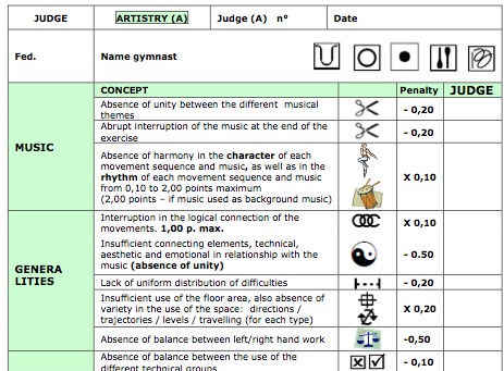
rhythmic_gym_judging.jpg
Maybe to achieve a Theory of Every WTF Thing requires looking beyond the gut, cultural affinities of a judged system, to its language, attempting a close read of the texts it produces. Phillips again:

RG has its own language, which non-RG initiates mostly perceive as a series of ultrasonic clicks and emoji hearts. What, for instance, is the precise distinction between the tournaments Miss Valentine 2012 (Tartu, Estonia, February 10-12), Pearls of Varna 2012 Academic (Bulgaria, July 2), and the 4th International Waves Cup (Germany, March 24)? I have read the rulebook in effect for the Olympics, the 125-page Code of Points: Rhythmic Gymnastics 2009-2012 [pdf], and let me tell you — you thought football had a lot going on. Between the aggro-ballet terminology (fouetté, entrelacé), the extensive use of pictograms, and the radical linguistic uncertainty (“The French version is the official text,” the front cover proclaims, in English), this thing reads like Finnegans Wake as drafted by the unicorn debate team.

Yes. RG has its own language. Just like everything else. And it has roots in aggro-ballet, and there are 43 words for ribbon twirling.
So the top hundred or so international sport and “sport” federations’ codes, preferably in print, to fill a bookshelf, and then to begin the data-intensive synthesis between them all. I’ll get right on that.
Sparkle Motion [grantland via @felixsalmon]

Friday At Printed Matter, 6:30, Eric Doeringer, Hermann Zschiegner & Me

So tomorrow evening, Friday, I’ll be speaking at Printed Matter. If anyone reading this is in town and interested, I hope you’ll stop by. Bring a fan, though; it gets hot in there.
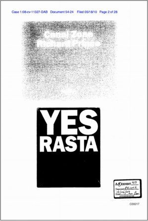
czrpyr_exhib_40.jpg
Eric Doeringer and I will be discussing appropriation and artist books, though he’s already won the night, merch-wise, thanks to his two new titles he’s launching. Fellow Prince appropriator Hermann Zschiegner will be moderating.
The whole evening, which starts at 6:30, is part of HELP/LESS, Chris Habib’s frankly awesome-looking show of authorship, originality, reproduction, and appropriation, which is taking over the whole store this summer. If you can’t make the talk, you should still swing by to see the show.
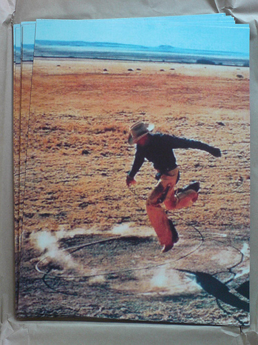
untitled_300x404_alumproof.jpg
Eric Doeringer + Greg Allen/ Book Launch + Discussion [printed matter’s facebook invite for the event]
HELP/LESS, curated by Chris Habib [printedmatter.org]
Previously, related: Untitled (300×404), a print after Richard Prince
Canal Zone Richard Prince Yes Rasta: The Book

Rijksoverheid Rood 9: The $50 Paint Job

Change I Can Believe In
So Todd Lapin at Telstar Logistics is starting to roll out The $50 Paint Job, and it’s really got me thinking.
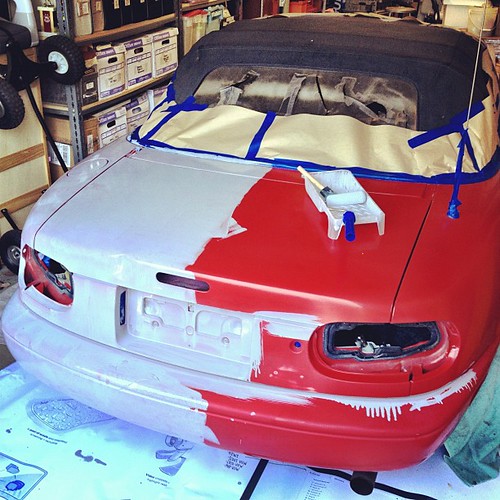
Basically, it’s Rustoleum household enamel, thinned by 50% or so with mineral spirits, and applied with high density foam rollers, with wet sanding between each two very thin coats. This guy did it on his Corvair, and that moparts.org thread goes on for days, months, years about it.
As I’ve been building up layers of Rijksoverheid enamel on my own panels, using various brushes and rollers, and wet sanding in between, I’ve been working toward an ideal that’s really eluded me so far: a hand-applied painted surface that shows no marks from the application. Like, for example, a Gerhard Richter mirror painting.
Part of the motivation for this is the ease with which you [I] could order these panels from a body shop. It’d be Moholy-Nagy easy–even easier since there’s no design, just color–to just order these monochromes by the official Dutch governmental auto paint code on the phone. I have the list right here. But I wanted to do them myself.
And so far, that perfectly self-leveled, brushless, orange peel-less surface has eluded me. But reading The $50 Paint Job stories, it’s obvious why: the paint straight out of the can is too thick. And for whatever misguided, paint-can-as-unaltered-found-object reason, I have resisted thinning it. Well screw that, because the next six coats are going to be nearly water-thin. I can’t wait.
Previously: rijksoverheid rood in process
The original idea, to paint monochromes and 2-color gradients based on the 21 officially approved colors in the Dutch government’s Rijkshuisstijl, plus the five blues of the country’s new logo, all of which are derived, we’re told, from Golden Age Dutch painting and the Dutch light that inspired Dutch painting.

On Thomas Hirschhorn’s Chains

hirschhorn_cnn_artnet.jpg
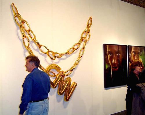
I fell for the first one ever saw, which was CNN, but in 2002 Thomas Hirschhorn started a whole series of gigantic, bling-inspired sculptures out of his signature, cheap-ass materials: foil, cardboard, mylar, and packing tape.
CNN was an edition of 50, published by Schellmann for Okwui Enwezor’s documenta 11, and it quickly sold out–and started getting flipped, as Pedro Velez’ artnet photo from c.2003 Art Chicago shows.
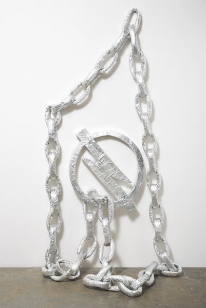
hirschhorn_opel_chain_pdp.jpg
But the tricky thing is that though they were produced from the same crap as his mass edition, Hirschhorn’s other chains were unique sculptures. And that might have hurt them in the market. Phillips couldn’t sell Opel Chain (2002) for $60-80,000 in 2008, even though that was a bargain for a large-ish Hirschhorn at the time.
hirschhorn_toyota_crousel.jpg
And though I’ll be forever grateful for introducing me to Hirschhorn’s work in the 90s, I could never ask what Chantal Crousel Galerie wanted for Toyota Chain (2002), but it was still hanging around in 2009.
I love Alison Gingeras’ quote from Parkett 57 (1999), for which Hirschhorn made an edition, Swiss Made, a giant, aluminum foil, cardboard, and packing tape watch:

Thomas Hirschhorn–an artist easily recognized for his persistent use of low-grade materials such as tinfoil, cardboard, plywood, plastic, and masking tape in his sculptural assemblages–perfectly illustrates cheapness in all of its senses. From the connotation of poor quality or shoddy standing to appearing easily made, despicable, or having little value, Hirschhorn has cultivated more than aesthetic consistency in his oeuvre. Underlying the objects that he fashions out of these meager materials is a sophisticated machine whose inner workings produce affects and interpretations that extend beyond mere formal statement. Cheap is no longer just an adjective; Hirschhorn makes it a procedure.

hirschhorn_wood_wall.jpg
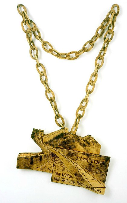
Wood Chain VII, Great Wall of China image: stephenfriedman
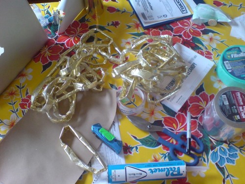
By 2004, Hirschhorn was making his large chain pieces out slightly more durable, more upscale wood, but I was not feeling it. I’m still not. So mylar and foam and aluminum tape it will be, simultaneously filling the Hirschhornian gap while saluting the three M’s: MOCA, Mercedes, and Mike D. Cheapness in all of its senses.

Study For Untitled (MOCA Mercedes, After Mike D), 2012

Mike D has traded up
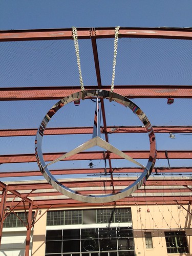
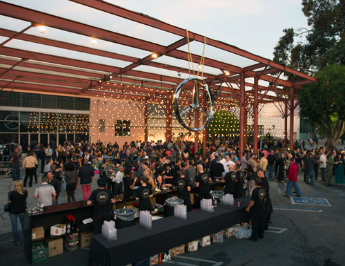
OK, people, who has not been telling me about this? In Transmission LA, the very important exhibition Mike D just curated at MOCA, sponsored by Mercedes Benz?
Fortunately, Tyler Green used flickr user Eli Carrico’s image, above, for a MOCAWTF roundup, or I might have missed it for even longer.]
Here are a couple of other views, from sadjeans, who reports that “this Mercedes emblem was six feet wide,” which, really?
Untitled
And these from Nicolas Arias:
Untitled
Untitled
Oops, sorry, that one’s from inside the show.
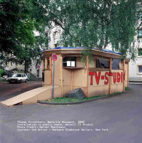
Besides its own self-evident awesomeness, it reminds me of one of my favorite artworks from Documenta 11, by Thomas Hirschhorn. Hirschhorn installed his Bataille Monument in a Turkish housing complex out of Kassel’s city center.
hirschhorn_bataille_studio.jpg
To get to it, he’d come pick you up in a worked-over, old Mercedes, which I can’t believe I can’t find a photo of? Really, Internet? But that’s not important now.
hirschhorn_cnn.jpg
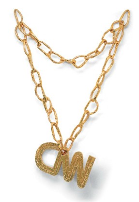
Because the work I’m talking about his contribution to the Documenta Collection by Edition Schellmann, sold exclusively at the show. CNN is a 2.5meter-wide piece of gold chain bling with the once-relevant news network logo dangling from it. An edition of 50, the original price was just EUR1200. And when it’s come up for sale it’s been just $5,000. So it’s an awesome–and inexpensive–way to fill a wall.
Obviously, if I can’t track down this original–do we know who the artist is? Mike D? Or the edition size? Did it enter MOCA’s collection?–I will be making my own edition in the Hirschhorn-ian style to celebrate MOCA’s and Mercedes Benz’s unwavering support and incisive relevance to contemporary art.
FIVE MINUTES LATER UPDATE:
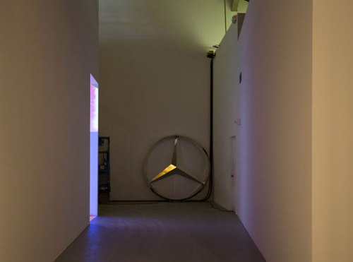
OK, then, it’s a go. Notcot has these hardhitting photos from the opening. The artist is indeed Mike D. His subversive appropriation of the Mercedes logo and his deployment of it as a readymade were not limited to the patio. He had at least two more, one leaning against a fence, and one inside, tucked into a corner.
notcot_mikemerc3.jpg
I assume they’re from dealerships. No idea how he got a hold of them. But that does not look like six feet across; more like four. Okay, that one may be six feet. And the chains are gold[en].
moca_mercedes_notcot3.jpg
Also from Notcot: this gripping firsthand report:

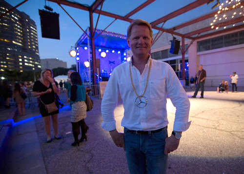
So it’s only natural that when curating this art festival (which they gave him carte blanche on!) he created a HUGE Mercedes emblem hanging on a large chain in the central pavillion of the exhibition… as well as a few huge emblems tucked around the space… and then around 25 special chain necklaces with authentic Mercedes-Benz emblems for the artists and key brand folks…

Which was enthusiastic enough [“Here’s Anders-Sundt Jensen, Head Of Brand Communications, modeling one of the necklaces!”] for Anders-Sundt Jensen, Head of Brand Communications, to give said necklace to said blogger at the end of the night.
miked_mb_brand_necklace_notcot.jpg
Hmm, do we have a photo of Deitch wearing a Mercedes chain necklace?

Infrared De Kooning Drawing

First things first, yes, I’ve heard the footsteps of the Tate’s awesome, new, online exhibition/project, the Gallery Of Lost Art behind me, and I will be trying to wrap up the search for the lost Short Circuit Johns flag painting very soon. At least soon enough to give them time to write my triumphant detective work into their essay. Ahem.
Meanwhile, let’s give credit where it’s due, because the Tatefolk have lured SFMOMA’s infrared imagery of Erased de Kooning Drawing out and onto the net.
Last year at CAA, one of SFMOMA’s design & web people Chad Coerver talked about the debates over whether or how to present the wealth of information in the Museum’s Getty-sponsored Rauschenberg Research Project. Whether to publish new infrared imagery of EdKD, for example, which might alter the way people perceive the object in ways the artist did not want or anticipate.
I guess they figured it out, because not only does the GOLA have it, the IR image is the teaser today on SFMOMA’s tumblr. [via wiblog and MAN]
Or maybe they’re still working on it. SFMOMA’s Erased De Kooning Drawing page has this footnote:

The use of advanced imaging technology and its implications for our understanding of Erased de Kooning Drawing will be explored fully through SFMOMA’s Rauschenberg Research Project, a four-year in-depth research program that will result in an online catalogue, slated for launch in summer 2013.

Carry on, then!
But the page also has this description, which seems to reflect a fuller, and different, understanding of the work than what was discussed during Rauschenberg’s lifetime:

After Rauschenberg completed the laborious erasure, he and fellow artist Jasper Johns devised a scheme for labeling, matting, and framing the work, with Johns inscribing the following words below the now-obliterated de Kooning drawing:
ERASED DE KOONING DRAWING
ROBERT RAUSCHENBERG
1953
The simple, gilded frame and understated inscription are integral parts of the finished artwork. Without the inscription, one would have no idea what is in the frame; the piece would be indecipherable. Together the erased page, inscription, and frame stand as evidence of the psychologically loaded deed of rendering another’s artwork invisible, enacted in the privacy of the artist’s studio.

Which, hmm. It seems vital that Johns’s central role in creating EdKD is acknowledged. I’d even argue it was equal, or equivalent, his precisely drawn marks the precise counterweight to Rauschenberg’s vigorous erasures. And the title, even the titling, and thus the conceptual framing, is Johns.
Or at least it was. But the gilt and the current matting, has been changed, once and maybe twice or more, since Johns and Rauschenberg broke up. So it is Bob’s. And the evidence of this evolution can be seen even more clearly, thanks to the Gallery of Lost Art’s zooming feature, on the back of the work.

Continue reading “Infrared De Kooning Drawing”

RIP, Ivan Karp, And Thanks

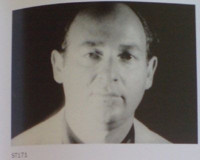
ivan_karp_st171.jpg
I’ll get back to the Rauschenberg thing in a bit, but it’s already been too long that I haven’t noted the passing of Ivan Karp. He had been an amazingly generous, interesting, and informative resource to me over the years I’ve been delving into the history of postwar art, always ready to share a story, or an opinion, a recollection, or a corrective. And I’m sad to think we won’t be having any more chats. My thoughts are with his family, and especially his wife, the artist and historian Marilynn Gelfman Karp, who has also been very thoughtful and generous with her insights and stories.
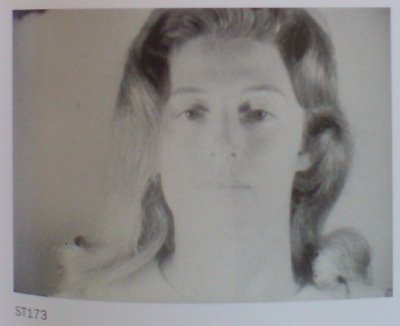
marilynn_karp_st173.jpg
An anecdote in Ivan’s NY Times obituary about how he and Marilynn met in what became an epicenter of the 1960s New York art world reminded me of a better version, from Ivan’s 1969 oral history interview for the Archives of American Art:

So kind of unknowingly the gallery by being what it was, an outgoing open place became a center of activity. People come in here and spend a lot of time. They’d meet each other. Every Saturday was an important event at the gallery. Dozens of people standing around in the back room discovering each other. There was a lot of romantic atmosphere. Always a lot of beautiful girls there. What always made the gallery activity worthwhile for me was the number of beautiful people and especially the beautiful girls who always came in. They were always particularly welcome; as they are to day still. That’s where I met my wife — at the gallery. She brought in slides and, in fact, brought in some paintings of an artist she was interested in. And I guess I was more interested in her than I was in the painter. But I think we did show the artist. And then I married his sponsor.

This painter was Vern Blosum. When I met Blosum almost 50 years later, it was clear he remembered the sting of losing his girlfriend as if it was yesterday.
For his part, when I called Ivan several years ago out of the blue and told him I wanted to talk with him about Vern Blosum, he just laughed and laughed. The jig was finally up.
images: Ivan and Marilynn Karp from their Screen Tests, ST171 and ST173, both 1964, obviously ganked from Callie Angell’s Warhol Screen Tests Catalogue Raisonne. Marilynn was also filmed for Warhol’s The Thirteen Most Beautiful Women.

Beebe v. Rauschenberg, The First Big Appropriation Lawsuit

I’ve been annoyed for six weeks now by Laura Gilbert’s op-ed in The Art Newspaper which argues, rather speciously, that “‘appropriation'” [her scare quotes] is somehow a less “savvy” artistic practice than licensing images or seeking permission. She frames this as somehow “rarely reported,” as if there’s a taboo in the art world about acknowledging that some highly successful artists who have been accused of copyright infringement find the process annoying and expensive, and thus seek to avoid it going forward. This is certainly true, but such burdens could just as easily be used to argue, as some TAN commenters have, that the copyright litigation system is unwieldy and favors the big and powerful. [The examples of happy happy licensing Gilbert cites–Koons & Marvel; Warhol & Disney–support this.]
But whatever, I decided way back when the Cariou v. Prince complaint surfaced that I wasn’t going to go tit for tat on every column or blog post concern trolling about copyright infringement.
rauschenberg_pull_hoarfrost.jpg
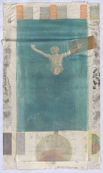
Rauschenberg’s Pull (Hoarfrost Series), 1974, 8×4 feet, offset and silkscreen
on fabric, silk, and cheesecloth collage and paper bags, ed. 29 plus a bunch of proofs, image: nga.gov.au

What I will do, though, is confess that for all the soaking I’ve been doing in appropriation, I had never heard of the case Gilbert discussed at the greatest length: when Robert Rauschenberg was sued for using an image from a magazine ad in one of his collages by the photographer who took it, Morton Beebe.

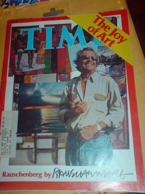
San Francisco photographer Morton Beebe only discovered that Robert Rauschenberg had used two of his photographs in the 1974 print Pull when his friends, artists Christo and Jean-Claude, were looking at his portfolio. Christo pointed to the photograph Mexico Diver and said: “My God, is that yours or Rauschenberg’s? Have you seen Time magazine this week?”
Beebe got hold of the magazine and saw in a feature about Rauschenberg that he had not only used Mexico Diver but also his photograph of a native New Guinean repeated across the top of the print. Both pictures were part of a series Beebe had shot for an advertisement for Nikon cameras that had appeared in 17 magazines.
Beebe sued. Rauschenberg’s printer testified that the artist had showed him the Nikon ad and said: “I’ll just lift it.”
Rauschenberg settled, paid the photographer’s legal fees and gave him a numbered print of Pull. He promised that whenever the image appeared in print Beebe would be acknowledged. Later, when Beebe discovered another unauthorised use of Mexico Diver, Rauschenberg gave him another print of Pull, which Beebe sold for $13,000.
Beebe points out that potentially high legal fees makes photographers reluctant to sue (in the US litigants typically bear their own costs). After the suit settled, in 1980, Rauschenberg shifted to using his own photographs exclusively for the next 28 years if his life, according to the Guggenheim Museum and others.

I am quoting Gilbert’s entire account of the case here because it sounds quite compelling and authoritative. But it is also biased–it’s based entirely on Beebe’s version of the claim and the settlement. And after investigating the original court documents, it’s clear that Beebe’s take leaves out key details and facts that could significantly affect how the case is perceived, and what it means.
There’s no doubt that Rauschenberg used Beebe’s image without permission, nor is there any uncertainty that Beebe felt wronged by the far more famous artist’s action. It’s also the case that Rauschenberg insisted, even after settling with Beebe, that his collage process was fair use, and that it resulted in entirely new work. If for no other reason, Beebe v. Rauschenberg should be better known because it embodies these emotional, economic, and power complexities so concisely.
Ultimately, though, I think the case does not support the anti-appropriation position that Beebe and Gilbert are promoting. [As recently as 2010, Beebe used his Rauschenberg complaint to lobby the White House (pdf) to strengthen IP laws “to better protect the creative community from piracy even from our fellow artists.”] I’ll get to that in the next post[s].
The other thing that’s amazing and feels important about Beebe v. Rauschenberg is the similarity–which Gilbert surely caught onto as well–between Rauschenberg’s appropriations and Prince’s. I mean, seriously, people, Rauschenberg had made Pull from a Nikon ad in 1974, three years before Richard Prince rephotographed his first magazine ad at all–and six years before he rephotographed his first Marlboro cowboys. And while Prince was working in the bowels of Time Magazine making tear sheets, Rauschenberg was designing his own Time cover–and putting a little registered copyright symbol in the corner.
rauschenberg_time_cover.jpg
No Longer Appropriate? by Laura Gilbert [theartnewspaper]
One of the few articles to discuss Beebe v. Rauschenberg, Gay Morris’s 1981 Artnet article, “When Artists Use Photographs: Is it fair use, legitimate transformation, or rip off?”, is excerpted in the 2007 textbook, Law, Ethics, & The Visual Arts

The VW Years, Appendix: Living Theatre

Welcome to another episode of The VW Years, greg.org’s ongoing mission to seek out firsthand accounts of John Cage and Merce Cunningham’s VW Bus.
These are some mentions of John Cage in The Living Theatre: Art, Exile, and Outrage,, John Tytell’s 1995 history/biography of Living Theatre founders Judith Malina and Julian Beck, which were compiled by Josh Ronsen and posted to silence-digest, a Cage-related mailing list in 1998:

“At the end of September, they visited Cage and Cunningham who had expressed an interest in sharing a place that could be used for concerts and dance recitals. Gracious, unassuming, the two men lived in a large white room, bare except for matting, a marble slab on the floor for a table, and long strips of foam rubber on the walls for seating. The environment reflected their minimalist aesthetic. Cage proposed to stage a piece by Satie that consisted of 840 repetitions of a one-minute composition. He advised them not to rely on newspaper advertising, but to use instead men with placards on tall stilts and others with drums.” –pg 72

“the only person Judith admitted caring about was John Cage, “mad and unquenchable” with his “hearty, heartless grin.” With Julian, she visited Cage in Stoney Point in the Hudson Valley. … Julian thought Cage was the “chain breaker among the shackled who love the sound of their chains.” Cage collected wild mushrooms, which Julian interpreted as a tribute to his reliance on chance as much as to his exquisite taste. … [Paul] Williams wanted to help them find a new location that Cage and Cunningham could share with The Living Theatre.” -pg 121
“In the middle of 1957, they saw Cunningham dance at the Brooklyn Academy of Music to Cage’s music. At a party afterward, C&C laughed all night like “two mischievous kids who had succeeded in some tremendous boyish escapade.”” -pg 125
“[they] visited Cage in Stoney Point, where they made strawberry jam and gathered mint, wild watercress, and asparagus for dinner. Feeling a surge of confidence in his own writing, he [Julian] gave Cage a group of poems to set to music.” -pg 128
“With Judith, Julian, Cunningham, and Paul Williams, John Cage drove from “columned loft to aerie garage” in his Volkswagen bus, smiling despite the traffic and the fact that their search was now in its 4th month. Finally, they found an abandoned building, formally a department store on 14th st and 6th ave, which Williams declare would be suitable for sharing as a theatre and dance space.” – pg 129
“Early in December, with Cage’s assistance, [Cunningham] moved some of his backdrops into the space. Cage brought with him a variety of percussion instruments–he owned more than 300 at that time–which he donated to the theatre. Julian thought there was a distance about Cage that prevented intimacy and the fullest communication, but he felt Cage’s gift was a real sign of the artistic support that would be crucial to the success of The Living Theatre.” -pg 140

On Johns On Newman

jj_ventriloquist_mfah.jpg
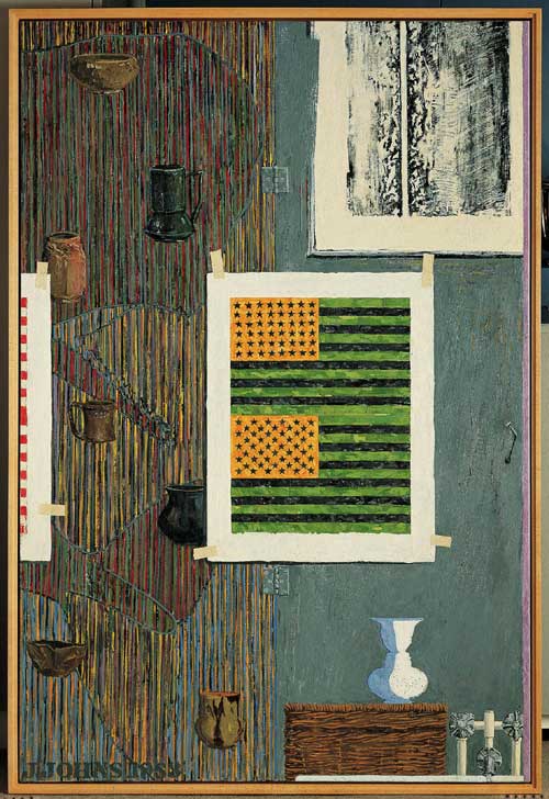
Jasper Johns, Ventriloquist, 1983, image via: MFAH
And now to the second oldest tab in my browser, an essay by Barbara Rose on Jasper Johns’ references to works by Barnett Newman, which accompanied an excellent 1999 show of Johns’s and Newman’s editions at Brooke Alexander Gallery.
From his earliest days in New York, Johns saw and collected Newman’s work, and Rose proposes an ongoing personal relationship between the artists that can be seen in Johns’s work, even from the very beginning:

In the paintings he exhibited at Betty Parsons [in 1951 and 1952], Newman accomplished a goal Pollock was also intent on resolving; he eliminated the distinction between figure and ground. Instead of separating one from the other, he proposed a format in which the image was identical with the field, with no background left over. No shapes were depicted, not even as flattened silhouettes. Rather the field was divided into regular zones. This is of course the format of the iconic Flag that Johns dreamed of and then painted for the first time in 1954. Because Johns’ image is both literal and identifiable, his medium is encaustic rather than oil, and he is more of an easel than a mural scale painter, the obvious debt of the horizontal bands of the flag, which line up to the horizontal framing edge as Newman’s “zips” line up to the vertical frame, has hardly been noticed.

In the 80s, Johns began inserting pictures within pictures, both of his own artworks and works he collected.
bnewman-untitled-1961-lithograph.jpg
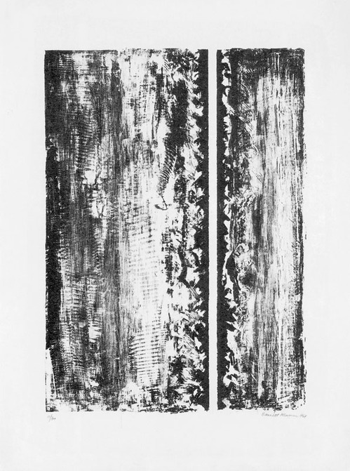
Barnett Newman, Untitled, 1961, image via baeditions
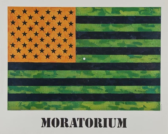
Rose discusses several examples of these autobiographical works, including Ventriloquist, top, which includes a mirrored/reverse image of Newman’s 1961 lithograph, Untitled, which Johns owns, and the artist’s own inverted double flag, a color combination Johns used for a 1969 fundraising edition/protest poster for the Committee Against the War in Vietnam. [The unsigned poster version, below, says “MORATORIUM” on the bottom; the signed, numbered edition does not. Maybe the customers for the more expensive version preferred their Johns Flags straight, so to speak, with less politics.]
jj_moratorium.jpg
Johns’ 1969 Flag (Moratorium) poster sold for just £300 last Spring
Anyway, two interesting things Rose doesn’t really get into much: the way Johns makes work about [and with] work he collects, not just work he admires. It’s something that would resurface later in his Catenary series, which seem to relate directly to an early Rauschenberg combine Johns owned, then sold, which has the shroud lines from a small parachute hanging off it. And the resonance this picture-in-picture construct has to Rauschenberg’s Short Circuit. I’ve always thought that Short Circuit was an outlier somehow for incorporating works by other artists; but it turns out that Johns himself eventually began doing something similar in his own paintings and prints.
Johns & Newman: An Encounter In Art, by Barbara Rose [baeditions]
Previously: Johns and Manet’s Execution of Maximilian

John Cage, Antonin Becvar, And Leonard Bernstein Walk Into A Bar

atlas_elipticalis_ta3sk.jpg
Plate from Antonin Becvar’s Atlas Elipticalis,1958, via ta3.sk
Welcome to the oldest tab in my browser: the Wikipedia page for the Czech astronomer Antonín Bečvář, who produced some extraordinary sky atlases which became indispensable astronomical reference tools around the world for decades.
Beginning with the Atlas Coeli in 1948, and then Atlas eclipticalis, 1950.0 (1958), Atlas borealis 1950.0 (1962), and Atlas australis 1950.0 (1964), Becvar and his team of students at the Skalnaté Pleso Observatory in Slovakia calculated, plotted, drew, and colored by hand every visible star in the sky over a certain magnitude, nearly 50,000 objects. The Sky Atlases were published in various editions, including large format, six-color printing with transparent overlays.
Harvard’s Sky Publishing Company acquired the international rights to Becvar’s atlases, and paid royalties, at Becvar’s request, in the form of astronomical photographic plates for his Observatory. I would imagine they are similar to the state-of-the-art emulsions developed by Kodak for the Palomar Observatory Sky Survey.
Which would all seem like plenty of hooks to get me interested, but there’s more. Because I learned of Becvar’s work while poking around the visual aesthetics, image, and artifacts of John Cage.
cage_atlas_eclipticalis_cello.jpg
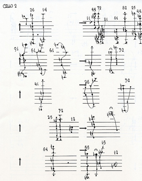
a page of the part for Cello II from Cage’s Atlas Elipticalis
Cage himself discovered the Sky Atlases in the observatory at Wesleyan, where he was teaching, and he used them to compose his first orchestral piece in 1961-2, Atlas Elipticalis. Cage overlaid the star charts with musical staves, and then used chance operations to determine pitch and to construct events [“constellations”] within each instrument’s part. Any number of the 86 parts can be played at any time, according to the conductor’s and performer’s discretion.

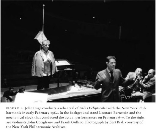
The piece debuted where it was commissioned, in Montreal in 1962, but it was the 1964 debut in New York that caught my attention. It was a shitshow, and Leonard Bernstein was at the center of it. Atlas Elipticalis was the first Cage composition performed by the NY Philharmonic. And the musicians–with Bernstein’s acquiescence, if not his collusion–basically sabotaged it, refusing to follow the score, or to take the instructions and parameters of the music seriously at all. They booed Cage along with the audience when he came out at the end of the piece. And Cage was apparently as angry as a Zen Buddhist could be.
cage_clock_nyphilharmonic.jpg
image via the cover of benjamin piekut’s book, experimentalism otherwise
At least part of the problem stemmed from Cage’s use of a clock to “conduct” the piece. Actually, a clock sculpture. Designed by Cage’s Stoney Point patron, the architect Paul Williams. In the chapter of his intricately researched historic snapshot of the NY Avant-Garde in 1964 titled, “When Orchestras Attack!”, Benjamin Piekut’s thorough reconstruction of the Atlas Elipticalis scandal includes a description of the workings of Williams’ clock, which marked the beginning, end, and the 2, 4, and 6 minute marks in the 8-minute performance with green, red, and white lights, respectively. The fate of this clock sculpture is at present unknown to me. But the hunt is on.
Becvar’s atlases [ta3.sk]
Antonin Becvar’s various Sky Atlases and catalogues on Amazon [amazon]