Wow, is it that time of Election Year already? When superblogger and apparently self-hating theater queen Andrew [Lloyd] Sullivan posts a WTF Obamafied version of a Les Mis anthem?
This time it’s “One Term More” which, Holy Cameron Mackintosh, people. Just go watch it this very instant. Don DeMesquita, ladies and gentlemen.
Because it even has “A Political Parody” right in the subtitle, I’m forced to wonder what, exactly, it’s a parody of. And then how do I really know it isn’t some kind of super-jiujitsu triangulating GOP countermeasure to psych out musical theater liberals? But no, the fair use disclaimer is so desperate, they must be real.
HOW COULD I HAVE EVER DOUBTED UPDATE: I forgot the couplet, “Emboldened by Star-Spangled myth,
We want a JEDI…NOT a SITH!!!”
Anyway, in 2008, it was “Les Misbarack,” UltimateImprov’s straight-up lipsynch of “One Day More,” set in the Obama National Campaign HQ on election eve.
Which Sullivan introduced on Sept. 12th, at 4:53 AM, with the comment, “Whatever happens, the McCain campaign could never pull this off. Patience, steel… triumph.”
To which I will only add, “Malgre tout, la Resistance demeure.” Or in this case, “So hat doch, la Resistance gesiegt!”
Category: scott sforza, wh producer
Running Presidential Fence

I’m really trying to get this writing thing done tonight, but I just have to point out that Richard Smith’s photo of the Secret Service’s six-mile perimeter fence at the RNC in Tampa is awesome. It’s like if Christo and Serra were cellmates and Cady Noland was their baton-wielding guard.
Fence Comes Down [narrativemag]
UPDATE:
Speaking of Running Fence, there are two historical markers in Marin County commemorating Christo & Jeanne-Claude’s 1976 project.


see full size images at the Wikipedia entry for Running Fence. Please.
This anniversary marker is located in the quarter-acre Watson School Historic Park in Bodega. An outdoor vitrine contains an installation photo by the artists onto which was added the following text:
Running Fence
September 10, 1976
On September 11, 2001,
the Board of Supervisors of the
County of Sonoma selected this
site to commemorate the contributions of
Christo and Jeanne-Claude.
Their vision,
dedication and
perserverance made
the Running Fence
possible. This art
project consisted of:
42 months of collaborative efforts with ranch property owner participation, 18 public hearings,
3 sessions at Superior Court, an environmental impact report and the temporary use of the hills, sky, and ocean.
Rising from the Pacific Ocean south of Bodega Bay the 19 foot high 24.5 moile long Running Fence ran west to east,
following the rolling hills of Marin and Sonoma counties to the Colati ridge. [Format and italics original.]
Watson School Park is currently listed as closed for renovation. It is not known whether the marker is affected.
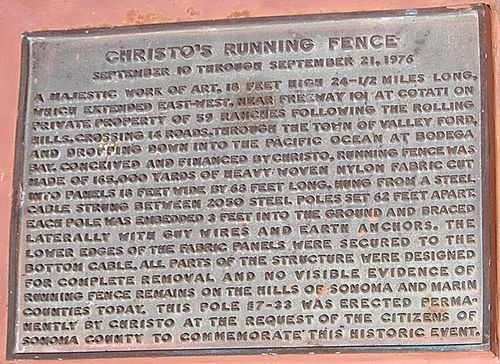
Meanwhile, in December 1976, the County Landmarks Commission in Sonoma designated Pole #7-33 as Historic Landmark #24, and installed a bronze plaque [above] that reads:
CHRISTO’S RUNNING FENCE
September 10 through September 21, 1976
A majestic work of art, 18 feet high 24-1/2 miles long, which extended east-west, near Freeway 101 at Cotati on private property of 59 ranches following the rolling hills, crossing 14 roads, through the town of Valley Ford, and dropping down into the Pacific Ocean at Bodega Bay. Conceived and financed by Christo, Running Fence was made of 165,000 yards of heavy woven nylon fabric cut into panels 18 feet wide by 68 feet long, hung from a steel cable strung between 2050 steel poles set 62 feet apart. Each pole was embedded 3 feet into the ground and braced laterally with guy wires and earth anchors. The lower edges of the fabric panels were secured to the bottom cable. All parts of the structure were designed for complete removal and novisible evidence of Running Fence remains on the hills of Sonoma and Marin Counties today. This pole #7-33 was erected permanently by Christo at the request of the citizens of Sonoma County to commemorate this historic event.
The County’s landmark information lists the site as “containing steel pool [sic] from original art installation.”
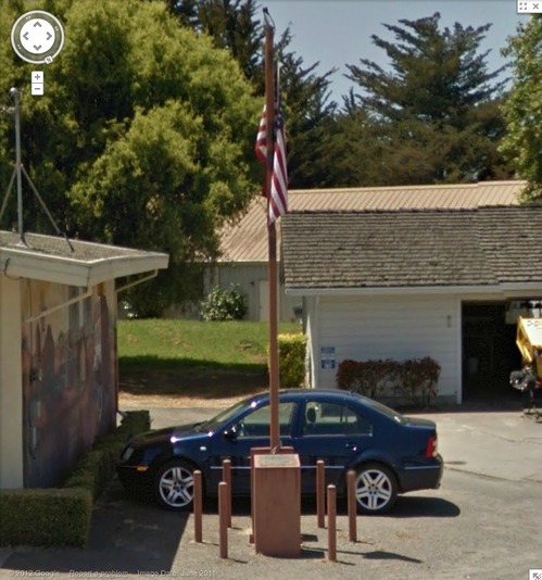
I believe this is it, next to the post office. Looks like it’s presently being used as a flagpole.
Oh, the Bodega bay Heritage Gallery has a photo of the fancier plaque on the other side of the pole. Also, Running Fence was acquired by the Smithsonian American Art Museum. Remembering Running Fence was on view in 2010.
If moving it away from that mural didn’t destroy its context, I would definitely replicate that, as is, stanchions, flag and all. Maybe a vinyl wallpaper photomural would work.
We Built It.

A photo I’ve been waiting to see from the RNC in Tampa, unidentified source via brian boucher
factchecking update: you know, I’m gonna go with: this debt clock photo is as true as this one.
Frank Lloyd Right, Or The Sforzian Hearth

Ooh, the party conventions are coming, Sforzian Fashion Week, and the NYTimes’ advance team is reporting on the GOP advance team whose once-every-four-years job is to make the Republican candidate for president come across as a man of the people on TV. Here’s Jeremy Peters:
The campaign aides are determined to overcome perceptions that Mr. Romney is stiff, aloof and distant. So they have built one of the most intricate set pieces ever designed for a convention — a $2.5 million Frank Lloyd Wright-inspired theatrical stage. From its dark-wood finish to the brightly glowing high-resolution screens in the rafters that look like skylights, every aspect of the stage has been designed to convey warmth, approachability and openness.
Yes. OK.
This time, Samantha Stark reports in the Times video, the stage is now fronted by open, non-hierarchical stairs reaching down into the crowd. Which, yeah no, ask McCain, Bush, and Dole about that convention convention.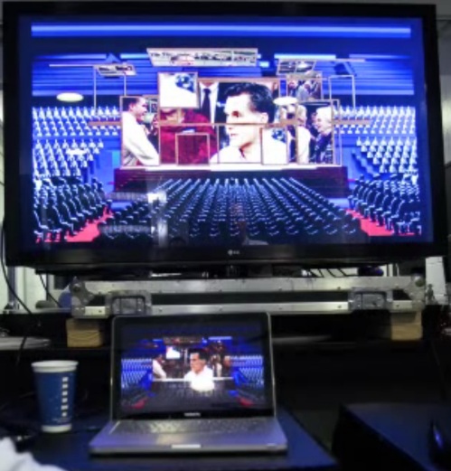
What is actually different is that the 13-screen video wall is now all asymmetrical and casual-like, with all the screens “framed in dark wood to give the feeling of looking into someone’s living room.”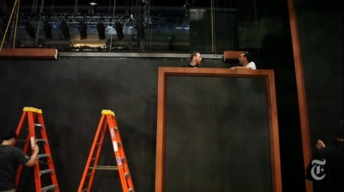
Why, it’s practically a Sforzian frame cluster, a slightly enlarged version of the one the Romneys have on the grand piano at Lake Winni.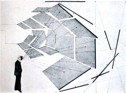
If you can see any FLW, please let me know, because all I can see in Edward Linsmier’s sexy still and video images is Herbert Bayer’s all-encompassing field of vision [above]. Maybe a Bauhaus reference is too heady [or foreign] for Romneyvolken to cop to. Or maybe they’re wary of acknowledging the importance of the fundamentally subjective viewing experience they’re trying to manipulate.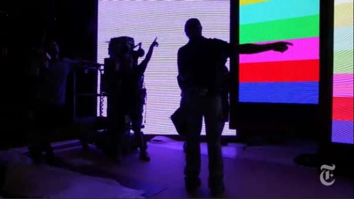
Except, oh wait, that’s the whole point of the show, the event, and the article: letting us know how it’ll be just you and me, America, TV-hangin’ living room to living room with our bestest, richest friends.
More than hang, though, Linsmier’s images of the set’s big, test-pattern-y bands of glowing color, stacked against each other like that, with silhouettes of roadies all around, make me want to paint. Crank out a whole $#)%ing frame cluster of to-scale paintings.
Stephen Prina meeting Olafur Eliasson at Liz Deschenes’ place, with a cameo by Jeremy Blake.
Romney Campaign works feverishly to project relaxed image [nyt]
The New Sforzian Aesthetic

This is awesome. Someone flew a banner over a Paul Ryan event in Lakewood, Colorado, carrying a @PaulRyanGosling-esque quote, “Hey Girl, Choose me, lose choice.” And though he didn’t know what it was, CNBC reporter @EamonJavers tweeted a photo of it.
We’re all Scott Sforzas now.
Banner Above Paul Ryan-Led Event: ‘Hey Girl, Choose Me, Lose Choice–P. Ryan’ [theatlantic via @alexismadrigal]
Sforzian Acoustics
One of Karl Rove’s objectives for his Sforzian backdrops was “to set up picture so that if the television sound is turned down, that it gets across what it is the President wants.”
With this new ad, “Firms,” [direct YouTube link, in case you’re seeing a freakin’ Swedish bike helmet fashion show up there instead, which, #iframewtf?], the Obama campaign has turned Rove’s formula on its head.
Sure, the sound-off visuals get the point across just fine: dolly shots of news stories of Romney’s outsourcing and, apparently, job-destroying history set into depopulated locales: closed factories, empty conference rooms, and abandoned parking lots–and then headlines about his Cayman Islands accounts are tucked into shots of isolated beaches.
But the only sound is Mitt Romney himself singing “America the Beautiful.” Which they’ve tweaked ever so slightly to match the ambient aural quality of each shot, giving the sense that Romney’s singing in each place. Even without the visuals, you get a visceral feel of Romney wandering alone across a desolate America, singing to himself.
As a filmmaker/reader at Talking Points Memo describes the effect,
[P]lacing Romney’s voice in the various locations builds the implication in the mind of the listener that Romney is present and witnessing it. It’s almost like he’s in America’s front office, singing into a PA microphone while the building rots. This highlights another feature of sound design: it’s a good way of giving people information in such a way that they don’t even know how they know it. You see the ad and there’s no cognitive speed bump to keep you from concluding that Romney was there in that empty factory, or there in the abandoned conference room, or there sipping Coronas on a beach in Grand Cayman.
Well, I know that’s the ad it most resembles, but he probably wouldn’t be sipping a Corona. But it’s a good point. And I think I may have a new ringtone.
New Aesthetic X Middle Earth
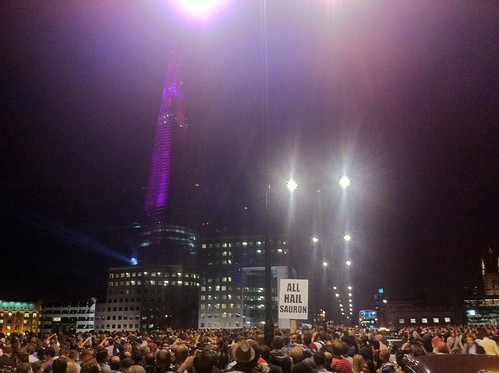
Nice hack. I didn’t realize James Bridle made the awesome ALL HAIL SAURON placard at the The Shard laser show; I just thought he spotted it.
Anyway, Phil Gyford thinks placards could become a platform, a way to integrate protest into the fabric of everyday life. It’d be fresher, he argues, and less invisible than bumper stickers or t-shirts.
And as much as I’d love to see Barack Obama get met in the Oval Office by someone wearing a Katharine Hamnett-style STOP THE WAR ON DRUGS or STOP FRACKING t-shirt, I think it only underscores the point that such deployments are still rely on a media to make or preserve their contextual power.
I don’t think that’s what Gyford’s suggesting, though; his placard-a-day proposal is speaking truth to power by everyone speaking truth to neighbors and people on the street.
Of course, imagine placards manage to catch on, and to survive the regulation and censorship that already befall t-shirt wearers and bumper sticker sporters, who’ve been kicked out of public [and privatized public] spaces and fired from their jobs and blurred out of reality TV shows. They’d get professionalized–in fact, they already are. The “it’s not a billboard; it’s a hapless guy with a sign!” free speech loophole is the advertising medium of choice for apartment complexes and suit outlets.
Or it used to be. Now it’s public performance art and a highly evolved sport. Last year San Diego-based Aarow Advertising held the 1st Annual World Sign Spinning Championships. The company’s founders, then 18-yo, say they invented signspinning in 2002 as a way to save themselves from what was “pretty much the worst job in the world,” standing on a busy corner holding a sign.
image via noel y.c.
As for the rest of us, how many people would communicate anything different than the message of whatever corporate brand tribe pushes their buttons correctly? Placards would become shopping bags with worse ergonomics.
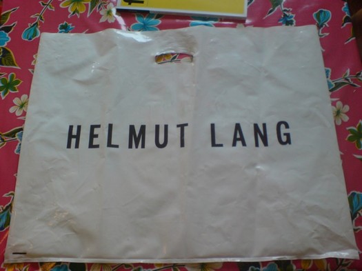
Which reminds me, I just found this OG Helmut Lang shopping bag in our storage unit. I would totally carry that into every Prada store in town. STOP PATRIZIO BERTELLI.
Placads for everyday life [gyford via dan phiffer’s twitter]
Sforzian Off Into The Sunset
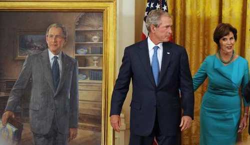
The first thing I noticed about George W. Bush’s official White House portrait unveiled yesterday was the way he stared off into space. Also in the painting. And the next thing was the painting-in-painting right over his shoulder. It was a western-style painting of men on horseback charging up a hill, and all I remembered about it was that it was Bush’s favorite painting, and that’s why he had it right next to him in the Oval Office.
Well, Christopher Knight has the almost too good to be true story of the painting, which was originally uncoverd by Jacob Weisberg in 2008. The work was commissioned from Wilhelm Heinrich Detlev Koerner in 1916 by the Saturday Evening Post, and it was apparently used to illustrate several entirely different stories over the years before finally acquiring the religious associations Bush fell in love with it for.
Knight goes into exquisite detail on them, but my favorite caption has to be from the painting’s 1917 appearance, “Bandits Move About from Town to Town, Pillaging Whatever They Can Find.” Bush said the posse reminded him of the people who served in his administrations, which, well.
[And if you’re wondering, yes, having Chinese Paint Mill make one is the obvious thing to do, and hell no, I’m still not going to make a near-lifesized portrait of George W. Bush.]
George W. Bush’s unusually frank portrait [latimes, image: Olivier Douliery, MCT via LAT]
Trump, Sforza. Sforza, Trump.

Here is Mitt Romney deplaning in Las Vegas, where he met with Gingrich’s bank, and where reality [sic] TV personality Donald Trump is hosting a fundraiser for him.
Suffice it to say, Romney is either actually courting the Trump Birther Faction, or his campaign has yet to master the stagecrafting subtleties of Sforzian backdrops. Either way, it’s win-win for the wire service photographers. [AP via tpm]
Painting Truth To Power

Ooh, that is interesting. By covering themselves in paint, members of Occupy Frankfurt effectively inverted the crowd control technique where police use dye cannons to disperse protesters–and to tag them for easier identification and roundup later. Nice to see that painting’s only detained, not dead. I wonder if this kind of painting project happens every May?

Police spraying protesters in Kampala, Uganda, May 10, 2011 [image james akena/reuters via cfr.org]
Occupy Frankfurt protestor and German riot police photographed by Kai Pfaffenbach for Reuters [via boingboing]
Previously: May 16th: Police Action Painting
North Korea Shows Its Big Board

The Japanese blog Itai [Painful] News has a nice photo roundup showing how North Korea’s missile rocket control room compares to those of other spacefaring countries. I think it’s safe to say that Japan is cowering in fear at North Korea’s state-of-the-art powerstrip technology.
痛いニュース | 北朝鮮、発射施設公開 コントロールルームがひどすぎると話題に/ On The Subject of North Korea’s Ridiculous Launch Control Room [dqnplus via @camcavers]
Robert Montgomery: Spectacular Vernacular
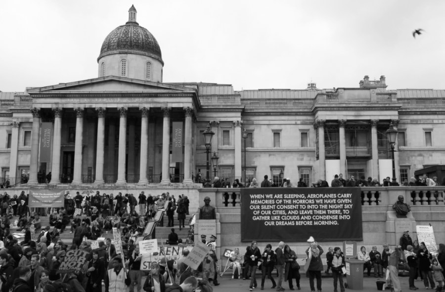
I’ve got a few reservations, but I’m really quite smitten with London-based Scottish artist Robert Montgomery’s poetically critical billboard artworks.
The one above was unfurled at a Stop The War protest in Trafalgar Square last October. It reads:
WHEN WE ARE SLEEPING, AEROPLANES CARRY
MEMORIES OF THE HORRORS WE HAVE GIVEN
OUR SILENT CONSENT TO INTO THE NIGHT SKY
OF OUR CITIES, AND LEAVE THEM THERE, TO
GATHER LIKE CLOUDS AND CONDENSE INTO
OUR DREAMS BEFORE MORNING.
If the stark white-on-black text and the clouds and the protest didn’t already remind me of Felix Gonzalez-Torres, this particular photo, which ran on Purple’s blog, even has a bird in flight in the upper right corner.
Montgomery’s standard M.O. is to paste his billboards guerrilla-style, without permission, on top of existing advertisements. But for
an exhibition last month at KK Outlet, the gallery got authorization to install a series of three billboards with something of an Occupy theme. [Occupy had been occupying nearby at Shoreditch, and the artist had a collaborative project planned, but, as he told the Independent, “they got turfed out on 25 January so that didn’t happen.”]
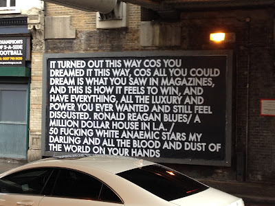
The deployment of poetry as protest takes its cue, Montgomery readily acknowledges, from the Situationists and Guy Debord, which, baby and bathwater and all, I will accept. My ambivalence, such as it is, really has more to do with Montgomery’s apparent activism on the fashionista front, his day jobs at Dazed and Confused, his carousing with Olivier Zahm, even the galleries that tout their Occupy shows one month, and their design studios working for LVMH the next.
But who’s to complain, seeing as how I followed the linkstream to his work while surfing for extraordinary calf leather shoes myself?
Let he who is without consumerist sin throw the first stone. Is being the global street fashion industrial complex’s social conscience is any more damning than being the art world’s anything?
Montgomery’s disarming, enticing, depressing, enlightening poems are still there, still catching advertising-conditioned passersby, only to release them with an unsettling thought in their heads.
Givin’ me 500 Errors right now, though: Robert Montgomery portfolio site [robertmontgomery.org]
It turned out this way cos you dreamed it this way [kkoutlet.com]
Robert Montgomery opening and installation shots via KK Outlet’s flickr [flickr]
The artist vandalising advertising with poetry [independent.co.uk]
R-Money, R-Problems

R-M-O Oh my heck! N-E-Y
This awesomely remixed version of this AP photo [by Gerald Herbert, below] from a campaign event in Elko, Nevada last Friday makes me marvel at the many lost opportunities for Sforzian hacks in the past.

I mean, why should wire service photographers have all the fun? But then I read all the way through the Democratic Underground forum thread where the Photoshopped version first appeared, and where dozens of armchair politicos oneupped each other with their media acumen:
Mark D.
63. Romney is an anagram for R Money
As this photo made me realize that.
Tweet what I’d said-go viral with it.
JI7
43. a quick or even long Glance still looks like “money”
if i was adivising them and saw this i would have recommended against it.
illinoismike
59. Something else
What bothers me more about this picture is that all the participants are male and white. That doesn’t seem to bother Mitt at all!
silverweb
3. Is that real?
Ohhhh, please-please-please-please let it be real so we can bury him with it!!!
MrScorpio
74. R. Money, Mitt’s new rap name. nt
SemperEadem
19. :: very slow golf clap ::
you couldn’t make this shit up.
“r” “money” our money… yep.. can’t make this shit up.
[barrage of slow clap animated gifs deleted]
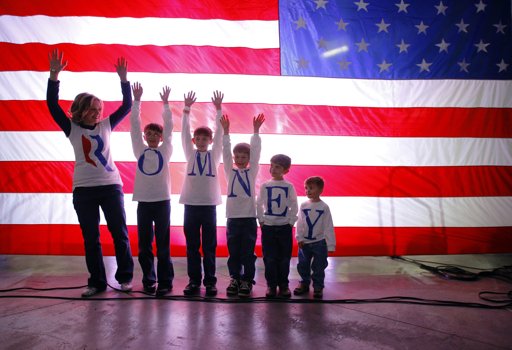
And then while trying to find the source info for the original photo, I came across Bryan Snyder’s shot for Reuters of the Fisher family waiting to meet The Man behind the curtain, and doing the wave or something.

And then there was another shot, by another AP photographer, Ted Warren, of the Fishers meeting Romney again. Or for the first time. This is from the front of the flag, where the Fishers had been waiting from the get go–and photographing themselves. And being photographed by Warren in turn.
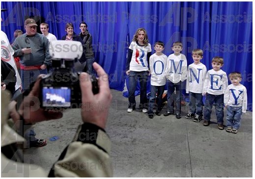
And so somewhere in between these photos, after the event, Mitt put his bomber jacket on, the Fishers got invited backstage, and they got a private [sic] photo-op.

Y? Because we like you!
And then Snyder–and Proud Mom–both snapped a photo of Romney autographing the shirt of the most disinterested little Fisher of them all. Actually, look at “E”; his shirt’s signed, too.
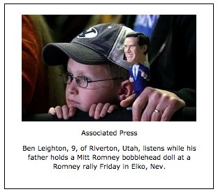
And then there’s the kid whose dad–given the BYU hat, I’m gonna guess he’s a supporter–drove two hours to the event with a Romney bobblehead [above]. And the shot of Mitt reflected in a thickset supporter’s aviator glasses, and the soft focus cowboy hats in the foreground signalling The West.

via apimages.com
And I realized all these images exist on a hacking continuum between real and faked, homebrewed and happenstance. Whether it’s the inkjetting family, the pack of weary photojournalists, the local handlers, or the messageboard trolls, people are just trying to do the best with what they’re given. Given all the stars that have to align, and all the fingers in the pie, I guess we should be lucky to get any shots at all.
Pic of the moment [democraticunderground.com via @akaczynski]
Everything else from AP & Reuters via Yahoo News.
How Firm A Foundation
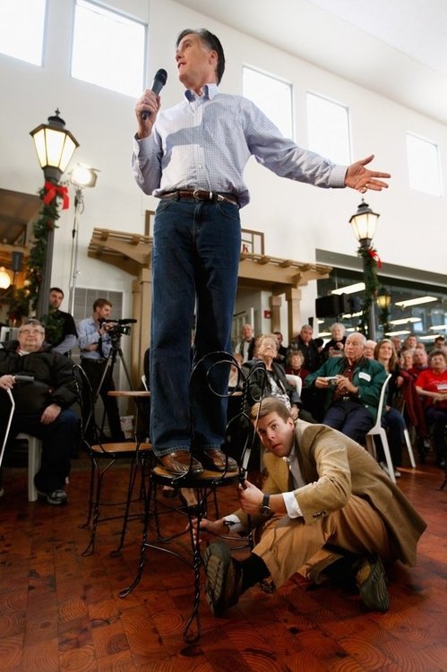
See, this is the kind of frugal Sforzian stagecraft that Mitt Romney learned from his Mormon pioneer ancestors: just use the replica sets from The Music Man and con a local into holding your chair!
There’s no trouble in Mason City with the end cut flooring, though; I’d totally vote for that.
Campaign Photo of the Day [MSNBC’s @JamilSmith via Yahoo News’s @Chris_Moody via NYT’s @nickconfessore [yahoo]
“You’ll feel as if you’d rented a video of the movie.” [themusicmansquare.org]
Son Of Strelka, Son Of God, By Dan Warren
While I was painting today, I first listened to a slightly underwhelming Q&A from MIT with Otto Piene and Hans Haacke, which was short, and so my iTunes started shuffling, which never happens. I don’t really listen to music, so iTunes ends up being a repository of things I wanted at one point–but then pretty much didn’t listen to. Like the audiobook version of Barack Obama’s Dreams of My Father, 2-3 min. segments of which would turn up at random every few tracks.
Which reminds me, kind of hilariously, of what, for me, is one of the most remarkable artistic achievements of the year, the awesomeness of which may actually push me to make a best-of list, which I don’t like to do, just so I can put it where it belongs, near the top.
I’m talking, of course, about Dan Warren’s remix masterpiece, Son of Strelka, Son of God, a surreal, mythological epic about a dog-headed demigod who destroys, and then recreates, the world, which Warren created by stringing together 3-10 second snippets from Obama’s recording. Here’s the synopsis:
Our hero’s name is Stanley, but he doesn’t really show up until Chapter 3. Stanley’s father is the first proto-man, who fell as a fruit from the first tree. He found the world an empty and desolate place, so he climbed to the top of the tree and began creating animals and plants and whatnot just by speaking their names. He gets really excited about the process, and accidentally creates a monkey in thin air, which promptly plummets to his death. He realizes that he needs to be a little more thoughtful about this process, and finishes by creating many of the beautiful things in the world. Then he disappears.
The first of the story’s nine chapters was animated by Ainsley Seago; the whole thing is pulled together nicely by Atlanta DJ EBA’s soundtrack. The whole project’s just extraordinary and feels like the future.
Son of Strelka, Son of God audio odyssey, links + a synopsis [sonofstrelka.com]
download Son of Strelka, Son of God for free from Warren’s site [dannwarren.net]

