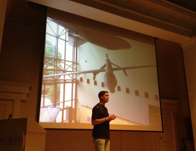
James Bridle of the New Aesthetic and Dronestagram Bridles opened a show at the Corcoran this evening, and I attended. It was the first time James and I have met in person, after several years of blogging at each other.
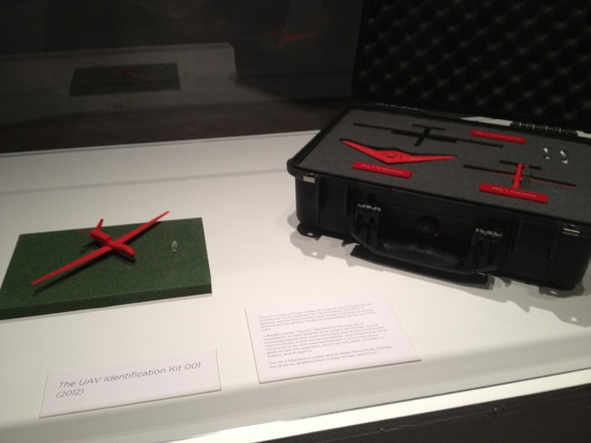
The show itself is small and drone-centric, containing a grid of Dronestagram images and Google Map dronespottings, but also video, a 10-volume printed excerpt of a UAV-related webcrawling database project in development, and Bridle’s classic drone identification kit [below].
The most stunning and disturbing image in the show is a realization Bridle made of the “Light of God,” a nightvision goggle-eye view of a targetting laser descending from the heavens. It’s based on a drone pilot’s commentary in an Omer Fast video, and it’s gorgeous, eerie, and chilling as hell.
During his talk in the adjacent auditorium, Bridle began by mentioning how he is compelled to make physical the things he studies. His most powerful piece, the life-sized outline of a drone drawn on the ground, is an excellent example of this.
In answer to one of the last questions, about materialist formalist dialectic, Bridle noted how he often found himself making an object of something from the network, in order to photograph it and reinsert it into the network. The Corcoran show feels like this: a physical instantiation of digital content.
The idea for the show, or particularly, for Bridle to be the go-to guy for such a show, more than just The New Aesthetic Guy, but certainly that, came from the Corcoran’s IT department, said the curator who introduced the evening. I will choose to take this as evidence of the Corcoran’s cross-disciplinary innovation and flat organization, not as a sign of a vacuum at the top of the institution. Anyway, the whole affair seems closely linked to the school side of the Corcoran, i.e., the still-functional side. The crowd was crowded, and felt student-heavy.
Anyway, James Bridle. Bridle noted that we in Washington are lucky to have a real Predator drone in our midst, right there at Air & Space Museum. It is exceedingly rare, he said, and he would know, to be able to be in the presence of an actual drone. They’re either largely invisible, or they’re bearing down on your village. And there’s one hanging on the Mall.
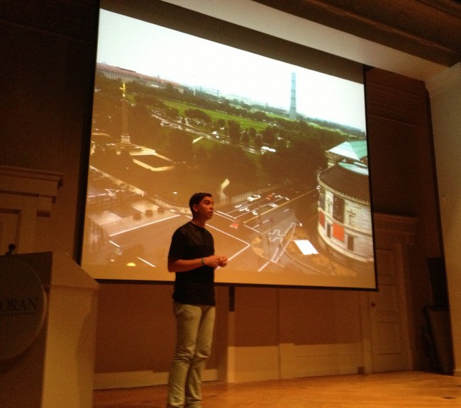
And now there is the shadow of one, the outline of one, really on the sculpture pad of the Corcoran. That’s how it’s described, as being sited on the sculpture pad. Obviously, it doesn’t begin to fit on the sculpture pad. It’s painted on the pad, the rocks, the curb and sidewalk, with white paint of some no doubt temporary kind.
It is much bigger than you might imagine, which is exactly the point. That, and imagining it being overhead and casting a shadow on the ground, the thing a Pakistani wedding party might see right before the missile hits.
Bridle noted as to how not many people will get to see this privileged view from above. I would note that White House staff in the Eisenhower Old Executive Office Building will get to see it every day, and that right there is quite something.
But he’s right, and it underscores his point, that the drone outline reads quite differently from the ground. It’s not Nazca Lines different, but that’s the sense of it.
I asked James later how he’d decided which way to point the drone. There was really only one good way to fit it, he said, and also, he knew he didn’t want to aim it at the White House. Which is understandable. When he installed his first drone drawing in Istanbul, Bridle similarly made sure not to aim the drone at Mecca. In consciously not aiming at the White House, Bridle’s drone ends up feeling like it’s coming directly from the White House. Which probably intensifies its critical position a bit. It worked for me, at least.
In between these moments was a cogent, timely, and depressing talk about technology as a tool of control and a reflection of the political and social systems that foster and use it. If it was recorded or streamed, I will try to find a link.
Meanwhile, as I walked around the drone on my way home, I did think of one piece missing. Not to tell James how to do his job or anything. But it occurs to me that the sound of drones is distinctive and terrifying. Perhaps a sound element to recreate the perpetual presence of drones in the vicinity of the Corcoran, would provide a visceral experience. Who knows, it might even wake the neighbors.
Indeed: Corcoran College of Art & Design: Quiet Disposition by James Bridle, through July 7, 2013 [corcoran.edu]
Category: scott sforza, wh producer
Booya
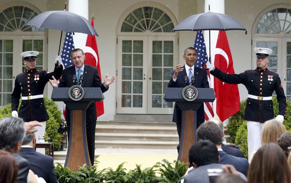
As soon as I saw these images of Marines called in to hold umbrellas over Presidents Obama and Erdogan yesterday, I laughed imagining how the Booya! diaspora of military fanbois from the previous administration would take it.
And right on cue, they declared a scandal, because male Marines do not hold umbrellas. Which, honestly.
This round goes to Obama on points. [images uncredited somehow on booyahoo! it’s like the first step of their tumblr acquisition is to stop crediting image sources]
Chinese Transcendentalism
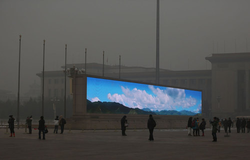
Photojournalist Feng Li has some truly epic images of Tienanmen Square in the recent post on Beijing pollution at In Focus. Like the giant video wall above, which feels like a cross between Blade Runner and Happy Together.
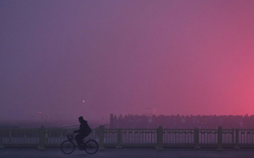
And this extraordinary image of a flag-raising ceremony just out of frame, which sure? Whatever you need to say in order to get that amazing gradient.
If Frederic Edwin Church were alive today, he’d be wearing a panda mask and painting in Beijing.
China’s Toxic Sky [see fullsize images by Feng Li/Getty at The Atlantic]
Previously, related: Kodak Colorama
Supreme Sforza
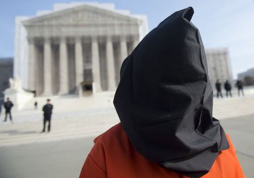
image: protestor in front of the US Supreme Court on Jan. 8, 2013, the 11th anniversary of the opening of the Guantanamo prison. by Saul Loeb for AFP/Getty
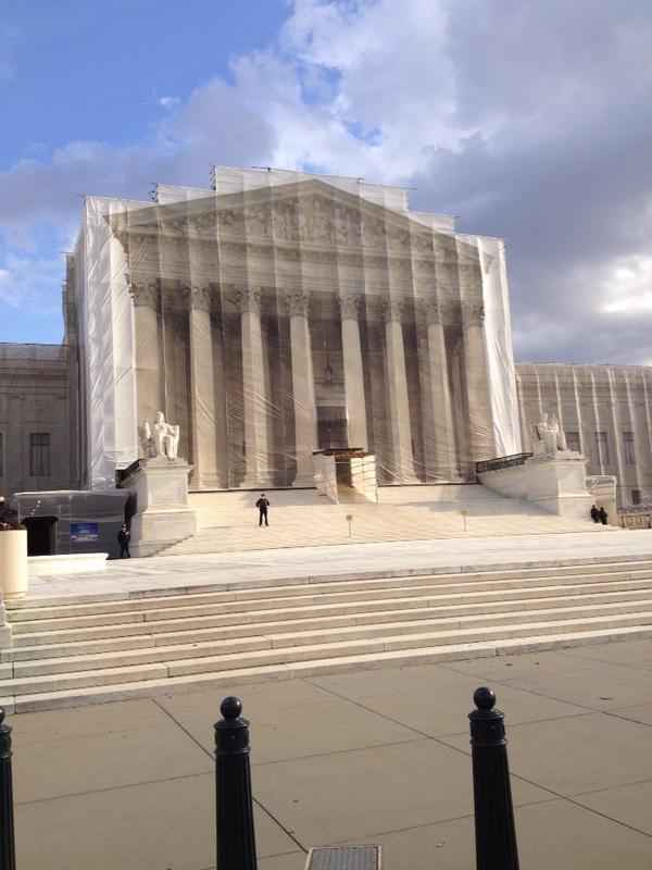
I’ve been meaning for a couple of weeks now to post a photo of the extraordinary construction scrim on the front of the US Supreme Court, which has a full-scale photo reproduction of the actual building. Here we go, since this tweet:
This is art RT @wayneandwax: whoa RT @matthewstoller: The Supreme Court is covered with a Supreme Court themed tarp.
— John Pyper (@johnpyper) December 19, 2012
I had no idea. So I looked it up. And was troubled by the fact that I had no idea it had been in place since last May. During the 21-month west facade stone restoration project, “The scaffolding and ongoing conservation work will be concealed by a scrim that will mimic the Court’s architecture.”
The Supreme Court building was designed by Cass Gilbert with John Rockart, and completed only in 1935. From its overall classical Greek temple design to the sculptures on the facades to the smallest ornamentations of the bronze flagpoles and handrails, is highly symbolic. As Chief Justice Charles Evans Hughes said at the laying of the cornerstone in 1932, its very creation and existence are symbolic:
The Republic endures and this is the symbol of its faith…the national ideal of justice in the highest sphere of activity.
So it is entirely appropriate, then, to take a symbolic view of the scrim as well, and its illusionistic simulation of Equal Justice Under Law. As symbolic curtains go, it’s the most inadvertently damning drapery since Colin Powell covered up the UN Security Council’s Guernica tapestry in 2003.
The anniversary of Guantanamo coincided with the unreleased ruling in the hearing on Pvt. Bradley Manning’s illegal and abusive detention without charge. The cancer of vengeance and torture that the US government first directed only toward foreign others has spread to its treatment of our country’s citizens.
And so the thing that gets me about Saul Loeb’s photo above is not the hooded Abu Ghraib/GTMO/Fort Meade protestor, or the Court’s photogenic tarp, but the police officers spread long the steps between them.
Interesting, related, and surprisingly full of scare quotes for a 2009 show: Ben Street’s review of Goshka Macuga’s Whitechapel installation about Guernica, which included the UN tapestry.
Study For A Fence And A Wall (2006)
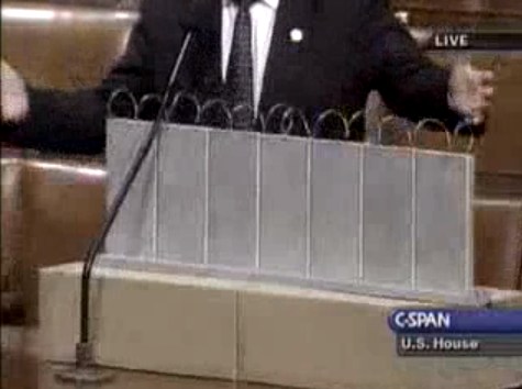
On July 11, 2006, on the floor of the US House of Representatives, Congressman Steve King, Republican from Iowa, presented a model of “a fence and a wall” he had designed. It was a site-specific proposal, to be located on the US-Mexico border.
The fence/wall could be built, Mr. King explained, using a slipform machine to lay a concrete foundation in a 5-foot deep trench cut into the desert floor, a gesture that immediately brings to mind the Earth Art interventions of Michael Heizer. Pre-cast concrete panels, Post-minimalist readymades 10 feet wide and 13 feet high, could be dropped in with a crane.
“Our little construction company,” Mr. King said, referring to the King Construction Company, which he founded, and which was then being run by his son, “could build a mile a day of this, once you got the system going.”
Mr. King demonstrated the construction of the wall using his tabletop model, made of cardboard boxes, silver-painted wood slats, and a couple of feet of coiled wire [representing the wall’s crown of concertina wire, which would be electrified “with the kind of current that would not kill somebody…we do that with livestock all the time.”]
It’s true that the remarkable simplicity of the design and the economy of the materials resonate the work of Richard Tuttle. But in the scale and especially the form, King seems to be making a conscious reference to the early work of Anne Truitt.
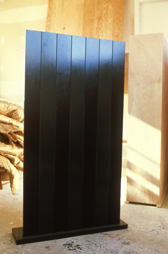
Seven, 1962, image: annetruitt.org
Obviously, at some point after his arrival in Washington in 2003, King studied the iconic Truitts in local collections: the highly fence-like First (1961) [at the Baltimore Museum] and slab-on-plinth structures like Insurrection (1962) [at the Corcoran]. But even I was surprised to see King make such an explicit homage to Truitt’s Seven (1962) [above, collection of the artist’s estate].
Much like Christo and Jeanne-Claude, King conceived of his site-specific fence/wall to be temporary, at least conceptually:
You could take it back down. If somehow they got their economy working and got their laws working in Mexico we could pull this back out just as easy as we could put it in. We could open it up again or we could open it up and let livestock run through there, whatever we choose.
Whatever we choose. Thus the fence/wall becomes a symbol of American freedom.
According to the Congressional Record, Mr. King, appearing as an expert witness, exhibited his Study For A Fence And A Wall again a week later, in a joint hearing of the House Committees of Homeland Security and Government Reform.
The current whereabouts of King’s model is not immediately clear, but I guess I could call about it. Meanwhile, I would love to see this work realized at full scale, if only temporarily, where it was conceived: right here in Washington DC. Perhaps in the National Gallery’s sculpture garden, or along one of the sketchier sections of Pennsylvania Avenue, where dangerous elements threaten Our Freedoms.
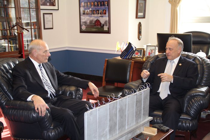
January 2017 inevitable update: Oh how we did not need to worry that this work might not have survived. On Jan. 13 Congressman King tweeted out a photo with it, and the new appointee for DHS. Study was installed on his coffee table in his office. It will be noted that it has a new base, set in unpainted wood feet, presumably a pair. The articulation of the wall at the ground and the underground footing are now fully visible. The box representing the desert floor, and the notch, where “you put a trench in the desert floor.” are not seen. What was once site-specific is now available for installation anywhere, I guess. Though it’s really tough to say at the moment.
‘Whites, Lancaster, Oh, US’

I realize that if I don’t mention these now, I never will. Because by this time tomorrow–or the next day–all will be right with the world again. Mitt Romney will have an abundance of time on his hands, and, most importantly, as The Awl’s annotators so ably note, White House photographer Pete Souza’s long nightmare will be over.
Here are some rather amazing photos, almost two weeks old now, yet among the most recent to be posted to Mitt Romney’s flickr stream, which is apparently the red-headed stepchild Log Cabin Republican to Instagram’s Tea Party.
They’re from a rally in, seriously, “Whites, Lancaster, OH, US,” which simultaneously creates and conquers the mashup genre of photo-geotag-as-poetry-and-political-commentary.
Cox and Linkins are right to marvel at the WTFlighting because, holy smokes, the rally is being held at what cinematographers call “the hour before Magic Hour, where everything is drenched in either horrible raking light, shadows, or lens flares.”
This is the stagecraft operation that seeks to inherit the mantle of Scott Sforza, the architect of the Mission Accomplished banner on the deck of the USS Abraham Lincoln, which aircraft carrier he turned to catch the real Magic Hour.”
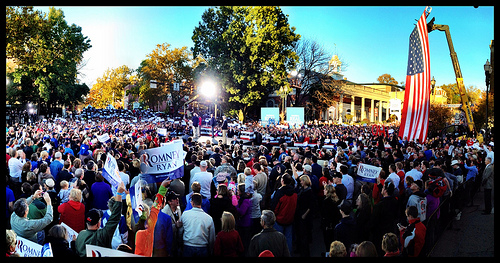
With the setting sun lighting up a few buildings behind/around them, the Romney campaign fired up their rally stage, set in the middle of the intersection of Broad and Main in Lancaster, with two giant floodlights. Which also hit the crowd. No need to estimate how many people attended–you can count every one of them. They seem to fill around half the planned space, with the oldest of the old making sure the distant bleachers don’t go to waste.
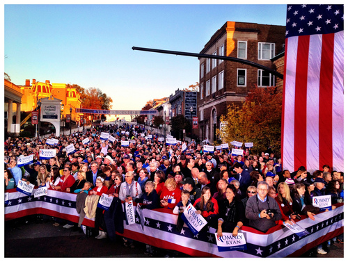
Here is my favorite glare, a photo I call “Idle-Class Tax Relief”:

I assume it’s a wide-angle lens or whatever, but it’s fascinating to me how disorienting the perspective is on these photos. The size of peoples’ heads. The indeterminate scale of that flag and those letters behind. And all uniformly in/slightly out of focus. Just so wild. It’ll be good to be done with it.
‘You Need A Donation To Get In Line’

image: Brian Snyder/Reuters via Buzzfeed
Mitt Romney’s campaign had already printed the “Victory Rally” press passes when they hastily decided to turn an Ohio stump speech into a “storm relief event” yesterday. So Romney could be photographed receiving canned food and other supplies donated by his supporters. Which would be loaded onto a waiting Penske truck and, presumably, driven to New Jersey or wherever.
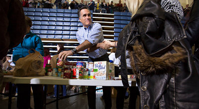
image of Mitt getting crosswise via Jonathan Crowley/NYT
As Buzzfeed reports, though,
the last-minute nature of the call for donations left some in the campaign concerned that they would end up with an empty truck. So the night before the event, campaign aides went to a local Wal Mart and spent $5,000 on granola bars, canned food, and diapers to put on display while they waited for donations to come in.
Those prop supplies came in handy when supporters who didn’t have something to ‘donate’ still lined up, wanting to meet their man; a campaign staffer. “Just grab something,” they were told. And they did.
I would love to find photos of the same case of Gatorade being re-donated several times.
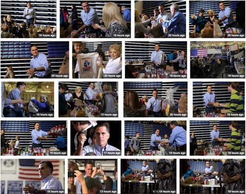
But it sounds like Mitt only actually worked the line for 30 minutes, so the campaign’s Walmart stash probably held up. And I guess it’s not important at what kind of shelter Mitt’s Penske truckload of storm relief props ends up, as long as Paul Ryan is on hand to restack them.
The Making of Romney’s Storm Relief Event [buzzfeed]
Sforzian Pano
Oh, Romney, Romney, Romney.

This Romney staffer’s Instragrammed collage of a Las Vegas rally has been making the rounds because, holy smokes, people, everyone knows that the Republican tent is not that big, and anyway, right now it only has one pole: just cold say and do whatever the )$#( it takes to beat the black guy.
Which, even so, should put such a baldly distorted, manipulated image on the far side of WTF. So far, in fact, that it makes me think it really has to be attributed not, for once, to their propagandistic lying, but to a glitch from an auto-pano-stitching algorithm.
I tried to find the link again, but I’ve seen the iPhone 5’s new panorama function occasionally erases moving cars. Do any non-partisan panorama people recognize this as typical of a particular app, or smartphone?
Previously and definitely related, and wow, really? “Whatever It Takes?” on 10/28/2004? Sforza now spelled with a CTRL-V
Homeless Hotspot

From the Washington Post report, “Charity president unhappy about Paul Ryan soup kitchen ‘photo op'”:
He added: “The photo-op they did wasn’t even accurate. He did nothing. He just came in here to get his picture taken at the dining hall.”
Ryan had stopped by the soup kitchen for about 15 minutes on his way to the airport after his Saturday morning town hall in Youngstown. By the time he arrived, the food had already been served, the patrons had left, and the hall had been cleaned.
Upon entering the soup kitchen, Ryan, his wife and three young children greeted and thanked several volunteers, then donned white aprons and offered to clean some dishes. Photographers snapped photos and TV cameras shot footage of Ryan and his family washing pots and pans that did not appear to be dirty.
Verily he hath his reward.
Merkel Jacket Matching System
The “The Girls Of Berlusconi” collection makes it rather NSFW, but The Spectacle of The Tragedy, Dutch designer Noortje van Eekelen‘s “visual database of the European Show and its Leading Actors is pretty amazing.
Don’t you worry none about that link above, though, because it overlays this epic Pantone Matching System-style spectrum of Angela Merkel blazers over everything, no problem.
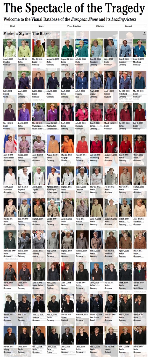
It’s almost enough to make me want to make a 100-piece monochrome painting set, with the color for each piece derived from each of van Eekelen’s appropriated news photos. Or maybe it’s enough to eliminate doubling, and just do each discernible color.
Or maybe it’s a screenprint portfolio, a politicized, EU-trainwreck-inspired riff on the inspiring Kayrock Color System, which I nabbed from the NY Artist Book Fair a couple of weeks ago. A beautiful work.
The Spectacle of The Tragedy [thespectacleofthetragedy.eu via guardian, thanks peteykins]
Noortje Van Eekelen portfolio site [noortjevaneekelen.nl]
Kayrock Screenprinting [kayrockscreenprinting]
Sforzian Trophy
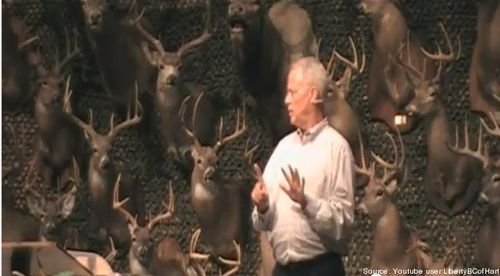
Rep. Paul Broun, a physician, with an MD, and a BS in Chemistry, who is a Republican member of the House Science Committee, was speaking at the Liberty Baptist Church Sportsman’s Banquet in September when he called out evolution and the Big Bang as “lies straight from the pit of Hell,” and revealed there was a global atheist/science conspiracy to cover up the true age of the–I’m sorry, did you say something? Because I can’t stop staring at the most amazing Sforzian backdrop in the entire 9,000-year history of planet Earth.
Rep. Paul Broun (R-GA): Evolution, Big Bang ‘Lies Straight From The Pit Of Hell’ [tpm]
Crusoe Umbrella X Satellite
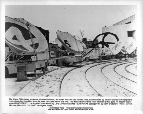
On the eve of the first presidential debate, I gank this photo, taken in March 1988:
The Claes Oldenburg sculpture, Crusoe Umbrella, on Nollen Plaza in Des Moines, Iowa, is surrounded by satellite dishes and equipment trucks beaming live video from the Iowa caucuses earlier this year. The demand for satellite video technology has gone far beyond television. (MUST CREDIT: Los Angeles Times Photo by Larry Davis)
You can buy this photo, in fact, for like $28. [ebay]
Gosh And Golly, Those Aren’t Swear Words
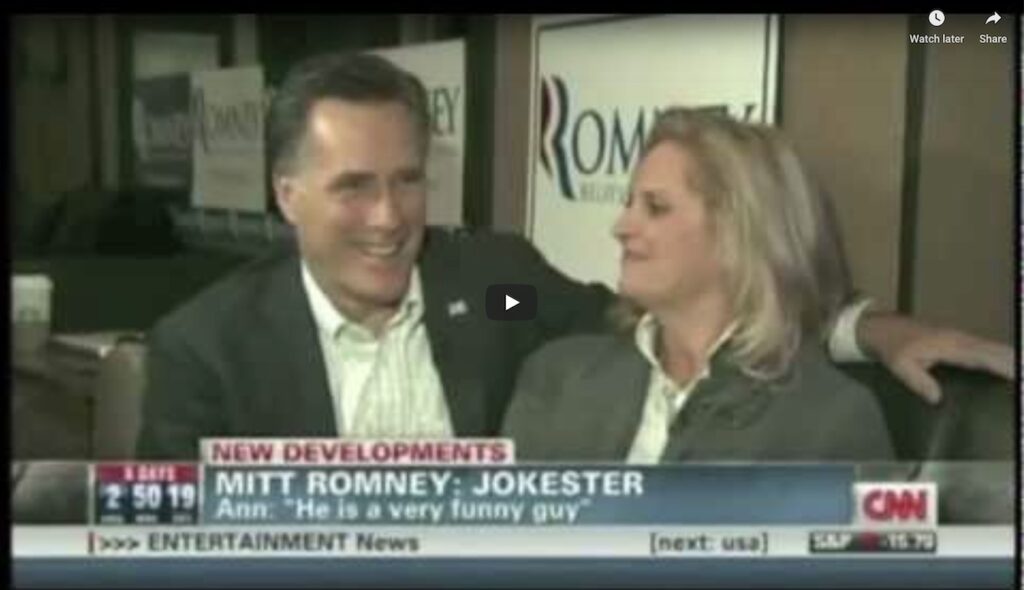
Three words: Oh my heck. [dissociativepress.com via @petcobra]
Malcolm X, Black Muslim, Sforzian
Maurice Berger has a fascinating post on the NY Times Lens blog about Malcolm X’s sophisticated use of the media, particularly photography, and particularly the antagonistic white/mainstream media, to reach out to potential black constituents.
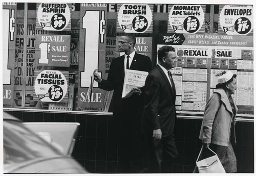
Exhibit 1–actually and unfortunately, it’s the only photo in the post–is Robert Flora’s 1963 photo for UPI, the caption for which:
Malcolm X, the nation’s number two black Muslim leader, reads a story about the Muslims in a national magazine as he sits in court with other Muslims awaiting verdict of an all-white jury deliberating the face of 14 Muslims accused of criminal assault against Los Angeles police officers.
manages to mention Muslims four times in once sentence. Impressive.
As Berger notes,
The men in the picture are focused on articles about the Nation of Islam. The Life magazine story that engrosses Malcolm, for example, was typical of the derisive coverage of the Black Muslims in the mainstream press: “The White Devil’s Day Is Almost Over: Black Muslim’s Cry Grows Louder,” screams its headline.
It only proves Berger’s astute point to point it out, but Malcolm X is anything but engrossed; he’s holding the magazine up for the photographer. Even if he were able to read at that angle–he seems to actually be looking at the paper in the hands of the man to his left–a quick search of the actual LIFE Magazine article shows there is nothing to read. The other half of the spread is a full-page shot of Elijah Muhammad, by Gordon Parks. [The cover line for the feature reads, “A Negro Photographer Shoots From The Inside – THE BLACK MUSLIMS.”]
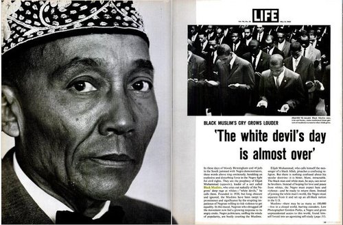
Which, it turns out the man to Malcolm’s right is also reading. Berger doesn’t mention the headline on the paper the guy behind is very much not reading: “Seven Unarmed Negroes Shot in Cold Blood by Los Angeles Police.”
Which turns out to be Muhammad Speaks, the NOI’s newspaper. The first Google result for it appears, perfectly, in Gordon Parks’ LIFE feature. Parks was following Malcolm at the trial. Which only underscores the newspaper’s–and eventually, the magazine’s–function as a prop, intended not [necessarily, nor not solely] for the jury, but for the photographers covering the trial.
If there’s any doubt of the paper’s message-within-a-photo, here are other shots by Parks, of Malcolm X selling the paper,
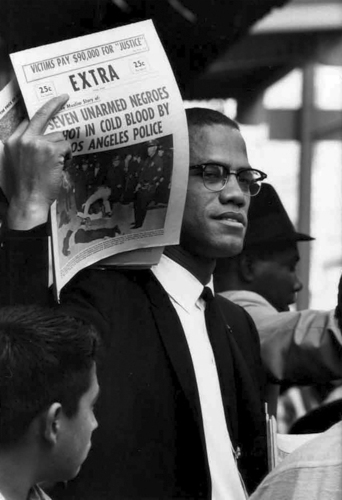
and holding it up at a Black Muslim speech in Harlem. [images via Gordon Parks Foundation]
I don’t know why it has literally never occurred to me, but Berger’s account of the vehemence and derision Malcolm X received from the white establishment, and the extraordinary calculation and discipline with which Malcolm carried and presented himself, and his unfailingly calm, cool, self-assured and buttoned-down image, really jumps out at me now. Especially when it’s coupled with the terms Muslims and Black Muslims, which get repeated in the press of the day with such divisive, alienating force.
As if that was the absolute worst, scariest thing you could call someone. In 1963. In 2012, meanwhile, it’s settled into a niche birther conspiracy.

Malcolm X as Visual Strategist [nyt lens blog]
Blurromney

It’s not like this hasn’t happened before. I remember one time, in the late 1990s, at the Stedelijk, being transfixed by a series of videos Gabriel Orozco had made. I was already very interested in his work for a while, but there was something about those videos.
Orozco had basically edited them in-camera while walking around New York and Amsterdam, and they had this wonderful, stream-of-perception-like quality, almost as close as you could get, it seemed, to the artist’s own visual experience.
It basically changed the way I see. He was making off-hand, formal connections between things. There were a lot of circles, for example. Cups, bicycle tires, stickers on windows, bar coasters, bubbles. And once the connection had been made, it became impossible not to think of Orozco every time I saw circles in the world. There was much in Gabriel’s early work that was similarly, quietly powerful in the way it awoke you [me] to nuances of seeing and understanding the world around you [me].
Which is not quite the point here, except that just as with Orozco and his circles, it’s now basically impossible for me to see a blur and not think of Gerhard Richter. And not wonder, for example, how awesome it might be as a painting.1
Like–oh, I’ll just pick any random thing–a still from the damning video of Mitt Romney speaking unguarded Republican truthiness at a private fundraiser in Florida, which was shot and disseminated anonymously for weeks before Mother Jones picked it up today. And attempted to protect the video’s source–by blurring the footage. Except for Romney himself, whose face is unblurred, and the Corinthian capital behind him. Hey look, a circle.
1 The answer, of course, is it’d look awesome. Just look at those colors. The different segments of the video have different blurs, too. I think this one’s especially velvety. Chinese Paint Mill certainly has their work cut out for them.

