
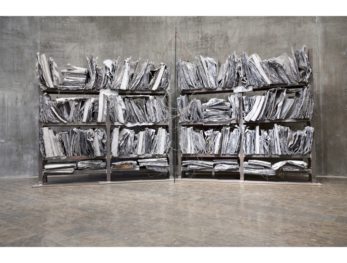
The High Priestess/Zweistromland, 1985-89, collection: astrum fearnley museet, best photo ever is actually here at kunstkrittik.no
I fell hard for Anselm Kiefer’s impossible but seductive lead books back in the day. I was in college and just making my way from religiously/symbolically loaded Italian Renaissance to contemporary art, when I found the lush catalogue for Kiefer’s The High Priestess on a visit to Rizzoli in NYC. [NY was then still in the wake of a big Kiefer retrospective, which I’d missed.] It was like the guidebook to the historically saturated, emotionally fraught world Wim Wenders had just captured in his 1987 angels documentary, Wings of Desire.
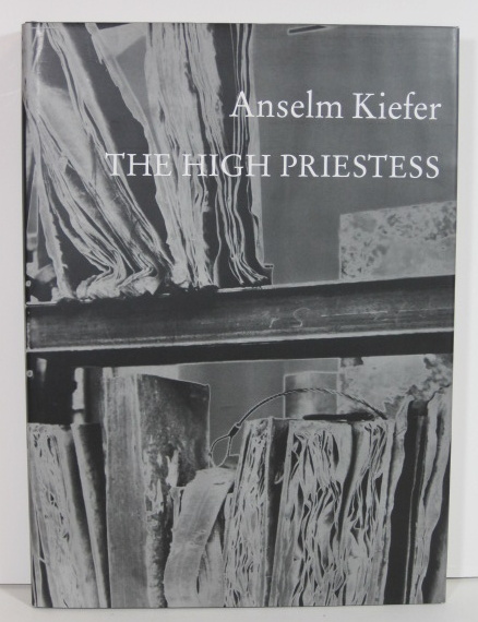
The High Priestess, 1989, photos by the artist, image of a signed copy available from bythebooklc in Phoenix
After a few years, I cooled a bit on Kiefer, got a bit more context, began to recognize and be [a bit] skeptical of my own susceptibility to the allure of superlative materialism. So the show at Marian Goodman in 1993, which consisted of the contents of the vanished artist’s abandoned studio in Germany–a teetering stack of once-valuable, ruined, dirt-encrusted paintings, and a long table strewn with semen-splattered ledger books–didn’t hit me as hard as it did some folks.
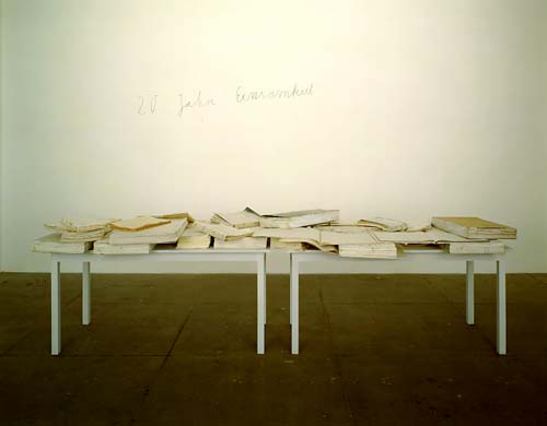
20 Jahre Einsamkeit/20 Years of Loneliness, 1971-1991, image via schjeldahl/artnet
[Re-reading it now for the first time in 20+ years, I realize that Jack Flam’s 1992 NYRB essay on Kiefer’s work and the euphoric literature it spawned was the source of my unconscious reboot. I basically internalized Flam’s argument in its entirety; I must have been a hit at parties, parroting that thing.]
Anyway, the point is, I guess, is I have a long and conflicted relationship with artist books, especially the most physically luxurious and sublime ones. I know this. I live this. I make books myself with as little aestheticizing consciousness as possible because of this.
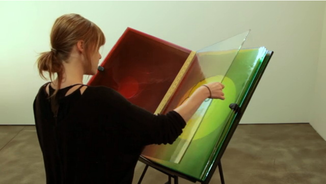
And yet, here I am, swooning like an undergrad at the amazing video of Olafur Eliasson’s A View Becomes A Window, an edition of nine handblown glass-and-leather books produced for Ivorypress, which is on view in Madrid through this week:
Seeing the colored glass samples stacked up around his studio for the last several years, AVBAW seems like the most normal, logical extension of Olafur’s recent work. Which is just the cool, analytical inevitability it needed to get past my sublime defenses.
‘That’s The Real [Gramsci] Monument’
The idea that 10 years from now–10 months from now–people will keep talking about an artist from Switzerland who landed in the middle of Forest Houses and for 77 days brought a different image of reality, that’s the real monument. It may not trigger a vocation, but it might trigger new ways of seeing reality and thinking that might not have been imaginable before. And maybe it’ll give us all, residents and non-residents of Forest Houses, the confidence that we can have an idea, have a project of our own, have a mission in life.
From Paul Schmelzer’s great q&a with Dia’s Philippe Vergne about Thomas Hirschhorn’s Gramsci Monument.
Vergne has interesting things to say about Dia, too, and how a seemingly temporary project like Gramsci fits into its core tradition of commissioning and exhibiting ambitious artist projects.
The Momentary Monument | Philippe Vergne on Thomas Hirschhorn’s Ode to Gramsci [walkerart.org]
WTF Fieldstone, Chevy Chase
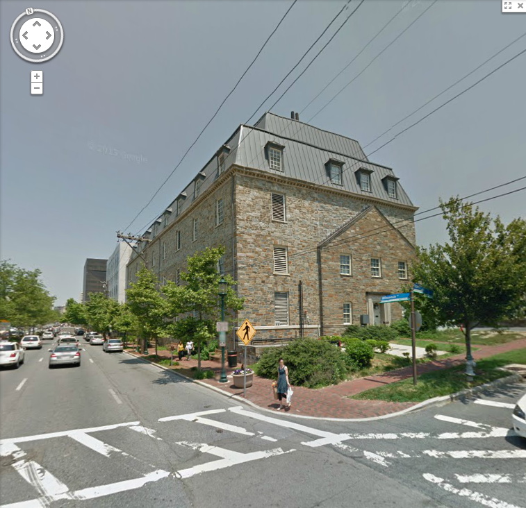
This fieldstone house-metastasized-into-a-horrible-building in Chevy Chase, MD always bums me the hell right out whenever I pass by.
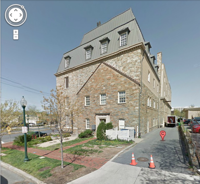
I think it’s just a random office building, not even an Elks Lodge or anything. Anyone know who or what happened here? Is there a sad story, or does this count for a preservationist victory in these parts?
4533 Stanford St, I believe [google maps]
Gerhard Richter’s Septembers
tl;dr version: Gerhard Richter made a small painting, September, based on a photo of the WTC getting hit by a plane, and gave it to MoMA, which has never shown it. Then he made a print version, which he sold here and there, and which has been seen in NYC once. The image is the same, but the experience of them is quite different, which is something no one really mentions or talks about. It’s almost like the propagation of the image is more important than the actual objects, or than the particulars of seeing them in person. Which, in addition to being the kind of distancing tactic Richter’s very fond of, is also a non-trivial observation that can be made about the WTC attacks themselves.
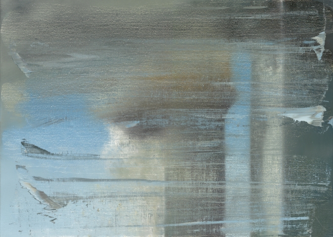
I had not wanted to write about the WTC attacks [or “September 11th”] on September 11th, and though it was the day I actually started thinking about this post, I didn’t want to write about Gerhard Richter’s September on September 11th, either. And I’m glad I’ve waited; my reflex was to be a bit cynical, and that has largely dissipated. So.
Richter was in the air on September 11th, traveling to New York and grounded/diverted to Nova Scotia. His eventual artistic engagement with the attacks was a small painting, September [CR: 891-5], above, which he made in 2005. Joe Hage, the collector who is also the instigator behind the artist’s ambitious website, acquired a half interest in the painting in order, the story goes, to prevent Richter from deciding to destroy it.
The aura of ambivalence surrounding the painting’s existence is of a piece with the painting itself, which is based on a FAZ photo of the hijacked UA175 hitting the South Tower. [A newspaper image the artist didn’t see at the time, because he was stuck in Canada. Which means he hunted it down at some point.] Richter knifed and scraped the canvas, deploying abstraction to obscure or even erase the representational image.
As far as I can tell, the small painting, just 52x72cm, dimensions Rob Storr compared to a TV screen, but which I’d say is more computer monitor-size, has never been shown in New York.
It wasn’t in Richter’s solo show at Marian Goodman in 2005-6, even though squeegee paintings listed before and after it in the artist’s roughly chronological CR were. MoMA acquired a dozen of them, a series of abstracts, CR 892-1 through 12, titled Wald/Forest.
When Goodman showed Richter’s paintings again in 2009-10, September the painting was not among them. That’s when the artist and Hage donated it to The Modern, and when Storr made a video about it. His take on the painting and its context were expanded into a book-length essay published in 2011.
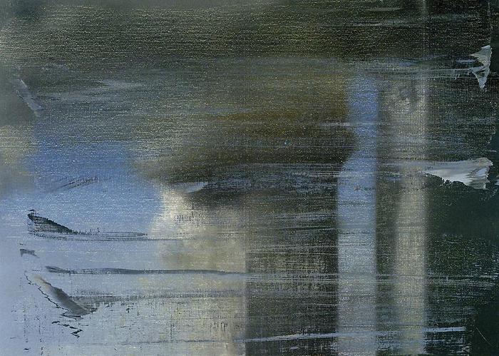
But wait, wasn’t it–no. That 2009 show did include a September. But it was a print. As the gallery checklist describes it, a “print between glass”. September 2009 turns out to be an enlarged [66x90cm] inkjet on vinyl mounted between two sheets of glass, and published in an edition of 40.
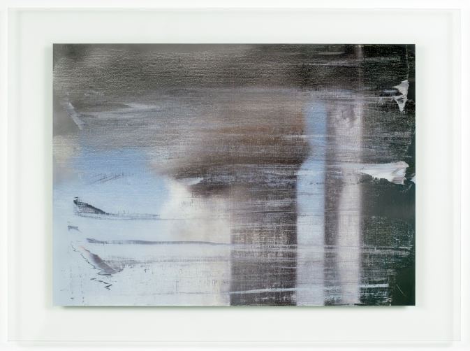
September, 2009, CR 139, digital print between two panes of glass, image: gerhard-richter.com
The gallery’s own reproduction of the print leaves out the glass mount; and smooth, sealed surface; and the reflection it inevitably creates. Even though these have to be considered as central elements of this work, as different as can be from the scarred, textured surface of the painting it reproduces.
Here’s an installation shot from We Heart New York that shows the gallery and other work reflected in the print’s mirror-like surface:

And here’s a shot of it installed last year at a retrospective of Richter’s editions at Collectors Room, Berlin. It’s big and glass and framed, and looks and feels completely different than a painting. Because it’s a blown up, face-mounted photo of a painting.
Yet even here, in a show about editions, curator Hubertus Butin mostly talks about September as a painting. And so did Storr. And I confess, I’d seen the Goodman show, and read Storr’s book, and seen his interview, but it wasn’t until I saw this shot that it even registered with me that there was an edition. And that’s what I’d seen, not the painting I thought I’d seen.
When I realized this last week, on September 11th, I felt a rush of cynicism, reading Richter’s production of an edition as a sell-out. Just as he donated his Important Historical Image to the Modern, he’d quietly sold 40 copies of it to lesser [sic] museums and collectors. Dallas got one. But then I saw one in Beirut, and it occurred to me that an edition circulates the image in ways that transcend the painting itself. It puts September in more, wider, and more varied contexts than MoMA’s loan policy could ever accommodate. [UPDATE: John from BR&S adds that a print was in this 2011 exhibition at Montserrat College of Art. Indeed, it’s on the catalogue cover. Storr also spoke.]
In that video tour, Butin talked about Betty, calling Richter’s painted portrait of his daughter the “most famous and probably the most successful picture that he has ever created.” Successful, Butin continued, because “No other subject of his has been as frequently reproduced in books, catalogues, postcards and posters.” The Betty in his show is, of course, an edition, not the original. It’s a print of a photo of the painting [of a photo.] And as an image, at least one metric of its success, is its rate of reproduction.
September the print has exactly the same relationship to September the painting. And even more than a painting, a glassy digital print ends up capturing September‘s electronic screen essence that Storr originally identified. Which makes me wonder how, why, New York, of all places–of all places–has only seen the print, and not the painting. Not the visceral, physical experience of the original, but the distanced, reflective, mediated simulation. Or maybe it’s all incidental to September achieving historic, Betty-scale “success”.
September, CR| 891-5, 2005 [gerhard-richter.com]
September, CR 139, 2009 gerhard-richter.com]
September: A History Painting by Gerhard Richter, by Robert Storr [amazon]
The Enterprise School

In an extensive profile of the NSA Director, Foreign Policy reports that when Lt. Gen. Keith Alexander was head of Army Intelligence, he built out his “Information Dominance Center” to look like the bridge of the Starship Enterprise:
It had been designed by a Hollywood set designer…complete with chrome panels, computer stations, a huge TV monitor on the forward wall, and doors that made a ‘whoosh’ sound when they slid open and closed. Lawmakers and other important officials took turns sitting in a leather ‘captain’s chair’ in the center of the room and watched as Alexander, a lover of science-fiction movies, showed off his data tools on the big screen.
“Everybody wanted to sit in the chair at least once to pretend he was Jean-Luc Picard,” says a retired officer in charge of VIP visits.
Indeed. And here, I believe, it is.
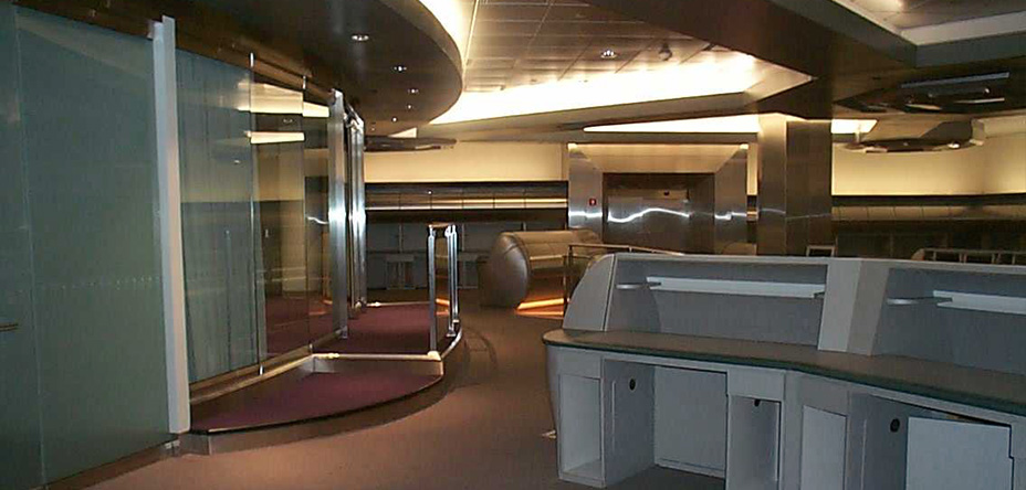
The Information Dominance Center at Fort Belvoir, VA is featured in the portfolio of DBI Architects, a leading DC commercial architecture firm. The firm has done buildouts for absolutely everyone, but in the 1980s, they created a “Stealth Design” practice, focusing on computer rooms and “technology-oriented spaces, including network operation centers, switch sites, data centers, advanced concept laboratories, and video teleconferencing centers.”

With several top-level command centers under their belt, DBI turns out to be one of the go-to architects for the post-9/11 Intelligence Industrial Complex. Their regional clients include Geo-Eye, the satellite imaging company which powers Google Maps; Lockheed Martin, for whom they build a 50,000-sf control center; various Army intelligence divisions; and even the White House itself. DBI remodeled the WH Situation Room in 2007. They also built the grand, cinematic nerve center of the Department of Homeland Security’s National Counter-Terrorism Center, which was in an undisclosed suburban office park location until George Bush used it as a press corps backdrop in 2006.
The DBI look is part NASA, part Dr. Strangelove, to NORAD to War Games and on and on, back and forth. The big screened control center is part of the security theatrical tradition now. And in an era of Federation-inspired flip phones and iPads, where the fictional CIA of 24 enabled and rationalized torture at the actual CIA’s hands, we probably shouldn’t be surprised that politicians–of all people–are susceptible to intelligence industry set pieces that look and feel just like a movie.
Previously: But He’ll– He’ll See The Big Board!
Hell Yes, Francois Hollande!

image: reuters via @noonz
My gosh, have I been wrong in trying to ignore French president Francois Hollande all this time?
Watch the video how the robot’s handler, from Aldebaran Robotiques, turns its head toward the cameras. Presumably so it doesn’t look like it’s nursing. [francetvinfo.fr]
The robot told Hollande it’s name was Nao, and that it is seven years old. I would have guessed at least eight:
Algorithm Exercise with QRIO by daisu
A Vested Interest
Josh Marshall solicited “What’s Your 9/11” thoughts from the readers of Talking Points Memo. I’ve avoided reading them, and most such other efforts this week. But the title he gave to reader DE’s submission really encapsulated my own ambivalence about what the Memorial Industrial Complex has metastasized into, and why I’m reluctant to turn myself over to it:
So my personal unease with 9/11 memorials is the feeling that there are a lot of people in this country with a vested interest in the country not moving on, even though the two main perpetrators of the attack are either dead or in US custody and the organization they led has been soundly defeated. They want our leaders to keep delivering the Gettysburg Address every year, to keep us on that war footing, so that they can misdirect our resources and some Americans’ lives in the service of foreign and domestic policy goals that have nothing to do with what happened on 9/11.
This manipulation of memorialization by keeping the wounds open was quickly apparent to some, of course. For all the good that did.
“A Vested Interest in the Country Not Moving On.” [tpm]
It’s Not You; It’s Me.

There’s something kind of fantastic about Christie’s selling this example of Koons’s Parkett edition, Inflatable Balloon Flower, in the same season as Peter Brant’s Balloon Dog.
With a radically tiny estimate [est. £500 – £700] and the giant, freaking caveat: “Please note that the present lot does not fully inflate.”
In fact, there are only two lots in the sale with droopier estimates than the Koons. [The top estimate in the 95-lot sale, a private collection of all the Parkett editions from the journal’s first 50 issues, is £150,000 – £250,000, for a Gerhard Richter squeegee painting, one of 120 unique works created in 1993 for Parkett 35.]
Which makes the Koons all the more attractive. Hasn’t turgidity science progressed sufficiently since 1997 to fix this problem? Couldn’t the skillful mouth of a trained fluffer help this aging Koons regain its youthful firmness and vigor? Maybe just a temporary fix for when you need it: the evening when the museum committee comes over for a collection visit, for example. And if your Koons inflation lasts more than four hours, then call your conservator.
And if all else fails, surely there are a million and one metaphorical uses for a deflating Koons balloon sculpture. There have to be a dozen newly minted MFAs who have been looking to fill that Koons-sized hole in their market-critiquing installations.
Sept. 26, 2013, Lot 50C: Jeff Koons Inflatable Balloon Flower – Yellow (Parkett 50/51) est, £500 – £700 [christies.com]
Previously, related: Ghetto Erased de Kooning Drawing
On The Real [sic] Economic And Cultural Power Of The Art World
In this set-up for After Art, his slim tome of theory on networked images, Yale’s David Joselit argues that art’s status as a luxury commodity is not a bug, but a feature, and the art world should get with the program:
Indeed, all over the world, from Bilbao to Abu Dhabi to Beijing, new contemporary museums are being established in order to consolidate local elites, and broadcast a global image of cultural progressiveness. Commenting on the Qatar Museum Authority’s staggering budget of some $1 billion per year for art acquisitions, the New York Times recently declared, “it seems clear that, just as Qatar has used its oil riches to boost its influence in the Middle East with ventures like arming Syrian rebels, its wealth is also being deployed to help the country become a force in the world of culture.” It is rather breathtaking — and enormously revealing — that arming Syrian rebels and building a sophisticated cultural infrastructure can be so seamlessly joined in the same sentence.
Paradoxically, artists, critics and historians too often disavow the art world’s capacity as an economic engine and its political power as a marker of national development. The reasons for this are obvious: if one admits the real economic and cultural power of the art world, one must also give up on the enduring myth that works of art remain apart from that world, existing in a realm of detached criticality or extra-economic authenticity. In actuality, the art world has grown enormously in the post-World War II period and in its combination of knowledge production, public presentation, and patronage of powerful elites, it has begun to resemble institutions of higher learning on the one hand, and the entertainment industry on the other. It seems to me that art’s worldly power, which tends to be veiled (or literally obscene), can be harnessed better and to more progressive ends by artists.
I guess I’ll have to read the book, but a term like “art world” can obfuscate a whole lot of power-related detail, of who’s doing the wielding and to what end. But I suspect neither art’s power nor the enduring myth are quite as real IRL as they are in Joselit’s thought experiment. And I don’t know about revealing, but that whole Syrian thing just gets more breathtakingly timely by the week, doesn’t it?
UPDATE: Joselit’s piece ends by holding up Ai Weiwei as an example of an artist who wields this kind of art world/real world power. Which, interestingly, Jason Farago mentions Ai, too, in his BBC article on the timid Metropolitan Opera getting dragged into the controversy over Russia’s shameful discrimination of LGBT people. Farago compares the Met’s inaction to the institutional outcries and support given to Ai Weiwei during his imprisonment. [via @karenarchey]
Which might render Joselit’s notion of art world power all the more quaint, and his call for action all the more damningly empty. His book came out in 2012, but the oppression and discrimination against lesbians and gays in Russia is surely the first test of Joselit’s paradigm: a fundamental “progressive end” toward which the “art world”–not just artists and institutions, but presumably, the administrators, executives, trustees, collectors, dealers, fair organizers, magazines, philanthropists, and critics–should be harnessing “art’s worldly power.”
How’s that going? Sure, there’s tepid talk of boycotting the Moscow Biennial. But has anyone checked in with the Russian oligarchs and collectors [and the Ukranian one(s), for that matter, since Ukraine has already enacted similar discriminatory measures] who collect, show and sponsor? Who chair galas and sit on museum boards and invest in art-related Internet startups? It would make for an exciting Frieze VIP preview. But I’m not waiting up.
The Politics of Information | David Joselit [berfrois.com]
Sturtevant on ‘The Entangled Challenge of Replication’
It’s almost four years now since I read this paper by Sturtevant–the first extended thing I’d actually read by her, not about her–when Tate Papers came online, and it’s been rocking my world ever since. She’d prepared it in October 2007 for a symposium titled, Inherent Vice: The Replica and its Implications in Modern Sculpture Workshop.
Her crisp, verse-like text talks about replicas, copies, repeats, remakes, and re-dos, and where our “cyber” age has brought them. Here’s a favorite part:
This trap, our obsession
of what lies on the surface,
is prevalent everywhere.
It is not a question of getting
rid of these potent elements as
not knowing it could be there.
Its blatant absence is in high gear
in most of our current art whose
push and shove is production
as meaning and consumption
as use.
Or burden by heavy subjectivity
or
hiding behind anonymity,
or
displaying our vast barren interior
by retreating to regressive teeny-bopper imagery.
The interior of art, the understructure,
is being concisely and brutally eliminated.
Ironically [because the next section of the talk is a criticism of listening instead of seeing], I’ve recently begun running art papers through my laptop’s text-to-speech, turning them into artist talks, which I listen to while I work. For whatever reason, Sturtevant’s text yields one of the robot’s best [re-]performances.
So I just recorded a reading by Alex, the most naturalistic of OSX’s default voices, which you can play here. It’s about 7min. [mp3]
Or re-do it yourself with your favorite voice: Inherent Vice or Vice Versa | Sturtevant, from Tate Papers Issue 8 [tate.org.uk/research]
Aujourd’hui, c’est la rentrée au 2005

Denis Charlet/AFP
Congratulations, François Hollande, you have made the dumbest on-camera face of any international leader since 2005, when George Bush tried to exit a Beijing press conference through a locked door.
Decision to withdraw unflattering photo of François Hollande is criticised [guardian]
Previously, 2005: Mandate of Heavens to Murgatroid
Calvin Klein’s House For A Single Man

image of CK 0.9, the plywood mockup, c.2009, via sara hart archpaper
Where to start?
Mr. Haverland and Mr. Klein began meeting two to three times a week and bonded over a love of architects like Mies van der Rohe, Richard Neutra and Joe D’Urso.
…
Danish modern chairs by Poul Kjaerholm are in one of the sitting rooms downstairs. Other vintage pieces by Jean Prouvé and Le Corbusier have arrived.
…
After that, a life-size mock-up of the two-story house was built of plywood on the property. That project was so substantial that it required a building permit from the Village of Southampton and wound up costing approximately $350,000, according to two sources close to Mr. Klein. So that Mr. Klein could get an even better idea of what it was to be like, the furniture he had in mind was created out of foamcore.
…
“I think it’s going to change the way we think about houses in the Hamptons,” said Sam Shahid, an old friend of Mr. Klein’s who has worked on many of his most famous ad campaigns. “Like when Charles Gwathmey built his house, and it changed everybody’s idea of what the future was. I can’t wait to see it.”
First, Mies, Neutra and d’Urso?
And also, Kjaerholm, Prouvé, and Corbusier? Just no. No, no, and WTFLOL no.
if Calvin really wanted to change the way we think about houses in the Hamptons, he’d have stopped with the plywood mockup. Can you imagine how awesome that would’ve been? He could build a new one every spring. A new architect every year. He could spend a million dollars a year for life, on career-making commissions and still come out ahead. It would have been marvelous.
Instead we end up with just another $75 million OCD dream house.
The House That Calvin Built [nyt]
Image: Sara Hart/Archpaper
[2020 update: after all that Calvin sold out for $100m to Ken Griffin, who now has his eleventh nine-figure pandemic safe house or whatever.]
Pixels & Atomists
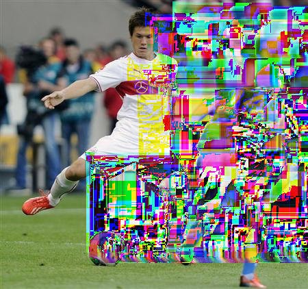
ホッフェンハイム戦の前半、先発出場しパスを出すシュツットガルトの酒井高=シュツットガルト(共同) originally via msn.jp/kyodo
This sweet image from Glitch News [via jwz] makes me want to inkjet print it life-size the way
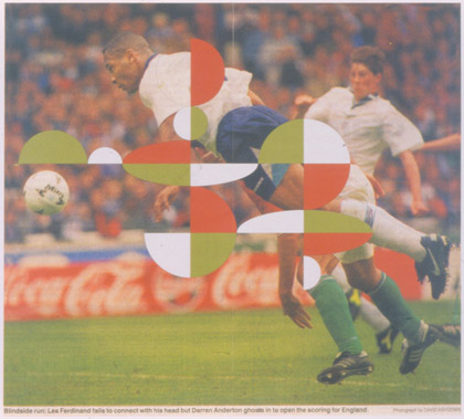
Gabriel Orozco, Blindside Run, from the Atomists series, 1996
Gabriel Orozco printed the Atomists in 1996. He exhibited them at Empty Club, an installation organized by Artangel in a decommissioned gentleman’s club in London, in 1997. [artangel.org.uk]
Art & Technology & Serra & Steel Mills
Visitor posted this comment from Richard Serra’s 1974 interview with Liza Bear, quoting his own statement from the catalogue for Maurice Tuchman’s 1970 show at LACMA, Art and Technology, about technology being “a form of toolmaking, body extension.” Also, “Technology is what we do to the Black Panthers and the Vietnamese.”
technology is david hammons pissing on your sculpture. pic.twitter.com/QPm5w2zysT
— visitor design (@visitordesign) August 30, 2013
He goes on to say that “It reflects my political responsibility to the public–not that I have any idealistic notions of swaying the masses through television. I think commercial TV is basically show business, and that means show business is used to reflect corporate America’s interests.”
Of course, one of the criticisms leveled at Art & Technology was that it was using art to reflect those same corporate interests. Tuchman arranged for 64 men of the art and industry to pair up to produce artworks, which would be exhibited at the Museum, and also the US Pavilion at the Osaka 70 World’s Fair. The results were mixed at best.
Roy Lichtenstein worked with Paramount to make 35mm painting/film installations. Warhol made some wacky lenticular rain machine. Rauschenberg made a bubbling pool of lubricating mud. Tony Smith tried to make a cave from thousands of cardboard tetrahedrons. And all of it went down when opposition to the Vietnam war and Nixon and the Establishment were hitting new nadirs every day. If the show was meant to heal, bridge, transcend, or even paper over the cultural chasms between art and the American corporate machine, it has to be considered a failure.
And yet, somehow I hadn’t noticed this, and I can’t remember ever hearing it discussed, the work Richard Serra made for Art and Technology seems like some of the most crucial of his career. I’ll look again, but in terms of the artists’ own practice, I think Serra made what turns out to have been the most important art in the show.
Serra was, remarkably, the seventh artist Tuchman tried to match with Kaiser Steel Corp’s Fontana mill. [Among the first six attempted matches: Smithson and di Suvero, which, sure, but also Jules Olitski and Len Lye, which, what?] He proposed work that would “be related to both the physical properties of the site and the characteristics of the materials and processes concomitant to it.”
The three “categories” he envisioned were, casting, overlaying/stacking, and constructions.
And that’s just what he did. Serra worked nights with the crew assigned to him to get a feel for steel in its different forms, for the site, and for the processes available to manipulate the material. After several weeks working in the skullcracker yard, where scrap steel was moved around with a giant magnetic crane for reprocessing, he used the machinery to execute 12 different constructions [or 20, depending] within two intense, final weeks. “The procedure would be to erect a piece, and, if he considered it successful, to have it recorded photographically when possible. The structure was then dismantled.”
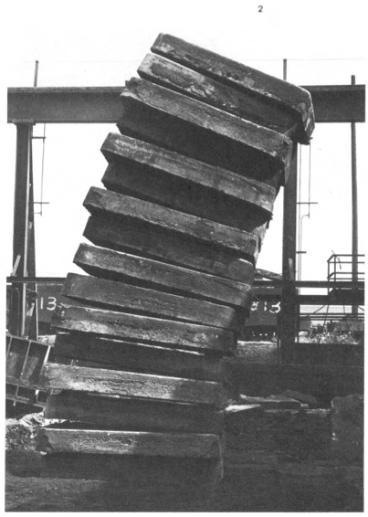
Stacked Steels Slabs (Skullcracker Series), 1969, constructed at Kaiser Steel, Fontana, CA
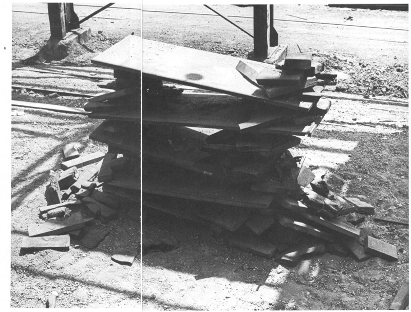
The first of these pieces is probably the best-known, a leaning stack of sixteen 6-ton slabs of cast steel known as stools, the photo of which has circulated under the name, Stacked Steels Slabs (Skullcracker Series). These Skullcracker Series works became more structurally complex; Serra created loose piles of steel scrap, then propped large slabs against or on top of them.
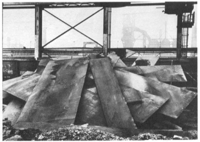
He made counter-balanced structures with plates jutting out in various directions. They remind me a bit of the block towers architect Eliot Noyes made to demonstrate balance in a 1955 educational film. I’m sure, of course, they were completely different.
After a second, less successful stay in 1970, Serra agreed to return in the Spring of 1971 for the actual LACMA show. He would erect a Skullcracker Series at the museum, and also install “a piece related to his more recent thinking; the idea derived directly from what he had learned about steel at Kaiser.”
His idea was to measure a site and install a steel plate, which would be cut along the edge of the ground, thereby taking the contour of the topography into which it had been installed.
Though the cutting is, I think, unique, a form of drawing, this creation of sculpture that marks the contours of a site is immediately, obviously recognizable as central to Serra’s work at the time. He was doing it at that exact moment in St. Louis with Pulitzer Piece, and in Ontario with Shift. And he says that it all came “directly from what he had learned about steel at Kaiser.” [Those links are both to Tyler Green’s Modern Art Notes, who’s written one of the very few art-aware accounts of actually visiting Shift.]
Serra’s steel mill-based practice is something else that, in the intervening decades, has become central to Serra’s work. In interviews, it’s usually explained by biography, by early factory jobs in college. But those jobs didn’t get a mention in Tuchman’s Art & Technology catalogue, and Tuchman’s complicated show rarely gets credited for arranging the corporate collaboration at Kaiser Steel that gave Serra his first studio in a steel mill.
Previously, related: Stop & Piss: David Hammons’ Pissed Off
Gretchen Bender On ‘Art As Signs And Not As Valuable Objects’
Gretchen Bender, Sensurround, 1983, silkscreen and c-print on tin
From Andrew Russeth comes Cindy Sherman’s 1987 interview with Gretchen Bender, published in BOMB Magazine:
CS There’s an article in an L.A. paper describing you as a TV terrorist, saying that you can attain a critical edge through overload.
GB Yeah. There are artists who talk of using silence as a weapon, an alternative and an act of resistance. That’s one end of it. I’ve gone in the opposite direction but with the same desire. I think it’s more important to mimic and provoke at this point.
CS Your theatrical pieces are counterpointed by the tin pieces, which ironically, make objects out of paradigms.
GB Either way, it’s only temporarily effective. Hans Haacke uses part of the dominant high culture to criticize the function of the whole system through his object/displays. The question is–how broadly effective do you want to be? That is a difficult question with artists. Artists can be confused about their situation as a powerless elite. We operate from the protective base of the art world, a situation in which we can develop ideas but a place from which it is complicated to launch media-related art work without it getting co-opted by the very structures it criticizes. Although I use those structures. I’m resisting one channel television because I haven’t figured out how to effectively communicate except in a theatrical setting.
Again, I started wanting to quote the silence and art’s engagement/fear of politics, and I didn’t want to stop reading. Plus, it’s all talking about the tin pieces:
CS You’ve been criticized for being high tech, which is another way of infiltrating popular culture–using the technology that they use.
GB It’s something visual artists tend to resist although that resistance is steadily breaking down. More artists are figuring out how to use computer technology . . . there’s so much that’s happening visually. It’s strange that the art world resists using the visual tools of our time. What’s that about? It is scary when you have this heritage that you invoke–art history.
CS It’s supposed to be more pure if you use materials like paint or make it all yourself or use another person to make it for you.
GB The art world is trying to protect this antiquated territory and what is most disturbing about switching over to the newer technologies is that there is no authority to invoke. There aren’t any guidelines to tell you that you’re making ‘good’ art. No one knows enough or understands enough. There’s so much experimentation to do, so many blind visual forays to risk, so many conceptual implications of the newer technologies to try to comprehend. Many artists aren’t willing to take those risks. You don’t know if you are going to be effective or not, if you are going to make silly or profound works. I think that’s what terrifies most artists and I think that’s why the art world is so slow to accept the culture of today.
CS You have used imagery from other people’s art work in some of your own pieces. I interpreted that as reducing expensive works of art by male artists–paintings–to this disposable imagery level.
GB I wanted to use the art as signs and not as valuable objects. I decided to combine those found art reproductions as one combines words in a language or even just parts of an alphabet. I saw them as a moving language. I have been working with the equivalent flow of television. Before that, I was actually dealing with the equivalent flow of art objects. What’s really being said? At the same time, I realized that because we had gotten so much of our art out of magazines and reproductions, we weren’t contemplating art anymore. So I made those tin pieces to be a scan. You couldn’t fall into the pieces and contemplate. I go into galleries to see shows, to be aware of what is going on and it takes three minutes to see a show. Where are we? And what are we doing? It’s our nervous system–the time we live in–it’s not about reverie.
…
GB Artists using media have taken on a more complicated position in the culture than painters. Painters like tradition. And I think it’s a hundred, or a thousand times more difficult for a painter to make politically engaged work. They know that if it smells like art and looks like art and tastes like art–it’s painting. There’s not much risk in the art world.
CS Especially now, it seems really dull right now.
GB At the same time, I constantly examine my . . . I’m still operating within the art world. There is that base. Maybe it’s a base to reaffirm your goals or your sanity in trying to develop ideas. You do have people who want to see you succeed in producing important work.
Silkscreen on sheet metal must have caught Cady Noland’s attention. BOMB Magazine: Gretchen Bender by Cindy Sherman [bombsite]