Forbidden Colors, By Felix Gonzalez-Torres

Felix Gonzalez-Torres, Forbidden Colors, 1988, acrylic on panel, 20×16 in. each, collection, Museum of Contemporary Art, Los Angeles

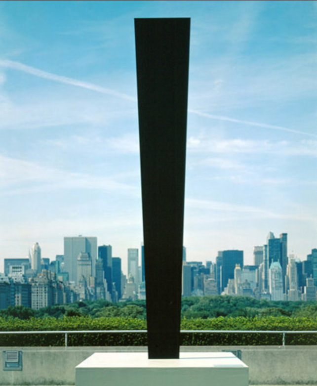
Felix Gonzalez-Torres actually made a lot of paintings. Most are Bloodworks paintings, gesso and graphite grids bisected by a diagonal line, referring to a doomed medical readout.

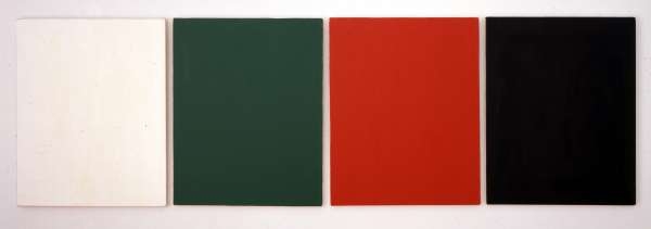
But in 1988 he also made Forbidden Colors, four 16×20-in acrylic monochromes in white, green, red and black. He showed the piece, along with four framed photostats, in a project installation at The New Museum, 25 years ago right now.

The paintings are now owned by MOCA. The text Felix wrote for the show is below [reproduced in Julie Ault’s 2008 Felix monograph, via fernandocestari]:

INSTALLATION BY FÉLIX GONZÁLEZ-TORRES September 16 – November 20, 1988
When I was asked to write a short statement about the work in this space I thought it would be a good opportunity to disclose and, in a certain sense, to demystify my approach. I hope that it will guide the viewer and will allow an active participation in the unravelling of the meaning and the purpose of this work. Many may consider this text redundant; and unnecessary intrusion, or even a handicap. It is assumed that the work must “speak for itself,” as if the divine dogma of modernism were able to deliver a clear and universal message to a uniform “family of man.” Others know this is not true that each of us perceives things according to who and how we are at particular junctures, whose terms are always shifting. Preferably the exhibition gallery will function as an educational device, simple and basic, without the mysteries of the muse, reactivating history to affirm our place in this landscape of 1988.
This work is mostly personal. It is about those very early hours in the morning, while still half asleep, when I tend to visualize information, to see panoramas in which the fictional, the important, the banal, and the historical are collapsed into a single caption. Leaving me anxious and responsible to anchor a logical accompanying image scanning the TV channels trying to sort out and match sound and sight. This work is about my exclusion from the circle of power where social and cultural values are elaborated and about my rejection of the imposed and established order.
It is a fact people are discriminated against for being HIV positive. It is a fact the majority of the Nazi industrialists retained their wealth after war. It is a fact the night belongs to Michelob and Coke is real. It is a fact the color of your skin matters. It is a fact Crazy Eddie’s prices are insane. It is a fact that four colors red, black, green and white placed next to each other in any form are strictly forbidden by the Israeli army in the occupied Palestinian territories. This color combination can cause an arrest, a beating, a curfew, a shooting, or a news photograph. Yet it is a fact that these forbidden colors, presented as a solitary act of consciousness here in SoHo, will not precipitate a similar reaction.
From the first moment of encounter, the four colour canvases in this room will “speak” to everyone. Some will define them as an exercise in color theory, or some sort of abstraction. Some as four boring rectangular canvases hanging on the wall. Now that you’ve read this text, I hope for a different message.
For all the PWAs.

I don’t think I’ve ever seen Forbidden Colors in person. It was in a group show at White Columns in 1993, and MOCA showed it once in 2002. That’s it. I’ve noticed it in the catalogue raisonne, of course, though without really paying the piece much attention. Really, I didn’t understand the reference. And the photo didn’t really reproduce the green panel; it looked black.

UPDATE Thanks to petitemaoiste, who just tweeted that the piece was also included in John Farmer’s 1995 collection show, “The Compulsion to Repeat.”
It’s interesting, though, how you notice things, or take notice of them, when your own frame of reference changes.

The ban on the Palestinian flag, its colors, and any “artwork of ‘political significance'” was lifted in 1993 as part of the Oslo Peace Accords.

[December 2023 UPDATE: In 2021 in response to Israeli violence against Palestinians, I made a replicable version, Gonzalez-Torres’ Forbidden Colors, and offered it to any institution who wanted to show but could not borrow the original. Also, the original was included in the 2023 Carnegie International. Meanwhile, it is a new fact that Israel, Germany, the UK, and places in the US, among others, are actually banning display of the colors of the Palestinian flag, part of an attempt to silence protest of the ongoing genocide in Gaza and attacks in the occupied West Bank.]

Ellsworth Kelly Postcards: Wish You Were Here!

kelly_veneziano_washmt_freeman.jpg
Domenico Veneziano / Washington Monument, 1984, image: peter freeman/artsy
So I didn’t spot this Ellsworth Kelly postcard collage at Peter Freeman’s booth at Frieze Masters, and I love it. It makes me want to see more. And to wonder why we haven’t?
Kelly’s used collage and found shapes and forms to develop his paintings and sculptures since the very beginning. He’s made postcard collages to explore scale and shape and site, too. They’re little glimpses into the way he sees. He makes them for himself, and he sends them to friends.
This example, made using photo torn from the newspaper and a postcard from the National Gallery of Veneziano’s St. John in the Desert has some postal markings on it, so I expect it’s the latter.
statue_of_liberty_1957.jpg
Statue of Liberty, 1957
Can we have a show of these, please? Or at least a book? I guess the closest so far is that amazing Drawing Center show in 2002, Ellsworth Kelly Tablet: 1949-73, curated by Yve-Alain Bois, which had collaged up pages from the artist’s sketchbooks.
upper_manh_1957.jpg
Upper Manhattan, 1957
But these postcard collages are not just, or not all, preparatory works; they’re social, too. Their intimate scale, non-preciousness, and exchange function remind me of Felix Gonzalez-Torres’s Polaroids and Gerhard Richter’s overpainted photographs. The absolute least gesture and material required to convey the artist’s observation.
tuileries_study_bl-w_1964.jpg
Study for a Blue and White Sculpture of Les Tuileries, 1964, like many of the smaller images, from a slideshow at nyss.org
They inevitably also function as postcards, seeming to mark a visit to a place, and the artist’s reaction or memory there. In the Guggenheim’s 1996 retrospective catalogue, Roberta Bernstein called them “souvenirs of experience.” The light on the Seine, the bridge near the Taconic, the sliced coffee lid at Agnes Martin’s place. Kelly talks of seeing things others don’t, thus the unsuitability of an off-the-rack postcard.
st_maarten_triangle_1974.jpg
St. Maarten, 1974
In at least one case, the private, unique postcard became a published edition.
st_mart_horiz_nude-1974.jpg
St Martin Horizontal Nude, 1974
If I’d realized that it started with a postcard, I’d have been less baffled by the big lithographs that pop up occasionally at auction.
st_martin_lndscp_1979_2-a.jpg
Saint Martin Landscape, 1979, 16×22-in
Postcards are obviously useful for sculpture, space, and scale. They’re ambitious and offhand at the same time, a powerful proposition that can be discounted, but not unseen.
riverfront_stadium_1980-2.jpg
This 1980 postcard collage of Riverfront Stadium reminds me of Ground Zero, the newspaper collage Kelly sent to Herbert Muschamp in 2003:
ellsworth_kelly_ground_zero_nyt.jpg
There’s one other instance I can think of where Kelly’s postcard collages and his monumental sculptural situation are linked, the imposition of sculptural form on photogenic tourist vista: his 1998 sculptural installation on the roof garden of the Metropolitan Museum.
I’ve found this over and over: 1998 is invisible online. There was a lag between the internet and digital photography, and archival digitization projects privilege the dusty. Ellsworth Kelly Metropolitan is a predictably beautiful search on flickr, but it doesn’t yield any images from the pre-flickr era. Which is really too bad, because as I recall, they were picture perfect.
kelly_totem_met_roof.jpg
UPDATE:: Whaddyaknow, here’s a picture of Totem on the roof of the Met, which I just randomly found in a 2010 NPR story about the closure of Carlson & Co.
Anyway, point is, we need a show. So please send all the Ellsworth Kelly postcard collages to me, and I will exhibit them.
Previously, suddenly related, souvenirs of virtual experience: Ellsworth Kelly on Google Art Project

The Next Pynchon Novel Will Be Written By A Bot

audpub_truitt_cov.jpg
I somehow missed the announcement for this when it was published in 2011, but here’s Anne Truitt Minimalism, Color Field, Morris Louis, Kenneth Noland, Bryn Mawr College, Psychology, James Truitt, edited by Eldon A. Mainyu.
It’s a 112-page collection of Wikipedia articles for $56. And it’s one of the 6,910 titles by Mainyu for sale at Barnes & Noble. It’s the on-demand publishing equivalent of Artisoo’s Amazon Art mashup of Google Images and Chinese Paint Mill. And it, too, caught Anne Truitt in its indexical merchandise net.
Whoops, he just cranked it to 6,911. Here are the bestsellers:
audpublishing_screenshot.jpg
Which you’ll note veers to the alphabetical pretty quickly. I would guess that so far, BN has sold copies of seven Mainyu books.
Anyway, Mainyu’s not alone. He fronts Aud Publishing, which is just one of the 78 Wikipedia-centered imprints launched in 2011 by the Mauritius- and Germany-based book mill known as VDM Publishing. The division was apparently created and staffed by running the text of Foucault’s Pendulum into a Pynchon Name Generator:
Dismas Reinald Apostolis, Dic Press
Gerd Numitor, Flu Press
Agamemnon Maverick, Ord Publishing
Elwood Kuni Waldorm, PsychoPublishing
Indigo Theophanes Dax, The
The! Every one of them has several thousand titles and several hundred thousand Google results, tracing the invisible contours and channels of publishing’s automated datascape.
The crazy thing is, now I actually want to see some of these books, see how they turned out, but also see how they were spidered together. Because that Truitt title is not just an automated grab of the first ten links in the Wikipedia entry. Or at least it’s not now. Maybe it was in 2011.
permanent_food_4_adaweb.gifWhat would assembling a more complicated or randomized chain of Wikipedia links yield? Is there a Six Degrees of Kevin Bacon-like connectedness between any and all bits of human knowledge [on Wikipedia]? Is there poetry or literature to be found/made there? Could an algorithm surfing through Wikipedia produce meaning or newness, or something beyond the temporary frisson of WTF juxtaposition?
I think of magazine projects like Maurizio Cattelan & Dominique Gonzalez-Foerster’s Permanent Food, which solicited and compiled tearsheets from around the world, in hopes of creating what Maurizio called a magazine with no personality. [I forgot ada’web also did a web version, Permanent Foam. 17 years later, I guess I should be more surprised that one of the 14 links actually still works.] Then there’s the more associational daisy chain of visuals that was Ruth Root’s wondrous press release for her 2008 show at Kreps. And of course, The Arcades Project.
So it seems entirely possible to make an engrossing read, maybe even a story, out of a Wikipedia surf session. Someone has to have done this already, right? But I guess the gantlet Mainyu has thrown down is to find the genius in the automation, to see if you can write the bot that creates the iconic literature of its time.

The Annotated Charlotte Moorman Answering Machine Tapes

yoko_ono_moma_show_ad_vv.jpg
So like you, I’m sure, I was baffled and amused listening to avant-garde cellist and frequent Nam June Paik collaborator Charlotte Moorman’s answering machine recording on Ubu.
It takes a minute to get your bearings, and then you realize it really is John Lennon complaining about a review in the Village Voice by “a couple of bastards, whoever they are,” and also mentioning an ad Yoko placed in the same issue.
And then there’s a spitting mad John Cage demanding Charlotte or Howard Wise write a letter to the Village Voice “protesting Fred McDarrah’s censorship of my name from that article, or I’m never doing anything for you or anybody else ever again,” which, hello, what?
What had Cage been so ignominiously ignored in? It wasn’t even clear what year the tape was from, though Moorman’s callers mention Thanksgiving [and the recording title says Nov. 24 – Dec. 6]. If Howard Wise was mentioned, perhaps it was Moorman’s performance of a Cage composition at the gallery.
Well, stop worrying, because Lennon’s reference to Ono’s ad means it’s 1971, when Ono advertised her own One Woman Show at The Museum of Modern Art, and its accompanying catalogue, even though the museum was not on board with it.
Ono hired a guy with a sandwich board to walk around in front of the Modern for two weeks, Dec. 1-15, advertising a show that was technically not inside. [Though it confused enough people, apparently, that the membership desk put a little sign up, with Ono’s ad, saying “This is not here,” which was, by so doing, no longer true.] Anyway, the citation given for Ono’s Voice ad is usually Dec. 2, 1971. And the ad does run in that issue.
But the version Lennon was calling Moorman about, “on page 31,” was actually from the week prior, Nov. 25. It’s up top, reproduced, I believe, for the first time online, not counting Google’s still unindexed archive of the Village Voice. NBD.
Which is where Fred McDurrah’s article is found, too. It was a report from Moorman’s 8th Annual Avant Garde Festival, a roving project that infuriated and entertained the small New York art world with impressive regularity. 1971’s version was held in the 69th Regiment Armory, and was backed by Barbara & Howard Wise. McDarrah’s ostentatiously jaded account was meant to disparage the multi-media, performative, absurdist circus, but he actually makes it sound kind of interesting. Or maybe reading about it now, during Frieze Week, it just seems normal.
McDarrah writes that Moorman secured the Armory by promising “the Colonel in charge” that there would be “no nudes, no sex, no politics, no dope, no nothing.” Not all of her artist invitees seem to have gotten the message.

I looked at my watch and decided it was time to ask the soldiers the standard “what-do-you-think-of-this-stuff question…A veteran of all the wars who was covered with stars, badges, ribbons, buttons, and braid summarized his feelings: “It’s ridiculous, stupid, the whole damn thing. All those people smoking marijuana back there. I saw them. And using a federal building too. A bunch of kooks. I could bow them bastards to hell. I’d go up in the balcony with a machine gun. I even saw some naked. I’m glad I’m being transferred out.”

Yow, OK then. Did New York’s know how close it came to starring in an art world-meets-Kent State-themed prequel of Inglourious Basterds?
Anyway, sure enough, Cage isn’t mentioned anywhere. Though he’s probably glad to have missed the near massacre. In another, later message on Moorman’s machine, a calmer, more sheepish Cage apologies for not attending a big event, so I’m going to guess that it was Cage’s composition, not his presence, that was snubbed. Unless it was Cage who McDarrah called Moorman about; he left his own message when he heard he’d misidentified someone sitting “cross-legged in the corner and mix[ing] his ‘ohms’ into the abysmal hum and drone of 1000 sounds” as Steve Reich.

And it turns out all I had to do was look a little further. Because computer artist Fred Stern, who did get namechecked in the Voice article, turned Moorman’s recording into a slideshow, synced with clippings and snapshots. Very helpful.
Charlotte Moorman’s Answering Machine Message Tape [youtube]

The Confederacy Is Present

catblack_cruz_palin_lee.jpg
Carhartt product placement? image: @catblackfrazier
Talking Points Memo calls it “Rage & Performance Art,” which is complicated only if you let it.
Senators Ted Cruz and Mike Lee and former half-term governor and Fox News personality Sarah Palin headlined a protest at the WWII Memorial today. They were decrying the memorial’s closure as a result of the government shutdown. The shutdown they orchestrated and perpetuate. Personally.
The protestors, Tea Party Republicans and truckers, siezed the barricades and marched them up 17th Street to the White House, where they waved a Confederate flag and demanded President Obama come out with his hands up.
davidfrum_confederate_wh.jpg
image: @davidfrum
On a process note, it’s interesting that where Sforzian moments were once centrally conceived for and executed by professional photojournalists, nowadays photo-op political stunt events are disseminated through amateur snapshots.
palin_stockman_appeal_to_heaven.jpg
One thing that hasn’t changed, though, is Karl Rove’s Sforzian dictum that you should be able to get the message even if you have the TV sound turned off. And I think that comes across loud and clear.
As in this photo from [decidedly non-amateur, non-bystander] Texas Republican congressman Steve Stockman, which includes a flag behind Palin that cites John Locke’s “appeal to heaven” to call for revolution against the government. [via andrewsullivan.com]

Guantanamo Bay: The Hunger Strikes, by Jonathan Hodgson

hodgson_gtmo_guardian_gloves.jpg
the blue gloves
The Guardian commissioned this animated short by director Jonathan Hodgson about the ongoing hunger strikes by prisoners in Guantanamo. The content and text are all based on testimony of five men who are still imprisoned six years after being cleared for release.
The disturbing treatment depicted in the film is largely dictated by the US military’s standard operating procedure regulation manuals for handling prisoners and administering force feedings.
Guantánamo Bay: The Hunger Strikes – video animation [guardian]
Previously, related: Standard Operating Procedure

Mrs. Joseph Barber, By Berenice Abbott

mrs_jos_barber_abbott.jpg

So like twelve years ago, I stumbled across this photo in some dealer’s bin. It’s a portrait of a young woman with hair pulled back, a braid just peeking out across the back of her head, and she’s wearing a very plain, even severe outfit. There’s a great rhythm of contrasts between the sitter’s hair and forehead, her cheeks, and her dress and shawl.

On the back was written “photograph by Berenice Abbott, N.Y.,” in one hand [but not the signature Abbott’s known for], and in another,
Mrs Joseph Barber
2 col cut
Sun Soc
EBL

Which meant this was Mrs Barber’s engagement photo? Pretty modern. And it was a print submitted to a newspaper with a wedding announcement, where it ended up in a morgue for decades.

So I bought the print, and figured I could sleuth it out and authenticate it. Abbott would have been a bold choice for a wedding portrait in 1935-6. Most Abbott portraits we’ve seen are of sitters we know: in Paris she famously photographed James Joyce and Eugene Atget, for example.

Mrs. Barber was not, for example, included in the portrait portfolios Abbott published at various times; she’s not one of the 42 portraits on the website of Commerce Graphics, the outfit which acquired Abbott’s archive. Of course, they didn’t have a website when I got the photo. Google Images had barely launched, and still kind of sucked, in fact. So the only way to research was through books, where Mrs. Barber didn’t appear, or through newspaper archives, where, eventually, she did.

Joseph Barber Jr., of Andover, Harvard, and Columbia Journalism School, was an editor at The Atlantic Monthly when he married Eileen Paradis, a graduate of Mt Holyoke College and the University of Grenoble, on 15 February 1936. He would later become the magazine’s managing editor and hold editing and reporting positions at the Washington Post. A collection of Barber’s reports for The Atlantic was published in 1941 as a book, Hawaii: Restless Rampart. In it, he maps out the monopolistic plantation feudalism of the island territory’s politics, as well as the massive US military buildup of the book’s title. He quoted an army official as saying, “We intend to make the price of taking Pearl Harbor so prohibitively high that no enemy would want to pay it.”

Anyway, Eileen Paradis. The only mention I could find of Paradis at the time was her wedding announcement in a Boston paper [on microfiche!], where she was reported to have worn “an oyster white chiffon gown made on Grecian lines,” with a matching veil held by a gold wreath, and a gold belt. Which sounds like it’d match the hair. But the photo in the Globe that day was for Miss Mary Redmond Davidson, who had announced her engagement to Mr. Samuel Loring Ayres, Jr.

And that’s where it stood. A dead end, confirming Paradis/Barber’s marriage, but no proof of whether the photo was actually her, and, of course, whether Abbott had taken it. I didn’t have a hallway packed salon-style with vintage photographs, and I’m not really into hanging lone pictures of other peoples’ relatives, so I put it away.

And I just found it this morning while looking for some documentation of another work. On a whim, I typed “Eileen Paradis” back into Google, and whaddyaknow. Amid all the citations from the alumni newsletters and the Harvard Club directories is a collection of silver and art donated to the Mt. Holyoke College Museum of Art by The Estate of Eileen Paradis Barber (Class of 1929) in 1997.

The Barbers turned out to collect a fair amount of modern art in their day. There were watercolors by Arthur Dove, works by Max Ernst, Isamu Noguchi, Reginald Marsh, Romare Bearden, and John Marin, along with a sheaf of Japanese woodblocks and a couple of impressionist drawings. There were also five photographs, all by Berenice Abbott: three classic images from her Changing New York project–and two prints of Paradis’ portrait.

mh_1997_14_4_v1.jpg
Berenice Abbott, Eileen Barber, prob. 1936, MH 1997.14.4

One print is much lighter, and the background especially looks to have been dodged or retouched. The other is closer to mine, though the image is a little longer. From the jpg, at least, the image looks like the best of the three, which may be why Barber kept it.
mh_1997_14_4a_v1.jpg
Berenice Abbott, Eileen Barber, prob. 1936, MH 1997.14.4a

Mine also has a handling crease on the far left edge and the top left corner, and a little orange spot in the image that looks like a chemical burn, which may be why she sent it to the paper.

So mystery solved. I’m kind of marveling at how something once impossible became instantly knowable. It still feels like magic sometimes around here. I’m also kind of daunted, because I found out this photograph, this piece of paper I’d bought on a hunch, turns out to be what I thought it was. Abbott’s famous images are everywhere, and published in editions of hundreds. But this is one of only three known to exist. and what series of happy accidents kept it intact this long?

update: After I published this a scholar familiar with Abbott’s work confirmed that Barber’s portrait does indeed reside in the artist’s archive, among many other interesting portraits of less public figures.

And it was suggested that the Barbers got to know Abbott via the writer Elizabeth McCausland. McCausland wrote about art for many publications of the day, and on many of the artists in the Barbers’ collection. And of course, McCausland was also Abbott’s partner and frequent collaborator, writing the texts and captions for her photobooks and exhibitions.

So rather than just an avant-garde wedding portrait commission, the photo is likely a document of a friendship and a community of artists and writers.

Emerge-ing

The third edition of the (e)merge art fair was held this weekend at the Rubells’ hotel in Washington DC. After not being sure whether I’d be in town, I was, and I went on Saturday afternoon. I’d say it was well-attended, but not crowded.
The fair was smaller than the first/only time I’d been in 2011, with one 32-room floor of exhibitors instead of 2.5. And some of this year’s exhibitors took double/adjoining rooms. And in addition to a couple of DC galleries, there were local non-profits and agencies like Transformer Gallery, WPA, and DC’s Arts & Humanities agency.
Despite trying to keep up with art making things, I knew almost none of the galleries or artists I saw. (E)merge’s emphasis on emerging galleries showing emerging artists felt like a self-fulfilling and self-limiting parameter that makes for a tricky situation in which to buy–and sell–art. It’s a set-up that appeals almost exclusively to collectors’ impulse purchase reflex, not their investment aspirations, and definitely not their craving for glamor, luxury, status, or social theater.
On the other hand, there seemed to be significantly more artists in the fair’s Artists Platform, self-representing artists, collaboratives, and artist-run galleries who were spread out around the hotel’s ground floor, deck, and parking garage. They were mostly solid, engaging, and interesting. Baltimore and MICA were heavily represented, the Corcoran, much less so. I left wanting to merge (e)merge with Artomatic.
But enough of that armchair quarterbacking. Here’s some of what I saw that stuck with me, in roughly chronological order. It’s like a timeshifted liveblogging highlight reel of my (e)merge visit.

Continue reading “Emerge-ing”

American Decay

andre_line_of_march.jpg
From grupa o.k. comes this 1972 diagram [drawing?] by Carl Andre, Line of March, which describes a smallish floor piece. And it connects to the second inauguration, on January 20, 1972 [sic?], of Richard Nixon.
Courtney Fiske blogged about finding a 1973 ARTNews article about Line of March titled “The politics of cheese.” Andre had found the index card-size sheet metal pieces for the sculpture on his way to Washington, where he’d planned to protest Nixon’s inauguration by installing a work, titled American Decay at Max Protetch’s gallery on M Street:

The piece consisted of 500 pounds of cottage cheese anointed with 10 gallons of ketchup, resting atop tar paper, covering an area about 12 by 18 feet, with the cheese itself about 10 inches deep. Although the piece was not for sale, one collector did take home ten small cans of the Sealtest large-curd cottage cheese.
There were those who felt, on seeing the piece, that Andre had taken an obscurantist stance, but they should remember that during the campaign Nixon’s lunches consisted of cottage cheese coated with ketchup. It has not yet been determined if the cottage cheese Nixon ate was Sealtest large-curd. At any rate, American Decay, which opened at the Protetch Gallery on Jan. 19, closed on Jan. 20 because of the putrid smell which permeated the premises.

I can’t find photos of American Decay, but I will definitely look. It sounds gross, but fantastic.
The student of politics will also note that Nixon’s inauguration actually took place on January 20, 1973, a full year after the date in the drawing above. Gilbert & Lila Sullivan had another Line of March drawing in their collection that does have the “right” date.
So now I really have no idea what this piece of paper is.

To The Sforzian Barricades!

reince_wwii_mem_ryanjr.jpg
For a brief moment yesterday, the first morning of the GOP-instigated shutdown of the federal government, anxious confusion reigned. And as folks began realizing that in addition to the hundreds of thousands of furloughed and unpaid workers, and the halt to vital government programs across the country, Washington’s museums and memorials were also closed to the public, there was a ray of hope.
A tour group of World War II veterans, The Greatest Generation, were not going to stand for this assault on our great constitutional democratic institutions. So they had someone push them in their wheelchairs into the World War II Memorial as Park Police watched from the sidelines.
Yeah, then it turns out the pushers were some of the same Tea Party extremists in the House who had voted for, nay, clamored for, the government to be shut down in the first place. Last night the likes of Michele Bachmann and Steve King were promising to personally help any veterans group fight their way back into the Memorial any day if they had to. And they just dared Pres. Obama to arrest them all. Ideally, on live cable TV.
Today, with conservative media attention riveted on this Mussolinian plaza which slices the National Mall in two like a hernia operation, Park Police decided to stand aside as congressional tour guides boldly shouted, “Tear down this fence!” and “Stand our ground!” and whatever.
And GOP chairman Reince Priebus himself stood in the glare of cameras and the afternoon sun, brandishing a GOP check and offering to pay to keep the memorial open (for vets) or, in Gawker’s words, “to rent the WWII Memorial for shutdown theater,” and –hey, how’d those people in the background get past Obama’s Black Fence of Tyranny? It’s almost like that little fence was put there, in front of the sign, and strewn with police tape, just so, just to be photographed. Can we get a wide shot on this one?
[image tweeted by HuffPostPol reporter @RyanJReilly: “‘Go do your job, idiot!’ — protestor to @Reince at WWII Memorial”]

What You See Is What You Believe: Barnett Newmans From The Knoedler/Rosales Collection

newman_untitled48_hov.jpg
So Knoedler Gallery’s Ann Freedman didn’t only traffick in forged Motherwells and Pollocks; she moved a couple of fake Barnett Newman paintings, too. But, I guess, because the owners of them didn’t sue, we haven’t seen images of those works. Which doesn’t mean they’re not out there. Or that they haven’t been seen. In fact, at least one Newman painting was included in a high-profile gallery exhibition in New York, and at the Guggenheim in Bilbao, making it one of the most prominent paintings in the whole Knoedler forgery scandal.
The details come from the complaint filed by Freedman earlier this month as part of a defamation lawsuit against dealer Marco Grassi, which Art Market Monitor has posted. Freedman sued Grassi for giving a fairly nonspecific quote about how she hadn’t done her due diligence before selling dozens of previously unknown AbEx masterpieces brought to Knoedler by Glafira Rosales. I’m struck by how incidental Grassi’s actual comments are, especially compared to the extensive details which Freedman lays out in her complaint. It’s almost like she is suing someone just so she can inject her version of the facts into the public discourse on the case, attempting to bolster her own claim that she’s a victim of Rosales’ deceptions, not a collaborator or enabler.
newman_hov_orig.jpeg
And so Freedman goes artist by artist, describing all her gallery’s research efforts, and piling up the comments and credentials of the art world experts she says saw–and praised, i.e., authenticated–the Rosales paintings. She mentions two Newmans. For Untitled (1949, a 59×34-in Newman canvas, the list included Ann Temkin, who curated the Philadelphia Museum’s Newman retrospective; Richard Shiff, who co-authored the artist’s catalogue raisonne; directors and curators from the Albright-Knox, who she said tried to acquire the painting; and the National Gallery’s Harry Cooper:

These experts and scholars likewise believed in the authenticity of this painting. For example, when Cooper viewed it, he stated that it was “beautiful” and “bore a relationship to the feeling in Stations of the Cross,” a well-known Newman work.

“Believed in the authenticity of this painting.” Imagine Freedman, the president of the oldest art gallery in the country, hosting a group of museum officials one evening in 2007, and then asking them what they thought of the Barnett Newman piece she’d just hung. If they asked where it had come from, she’d have said, what? From a private Swiss collection? Who would be the one to cast doubt on the authenticity of the painting in that context?
newman_knoedler_hov.jpg
Another expert was even more deeply involved with the 1949 “Newman,” though; art historian David Anfam included it in his 2008 show, “Abstract Expressionism: A World Elsewhere,” that inaugurated Haunch of Venison’s New York space after Christie’s purchase of the gallery. The exhibition, stuffed with works borrowed from both museums and other dealers, was technically a non-selling show, though as Roberta Smith’s scolding review noted, Haunch of Venison’s statements on the matter were coy, dissembling, or both. Smith counted a dozen, but based on the number of gallery-organized loans, I figure at least 30 of the 62 works in the show could have been for sale. And sure enough, in Freedman’s lawsuit, she says that Anfam had “eagerly marketed [the Newman he borrowed] to potential purchasers.”
[MAY 2014 UPDATE: The NY Times’ Patricia Cohen cites unspecified court documents to describe how fear of litigation kept skeptical scholars from speaking out publicly, but it didn’t shut them up entirely:

And in June 2008, months after Dedalus started asking questions, three Barnett Newman experts — John O’Neill, Carol Mancusi-Ungaro and Yves-Alain Bois — concurred that what was said to be a Newman, from Knoedler, hanging at the Beyeler Foundation in Switzerland was a fake. But as Mr. Bois wrote in an email to the Beyeler, he and his colleagues were “told not to make a public announcement” by a lawyer for the Barnett Newman Foundation, who feared a lawsuit.

June 2008 would be Art Basel season. I can’t see what exhibition at the Beyeler might have included a Newman, though.]
Smith’s review mentioned “an unfamiliar Newman” as a worthwhile element of the Haunch of Venison show, but there was none visible in installation shots online. [And of course, Christie’s deleted HoV’s website after the gallery was folded into the auction house’s private sales division.] So I headed to the Strand to pick up a remaindered copy of Anfam’s catalogue for the show.
In his essay for a New York School show in New York, blocks from dozens of well-known masterpieces on constant view, Anfam said he sought works that provided “freshness and variety.” So “a hitherto almost [sic] unknown Newman from his annus mirabilis of 1949″ must have fit right in.
Whatever my original interest in seeing what a successful fake ur-Newman looked like, it couldn’t compare to the odd sense of skeptical anticipation I had flipping through the catalogue. There were four Newman’s in Anfam’s show, and as I saw each one, I wondered if it was the fake.
It didn’t matter that I had the title and dimensions of the forgery; suspicion still tainted that first look. The expectation of uncovering a forgery had me questioning every work, searching for anomalies. That zip didn’t look right. The brushy, translucent fields are obviously off. That’s just a poorly proportioned copy of a classic. And in each case, of course, the work turned out to be an authentic Newman with immediately unassailable provenance. The Newmans Newman had painted had been set at odds with my mental image of what a Newman “should” be.
bochner_misunderstanding.jpg
It reminded me of Mel Bochner’s contribution to the “Artists & Photographs” box published by Multples, Inc. in 1970, titled Misunderstandings ( A theory of photography). Bochner had been collecting quotes about photography on note cards, which no art magazine had wanted to publish. When Marian Goodman asked him for a piece, he mixed six of the quotes with three he made up on his own. As he told triplecanopy & rhizome in 2010:

To this day, I have never revealed which are which. Under the principle “One rotten apple spoils the barrel,” the intention of this act of forgery was to undermine any possibility of belief in the text. The “groundlessness” of the quotations became the equivalent of what I viewed as the groundlessness of photography itself, focusing attention on the artificiality of any framing device. I saw this as an attack on one of the main tenets of minimalism, Frank Stella’s claim that “what you see is what you see.”

What you see is what you see. The Knoedler forgeries blow that up both coming and going.
I’ve tried to preserve, or at least approximate my sense of doubt here, by not captioning the images from the HoV catalogue. I’m sure you can figure it out, though, even without doing math or looking at img file names. It’s one of those “Now that you mention it” moments. The others are, of course, unassailably authentic, with provenances and documentation and history that only emphasizes the Knoedler painting’s complete lack of the same.
And meanwhile, the other Knoedler/Rosales Newman, Untitled (1950), is still a mystery. Like the 1949 forgery, it was selected for a 2007-8 show organized by the Guggenheim and Terra Foundations titled, “Art in the USA: 300 Years of Innovation,” but it ended up staying home. [Though the show also traveled to Moscow, Shanghai, and Beijing, Freedman’s complaint only says that Untitled (1949) went to the Guggenheim Bilbao.] Anyway, I hope (1950)’ll turn up, too.
Meanwhile, I’d like to make an open offer to the current owner(s) of the Knoedler/Rosales Newmans, to buy them for a fair price. Assuming they can be authenticated, of course.

Let’s Crash

boehner_shutdown_911_ap.jpg
John Boehner pointing to the GOP target on the South Tower of Obamacare printouts, after a strategy meeting of House Republicans, I guess. image: AP/Rilley via TPM

Anxieties were rising on Capitol Hill with deep divisions (both within the GOP and between the two parties) just days before many federal services were set to close their doors. But in their private meeting, House Republicans agreed to unite on the goal that binds them together: wanting to unravel and defeat Obamacare.
“The whole room: ‘Let’s vote!'” Rep. John Culberson (R-TX) told reporters, according to MSNBC. “I said, like 9/11, ‘let’s roll!'” (The congressman was referring to the last words of a passenger aboard a flight that was hijacked on Sept. 11, 2001 and crashed in Pennsylvania.)

House GOPer Compares Delay Obamacare Bill To Fighting 9/11 Hijackers [tpm]
Related: Judging from the Boehner’s flickr stream, the Speaker could use a Souza. [flickr]
I guess this is what the wider shot looked like:
boehner_obamacare_911wtf.jpg

On Dennis Johnson’s November

On and off for the last several months, I’ve been soaking in an extraordinary piece of music, and trying to get up to speed on the series of minorly monumental circumstances that are bringing it out of obscurity.
In 1959 Dennis Johnson, a college friend of LaMonte Young, composed November, a six-hour piano piece that basically gave birth to the minimalist music movement as we know it. Young, never shy about his own importance, credits November as the source and inspiration for his own ur-minimalist composition, The Well Tuned Piano. It was all there in November first.
But except for a rough 2-hour recording from 1962, Johnson’s work had faded from consciousness, discussion, performance, and history. And Johnson himself had disappeared from the music landscape. Until musicologist Kyle Gann began investigating it, and reconstructing the score. Then R. Andrew Lee recorded it. And it got released last spring on a 4CD box set.
I found November through musician Ben.Harper’s blog, Boring Like A Drill. The unfolding of November‘s story across several years of posts is convoluted, but really wonderful. Here’s a bit of his description of attending a live performance of November by Lee, timed to the CD release:

Over five hours, the music works a strange effect on the listener. The intervening decades of minimalist and ambient music have made us familiar with the concepts of long durations, tonal stasis, consistent dynamics, repetitions, but November uses these techniques in an unusual way. The sense of continuity is very strong, but there is no fixed pulse and few strict repetitions. The slowness, spareness and use of silence, with an organic sense of rhythm, make it seem very similar in many respects to Morton Feldman’s late music. The harmonic language, however, is very different. Johnson’s piece uses clear, familiar tonality to play with our expectations of the music’s ultimate direction, whereas Feldman’s chromatic ambiguity seeks to negate any feeling of movement in harmony or time.
The semi-improvised nature of November adds another element to a performance. It was interesting to watch Lee relax as he moved from the fully-notated transcription of the piece’s first 100 minutes, into the more open notation that made up the next three hours of playing. He seemed to go into a serene state of focused timelessness, perfectly matching the music he was playing.

November reminds me of a CD by Gabriel Orozco titled “Clinton is Innocent,” on which the artist improvised some random one-handed note clusters that were meant to evoke memories of the piano music of his childhood home. I used some of Orozco’s music in my first short film, Souvenir (November 2001), but for these months now, the coincidence of Johnson’s title has had me rethinking that score.
Late November [boring like a drill]
Gann talking about November on WNYC’s Spinning on Air last August [wnyc.org]
Buy R. Andrew Lee’s recording of Dennis Johnson’s November from Irritable Hedgehog [irritablehedgehog.com]
UPDATE AN HOUR LATER: D’oh, there I go again, I just listened to the WNYC show again.

Lead & Glass

kiefer_high_priestess_afno.jpg
The High Priestess/Zweistromland, 1985-89, collection: astrum fearnley museet, best photo ever is actually here at kunstkrittik.no
I fell hard for Anselm Kiefer’s impossible but seductive lead books back in the day. I was in college and just making my way from religiously/symbolically loaded Italian Renaissance to contemporary art, when I found the lush catalogue for Kiefer’s The High Priestess on a visit to Rizzoli in NYC. [NY was then still in the wake of a big Kiefer retrospective, which I’d missed.] It was like the guidebook to the historically saturated, emotionally fraught world Wim Wenders had just captured in his 1987 angels documentary, Wings of Desire.
high_priestess_bythebook.JPG
The High Priestess, 1989, photos by the artist, image of a signed copy available from bythebooklc in Phoenix
After a few years, I cooled a bit on Kiefer, got a bit more context, began to recognize and be [a bit] skeptical of my own susceptibility to the allure of superlative materialism. So the show at Marian Goodman in 1993, which consisted of the contents of the vanished artist’s abandoned studio in Germany–a teetering stack of once-valuable, ruined, dirt-encrusted paintings, and a long table strewn with semen-splattered ledger books–didn’t hit me as hard as it did some folks.
kiefer_books_schjeldahl2-12-1.jpg
20 Jahre Einsamkeit/20 Years of Loneliness, 1971-1991, image via schjeldahl/artnet
[Re-reading it now for the first time in 20+ years, I realize that Jack Flam’s 1992 NYRB essay on Kiefer’s work and the euphoric literature it spawned was the source of my unconscious reboot. I basically internalized Flam’s argument in its entirety; I must have been a hit at parties, parroting that thing.]
Anyway, the point is, I guess, is I have a long and conflicted relationship with artist books, especially the most physically luxurious and sublime ones. I know this. I live this. I make books myself with as little aestheticizing consciousness as possible because of this.
olafur_ivorypress_scr1.jpg
And yet, here I am, swooning like an undergrad at the amazing video of Olafur Eliasson’s A View Becomes A Window, an edition of nine handblown glass-and-leather books produced for Ivorypress, which is on view in Madrid through this week:

Seeing the colored glass samples stacked up around his studio for the last several years, AVBAW seems like the most normal, logical extension of Olafur’s recent work. Which is just the cool, analytical inevitability it needed to get past my sublime defenses.