
This is so awesome. I know there’s no sound, but it seems like I can hear all those reality TV show team members’ hearts beating.
[Michael David Murphy via waxy]
On Politics, Damn Politics, And Art
I don’t know what, if anything, these mean, but these two stories last week made me wonder about the relationship of art and politics and Washington DC as viewed from a political/media perspective.
First up, and most disturbing, was the Washington Post Arts/Style section’s discussion of an American Psychology Association study [which, right?] linking creativity with lying & cheating. The Post was not alone in referencing artists–it took its headline, “Are artists cheaters?” from The Economist, “Are artists liars?”. But unlike the Economist, which actually didn’t discuss artists or art at all, the Post framed its entire story about the study around the inherent dishonesty of art and artists in a way I found facile and offhandedly hostile:
It’s not a wholly new idea. Being a liar is a requirement of being an artist, Ian Leslie argued in the Economist. “If art is a kind of lying, then lying is a form of art, albeit of a lower order — as Oscar Wilde and Mark Twain have observed,” writes Leslie. “Both liars and artists refuse to accept the tyranny of reality.”
Lying and cheating for one’s art — as in making up stories, cultivating a persona, and even appropriating other’s work — is different than cheating for personal gain, though. There have been prominent examples of artists who have engaged in both forms of it. Paul Gauguin’s numerous ethical breaches — beyond sleeping with teenage girls in his adopted homeland of Tahiti — included misrepresenting his paintings of the island to collectors back in France as a garden paradise, when in fact, it was colonized and stricken with alcoholism and disease.
So artists are prone, even required to “act unethically.” And so when someone who is, by every definition, an uncreative non-artist lies with the express, unethical intent to deceive, it is called art.
That’s according to an anonymous Mitt Romney campaign official rationalizing his candidate’s patently dishonest misrepresentation of a statement of President Obama:
“First of all, ads are propaganda by definition. We are in the persuasion business, the propaganda business…. Ads are agitprop…. Ads are about hyperbole, they are about editing. It’s ludicrous for them to say that an ad is taking something out of context…. All ads do that. They are manipulative pieces of persuasive art.” [The Reinvention of Political Morality, -NYT]
Which, of course, is all on the heels of Rachel Maddow’s ongoing mockery of Herman Cain’s delusional, lie-filled campaign as “performance art.”
This conflation of art and lying not only serves to justify, albeit cynically, the actual unethical behavior in the political realm, it also weakens and pre-emptively discredits art itself as a vehicle for protest, speech, idealism, or whatever intent/content the artist might have. It seems like one [more] way in which politics plays politics with art in ways that art is not even fully aware.
If there’s any good writing or thinking on this kind of thing, I’d love to hear about it. Honestly.
Gettysburg And The Disney/Ken Burns Effect
The new issue of Public Art Dialogue is out–as you know, right?–and it includes an article by Drake University art historian Maura Lyons that looks at how Disney, photography, and Ken Burns altered the Gettysburg National Military Park.
In the 1990s, the National Parks Service decided to reconfigure Gettysburg toward a “historically authentic” representation of the landscape as it appeared during the pivotal three-day battle in 1863, emphasizing the sites of action. After visiting the battlefield last year, I wrote [and wrote] about the problematic inconsistencies and selectivity of the strategy, which seemed to me like a retrofitted justification for an anti-modernist campaign to remove Richard Neutra’s Cyclorama building. Which it may still be, but not only that.
The NPS, Lyons argues, was trying to shore up the memorial’s relevance–and revenue–by responding to other presentations of Civil War history:
The landscape historian Brian Black has argued that the new direction for preservation at Gettysburg was partially motivated by the fact that, during the 1990s, the Walt Disney Company was planning to develop a historically themed park named Disney’s America in northern Virginia…NPS identified Disney as a possible economic threat an moved to solidify Gettysburg’s historical landscape as an authentic and authoritative one. In these efforts they could take advantage of a feature that Disney did not possess: the national park’s location on a notable battlefield.
Part of what helped kill Disney’s America, of course, was its proximity to another major Civil War site, the Memorial in Manassas to the Battles of Bull Run.
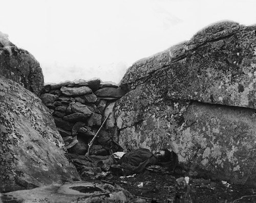
Alexander Gardner, The home of a Rebel Sharpshooter, Gettysburg 1863
As for photography, Lyons cites Gettysburg Then & Now, William Frassanito’s decades-long research project to identify and reshoot the sites of vintage, battle-era photographs. And a study by Jim Weeks, who found that
the desires of visitors, who want to see visions of the battlefield familiar to them from historical photographs, particularly from their deployment in Ken Burns’ documentary series The Civil War…helped prompt the restorations of the last 20 years… Weeks observes that “While in earlier phases Gettysburg controlled its image, by the latest phase images controlled Gettysburg.”
Lyons, Maura, “Memorialization and Marginalization: Vernacular Sites and the American Civil War,” PAD Journal, vol. 1, no. 2, pp163-191 [tandfonline.com]
Previously: Some pointers, or what to do with Neutra’s Gettysburg Cyclorama Center?
On Studying Why Americans Protest Art
Here is a PBS Newshour Q&A with Steven Tepper, discussing his research into why art–or the arts, really, since he looks at theater, libraries, music, too–triggers protests in some communities at some times and not others. He found that the protests are “always deeply rooted in local concerns.”:
STEVEN TEPPER: I looked at 805 cases of conflict across 71 mid- to large-sized cities in America. When all was said and done, and I looked at all the various things that might correlate with the cities that the highest rates of protest over a four year period in the 1990s, it was the rate of immigration in the decade prior that most strongly determined whether a city was a high city or a low city in terms of its protests levels. Cities that had experienced rapid population changes, in particular if the percent of foreign born had grown significantly, those cities were the most contentious in the late 1990s. And the argument in the book is that when people feel unsettled by the rate of social change, when the things around them are changing fast — economics, demographics, technology — art becomes something that they fight over as a way to reassert their values, reassert a sense of who their community is and where they fit into their community, who’s values still matter, what does a community look like going forward, and art becomes this amazing arena in which people negotiate their differences of opinions around the contours of their expressive lives together.
Great, so now we know? And we don’t have to read Tapper’s new book, Not Here, Not Now, Not That! Protest Over Art and Culture in America? Except that reading the book may be the only way to get a handle on the “social changes” Tapper mentions. Because they frequently seem to involve race, religion, and gay.
And I assume that he sets aside the culture-war-style protests started by organizations or politicians to gin up support or fundraising, which do not always have a local impetus. [Though even as I think about the Smithsonian’s “Hide/Seek” mess, the reality was, it was timed to disrupt the Congressional debate and coverage of the repeal of “Don’t Ask, Don’t Tell,” so in a way, it was hyperlocal.]
tl;dw, reading the transcript is quicker: Conversation: Why Do Americans Protest Art? [pbs newshour]
Go ahead, buy: Not Here, Not Now, Not That! Protest Over Art and Culture in America [amazon]
The Cosby Sweater Project
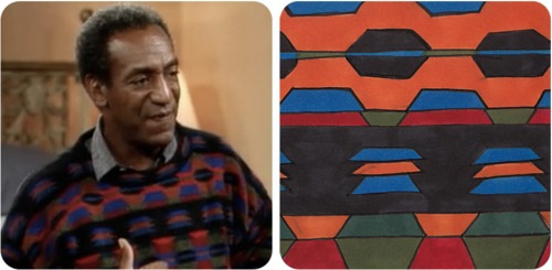
“Season 3, Episode 3: ‘Golden Anniversary'”
This is epic. Painting the key sweaters of The Cosby Show, one episode at a time, in chronological order. Which is awesome, not because it charts the evolution of the Cosby Sweater; any punk with a tumblr could do that. But because it’s fun to imagine Thomas Nozkowski’s reaction, as the seasons progress, and he hears the footsteps behind him, getting ever closer. And an occasional spastic, growly laugh.
The Cosby Sweater Project [thecosbysweaterproject.com via I wish I could remember]
On The BELLMAC-32, And Perhaps The World’s Largest Plotter Pen Drawing
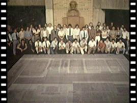
BELLMAC-32A Layout in the Ball Labs, Murray Hill Lobby, image: ieeeghn.org
Look closely, at least until I can track down a larger version of this snapshot.
Because it may be the world’s largest plotter pen drawing.
It’s a 20×20-foot layout of the BELLMAC-32, the world’s first 32-bit microprocessor, developed by AT&T just before they divested themselves of Bell Labs and the RBOCs beginning in the late 1970s.

BELLMAC-32A microphotograph, via ieeeghn.org
According to a first-hand history of IEEE fellow Dr. Sung Mo (Steve) Kang, developing the BELLMAC-32 constantly uncovered the limitations of the design, testing, manufacture, and QA process for microprocessors:
Chip layout verification was another huge challenge. At that time, no CAD tools were available for the entire chip layout verification. As a result, we had to generate many CALCOMP plots and Scotch-taped them together to form a 20-foot-by-20 foot plot that was placed on the floor in a huge room. To make sure interconnects were formed properly, all terminals were labeled and wires were traced by using color pencils to make sure the lines ran continually. Although primitive, this method uncovered many errors and, in the end, produced error-free layouts and fabricated chips. We used a huge empty room in Building 3 of AT&T Bell Labs at Murray Hill or the main lobby area to complete the checking.
I love that creating the most advanced computer chip of the day still involved PhDs crawling across the floor with colored pencils.
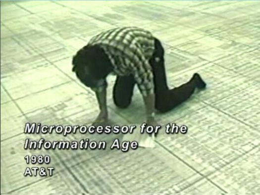
Still from Microprocessor for the Information Age, a 1982 industrial film on the making of the BELLMAC-32, via AT&T’s Archive
And of course, there’s the giant drawing itself, spit out by a printer in tiles and taped together. Was Wade Guyton even born when this all went down? Yes, but still. So awesome.
Now to track down a working CALCOMP plotter and recreate it. Because it’s probably too much to hope that AT&T or one of their computer engineer diaspora rolled all those sheets up and stuck them in their moisture-free basement. Right?
Microprocessor for the Information Age (1982) [techchannel.att.com thanks greg.org reader robin edgerton]
First-Hand: The AT&T BELLMAC-32 Microprocessor Development [ieeeghn.org]
previously: Shatner, plotter art, and the drawing machine as seen at the beginning of the digital age
Considering The Eameses As Artists
A few months ago, I was asked to write something about Ray and Charles Eames by the folks at Humanities Magazine, published by the National Endowment for the Humanities.
The NEH had provided some funding to Jason Cohn and Bill Jersey’s documentary, Charles & Ray Eames: The Architect and the Painter, so a straight-up review wouldn’t really work. But I was encouraged by the documentary’s title, and its exploration of Ray’s role in the duo’s collaborative process, and so I decided to float the idea that there’s a lot to learn by considering the Eameses as artists:
Throughout their own careers, whether making architecture, furniture, toys, annual reports, or films, the Eameses presented themselves as designers. And despite their forays into education, computing, and international diplomacy, that’s how they are typically seen. But calling the Eameses designers while trying to account for their polymathic legacy can be problematic, particularly if we’re picturing the designer as a lone, heroic genius: Charles Eames as the Howard Roark of American consumer capitalism. It invites many esoteric and academic questions about process, context, gender, and collaboration, which are interesting but hard to resolve. When considered from an artistic perspective, however, many of these complications evaporate. Accepting Ray and Charles Eames as artists and their studio work as art gets us away from the arbitrage over who did what and how. Plus, it enriches and deepens the contemporary understanding of their role in the culture of their time.
That’s John Neuhart up there, by the way; he built the Eameses’ greatest object besides their house, and one of the greatest unsung, unrecognized artworks of the modernist era, the Solar Do-Nothing Machine.
Modern Love, Humanities Magazine, Nov/Dec. 2011 [neh.gov]
The New Aesthetic On Stage
Here’s video of James Bridle giving a live, keynote speech version of his awesome tumblr, The New Aesthetic, at a web conference in Australia. Lots of good stuff, though not much that will be new to TNA followers.
There are a few greg.org favorites in there, too, including lots of camo, Dutch Google camo, Blurmany, that crazy Google Books book, Google Google Google camo camo camo.
Waving At Machines, at Web Directions South, Sydney AU [booktwo.org]
John Cage’s Sweet Nut Balls
Here’s another recipe from John Cage, this one maybe from a stay in Ithaca? Before he went vegan, obviously. From Empty words: writings ’73-’78, p. 91:
Holiday Inn: Room 135.
Four cups of ground walnuts;
4 cups of flour;
12 tablespoons of sugar;
2 2/3 cups of butter;
4 teaspoons of vanilla.
Form into circa 125 small balls.
Bake at 350 degrees in motel oven.
Now back to Room 135.
Roll in 1 pound of powdered sugar.
Nut balls.
Makes enough for one dance company, I guess.
Everything And The Kitchen Sink
We took the family to Hillwood over the holidays. It’s Marjorie Merriweather Post’s house-turned-house museum, and it’s kind of bizarre, frankly. Not seriously wack, but just a low-grade oddness which, who knows, maybe the passage of time and the accretion of history will help mitigate, and 50 years from now, it’ll be Washington’s Frick Museum. But it’s not yet.
Hillwood is a sprawling memorial to the oft-married heiress/socialite’s extravagant but ultimately middlebrow taste. The house is kind of big, but mostly grand, similar in scale and layout to the White House, but in Georgian/James River revival style, built in the 1920s. The storm doors on the terrace entrances look like the ones on every postwar red brick grandma house in Washington. The gardens are sprawling, but conventional.
Post’s collections are a docent’s paradise: tons of factoids to be shared about piles of French furniture, Sevres porcelain, Russian baubles and czarist portraits. And antique miniature furniture. None of it was as interesting as the positively massive cut crystal pendants hanging from every sconce and chandelier; seriously, grapefruit- or palm-sized or bigger, almost every one.

And so my favorite room ends up being the kitchen, which is fantastic. It’s huge and vintage and all stainless steel, acres of Lustertone countertop, with a couple of sections of Formica and marble. It’s a rare testament to the blind folly of our renovation-mad real estate culture. Keep your vintage kitchens, people, are you crazy?? [That pink tile and rococo gold-plated fixture master bathroom, OTOH, yow. A cautionary tale.]
Anyway, point is, this awesome double sink thing here in the butler’s pantry? What is going on with this? I think it’s stamped Geneva on the front edge. It is spectacular. Made my day.
Kim Schoenstadt At–Whoa, UMOCA

A little while ago, I got an email from LA-based artist Kim Schoenstadt, asking if it was alright to reference some photos I took a few years ago of unusually awesome modernist houses in Salt Lake City. She planned to incorporate drawings based on parts of the photos into a larger landscape/installation at her Doctorow Prize exhibition at the Salt Lake Art Center.
Obviously, yeah, fire it up, I said.
And then just now, I popped on over to the SLAC website to see how it all turned out, and it looks great. There’s a participatory drawing/paint-by-numbers/vinyl sticker reveal component of the show I’m not quite grasping, but it should make sense when we see it in person in a couple of weeks.
Meanwhile, holy smokes, the Art Center announced today that it has changed its name to the Utah Museum of Contemporary Art. Which is a thing I can barely imagine exists, but there it is. And to think it was once called the Art Barn. Mazeltovs all around out there.
Utah MOCA Doctorow Prize – Inaugural Exhibition, Kim Schoenstadt [utahmoca.org, which domain name was registered in Aug 2010, so maybe I’m just the last to know]
Kim Schoenstadt [kimschoenstadt.com]
And Now Erased Kennedy?
Wild. The previous post about erased and archived and someday-to-be-resuscitated Nixon reminded longtime greg.org reader Jonathan of another obscured national conspiracy: the Dictabelt recordings of the Kennedy assassination.
Apparently, a motorcycle policeman along the presidential motorcade route through Dallas had his mic stuck open, and he inadvertently laid down several minutes of audio on a police radio channel, which was being recorded by something called a Dictabelt.
Generations of investigators who examined the recording drew controversial and sometimes conflicting conclusions from it about the participation of a second gunman. But basic questions about which policeman’s radio was being recorded, and where he was at the time, have never been answered definitively.
In any case, the celluloid acetate medium on which the recording was made is microscopically degraded further with every pass of the stylus. So the more it is disputed and heard and analyzed, the more it is physically erased.
Dictabelt evidence relating to the assassination of John F. Kennedy [wikipedia, thanks jf]
Erased De Kooning, Erased Nixon
The new issue of Cabinet arrived today [free with my new iPad case!], and it includes a fascinating article by Susan Schuppli about the 18 1/2-minutes of erased audiotape at the center of the Watergate scandal. Apparently, the National Archives has sealed the original tape reel, known as Tape 342, with the erased segment, and evaluates advances in forensic analysis capabilities, “waiting for that moment when the kiss of technological progress will reawaken it.”
The last formal scientific panel to review the matter was in 2001; its tests were unsuccessful. Schuppli obtained a copy of Tape 342–technically, a copy of a copy–from the Archives, and performed various chemical and microscopic imaging of it. Because, well:
In conceptually rousing Tape 342 from its archival slumber, I hope to emphasize that erasure was not a process that removed information to produce an absence. In fact, an analogue tape recorder can only ever re-record over an existing track and thus Nixon’s, or his secretary Rose Mary Woods’s, purported act of tampering was a supplementary act of recording–an additive rather than a subtractive process.
This recognition of erasure as a generative event, not a destructive one, reminds me of Leo Steinberg, quoting Tom Hess, on de Kooning’s use of erasure, and Rauschenberg’s erasure of de Kooning:
De Kooning was the one who belabored his drawings with an eraser. Bob was proposing a sort of collaboration, offering–without having to draw like the master–to supply the finishing touch (read coup de grace)
Which reminded me that at a CAA panel last winter, SFMOMA’s Chad Coerver, who talked about creating the museum’s digital archive of its Rauschenberg holdings, mentioned that conservators using electronic imaging had been able to discover de Kooning’s original drawing. And that they’d been discussing with curators whether to make the image public. Which, holy smokes, I’m glad SFMOMA doesn’t have Tape 342.
Philip Glass, Gandhi And The Peoples’ Mic
New Yorker music critic Alex Ross posted this extraordinary video of Philip Glass and the Occupy Wall Street General Assembly outside Lincoln Center, where the Metropolitan Opera performed Satyagraha, the composer’s 2008 production of his 1980 telling of the early life of Gandhi.
Starting at about 3:00, Glass and the peoples’ mic recite the closing lines of the opera:
When righteousness
withers away
and evil
rules the land,
we come into being,
age after age,
and take visible shape,
and move,
a man among men,
for the protection of good,
thrusting back evil
and setting virtue on her seat again.
As operagoers begin to realize what’s going on, and that Glass is there, they start ignoring the police cordon trying to direct them away from the protest, and start drifting down the stairs. It’s pretty extraordinary.
The Satyagraha Protest [therestisnoise]
The EAI High Definition Video Guide
Whether you’re sitting at home, poking at your remote to stretch, squash, and crop your Criterion movies; or preparing a video group show in Miami, Electronic Arts Intermix’s High Definition Video Guide is an indispensable source of basic technical information:
If we agree that mindfulness about the proper display of electronic art is necessary to maintain the integrity of the work, then a basic awareness of how this new medium works is crucial. In what ways is HD different from other forms of video? How do these factors visibly affect the picture? How can older analog works be properly displayed with today’s technology? All in all, how will HD video impact collection, exhibition and preservation?
This addendum to EAI’s Online Resource Guide explains HD technology and its implications for curators, conservators, registrars, art historians and educators. The goal is not to mandate best practices, but to offer the foundation of a consistent vocabulary. Even more, the aim is to initiate dialogue across the field about the challenges and possibilities in this new chapter in the history of the moving image.
Thanks to Ed Halter of Light Industry, who included EIA’s HD Guide in his Best of 2011 list in Artforum.