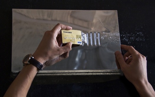
Sebastian Errazuriz came up with the idea for his coke slab when he saw friends scratching out lines on a coffee table. The indentations make it so easy, a child could do it!
It’s so functional and brilliant, I’m surprised someone hasn’t invented it already. It’s also gorgeous to look at, though it also appears that the actual production version available for sale on Grey Area’s website is matte finish, not mirror-finish stainless steel. Too bad.
Maybe better to wait for Rirkrit‘s version.
[Other things I just thoguht of: Painting Bitten By A Man, 1961, Jasper Johns; Table, also 1961, Yves Klein.]
COKE SLAB
Sebastian Errazuriz, 16 x 9 x 0.75 inches, $2,100 [shopgreyarea.com via museumnerd]
On Bruce McAllister’s DOCUMERICA And Robert Smithson’s Spiral Jetty

One of the startling images Alan Taylor included from the EPA’s DOCUMERICA collection is by Bruce McAllister. The caption:
A train on the Southern Pacific Railroad passes a five-acre pond, which was used as a dump site by area commercial firms, near Ogden, Utah, in April of 1974. The acid water, oil, acid clay sludge, dead animals, junked cars and other dump debris were cleaned up by several governmental groups under the supervision of the EPA. Some 1,200,000 gallons of liquid were pumped from the site, neutralized and taken to a disposal site.
Hmm, is that the only photo McAllister took of railroads and toxic industrial dumps near Ogden in the early 1970s?
No.
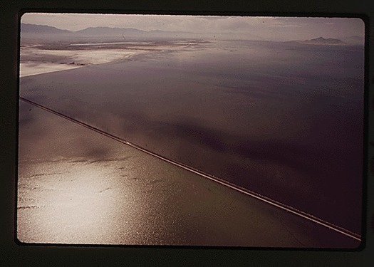
“THE UNION PACIFIC RAILROAD’S CAUSEWAY ACROSS THE GREAT SALT LAKE THREATENS THE ECOLOGICAL BALANCE OF THE LAKE, 07/1972”
McAllister’s acid pond is “near Ogden,” but it turns out it was even nearer the Great Salt Lake. The site was called Little Mountain Salvage.
Continue reading “On Bruce McAllister’s DOCUMERICA And Robert Smithson’s Spiral Jetty”
DOCUMERICA And The Ills Of The 1970s American Landscape
Following on from the multiple installments of archival World War II images on hisphotoblog In Focus, Alan Taylor has assembled selections from another remarkable public photo archive, this time from the Environmental Protection Agency. In the early 1970s, the newly formed EPA sent photographers around the US to document the environmental and physical state of the country. The project, titled DOCUMERICA, rivals the Depression-era Farm Security Agency’s photo effort in scope and scale; more than 100 photographers produced over 80,000 images, and the Corcoran and Smithsonian organized DOCUMERICA exhibitions that toured the country until 1978.
In setting out to “systematically record the ills of the 1970s American landscape,” EPA project director Gifford Hampshire consciously patterned DOCUMERICA on the FSA’s photo program, consulting with FSA veteran Arthur Rothstein on setting it up and selecting photographers.
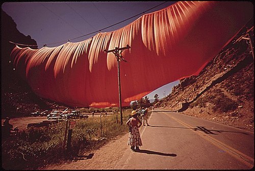
Around 16,000 have been digitized and are available on the National Archive’s website, and I’ve just barely started poking around. The least interesting of the two things I’ve found so far, both from photographer Bruce McAllister, is documentation of what I believe is the first installation, on October 10, 1971, of Christo & Jeanne Claude’s Valley Curtain in Rifle Gap, Colorado.
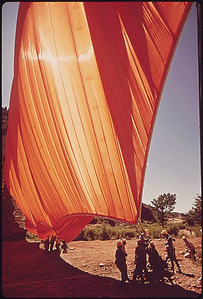
I’m guessing it’s the first, because McAllister’s photo captions mention how “it was ripped to shreds by canyon winds in 24 hours.” Christo tried again on August 10, 1972, but that time, a storm forced the curtain’s early removal. Which makes McAllister’s stated date of 05/1972 incorrect. On the other hand, sundresses and October in the mountains don’t normally go together, do they? Either way, as ills of the American landscape go, Valley Curtain was little more than a 24-hr flu.
Alan Taylor’s 46 favorite images from DOCUMERICA [theatlantic.com]
DOCUMERICA: Snapshots of Crisis and Cure in the 1970s [archives.org prologue magazine]
Search the Archives Research Catalog for “Christo Javacheff” [archives.gov]
Where Is Enzo Mari’s ‘Where Is The Craftsman?’
In what is probably the most ideologically analytical essay ever written about paperweights, curator Barbara Casavecchia notes that many of the 60 paperweights she selected from Enzo Mari’s collection “are the product of a manual labor–serving as fragmented evidence of the persistence of non-alienating forms of work, specifically within the craftsman-like dimension inherent to production that Mari has investigated for years.”
One incarnation of Mari’s investigation was an exhibition and discussion forum he organized in 1981 titled, “Dov’e l’artigiano”/”Where is the crafstman”. It was presented first at Fortezza da Basso in Florence, and then at the Triennale in Milan. There was a catalogue published–which I can’t find anywhere–and at least one review–which I can only find a few quotes from, but otherwise, the Italians have not yet processed or digitized their contemporary design history yet.
In his latest book, Venticinque modi per piantare un chiodo/25 ways to drive a nail, Mari says the objective was to “illustrate the unresolved ambiguity of the relationship between industrial design and ‘handmade.'”
Excerpts from an Ottagono review of “Dov’e l’artigiano” place the show and Mari’s critical view of the alienating labor conditions of mass production at the center of the debate over Italian design, culture, business, even a national identity of sorts. On the one hand, some Italian producers, still modernizing, hid the fact that their consumer products were partially made by hand because they “did not want to lose the noble title” of industrial design. And others hid the fact that they’d begun using industrial manufacturing processes because they didn’t want “to lose the prestigious title of an object ‘made by hand.'”
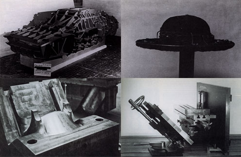
As he had done in 1973 with his autoprogettazione plans, exhibition, and product line, Mari eschewed theoretical arguments in favor of a “didactic exhibition” of objects and the close analysis of their creation. For the show he uncovered hundreds of examples of artisanal and craftsman-like processes being used to make mass-produced industrial design. Here are the objects and categories I’ve been able to find so far:
- Industrial prototypes and models made by craftsmen, such as hand-formed auto body parts by Italdesign’s Giorgetto Giugiaro and Aldo Mantovani for Alfa Romeo [top left, I think]
- Scale models and testing prototypes of turbines.
- A hand-made mold for high-quality plastic chairs [bottom left].
- The schematic drawing for an integrated circuit, which apparently took over 1800 man-hours to create. [I believe it]
- “Technological masterpieces” such as US nuclear submarines, one-off industrial objects.
- An 18th-century-style table with legs “built in series with industrial machinery, but finished with a stroke of the chisel to make it ‘unique.'”
- A Borsalino custom-made for the Pope [top right].
- A machine-like sculpture by Mari collaborator Paolo Gallerani [bottom right].
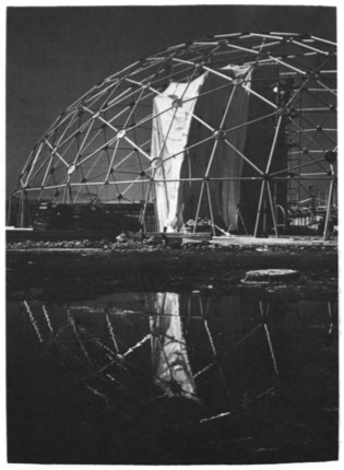
Oh yeah, and the whole show took place inside a geodesic dome.
I’ll add more objects and pictures if/as I find them. It’s hard to process a 30-year-old exhibit you’ve only just found out about. But it makes me think of things like, well, obviously, pen plotters and that insane William Shatner integrated circuit drawing movie. And NASA workers using giant clothespins to glue the mylar strips toghether for Project Echo satelloons. And Richard Serra sculptures made in defunct shipyards and Richard Prince car hoods. And hand-embroidered Gap kids’ dresses that turn out to have been made by children in India. And etsy and custom Nikes and pre-stressed jeans. And Ikea furniture that offloads all the non-alienating labor processes onto the customer.
Which is all by way of saying I have no grand theories on the current state of the relationship between craft and industrial production; but I think they’ve turned out to be not quite as incompatible as they seemed in 1981.
LINKS/RELATED
This all started with the catalogue essay for Enzo Mari: Sixty Paperweights, An Intellectual Work, which just closed in Berlin. [kaleidoscope-press.com, tanyaleighton.com]
Maddamura’s discovery of the Ottagono review is one of the few online sources of info on the “Dove’e l’Artigiano” show [image, too: maddamura.eu]
Mari’s new book, 25 Ways to Drive A Nail, is not available in English yet. [google books tho]
‘You Are Good Dome Builders.’
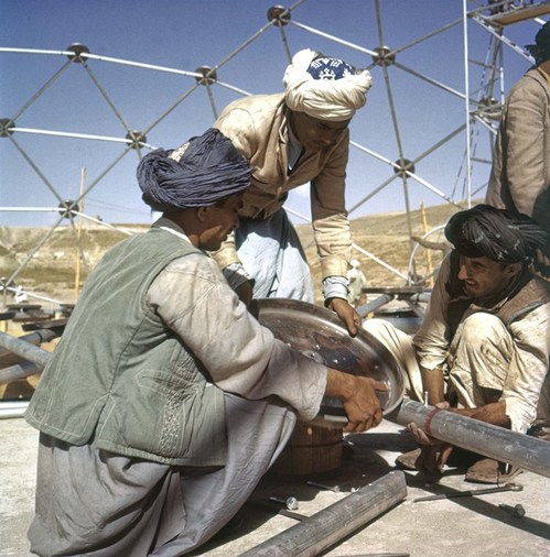
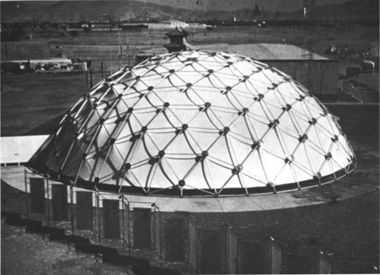
(K-2-28) This is the first of our United States, Department of Commerce, Trade Fair domes. It was erected in Kabul, Afghanistan in 1957. The U.S. Department of Commerce came to me in an emergency and with a very small budget. We were given thirty days to design and produce this structure, which we succeeded in doing. It had to be so designed that it could be folded up and put into one DC-4, which was all that was available for that task. It had to be flown across the ocean to Afghanistan, accompanied by only one of my engineers. All its parts were color coded so that the Afghan people were able to erect it by putting the red end to the red hold on the hub and the blue to the blue, etc. The Afghans didn’t know what they were building at all. They thought it was meant to be a conventional rectilinear structure, but suddenly found they had produced a hemispherical structure. They were bogle [sic] eyed and excited. The workers began to shoot-the-shoots [sic] down the taut nylon-geon-skin of the dome. The king of Afghanistan acclaimed the dome.
World society is accustomed to the concept of an architectural design which is erected by skilled craftsmen who’s [sic] skill, a priori, permitted the architect to design the kind of building which the craftsmen build. It was up to the architect to keep in mind that which the craftsmen could build.
In the case of our Afghan dome, when the Afghan people saw that the Afghan workmen had put up a new dome structure they attributed its spherical success to the Afghans’ craft skill. They said to the Afghan workmen shooting the shoots down the dome, “You are good dome builders.” The workmen replied, “Yes we are” and the Afghans applauded. So they said it was obviously Afghan architecture–a modern plastic and aluminum super-yurt. This made our dome the hit of the Kabul 1957 Trade Fair and the U.S.A. Departmetn of Commerce who had originally taken on the dome only as a last minute emergency device to stay within budget yet meet a challenge decided to see if this unexpected geodesic virtue, of popular appeal, would meet with equal favor elsewhere. It did time and time again.
This is a picture of the same Afghan dome which being 100% demountable, without parts loss or deterioration, went on economically in disassembled condition successively by air to New Delhi, Bangkok, Burma, Tokyo, the Philippines, and then down to Lima, Peru, on the west coast of South America and is now back in Africa again. This geodesic dome is now on its second local-stop trip around the world by air. It now has many counterparts doing the same.
Buckminster Fuller, from World Design Science Decade 1965-1975, Document 2: Inventory of World Resources, Human Trends And Needs, 1963, pp. 78-9. [All WDSD documents are available for download at the Buckminster Fuller Institute.]
Previously: Welcome to the Kabul Dome
In Afghanistan Did Buckminster Fuller A Statecrafty Geodesic Dome Erect
Let’s See You Try To Pepper Spray Them NOW, Hmm?
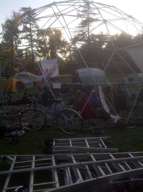
Wait, the UC Davis Occupy protestors built a 30-foot geodesic dome for their general assembly? Of course they did.
This is not a drill, people. Welcome to the Pepper Dome.
[image via @amychamp]
Previously: jackboot, Bean Boot
Dazzle
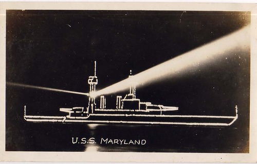
Apparently, as a state-of-the-art battleship in the US Navy during the 1920s, the USS Maryland was “in great demand for special occasions.”
Which might give a hint about why she was tricked out at some point in these dazzling but highly non-camo lights.
USS Maryland [thekingof via reference library]
Rirkrit Passed The Shark On The Autobahn
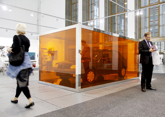
image via artreview
Oh, man, oh, man. I think this clears up a lot. Finally, here is a quote that gives some insight on Rirkrit Tiravanija’s approach to art objects and object-making. The artist is discussing the making of Untitled 2010 (All the days on the Autobahn), 2010, which was purchased by the Foundation for the Association of Friends of the National Gallery Berlin for Contemporary Art:
untitled 2010 (all the days on the autobahn), is a work extending from a series that I have been working on over the past ten years. It is biographical and also a documentation of the artist and art in action, where the boundaries of life and art merge into one becoming indistinguishable from each other. The artist in his daily life; his movement through time and space becomes his practice. In response to the quotation above which I said many many years ago, the question for me as an artist is how does one continue to make art after Duchamp’s readymade? In some ways I found art to be defined by the action taken upon the object, the use of the object when one lives with it; with action and usage one is asked to form meaning. The Peugeot 205 was a car I drove while living in Berlin, it was an economical and efficient utility vehicle – it took me to many places where I had to travel for work, and a so I formed a deep relationship with it. Over time and with all my other concerns, the car became redundant and I placed it aside, and with this work, I encased it and returned it to its original state — as the readymade. On its heel (rear left wheel) a riddle can be found written on a crushed up coffee cup that states, “is this all there is to life”. [emphasis added]
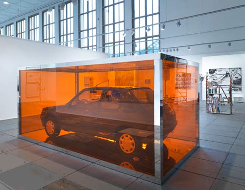
So the functional objects of the artist’s daily life/practice become redundant [in the US or the British sense? I don’t know], and then convert–or revert–to readymade status. It’s the ultimate upcycling. But that doesn’t quite explain the mirrored steel & Perspex vitrine; can a readymade exist within a custommade?
I can’t think; I’m too distracted by the chrome Autoprogettazione bookcase in the back there, part of neugerrimscheider’s vast, shiny booth at last year’s Artforum Berlin. Do want.
#70 Rirkrit Tiravanija | untitled 2010 (all the days on the autobahn), 2010 [vfn-stiftung.org]
Previously: Transactional Aesthetics, or the highly collectable Rirkrit Tiravanija
howtospendit.com +rirkrit
There’s No Such Thing As A Free Lunch
Dos Zapatas
Looking through Social Photography II, Carriage Trade’s second Phone Camera benefit auction, I find this photo by Sarina Basta, Zapata Headquarters, Cuernavaca, and I’m like, Zapata? I swear, I’ve seen this before.
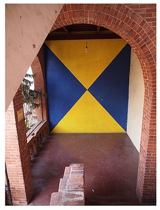
But not quite.
In the Diego Rivera murals exhibit at MoMA, there’s a full-size X-ray image of the artist’s iconic, Agrarian Leader Zapata, which shows the fresco panel’s internal steel bracing structure.
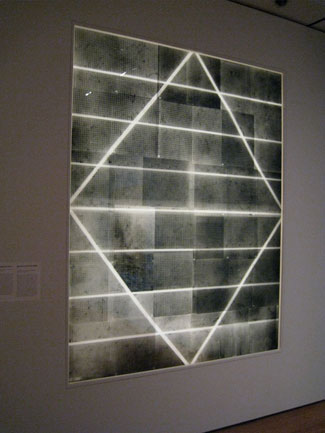
Here’s an image of it from Jill Krementz’s remarkably comprehensive coverage of the preview for New York Social Diary. Krementz, who even managed a photo of anti-Zapata Anna Wintour who was not at the Rivera press preview, but was leaving a meeting for the Film Department’s Pedro Almodovar benefit.
Close Encounters Jam Session
I’m sure the original’s long gone, but I want the Moog synthesizer-equipped lightboard from Close Encounters of the Third Kind.
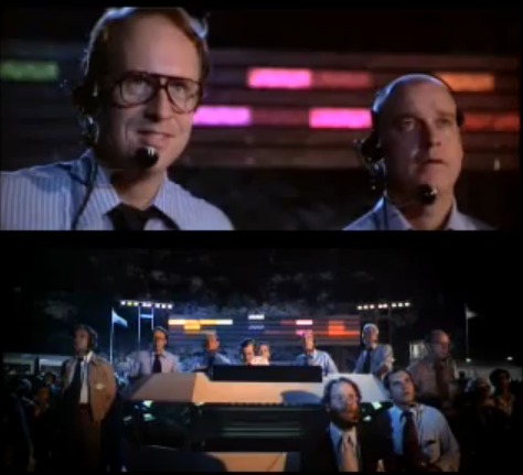
The idea of communicating with extraterrestrials via “a basic tonal vocabulary” synched to a gridded light show is like the lovechild of Carl Sagan and Ellsworth Kelly, conceived at an outdoor Pink Floyd concert. In a good way.
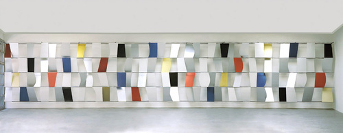
Sculpture for a Large Wall, 1957, image: moma.org
[Just an aside, the story of Kelly’s Sculpture for a Large Wall is utterly fantastic. I’m glad that it’s safe and at MoMA, but the utter failure of Philadelphia to keep it should be discussed every time the Eakins or Barnes stories are told.]
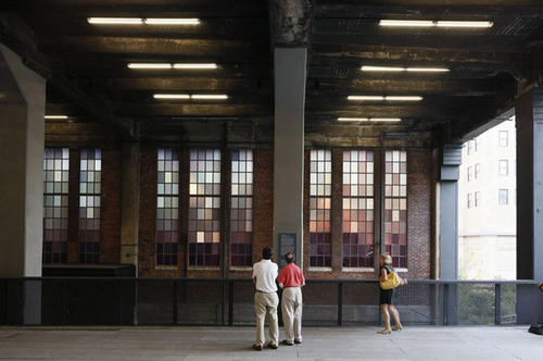
Spencer Finch, The River That Flows Both Ways, image by iwan bann via thehighline
I would have expected Spencer Finch or Leo Villareal to have made one of these already. Or any one of a number of early Silicon Valley IPO nerds. But I can’t find any record of replicas anywhere. So I will step in where I must.
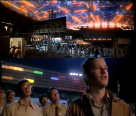
My first guess was that Douglas Trumbull gets the credit for the board; and maybe he designed and executed it. But according to Ray Morton’s definitive-sounding 2007 book on the making of Close Encounters, it was Spielberg’s idea to have a colored lights that correspond to each Moog tone. John Williams composed and recorded the music in advance, so it could be played back on set for filming what was called “the jam session.” I’ll gladly overlook this somewhat Milli Vanillistic approach to jamming in exchange for the score and the rig’s schematics.
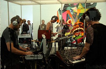
Rirkrit Tiravanija, Untitled (Rehearsal Studio No. 6, Silent Version), 1996, installed at MCA Chicago, image via artforum
Because obviously, when you exhibit this, you’ll expect the first thing everyone will play is that iconic five-note greeting. Then they’ll get into a jam session of their own. You’d probably want to make it possible, via the web or USB stick or something, for people to execute their own compositions, to let the computer “take over the conversation” once in a while. And you’d probably stream the piece over the web, too, give it its own channel. Maybe schedule some performers to come in and use it.
Then for good measure, put the whole thing on a golden CD and launch it into space, and wait for a response.
Off the Golden Record
Jackboot, Bean Boot
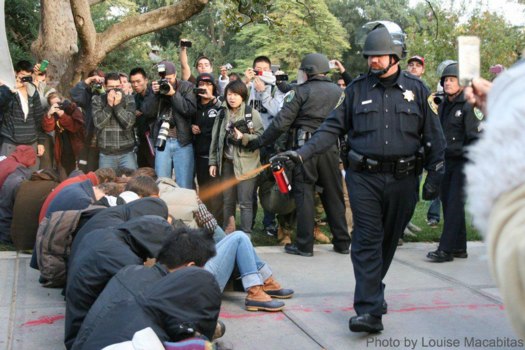
The video is absolutely riveting, all the way through. And though it’s outrageous &c &c., the casual pepper spraying of the seated student protestors is only the second or third most important takeaway from this clip.
That said, I have to confess that the, like, third thing I thought when seeing Louise Macabitas’ photo [via motherjones] was, “Hey, Bean Boots!”
Rijksoverheid Rood 5: Mirror
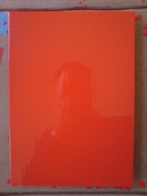
Theoretically, I can get the prep and sanding and tacking and painting of a new coat, and the cleanup, and a bit of documentation, done in a little over an hour now. But I also find it takes a certain kind of hour.
And anyway, I wanted to switch to a roller, and so I went looking at neighborhood hardware stores, to no avail. I explained to one ACE manager what I needed: a roller for laying down smooth oil enamel on steel panel. Yes, it’s primed. No, it’s just a panel. No, can’t spray; it’s custom mixed in a can. Monochr– Just the one color. Not going to paint anything on top of it. He finally said, “It sounds like art.” Well, that remains to be seen. Right now, it’s just a painting.
Well, yes and no. It’s taken me several coats or sessions to realize that I’ve been handling these panels very carefully, like art–but like someone else’s art. Art I’ve bought and need to take care of. I think I’m over that. They need to be made before they need to be conserved.
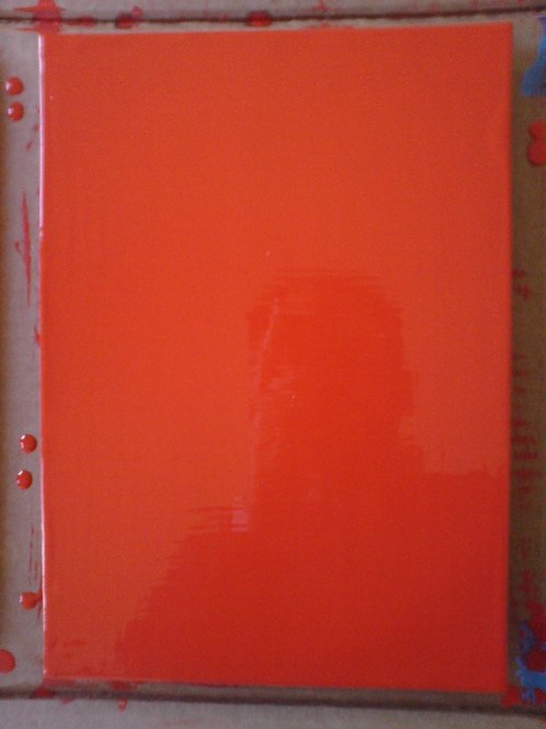
And now that I’m handling them a lot more, and less hesitantly, I’m finding I like the feel of the steel panel [top] better than the aluminum [above]. At least at this gauge, the aluminum is just too light and flimsy. And since I don’t want the metal to have an edge profile of its own, I’m wary of moving up to a thicker gauge.
The sponge brush, well, I’m not sure I’m for it. It does produce a much finer striation than the natural brush I’ve used till now. What I think is that for these layers I know I’m going to sand, it’s not as important. I am interested, though, in how the brush strokes differ, horizontally and vertically, or portrait and landscape [sic or heh, I’m not sure which]. If I can’t get rid of it entirely, I may keep that somehow.
[Note: I missed posting an update #4, but it was sanding, and then cutting the drip/stalactites off, rather than wait any longer for them to dry, which they’d never really do, and then you’d sand across one, and it’d break and shmear like a rood zit.]
You’ll Be My Mirror
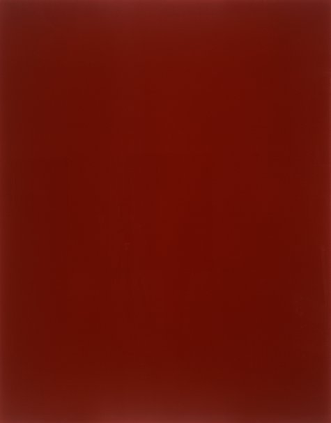
gerhard richter, blood red mirror, cr736-3, 1991, image via gerhard-richter.com via jenettem’s twitter/tumblr to cavetocanvas’s tumblr
You see the problem: this is exactly the effect I’m trying to get with my Rijksoverheid Rood paintings. Only with a brush.
I totally love Gerhard Richter’s mirrors. And his mirror paintings. There was that diptych in Rob Storr’s show. And oh man, that installation at Dia Beacon? I think it was the early gray paintings that helped me into the mirrors. Which is probably why I had never noticed that there were red mirror paintings, too. Of course, the mirrors don’t look like this.
They look like this:
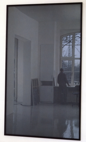
mirror, grau, cr735-1, 1991, image gerhard-richter
There are at least 44 mirror works so far. Including this one I’d never seen, an edition done in 1986 for the Kunstverein in Dusseldorf. I love Richter’s website description of this cork-backed mirror: “This object is not a ready-made but was made to Richter’s specific instructions.”
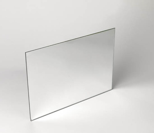
I think this one sold at Swann last year may have a little chip in the lower corner.
Richter’s specific instructions: make it 210x298mm, a dimension better known as A4. Less well known as the size of the metal panels I’m painting right now.
I think this helps me to sort the things I make into two categories: things I make because other people made them; and things I make and then find out other people made, too.
Chinese Google Earth Art Project
I confess, I haven’t checked out Utah’s Dugway Proving Grounds since the Terraserver era. But I just checked them out again
This crazy, Toyo Ito-ish tangle of 20m-wide white lines in the desert of Gangsu province have been stumping folks on Googlesightseeing for 2+ years. [Scrolling down, they found Google Earth images of the feature under construction in the spring of 2005.]
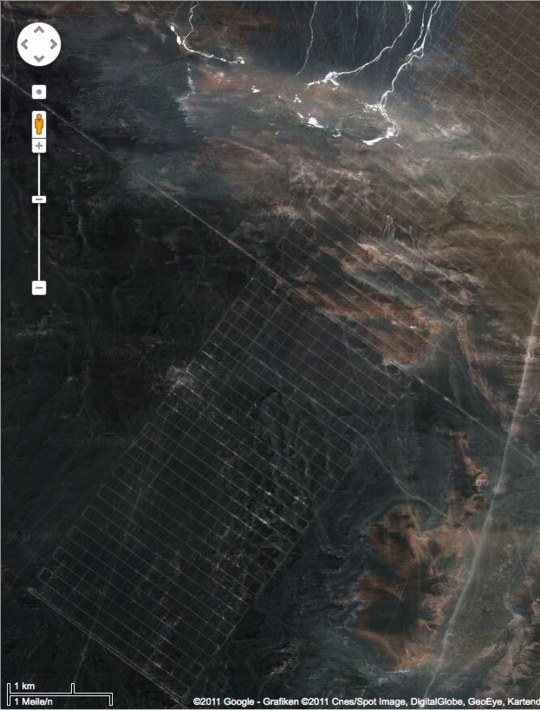
This is my favorite, though, an 18-mile-long grid [!] in Xinjiang. The speculation is that it’s a calibration grid for Chinese spy satellites. I like to think of it as the world’s biggest Agnes Martin painting.
Gizmodo’s been adding more Chinese Google Earth oddities to their original post. I’d still put Dugway into the top 3, or at least the top 5.
[thanks ryan, patrick, dt, and a couple of other people who also consider me their go-to guy for oddball Google earth art links.]
What I Want To Look At Today: Byron Kim’s Night Sky Paintings
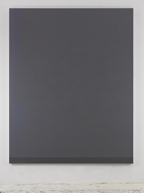
Byron Kim, Untitled (for S.B.), image via jamescohan.com
Byron Kim’s first show at James Cohan consists of large, nearly monochromatic paintings of the night sky in Brooklyn. Or perhaps they’re of memories of the night sky in Brooklyn, or evocations or references to specific phenomena of the night sky in a city. From the press release:
In this new series of work, Kim paints night in the city, evoking the quality of light and hazy cloud formations in the transition from dusk to dark and beyond. He depicts the state of constant suspension that city dwellers experience; the omnipresent lights block their view into the cosmos and deny a resolution to the day that true darkness delivers. The paintings in this ongoing series, measuring 90 x 72 inches, often have hard-edged, painted borders on two or three sides that act as reminders of the architectural elements like windows, cornices and facades of buildings that frame our views of the city sky. Kim paints his crepuscular skies from memory, creating open spaces that act as trigger points for the viewer’s inner dialogue, giving the imagination room to resonate and remember.
Art in America’s Faye Hirsch talks with Kim about the work, which is somewhat related to his ongoing Sunday Painting series, quick renditions of the daytime sky, which are much more representational [or maybe not? Some of those Dark paintings seem very atmospheric, and the borders do feel like architecture.] And they all kind of remind me of the varied blues of Donald Moffett’s monochrome photographs of the sky, which always felt very poetic to me, and which were always framed and matted in strong white so they looked like windows. Which all makes me wonder if the other unmentioned reference here is James Turrell’s PS1 piece.
Byron Kim, Nov 4 – Dec 17, 2011 [jamescohan.com]
Night Rider: Q&A with Byron Kim [artinamerica.com]
previously: what I looked at today: NGA monochromes, [including Byron Kim]

