
The very special presentation of Merce & John: The VW Years will return after this brief announcement from holy crap, Richard Serra’s suburban!
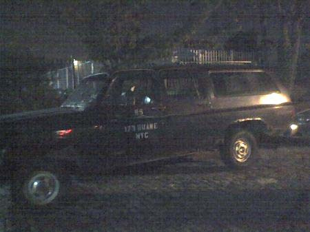
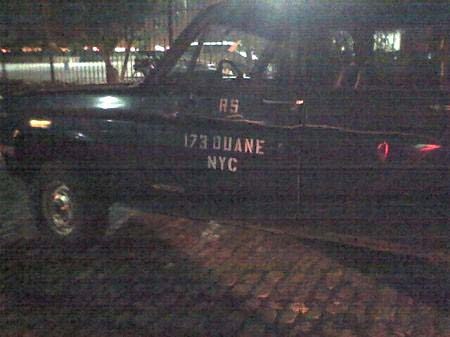
Thanks, wary meyers! Now don’t get all stalky. And stay tuned, eventually, finally, for Donald Judd’s Land Rover.
No One Puts Big Nose Baby Moose In A Corner
Sometimes all Mark Grotjahn wants is to dance. Here are four five videos of those times, in chronological order:
Nov. 2007:
Jan. 2008:
May 2008:
Feb. 2011 [via artblogartblog]
May 2012:
Alexander Girard Shelves? Alcoa Forecast Throwback
You know what I never got around to doing in 2010? Finishing the catalogue of all the designs created for the Alcoa Forecast ad campaign in the late 1950s.
That was the postwar, civilian/consumer-oriented, Glorious Aluminum Future PR campaign that gave birth to the Eames Solar Do-Nothing Toy. Which is by far its greatest claim to fame.
But still, there were other products, prototypes, designs, toys, sculptures, concepts. Like the ones I ran across in April 2010: Eliot Noyes’s design for a carport-like, aluminum & Perspex shelter; satelloon-esque, spherical prototypes for a portable oven by Greta Magnusson Grossman and the Music Sphere, a hi-fi by Lester Beall; and modular prismatic side tables by Isamu Noguchi. Then I found a couple of boring ones, and got distracted.
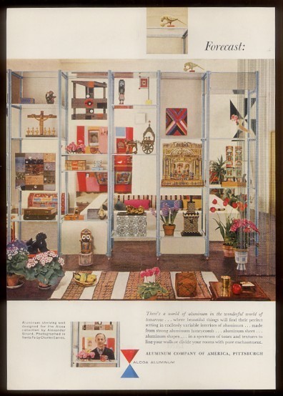
But I just stumbled across this tearsheet on eBay, which is probably from the July 27, 1957 issue of the New Yorker, and which shows a shelving system Alexander Girard designed for the Alcoa Forecast campaign. The photo, shot in Santa Fe, at Girard’s house, was taken by Charles Eames. Which, according to the timeline of John Neuhart, the Eames employee who actually created it, is about when the Solar Do-Nothing Machine was realized.
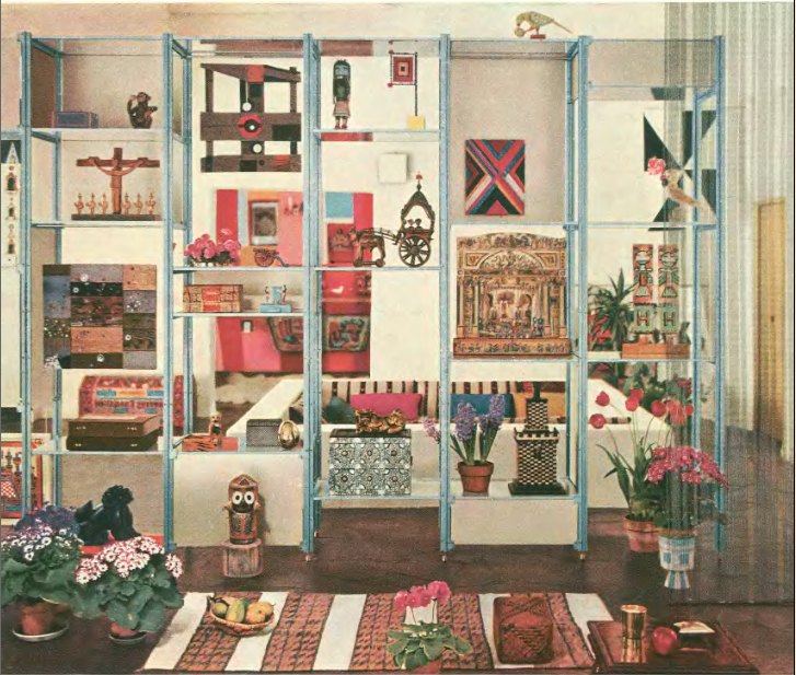
So Girard. Hmm. Overall, of course, awesome. But the shelves themselves? I gotta say, I’m not feeling it. The various panels in milk or smoked glass are fine, but the tubular metal seems off, and the feet are a mess.
The image itself seems to be more successful, or interesting, the way it collapses background and foreground into the shelves, which is funny, since they’re ostensibly meant to divide the space they inhabit, not flatten it. That Four Seasons-looking chain curtain thing on the right is especially odd/cool. And that Mary Heilmann painting top-center is freaking awesome.
WWPD?
Yes, I know I should be praising Norman Foster for his Dymaxion Car, which, of course.
But instead, I will be grateful for the deftness of Lord Foster’s humblebraggadocio in the essay he wrote for his wife’s show/book in Madrid on Jean Prouvé.
[Best line hands down: “He reviewed the drawings in silence. then said, simply: ‘You don’t need me – it’s perfect as it is.'”]
In discussing his firm’s work at the Free University of Berlin, which included the extensive renovation of the Rostlaube, or “Rustbucket,” the affectionate name given to Prouvé’s innovative-but-decaying CorTen-clad library:
Our approach from the start was not to ask ‘How can we match what Prouvé did?’, but to try to imagine how he would have responded, given the same challenge. So instead we asked: ‘How can we do what Prouvé would do now?’
We could have used Corten steel in much thicker sections, which technically would have been correct. But if Prouvé had known that the material needed to be sized differently, and that was his starting point, then the result would have been very different too. Most likely he would have looked at the alternatives and chosen a material that could be detailed finely and would stand the test of time; and so that’s what we did. We replaced the corroded panels and framing with new elements made from bronze, which as it weathers and acquires a patina is gradually taking on the colour tones of the original.
Which is what happened, eventually, I’m sure. But when it was done, the library looked as awesomely, hilariously shiny as a new Pfennig.

Do they still have Pfennig? I guess they will soon enough.
Foster on Prouvé [blueprintmagazine.co.uk, image via busse]
Unrelated, unmentioned, and most probably not WPWD: Foster & Partners’ cuh-razy Library of Philology at Free University Berlin [fosterandpartners]
Ben Schumacher, Images As/Of Work
Electrum @ Reference with Hugh Scott Douglas, 2011
Oh, man, basically every thing in Ben Schumacher’s shows and his source and reference material and his investigations and archive divings and whatever the hell else in his tumblrs is just giving me the shivers right now with its awesomeness.
I mean, what even is it? Is it a photo of a piece? Of an installation? Or a scan of something? Or a collage or–basically, yes, exactly. It’s like it knows it’s being seen on a tumblr.
Worse is a smallish tumblr, just 8pgs so far, from whence the above image was ganked [worse]
——2- is longer, and it ruined my evening schedule because I could not skip anything [——2-]
RO/LU, of course, has an excellent eye for the works, and a link to an interview that makes much sense, also he had a car window shipped from eBay straight to Bob Nickas, which is hilarious. [rolu]
The VW Years, Ch. 3: John Cage
The VW bus makes many appearances in John Cage’s own writings, especially his tour diaries in Empty Words: Writings ’73-78:
After winning the mushroom quiz in Italy, I bought a Volkswagen microbus for the company. Joe’s was open but said it wasn’t. At Sofu Teshigahara’s house, room where we ate had two parts: one Japanese; the other Western. Also, two different dinners; we ate them both.
We descended like a plague of locusts on the Brownsville Eat-All-You-Want restaurant ($1.50). Just for dessert Steve Paxton had five pieces of pie. Merce asked the cashier: How do you manage to keep this place going? “Most people,” she replied rather sadly, “don’t eat as much as you people.” [p. 80]
…
Tarpaulin centered on the bus’s luggage rack, luggage fitted on it. Ends’n’sides were folded over; long ropes used to wrap the cargo up. [p. 82]
…
We were waiting to be ferried across the Mississippi. We had nothing to eat. We waited two hours. It was cold and muddy. When we decided to leave, Rick and Remy had to push the bus up the hill. Later we learned that the ferry service had been discontinued two years before. [p. 90]
…
Pontpoint: the company ate by candlelight. Everywhere we’ve gone, we’ve gone en masse. A borrowed private care took two, two such cars took six to eight, the Volkswagen bus took nine. Now airplanes and chartered buses take any number of us. Soon (gas rationing) we’ll travel like Thoreau by staying where we are, each in his own. [p. 95]
In Richard Kostelanetz’s John Cage: an anthology, the dance critic Stephen Smoliar recounted one story Cage told the audience at opening night of the company’s 1970 season at BAM:
The Cunningham Company used to make transcontinental tours in a Volkswagen Microbus. Once, when we drove up to a gas station in Ohio and the dancers, as usual, all piled out to go to the toilets and exercise around the pumps, the station attendant asked me whether we were a group of comedians. I said, “No. We’re from New York.”
This pushes back the end of The VW Years to the 60s at some point.
Carlo Mollino, Becky Beasley, ‘The Outside’
Let me tell you, spare, door-sized black & white prints in screen-like triptychs are not what I think of when I hear “Carlo Mollino” and “photography.” [Google search possibly nsfw]
But Becky Beasley’s show “The Outside,” at Francesca Minini in Milan, is just that, an austere yet decorative-looking exploration of Mollino’s treatment of photography and public/private space. In a good, specific, abstract way, it looks positively Quaytman-esque.
Becky Beasley’s “The Outside” runs through Jan. 14, 2012 [art-agenda.com]
The VW Years: Ch. 2, Remy Charlip & Steve Paxton
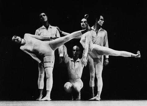
[l to r] Viola Farber, Bruce King, Remy Charlip, Carolyn Brown & Merce Cunningham performing Nocturnes in 1956. photo CDF/Louis A. Stevenson, Jr. via the estate project
Remy Charlip was an early collaborator in Merce Cunningham’s orbit. Years before he began his second or third acclaimed career as a children’s book illustrator and author, Charlip danced with Cunningham and Martha Graham in New York and at Black Mountain College. He created the programs for the August 1952 Cage et al performance at BMC which is considered the first “Happening.” They were printed on cigarette paper, and were placed at the entrance next to a bowl of tobacco, with an ashtray on each seat.
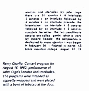
image of what has to be a Charlip program for a different Cage performance, via The Arts at Black Mountain College
Though he’s a bit off on the dates, what with Cage only buying the VW bus in 1959, John Held’s Charlip biography lays out the basic configuration of the bus:
As if BMC was not enough, Charlip received continuing post-graduate work from 1956-1961 in the back of a Volkswagen Microbus driven by John Cage, navigated by Merce Cunningham, enlivened by Robert Rauschenberg, with traveling companions Nicholas Cernovich and dancers Carolyn Brown, Viola Farber, Steve Paxton and others.
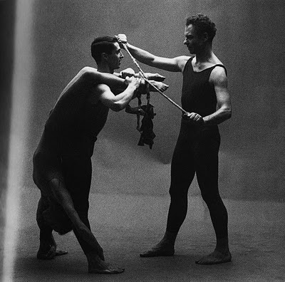
[l to r] Carolyn Brown, Steve Paxton & Merce Cunningham, 1961, image via cepress
A couple of weeks ago, Paxton talked to the Washington Post about the bus: Later that year [1960? ’61? -ed.] Remy resigned, and I was invited into the smaller company. This meant touring around the U.S. in a Volkswagen bus, which, I was informed, it was my duty to pack. And unpack. And distribute and later collect all the items packed. There were the spaces under the seats, a compartment in the back, and a roof rack to transport nine persons’ personal luggage, the equipment of John Cage and David Tudor for various musical adventures, and the sets and costumes for the tour. The bus was heavy laden, and it never let us down, including at least two tours the the West Coast.
John or Merce drove, and John liked to play Scrabble when off-duty. The rest of us conversed and Viola [Farber] knitted. It was rather like a family around the hearth. Long silence, naps, breaks to stretch and walk about, and usually some amazing treat produced by John, a huge salad perhaps, or once Rogue River pears at perfect ripeness with pear liquor to accompany. David was quiet, Marilyn Wood chatty, Carolyn [Brown] and Viola made comment, Merce sometimes spoke, John and Bob laughed a lot, and both were great story-tellers. I remember the actual driving fondly.
It may have been amidst family-like intimacy of the bus that Paxton and Rauschenberg started the relationship that ended the relationship between Rauschenberg and Johns in 1961-2.
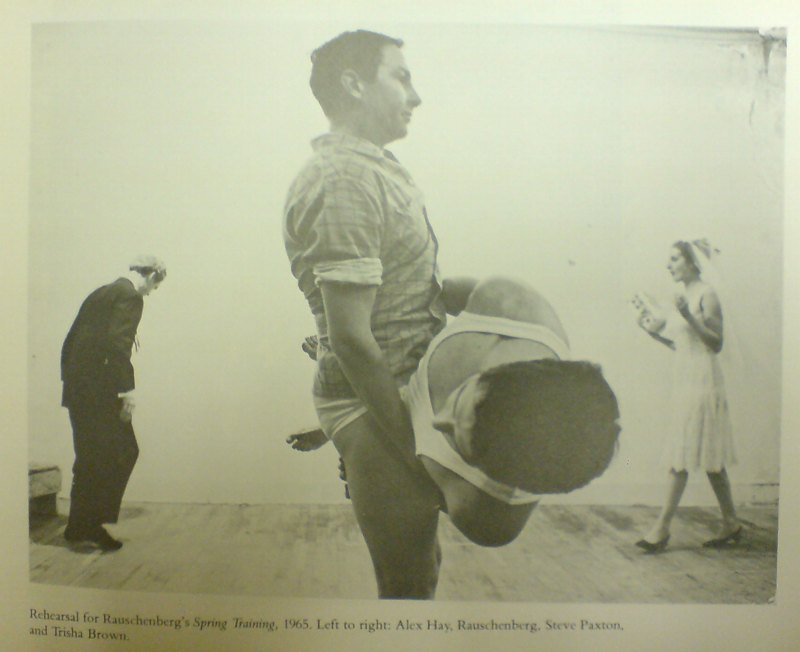
Robert Rauschenberg & Steve Paxton, with Alex Hay [l] and Trisha Brown [r] rehearsing Spring Training, 1965. image via SAAM Rauschenberg catalogue, 1976
The VW Years: Ch. 1
John Cage, Merce Cunningham, and Robert Rauschenberg photographed in 1960 by Richard Avedon
In a few days, the Merce Cunningham Dance Company will perform for the last time. I have not been a close follower of Cunningham’s work, except in the New Yorker way, how, for the two decades since I moved to the city, Merce and his company were an integral part of the cultural fabric. Merce? You’re soaking in it!
I was always more of a Cage fan. And so it’s been fascinating, and enlightening, and continually surprising over the last year or so, as I’ve been digging into the early days of Rauschenberg and Johns, trying to understand their formative work and context, to see how closely connected they were with Merce and John. How small the circle of artists was which generated so many incredible works and ideas. And yet how infrequently I consider their work in relation to each other, or consider the nature of their collaboration beyond the basic namecheck.
In a way, I guess Rauschenberg and Johns and their intense, but short-lived collaborative period serves as the antithesis of Cunningham and Cage’s lifelong partnership. But they all began so close, and so much together.
Anyway, as I’ve become more familiar and more admiring of Cunningham’s work and Cage’s work with him, I’ve begun trying to piece together the world they inhabited in the late 1950s and early 1960s, when they were just starting out. And one thing that comes up in every story about those days is the VW microbus Merce and his fledgling company would pile into to tour the country. Cunningham’s longtime principal dancer Carolyn Brown even titled the chapter in her 2007 memoir “The VW Years.”
But I’ll get to that. First, the story of the VW bus itself, how John Cage bought it, and how it figured into various peoples’ accounts of those crazy, early days.
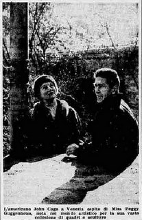 In 1958, Cage had performed at a blowout retrospective concert organized by Johns, Rauschenberg, and hustler/activist/filmmaker Emile de Antonio; and he’d exhibited his scores at Stable Gallery. Then in the taught and performed in Europe, including at Expo ’58 in Brussels, and then settled into a several months’ residency in Milan at RAI, Italian state television. In February of 1959, after hanging out with Peggy Guggenheim at her Venetian palazzo, he appeared on Lascia o Raddoppia, the local equivalent of the $64,000 Question, where he performed new compositions, became famous by the end of the week–and ended up winning 5 million lira in a series of ridiculously rigged questions about mushrooms.
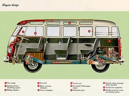
And so he took his winnings and Italian fame back to the US, where he used part of the money to buy a piano for himself, and a white VW microbus for Merce and the company to tour in.
The most extensive accounts of the Italian game show boondoggle and the VW van purchase are from Begin Again, Kenneth Silverman’s Cage biography, and Stefano Pocci’s guest post on the John Cage Trust blog.
Lascia o Raddoppia, Milan, 1959 [johncagetrust]
Son Of Strelka, Son Of God, By Dan Warren
While I was painting today, I first listened to a slightly underwhelming Q&A from MIT with Otto Piene and Hans Haacke, which was short, and so my iTunes started shuffling, which never happens. I don’t really listen to music, so iTunes ends up being a repository of things I wanted at one point–but then pretty much didn’t listen to. Like the audiobook version of Barack Obama’s Dreams of My Father, 2-3 min. segments of which would turn up at random every few tracks.
Which reminds me, kind of hilariously, of what, for me, is one of the most remarkable artistic achievements of the year, the awesomeness of which may actually push me to make a best-of list, which I don’t like to do, just so I can put it where it belongs, near the top.
I’m talking, of course, about Dan Warren’s remix masterpiece, Son of Strelka, Son of God, a surreal, mythological epic about a dog-headed demigod who destroys, and then recreates, the world, which Warren created by stringing together 3-10 second snippets from Obama’s recording. Here’s the synopsis:
Our hero’s name is Stanley, but he doesn’t really show up until Chapter 3. Stanley’s father is the first proto-man, who fell as a fruit from the first tree. He found the world an empty and desolate place, so he climbed to the top of the tree and began creating animals and plants and whatnot just by speaking their names. He gets really excited about the process, and accidentally creates a monkey in thin air, which promptly plummets to his death. He realizes that he needs to be a little more thoughtful about this process, and finishes by creating many of the beautiful things in the world. Then he disappears.
The first of the story’s nine chapters was animated by Ainsley Seago; the whole thing is pulled together nicely by Atlanta DJ EBA’s soundtrack. The whole project’s just extraordinary and feels like the future.
Son of Strelka, Son of God audio odyssey, links + a synopsis [sonofstrelka.com]
download Son of Strelka, Son of God for free from Warren’s site [dannwarren.net]
Dutch Camo Landscape Painting Painting
While moving some art around this week, I found a bag of acrylics I bought early last year, when I planned to paint the Dutch camo landscapes. Trying to figure out how to do it led me to start looking more closely at the painting techniques of a whole range of works–from Dutch Golden Age landscapes to Picabia to Hard Edge to Douglas freakin Coupland–and to various paint/photograph combos.
I wanted to match the ploygonal camo colors right, so I’d looked at various digital-to-analogue conversion strategies, to extracting the Pantone colors from each polygon, then sending an autogenerated list off to some paint company, who’d produce each one for me. I was going to have the colors matched by someone. I studied the various color theories, from Goethe forward. My master painter brother-in-law would tell me about the different companies’ different pigments mixing and drying differently. I took notice just last month of how Richter knows and manipulates the drying rates of the various layers of the various paints he squeegees.
I basically ended up trying to get the painting perfect in my head. First.
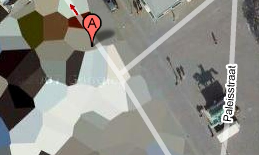
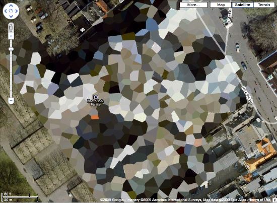
Anyway, with the collection of paints I’d bought fresh in my head, after I put away the Rijksoverheid paintings, I just decided to paint one of those camo things. So I got one of the smaller prints, of the crazy camo ball over Noordwijk–yep, it’s still there— taped off the two polygons that were an identical gray, and I mixed the paint in a little tray. By looking at it, and seeing when it was done. And it matched. And so I painted those two polygons in a few minutes. And that was it.
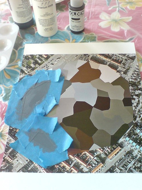
At the second I was done, I realized I coulda/shoulda taped off some more polys and kept going, some of the other gray-family ones. I can see how the project could proceed like that, working the paints in succession to match a little family of colors. And wow, acrylic dries so fast, I could just keep right on going. Though I still have to see whether I can tape over painted photograph, or if it requires something else. Whatever, the point is, it works, and I did it, and seriously, what the hell was taking me so long to get started?
Whether it turns out to be interesting or good, of course, is another question. Which now I know I’ll be able to find out.
Previously, 09/2009: Houses of Orange
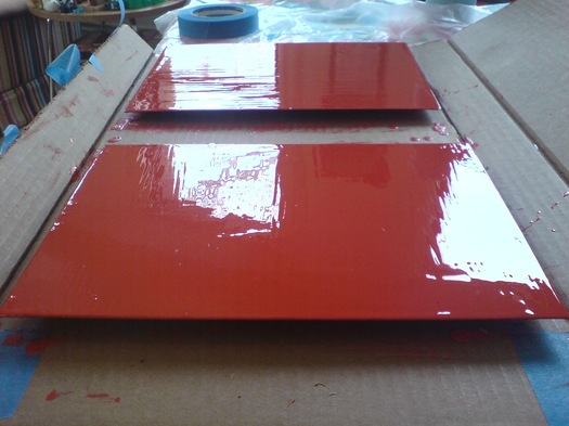
Rijksoverheid Rood 5: Thinner
Since I appear to only be able to find the time bandwidth to paint on the weekend, sometime I might have to investigate terms that already haunt me anyway, like “weekend painter.” At least I’m not painting on Sunday, right?
Anyway, another sanding and another layer of Rijksoverheid Rood on the two panels, this time with a little bit of thinner added to the paint. It felt different, for sure. We’ll see how it ends up.
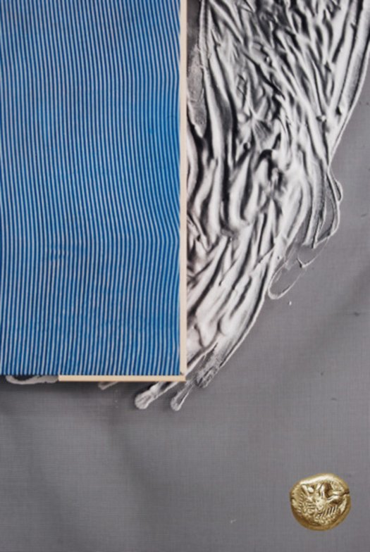
Beautiful Boro Noragi @ Sri

I love this boro jacket at Sri as much for the color as the patching:
This jacket is well-used, as is quite obvious. To describe its color is difficult: it is a kind of medium-range grey blue; the hemp cloth itself is woven of exceedingly narrow stripes which gives a misty appearance to the neutral color.
This is actually the inside of the jacket. The 10 other photos Sri posted doesn’t include a shot of the outside.
boro hemp noragi, taisho era [srithreads]
On Close Encounters, Scriabin, Schoenberg, Bernstein
OK, here are some more details about how the crazy-awesome synthesizer/lightboard came together in Close Encounters of the Third Kind, courtesy of Ray Morton’s 2007 book on the making of the film.
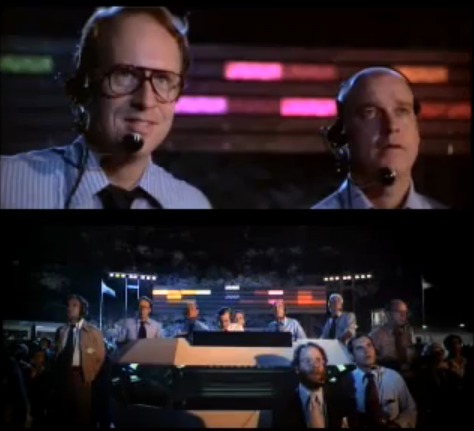
Maybe not surprisingly, it grew and evolved along with the crucial scene, known as the Box Canyon scene. Originally, Spielberg’s idea was to use run&gun documentary style film of humans meeting aliens on a very hastily constructed tent base. [the idea of the Mothership landing in a McDonald’s parking lot was nixed early on]. This grew to a runway, which became a stadium, which became a Box Canyon on the backside of Devil’s Tower.
Except that there was no way they could shoot all that at night outdoors, so they ended up moving the entire production to Mobile, Alabama, where they created the world’s largest soundstage out of a pair of WWII-era dirigible hangars, nearly bankrupting everyone in the process.
And though I mentioned Douglas Trumbull as a possible creator, Morton’s book credits Spielberg and art director Joe Alves [who, as production designer on Jaws, had also created Bruce the shark]
Inspired by Russian composer Alexander Nikolayevich Scriabin (1872-1915), who had theorized that specific musical notes prompted listeners to think of specific colors, Spielberg came up with the idea of connecting the Moog synthesizer to an array of colored lights so that each time a note was played on the Moog, a corresponding color would flash in the array. Alves suggested that the colors appear on a huge video screen but Spielberg wanted something resembling an athletic field scoreboard. Developing this idea, Alves decided to segment the board into several rows of colored rectangular panels. He then needed to find a logical way to relate the colors on the lightboard with the musical notes being played on the synthesizer. He wasn’t quite sure how to do this until he saw a television program that featured Leonard Bernstein talking about composer Arnold Schoenberg (1874-1951).
Schoenberg had devised a method of musical composition that utilized all twelve tones in the chromatic scale. Realizing that there were also twelve colors in a secondary progression on the color wheel, Alves decided to link the tones and the colors (beginning with middle C and yellow), which gave him a row of twelve rectangles running across the board. He then added three more rows on top, consisting of lighter tones and higher octaves, and two more rows on the bottom, consisting of darker tones and lower octaves, for a total of seventy-two rectangles A full-scale version of this color board would be created when the actual set was built.
First off, how hilarious that Alves got the idea of a Schoenbergian twelve-tone scale from Bernstein; Bernstein hated that shit. I’m going to guess that Alves is referring to Bernstein’s notorious Norton Lectures at Harvard in 1973, in which he argued for tonal music as a universal language against Schoenberg’s chromatic system. The lectures titled, The Unanswered Question were aired on PBS.
Previously: Close Encounters Jam Session
Bill Walton, In The Artist’s Studio
I’m really bummed to have missed The Gifting of Bill Walton’s Studio on December 4th, the extraordinary culmination of the ICA Philadelphia’s memorial recreation/exhibit of the late local master’s crowded workplace.
As ICA blogger/curator Rachel Pastan tells it, the event went of exactly as planned, with people trading memories and stories of Walton, and then choosing a memento from the studio–tools, brushes, scraps, materials, anything but finished sculptures–to take with them.
I guess it’s alright, because I’ve kind of been doing the same thing already, since 1996.
I found Bill Walton’s humble, powerful, minimalist, materialist sculptures when I was attending business school in Philadelphia. When Larry Becker Gallery had his second Walton show during my final semester, I splurged and bought a small piece–small even by Walton’s standards, though bigger than the gold or copper headless nail works he’d embed flush in the wall.
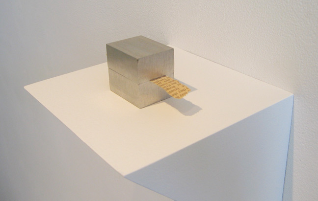
It’s a strip of lead an inch or so wide, carefully folded back and forth on itself into a little stack, almost like a cube. Pinched between one of the folds is a single 10″-inch blade of dried grass. In concept, it’s similar to the aluminum block & newspaper work Walton showed at Patricia Sweetow Gallery in 2005 [above]. [BTW, I love that he didn’t date his works. They exist among themselves, not in a timeline or progression.]
Becker explained that it was common to the streets of Philadelphia, and should I ever need to replace the grass, I could go out and find it. The species of grass is included on the label on the little custom-built archival cardboard case–it’s put away right now, so I can’t look it up–and Walton helpfully included a couple of spares behind a taped sheet of glassine.
Becker had shown the little sculpture on a small, white wall bracket about the size of a CD-case. For a while, I alarmed Becker by telling him how I had placed the sculpture on a cinnabar lacquered netsuke stand I’d found in the basement of my globetrotting landlady’s townhouse.
I was very interested at the time in the way Western modernism and minimalism resonated with Asian and Zen precursors–I was a groupie for John Cage’s Rolywholyover, which was at the Philadelphia Museum in 1995. And then later, when MoMA was choosing the architect for its expansion, I was translating criticism about Yoshio Taniguchi and his architect father Yoshiro Taniguchi, who had worked with Corbusier, designed the awesome mid-century modern Hotel Okura in Tokyo, and who founded Meiji-mura, an architecture preservation park which contains Frank Lloyd Wright’s Imperial Hotel.
But that’s several other stories. When my grass broke and my supply ran out, I began making a point to harvest a blade or two every time I went back to Philadelphia.
I kind of drifted away from a close following of Walton’s work after I left town, but Walton’s sculpture ends up occupying an outsize mental space for me, and it continues to link me to the city where Walton made it–and where I found it during my 2-year sojourn.
The transfiguration of Bill Walton’s studio [icaphila.org]