Powerless Structures, Fig. 19, 1998

elmdrag_home_left.jpg
All this Rapture hype reminds me of this old school Elmgreen & Dragset piece from their Powerless Structures series. Even though I’m sure the Rapture people are sure the two guys not wearing these outfits are goin’ straight to hell.

Image via art21, where this piece appears to be titled, “Home Is The Place You Left,” which is actually the name of their 2008 exhibition in Trondheim.

For that matter, everyone from Perrotin to Konsthall Malmo lists the jeans as Levi’s, but when they were at the Swiss Institute back in the day, they were Diesel. Just sayin’.

The Secret Bauhaus’s Other Ball

bauhaus_ball_pdp130-sm.jpg
Andy helpfully pointed out this mirrored glass ball, which I’d missed in the catalogue for Phillips’ upcoming design auction.
Everyone knows the Bauhaus was a huge party school. And during the Winter 1929 semester, Oskar Schlemmer had put an extra emphasis on partying, “to preserve the character of the Bauhaus community.” And so what had started as a metal shop farewell get-together for Marianne Brandt on 9 February 1929 with the tasteful theme, “Church Bells, Doorbells, and Other Bells” [Hmm, one of the few cases where it sounds better in German: “Glocken Schellen, Klingel Fest.”] became a raging, balls-out “Metallisches Fest,” which took over the entire, iconic Dessau building. As MoMA’s 2009 catalogue tells it:

The pure qualities of metal lend themselves to costumes with decorations that magically transform the Bauhaus through shimmering, reflective surfaces. According to Schlemmer, “The Bauhaus was also attractive from the outside, radiant in the winter night: the windows with metal paper stuck inside them, the light bulbs–white and colored according to the room–the views through the great glass block–for a whole night these transformed the building of the ‘Hoschschule fur Gestaltung.”

Party on, Oskar! I’m glad the Bauhaus Arkiv is so careful with all their materials, they don’t let anything more than a postage-stamp-sized image slip through to the web.
I can’t remember where I found this copy of the Bauhaus wallpaper sales brochure which came out soon after the Fest, but it wasn’t the Bauhaus Arkiv:
bauhaus_wallpaper_cov-sm.jpg
And Marianne Brandt Geselleschaft only had a tiny version of this Brandt self-portrait taken a mirrored glass ball.
marianne_brandt_kugelportrait.jpg
Though to their credit, the firm did throw another Metallische Fest in 2005, even if the guest of honor had long since departed for good.
Lot 130 Bauhaus Mirror Ball, est $5-7,000 [phillipsdepury.com]
Previously [as in previously on greg.org, but after the Bauhaus, obv]: Shiny Space Balls? Yes Please!
Oh wait, Muybridge was before the Bauhaus

Serra ‘Designs His Works To Last.’

Well this certainly wasn’t in his MoMA retrospective.
rs_cage_1-det.jpg
There are rubber and neon pieces dated from 1966-7, of course, and because they look prescient now, Benjamin Buchloh’s catalogue essay discusses early Richard Serra sculptures like Doors and Trough Pieces as “the official beginning of his oeuvre.” But Buchloh dismisses Richard Serra’s first solo show in May 1966 in Italy, where the young artist was traveling on a Fulbright, as nothing but “his rather literal responses to Rauschenberg’s combines.” Fortunately, the show got written up–with a picture, even–in Time Magazine:

Continue reading “Serra ‘Designs His Works To Last.’”

Charline Von Heyl Is Reading Your Blog

popova.jpg
Von Heyl-bait: Spatial Force Construction, 1921, Lyubov Popova
A couple of weeks ago Charline von Heyl made a refreshingly badass presentation on painting at the Hammer Museum. [It was organized by UCLA’s art department.] The tenor was quite different, it quickly became one of my favorite artist talks since Thomas Houseago’s Public Art Fund lecture at the New School last year.
Von Heyl talks a lot about her sources and tactics, including design, folk and indigenous art, and overlooked and bad [Bad?] painting. Rather than narrating a trajectory for her work, or elaborating on her technique, she focuses on how she looks, and on how central that is to what she does eventually turn out.
So obviously, this from the q&a:

I find the idea of time in painting super-interesting in every respect, you know, the speed of the brush, the way the backwards/forwards thing goes, the time of the paradox, which is probably my idea of irony, the material thing that switches things around.
And so all those things really feed into each other, and the time of looking is constantly feeding into it, constantly. And it’s really–one of the first things I do when I go to the studio is to get different books and check different things out.
And for me, the whole blog thing is a godsend. If I put in one of my favorite paintings, some weird Popova painting or something like that, and go to images and blog, there’s a kindred soul, you know, somebody who has the same taste. And from there, you find other blogs because he’s going to go somewhere, And I think books have been so important for me, but now, blogs, painters’ blogs are, I mean, there are a lot of people who are super smart when it comes to looking, and it’s really fun to look at it. I use that a lot, too.

A follow-up question asked what blogs she looks at, and she balked; she can’t name her favorite books, either, she said, because she doesn’t know the titles. It’s a result of being immersed in “this community of images.” So it makes sense that the one blog she did manage to namecheck is Bibliodyssey. [She also said she does read Notes on Looking, too.]
UCLA Department of Art Lectures: Charline von Heyl [hammer.ucla.edu, thx gregPosted on Categories art, inspiration, interviews

ArtCash

eat_artcash_nymag71.jpg
ArtCash by Rauschenberg (top) and Tom Gormley, via nymag
Whatever else it was, Billy Kluver, Bob Rauschenberg and Robert Whitman’s Experiments in Art & Technology was wildly successful at never selling out; the collaborative was constantly broke and getting bailed out by whomever they could find. E.A.T. was booted from the Pepsi Pavilion at Expo70 as soon as it opened over wild cost overruns. I saw a thick folder of invoices, IOUs, and pleas for petty cash in the Castelli Archives. I hear there’s an identical stack, probably even thicker, in the Foundation for Contemporary Arts. And then the other night, I find this 1971 article about art and money in [where else?] New York Magazine:

In the sixties several American artists, most notably Larry Rivers and Andy Warhol, used money as the subject of their paintings. Calling on their example, a broke E.A.T. organized a gambling event last week to finance further activities. Currency was designed by Warhol, Robert Whitman, Robert Rauschenberg, Red Grooms and Marisol [and Tom Gormley], on an escalating scale. But Swedish artist Oyvind Fahlstrom’s design was turned down for political reasons–it depicted Nixon inflating and deflating himself…Their gambling night was an amusing comment on the current situation as well as, hopefully, a way to outflank the museum-bank gallery-cartel syndrome.

The gambling night was held at Ted Kheel’s Automation House on the Upper East Side, which connected to the head end of one of Manhattan’s first cable TV companies. Proceeds were actually flagged for E.A.T.’s Community Television Center and Artists & Television program, which had solicited proposals for artist-produced TV shows.
Warhol_large.jpg
$25 got you $25 ArtCash bucks, which you could use to win “TV sets and original graphics.” At least a few people just took the ArtCash. According to the lot description of an unbroken $500 bundle of Warhol Ones at the 2009 Dumbo Arts Center benefit auction, the ArtCash bills were printed [but not engraved] by the actual American Banknote Company.
E.A.T. published three signed ArtCash posters showing either the fronts or backs of the various denominations. Here’s a composite showing two of the three [l via pdp; r via artnet]
artcash_left.jpg
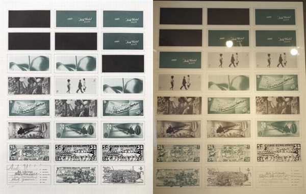
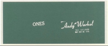
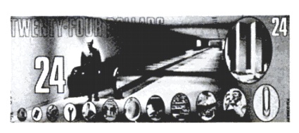
The denominations were $1 [Warhol], $3 [Whitman], $12 [Rauschenberg], $24 [Gormley], $51 [Grooms], and $88 [Marisol]. Which means each print had a face value of $468. Considering that Phillips sold the copy on the left for just $1,875 in 2008, these may be the worst-performing Warhols on the market.
Whoa, in tallying that out, I took a closer look at each bill; Gormley’s look to include the World Trade Center, which might mean that that underground moving walkway is in Albany, which might make that figure there then-governor Nelson Rockefeller.
gormley_artcash_cu.jpg
The E.A.T. Archives at the Getty includes several more stacks of ArtCash, including some by Jeff Davis, who, who?
Jan 2013 UPDATE: Good things come to those who blog. greg.org reader and/or ArtCash Googler Sarah Hollenberg of the University of Utah Art & Art History department writes that the Jeff Davis mentioned above is none other than the country’s greatest example of printing your own money, Jefferson Davis, President of the Confederate States of America. Hollenberg:

The bill that the Getty credits to him is by Red Grooms. They mistook the reference to Davis as a signature because they keep the bills wrapped up with a strip of paper, which covers up Grooms’ signature.

And now we know. Thanks!

Police Action Painting

uganda_pink_cfr.jpg
Police spraying protesters in Kampala, Uganda, May 10, 2011 [image james akena/reuters via cfr.org]
I haven’t been able to get these images out of my head since Brian Sholis pointed to them; they’re stunning and disturbing at once.
As Time Lightbox’s Ishaan Tharoor put it,

We’re used to protest movements that come in colors–the yellow of people power in the Philippines, Ukraine’s orange, the green of Iran’s brutalized democrats. We’re less accustomed to seeing protests quashed with color. But in Uganda, security forces sprayed opposition leaders and activists with a vivid pink dye–a mark intended both to humiliate dissidents and make it easier for police to nab them.

The first publicized use of dye cannons was in Cape Town, South Africa in 1989, in a fiasco that became known as the Purple Rain Protest [image below via wikipedia] An anti-apartheid demonstrator seized the cannon and turned it on the white-painted buildings in the square, including the National Party headquarters. “The purple shall govern” became a rallying cry for the democracy movement.
purple_rain_za.jpg
In 2008, after Indian police painted protestors purple in Srinagar, Slate’s Explainer put together a concise history of the dye cannon. Which is, well, ironic, considering how aesthetically similar the police painting images are to the Indian Holi Festival, where crowds bombard each other with powdered pigment as part of an equalizing, anarchic celebration of religious joy.
Clearly this is not art; but it is painting. And the sobering political implications and power dynamics depicted in these incredible–even, I hate to say it, beautiful–images makes me question the glib, benign assumptions I hold for that word, that action.
For a long time, I’ve been fascinated by the military definition of ‘painting,” the use of laser sighting and guidance systems to target weapons ranging from guns to missiles. It made me wonder what other seemingly paradoxical contexts “painting” has found its cultured, refined way into. I guess I can add one more to the list.
Color in the midst of protest [time lightbox]

Richard Serra Was Not Pleased With The US Government.

serra_amer_flag_worship.jpg
Richard Serra, The American Flag is not an object of worship, 1989, 288 x 376 cm
One of the artworks ImClone CEO Sam Waksal bought from Gagosian but didn’t pay sales tax on in 2000 was a huge, $350,000 Richard Serra drawing titled, The American Flag is not an object of worship.
Interestingly, when the drawing sold at Sotheby’s in 2004 [for $232,000 against an estimate of just $80-120,000. There really ought to be a word for a deal where you weasel out an 8.25% “discount” after dumbly overpaying by 50-300%. Maybe a Waksale.], the provenance only mentioned collector/Dia board member/Kim Heirston dater Dr. Pentti Kouri [who passed away in 2009] and the Leo Castelli Gallery, where the work was originally shown.
And what a show it was.
“8 Drawings: Weights and Measures” opened in September 1989, in the wake of the Tilted Arc controversy, and six months after the 1981 sculpture was removed [and according to the artist, “destroyed”] from Federal Plaza in lower Manhattan. And from the titles Serra gave the massive paintstick on paper works, I don’t think he’d quite gotten over the loss.
serra_castelli_poster_wtmeas.jpg
Poster/flyer for “Richard Serra 8 Drawings: Weights and Measures”
There’s a room in the Met’s Serra drawings retrospective with several works from the Castelli “Weights and Measures” show, including The United States Courts are partial to the Government [105×185 in.], No mandatory patriotism [93×201 in.], and the massive The United States Government destroys art [113×215 in.], which is owned by the Broads.
I can’t find out online, and I don’t have my Serra drawings catalogue raisonné with me to check, but it would be interesting, if maybe a little too neatly literal, if the cumulative dimensions of the eight “Weights and Measures” drawings added up to 120 feet, the length of Titled Arc. It’d turn the drawings into fragmented shadows of the lost sculpture, ghost slabs floating in a gallery before being dispersed to haunt collections around the world. Serra’s not averse to coding such biographical or historical references in a work’s dimensions; I seem to remember hearing that the dimensions of the six forged steel blocks in his 1996 sculpture 58 x 64 x 70 were derived from his and his wife Clara’s eye heights. [I can’t find any mention of that now, though; I’ll have to check.] Anyway, TBD all over the place.
[UPDATE: thanks to the Communications office at the Met for sending along the checklist, which also includes the dimensions of the other two W&M drawings in the show. The four drawings mentioned here do, in fact, add up to 62 linear feet. So a 120 ft total is in the realm of the possible.]
2015 UPDATE: yes, but maybe not? I can’t believe I never published the result of this research, but I did gather the dimensions of all the W&M drawings, and they ran about 117 linear feet. If they each have 4.5-in larger framed dimensions, they’ll add up to 120 feet, but I doubt Serra’s numerological interests would incorporate frames. I’d love to be wrong about that and right about the dispersed, destroyed ghost of Tilted Arc, but I think it’s the other way around. Oh well.
serra_castelli_poster_wtmeas_dim.jpg
Weights & Measures, annotated, dimensions in inches

On Looking Into Tarkovsky’s Mirror

tarkovsky_mirror_balloon1.jpg
I just watched Tarkovsky’s 1975 film The Mirror for the first time as an adult, basically; when I saw it in college, I had no clue and was bored out of my gourd by it. In fact, for a long time, I’d conflated it, burning houses and whatnot, with The Sacrifice.
tarkovsky_mirror_balloon2.jpg
Anyway, the largely plotless, highly autobiographical film is a memory-like collage of documentary footage and vignettes set in disparate time periods. When I say, plotless, though, I mean it’s a movie about a guy who spent ten years trying to make a movie about his childhood purely as an excuse to show the awesome scenes of a Soviet military balloon from the Spanish Civil War. At least that’s how it looks to me now.
tarkovsky_mirror_balloon3.jpg
tarkovsky_mirror_balloon4.jpg
tarkovsky_mirror_balloon5.jpg
Previously: an image of a guy on a balloon inspecting Echo II at Lakehurst, NJ

From The Department Of Corrections: Side-Stepping

You never know what you’ll find digging around in archives, even your own. While looking back at greg.org posts about Alexander Payne and Dany Wolf, I bumped into this gem from 2003, the reconstructed list of artworks Sam Waksal bought from Gagosian Gallery without paying NY state sales tax, and how much he paid.
At the time, I’d written that not only had Waksal, the CEO of ImClone whose case broke around the same time his friend Martha Stewart was getting charged with insider trading, the newbie collector hadn’t negotiated a discount from the gallery beyond the sales tax. And that the ploy of having empty boxes–or in some of Waksal’s purchases, just the invoices–sent out of state, had “been tripping up art world naifs since the 80’s, at least.”
Well, this statement was incorrect on several fronts. The investigation of Waksal had followed on the fraud investigation of certified art world naif Tyco CEO Dennis Koslowski, remember, which had been triggered by an art sales tax evasion inquiry involving the fictitious shipment of 3rd-rate Monets to a factory in New Hampshire. But in a subsequent 2004 wrap-up on the caper, the NY Times’ Timothy O’Brien reported that as many as 90 art world figures were implicaited in DA Robert Morgenthau’s investigation, including many non-naifs.
And as for the 80’s, well.
On a recent visit to the Leo Castelli Gallery collection at the Archives of American Art, I came across a letter from the gallery to Mr. Frederick Weisman, one of the biggest collectors around, who had apparently been confused by the arrival of an empty box at his Sunset Blvd office. The letter was dated Jun 22, 1965:

The package you received was intentionally empty. It represents a Lichtenstein banner that Richard purchased. The package was sent to your California address to side-step New York City tax. I hope this hasn’t caused you any unnecessary concern.

It’s not specified, but I’ll assume the banner was Pistol, 1964, the best of the three Lichtenstein made with the Betsy Ross Flag & Banner Co., Richard, of course, is the Richard Weisman of Find The Warhols! fame, who does in fact live in California. And so, it would seem, does the banner.
lichtenstein_gun_banner.jpg
The history for a Pistol banner sold at Sotheby’s in 2008 mentions its inclusion in a 1967 exhibition at the Pasadena Museum, which Weisman’s uncle Norton Simon would soon take over.
It appears the only nair around here is 2003 me.

The Fall Of Bootleg (Empire)

gordon_bootleg_empire_pdp.jpg
In 1997 Douglas Gordon surreptitiously videotaped two hours of Andy Warhol’s Empire during an installation in Berlin. He called it Bootleg (Empire):

‘I did a version of ‘Empire’, which was called ‘Bootleg Empire’, it is almost like the amateur version of the auteur masterpiece — it’s very shakily done. I lived in Berlin for a while and I went to see Warhol’s ‘Empire’ and I thought ‘I may never get to see this again’, so I filmed it for an hour went to the pub and then came back and filmed it for the last hour. So mine only lasts for two hours — so it’s like ‘the best of’ or something. But quite often my version is seen with his films in exhibitions, which is kind of funny as mine is slightly more dramatic as it is shaky and there are shadows of people walking in front of the camera.’ (Jean Wainwright ‘Mirror Images’ (Interview with Douglas Gordon) Art Monthly, Dec-Jan 2002/03, No. 262) [via a new path]

In 1998, he released Bootleg (Empire) as a video edition of eleven. For whatever reason, maybe because he has the word “bootleg” in the title, it’s often referred to as an homage. How many intellectual property battles could be dodged if everyone made sure to use that word, I wonder.
Anyway, one of the Bootleg (Empire) editions didn’t sell Friday at Philips de Pury. The estimate was $30-40,000.
And the details seem confusing. The lot description says “installation dimensions variable,” as you’d expect from a Gordon. But when another of the edition sold in 2000 at Christie’s [for $9,400], the description said it was “for view on monitor only.” The Christie’s edition also contained two tapes, a VHS and a Beta, but the duration is given as only 62 minutes, not two hours. Philips doesn’t bother to provide the duration information in their catalogue, but the piece was two hours long at the Guggenheim’s “Haunted” exhibition last fall.
So far, I can find mentions of at least three other Bootleg works, all of which predate Empire. Bootleg (Big Mouth, Cramped and Stoned), use slowed down, slient concert performance footage from the Smiths, the Cramps, and the Rolling Stones, respectively.

Wow, The Unseen Original Ending From Alexander Payne’s Election


Wow. It’s amazing how awkward and wrong this original ending to Alexander Payne’s 1999 feature Election seems. According to Peter Sciretta at Slashfilm, this six-minute segment comes from a VHS transfer of an original work print found at a flea market. The ending tested so badly, Payne went back to shoot additional footage for the more satisfyingly harsh ending he released.
Sciretta notes that there’s never been any discussion of another ending to the film, but hey-ho, It’s right there in Payne’s and Jim Taylor’s original script.
Watch The Never Before Seen Original Ending of Alexander Payne’s ‘Election’ [slashfilm via matthew clayfield]
Previously: I co-hosted a MoMA Film Dept. party for Alexander Payne in 2003. more recapping here.

Shh, Don’t Speak.

From Dennis Lim’s brief Q&A with Gus Van Sant at Cannes, where Restless is [finally?] debuting:

We did silent takes of almost every scene so we could maybe use them in the editing. Terry Malick apparently shoots silent takes so he can mold what he wants out of the scenes. But with our takes we actually created a silent version because we had enough material and we realized we could — maybe it’ll be on the DVD. Everything is there except the dialogue — all the sounds and music, and you hear all the footsteps, but there’s nobody talking and no lips moving. They’re the same scenes, but it has the distance of not being dialogue-driven. It’s the exact same love story but it plays like a different movie.

It’s funny, because Gerry and Elephant only have like 10 pages of dialogue between them anyway.
Previously: Gus Van Sant’s go-to guy, the greg.org 2003 interview with producer Dany Wolf