
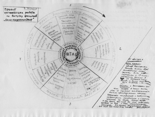
I’ve had this image of Dziga Vertov’s filmmaking process/org chart on my desktop for a couple of weeks now, ever since it was image of the day at mubi.com.
It’s specifically for his “Kino Korrespondent” films, which he produced in 1922-25. There’s crew in concentric circles, expanding out from the director. And the four quadrants of the wheel are apparently “fronts”: documentary, literary, recording, and editing. It seems like a cycle, or an iterative process.
MoMA just completed a major retrospective of Vertov’s films, including, for the first time, all his Kino-Pravda works. The working diagram immediately reminded me of the poster that was the icon for the series, from the 1930 film, Enthusiasm: Symphony of the Donbass. Enthusiasm is an experimental film symphony of synched documentary image and concrete sound.
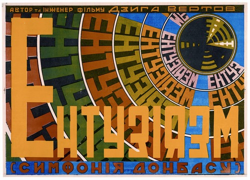
image of the day: how Dziga Vertov organizes filmmaking [mubi.com]
Image, obviously, from the Austrian Film Museum’s Dziga Vertov Collection [filmmuseum.at]
Dziga Vertov, 15 Apr – 4 June, 2011 [moma.org]
Norman Mailer On Erased de Kooning Drawing, Art
One of the more amusing Erased de Kooning references I’ve come across is from Norman Mailer. It’s reproduced in his 2003 book, The Spooky Art: Thoughts On Writing, but it seems to date from either a 1984 lecture or even a 1974 Esquire Magazine article. Mailer gets things wrong in a helpful way:
The work, when sold, bore the inscription, “A drawing from Willem de Kooning erased by Robert Rauschenberg.” Both artists are not proposing something more than that the artist has the same right as the financier to print money; they may even be saying that the meat and marrow of art, the painterly core, the life of the pigment, and the world of technique with which hands lay on that pigment are convertible to something other. The ambiguity of meaning in the twentieth century, the hollow in the heart of faith, has become such an obsessional hole that art may have to be converted into intellectual transactions. It is as if we are looking for stuff, any stuff with which to stuff the hole, and will convert every value into packing for this purpose. For there is no doubt that in erasing the pastel and selling it, art has been diminished but our knowledge of society is certainly enriched. An aesthetic artifact has been converted into a sociological artifact. It is not the painting that intrigues us now but the lividities of art fashion which made the transaction possible in the first place. Something rabid is loose in the century. Maybe we are not converting art into some comprehension of social process but rather are using art to choke the hole, as if society has become so hopeless, which is to say so twisted in knots of faithless ideological spaghetti, that the glee is in strangling the victims.
Yow, OK. To the extent that Rauschenberg wanted to create an imageless drawing, upon which would be projected the passing shadows of meaning and ideology, I think Mailer has helped him succeed.
Mailer’s focus on the non-existent financial motivations behind Erased de Kooning Drawing seem to show his fight is elsewhere. Not only did Rauschenberg not sell the work for more than 35 years, and only then at a discount to a museum, he actually destroyed a gift, a valuable drawing from one of the highest-paid artists of the time, when he himself was dirt poor and relegated to painting on newsprint.
But combined with his specific error on the inscription, Mailer’s market-centric misreading does help identify the source for his anecdote: it was Leo Steinberg, one of the first and most important critical voices on Rauschenberg’s work. Steinberg, whose major works like Other Criteria, require you to leave the screen and head to the shelf, old-school.
Before Steinberg, though one more from Mailer. He attributes this story [or non-story, as it turns out] to Jon Naar, the photographer who collaborated with Mailer on the epic 1973 book, The Faith Of Graffiti:
Years ago, back in the early Fifties, he conceived of a story he was finally not to write, for he lost his comprehension of it. A rich young artist in New York in the early Fifties, bursting to go beyond Abstract Expressionism, began to rent billboards on which he sketched huge, ill-defined (never say they were sloppy) works in paint chosen to run easily and flake quickly. The rains distorted the lines, made gullies of the forms, automobile exhausts laid down a patina, and comets of flying birds crusted the disappearing surface with their impasto. By the time fifty such billboards had been finished–a prodigious year for the painter–the vogue was on. His show was an event. They transported the billboards by trailer-truck and broke the front wall of the gallery to get the art objects inside. It was the biggest one-man exhibition in New York that year. At its conclusion, two art critics were arguing whether such species of work still belonged to art.
“You’re mad,” cried one. “It is not art, it is never art.”
“No,” said the other. “I think it’s valid.”
So would the story end. Its title, Validity. But before he had written a word he made the mistake of telling it to a young Abstract Expressionist whose work he liked. “Of course it’s valid,” said the painter, eyes shining with the project. “I’d do it myself if I could afford the billboards.”
I was waiting for an infant Dan Colen to crawl into this story, but alas. He must have read it in art school.
Google Ghost View
Oh, now this is interesting.
Andy links to an interior Street View-style panorama being featured on Google Offers. [Which is also interesting, but.]
But when you step outside into Street View’s street view, this is what you see:
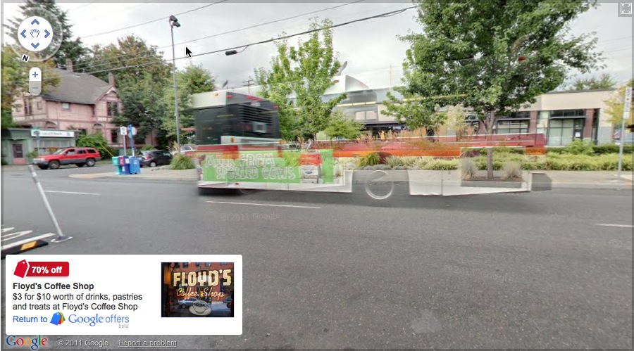
It looks like an enhancement of the way Google deals with obstructions by stitching differently timed images together in their panos. You can imagine that, as Google populates its image database, it will depopulate its published images, erasing more and more of the visual information it deems extraneous or obstructive.
This Google ghost bus will look novel, until it becomes the norm, and then it, too, will be refined out of existence.
Talk Like A Venetian
Oh, the Biennale! So many people asking you what you saw! So many names you just read on the page, or the label, or the banner, without pronouncing!
I’ll be adding some Venice Biennial names to the official greg.org art world pronunciation guide. If you see or hear any good ones, send or tweet them along!
First up, starting at the top:
Curator Bice Curiger
BEE-cheh. Like the restaurant on 54th St. Did you know it’s short for Beatrice? Just imagine Che Guevara taking an interpretive dance class: “Be a tree, Che.” and then leave out the “a tree,” cuz you guys are tight.
Koo-REE-gare, rhymes with Care Bear [via youtube]
On Erased de Kooning Drawing, Cont’d
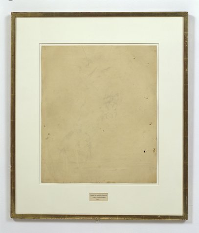
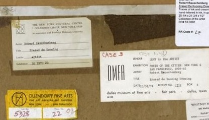
Robert Rauschenberg, Erased de Kooning Drawing, 1953, “drawing | traces of ink and crayon on paper, mat, label, and gilded frame.” via SFMOMA
So the basic question, “What do we really know about Erased de Kooning Drawing and how do we know it?” Is really driven by some recent discoveries that my understanding of the work and its story–its history–turns out to be wrong. Incomplete. Based on some assumptions that should, it turns out, be questioned.
For example, Erased de Kooning Drawing is regularly referred to know as one of Rauschenberg’s most important works, which prefigured or influenced entire movements in contemporary art. But so far, I haven’t found actual evidence that the work was even exhibited before 1973. It’s barely even discussed in the 1960s literature on Rauschenberg, never mind the 50s [It supposedly began shocking the art world soon after its creation in 1953.]
I’m always kind of torn between trying to figure this stuff out by piling on the research and citations and sifting through it, and then posting about it, and just documenting my inquiry, incomplete as it may be, as I go along.
I guess the key here may be laying out what freaked me out, and saying that it kind of blows my mind precisely because I’ve been spending so much time looking back at the relationship and collaboration between Rauschenberg and Johns, and at the stigmatized silence that continues to distort our view and our understanding of their crucial, early work.
A week or so ago, I saw a digitally remastered version of Emile de Antonio’s 1972 documentary, Painters Painting [Here’s the vanilla Ubu version.] De Antonio was a longtime friend of both Johns and Rauschenberg; he helped them get their earliest job together as window dressers for Bonwit Teller. I saw a 1976 note in the Smithsonian archives where Walter Hopps says that Bob called de Antonio “a hustler.” He became a complex and controversial filmmaker with a 10,000 page FBI file. For Painters Painting, he conducted extended interviews with both artists and a critically disparate range of others on the scene [the film was mostly shot in 1970]. According to my MFA brother-in-law, the film is a hilarious staple in art schools, which I think I object to; I may take on the film’s content and form head-on at some point, but not now.
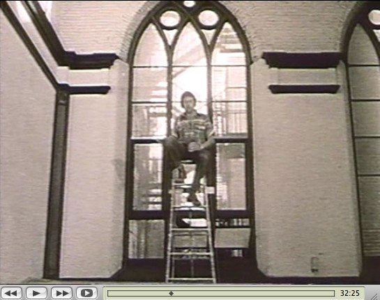
Rauschenberg recounted the story of making Erased de Kooning while sitting atop a ladder in front of the church-like windows of his Lafayette St studio. His delivery is deadpan, deliberately ridiculous, and not a little drunk. De Antonio’s editing is kind of disruptive, but the issue isn’t whether erasing the drawing took “nearly three weeks” or a month, or 15 erasers or 40. The issue is Erased de Kooning Drawing itself:
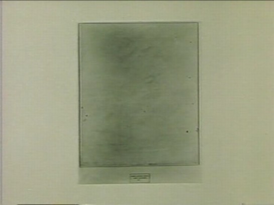
There’s no frame. And no mat. No nothing, just the drawing. Which feels substantively different. De Kooning’s original sheet appears to be mounted onto the piece of paper onto which the label was drawn. Where the mat now seems to separate the label and the drawing, without it, it seems like one thing. A collage, perhaps, but a joined, unified, self-contained whole.
Which makes the label not just a label, but a text, a set of marks, as much a drawing as the erased marks–or the erasure marks. Rauschenberg’s explanation to de Antonio is different from other, later tellings, and from the neo-dada, Freudian interpretations of others. He seems entirely clear about what he wanted to do:
One of the things I wanted to try was an all-eraser drawing. And, uh, I did drawings myself, and erased them. But that seemed like fifty, fifty. And so I knew I need to pull back farther, and like, if it’s gonna be an all-eraser drawing, it had to be art in the beginning.
He was trying to make a mark with an eraser. It’s the difference between erasing a drawing, and drawing with an eraser. And when he was done, the result was both an erased de Kooning and a drawing. And the hand-drawn label declared as much. It’s almost a perfectly symmetrical prefiguring of Joseph Kosuth’s One and Three Chairs, made a dozen years later.

But did Kosuth know and react to Erased de Kooning Drawing in creating his piece? Did de Antonio just happen to shoot the drawing while it was out of its frame, or did it look different–was it constituted differently–in 1970? And before? When did it change to the conceptual object, where the label is demoted, no longer an integral element, diametrically opposite but co-equal with the “drawing,” the concept, but now a separated, ancillary presentation device equivalent to mat and frame? Rauschenberg wrote on the back of the work, “FRAME IS PART OF DRAWING,” but I’m not sure that was always the case.
It seems to me that Erased de Kooning Drawing became one thing in the early 1970s, but before then, it was something else.
Previously: ‘FRAME IS PART OF DRAWING’
Next up: looking back at what was said and written and known and shown about Erased de Kooning Drawing before 1973.
‘Art Doesn’t Begin And End In A Physical Frame’
So I try to take a break from this [now rather long] exploration of the history of Robert Rauschenberg’s Erased de Kooning Drawing by reading my Avalanche magazines.
And there I find an announcement for Oh Dracula, a 1974 Chris Burden performance/installation which took place at the Utah Museum of Art at the University of Utah in Salt Lake City. Really? Yes.
October 6 – October 9, 1974, in fact, which makes it one of Burden’s earliest museum shows.
But it seems that the piece was not just organized by the museum, but as part of the Joint Conference of the Western Association of Art Museums and the Western Regional Conference of the American Association of Museums, which was held in Salt Lake that year. I’ve added it to the research list.
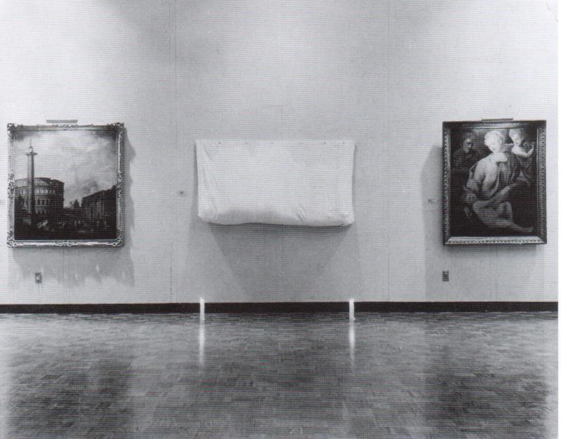
Avalanche said cellophane, but in a 2000 essay in Frieze Ralph Rugoff said canvas. Either way, Burden climbed into a “chrysalis”-like sac and had himself installed in between some of the museum’s exceedingly random 18th century paintings, with candles placed at his head and feet. And there he hid all day.
Rugoff’s piece is about invisibility; he talks about Burden’s hiding pieces, and John Cage’s silence, but not Erased de Kooning Drawing, even though his ending paragraph reminded me of it:
But perhaps the most salutary effect of invisible art lies in the chameleon-like array of meanings which have cloaked it over the past half century. Rather than simply serving as a static limit defining the no-go zone of artistic practice, it has alternately appeared under the guise of the Sublime, of social idealism, avant-garde aggression, personal humility and ironic commentary. No single artist has been able to possess invisibility as a signature medium, and its wayward history gently yet pointedly mocks our waning belief in the cult of originality. It suggests instead that art doesn’t begin and end in a physical frame or a singular context, but lives on in the potentially endless process by which we make use of it.
Oh Dracula isn’t mentioned in Burden’s current bio, and though I talked about Burden while I was lecturing at the University of Utah, no one there mentioned it to me, either. So it’s a different kind of erasure.
Touched by your presence [frieze]
‘FRAME IS PART OF DRAWING’
How do we know what we know, and when?
For instance, we know that Erased de Kooning Drawing (1953) is one of Robert Rauschenberg’s most important, influential works. It’s the kind of commonly accepted history that lands a piece in the Final Four of Tyler Green’s Art Madness poll to determine America’s Greatest Post-War Artwork.
And we know the story of it, how Bob took a bottle of liquor with him to Bill’s studio to ask for a drawing to erase. And how Bill, at first reluctant, twice-validated the sacrifice by giving away “a drawing he’d miss” and which would be “hard” for Bob to erase. And then Bob signed it and framed it and sparked an art world scandal with it which hasn’t really abated. We know this because Bob and then his curator and critic advocates repeat the story so frequently. [Vincent Katz has a nice telling of it in Tate Magazine in Autumn 2006.]
But this weekend, I suddenly had cause to wonder just how all this went down, and when, really, did this revolution start? Because it’s not as clear or as obvious as I had always assumed.
That’s Erased de Kooning Drawing up there, precisely matted and framed. That’s how I saw it for the first time in Walter Hopps’ “Rauschenberg In The Early 1950s” show at the Menil 20 years ago, and then again in John Cage’s “Rolywholyover” a couple of years after that. [Or am I conflating the two Guggenheim SoHo versions of those shows?]
At the time, it was still in the artist’s own collection. In 1998, SFMOMA acquired it along with a group of other Rauschenberg works. [Calvin Tomkins wrote in the New Yorker in 2005 that MoMA was offered the works first and turned them down.] Its official description: “drawing | traces of ink and crayon on paper, mat, label, and gilded frame.” It’s not just a drawing, not just an erased drawing, it’s an object assembled.
SFMOMA has a nice little, c.2000 interactive that includes the back of the piece:
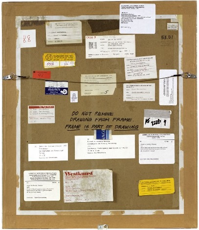
“DO NOT REMOVE
DRAWING FROM FRAME
FRAME IS PART OF DRAWING”
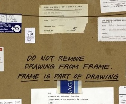
LOVE THAT. I could geek out staring at the backs of artworks all day. Did Bob himself write that? It looks like it.
The early line on Erased de Kooning was either “neo-dada,” which was a standard critical reaction to Rauschenberg in the 50s, or AbEx patricide. But it has since evolved far beyond these bad boy, enfant terrible readings, to be considered a precursor of huge swaths of contemporary art.
In his 2009 book, Random Order: Robert Rauschenberg and the Neo-Avant-Garde, Branden Joseph discussed Erased de Kooning Drawing as one of the touchstones of conceptual art and appropriation art, alongside Marcel Duchamp’s mustache-on-the-Mona-Lisa, L.H.O.O.Q:
Whether by defacement or effacement, the two works’ devaluation of the appropriated representation (an essential factor in the process of allegorization) is equally effective. Rauschenberg’s subsequent mounting of the erased sheet of paper within a gold frame, together with the addition of a carefully hand-lettered label with a new authorial attribution, title, and date (“Erased de Kooning drawing / Robert Rauschenberg / 1953”), simultaneously doubles the visual text with a new signification and calls attention away from the (now depleted) visual aspect of the work and toward the conventional and institutional devices of the work’s “framing.”…For Rauschenberg’s Erased de Kooning Drawing essentially reenacted the reception of his White Paintings: the initial evacuation of expressive or representational meaning in favor of transitional, temporal forces subsequently gave way to a process in which meaning was reattributed to the work from the outside.
Indeed it was. As the White Paintings were to the reflections and shadows in the room, so Erased de Kooning Drawing was to passing theories of art.
In 1976 Bernice Rose put “the famous Erased de Kooning drawing” along side Jasper Johns’ Diver at the foundation of The Modern’s major survey, “Drawing Now.” Reviewing the show for the New Yorker, Harold Rosenberg dismissively labeled Pop, Minimalism and Conceptualism, the work that followed Rauschenberg’s and Johns’s “parodies of Action painting,” as the new “Academy of the Erased de Kooning.”
Later that year, the drawing was in Walter Hopps’ Rauschenberg Retrospective at the Smithsonian, which traveled back, in 1977, to MoMA. Where it prompted Grace Glueck to open her NY Times story with a rhetorical question–“Wasn’t it only a couple of years ago that Robert Rauschenberg erased a drawing by Willem de Kooning?”
Yes, only a couple, give or take twenty four. Maybe it just took that long to get it. We had to wait for Conceptualism to be invented before anyone could recognize Erased de Kooning was its foundation.
In the September 1982 issue of Artforum, none other than Benjamin Buchloh discussed Erased de Kooning Drawing‘s historical importance in a sprawling 14-page essay titled, “Allegorical Procedures: Appropriation and Montage in Contemporary Art”:
At the climax of the Abstract Expressionist idiom and its reign in the art world this may have been perceived as a sublimated patricidal assault by the new generations most advanced artists, but it now appears to have been one of the first examples of allegorization in post-New York School art. It can be recognized as such in its procedures of appropriation, the depletion of the confiscated image, the superimposition or doubling of a visual text by a second text, and the shift of attention and reading to the framing device. Rauschenberg’s appropriation confronts two paradigms of drawing: that of de Kooning’s denotative lines, and that of the indexical functions of the erasure. Production procedures (gesture), expression, and sign (representation) seem to have become materially and semantically congruent. Where perceptual data are withheld or removed from the traditional surface of display, the gesture of erasure shifts the focus of attention to the appropriated historical constrict on the one hand, and to the devices of framing and presentation, on the other.
Whew. But.
Back up. Because here is Buchloh’s account of the gesture, and of the “device of framing and presentation”:
After the careful execution of the erasure, which left vestiges of pencil and the imprint of the drawn lines visible as clues of visual recognizability, the drawing was framed in a gold frame. An engraved metal label attached to the frame identified the drawing as a work by Robert Rauschenberg entitled
and dated 1953.
[Emphasis added because, WTF engraved metal label?] When did it have a metal label?
There wasn’t one in 1991 when I saw it. And there wasn’t one in 1976, when Walter Hopps wrote this catalogue entry: “He [Rauschenberg] then hand-lettered the title, date of the work, and his name on a label and placed the drawing in a gold-leaf frame bought specifically for it.” [Oddly, the only source Hopps cites is an Interview Magazine Q&A, dated May 1976, just as the catalogue was being produced.]
There is no way that the hand-drawn label in the middle of the mat of Erased de Kooning Drawing could be mistaken for a metal label on a frame. At least if you had seen the work in person. Or had discussed it with anyone who had. So the implication, then, is that in 1982, Benjamin Buchloh had not actually seen Erased de Kooning Drawing, or that he’d misremembered it or misread a photo of it, and neither he nor anyone at the magazine of record noticed the error. Which does make some sense if Erased de Kooning is a conceptual work in the mode of Joseph Kosuth, not an art object, per se but an “idea of an art work [whose] formal components weren’t important.” [Of course, Kosuth said that in 1965, more than a decade after Rauschenberg apparently already demonstrated it.]
But there are some problems here. Judging by all the registrars’ labels and notes on the back, it seems impossible that someone like Benjamin Buchloh would not have seen Erased de Kooning Drawing in the 30 years since its creation. But looking more closely, I can’t find any exhibitions dating before 1973. That’s when Susan Ginsburg’s show, “3D Into 2D: Drawing For Sculpture,” opened at the New York Cultural Center. [Ginsburg was, among many other things, a board member of Change, Inc., an artist emergency assistance foundation Rauschenberg started in 1970.]
Was Erased de Kooning Drawing shown in the 60s? Or the 50s, for that matter? Where? How? What was the reaction? Because the triumphant Conceptualist historicization of the work seems to have obscured–if not actually erased–its early history.
Grate Art
Oh, yeah. With this awesome cheese grater screen, Mona Hatoum has just won a 10-year pass in my book; she can do whatever she wants.
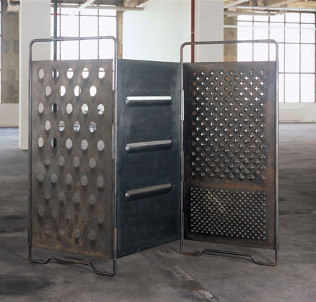
Oh, really? It’s called Grater Divide? And it was made in 2002? Well, her 10-year-pass is just about up.
Wall Works
I’ve always admired the series of site-specific Wall Works produced over the years by Edition Schellmann, even though I’ve never mustered the courage to buy one. Fear of commitment, I guess. Too nomadic.
Well, no, that’s not quite right. Because their finitude is part of their appeal. The way they thwart commodification and exchange by being limited, by nature and design, to a finite number of installations.
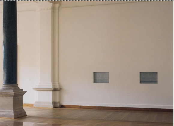
You could cheat, I suppose, and reinstall your Judd elements once you know the ratio. Or re-paint your Darren Almond sunlight once you know the angle or time. But then what have you got? If you’re going to ignore the artist’s intention, you might as well save the dough and fabricate the whole thing anyway.
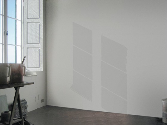
Anyway, none has ever made me sad, until now:
Wall Drawing, Sol Lewitt, 1992
description:
“wall drawing” to be written on a wall in the hand of the owner, medium and size to be chosen by the owner. Limited to 10 installations. Certificate: an 8 x 10″ black and white photograph of the installation, sent by the owner to the artist, who will sign, number and return it.
I guess finitude is the right word:
Finitude. To be carefully distinguished from “mortality.” Finitude refers not to the fact that man dies but to the fact that as a free choice of his own project of being, he makes himself finite by excluding other possibilities each time that he chooses the one which he prefers. Man would thus because of his facticity be finite even if immortal.
Esso De Cherbourg
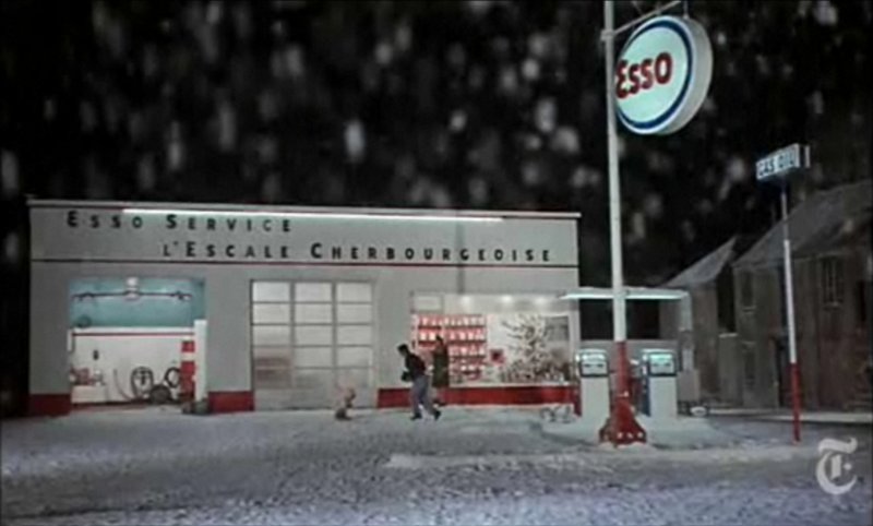
It may not be the absolute origin of my desire to live in a converted, modernist gas station, but AO Scott’s recent reminiscence reminds me that the Esso station at the end of Jacques Demy’s incomparable Les Parapluies de Cherbourg is one of my formative cinematic and architectural experiences.
I got completely blindsided by the film in the early 1990s when I basically wandered into the Time Warner screening room at MoMA and watched a preview of the restoration of the film spearheaded by Demy’s widow, Agnes Varda, who was on hand to discuss it. Truly not worthy, but there you go.
Uh-oh, something looks screwy with these prices; is there an issue with US availability of the DVD? [amazon]
Colorama
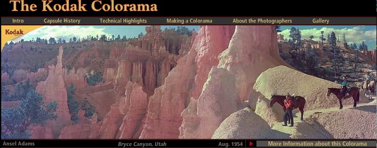
I really need a photomurals tag at this point. The Kodak Colorama billboard was installed in the Great Hall of Grand Central Station from 1950 until around 1990, when the station began a long-overdue restoration.
Anyway, 18×60 foot backlit, color transparencies, “the biggest photographs in the world,” one a month for forty freakin’ years. It’s like if Norman Rockwell had a son named Jeff Wall who went into advertising.
According to the Kodak Colorama mini-site, company executives Adolph Stuber and Waldo Potter originally thought to recreate “Kodak’s success with projecting color slides to a staggering size for the 1939 World’s Fair,” but the Great Hall’s sunlight forced them to go the backlit route.
Just as regular photomurals were first printed in wallpaper-like strips, the Colorama transparencies were made of 18-inch [and later 36-in] rolls pieced together witn tape.
Colorama was designed to promote “a critical cause — photography for photography’s sake.” Which means something different to a company that sells cameras and film. The majority of the Colorama pictures were by Kodak staff photographers, who inserted amateur photographers in glorious landscapes.
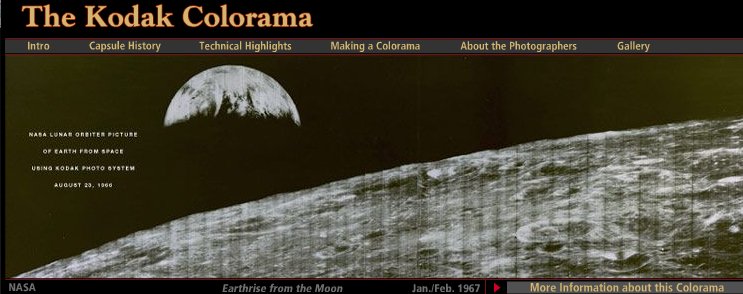
But not all. There are several Coloramas over the years by Ansel Adams, including the August 1954 panorama of Bryce Canyon, Utah up top. The 1967 Earthrise image above is the only black & white Colorama photo. Apparently, it had been covered a lot immediately after NASA received the transmission from the Lunar Orbiter, and the Colorama appearance kind of leveraged that familiarity.
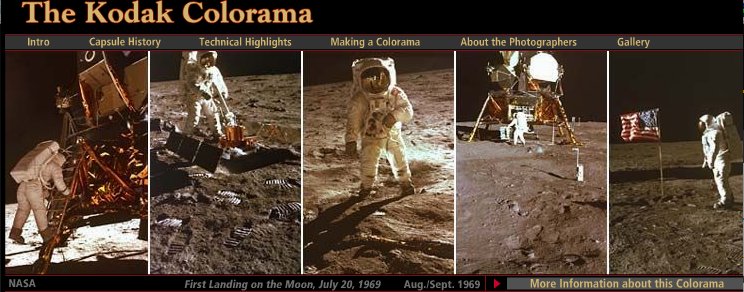
Contrast that, though, with the 1969 Apollo 11 images, where Kodak engineers rushed to print NASA’s just-released negatives from the moon landing, and ended up scooping Time, Newsweek and Life, to the benefit of the “awed crowds.”
The Kodak Colorama [kodak.com]
Last summer, Kodak donated the Colorama Archive to Eastman House [eastmanhouse.org]
Aarhus Madness
O wow.
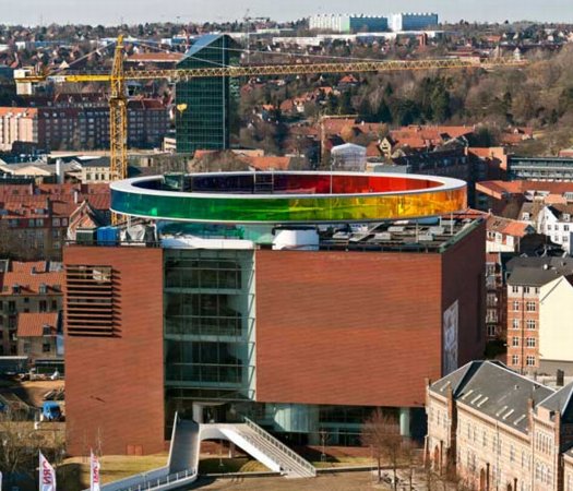
Olafur Eliasson’s Your Rainbow Panorama opens Thursday on the roof of ARoS Aarhus Kunstmuseum in Denmark. It’s a 360-degree glass promenade which paints the cityscape with every color of the spectrum.
Too bad the promenade roof’s not rainbow-tinted glass, too. That’d make one helluva signature on Google Maps.
Image and statement via olafureliasson.net [olafureliasson.net]
More images at designboom [designboom.com]
Previously: Olafur: The Magazine?
Color Experiment paintings
Apropos Of Absolutely Nothing Else Posted On greg.org In The Last Seven Months
Weight, Weight, Don’t Tell Me
On October 4th, 1994, at an artist panel discussion for MoMA’s Cy Twombly retrospective, Richard Serra made an offhand comment about how “The last century of art has been based on a misreading of Cezanne.”
To a young, impressionable student/fanboi still putting his contemporary art world view together, this was a shock. Because it was Serra, and because I still assumed there was some right art historical “answer” to be gotten to, and because Serra didn’t bother to say how everybody got it wrong, it lodged in my brain for years.
And so it was that at some point a couple of years later, when I met him at a party, I asked him what he’d meant. Of course, he didn’t remember what he’d said, or the context, so he gamely tried to float a couple of possible theories, but nothing that matched the seeming conviction with which I’d remembered him saying it. So I tried to forget about it.
And I thought I had, at least until just now, when I was reading Serra’s discussion with Gary Garrels in the Richard Serra: Drawing catalogue. They were talking about the “jump” in Serra’s work after 1989 in terms of Cezanne:
GG: Those double-panel drawings, rather than dealing with a wall or with a room or a space, deal with internal relationships.
RS: They are masses in relation to one another. They’re not about composition or figure-ground; they emphasize the comparison of different weights in juxtaposition.
GG: So this, to me, is again another jump.
RS: For me they have more to do with Cezanne than with Malevich. I wasn’t looking at Cezanne when I conceived them, but in retrospect, I see a clear connection in the way they deal with weight and mass in relation to shape. They’re the opposite of the floating shapes of Constructivism and Malevich, referred to in drawings like Heir
The comparison of the diptychs with Cezanne may be a stretch, but no one else comes to mind who deals so physically with mass and weight. No one talks about the weight of Cezanne, but there’s a manifestation of weight there that’s not in Picasso, not in Matisse, barely in anyone who follows. Cezanne is obviously interested in gravity and in the relation of weight to plane. Take Still Life with Plaster Cupid [ca. 1894], in the Courtauld, where he punches a hole in the space, and you think the apples and onions are going to roll off the table. The only thing holding them in place is their weight. They have the weight of cannonballs.
So the answer, then, is C) gravity.
But then, literally, as I’m typing this in from the book, it’s 41:00 into the recording of the panel, right where Serra says it:
I think Twombly has a big range– a big range of evocation. I think that’s what he does. He doesn’t present an image; he evokes a sensuality, and it’s unlike anything in post–I think. I’d have to go back to someone like Baziotes, maybe–there’s nothing in the American brain like that. Americans are much–maybe Brice. Americans are much more heavy-handed, much more flat-footed, much more aggressive.
This is the opposite of Cezanne. And the whole inheritance of the New York School kind of goes Cezanne; Cubism; into Abstract Expressionism; Pop Art pretty much hangs things back on a grid; the grid comes back up again in Minimalism. That seems to me all an extension of a certain kind of classicisim and aggression and a standardization coming out of Cezanne, a misreading of Cezanne, albeit. And Twombly takes the opposite attack. It’s very lyrical. And very open. And very…delicate.
Brice Marden: Yeah, I think it’s really great that he left town. [crowd laughs]
OK, then. I seem to have misunderstood the question. The correct answer is actually D) Serra likes to think in terms of major historical frameworks. I’m glad that’s all cleared up.
‘One Of The First Works That They Made After Becoming A Couple’
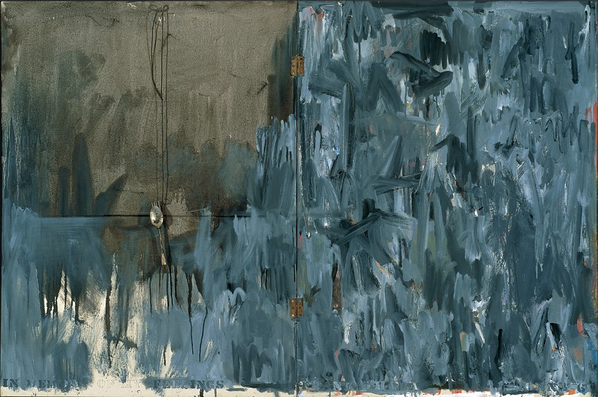
In Memory of My Feelings – Frank O’Hara, 1961, Art Institute of Chicago
I’ve had a jpg of Jasper Johns’ 1961 painting, In Memory of My Feelings – Frank O’Hara on my desktop for months now. It was one of the most important works in the National Portrait Gallery’s “Hide/Seek” exhibition, and I took the chance to study it up close several times throughout the run of the show.
I have also been a little wary to write much about it, and its seemingly powerful resonance with Johns’ Short Circuit flag, partly because I was unsure of how much to read in, and how relevant or not the associations I was seeing really were.
In Memory of My Feelings definitely relates to the other, larger Flag–at 40×60 vs 42×60, it’s nearly identical in size. But unlike the 1955 Flag, or any other flags, it’s made of two canvases hinged together. Hinges, functional and not, are just one unexamined element that appears in both Johns’ and Rauschenberg’s early work. [Light bulbs are another. Maps, just barely.]
When In Memory is discussed, the somber, grey tones come first. Then there’s Johns’ stenciled inclusion of the words “dead man” next to his own name on the bottom. And the overpainted skull that you can barely make out in the upper right quadrant somewhere. And that’s it, and then the Frank O’Hara reference takes over, and the irony that Frank O’Hara would die five years after this was made–as if this had anything to do with the painting, or Johns’ painting of it.
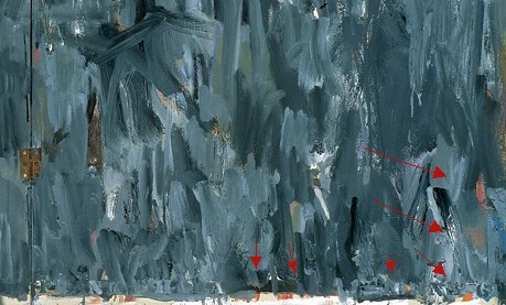
And so I wondered why I couldn’t find anyone talking about what IS clearly visible through the overpainting in the lower right section [detail above], which is a series of vertical red and white stripes. A flag. Or maybe two. Photos weren’t allowed in NPG exhibition, and I can’t remember now. But there is at least one flag painting under there.
One person who does talk about In Memory of My Feelings, though, is “Hide/Seek” co-curator Jonathan Katz. In a gallery talk video, Katz talks about putting Johns’ and Rauschenberg’s works side by side to show it for the first time in the context of their relationship, and particularly their breakup.
Katz talks matter-of-factly about these artists’ relationship and collaboration in a way that no curator ever has. And keeping the bitterness of the breakup in mind certainly brings a lot of content to the fore in Johns’ painting. It feels especially necessary for understanding why Johns might have chosen to reference this poet and this poem. [Spoiler: it’s about dealing with the despair of a breakup.]
But Katz, whose delivery is slick and precise, not a word out of place, drops what I think is a bombshell? And just keeps on going:
When [Johns] and Rauschenberg met, one of the first works that they made after becoming a couple, was the famous–even iconic–Jasper Johns American Flag painting. This is a picture of that flag, in grey, reversed. The obverse of the picture that they made when they got together.
In one sense, it’s obvious, and in another, it’s ridiculous. Or at least unheard-of. Yes, definitely unheard-of. Katz is proposing, in passing, fundamental changes to the understanding of bodies of work, practices, and histories of two of the most important artists of the last 100 years.
This is the compelling thing for me about Short Circuit, an early 1955 Rauschenberg combine with a Jasper Johns flag behind a hinged door. A work which was originally/also titled Construct with J.J. Flag, and which was exhibited by Alan Solomon under both their names in 1958. It makes the otherwise incredible, even shocking assertion that Johns and Rauschenberg collaborated and made some of their most important work together seem perfectly obvious.