
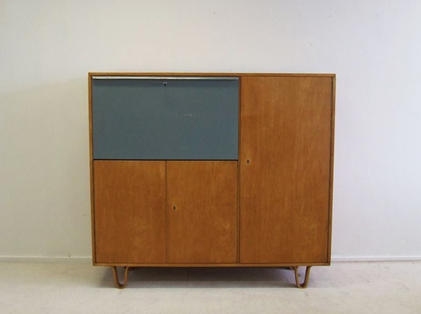
They may not be able to create an art ecosystem that can withstand the whims of populist demagogues, but I tell ya, back in the day, the Dutch sure could make the hell out of a birch writing cabinet.
Cees Braakman for Pastoe writing cabinet, birchwood cabinet with original colour-painted flap door (scratch), EUR1300 [vervlogenjaren.nl via anambitiousprojectcollapsing, also previously, reflib]
Dutch Camo Domescapes
I love it when a plan comes together. Or at least when several subjects of interest converge unexpectedly.
It seems the Dutch art world is about to be decimated by sudden and substantial government funding cuts and reorganizations. [for angry details, check sven lutticken’s recent post; for plaintive, possibly resigned reaction from the affected institutions, try the open letter at the Dutch public arts organization, SKOR.]
If the proposed changes really do take effect, and the status quo of one of the most highly developed state-sponsored ecosystems for the arts is actually dismantled at a stroke, I think it’s really important to requestion every comfortable assumption of the involvement between art and politics. It has a lot of obvious problems and weaknesses, but the Dutch system, at least as perceived from abroad, has always seemed like the apotheosis of certain ideals of cultural industrial policy, which, Lutticken argues, now “don’t seem to be worth a penny.”
Anyway, not that they saw them coming, but SKOR tried to understand the political shifts that precipitated these cuts in the December 2010 issue [#20] of their excellent journal, Open, which examines populism and the persistent need for narrative and myth in the democratic process.
Dutch populism seems to center on–surprise–issues of immigration, assimilation, and Muslim vs. Christian cultural influence. As it turns out, one of the contributors in Open 20 is Foundland, a graphics, art, and research group that seems part collaborative, part design firm.
In 2009, Foundland created CACHÉ ÉXPOSÉ, an investigation into the remote, largely invisible, and unreported system of detention and deportation facilities in the Netherlands. The majority of the people imprisoned in the facilities or subjected to the system seem to be immigrants and refugees from largely Muslim countries.
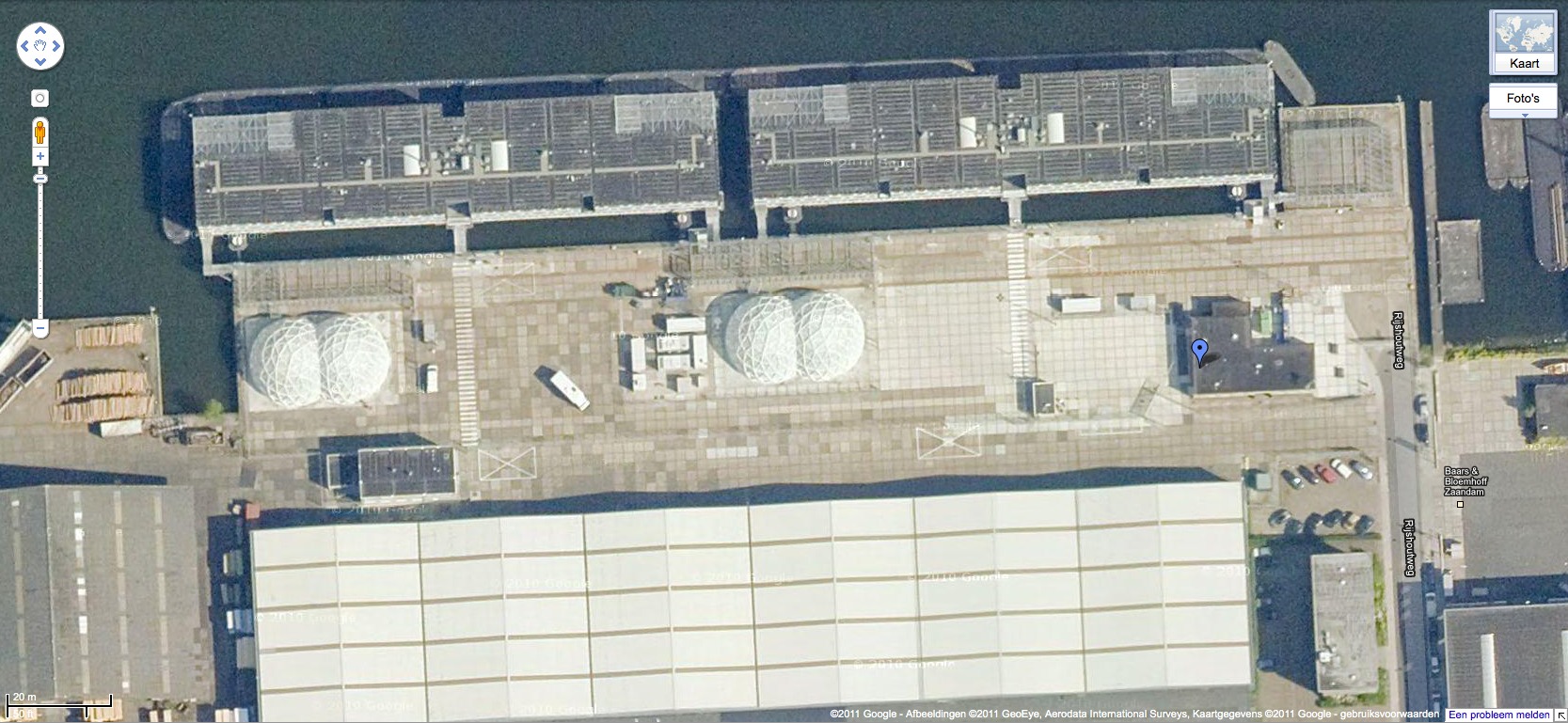
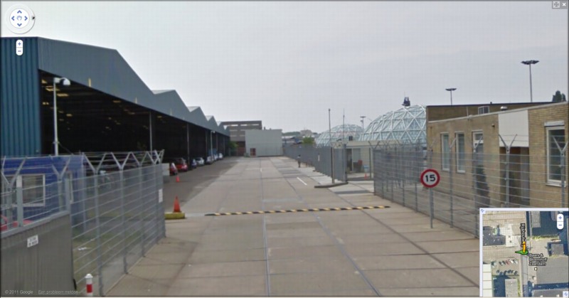
When I read the description of the project, I wanted to see if, like the intelligence- and military-related sites, these politically sensitive detention sites were obscured on Google Maps. Fortunately, Foundland had created a Google Maps list as part of the CACHÉ ÉXPOSÉ project.
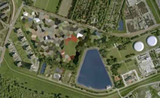
And the short answer is no. Their industrial anonymity is camouflage enough. But then hey-ho, looking at the waterfront detention center in Zaandam, a commercial city northwest of Amsterdam, what do I see? Awesome-looking domes.
Double geodesic domes of unknown purpose, but which look to be at least somewhat transparent or translucent from Street View. What a wonderfully open society the Netherlands must be that in can allow the Google Street View car to drive right up into the middle of its immigrant prisons. Oh wait.
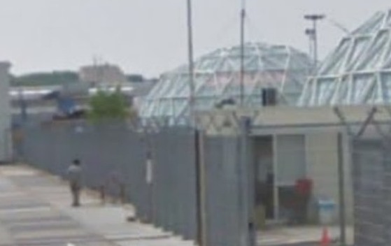
What strikes me, besides the lone figure standing outside the double barbed-wire fence? Is irony the right word to see a geodesic dome, a form which was once erected to great fanfare in Afghanistan, where it served as a symbolic center of friendship, trade, democracy, and political cooperation with the west, being deployed in a back alley prison in Europe filled, presumably, with impoverished immigrants from the Middle East?
Then again, Afghans in 1956 apparently did see the US’s Kabul Dome pavilion as representing The Future. So.
Hey-Ho, The Art Institute Bought Short Circuit
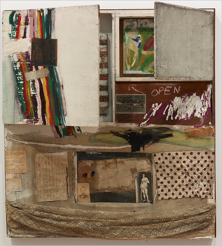
Short Circuit, Robert Rauschenberg, et al, via the estate/VAGA
I always [well, for a weekend or two last December, anyway] figured I’d find the original Jasper Johns flag painting that was inside Rauschenberg’s Short Circuit before the Combine was sold, so that it could be presented to its eventual owner in its original, art history-upending state.
Yeah, well. Turns out the missing flag was not a dealbreaker for the Art Institute of Chicago. Carol Vogel just released the news that James Cuno orchestrated the Museum’s purchase of Short Circuit, Sturtevant flag and all, from the estate, for an anonymously sourced price of $15 to $20 million.
In her piece, Vogel mentions the flag, and the Susan Weil painting, behind the cabinet doors. But then she says something I’ve never heard or seen anywhere: that though both were invited, neither Ray Johnson nor Stan VanDerBeek actually contributed pieces to the Combine VanDerBeek we knew, but Johnson?
I’d always understood that Johnson was in, and I’d assumed that the collage in the center of the lower half, with the Abe Lincoln and Venus postcard, was Johnson’s. If it blended so seamlessly with the rest of the Combine, and with the rest of Rauschenberg’s oeuvre, well, all the better. Johnson was famously sanguine about his collage work, and loved if his artist friends tweaked or reused it. Or so I’m told.
I like this reproduction of the piece, too, with the doors barely ajar. I’ve heard a story from a couple of people now, that when Johns went to Gagosian to see the show, he mentioned that the doors on Short Circuit were supposed to be closed. This image kind of finesses the door, concealing just enough so that the first thing you say when you see the piece is, “Holy smokes, that’s a Jasper Johns flag three years before he showed it anywhere!”
Prime Rauschenberg at Chicago Art Institute [nyt]
Previously: Until I get some tags, this is how you find all the Short Circuit-related posts around here
WTF SPIRAL JETTY PAPERWORK MAYHEM
Holy smokes, this is like something out of Land Art Kafka. Tyler Green points to a just-published report by the Salt Lake Tribune’s Glen Warchol: the Utah Department of Natural Resources is claiming the Dia Foundation’s 20-year lease on the 10 acres of state land under the Spiral Jetty is not being renewed. Dia was “tardy” in making its $250 lease payment, and that the Foundation had not responded to an automatically generated notice of the end of the lease sent in February.
Dia’s deputy director had no idea about the situation when the Tribune reporter called for comment. Yet the report also includes multiple sources from the state, and other local experts familiar with state land leases.
The story is just flabbergasting, the dismissive quotes in particular. Oh, and the land use attorney who finds the non-renewal “unusual” and who notes that it’d be “unheard-of” for the state to fail to renew a mineral extraction company’s lease.
Robert Smithson leased 10 acres of sovereign land at Rozel Point to build the Spiral Jetty in 1970. The original payment was $100/year. The artist’s estate gave the Jetty to Dia in 1999, which implies that the estate had renewed it at $250/year around 1990.
Reading the report again, this paragraph jumps out at me:
The Spiral Jetty would continue to be protected as state land and the public access would remain the same, [Forestry and State Lands spokesman] Curry said. “Dia’s not holding the lease is not going to change anything regarding the Spiral Jetty.”
On the one hand, it could sound like an attempt or decision by the state to take control of the Jetty itself. On the other, neither Warchol nor the state spokesman seems too steeped in the nuances of ownership and authorization of an artwork. [Which obviously happens to be site-specific, but still.]
It’s an early report of a fragment of a complicated situation with [literally] monumental consequences.
Control of iconic sculpture Spiral Jetty in dispute [sltrib via @tylergreendc]
Water Pictures, by Marion Thayer MacMillan
I found a beautiful and odd book the other day, Reflections: The Story of Water Pictures, published in 1936 by Marion Thayer MacMillan.
While vacationing in the Indian territories surrounding Georgian Bay on Lake Ontario, soon after the end of World War I, McMillan discovered a Rorschach-like phenomenon where still waters would occasionally produce perfect mirror images of the craggy coastline.
Over 15-plus years studied and photographed perfectly mirrored reflections along the coastline of Georgian Bay, Lake Ontario. [She tells of teaching herself photography in order to capture these ephemeral landscape images.]
MacMillan began showing her photos around, first to the local population and Indian craftsmen, and she came to the conclusion that such visual phenomena were apparent to centuries of canoeing Indians, who drew inspiration from them for their myths and artifacts. She particularly saw radially symmetric totem poles as permanent representations of these phenomena.
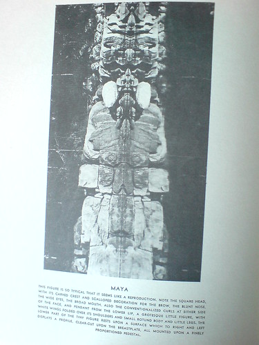
Eventually, she began giving slide lectures of the photos at museums, universities, and art societies, where she drew connections between this “primitive” visual language, which was surely a common thread among all “savage” cultures, and the most advanced modernist, abstractionist movement being put forward in the art world of the day.
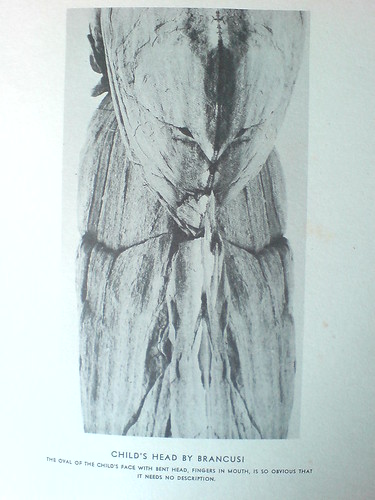
And so the caption on her photo, titled Child’s Head by Brancusi, reads, “The oval of the child’s face, with bend head, fingers in mouth, is so obvious that it needs no description.”
Many, or really most, of her photos are similarly titled and labeled; in her search for meaning in this optical, perceptual phenomenon, MacMillan repeatedly found “obvious” representations of artistic, literary, and religio-spiritual subjects. Which only temporarily distracts from the beauty and now-historically tinged aesthetic of the images themselves. I imagine there are some sexy, old prints out there somewhere.
The art and anthropology worlds seem to have been politely intrigued but largely unaffected my Mrs. MacMillan’s work or discoveries. Though she does mention a photographer she’d introduced the effect to had taken some accomplished Water Pictures of her own, which she showed at Julien Levy’s gallery, to generally positive reviews.
Basically, as long-lost art goes, MacMillan’s book doesn’t feel like a masterpiece, or even that important. In one way, I feel a bit implicated, as I sit here, finding or creating world-changing images and rewriting art history, in my little blog canoe. But then, it was important to her, and maybe it’s enough to recognize that.
Reflections: The Story of Water Pictures is usually available on Abebooks, though my $20 inscribed copy seems like an outlier [abebooks]
I posted a couple more images in the gregorg flickr [flickr]
‘A Sort Of Collaboration’
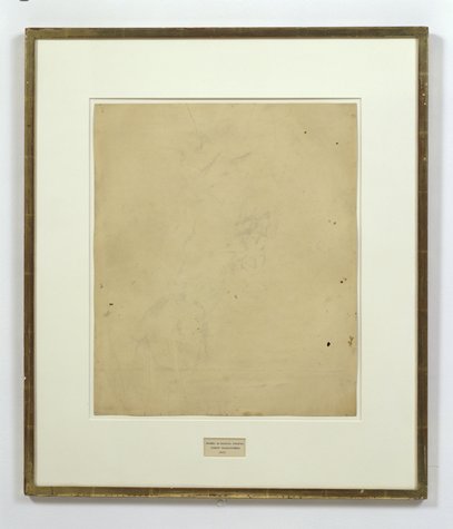
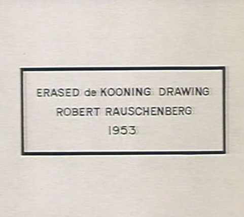
Erased de Kooning Drawing as of 1999 at SFMOMA
When we last left Erased de Kooning Drawing, the late, great Leo Steinberg had finally told his story about getting Rauschenberg on the phone in 1957 in order to sort the damn thing out. Steinberg’s conclusion was that, far from a “Neo-Dada” prank or Oedipal negation, Rauschenberg had offered de Kooning “a sort of collaboration” of erasure. The plausibility of this interpretation was inspired by the equally collaborative combine painting of the same period, Short Circuit.
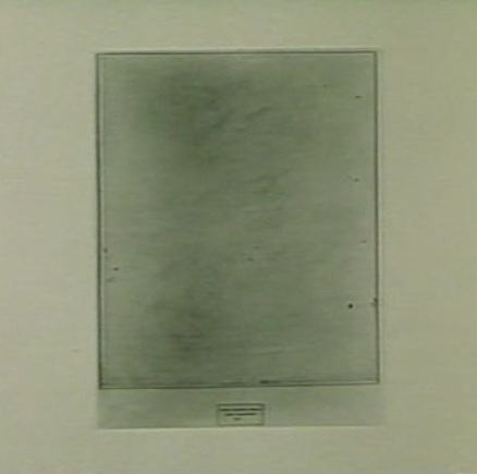
Erased de Kooning Drawing, without present matboard, c. 1970, via Emile de Antonio’s Painters Painting
So to recap quickly: EdKD is a collaborative work. In which erasure-as-drawing is the subject, or the strategy. Each artist with his different markmaking method. And it is inscribed, labeled, by hand, with a flatly descriptive title and claim of authorship. And though it had been unmatted at some point [above] rendering the inscription and the drawing as one collaged work, it was matted in a way that obscured this unity, and it was [eventually] presented as a framed, presented object. A conceptual work, realized. A concept of a drawing erased. Hold all that in your head. Am I missing anything?
Erased de Kooning Drawing, detail, c. 1970, via Painters Painting
Anything besides the small detail that the inscription, the text, the third instantiation of the concept, the generative inverse of the erased drawing itself, was made by Jasper Johns?
For the crucial period of EdKD‘s uptake into the art world’s discourse, Rauschenberg had always claimed that he had written the inscription. That he’d “signed” it. That’s what he told Emile de Antonio on top of that ladder. That’s the only way anyone talked about it. But it is not true.
Vincent Katz has made one of the rare references to the importance of the work’s collaborative creation in Tate Magazine in 2006. But others credit Calvin Tomkins with breaking the news of Johns’ involvement in EdKD in his 2005 New Yorker profile of Rauschenberg:
Johns gave Rauschenberg the title for “Erased de Kooning Drawing,” which came into being in 1953, when Rauschenberg persuaded de Kooning to give him a drawing which he would then erase, to see whether a work of art could be created by the technique of erasure; Johns also did the precise lettering for the title, on the framed matte below the very faint, wraithlike ghost of the erased image.
The title, of course, is not on the matte, but under it. It was originally of a piece with the drawing, until the matte separated it, demoted it, even. Which may intensify the implications of difference between pre- and post-matted drawing.
[Tomkins does not identify the source of his revelation about Johns’ involvement, even though he wrote in the same piece that “Johns recently told Joachim Pissarro, a curator at MoMA, that he thought the term ‘combine’ had been his suggestion.” The latter was a memory Rauschenberg apparently did not share.]
Tomkins may have been the first to publish it, but claim of Johns’ collaboration was first made at least six years earlier, by a seemingly unlikely source: Robert Rauschenberg.
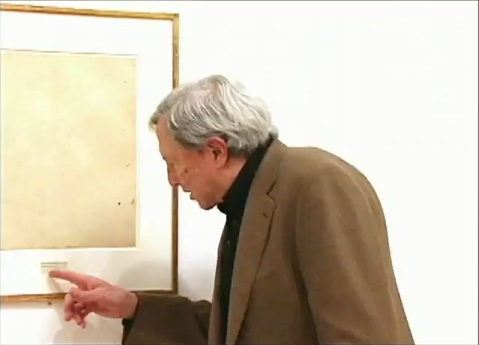
In a 1999 video interview about the newly acquired EdKD, Rauschenberg told SFMOMA curators,
So when I titled it, it was very difficult to figure out exactly how to phrase this.
And, uh, Jasper Johns was living upstairs, so I asked him to, to do, the uh, the writing.
And they say you never get to know your neighbors in New York. Sometimes you make historic works of art together with them.
Except that on Pearl Street, as Castelli famously told it, Johns was downstairs. And Rauschenberg was upstairs, in the loft vacated in the summer of 1955 by Rachel Rosenthal, who had found the building in the Spring of 1954. Rauschenberg was certainly around–and living around the corner–before then. They’d met early in the winter of 1954, began and he and Johns had already created and shown Short Circuit by then. So either Rauschenberg was referring to a time before they moved in together, Or Johns didn’t add his pieces to the drawing before mid-1955. Either way, it sounds like the drawing, to use Tomkins’ odd phrasing, actually “came into being” after 1953, the date Johns wrote on it.
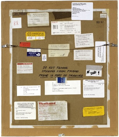
Part 1: ‘FRAME IS PART OF DRAWING’
Part 2: Erasers Erasing in Painters Painting
Part 3: Norman Mailer on Erased de Kooning and other ‘hopeless’ and ‘diminished’ art
Parts 4&5: Leo Steinberg on EdKD and how it’s a collaboration
Part 6: A 3-Way Collaboration, that is, with Jasper Johns. Oh, that’s this post. Just one more, I think.
iIkea: Furniture In The Cloud
An aside from Dan Hill’s extended examination of physical retail:
a conversation earlier today, spiraling out of the fact that we have some Ikea furniture (a bed) in a shipping container somewhere, traveling from Australia to Finland, and the thought occurs that Ikea could replace that physical shipping by simply sending a copy of the bed from the Espoo store, and picking up the old one in Sydney. A form of fabrication possible with their already distributed network of components.
On Retail [cityofsound]
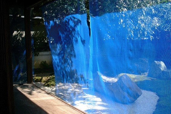
Blue Memory By Gabriel Orozco
Looking back at some of the other projects of FREE SOL LEWITT co-curator Daniel McClean, I have basically concluded that we have been walking in a weird parallel in the art world for ten-plus years, without ever actually meeting.
In 2000, when we were still buying a fair amount of his work [i.e., when it was last affordable enough for us to buy, or to buy more than one thing], McClean curated an installation in Japan by Gabriel Orozco.
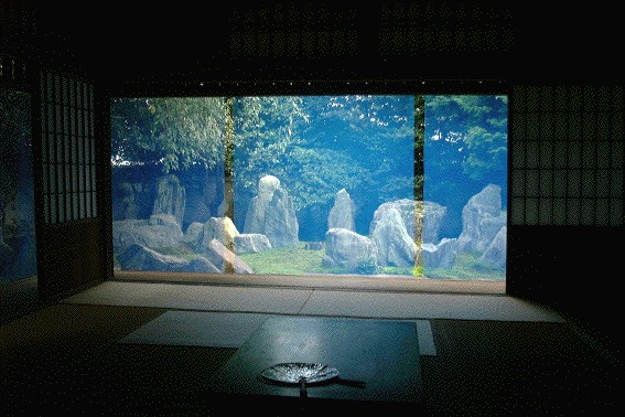
Called Blue Memory, Orozco hung a screen of fine, blue netting/fencing on the edge of the eaves of Kyoto garden designer Shigemori Mirei’s house, where the bamboo sunshades usually go. It’s classic Orozco, a transformative effect produced with modest, found or offcast materials.
See more images at Shima/Island, a series of four temporary installations and artist/curator-led seminars in 2000-2001 about the Japanese landscape. [hi-ho.ne.jp]
Artistic License: Daniel McClean on Contracts and Aesthetics [bombsite]
The Magnited States Of America
Angry Voicemail we got from an Alamo Drafthouse Customer
This is so awesome, if a little salty. [via @ianbuckwalter]
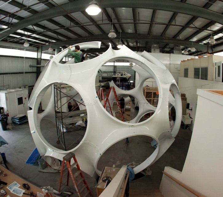
Fuller Fly’s Eye Dome Gets Miami Makeover
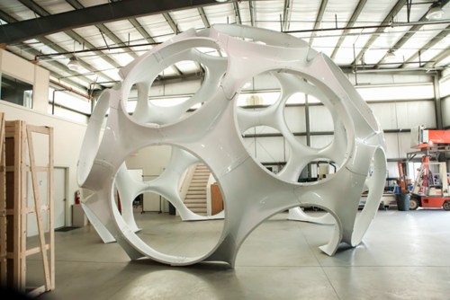
So everyone dutifully reproduced the press release about Craig Robins putting Buckminster Fuller’s 24-foot version of the Fly’s Eye Dome through a “historic restoration” by boat fabricator Goetz Composites, yet no one seems to have followed through with picture of the completed job. Well here you go, from Goetz themselves.
In 2008, Max Protetch exhibited the fiberglass dome, a prototype manufactured in 1976-7–which used to be described as a 26-foot diameter dome, btw–at La Guardia Place in the Village. The photo below is from his installation at Protetch: Beacon last year.
![]()
Said the press release:
Eric [Goetz] and his team, working with Daniel J. Reiser and John Warren who fabricated the original structure with Bucky, have gone to extraordinary lengths to engage this process with the same meticulous detail as a world-class fine art restorer.
Which is apparently not the same thing as restoring a world-class work of art, or even a piece of design, where the patina is to be preserved, even treasured, but more like a Pebble Beach concours-style project, where you chrome-plate all the screws.
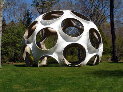
Maybe it could be argued that stripping off the blue paint on the inside brings it closer to its “original condition.” But looking at the raw fiberglass interior of the 33-foot dome Jack Lenor Larsen installed at Longhouse Reserve in Easthampton, I wonder if original originally meant something else.
Larsen’s dome was first loaned to him by Fuller’s daughter Allegra Fuller Snyder. It was constructed by John Kuhtik, whose company Emod had by then been working to produce the Fly’s Eye dome “for nearly a decade”, presumably with Fuller’s blessing and involvement.
Anyway, I guess I’m stoked that Protetch hustled and saved one of Fuller’s rare artifacts, even if saving it means stripping it of its history. I’m sure it’ll look shiny and fantastic in Miami.
Restoration of Buckminster Fuller’s iconic Fly’s Eye Dome at America’s Cup [archdaily]
In Afghanistan Did Buckminster Fuller A Statecrafty Geodesic Dome Erect
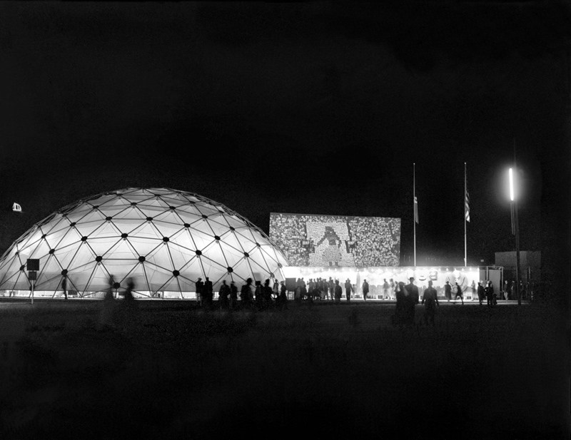
US Pavilion at Jeshyn Fair, 1956, photo by James Cudney
In the Spring of 1956, as the Jeshyn Fair celebrating Afghan independence approached, and the Soviets were well along in constructing a massive pavilion, US diplomats in Kabul thought the US better have one, too.
A USIA officer named Jack Masey commissioned Buckminster Fuller to create a 100-foot diameter geodesic dome in two months. His Raleigh, NC-based firm, Synergetics, Inc., apparently completed it in one.
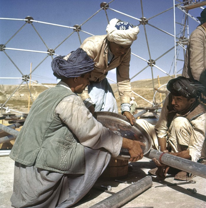
Pashto laborers assembling Buckminster Fuller dome, 1956, photo by Jack Masey
It was airlifted to Kabul, where a crew of local Pashto erected it in two days. The aluminum & plastic-coated nylon dome tent pavilion was a hit, “perhaps the most significant cultural event” of the “golden age” of US-Afghan relations, according to the creators of “In Small Things Remembered,” an exhibit looking at the history of the two countries’ relationship.
The show, which closed yesterday at the Meridian International Center in Washington, DC, was organized by Dr. Curtis Sandberg, VP of the Arts at Meridian, and sponsored by the State Department. It comprised photos discovered in various archives and foreign service officers’ private collections, such as Masey, above, and James Cudney, top, who spent eleven years in Afghanistan taking pictures, and developing various photography- and media-based culture, education, and diplomacy programs. Cudney passed away in 2009, but some more of his Afghan photos can be seen in the previews of two 2010 calendars he or his family created on lulu.com. They look pretty amazing.
Anyway, the US Information Agency and Dept. of Commerce continued to use the Kabul dome for trade fairs across Asia. As USIA’s director of design, Masey would go on to select Fuller to build the US Pavilion at the Montreal 67 expo, too.
In Small Things Remembered, at Meridian through June 5 [meridian.org]
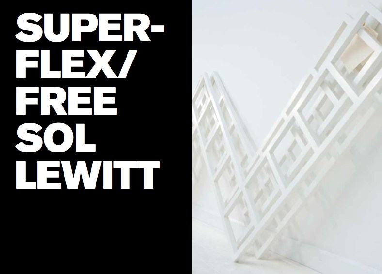
Faux Sol Mio: SUPERFLEX/ FREE SOL LEWITT
So awesome, yet, so annoying. How did I not know of this? When it was going on? I was emailing with the Van Abbemuseum at the time about replicas of artworks, particularly their refabrications of Laszlo Moholy-Nagy’s Light Space Modulator and his Raum der Gegenwart. I’d just been working on an exhibition proposal myself for turning a gallery into a production site for sanctioned art replication. I was hanging with SUPERFLEX themselves last October after the Creative Time Summit, just weeks after the show closed. I was knee-deep in museums and artists and copyright as I released my edition with 20×200.com. And yet I only find out about FREE SOL LEWITT this morning from Half Letter Press’s tweet?? Obviously, I bought the print version of the catalogue before the download for the free pdf version was complete. So I am clearly doing something wrong to have missed this.
Anyway.
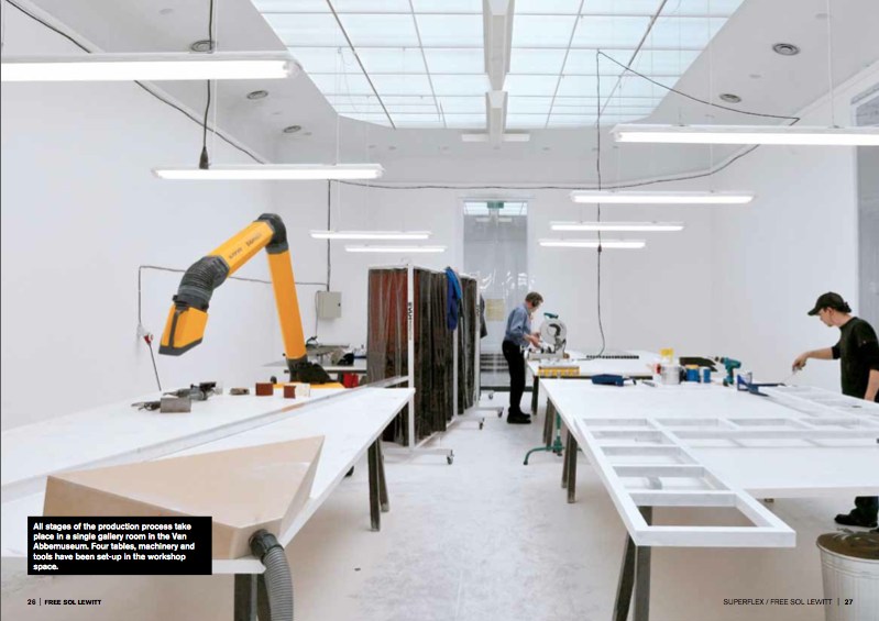
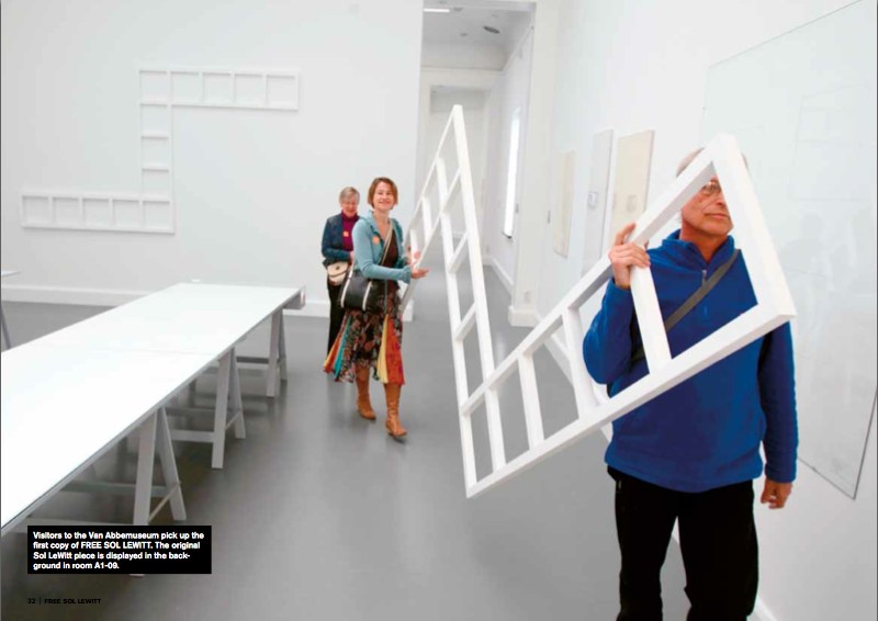
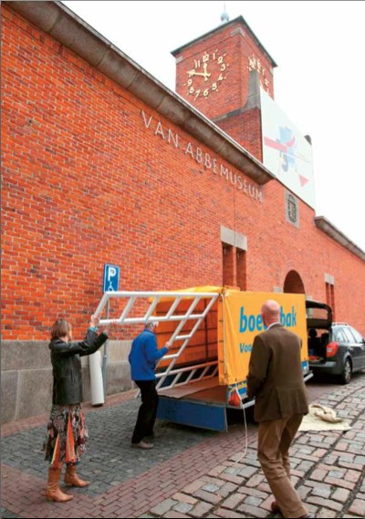
In 2010 the Danish artist collective SUPERFLEX curated an exhibition at the Van Abbemuseum in Eindhoven, “In Between Minimalisms,” that included a work of their own. [Which was in turn curated by curator-turned-lawyer Daniel McClean] FREE SOL LEWITT is a machine, a small-scale factory set up inside the museum, which created exact replicas of a work in the collection, Sol Lewitt’s Untitled (Wall Structure) (1972). The replicas, certified as new works by SUPERFLEX, were then given away to the public.
Some of the details of this production remain unclear, like how many were made. I gather that by working four hours/day, the aluminum cutter, welder, sander, and painter were able to produce 1-2 FREE SOL LEWITTs per week during the 20-week run of the show. Five were “almost finished” within the ten day interval between the opening of the show and the symposium held at the museum on the question, “Who Owns the Artwork?”.
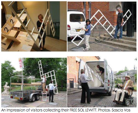
Or what happened to them. The FREE SOL LEWITTs were awarded by lottery to museum visitors who expressed interest in filling out a form. Except for the cheery faces of the lucky recipients of a few structures, who were photographed loading the almost comically large, unwieldy 2×3.5-meter work, unprotected, into rental trailers and vans, I can’t find any news of where or how the SUPERFLEX pieces are being put to use.
SUPERFLEX chose to replicate Lewitt’s work because his pioneering ideas of conceptualism, seriality, and art objecthood resonated with the collective’s own position toward copyright, exchange, and control.
In both essays and interviews in the catalogue, they challenged museums to make countering the constraints of copyright an integral part of their institutional missions. They spoke of the “artistic commonwealth” in which artists borrow and copy freely from each other, and artists and their estates and artists’ rights agencies do not shut down each others’ creative processes by the invocation of copyright. The project’s shape was inspired by Lewitt’s statement in 1973 that “ideas once expressed become the common property of all” and that “we artists, I believe are part of a single community sharing a common language.”
And then I laughed. Because though it’s clear Richard Prince is a citizen of the Artistic Commonwealth, it’s equally obvious that the United States is not a member.
SUPERFLEX/ FREE SOL LEWITT, April – Sept. 2010 [vanabbemuseum.nl]
Buy the FREE SOL LEWITT catalogue, $25 at Half Letter Press [halfletterpress.com]
SUPERFLEX [superflex.net]
Torn Scraped Triggered Erasure Produced
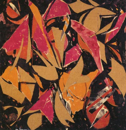
Lee Krasner, Bird Talk, 1955, oil, paper, canvas on cotton duck
Lesley Vance on Lee Krasner, in Artforum’s artists on ab-ex feature:
At one point in the early 1950s, Krasner grew dissatisfied with some drawings she had been working on in her studio, so she tore them to shreds and tossed the scraps on the floor in frustration. The sight of those fallen fragments triggered much of her subsequent work–collages made from ripped-apart drawings and, later, from torn sections of paintings.
I had a similar moment of destruction born from discontent a few years ago, only instead of tearing up my painting, I scraped away paint. This act of erasure produced a more intuitive composition and opened the door to the type of spaces I now pursue.
Leslie Vance at Kordansky
Brian Dillon on erasure, palimpsest, etc. [fort-da]
Encounters With Erased de Kooning Drawing
You know what, it’s the weekend. We can have two long Leo Steinberg-related posts at once. Read’em on the NetJets to Basel.
 Though he mentioned it in his most important piece of writing, which was also the most important piece of writing on Rauschenberg, it’s not entirely clear whether Leo Steinberg had actually seen Erased de Kooning Drawing when he wrote “Other Criteria.”
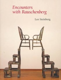
And as he tells the story in his awesome 2000 book, Encounters With Rauschenberg – A Lavishly Illustrated Lecture, Steinberg makes not seeing it the point. I’m really tempted to include all seven pages of EdKD from the 85-page book–the text was published straight from his lectures for the 1997-8 Rauschenberg retrospective at the Guggenheim and Menil, and it really sounds just like him. [I met Steinberg in 1991 when the delightfully friendly woman I was sitting next to for his Picasso lecture series at Rice University introduced us; she turned out to be his host, Dominique de Menil. Life-changing, &c, &c. but not right now.]
But I won’t. Even though it’s out of print and expensive. It really should be a PDF now. Anyway.
Steinberg’s take on EdKD is useful here because he was watching Rauschenberg’s career and involved in its critical dialogue almost from the very beginning; he’s about as well-informed or as thoughtful an audience voice as Rauschenberg could find in the 1950s and 60s. And so his reaction seems like a good proxy for the best perspective possible of the time. And it sounds like, though he felt he had to address it, and though he could argue for its critical or conceptual significance, Steinberg didn’t really like Erased de Kooning Drawing very much. It bugged him. He even apologized to his lecture audience for spending “so much time on a negative entity” and a “one-time exploit.” But but!
The lead-in for his story about first encountering EdKD was, interestingly enough, an anecdote from 1961 and Rauschenberg and Johns, about artists putting personal content into their work, and denying it, and then eventually ‘fessing up, and so about not quite trusting what artists themselves said:
That experience confirmed me in a guiding principle of critical conduct: “If you want the truth about a work of art, be sure always to get your data from the horse’s mouth, bearing in mind that the artist is the one selling the horse.”
And did I abide by my principle? I should say not! My longest conversation with Rauschenberg occurred c. 1957, when I first heard about something outrageous he’d done some years before. And rather than going after the outrage–the horse, as it were–I called the trader.
[uh, don’t want to spoil the story arc, but isn’t not ignoring a lesson in 1957 that stems from looking back from the 80s to a 1961 conversation putting the horse before the trader? Just sayin’. -ed.]
The work in question was Rauschenberg’s Erased de Kooning Drawing of 1953. The piece had not been exhibited; you heard of it by word of mouth. I did, and it gave me no peace. Because the destruction of works of art terrifies.
See, now this is news right there: not exhibited before, word of mouth, a piece you know and worry about without seeing.
How could Bob have done it; and why? The work is often, and to this day, referred to as “a Neo-Dada gesture,” but that’s just a way of casting it from your thought. Obvious alternatives to Neo-Dada suggested themselves at once. An Oedipal gesture? Young Rauschenberg killing the father figure? Well, maybe.
But wasn’t it also a taunting of the art market?–an artist’s mockery of the values now driving the commerce in modern art?
This would put paid, so to speak, to Norman Mailer’s complaint that Bob was erasing to play the market. Steinberg tells how everyone was very aware/shocked/jealous/disturbed when a de Kooning finally sold for $10,000. And Rauschenberg was the one, don’t forget, who got the angriest at Robert Scull for his market-making auction some years later. But all these seemingly contradictory interpretations, Steinberg pointed out, were just assumptions from afar.
So I picked up the phone and called the horse trader himself. And we talked for well over an hour. Occasionally, thereafter, I considered writing up what I remembered of our talk, but then Calvin Tomkins discussed the Erased de Kooning Drawing in his Rauschenberg profile in The New Yorker, and he did it so well that I thought, “Good, that’s one less thing I have to write.” But I don’t mind talking about it and recalling whatever I can of that phone conversation.
On the first question of why, Rauschenberg gave an explanation similar to the one he’d told Emile de Antonio: he was interested in drawing with an eraser “as a graphic, or anti-graphic element,” and found that erasing his own work was unsatisfying.
As for why de Kooning and not some other pre-existing work of art, Steinberg examines and largely discounts the Oedipal explanation, and instead suggests that Rauschenberg recognized or claimed a kindred spirit, that erasure as a technique was central to de Kooning’s own practice. And yes, this section I’m obviously going to quote at length:
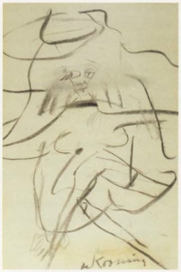
There is another reason, I think, why Bob lit on de Kooning. I live with a de Kooning drawing from the early 1950s–it’s of a seated woman, frontal, legs crossed [below]. The face was drawn, then erased to leave a wide, gray, atmospheric smudge; and then drawn again.
Willem de Kooning, Woman in a Rowboat, 1953
And here is Tom Hess’ account of Bill de Kooning’s working method. I’d like to read you a paragraph from Tom’s book Willem de Kooning Drawings (1972), and I’m encouraged to do this by the example of Rauschenberg’s Short Circuit combine, which, you remember, brought in some of Bob’s friends piggyback. Tom Hess was a friend; hear him describe de Kooning’s habit of draftsmanship.I remember watching de Kooning begin a drawing, in 1951, sitting idly by a window, the pad on his knee.He used an ordinary pencil, the point sharpened with a knife to expose the maximum of lead but still strong enough to withstand pressure. He made a few strokes, then almost instinctively, it seemed to me, turned the pencil around and began to go over the graphite marks with the eraser. Not to rubout the lines, but to move them, push them across the paper, turn them into planes…De Kooning’s line–the essence of drawing–is always under attack. It is smeared across the paper, pushed into widening shapes, kept away from the expression of an edge…the mutually exclusive concepts of line and plane are held in tension. It is the characteristic open de Kooning situation…in which thesis and antithesis are both pushed to their fullest statement, and then allowed to exist together…
This much Tom Hess.
In view of such working procedure, one might toy with this further reason why Rauschenberg’s partner in the affair had to be de Kooning, rather than Rembrandt or Andrew Wyeth. De Kooning was the one who belabored his drawings with an eraser. Bob was proposing a sort of collaboration, offering–without having to draw like the master–to supply the finishing touch (read coup de grace)
I could just go on and on. Steinberg noticed that, despite declaring his early love for drawing, Rauschenberg seems to have pretty much stopped drawing after the early 50s, Erased de Kooning Drawing was really about erasing drawing itself.
And since he brought it up, and in the context of collaboration, too, maybe that makes Short Circuit, which includes two paintings by his partner and ex-wife, a way to wrangle painting into its place, too: subsumed behind closed doors. It’s an admittedly rough analogy, but then, I only just thought of it.
In any case, Steinberg’s collaborative interpretation of Erased de Kooning Drawing is worth holding onto. On with the story:
Meanwhile, Bob and I are still on the phone. And Bob says, “This thing really works on you, doesn’t it?”…Finally, I asked, “Look, we’ve now been talking about this thing for over an hour, and I haven’t even seen it. Would it make any difference if I did?” He said, “Probably not.” And that’s when it dawned on me–it’s easy-come now, but the thought had its freshness once–I suddenly understood that the fruit of an artist’s work need not be an object. It could be an action, something once done, but so unforgettably done, that it’s never done with–a satellite orbiting in your consciousness, like the perfect crime or a beau geste.
Since then, I’ve seen the Erased de Kooning Drawing several times, and find it ever less interesting to look at. But the decision behind it never ceases to fascinate and expand.
It now seems to me that Rauschenberg has repaid de Kooning’s gift to him. For though we all know de Kooning to have been a great draftsman, I can think of no single de Kooning drawing that is famous the way some of his paintings are, except the one Bob erased.
Leo Steinberg On Erased de Kooning Drawing
So ultimately, Norman Mailer’s off the hook. We know that when he wrote about Erased de Kooning Drawing in the 1970s, 1980s, Mailer fragged Rauschenberg for selling it–which he hadn’t–as much as making it. And he got the title wrong: “A drawing from Willem de Kooning erased by Robert Rauschenberg”. Which might mean he never went to see it anywhere it was showing over the years, but it also means he probably felt he got the work, didn’t need to see it. And that he was reading art historian Leo Steinberg’s indispensable 1975 collection of writings, Other Criteria.
That particular wrong version of the inscription on EdKD comes from Steinberg’s title essay, which was first published in Artforum in 1972 as “Reflections on the State of Criticism.” Steinberg originally presented a version of “Reflections” as a lecture at the Museum of Modern Art in March 1968. It was one of a 10-part series of Wednesday night lectures by leading critics and historians [which happens to have been organized by the Modern’s Junior Council then chaired by Barbara Jakobson, which is the predecessor group to the group I chaired for a while, the Junior Associates. Needless to say, I have never felt like a bigger slacker than when I look back at all the stuff the Junior Council did in the 60s. Recordings of the series were restored in 2008, but the Steinberg lecture is not listed among them. I’ll look into that.]
Anyway, Steinberg’s piece is an epic refutation of Greenbergian modernism’s view of both Renaissance and contemporary art. For its compelling critical framework, its defense of content and for identifying what Steinberg called the “flatbed picture plane,” Branden Joseph dubbed “‘Other Criteria’ the single most important article on Rauschenberg’s production.”
Steinberg discussed EdKD along with a 1952 grass painting hung on the wall as an example of Rauschenberg’s early challenges to conventional expectations of orientation:
In retrospect, the most clownish of Rauschenberg’s youthful pranks take on a kind of stylistic consistency…When he erased a de Kooning drawing, exhibiting it as “Drawing by Willem de Kooning erased by Robert Rauschenberg,” he was making more than a multifaceted psychological gesture; he was changing–for the viewer no less than for himself–the angle of imaginative confrontation; tilting de Kooning’s evocation of a worldspace into a thing produced by pressing down on a desk.
Which is interesting, but maybe not quite as interesting as the fact that, as late as 1972 or even 1975, one of Rauschenberg’s greatest critical champions seems not to have noticed that his version of the inscription is actually incorrect. Or that the earliest exhibition date listed on the back of EdKD itself is actually 1973, in a show by an even closer Rauschenberg ally, Susan Ginsburg.
[Interesting sidebar: after posting SFMOMA’s photo of the back of EdKD, a regular greg.org reader told me s/he had seen EdKD getting reframed or rematted “in the late nineties” at Minagawa, and watched as they carefully reattached the archival materials on the back. Maybe Bob was sprucing it up before selling it.]
So anyway, as of the publication of Other Criteria, then, Steinberg considered Erased de Kooning Drawing as a “youthful prank” that was “clownish,” yet prescient. But it’s not clear that the great advocate of close looking had actually seen the work.
Part 1: ‘FRAME IS PART OF DRAWING’
Part 2: Erasers Erasing in Painters Painting
Part 3: Norman Mailer on Erased de Kooning and other ‘hopeless’ and ‘diminished’ art