

1994 Calling: Spiral Jetty
We’re consolidating storage spaces between New York and Washington, and it’s given me a chance to reorganize a bit. I found a couple of boxes my 1994 self apparently just threw stuff into, sealed up, and shipped off, almost like Warhol-style time capsules.
At least, that’s the positive spin on them. I’m sure Hoarders has a different take.
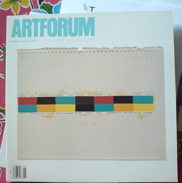
Anyway, one of the things I found was a stack of old Artforum magazines, including this one, from Summer 1994, which was something of a Donald Judd tribute issue. The cover image of a Judd study for a 1985 wall work collaged from paint chips jumped right out of the box at me.
The next thing I noticed when I picked it up was how thing and light it was: just 120 pages, plus a 32-page Bookforum inset. Adorable.
And then, flipping through it, I saw this:
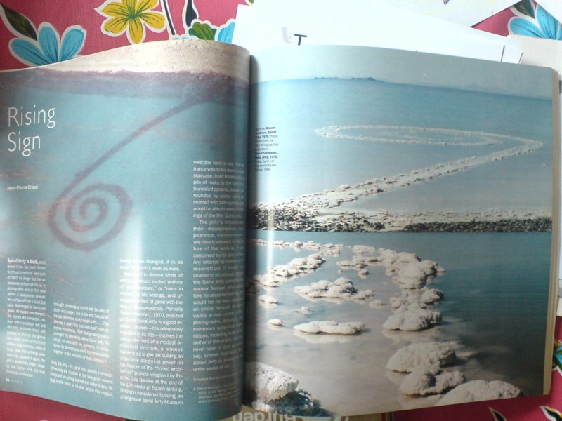
A two-page photospread, dropped into the issue in the Artforum equivalent of breaking news, which announced to the art world the re-emergence of Robert Smithson’s Spiral Jetty. Summer 1994, people, just like I said it did.
The 1993 aerial photo on the left is by Atsushi Fujie; it’s hard now to remember the time–even though it was most of the Jetty‘s first two decades of existence–when the only way to really see it was from the air. [Whoops, Fujie’s photo is dated here from the 1970s.]
In any case, the two contemporary photos on the right are by Carol van Wagoner of the Salt Lake Tribune, the paper which first published news of the Jetty‘s appearance in the Spring of 1994, before the snowmelt, when Great Salt Lake was at its low point.
The brief text by Parisian art historian Jean-Pierre Criqui, which opens “Spiral Jetty is back, and it doesn’t look like itself,” is a nice time capsule, suitable to mark the transition in the Jetty‘s history. The moment when the archetypal work of Land Art stopped being just a sign of itself–a concept, a state of mind, really–and reasserted its massive physical presence, and its inextricable link to its site:
The jetty’s vicissitudes, then–disappearance, reappearance, transformation–are clearly relevant to the nature of the work as it was conceived by its (co-) author. Any attempt to restore or to reconstruct it would run counter to its concept. Should the Spiral Jetty someday disappear forever, what would take its place beneath its title would be no less powerful: an entire network of signs, visible or not–a text, a film, photographs, drawings, and numerous subjective elaborations, including those of the author of this article, who has never been to Utah yet would say, without hesitation, that Spiral Jetty is among his favorite works of art.
As one who drove out to the Jetty for the first time that Summer, I can say without hesitation that it’s among my favorite works of art, too.
Meridith Pingree’s Got Your Catenaries Right Here, Boys
Meridith Pingree —– Blue Curtain
Meridith Pingree’s in a show right now at Freight + Volume. Thanks, Anaba for the heads up on this fascinating-looking work.
It reminds me a bit of Rebecca Horn’s work, which, frankly, I haven’t seen much of since her jaw-droppingly weird retrospective in the Guggenheim rotunda in 199…2? 1993. Wow, feels like yesterday, but it was so long ago.
Pingree’s kinetic sculptures seem a little less menacing, maybe? Or maybe it’s just watching them on video feels safer.
Previously: speaking of catenaries…
Sgarbian Backdrops
The near-universal consensus from the VIP opening was that the Italian Pavilion exhibition curated by art critic/Berlusconi apparatchik Vittorio Sgarbi was an unalloyed, over-politicized disaster. Yet so far, I have seen very little substantive criticism or engagement with it. Rome-based art theorist Mike Watson’s column in Frieze is a so-far-rare exception:
…the show appears to have resulted unwittingly from the congruence of a cultural elite who lack political power and a political elite who lack culture, highlighting the negative aspects of both – although ultimately it is the clumsy Berlusconian presence which comes off worse here.
In Italy, a country with a deep cultural heritage, the fine arts are the final refuge from a philistine tendency that affects everyday life with an alarming pervasiveness. Yet it appears that the systemic contradictions which plague the Italian political and cultural sphere – and which serve to keep the powerful grinning their stricken grins – have now invaded the fine arts.
Oddly, when I first started liking this quote last week, it was partly because I’d read it as “the fine arts are the final refuge for a philistine tendency,” an Italian play on patriotism as the last refuge of scoundrels. I imagined a demagoguing, pseudo-populist media mogul’s flailing administration wrapping itself in a fresco at Venice. But apparently not.
Instead, Watson maintains the notion of art as a “refuge from,” a world apart from the [real] world. Watson says this philistine affront occupying “the centre of the most prominent cultural event in the art world’s calendar,” demands “an appropriate response.” But what? A sternly worded petition? Some scathingly derisive remarks over dinner in Basel? Art world folks can tweet their outrage all they want, but when the smoke from Sgarbi’s stinkbomb of a show clears, they’ll still be inside their gilded cage refuge.
The Physiognomy of a Nation [frieze]
Rauschenberg Currents Event
Robert Rauschenberg’s massive 1970 silk screen edition, Currents sure is hard to miss. And not just because it’s 18 meters long.
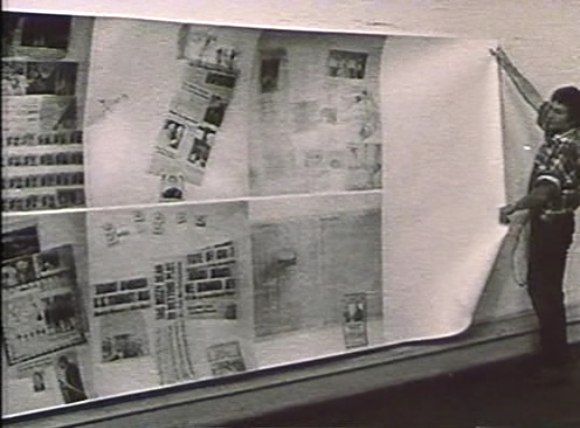
MoMA’s copy from the edition [of just six] has been wrapped around the corner of the second floor galleries for a while now. Which may have helped coax Peter Freeman into bringing out another of the screenprints last week for Art Basel.
But it’s also at the end of the Rauschenberg’s segment in Emile de Antonio’s documentary, Painters Painting [above], which I rewatched recently. Bob unfurls it with a slightly soused, earnestly glib voiceover about how, even though there’s so much information packed into a daily newspaper, most people don’t read it. But if someone spends $15,000 on the info, the artist can get him to pay attention. Or at least not wrap the fish in it and throw it out.
Which is ironic, I guess, because I’ve found that the size and visual uniformity has caused me to stroll by Currents without ever even slowing down. I register it as reworked newspaper content, on a giant roll, just like the real newspaper itself–but I don’t slow down to look closely. I mean, really, at that scale, how much of my time does Rauschenberg really think he’s gonna get?
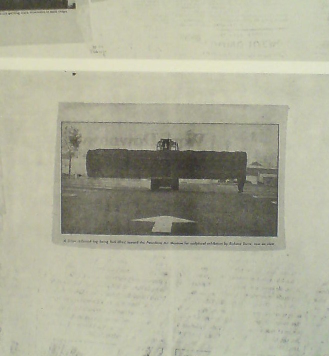
So maybe it was because I’d just run into Richard Serra moments before in the atrium, or because I came at the work head-on this time, instead of from the side. But I’d never noticed, for example, that there is a news photo of a frontloader bringing a massive fir tree trunk to the Pasadena Art Museum for Serra’s 1970 work, Sawing: Base Plate Template (Twelve Fir Trees)
Above it and to the right, I’d swear that row of tract houses is a Dan Graham photo.
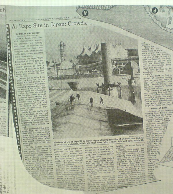
And hey, there’s a story about construction progress on Expo 70 in Osaka, where E.A.T., the collaborative Rauschenberg founded with Billy Kluver, was creating the Pepsi Pavilion, and where Rauschenberg was still thinking he’d show his own work, a plexiglass cubeful of bubbling drillers’ mud called Mud-Muse, which he’d developed with Teledyne for LACMA’s Art & Technology show and the US Pavilion.
If I can spot these now-obvious contemporary art references in Currents, what else must be lurking in there? Was incorporating other artists’ images Rauschenberg’s way of tipping his hat to artists and work he liked, or was he assimilating and subsuming it in his own, sprawling scroll? Was he engaging in a dialogue with the Conceptual and post-minimalist kids coming up or putting them in their place? Or trying to put himself in theirs?
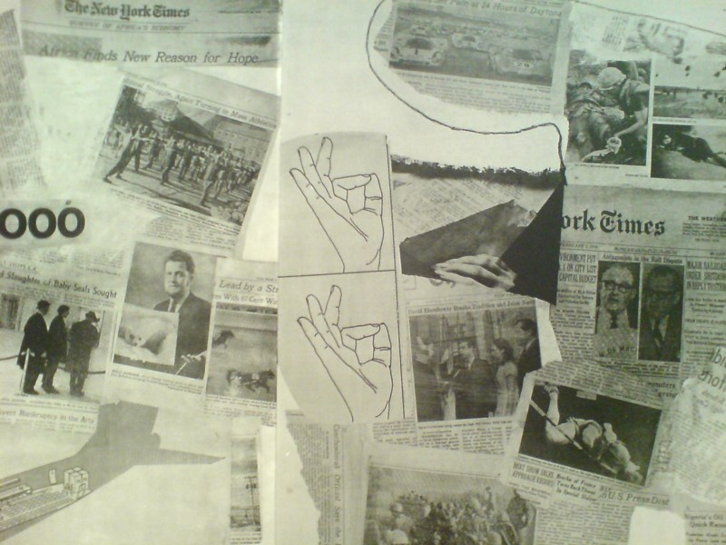
The most intriguing references now, though, turn out to be a little trickier. There are multiple instances of diagrams showing hands throwing the OK sign which remind me of nothing so much as the sign language woodblocks used in the prints at Jasper Johns’ latest show at Marks.
Shrinky Dink 4, 2011, intaglio print, image via
I remember thinking immediately of Rauschenberg when I saw the mirrored newspaper transfer appearing in the upper left of this Johns drawing, Untitled, 2010.
Rauschenberg began using the technique in the mid-60s, and it’s all over Currents. Remind me again how long MoMA’s had their print on view?
Ro/Lu Lo/Go
Ro/Lu is en fuego these days, in case you didn’t know, and I’ve been lucky enough to get warmed by their fire.
First off, they’ve been doing this Simple Chair project, an exploration of how and where our stuff is made. It’s making its second appearance at Mass MOCA. I was planning to just write about it more when I saw the publication [to which I contributed a brief article of my Enzo Mari X Ikea table project], but Ro/Lu just keeps on doing stuff, so I can’t sit silently by.
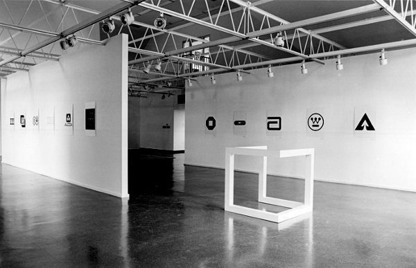
And then, as if reading my mind–or my blog drafts, or maybe communicating telepathically with me through the minimalist/modernist/design/art ether–they posted a link to an awesome-looking 1980 exhibition at The Renaissance Society in Chicago, “Objects and Logotypes: Relationships Between Minimal Art and Corporate Design”.
Whoa. It’s fascinating to see how Minimalism, modernism, and corporate branding were perceived and presented thirty years ago. They all feel digested and processed now, but I get the sense that what curator Buzz Spector is talking about in his essay is not quite the same thing we use those terms for today.
Which may be a way of saying I take issue with many of Spector’s definitions and points, but I’m not quite able to articulate why I think he’s wrong. I mean, I can say that I think Greenberg’s Minimalism-as-“mannerism” does not seem related at all to the principles of usage in corporate visual design. Or that the ubiquitous, homogenizing proliferation of a corporate logo seems like the diametric opposite of Robert Morris’s sculptural gestalt, not its twin.
But Spector’s show still seems like an interesting, important first step for the coming revisiting of Minimalism. And siting avant-garde art practices in parallel to mid-century corporate marketing is pretty compelling to think about. And I really like the idea Spector hangs his show on, that these designers and artists are alike in conflating form and value, i.e., that they “reflect a common faith in the efficacy of form as a means of restructuring society through public exposure to works executed within particular systems of use.”
As I sit here in the middle of a mild obsession with the Netherlands government’s new, painting-inspired rebranding and centralized visual identity system, this idea feels as relevant as ever.
So thanks, Ro/Lu!
Working In The Medium Of Vinyl Wrap Art Car
Last year about this time, after seeing Jeff Koons’s BMW Art Car, I tossed off the idea that artists could be cranking out vinyl wraps as artworks.
Which I will happily assume is why designboom and Porsche had this contest last winter to create vinyl wraps for the Cayman.
Which, hrm. Even as I randomly take full credit for the idea, I gotta say, it’s just as likely it’s entirely wrong.
Sheep Parade
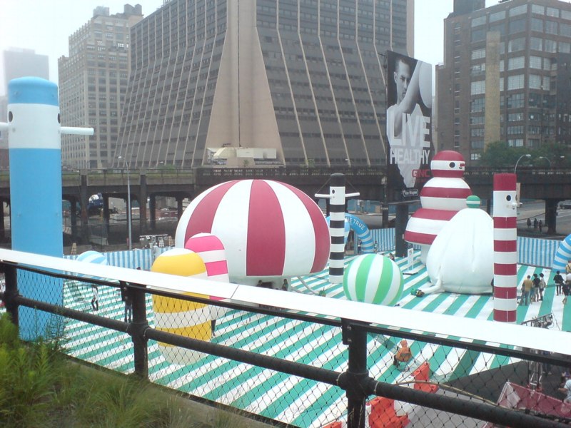
After hipster bouncy castles and food truck happy hours, and shuffling like giddy commuters along a packed, 10-block-long sidewalk the size of a lesser tunnel passageway at Penn Station, I was forced the other night to contemplate the cheery, civic absurdity of the High Line.
Which fortunately turned out to be mostly novelty; the crowd thinned out noticeably on the older, wider section south of 23rd St. I was early for dinner, so I pressed on, keeping a hopeful eye out for Euan as I passed under the Standard; running into him would mean his long, weary nightmare of being stuck, laid over, at Charles de Gaulle had ended. [Alas, he tweeted, it had not.]
Though you’d think it might, entertaining the possibility, however remote, of seeing my most authentically Austin Powers-ish friend did not prepare me for the marching band.
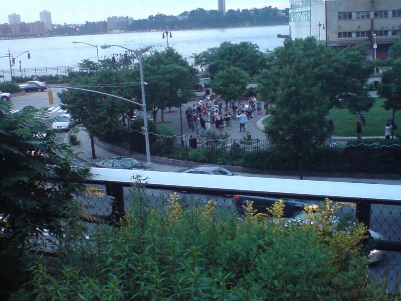
Their music, obviously was heard first. I was coming towards them, or–how thick are these reedy plantings?–perhaps they were coming towards me. Somehow, it was neither. The band remained well within earshot, but largely out of sight to High Liners who didn’t want to stand in the bubbly water feature section above the gas station on 15th St. Wade in, though, and you could see them marching in a circle–yes, there they go, taking another lap–around the oval green of 14th Street Park.
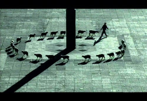
And thus, I was compelled to think again–twice in one day!–of Francis Alys, whose video works, Rehearsal I, of a futile trip made to the accompaniment of a brass band, and Cuentos Patrioticos [above], in which a shepherd leads his flock in a beautifully improbable circle around the Madre Patria in Mexico City’s Zócalo, are the best things in his MoMA exhibit, not counting the skillfully executed vitrines and pedestals. [image via]
Up Newtown Creek, Or This, Anish, It Don’t Stink
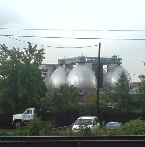
I’ve been moving art and life at our storage unit in Long Island City several times the last couple of weeks, and it’s given me time to really look. Look across the water to the most spectacular structures built in New York City in the last five years: the massive, stainless steel egg-shaped digesters at the Newtown Creek Waste Water Treatment Plant.
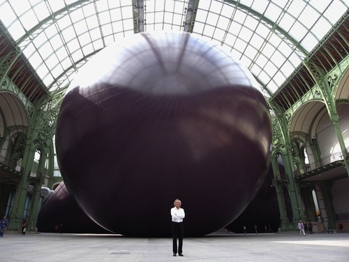
I mean, really. I refuse to be swayed or disheartened [too much] by it–it’s totally different, I say. I really want to put mine in the Pantheon anyway, I say–but several thoughtful folks have expressed their sympathies upon seeing Anish Kapoor’s Leviathan at the Grand Palais photographed from its more satelloonish angles.
But you know what they say in the sewage treatment business, what goes around comes around. If Kapoor has the intestinal fortitude to keep working after the opening of these unsurpassable 145-foot tanks, I can certainly forge ahead with replicating a satelloon.
If anything, it’s even more relevant and imperative than before. Because Newtown Creek is actually designed by Polshek Partners [now Ennead], who also designed the Rose Center at the American Museum of Natural History, an early inspiration for my Project Echo project.
In a way, then, the idea for putting a satelloon in a museum space was hatched from the eggs of Newtown Creek. In another way, though, no, gross.
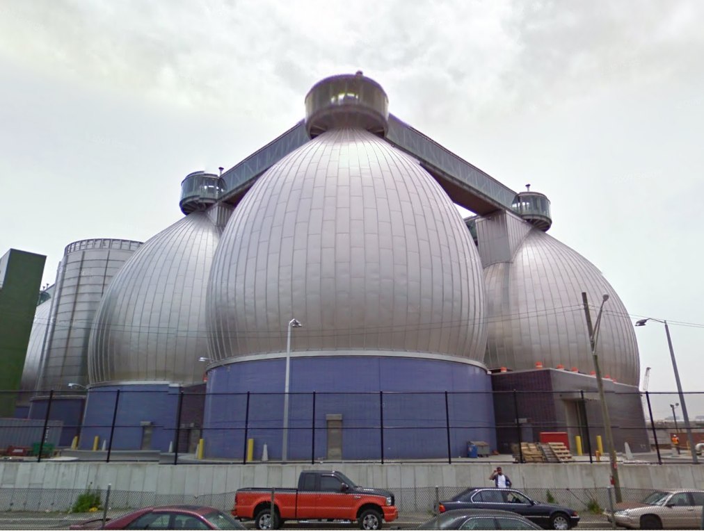
Newtown Creek Waste Water Treatment Plant digesters up close and symmetrical on Google Maps [google]
I Copy Therefore I Am Superflex
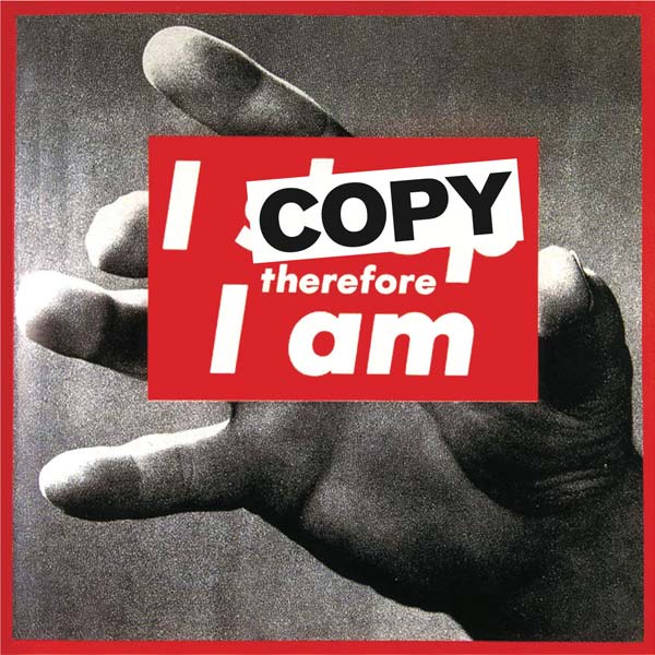
I’m always thinking of the Danish artist collaborative Superflex in terms of media or information, action or activism. But they sure can make some fine-looking, seemingly commodifiable art objects, too.
A few years ago, as part of their Copyshop franchise project, Superflex had made T-shirts with Barbara Kruger’s iconic painting altered to read, “I copy, therefore I am.” But this year, their Copenhagen dealer Nils Staerk had a full-scale [111×113-in] printed vinyl version on view at Art Basel.
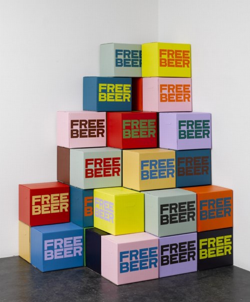
In addition to their videos, Staerk’s site has some other graphic works and objects, including this pleasantly Brillo-esque corner pyramid of FREE BEER cases from 2007. [Which is far more resilient than, and not to be confused with, Cyprien Gallard’s recent pyramid of free beer at KW-Berlin.]
Out Of ‘Out Of Practice’
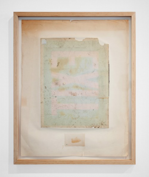
Away | Out, 2010, Seth Adeslberger via
Seth Adelsberger’s evocation of Erased de Kooning Drawing in this work on found paper manages to be both calculated and offhand. It was one of my favorites in “Out of Practice,” Baltimore gallery Nudashank’s sweet show about studio and process in Joshua Abelow’s temporary Art Blog Art Blog space. It closes today, so hop to.
Out of Practice, through June 18 [artblogartblog.com]
Nudashank is an awesome Baltimore gallery [nudashank.com]
Seth Adelsberger portfolio site [sethadelsberger.com]
ABC & POD at Printed Matter Thursday Night
So when I first published the Richard Prince Canal Zone YES RASTA book in March, I got some nice responses from people, including a couple of folks who suggested I look at joining ABC, the Artists’ Book Co-operative. ABC is an interesting-looking coalition of artists and photographers who come together to support and discuss print-on-demand publishing and to bring attention to their projects.
As it turns out, Printed Matter is hosting a reception and conversation tomorrow night with active members of ABC, which is in conjunction with an exhibition of ABC/POD titles that runs until June 30th.
It should be positively informative and delightful, and I look forward to going, to meeting some of the folks there, and to possibly seeing a greg.org reader or two as well. At this point, I think I will not endeavor to join ABC, but to continue to admire them from a distance.
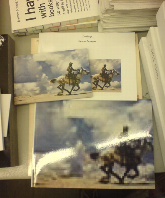
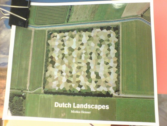
Seeing as how they already have at least one guy who copies jpegs of Richard Prince cowboy photos in volume, and another who just released a collection of Google Maps images showing of the peculiarly aesthetic polygonal camouflage technique used to obscure sensitive sites in the Dutch landscape, maybe a little more distance would be better for all concerned.
ABC Artists’ Book Co-operative conversation and reception, Thursday, June 16, 5-7 PM [printedmatter.org]
Sportsdomes: Refugee Prison Barge Domecage By Customr
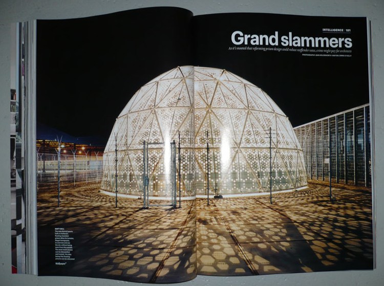
Well here’s one Dutch immigrant detention center that’s not invisible! Just the opposite.
That’s the Sportsdomes DJI up there, by architect Willem van der Sluis, featured in Wallpaper* Magazine in 2008, the same year the project won a Dutch Design Award for his Amsterdam firm Customr.
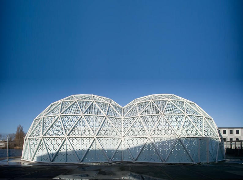
Just like the Kabul Dome the US Government ordered from Buckminster Fuller in 1955, Customr’s Sportsdomes were designed on a tight budget; in a hurry; using the latest modular manufacturing technology; so that they can be erected, dismantled, and moved with minimal skilled labor; primarily in arguable beneficence toward brown people.
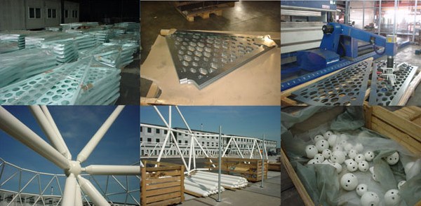
Their gradated, perforated metal skin creates an indoor/outdoor space that is meant to offer a pleasant ambiance to detainees for a couple of hours of free play during each of their last weeks in the Netherlands, while protecting their privacy/ hiding their identities from the outside world.
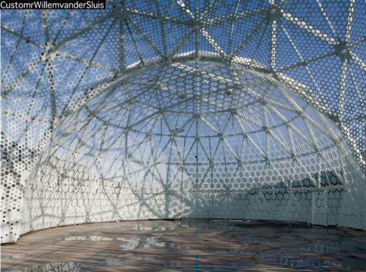
While they were points of contention among the neighbors, the Zaandam domes proved so successful that their patron, the Ministry of Security and Justice, ordered another “domecage” in 2008. Did I say “domecage”? I meant sportsdome.
CustomrWillemvanderSluis [customr.com via design den haag]
Previously:
Dutch camo domescapes
Welcome to the Kabul Dome
De Rijkshuisstijl & The 1 Logo Project
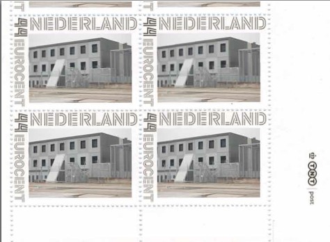
As part of their project Caché-Exposé, investigating the Netherlands’ largely invisible detention and deportation system, the Amsterdam art & design collaborative Foundland documented obscure, anonymous detention sites around the country. Then they used a highly official, public system to distribute their images: design-it-yourself postage stamps.
What with the domes, the minimalist/industrial architecture, these stamps, and–hello, this awesome flag they shot in 2008–I can’t help noticing how beautifully designed the Dutch immigrant prison system is. So thoughtful.
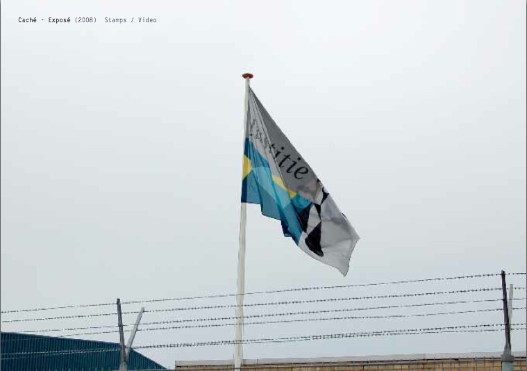
That is the Ministry of Security & Justice flag there, flying over the Zaandam waterfront dome prison. The biomorphic shape is a perspectival view of the scales of Justice, a fragment of the Ministry logo, which is an abstracted, blindfolded Justice.
![]()
Is, or was. Because on Google Streetview, the flag is different. Much simpler.
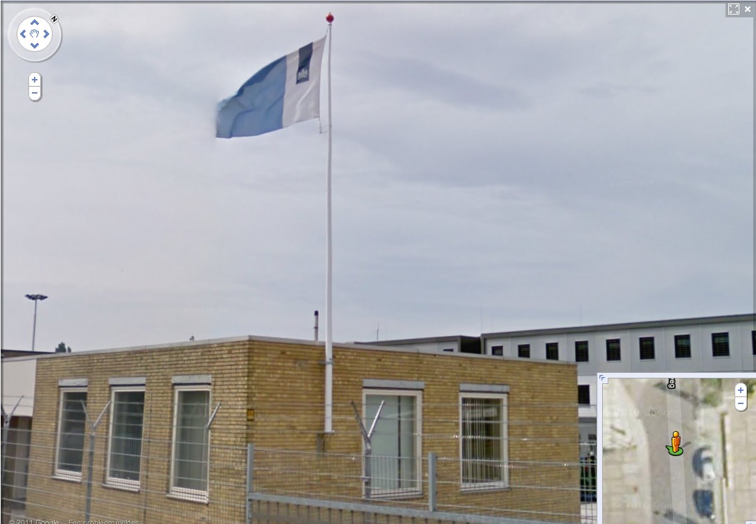
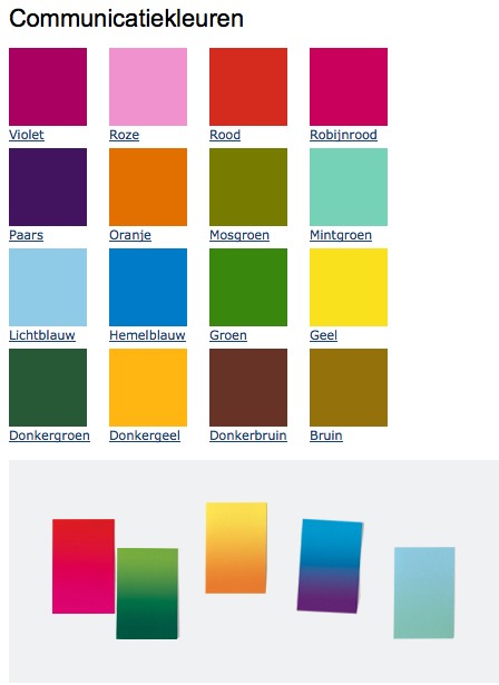
That is the new Rijkshuisstijl, which is officially called the Central Government Visual Identity, but which I gladly transliterate as the State House Style, a four-year effort begun in 2007 to centralize and redesign the Dutch government’s corporate identity. Part of that initiative was the 1 Logo Project, a replacement of 125+ separate ministry and agency logos with a single logo, the national coat of arms on a vertical blue bar.
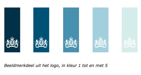
Ah, I’m told it’s a ribbon. Here’s the English version of the style guide.
Oh, man, the color palette, 16 colors “inspired by the colorful Dutch landscape painting,” plus five gradients. Get me Colby Poster on the horn.
I am kind of geeking out over this. On the one hand, it’s a normal redesign gig, tastefully done, but typical to the point of banality. On the other, because it’s the state, I can’t help but read every platitude in the mission statement and objectives, every justification of every design decision and element, through a politicized filter. Without knowing really anything about the details or shifts in Dutch poltiics beyond recent surges of right-wing populism, I can’t help but interpret the identification of problems the Rijkshuisstijl was intended to fix as criticism of the parties and governments then in power.
Partly, it’s the Rijkshuisstijl’s incredibly bold assertions of design’s importance and function. And the grand assertions of meaning:
“The symbol exists of a blue ribbon with the coat of arms. Subtle and unpretentious, an authority without being authoritarian.”
The color of the logo is Rijksoverheid Blue. Inspired by the Dutch skies and Dutch light. Blue for calm and reliability. Blue for tradition and enduring values. Blue for harmony and balance.”
“The wide variety of logos previously used by various government organisations made them less recognisable, causing confusion among the public and business community. People were no longer able to see the wood for the trees. Central government organisations seemed to be competing rather than cooperating with each other. This approach compounded the widely held view that central government was fragmented.”
“The mission statement and the motto both underline what central government stands for. They give the central government logo (Rijkslogo) real meaning.”
And then there’s the irony of context, the subjective happenstance of discovering the Rijkshuisstijl while looking at an exposé criticizing the Netherlands’ unjust treatment of immigrants, a project which I’d discovered in turn while reading about the current populist government’s massive cuts to the country’s arts infrastructure. Is this what modernism and Good Design signed on for? Because it’s what they got.
Oh, and there was a symposium, and a book, De stijl van het Rijk/ Style and the State, produced last fall by the Stichting Design den Haag.
Foundland [foundland.org]
Rijkshuisstijl guide in English [rijkshuisstijl.nl]
UPDATE: So the work was actually done by Studio Dumbar in Rotterdam, announced on their site in 2007 [studiodumbar.com]
What I Looked At: Sol LeWitt Structures
I finally made it down to City Hall Park to see the Public Art Fund’s installation of Sol LeWitt structures. Which, first or now, you must watch the discussion of working with LeWitt at the New School. Go ahead, I’ll wait.
OK.
So along with the general admiration and pleasure of seeing so many LeWitts, the first thing I think is: picturesque.
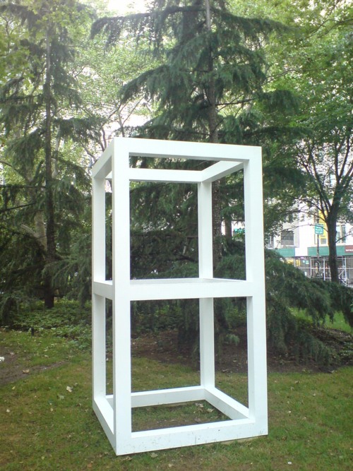
Double Modular Cube, 1969
Lewitt introduced human proportions into these modules, which may somehow account for why it feels like an idyllically sited pavilion or garden folly. But it’s definitely activating something in the landscape, too.
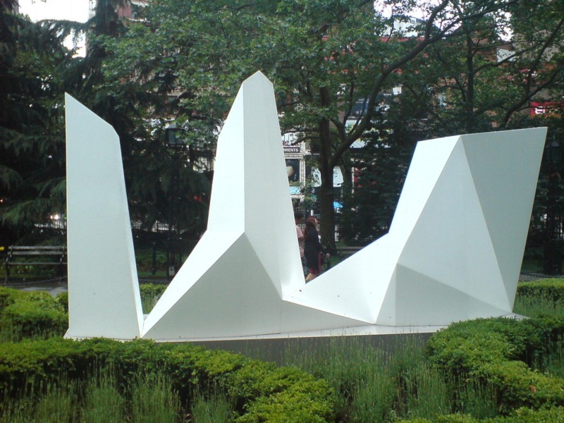
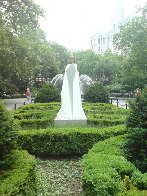
Then there is Complex Forms, 1987:
Which, I know, I know, every algorithmically-generated polygon around here gets tied to Dutch Camo Landscapes. But:
For the Complex Forms, the artist drafted a two-dimensional polygon and placed dots at various locations within it. As the form is projected into three dimensions, those interior points are elevated into space at different heights. The elevated points dictate the seams of the object’s multi-faceted surface.
So these things turn out to be topographies “projected” from two dimensions into three. Maps. So it is not a stretch.
The way I found the Dutch Camo Landscapes in the first place was through architecture. They were 2D patterns generated from photos of 3D structures, which read as 3D structures themselves. As camo deployed against aerial surveillance, I’ve also imagined them as crystalline structures or surfaces, topographies, installed above whatever site is being obscured.
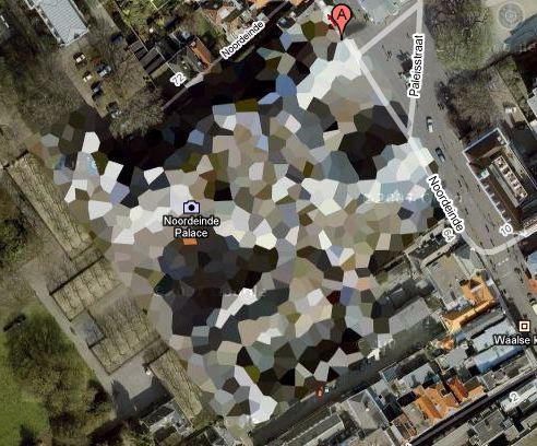
It’s to the point that last fall, I actually went to the Noordeinde Paleis [above] in The Hague, not *really* expecting, but kind of hoping, to see it sitting, safe from terror or whatever, under a giant, polychrome, polygonal tent. It was not. I’ll add that to my project list, though. [note to self: call Queen Beatrix.]
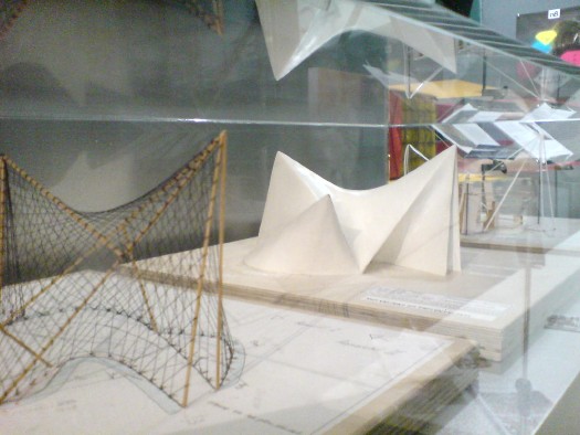
It also reminds me, even more explicitly, of Le Corbusier and Iannis Xenakis’ 1958 Philips Pavilion in Brussels, which, as these two models I found displayed shoved into a corner at ARCAM in Amsterdam one night show, was similarly constructed from 2-dimensional curves and points projected into space.
“The Complex Forms introduce irregularity into LeWitt’s work,” we are told, “which is further explored, for example,” in the Splotches. Which, again, two-dimensional drawing projected into structure via formulas for generating color and height. I can really dig these things, except–I didn’t photograph it, didn’t want to be a crank, but holy crap, I can’t stop staring at that seam.
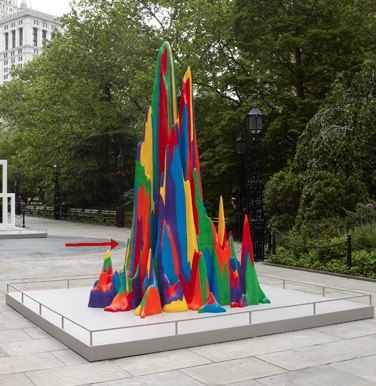
Splotch 15 [with giant $#)%ing seam], 2005
It was not like this when it was exhibited on the Met’s roof garden in 2005, was it?
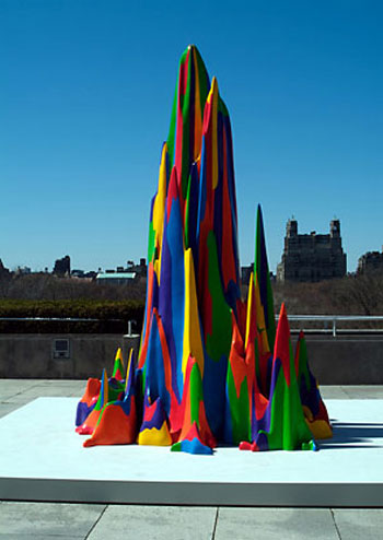
No, I do not think it was. What gives?
The next thing is how lush and classical City Hall Park is. Since this incarnation dates from 1999, I guess historicist is the right word. I don’t remember noticing this as acutely as I do now.
Maybe because so many LeWitts are installed along the park’s radial axis, lined up with that replica fountain just so.
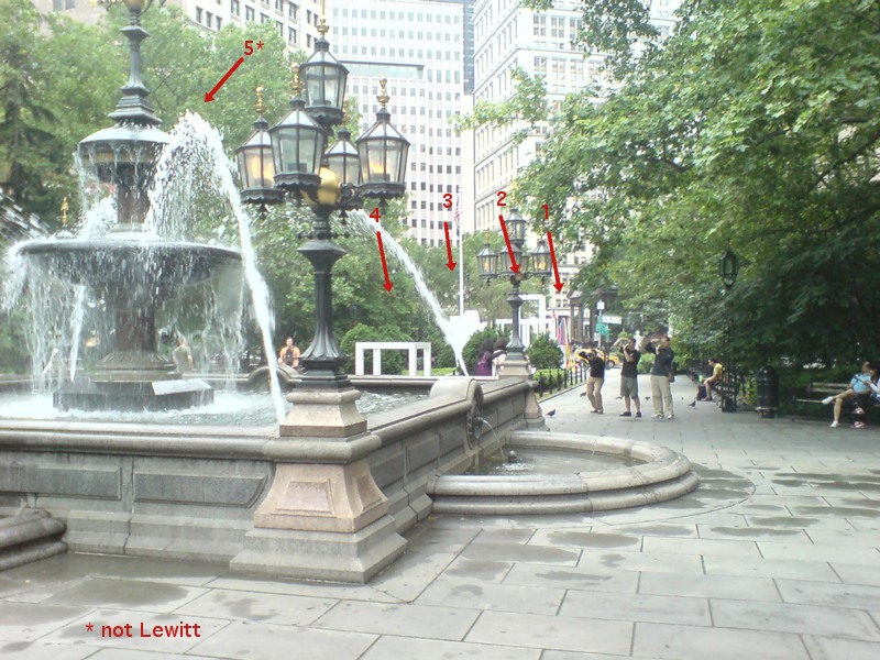
In his opening remarks at the New School, Nicholas Baume described the Public Art Fund’s program as “looking back at radical practices dating from the 1960s and registering their contemporary resonance.” He goes on to cite the appeal of seeing “the interesting juxtaposition of natural landscape [sic], New York City skyscrapers, and the architectural and decorative elements of the park,” which “provide a fascinating and rich context.” But now this installation, I get less sense of juxtaposition, and more assimilation. Radial historicism: 1. Radical practice: 0.
As I’m walking around, trying to figure out how to process this situation, I suddenly looked at the Complex Structures head-on, i.e., the “wrong” way.
And it turns out to be radially symmetrical itself. A mirror image. And I remember writing about laughing at first at Chinese tourists who didn’t “get” the Iwo Jima Memorial, and who posed for photos at the head of the statue, only to realize they didn’t have the same LIFE Magazine photo-mediated historical context as Americans.
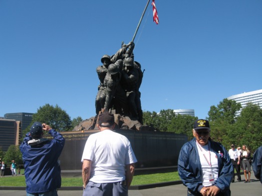
Connecticut veterans at the front of the Iwo Jima Memorial, image: ct.gov
Which, suddenly, LeWitt’s practice of projecting a 2D image into a 3D structure has an entirely new, complicated legacy which I’ve never seen addressed before, but maybe this City Hall Park is a good place to start.