
“Bush’s last round of golf as president dates back to October 13, 2003, according to meticulous records kept by CBS news.”
So glad to know the media is so meticulous. That’s almost two months after the August date Bush claimed to have stopped golfing.
Bush: I quit golf over Iraq war [afp/yahoo]
P.S.: The complete quote from the title, “I call upon all nations to do everything they can to stop these terrorist killers. Thank you. Now watch this drive.” was made on a tee in Kennebunkport on Aug. 4, 2002. [“Before Golf, Bush Decries Latest Deaths In Mideast |
Upcoming Holiday to Be No Vacation From Strife”, washpost
MUTO By Blu
This is awesome, like OG William Kentridge in real space. MUTO is a new stop-action animation by Blu, a Buenos Aires artist, where I guess/hope they have different etiquette about painting over someone else’s art on the street.
MUTO a wall-painted animation by BLU from blu on Vimeo.
blublu.org and blublog [via waxy]
Enzo Mari x Ikea Mashup, Ch. 1
![]()
I wrote a few months ago about making a dining room table following Italian designer and theorist Enzo Mari’s 1974 Proposta per un’autoprogettazione, roughly translated as “A Project for self-design.” Mari’s goal was to effect a critical examination of the objects around us and the system of design, manufacture, distribution, marketing, and commerce that brings them into being. He did this by developing blueprints for a houseful of furniture that could be made from standardized pine lumber, in a day or two. The designs require only the simplest saw cuts and a hammer. And if you get the lumberyard to cut the lengths for you, it just requires a hammer. As Mari explained in an interview:
these items are not intended as alternatives to industrial ones, their creation is intended as a sort of critical exercise on design, and this is the reason why this experiment was called home design, not home production. The user, in repeating the operation, which can never be a slavish repetition…the designs have no measurements and while you are making them you can make changes, variations…when making the object the user becomes aware of the structural reasoning behind the object itself, therefore, subsequently he improves his own ability to assess the objects on the market with a more critical eye.
The EFFE table I want to build requires two sizes of board: 1×2 inch pine for the structure, and 1×8 planks for the top. In 1983, Mari explained that, “As regards material, the easiest to acquire is undoubtedly still the wooden plank.” Undoubtedly. So I headed down to the nearest hardware store, where there were several hundred varieties of curtain rod finials, but no lumber. I was told I could order pine boards of these dimensions, and they’d come in about a week. Couldn’t my contractor get wood for me? So I went to Home Depot, which had pine boards in several grades and dimensions. They were all from New Zealand.
First off, it wasn’t that nice-looking, but buying processed wood from the other side of the world in a 100,000-sf store seemed to contradict the spirit of the autoproggetazione project. Under those circumstances, Jeff Bezos’ critical response to the furniture design industry made more sense. [When he started Amazon, he made the desks out of hollow-core doors and sawhorses, a scrappy tradition the company continued.] But I didn’t want the aggressively cheap improvisation of a Bezos Table in my house.
The place where I saw the biggest piles of untreated pine lumber was, ironically, Ikea. The warehouse section near the store’s exit has palletsful of bookcases, chairs and beds, all flatpacked and ready for assembly [home production?] What would happen if you treat Ikea as your corner hardware store, and use their flatpack-optimized, mass-produced furniture components as the raw materials in an entirely different design?

Looking through the Ikea hacking communities, it seems no one had tried to make an Enzo Mari table from Ikea parts before. While Ikea publishes detailed dimensions for their assembled products, there’s no information on part specs. Over the course of several trips to Ikeas outside New York and Washington, DC, I identified every Ikea product that looked like a promising source of pine parts, and I measured each piece of wood.
Though there are many pine products at Ikea, there are just eight products or series whose parts come close to standard 1-by lumber dimensions. I’ll put them in the next post. Then I’ll calculate the various combinations to figure out things like the optimum use of material, the least amount of cutting, the cheapest/most expensive, the closest to Mari’s design, and the most successful table. We’ll see how it goes.

related: the 2002 reprint of Autoprogettazione from Corraini is much harder to find than it should be [abebooks]
previously: Autoprogettazione: The Making Of An Enzo Mari Dining Room Table
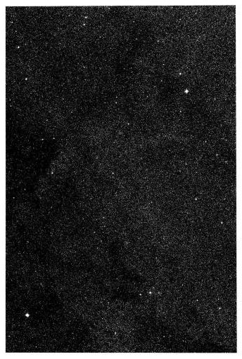
On The Sky Atlas And The NGS-Palomar Observatory Sky Survey
The Palomar Observatory Sky Survey was sponsored by the National Geographic Society. Over ten years, between 1948 and 1958, astronomers at Cal Tech’s Palomar Observatory used a 48-inch Schmidt Telescope to create the most advanced sky survey ever, a comprehensive portrait of most of the visible universe as seen from the Northern Hemisphere. [Actually, the survey detected objects of a magnitude of +22, one million times fainter than the limits of human vision.]
When completed, the 935 pairs of glass plates, one filtered red, and one blue, were compiled into the Sky Atlas, which was published over the years on paper, glass, and film.
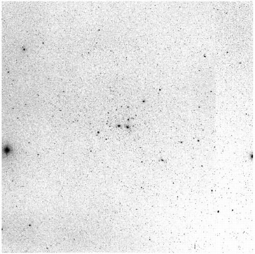
I first found out about the NGS-POSS about ten years ago I was visiting a physicist friend at her university office. There was a reception in the department library, and we wandered off to explore, and ended up in a rear stairwell, where she showed me a large, grey, metal flatfile on a landing. Inside each drawer was a stack of large, slightly curled photographs. They were printed in the negative; instead of glowing stars on a black sky, each page was light silver, flecked with linty black specks. There was a string of numbers–right ascension and declination, it turned out–on the top of each print.
Two print versions of the POSS were published, one 14×17″ format in the 1950’s and 1960’s, and another, 14×14″, in the 1970’s. The version I saw was the former. Paper turned out to be the least useful format for astronomical analysis; glass and film were much better, and since the POSS plates were scanned into the Digitized Sky Survey in the 1990’s, the print version of the Sky Atlas is obsolete by several generations.
So besides finding an extant copy gathering dust and taking up space in a university physics department somewhere, the logical [sic] thing to do is to print an entirely new set from the original plates.
Two sets of original plates were created, one to work from, and the other to be “stored, unused, in the dome of the 200-inch telescope on Palomar Mountain, where it will be available in the even that the plates in Pasadena should be damaged or destroyed by some catastrophe.”
At least that’s where they were in 1963 when R.L. Minkowski and G.O. Abell wrote about the NGS-POSS for K. Aa. Strand’s Basic Astronomical Data, Vol. III of Stars and Stellar Systems. They described in some detail the characteristics of the Survey, as well as the making of the prints. [Strand’s compendium also includes descriptions of earlier sky surveys, which I might get to later.] After the jump, some excerpts from Minkowski & Abell’s paper, pp.481-6, on the production of the Sky Atlas
Continue reading “On The Sky Atlas And The NGS-Palomar Observatory Sky Survey”
Eli Manning, The Manchurian Sforzian Backdrop

The hand that picks the nose shakes the hand that rules the world. For another seven months. [ap via wonkette]
EE Barnard’s Photographic Atlas of Selected Regions of the Milky Way
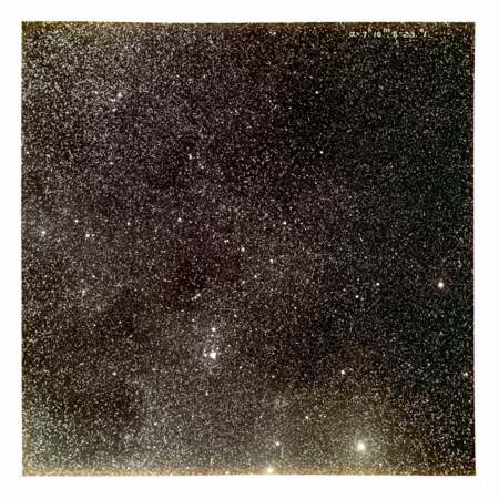
Edward Emerson Barnard was a self-taught astronomer who built a house for himself and his new bride with money earned spotting comets. [A patent medicine magnate was offering $200/comet in the 1880’s; in one year, Barnard spotted eight.] He was the first person to discover a new moon of Jupiter since Gallileo.
In 1895, he became a professor of astronomy at the University of Chicago, which gave him the observatory access he needed to complete one of the first photographic sky surveys. He spent decades, up until his death in 1923, photographing the Milky Way and nebulae, and overseeing the printing of photographs for his survey.
Thanks to the tireless efforts of his cataloguer and assistant Mary Calvert, A Photographic Atlas of Selected Regions of the Milky Way, which was finally published in 1929, in an edition of around 700. It’s a stunning achievement, a handmade artist’s book in the form of pioneering science.
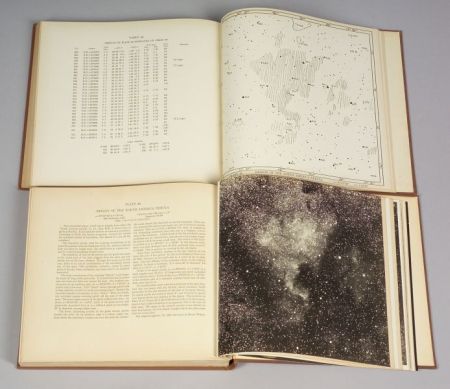
Georgia Tech’s library has digitized their copy of Selected Regions of the Milky Way, which allows broader access, and reduces wear and traffic on the $8-10,000 books. [The example above sold at Skinner’s scientific instruments auction in 2006 for around $7,000. Can’t find the exact number right now.]
Now That’s An Addition

I finally pulled some pictures off my camera from last summer. That’s when I noticed this little bungalow–with a sweet, vertical addition–just off the mainstreet in Morehead City, NC.
There are a couple more shots on flickr.
Dude. Olafur Eliasson Has A Blog
Well, he and his studio do. Spatial Vibration documents a series of collaboration/experiments concerning the relationship of sound and space. Several of the experiments are on view in a show of the same name, “Spatial Vibration, String-Based Instrument, Study II,” at Tanya Bonakdar Gallery through mid-June.
The Endless Study translates the sonic vibrations of a single-string instrument into a drawing by means of two pen-equipped pendulum arms, which record [sic] the sounds onto a rotating sheet of paper. It’s an update of a 19th century invention known as a harmonograph.

It remains to be seen what range of aural and visual effects emerge from the public’s access to the experiment. But the Studio crew, who have clearly been practicing, seem quite proficient at producing elegant, spiral drawings. But can you dance to them? Are beautiful drawings the happy accident of a particular type of performance, or is the musical composition–and the experience of listening to it–now incidental to the production of a desired drawing?
Meanwhile, another, even more ambitiously scaled experiment involves a 3-dimensional harmonograph, with a pendulum on each axis, which translates sound+time [i.e., a performance] into movement in 3D space. This path is then translated into a model. Olafur says it better:
By linking each pendulum to a digital interface I can ascribe to them the coordinates of x, y and z, and then digitally draw the spatial result of the three frequencies. They are easily tuned to a C major chord, for instance, one pendulum sounding the note C, one E, and one G. If they are given the correct frequency, the chord is harmonious and the vibrations form an orderly whole. This solidifies over time, thus drawing the contours of a three-dimensional object in space. In other words: sound vibrations can be turned into a tangible object. It is almost like building a model. One could develop this experiment into vast spatial arrangements by turning harmonious chords into spatial shapes. If we were to use a whole concert, like Beethoven’s Fifth Symphony, we might build an entire city.
An entire city. But that returns me to my previous question: would you want to live in Beethoven’s Fifth? What if the highest quality of city life is produced by something musically awful, like Mariah Carey’s third comeback album? Or an annoying corporate jingle? Do you lay down a heavy bassline to produce your city’s street grid? What would be on Jane Jacobs’ iPod?
Spatial Vibration, includes video, photos, and exhibition info [spatialvibration.blogspot.com]
Spatial Vibration is on view at Tanya Bonakdar Gallery through Jun. 7 [tanyabonakdargallery]
Wholphin [!] Interview on Wonderland Stream [!!]
Very interesting. Stream Magazine, part of Wonderland, is a new venue for online filmmaking, or an online venue for new filmmakers. Not quite sure yet. Alls I know is, Austin Bunn has a nice interview with Brett Hoff editor of Wholphin. It all looks fresh as a daisy, even though the pieces they’re discussing are all a few issues old now. [Note to self: finally start watching Wholphin #6.]
The World According to Wholphin [wonderlandstream.com via bigscreenlittlescreen]
Thomas Ruff’s Sterne Series
From around 1989-92, the German photographer Thomas Ruff created a body of work using astronomical survey photos from the European Southern Observatory in Chile. There is very little discussion online of this series[1], even though I believe it’s the first time Ruff uses a found image in his work. [Before the Sterne series, Ruff was known for his very large portraits of his friends, which he described as “a construct based on identification photographs.” Since then, he has appropriated and manipulated many types of photos, including industrial catalogue illustrations and internet porn.]
Ruff talked briefly about the Star photos in a rather painful 1993 interview with Philip Pocock:
Pocock: Why stars? Do they mean something extra special to you?
Ruff: When I was eighteen I had to decide whether to become an astronomer or a photographer. I also wanted to move the so-called künstlerische Fotografie boundary. Do you know Flusser?
Pocock: No.
Ruff: He defines isolated categories for photography that sometimes cross over. For example, if medical photography is used in a journalistic way, or with the Stars, a scientific archive isn’t used for scientific research but for my idea of what stars look like. It’s also a homage to Karl Bloßfeldt. In the twenties he took photographs of plants to explain to his students architectural archetypes. So he was a researcher but the way he represented his intention with the help of photography made him an artist. I like these crossovers.
All interesting enough, but given the photos he uses, I think the most relevant perspective comes earlier in another part of the interview, where he distinguishes between photographing to “capture reality” and “to make a picture.”
Ruff definitely makes an awesome picture. The Sterne photos are stunning, at least the largest prints–185cm wide by 250cm tall–are. They generally do well at auction, though it sometimes feels like the ones that do better are the “starrier” ones, a notion that seems to play right into Ruff’s interest, inherited from his teachers, Berndt and Hilla Becher, that photographs are cliches, constructs of expectations [“my idea of what stars look like,” even.]
The photos Ruff used came from a project so conceptually ambitious and subjectively constrained, it’d do the Bechers proud. The ESO Southern Sky Atlas was a massive undertaking, an attempt begun in 1972 [images were taken from 1974-1987] to document the entire visible universe. Or at least the half of it visible from the Southern Hemisphere. And just the objects of enough magnitude to show up with the then-new 100-inch UK Schmidt Telescope and the 1m ESO telescope at La Cilla, Chile. And which could be seen on Kodak’s then-new, experimental, hypersensitized emulsion.
The resulting 1,000+ photos are at once evidence of photography’s futile limitations, and one of its greatest artistic achievements; they out-Becher the Bechers. The Sky Atlas is just one of several sky surveys over the 20th century. Each starts out with the same ambitious goal; each takes years of painstaking work; each results in images and objects that exhibit conceptual rigor and contemporary visual appeal in equal amounts; and as technology progresses, each is rendered utterly obsolete by the next survey. Particularly as astronomical data is digitized, the era of producing objects–glass negative plates and photographic prints–has died. Now it sits, at best, forgotten and neglected in university libraries and on storeroom shelves. At worst, it will be cleared out and dumped, replaced–people think–by a small stack of CD-ROMs or a web server.
For such projects, once-scientific milestones that represent an era’s pinnacle of our achievement, the literal attainment of the capacity of human vision, maybe the best thing for them is to stop being science and start being art.
Note to astronomical librarians: if you’re clearing out old sky surveys and atlases, please dump them my way.
[1] At least in English. Henning Engelke wrote about the Sterne series and the science-to-art spectrum, but it’s in German and locked in a in pdf. maybe this google translation of the reformatted html version will be comprehensible.
Waiting For Google
Holy smokes, this is really wonderful. [via fimoculous]
The Codicil To John de Menil’s Will
In 2005, Robert Gober curated a show at the Menil Collection in Houston. In his catalogue, Robert Gober Sculptures and Installations, 1979-2007,” for the Schaulager show, Gober says, “Initially, I was only interested in curating from the collection and not including my own work, but when I began investigating the contents and the storage of the Menil Collection, I saw what [then chief curator] Matthew Drutt was already seeing. My work and the work in the collection shared affinities and themes. Catholicism, Surrealism, race, and a belief in the everyday object.”
The exhibition’s title, “The Meat Wagon,” comes from a codicil to John de Menil’s will. It’s awesome.
To my Executor
c/o Pierre M. Schumberger
I am a religions man deep at heart, in spite of appearances. I want to be buried as a catholic, with gaiety and seriousness.
I want the mass and last rites to be by Father Moubarac, because he is a highly spiritual man. Within what is permissible by catholic rules, and within the discretion of Moubarac, I want whoever feels so inclined to receive communion.
I want to be buried in wood, like the jews. The cheapest wood will be good enough. Any wood will do. I want a green pall, as we had for Jerry MacAgy. I would prefer a pickup or a flat bed truck to the conventional hearse.
I want the service to be held at my parish, St. Annes, not at The Rothko Chapel, because it would set a bad precedent.
I want music. I would like Bob Dylan to perform, and if it isn’t possible, any two or three electric guitars playing softly. I want them to play tunes of Bob Dylan, and to avoid misunderstanding, I have recorded suggestions on the enclosed tape. The first one, Ballad of Hollis Brown is evocative of the knell (nostalgic bell tolling). Then at some point Blowin’ In The Wind, The Times They Are A-Changin’ and WIth God On Our Side, because all my life I’ve been, mind and marrow, on the side of the underdog. Then Girl From The North Country to the rhythm of which the pall bearers would strut out of the church. Father Duploye could also be asked to sing Veni Creator in latin, to the soft accompaniment of a guitar.
I would like the funeral director to be Black.
I would like the pall bearers to be Ladislas Bugner, Francesco, Francois, Miles Glaser, Mickey Leland and Pete Schlumberger.
I would like George to stand with Dominique, Christophe, Adelaide, and Phil. Simone Swan, Helen Winkler, Jean Riboud, Ame Vennema, Rossellini and Howard Barnstone will be part of the family. Also Gladys Simmons and Emma Henderson.
I want no eulogy.
These details are not inspired by a pride, which would be rather vain, because I’ll be a corpse for the meat wagon. I just want to show that faith can be alive.
Date:NovemberDecember 13, 1972
/s/ John de Menil
The Rothko Chapel had only been dedicated in 1971. John de Menil died on June 1, 1973. His wife Dominique, who exerted a formative influence on my views of art in the times we met between 1990 and 1995, died in 1998.
Rain Machine?
Just a Vegas-y two second video, but I wonder if this rain machine gives a hint of what’s coming this week at Olafur Eliasson’s MoMA/PS1 show.
It’s A Little Abstract
Another of the things that Richard Serra said at LACMA last week has stuck with me was the artist’s call to arms for abstraction: basically, for artists in the 20th century, you’re either with us [i.e., Serra and Malevich] or you’re with the terrorists [i.e., Duchamp].
I was reminded by it, ironically, by the Times’ review of the new Tomma Abts show at the New Museum. By now, the spatial effect of seeing Abts’ arduously determined, small-scale, abstract paintings installed in large, white cubes is part of her experience. Abts’ room at the Carnegie International–which was also curated by Laura Hoptman–was an engrossing highlight; the paintings commanded the industrial space at greengrassi in London, too.] Ken Johnson writes, “Ms. Abts’s 14 small works look as though they died and went to heaven.”
But he also said, “Stylistically the paintings seem oddly out of sync with the present; they could be recently rediscovered works from the 1950s or ’60s.” That sense of anachronism seems inextricably tied to both the style–abstraction–and to the size. Though I can think of powerful exceptions, it seems like abstraction and smallness have been out of sync since WWII.
Abstractionist Thomas Nozkowski, who gets namechecked by Johnson–and whose resurgence is happening right now withfirst show after switching from Max Protetch to PaceWildenstein–talked in 2004 of deliberately choosing in the 70’s to paint on small board instead of giant canvas…
You can’t really understand artists of my generation until you factor the political atmosphere into any analysis of their work. I felt that I could no longer do big paintings that were for an audience of the very institutions that I then despised. The last thing I wanted to do was to paint for a museum, to paint for a bank lobby. I wanted to paint paintings that could fit in my friends’ rooms. So I started making 16 by 20 inch paintings that you would recognize today as my work, in 1975. These pictures, initially for political reasons, had roots in subject, in things that connected to the real world.
…and of the extremely skeptical response he received at the time, from curators, dealers, and his fellow artists:
I remember Steingrim Larssen who was then the director of the Louisiana Museum near Copenhagen coming by, and, to my surprise, he got excited about the paintings. This was 1975 or ’76, and he pulled a whole group out, said that he thought they were really interesting and then said, “Your psychiatrist told you to do these right?” He just thought it was some kind of therapy, he couldn’t imagine that this was serious work. I got a lot of that. Even Betty Parsons who was very supportive and loved young artists, she would flinch whenever I showed her a painting. So, I joined a co-op gallery to have a way to get them out of the studio and into the world.
…
There was an organization called The Organization of Independent Artists and they were attempting to subvert the gallery and museum system and all the established hierarchies. They had decided that each artist shown in their group shows would pick the next artists and so on. I was one of the artists chosen for the second show. I remember going to the organizational meeting and being told that the other artists had decided I couldn’t be in the show because the paintings weren’t serious.
Art Of Note
Andy designed this postcard for the Walker Art Center, which is cool.
But the notes on the flickr photo are even cooler.
cf. the most heavily annotated photo on flickr [kottke]