
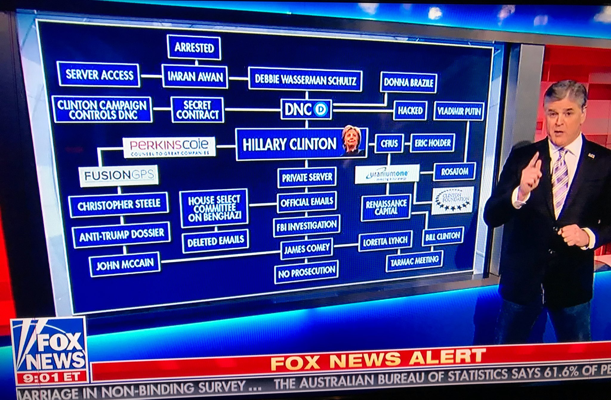
Sean Hannity going full Glenn Beck on Fox News, via @mikedelmoro
Mike Kelley, Entry Way (Genealogical Chart), 1995, via phillips

Mark Lombardi, Banco Nazionale del Lavoro, Reagan, Bush, Thatcher, and the Arming of Iraq, c. 1979-1990 (4th version), 1998, collection: moma.org
Ellsworth Kelly Dancing Monkey
Spring (Yellow Curve), 1984, paper on postcard
So far you are not sending me all the Ellsworth Kelly postcards like I asked, so I am forced to find them myself.
Summer (Blue Curve), 1984, paper on postcard
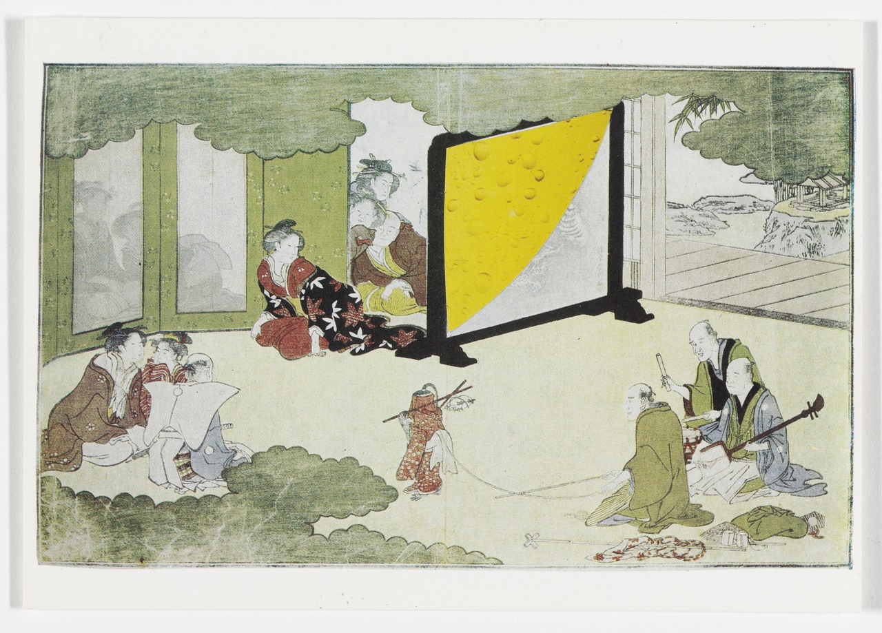
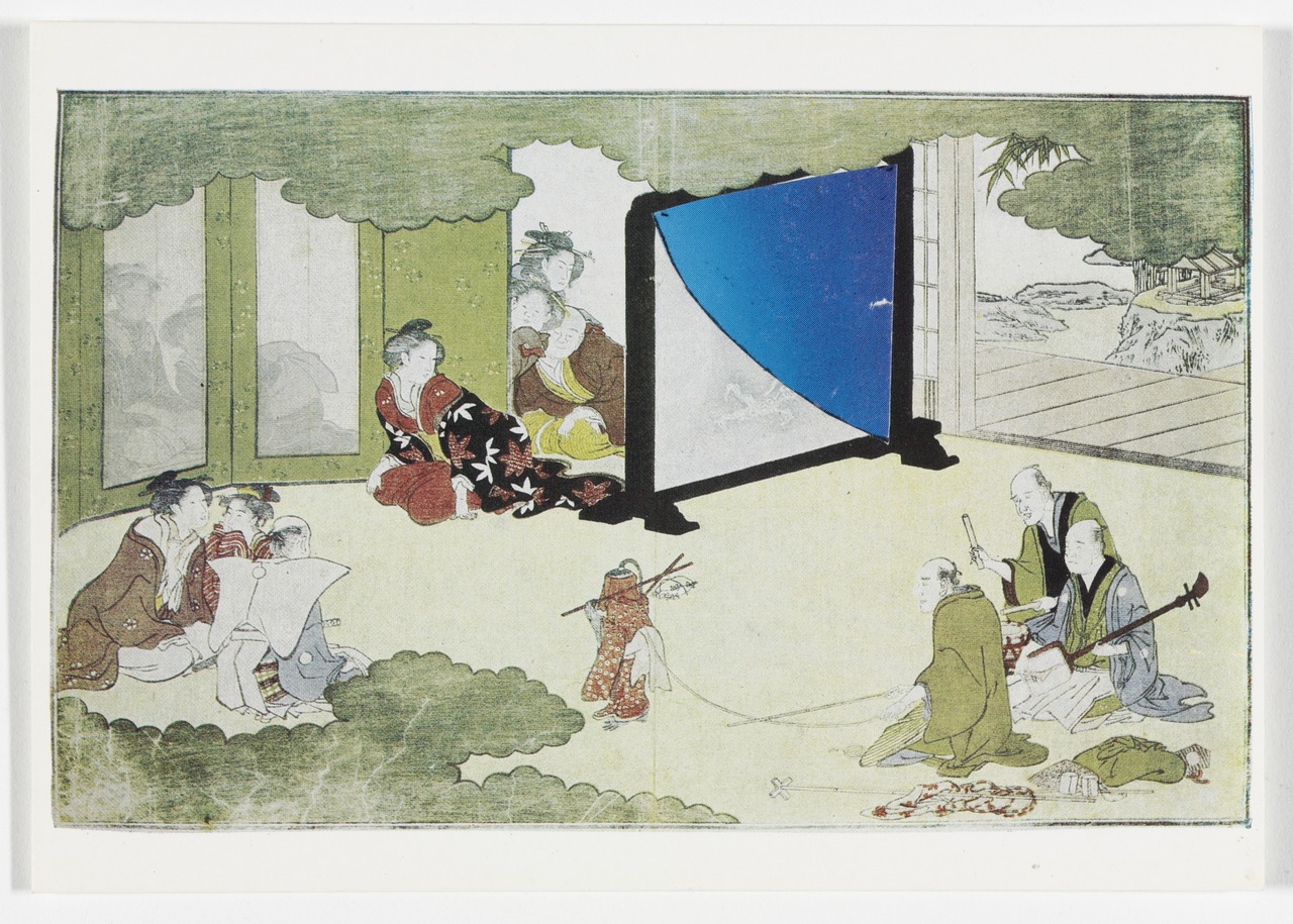
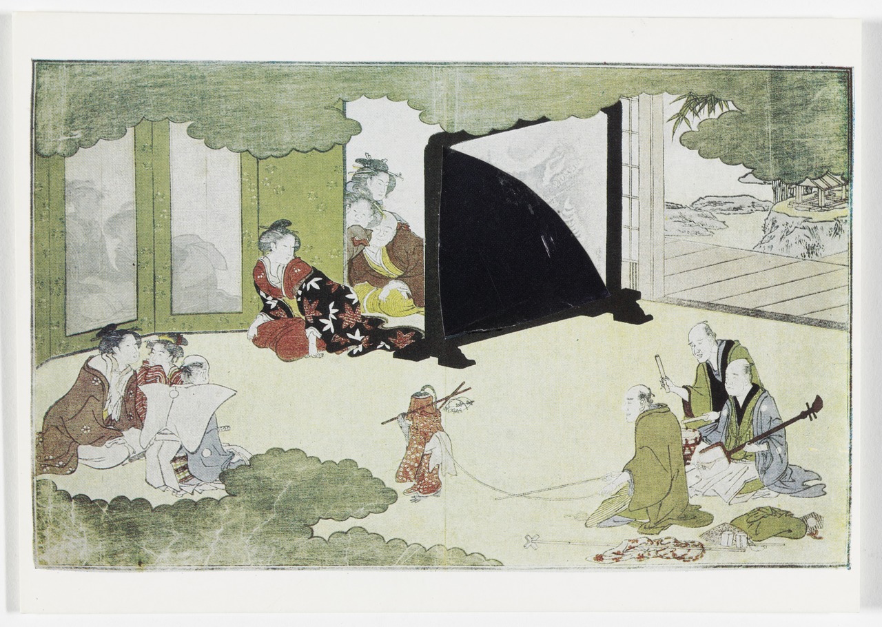
Oh wow, here is something wonderful which I have never seen before: a set of Ellsworth Kelly postcards. Four identical postcards, each with a varied but similar collaged element, a very Kelly-esque quarter circle, rotated within a frame, and titled with the four seasons.
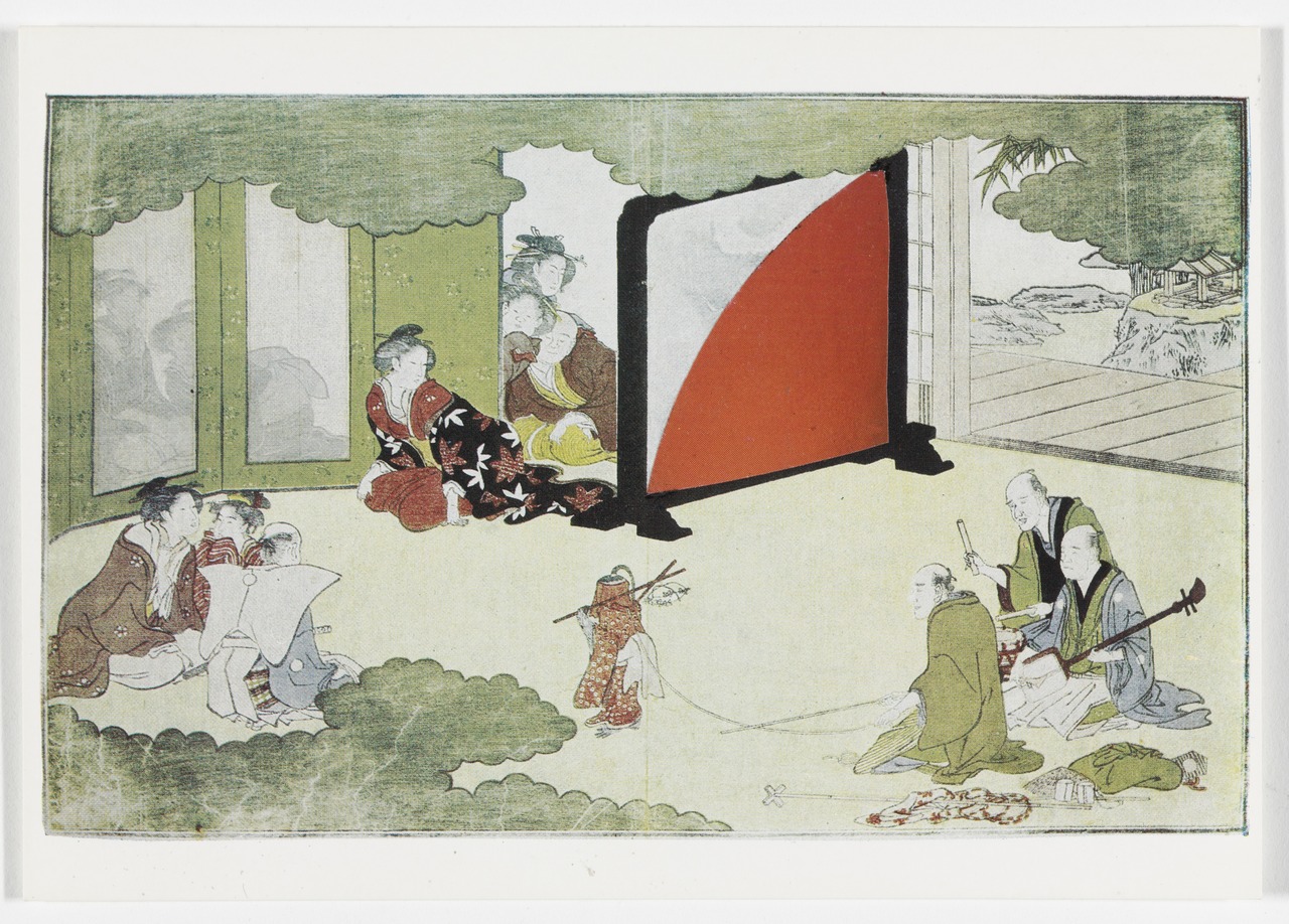
Autumn (Red Curve), 1984, paper on postcard
They’re almost Kelly paintings, but not quite: the blue curve seems to have a gradient, and the yellow curve looks like it’s covered in raindrops. They’re affixed on a tsuitate, a stationary, single panel Japanese screen that blocks views and drafts through a doorway. The combination of primary curves collaged with Asian art reminds me of some works Gabriel Orozco showed at Marian Goodman in 1994; they were remixes of overlapping circular cutouts from exhibition catalogues for Chinese scholar rocks and Ellsworth Kelly paintings. They were fantastic, and all sold, alas, and I am baffled that I can’t find a single image of them online right now.
Winter (Black Curve), 1984, paper on postcard
Anyway, the image Kelly set each curve into is Japanese, a woodblock print. It turns out it’s by Kitagawa Utamaro, an illustration from a 1789 collection of New Year’s poems called Waka Ebisu. I can’t yet figure out where Kelly might have gotten his postcards; maybe his 1984 exhibition history will yield a clue. [update: nope.] But Harvard has the print. The Met has the print, but has never shown it. The British Museum has the whole portfolio, and the best online documentation. The British Library’s online resource is a copyright-grabbing embarrassment. If I make my own Kelly Four Seasons collages, I’ll use their paranoid watermark jpg just because.
The scene is titled Saru-hiki [Monkey Trainer] and shows a troupe of performers visiting the house of a daimyō during New Year’s. Musicians accompany a dancing monkey in a kimono as the refined ladies of the house look on, some peeking around the tsuitate and others watching from behind semi-opaque bamboo screens called sudare.
Kelly presumably sent the postcards to his partner Jack Shear, because Shear donated them to MoMA in 2011, in honor of four refined ladies of that house, who have long supported Kelly and his work: Kathy Fuld (Spring); Agnes Gund (Summer); Jo Carole Lauder (Autumn); and Marie-Josée Kravis (Winter). So who does that make the dancing monkey?
Ehon waka Ebisu 絵本龢謌夷 (The Young God Ebisu, an Illustrated Book) [britishmuseum.org]
Previously, related: Ellsworth Kelly Postcards: Wish You Were Here!
UPDATE: Our Guernica Cycle – Ivanka / Merkel 03.17.2017
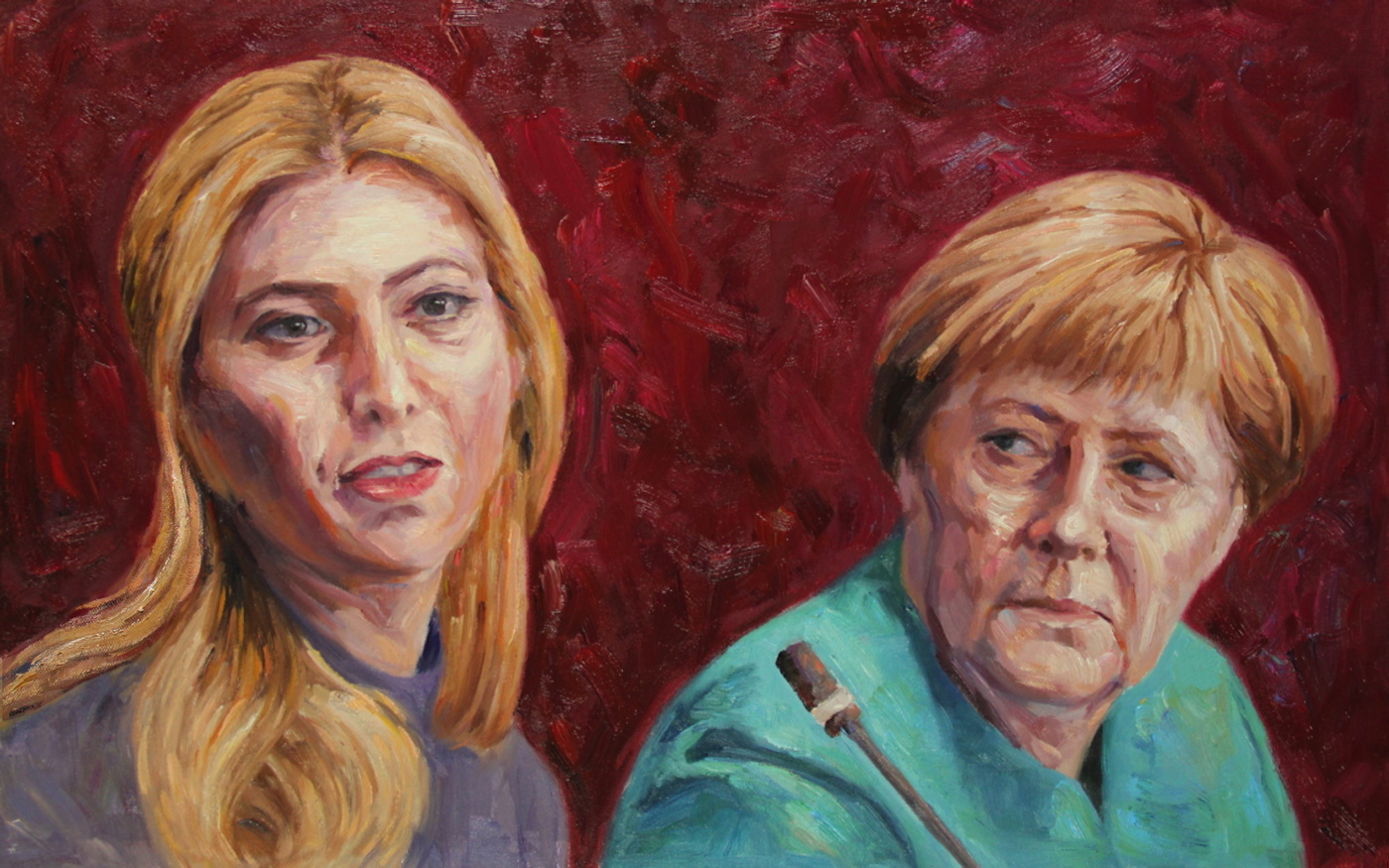
Our Guernica Cycle – Ivanka / Merkel 03.17.2017, 2017, 50x80cm, oil on canvas and associated print editions, greg.org
Happy apparent Birthday, Ivanka!
I’ve been staring at her distorted portrait for so long, it took the shock of the news yesterday to make me realize I have not actually, officially, gone public with the results of the first picture I Kickstarted. “Our Guernica, by Our Picasso,” an historic painting to mark the moment last March when Ivanka Trump turned up in a White House meeting with the leader of the free world, Angela Merkel, executed in the style of George W. Bush.
In the course of production of the pyramidful of print editions, plus some canvases, the project became Our Guernica Cycle, and Ivanka/Merkel 03.17.2017 became the first image, unfortunately, and not the last. I’ve now lived with these images for almost six months. All but two of the project backers have received their merch [the last two canvases are staring at me right now, set to be shipped before the opioid crisis is solved.]
And a new image is complete. It is a moment for reflection. Also a moment to celebrate getting these things out of the house. And I’m still asking the question I started with: what is art supposed to do? What is a painting for? The image I ended up with is terrible. In the process of applying the Kinkade-ian custom “highlights,” I realized they could only and ever make things worse. I started calling them “highblights,” or just “blight.” I gave backers the choice between “more blight!” and “it’s bad enough!” and they split almost evenly. With the last works going out the door, I am still undecided.
What does it mean, too, for an artwork to be experienced only [or largely] privately, by its purchasers? It is the antithesis of a Guernica; it’s My Own Private Guernica. Our Guernica.
The greatest outcome from this project has to be the show of support, the collective, shared outrage combined with an open-eyed engagement with art, even knowing it will not solve the horrible problems looming all around us. 59 people bought prints that didn’t exist of an image that hadn’t been created yet, in order to see it happen. And that is amazing, and I am very grateful. Maybe the real Our Guernica is the friends we make along the way.
Six months later, though, we’re obviously not through this. The world has not ended [I’m writing this at 11:39 on Monday night. Oh, I’m just about to publish it at 1PM on Tuesday.] The world has not ended, but our town square is still being strafed by Nazis. So Our Guernica is Our Guernica Cycle. What does that mean?
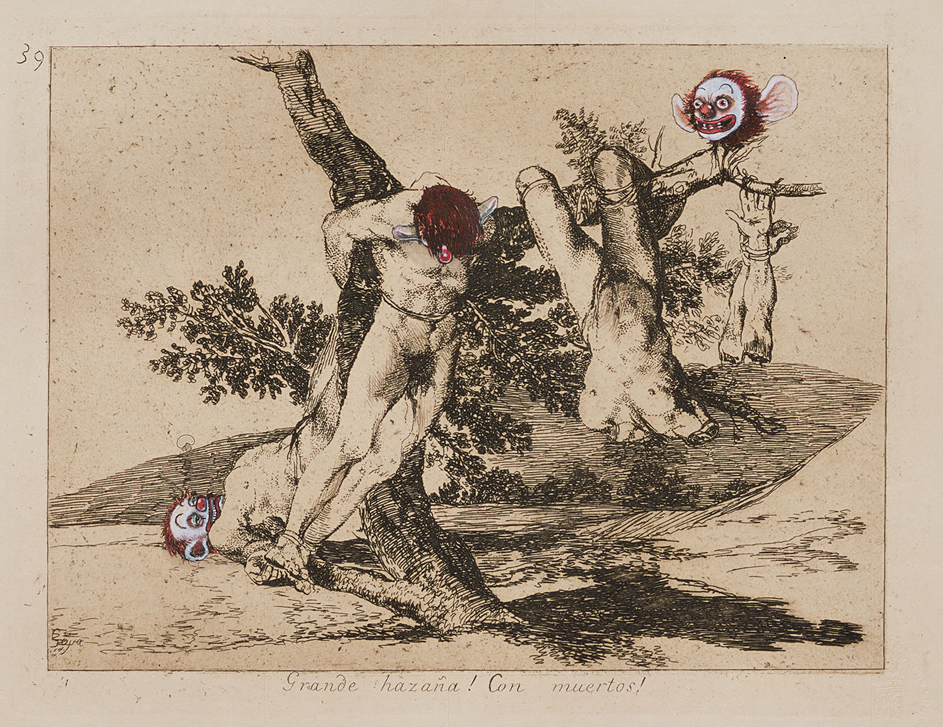
In the spirit of #thisisnotnormal, I’ve been working my way through images and possibilities, with the goal of accurately witnessing and capturing the political horrors and threats that surround us. Even more than Guernica, I’ve been thinking of Goya, whose Disasters of War series, 80+ prints whose creation occupied decades, and which Goya did not anticipate publishing in full in his own atrocity-rattled lifetime. I’ve especially come to appreciate the Chapman brothers’ Insult to Injury project, [above] where their clownish embellishments of a Goya Disasters of War portfolio condemned the folly of Bush & Blair’s Iraq War. [Called it, obv.]
So I expect this series will go on a while. After the backers were taken care of, I used the rest of the Kickstarter project funds to commission the next painting. It, too, has arrived. I think I will invite the original backers to order one first, but it should be available soon. It, too, was created with instructions to look like George Bush had painted it. The Chinese painters I’m working with seem to have gotten a little better at this bad style. Perhaps that will be when we know the Cycle is complete: when the #ChinesePaintMill system designed to industrialize Gerhard Richter’s paint-from-photo tactics can successfully reproduce the clumsy expressionist facture of the man who is still, alas, America’s most relevant painter. So stay tuned.
Our Guernica, After Our Picasso [kickstarter]
Previously, related: On Coming Around on Insult to Injury
Talking Walter Hopps, Ferus, & LA with Anne Doran & Deborah Treisman, 10/29 @Alden Projects
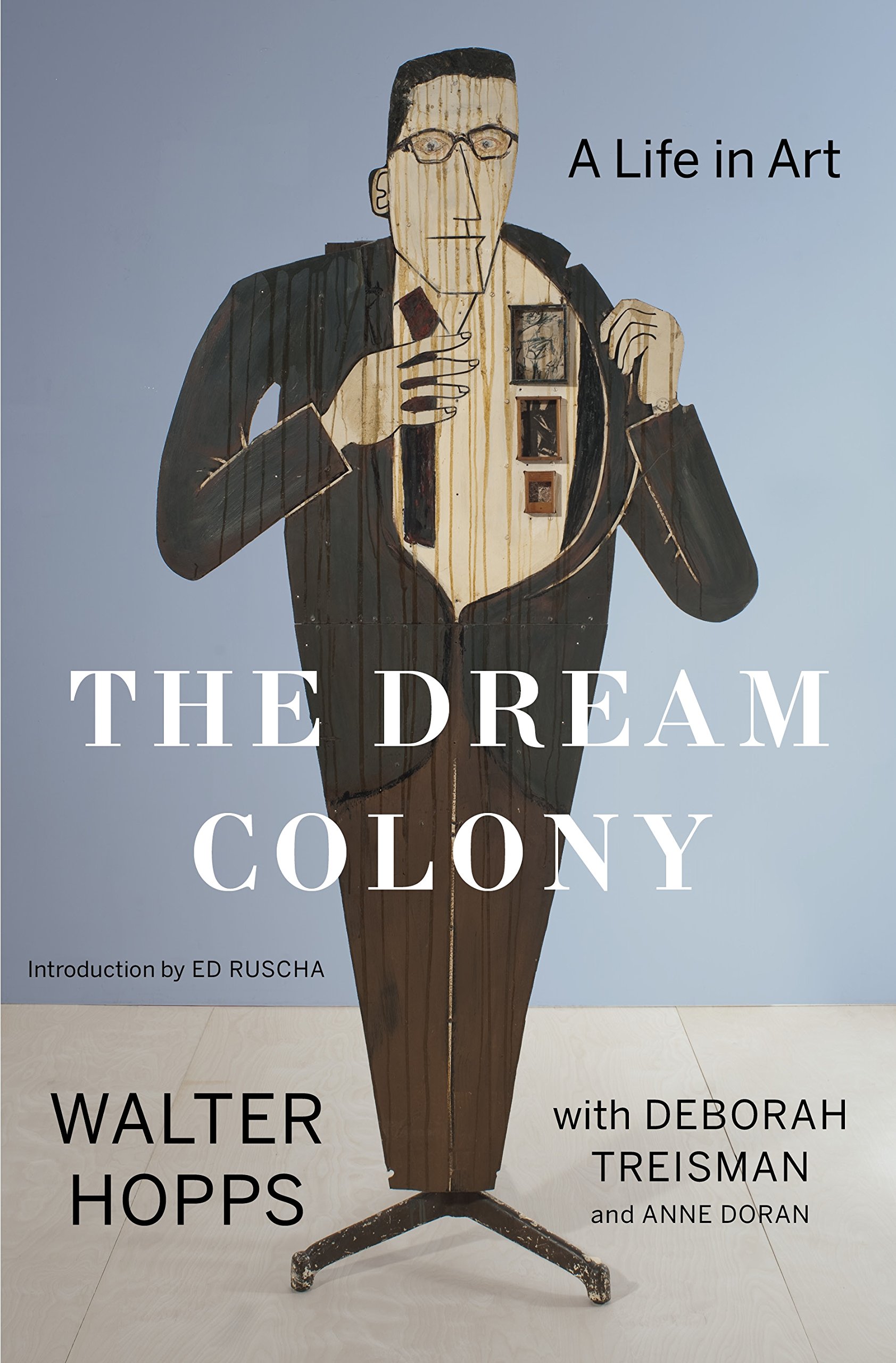
I’m stoked to be speaking this coming Sunday, Oct. 29, with Anne Doran and Deborah Treisman, about their new book, The Dream Colony: A Life in Art by Walter Hopps. The discussion and book signing will take place at Alden Projects™ on the LES, starting at 6pm.
Todd Alden has an incredible-sounding show up right now which provides a nearly perfect backdrop and context for a discussion of Hopps and the emergence of the post-war LA art world: a collection of 66 exhibition posters for Ferus Gallery, which Hopps founded with Ed Kienholz, which was then taken over by Irving Blum.
I imagine the talk will draw heavily on Doran & Treisman’s book, which they created from over 100 hours of interviews with Hopps; and on the posters themselves, which Hopps, and later Blum, often created in collaboration with the budding artists themselves, including Ed Ruscha, Roy Lichtenstein, and Andy Warhol.
It should be a great talk about a great read in a great show, so do try and come.
You could buy The Dream Colony now via bookshop.org, but why not get a copy from the authors on Sunday night? [amazon bookshop.org]
Ferus Gallery: Between The Folds runs through Nov., 19, 2017, at Alden Projects™ [aldenprojects.com]
Better Read #017: Embroidery Trouble Shooting Guide
SEW SEW SEW SEW SEW SEW
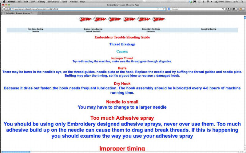
This installment of Better Read is the text of the found net artwork, Embroidery Trouble Shooting Page, which was repeated as untitled (etsg) in 2015.
When I first found the page, I marveled at its beautiful folly, and dreamed of printing it as a book. Then of using it as an abstract painting composition generator. Then I accepted responsibility to publish and preserve it after its original code changed. And since then, I’ve explored the possibilities and process for printing it as a single, giant page. I expect it would fill a wall. If you have any thoughts or tips for capturing a rendered webpage as a single image, I hope you’ll get in touch.
Download better_read_017_etsg_20171018.mp3 [mp3, 5:35, 2.7mb, via greg.org]
Previously: Untitled (Embroidery Trouble Shooting Guide)
untitled (etsg), 2015 [etsg.greg.org]
Podcast: Play in new window | Download
Subscribe: RSS
Tommy Hilfiger Capo Personale
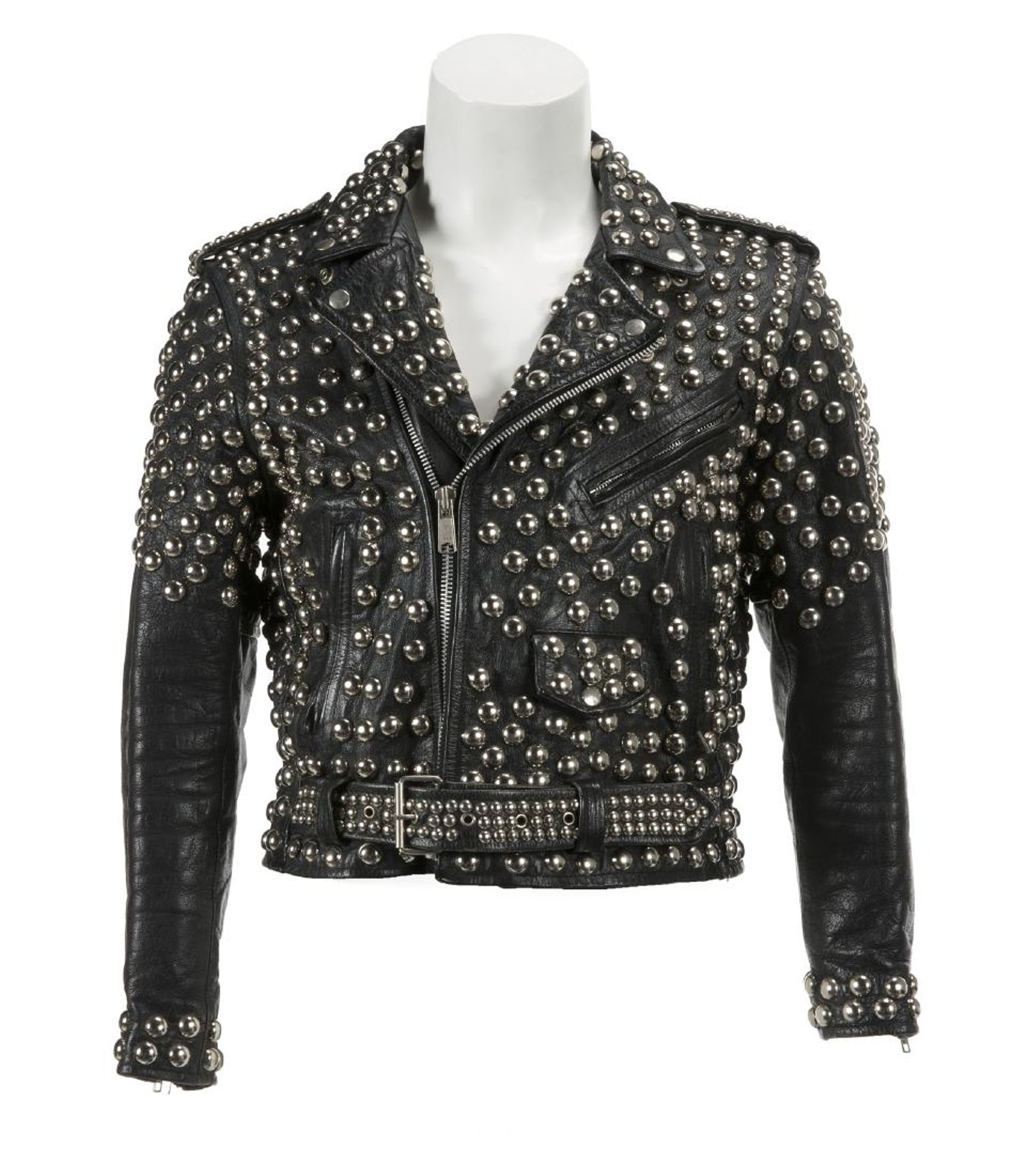
“Tommy Hilfiger Judas Priest Jacket”
What’s the opposite of a collection? The “Tommy Hilfiger Collection” is being auctioned this week, and it is as pure and empty and hollow and pointless as the man himself and everything he’s ever done. In a way, maybe that achieves a certain level of genius, or whatever its opposite is. A thousand crappy livesful of junk goes up for sale every week, I’m sure, but there’s something useful to understanding the concept of a brand to see how slapping the name Tommy Hilfiger on a thing somehow makes it worth less.
To save Martin Wong’s amazing accumulation of tchotchkes and mementos from his mother’s house, and keep it from being dumped on eBay, Danh Vo transformed the entire collection into a single artwork of his own, which was acquired by the Guggenheim. Vo cast a light on the failings of our cultural memory, and our institutions, even as he successfully navigated his and Wong’s works through the gantlet of conceptual and procedural obstacles. This added depth, resonance, and interpretation to objects, a collection, which might otherwise be seen as insignificant.
This Tommy Hilfiger Collection is the diametric opposite: these objects were acquired and accumulated in the deluded, aspirational pursuit of luxury, fame and glory as ends in themselves, and they suck. They should be scattered to the wind, abandoned and forgotten. It’s not that they don’t have any meaning; they literally mean nothing. Nothing is their meaning. Even paying attention to them here, now, as I type, or as you read, causes only the regret of lost time, and foolish error to well up inside. But it’s too late now, all we can do is try to move on.
Untitled (Presidential Seal), 2017

The Seal of the President of The United States is the official coat of arms of the U.S. Presidency, and is based on the Great Seal of the United States [below], which is used by the federal government to verify the authenticity of certain official documents. The basics of the current design go back to 1877. After a formal redesign was initiated by Franklin Roosevelt, it was taken up and finalized by Harry Truman in 1945.
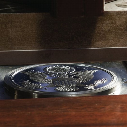
Counter-die for the Great Seal of the United States
In that redesign, based on a painting provided by US Naval Commodore Byron McCandless, the eagle was switched from facing to the left-in the forward direction when used on a mounted flag-to facing right, dexter, the standard direction in heraldry. A press release of October 25, 1945 says the eagle faces “right-the direction of honor-but also toward the olive branches of peace” it holds in its right talon.
The Seal design has been unchanged since 1960, when the 50th star was added to its border recognizing the inclusion of Hawai’i in the United States.
The Seal is used on the lectern for presidential press conferences. It appears on the side of Air Force One, Marine One, and presidential limousines. It is affixed to the balcony of the White House for state arrival ceremonies. The Secret Service is authorized to use the Seal of the President on merchandise it sells for charitable fundraising in its White House Online Gift Shop.
The law governing the use of the Presidential Seal is contained in Title 18 U.S. Code § 713. It is primarily concerned with using the Seal to falsely imply endorsement or support for commercial activities by the Government or the President, and with the wrongful exploitation of the Seal for commercial gain:
(a) Whoever knowingly displays any printed or other likeness of the great seal of the United States, or of the seals of the President or the Vice President of the United States, or the seal of the United States Senate, or the seal of the United States House of Representatives, or the seal of the United States Congress, or any facsimile thereof, in, or in connection with, any advertisement, poster, circular, book, pamphlet, or other publication, public meeting, play, motion picture, telecast, or other production, or on any building, monument, or stationery, for the purpose of conveying, or in a manner reasonably calculated to convey, a false impression of sponsorship or approval by the Government of the United States or by any department, agency, or instrumentality thereof, shall be fined under this title or imprisoned not more than six months, or both.
(b) Whoever, except as authorized under regulations promulgated by the President and published in the Federal Register, knowingly manufactures, reproduces, sells, or purchases for resale, either separately or appended to any article manufactured or sold, any likeness of the seals of the President or Vice President, or any substantial part thereof, except for manufacture or sale of the article for the official use of the Government of the United States, shall be fined under this title or imprisoned not more than six months, or both.
In 1972 Richard Nixon promulgated regulations about authorized uses of the Presidential Seal by issuing Executive Order 11649. The Seal, it states, may be used by the President. It may be reproduced for “Use by way of photographic or electronic visual reproduction in pictures, moving pictures, or telecasts of bona fide news content.” It is permitted “in libraries, museums, or educational facilities incident to descriptions or exhibits relating to seals, coats of arms, heraldry, or the Presidency.”
In 1976 Gerald Ford amended EO 11649 by issuing EO 11916, further authorizing “Use in encyclopedias, dictionaries, books, journals, pamphlets, periodicals or magazines incident to a description or history of seals, coats of arms, heraldry, or the Presidency.”
Section 2 of EO 11649 goes on to echo 18 U.S. Code § 713 (b) in constraining commercial exploitation of the Seal:
The manufacture, reproduction, sale, or purchase for resale, either separately or appended to any article manufactured or sold, of the Seals of the President or Vice President, or any likeness or substantial part thereof, except as provided in this Order or as otherwise provided by law, is prohibited.
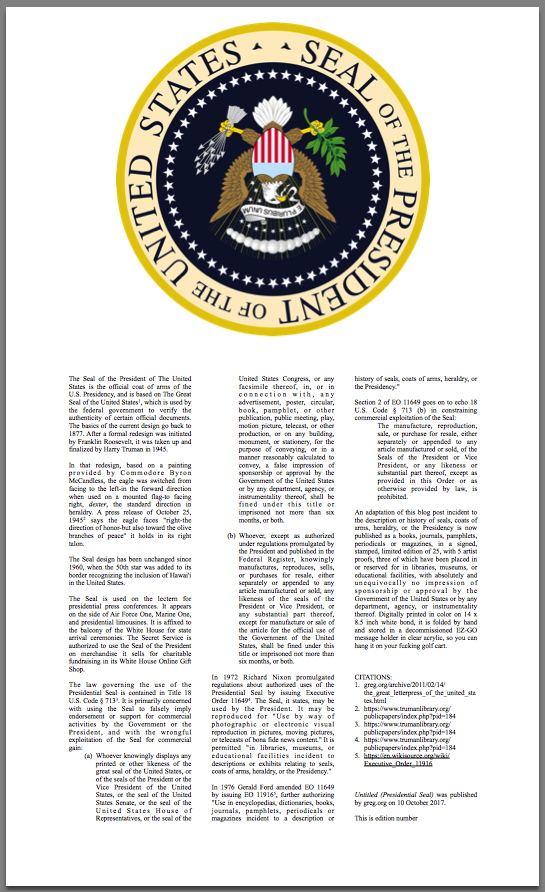
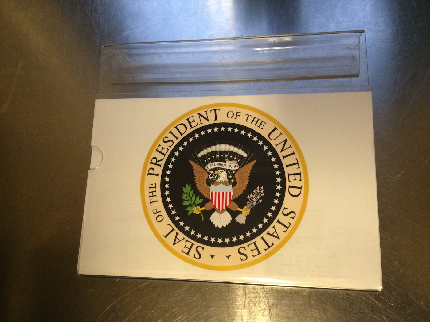
greg.org, Untitled (Presidential Seal), 2017, digital print on bond in acrylic message holder.
Sheet: 14 x 8.5 in. Folded: 6 x 8.5 in., ed. 25 + 5 AP
An adaptation of this blog post incident to the description or history of seals, coats of arms, heraldry, or the Presidency is now published as a books, journals, pamphlets, periodicals or magazines, in a signed, stamped, limited edition of 25, with 5 artist proofs, three of which have been placed in or reserved for in libraries, museums, or educational facilities, with absolutely and unequivocally no impression of sponsorship or approval by the Government of the United States or by any department, agency, or instrumentality thereof.
Digitally printed in color on 14 x 8.5 inch white bond, it is folded by hand and stored in a decommissioned EZ-GO message holder in clear acrylic, so you can hang it on your fucking golf cart.
Untitled (Presidential Seal) is $20, shipped. [via paypal]
ARTIST PROOF UPDATE: It works.
Statement-As-Question: How Do You Get Here? From How Is Art History Made?
No one sends me these, so I have to find them by chance, but I am still interested in the statement-as-question as a form. If the Q&A for panel discussion or public talk *you* experienced was waylaid by such a question, please send me a link.
Last night, while I was experimenting with polishing a painting, I listened to a particularly unsatisfying discussion from the Salon series at Art Basel 2013 titled, “How Is Art History Made?” Moderated by curator Monika Szewczyk, Seth Siegelaub and Adam Szymczyk talked about their Kunsthalle Basel project, which put a series of art world structure-related questions by Siegelaub, translated into six European languages, on posters around town during the fair.
Siegelaub began his remarks by admitting he didn’t have any answers, he was just asking the questions, the main one being, basically, is Art History ultimately a history of the market? There was apparently an agreement not to name any artist names, so the discussion remained very general, which is not to say theoretical.
Ultimately, the only satisfying thing was that the panel’s question-as-title about a question-as-project led directly to the frustrated audience member’s statement-as-question. A woman off camera, unidentified, on the front row, with a Chinese accent, had apparently, and not unreasonably, assumed the officially organized event would answer the question of its title. It had not, and so she had just one simple question.
It begins at 37:00. My interest is to accurately document the experience of the text, so I have preserved grammatical usage. Linebreaks are intended to approximate pauses:
Previously:
Statement-As-Question from Fractures of the Civilization
‘I’m Going To Fail,’ or Protocols of Participation
Continue reading “Statement-As-Question: How Do You Get Here? From How Is Art History Made?”
RIP Vern Blosum
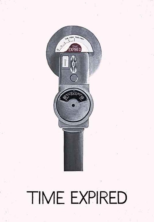
Time Expired, 1962, MoMA, acquired, interestingly, in 1971.
The name is made up, but the art and the person are real, and so is their family. Tracking down and meeting Vern Blosum was a huge treat for me, and I’m saddened to learn the artist has passed away.
Several years after it acquired a Blosum painting, The Museum of Modern Art grew concerned that the artist did not exist, and that perhaps, as rumored, the painting was a prank. Leo Castelli, whose gallery had sold many Blosums to prominent collectors in the early days of Pop, but who never gave Blosum a show, provided the museum with an artist bio. The Modern went so far as to search local archives for birth announcements and certificates in Blosum’s claimed home state of Colorado, around his claimed birth date in 1936. When they couldn’t find any, they put the painting in storage, where it remained for nearly 50 years.
It’s interesting that the brief announcement of Blosum’s death put out by the artist’s gallery contains this fictitious birth information. When I met the artist occasionally known as Blosum, I was assured that the MoMA bio was not untrue. So from the artist’s view, there is apparently some significance in its details. I expect I will look into this delta, but now is not really the time.
Previously: 2010: Anyone tell me about Vern Blosum?
2011: Verne Blosum found, or rather, found by Verne Blossum
Untitled (We Privatized All Of Versailles), 2017
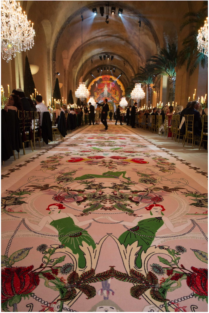
Installation shot: Untitled (We Privatized All Of Versailles), 2017, embroidered carpet, est. 4m x 3m, ed. 15+3 or so AP, installed at l’Orangerie, Palais de Versailles, May 2017, image: vogue.com
Yesterday was a rough day to be a human being. Turning to art as a supposed respite from the outrages and insanities of the culture swirling around us proved only somewhat effective. Not in a position to handle the news of the day, I turned to the injustices and emotions wrought by Vogue.com’s freshly published, half-baked writeup of a wedding four months past.
The couple, profligate European randoms, heirs to immense enough fortunes but seemingly bereft of wisdom or self-awareness, are made to sound like they think they invented the seven figure wedding. The illogics and contradictions of the narrative continued to bug me across the day: Kim & Kanye were not permitted to have their wedding in Versailles, and were forced to settle for a rehearsal dinner in l’Orangerie, but this former Lanvin intern is so well connected, she could pull it off? Except weddings are not permitted in public buildings in France, so they either had a stealth ceremony, in which case, are they legal? Or they got married in the mairie like everybody else, and had a little religious after-thing, followed by dinner, in one of the five event rental spaces at Versailles: l’Orangerie.
And the bride didn’t have time to get shoes made, but she had time to fill the 156-meter long gallery with a rug, custom embroidered with an Erté-inspired design from the invitation. [Except she did get shoes made. And I have been staring at this rug, and is it really embroidered or just printed?]
On the bright side, karmically speaking, May 28th was brutally hot in Paris, 32 degrees, 12 degrees above average, so all 450 guests had to schlep from the entrance of Versailles, out across the garden, down the 100 Steps, and then double back, a 20 minute trip, in eveningwear, only to reach the historic greenhouse spaces that could not be air-conditioned because of “legalities.” [The bride said the forecast had been for rain. Think about that for a second.]
But back to that rug. It is now my second textile work, with each repeat of the rug design comprising a separate example from the edition. Let’s chop that thing up. Like those wheelie-marks-on-plywood paintings Aaron Young made at the Armory that one time, with the motorcycle gang. Or maybe the proper reference are the verre églomisé mural panels Jean-Théodore Dupas designed for the grand salon of the SS Normandie, an indeterminate number of which were salvaged and dispersed when the great French ocean liner burned and sank in New York harbor in 1942.
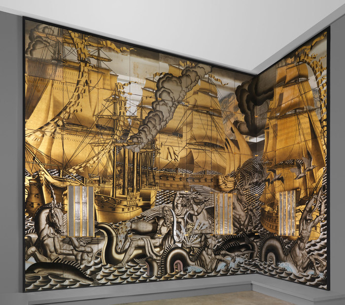
History of Navigation reverse gilded glass panels from the SS Normandie, 1934, collection/image: the met
Anyway. 156m space, 450 guests, two tables, 110 meters long, 12 meter wide space, 3m wide rug, maybe 4m repeat? We may have lost a few sections when the wedding couple processed their horses down the aisle.
The happy couple gets one, of course, and the calligrapher, and the fashion show producer/wedding planner. Probably set aside one each for the parents, who, though presumably footing the bill, go entirely unmentioned. I’m going to err on the side of caution and say it’s an edition of 15, with 3 or so APs.
I’d probably have a slightly easier time getting a hold of the rug if I held off posting this, but I’m fine to let it play out.
the wedding write-up and slideshow [vogue]
the calligrapher/graphic artist who did the invitation which was adapted for the carpet [stephaniefishwick.com]
previously: Untitled (I Can See Russia From My House), 2017
Untitled (Mnuchin Gallery), 2017
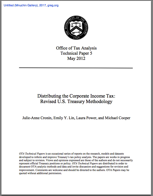
Untitled (Mnuchin Gallery), title page, 2017, 34-page pdf
Untitled (Mnuchin Gallery) is a 2017 work comprising a 2012 technical paper by four economists in the United States Treasury Department’s Office of Tax Analysis. The paper explained a revision to the Treasury’s methodology for analyzing the impact of corporate income taxes on companies, owners, and workers. It did this by examining the type of income (capital or labor/wage) and the distribution of those income sources across the entire taxpayer population. It was found, for example, that the top 1% of households accounted for 49.8% of total capital income, but only 11.5% of labor income.
The purpose of the study was to understand the impacts of tax-related policies and forecasts more accurately, and in greater detail, in the hope that more accurate data will lead to better-crafted policy and legislation.
Treasury Secretary Steven Mnuchin has spent several months making claims about lowering corporate income tax rates that are directly contradicted by the findings of the study, and the calculations of Treasury Department’s career economists. So he had the study removed from the US Treasury website, and a spokesman has disavowed the methodology as “the dated staff analysis of the previous administration.” No alternate methodology or analysis has been offered.
Steven Mnuchin, like his father Robert Mnuchin, was a partner at Goldman Sachs. Like is father, he collects modern and contemporary art. One Mnuchin is in the business of conferring relevance on objects by exhibiting them, the other by suppressing and disappearing them. This work is a family reunion of those two tactics.
Untitled_Mnuchin_Gallery.pdf [34pg, pdf, via wsj]
Untitled (Boxwood Maze), 1967/2017
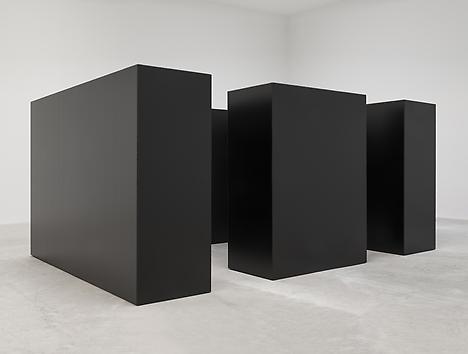
Tony Smith, Maze, 1967/2014, steel units 7×10 feet and 7×5 feet, installed at Matthew Marks LA
When it was first shown at Finch College Gallery in 1967, Grace Glueck said Tony Smith’s The Maze “evokes the feeling of an endless forest.”
When he published it in Brian O’Doherty’s editions 5+6 of Aspen: The Magazine in a Box, Smith said it was “a labyrinth rather than a monument,” and gave anyone who wished permission “to reproduce the work in its original dimensions (in metal or wood).
I would now like to tie it all together by giving anyone who wishes permission to reproduce The Maze in its original dimensions in fake boxwood hedge walls.
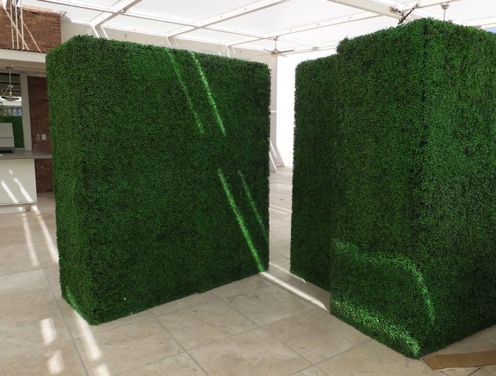
Most off-the-rack fake boxwood hedge walls are eight feet tall and often include a fake planter base. Most are also 15 inches thick. A real fake boxwood hedge wall The Maze will observe Smith’s original specifications, and use fake boxwood hedge walls seven feet high and 30 inches thick. Two will be five feet long, and two will be ten. They should not have a planter base.
There are many fake boxwood hedge wall solutions providers out there, but might I suggest you consider Make Be-Leaves, who already seems 3/4 of the way there with the 7-ft walls above?
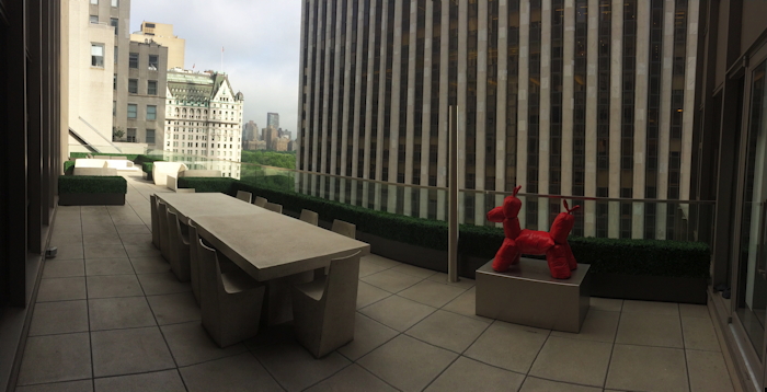
fake UV boxwood hedge plantscape…
Among their many successful installations is this fake boxwood hedge plantscape on the CPK vu terrace of a Madison Avenue real estate investment firm. And yet it manages to be only the second greatest fake thing in sight. What the actual f.
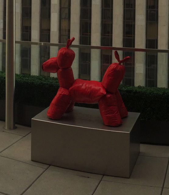
… with a fake Koons balloon dog made from, what, garbage bags [?], image: makebe-leaves.com
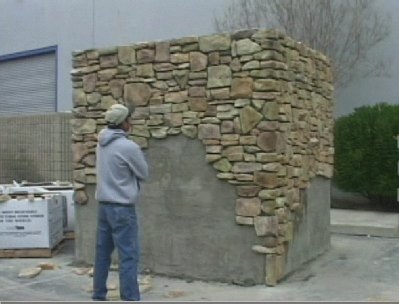
And here I thought I’d end this post with the Tony Smith Die made out of fake rock veneers.
The Maze, (1967/XXXX), Tony Smith [greg.org]
The Maze Collection
Previously, shockingly related Tony Smith moment: The Allure of Permanence
Not related: Jon Rafman stickin’ his VR in a flimsy astroturf hedge maze [thestar, thx @briansholis]
Aall thanks go to @ftrain, whose tweet of an aerial photo of a Google corporate event was filled with an extravagant architecture of fake boxwood hedge walls.
Erased Kassay JPEG
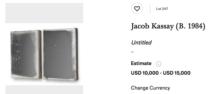
Lot 247: Jacob Kassay, Untitled, 2010, two 14×10 silver on acrylic (not gesso?) canvases, est $10-15,000 [image via christies]
Scanning the catalogue for this month’s Christie’s sale turned up something unexpected: an affordable Jacob Kassay painting. Two of them, in fact. After his ominously seductive debut show opened at Eleven Rivington in the wake of the 2008 financial crisis, Kassay’s silvered gesso canvases were transmuted into auction gold. Shiny objects reflecting distorted images of their viewers, Kassay’s paintings were the first to get churned and flipped in a frenzied art market obsessed with declaring-and cashing in on-a steady stream of new stars.
It’s the kind of limelight that can wreck a girl’s practice, if not her complexion, and Kassay has been reticent, even diffident sometimes, of the hype. He’s generally refused to engage the art market star process, at least on anything other than his own terms. For a while he refused to have his picture taken. His website, a kaleidoscope of semi-transparent images, would kick you off after a few seconds, presumably when you’re just tryna do some research for an upcoming auction.
Kassay has also always been fairly specific about images of his shows, especially photos of his silvered paintings. So it should make all the sense in the world that he’d care about the proliferation of auction-related reproductions of his work. What was more surprising, though, was the apparent removal of all images of his work from Phillips’ website.
Sotheby’s has done this for a while now, removing images of works shortly after the sale is completed, but this is the first time I’ve seen all of an artist’s images removed from a site. Or should I say, replaced. If you thought Kassays all looked the same before, well, brother, you’re in for a treat. I’d like to see these in mirror finish, please.
[FWIW, this particular pair, from 2010, was flipped at Phillips in 2011 for $104,500. If there’s anything more alluring than a shiny object, it’s two. And if there’s anything more seductive than that, it’s a 90% discount. [Update: indeed, they sold for $8,000 bid, $10,000 with premium. That is some Cady Noland-level collector anxiety inducement and value erasure. Well played.]
Sept 28, 2017, Lot 247: Jacob Kassay diptych, 2010, est. $10-15,000 [christies]
8 Nov 2011, Lot 205: Jacob Kassay, Untitled diptych, est. $30-40,000, sold for $104,500 [phillips]
Ruth Asawa BMC Laundry Stamp Drawings
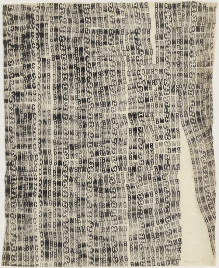
Ruth Asawa, Untitled (BMC.76, BMC laundry stamp), 1948-49, image via: hyperallergic
You rarely get to see more than one Ruth Asawa wire lobe sculpture, and you almost never get to see works on paper. So get to David Zwirner’s place, because they have it all right now. It is probably the biggest assemblage of Asawa’s work since the 2006 show at the de Young Museum in San Francisco.
And I guess I wasn’t attuned to it at the time, but Asawa’s rubber stamp drawings from Black Mountain College are extraordinary. Here’s one made with the BMC laundry stamp. Her sculptures have always felt like line drawings in space, and these feel like word sculptures on paper.
Another thing I was not paying enough attention to in 2007: one of Asawa’s BMC laundry stamp drawings was used as the basis for a mattress ticking? How did that happen?
Ruth Asawa, thru Oct 21, 2017 [davidzwirner]
Ruth Asawa, a Pioneer of Necessity, by John Yau [hyperallergic]
Ruth Asawa’s Black Mountain Work [ruthasawa]
Better Read #016: Roy Lichtenstein Word Lists
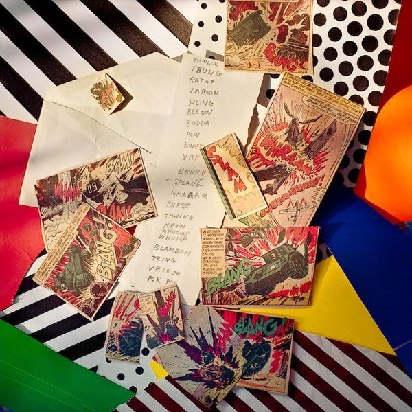
Laurie Lambrecht, Explosion, Slam, photo composition of Roy Lichtenstein’s Hand Written Word List and comic book clipping source material, made in the artist’s studio between 1990 and 1992. image via lensculture
Why did Roy Lichtenstein make word lists is not really my question. How did Roy Lichtenstein’s word lists end up in the list of his artworks catalogued by the Lichtenstein Foundation?
Both lists date from 1990. The first Handwritten Word List, feels like it fits right in. It appears to be a compilation, or a selection, of the onomatopoetic word graphics Lichtenstein famously adapted from comic books for his paintings. This list appears in at least two pictures taken between 1990 and 1992 by Laurie Lambrecht, a photographer who worked as an assistant to Lichtenstein in his studio. In the composition above, titled Explosion, Slam, it is surrounded by comics clippings. Her account of this time, inventorying Lichtenstein’s studio in preparation for his 1993 Guggenheim retrospective, mentions Polaroids, “bulging notebooks,” and a “scrapbook full of ‘Crying Girls,'” none of which apparently made the leap from archive to corpus that these lists did.
The second, Typed Word List, are all adjectives “of praise,” in an alphabetical order. Did he create it for a work? A series? A lecture? Would he consult the list when artist friends asked his opinion about their show? I mean, you could probably get away with it on the phone, but it could get awkward to use such a prompt in person. [“What’d you think?” (Pulls out list.) “Neato.”]
Or maybe he came up with the list after a heated conversation with Richard Serra, who was like, “You can’t have the verbs, Roy, they’re mine!” And Roy was like, “Fine!”
In any case, they’re both pretty beat up, well-used, and have no discernible aesthetic embellishment. I won’t say they’re not aesthetic, because they are what they are.
Download Better_Read_016_Roy_Lichtenstein_Word_Lists.mp3 [2:25, 1.3mb, greg.org]
Hand Written Word List, 1990 [imageduplicator.com]
Typed Word List, 1990 [imageduplicator.com]
Inside Roy Lichtenstein’s Studio, photos by Laurie Lambrecht [lensculture]
Podcast: Play in new window | Download
Subscribe: RSS