Actual Size Nude No. 3

duchamp_nude_descending_3_photo_pma.jpg
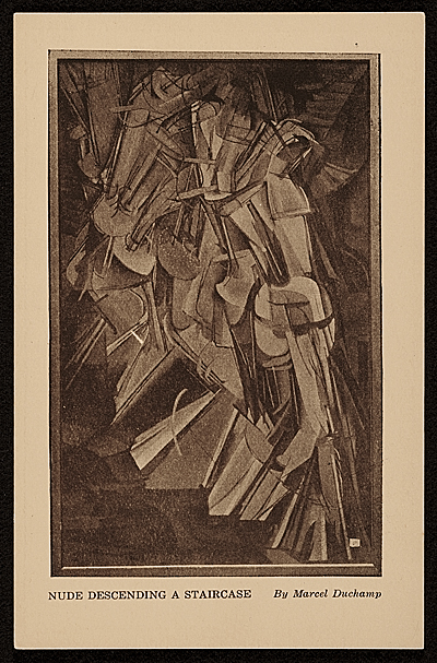
Nude Descending a Staircase (No. 3), 1916, 148.1 × 91.8 cm, image: philamuseum.org
I’ve been enjoying Elena Filipovic’s 2013 dissertation, whose title says it all: “The Apparently Marginal Activities of Marcel Duchamp.” [pdf via monoskop, obv]. So far it’s about photography, including a long look at the so-called Box of 1914 (1913-14), in which Duchamp made 1:1 photos of a selection of his handwritten notes. The photos were mounted and put into repurposed, reworked commercial boxes from photoplates, and distributed to friends. As Duchamp would describe it later, the Box was a work in itself which would operate as a guide alongside The Large Glass he was designing. Of 5+1AP, only 4 survive. The Pompidou has the best pictures of it.
duchamp_nude_descending_2_photo_pma.jpg
Nude Descending a Staircase (No. 2), 1912, 147 × 89.2 cm (close!), image: philamuseum.org
But Filipovic’s discussion of Duchamp’s early photo activities naturally includes one of my own favorite Duchamp pieces, Nude Descending a Staircase (No. 3), a full-scale photo copy of his most famous painting, which itself was inspired by the chronophotography of Etienne-Jules Marey, which he made for the Arensbergs in 1916. No. 3, that is, because, well, let’s let the Philadelphia Museum explain:

In 1916, Marcel Duchamp recreated his Nude Descending a Staircase (No. 2) for his patrons Louise and Walter Arensberg, who had coveted the notorious painting since seeing it at the Armory Show in New York three years earlier. Given that the original was now owned by a San Francisco art dealer who did not want to part with it, Duchamp had a commercial photography studio enlarge a postcard image of the work to match the proportions of the original canvas. The colossal photograph was then meticulously retouched by the artist in a wide variety of mediums, including pencil, ink, watercolor, and pastel, to replicate the crisply delineated forms of the original composition.

#Actually, as Filipovic points out, Duchamp did not have access to the painting, and he did “not at all attempt[…] to replicate the original painting’s color scheme.”

The fact is, what he created was a dubious hybrid, neither true painting nor unadulterated mechanical photography: the hand-colored photographic copy of a hand- painted canvas defied both mediums in one blow. The very originality of painting (in this case, Duchamp’s single most famous painting on canvas) is unsettled in the act of mechanically producing a photographic copy to take its place; yet, conversely, the mechanical reproducibility of photography, the medium’s single most defining feature, is revoked by turning the photograph into a unique, hand painted and–thus newly original–artifact. [p.65]

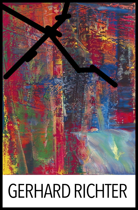
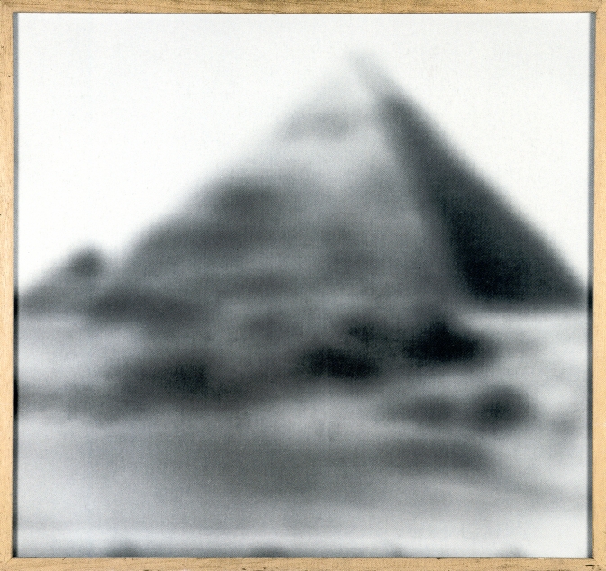
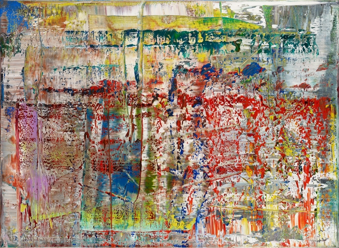
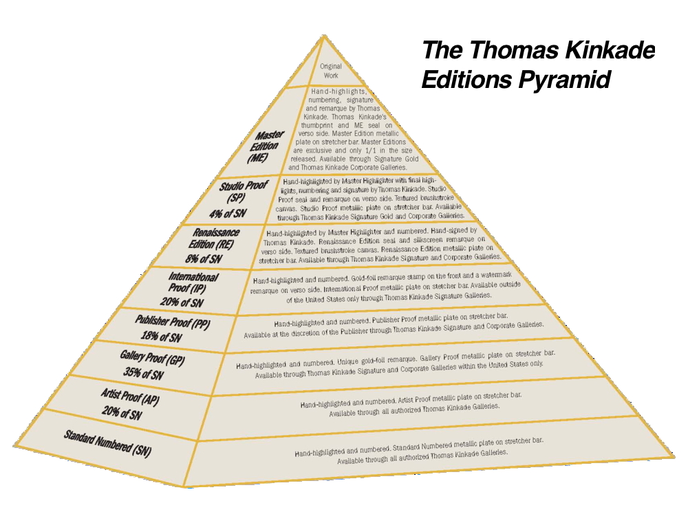
Even better, it’s a photo of postcard of a painting (inspired by photos). A Duchamp Editions Pyramid constructed several generations before Thomas Kinkade’s. Or Gerhard Richter’s. What else will the ever-shifting sands of Art History reveal?
duchamp_nude_postcard_armory_show_aaa.jpg
Postcard of Nude Descending A Staircase (No. 2), 14 x 9 cm, published for the 1913 Armory Show, image: aaa.si.edu
The Arensberg’s eventually acquired the original [sic] Nude Descending A Staircase (No. 2) in 1919, and installed both the painting and the overpainted photo in their living room. Then Duchamp showed them side by side in Walter Hopps’ 1963 Pasadena retrospective. Neither is on view at the moment in Philadelphia. Michael Bierke’s great-grandfather sent a copy of this postcard to his wife from the 1913 Armory Show, though-and Francis Naumann is doing his masterwork in the comments.

Actual Size

heizer_actual_size_munich_rotary_whitney_sm.jpg
Michael Heizer, Munich Rotary, 1970, transparencies and projectors, installed here at LACMA in 2012, but on view at the Whitney through Apr. 10, 2016
Michael Heizer talked about Munich Depression (1969) and Munich Rotary (1970) with Heiner Friedrich and the Whitney folks, and Interview Magazine is ON it.

HEIZER: I have a genius friend named Maris Ambats, whom I talked to about making a projector to project an image at the actual size. The deal was to let the camera be a translator between reality and a replicated reality, which means making the photograph as big as the thing itself. So here it is. It gets squeezed down through the camera, and then it’s blown back up to the same size.
…MANCUSI-UNGARO: And the first time you showed Munich Rotary was in 1971 in Detroit…
HEIZER: Sam Wagstaff [who was then the curator of contemporary art at the Detroit Institute of Arts] introduced photography to the modern-art market. He liked photography so much he wanted to show it in the grand hall in this classical museum. It’s a big, big classical building–it’s like the Louvre inside with huge rooms. He put my piece in this huge 200-foot room. It was really good, and it was intended to be a photographic offering, a photographic artwork. Wagstaff had the nerve to do that. The trustees wanted him to remove that sculpture of mine he exhibited, too, and he resigned because of it. But he had the nerve, and he believed in it. He was right. It’s become so insidious. Photography is everywhere now. Back then, it wasn’t an art-world technique. But, the thing is, you can’t separate the film derivation from the real thing. Munich Depression and Munich Rotary are different works of art, but they come from the real thing. So you can’t escape it.
DE SALVO: You can’t uncouple them.
HEIZER: No point in trying to.

This hits a lot of buttons for me, first because of what’s not really discussed: the full-scale photomurals of boulders Heizer showed alongside Munich Rotary at LACMA in 2012, in a show called “Actual Size.” [Actually, Munich Rotary is or has been called Actual Size: Munich Rotary, too.] This felt like a photo representational rebuke of MOCA’s 2012 Land Art show, which Heizer refused to participate in.
But it really all makes me rethink how photography operated in this era as both a mode of art production, and as a means of circulation. The difference between the image and what it depicts, photography’s built-in distortions of “the scale of the world,” as Sontag put it.
Thumbnail image for destroyed_richter_013_family_chopshop_install.jpg
Destroyed Richter Painting No. 013, 2016, installation shot
The double distortion by photography and the market is what drove me to make the Destroyed Richter Paintings. I want to experience the difference (or the similarities) between a photo of a painting (or a jpg of a 4×5 slide) and an actual size reproduction of that (image of that) painting. Some have size info attached, but at first all the Destroyed Richter Paintings dimensions were extrapolated from the painting in them, and the studio space they inhabited. While figuring this out, I definitely considered conceptualist folks like Joseph Kosuth or Mel Bochner when I looked back at these issues, but Heizer and his photos were unknown to me. I sure look at them now, though.
And apparently I need to look at Audubon, too, who insisted on illustrating his birds life-size, and letting the printing people just deal. William S. Smith discusses Audubon and Actual Size in Art in America, and looks at scale and representation as analogs for control:

Heizer’s actual-size photographs of Munich Depression establish control over the context in which they are viewed–a control he could never assert over the site on which it was made. Photographs of variable scale can be reprinted, republished, circulated and annotated in popular magazines. But the actual-size works have to be seen in person in a setting where the placement of the projectors can be tightly controlled. They are photographic oddities, resistant to reproduction and circulation. This resistance, too, comes at a cost, because it makes the work, conceived supposedly in innocence of “commercial and utilitarian concerns,” entirely dependent on institutions with the resources and space that Heizer requires.

heizer_actual_size_lacma_x-traonline.jpg
Huh, this installation view of Michael Heizer’s “Actual Size” show at LACMA in 2012 is really about the museum. Broad wins again. via x-traonline.org
This is not to just hitch my wagon to whatever 60s star is riding through town. I am actually in the middle of sending out photos of the Destroyed Richters, and unless it’s a flagrant installation shot, the works keep ending up looking like the photos. I find myself stuck in this same representational gap, in a hole, I have dug for myself. But at least I am not alone. While looking around for photos of Heizer’s “Actual Size” show, I realized they are really all about LACMA, and their giant pavilion. And though all those megaliths are presumably still where Heizer photographed them 46 years ago, the work that’s inextricably coupled with Munich Rotary, Munich Depression, created on an active suburban building site, was destroyed within months of its completion.
michael_heizer_munich_depression_perlach.jpg
Michael Heizer’s Munich Depression, May 1969, Perlach, Munich, Germany
Michael Heizer by Heiner Friedrich [interviewmagazine]
One to One [artinamericamagazine]

Untitled (Damaged Richter Poster), 2010-2016

cracked_richter_poster_hirshhorn.jpg
In 2010 the kid took a weekly studio class at the Hirshhorn with Dan Steinhilber. It was fantastic, but unfortunately, it was the last one the museum offered for non-teens. It was held in the education space in the sculpture garden, a space which could connect under the road to the museum, but for various logistical reasons, does not.
This incredible framed poster from Gerhard Richter’s 1987-8 exhibition was there. The painting in it, A B Dunkel, or Abstraktes Bild Dunkel (Dark), (CR: 613-2), 1986, is from what is considered Richter’s breakthrough year for squeegee painting. For me, though, it’s the gaffer’s tape that makes it special.
Now that I have declared it a work, I called the Hirshhorn. It is still there. There are no plans for it at this time. I called the museum shop, which has an endlessly interesting selection of books and exhibition catalogues for sale from the museum’s own library, but which does not, it turns out, have any 28-year-old Richter exhibition posters lying around.
It’s possible that it’s not even a product, but marketing material or signage; I couldn’t find another example of this poster mentioned online. So for now, it is ed. 1/1. Plus a study.
study_damaged_richter_poster.jpg

Superflex SUPERCOPY SUPERCOPY SUPERCOPY Silkscreen Kit

LandFoundation_Superflex_Supercopy_Screen_paddle8.jpg
Here is a silkscreen by the Danish collaborative SUPERFLEX that will enable you to print their SUPERCOPY logo on any and everything you like. So you can make SUPERCOPY merch and swag for yourself. Or so you can make SUPERCOPY brand awareness for them, it’s win-win.
And since it’s being sold to benefit Rirkrit’s The Land Foundation, I suppose it’s
WIN
WIN
WIN.
Superflex Supercopy /Logo, est $6,000, opening bid $3,000, ends Mar. 23, 2016 for The Land Foundation [paddle8 via rirkrit]
Previously, related:
Transactional Aesthetics, or the Highly Collectable Rirkrit Tiravanija
Superflex Haacke Tack
I copy, therefore I am Superflex
Faux Sol Mio: Superflex / Free Sol Lewitt
Shanzhai van Abbemuseum by Li Mu

Bloghdad.com/Torture

It’s the 13th anniversary of the invasion of Iraq. Former Pentagon interrogation contractor Eric Fair wrote a simple and wrenching essay in the New York Times about trying to regain his humanity after torturing Iraqis for the US government.

If I had the opportunity to speak to other interrogators and intelligence professionals, I would warn them about men like Donald Trump and Ted Cruz. I would warn them that they’ll be told to cross lines by men who would never be asked to do it themselves, and they’ll cross those lines long before they consider anything like waterboarding. And I would warn them that once they do cross the line, those men will not be there to help them find their way back.

We owe it to conscientious Americans like Fair to make sure this doesn’t happen again. Not torture, not a bullshit war ginned up out of lies and garbage, none of it.
Owning Up To Torture [nyt]

On Listening To Phyllida Barlow

Now that I’m on the other side of it, I’m kind of amazed at how much the ideas that led me to Chop Shop resonated with the discussion Phyllida Barlow had at the Nasher Sculpture Center with Tyler Green. The live conversation was on MANPodcast in July 2015.
phyllida_barlow_nasher_2015.jpg
Phyllida Barlow, tryst, 2015, installation at Nasher Sculpture Center, Dallas [image: manpodcast.com]
I was listening to it again tonight on the way home and pulled some highlights: like this idea of fragments:

It always seems to me extraordinary that our lineage of Western art is dependent on broken fragments of things for which we have no proper-I mean, we look at torsos that don’t have limbs, that come from Hellenic times…and they’re iconic. ‘This is great.’ and Western art runs out of that greatness. And there doesn’t seem to be an issue that the arms are missing, or the legs are missing.
So the fragment and the half-finished has for everybody-it does for me-a certain beauty. it’s sublime. [9m00s]

This notion of the fate of art:

Really a question that emerged very early on, which is, ‘Where does art end up?’…Do you, as in my case, enjoy it, or as I was doing in the 80s and 90s and just putting it on the roof of our car, and taking it somewhere and just putting it on the street corner? And abandoning these things, and finally, after a few years of doing that, one night at 3 o’clock in the morning, I took them all to Blackfriars Bridge and chucked them in the Thames. [Laughing] Such is the way of artists, you know. It was one of the most liberating things I’d done. [13m15s]

Barlow talks about touch, and how the anticipation of touch is more powerful than touch itself:

I think this issue of touch is, for me, problematic. I think touch is a language, a non-verbal language, and how you imagine touching something seems to me to be more important than actually reaching out and touching it, where the minute you’ve touched it, the mystery, or the imaginative process, gets solved. You know, that’s closure on it.
I think there are…numerous art objects where there is a longing to touch, or an interest in what this thing is. But I think that it’s up to us to work out, what we then imagine what this might be? Is it hot or cold? There are artists who very much play that; Pierre Huyghe made a sculpture that is very much hot when you touch it. I think that’s a sort of fascinating game. I found that work, for me, you know, the minute you’d done that action, I didn’t know quite what else there was to discover about it. [51m00]

Just now I listened to this and the action I thought of was cutting the Barnett Newman painting and the Gursky Rhine. The thought of cutting, and the process of composition, the decisionmaking, the weighing, these all feel vital, and different from the actual chops.
chop_shop_newman_no_2_install.jpg
Chop Shop Newman Painting No. 1 [destroyed] and No. 2, both 2016
That experience is reserved for whoever buys it; by design it is not the same experience as the regular viewer. Taking Barlow’s perspective on touch would mean that considering the potential is more interesting. But I think what actually happens is that the decision to cut, crop, compose and define shifts a collector away from just seeing and toward creating. From the audience to the artist.

Imi Knoebel’s Sternenhimmel (Starry Sky)

imi_knoebel_sternenhimmel_-_fur_lola_christies.jpg
I don’t know much about Imi Knoebel’s Sternenhimmel photos, except they look awesome. And by awesome, I mean, like the gridded slice of sky seen captured by the Palomar Observatory Sky Survey photos I installed at apexart a couple of years ago.
exhib_spc_pano_poss1.jpg
Sternenhimmel is actually Sternenhimmel – für Lola, a portfolio of 54 prints, each 40x30cm, that Knoebel apparently shot in 1970, but only produced as an edition in 2006. He has a granddaughter named Lola who looks to be about that age, so maybe that’s why.
This is ed. 1/7, plus 2APs, and this is the second time it’s come up for sale at Christie’s. I’d like to think his 8yo granddaughter is not hard up for the £12-18,000 they didn’t sell for in 2014 or the £7-10,000 they’re estimated at now. But maybe she got an AP.
Not much is online about Sternenhimmel, except Joerg Heiser’s discussion of seriality and Knoebel’s 1975 Kunsthalle Düsseldorf exhibition:

The conceptual focus of the pictures of stars, which were brought together into one large picture in the exhibition, is that one star was added to each photo, but this information is not supplied in the catalog. The star motif makes the refusal to communicate sexy; it does not reflect obtuse mental sloth, but is mysteriously seductive due to the cosmic, unending series of stars. It is minimal techno, so to speak, long before it existed, digital in the analog age. Black and white as 0 and 1.

imi_knoebel_projections_christies.jpg
Imi Knoebel, Projections, 1974, 28 photos, ed. 2/9, image: christies
Knoebel was making a series of 250,000 line drawings (Linienbilder) and photos documenting the flashing patterns of lights in a closed room (Innenprojektionen, above), so maybe taking a picture of every star was just one more grand project doomed to futility. (Not to get too On Kawara about it, but if he kept it up, he probably could’ve finished the drawings by now. 250,000 drawings in 50 years is only like a dozen a day.)
14 Apr 2016, lot 168, Imi Knoebel, Sternenhimmel – für Lola, 1970/2006, est. £7-10,000 [christies]
Seriality and Color in Knoebel’s Work [db-artmag.de]

Grids

richter_cage_grid_i_complete_17296.jpg
Gerhard Richter, Cage Grid I (Complete Set), 2011, 16 giclee prints on aluminum, each 75x75cm, a 1:1 reproduction of Cage 6, [CR: 897-6], 2006., ed 16+4AP [image: gerhard-richter.com], cf. the Photo Copy; Facsimile Objects
destroyed_richter_grid_004_chopshop_install_dk.jpg
greg.org, Destroyed Richter Grid 004, 2016, 12 UV prints on aluminum, each 50x53cm, ed. 1/1, each panel ed. 1/1, a 1:1 reproduction of Abstraktes Bild [CR:909-6], 2009, which was destroyed, installed next to the gloomy corner at Chop Shop, March 2016.

‘Funerary Portraits For Paintings’

coptic_funerary_portrait_metmuseum.jpg
Portrait of a young woman with a gilded wreath, c. AD 120-140, encaustic, wood, gold leaf, metmuseum.org
Someone just emailed me after seeing the show at SPRING/BREAK and called the Destroyed Richters “funerary portraits for paintings,” and right now I’m just trying to breathe through it.
destroyed_richter_013_family_chopshop_install.jpg
Destroyed Richter Painting No. 013, 2016, oil on canvas, installed at Chop Shop

Chop Shop At SPRING/BREAK 2016, Curated By Magda Sawon

chop_shop_spring_break_install_6.jpg
Chop Shop installation shot at SPRING/BREAK 2016, in the vault on the 3rd floor of Moynihan Station, image: Tamas Banovich
I am psyched to announce “Chop Shop”, a show of my work at SPRING/BREAK 2016. SPRING/BREAK’s keyword this year is ⌘COPY⌘PASTE, which is probably what gave Magda Sawon the idea to approach me about a project. “Chop Shop” coalesced around several subjects and series that have appeared recently on greg.org: creative destruction; authenticity; artist’s agency; a critique of collectors, the market, and the networks art traverses; and the interactions between our digital, cognitive, and physical experiences.
In just the last few weeks, the show grew more ambitious and felt like the whole thing might just veer off the rails, but thanks to Magda and her people, the flexible and gracious organizers of SPRING/BREAK, and the expert assistance of some brave painters and printers, it all came together. And it looks absolutely mindbogglingly great, almost exactly the uncanny combination of spectacle, aura, and outrageous WTF? that I’d imagined. And to top it all off, it’s installed inside A GIANT, FREAKING VAULT.
chop_shop_spring_break_install_3.jpg
Chop Shop installation shot with Destroyed Richter Grid No. 4, Destroyed Richter Painting No. 8, Shanzhai Gursky Grid No. 1, and Destroyed Richter Paintings Nos. 12 & 11, image: Tamas Banovich

Every work in “Chop Shop” is something I’ve been imagining or visualizing for months, or sometimes even years, but which I had not experienced in person, until now. And this process of conceptualizing something, and then actually realizing it, and then experiencing it, is intensely satisfying to me. I look at tons and tons of art, not only online, but in person, too. And the differences between these experiences and the impressions they leave feel important. So it’s not just a nicety when I say I hope you will be able to see “Chop Shop” in person. [It runs from Tuesday March 1 through March 7.]
“Chop Shop’s” images are appropriated from the old masters, but its processes are lifted from collectors, dealers, and museum shopkeepers. The artwork on view has either already been destroyed, and brought back to life, or it’s about to be chopped up to order, or broken up and parted out.
The show includes: new Destroyed Richter Paintings, which are full-scale resurrections of Gerhard Richter paintings that now exist only in archival negatives or jpgs. Some are of paintings the artist destroyed himself (after photographing them, obv), and some are of paintings that have been destroyed in the wild. In a nod to Richter’s own practice of transforming his paintings into photos, prints, or other media, some of the Destroyed Richter Paintings in “Chop Shop” are printed on aluminum panels. They are literally dazzling.

destroyed_richter_grid_1_chopshop_install.jpg
Destroyed Richter Grid No. 1 A-L, 2016, UV pigment on aluminum, 50x60cm each, unique, image: Tamas Banovich

In another nod-or maybe it’s a critique wrapped up in an homage, it’s really too early to say-to Richter’s own destructive predilections, the Destroyed Richter Grid works transform [the jpg of] a lost squeegee painting into a set of prints on aluminum, which will be sold separately and scattered. Unlike Richter’s Facsimile Objects, which are produced in bulk, these grid pieces are each a lone, unique work, part of a whole that will only be visible together during the show. So Richter’s lost works stay lost, unless or until an enterprising curator in the future tracks all these panels down and reassembles them. And even then, what do we have, but a reconstituted jpg? We go to exhibition with the art we have, I guess.

shanzhai_gursky_005_chopshop_install.jpg
Shanzhai Gursky No. 005, 2016, C-print, 185x303cm, will be destroyed in the production of Shanzhai Gursky Nos. 006 – whatever, 185cm x whatever, at Chop Shop

Shanzhai Gursky Grids are related to the Shanzhai Gursky series, which are produced full-scale from whatever the highest-resolution versions of Andreas Gursky’s images are available at the time. Except in this case, these new works, made for “Chop Shop,” will be themselves chopped and destroyed, with the fragments each constituting a new, unique work. Some are pre-chopped for your convenience, but others will be chopped to order, then properly mounted and framed for posterity. But the sight of these Gursky-looking works hanging, raw and exposed, naked, is just awesome. What a world, they make me think. What. a. world.

gregallen_study_for_chop_shop_newman_2-6_small.jpg
Study for Chop Shop Newman No. 1 and Nos. 2-6, 2015, jpg, but oh it’s real now, baby

Which brings us to the centerpiece of the show, Chop Shop Newman Painting No. 1, a full-scale repetition of Barnett Newman’s Voice of Fire (1967). It is literally awe-inducing, at least for me, and not just because I made it. [With conservation and materials research by the National Gallery of Canada, sage advice from David Diao, and the painterly talents of Tamas Banovich and Kyle Nielsen.] Newman made the 18-ft tall Voice of Fire to order for the 27-story geodesic sphere of the Expo67 US Pavilion. Chop Shop Newman No. 1 will be cut down into Chop Shop Newman Nos. 2 – ?? during the fair, with dimensions and compositions determined by the connoisseur collectors on a first-come, first-served basis. While supplies last.

There are so many variables and unknowns, and it’s crazy/fascinating ceding the fate of so much work to the hands of collectors-or to their indifference, if no one ends up caring, or engaging, or liking the stuff enough to take it home, which I suppose could happen. But it’s also immensely satisfying the way this show has me thinking through the systems of art, our expectations for it, and how we experience and value the world around us. So there’s that.

Destroyed Richter Grid 003 A-D, 2016, UV pigment on aluminum, ed 1/1, also DRG-005, the whole thing, Chop Shop installation
Destroyed Richter Grid 004 A-L, 2016, UV pigment on aluminum, ed. 1/1, also DRG-006, the whole thing, installed at Chop Shop, Spring/Break

Press release: Magdalena Sawon presents Chop Shop by GREG ALLEN at SPRING/BREAK Art Show, March 1 – 7, 2016 [postmastersart]
SPRING/BREAK Art Show 2016, ⌘COPY⌘PASTE [springbreakartshow]
So slick, you can buy “Chop Shop” works directly online until April 30th! [springbreakartfair]
Who’s Afraid of Red & Blue? About Chop Shop Newman Painting No. 1 et al.
the original blog post, At Home with Voice of Fire
Previously, related: on Reassembling chopped up masterpieces after 500 years
on the still-hypothetical proposition that there is a non-traumatic way to chop up a Barnett Newman
On museums showing reproductions and being like, oh nbd
It was. the. jutes. Stefan Simchowitz just cold chopping up Ibrahim Mahama’s jute sack installations

UPDATE: Reviews
“The outcome is a painterly concatenation of destructive and creative forces, capital’s relentless churn made both gestural and material.” [mostafa heddaya for artinfo]
“They look modest and a little scared. (Rightfully so: “Voice of Fire” (sic) lost its first chunk to an X-Acto knife on opening night.)” [jillian steinhauer for hyperallergic]
“Allen made an absurdist gesture by offering up fragments of copied masterworks of contemporary art for sale by the square foot, like pizza.” [chris green for afc]

[!!]

Who’s Afraid Of Red & Blue?

sandback_install_df_monclova.jpg
Fred Sandback installation at Proyectos Monclova, DF, via @monclova
It’s like how when you learn a word you start hearing it everywhere.
sandback_DF_moffit_frieze.jpg
Fred Sandback installation at Monclova via Evan Moffitt for @frieze
I’ve been soaking in a lot of red and blue lately.
gucci_s-s17_redblue_ann_caruso.jpg
Gucci S/S17, image via ann_caruso’s ig
webdriver_torso_screenshot.jpg
Webdriver Torso as found painting system, via
What to do with it? Turn over the decisionmaking to found or chance operations?

Webdriver Torso as found logo system, via
Appropriate? Outsource? Abrogate? Collaborate? Engage? Every strategy has its own context. Or rather, the context is mutable (too).
Thumbnail image for expo67_ masey.jpg
Barnett Newman’s Voice of Fire installed in the space it was created for, the US Pavilion at Expo67 in Montreal, image via jack masey’s book
I made a repetition of Barnett Newman’s Voice of Fire recently, with the help of some excellent painters. It’s 18 feet high and 8 feet wide. For now.
sorcerers_apprentice_axe.jpg
Sorcerer’s Apprentice, Fantasia, 1940
At Chop Shop at SPRING/BREAK, collectors will reconfigure Newman’s red and blues to suit their own compositional and spatial needs. The results might be Newmanesque, or they might be something totally different.
gregallen_study_for_chop_shop_newman_2-6_small.jpg
Study for Chop Shop Newman, 2016
I was psyched to write about it, but now I’m kind of unnerved to see what people will actually do. What if they chop up the whole thing and cart it home? In big pieces or small ones? A lot or a little? What if they do nothing? Alan Solomon called Voice of Fire “virtually unsalable.” We shall see, but I think I have solved that problem.

Gerhard Richter Facsimile Objects

richter_pyramid_rottloff_cr-9.jpg
The Gerhard Richter edition Pyramid, 1966, 92 x 98 cm, image: gerhard-richter.com

In 1966, Gerhard Richter made a small edition titled Pyramid, for a multiples group show in Karlsruhe. Pyramid is a photo printed on treated canvas of a 1964 painting, Small Pyramid, which is itself based on an offset photograph illustrating an encyclopedia entry. In addition to variations in mounting and frames, Richter made each of the 13 prints (ed. 10+3 proofs) unique by altering the exposure time.

richter_cage_grid_i_complete_17296.jpg
Cage Grid I, complete

Richter’s made a lot of photo versions of his paintings, but I think this was the only time Richter used photo-on-canvas, and it came to mind a couple of years ago when I was looking at Cage Grid, the only first time Richter used giclée prints.

Those Cage Grids were made for sale at/by Tate Modern during the retrospective, sort of a giant benefit edition. It’s a situation artists know well, where the museums and arts institutions who show them ask them to donate works to auction or fund a show. [The corollary is dealers being hit up to fund exhibitions, or the production of new work, which then turns the museum, or the biennale pavilion, into a showroom.]

Anyway, for an extremely successful artist like Richter, the willingness to support the many public exhibitions of his work is probably only surpassed by the eagerness of museums to get in on some of that Richter swag. Fulfilling every request for auction donations or benefit editions could probably consume the artist’s entire practice, becoming a distortion or distraction. And so a compartmentalized, systematic approach was needed.
Enter the “facsimile object.”

abstraktes_bild_p1_g-r_20259.jpg
P1 “Abstraktes Bild”, 2014 “A Diasec mounted chromogenic print of: Abstraktes Bild, [1990,] Catalogue Raisonné 724-4″, image: gerhard-richter.com”

Facsimile object is Richter’s term for photographic reproductions of Richter’s paintings, produced “under Richter’s direction and approval,” in large, numbered but unsigned editions, which are sold through museum shops to support an exhibition. Since 2014, 13 facsimile objects have been created, all mounted on aluminum, and all but one in editions of 500. That’s more than 6,000 objects. They all sold out almost immediately at prices from EUR1,000-1,500. Whatever their status as art, facsimile objects turn out to be a highly efficient mechanism for crowdfunding Richter exhibitions.

Richter’s facsimile objects are created by a company called HENI Productions, which was founded by Joe Hage, a lawyer, collector, and Richter confidante. Hage was the force behind the artist’s website; he bought half of September; and he produced Cage Grid I. If he’s not the COO of Richter Gmbh, he’s at least in charge of biz dev.

gr_haggadah_895-10_rel_p2.jpg
P2 “Haggadah”, 2014, a 100cm print of a 152cm painting, image: gerhard-richter.com

As actual, signed editions, Cage Grids were a proof of concept; the first batch of official facsimile objects came and went without my noticing. P1 “Abstraktes Bild” , P2 “Haggadah” , and Bouquet (P3) were produced for sale at the Fondation Beyeler’s Pictures/Series show. I did pay attention when a P1 came through Sotheby’s a couple of months later with a £4-6,000 estimate. Because it sold for £41,250.

The first two Beyeler facsimile object subjects are significant in their own right. Richter used CR 724-4 as the basis for generating his Strip Series, and to produce a set of tapestries. Haggadah, CR 895-10, is a much-shown, much-reproduced 2006 squeegee painting that appears on the frontispiece of Tate’s Panorama catalogue, and in an atypically large set of detail photos on the artist’s website.

Gerhard_Richter_P10_2.jpg
P10 “Bagdad”, 2015, image: serpentine galleries

From there things get merch-y pretty quick. P3 is a 1:1 facsimile of Bouquet (2009), a small, blurred painting of flowers that’s been overpainted with a squeegee. P4 – P7 are slightly enlarged pictures of the enamel-on-glass Flow series.

P8 – P11, meanwhile, were pictures of more enamel-on-glass for The Serpentine, which sold them all out at £1,500/each, thanks in no small part to vigorous flipping of P1 – P3, and the entrance of seasoned Banksy, Hirst, and Murakami print investors into the market. I think we’ve found the level of the room.

Despite the best laid terms & conditions of The Serpentine’s shop [pdf], all of these facsimile objects are being flipped constantly, in every contemporary auction, and on every online art sales platform. They’re the Richter plastic microbeads in the secondary market ocean. In almost every case, they’re presented as artworks, editions, and the description is entirely of the work depicted. For most art functions, especially shopping, these objects do indeed operate as perfect facsimiles.

And that fascinates me.

I was kind of obsessed with Richter’s facsimile objects last year. I was parsing the relationships between the object and its subject, the information around it, and its viewers, and ultimately, between the object and the artist. Whoever that might be. And then I put them aside, only to find, now, that they got even more interesting. Facsimile objects now have their own category on Richter’s website: Prints. The website text is slightly different than the object labels: “A Diasec mounted chromogenic print of: Abstraktes Bild” vs “A facsimile object of: / Gerhard Richter/ Abstraktes Bild,” for example.

These are not just facsimiles of Richter; they are by him as well.

richter_p12_annunciation_after_titian_125x200_20270.jpg
P12 “Annunciation after Titian”, 2015, 125 x 200 cm facsimile object, image: gerhard-richter.com

The next objects seem to bear out the artist’s interest in exploring the nature of the gift shop souvenir. P12 “Annunciation after Titian” is a full-scale facsimile object of the iconic blur painting which Richter made after a postcard he picked up in Venice. [This Annunciation, now at the Hirshhorn, was reunited with the artist’s other four Annunciation paintings for the first time since 1973 in the Fondation Beyeler show.] Though they’re still unsigned, these 125x200cm objects number only 50, “+ 3 A.P.”, whatever that means in this context.

Which brings me back to the pyramid. The Thomas Kinkade Editions Pyramid, devised by the late artist’s company to explain the auratic and financial calculations of the various facsimile objects on offer. Because I think it’s time someone make one for Richter.

kinkade_editions_pyramid_blank.jpg
Huh, this adds up to 105%.

Richter told an interviewer at the time he made the Annunciations, “I wanted to trace him as precisely as possible, maybe because I wanted to own such a beautiful Titian…[laughs]” Exact replicas to sate the thirst for an otherwise unobtainable masterpiece? It turns out he’s been making facsimile objects all along.

[2020 Update: a facsimile edition of Abstraktes Bild (P1) (no. 325/500(!)) estimated to sell during the pandemic for $20-30k just sold for $60,000. And a smaller, duskier (P2) sold for $62,500. What is even happening.]

David Diao, Barnett Newman: The Cut Up Painting, 2014

david_diao_barnett_newman_the_cut-up_painting.jpg
David Diao, Barnett Newman: The Cut Up Painting, 2014, 153x127cm, image: office baroque
I’ve known about David Diao’s productive engagement with the work of Barnett Newman for a while, but I was still pretty blown away to get the announcement in my inbox this morning for his show, Ref: Barnett Newman, at Office Baroque in Brussels.
Because holy smokes, he has The Cut-Up Painting. Sort of.
The story has been around for a while, but rather vague, about how Barney had instructed his wife Annalee to cut up a certain painting. It was finished, but he felt it wasn’t working. She hadn’t cut it up before the artist died suddenly of a heart attack in 1970, but she wrestled with it, and decided to fulfill his wishes. So she chopped it up.
And that night, the story goes, she had a dream, and Barney appeared and told her she was cutting him up. And she woke the next morning, distraught, and gathered all the pieces together, and had them reassembled and lined on a new canvas.
The result was what you’d expect, a Frankennewman, and the painting, or object, whatever it had become, was never shown. [Rumors circulated that someone else altogether, another painter, had destroyed, not an unfinished or rejected work, but an actual Newman. This kind of thing happens when a work is absent, invisible, missing.]
The first time I’d heard of The Cut-Up Painting discussed publicly was in a 2008 symposium at the Getty Conservation Institute. Carol Mancusi-Ungaro described the story as Annalee told it to her. It’s wild and unsettling, with a twist, when Mancusi-Ungaro says Newman had confided in her “because I’m a conservator, and because I’m a woman, and I could identify with this feeling, perhaps.” [The Getty put it on YouTube in 2012.]
The Cut-Up Painting was not included in the Menil’s show of late Barnett Newman last year, even though it did include the unfinished paintings Annalee gave the Menil for study & conservation. Sarah Rich did discuss it, though, in an essay in the show’s excellent exhibition catalogue, which also includes texts and research by Michelle White and Brad Eply:

When she first undid this unfinished work, she [Annalee] was following orders, though her dream suggests she also understood the cutting to be a violation. When she had the painting put back together, her act of preservation was also a transgression. Annalee Newman thus uncovered, in her own way, the means by which a painting might host the contours of ethical deliberation (a subject essential to Newman’s own artistic praxis). With those cuts and their stitching, with the deliberations she conducted, deferred, acted upon, and regretted, Annalee Newman performed an experience in which duty becomes consubstantial with defiance.

And now here it is, in some form, at least. David Diao has made a painting of Newman’s Cut Up Painting, and it looks pretty close to the image Mancusi-Ungaro showed briefly at the Getty, so it’s not just an imagining. I am fascinated to see it. Now to figure out how to get to Brussels.
Ref: Barnett Newman opens 27 Feb. and runs through 6 Apr 2016 at Office Baroque [officebaroque.com]
Office Baroque is also showing earlier works by Diao at The Independent NYC during Armory Week, so there’s one I won’t miss.

Fools, Gluttony & Lust, Together At Last

bosch_ship_of_fools_gluttony_lust_united.jpg
top: Ship of Fools;
center: pixels about the width of a 19th century saw blade;
bottom: Allegory of Gluttony and Lust

The Noordbrabants Museum has organized an epic show of Hieronymous Bosch that reunites 17 of the artist’s 24 known works. The exact number is in flux, though, because of deattributions [touchy!] and reattributions associated with the show’s years-long research phase. Also, it’s not clear whether this counts as one work or two:

The Noordbrabants show also unites dismembered works. These include The Ship of Fools (Louvre, Paris) and the Allegory of Gluttony and Lust (Yale University Art Gallery) of 1500-10, which were probably sawn in two in the early 19th century. For the first time they are being displayed together, unframed and truly reunited.

Maybe it’s the Renaissance altarpiece student-turned-MBA in me, but I just love this.
These are only two of four known pieces of what is believed to be Bosch’s original work. Fools, Gluttony and Lust are the inner left panel of a folding triptych; the inner right panel is now known as Death and the Miser and is in the National Gallery in DC. The central panel, which presumably showed Pride, Envy, Lust, Anger, and Sloth, is missing.
The NGA’s research says their panel was cut to veneer width and laminated onto another piece of wood around 1900. Why? Because there was a painting on the back, too. A large round panel called The Wayfarer is now in the Museum Boijmans Van Beuningen. None of these panels are big; the wings are 13 inches wide, and the rondel is 28-inches across, so it’s not like they wouldn’t fit the house or the frame. No, it was strictly business.
Interestingly, another work in the show, with a similar wayfarer, Haywain Triptych, was brought to Spain in the 16th century, broken up and parted out in 1848, and eventually reunited at the Prado in 1914. A copy was made for the king.
Prado pulls two works from landmark Bosch exhibition [theartnewspaper]
Previously, related: On Manet’s The Execution of Maximilian, which got cut up, and was reassembled by Degas
Oh, I guess that means this is related, too: A Domestic Proposal: At home with Voice of Fire