
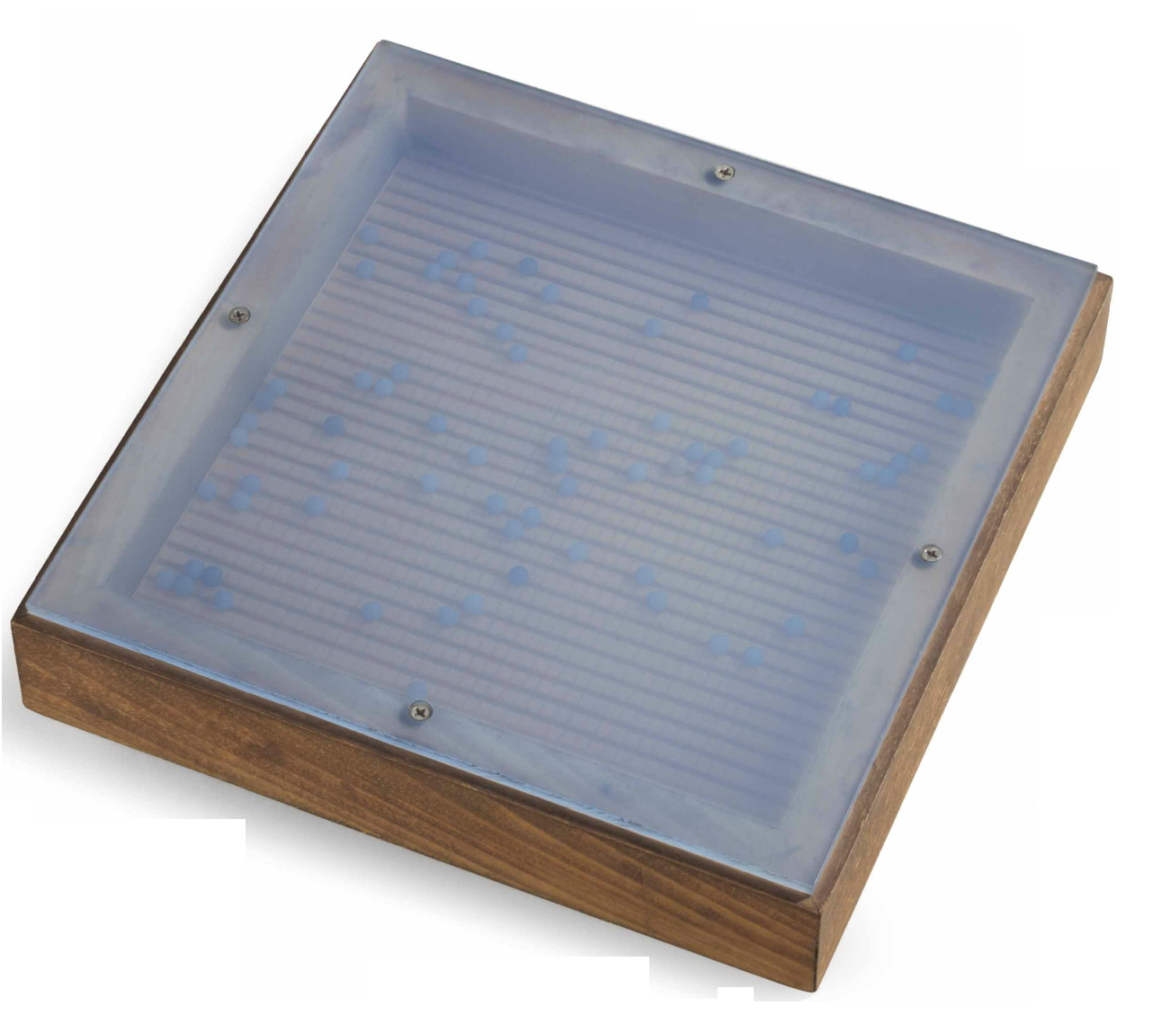
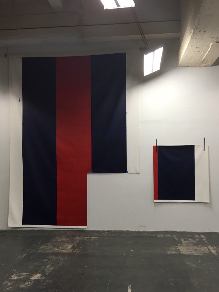
Agnes Martin, The Wave, 1963, being sold at Christie’s next week
I am unexpectedly interested in Agnes Martin’s toy/sculpture/object, The Wave, which is coming to auction next week at Christie’s. The Wave is one of five such objects, a small (11×11 inch) shadowbox with tinted plexiglass, in which dozens of blue beads roll across a grid incised in the wooden base, making a roiling sound of the title. The first was created for a Christmas 1963 group show organized by Jock Truman at the Betty Parsons Gallery. It was listed for $300.
This example has Robert Elkon in the provenance, which suggests it was purchased, not in the Toys show, but later. The late owner Daniel Dietrich II also bought some Martin paintings from Elkon, her dealer at this foundational moment in her career.
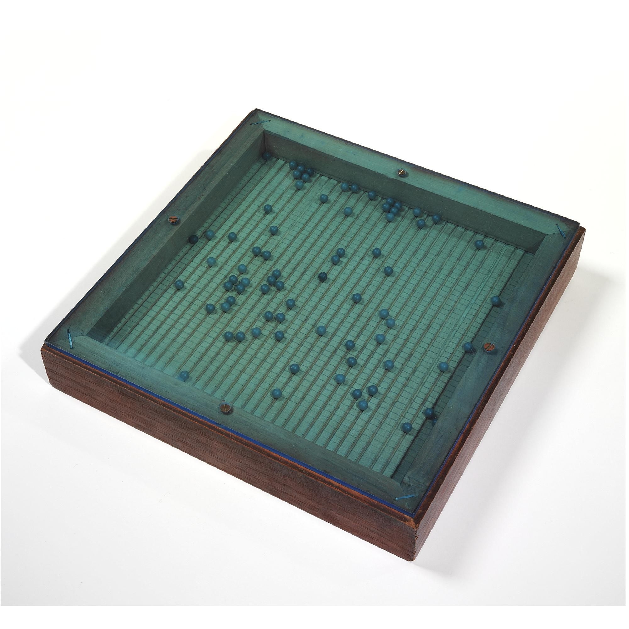
Robert Elkon’s Agnes Martin The Wave, which his family sold at Sotheby’s in 2007.
Other examples of The Wave went to Elkon himself, Parsons herself, and Lenore Tawney, which leaves just one unaccounted for. But that tight grouping makes them very much a friends & family-type object.
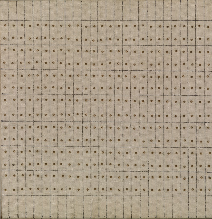
Agnes Martin, Little Sister, 1962, oil, ink, brass nails on canvas over wood, around 10×10 in.
At first it felt like a novelty, and the novelty show it was created for didn’t help. But sitting with it (in my tabs, at least), The Wave feels a lot closer to Martin’s work than I thought, especially her work in 1962-3. She had found her 72×72-inch format by then, but she was also still producing small paintings, too, 12×12-inch grids of pencil on canvas. A couple of them also use brass nail heads as dots among her dashes. The Guggenheim has one of these works from 1962 called Little Sister [above].
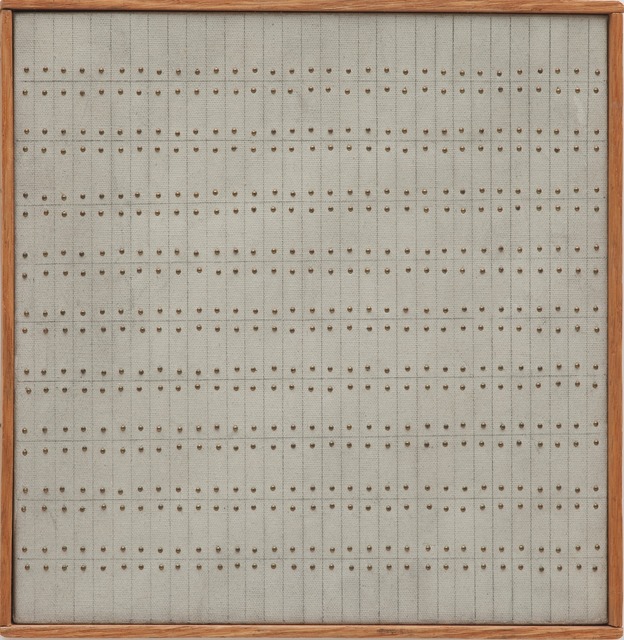
Another similar 1962 work, Untitled, 12x12in., at the Museum of Contemporary Art San Diego, is shown on Artsy with the slat frame. The San Diego connection is interesting but probably irrelevant, at least from Martin’s perspective, but not mine. I am sure that seeing Robert Irwin’s handheld paintings from the late 1950s at the Hirshhorn led me to notice The Wave which I don’t remember seeing in either Whitney 1992 or 2015. [Is there really one in the Tate/LACMA show? Or is it just in the catalogue?]
Anyway, the premise of The Wave as a plaything made for a show for kids belies the respect Martin had for children, who she regularly praised for their openness to inspiration. Inspiration was the constant goal of Martin’s artmaking, and the experience she sought to facilitate through her work, and intellect and the chaos of the world were the constant obstacles. Without any evidence beyond her friend and dealer Arne Glimcher’s recollection that she “meditated daily,” I can now totally picture Martin in her studio, rolling The Wave back and forth in her hands until she felt ready to lose herself in painting.
The ocean is deathless
The island rise and die
Quietly come, quietly go
A silent swaying breath
I wish the idea of time would drain
out of my cells and leave me
quiet even on this shore.
May 10, 2016, Lot 26 B, The Wave, 1963, est. $400,00 – 600,00 [christies.com]
The Archives of American Art has digitized most of the Parsons Gallery’s records about “Toys By Artists” [aaa.si.edu]
[note: That last quote is usually attributed to Martin, and she did include it in a note she sent to Glimcher. But at least one source attributed it to the critic Jill Johnston. Johnston was a friend of Martin in NY in the 60s; both were gay, also schizophrenic, which is not necessarily where I thought to end this post.]
A Sh*tload Of Gold
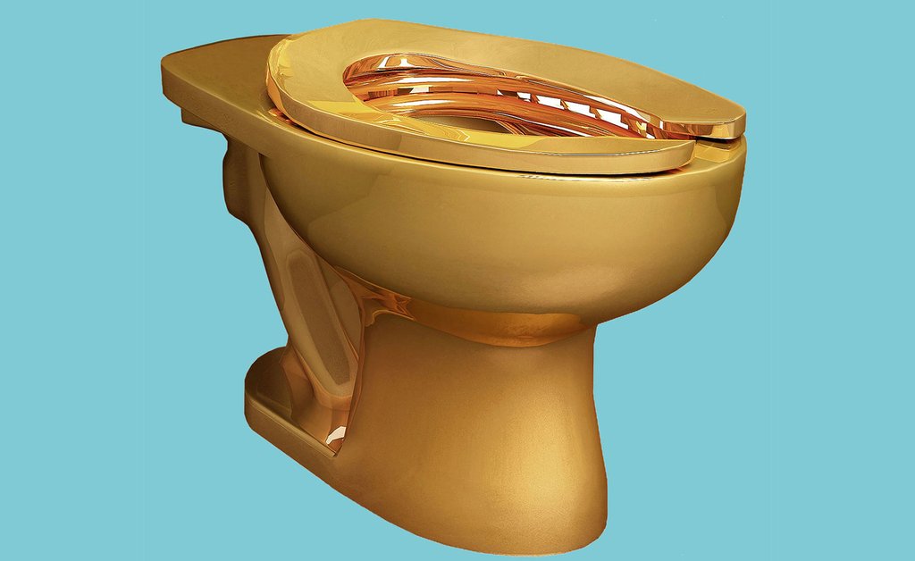
Maurizio Cattelan is installing an 18k gold toilet in a restroom at the Guggenheim. How much gold is that?
The rendering appears to show a standard Kohler toilet, but in solid gold. According to Amazon, that toilet, with a seat, weighs 62 pounds, around 28kg. At around $40,000/kg, that prices out to around a million dollars right now. [When Chris Burden tried to show a stack of 100 1-kg gold bars at Gagosian in LA in 2009, it cost around $3 million, $30k/kg. But their gold dealer Allen Stanford got arrested for multi-billion-dollar fraud before he could deliver. I don’t know how that ended up, but there are worse economic fates than being stuck holding gold for a few months at the beginning of 2009.]
Anyway, the thing is, porcelain and gold have different densities. Porcelain is 2.5g/cm^3, and gold is 19.29g/cm^3. So if the entire volume of porcelain in a porcelain toilet is swapped out with gold, that thing is not going to weigh 28kg, but nearly 8x more, say 210kg, which is like $8.2 million. The seat alone will weigh like 12kg, so be careful lifting it-and putting it down.
Now anyone knows you don’t need that much solid gold to make a solid toilet, though. A stainless steel toilet weighs around 20kg, and steel has a density of 7.82 g/cm^3, so an identically made gold toilet would require just 50kg of gold, around $2 million.
Let’s see how this all goes down.
[2023 update: Well if you’re reading this blog post, you probably have some idea how the last seven years have gone down, so I’ll just get to the correction/update. According to police reports in The Sun (UK) about the ongoing investigation of the theft of Cattelan’s toilet from Blenheim Palace in 2019, the toilet weighed “14 stone,” which is 89kg. 50kg would have been just 8 stone. greg.org regrets, among so, so many things, the error.]
Berghain Sticker Fun #Monochromes
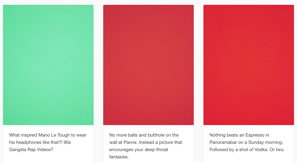
Photography is prohibited inside the giant Berlin dance club Berghain. Security puts a sticker over your phonecam lens, and anyone caught sneaking pictures is booted and blacklisted. So Berghain Sticker Fun is a tumblr of purported photos of those stickers. They’re just monochromes, with captions of whatever the camera was supposedly pointing at.
It’s all very cute, and a fun way to infer content and transgressiveness onto a monochrome. I’ve tried to replicate the effect, but either my phone’s not awesome enough to shoot through an opaque sticker, or Berghain has some kind of amazing sticker technology that those of us on the outside will never know. Oh well!
Berghain Sticker Fun [tumblr via vice, thx @MichelleLHOOQ]
Say You’re In If You’re In

Wolfgang Tillmans is worried about the impending vote for the UK to remain in the EU. So he and his studio assistants created a set of posters to encourage people to stay in, and especially to vote, and to register to vote. UK voting registration must be completed by June 7.
After they were released yesterday, I tried to find a printer in the US who could easily handle an A1 (33×24 in, roughly) size. So far, nothing. I need to print them out before the vote, though; if it goes awry, I don’t think I’ll have the heart to make a memorial set.

I also tried to find anyplace that can confirm that Wolfgang’s parents are Polish and Spanish. He grew up in Germany, and I always understood he was German-in-London.
There are a couple of atmospheric landscapes, and some of the posters are now-classic Tillmans abstraction, but most of them are straight-up text, a new direction for Tillmans’ practice. Text are images, though, so it’s really not that far afield. The most intriguing poster for me is #24. It’s completely blank.
It’s probably the one that most closely mirrors my feelings about the EU’s right-wing turn lately; I just haven’t known what to say. And it boggles my mind that the Britain and Europe of my generation are creating such an existential crisis for themselves.
Read Wolfgang Tillmans’ letter and download and circulate the posters [tillmans.co.uk]
UPDATE: So I emailed Wolfgang’s studio to find out the story behind the blank poster, and the next day they replaced the pdf file. The new poster bundle includes two new posters, and the monochrome is gone. So now we know. And that original 4.21 pdf is vintage/collectible.
⌘S
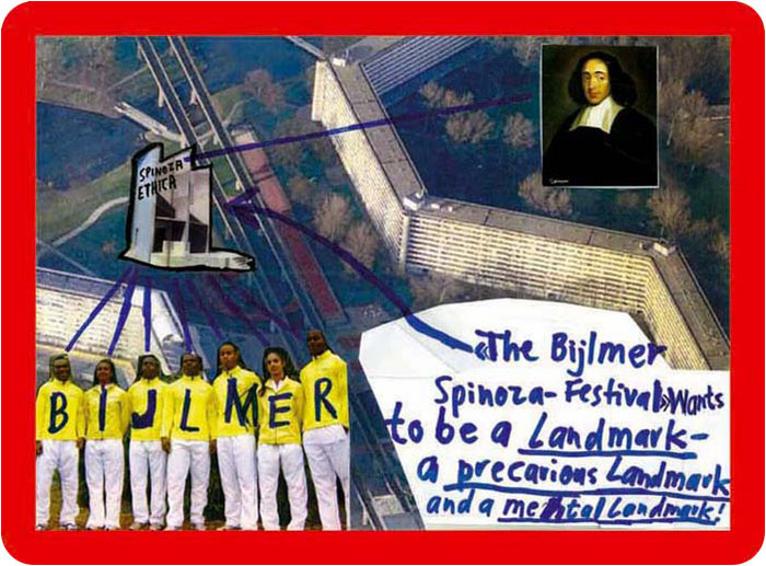
About five years ago I began collecting dead websites. It started in 2010 with Thomas Hirschhorn, after his first website, made for the Bijlmer Spinoza-Festival in Amsterdam, disappeared from the net. The Spinoza project was the third in a series of temporary projects dedicated to philosophers.
Hirschhorn calls these “presence and production” works. Here is a 2009 interview with Ross Birrell:
“Presence” and “Production” are terms I use for specific projects which require my presence and my production. It means to make a physical statement here and now.
I believe that only with presence – my presence – and only with production – my production – can I provoke through my work, an impact on the field.
When the project is over, the programs end, the materials are dispersed, the artist moves on, and a couple of months later, the website where the entire thing had been documented disappears. Then the links go dead, the URL expires, and gets scooped up by some zombie ad network. All that remains are some jpgs illustrating Marcus Steinweg’s Bijlmer lectures.
I’d been to the first at Documenta, the Bataille Monument, in 2002, but not the Spinoza Festival, and so the website was it for me. I’d wanted to read and see more, longer. And then I discovered I couldn’t. It was gone.
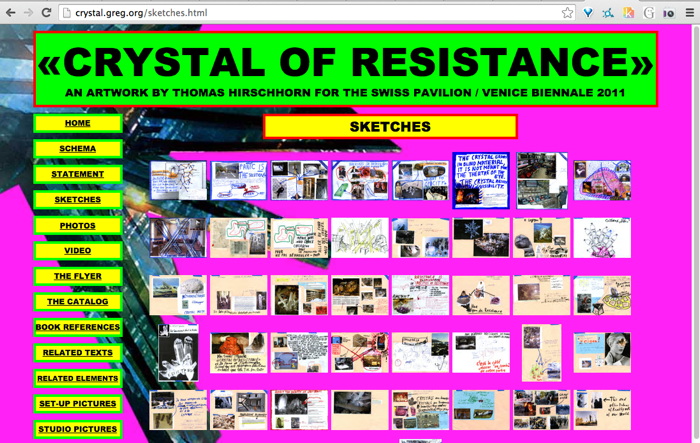
So when Hirschhorn launched his second website the next year, for CRYSTAL OF RESISTANCE, the Swiss Pavilion at the 2011 Venice Biennale, I was ready. Almost. I grabbed the whole site several times, but l missed some galleries. And then it was gone.
The GRAMSCI MONUMENT site in 2013, I definitely got that one. And Hirschhorn’s project at the Palais de Tokyo in 2014, FLAMME ETERNELLE, I got that one too.
When the greatest website in the world got edited into oblivion, I grabbed it from the Internet Archive and made a piece out of it last year: Untitled (Embroidery Trouble Shooting Guide).
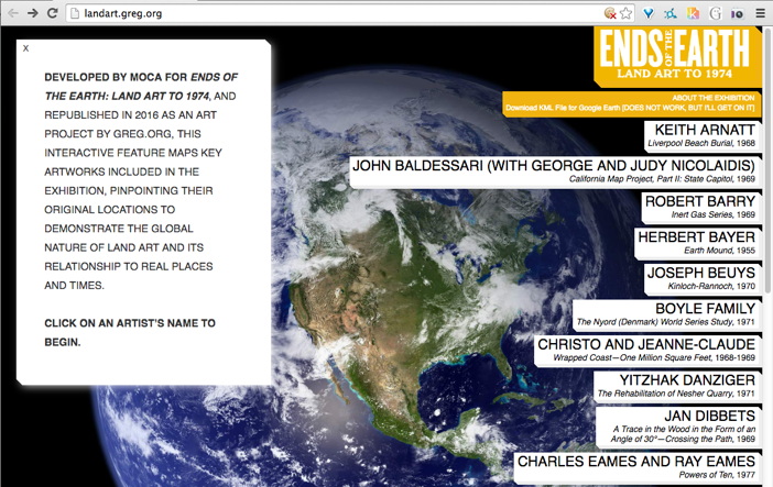
Then a few months ago I heard MOCA had deleted the informative and interactive mini-site for Philipp Kaiser and Miwon Kwon’s Land Art show, so I rebuilt that one. Or I’m in process. I still have to reconnect the Google Earth links. [Google’s deprecated KML API may have led to the page’s demise.]
This is how I started posting them as subdomains, similar to found texts or found web objects. In the case of Hirschhorn, I was very aware since Venice that these were different, and very much not his work: “This website is neither an artwork, nor part of the artwork <>”, it said on the front of the site.
But wasn’t, but now it was, but of a different work. Hirschhorn’s projects required his presence and his production, and my sites had neither. They appeared the same but were the opposite.

They weren’t just for me anymore. At least I didn’t have to think so.
I do edit them, leave my mark, track changes, in the text somewhere, or the source, in ways that are invisible or imperceptible, where I imagine literally no one will ever know or care. At one point, in a more cynical mood, I rewrote the entire Gramsci Monument to be entirely about me. But the more I consider Hirschhorn’s practice, the less sure I am that the gesture works as critique. [Of him, anyway. Of me, OTOH… At least I kept a clean version too.]
For example, here is something I wrote in the source of Ends of the Earth:
Though it is still available on the Internet Archive, this is the kind of thing that should, I feel, exist within an art context. It is too off-the-cuff to imagine these two mirrors as a site and non-site, but that is an apt reference, I won’t throw it out. What ultimately motivates this repetition of the site is a bafflement at why MOCA removed it in the first place. Huge shoutout to Kimberly Drew (@museummammy) for calling this to my attention.
I just feel like I have to grab these things, even the ones that get scraped into the Internet Archive. It’s an urge that I can’t dismiss, even when I can recognize the futility of it. I have to save them.
#FindTheWarhols Episodes 3 & 4: The Corktown Caper
7/10ths of a set of Campbell’s Soup prints walked out of the Springfield Museum of Art last week, and the FBI is ON it. Unfortunately, unlike the LAPD, the FBI does not make awesome #FindTheWarhols posters, so I cobbled together their webpage into one 41 x 8.5 inch PDF file you can print at home (or at work, or wherever you keep your stash of 41-inch paper. Not my problem.)
ALMOST EXACTLY A YEAR LATER UPDATE: Thanks to @mattdpearce for tweeting out the FBI has actually made a fine-looking wanted poster for these soup cans, which you can download here [pdf] It’s only 8.5×11, but it’s a start!
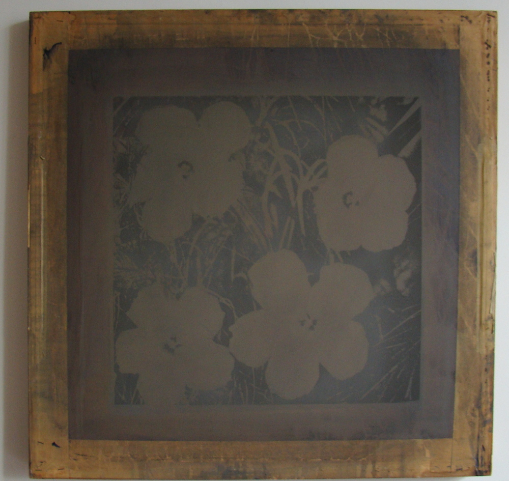
Have you seen me? Lately? Andy Warhol Flowers screen, stolen and still missing. Image: fbi.gov
What the FBI does do, though, is add stolen works to the National Stolen Art File. With hundreds of prints missing in batches of 20+, Warhol has to be the most stolen artist in the country, by volume. [Using the proper unit of measure for linear feet of stacked and racked Warhols, I’d guess 0.4 Mugrabis of Warhols have been stolen in this country. Of course, it’s mostly flotsam, so in dollar terms, all the 343 other works listed in the FBI file still don’t add up to One Gardner Unit. #FindTheVermeer]
And what is the most interesting stolen Warhol on the black market right now? It’s the screen Warhol used to print Flowers. If the screen is 36 inches across, the image would be about 24 inches, the size of the 1964 paintings. [There are also approximately one million later Flowers prints, but they’re bigger.] Is this one that Warhol lent to Elaine Sturtevant? Now *that* would be some provenance.
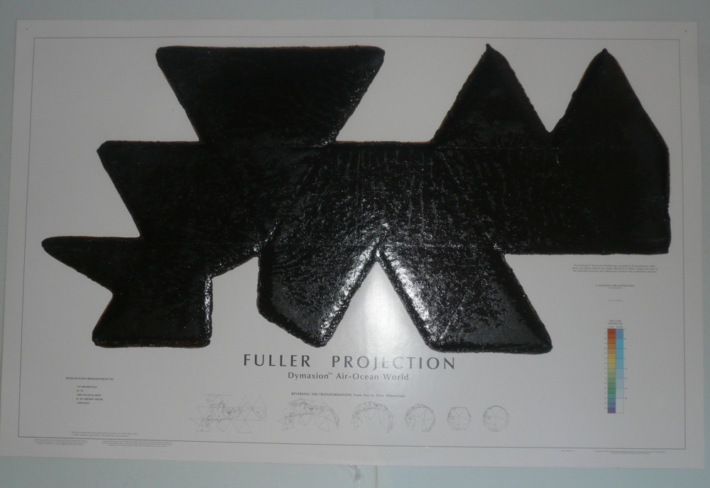
jacked Dymaxion Map with tar [?], 2009-10, by Matthew Day Jackson, still missing. image: fbi.gov]
The Warhol screen turns out to be one of 10 works in the FBI file listed with additional information of “DE106.” It’s an interesting and unusual bunch: a Larry Rivers sketch for his Frank O’Hara portrait; a Buckminster Fuller Dymaxion Map covered with tar by Matthew Day Jackson; a self-portrait by Rene Ricard.
So I called the FBI to see what the backstory was. Were all these DE106 works stolen from the same collection? “That’s an artifact of the data entry. It’s meaningless,” said the FBI Art Theft agent I spoke with. So these were not all stolen in the same incident? “No. Everything I can tell you is on the website.”
OK, thanks! Never one to take an FBI agent fielding coldcalls from a random blogger at her word, I Googled it. And all the DE106 works were stolen together, in April 2012. In DEtroit. Metadata, people. None of the links to the story on local TV news or newspaper sites work anymore, so the most thorough account of the caper is on none other than Huffington Post. [Legacy media: 0, Recappers: 1]
An unidentified collector in Corktown seems to have had a cartload of works stolen over the weekend of April 27-29. The FBI released photos […] and announced a $5,000 reward […], but they feared “the artwork may have been transported out of the country.” Which, when you’re on the other side of a bridge from Canada, is probably always a concern.
inset: the jacked Serrano photo of Weinstein, collaged onto Robert Polidori’s 2012 VF photo of Scott Griffin’s Chelsea Hotel apartment, with a Serrano portrait of Arthur Miller.
If you couldn’t tell from the paltry reward, the works were uninsured. One unusual piece is a 2003 Andre Serrano portrait of the poet and librettist Arnold Weinstein. Weinstein lived in the Chelsea Hotel, and this Vanity Fair photoset by Robert Polidori includes a very similar Serrano portrait of Weinstein collaborator Arthur Miller. It’s in the apartment of producer Scott Griffin. Who moved to Detroit, bought a warehouse building that housed the offices of HuffPo and Curbed-and had his art storage cleaned out, probably by an employee with a master key. They also took a Segway. I made a wanted poster, in case the FBI scrubs their metadata.
One blog report said the Warhol screen had “disintegrated so much over the years that it cannot be reused.” Which sounds like a challenge. What could you get from printing with a disintegrating Warhol screen? I would love to find out.
FBI Reward Poster for Stolen Warhol Soup Screenprints – greg.org.pdf [pdf]
Reward Up to $25,000 for Recovery of Stolen Andy Warhol Paintings [fbi.gov]
Detroit Art Theft: 19 Works Worth Millions, One By Andy Warhol, Stolen From Private Collection (PHOTOS) [huffpo]
Corktown Art Heist May Have Been Inside Job [deadlinedetroit]
Ad Hoc poster for FBI DE106, AKA The Corktown Caper [pdf]
Previously, related: Find The Warhol Jews, with links to previous Find The Warhols! posts, including what may be the world’s first failed Kickstarter campaign
Noting Berthold’s Political Handkerchief

To circumvent the tax on paper designed to drive revolutionary activists like himself out of the British print media, Henry Berthold published his calls for reform and worker solidarity on cotton. Berthold’s Political Handkerchief was itself a political statement, apart from its content. It seems to have run for around ten issues beginning in September 1831.
I guess if there were a modern equivalent, it would be short stories on Chipotle bags. Or T-shirts, probably.
Anyway, there’s a bit about the Political Handkerchief from 2013 on a Princeton blog.
Notabilia | Berthold’s Political Handkerchief • 1831 [blogs.princeton.edu via @john_overholt]
Previously, related, and the reason I am posting this, because of trends: Queen Victoria Silk Newspaper
Actual Size Nude No. 3
 Nude Descending a Staircase (No. 3), 1916, 148.1 × 91.8 cm, image: philamuseum.org
I’ve been enjoying Elena Filipovic’s 2013 dissertation, whose title says it all: “The Apparently Marginal Activities of Marcel Duchamp.” [pdf via monoskop, obv]. So far it’s about photography, including a long look at the so-called Box of 1914 (1913-14), in which Duchamp made 1:1 photos of a selection of his handwritten notes. The photos were mounted and put into repurposed, reworked commercial boxes from photoplates, and distributed to friends. As Duchamp would describe it later, the Box was a work in itself which would operate as a guide alongside The Large Glass he was designing. Of 5+1AP, only 4 survive. The Pompidou has the best pictures of it.

Nude Descending a Staircase (No. 2), 1912, 147 × 89.2 cm (close!), image: philamuseum.org
But Filipovic’s discussion of Duchamp’s early photo activities naturally includes one of my own favorite Duchamp pieces, Nude Descending a Staircase (No. 3), a full-scale photo copy of his most famous painting, which itself was inspired by the chronophotography of Etienne-Jules Marey, which he made for the Arensbergs in 1916. No. 3, that is, because, well, let’s let the Philadelphia Museum explain:
In 1916, Marcel Duchamp recreated his Nude Descending a Staircase (No. 2) for his patrons Louise and Walter Arensberg, who had coveted the notorious painting since seeing it at the Armory Show in New York three years earlier. Given that the original was now owned by a San Francisco art dealer who did not want to part with it, Duchamp had a commercial photography studio enlarge a postcard image of the work to match the proportions of the original canvas. The colossal photograph was then meticulously retouched by the artist in a wide variety of mediums, including pencil, ink, watercolor, and pastel, to replicate the crisply delineated forms of the original composition.
#Actually, as Filipovic points out, Duchamp did not have access to the painting, and he did “not at all attempt[…] to replicate the original painting’s color scheme.”
The fact is, what he created was a dubious hybrid, neither true painting nor unadulterated mechanical photography: the hand-colored photographic copy of a hand- painted canvas defied both mediums in one blow. The very originality of painting (in this case, Duchamp’s single most famous painting on canvas) is unsettled in the act of mechanically producing a photographic copy to take its place; yet, conversely, the mechanical reproducibility of photography, the medium’s single most defining feature, is revoked by turning the photograph into a unique, hand painted and–thus newly original–artifact. [p.65]
Even better, it’s a photo of postcard of a painting (inspired by photos). A Duchamp Editions Pyramid constructed several generations before Thomas Kinkade’s. Or Gerhard Richter’s. What else will the ever-shifting sands of Art History reveal?
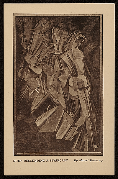
Postcard of Nude Descending A Staircase (No. 2), 14 x 9 cm, published for the 1913 Armory Show, image: aaa.si.edu
The Arensberg’s eventually acquired the original [sic] Nude Descending A Staircase (No. 2) in 1919, and installed both the painting and the overpainted photo in their living room. Then Duchamp showed them side by side in Walter Hopps’ 1963 Pasadena retrospective. Neither is on view at the moment in Philadelphia. Michael Bierke’s great-grandfather sent a copy of this postcard to his wife from the 1913 Armory Show, though-and Francis Naumann is doing his masterwork in the comments.
Actual Size

Michael Heizer, Munich Rotary, 1970, transparencies and projectors, installed here at LACMA in 2012, but on view at the Whitney through Apr. 10, 2016
Michael Heizer talked about Munich Depression (1969) and Munich Rotary (1970) with Heiner Friedrich and the Whitney folks, and Interview Magazine is ON it.
HEIZER: I have a genius friend named Maris Ambats, whom I talked to about making a projector to project an image at the actual size. The deal was to let the camera be a translator between reality and a replicated reality, which means making the photograph as big as the thing itself. So here it is. It gets squeezed down through the camera, and then it’s blown back up to the same size.
…MANCUSI-UNGARO: And the first time you showed Munich Rotary was in 1971 in Detroit…
HEIZER: Sam Wagstaff [who was then the curator of contemporary art at the Detroit Institute of Arts] introduced photography to the modern-art market. He liked photography so much he wanted to show it in the grand hall in this classical museum. It’s a big, big classical building–it’s like the Louvre inside with huge rooms. He put my piece in this huge 200-foot room. It was really good, and it was intended to be a photographic offering, a photographic artwork. Wagstaff had the nerve to do that. The trustees wanted him to remove that sculpture of mine he exhibited, too, and he resigned because of it. But he had the nerve, and he believed in it. He was right. It’s become so insidious. Photography is everywhere now. Back then, it wasn’t an art-world technique. But, the thing is, you can’t separate the film derivation from the real thing. Munich Depression and Munich Rotary are different works of art, but they come from the real thing. So you can’t escape it.
DE SALVO: You can’t uncouple them.
HEIZER: No point in trying to.
This hits a lot of buttons for me, first because of what’s not really discussed: the full-scale photomurals of boulders Heizer showed alongside Munich Rotary at LACMA in 2012, in a show called “Actual Size.” [Actually, Munich Rotary is or has been called Actual Size: Munich Rotary, too.] This felt like a photo representational rebuke of MOCA’s 2012 Land Art show, which Heizer refused to participate in.
But it really all makes me rethink how photography operated in this era as both a mode of art production, and as a means of circulation. The difference between the image and what it depicts, photography’s built-in distortions of “the scale of the world,” as Sontag put it.
Destroyed Richter Painting No. 013, 2016, installation shot
The double distortion by photography and the market is what drove me to make the Destroyed Richter Paintings. I want to experience the difference (or the similarities) between a photo of a painting (or a jpg of a 4×5 slide) and an actual size reproduction of that (image of that) painting. Some have size info attached, but at first all the Destroyed Richter Paintings dimensions were extrapolated from the painting in them, and the studio space they inhabited. While figuring this out, I definitely considered conceptualist folks like Joseph Kosuth or Mel Bochner when I looked back at these issues, but Heizer and his photos were unknown to me. I sure look at them now, though.
And apparently I need to look at Audubon, too, who insisted on illustrating his birds life-size, and letting the printing people just deal. William S. Smith discusses Audubon and Actual Size in Art in America, and looks at scale and representation as analogs for control:
Heizer’s actual-size photographs of Munich Depression establish control over the context in which they are viewed–a control he could never assert over the site on which it was made. Photographs of variable scale can be reprinted, republished, circulated and annotated in popular magazines. But the actual-size works have to be seen in person in a setting where the placement of the projectors can be tightly controlled. They are photographic oddities, resistant to reproduction and circulation. This resistance, too, comes at a cost, because it makes the work, conceived supposedly in innocence of “commercial and utilitarian concerns,” entirely dependent on institutions with the resources and space that Heizer requires.
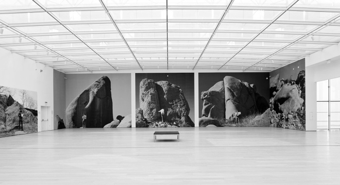
Huh, this installation view of Michael Heizer’s “Actual Size” show at LACMA in 2012 is really about the museum. Broad wins again. via x-traonline.org
This is not to just hitch my wagon to whatever 60s star is riding through town. I am actually in the middle of sending out photos of the Destroyed Richters, and unless it’s a flagrant installation shot, the works keep ending up looking like the photos. I find myself stuck in this same representational gap, in a hole, I have dug for myself. But at least I am not alone. While looking around for photos of Heizer’s “Actual Size” show, I realized they are really all about LACMA, and their giant pavilion. And though all those megaliths are presumably still where Heizer photographed them 46 years ago, the work that’s inextricably coupled with Munich Rotary, Munich Depression, created on an active suburban building site, was destroyed within months of its completion.
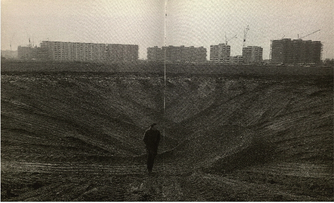
Michael Heizer’s Munich Depression, May 1969, Perlach, Munich, Germany
Michael Heizer by Heiner Friedrich [interviewmagazine]
One to One [artinamericamagazine]
Untitled (Damaged Richter Poster), 2010-2016
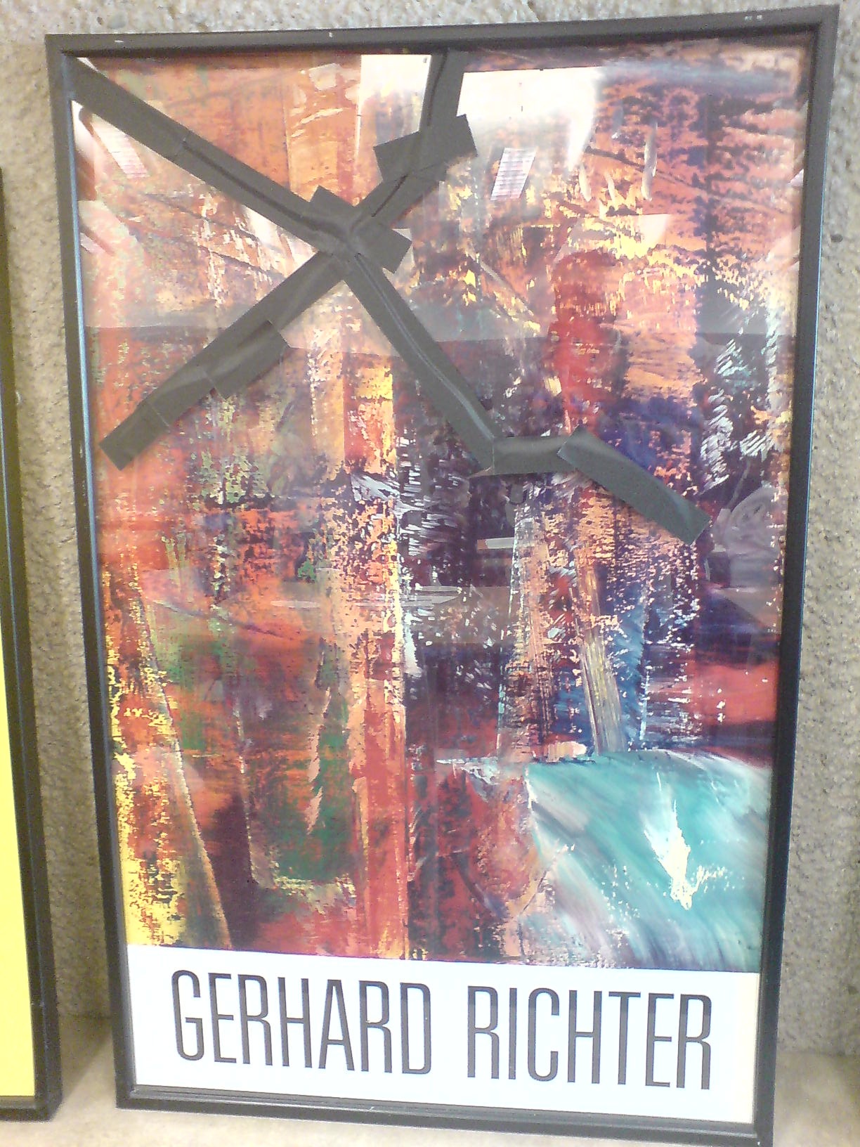
In 2010 the kid took a weekly studio class at the Hirshhorn with Dan Steinhilber. It was fantastic, but unfortunately, it was the last one the museum offered for non-teens. It was held in the education space in the sculpture garden, a space which could connect under the road to the museum, but for various logistical reasons, does not.
This incredible framed poster from Gerhard Richter’s 1987-8 exhibition was there. The painting in it, A B Dunkel, or Abstraktes Bild Dunkel (Dark), (CR: 613-2), 1986, is from what is considered Richter’s breakthrough year for squeegee painting. For me, though, it’s the gaffer’s tape that makes it special.
Now that I have declared it a work, I called the Hirshhorn. It is still there. There are no plans for it at this time. I called the museum shop, which has an endlessly interesting selection of books and exhibition catalogues for sale from the museum’s own library, but which does not, it turns out, have any 28-year-old Richter exhibition posters lying around.
It’s possible that it’s not even a product, but marketing material or signage; I couldn’t find another example of this poster mentioned online. So for now, it is ed. 1/1. Plus a study.
Superflex SUPERCOPY SUPERCOPY SUPERCOPY Silkscreen Kit
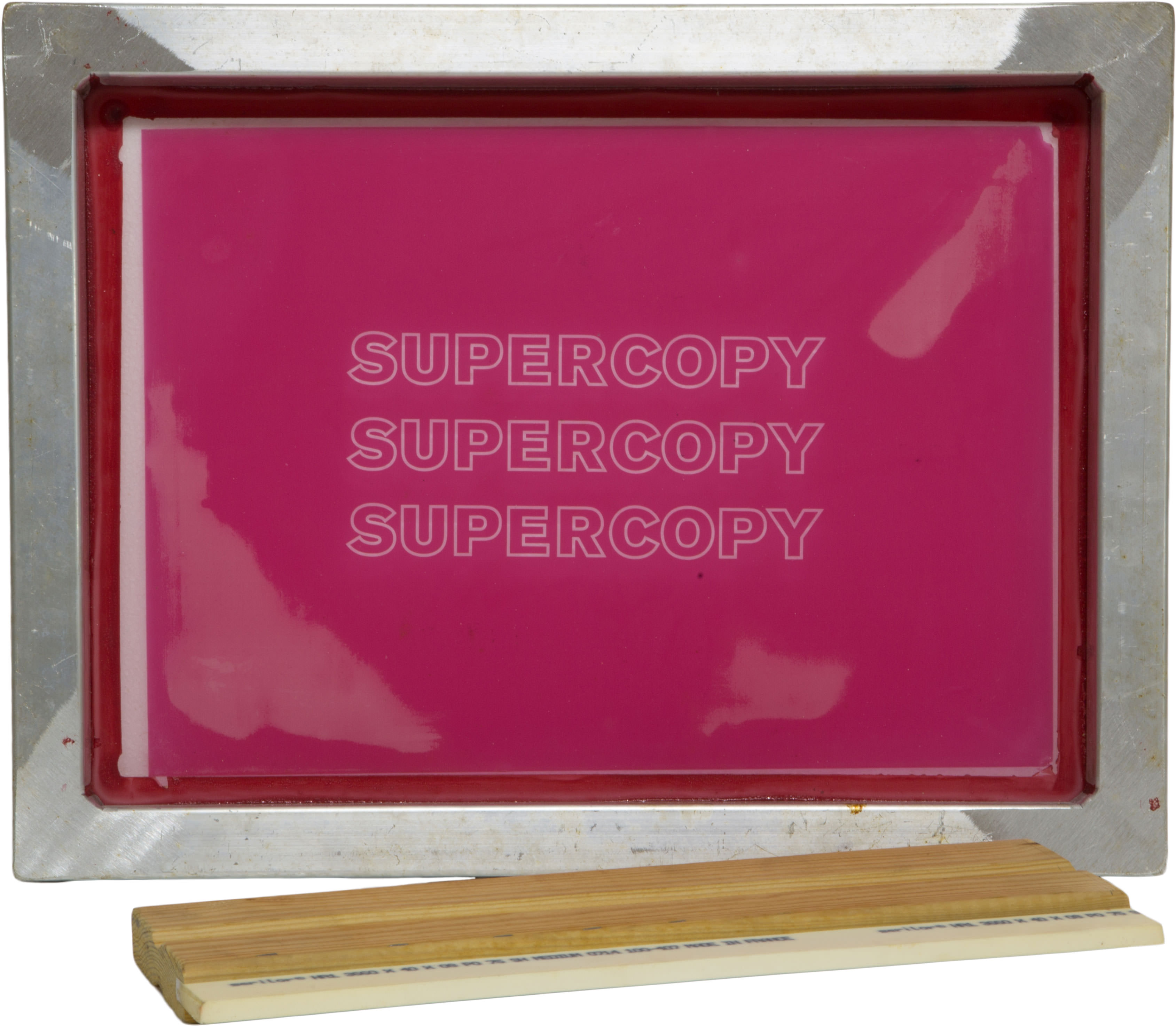
Here is a silkscreen by the Danish collaborative SUPERFLEX that will enable you to print their SUPERCOPY logo on any and everything you like. So you can make SUPERCOPY merch and swag for yourself. Or so you can make SUPERCOPY brand awareness for them, it’s win-win.
And since it’s being sold to benefit Rirkrit’s The Land Foundation, I suppose it’s
WIN
WIN
WIN.
Superflex Supercopy /Logo, est $6,000, opening bid $3,000, ends Mar. 23, 2016 for The Land Foundation [paddle8 via rirkrit]
Previously, related:
Transactional Aesthetics, or the Highly Collectable Rirkrit Tiravanija
Superflex Haacke Tack
I copy, therefore I am Superflex
Faux Sol Mio: Superflex / Free Sol Lewitt
Shanzhai van Abbemuseum by Li Mu
Bloghdad.com/Torture
It’s the 13th anniversary of the invasion of Iraq. Former Pentagon interrogation contractor Eric Fair wrote a simple and wrenching essay in the New York Times about trying to regain his humanity after torturing Iraqis for the US government.
If I had the opportunity to speak to other interrogators and intelligence professionals, I would warn them about men like Donald Trump and Ted Cruz. I would warn them that they’ll be told to cross lines by men who would never be asked to do it themselves, and they’ll cross those lines long before they consider anything like waterboarding. And I would warn them that once they do cross the line, those men will not be there to help them find their way back.
We owe it to conscientious Americans like Fair to make sure this doesn’t happen again. Not torture, not a bullshit war ginned up out of lies and garbage, none of it.
Owning Up To Torture [nyt]
Qué Mundo!

This Reuters photo of Air Force One landing in Havana is excellent, and not something I thought I’d see while I’m still this young. But if I think about it, after seven years, it’s not unexpected at all.
h/t Three Photographs from Havana, @whileseated [medium]
On Listening To Phyllida Barlow
Now that I’m on the other side of it, I’m kind of amazed at how much the ideas that led me to Chop Shop resonated with the discussion Phyllida Barlow had at the Nasher Sculpture Center with Tyler Green. The live conversation was on MANPodcast in July 2015.
Phyllida Barlow, tryst, 2015, installation at Nasher Sculpture Center, Dallas [image: manpodcast.com]
I was listening to it again tonight on the way home and pulled some highlights: like this idea of fragments:
It always seems to me extraordinary that our lineage of Western art is dependent on broken fragments of things for which we have no proper-I mean, we look at torsos that don’t have limbs, that come from Hellenic times…and they’re iconic. ‘This is great.’ and Western art runs out of that greatness. And there doesn’t seem to be an issue that the arms are missing, or the legs are missing.
So the fragment and the half-finished has for everybody-it does for me-a certain beauty. it’s sublime. [9m00s]
This notion of the fate of art:
Really a question that emerged very early on, which is, ‘Where does art end up?’…Do you, as in my case, enjoy it, or as I was doing in the 80s and 90s and just putting it on the roof of our car, and taking it somewhere and just putting it on the street corner? And abandoning these things, and finally, after a few years of doing that, one night at 3 o’clock in the morning, I took them all to Blackfriars Bridge and chucked them in the Thames. [Laughing] Such is the way of artists, you know. It was one of the most liberating things I’d done. [13m15s]
Barlow talks about touch, and how the anticipation of touch is more powerful than touch itself:
I think this issue of touch is, for me, problematic. I think touch is a language, a non-verbal language, and how you imagine touching something seems to me to be more important than actually reaching out and touching it, where the minute you’ve touched it, the mystery, or the imaginative process, gets solved. You know, that’s closure on it.
I think there are…numerous art objects where there is a longing to touch, or an interest in what this thing is. But I think that it’s up to us to work out, what we then imagine what this might be? Is it hot or cold? There are artists who very much play that; Pierre Huyghe made a sculpture that is very much hot when you touch it. I think that’s a sort of fascinating game. I found that work, for me, you know, the minute you’d done that action, I didn’t know quite what else there was to discover about it. [51m00]
Just now I listened to this and the action I thought of was cutting the Barnett Newman painting and the Gursky Rhine. The thought of cutting, and the process of composition, the decisionmaking, the weighing, these all feel vital, and different from the actual chops.
Chop Shop Newman Painting No. 1 [destroyed] and No. 2, both 2016
That experience is reserved for whoever buys it; by design it is not the same experience as the regular viewer. Taking Barlow’s perspective on touch would mean that considering the potential is more interesting. But I think what actually happens is that the decision to cut, crop, compose and define shifts a collector away from just seeing and toward creating. From the audience to the artist.
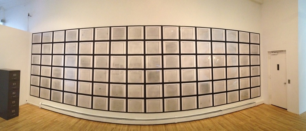
Imi Knoebel’s Sternenhimmel (Starry Sky)
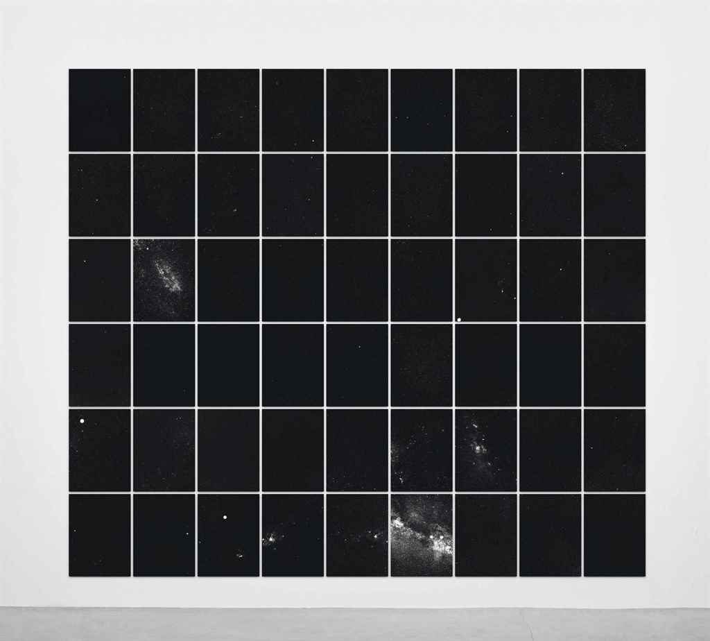
I don’t know much about Imi Knoebel’s Sternenhimmel photos, except they look awesome. And by awesome, I mean, like the gridded slice of sky seen captured by the Palomar Observatory Sky Survey photos I installed at apexart a couple of years ago.
Sternenhimmel is actually Sternenhimmel – für Lola, a portfolio of 54 prints, each 40x30cm, that Knoebel apparently shot in 1970, but only produced as an edition in 2006. He has a granddaughter named Lola who looks to be about that age, so maybe that’s why.
This is ed. 1/7, plus 2APs, and this is the second time it’s come up for sale at Christie’s. I’d like to think his 8yo granddaughter is not hard up for the £12-18,000 they didn’t sell for in 2014 or the £7-10,000 they’re estimated at now. But maybe she got an AP.
Not much is online about Sternenhimmel, except Joerg Heiser’s discussion of seriality and Knoebel’s 1975 Kunsthalle Düsseldorf exhibition:
The conceptual focus of the pictures of stars, which were brought together into one large picture in the exhibition, is that one star was added to each photo, but this information is not supplied in the catalog. The star motif makes the refusal to communicate sexy; it does not reflect obtuse mental sloth, but is mysteriously seductive due to the cosmic, unending series of stars. It is minimal techno, so to speak, long before it existed, digital in the analog age. Black and white as 0 and 1.
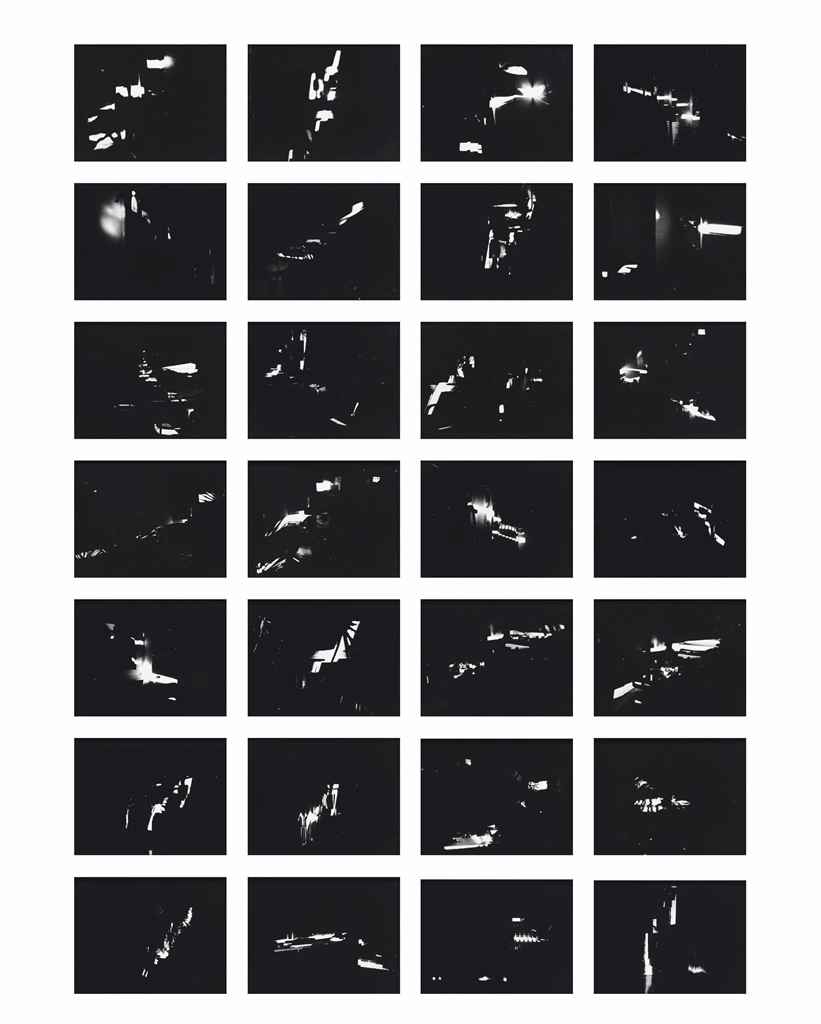
Imi Knoebel, Projections, 1974, 28 photos, ed. 2/9, image: christies
Knoebel was making a series of 250,000 line drawings (Linienbilder) and photos documenting the flashing patterns of lights in a closed room (Innenprojektionen, above), so maybe taking a picture of every star was just one more grand project doomed to futility. (Not to get too On Kawara about it, but if he kept it up, he probably could’ve finished the drawings by now. 250,000 drawings in 50 years is only like a dozen a day.)
14 Apr 2016, lot 168, Imi Knoebel, Sternenhimmel – für Lola, 1970/2006, est. £7-10,000 [christies]
Seriality and Color in Knoebel’s Work [db-artmag.de]