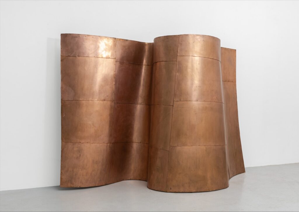
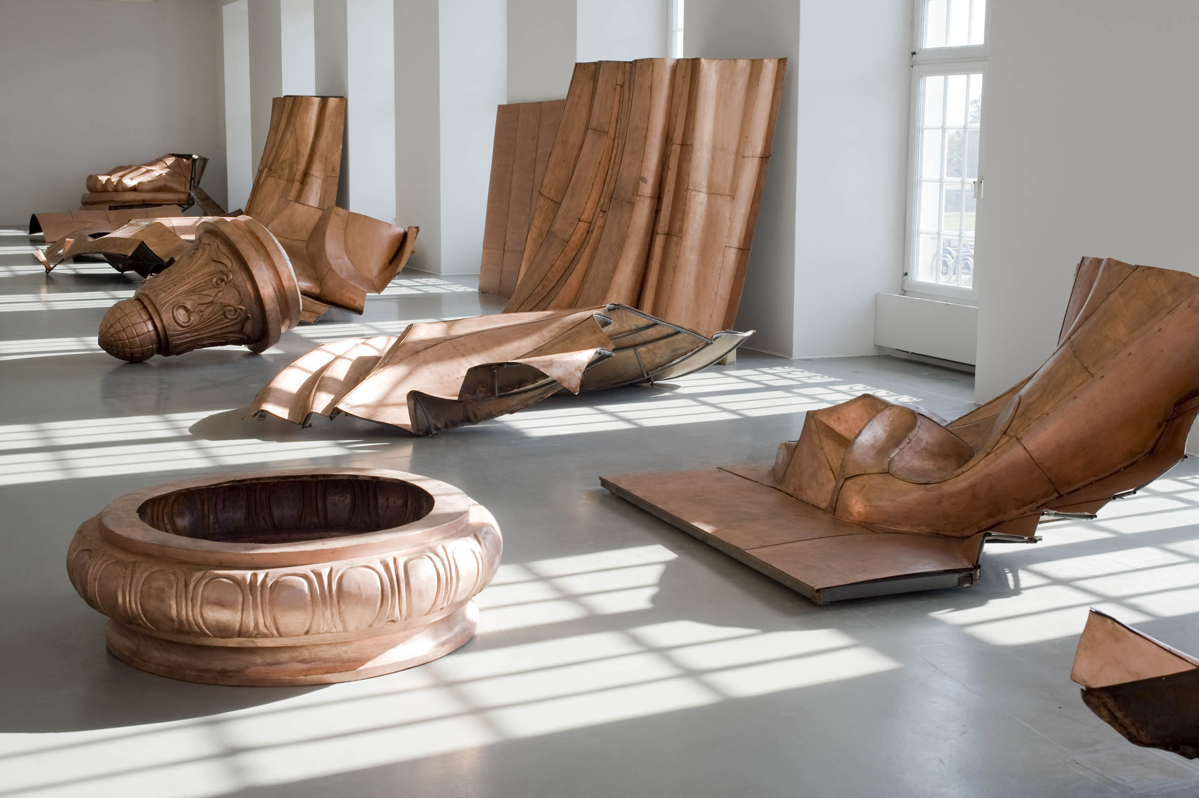
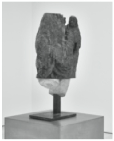
Danh Vo, We The People (Detail), 2011-16, hammered copper [and?], 110 x 338 x 229 cm, selling 16 May 2025 at Sotheby’s
We’ve all been reading the condition report every day, and We, The People are in rough shape at the moment. But if I were bidding, I’d ask for a condition report for this fragment of We The People (detail), too. Because in one of the Sotheby’s photos, the Statue of Liberty’s face looks fine, and in the other it looks like there’s some delamination going on under the copper sheeting.
As far as these things go, this is a really great fragment, but ngl, Danh Vo’s project felt a lot better when it was more conceptual and less documentary.
Danh Vo, We The People (detail), 2011-2016, 200 x 120 x 280 cm, at Galerie Chantal Crousel’s presentation at Art Basel
One problem with Christie’s selling the Fra Angelico after Basel is that as soon as my Fra Angelico Gofundme reached 10% I’d siphon it off to buy this gorgeous piece of Danh Vo’s We The People at Chantal Crousel’s booth. I’m only posting it because I assume it’s already been snapped up by someone in an earlier timezone.
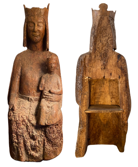
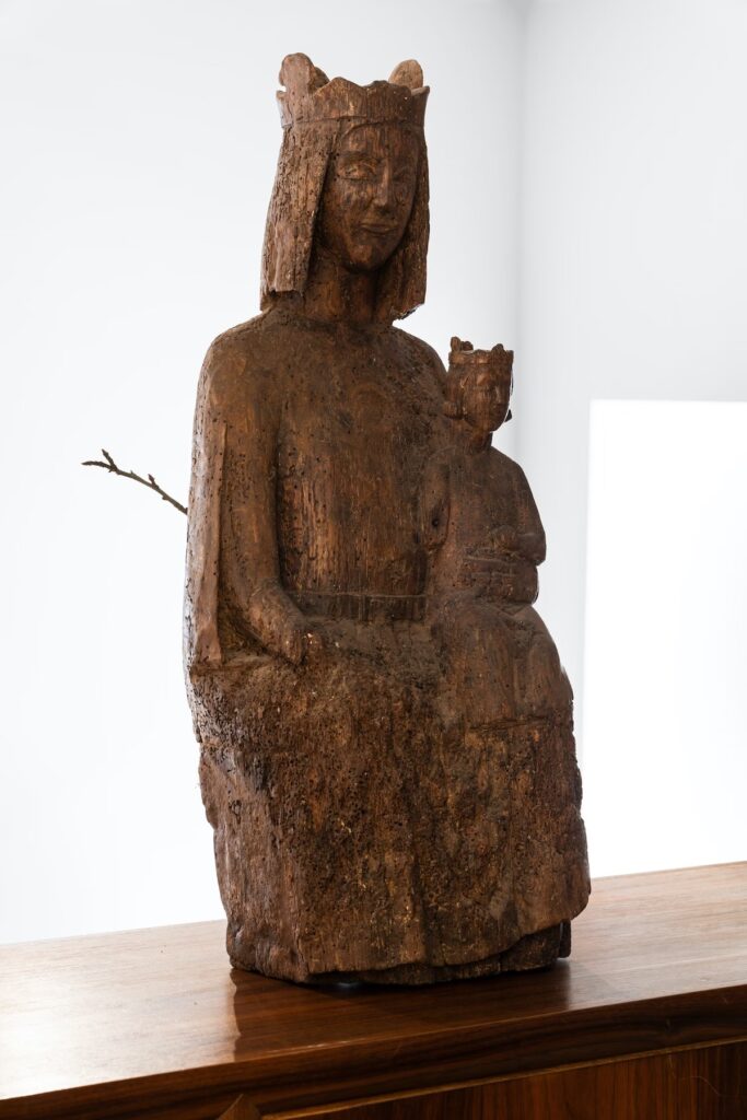
Enthroned Virgin, French, 13th Century, not available at Ekinium, Paris
It’s fascinating to think of the history of this carved walnut statue hollowed out with a little shelf in the back. Of its genre, a Sedes sapientiae, or the Seat of Wisdom, that depicts the enthroned Virgin Mary holding the infant Jesus on her lap. Of how it probably adorned a church in central France from some point in the 13th century, until who knows when, it’s not clear.
Of how it survived the centuries, worn, aged, saved and ignored in some fortuitous combination, gathering the rough patina of a deconsecrated, or at least not ostentatiously venerated, relic.
Of how it made its way to the capital, Paris, to rest for a moment under the authenticating connoisseurial gaze of an online antique dealer specializing in ancient and medieval sculpture.
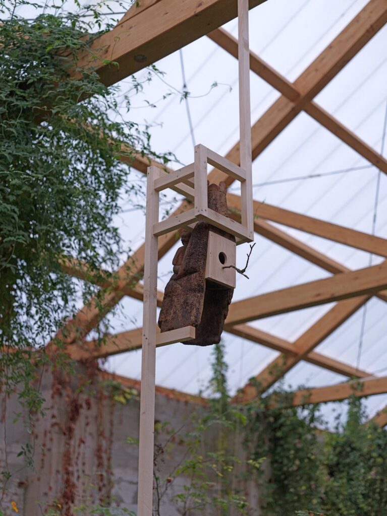
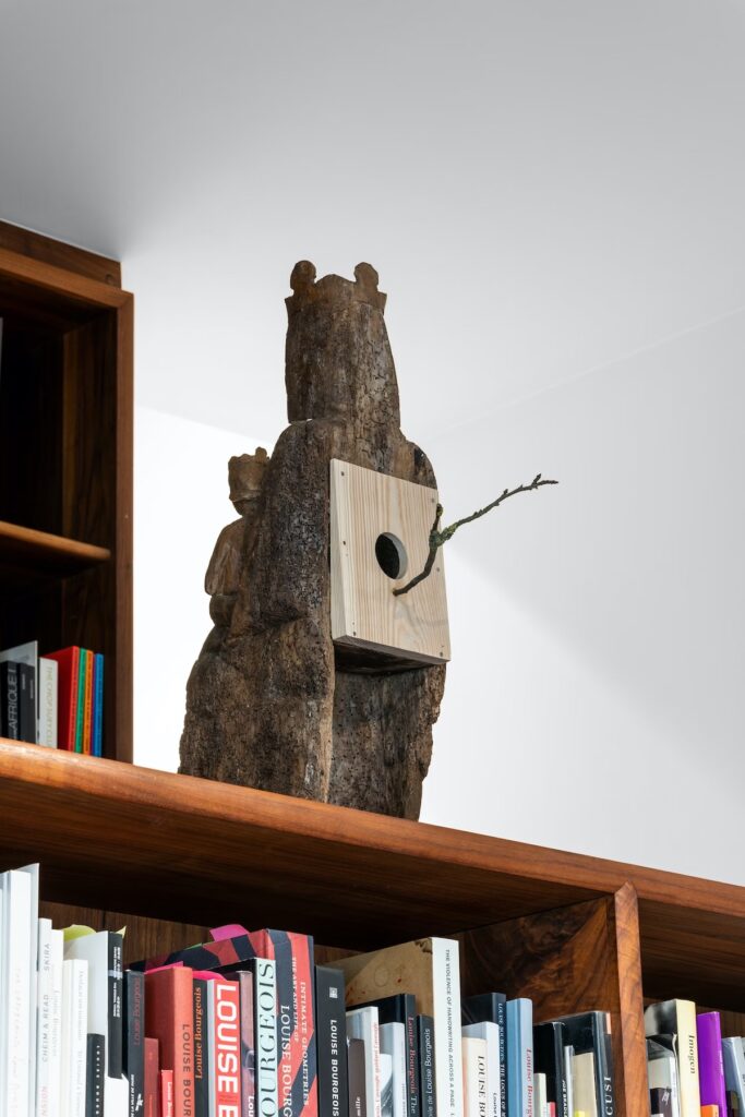
Danh Vo, Untitled, 2023, installed at Güldenhof, date unknown, image via Xavier Hufkens
And then of how, in the last several months, it was purchased by a Vietnamese artist who, using a simple, wedged plank and a stick, transformed it into a birdhouse, and installed it in the greenhouse/performance space of his communal garden/farm/studio outside Berlin. As the Psalmist declared, “Yea, the sparrow hath found an house” [Ps. 84:3].
Danh Vo, Untitled, 2023, installed at Xavier Hufkens, Mar-May 2023
And of how it traveled from Güldenhof to Brussels, where it perched atop the bookcase of an influential art dealer, and where until last week the rich and powerful of Europe traveled to be in its presence, or perhaps to put a hold on it via pdf.
Danh Vo, Untitled, 2023, image via Xavier Hufkens
Whatever the future hold for this object, it is likely to be dramatically different from what it might have expected even as recently as a year ago. Fear not therefore: ye are of more value than many sparrows [Matt. 10:31], but if you ask successfully, perhaps the value of 10% fewer sparrows.
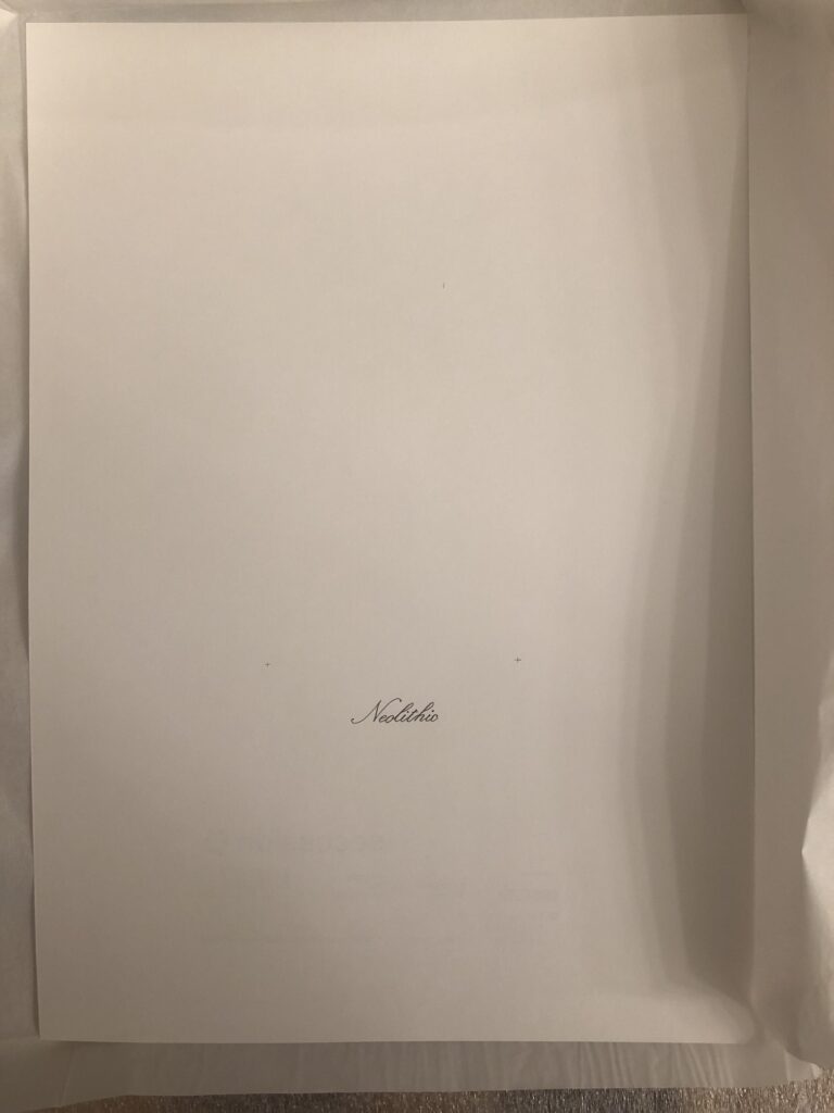
Danh Vo, Untitled, 2021, graphite & ink on A3 paper by Phung Vo, Revolver for Secession
Danh Vo had two shows simultaneously last fall, with work that turns out to be related.
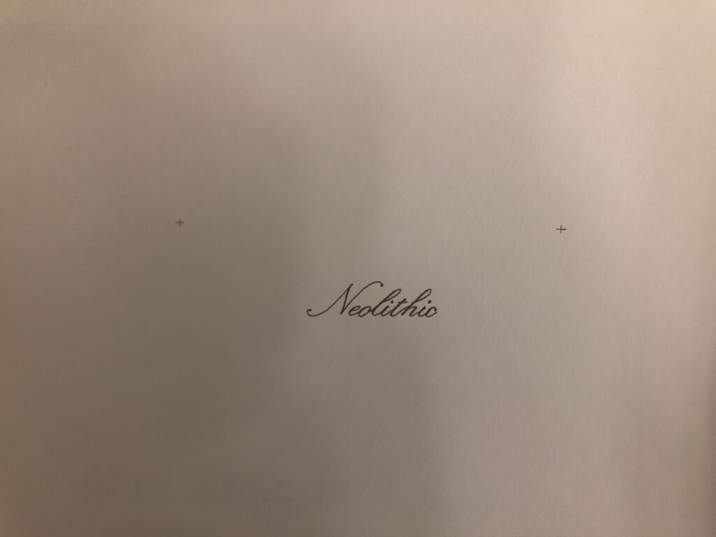
Thought it had an ISBN number, the publication for Vo’s show at Secession in Vienna was not a book, but a drawing. The artist’s father Phung Vo wrote the word Neolithic on one side of an A3 piece of paper. The exhibition’s sponsors Secession’s colophon were stamped on the back. It was slightly baffling, tbqh.
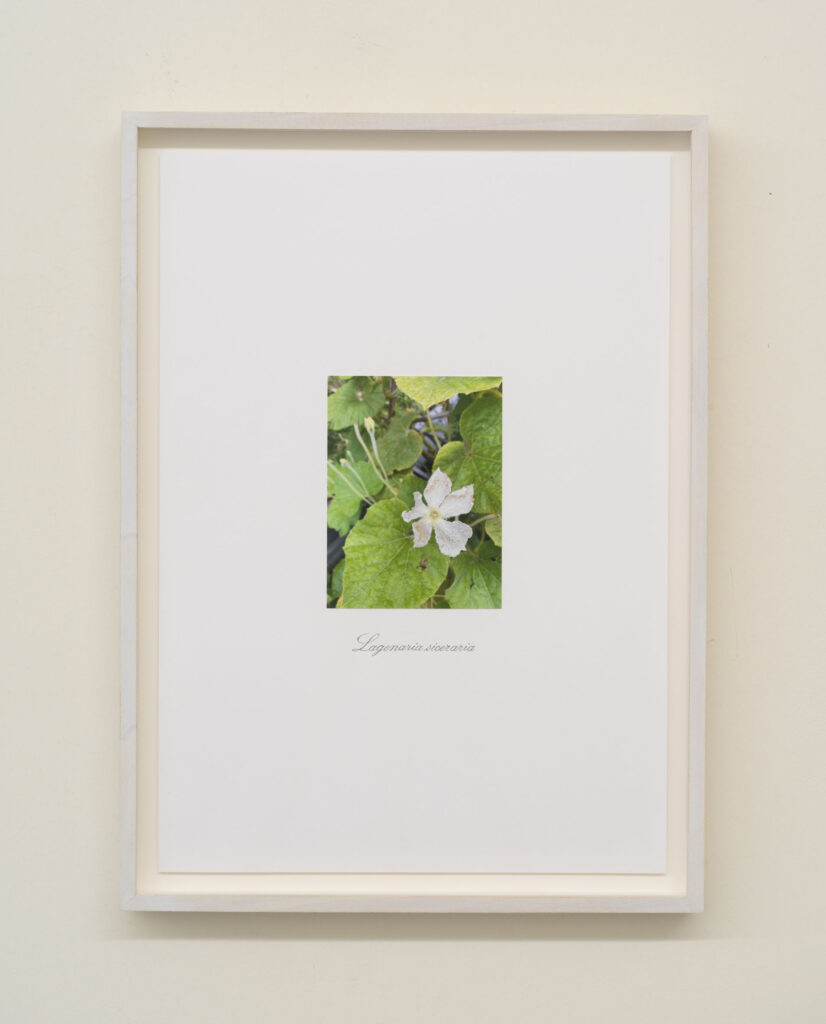
Danh Vo, Untitled, 2021, graphite and c-print on paper, A3, framed, image: massimodecarlo
Meanwhile, at Massimo De Carlo, he showed photos of flowers from his farm outside Berlin, mounted on an identically sized sheet of paper, with the scientific name underneath, also written by his father, in the same script as Neolithic.
Danh Vo, Untitled, 2021, detail
They’re impossible to see from the reproductions online, but there are tiny alignment crosses above Neolithic. The text is in the same place on both, and the marks seem to be where a photo would go. The composition of these works is basically the same.
The Neolithic publication is the first thing Manuela Ammer asked Vo about in their gallery talk at the closing of the Secession show. Vo explained that he’d come to see these two things–specific names of flowers and the neolithic–as opposites, and that his practice entails not choosing, but doing both, and considering the difference.
To Vo, neolithic is an abstraction, an amorphous period of time about which there is so much we can’t know, because the only human traces that survive are stone. This is what is captured, he did not say, by the absence of a photo.
Phung Vo Facsimile Object (PV1), 2022, 297 x 210 mm, digital print, with full-size, digitally printed COA, signed and stamped
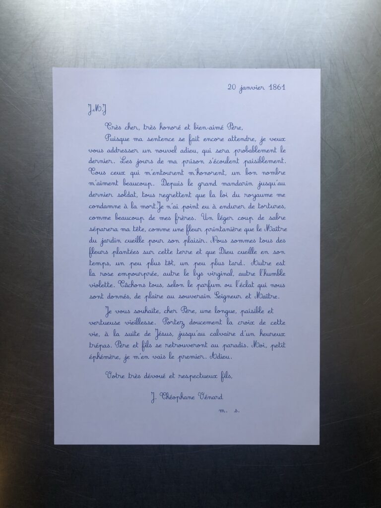
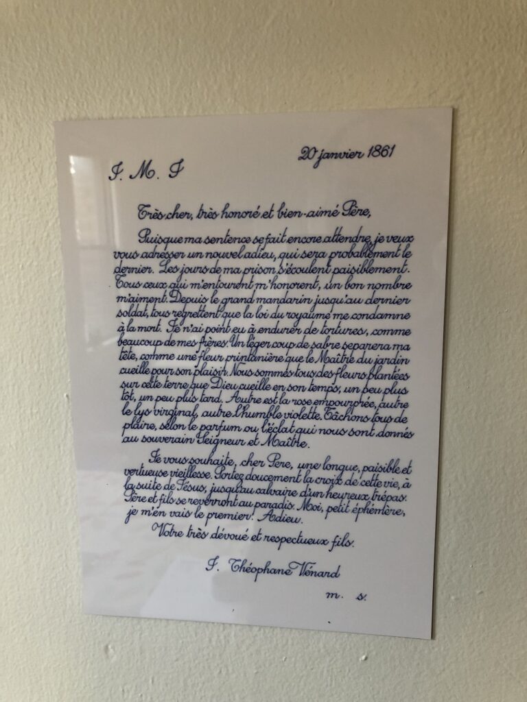
I’ve written before about the long reach of Danh Vo’s 2.2.1861 (2009 – ) on my thinking, but also specifically on the Facsimile Objects project, beforeI made a one-off Facsimile Object of it. Having a visual of Phung Vo’s beautifully transcribed letter from soon-to-be-beheaded J. Théophane Vénard to his father in front of me, instead of tucked safely away, has leveled up that influence.
It makes me try to improve my handwriting. It intensified my preference for A4 paper, which turns out to be difficult to find and work with in a world that defaults to 8.5 x 11. It prompted me to seek out the original source for Vénard’s letter. It got me to learn LaTeX. It, along with spending time with aging parents and a global pandemic, made me think about mortality, the moment that awaits us all.
And it made me think about what a Facsimile Object does, or what it could do.
Phung Vo Facsimile Object (PV1) is one result. It is the transcription of a slightly different published version of Vénard’s letter than the one Vo uses. It is set in LaTex using the French Cursive font package created by Emmanual Beffara, and printed on Vietnamese A4 paper. A certificate of authenticity matches it, and both are contained in an A4 document sleeve.
The layout is inspired by Vo’s 2.2.1861, but between the machine font and the slight textual differences, the line breaks diverge after just four lines. It’s a bit like how the clocks in Felix Gonzalez-Torres’ “Untitled” (Perfect Lovers) slip out of sync, except for the perfect lovers part, and the baked-in indexing of facsimulatory failure.
I am not decided about what to do with these. Part of me wants to make them available on demand. Part of me thinks they shouldn’t go out until the…end of Vo’s project. [Here at the beginning of a new lunar year, I once again wish Phung Vo a long, healthy, happy, and prosperous life.]
As I contemplate this, I remember back to a project I started in the Summer of 2014, to continue On Kawara’s Today Series after the artist’s death as a communal practice. It was called fromnowon.us, and it would have made it possible for people to order a date painting from Chinese Paint Mill, depicting the date on which it was painted. I’d arranged the production, even getting the painters to include a sheet of the local Shenzhen newspaper with each completed painting. When the test painting arrived, it turned out to be from Sept. 11th. Which gave me pause.
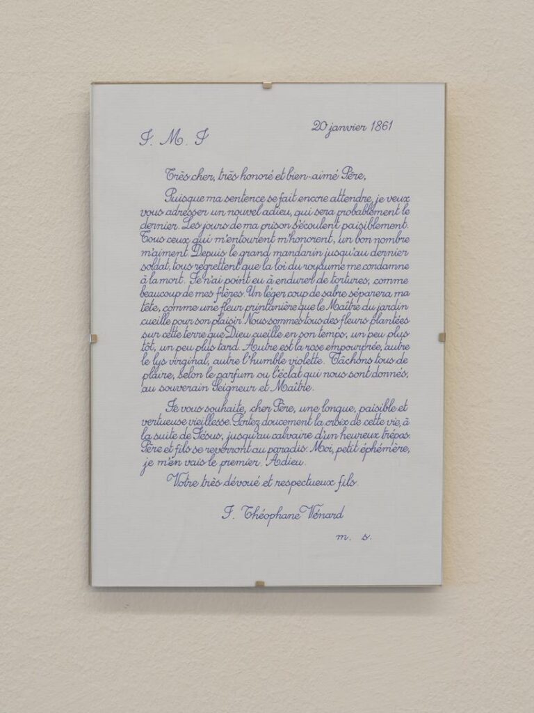
Danh Vo Facsimile Object (V1), 2021, dye sublimation pigment on aluminum, 297 x 210 mm
Previous mentions of Danh Vo do not begin to account for the extent to which his work has influenced the Facsimile Object project.
The Frenchness of the original Manet Facsimile Object drove me to decide the certificates of authenticity needed to somehow be French as well. I spent a couple of increasingly frustrated weeks looking for a calligrapher who could execute certificates in official 19th century French letter forms. Researching the history of French script, I kept running up against the realization that the image of French cursive in my mind had become Vietnamese.
2.2.1861 (2009 – ) is one of Danh Vo’s simplest, most elegant, and most powerful projects. His father, Phung Vo, copies out editions of a farewell letter Jean-Théophane Vénard, a 19th century Catholic missionary wrote to his father on the eve of his beheading for proselytizing. Phung learned exquisite, French-style penmanship in school Vietnam during French colonial rule, and converted to Catholicism as a gesture of political solidarity with the South Vietnamese regime–but he doesn’t speak French. He’s reproduced the letter hundreds, if not thousands, of times, and Danh includes the letter in all his exhibitions. Phung’s letters will continue as long as he’s able. In the mean time, the father’s elaborate calligraphic texts have become an evermore prominent element of the son’s work.
After deciding not to try to get Phung Vo to make them, I ended up copying his letter for practice, and producing the Manet certificates myself. It’s a pattern I’ve kept since, using period German script for the Dürer certificates, and so on.
I think Vo’s creating 2.2.1861 as a time-bracketed edition, available until it’s not, also informed my own approach to the Facsimile Object editions. Though a bigger inspiration was clearly limited-time editions that arose during the pandemic, like Pictures for Elmhurst and Wolfgang Tillmans’ Between Bridges. They’re available as long as they’re needed, or useful, or relevant, or I don’t know what. It’s not like they’re meant to be disposable, but there is a finitude to them.
Anyway, as much as I love 2.2.1861, I’ve never put one up; they feel pretty intimate, but also pretty fragile, the less handling the better. While wishing Vo and his family all the health and safety in the world, the last year-plus had me thinking about mortality more regularly. And I decided to order a letter now, while I knew they were available. When it arrived–the lead time was several months–I immediately felt like I knew what had to be done, and so I made a Facsimile Object of it.
In a way, this Facsimile Object complicates the relationship between itself, the artwork, and a COA. What would a certificate of authenticity even look like here, but a less expert copy of the original work?
Within minutes of my taking the photo at the top of the post, the tape slipped, and the object guillotined to the floor. It was totally fine, and will be hanging again by morning. It is very sturdy. I can’t tell for sure in the dark, but it also seems to have a slight lack of focus, or a pixel-level distortion keyed to the tiny waverings of Vo’s line. It reminds me of the visual tension present in Richter’s stripe series. Those images are created not by stretching, but by replicating an almost imperceptibly narrow vertical strip of a painting. Will producing a facsimile object cause an unanticipated, slight distortion that’s only visible in person, close up? Daylight can’t come fast enough.
[update: it does! actually, it feels a little blurry. perhaps something about the scanning, or the surface of the paper. Anyway, fascinating.
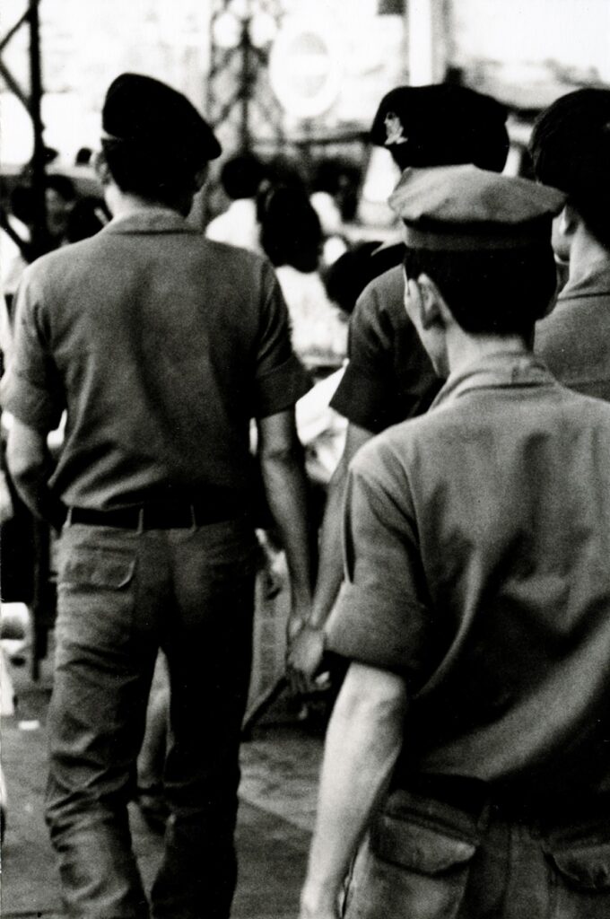
Danh Vo, Good Life, Army Boys, 1966/2007, selected from photos taken by Joseph M. Carrier in the mid-1960s in Vietnam
I just learned that Joseph M. Carrier, the former RAND Corporation analyst in Vietnam, who cruised Danh Vo in 2006 at an artist talk for a residency in Pacific Palisades, then invited him to his house, showed him his vast archive of photos, documentation, research, ethnographic material, and erotica, then invited him to go to Vietnam together, has been alive all this time, and only passed away at the end of November 2020.
Carrier has been an important presence in Vo’s work and career. Vo first showed creepshots Carrier took of young men on the streets of Vietnam as Good Life (1966/2007) at Bortolozzi in Berlin, but these homosocial images have been included in many of Vo’s shows since. He’s discussed them both in terms of Carrier’s own experience as a gay man fired for his gayness, and as projected autobiographical content of Vo’s own lost life in the war-wracked country he fled as a child in the 1970s.
What is incredible is that he kept diaries, papers from the RAND Corporation, love letters and lots of photos and original negatives. What’s more incredible is that he gave it all to me!
Primarily I think this whole affair I have with Joe’s material is an act of divine justice for not really having my own history. As a refugee my parents left it all behind, mentally and also physically. No pictures or documents of my family’s life in Vietnam exist, and its a kind of magical coincidence that I got this archive which I strangely but sincerely feel belongs to me.
Sure enough, at an Art Basel Statements installation in 2008, Vo exhibited a copy of Carrier’s will, which mentioned Vo’s inheriting Carrier’s archive.
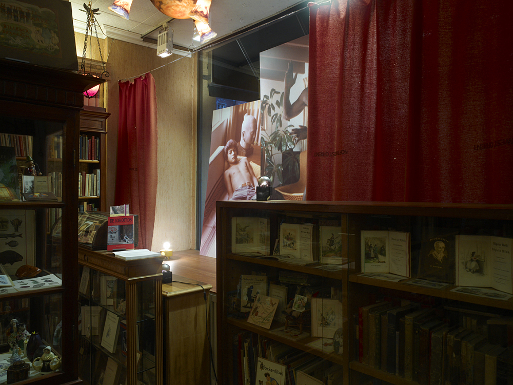
Danh Vo, “Boys seen through a shop window,” Galerie Daniel Buchholz, Köln, 2009, installation view via GB
The three-way affair between Vo, Joe, and his material also manifested in a 2009 show at Buchholz in Cologne, “Boys seen through a shop window.” Carrier wrote the press release for the show [pdf] in strikingly personal first-person non-artspeak, but the show really did look like Vo had cleaned out Carrier’s house and turned it into one giant installation piece.
But Carrier was still alive and going strong in 2010, when Vo talked of staying with him on another trip to LA, before his Artists Space show which featured photogravures made of Carrier’s images.
At the time the perceived dynamic of Vo’s relationship with Carrier was colored by Vo’s relationship with Michael Elmgreen, who he was dating at the time, but whose signature he also secretly forged on a Danish Arts Council grant so he could go to the opening of Prada Marfa as a photographer’s assistant.
Vo talked a bit about the ambivalence and instrumentalization of relationships and relationship structures in 2007 [when he was still marrying friends and immediately divorcing them, just to add to his official last name], in the context of a refugee’s desperate survival tactics. But, as he said even then, “I was a boat refugee when I was four, but I’m pretty dry now.”
Vo’s work, and his collaborations, especially early on, were unsettling, not just because of what he called “parasitism,” but because of his forthright ambivalence even then to forefront his questioning of the fundamental assumptions of human interaction. Finding out about Carrier’s death–and the fascinating, complicated and varied life he led–underscores the efficiency of the art context to reduce him to a sort of found object. But it also exposes the limitations we all face in understanding the nuances of someone else’s relationships. Which feels like part of Vo’s point all along. Meanwhile, I think Danh’s gonna need a bigger storage unit.
After reading Tim Schneider’s recent article about the market views of Danh Vo’s work, I realized I hadn’t written about Vo’s Guggenheim show.
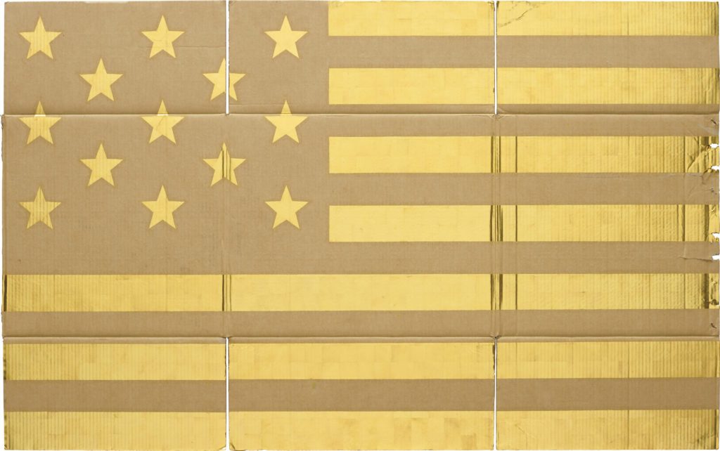
Tim’s point is well taken, and borne out in the show: Vo makes both sexy, shiny, collector bait (gold-leafed flags & alphabets, Statue of Liberty fragments) and meaning-laden but head-scratchingly unaesthetic cultural detritus (the stuffing from Robert McNamara’s chair, the Unabomber’s typewriter). The typical market dynamics of art stardom readily attend to the former, while posing a challenge to the latter.
Parts is parts: The White House Years of Robert McNamara, Lot 20, 23 October 2012 image: Sotheby’s
At least that’s how it looks on the secondary market. Vo’s global network of top-flight dealers know a thing or two about placing “difficult” work with “connoisseurs.” Those McNamara chairs, purchased at Sotheby’s for $146,000, were promptly stripped for parts, which were sold as separate works to nine of Marian Goodman’s most well-cultivated private and institutional clients. And some of the wonkiest Gothic and Hellenic scrap mashups with the grossest Exorcist titles are in the collection of Francois Pinault. Then Vo installed them in the Dogana alongside scrap metal rented [rented!] from Cameron Rowland and plastic tarps David Hammons dragged into Mnuchin’s joint from the street.
Two things that stuck with me from the Guggenheim, and any time I see one of Vo’s spare, deliberate installations: he makes almost as many objects as he shops, and he shops a lot.
Just a few of the editions, mostly photogravures, Danh Vo has produced with Niels Borch Jensen starting in 2010
Vo makes a lot of very interesting editions, which get equal treatment in his shows, even if they don’t garner equal attention. An easy place to start looking is the sheaf of photogravures Vo has produced with Niels Borch Jensen. There was a burst of activity in 2010, starting with Joseph Carrier’s photos of Vietnam; various family snapshots; and a candid photo of the artist who, at that moment, would have been his ex’s ex. Loaded/awkward. Anyway, seven of the 12 prints in the screencap above are in the show, and that’s still just the tip of an iceberg.
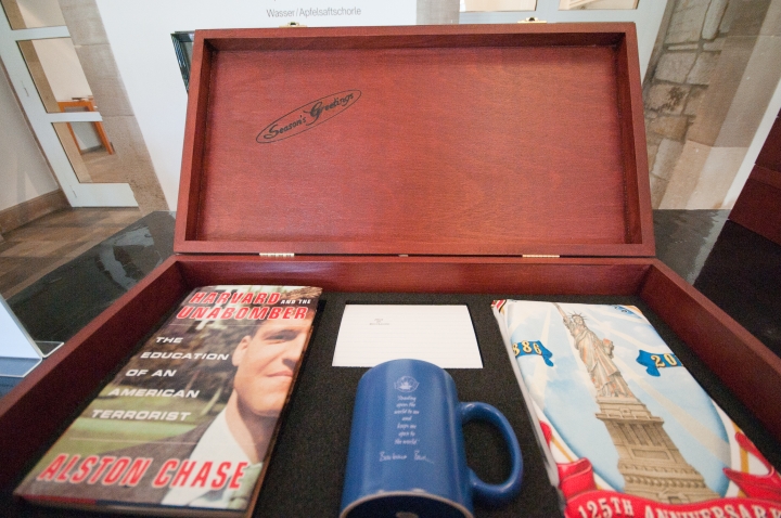
Danh Vo, Seasons Greetings, 2011, ed. 24, for the Fredericianum, image: newarteditions, which doesn’t have it.
The first Vo edition I regret not getting was Seasons Greetings, made for his show at the Fredericianum in Kassel. A gift box contains a T-shirt from the Statue of Liberty; a coffee mug with a Barbara Bush quote on it from the GHWB Library shop; a book about Ted Kaczynski Harvard sued out of print; and just when you think the loaded-souvenir-shopping-as-practice has gone too far, there is a card on which Vo typed out the name of the show, JULY, IV, MDCCLXXIV– using Kaczynski’s typewriter.
I started thinking about these editions because Tim Schneider hadn’t mentioned them, at least not directly. Tim broke out the auction performance for Vo’s works: of 52 pieces to come up for sale, 13 were not gilded cardboard or Statue of Liberty chunks, and 6 of these 13 were bought in. And two of those six, I realized, were the same piece.
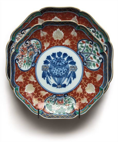
Danh Vo, Untitled, 2009, two Imari plates previously owned by Gen. Lyman Lemnitzer, ed. 7/12, not sold by Blake Byrne at Phillips NY, Feb 2016.
Two examples of Untitled, 2009 (above), from an edition of 12, had come up for auction: one at Phillips in 2016, from Daniel Buchholz (est. $8,000-12,000); and another, from Bortolozzi, in Christie’s London in 2015 (est. £10,000 – £15,000). [Christie’s deletes webpages for unsold lots, so unless you have a print catalogue, or an artnet database, you’ll need an Internet Archive.]
Untitled (2009) in 2010, hanging in Danh Vo’s kitchen. He opened his apartment as a venue for the Berlin Biennale. image: kunsten.nu
When Vo turned his apartment into an exhibition site for the 2010 Berlin Biennale, they were hanging in the kitchen [above]. And before that, in a Summer group show in 2009, Daniel Buchholz showed them in Köln. That credit line also includes an auction catalogue for the estate of Gen. Lyman Lemnitzer, which was unmentioned anywhere else.
Lot 3498: Lyman Lemnitzer’s Japanese dinnerware, as purchased in 2007 by Danh Vo for $625+premium, image:liveauctioneers.com
Which immediately got me wondering. And sure enough, there it is: 2007, Alderfer Auction in Hatfield, Pennsylvania. Among the various lots of Japanese Imari ware Gen. Lemnitzer had accumulated were twolots of twelve matching plates in slightly different sizes. They totaled, with premium, around $1200. Even as a barely emerging artist, I’m sure he netted out.
How low can you Vo? Lot 0402: 2pc Imari porcelain plates, looking very Vo-ish, sold for $60 in West Palm Beach, image: liveauctioneers.com
The super weird thing, though I didn’t know how weird yet, was that the day after I was searching for Vo’s 11-year-old sale, a near identical pair of Imari plates was coming up for auction in West Palm Beach. The pattern was identical, the marks identical, the sizes were very slightly different, but maybe not out of the auction houses’ margin of error. The auction estimate was $40-60. Even by the cruelest market calculus, that seemed like an unlikely price curve.
There must be thousands of plates like this, I thought, wrongly. A search through almost ten thousand auctions for Imari porcelain plates turned up only one that matched the Lemnitzer plates Vo bought and the two in front of me. [Sidebar: there is too much stuff in this world.] Could this pair be an overlooked Vo edition? If it was, could it be rescued? More interestingly, if it wasn’t, did it matter?
The auratic weight of provenance, history, culture, and memory are at the crux of Vo’s work. He buys the objects he buys because of these associations, and he puts them in an art context, where their backstory operates like an informational dye packet that explodes when you read a wall text, irrevocably staining the object in your mind, if not your eye. You can complain about the inertness or opacity of Vo’s objects, and their reliance on explanations, but I’m pretty sure he dgaf. And by the time you realize it, it’s already too late; Vo has changed the way you see–and think about–what he’s put before you.
So can that connection be severed? And if severed, can it be reattached? If it never existed, can it be conjured by an identical object? Vo spends an awful lot of time shopping. It’s probably the main part of his practice, besides chopping. These intangible issues, evocations, and associations hover around every transaction we make; it’s how brands work, how fashion works, how art works. Vo transposes his objects from one sphere–the historical, political, or personal–to another, but every time we trawl through eBay or a museum shop, so do we. Consumption and the mechanisms and networks of capitalism implicate us all.
Whether these Floridian plates once sat on the shelf of the American father of the Vietnam War is immaterial. Because now these plates evoke Danh Vo. And that is something.
If you bought these plates, please know that you only did so because the liveauctioneers app gave me the false impression that I had placed a winning bid, and then gave no warning before it closed the sale. While you enjoy your plates, I will enjoy thinking about them. [But if you want to unload them, HMU.]
Public Art Fund installation, 2014, image: James Ewing via PAF
I have been thinking a lot about [among other things, obviously] context. How much the time, place, history, experience, and state of mind influence our experience with an artwork.
I think of my encounters with Vermeer’s View of Delft, and of reading about Lawrence Wechsler’s crucial visits to Vermeers in The Hague while covering Bosnian war crimes tribunals at the International Criminal Court. Art provides solace, sanity, respite, and sometimes, it makes difficult truths known, quietly and powerfully, to those who seek, sometimes through what Berger calls, “a felt absence.”
A lot of people I see are turning to art for some of these same things right now, trying to grapple with the devastating results of the US presidential election. Which might be nice. But I can’t help thinking of a work I liked immensely, but which now feels all but unbearable.
Fridericianum install shot by Nils Klinger via CAD The Public Art Fund brought some to New York in 2014, but Danh Vo began showing pieces of We The People, his full-scale replication of the Statue of Liberty, at the Fredericianum in Kassel in 2011. That show’s title, JULY, IV, MDCCLXXVI, came from the tablet in the Statue’s hand.
Oddly, I didn’t remember the press release for the show being this explicit:
the sculpture is dissected into its individual parts and thus abstracted. In his recreation, Vo concentrates on reproducing the thin copper skin (the iron scaffolding supporting the figure is missing), which gives WE THE PEOPLE a special fragility. The broken icon, the destroyed allegorical figure of Libertas, forms a strong counterpoint to the massive materiality.
Maybe it’s the difference between abstraction and reality. Or their collapse into each other. A felt absence.
Oh no, I was too slow. I was in the middle of a deadline-intensive project when I suggested that. While I understood the reluctance, even the revulsion, an artist might feel, but being compelled by a judge to make a “large and impressive” artwork–and a $350,000 one, no less–sounded like a fascinating situation. What would you do?
…, 2015, oak and polychrome Madonna and child, French Early Gothic 1280- 1320; marble torso of Apollo, Roman workshop, 1st-2nd century ad; steel 154.2 × 50 × 50 cm
Courtesy of the artist and Marian Goodman Gallery [works list (pdf) via palazzograssi.it]
Well, today, just as I was mapping out the parameters of my own proposal, Danh Vo apparently answered that question himself. His proposal to Dutch-in-Switzerland collector Bert Kreuk was a little unclear in the details, but it involves a quote from the demon possessing Regan in The Exorcist, which Vo had also used for a piece in his show at Marian Goodman in London last January, and which he included in “Slip of the Tongue,” his fantastic group show at Punta della Dogana in Venice. [I guess it’s still available. Ask for it by name!]
Maybe Vo already had this whole Kreuk/Gemeentemuseum/lawsuit situation on his mind when he chose The Exorcist for his source material. Who knows? But the artwork parameters cited in the court’s new ruling in Kreuk’s lawsuit are intriguing enough to lay out, and at least give some though to the question: What Would Danh Vo Do?
JUNE 2015 UPDATE: The Dutch judge ruled in Kreuk’s favor, ordering Vo to create “a large and impressive” work as he apparently originally committed to do. There are other conditions and instructions, like, they have to get along and stuff [not kidding]. It’s an extraordinary ruling, and while I’m sure Borgias or burghers compelled artists to make stuff in the past, this proposes an almost unprecedented situation for the creation of a contemporary artwork. I’ll do a separate post on the matter, I think. Kreuk emailed me to let me know of the judge’s decision, reminding me that I had called his suit “folly.” I’m happy to be corrected when I’m wrong, but I’m not so sure I was. Winning can still be folly. I do know I’m even happier not to be involved in this mess. oy, is this a mess, and the reporting about it is not helping. As the English-speaking art world has learned in the last week or so, Dutch collector Bert Kreuk is suing Danh Vo for around EUR900,000 ($US1.2m) for failing to deliver a $350,000 installation commissioned for a show of Kreuk’s collection at the Gemeentemuseum in The Hague last summer.
The original RTL story [in Dutch] didn’t have many details of the case, but it did mention that Kreuk had been criticized for selling 11 works from the exhibition at Sotheby’s just weeks after it closed. This translated into artnet’s headline calling Kreuk an “art-flipper.” Which was apparently worse than losing a $350,000-1.2m Danh Vo, because it was the focus of much of Kreuk’s sympathetic q&a with Sotheby’s & BLOUIN ArtInfo writer Abigail Esman.
It all seemed rather confusing and odd to me, and frankly, cut and dry, legally, when an artist takes money and then doesn’t deliver. Kreuk had also said that “Danh Vo has already been ordered by the courts to finish another, different work in my collection, backed by an immediate due and payable fine of 40,000 euros and 2000 for each day of delay.” Which, again, seemed pretty severe, so I wanted to see the actual court documents, to see the facts underlying the various, specific claims Kreuk was making. Fortunately, one of Kreuk’s first tweets was a Dutch art law firm’s facebook post which linked to the Rotterdam District Court’s preliminary finding [Case no. C/10/442131 / HA ZA 14-57, by the way]. And now I am more confused. But I also find some of Kreuk’s characterizations inaccurate at best, and I think his lawsuit is folly, and he would be wise to withdraw it.
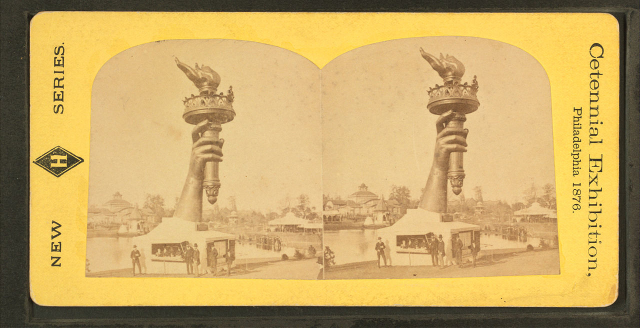
Here is an interview [in Danish, subtitled] with Danh Vo, on the making and exhibition of We The People (Detail), his full-scale copy of the Statue of Liberty. Many of the 400+ pieces of We The People were rotated and stored at the Statens Museum for Kunst in Denmark in 2012-13.
I am enthralled with this work; it strikes me as one of the smartest, most elegant, and provocative sculpture projects in years, and yet it didn’t occur to me until Vo mentioned it that Gustave Eiffel, who designed a steel armature to support Bartholdi’s copper repousse skin, did not see the Statue of Liberty installed in the US.
But reading up on the Statue’s history, it turns out the entire statue was assembled in Eiffel’s factory in France, and then disassembled for shipping. Also–and I did know this and should have remembered it–the statue began as parts, exhibited. Bartholdi made the statue’s arm and torch, which traveled to the US for the 1876 US Centennial, and which remained installed in Madison Square Park for several years afterward. And the head was exhibited at the Paris World’s Fair in 1878, all as part of a fundraising, promotional effort for the project. SMK TV: Danh Vo – We the People [smk.dk youtube via @aservais1]


 oy, is this a mess, and the reporting about it is not helping. As the English-speaking art world has learned in the last week or so, Dutch collector Bert Kreuk is suing Danh Vo for around EUR900,000 ($US1.2m) for failing to deliver a $350,000 installation commissioned for a show of Kreuk’s collection at the Gemeentemuseum in The Hague last summer.