
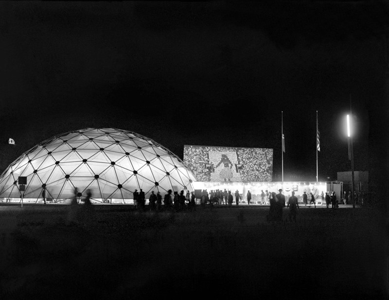
US Pavilion at Jeshyn Fair, 1956, photo by James Cudney
In the Spring of 1956, as the Jeshyn Fair celebrating Afghan independence approached, and the Soviets were well along in constructing a massive pavilion, US diplomats in Kabul thought the US better have one, too.
A USIA officer named Jack Masey commissioned Buckminster Fuller to create a 100-foot diameter geodesic dome in two months. His Raleigh, NC-based firm, Synergetics, Inc., apparently completed it in one.
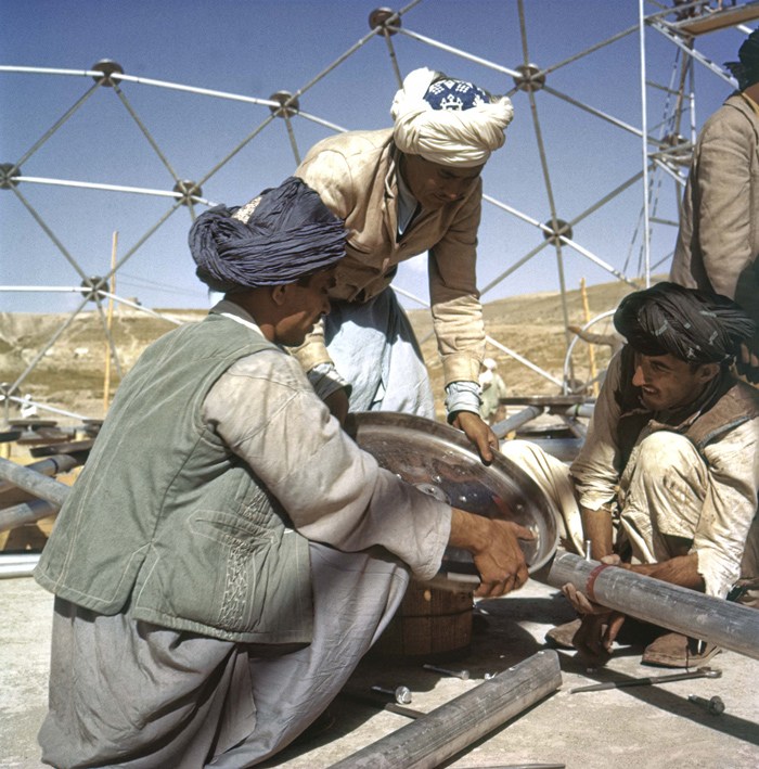
Pashto laborers assembling Buckminster Fuller dome, 1956, photo by Jack Masey
It was airlifted to Kabul, where a crew of local Pashto erected it in two days. The aluminum & plastic-coated nylon dome tent pavilion was a hit, “perhaps the most significant cultural event” of the “golden age” of US-Afghan relations, according to the creators of “In Small Things Remembered,” an exhibit looking at the history of the two countries’ relationship.
The show, which closed yesterday at the Meridian International Center in Washington, DC, was organized by Dr. Curtis Sandberg, VP of the Arts at Meridian, and sponsored by the State Department. It comprised photos discovered in various archives and foreign service officers’ private collections, such as Masey, above, and James Cudney, top, who spent eleven years in Afghanistan taking pictures, and developing various photography- and media-based culture, education, and diplomacy programs. Cudney passed away in 2009, but some more of his Afghan photos can be seen in the previews of two 2010 calendars he or his family created on lulu.com. They look pretty amazing.
Anyway, the US Information Agency and Dept. of Commerce continued to use the Kabul dome for trade fairs across Asia. As USIA’s director of design, Masey would go on to select Fuller to build the US Pavilion at the Montreal 67 expo, too.
In Small Things Remembered, at Meridian through June 5 [meridian.org]
Author: greg
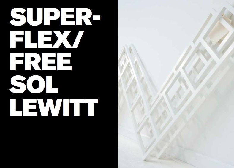
Faux Sol Mio: SUPERFLEX/ FREE SOL LEWITT
So awesome, yet, so annoying. How did I not know of this? When it was going on? I was emailing with the Van Abbemuseum at the time about replicas of artworks, particularly their refabrications of Laszlo Moholy-Nagy’s Light Space Modulator and his Raum der Gegenwart. I’d just been working on an exhibition proposal myself for turning a gallery into a production site for sanctioned art replication. I was hanging with SUPERFLEX themselves last October after the Creative Time Summit, just weeks after the show closed. I was knee-deep in museums and artists and copyright as I released my edition with 20×200.com. And yet I only find out about FREE SOL LEWITT this morning from Half Letter Press’s tweet?? Obviously, I bought the print version of the catalogue before the download for the free pdf version was complete. So I am clearly doing something wrong to have missed this.
Anyway.
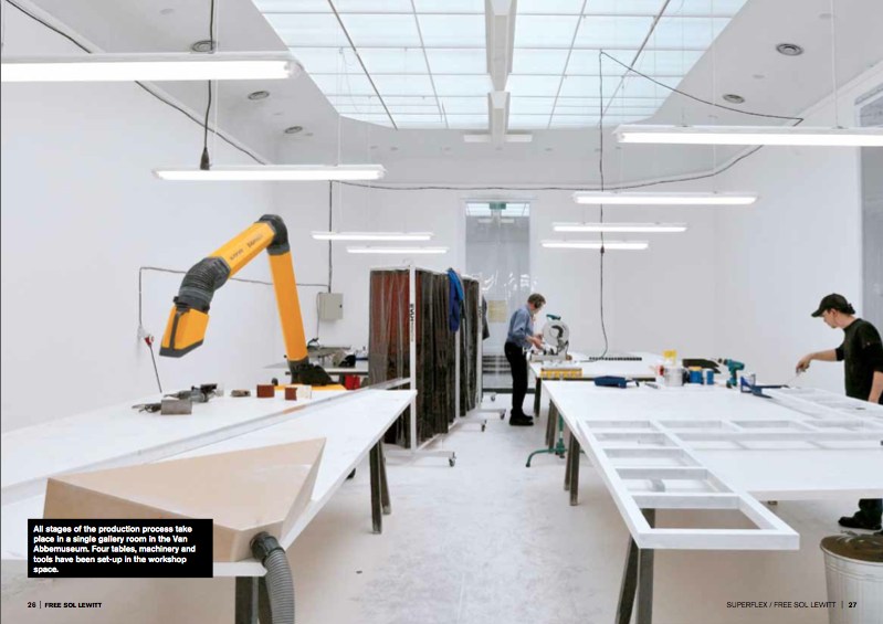
In 2010 the Danish artist collective SUPERFLEX curated an exhibition at the Van Abbemuseum in Eindhoven, “In Between Minimalisms,” that included a work of their own. [Which was in turn curated by curator-turned-lawyer Daniel McClean] FREE SOL LEWITT is a machine, a small-scale factory set up inside the museum, which created exact replicas of a work in the collection, Sol Lewitt’s Untitled (Wall Structure) (1972). The replicas, certified as new works by SUPERFLEX, were then given away to the public.
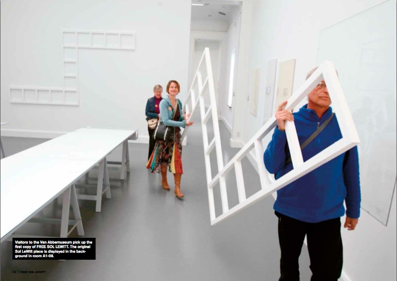
Some of the details of this production remain unclear, like how many were made. I gather that by working four hours/day, the aluminum cutter, welder, sander, and painter were able to produce 1-2 FREE SOL LEWITTs per week during the 20-week run of the show. Five were “almost finished” within the ten day interval between the opening of the show and the symposium held at the museum on the question, “Who Owns the Artwork?”.
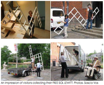
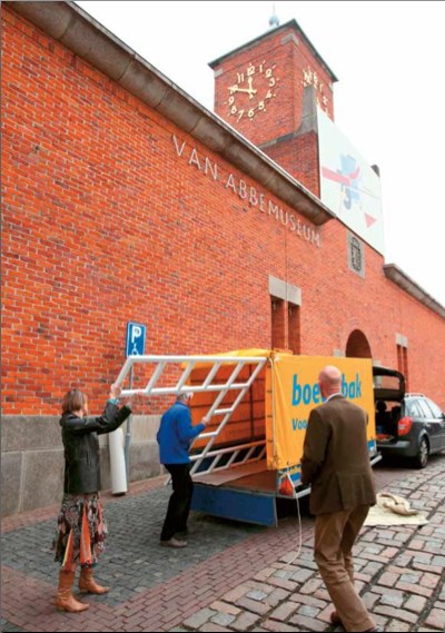
Or what happened to them. The FREE SOL LEWITTs were awarded by lottery to museum visitors who expressed interest in filling out a form. Except for the cheery faces of the lucky recipients of a few structures, who were photographed loading the almost comically large, unwieldy 2×3.5-meter work, unprotected, into rental trailers and vans, I can’t find any news of where or how the SUPERFLEX pieces are being put to use.
SUPERFLEX chose to replicate Lewitt’s work because his pioneering ideas of conceptualism, seriality, and art objecthood resonated with the collective’s own position toward copyright, exchange, and control.
In both essays and interviews in the catalogue, they challenged museums to make countering the constraints of copyright an integral part of their institutional missions. They spoke of the “artistic commonwealth” in which artists borrow and copy freely from each other, and artists and their estates and artists’ rights agencies do not shut down each others’ creative processes by the invocation of copyright. The project’s shape was inspired by Lewitt’s statement in 1973 that “ideas once expressed become the common property of all” and that “we artists, I believe are part of a single community sharing a common language.”
And then I laughed. Because though it’s clear Richard Prince is a citizen of the Artistic Commonwealth, it’s equally obvious that the United States is not a member.
SUPERFLEX/ FREE SOL LEWITT, April – Sept. 2010 [vanabbemuseum.nl]
Buy the FREE SOL LEWITT catalogue, $25 at Half Letter Press [halfletterpress.com]
SUPERFLEX [superflex.net]
Torn Scraped Triggered Erasure Produced
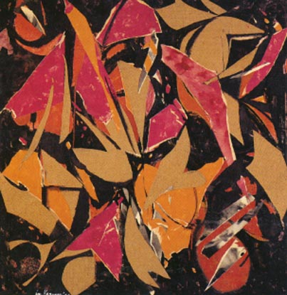
Lee Krasner, Bird Talk, 1955, oil, paper, canvas on cotton duck
Lesley Vance on Lee Krasner, in Artforum’s artists on ab-ex feature:
At one point in the early 1950s, Krasner grew dissatisfied with some drawings she had been working on in her studio, so she tore them to shreds and tossed the scraps on the floor in frustration. The sight of those fallen fragments triggered much of her subsequent work–collages made from ripped-apart drawings and, later, from torn sections of paintings.
I had a similar moment of destruction born from discontent a few years ago, only instead of tearing up my painting, I scraped away paint. This act of erasure produced a more intuitive composition and opened the door to the type of spaces I now pursue.
Leslie Vance at Kordansky
Brian Dillon on erasure, palimpsest, etc. [fort-da]
Encounters With Erased de Kooning Drawing
You know what, it’s the weekend. We can have two long Leo Steinberg-related posts at once. Read’em on the NetJets to Basel.
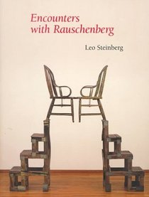 Though he mentioned it in his most important piece of writing, which was also the most important piece of writing on Rauschenberg, it’s not entirely clear whether Leo Steinberg had actually seen Erased de Kooning Drawing when he wrote “Other Criteria.”
And as he tells the story in his awesome 2000 book, Encounters With Rauschenberg – A Lavishly Illustrated Lecture, Steinberg makes not seeing it the point. I’m really tempted to include all seven pages of EdKD from the 85-page book–the text was published straight from his lectures for the 1997-8 Rauschenberg retrospective at the Guggenheim and Menil, and it really sounds just like him. [I met Steinberg in 1991 when the delightfully friendly woman I was sitting next to for his Picasso lecture series at Rice University introduced us; she turned out to be his host, Dominique de Menil. Life-changing, &c, &c. but not right now.]
But I won’t. Even though it’s out of print and expensive. It really should be a PDF now. Anyway.
Steinberg’s take on EdKD is useful here because he was watching Rauschenberg’s career and involved in its critical dialogue almost from the very beginning; he’s about as well-informed or as thoughtful an audience voice as Rauschenberg could find in the 1950s and 60s. And so his reaction seems like a good proxy for the best perspective possible of the time. And it sounds like, though he felt he had to address it, and though he could argue for its critical or conceptual significance, Steinberg didn’t really like Erased de Kooning Drawing very much. It bugged him. He even apologized to his lecture audience for spending “so much time on a negative entity” and a “one-time exploit.” But but!
The lead-in for his story about first encountering EdKD was, interestingly enough, an anecdote from 1961 and Rauschenberg and Johns, about artists putting personal content into their work, and denying it, and then eventually ‘fessing up, and so about not quite trusting what artists themselves said:
That experience confirmed me in a guiding principle of critical conduct: “If you want the truth about a work of art, be sure always to get your data from the horse’s mouth, bearing in mind that the artist is the one selling the horse.”
And did I abide by my principle? I should say not! My longest conversation with Rauschenberg occurred c. 1957, when I first heard about something outrageous he’d done some years before. And rather than going after the outrage–the horse, as it were–I called the trader.
[uh, don’t want to spoil the story arc, but isn’t not ignoring a lesson in 1957 that stems from looking back from the 80s to a 1961 conversation putting the horse before the trader? Just sayin’. -ed.]
The work in question was Rauschenberg’s Erased de Kooning Drawing of 1953. The piece had not been exhibited; you heard of it by word of mouth. I did, and it gave me no peace. Because the destruction of works of art terrifies.
See, now this is news right there: not exhibited before, word of mouth, a piece you know and worry about without seeing.
How could Bob have done it; and why? The work is often, and to this day, referred to as “a Neo-Dada gesture,” but that’s just a way of casting it from your thought. Obvious alternatives to Neo-Dada suggested themselves at once. An Oedipal gesture? Young Rauschenberg killing the father figure? Well, maybe.
But wasn’t it also a taunting of the art market?–an artist’s mockery of the values now driving the commerce in modern art?
This would put paid, so to speak, to Norman Mailer’s complaint that Bob was erasing to play the market. Steinberg tells how everyone was very aware/shocked/jealous/disturbed when a de Kooning finally sold for $10,000. And Rauschenberg was the one, don’t forget, who got the angriest at Robert Scull for his market-making auction some years later. But all these seemingly contradictory interpretations, Steinberg pointed out, were just assumptions from afar.
So I picked up the phone and called the horse trader himself. And we talked for well over an hour. Occasionally, thereafter, I considered writing up what I remembered of our talk, but then Calvin Tomkins discussed the Erased de Kooning Drawing in his Rauschenberg profile in The New Yorker, and he did it so well that I thought, “Good, that’s one less thing I have to write.” But I don’t mind talking about it and recalling whatever I can of that phone conversation.
On the first question of why, Rauschenberg gave an explanation similar to the one he’d told Emile de Antonio: he was interested in drawing with an eraser “as a graphic, or anti-graphic element,” and found that erasing his own work was unsatisfying.
As for why de Kooning and not some other pre-existing work of art, Steinberg examines and largely discounts the Oedipal explanation, and instead suggests that Rauschenberg recognized or claimed a kindred spirit, that erasure as a technique was central to de Kooning’s own practice. And yes, this section I’m obviously going to quote at length:
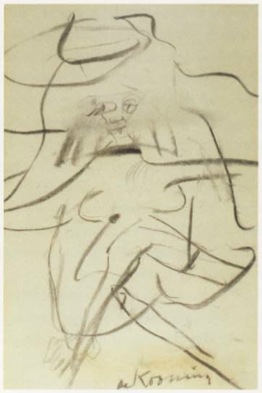
There is another reason, I think, why Bob lit on de Kooning. I live with a de Kooning drawing from the early 1950s–it’s of a seated woman, frontal, legs crossed [below]. The face was drawn, then erased to leave a wide, gray, atmospheric smudge; and then drawn again.
Willem de Kooning, Woman in a Rowboat, 1953
And here is Tom Hess’ account of Bill de Kooning’s working method. I’d like to read you a paragraph from Tom’s book Willem de Kooning Drawings (1972), and I’m encouraged to do this by the example of Rauschenberg’s Short Circuit combine, which, you remember, brought in some of Bob’s friends piggyback. Tom Hess was a friend; hear him describe de Kooning’s habit of draftsmanship.I remember watching de Kooning begin a drawing, in 1951, sitting idly by a window, the pad on his knee.He used an ordinary pencil, the point sharpened with a knife to expose the maximum of lead but still strong enough to withstand pressure. He made a few strokes, then almost instinctively, it seemed to me, turned the pencil around and began to go over the graphite marks with the eraser. Not to rubout the lines, but to move them, push them across the paper, turn them into planes…De Kooning’s line–the essence of drawing–is always under attack. It is smeared across the paper, pushed into widening shapes, kept away from the expression of an edge…the mutually exclusive concepts of line and plane are held in tension. It is the characteristic open de Kooning situation…in which thesis and antithesis are both pushed to their fullest statement, and then allowed to exist together…
This much Tom Hess.
In view of such working procedure, one might toy with this further reason why Rauschenberg’s partner in the affair had to be de Kooning, rather than Rembrandt or Andrew Wyeth. De Kooning was the one who belabored his drawings with an eraser. Bob was proposing a sort of collaboration, offering–without having to draw like the master–to supply the finishing touch (read coup de grace)
I could just go on and on. Steinberg noticed that, despite declaring his early love for drawing, Rauschenberg seems to have pretty much stopped drawing after the early 50s, Erased de Kooning Drawing was really about erasing drawing itself.
And since he brought it up, and in the context of collaboration, too, maybe that makes Short Circuit, which includes two paintings by his partner and ex-wife, a way to wrangle painting into its place, too: subsumed behind closed doors. It’s an admittedly rough analogy, but then, I only just thought of it.
In any case, Steinberg’s collaborative interpretation of Erased de Kooning Drawing is worth holding onto. On with the story:
Meanwhile, Bob and I are still on the phone. And Bob says, “This thing really works on you, doesn’t it?”…Finally, I asked, “Look, we’ve now been talking about this thing for over an hour, and I haven’t even seen it. Would it make any difference if I did?” He said, “Probably not.” And that’s when it dawned on me–it’s easy-come now, but the thought had its freshness once–I suddenly understood that the fruit of an artist’s work need not be an object. It could be an action, something once done, but so unforgettably done, that it’s never done with–a satellite orbiting in your consciousness, like the perfect crime or a beau geste.
Since then, I’ve seen the Erased de Kooning Drawing several times, and find it ever less interesting to look at. But the decision behind it never ceases to fascinate and expand.
It now seems to me that Rauschenberg has repaid de Kooning’s gift to him. For though we all know de Kooning to have been a great draftsman, I can think of no single de Kooning drawing that is famous the way some of his paintings are, except the one Bob erased.
Leo Steinberg On Erased de Kooning Drawing
So ultimately, Norman Mailer’s off the hook. We know that when he wrote about Erased de Kooning Drawing in the 1970s, 1980s, Mailer fragged Rauschenberg for selling it–which he hadn’t–as much as making it. And he got the title wrong: “A drawing from Willem de Kooning erased by Robert Rauschenberg”. Which might mean he never went to see it anywhere it was showing over the years, but it also means he probably felt he got the work, didn’t need to see it. And that he was reading art historian Leo Steinberg’s indispensable 1975 collection of writings, Other Criteria.
That particular wrong version of the inscription on EdKD comes from Steinberg’s title essay, which was first published in Artforum in 1972 as “Reflections on the State of Criticism.” Steinberg originally presented a version of “Reflections” as a lecture at the Museum of Modern Art in March 1968. It was one of a 10-part series of Wednesday night lectures by leading critics and historians [which happens to have been organized by the Modern’s Junior Council then chaired by Barbara Jakobson, which is the predecessor group to the group I chaired for a while, the Junior Associates. Needless to say, I have never felt like a bigger slacker than when I look back at all the stuff the Junior Council did in the 60s. Recordings of the series were restored in 2008, but the Steinberg lecture is not listed among them. I’ll look into that.]
Anyway, Steinberg’s piece is an epic refutation of Greenbergian modernism’s view of both Renaissance and contemporary art. For its compelling critical framework, its defense of content and for identifying what Steinberg called the “flatbed picture plane,” Branden Joseph dubbed “‘Other Criteria’ the single most important article on Rauschenberg’s production.”
Steinberg discussed EdKD along with a 1952 grass painting hung on the wall as an example of Rauschenberg’s early challenges to conventional expectations of orientation:
In retrospect, the most clownish of Rauschenberg’s youthful pranks take on a kind of stylistic consistency…When he erased a de Kooning drawing, exhibiting it as “Drawing by Willem de Kooning erased by Robert Rauschenberg,” he was making more than a multifaceted psychological gesture; he was changing–for the viewer no less than for himself–the angle of imaginative confrontation; tilting de Kooning’s evocation of a worldspace into a thing produced by pressing down on a desk.
Which is interesting, but maybe not quite as interesting as the fact that, as late as 1972 or even 1975, one of Rauschenberg’s greatest critical champions seems not to have noticed that his version of the inscription is actually incorrect. Or that the earliest exhibition date listed on the back of EdKD itself is actually 1973, in a show by an even closer Rauschenberg ally, Susan Ginsburg.
[Interesting sidebar: after posting SFMOMA’s photo of the back of EdKD, a regular greg.org reader told me s/he had seen EdKD getting reframed or rematted “in the late nineties” at Minagawa, and watched as they carefully reattached the archival materials on the back. Maybe Bob was sprucing it up before selling it.]
So anyway, as of the publication of Other Criteria, then, Steinberg considered Erased de Kooning Drawing as a “youthful prank” that was “clownish,” yet prescient. But it’s not clear that the great advocate of close looking had actually seen the work.
Part 1: ‘FRAME IS PART OF DRAWING’
Part 2: Erasers Erasing in Painters Painting
Part 3: Norman Mailer on Erased de Kooning and other ‘hopeless’ and ‘diminished’ art
Awesome Twitter Juxtaposition Of The Day
These tweets actually do reflect the opinions of greg.org:
Man At The Center With A Movie Camera
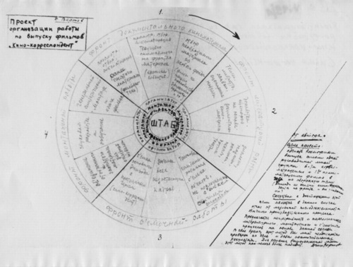
I’ve had this image of Dziga Vertov’s filmmaking process/org chart on my desktop for a couple of weeks now, ever since it was image of the day at mubi.com.
It’s specifically for his “Kino Korrespondent” films, which he produced in 1922-25. There’s crew in concentric circles, expanding out from the director. And the four quadrants of the wheel are apparently “fronts”: documentary, literary, recording, and editing. It seems like a cycle, or an iterative process.
MoMA just completed a major retrospective of Vertov’s films, including, for the first time, all his Kino-Pravda works. The working diagram immediately reminded me of the poster that was the icon for the series, from the 1930 film, Enthusiasm: Symphony of the Donbass. Enthusiasm is an experimental film symphony of synched documentary image and concrete sound.
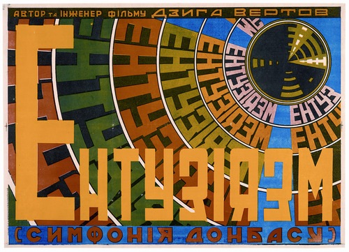
image of the day: how Dziga Vertov organizes filmmaking [mubi.com]
Image, obviously, from the Austrian Film Museum’s Dziga Vertov Collection [filmmuseum.at]
Dziga Vertov, 15 Apr – 4 June, 2011 [moma.org]
Norman Mailer On Erased de Kooning Drawing, Art
One of the more amusing Erased de Kooning references I’ve come across is from Norman Mailer. It’s reproduced in his 2003 book, The Spooky Art: Thoughts On Writing, but it seems to date from either a 1984 lecture or even a 1974 Esquire Magazine article. Mailer gets things wrong in a helpful way:
The work, when sold, bore the inscription, “A drawing from Willem de Kooning erased by Robert Rauschenberg.” Both artists are not proposing something more than that the artist has the same right as the financier to print money; they may even be saying that the meat and marrow of art, the painterly core, the life of the pigment, and the world of technique with which hands lay on that pigment are convertible to something other. The ambiguity of meaning in the twentieth century, the hollow in the heart of faith, has become such an obsessional hole that art may have to be converted into intellectual transactions. It is as if we are looking for stuff, any stuff with which to stuff the hole, and will convert every value into packing for this purpose. For there is no doubt that in erasing the pastel and selling it, art has been diminished but our knowledge of society is certainly enriched. An aesthetic artifact has been converted into a sociological artifact. It is not the painting that intrigues us now but the lividities of art fashion which made the transaction possible in the first place. Something rabid is loose in the century. Maybe we are not converting art into some comprehension of social process but rather are using art to choke the hole, as if society has become so hopeless, which is to say so twisted in knots of faithless ideological spaghetti, that the glee is in strangling the victims.
Yow, OK. To the extent that Rauschenberg wanted to create an imageless drawing, upon which would be projected the passing shadows of meaning and ideology, I think Mailer has helped him succeed.
Mailer’s focus on the non-existent financial motivations behind Erased de Kooning Drawing seem to show his fight is elsewhere. Not only did Rauschenberg not sell the work for more than 35 years, and only then at a discount to a museum, he actually destroyed a gift, a valuable drawing from one of the highest-paid artists of the time, when he himself was dirt poor and relegated to painting on newsprint.
But combined with his specific error on the inscription, Mailer’s market-centric misreading does help identify the source for his anecdote: it was Leo Steinberg, one of the first and most important critical voices on Rauschenberg’s work. Steinberg, whose major works like Other Criteria, require you to leave the screen and head to the shelf, old-school.
Before Steinberg, though one more from Mailer. He attributes this story [or non-story, as it turns out] to Jon Naar, the photographer who collaborated with Mailer on the epic 1973 book, The Faith Of Graffiti:
Years ago, back in the early Fifties, he conceived of a story he was finally not to write, for he lost his comprehension of it. A rich young artist in New York in the early Fifties, bursting to go beyond Abstract Expressionism, began to rent billboards on which he sketched huge, ill-defined (never say they were sloppy) works in paint chosen to run easily and flake quickly. The rains distorted the lines, made gullies of the forms, automobile exhausts laid down a patina, and comets of flying birds crusted the disappearing surface with their impasto. By the time fifty such billboards had been finished–a prodigious year for the painter–the vogue was on. His show was an event. They transported the billboards by trailer-truck and broke the front wall of the gallery to get the art objects inside. It was the biggest one-man exhibition in New York that year. At its conclusion, two art critics were arguing whether such species of work still belonged to art.
“You’re mad,” cried one. “It is not art, it is never art.”
“No,” said the other. “I think it’s valid.”
So would the story end. Its title, Validity. But before he had written a word he made the mistake of telling it to a young Abstract Expressionist whose work he liked. “Of course it’s valid,” said the painter, eyes shining with the project. “I’d do it myself if I could afford the billboards.”
I was waiting for an infant Dan Colen to crawl into this story, but alas. He must have read it in art school.
Google Ghost View
Oh, now this is interesting.
Andy links to an interior Street View-style panorama being featured on Google Offers. [Which is also interesting, but.]
But when you step outside into Street View’s street view, this is what you see:
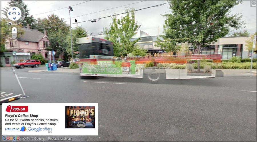
It looks like an enhancement of the way Google deals with obstructions by stitching differently timed images together in their panos. You can imagine that, as Google populates its image database, it will depopulate its published images, erasing more and more of the visual information it deems extraneous or obstructive.
This Google ghost bus will look novel, until it becomes the norm, and then it, too, will be refined out of existence.
Talk Like A Venetian
Oh, the Biennale! So many people asking you what you saw! So many names you just read on the page, or the label, or the banner, without pronouncing!
I’ll be adding some Venice Biennial names to the official greg.org art world pronunciation guide. If you see or hear any good ones, send or tweet them along!
First up, starting at the top:
Curator Bice Curiger
BEE-cheh. Like the restaurant on 54th St. Did you know it’s short for Beatrice? Just imagine Che Guevara taking an interpretive dance class: “Be a tree, Che.” and then leave out the “a tree,” cuz you guys are tight.
Koo-REE-gare, rhymes with Care Bear [via youtube]
On Erased de Kooning Drawing, Cont’d
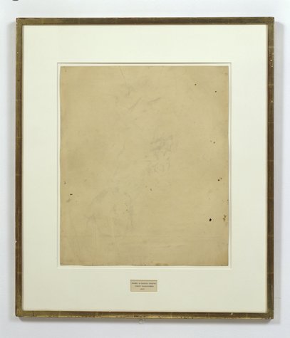
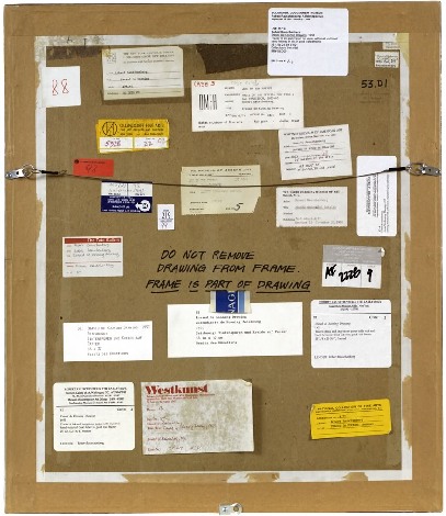
Robert Rauschenberg, Erased de Kooning Drawing, 1953, “drawing | traces of ink and crayon on paper, mat, label, and gilded frame.” via SFMOMA
So the basic question, “What do we really know about Erased de Kooning Drawing and how do we know it?” Is really driven by some recent discoveries that my understanding of the work and its story–its history–turns out to be wrong. Incomplete. Based on some assumptions that should, it turns out, be questioned.
For example, Erased de Kooning Drawing is regularly referred to know as one of Rauschenberg’s most important works, which prefigured or influenced entire movements in contemporary art. But so far, I haven’t found actual evidence that the work was even exhibited before 1973. It’s barely even discussed in the 1960s literature on Rauschenberg, never mind the 50s [It supposedly began shocking the art world soon after its creation in 1953.]
I’m always kind of torn between trying to figure this stuff out by piling on the research and citations and sifting through it, and then posting about it, and just documenting my inquiry, incomplete as it may be, as I go along.
I guess the key here may be laying out what freaked me out, and saying that it kind of blows my mind precisely because I’ve been spending so much time looking back at the relationship and collaboration between Rauschenberg and Johns, and at the stigmatized silence that continues to distort our view and our understanding of their crucial, early work.
A week or so ago, I saw a digitally remastered version of Emile de Antonio’s 1972 documentary, Painters Painting [Here’s the vanilla Ubu version.] De Antonio was a longtime friend of both Johns and Rauschenberg; he helped them get their earliest job together as window dressers for Bonwit Teller. I saw a 1976 note in the Smithsonian archives where Walter Hopps says that Bob called de Antonio “a hustler.” He became a complex and controversial filmmaker with a 10,000 page FBI file. For Painters Painting, he conducted extended interviews with both artists and a critically disparate range of others on the scene [the film was mostly shot in 1970]. According to my MFA brother-in-law, the film is a hilarious staple in art schools, which I think I object to; I may take on the film’s content and form head-on at some point, but not now.
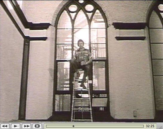
Rauschenberg recounted the story of making Erased de Kooning while sitting atop a ladder in front of the church-like windows of his Lafayette St studio. His delivery is deadpan, deliberately ridiculous, and not a little drunk. De Antonio’s editing is kind of disruptive, but the issue isn’t whether erasing the drawing took “nearly three weeks” or a month, or 15 erasers or 40. The issue is Erased de Kooning Drawing itself:
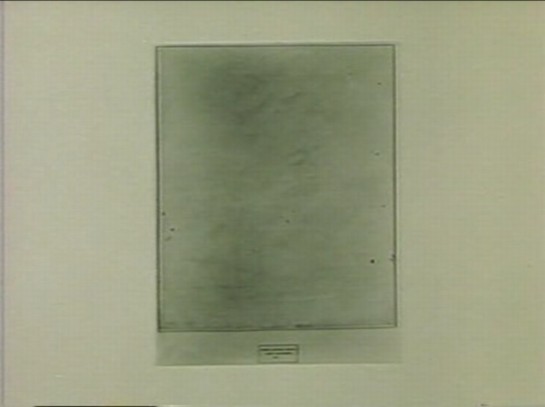
There’s no frame. And no mat. No nothing, just the drawing. Which feels substantively different. De Kooning’s original sheet appears to be mounted onto the piece of paper onto which the label was drawn. Where the mat now seems to separate the label and the drawing, without it, it seems like one thing. A collage, perhaps, but a joined, unified, self-contained whole.
Which makes the label not just a label, but a text, a set of marks, as much a drawing as the erased marks–or the erasure marks. Rauschenberg’s explanation to de Antonio is different from other, later tellings, and from the neo-dada, Freudian interpretations of others. He seems entirely clear about what he wanted to do:
One of the things I wanted to try was an all-eraser drawing. And, uh, I did drawings myself, and erased them. But that seemed like fifty, fifty. And so I knew I need to pull back farther, and like, if it’s gonna be an all-eraser drawing, it had to be art in the beginning.
He was trying to make a mark with an eraser. It’s the difference between erasing a drawing, and drawing with an eraser. And when he was done, the result was both an erased de Kooning and a drawing. And the hand-drawn label declared as much. It’s almost a perfectly symmetrical prefiguring of Joseph Kosuth’s One and Three Chairs, made a dozen years later.

But did Kosuth know and react to Erased de Kooning Drawing in creating his piece? Did de Antonio just happen to shoot the drawing while it was out of its frame, or did it look different–was it constituted differently–in 1970? And before? When did it change to the conceptual object, where the label is demoted, no longer an integral element, diametrically opposite but co-equal with the “drawing,” the concept, but now a separated, ancillary presentation device equivalent to mat and frame? Rauschenberg wrote on the back of the work, “FRAME IS PART OF DRAWING,” but I’m not sure that was always the case.
It seems to me that Erased de Kooning Drawing became one thing in the early 1970s, but before then, it was something else.
Previously: ‘FRAME IS PART OF DRAWING’
Next up: looking back at what was said and written and known and shown about Erased de Kooning Drawing before 1973.
‘Art Doesn’t Begin And End In A Physical Frame’
So I try to take a break from this [now rather long] exploration of the history of Robert Rauschenberg’s Erased de Kooning Drawing by reading my Avalanche magazines.
And there I find an announcement for Oh Dracula, a 1974 Chris Burden performance/installation which took place at the Utah Museum of Art at the University of Utah in Salt Lake City. Really? Yes.
October 6 – October 9, 1974, in fact, which makes it one of Burden’s earliest museum shows.
But it seems that the piece was not just organized by the museum, but as part of the Joint Conference of the Western Association of Art Museums and the Western Regional Conference of the American Association of Museums, which was held in Salt Lake that year. I’ve added it to the research list.
Avalanche said cellophane, but in a 2000 essay in Frieze Ralph Rugoff said canvas. Either way, Burden climbed into a “chrysalis”-like sac and had himself installed in between some of the museum’s exceedingly random 18th century paintings, with candles placed at his head and feet. And there he hid all day.
Rugoff’s piece is about invisibility; he talks about Burden’s hiding pieces, and John Cage’s silence, but not Erased de Kooning Drawing, even though his ending paragraph reminded me of it:
But perhaps the most salutary effect of invisible art lies in the chameleon-like array of meanings which have cloaked it over the past half century. Rather than simply serving as a static limit defining the no-go zone of artistic practice, it has alternately appeared under the guise of the Sublime, of social idealism, avant-garde aggression, personal humility and ironic commentary. No single artist has been able to possess invisibility as a signature medium, and its wayward history gently yet pointedly mocks our waning belief in the cult of originality. It suggests instead that art doesn’t begin and end in a physical frame or a singular context, but lives on in the potentially endless process by which we make use of it.
Oh Dracula isn’t mentioned in Burden’s current bio, and though I talked about Burden while I was lecturing at the University of Utah, no one there mentioned it to me, either. So it’s a different kind of erasure.
Touched by your presence [frieze]
‘FRAME IS PART OF DRAWING’
How do we know what we know, and when?
For instance, we know that Erased de Kooning Drawing (1953) is one of Robert Rauschenberg’s most important, influential works. It’s the kind of commonly accepted history that lands a piece in the Final Four of Tyler Green’s Art Madness poll to determine America’s Greatest Post-War Artwork.
And we know the story of it, how Bob took a bottle of liquor with him to Bill’s studio to ask for a drawing to erase. And how Bill, at first reluctant, twice-validated the sacrifice by giving away “a drawing he’d miss” and which would be “hard” for Bob to erase. And then Bob signed it and framed it and sparked an art world scandal with it which hasn’t really abated. We know this because Bob and then his curator and critic advocates repeat the story so frequently. [Vincent Katz has a nice telling of it in Tate Magazine in Autumn 2006.]
But this weekend, I suddenly had cause to wonder just how all this went down, and when, really, did this revolution start? Because it’s not as clear or as obvious as I had always assumed.
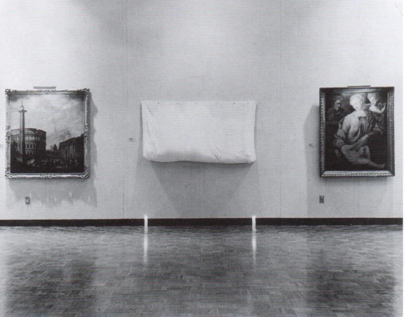
That’s Erased de Kooning Drawing up there, precisely matted and framed. That’s how I saw it for the first time in Walter Hopps’ “Rauschenberg In The Early 1950s” show at the Menil 20 years ago, and then again in John Cage’s “Rolywholyover” a couple of years after that. [Or am I conflating the two Guggenheim SoHo versions of those shows?]
At the time, it was still in the artist’s own collection. In 1998, SFMOMA acquired it along with a group of other Rauschenberg works. [Calvin Tomkins wrote in the New Yorker in 2005 that MoMA was offered the works first and turned them down.] Its official description: “drawing | traces of ink and crayon on paper, mat, label, and gilded frame.” It’s not just a drawing, not just an erased drawing, it’s an object assembled.
SFMOMA has a nice little, c.2000 interactive that includes the back of the piece:
“DO NOT REMOVE
DRAWING FROM FRAME
FRAME IS PART OF DRAWING”
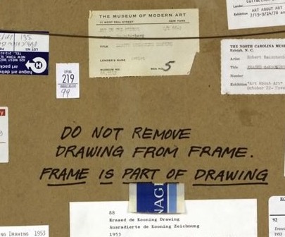
LOVE THAT. I could geek out staring at the backs of artworks all day. Did Bob himself write that? It looks like it.
The early line on Erased de Kooning was either “neo-dada,” which was a standard critical reaction to Rauschenberg in the 50s, or AbEx patricide. But it has since evolved far beyond these bad boy, enfant terrible readings, to be considered a precursor of huge swaths of contemporary art.
In his 2009 book, Random Order: Robert Rauschenberg and the Neo-Avant-Garde, Branden Joseph discussed Erased de Kooning Drawing as one of the touchstones of conceptual art and appropriation art, alongside Marcel Duchamp’s mustache-on-the-Mona-Lisa, L.H.O.O.Q:
Whether by defacement or effacement, the two works’ devaluation of the appropriated representation (an essential factor in the process of allegorization) is equally effective. Rauschenberg’s subsequent mounting of the erased sheet of paper within a gold frame, together with the addition of a carefully hand-lettered label with a new authorial attribution, title, and date (“Erased de Kooning drawing / Robert Rauschenberg / 1953”), simultaneously doubles the visual text with a new signification and calls attention away from the (now depleted) visual aspect of the work and toward the conventional and institutional devices of the work’s “framing.”…For Rauschenberg’s Erased de Kooning Drawing essentially reenacted the reception of his White Paintings: the initial evacuation of expressive or representational meaning in favor of transitional, temporal forces subsequently gave way to a process in which meaning was reattributed to the work from the outside.
Indeed it was. As the White Paintings were to the reflections and shadows in the room, so Erased de Kooning Drawing was to passing theories of art.
In 1976 Bernice Rose put “the famous Erased de Kooning drawing” along side Jasper Johns’ Diver at the foundation of The Modern’s major survey, “Drawing Now.” Reviewing the show for the New Yorker, Harold Rosenberg dismissively labeled Pop, Minimalism and Conceptualism, the work that followed Rauschenberg’s and Johns’s “parodies of Action painting,” as the new “Academy of the Erased de Kooning.”
Later that year, the drawing was in Walter Hopps’ Rauschenberg Retrospective at the Smithsonian, which traveled back, in 1977, to MoMA. Where it prompted Grace Glueck to open her NY Times story with a rhetorical question–“Wasn’t it only a couple of years ago that Robert Rauschenberg erased a drawing by Willem de Kooning?”
Yes, only a couple, give or take twenty four. Maybe it just took that long to get it. We had to wait for Conceptualism to be invented before anyone could recognize Erased de Kooning was its foundation.
In the September 1982 issue of Artforum, none other than Benjamin Buchloh discussed Erased de Kooning Drawing‘s historical importance in a sprawling 14-page essay titled, “Allegorical Procedures: Appropriation and Montage in Contemporary Art”:
At the climax of the Abstract Expressionist idiom and its reign in the art world this may have been perceived as a sublimated patricidal assault by the new generations most advanced artists, but it now appears to have been one of the first examples of allegorization in post-New York School art. It can be recognized as such in its procedures of appropriation, the depletion of the confiscated image, the superimposition or doubling of a visual text by a second text, and the shift of attention and reading to the framing device. Rauschenberg’s appropriation confronts two paradigms of drawing: that of de Kooning’s denotative lines, and that of the indexical functions of the erasure. Production procedures (gesture), expression, and sign (representation) seem to have become materially and semantically congruent. Where perceptual data are withheld or removed from the traditional surface of display, the gesture of erasure shifts the focus of attention to the appropriated historical constrict on the one hand, and to the devices of framing and presentation, on the other.
Whew. But.
Back up. Because here is Buchloh’s account of the gesture, and of the “device of framing and presentation”:
After the careful execution of the erasure, which left vestiges of pencil and the imprint of the drawn lines visible as clues of visual recognizability, the drawing was framed in a gold frame. An engraved metal label attached to the frame identified the drawing as a work by Robert Rauschenberg entitled
and dated 1953.
[Emphasis added because, WTF engraved metal label?] When did it have a metal label?
There wasn’t one in 1991 when I saw it. And there wasn’t one in 1976, when Walter Hopps wrote this catalogue entry: “He [Rauschenberg] then hand-lettered the title, date of the work, and his name on a label and placed the drawing in a gold-leaf frame bought specifically for it.” [Oddly, the only source Hopps cites is an Interview Magazine Q&A, dated May 1976, just as the catalogue was being produced.]
There is no way that the hand-drawn label in the middle of the mat of Erased de Kooning Drawing could be mistaken for a metal label on a frame. At least if you had seen the work in person. Or had discussed it with anyone who had. So the implication, then, is that in 1982, Benjamin Buchloh had not actually seen Erased de Kooning Drawing, or that he’d misremembered it or misread a photo of it, and neither he nor anyone at the magazine of record noticed the error. Which does make some sense if Erased de Kooning is a conceptual work in the mode of Joseph Kosuth, not an art object, per se but an “idea of an art work [whose] formal components weren’t important.” [Of course, Kosuth said that in 1965, more than a decade after Rauschenberg apparently already demonstrated it.]
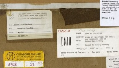
But there are some problems here. Judging by all the registrars’ labels and notes on the back, it seems impossible that someone like Benjamin Buchloh would not have seen Erased de Kooning Drawing in the 30 years since its creation. But looking more closely, I can’t find any exhibitions dating before 1973. That’s when Susan Ginsburg’s show, “3D Into 2D: Drawing For Sculpture,” opened at the New York Cultural Center. [Ginsburg was, among many other things, a board member of Change, Inc., an artist emergency assistance foundation Rauschenberg started in 1970.]
Was Erased de Kooning Drawing shown in the 60s? Or the 50s, for that matter? Where? How? What was the reaction? Because the triumphant Conceptualist historicization of the work seems to have obscured–if not actually erased–its early history.
Grate Art
Oh, yeah. With this awesome cheese grater screen, Mona Hatoum has just won a 10-year pass in my book; she can do whatever she wants.
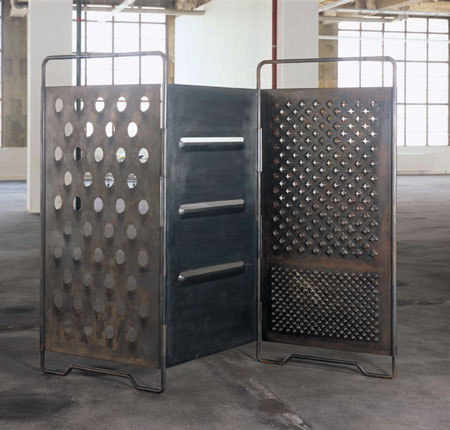
Oh, really? It’s called Grater Divide? And it was made in 2002? Well, her 10-year-pass is just about up.
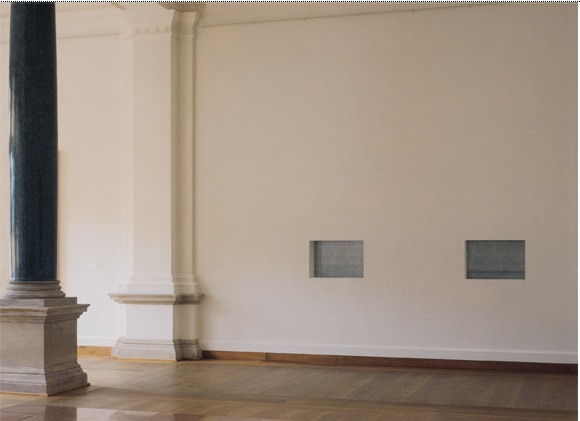
Wall Works
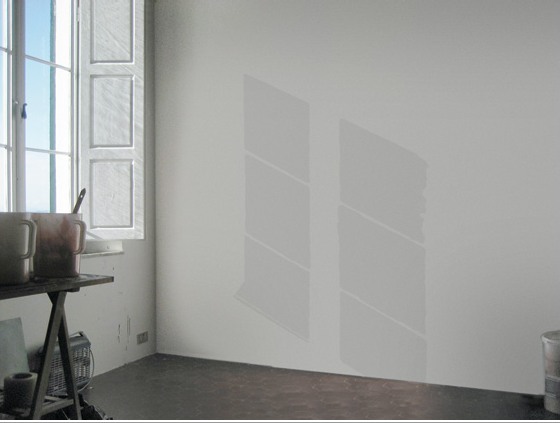
I’ve always admired the series of site-specific Wall Works produced over the years by Edition Schellmann, even though I’ve never mustered the courage to buy one. Fear of commitment, I guess. Too nomadic.
Well, no, that’s not quite right. Because their finitude is part of their appeal. The way they thwart commodification and exchange by being limited, by nature and design, to a finite number of installations.
You could cheat, I suppose, and reinstall your Judd elements once you know the ratio. Or re-paint your Darren Almond sunlight once you know the angle or time. But then what have you got? If you’re going to ignore the artist’s intention, you might as well save the dough and fabricate the whole thing anyway.
Anyway, none has ever made me sad, until now:
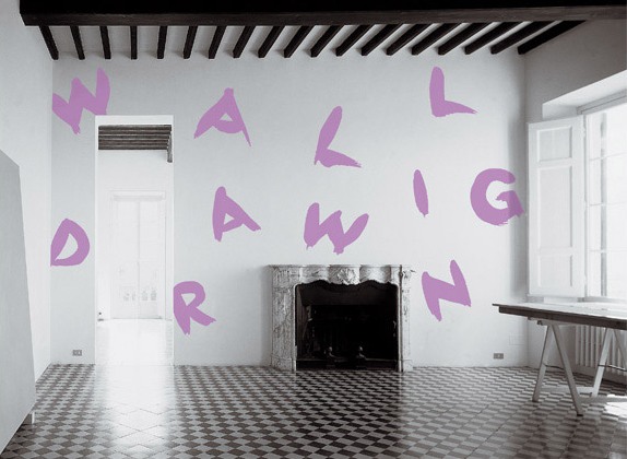
Wall Drawing, Sol Lewitt, 1992
description:
“wall drawing” to be written on a wall in the hand of the owner, medium and size to be chosen by the owner. Limited to 10 installations. Certificate: an 8 x 10″ black and white photograph of the installation, sent by the owner to the artist, who will sign, number and return it.
I guess finitude is the right word:
Finitude. To be carefully distinguished from “mortality.” Finitude refers not to the fact that man dies but to the fact that as a free choice of his own project of being, he makes himself finite by excluding other possibilities each time that he chooses the one which he prefers. Man would thus because of his facticity be finite even if immortal.