
I think Jason’s tuning that one a bit, but still.
I’ve had this one sitting on my desktop for a little while, actually.

Author: greg
Process Color Street View
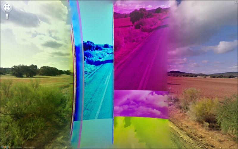
I kid about Jon Rafman, but it’s out of love. Just check out this incredible pano of BF wherever stitched together from different CMYK separations. It could be a Rauschenberg or something. By which I mean it’d make a great painting or print.
And which is kind of what caught me up about it; I’m sure it’s just some automatic step in the Street View imaging process, but I always associate CMYK with print output, not screen. Maybe someone who knows this stuff better can explain the advantages of converting RGB to CMYK for images that are presumably never intended to leave the digital world.
2/12 update: thanks to a Guardian slideshow of 9-eyes, we now know this was shot on CM-4009, north of Polan, Spain. It also appears to be the effect of a wonky rear-facing camera. Similar spectral striations appear all along the road, interspersed with a patch of b/w or desaturated imagery knitted into the pano, which I assume isolates the effect to a single camera. The CCD striations contrast nicely though with the occasional appearance of their optical equivalents: old-school lens flares from the sun. Ironically, the particularly awesome glitch Rafnan highlighted seems to have been removed or reprocessed. Another reminder that Google is watching the watchers.
Previously:
Google Street View’s shiny balls
Google Lens Cap View
Walking Men, or the Google Street View Trike has a posse–who delete images of themselves when they’re published on blogs
The Satelloons Of Buckminster Fuller
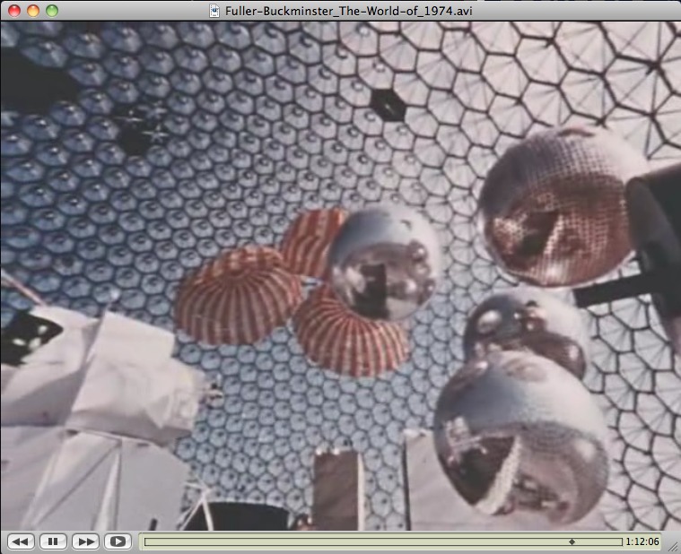
You know, every once in a while, I think that it’s crazy to be considering satelloons as art instead of what they really were–aestheticized objects designed to be seen and exhibited.
And then I’ll catch a glimpse of Expo 67 somewhere, and realize I’m still well inside the bubble.
A still from The World of Buckminster Fuller, which is on DVD, available at Amazon, not ubu.com, why would it be?
Previous Expo67 posts:
not that anyone asked, but here’s Fuller’s own idea for the US Pavilion
on the American Painting Now show, organized by Alan Solomon
the Canadian fracas over Barnett Newman’s Voice of Fire
Forgot how much I loved writing this post on art protestor/greenhouse owner John Czupryniak’s Newman knockoff, Voice of the Taxpayer
Expo 70 design finding the Expo 67 Pavilion hard to beat
Device For Producing Light Effects
This is basically the funniest Oskar Fischinger post you will ever read.
Oskar Fischinger’s Love Machine [lacmonfire]
Donald Trump Will Not Be President.
I went to the groundbreaking ceremony for MoMA’s new building. It was held in a large tent in the Sculpture Garden. The time came when all the VIPs were supposed to don ceremonial hardhats, and take their ceremonial shovels, and then take their first ceremonial photo-op scoops in the sandbox in front of the dais.
I was sitting on the far edge, and Mayor Giuliani’s security detail was standing next to me.
When a MoMA operative began putting the helmets on the VIPs’ heads, they tightened into a panic. “Oh, shit, not the hair,” they stage whispered. “NOT the hair.” Maybe they were praying, because no one could hear them but the Good Lord and myself, and I was actually praying for the helmet.
I was reminded of that extreme combover encounter as I watched this clip of Donald Trump nuzzling his mug into Giuliani’s drag queen cleavage. Trump’s part is somewhere on the back of his neck, just high enough that the rest of his hair looks like those stubby, shaving brush ponytails that were all too common in the early 1990s [insert mea culpa here].
I just point this out because at least Giuliani lost the combover before he went on his own ego- and business-prospect inflation tour by pretending to run for President.
Some Vija Celmins Interviews
This LACMA interview with Vija Celmins about her show there of early work is just great. [The show itself is great, too; it was first at the Menil.]
No sooner did I watch it, than Celmins’ name came up in the Jasper Johns Gray catalogue. And I decided that what’s needed is more Vija Celmins interviews.
And that’s when I realized that my expectation that there weren’t enough Celmins interviews was based on my reading of her work as so quiet and self-contained. In fact, Celmins herself is quite open, and gives lots of great, thoughtful interviews.
Here’s another from 2008, the Carnegie International:
Art21 did one, of course, but this clip’s only a minute long.
Simon Grant did a pretty long career-related interview with Celmins for Tate in 2007, which used the Pompidou’s drawings retrospective as its hook.
I started going through my photographs and newspaper clippings that I had collected -images of Second World War planes, a nuclear explosion at Bikini Atoll, an airship – and I made drawings of those.
Reading that, and thinking of the Menil/LACMA show, my being reminded of Joy Garnett’s paintings doesn’t seem that far afield after all.
Anyway.
Phong Bui’s 2010 interview is classic Brooklyn Rail: deep and specific on history and the work. Ah, see? Here’s the word I was looking for, the one that threw me off of Celmins’ interview path:
Rail: Guston also loved Morandi, whom I know you admire, and Morandi’s most admired painter was Chardin.
Celmins: I like Chardin, too.
Rail: Especially the late Chardins, depicting the modest interiors, which include kitchen maids in moments of reflection. They were generally painted with muted lighting and therefore created a quiet ambiance, which also is reinforced by the subdued color scheme. The series that made the depiction.
Celmins: You know that muteness exists in Vermeer, Chardin, and Morandi. I don’t know who else you would say, in contemporary art. Would you say Ryman? It’s hard to say.
Rail: It’d be hard to talk about silence or quietude.
But you know where THE Celmins interview is? In a book. Chuck Close interviewed Celmins, at Bill Bartman’s behest, and A.R.T. Press published it in 1992. I think I may even have that somewhere. I certainly thought about buying that etching of Saturn often enough. Gotta track that down.
Dwelling For Seclusion, By Observatorium

I’m trying to remember what made me think of this. I’m coming up blank.
In 1995, Geert van de Camp, Andre Dekker and Ruud Reutelingsperger decided to work together to create space which facilitated longer-term contemplation. They called their collaborative Observatorium.
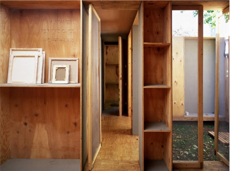
In 1997, they set up their second Observatorium structure– in this case, a small, modernist house-like space made mostly of plywood bookshelves–at Snug Harbor Cultural Center on Staten Island. You could arrange to stay in it for 24 hours, a day and a night. It was like Rirkrit’s apartment replica at Passerby, but only for one person at a time. Like De Maria’s Lightning Field, only turned inward, for communing with an interior landscape.
Somewhere over the years, I’d gotten it in my head that the Observatorium was by another Rotterdam-based collective, Atelier van Lieshout, and I’d periodically try unsuccessfully to find it again.
Here is the Observatorium website [observatorium.org]
And their blog. [observatoriumrotterdam.blogspot.com]
Look, they’re at the Marin Headlands now, organizing a residency/workshop to address the use of the old Fort Barry Gymnasium building. [opentotheelements.wordpress.com]
They have a new book: Observatorium: Big Pieces Of Time [6 to 9 weeks?]
Publishing A Book? Check Your Wok
So I try to create a book with as little creative alteration as possible, to hew as closely as I can to the court documents themselves, without changing, editing, or annotating them at all.
OK, so I weave images from the exhibits they’re discussing into the sections of the transcript where they’re discussing them. And–NO design–I only use Preview’s default annotation settings–giant, red Helvetica–to create the headings, and the table of contents, and the cover.
OK, so I have to cheat a little to get the cover to work, so I do end up re-keying the cover in the cover wizard, so that it matches the annotation typeface. But that is IT.
And what happens when you are aggressive about not trying to create an aestheticized object–or rather, to create an aestheticized object that looks like you did nothing aesthetic to create it? When you try to write less than a hundred words total, including your self-consciously long title?
Well, we can ask Brett in Miami. He’s the first one who spotted three–three!–typos on the back cover of the softcover edition. Well, he’s the first one to let me know he spotted them, anyway. And for that I thank him.
I corrected two immediately, and I’m still pondering about the third: “…it is intended to serve as an art historical and critical resource, filtering relevant primary information about Prince’s biography, practice and wok…”
I mean, couldn’t it stay? “Oh, Richard Prince, I love your wok!” Maybe it’s the t-shirt.
update: here’s the link to the new printer, where you can buy the expanded edition in softcover.
Quote Of The Day
Italics in original:
Nan Rosenthal: Does the color gray carry for you a suggestion of ambiguity?
Jasper Johns: Everything carries for me a suggestion of ambiguity.
From the q&a in Jasper Johns Gray
On The Execution of Maximilian
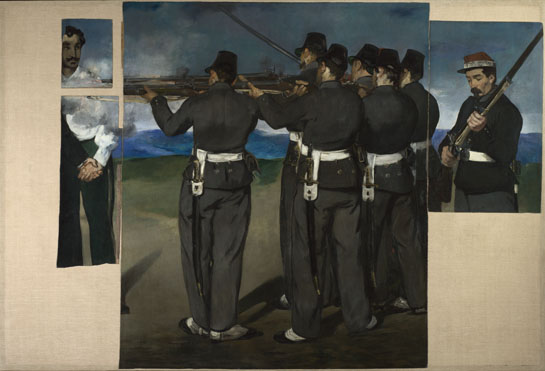
The Execution of Maximilian, Edouard Manet, image via national gallery
Edouard Manet made three large paintings in 1867-8 on The Execution of Maximilian, a subject torn from the day’s headlines, but which, because they were critical of Napoleon III’s policies, were never exhibited in France in his lifetime. [Maximilian was a Hapsburg who Napoleon had installed as a puppet emperor in Mexico. He was executed when the French army abandoned him and deposed Mexican president Benito Juarez regained power. A lithograph stone Manet was creating on the same subject was apparently confiscated, and only returned after the artist publicly protested.] Their composition all relate to Goya’s Third of May, which Manet saw in 1865.
The second painting, above, was cut into pieces after Manet’s death in 1883, and sold separately by his heirs. In the 1890s, Degas repurchased the fragments and remounted them on a single canvas the size of the original painting. The National Gallery in London acquired the piece[s] in 1918, and had them disassembled and framed separately until 1992, when they were once again reconstituted on a single canvas.
I’m kind of fascinated by all this history–the history of Manet’s painting itself, that is, not just the charged history he depicted. I think I will look into it some more, probably starting with John Elderfield’s catalogue for MoMA’s 2006 exhibition which brought all of Manet’s Execution of Maximilian works together for the first time.
I mention it now because the circumstances of Manet’s painting are discussed several times in Jasper Johns Gray, the catalogue of that incredible show at the Met in 2008 [and at the Art Institute before that. Good morning, Chicago!]. Johns had been invited by the National Gallery to make a work “in dialogue” with a work in the collection, and he chose this collaged, fragmented Manet.
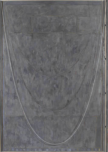
Near The Lagoon via metmuseum
Johns took the composition of the Manet fragments as a formal element in several of his Catenary works, including Near The Lagoon (2002-3). As RIchard Schiff put it,
The “picture,” as a collage, is something of an “object.” Each fragment maintains a strong material presence, for its external shape is unrelated to (alienated from) the pictorial composition within it. Johns treated the shapes themselves as comprising an abstract image, a composition. He mimicked their placement and proportions with his own collaged pieces, then rotated the entire configuration clockwise 90 degrees so that it assumed a vertical orientation.
Schiff goes on to discuss pictures’ freedom from gravity as compared to a catenary’s dependence on it.
Johns’ paintings are interesting for the directness of their engagement with other artists–not just Manet, but Degas, and even Goya. There are other spots in the Gray catalogue where Johns’ Catenary paintings are considered to be in dialogue with Rauschenberg’s 1955 combine painting Untitled, which has a parachute affixed to the surface. [Johns owned the work for years, having bought it out of Bob’s 1963 Castelli show. Which, hmm, complicated? Also, I can’t find an image of it online.]
I guess I’m most interested, though, in trying to get a better sense of how collage and this picture/object relationship play out across Johns’ work, particularly with regard to canvas. There are examples reaching way back to the Short Circuit era where Johns affixes canvas on canvas, pictures [sic] on pictures [sic], or where he builds up a single work from multiple stretched canvases attached together.
[There are also many works where Johns uses hinges and doors in his work, both of which appear in Short Circuit. So far, I can’t find anyone who has taken a look at these elements specifically in Johns’ work. One thing I’m finding, though, is how this single, early combine–which has been largely unseen and unstudied since its creation, and never in the context of Johns’ work–casts a different light on much of the established critical discussion. It’s like a trigger to question the assumptions and the interpretations and inferences which have accreted over the decades.
If Short Circuit is an anomaly, a work wholly isolated from both Rauschenberg’s and Johns’ other works of the time and since, then it probably doesn’t matter; it’s just an art historical oddity. I’m kind of testing the hypothesis, though, that Short Circuit and the Flag Johns put in it, have a direct, possibly even foundational, relationship to the artists’ work. If that’s true, then it seems like it would ripple through their careers and upend much of the received understanding of these two artists. At least that’s the theory.
What Books May Come

Looks like Monday is Unboxing Day. Whether UPS or USPS, be sure to thank the union members who worked through the weekend to bring you your art nerdy books.
The hardback with the current cover design [updated link, see below] arrived in Mondo Blogoland. I really do like this cover, too. Patrick thinks I should change it back to the softcover version, though, so that his is more collectible. Which is a very generous and slightly hilarious thing to say.
I was also thinking of making a 2-color silkscreen print out of this cover image. Or maybe even a whole portfolio of the Prince v. Cariou exhibits. I tell you, look at Rauschenberg too long, and you’ll want to start silkscreening everything that’s not pinned down.
Oh ho, at Joy Garnett’s studio [below], they staged an impromptu reading of my “conceptual piece.” And now I’m thinking that staging a dramatic re-enactment of portions of the transcript some night could be a lot of fun. Hmm.

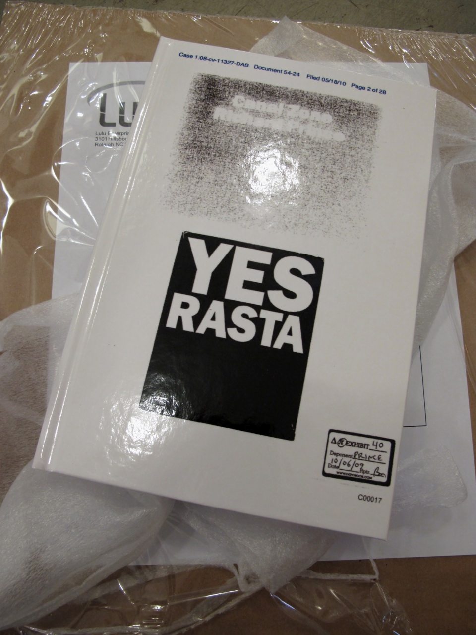
Meanwhile, back at Canal Zone Richard Prince YES RASTA: Selected Court Documents &c., &c. HQ, the champagne mangoes have a new, romantically exotic friend:
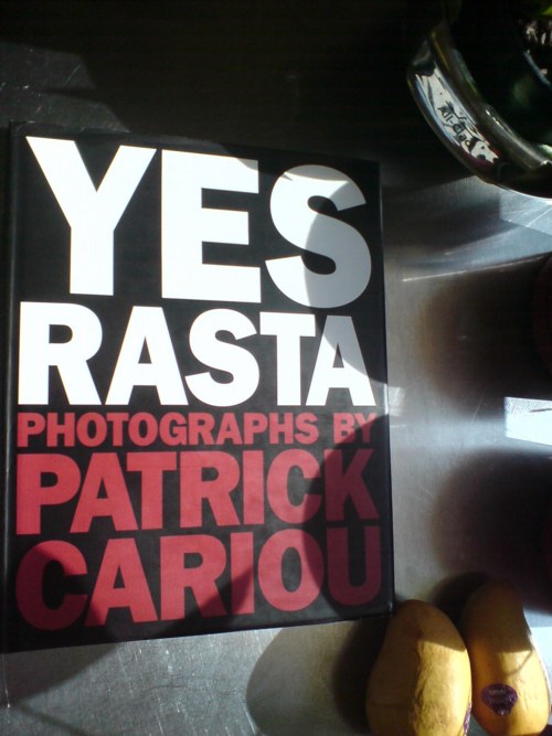
Cariou’s book was apparently supposed to be available as a limited edition, with a signed print. Did not know that. It says it right there on the colophon, though: “A slipcased, limited edition of this book with a signed and numbered artwork by the artist is available upon inquiry; please contact the publisher.”
There’s also a credit to The Small Darkroom, New York for “gelatin-silver prints,” a reference, presumably, to the edition. And there’s a separate ISBN number, 1-57687-074-X, which goes basically nowhere. Which means that Cariou and/or powerHouse had planned to do a limited edition, but it never happened. Wonder why that was? I guess if I were an attorney for someone getting sued for damaging someone’s book and photography market, I might care a little more.
Apr 2011 update: At the moment, the hardcover copy is not available. Here’s a new link to order a softcover copy of the new, expanded edition, which includes Prince’s entire deposition, and additional legal documents.
ペプシ館 EXPO’70 Poster
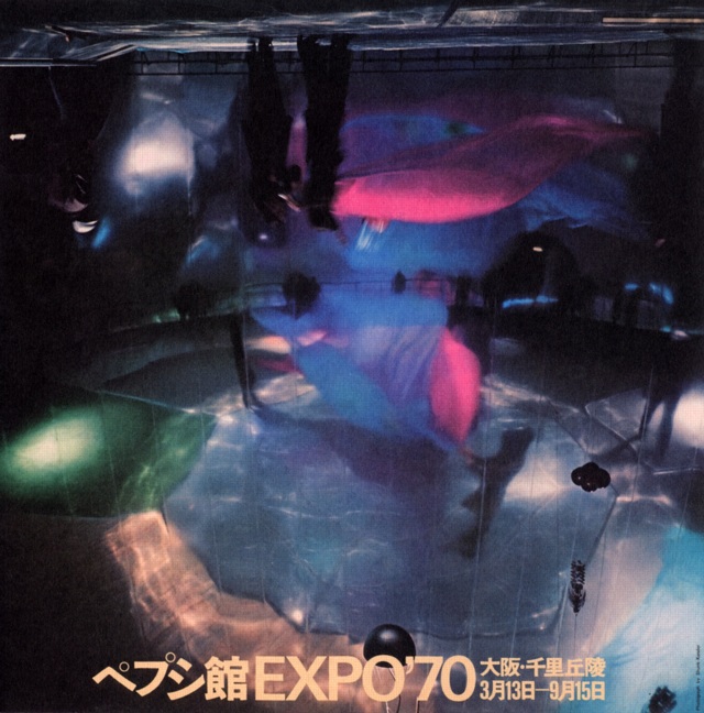
image via Morioka Yoshitomo’s online syllabus of Art & Technology
I don’t collect posters, I really don’t. I just buy some. And then some more.
But when I saw the description of this poster in the Getty’s E.A.T. archive finding aid, I knew I had to add it to the list:
Pepsi Pavilion
printed in Japan, Shunk-Kender photograph of interior of the mirror dome. It shows a rehearsal of the work by Remy Charlip, “Homage to Loie Fuller,” performed at the opening ceremonies. The photograph is printed upside down to emphasize the three-dimensionality of the real image the concave mirror dome produced. Signed by all artist/engineer participants, unnumbered.
Signed or not, I have to track it down.
E.A.T.’s Pepsi Pavilion still kind of blows my mind, several years after I first fixated on it. And it only belatedly occurs to me that though the project was officially a failure, which E.A.T., Kluever, and Whitman were left trying to make the best of, there is a Japanese domestic perspective on it that remains largely unexplored, at least in the English-speaking world. I will have to look into that.
Meanwhile, it’s almost enough to know that the Japanese term for Pepsi Pavilion is ペプシ館, pronounced Pepsi-kan.
Also, Remy Charlip’s “Homage to Loie Fuller”? Do we even have a complete list of all the artists, happenings, programs, and performances that went unrealized when Pepsi cut off the cash?
Also, Shunk-Kender? Those guys really, really got around. Have we already done shows or books or something on them? Art History, I’m talking to you.
UPDATE WHOA, and I have heard back from Art History. At least I got her voicemail. Stay tuned.
Previously: E.A.T. it up: the Pepsi Pavilion at Expo 70 in Osaka
Q. was the Pepsi Pavilion art?
Google Street View’s Shiny Balls
People often ask me, “What is it that makes your Google Street View Art so different, so appealing?”
Actually, no one asks me that, they just send me “Hey, look!” emails with links to Jon Rafman and Michael Wolf. But if they did ask me, I’d probably go off about Bergson and the flaneur’s gaze and Deleuzian notions of cinematic time and the panoptic surveil–
“Hey, look! Shiny object! Want that!”

Seriously, chrome that bad boy in an edition of 5, please. I’ll keep the AP.
via Behind The Scenes with Street View [youtube]
Merz van der Rohe
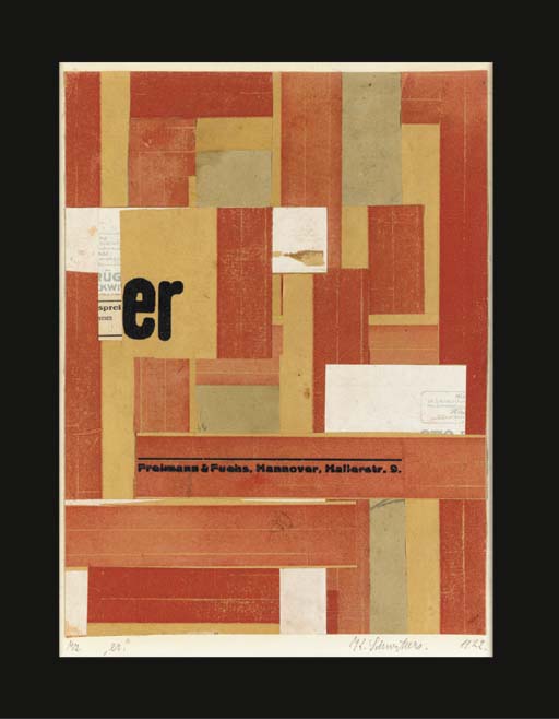
When Kurt Schwitters died in 1948, his lawyer inherited the art the artist had held onto. After his death in 1956, it was dispersed. Sidney Janis bought this 1922 Kurt Schwitters Merz collage, titled er, and then promptly sold it to Schwitter’s friend Mies van der Rohe, whose family held onto it until 2003, when they sold it for £105,650. [christies.com]
So Sue Me, I Think My Richard Prince Depositions Book Looks Awesome
Wow, can I just say that, when combined with the rapid production power of our digitized present, appropriation art is just awesome?
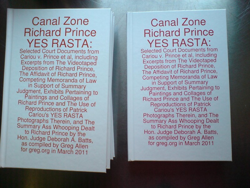
I just got the first hardcover copies of the first version of the book I conceived of a week ago today, Canal Zone Richard Prince YES RASTA: Selected Court Documents from Cariou v. Prince et al, including Excerpts from The Videotaped Deposition of Richard Prince, The Affidavit of Richard Prince, Competing Memoranda of Law in Support of Summary Judgment, Exhibits Pertaining to Paintings and Collages of Richard Prince and the Use of Reproductions of Patrick Cariou’s YES RASTA Photographs Therein, and The Summary Ass Whooping Dealt to Richard Prince by the Hon. Judge Deborah A. Batts, as compiled by Greg Allen for greg.org in March 2011, and it looks rather sweet.
I’m waiting to see a paperback version [updated link info below], and to see the other cover design in person, the one reproducing the court exhibit featuring the photocopied covers of the two dueling books. I like the graphic punch of that one. But I had a hunch, and I’m seeming right, that the original un-design, the full title, laid out in giant red letters [the default setting for the annotate function in Preview, the only software I used to produce the thing] is kind of awesome. So there may be some version tweaking to be done.
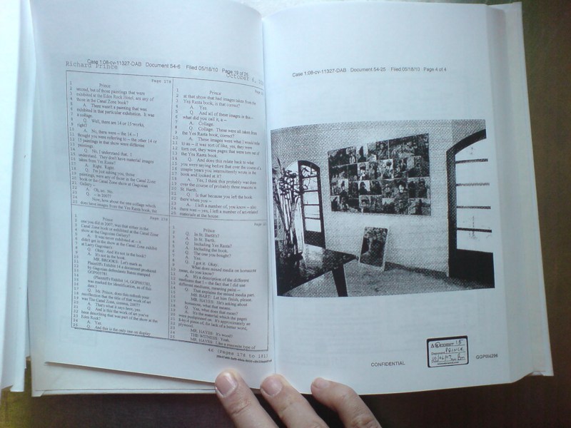
Anyway, the inside is pretty nice, too. The 2×2 deposition transcript pages turn out to read just fine in a trade-size book. Which makes it perfect for the beach or wherever. And it is much thinner than I expected. 290 pages is a lot of content, but it is a pretty manageable-sized book. Also, a little sluttier, frankly. Some of those photocopied PDF’s of Prince’s paintings turn out to be pretty legible after all.
Publishing a book to serve as an indispensable art history reference–and which consists entirely of someone else’s work–should really not feel this fun. But I guess that’s why appropriation’s so hot these days.
UPDATE: Here’s a link to buy the new, expanded softcover edition, which now includes Prince’s entire deposition transcript, plus several other key legal documents. It’s a bit higher quality, too. New printer.