
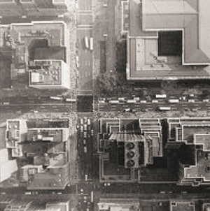
Andrew Russeth has a great post about the making of Robert Irwin’s Black Plane. As part of the Whitney’s 1977 survey of the artist’s work, Irwin had the museum staff paint the intersection of 42nd St & Fifth Avenue, a certain heart of the city, with blacktop sealer. The image above is an aerial photo from the Chinati Foundation newsletter, 2001, which accompanied an interview of Irwin by Marianne Stockebrand.
It, along with the date of the Chinati publication, December 2001, reminds me of a proposal for the rebuilding of the World Trade Center site that Ellsworth Kelly made in October. In early 2003, after seeing an aerial photo of the site in the Times, Kelly painted a green trapezoid as a stand-in for the large grass mound he envisioned, and sent his collage to Herbert Muschamp. The artist also noted that other artists he’d spoken to, including Joel Shapiro and John Baldessari, also thought that nothing should be rebuilt on the WTC site.
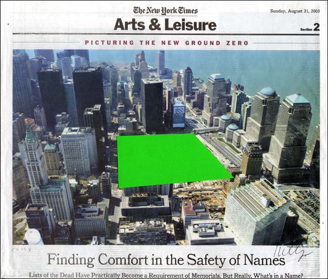
Muschamp arranged for Kelly’s collage to be donated to the Whitney.
Author: greg
Dear pwn0 on Publicsurplus.com, I want to buy your Palomar Sky Survey Prints
 Dear pwn0,
How are you? I would like to discuss with you the Palomar Sky Survey prints you bought on publicsurplus.com in 2010.
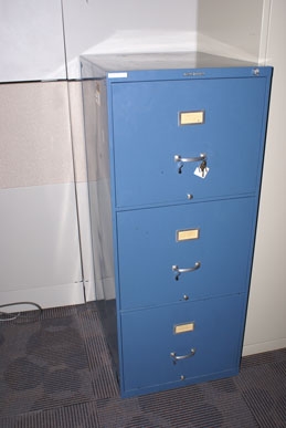
I know it was a POSS-I set of prints, but from the size of the file cabinet, it looks like it was an early or partial version. And I hear from the folks at the planetarium who sold it that it might have been incomplete.
I have attempted to relay a message via publicsurplus.com itself, but the company does not respond to any non-automated communication attempts.
pwn0. Are those your initials? Perhaps someone knows you, and might relay this message to you? From the other, large, shop-related items you have purchased recently on publicsurplus.com, I am assuming you live in Utah. Which is awesome. My mom lives there, and we’ll be visiting in a few weeks.
Anyway, I’m interested in hearing about that old file cabinet full of obsolete astronomy photos–and then I’m interested in buying it from you. So please drop me an email at greg at greg dot org. Thanks!
On Size Matters
And speaking of Richard Serra. I can’t figure out how James Meyer’s 2004 Artforum essay on the problematics of size in contemporary sculpture got by me until now. It ends too soon, but it’s pretty great.
Beginning with the overwhelming Tate Turbine Hall pieces by Olafur Eliasson and Anish Kapoor, Meyer retraces the history of sculptural size and scale, and how minimalism’s supposedly non-anthropic form was still keyed to the human viewer’s presence. And how post-minimalist folks like Tony Smith and Richard Serra got into, basically, a size arms race, which manipulated the spatial power and experience of the institution instead of critiquing it or fostering self-aware perception. [I’m collapsing a whole lot here. It’s really worth a read.]
Anyway, I mention it now for two reasons, the first being that Meyer begins his history with the 1940s and Abstract Expressionist murals:
SCALE ENTERS THE DISCUSSION of postwar art within the context of Abstract Expressionism. The development of the mural canvas by the late 1940s introduced a bodily scale into painting–a scale that was variously described as one sustained between the painter and the work and between the viewer and the work; on one hand, a phenomenology of making, and on the other, one of perception. Jackson Pollock famously spoke of his drip method as a means to “literally be in the painting.” Mark Rothko noted that he painted “large pictures … precisely because I want to be very intimate and human.” Mural scale was seen as an antidote to the easel scale of Cubism and Surrealism and the illusionism this embodied. As Pollock observed in the same statement. “The tendency of modern feeling is towards the wall picture or mural.”
Which means postwar sculpture and space becomes yet another aspect of the photomural’s history and influence I have to look into.
The other, bigger [sic] reason, though, is Meyer’s articulation of size-ism and awe-based exhibition experience. His is one of the few strongly argued critiques of otherwise-sacrosanct subjects like Richard Serra’s giant torqued sculptures and the museums that fit it, particularly Dia:Beacon and the Guggenheim Bilbao:
Having demanded and inspired the enlarged spaces that museum directors and trustees find it so necessary to proffer, Serra’s sculpture has become the contemporary museum’s major draw, an attraction of sufficient size and impact.
This challenge to the pervasive art world conflation of size, significance, and permanence is basically the context out of which I hatched my own idea to exhibit a Project Echo satelloon in an art space. The problem being, of course, that since all the world’s biggest, newest museums were built to accommodate Richard Serra sculptures, there are less than five venues that could actually show a 100-foot diameter spherical balloon sculpture. They’re just as prone to stylistic and functional obsolescence as a 19th century, fabric-walled salon.
Of course, the real problem is I hadn’t read it, and I really should have.
No more scale: the experience of size in contemporary sculpture, James Meyer, Artforum Summer 2004 [findarticles]
Richard Serra Drawings: The Making Of
Richars Serra’s work, and especially his drawings and sketches, have a pretty foundational place in my art worldview. So I’m stoked to see the Met’s drawings retrospective, especially after Brian Dupont’s process-oriented perspective on the work and the show.
I get really wonked out thinking about Serra’s process and have tried to imagine how to capture the conception and fabrication of his steel sculptures in a show–or in as visceral a way as his corner splash pieces do. Besides the rare chance of seeing Serra’s sketchbooks, I think Brian makes a good case that the large oilstick drawings embody their own making as much as anything Serra’s ever done.
Intent or Artifact: Richard Serra’s Drawings. [briandupont]
One Foot Scale
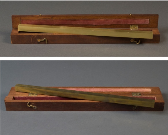
The curators of NIST’s collection of historical and scientific artifacts have thrown open the racks in hopes of crowdsourcing the origins of some unknown pieces.
On top of the list: this brass one foot scale, in a handy, fitted, velvet-lined travel case, which is obviously the inspiration for Walter de Maria’s High Energy Unit [also here]. Love that thing.

Anyway, case closed. What else ya got, NIST?
One Foot Scales: NIST Digital Collections crowdsourcing initiative [nistdigitalarchives]
Yes Rasta Indeed.
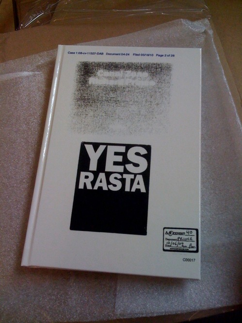
Another book report just came in, this one from Andy: “Bonus: ups driver was smoking in the truck. Box smells like weed.”
Thanks for partaking!
Allied To The Human Form
Can I just tell you how awesome the Contra Mundum I – VII lecture compilation is? How did I not buy this before? How did I not fly out to LA in 2009 for these talks, each one of which is greater than the next, and the first was pretty damn near perfect?
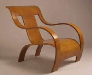
Rupert Deese kicked off the lecture series at the Mandrake with his incredible tales of building and documenting and investigating furniture for and by the likes of Donald Judd, Josef Albers, and Gerald Summers.
Oh, how I totally remember seeing those incredible 1929 Gerald Summers single-sheet molded ply chairs at Bergdorf’s in 1990 [above] and having my furniture mind blown. Only I didn’t realize those were the first and only good knock-offs, and I didn’t snap them up for a song when they were changing the display.
But enough about me. The story I have to put here is not mine, or even Deese’s:
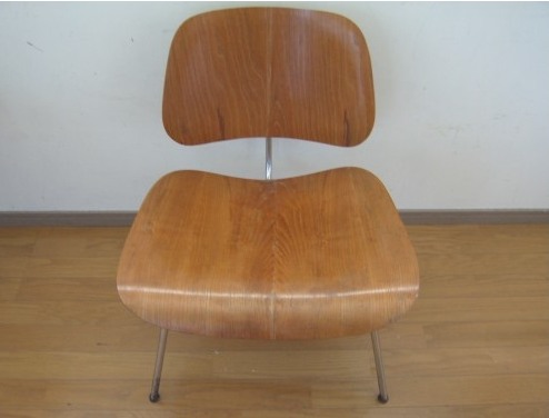
When I was at the information desk at the Met, Norma, one of the people there, told me a funny story about Charles and Ray Eames. They were doing a show at the Met and they showed up; it was about two years before Charles died. Ray died ten years later to the day. So the information desk, most of you know, is round, in the middle of the main hall there, and when people come to visit they come up and they say, “The Eameses are here.” So you call up to the department and you say, “The Eameses are here,” and then you politely ask, “While you are waiting for the curator to come down can you please step away from the desk?” So, as the Eameses stepped away from the desk Ray dropped something. So, she did not bend her knees, she just reached down and picked the thing up. And Norma saw her rear end and said, “Oh, my god, that is the plywood seat!” And so she told me that. And, well, the Eames furniture is allied to the human form, I’d say–quickly I would say that–but Judd’s furniture is allied to this. [gesturing to the room] It’s all about the structure around it.
Contra Mundum I – VII, published in Nov. 2010 by Oslo Editions [osloeditions.com via ro/lu]
Alex Klein and Mark Owens explain Contra Mundum in 500 words [artforum.com]
Buy Contra Mundum I-VII online via textfield, $18 [textfield.org]
1,000 Or 1 Chairs
Though there was some buzz about the “Chinese Embassy” on 42nd Street, which is actually the UN Mission, I wasn’t seeing anything in the twitterstream about the protesting the arrest and detention of Ai Weiwei by restaging a global version of his installation, 1,001 Chairs at the actual Chinese Embassy in Washington DC.
So we set out, with a toy high chair, just in case. Good thing.
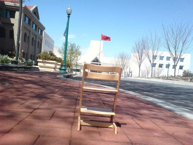
We rounded the corner, and the street in front of I.M. Pei’s imposing limestone structure was as empty as the rest of the closed-off, empty embassy loop. We took a picture.
Then we decided to head closer, and a good thing, too. Because there was another chair after all.
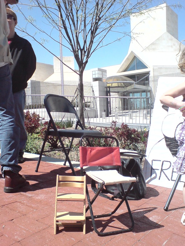
And a couple being sat in, by five protestors, including two in Free Ai Weiwei t-shirts and two in funny hats. We stopped, added our chair, checked in on the protest [“there’ve been a few”], took some pictures, and took off. A few minutes later on the walk home, the t-shirted pair passed us on their bikes and waved.
Linked Hybrid: Steven Holl Rebuilds The World Trade Center In Beijing
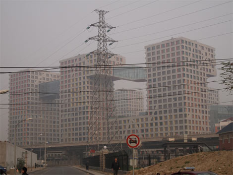
So Dan Hill’s posted another of his typically incisive analysis of an urban situation. This time it’s his extended and engrossing account of visiting Linked Hybrid, the massive urban development in Beijing, designed by Steven Holl Architects, which was just opening at the time [late 2009].

above and top via cityofsound
After being repeatedly shooed away by gun-toting guards from what Holl had pitched as “an open and porous public space,” Hill found his way in, and eventually ended up in the marketing office where there’s this poster of–what to call it without sounding utterly inappropriate? A bombshell? A landmine? A plane flying into a tower?:
More incredibly again, the adjacent wall features another poster of exaggerated Hybrid-like building on an urban skyline, under the phrase:
“Let citizens all over the world gather under the banner of the United States with the spirit of freedom.”
What can this possibly mean in this context? The absorption of the brand of ‘starchitecture’ is easy to see in a culture shifting through the gears of consumer culture, but of the brand of the United States?
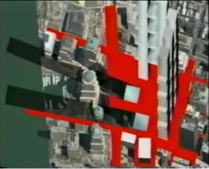
That’s no moon. It’s the proposal for Memorial Square, the World Trade Center site put forward in 2002 by Holl, Charles Gwathmey, Richard Meier, and Peter Eisenman, or as they called themselves at the time, the Dream Team.
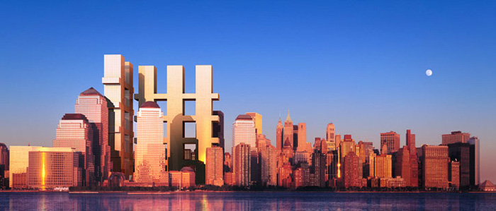
Memorial Square, 2002, “Dream Team,” image via renewnyc.org
At the time–the day after the unveiling, actually, at a screening of my short film, Souvenir (November 2001), which was followed by Etienne Sauret’s incredible documentary short, The First 24 Hours–I recognized the form the Dream Team was proposing as a gargantuan evocation of the fragments of the World Trade Center’s facade.
They denied the reference, even as they awkwardly argued and edited around it on the Charlie Rose Show. But I think it’s self-evident. Anyone wanting to argue otherwise to me should read those two posts and the links within first. Then I’ll tell you my story about asking Eisenman about it face-to-face.
What’s fascinating now, though, in rewatching that Charlie Rose episode, is not the Dream Team proposal’s basis in the wreckage of the World Trade Center, but its multiple similarities to Holl’s Linked Hybrid.
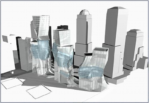
Holl and Meier especially discussed the Memorial Square proposal as primarily a public space, one which is entered from the city by “multiple portals.” Holl even calls the structure a “hybrid.”
While the Team took great pains to deny the proposal had any “signature” style, I would speculate otherwise. The overall concept of structure capturing “a moment” in history and memory comes from Eisenman’s proposal [above] for Herbert Muschamp’s WTC charette.
Meanwhile, the form is Holl’s, as is the idea that its entire surface would glow at night on one face. The rendering resembles nothing so much as the skyscraper cousin to Holl’s residence for the Swiss ambassador to Washington.
Dan Hill makes a persuasive critique of the simultaneous successes of Linked Hybrid as a structure and its failure as the open urban experience Holl envisioned. And it’s tempting to take comfort from afar and tut-tut the clunky shortcomings of Chinese modernization. But
are the urban and sociological failures of Linked Hybrid really any better or worse than the manipulated politicized mess that Daniel Libeskind’s World Trade Center plan has wrought?
I think the more sobering path is to recognize the remarkable extent to which Holl succeeded in realizing his Dream Team’s proposal for downtown Manhattan in Beijing–and to acknowledge that, there but for the grace of George Pataki go we.
Linked Hybrid’s marketers invite “citizens all over the world [to] gather under the banner of the United States with the spirit of freedom.” But on this day, when citizens all over the world gather to protest the continued imprisonment of Ai Weiwei, the co-creator [with Swiss architects Herzog & deMeuron] of the China’s most famous public building, the Bird’s Nest Olympic stadium, can we really say “our” public sphere is superior, or even free?
Architecturally speaking, at least, we are all New Yorkers now, and Beijingers, too.
[2018 UPDATE: In 2018 The New York Times reports that five women who worked with Meier, either at his firm or as a contractor, have come forward to say the architect made aggressive and unwanted sexual advances and propositions to them. The report also makes painfully clear that Meier’s behavior was widely known for a long time, and that his colleagues and partners did basically nothing to stop it beyond occasionally warning young employees to not find themselves alone with him. This update has been added to every post on greg.org pertaining to Meier or his work.]
Source Material
What is the point of books if you’re just going to store them out of sight?
I mean, just look at the back cover of A.R.T. Press’s 1992 interview of Vija Celmins by Chuck Close. If only I’d had this book somewhere besides my storage unit all these years, I might’ve realized sooner that what I’ve been doing, basically, is reconstructing the pile of photos on Vija Celmin’s desk.
An Artistic Discovery: The Congressional Art Competition
I know what it is, and what it’s for, and where it is, and what what. But still.
In a year when politicians’ considerations of art have had considerable impact on art, artists, and the art world, it is fascinating to consider the official guidelines [pdf] for the Congressional Art Competition.
Founded in 1982, the Congressional Art Competition offers high school-age artists in each congressional district the chance to have their work exhibited on Capitol Hill, or in their representative’s offices, for an entire year.
Each entry must be original in concept, design, and execution and may not violate any U.S. copyright laws. Any entry that has been copied from an existing photo (other than the student’s own), painting, graphic, advertisement, or any other work produced by another person is a violation of the competition rules and will not be accepted. Work entered must be in the original medium (that is, not a scanned reproduction of a painting or drawing).
…
Artwork must adhere to the policy of the House Office Building Commission. In accordance with this policy, exhibits depicting subjects of contemporary political controversy or a sensationalistic or gruesome nature are not allowed. It is necessary that all artwork be reviewed by the panel chaired by the Architect of the Capitol and any portion not in consonance with the Commission’s policy will be omitted from the exhibit. The panel will make the final decision regarding the suitability of all artwork for the Congressional Art Competition exhibition in the Capitol.
a href=”http://www.house.gov/house/ArtGuidelines.shtml”>An Artistic Discovery: The Congressional Art Competition [house.gov via patch.com, thx @artisphere]
Powhida Street View
As they say in Blurmany, this is ucking awesome.
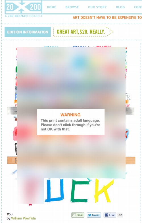
You, a new print by WIlliam Powhida at 20×200.com [20×200.com]
Previously: Google Art Project, or Les Blurmoiselles d’Avignon
Blurmany and the pixelated sublime
That’s Where All The Deals Are Being Made These Days
You know how at the end of The Player, Griffin is talking on the car phone to his erstwhile rival-colleague Larry Levy, who’s driving through Century City, on his way to an AA meeting? And Griffin says, “Gee, Larry, I didn’t realize you had a drinking problem?” And Larry admits, “Well I don’t really, but that’s where all the deals are being made these days.”? You know that scene?
Maybe that’s how it was with orgies in the New York art world of the 1960s. They’re just where all the deals were being made.
Here’s an entry from Gary Comenas’ exhaustive and ever-growing timeline on warholstars.org:
c. 1961/62: ONDINE MEETS ANDY WARHOL AT AN ORGY. (PS423)
Ondine:
“I was at an orgy, and he [Warhol] was, ah, this great presence in the back of the room. And this orgy was run by a friend of mine, and, so, I said to this person, ‘Would you please mind throwing that thing [Warhol] out of here?’ And that thing was thrown out of there, and when he came up to me the next time, he said to me, ‘Nobody has ever thrown me out of a party.’ He said, ‘You know? don’t you know who I am?’ And I said, ‘Well, I don’t give a good flying f**k who you are. You just weren’t there. You weren’t involved…'” (PS423)
JANUARY 31 – FEBRUARY 18, 1961: “JASPER JOHNS: DRAWINGS, SCULPTURES & LITHOGRAPHS” AT THE LEO CASTELLI GALLERY.
According to Pop: The Genius of Andy Warhol, published in 2009, it was at this exhibition that Warhol first met Johns.
Oh, whoops, it looks like I accidentally cut and pasted part of the next entry in the timeline.
PS423 is Comenas’ own annotation system, a reference to Patrick S. Smith’s 1986 dissertation, Andy Warhol’s Art and Films (Michigan: UMI Research Press, 1986)
From Jasper Johns’ A History Of Orgies

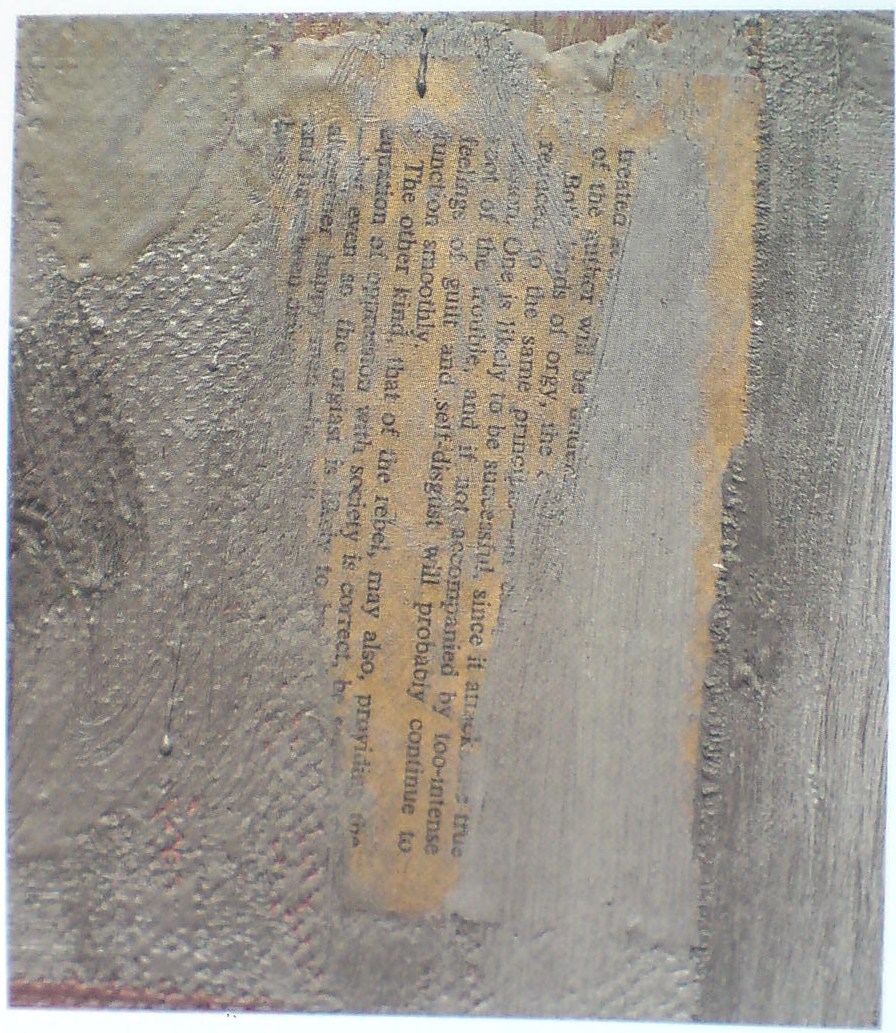
Barbara Rose called this partially obscured page of text “The most tantalizing fragment” visible in Jasper Johns’ 1962 painting, Map, and speculated that it was “probably ripped from a paperback book Johns had in his studio.” The visible word “rebel” resonated with Rose’s idea that Map is akin to a battlefield map, and relates to the Civil War, the centennial of which was being commemorated when Johns, who had recently decamped for his native South Carolina, made the painting.
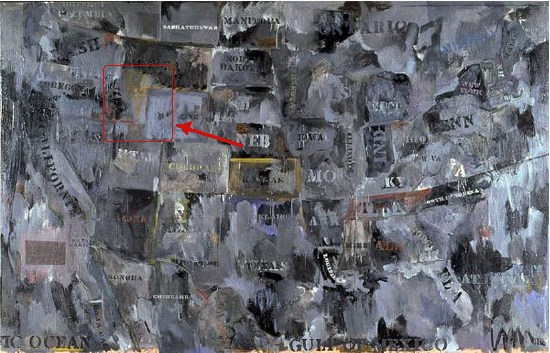
It turns out the page is from the short, 2-page preface to a hardcover, the 1960 US edition of Burgo Partridge’s 1958 book, A History of Orgies. I bought this book, which is basically one Oxford student’s quick tour through the dirty parts of the classics, followed by a brief history of sexual excesses and hypocritical moralizing in Europe, ending with a call to keep pushing modern society toward a Greek ideal of a sensible, guilt-free sexual culture.
A History of Orgies was apparently a good-, if not best-, seller, both in the UK and the US. After buying a copy online–strictly for research purposes, you understand–I skimmed through it. What I don’t know about orgies could fill several books, but its argument, even its thesis, frankly, seems a bit scattershot. Perhaps more lucid syntheses of orgies have followed Partridge’s? I’ll wait for the orgiast literati to chime in. But it was impossible for me to read the preface without thinking of it in terms of Johns’ work, and also his life in 1960-62, and the culture around him.
Rose calls the visible phrases “chosen and deliberately revealed,” and says they “participate in Johns’s game of peekaboo, which he plays with his audience, much as a stripper suggests that more will be revealed with each succeeding fan flutter,” which is a kind of hilarious image, given the actual source of the text.
And just as the brushstrokes teasingly obscure some of the text, I also can’t help wondering what’s behind, what we can never see: the other side of the page. There are at least three Johns works from this period–Canvas (1956), Fool’s House (1962), and Souvenir 2 (1964, below)–where the artist affixes smaller canvases face down on his larger work, depriving the viewer of knowing what lies underneath. I have no idea if there’s anything in the first page of Partridge’s preface that Johns wanted to not-show, but the full text of what he ended up not-showing is below.
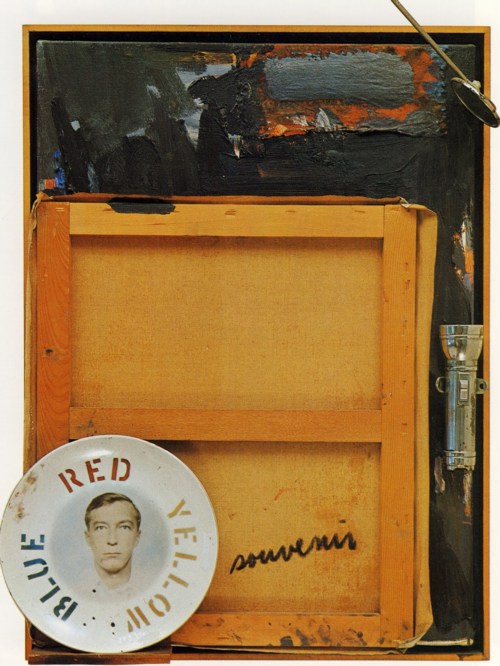
Souvenir 2, 1964, which was in the Ganz collection until 1997 excellent discussion at Christie’s
In the previous post, I referenced the skepticism, voiced by Yve-Alain Bois, of the usefulness of identifying [and thus being tempted to interpret] all the raw materials in Rauschenberg’s combines. It’s not like there’s a unifying, hidden message, a Rauschenberg Code, waiting to be deciphered by some future Tom Hanks. But technology is rapidly making the once-impossible trivial, and art from the past is going to have to deal with it. It took me only a couple of Googling minutes to identify a text that Rose could only speculate on–and which Johns, if he ever meant for it to be identified, has certainly not discussed.
But this impact of instant, ubiquitous information reminds me of how Land Art, once intended to be remote and highly inaccessible, if not impossible to find, ends up on GPS systems and Google Maps. The times, they’re a-changing.
Anyway, ladies and gentlemen, the preface to Burgo Partridge’s A History of Orgies with pagination intact, and the texts visible in Johns’ Map in italics:
The Orgies Of Art History
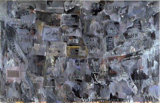
Map, 1962, Jasper Johns, via moca.org
For her contribution to the Jasper Johns Gray (2007) catalogue, Barbara Rose writes about the history and significance of Map, 1962, the artist’s first big, gray masterpiece. Johns made it to raise money for his new Foundation for Contemporary Arts, which was founded to stage some performances of Merce Cunningham. Marcia Weisman bought it out of Johns’ studio and ended up leaving it to MoCA.
Rose suggests that Johns’ Map paintings are akin to battlefield maps, and that the gray one, in fact, resonates with a particular Civil War battle, the Battle of Antietam. She cites Johns’ own South Carolina upbringing, the centennial commemoration of the Civil War that was in the news in 1960-2, and a series of paintings by Frank Stella which drew some of their titles from Civil War battlefields. [Rose was married to Stella at the time, of course, and also refers to one diptych from the series titled Jasper’s Dilemma.] Also, Rose writes, “The difficult realities of Johns’s personal life coincide with the idea that this map pictures a battlefield.”
After recounting some formalist skirmishes with General Clement Greenberg’s troops, Rose zooms in on the surface of the painting and on some of the collaged elements in Map that Johns intentionally left visible:
Topographically, the hills, ridges, and ravines of Johns’s gray Map suggest geological strata bursting. Paint washes over the surface like sea spume or waves eroding coastlines. Known borders are changed or blurred. This transgression of boundaries is a physical fact of art historical as well as personal significance. The surface is scarred and scraped in areas so that the printed matter sealed into it with adhesive encaustic is visible. The most tantalizing fragment is not newsprint but part of a page, probably ripped from a paperback book Johns had in his studio. One can make out the words “intense feelings of guilt and self-disgust,” as well as “rebel” and “orgiast.” These chosen and deliberately revealed phrases participate in Johns’s game of peekaboo, which he plays with his audience, much as a stripper suggests that more will be revealed with each succeeding fan flutter.
Map detail, via Jasper Johns Gray
Lots of interesting stuff, but I am most fascinated by the overall strategy Rose adopts, of floating the connection to “the difficult realities of Johns’s personal life,” and then going both wide and deep about everything but.