The greg.org Evening Sale

Flipping through the lots for Christie’s upcoming contemporary sale feels like diving into the greg.org archives. Besides the Rauschenberg combine coming out of the Ganz’s closet, there’s also:
sturtevant_johns_white_num.jpg
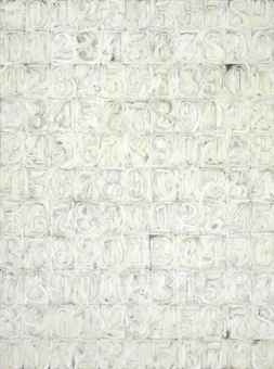
a great Johns White Numbers painting (1991) by Sturtevant. This text is nice, too:

To create her paintings, Sturtevant does not copy. She does not employ grids, squares, tracing paper or cameras. She summons her memory of images to recreate and reinvent them. By obsessively utilizing the identical materials and techniques as those who came before her, Sturtevant asserts her work is not about copying or appropriation, rather, the power and autonomy of originality.

Love that, so Pierre Menard.
wesselmann_nude_jfk.jpg
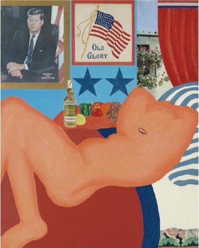
Tom Wesselmann’s Great American Nude #21 (1961) is up for sale again, too. In her biography of DC artist and JFK mistress Mary Pinchot Meyer, author Nina Burleigh mixed up #21 with #44. It was the former, not the latter, which was the subject of some controversy in Washington when it got yanked before the opening of the 1963 Gallery of Modern Art exhibit, “The Popular Image.” Burleigh said Meyer whispered about it to JFK, who laughed and kept it in. The painting in the show. But I looked it up, and no. The painting stayed out, probably because it included a nude next to an image of the sitting president. Or something. Anyway, censorship! Scandal! Sale!
warhol_athletes_christies.jpg
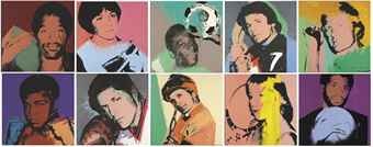
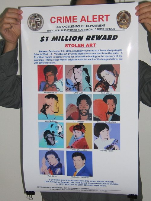
And speaking of scandal and mystery, Los Angeles collector Richard Weisman is apparently selling one of his remaining sets of Warhol Athlete Series paintings, which he commissioned en masse back in the day.
They’re like the set that was reported stolen from his dining room a couple of years ago. The disappearance of which prompted LAPD’s art theft unit to release the awesomest wanted poster ever. Which I tried to Kickstart into production as the Find The Warhols Project, only Kickstarter and I had apparently not developed our audiences sufficiently to accept the idea of a project-as-critique. And the reward for which was discontinued anyway when Weisman decided to drop his insurance claim, because of the investigative hassle. Which art theft experts read as a sign that the theft was an interfamily job, and not the kind of thing that one likes to have reported out in all the papers if one can help it.
But it’s not that set; I checked. Instead, it’s the set Weisman tried to sell in China during the Olympics for $28 million. Now priced to move, with an estimate of just $4-6 million. Also, too bad the Warhols don’t need finding anymore; that poster looks really sweet. Guess I’ll save it for the retrospective.
ftw_poster.jpg

Mister Rauschenberg’s Neighborhood

rauschenberg_tower.jpg
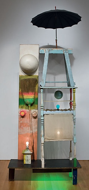
Christie’s is selling The Tower, a 1957 combine by Robert Rauschenberg which Victor and Sally Ganz bought from Betty Parsons in 1976. The work is a double portrait assembled from found, painted objects and light bulbs, and was originally part of the set for a Paul Taylor Dance Company production based on the myth of Adonis. The costumes for the production were designed by Rauschenberg’s partner Jasper Johns.
Did I say partner? I guess I meant neighbor. Here’s Christie’s quoting Paul Schimmel from his 2005 Combines exhibition catalogue:

While Rauschenberg’s work does respond to the painterly traditions of the 1950s, it does so in a manner that isolates the act of painting from the complete composition. For him, painting became a thing, an object treated similarly to Assemblage in which elements were organized on a non-hierarchical surface. Rauschenberg took aspects of Picasso and the Cubist collage, Kurt Schwitters, and the Surrealism of Joseph Cornell and created a three-dimensional, collage-based art. Together with Jasper Johns, Rauschenberg defined the American art of the 1950s; Pop art would have been inconceivable without their respective breakthroughs. Incidentally, many of their most important advancements were devised when they were most closely associated, living as neighbors, during the second half of the 1950s-the period during which The Tower (1957) was created.

[emphasis added for salient points regarding Short Circuit and for WTF, respective? Incidentally? Neighbors??, respectively.]
Schimmel goes on to note that the appearance here of a broom “anticipates Jasper Johns’s use of the broom in Fool’s House (1962), at a time when they were no longer neighbors.” Yet while he notes that “Lights and bulbs,” one of the defining elements of The Tower, “recur in numerous works”–of Rauschenberg–the fact that just months later, while they were still, uh, neighborly, Johns chose a light bulb as the subject of his first sculpture goes completely unmentioned.
johns_lightbulb_mcasd.jpg
Light Bulb (I), 1958, Jasper Johns, image: mcasd.org
Here is Post-War & Contemporary Deputy Co-Chair Laura Paulson in a gallery talk video,

The Tower is very autobiographical, using found imagery, found objects that would give you clues to aspects of Rauschenberg’s life. Rauschenberg was a gregarious, outgoing, very generous person, but he spoke often in sort of cryptic, very defined ways. And in Tower you have this sort of personage, which to me is just so perfectly Rauschenberg, you really feel this inside/outside aspect of it. And to me, that really defines how his art was: very autobiographical, giving you clues, but not necessarily the full story.

You don’t say.
It’s a little bit funny. One reason I’ve stayed so interested in Short Circuit has been the implications of finding the original Jasper Johns Flag on the creation myth of Flag itself. Because really, what would it mean if Johns’ first flag painting was actually shown inside his boyfriend’s combine? And he didn’t even get credited for it? What if Johns’ idea to paint the flag came from the same place as his idea to paint the map, Rauschenberg?
But what if it goes both ways? The Tower, Schimmel writes, dates from “the middle of Rauschenberg’s Combine period, which extends roughly from 1954 to 1962.” Which is, incidentally, also the period Johns and Rauschenberg were a couple. What if combines came from Johns? Or silk screening?
Or maybe it’s not so simplistic or binary. Maybe “their respective breakthroughs” were collaborative? Maybe they talked through and worked through “their most important advancements” together? How does Target with Plaster Casts relate to the combines of 1955? Or how do the combines relate to Johns’ object-laden paintings of the post-breakup era? What do the famously autobiographical, emotionally-charged-yet-obdurate works of these two artists reveal about each other, their life together, their production, and the culture in which they lived?
For three generations now, the art and art history worlds have been arguing for the separation of these two artists and the distinct, unknowable power of their “respective” achievements. Some day maybe we can tell the full story.
Lot 28, The Tower, 1957, est. $12,000,000-18,000,000 [christies.com]

The Free Speech Movement Monument Was Censored.

In 1989, a group of veteran activists organized the Berkeley Art Project to create a monument marking the 25th anniversary of the Free Speech Movement. Mark Brest van Kempen’s conceptual proposal won the elaborate national competition and dialogue. It is a 6-inch diameter circle of earth surrounded by a granite circle that reads, “This soil and the air space extending above it shall not be a part of any nation and shall not be subject to any entity’s jurisdiction.”
Remarkably, the Berkeley University administration only accepted the monument on the condition that any reference at all to the Free Speech Movement be stricken from the work and any surrounding publicity.
A podcast I’d never heard of but really like now, 99% Invisible, has the story of the Free Speech Monument, and an interview with the artist.

For added perspective, check out the 1992 statement by FSM leader Michael Rossman, who opposed the selection of a conceptualist monument–until Berkeley’s president added to its conceptual power by censoring it:

If this story be remembered as part of the work, it will stand for the ages, or until a censorious jackhammer erases it from the Plaza. A century hence, our descendants may read the truth written in stone: What happened here in 1964 was so significant and so deeply contested that nearly thirty years later the university administration still would not permit faculty and students to honor its name, but instead insisted on censoring their political expression. In this perversely perfect monument to the FSM, they may read a larger truth applying far beyond the campus: that the issues opened in that conflict and era, of civil liberties and rights, had still not been resolved, but continued deeply contested.

The Invisible Monument To Free Speech [99percentinvisible.org via someone awesome I can’t remember who, but probably Geoff Manaugh, since he’s the subject of the previous episode]
The Berkeley Art Project, by Michael Rossman [mrossman.org]

Pass It On

In 1969, Rene Block in Berlin published Blaues Dreiecken, Blue Triangle, an instruction-based edition by Blinky Palermo. It includes a large triangular stencil, a tube of blue paint, a brush, and a print made with same.
The instruction sheet reads, “Malen Sie mit Hilfe der Schablone ein blaues Dreieck über eine Tür. Verschenken Sie dann das Original Blatt.” [“With the help of the template, paint a blue triangle over a door. Then give away the original sheet.”]
palermo_block_blue_triangle.jpg
image: editionblockberlin.de
I wonder how often that has happened. The example shown at the Hirshhorn’s Blinky Palermo retrospective still includes the original print; the tube of paint looks undepleted, and that stencil doesn’t look like it was used to paint anything, including the triangle over the gallery doorway. [UPDATE: alright, I happened by the Hirshhorn again today, and took a closer look; the stencil does seem fresh, but the brush has been used at some point. And maybe the paint, too? Maybe Blinky painted each triangle print with the set itself? I hate ending everything with a question mark. This was 46/50, from Block, btw.]
All of which should surprise no one, I guess, conservators and exhibition practices being what they are.
Does anyone ever actually execute these things? Complete the artist’s instructions and realize, presumably, their intentions? Or have market forces condemned these kinds of works to permanent potentiality?
A Blue Triangle sold in Berlin for EUR34,000, and though it still contained the original, giveaway print, at least it did “contain traces of use.”
In 2009, artist Pierre Leguillon translated Palermo’s instruction to mean “give away the stencil,” and so he started just paintin’ Blue Triangles over doors all over the place. [Though it doesn’t appear that he used a Palermo edition, or even a stencil at all; he just taped them off. C’est complique.]
johns_diy_target.jpg
Do It Yourself (Target), 1960, Sonnabend Collection, image: MADRE
In 1960, Jasper Johns created Do It Yourself (Target), a framed drawing/diagram and collage of paint pots and brush. Given the artist, date, and that it’s a unique work under glass in his dealer’s collection, I would suspect that the denial of the invitation to collaborate is central to the work.
johns_moma_target_1970.jpg
And yet, what happened to Target 1970, a mass-produced multiple similar to Do It Yourself (Target), which was included in MoMA’s catalogue for a 1971 Gemini G.E.L. retrospective? Those books are occasionally misdescribed as signed Johns editions [the signature is part of the offset print], and they’re offered for between $2500 and $75. Yet, even so, I’ve never seen one executed.
Does that mean the contingency of the void has been successfully translated to a different market segment? Or just that no one ever bothers to try to resell the “used” copies? Maybe it’d be interesting to buy a few of these Johns things, and give them to folks to execute.

In Fighting Cubists Of All Sorts

cubists_of_all_sorts_nyt.jpg
Mr. Kenyon Cox expresses the views of a sound artist and a rational human being in relation to the so-called art of the cubists and the futurists in an interview reported in the Magazine Section of THE SUNDAY TIMES. The cant of these people already fills the air. We all know too well that judgment of their silliness by common-sense methods will not avail to silence them. They may all be arrant humbugs, or some of them may be weak-minded persons who really believe their unintelligible markings and scratches signify something. Mr. Cox. well says:

This is not a sudden disruption or eruption in the history of art. It is the inevitable result of a tendency which has grown stronger and stronger during the last fifty years.

We need not dwell upon this branch of a particularly painful subject. Mr. Cox really says all there is to say about cubist “art.” But it should be borne in mind that this movement is surely a part of the general movement, discernible all over the world, to disrupt and degrade, if not to destroy, not only art, but literature and society, too. There is a kind of insanity extant which had its remote origin, it must be said, in the earlier developments of the democratic spirit. Its kinship to true democracy and to real freedom in thought, action, or expression, however, is slight and indefinite, but the cubists and futurists are own cousins to the anarchists in politics, the poets who defy syntax and decency, and all the would-be destroyers who with the pretense of trying to regenerate the world are really trying to block the wheels of progress in every direction.
There have been cubists and futurists in religion who have made of faith a mockery, that have their counterparts not only in politics but in all forms of art, including music, in the industrial movements and in philanthropy as well. Their only need seems to be that all that is old is bad, all that has been proved is false, all that has been cherished should be destroyed, all that is beautiful should be despised, all that is obvious should be ignored. Their power is wholly negative, they have nothing to replace the things they would exterminate.
They have no true message to impart, but there is no room, nevertheless, to doubt the potency of their appeal to many of the disheartened, embittered, and discontented, as well as the mentally ill-balanced. Of course, they will not destroy art, supplant literature with ribald nonsense, abolish economic law, or permanently retard the growth of nations. But we have no present hope that their influence will not grow and produce evil results. The mirth they cause encourages them, the ridicule they receive actually strengthens them. The only influence that can overcome them is sound education. What the cubist artists show is false art. The reasoning of their brothers in other fields is false. In fighting cubists of all sorts the trustworthy weapon is the truth. [Emphasis added.]
A New York Times editorial, published March 16, 1913 condemning, among others, Brancusi, Duchamp, Matisse, and Rodin [nytimes.com]
Related: CUBISTS AND FUTURISTS ARE MAKING INSANITY PAY, by Kenyon Cox, National Academy of Art, March 16, 1913 [nyt]

On John R. Pierce, Or The Satellite Has Two Daddies

john_r_pierce_port.jpgEveryone [sic] probably has the story tucked away in their head that science fiction author Arthur C. Clarke was the father of the communications satellite. I only recently realized, though, that satellites have, if not a thousand, then at least two fathers.

Dr. John R. Pierce
was Executive Director of Bell Labs’ Research Communications Principles Division. He coined the word “transistor.” And in 1955, independent of Clarke’s 1945 conception of manned, geostationary satellites, Pierce published a proposal for an unmanned communications satellite.
“Orbital Radio Relays” was published in April 1955 in Jet Propulsion, by the American Rocket Society. Pierce calculated that relays in space would be useful for transoceanic communication and proposed three types:

(a) 100-foot reflecting spheres at an altitude of around 2,200 miles; (b) a 100-foot oriented plane mirror in a 24-hour orbit, at an altitude of 22,000 miles; (c) an active repeater in a 24-hour orbit.

He was concerned with maintaining proper orientation in cases (b) and (c), the geostationary orbits, and so concluded that (a), a 100-foot inflatable sphere, was the easiest, most feasible starting point.
So yes, Pierce’s proposal triggered NASA’s early work on Project Echo, and NASA teamed with Pierce’s Bell Labs to operate it. Meanwhile, by 1960, Pierce was already well along on developing the first commercial satellite, Telstar I, which launched in 1962.
I’m kind of blown away by how much major work Pierce was involved in, but also at the breadth of his contributions and interest. And yet I’d basically never heard of him [or, rather, made the connection.] He wrote regularly for a non-expert audience on the role of technology in art, music, and literature. His 1968 collected essays is titled, Science, Art, and Communication.
But he was no technological evangelist, no Marshall McLuhan-style pop guru. And certainly not even remotely avant-garde. As far as I can tell, there were no Billy Kluver-style artist collabos for John Pierce.
Pierce opened a speech about Echo I at the Economic Club of Chicago on Dec. 8, 1960 by quoting Milton:

Sweet Echo, Sweetest nymph–
Sweet Queen of Parley, Daughter of the Sphere!
So may’st thou be translated to the skies
And give resounding grace to all Heaven’s harmonies!

So even as he zeroed in on the cost and technical calcuations needed to realize them, Pierce had to have been conscious of the beauty, the aesthetic perfection, even, of the satelloons he conceived.
A few weeks ago, I stumbled across an insane collection of photo negatives relating to Project Echo, including this image, of Pierce at the Palmer House hotel for the Economic Club dinner, prepping a fully functioning demo how Echo I works. Fully functioning. They are not miming; there are actual vacuum tubes and whatnot underneath that transmitter dish and the horn antenna. And of course, there’s a chandelier-sized satelloon hanging from the ceiling. Dr. John R. Pierce is now my favorite performance artist, and I must collect the ephemera from his most important work.
jbpierce_echo_palmer.jpg

9 Artists/ 9 Spaces: OG Minnesota Awesome

Oh, RO/LU, you are so awesome for posting this.
wegman_9spaces_rolu.jpg
9 Artists/ 9 Spaces was a public art exhibit organized in 1970 for the Minnesota States Art Council, while the Walker Art Center’s new building was under construction. The concept of creating temporary, site-specific works was almost unheard-of, but it’s since become an international norm of public art practice. The show was organized by none other than Richard Koshalek, who was assistant curator at the Walker at the time, but who is now the director of the Hirshhorn Museum.
From a purely practical standpoint, I’m afraid Peter Eeley is right, 9 Artists/ 9 Spaces “proved in many ways a disaster.” If anything, Eeley’s list of problems–“works were vandalized; damaged by accident; and shut down by the police for reasons of safety, fear, and improper permitting”–completely undersells the near-total mayhem surrounding the show.
Fortunately, Peggy Weil published what is apparently the first extended history of 9 Artists/ 9 Spaces as part of a larger exploration of public art. It is truly incredible.
Just one incident: William Wegman wanted a large vertical image to be rendered in horizontal format, so he proposed a large billboard painting of Minneapolis’s Foshay Tower on its side. The work, unfortunately titled What Goes Up Must Come Down, was installed on the U of M campus. Only no one notified the campus police of the project, and they freaked and called the FBI, who “showed up at Koshelek’s office the next morning to inform him that they’d read it as a bomb threat and dismantled it.”

Wegman himself posted about the 40-year-old show on his blog
a couple of weeks ago, after being contacted by the Walker; the billboard is apparently featured in a new tapestry created for the museum by Goshka Macuga. In fact, digging around a bit, almost the only info online about 9 Artists/ 9 Spaces seems to come from Weil and this Macuga project.
Whatever happened on the ground at the time now seems frankly awesome and entertaining; the very idea that public art could instantly provoke a wide range of heated responses seems almost quaint. But of course, such bemused hindsight requires an idealized, incomplete grasp of the political and cultural context of the show; the idea of bombings and long-term occupations of parks in St. Paul sounds positively surreal, but it happened.
The failure, really, is ours, for not remembering, knowing, studying, and learning from this rather spectacular-sounding show. Someone get me Koshalek on the horn!
Peggy Weil’s history of 9 Artists/ 9 Spaces, 1970-71, organized by Martin Friedman and Richard Koshalek [linkall.com, via RO/LU, who has other links and pictures]
What Goes Up Must Come Down [wegmansworld (!!)]

WTF Copyright! Photomurals At The Louvre

Revs & Cost in le Louvre !
Good grief. When McDonald’s in the Louvre made a giant photomural wallpaper from a Jake Dobkin photo of REVS & COST tags, which was included in a Hugo Martinez book, did they bother to ask either REVS or COST or Hugo or Jake for permission? No, of course not.
They just licensed the images from the French publisher, which actually didn’t have reprint rights to license. And the whole thing appears to have been settled for $800, or approximately two hours of Patrick Cariou’s lawyer’s time.
Revs & Cost in le Louvre [ekosystem’s flickr via c-monster]

Witch Balls And Gazing Balls

I’ve seen a million and one lawn ornaments without ever noticing any connection to satelloons. And then I saw this odd ball self-portrait of Edwaerd Muybridge last spring at the Corcoran [detail below], and I”m like, big shiny Victorian garden balls and satelloons!
muybridge_mirror_detail.jpg
Actually, I see it was the other way around: Muybridge was in May, and tricky photographs using mirrored balls that happened to be satellites was in March.
vanguard_life_06031957.jpg
Anyway, that’s when I realize I have no idea what they’re actually called, or how to find them, because they’re called something besides “those+glass+lawn+balls” or whatever. And so I start trying to figure out when I might accidentally run into our neighbor who has one, so I can ask.
Then last fall, on a trip to Amsterdam, we were walking through the antique scientific instrument district, we went into Staetshuys Antiquairs, which had some incredible and odd-looking globes and orreries in the window. And there on the edge of the mezzanine:
witches_balls_ams.jpg
Big [and small] shiny balls. Thick-looking, silvered glass globes, but hanging on chains, not sitting on grass. Staetshuys’s Stephan Meulendijks explained that they are called witch balls, and they served to deflect evil spirits from the windows of your house in 18th century England. Most witch balls I see discussed online, though, seem to date from the late 19th and early 20th century.
Wikipedia’s entry for witch balls shows hand-sized globes, but a couple at Staetshuys measured at least 30-40cm. [Actually, the one pictured, from the V&A, which was originally “acquired as a ‘Witches ball,'” and is now labeled a “bauble,” is “almost certainly a Christmas tree decoration.”
Anyway, the garden variety, are known as gazing balls, which is pretty close to a satelloon after all.

Andrea Bowers On The Political Landscape

Thomas Lawson’s 2010 interview with Andrea Bowers is like five kinds of great. It concerns the works in her show at Susan Vielmetter in Los Angeles, “The Political Landscape.” Bowers’ story of making a video piece about activist and Bush-era public land auction-saboteur Tim deChristoph has some nice critiques of the Earth Art Boys. And it’s surprising how surprising so many of the reactions were to her immigration- and border-related drawings.
bowers_vielmetter_olivado.jpg
But I can’t not post a bit of the discussion of the centerpiece of the show. Titled No Olvidado – Not Forgotten, the 10-foot-high, 23-panel mural/drawing contains the names of several thousand people known to have died crossing the Mexican-US border:

AB: Yes, it’s a hundred-foot drawing.
TL: And it is set up as a memorial, it’s a very grand piece. Let’s talk about it. Since it is monumental, it presumably required a different way of working?
AB: Right. I worked with a graphic designer and several assistants. It resulted from a conversation with an activist, Enrique Morones. He founded an organization called Border Angels. They started off in I think ’86, providing water and blankets to people crossing the border.
TL: And many die in the attempt–are they killed out there in the desert, or do they die from exposure and thirst?
AB: It’s both, but in many cases nobody knows. A lot of people die from dehydration or temperature, but there are also people who are killed. So Enrique collects names of anyone who dies migrating from Mexico to America. He actually has about ten thousand names. He finally admitted that the group of names he provided to me, a list of four or five thousand, is only up to the year 2000.
I’ve always been making memorials in one way or another, but memorials that I thought would never be made, or memorials that were kind of impossible to make. I’m fascinated by the Vietnam Memorial in DC, and how listing names functions in general. An important part of what I do concerns this documentary-type collection of information.

A Story about Civil Disobedience and Landscape: Interview with Andrea Bowers [eastofborneo.org]

Verne Blosum Found! Or Rather, Found By Verne Blossum

vb_twin_expiration_uncg.jpg
You stumble upon something that Google doesn’t know anything about, and you post about it, and then a while later, the other handful of people wondering about the same thing eventually email you, and you try to figure this stuff out together.
Thus it is that the Verne Blosum Fan Club is proud to welcome the Greensboro Chapter to the table.
The other day, a curator from the Weatherspoon Art Museum contacted me after seeing my 2010 posts about the pioneering Pop Art painter Vern Blosum. Because it turns out the museum which is affiliated with UNC-Greensboro, has a Verne Blossum painting, Twin Expiration, above, from 1962.
verne_blossum_wp.jpg
I first found out about Blossum when his parking meter painting, Violation was illustrated alongside Andy Warhol in a 1963 Washington Post article about Alice Denney’s foundational Pop Art show at the Washington Gallery of Modern Art.
Then it turned out MoMA has a Blosum parking meter as well, Time Expired, purchased for them in 1964 by Larry Aldrich. [No, I’m not typing it wrong, his name shows up in contemporary sources with both one s and two, with an e and without.]
blosum_sjsu.jpg
The Weatherspoon discovery [for whatever reason, their collection database has not been indexed by Google] comes on the heels of another out-of-the-blue email from some folks in California. Seems they’d come across Vern Blosum in the catalogue for Pop Art USA, a 1963 exhibition curated by the Pasadena Art Museum’s own John Coplans. That Blosum, titled 25 Minutes.
vb_pop_art_usa.jpg
Clearly, there’s a theme, and I’m not just talking about parking meters. 25 Minutes was apparently lent by the L.M. Asher family. Betty Asher was one of the major collectors and supporters and curators at LACMA for many years. Just phenomenal. And her son is Michael Asher.
The Weatherspoon’s Blossum turns out to have been donated in 1981 by Robert Scull, probably the most famous [or infamous, depending] Pop Art collector of them all, in honor of Virginia Dwan, who has had a long, generous relationship to the museum.
For an artist who seems to have mysteriously disappeared from the art world, Vern[e] Blos[s]um sure left behind, not just an intriguing body of work, but also an incredible body of collectors.
The work continues.

Hotel Palenque Street View

palenque_streetview.jpg
I’ve been meaning to post more about this for months, but now I’m glad I waited. In January curator/writer Pablo Leon de la Barra posted Google Street View photos of the Hotel Palenque on his blog, Centre For The Aesthetic Revolution.
I need to put a [sic] after basically every word in this sentence, but it’s pretty jarring to see a place you know only from an old artwork alive and well and part of the real world. Hotel Palenque was supposed to be a white man’s fictional, archeological non-site, not an actual site, where people stay when they come to town, and certainly not a real, surfable place on Google Street View.
monk_color_reversal_nonsite.jpg
But this is all precisely de la Barra’s point, too. He originally Googled the hotel because he was preparing a text on Jonathan Monk’s Color Reversal Nonsite with Ensuite Bathroom [2009, above] for the Museo Rufino Tamayo in Mexico City. Monk’s work is a mirrored replica of the Hotel Palenque sign, only upside down and backwards, as it would be loaded in a slide projector.
Just as the entropy of development means that once-remote earthworks are now tourist attractions on the GPS grid, de la Barra lays out how Smithson’s exoticized, Yucatan jungle ruin/playground is now more fully recognized as someone else’s [sic] home turf. And while it may be surprising to hear that Smithson’s Hotel Palenque was only presented for the first time in Mexico in 2005, it should surprise no one to learn that Smithson sounded like a drunken gringo.
REVISITING HOTEL PALENQUE THANKS TO GOOGLE MAPS [centre for the aesthetic revolution]
HOTEL PALENQUE IS ELSEWHERE: ON JONATHAN MONK’S HOTEL PALENQUE SIGN’ A TEXT BY PLB IN RUFINO MAGAZINE
Hotel Palenque, 15 Avenida 4 de Mayo on Google Maps [google maps]
Previously: non-site non-art, Smithson’s Hotel Palenque
Visiting Artist: U of U lecture on Smithson