
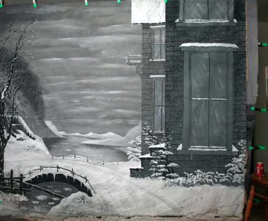
Holy smokes. Of course you know that blogger/collector/scholar Jim Linderman published The Painted Backdrop: Behind the Sitter in American Tintype Photography 1860-1920. Which would make him the go-to guy for anyone with some actual, original, extraordinarily rare, painted 19th century photographer’s studio backdrops to sell.
Jim’s correspondent, in fact, has two. And they look awesome.
I love that they’re painted in black and white. Just like the 19th century itself.
Pair of original 19th century painted photography studio backdrops (for sale) [dull tool dim bulb]
Related: Frederic Remington’s black & white paintings-for-engraving
Author: greg
Stainless Steel Brillo
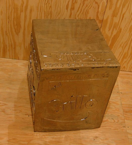
So awesome. Is there nothing that can’t be made better by Rirkrit chroming the hell out of it?
Fear Eats The Soul, Rirkrit Tiravanija, through April 16 at Gavin Brown’s Enterprise [gavinbrown.biz]
Awesome photo of chrome stainless steel Brillo Box and wok, one of many by Andrew Russeth [16miles.com]
Previously: Enzo Mari X Rirkrit Tiravanija
Extensive Brillo Box coverage on greg.org
Ab Eo Scientia A Quo Googleus
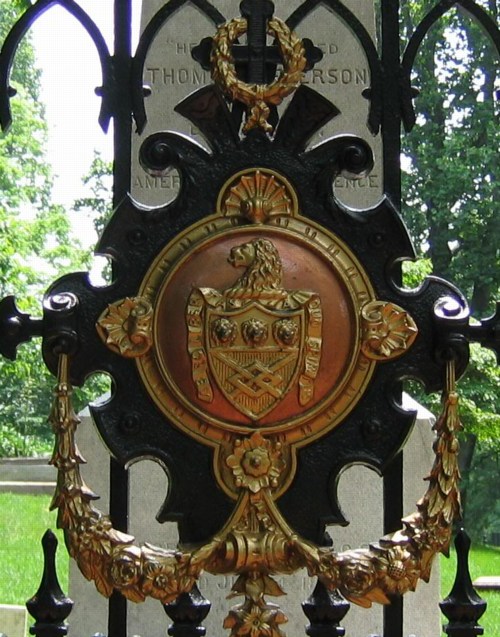
We went to Monticello this weekend–Jefferson was a complicated guy, brilliant, thanks for the Declaration etc, etc., but wow, high maintenance–and came away with a question about the Latin motto in the Jefferson coat of arms, which adorns the gate of the family cemetery where Jefferson and his white lineal descendants are buried.
Though we got the gist of it, the motto, “Ab eo libertas a quo spiritus,” had enough prepositions in it to make it hard to parse. But as we walked down the hill, trying to figure out “eo,” we realized we probably couldn’t. All we could do is look it up, and then we’d know.
That’s the binary situation the net has put us in: we either know something now, or we know it the instant after we look it up. There’s no figuring it out, no hints, just the answer.
Of course, this isn’t true for everything, or even most things–Google’s not just cold telling me where Jasper Johns’ Flag is, that’s for sure–but it’s true for enough things.
And that kind of bums me out a bit.
As for the motto, it does turn out to be a prepositional mess, which Jefferson may have added himself: “The spirit (comes) from he from whom Liberty comes,” or “Liberty comes from he who gives life.”
‘200 Inch Photograph’
Yeah, there’s photomurals, but anyone who’s spent some time poking around greg.org might have found my even longer-lasting photo obsession: the Palomar Observatory Sky Survey [see background and making of info here and here.] The idea is to take he 1,870 pairs of photos that resulted from this ambitious, 9-year project to systematically document the universe, into the art context. Where it had not, to my knowledge, ever been. [Thomas Ruff comes the closest, obviously.]
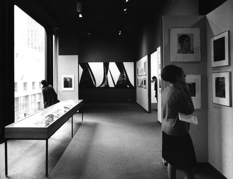
And so one would understand the excitement at finding this entry–right after Moholy Nagy and Wright Morris, and above Muybridge and Nadar–in the checklist [pdf] for the 1964 inaugural show in the Edward Steichen Photography Center, MoMA’s first dedicated photography galleries:
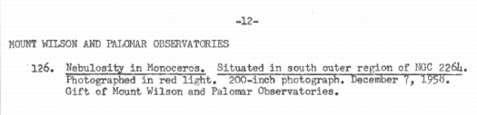
Mount Wilson and Palomar Observatories
Nebulosity in Monoceros. Situated in south outer region of NGC 2264.
Photographed in red light. 200-inch photograph. December 7, 1958.
Gift of Mount Wilson and Palomar Observatories.
Dude, not only was the Palomar Sky Survey IN an art context; it launched the art context. Dude, with a 200-inch photograph, it owned the art context.
So what did this look like? It must have been spectacular. But I can’t find any installation photos, or any reproduction of the work, or any writeups at all for what had to have been the biggest of the 239 photos on view in that first show, bigger, even, than Lennart Olson’s mural.
No problem, I can find the image from the artist’s [sic] side. Though it has been superseded by several far more advanced surveys, imagery from the 1950s-era POSS-1 is still available in the Space Telescope Science Institute’s Digitized Sky Survey. Here’s the red plate showing nebulosity in the constellation Monoceros on the south outer region of NGC 2264:
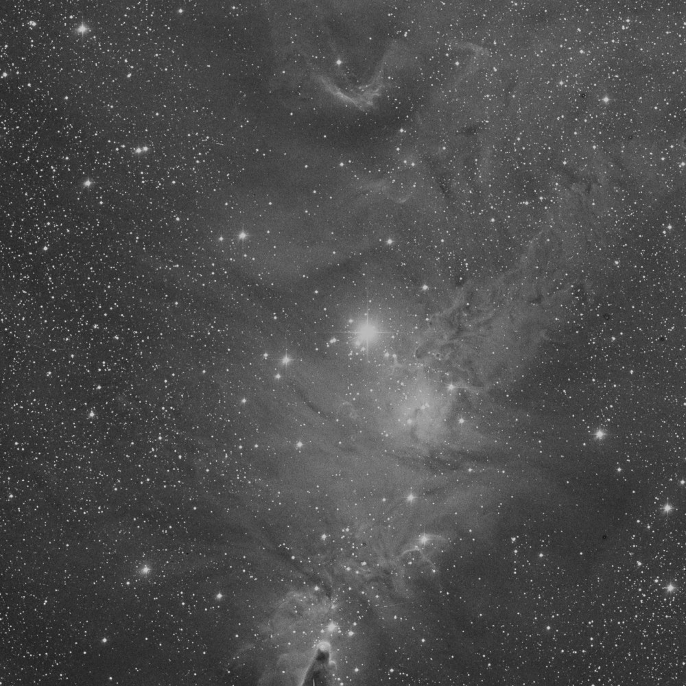
That’s the Cone Nebula down there at the bottom, just on the edge of the plate. Now imagine this photo printed nearly 17 feet tall, striking visitors to the newly reopened Modern with awe as they see how far photography has come.
And you’d have to imagine it, because it didn’t happen. There wasn’t a 17-foot tall photo gallery in the Museum in 1964. In fact, I’d wonder if the ceilings in the then-new Philip Johnson annex were even 16 feet.
Also, it turns out that the POSS-1 image of NGC 2264 was made on Nov. 30, 1951, not Dec. 7, 1958. So the 200-inch photograph does not refer to the print size. It is likely a reference to the telescope that took it, Palomar’s Hale Telescope, which was the largest in the world from 1948 to 1993. It was conceived by George Ellery Hale, who secured $6 million for the project in 1928 from the Rockefeller Foundation.
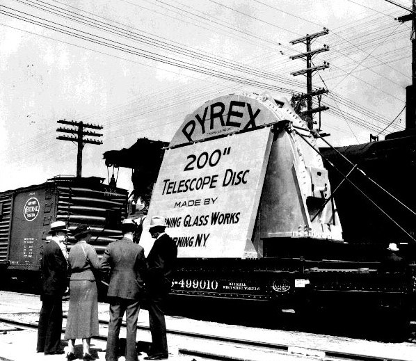
Corning cast the 200-inch mirror from Pyrex in 1934-36, and it was transported across the country by train to Pasadena where, after eleven years of polishing and shaping, the 40-ton mirror was hauled to the top of Mount Palomar and installed in the 1000-ton, Pantheon-sized rotating observatory. Edwin Hubble took the first photograph with the 200-inch telescope in January 1949.
I still haven’t found the details of the photo MoMA exhibited, but the mirror story makes up for it a little. And I thought artists were crazy.
Oh, That’s Right, Philip Johnson Was A Nazi
So I’m searching through the New York Times archive, trying different combinations of keywords to find references to photomurals at the Museum of Modern Art, and I find this intriguing 1934 headline:
TWO FORSAKE ART TO FOUND A PARTY; Museum Modernists Prepare to Go to Louisiana at Once to Study Huey Long’s Ways. GRAY SHIRT THEIR SYMBOL Young Harvard Graduates Think Politics Needs More ‘Emotion’ and Less ‘Intellectualism.’
But the Times’ archives purchasing has been acting up for a few months [it’s not just me, right?], and my 10-pack of articles has been stuck at five since October, so I can’t click through to see who these Museum Modernists are.
And a couple of weeks ago, I could have searched the rest of the internet and not found the answer, but now that Google has added the complete run of Spy Magazine, a search for “Museum Modernists” and “Huey Long” turns up one result: the devastating 1988 Spy article by Michael Sorkin detailing the fascist and Nazi activities of the young Philip Johnson.
I mean, holy crap. Gray Shirt Their Symbol barely scratches the surface. Johnson’s fellow modernist was Alan Blackburn, the Museum’s executive director. As MoMA’s archive puts it, “Both Blackburn and Philip Johnson resigned from the Museum in December of 1934 to pursue outside interests.”
Those interests ranged from donating large sums of money to and founding a youth wing for raging anti-semitic demagogues such as William Lemke and Father Coughlin to spying for the Nazis during the invasion of Poland.
Where was Philip? Spy, Oct. 1988 [google books]
Here’s an image of the Times article and photo. Amazingly vague. [uncommonplace book]
Lennart Olson, Photomuralist
In other seemingly obscure art historical news from 53rd Street: while Googling around on Compo Photocolor, I found this mention in a 1964 press release [pdf] from The Modern, which turns out to be a checklist for the newly remodeled and reopened museum’s first dedicated photography galleries, The Edward Steichen Photography Center:
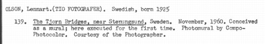
OLSON, Lennart. (TIO FOTOGRAFER). Swedish, born 1925
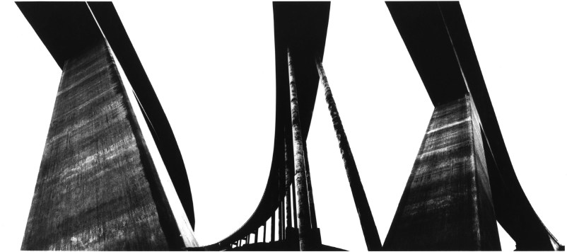
139. The Tjorn Bridges, near Sternungsund, Sweden. November, 1960. Conceived as a mural; here executed for the first time. Photomural by Compo- Photocolor. Courtesy of the Photographer.
So just like the first exhibition in MoMA’s original 53rd Street building 32 years earlier, the first show in the new building includes photos specifically conceived as a photomural.
[via]
Olson was a well-known Swedish photographer, though from this 2010 bio for him, his MoMA exposure was the source for much of his hometown fame. And unfortunately, the namechecking is hardly mutual. The only mentions of Lennart Olson on MoMA’s website are from the period press releases.
Steichen included Olson’s work in a 1953 survey of Postwar European photography [pdf]; in 1960, Steichen ends the department’s announcement of new acquisitions [pdf] with this: “Of particular interest is an 8-foot wide photographic panel, “Project for a Mural,” (1960) by Lennart Olson.” Which sounds related to the work that debuted in 1964.
In 1960, Olson was also included in an exhibition titled, “The Sense of Abstraction,” [press release pdf], which was organized by Grace Mayer and Kathleen Haven, who had put out a call for hundreds of photography portfolios. [It’s interesting to read that as a corollary to “straight” photography, abstraction meant producing “works whose sole function is to delight–or affront–the eye.”]
Anyway, Olson’s “monumental architectural studies” opened the show; the Museum described them as “abstract through individualistic interpretation of design.”
[via]
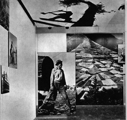
I can’t find images of the 1960 study, but here is an installation shot of the 1964 mural itself. At first and second glance, the scale and form remind me of Franz Kline, who arrived at his signature large-format abstractions by enlarging small drawings projected onto the wall.
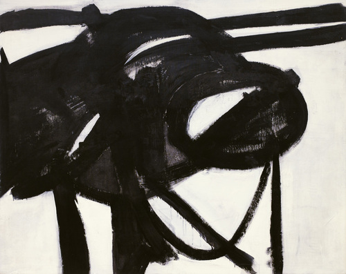
Chief, 1950, acquired by MoMA in 1952
The prominence MoMA gave to Olson’s large, abstract photomural seems to have been confined to the end of the Steichen era, aka the early 1960s. I don’t have any way yet to figure out whether this resonance between Ab Ex painting and large-format photography was conscious or coincidental, but it sure seems convenient.
Talking with artist John Powers today about this speculative painting vs photography dialogue/contest, he suggested looking, not at the artists themselves, but at their mediators: the curators and the museum. It’s easy to imagine curators sharing an attraction to the powerful scale and immersive gallery experience of large, trophy-sized artworks, just as it’s easy to imagine the ambitious size appealing to painters and photographers alike.
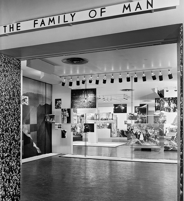
On the dust jacket for the book version, Steichen rather immodestly calls The Family of Man “the most ambitious and challenging project photography has ever attempted,” which serves as “a mirror of the universal elements and emotions of the everydayness of life.” Doesn’t sound like he regretted giving up painting much.
‘Coaxing the Illusion of Crisp, Clear Light from Pigment’
When I first came across the pixelated Dutch landscapes on Google Maps , I imagined the polygonal camo distortions hovering over the sensitive sites. From the ground, I thought, maybe it looked like a Gerhard Richter overpainted snapshot.
But now I think it looks more like the bright, beautiful gouaches by Louise Belcourt which Sharon featured on Two Coats of Paint recently.
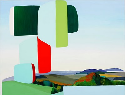
Images: Louise Belcourt’s place in the world [twocoatsofpaint.com]
‘Do-It-Yourself Existential Individualism’
Frieze’s 20-year retrospective of itself continues apace, and wow, it’s like running into an old flame on a train platform.
I hadn’t thought about Daniel Birnbaum’s 1996 essay, “IKEA at the End of Metaphysics” in years, but wow, it’s just all flooding back.
From a Heideggerian perspective IKEA best sellers such as ‘Billy’, ‘Ivan’, and ‘System 210’ do not represent a corruption of everyday life, but have merely formalised what is already there; the IKEA catalogue only makes the tendency towards uniformity more conspicuous. Heidegger’s global ‘levelling’ is not a critique of the common forms of everyday life as such, but of their passive acceptance. At the end of metaphysics, levelling is complete – no one questions the catalogue.
Obviously–well, now it’s obvious, anyway–my own Ikea X Enzo Mari mashup project has its origins in the critical perspective of the company and its ideology which Birnbaum mapped out 15 years ago, and which I absorbed.
Also, I’m reminded how I miss Jason Rhoades.
IKEA at the End of Metaphysics [frieze.com/20/ via ronald jones]
Where To Make A Steichen-Style Photomural: Compo Photocolor
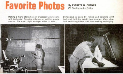
While trying to find out where and how to make a photomural, or at least how they used to make them, I found this slightly ridiculous 1966 Popular Science article about making photomurals in your very own home. And how you basically shouldn’t do it, but instead just mark up a negative and send it off to a photo enlarger somewhere.
Someplace like–hey-o!–the outfit mentioned in a caption, “Compo Photo Color, 220 W. 42nd St., NYC, specialists in murals and exhibition prints who did famous ‘Family of Man’ photo show.” And so it comes pretty much full circle, back to the most famous photomural exhibition of all.
So who is Compo Photo Color? Or was. Immediately available references are pretty scarce, but Compo seems to have been in business from the 1950s until the early-to-mid 1970s. Its principals were a German immigrant photographer Richard J. Schuler and Ernest Pile, and it was eventually consolidated into Wometco Photo Services, a division of the Miami-based movie theater owner. But back to the apparent heyday, in the 50s.
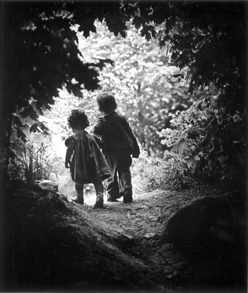
In a 2001 interview, photographer Wayne Miller, who was Steichen’s assistant and co-curator on Family of Man, and who contributed the most images to the show, talked about working with Compo on the prints:
Riess: About Gene Smith, can I ask you to repeat the story that I lost last time about asking Gene Smith for a print of that image in The Family of Man?
Miller: Oh yes. In The Family of Man, after we had made our final selections of what pictures we wanted to have in the exhibition we asked some local photographers if they’d like to make the print for us, or would they give us the negative and we ll have the print made by Compo Photocolor in New York. Actually we wanted Compo Photocolor to make all of them so the prints would have a commonality, and they would match the other prints quality-wise. And they were very good technicians.
But in this case, because of Gene, he wanted to make the prints, he didn t feel anybody could make the print as well as he could. And he invariably spent not only hours, but days in the darkroom. In fact, in a Life story he would disappear in the darkroom and return, and you almost– here he was seemingly weeks or months afterwards, with a beard and other things, and with the final prints. And it would drive the Life people mad.
In this case, we had a print that I’d found in the Life morgue of what he [Smith] called “A Walk in Paradise Garden,” something like that, of two children walking out from underneath this frame of bushes. A nice picture, and we wanted to use it at the end of the exhibition. It was going to be about, maybe 30″ x 40″.
I told Gene we wanted to do this and asked him if he’d like to make the print, and yes, he
certainly wanted to make the print. So I arranged for him to get the necessary paper and
chemicals to do this, because his wife Carmen said, “Don t give Gene the money for it, because he’ll spend it on other things.” So after he told me what he wanted, I did get the materials for him. And I gave him a deadline, knowing that he was often not able to meet a deadline, of about three weeks early. So he took this material.
Now the print we had that I’d gotten out of the files had been handled a great deal and it had some cracks in it. It was dog-eared, and it wasn’t a fine print at this point. So at the same time I gave these materials to Gene I sent the print from the Life files over to Compo Photocolor and asked them to make a copy of it, make a negative, and make a print to size. Just so we wouldn t get stuck in case he didn’t come up with the print. Later, when he did do it, we could always replace it. And sure enough, the deadline came and went and we had to put this copy print up on the wall. Because Gene hadn t shown up with his.
A couple of weeks later Gene shows up with these photographs rolled up under his arm. We went up to the museum exhibition space in the morning because the museum didn t open to the public until noon. And I took this print that we had down off the wall, and he unrolled his prints. He had half a dozen of them there, different qualities, and he laid them out beside this print. I was worried about this because I know how he struggles and works so hard on it. He will darken this or lighten that, and he ll use ferro cyanide to bleach little bits. And the delicacies with which he treats a print are just great, they re very great. So I was interested in seeing how it would work.
He laid his out, and he stood back there and looked at these prints. And he walked around a little bit and looked at them some more. Finally, he said, “You know, I think the print you have on the wall is the best one. Let s use that one.” [laughter] So he rolled his up and went along.
That I think points out the fact, I believe, that when you make a photograph, a print of a
photograph of larger than normal size, it picks up a new quality other than one of maybe an 11″x14″ or something. But one like this, maybe 30″x40″, it has a new quality to it.
You know, it didn’t occur to me at all until just now, but Paul Rudolph designed the installation for Steichen’s Family of Man, which was photographed by Ezra Stoller, in January 1955,
the same year Robert Rauschenberg was collaging photos into such giant combines as Rebus. Hmm.
On War-Era Murals
The question or theme or whatever hadn’t crystallized for me, but when Tyler linked to the previous two posts about Lt. Comm. Edward Steichen’s wartime propaganda exhibitions at the Museum of Modern Art, he noted that “there’s a lot of art historical work yet to be done on the impact World War II had on art and artists.”
It’s an interesting way to consider my fascination with the aesthetics and paradoxes of photomurals: their apparent historic status as something other than artwork, much like the photographic medium they’re derive from; their powerful scale, which creates a certain kind of all-encompassing viewing experience that is typically associated only with the later works of revolutionary “high art,” namely the Abstract Expressionists; and of course, the abstract and modernist aspects of the images themselves.
I’m not ready to go beyond the grand theory of “this looks like that,” but I keep seeing and finding resonances between photomurals, which were born in the Depression and came of age during WWII, and some of the major developments of postwar art.
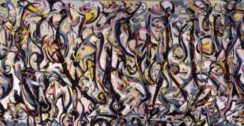
Mural, Jackson Pollock, 1943, collection: UIMA
I mean, I’m re-reading Tyler’s interview with Pepe Karmel about Jackson Pollock’s Mural [above], which was painted in 1943, and there are moments where I can’t help thinking about the 15- and 40-foot images in Steichen’s 1942 Road To Victory show:
It’s an important painting for Jackson Pollock because it’s the moment that announces his future as a painter of large, mural-scale paintings that become environments, and furthermore paintings that are in this distinct, all-over style that changes people’s idea of what a painting might be.
…
It’s like Barnett Newman’s Vir Heroicus Sublimis or Pollock’s own Number 1, 1950. You have to be there. You have to be standing in front of it and feel it filling up your field of vision and feel it wrapping around you and feel yourself falling into the field of the painting. If you don’t have that experience first-hand, you won’t get the feeling of the painting.
…
MAN: You talked about how important the painting was in terms of Pollock’s oeuvre. Can you detail why it’s so important to what came next in American and modern and contemporary art?
PK: The next step is off the wall and out into space. In contemporary art that deals with installation as an art form, which comes out of those paintings in 1950 and that comes out of this painting in 1943. It just doesn’t get more historic than this.
It’s truly a kind of unrecognized monument of American art.
Which isn’t to say that Pollock was referencing or even influenced by photomurals, just that both Herbert Bayer’s installation of Steichen’s photos and Pollock’s first epic-scale painting create an overwhelming spatial experience.
Photomurals were out-and-proud propaganda which had connections to filmmaking and the cinematic screen and to world’s fairs, [See Alvar Aalto’s Finnish Pavilion at the 1939 World’s Fair and the Japanese pavilion at the Golden Gate Expo that same year].
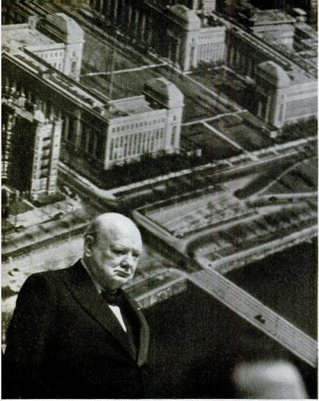
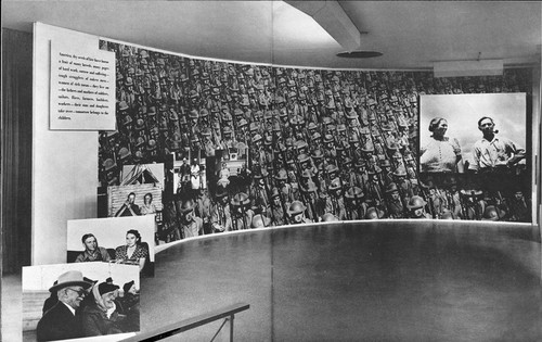
Which is one of just a handful of references to photomurals in LIFE magazine’s archives. In a moment of greg.org confluence, LIFE’s most prominent depictions of photomurals are not in museums or world’s fairs, but in political rallies–they are the ur-Sforzian backgrounds. For example, In 1949, FDR Jr. has a giant wall of smiling children behind him at a UAW convention. A chorus line of garment workers kick in front of a selection of “union heroes.” And when he spoke in Boston in 1949, Winston Churchill stood in front of an aerial photomural of the MIT campus [above] which reportedly “confused [the] television audience.”
How To Make A Giant, Steichen-Style Photomural
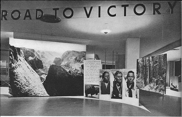
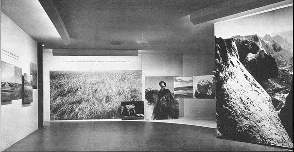
Looking through the installation photos for Road To Victory, Edward Steichen’s 1942 exhibition at the Museum of Modern Art, I find myself asking two things:
Who took these photos, and how did they make them? [Of course, my real question is usually, Where are they now, which really means, where can I get some? But anyway.]
The first question turns out to be harder to answer than I thought. The MoMA Bulletin for the show states that over 90% of the images are from government agencies, military sources, or wire service/news agencies, but they lack any credit line. It’s slightly amusing that most of the photocredits in the Bulletin turn out to be for the installation photos, not the subject photo murals themselves. If Edward Steichen and Carl Sandburg are the creators of Road To Victory: The Propaganda Artwork, then Samuel H. Gottscho is a rephotographing appropriation artist 40 years ahead of Richard Prince. I’ll have to do some digging for an image checklist in the exhibition’s archives.
As for how these things were made, though, there is actually a footnote for that. And the answer is surprisingly painterly:
To make the large murals, the negatives were enlarged in sections upon strips of photographic paper forty inches wide. The museum wall was first sized, then covered with a layer of wallpaper, next with one of cloth, and then the photographs were pasted on the cloth by paper hangers. The seams were lightly airbrushed, imperfections were retouched by hand, and finally the whole mural was painted with dull varnish to eliminate the glaring reflections rendered by the surface of photographic paper.
Fascinating. Photo wallpaper? Overpainted photomurals?
While large prints in the show were mounted on boards, and some murals were affixed to freestanding walls and panels, others were applied straight to the museum’s walls. Given the anonymity of the images, I’m going to guess that approximately none of these prints or murals survived the exhibition, much less the war.
The Road To Victory And Beyond
So in my ersatz zigzagging through the history of photomurals, I kind of skipped from Edward Steichen’s landmark Family of Man exhibition in 1955, where Paul Rudolph deployed enlarged photo prints for content and experience, as well as architectural elements in his exhibition design; to Capt. Steichen’s 1945 exhibition Power in the Pacific, which featured the work of the US Navy photography unit he commanded; to Steichen’s participation in MoMA’s first photography exhibition ever, a 1932 photomural invitational, which was intended to serve as a showroom for American artists, who faced stiff mural competition during the Depression from south of the border.
Sensing a trend here? Wondering what I missed? Wow. Michael from Stopping Off Place just forwarded me the link to MoMA’s bulletin for Road To Victory, a stunning 1942 photo exhibition that rolls up so many greg.org interests, it is kind of freaking me out right now. And the man who is bringing it to me? Lt. Comm. Edward Steichen.
I mean, I kind of stumbled onto the photomural trail last October, when a vintage exhibition print of Mies’ Barcelona Pavilion came up at auction. Its size, scale, and iconic modernist subject suddenly made the photomural seem like a missing link in the contemporary development of both photography and painting. And yet it’s also seeming like not many of these pictures survived, because they were merely exhibition collateral, functional propaganda material, no more an artwork than the brochure or the press release.
And yet these things existed. Is it possible at all that any of these prints still exist in some art handler’s garage?
Anyway, it’ll take me time to process this Road To Victory show, so I’m just going to skip across the most stunning parts: the show’s awesome, explicit propagandistic objectives; the utterly fresh painterly abstraction of these giant prints; the spatial, experiential design of Herber Bayer’s installation; the texts surrounding the exhibit, which traveled around the country in 1942 to apparently wild, patriotic acclaim; and the ironic, complicating aspects of authorship of the show and the work in it.
[Hint: they barely identify, much less mention the actual photographers at all. I, meanwhile, am happy and grateful to credit PhotoEphemera for these small versions of much larger scans of MoMA’s 1942 documentation of the show. Definitely worth diving into.]
Bloghdad.com/Issues
April 7, 2003 11:46 AM
TO: Doug Feith
FROM: Donald Rumsfeld
SUBJECT: Issues w/Various Countries
We need more coercive diplomacy with respect to Syria and LIbya, and we need it fast. If they mess up Iraq, it will delay bringing our troops home.
We also need to solve the Pakistan problem.
And Korea doesn’t seem to be going well.
Are you coming up with proposals for me to send around?
Thanks.
The release of this memo by warrior/wrestler/poet Donald Rumsfeld made me wonder what I was writing about in early April 2003, when the Iraq War was just underway.
And it turns out I was writing about the devastating poetry of Donald Rumsfeld.
Know Hope
Producer Ted Hope is at least three installments into his solid post-Sundance, post-Toronto explication of what he’s calling “The New Model of Indie Film Finance.” It’s a pretty clear-eyed look at the challenges even a celebrated, experienced filmmaker faces in realizing a project–and a profit.
Clearly we are at a point in US film culture where the infrastructure is not serving either the investors, the creators, or the audiences. Good films are getting made but not being delivered to their audience. Last year I went to a film investor conference. Several other producers were invited and we all asked to pitch projects. None of us left with funding, but the investors said to me that I was the only one that addressed how we would deal with the reality of not just getting our film to market, but bringing it to the ultimate end-users — the audience. As artists build communities around their projects in advance of actual production, they are developing a plan to give domestic value to their films. It is hard to imagine that any artist will be able to do enough pre-orders to predict 20% of negative costs from the USA — unless they are working on microbudgets — but taking a step forward is still a better plan than surrender to the unknown.
With uncertain economic conditions, shifting revenue streams, and a continued reliance on admittedly outmoded valuation metrics, Hope describes indie finance as being in “an era of risk mitigation.”
Twas ever thus, though, no? Frankly, if 7500 features were actually made in 2010, the vast majority of which will never make back their production cost, much less turn a profit, it sounds like the film financing business could use more risk mitigation, not less. But I’d guess that exponential increase in production volume over the last decade correlates to the drop in digital/HD production costs. It’s just that those losses are distributed across many more microbudget filmmakers’ uncles than ever before.
Hope hasn’t gotten to the profit part yet, but I expect it has something to do with microbudgets, non-theatrical distribution, and filmmaker audience/community-building. And that the answer has something to do with scrappy, groupie-friendly directors like Ed Burns and Kevin Smith. Stay tuned.
Part 3: The New Model Of Indie Film Finance, v2011.1 Domestic Value & Funding [hopeforfilm.com]
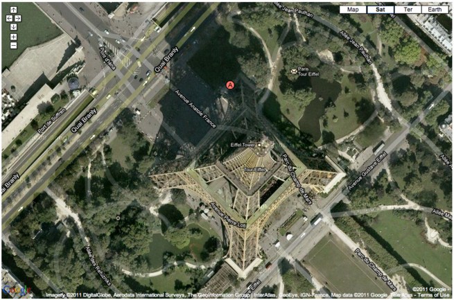
La Tour Eiffel Vu En Ballon
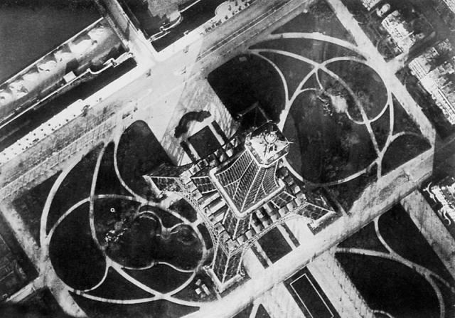
In 1909, balloonist/photographers André Schelcher and Albert Omer-Décugis took this picture from about 50m above the top of the Eiffel Tower. It is one of 40 images they published that year in a book titled, Paris vu en ballon et ses environs.
I just found it in my new Leon Gimpel catalogue, but it turns out to be included in Thierry Gervais’ 2001 article on the beginnings of aerial photography, which I posted about before.
With that angle, I would’ve said Schelcher’s photo looks more Bing than Google Maps, but Google’s got it.
Previously: Le début du point de vue Google Mappienne